 By David G. Firestone
For the end of the 2013 Season, I will reveal the best and worst paint schemes and driver suits of 2013. This was done using a focus group of one, namely myself, and uses the following standards:
Color Scheme:How the colors look, and how they work with each other.
Overall Design:How good the design itself looks, is there too much, or not enough.
Primary Sponsor Logos: How the primary sponsor logos look on the car
Originality: How original is the scheme. Note that originality can work both for and against a scheme in award voting.
Let’s get the bad paint scheme awards out of the way.
First, the Paint Schemie Award for Worst Single Paint Scheme.
The nominees are:
Dave Blaney #7 Sany Ford Fusion
Clint Bowyer #15 Duck Dynasty Toyota Camry
Greg Biffle #16 Red Cross Give Blood Ford Fusion
Landon Cassil #33 Chevy SS
Austin Dillon #33 Honey Nut Cheerios Chevy SS
Brian Keselowski #52 Star Coach Motor Tours Toyota Camry
And the Paint Schemie Award for worst single paint scheme goes to…
The next Paint Schemie Award is for Exhibition Race Paint Schemes. This category is a little different, as the Schemies will go to the best and worst special scheme that was run in either the Sprint Unlimited, the Sprint Showdown or the Sprint All-Star Race.
The Paint Schemie Award for Worst Exhibition Race Paint Scheme Goes To:
The Paint Schemie Worst Dressed Driver Award goes to Joey Logano
Our next category is the Award For Worst Scheme Set of 2013, which is given to the team that consistently runs bad paint schemes throughout the season.
The Nominees Are:
David Stremme #30 Toyota Camry
Scott Riggs #44 Ford Fusion
Carl Edwards #99 Ford Fusion
The Winner for Worst Scheme Set of 2013 goes to:
The Paint Schemie Award for Most Degraded Paint Scheme goes to Kasey Kahne, who’s scheme from 2013 is much worse than that of 2012.
Now the nominees for Best Single Paint Scheme are:
Kyle Busch #18 Doublemint Gum Toyota Camry
Trevor Bayne #21 Motorcraft/Quick Lane Ford Fusion
David Ragan #34 CSX Play it Safe Ford Fusion
Juan Pablo Montoya #42 Target Chevy SS
Jimmie Johnson #48 Lowes Chevy SS
David Reutimann #83 Burger King/Dr. Pepper Toyota Camry
The Paint Schemie Award for Best Single Paint Scheme Goes to
The next two Paint Schemie Awards are for Best Exhibition Race Paint Scheme, and Worst Exhibition . These are a little different, as they will go to the best and worst special scheme that was run in either the Sprint Unlimited, the Sprint Showdown or the Sprint All-Star Race.
And taking these schemes into consideration, the Paint Scheme Goes To:
The Paint Schemie Award for Most Improved Paint Scheme goes to:
Kevin Harvick
who improved his schemes from 2012 to 2013
The Paint Schemie Best Dressed Award goes to:
Now, our final Paint Schemie Award, The Best Scheme Set of 2013:
Now for this, I will take a look at the best Chevy Schemes, followed by Ford, and then Toyota, and then finally I will reveal the winners of the Paint Schemie Awards.
And now, the 5 best Chevy teams that have consistently run great schemes:
#1 Jimmie Johnson The classic design that is paired with different color schemes every once in a while works very well. The design gives the car a very clean look, and is a very timeless look.
#2 Kurt Busch Furniture Row Racing’s “less is more” approach works very well here, with a matte black, white lettering and red letters. They always look good, thought I wish their results on the track were as good as they look.
#3 Kevin Harvick Kevin has had, for the most part, done quite well. All of the schemes have great color schemes, and most have great sponsor logos, and are decently original. Originality works well here, but some of the overall designs, namely the Bad Boy Buggies and Rheem/Budweiser combination schemes need a lot of work, but otherwise Kevin Harvick has had a great season paint scheme wise.
#4 Juan Pablo Montoya The Target scheme is very solid, with great colors, great overall design, and great sponsor logos. Not original, but solid. The most original scheme is the Axe Apollo scheme, but that was just brutal. It had a decent color scheme, and a decent sponsor logo, but the whole outer-space motif just did not work. If Axe Apollo was not on the car this year, Juan would be at the top of the standings.
#5 Phoenix Racing/Turner Scott Motorsports A team that has a very consistent track record when it comes to good color schemes, originality, as well as primary sponsor logos, the team can sometimes have serious issues with overall design. The Hendrick Cars scheme, and the Guy Roofing scheme are just brutal in that category.
Moving on to Ford.
#1 Trevor Bayne The Wood Brothers haven’t run a full schedule this year, but when they have shown up, they have always looked good. The schemes are original, since the Wood Brothers used these schemes for many years, and the colors, overall design, and sponsor schemes are always great.
#2 Aric Almirola The Transportation Impact scheme is keeping Almirola from the top spot, because it does not fit the team at all, and it just looks brutal. Other than that scheme, which while original, has awful colors, and overall design, every scheme they ran is solid, with the STP/Farmland scheme almost making up for Transportation Impact.
#3 Sam Hornish Jr. His one and only appearance in the Sprint Cup came at Kansas this year, and this one scheme, with great colors, great overall design, and great sponsor logos worked very well. I gave him 3rd, since everyone else on the list ran full schedules, and he only ran one race.
#4 Marcos Ambrose The Mac Tools scheme looks odd, with a great color scheme, but iffy overall design. The Stanley logo redesign could have worked well, but the black covering the front and headlights does not enhance the look at all. I was not a fan of this scheme at the beginning of the year, but some slight adjustments to the color scheme worked well.
#5 Ricky Stenhouse Jr. A “pinkwashing” scheme makes an appearance, which takes away from the overall grade. That said, this team has great color schemes all year, but some of the overall designs have a bit too much noise. Sponsor logos work well, and Ricky has had a great year.
Last, but certainly not least is Toyota.
#1 Michael Waltrip/Mark Martin/Brian Vickers Every scheme they have run has been a hit, with great color scheme, great overall design, great sponsor logos, and decent originality. No bad schemes here!
#2 Kyle Busch Overall great design, color schemes, and primary sponsor logos, Kyle also has the most original schemes of the top contenders for the Paint Schemie awards. That said, the Mprove America needs a different shade of blue, while the white Interstate Batteries scheme could use a different color besides white.
#3BK Racing Great color schemes, sponsor logos, and overall design. These designs work well, except for the Old Dominion scheme, which is just awful. Everything that the other schemes are, Old Dominion is not, and it is keeping BK Racing out of the top spot.
#4 Martin Truex Jr. Overall, this team works well when it comes to colors, overall design, originality, and primary sponsor logos, except for the camouflage scheme. The camouflage scheme was awful, and it knocked Martin out of the top spot.
#5 JTG Daugherty Racing Most of what they ran this year was great, but the Bushes Baked Beans car has an odd overall design, and a weird color scheme. The Clorox scheme has a bad color scheme, as does the Charter scheme. If these schemes were fixed, there is no reason why JTG Daugherty could be in the top spot.
Now I will take these top contenders, and rank them in order from worst to best. These top contenders should feel very proud that they have earned a spot on the countdown.
#15 Ricky Stenhouse Jr.
#14 JTG Daugherty Racing
#13 Martin Truex Jr.
#12 Phoenix Racing/Turner Scott Motorsports
#11 Marcos Ambrose
#10 Juan Pablo Montoya
#9 Kevin Harvick
#8 Sam Hornish Jr.
#7 BK Racing
#6 Aric Almirola
#5 Kyle Busch
#4 Kurt Busch
#3 Michael Waltrip/Mark Martin/Brian Vickers
#2 Jimmie Johnson
And Finally The Paint Scheme Award for Best Paint Scheme Set of 2013 goes to:
Congratulations to everyone who won a First award, and to everyone who won a Worst award…paint your cars better!
To conclude the Paint Schemie Awards, I will finish with a top 10 list I have been wanting to do for quite a while. These are the
TOP 10 SPONSORS I MISS IN NASCAR
10 Skoal Bandit The shade of green they used was one of the best, and the car has a classic look that always looks good.
9 Kodiak A simple look, with my all-time favorite shade of green ever used on a race car. I have a lot of Kodiak race-used items, and they all look good.
8 Miller Genuine Draft Rusty’s MGD scheme had a much simpler design than the Miller Lite scheme, and it had a much better color scheme. I really hope they throwback to this scheme at some point.
7 Tide Are there any orange schemes that could ever live up to Tide? No, this is the best orange scheme in the history of auto racing.
6 Smokin’ Joe’s It had a great color scheme, and it had a very 1990’s design, that oddly enough still looks attractive.
5 Western Auto/Parts America The chrome numbers, the layered fading, the color scheme, it just comes together very well.
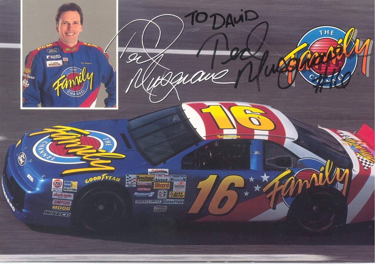
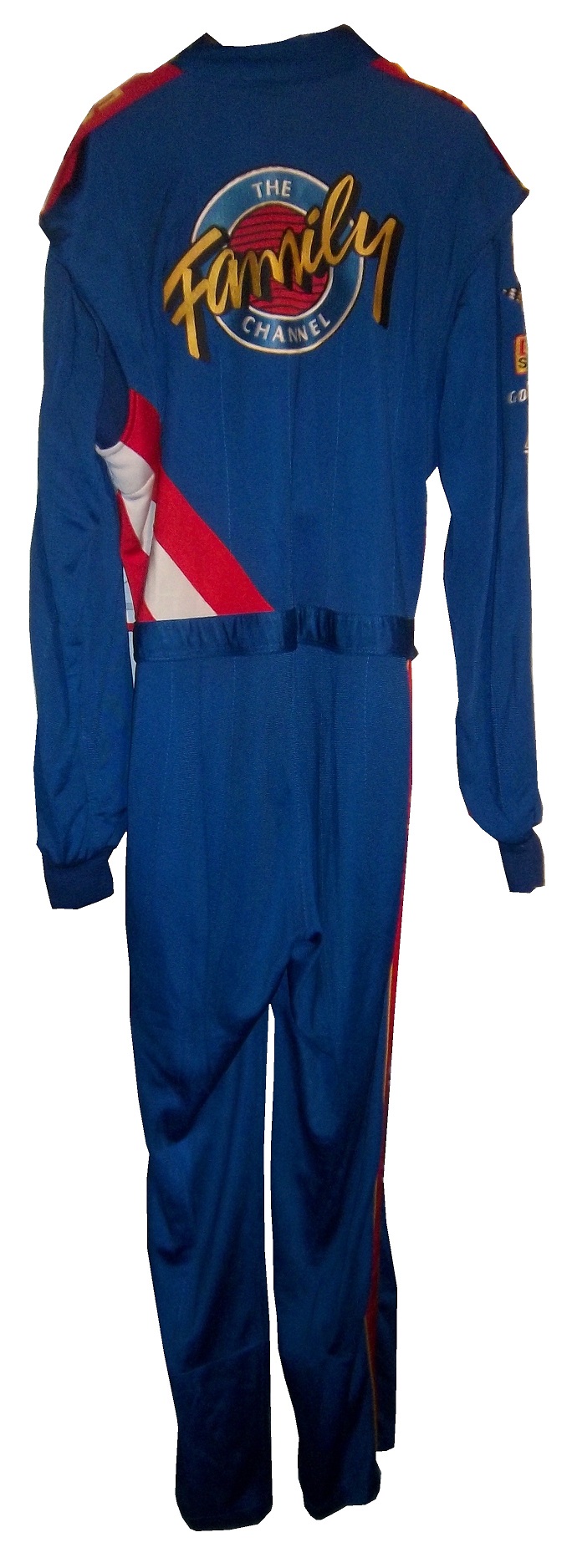
4 The Family Channel The logo is awesome, the colors can’t be any better, the lettering is great, and it just comes together very well.
3 Kodak If there is or was a better shade of yellow in NASCAR, I haven’t seen it yet!
2 Texaco/Havoline Great simple design, with an amazing hood logo, and great color scheme.
1 GM Goodwrench This scheme is, in a word, perfect. It doesn’t evolve, it doesn’t have to. It is simply perfect.
There is one last piece of business that I need to address. I like to keep it light on the Driver Suit Blog, but sometimes I have to address a news story that is heavy, like this story that was released on Thursday. Dario Franchiti, who has won 3 Indy 500’s, 4 Indycar Championships, and 21 races announced on Thursday, that due to injuries sustained at the Shell and Pennzoil Grand Prix of Houston on October 6. During that race, he was involved in a scary wreck, and suffered spinal and knee injuries that doctors have told him are too serious to resume his career. 13 fans, who were in the wrong place at the wrong time were injured in the wreck as well. I’m saddened that a talented driver had his career end like that, and I really wish it didn’t have to. But what I really hope is that IndyCar learns what lessons need to be learned, and make changes to safety so that the chances of this scenario repeating are lowered. I know that there will always be the risk of injury or death in auto racing, that adds to the mystique of the race car driver, but every wreck has a story to tell. These stories should be looked over, and changes made so that another talented in the prime of his career does not have to go through what Dario had to this week. Fans should also be able to go to a race, and not have to worry about getting hurt during a wreck. If the investigation in this incident results in changes that keep fans and drivers from serious injury in the future, than the lessons have been learned. My thoughts and prayers are with Dario and his Family right now.

 By David G. Firestone
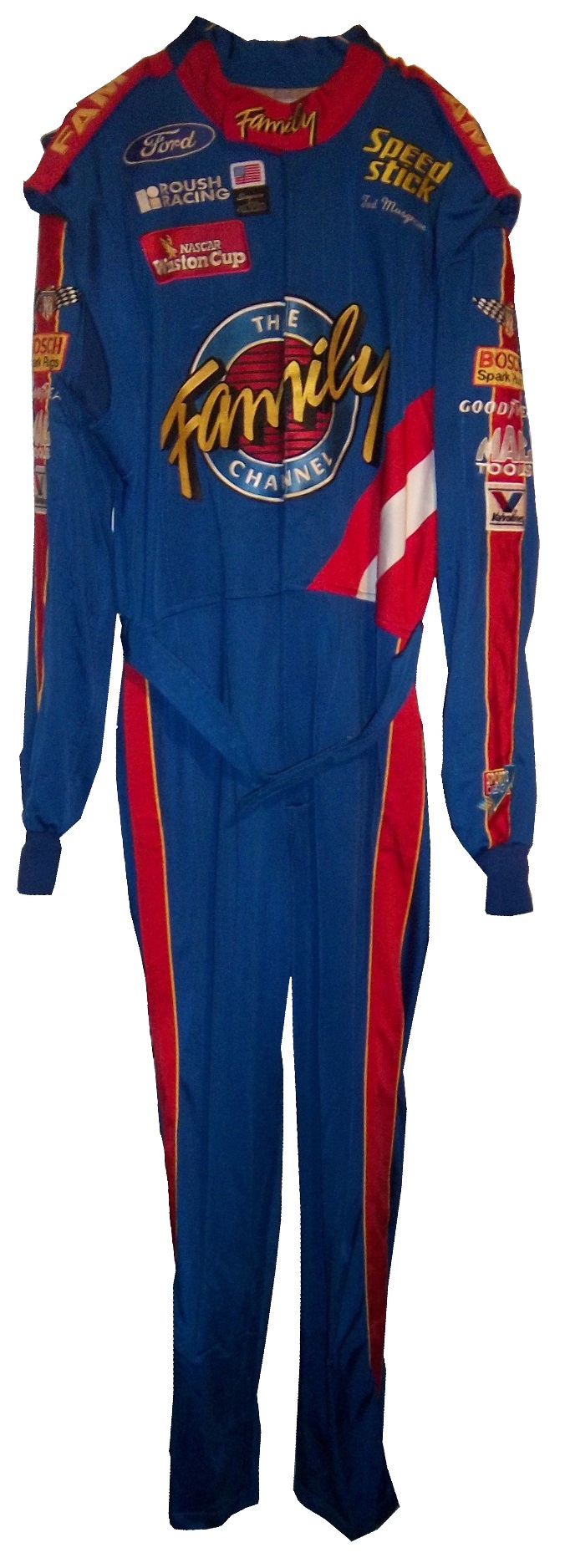


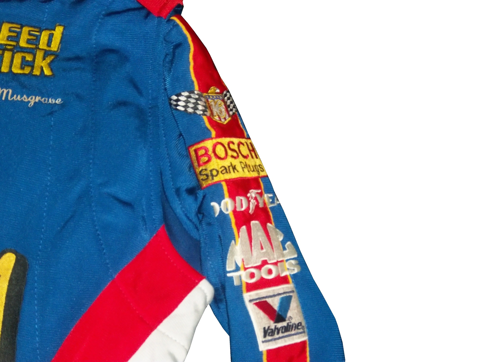
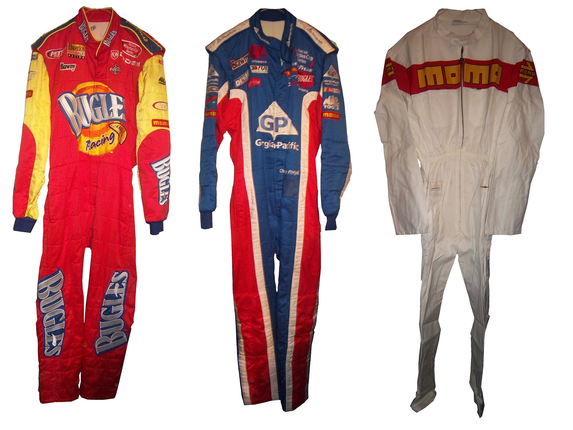
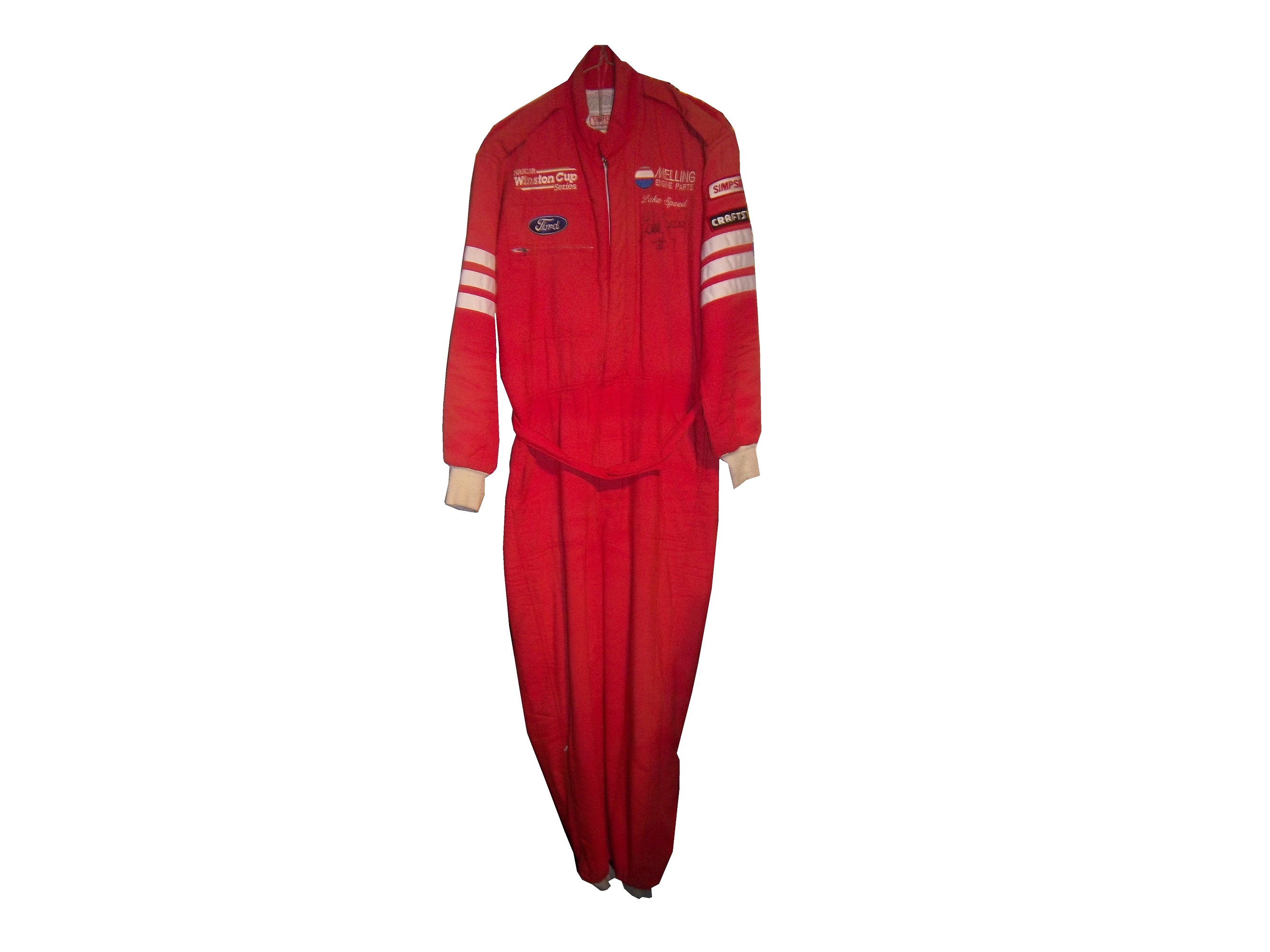
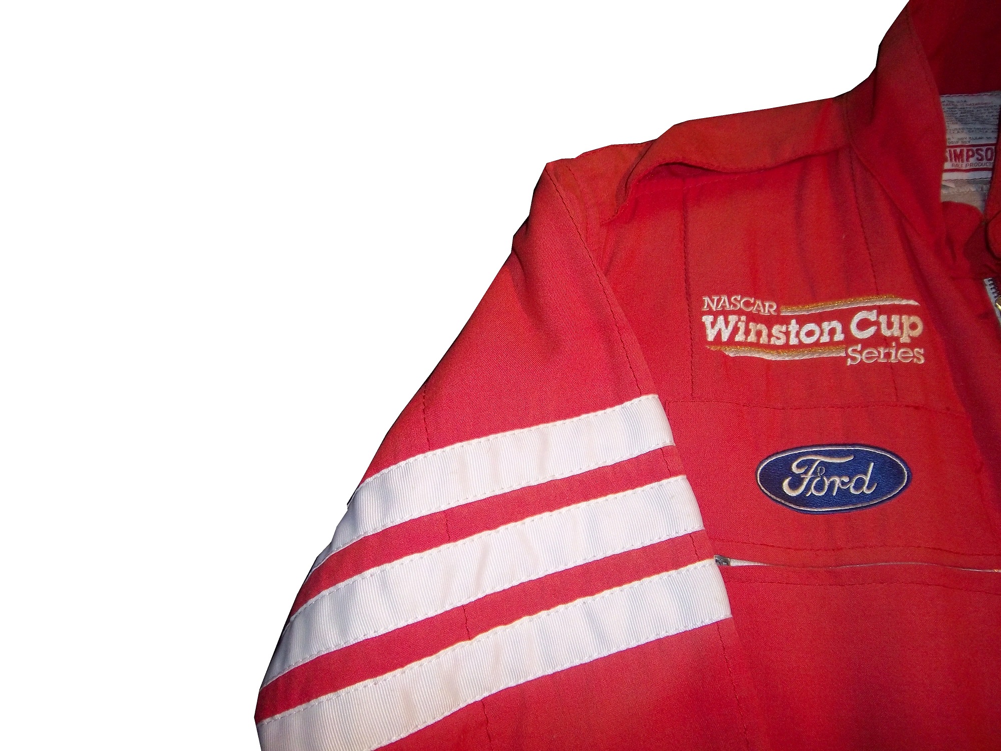
 It also has a ROUSH RACING and NASCAR WINSTON CUP SERIES logos.
  No television logos exist on the arms or legs.
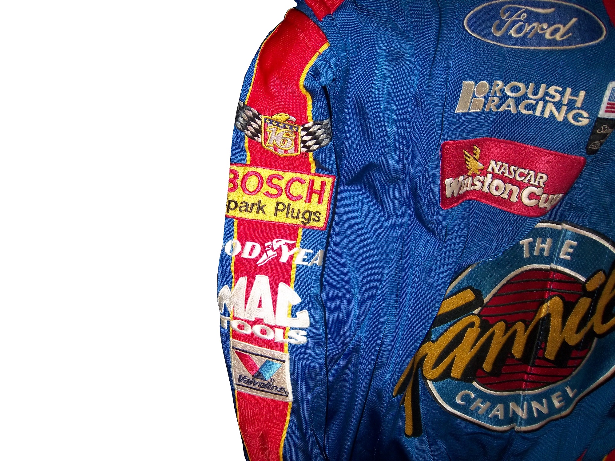

 And that classic name on the chest design that bit the dust shortly thereafter.
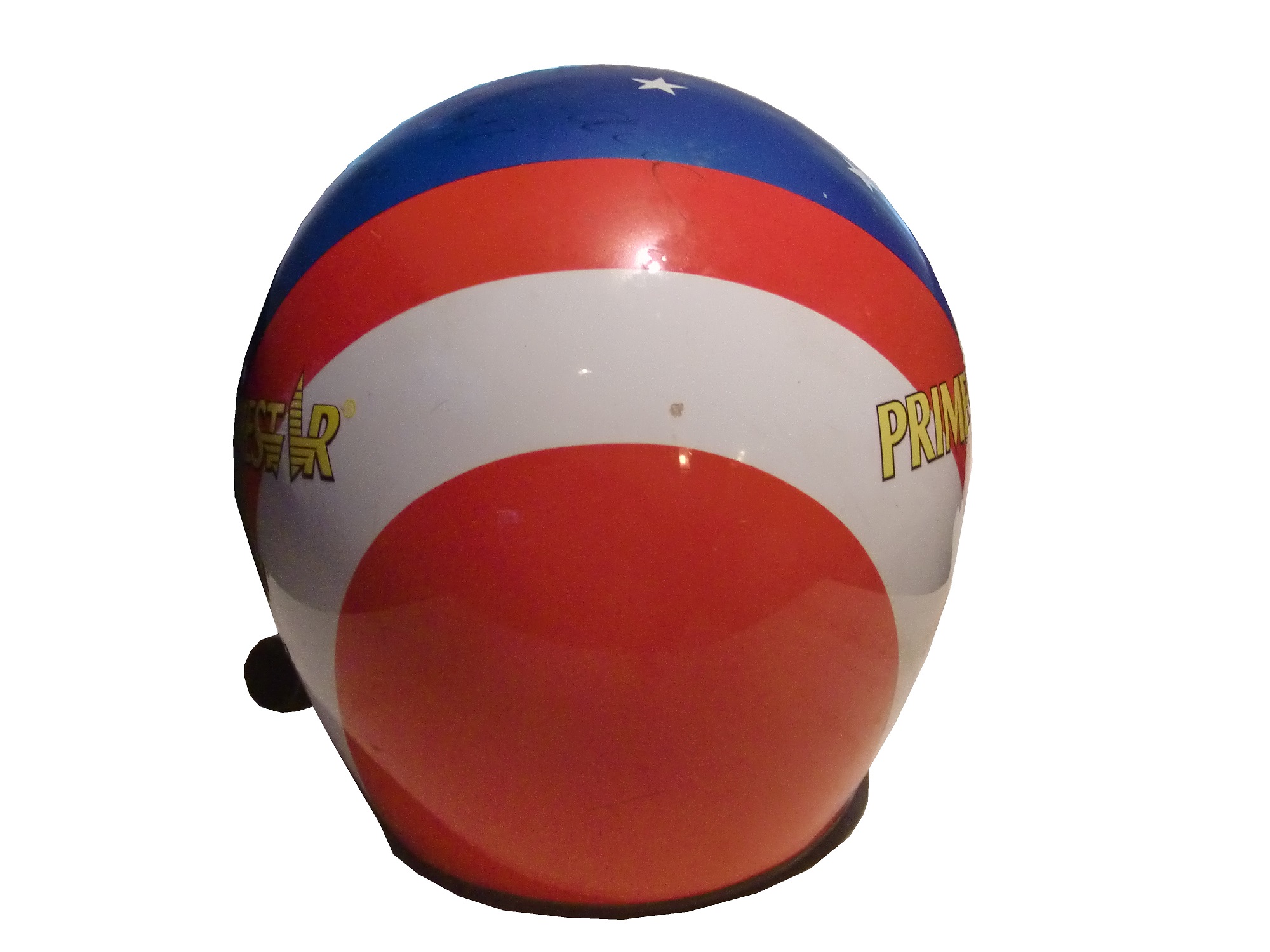
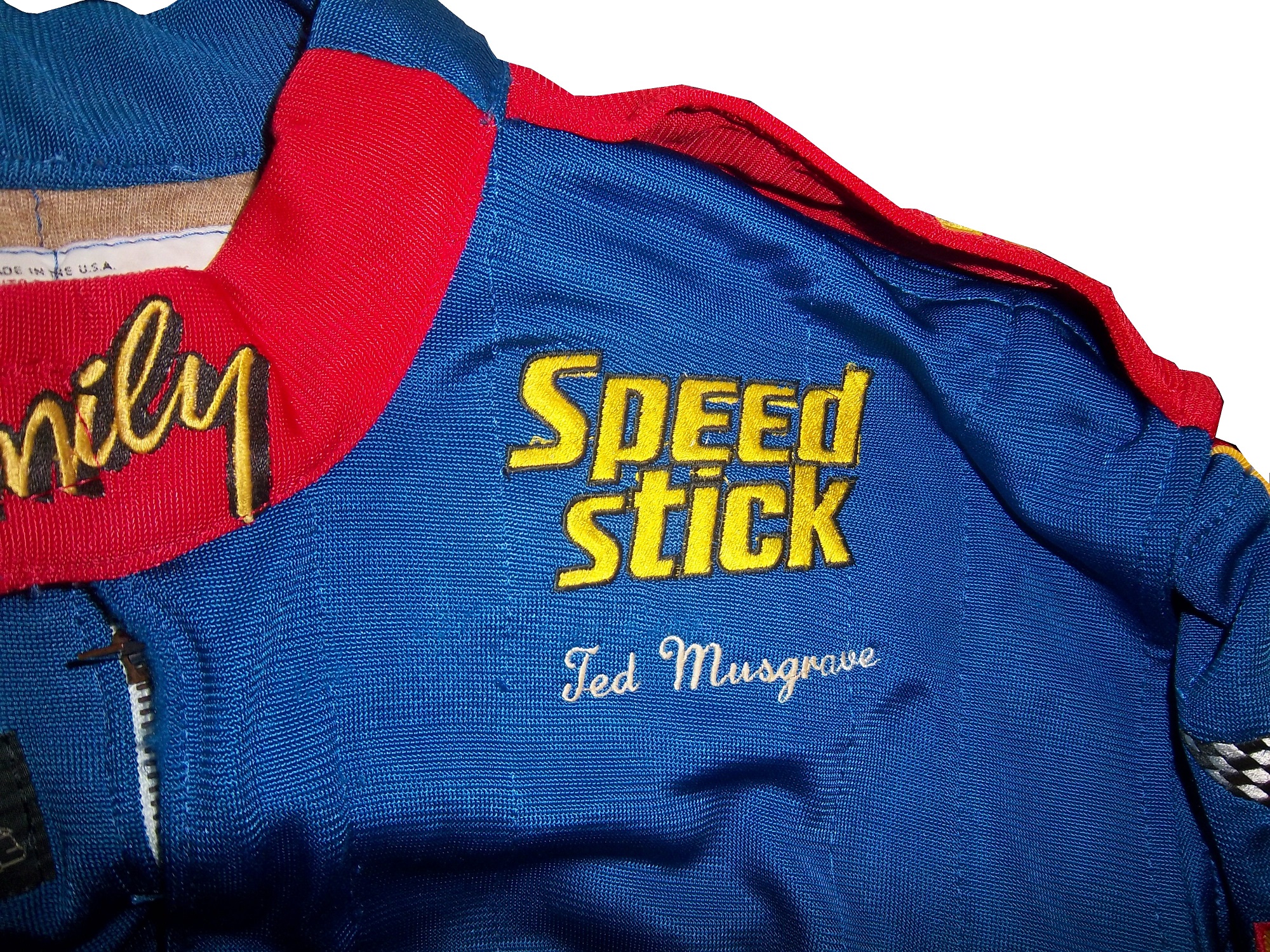 From 1996, I have this helmet.
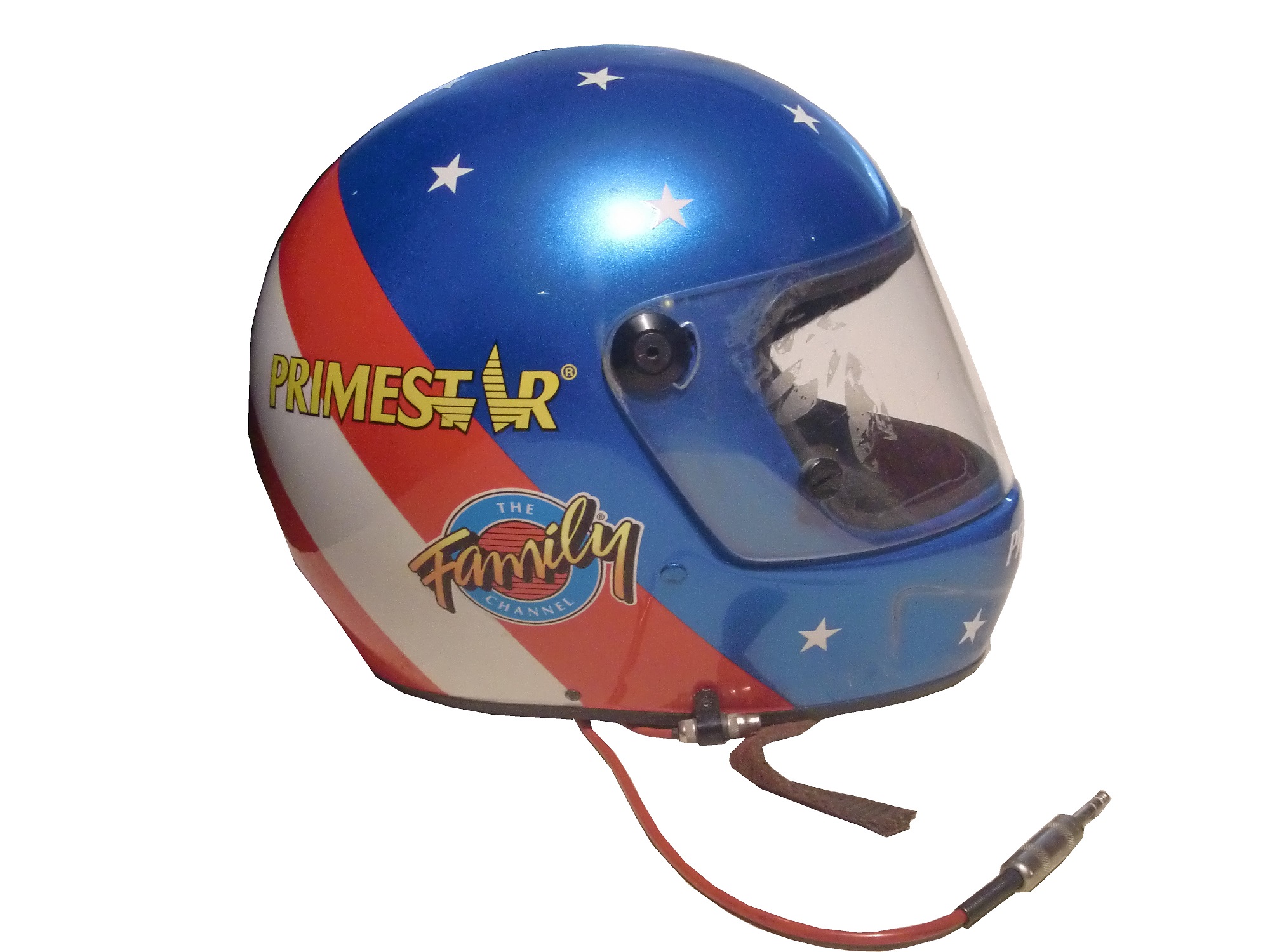

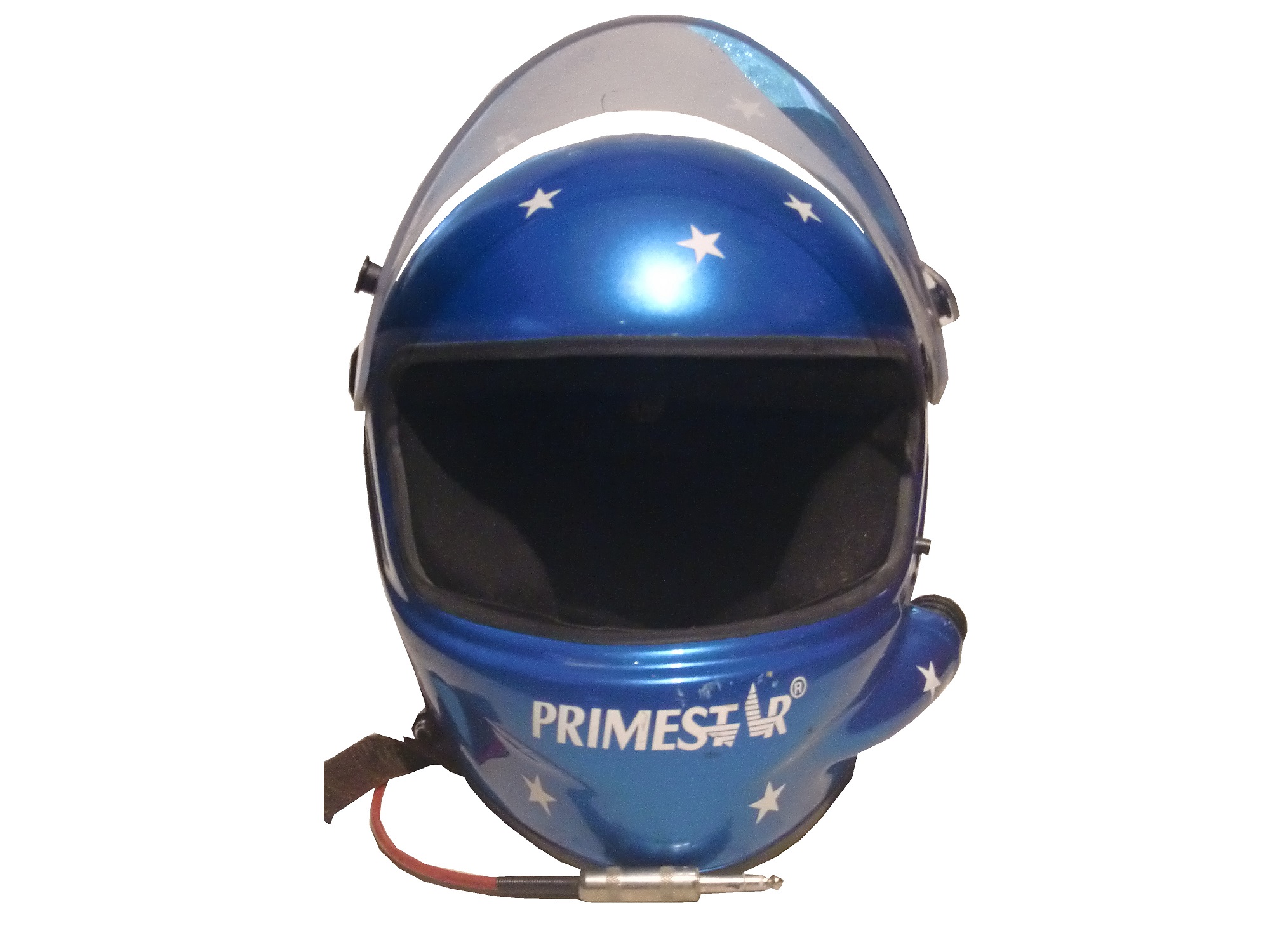

 This helmet was also the inspiration for a mini helmet, also released in 1996, which is very accurate.
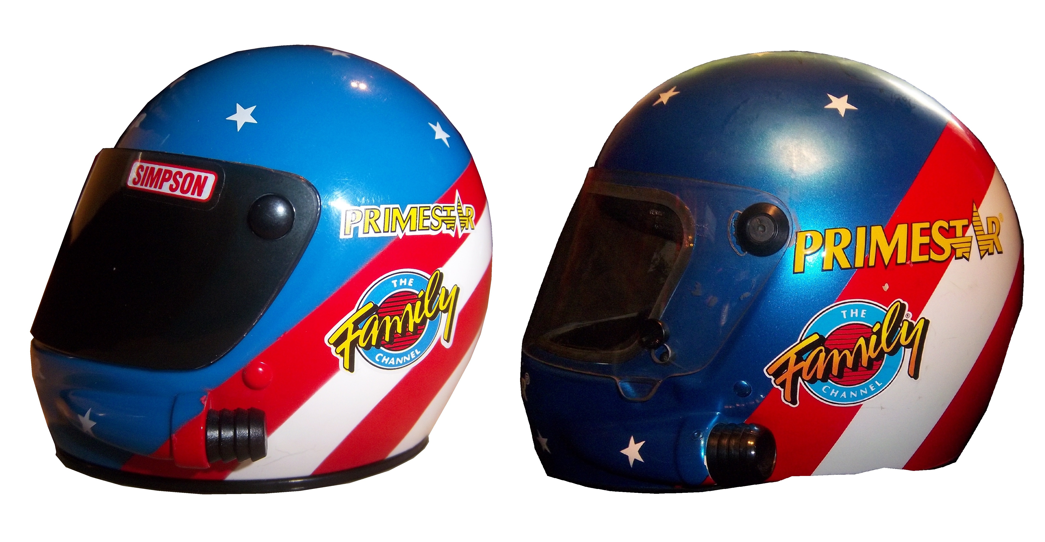


 a NASCAR 50th Anniversary logo,
 and Ted’s name on the belt.
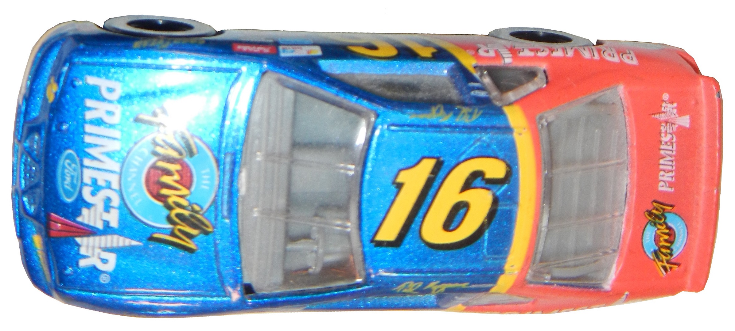
 When it comes to die casts, I have 4, two from 1996,
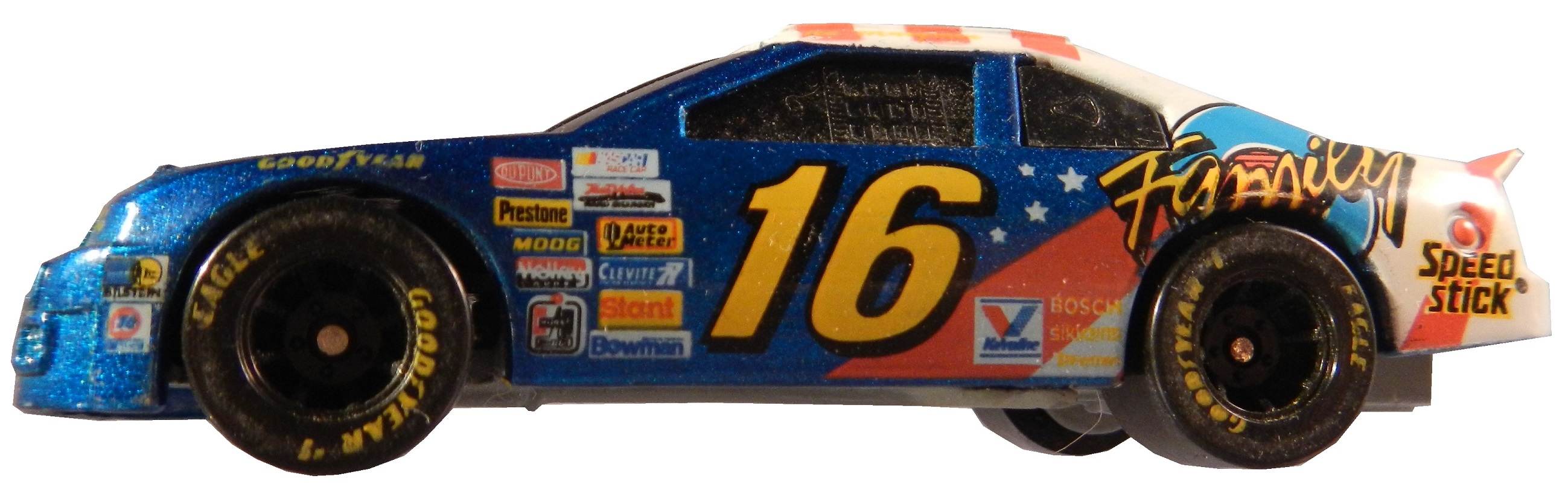
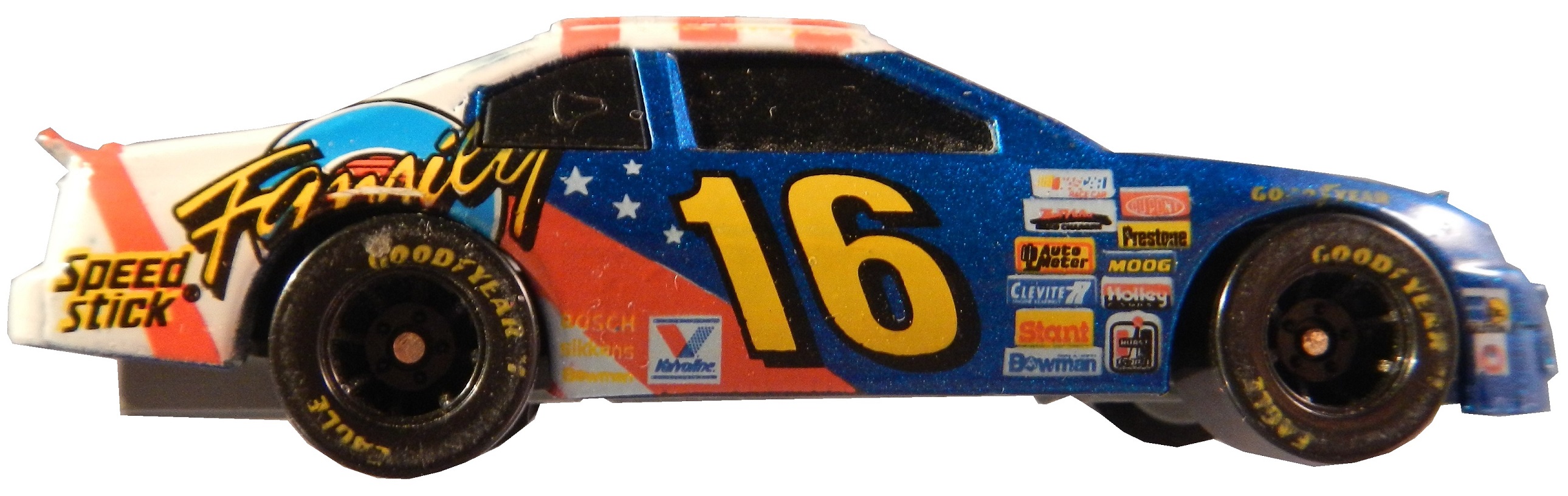


 as well as a 1996 hauler,
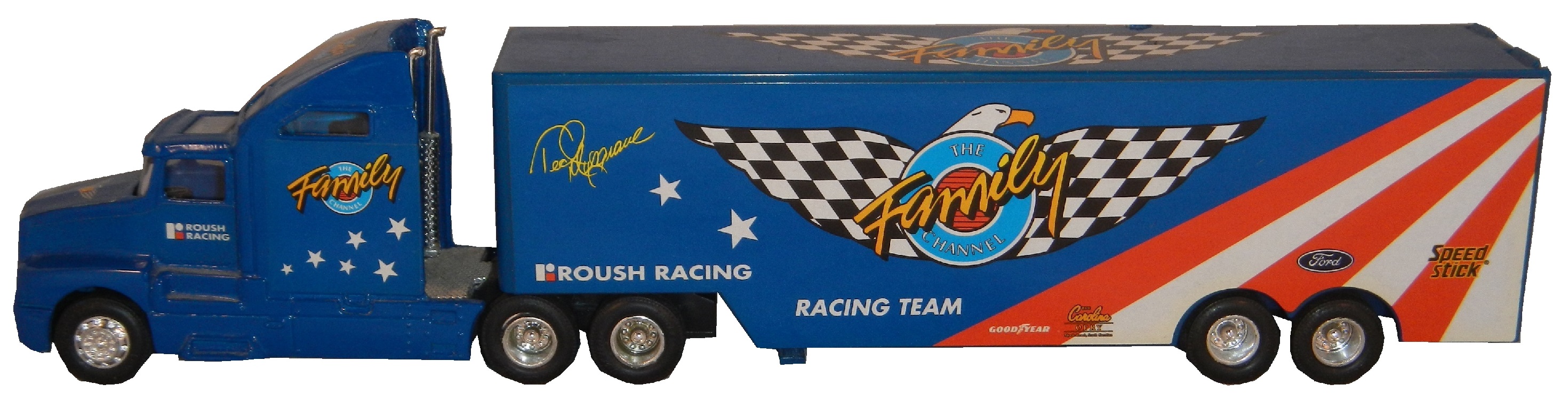

 and a die cast from 1997.

 This is a large piece of sheet metal from his days with Germain Racing, which Ted has autographed on the side.


