49 Years Later…Those 6 Days in May Are Still Being Felt.

By David G. Firestone

When Glenn “Fireball” Roberts was elected to the NASCAR Hall-Of-Fame on May 22, I felt the need to do this article. Fireball’s racing career was a Hall of Fame worthy, no one can argue that, but it was the wreck that led to his death that has had the most lasting effect. His election to the Hall-Of-Fame came 2 days shy of the 49th anniversary of the 1964 World 600. During that race, he was involved in a wreck on the 7th lap, and suffered an 80% body burn. While fire protection was mandatory in NASCAR, and many other racing groups, the way this was accomplished was by taking a pair of cotton coveralls, and dipping them into chemicals, which made them fireproof, but were uncomfortable to wear. Roberts was asthmatic, and the chemicals were aggravating his asthma. So he had a doctor’s note stating as such, and was not wearing any fire protection for that tragic event.

6 days later, on May 30, the 48th Indianapolis 500 was held. On lap 2, Dave MacDonald spun and crashed, which ignited a huge fire, due to the car being badly designed, poorly built, and having a large amount of fuel on board. Eddie Sachs was involved, and was killed due to blunt force trauma. Bobby Unser was burned, as was Robbie Dunman. Dave MacDonald had his lungs scorched by the flames, and was very badly burned, and passed away later in the day.

These two tragic events would, in the long run, have a very bright silver lining. Shortly after these took place, the safety culture of racing improved with the introduction of Nomex. Nomex offered better comfort and fire protection. There were Nomex suits being used in racing, though at that time they were experimental. After those 6 days in May of 1964, Nomex became, and still is the standard for racing suits. SFI was founded thereafter in order to make sure that the suits are up to par, and are safe. The proof that these suits are safe is the fact that other than the addition of extra layers and some cosmetic design changes, the suits remain largely the same.

Interestingly, the driver suit changes were not the only safety changes made after that incident. The cars themselves got a makeover. USAC, in charge of the Indy 500 at the time, mandated that the Indy cars had a new fuel cell design added to them. This fuel cel, which was used in military helicopters at the time, was designed to help prevent a huge explosion in a wreck. In addition, the standard fuel in Indy car was changed to methanol, instead of gasoline. On the NASCAR side, changes were slower to come, but they did come, and now races are much safer.

The major lesson here is that safety is evolutionary and that these accidents, as tragic as they are, all have lessons to be learned. With the 6 days in ’64, it was that fire protection needs to be a forefront of racing safety. With the 1955 24 Hours of Le Mans disaster, which saw one driver and 83 spectators killed, and another 120 injured the lesson was that spectator safety should be a very serious consideration in track design. With Ayrton Senna’s and Roland Ratzenberger’s deaths in the 1994 San Marino Grand Prix, the lesson was that car design needs to be more safety focused than what it was. With Dale Earnhardt’s death in the 2001 Daytona 500, The lesson is that sanctioning bodies in racing should be proactive with safety instead of reactive. These lessons have all been learned, and driver safety has been improved, but as has been said many times after these incidents, you can never take the risk of death out of racing.

Grading the 2013 All-Star Race

Last week was the All-Star Showdown and the All-Star Race.  These two events are magnets for special paint schemes.  The top two finishers from the Showdown move to the All-Star Race.  I have graded both events, starting with the Showdown.  It is ranked from best to worst.

The Good:

1 David Reutimann #83 Burger King/Dr. Pepper Toyota Camry. Great classic design with a great color scheme that gets an A+

2 Travis Kvapil #93 Burger King/ Dr. Pepper Toyota Camry See Above, A+

3 David Gilliland #38 Long John Silvers Ford Fusion Good color scheme, and the basic design used with that scheme on this car just makes it stand out. I’m not a fan of yellow on race cars in most cases, but I’ll overlook it this time because it is just so good. A+

4 Jeff Burton #31 Cat Chevy SS The scheme is solid, has good colors, great number designs and a good pattern used. Final Grade: A

5 Martin Truex Jr. #56 NAPA Toyota Camry Simple, elegant with a great color scheme, great logos and great number design.  Final Grade: A

Aric Almirola #43 Smithfield Ford Fusion Lose the design on the doors and it would be perfect. Other than that this scheme is perfect and earns a solid A

7 Mike Bliss #19 Gentry Plastics Inc. Toyota Camry-Good color scheme and simple design work well here, A

8 Terry Labonte #32 Oxy Water Ford Fusion I don’t know why, but I like this scheme. Normally I wouldn’t like the color scheme and basic design but for whatever reason, I like this. A-

Juan Pablo Montoya #42 Target Chevy SS Great color, great number design, and the pattern used is a lot more subtle than last year’s scheme. The quarter-panels have too many associate sponsors and looks too cluttered, keeping the Final Grade at a B.

10 Bobby Labonte #47 House Autry House Foods Toyota Camry The design is simple, but good. The color scheme need some work. The red used is too bright, as is the blue. The logo group on the quarter-panel is awful. B-. If the color wasn’t so bright, I could grade it higher.

The So-So

11 Joe Nemechek #87 Royal Teak Toyota Camry Good color scheme, simplistic design, not much to say here, C

12 Landon Cassill #33 Bicycle NASCAR Playing Cards Chevy SS-Decent color scheme, but the design is all over the place, way too chaotic, C-

13 Paul Menard #27 Serta Chevy SS Basically the same scheme as his regular scheme, but different hood logo…nothing really to say here…C-

14 JJ Yeley #36 World TradeX Chevy SS– Not much to say here…other than make the logo bigger. D-

15 Dave Blaney #7 Sany Chevy SS Great color scheme ruined by bad door design and generic racing number design. The design is just disgusting to look at, and it gets a D-

16 Casey Mears #13 Geico Ford Fusion Eww…just eww. The color scheme is dreadful, and the designs on the side are painful to look at. It passed because of the logo and number design. Final Grade: D-

17 David Stremme #30 Lean 1 Toyota Camry The best way I can describe this scheme is that there is nothing good about it. Anything they could have messed up with this scheme, they did. It gets an F

18 Scott Riggs #44 No Label Watches Ford Fusion An awful scheme made much worse by a horrible color scheme that earns an F- grade.

19 Michael McDowell #95 Levine Family Racing Ford Fusion There is nothing right about this scheme. F-

20 Brian Keselowski #52 Supportmillitary.org Toyoa Camry-Eww…Too much going on, with the oversized camo in too many different colors, and the door design which is awful. F-

Now on to the All-Star Race.  Jamie McMurray, and Ricky Stenhouse Jr. transferred in from their performances in the Showdown, and Danica Patrick was voted in.  As such, their grades will be mentioned here.

The Good

1 Brad Keselwoski #2 Miller Lite Fan Mosiac Ford Fusion.  It looks really good, and the pictures of the fans give it a condensation on the can effect that is really cool.  A+

2 David Ragan #34 CSX Play It Safe Ford Fusion This is a very solid scheme, with great colors, great design and an overall great look. CSX did this scheme very well and it gets an A+

3 Kyle Bush #18 Snickers Bites Toyota Camry A paint scheme that has a great color scheme, and illustrates the theory that less is more. Nothing bad about this Scheme-A+

4 Joey Logano #22 Pennzoil Ford Fusion Pennzoil has an amazing shade of yellow, and they really put it on display in this A+ scheme

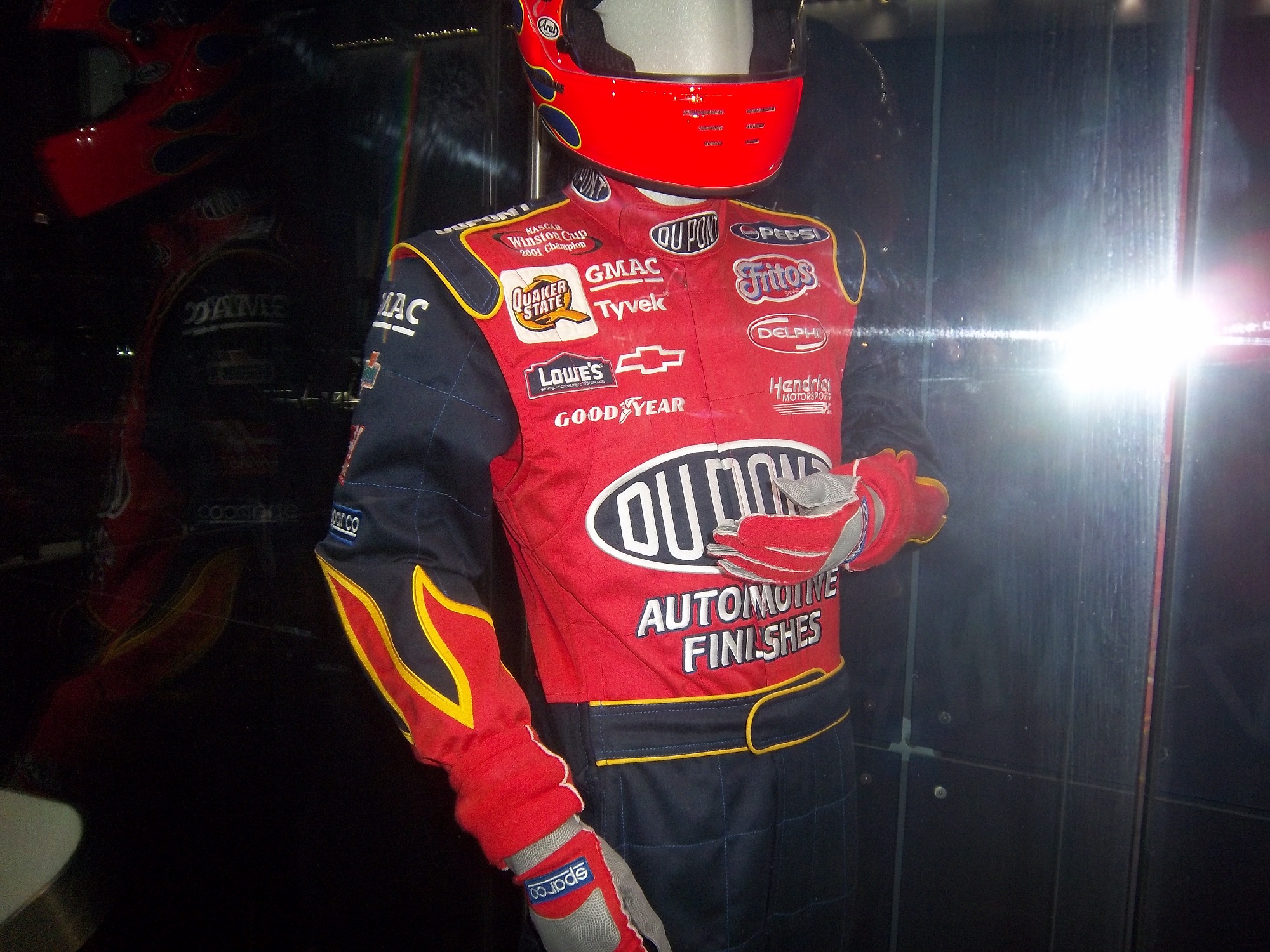
5 Jeff Gordon Cromax Pro Chevy SS Another good DuPont inspired scheme with a great color scheme and great design-A+

6 Dale Earnhardt Jr. #88 National Guard Chevy SS Great scheme, nothing wrong, A+

7 Danica Patrick #10 Go Daddy Cares Chevy SS-The racing stripe makes the scheme look better, and the hood logo is good as well  A

8 Carl Edwards #99 Fastenal Ford Fusion The stripes work well here, and the color scheme is good. A

9 Ricky Stenhouse Jr. #17 Best Buy Ford Fusion  The number design, color scheme, and simplistic design give the car a good look. A

10 Kevin Harvick #29 Budweiser/Rheem Chevy SS-Good color scheme, and I like the two different designs on the side.  A-

11 Clint Bowyer #15 5 Hour Energy Toyota Camry Good color scheme, decent design, could use some work on the front. B+

12 Tony Stewart #14 National Wild Turkey Federation Chevy SS Good color scheme and overall design, but the major issue I have is with the NATIONAL WILD TURKEY being on a curve and not as visible It gets a B-

The So-So

13 Jamie McMurray #1 Bass Pro Shops/NWTF Chevy SS-Great Color Scheme, Awful design, C+

14 Denny Hamlin #11 FedEx Express Toyota Camry The front nose design and stripes are awful. The color scheme is great, but the stripes kill it. The best grade I can give is a C+

15 Greg Biffle #16 3M Filtrete Ford Fusion-Could you please pick a color scheme and stick with it?  Two different color schemes on the same car is just awful. But they are two good color schemes. C-

16 Ryan Newman #39 Aspen Dental Chevy SS-Good colors, but awful design…what does this have to do with teeth?  C-

17 Jimmie Johnson #48 Lowes Patriotic Chevy SS-Not the best scheme he has run all year, but I would love to see the car in that shade of red on the bottom C-

18 Matt Kenseth #20 Husky Toyota Camry Not much really to say, mediocre color scheme, no real design to comment on, the logos are plain Jane enough, it’s a bland scheme that earns a C grade. A mediocre grade for a mediocre scheme.

The Awful

19 Marcos Ambrose #9 Stanley/DeWalt Ford Fusion  Is it normal to get seasick while looking at a paint scheme?  The Petty Blue just does not work here, and the oval around the letters is pointless.  The car looks awful even though it has a great color scheme and great sponsor logos. D

20 Kurt Busch #78 Furniture Row Military Appreciation Night Chevy SS I love the matte black that Furniture Row usually uses, so this is kind of disappointing. That said, the color are good, but the hood design needs work. The MILITARY APPRECIATION banner is much to small and it is hard to see at speed. A good scheme that has been ruined and earns a D-

Before I leave, I have two more pieces of business.  First off, I would also like to extend congratulations to Tim Flock, Jack Ingram, Dale Jarrett, Maurice Petty, and Glen “Fireball” Roberts for being elected to the 2014 class of the NASCAR Hall of Fame.

Second off, RIP Dick Trickle.  You will be missed.

All-Star Race Weekend Events and Fun

100_3196 By David G. Firestone

With the sad passing of Dick Trickle, as well as the All-Star Race, and the Memorial Day trifecta next week, I decided today I needed a change of pace, and I wouldn’t think about racing or driver suits today. So with my uncle in town, we went to the Museum of Science and Industry in Chicago. It’s an amazing museum with a lot of fun things to see and do, and we had a great time.

They have an exhibit that I saw concerning vintage cars, and a number of race cars. They have the winning car from the 1993 Sunrace USA100_3197

A 1924 Marmon race car 100_3194 100_3195

Wally Dallenbach’s car from the 1972 Indy 500 100_3193 100_3192

and Al Unser’s 1978 Lola race car that won the triple crown 100_3190 100_3191

The Spirit Of America, which held the land speed record from August 1963 to October 1964, and still holds the record for world’s longest skid mark is also on display as well.100_3185

There is a new exhibit as well, Science Storms, an impressive state of the art exhibit detailing the science of natural phenomena, and how modern society has to interact with it. It is on two floors in the main gallery. On the second floor, there are displays for physics, magnetism, electricity, and fire among other things. At the end of the balcony, there is a large Tesla coil mounted in the ceiling. Nearby, I was shocked to see this display:IMAG0047That is a Jeff Gordon driver suit, with a similar helmet. 100_3176 100_3175 100_3177 100_3171

A helmet that has been bi-sected to display the fire protection that the helmet100_3180

A helmet used for fire testing, and a Nomex hood.100_3181

A racing helmet and matching goggles from the 1950,s and a 1975 drag racing helmet worn by Dennis Baca100_3182

and some Nomex undergarments and a Sparco bag. 100_3178 100_3179

Now first off, why is the picture of Jeff Gordon from 2011 when the suit is from 2002? I think that it would be better if the picture of Gordon featured him wearing the suit on display. But that’s a minor complaint compared to some of the other issues the display has. The bag in the display clearly states “Jeff Gordon 2003.” So that might lead one to believe that the suit was from 2003. However after doing some research, the suit is from 2002. Looking at a 2003 suit, The Quaker State logo is different, the Lowes logo is gone, and the GMAC and Goodyear logos are in different places. So kudos to the museum for catching that.

The biggest issue is with the helmet cut in half. The sign clearly states “Jeff Gordon’s Helmet, Circa 2002.” Just taking a look at it, and I can clearly tell it’s not race-worn. I can tell for a number of reasons. Let’s start with the obvious fact that the color schemes on the helmet and driver suit are completely different. Second off, there are no ventilation ports or microphone equipment present. Since Gordon was wearing the vent on the left side of his helmet, the fact it is not there is very telling. Considering that DuPont Automotive Finishes paid nearly $12 million total to sponsor Gordon in 2002, his sponsor logos are conspicuously absent, and for a helmet that was supposedly worn for an entire racing season, it seems to be in very VERY good condition, almost new. It should also be noted that there are no HANS anchors present. At first I thought it was because the helmet was not meant to have them, but it turns out they were either supposed to be there, or have been removed. Why this occurred is not clear, but it clearly was NOT worn by Jeff Gordon. In fact, I would be shocked if he ever held this helmet. 100_3180 100_3180 - Copy100_3180 - Copy - Copy

But there is one other issue with this display. The whole display is geared around fire protection, but there is no mention of safety certification. This is not a minor complaint, as the suit has a FIA certification on the back of the neck, but in the display is almost invisible.100_3184

That picture, as bad as it is, is the best I can do, because the side of the display is inaccessible to viewers. If a display discussing fire safety, at least mention that the suit is certified to do just that!

Outside of that display, I had a great time at the Museum of Science and Industry, and I can look past those complaints to say that it is a really nice display that tells viewers a lot about racing safety. So if you are ever in Chicago, stop on over. I promise it is worth the time!

Now on to NASCAR All-Star Showdown Special Schemes…

First the All-Star Showdown Schemes…

Jamie McMurray #1 Bass Pro Shops/NWTF Chevy SS-Great Color Scheme, Awful design, C+

Danica Patrick #10 Go Daddy Cares Chevy SS-The racing stripe makes the scheme look better, and the hood logo is good as well  A

Mike Bliss #19 Gentry Plastics Inc. Toyota Camry-Good color scheme and simple design work well here, A

Landon Cassill #33 Bicycle NASCAR Playing Cards Chevy SS-Decent color scheme, but the design is all over the place, way too chaotic, C-

JJ Yeley #36 World TradeX Chevy SS– Not much to say here…other than make the logo bigger.  D-

Brian Keselowski #52 Supportmillitary.org Toyoa Camry-Eww…Too much going on, with the oversized camo in too many different colors, and the door design which is awful.  F-

Now On to All-Star Race Schemes.

Brad Keselwoski #2 Miller Lite Fan Mosiac Ford Fusion.  It looks really good, and the pictures of the fans give it a condensation on the can effect that is really cool.  A+

Greg Biffle #16 3M Filtrete Ford Fusion-Could you please pick a color scheme and stick with it?  Two different color schemes on the same car is just awful. But they are two good color schemes. C-

Kevin Harvick #29 Budweiser/Rheem Chevy SS-Good color scheme, and I like the two different designs on the side.  A-

Ryan Newman #39 Aspen Dental Chevy SS-Good colors, but awful design…what does this have to do with teeth?  C-

Jimmie Johnson #48 Lowes Patriotic Chevy SS-Not the best scheme he has run all year, but I would love to see the car in that shade of red on the bottom C-

Pit Boards…Unique and Under-Appreciated.

By David Firestone

Today, I thought we should discuss an item that everyone sees, but not everyone understands…the mighty pit board. Pit Boards are an item that most average collector wouldn’t think that would come up for sale, but they do. I am a proud owner of one myself:mccumbee-pit-1

This beauty of an item is from MRD Motorsports, and was used between 2007 and 2009 for Chad McCumbee and Blake Bjorklund, amongst others. Made from a thick plastic inside, with the color design made with a plastic similar to many campaign signs, it shows very nice use, with scratches and scuff marks. There are two types of pit boards. One type hangs above the pit lane, to help indicate to the driver where his pit is. This board almost always has the car number and holes cut into it to cut down on wind resistance. This is an example of one used by MRD.

The other type, like the one shown above, is to indicate to the car where to stop in the pit. In years past, a crew member would stand behind the board and the car would drive up to him, as shown at 6:49 at the video here…

Since this was as dangerous as one thinks it is, in the 1990’s, pit crews switched to the “lollipop” form still used today.  The board is held on a long pole and held where the driver can see and hit it to stop at their stall, as seen below:

Boards are often customized to driver preference.  Kevin Harvick is known for his “Happy Face” pit board.  Some drivers use sponsor names, other use car numbers.  It all looks confusing on pit road sometimes.  In this example, the MRD Motorsports board has the car number design on it.  This board shows where the pole was attached to the board.mccumbee-pit-2 mccumbee-pit-3

And it also shows numerous scratches and scuff marks from race use.mccumbee-pit-3 mccumbee-pit-4


The back of this board is plain black.  That is due to MRD being a low budget team, with limited resources.mccumbee-pit-5


A quick search on ebay and other sites shows that these items frequently sold as collectors items after a race.  These are unique items, and for NASCAR fans are conversation pieces.

And now on to Paint Schemes…

Brian Vickers #11 FedEx Delivery Manager Toyota Camry  Good simple scheme with great colors and design, gets an A

Sam Hornish Jr. #12 SKF Ford Fusion  Good color scheme, but it looks like a cross between Joey Logano’s scheme and Aric Almirola’s schemes.  I give it a B+

Tony Stewart #14 Mobil 1/Bass Pro Shop Chevy SS The color scheme is good, but the overall design isn’t as good as the regular scheme. Too much going on. The best grade it can earn is a C

Clint Bowyer #15 Toyota Toyota Camry Not much to complain about here, good color scheme and simple design and an A grade

Clint Bowyer #15 KFC I Ate The Bones Toyota Camry KFC has great lettering and a great shade of red, and both are not represented here very well.  That said, I don’t hate this scheme, colors are good, but what is with the hood design?  The KFC logo is too small, and the hood has some creepy guy with a bowl cut as the most promising feature.  All things considered, it earns a C-

Kyle Busch #18 M&M’s M’ Prove America Toyota Camry Good scheme with a great color scheme and good design. Nothing wrong with this solid A scheme.

Kyle Busch #18 Doublemint Gum Toyota Camry Just like Kyle’s scheme on the 18, I love the color scheme, love the simple design, love the fact that the 81 is the 18 backwards, love this scheme, A+

David Ragan #34 Detail Doctor Ford Fusion  Decent color scheme and decent design.  C-

Juan Pablo Montoya #42 Clorox 100th Anniversary Chevy SS  Surprise!  Happy Birthday!  The blue and white is good but the rest looks too goofy to be good.  It looks like a birthday party for a 4 year old.  Lose the confetti and streamers and I would like it much more, this scheme earns a D+

Aric Almirola #43 Enrich/Smithfield/Farmland Ford Fusion Lose the design on the doors and it would be perfect. Other than that these three schemes, different only by the hood and quarter panel sponsors are perfect and earn solid A schemes

Aric Almirola #43 Transportation Impact Ford Fusion Black white and lime green? Seriously? And the black front makes it look like the car was in a wreck and had the nose replaced. Not a good look at all. The door design is awful and the quarter panel is even worse! I can’t give this scheme a passing grade and it gets an F!

Aric Almirola #43 Jani-King/STP Gas Booster Ford Fusion This scheme makes up for the Transportation Impact scheme with simple perfection, and an A grade

Aric Almirola #43 STP/Farmland Ford Fusion OK, last Almirola scheme…I promise! A good throwback scheme is ruined with the door number design. Get rid of the oval design and it would get an A, whereas this scheme earns a B-

Scott Riggs #44 No Label Watches Ford Fusion An awful scheme made much worse by a horrible color scheme that earns an F- grade.

Scott Riggs #44 JPO Absorbents Ford Fusion Why do many racing teams have wave designs?  It is not a good design, and in this case it takes a good color scheme and ruins it earning a D grade.

Bobby Labonte #47 Clorox 100th Anniversary Toyota Camry Did anyone look at the main color of the car before it was painted?  This looks awful!  Montoya’s version looks better, but not by much.  D-

Jimmie Johnson #48 Lowes “Reverse” Chevy SS  Looks really good, and really stands out in nighttime racing.  Color scheme is good, as Lowe’s often is.  A+

Jimmie Johnson #48 Lowe’s “Emerald” Chevy SS  Decent color scheme, though if if were reversed it would look even better.  Even still it is good enough to earn an A-

Martin Truex Jr. #56 NAPA Brakes Toyota Camry Simple design, good color scheme, but the Twitter handle on the back of the roof is distracting and it looks awful.  It takes an A scheme to a B-

Kurt Busch #78 Furniture Row Military Appreciation Night Chevy SS I love the matte black that Furniture Row usually uses, so this is kind of disappointing. That said, the color are good, but the hood design needs work. The MILITARY APPRECIATION banner is much to small and it is hard to see at speed. A good scheme that has been ruined and earns a D-

Elliot Sadler #81 Double-Mint Gum Toyota Camry Just like Kyle’s scheme on the 18, I love the color scheme, love the simple design, love the fact that the 81 is the 18 backwards, love this scheme, A+

Dale Earnhardt Jr. #88 National Guard Chevy SS What the hell?  The blue and white scheme works well with this design, but camo and black?  It just looks awful.  I love Dale Jr. but I can’t defend this scheme at all. F-

Scott Speed #95 Tracking Point/JTS Truck Sales Ford Fusion Good color scheme, but awful design. The diamond plate decals does nothing to help, and it earns a D-

Michael McDowell #98 Curb Record/ The Bobby Bones Show Ford Fusion Love the color schemes and design. Bonus points for the diagonal hood logo. Not many people can make the diagonal logo work, but it works here, A+

Carl Edwards #99 Geek Squad Ford Fusion.  Not much to say here, really simple design and it looks alright…C+

Carl Edwards #99 Cheez Its/Frosted Flakes Ford Fusion.  These two schemes are awful.  Too much going on, too many colors, no consistency, not a good pair of schemes at all, F

To Answer a Valid Question

By David G. Firestone

Yesterday, I received a comment from “Eric” on my personal blog. Eric stated that “Since when is this a—–e the authority on paint schemes and uniform design? What’s his marketing experience or is this just his subjective opinion and who the hell asked for it?” Well Eric, I am a collector of driver suits and helmets. In February, I wrote a column for Uni-Watch, a sports uniform website, entitled “Gentlemen Start Your Engines.” The article was an introduction to the basics of driver suit design, using items from my personal collection.

The Driver Suit Blog was started as a direct result of that column. As I was working on the column, I was stunned to discover the lack of information on collecting driver suits available to the collector. Much of the information I included in that column was not readily available to collectors, and it made my research that much harder. I started The Driver Suit Blog in order to solve this problem. I want other collectors to have a place where they can get information on driver suits without as much difficulty as I had.

I started collecting driver suits in 2010. Prior to that, I was and still is very active in the game-used sports memorabilia hobby. I make videos of my collection under the title “Introduction to Sports Memorabilia” to help new collectors understand some of the aspects of collecting these items. Football, baseball, basketball and hockey uniforms and game-used memorabilia is a lot easier to research because there are many websites devoted to game-used items, and the game-wear patterns, terminology, and uniform designs are explained very clearly with visible examples. That makes research a lot easier. In addition to that, many auction houses are good for research as well.

Driver suits, and racing memorabilia in general are not as widely represented on websites, auction houses, and collector websites as NFL, NHL, MLB and NBA memorabilia. Granted the racing market is not as big as those, but there are still collectors out there, and they want and need to do research on their items. I have found more information on McDonald’s collectibles and Presidential bill signer pens than I have on collecting driver suits.

When it comes to paint schemes, I decided that I am focusing this blog on racing aesthetics and collectibles. Paint schemes are an intricate part of driver suit design. As paint schemes change, driver suit design changes with them. As a collector, I have to take these subtle changes into consideration. That said, when it comes to paint schemes, there are some good schemes and some awful schemes. I just take a public stance on what I think are good, and what I think are awful. I also collect a lot of race-used sheet metal, so the chances are good that pieces of these cars can and do end up in my collection, so I do have some interest in these schemes.

When it comes to “marketing” I’ve said that I’m a collector. I have no marketing experience, I don’t work on Madison Ave, I collect and analyze driver suits. In analyzing the various items in my collection I’ve noticed that the safety and marketing design requirements fuse into the driver suit. Even as I look at the items in my own collection, I see the marketing aspects, but not the safety aspects. So many of the aspects of the suit that people notice most are the marketing aspect not the safety aspect of it.

So “Eric” I hope that gives you some answers to your questions. Next time you feel like commenting, please don’t be so profane.