By David G. Firestone
I was going to review the new Verizon IndyCar Series logo earlier, but then Mello Yello came out with a new logo, and I quickly realized that there would be a new logo for the NHRA Mello Yello Drag Racing Series, so I figured I’d hold off until the new logo came out. Well, last week, the new logo was released. Normally, I don’t swear on this blog, but for these new logos, I’m going to, because they are just shit.
Let’s discuss the new Verizon IndyCar Series logo.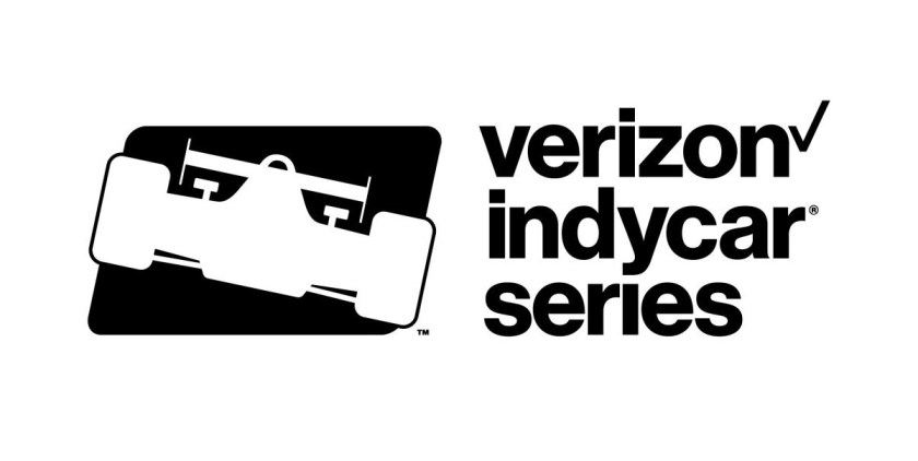 I new it was going to be awful, since Verizon’s new logo looks like shit. But it was even worse than I could have predicted. It looks generic. Seriously, it looks like a cheap knockoff logo sold on counterfeit merchandise. When I first saw it, I sincerely thought I was looking at a beta version, or a test version, but no, this is the new logo. It looks like there was maybe 5 minutes worth of thought to this new design. There was no effort whatsoever. If it were a badge, like the 2015 Verizon IndyCar Series logo, maybe I could get behind it a little more.
  I didn’t like the old logo either, but at least I gave them credit for putting some effort into the logo. With the 2016 logo, it’s the IndyCar logo, with some generic text. I’d like to bash it more, but there’s nothing to bash.
I hate the new IndyCar logo for not putting enough effort into the design. For the new NHRA Mello Yello Drag Racing Series logo, they put much too much effort into it, and it looks even more like shit: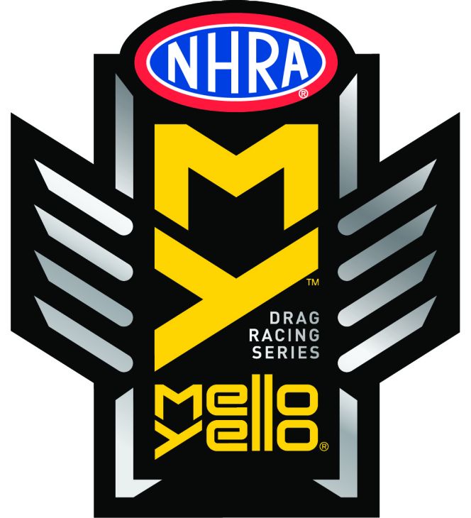 When I saw the new Mello Yello logo, my first thought was that the new logo had Peter Clifford’s fingerprints all over it. Peter Clifford was elected the new President of the NHRA, and instantly began suffering from a very common disease commonly known as “Newly Promoted Managers Syndrome.” Newly Promoted Managers Syndrome or NPMS is a temporary condition in which a newly promoted manager feels the need to prove he or she is worthy of the promotion, and will begin to make changes to show others he or she is. These changes can be minimal, a slight change to the dress code, a procedural change, or small rule changes. Sometimes, as in the case Peter Clifford is showing, these changes can be very massive, in redesigning the Pro Stock class, along with new television contracts and logos.
It would also make sense considering the timing of Mello Yello’s logo change, which came at the end of last year. Since these logo changes take months to design, and survey, it very easily could have corresponded to Peter Clifford’s election to NHRA President. Outside of the NHRA, Mello Yello doesn’t really sponsor anything, and the NHRA is their big marketing deal. As such, it does not seem that far fetched that the NHRA and Coca Cola worked together to come up with the new logo.
I liked the old Mello Yello logo, because it had a vintage look, but had a modern feel. The Mello Yello Drag Racing Series logo had a unique look, that was a little bit modern, and a little bit retro. The pipes and fire worked well, and it was a great looking logo that fit well wherever it was used on a car, uniform or apparel.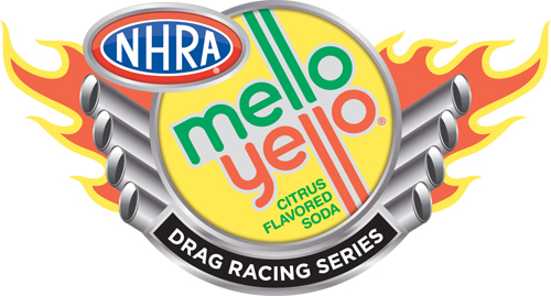 The 2016 logo is so overdone, it’s not even funny. While on the old logo, the pipes are cleary exhaust pipes, and the fire represents the fire coming out of the pipes during a fuel car run, the “pipes” on the new logo are poorly defined, and look really bad. It looks like it is trying to car-themed, but failing. The Mello Yello lettering would work better if it was only one line of text, instead of two. The fading of the silver is ugly, and does nothing to help the logo. The red, white and blue NHRA logo looks out of place on the yellow, black, and silver logo. It’s just a mess.
One thing I have to give the NHRA and Mello Yello credit for is that the new logo will work with their My NHRA campaign. I do think this new promotional campaign will bring more people into the sport as fans. The NHRA is very fan-based, and they give you access to the drivers, that no other racing series does. I go to the Route 66 Nationals every year, and I can say that I’ve gotten a lot of autographs, met a lot of drivers, and always had a great time. I’m hoping that aspect of going to a race never changes.
My conclusions are that the Verizon IndyCar Series logo was a cop-out. It’s a cheap, watered-down version of a racing series logo that had no thought behind it. The Mello Yello Drag Racing Series logo on the other hand, is much too over-designed, and poorly thought out.


