
Category: Other
Introduction to Sports Memorabilia-Currency
For the season finale of season 16, we will examine currency in its various forms, including pure gold, coins, bank notes, and coin dies.
Introduction to Sports Memorabilia-Shipwreck Recovered Items
A series of items rescued from shipwrecks will be examined this week.
From The Depths of the Sea…To My Collection
 By David G. Firestone
Going off topic today. I have always been interested in shipwrecks. I don’t know why, but the idea of the remains of a ship, and its contents lying on the bottom of the sea just fascinates me, as it does a lot of people. In fact, shipwreck memorabilia is an interesting hobby, as it is interesting to hold something that has spent decades at the bottom of the sea in your hands.
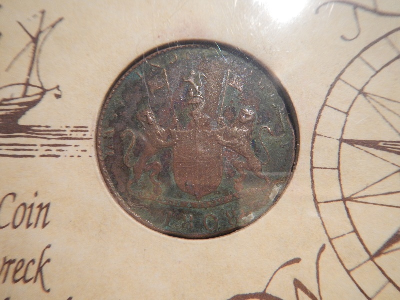
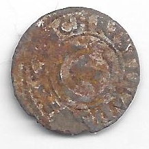
The most common shipwreck memorabilia are coins. Business and sailing were one in the same for many years, as companies made and shipped goods for sale all over the world, and the ships came back with large amounts of coins. When the unthinkable happened, and the ship sank, these coins were lost to the bottom of the sea, until recently, when the ability to dive down and explore these ships has become much more commonplace. Divers love to explore shipwrecks, and they will find items from the time, and bring them back to the service, either for their own collection, or to sell to other. These are examples of shipwrecked coins.
The Dutch East India company was founded on March 20, 1602, and the first company to sell stock in themselves. They were heavily involved in the spice trade, at one point having a monopoly on the Dutch spice trade. While profitable for a while, it was a corrupt venture, so much so, it ceased to exist on December 31, 1799. The ships used were known as “Dutch East Indiaman.” These are coins from the Dutch East Indiaman Merestein, which sank off which sank off the coast of Southern Africa in 1702. They spent over 260 years underwater, when they were discovered and recovered in the 1970’s. They still have silt on them from their time at the bottom.


Admiral Alan Gardner, 1st Baron Gardner was a career sailor in the British Royal Navy. He is well known for negotiating during the Mutiny at Spithead in 1797, and introducing lemon juice to prevent scurvy. He had a East Indiaman named after him, which was built in 1796, and sank on the Goodwin Sands in 1809. There were a large amount of coins which were stored in tightly sealed barrels on board. They were recovered in 1986, and examples like these two, were sold to the general public. They were mounted in plastic containers with nice graphics, and the back story of the Admiral Gardner. They also came with COA’s.


Moving away from coins, we move to this item from the SS Larchmont. The SS Larchmont was built in 1885 at Bath, Maine. It was a 252 foot long steamer that sailed from New York to Providence, Rhode Island. February 11, 1907, Larchmont collided with the Harry P. Knowles in a blizzard, and sank in 10 minutes. Between 10 and 19 people of the over 200 people on board survived. This brass item was pulled from the wreck site, and has been mounted to a wooden base with a brass plaque on it. I’m not sure what exactly it is.


No other shipwreck is as well known and has inspired so much intrigue as the Titanic. Launched in 1912, and ironically, despite the fact that it was lauded as being “unsinkable,” it sank during its first voyage. While the ship and most of the heavier items sank to the bottom of the Atlantic Ocean, lighter items, such as wooden items floated and drifted for a while. This small sliver of wood was found during the search for survivors.

In 1985, Jean-Louis Michel of IFREMER and Robert Ballard of the Woods Hole Oceanographic Institution found the wreckage of the Titanic at the bottom of the sea. Since his initial discovery, many artifacts have been recovered, including this piece of coal, which was sold at the Titanic artifact exhibition tour.

Next week, we look at a remnant from a once-promising career.
Introduction to Sports Memorabilia-Lottery Memorabilia
A set of lottery tickets from the 1800’s, and a drawing used lottery ball is the feature of this week’s episode.
Currency and Us Part 2-Banknotes and Their History
 By David G. Firestone
Last week, I discussed coins, and their history. The history of bank notes, or bills, is no less interesting. We spend our lives working to get bank notes, but we don’t often think about how they came to be. We tend to do that with most inventions. Interestingly, bank notes have an interesting history.
The first government to issue bank notes was the Song Dynasty in China. The Song Dynasty, in the early 11th century, allowed 16 different banks to print up the first bank notes. This was done because copper coinage is much heavier than a bank note, and that copper production was declining. Once the Song Dynasty realized the advantages of bank notes, they took over production of the notes in 1023. By the 1200’s, most Dynasties were using some form of paper bank note.
Around the 13th Century, Marco Polo and other European explorers made their way into Asia, and began to encounter paper bank notes. Polo was especially interested in these notes, stating chapter 24 in The Travels of Marco Polo:
“All these pieces of paper are, issued with as much solemnity and authority as if they were of pure gold or silver… with these pieces of paper, made as I have described, Kublai Khan causes all payments on his own account to be made; and he makes them to pass current universally over all his kingdoms and provinces and territories, and whithersoever his power and sovereignty extends… and indeed everybody takes them readily, for wheresoever a person may go throughout the Great Kaan’s dominions he shall find these pieces of paper current, and shall be able to transact all sales and purchases of goods by means of them just as well as if they were coins of pure gold.”
This system was seen as effective way to transport currency from one country to another, with little confusion as to exchange rates. These early notes were not true bank notes, but were promissory notes. The note was an instruction to the bank to pay the person holding the note the amount in gold or silver. As time went on, the banks began preferring to issue bank notes as currency, and governments soon followed. For a time, there were both governments and private banks were issuing their own notes. Private banks were eventually banned from issuing their own notes as currency, and the government bank notes became the standard.
In the United States, the Federal Government is in charge of printing bank notes, though this was not always the case. The Coinage Act of 1792 specified a “dollar” to be based in the Spanish milled dollar and of 371 grains and 4 sixteenths part of a grain of pure or 416 grains (27.0g) of standard silver and an “eagle” to be 247 and 4 eighths of a grain or 270 grains (17g) of gold (again depending on purity). This was based on the Spanish Dollar, which was in use in many of the Colonies at that time. This had its drawbacks, as at the time, all 13 Colonies were each using a different state-specific currency. Each currency defined the value of a dollar differently. This system was used until 1862, when, because of The Civil War, banknotes attached to gold or silver, called gold certificates or silver certificates were issued. These could be exchanged for a set amount of gold or silver.
American bank notes are made with a special paper, which uses scrap cotton from the denim jeans industry. This helps with durability. Granted a coin will have a useful life of 30 years, whereas a bank note will have a useful life of 22 months. The paper itself is made by Crane and Company of Dalton Massachusetts, who have made this special paper since 1879. Blue jean scraps make up 75% of the material in the paper, with the other 25% being waste flax. The process is painstaking. The steps to make the paper itself, including reductions, security threads, and security strips are very exacting. The paper is then rolled into rolls and shipped.
The paper then goes to the Bureau of Engraving and Printing in either Washington D.C. Or Fort Worth Texas. The paper is cut into uniform squares, and printed using the Intaglio printing method, first used in Germany in the 1430’s. A simplified explanation of the process is that the dies that have the reverse image of the bill are filled with ink. Excess ink is removed, and the design is stamped into the bill. The ink fills all the small crevices of the die. This gives the bank note a textured feel to it, due to the different layers of ink.
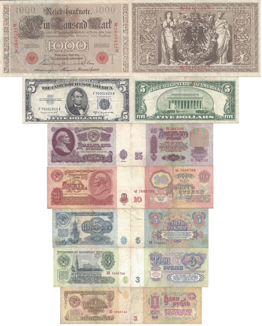
While the United States has had a somewhat stable currency since the Civil War, some other countries were not as fortunate. Germany, for example, went through a lot of upheaval in the 20th Century. Prior to World War I, The German Gold Mark was the banknote Germans used. Produced in denominations of 20, 50, 100 and 1000 Mark, the bank notes are quite large, especially compared to American notes, as this 1000 Mark example from 1910 shows: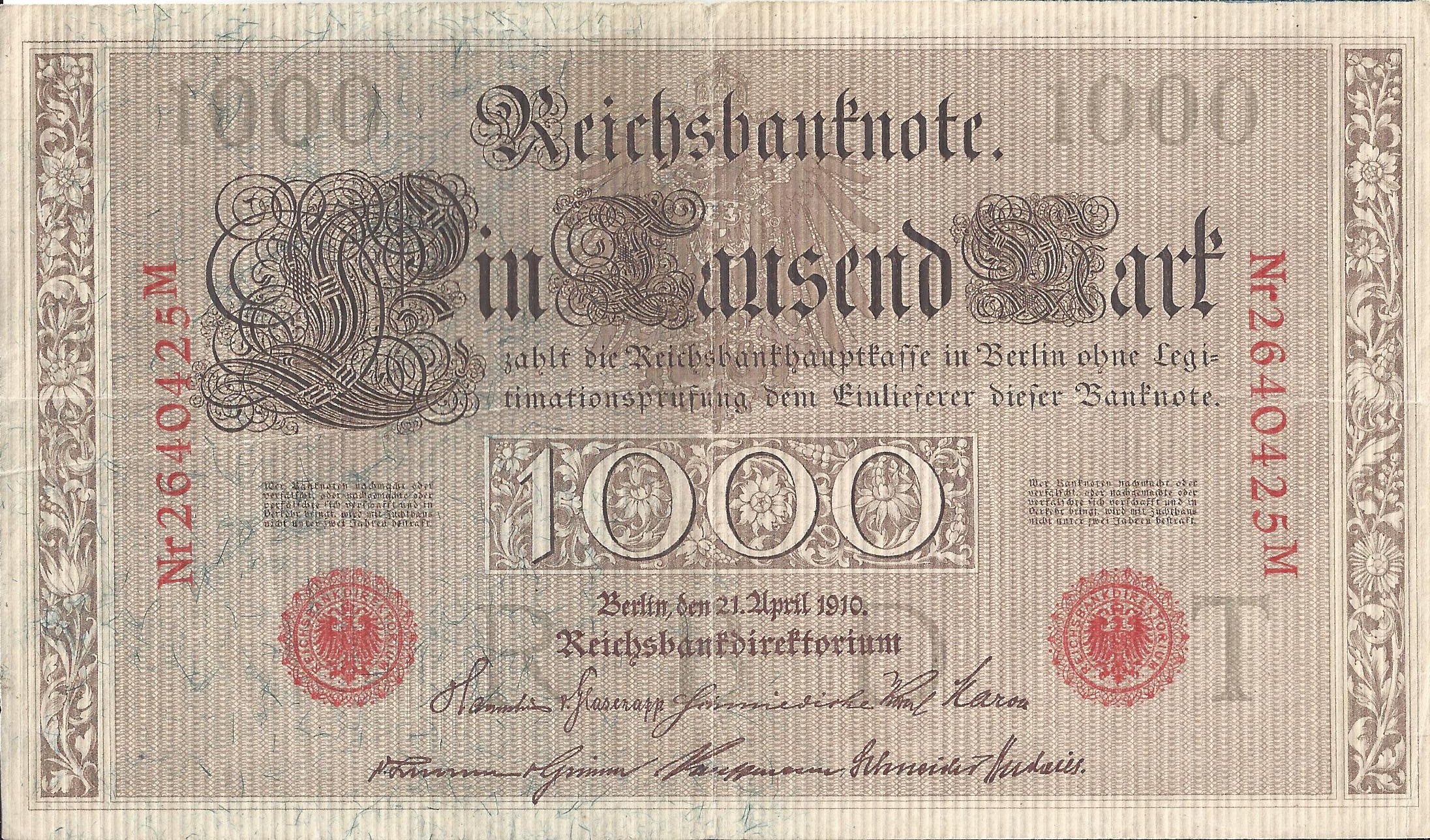
 The German Gold Mark was replaced in 1914, by the German Papiermark. This decision was because the link between the gold reserves and the mark was abandoned. By the end of the War in 1918, the German Papiermark was nearly worthless, due to the German loss, and insistence of Germany to pay back war debts by printing and using bank notes. The Rentenmark replaced the Papiermark as such, due to hyper inflation. It was replaced with the Reichsmark, prior to World War 11, and then the East German Mark, and Deutsche Mark from War’s end to 1990, when Germany was reunited, and the Deutsche Mark took over from 1990, until 2002, when the Euro took over as currency for Germany and much of Europe.
Another country that had a lot of economic upheaval was Russia. The Ruble is the traditional currency of Russia, and like other currencies, were made of gold or silver. The amount of metal per coin varied, until Peter The Great standardized the amount of silver in 1704. By 1768, banknotes were being printed, by the Assignation Bank. This lasted until 1843, when the Assignation Bank folded, and “state credit notes” were issued by the government.
The old system lasted until the October Revolution of 1917, when the Russian Soviet Federative Socialist Republic took over as government, and began circulating their own version of the ruble. The first version, which was used until 1922, had to be adjusted for post-war, non-gold standard hyperinflation after World War I. In 1922, the second version was instituted, this version having a rate of 1 “new” ruble for 10,000 “old” rubles, due to hyperinflation. The third change took place in 1923, at a rate of 100 to 1. This lasted until 1924, when Joesph Stalin’s consolidation of power following the death of Lenin, and Stalin issued the fourth version of the Soviet Ruble, which was attached to the gold standard, and lasted through 1947, when the fifth version, which was issued in response to citizens selling wartime rations for a profit, and keeping the money for themselves. This was placed on amounts over 3,000 rubles.
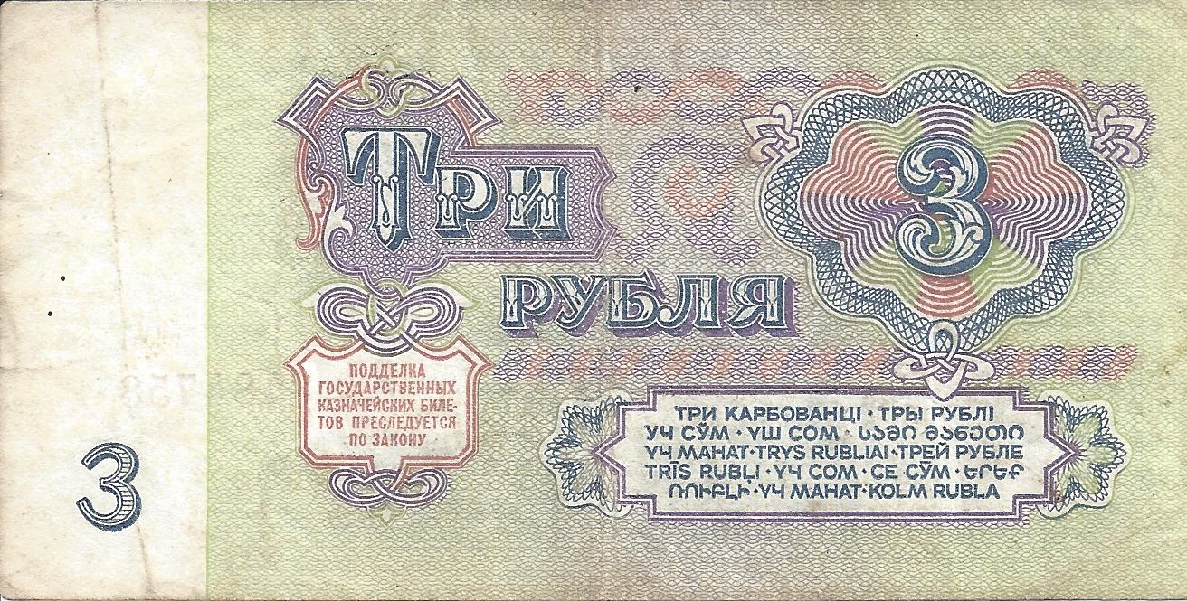
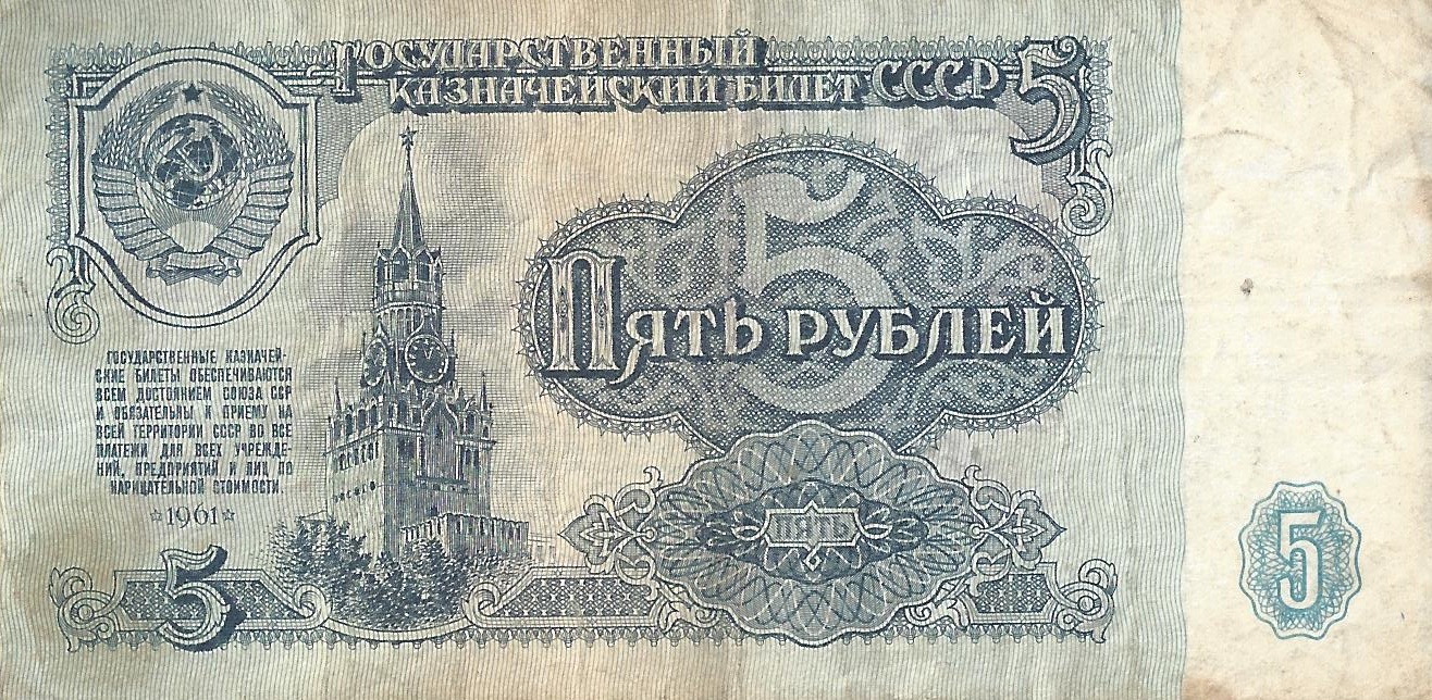
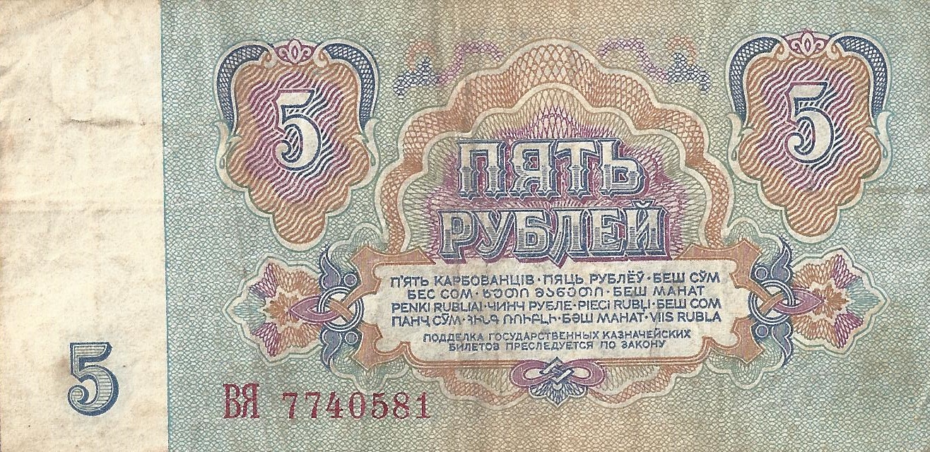
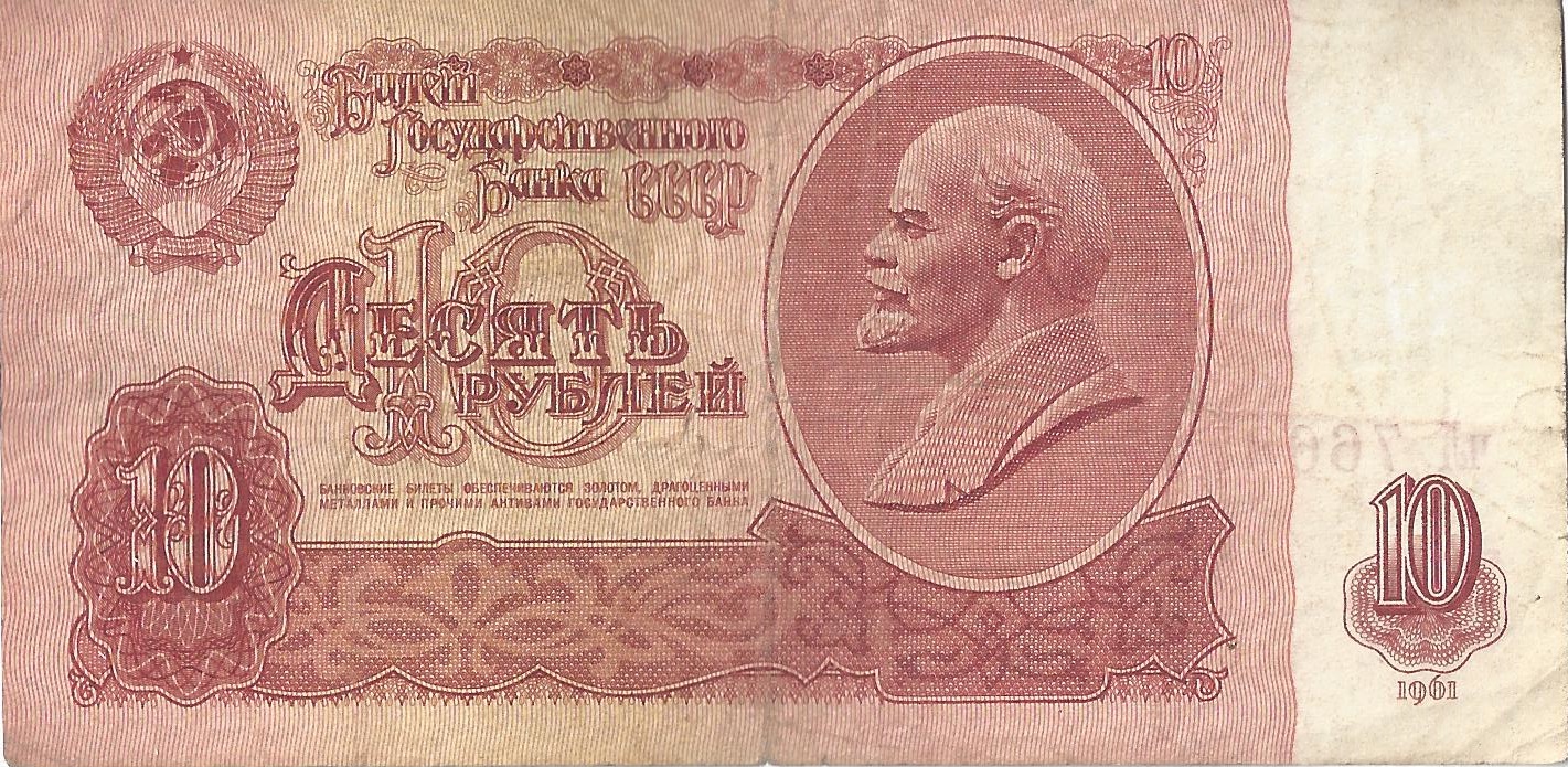
These are examples of the sixth version, used from 1961 to 1991. These brand new bank notes were designed by arists Victor Tsigal, and had a gold exchange rate of one ruble for 0.987412 gram of gold, though the gold was never offered to the general public. These are the 1, 3, 5, 10, and 25 ruble bills from 1961, the first year of issue.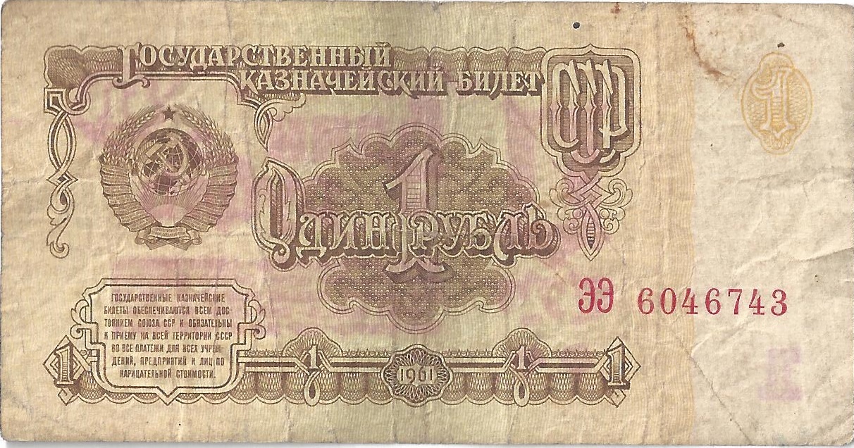


 Bank notes, like coins have different sizes, These are the scale designs of the different bank notes I have discussed.
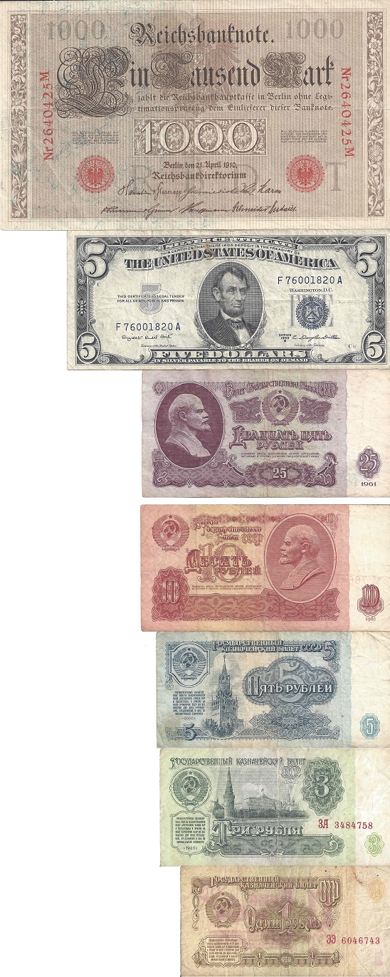
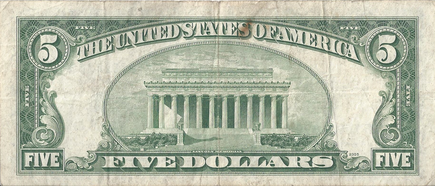
 I have to say that given recent trends, which emphasize anti-counterfeiting measures as opposed to aesthetic design, I hate United States Currency. This is the front and back of the current design, first used in 2006. This is the front and back from a $5 1953. This is the front and back of a $5 bill from 1928. This is the front and back of a $5 bill from 1896, and from 1891, 1880, and 1862. It’s amazing how much better the bill gets, the older it is. I understand that anti-counterfeiting measures are a requirement in this day in age, but can we at least make them pleasant to look at?
Next week, we will return to auto racing, with a historic piece of Funny Car memorabilia…stay tuned.
Currency and Us Part 1-Coins and Their History
 By David G. Firestone
I wanted to start 2016, and celebrate my 34th birthday with a project I have been working on for a while. Money really is the great equalizer. Every human being on the planet wants as much of it as possible. We work jobs we hate in order to get it, and we spend it as we see fit. While we mainly spend it on things we need to live, food, shelter, and clothing, we do spend it on things that make us happy.
I find it amazing that most people know so little about one of the most important objects in the world. For a lot of us, our pocket change can be useful, but if you knew the history about it, and how it was made, they would be awestruck.
Metallic coins really started with the human desire for gold. While the earliest known coins date back to around the 8th and 7th centuries BCE, gold has been used since 600 BCE for monetary purposes. Today, gold is still a part of global currency, but most gold mined is used for other applications, such as jewelry, electronics, medicine, commercial chemistry, and other industrial uses.
Gold is also a status symbol. Gold medals, and trophies are symbols of victory and achievement. Gold used in jewelry is symbolic of wealth and success. Gold in and of itself is seen as both a form of good and evil. One of James Bond’s most well known foes was Auric Goldfinger, who spent his entire life trying to acquire as much gold as possible.
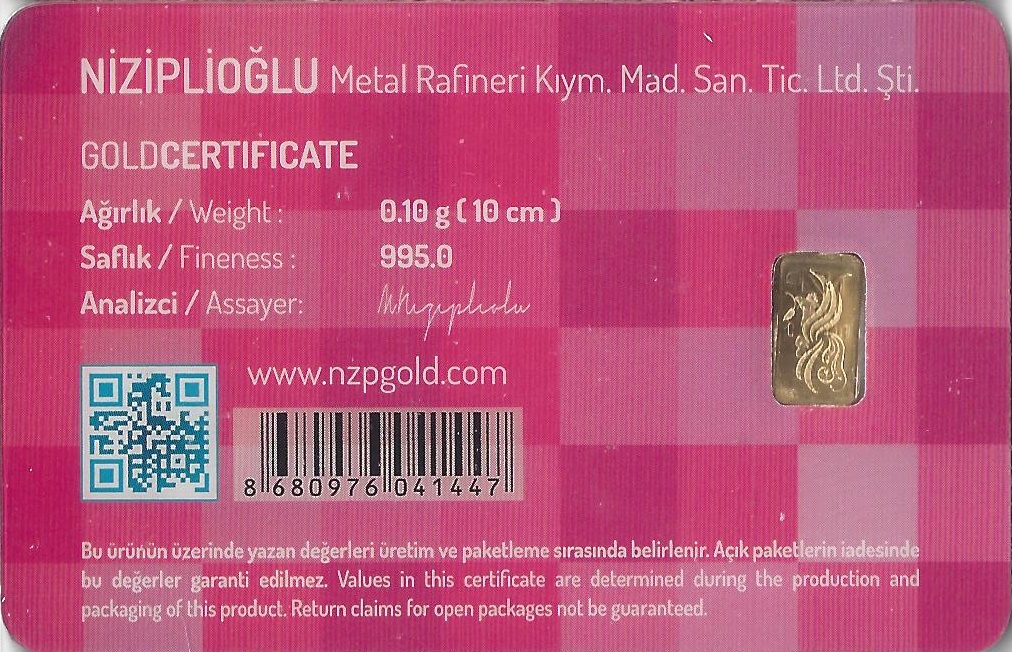
I happen to have some pure gold in my possession. I have .61 grams of gold in the form of three small ingots. Two of them, weighing .1 grams and .01 grams respectively are from NZP Gold, a smelting plant in Turkey. 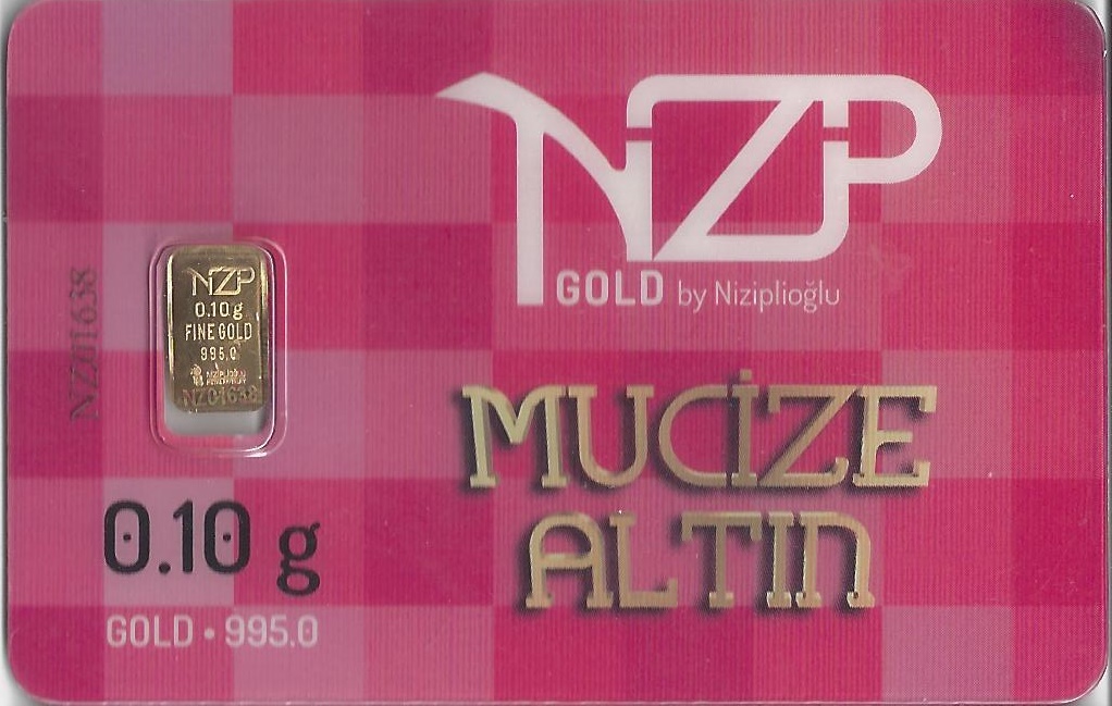

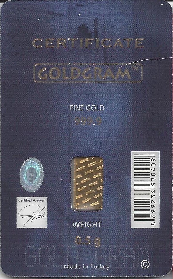
 The third one, weighing .5 grams comes from Istanbul Gold Refinery, also in Turkey.
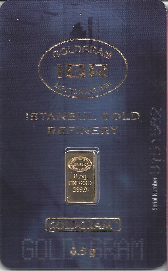
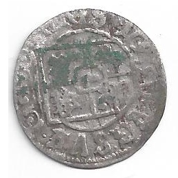
Coins started their lives as a way to simplify the use of gold as currency. Coins were originally made by using molds and metal. The blank was made using bars of metal, which was hammered out on anvils. Then the blank, which is known as a “planchet” was then heated up, placed between the two molds, and hammered. This was a less than precise method, and since the mold had to be hammered by hand, the design would vary. These examples of medieval coins are examples of that process.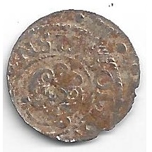


As time went on, the process improved. Dies replaced the molds. The die process is similar in theory to the mold process, but there is a lot more quality control involved. Dies are cast from a master die. The design for the master die is drawn on paper, and then hand carved in clay then plaster by an engraving expert, in a much larger size than the coin will be. That is then coated in expoxy, which takes 18 hours to set and cure, then it is placed in a machine that is called a “reducing lathe” which spins the design around while transferring every minute detail from the large epoxy mold to a coin-sized die. This die is called “the reduction hub” and is used to make the master die.
When the master die is made, the reduction hub is placed into a machine with a cone-shaped piece of metal. The machine presses the hub into the cone, creating the master die. This master die is used to make “working hubs” which are used in the die press. Dies have the image of the coin reversed, so they come out properly in the minting process. Planchets come about from 1,500 foot rolls of prefabricated metal, which has the correct mixing of metals. The planchets are punched out, and the waste metal is recycled. These are two examples of modern planchets, one is a quarter, one is a dime.

After they are washed and cleaned, the coins go through an “upsetting mill” which uses a large spinning disk to move the planchet through a groove which grows narrower and narrower. This adds a raised edge to the coin, higher than the design, which is called a “relief.” This is done to protect the relief. Then the planchet, with the raised edge heads to the press, where a die set is waiting. The coin press can stamp out 750 coins a minute, or 12.5 coins a second! One die is the “hammer” which moves back and forth during the stamping process, and the other is called the “anvil” and is stationary.
After the coin is struck, mint technicians examine a sample from the batch. If there are die errors, or other forms of damage, the lot it scrapped, the metal recycled, and a new hub is brought in. This is done for several reasons. The mint takes pride in their work, but the main reason is that new vending machines have scanners that scan coins as they are inserted. Errors of any kind mean that the scanner will reject the coin as it sees it as fake.
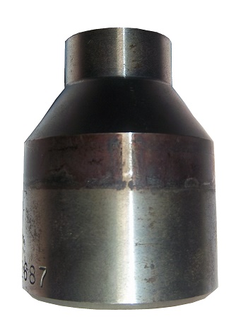
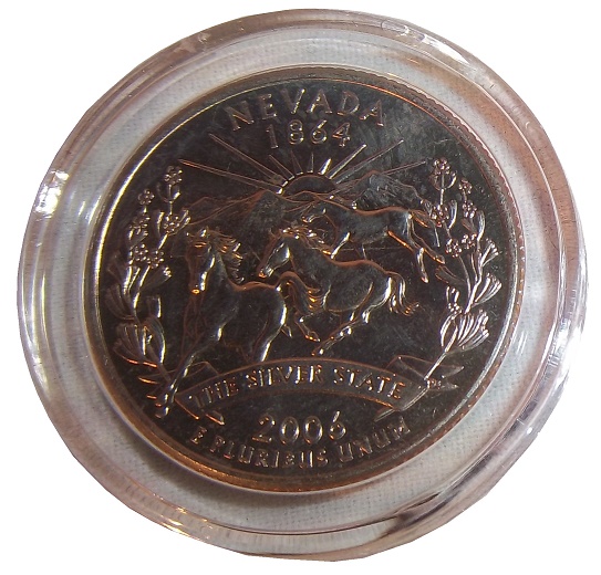
Interestingly, the US Mint doesn’t simply throw away used coin dies. They realize that there is a huge demand for coin dies. The relief is removed from the die, and destroyed. The end result is packaged with one of the coins it minted, and sold in sets to collectors, such as this example here.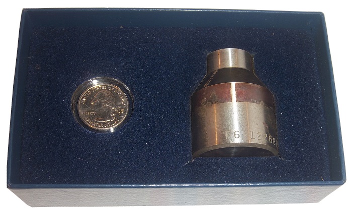
This set comes from the Philadelphia Mint, and the die, this one #P6-122687 was used from February 14, 2006 to February 16, 2006, and was used to strike 286,000 Nevada P quarters.  The relief has been removed,


 and the Brilliant Uncirculated Nevada P Quarter it comes with is one of the 286,000 quarters it minted.
The has obviously had the relief removed. This is not a minor issue, as there are a lot of counterfeiters out there, who want to make money the illegal way, rather than earn it. This also goes back to the Canadian Voyager Die incident. In 1986, the Royal Canadian Mint shipped both sets of master dies from Ottowa to Winnepeg. In the following investigation, it was discovered that the Royal Canadian Mint had no set procedure for shipping dies, and in a bid to save $43.50 Canadian. This disastrous decision forced the Mint to come up with a new design, due to the very real fears of counterfeiting, and as such, the Loonie was chosen as the new design for the dollar coin.
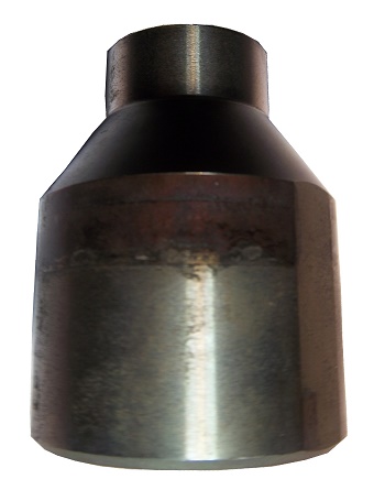
While it is impossible to get a die used in a monetary coin, medallion dies are easier to get. While some dies are clearly canceled, others, such as these three examples, still have the reverse image present. These two small dies were used to make a small “B.T.” token, slightly bigger than a nickel. 
 The accompanying token is a fit to the mold.


 This second die is from a 1960’s Wildwood Medallic Arts Wildlife series medallion.
  This is from the 3rd medal in the series, this is the Grizzly Bear die from the Grizzly Bear/Golden Eagle Medallion. The relief is just under 1.5 inches across, and is in perfect condition, having no evidence of cancellation.


 The detail in it is amazing.
Next week, I will discuss bank note design. Until then, here is a video showing the dies pressed into soft clay.
The 3rd Annual Paint Scheme Awards!

By David G. Firestone
For the end of the 2015 NASCAR Sprint Cup Season, the Paint Schemies have returned! The Schemies will reveal the best,and worst paint schemes of 2015. I’ve eliminated the exhibition and improved categories for 2015, with exhibition replaced by throwback paint scheme.This was done using the Driver Suit Blog executive committee for paint scheme analysis and consists of me and Driver Suit Blog assistant, my cat Alejandro, and uses the following standards:
Color Scheme:How the colors look, and how they work with each other.
Overall Design:How good the design itself looks, is there too much, or not enough.
Primary Sponsor Logos: How the primary sponsor logos look on the car
Originality: How original is the scheme.
All of the above can work for or against a scheme, and all will be taken into consideration.
Let’s get the bad paint scheme awards out of the way.
 First, the Paint Schemie Award for Worst Regular Season Single Paint Scheme .
The nominees are:
Austin Dillon #3 Bass Pro Shops Chevy SS
Sam Hornish Jr. #9 Lyons Financial Ford Fusion
Matt DiBenedetto #83 Voodoo Grills Toyota Camry
The Schemie Award for Worst Regular Season Single Paint Scheme goes to…
Sam Hornish Jr. #9 Lyons Financial Ford Fusion
The next award is for Worst Paint Scheme Set, meaning the team that is running consistently bad schemes all year. The nominees are:
The The winner of the Award For Worst Scheme Set of 2015 goes to…
The next Paint Schemie Award is for Throwback Paint Schemes. This category is a little different, as the Schemies will go to the best and worst throwback. For 2015, the nominees for Worst Throwback Paint Scheme are…
Chase Elliott #25 NAPA Fauxback Chevy SS
Denny Hamlin #11 Sport Clips Throwback Toyota Camry
Sam Hornish Jr. #9 Winn Dixie Throwback Ford Fusion
The Schemie for Worst Throwback Paint Scheme of 2015 goes to…
Chase Elliott #25 NAPA Fauxback Chevy SS
Now after talking about the bad, we discuss the good. Here are the winners in the best category…
First, the Paint Schemie Award for Best Regular Season Single Paint Scheme.
Jamie McMurray #1 Cessna/McDonald’s Chevy SS
Brad Keselowski #2 Miller Lite Ford Fusion
Denny Hamlin #11 FedEx Express Toyota Camry
Kyle Busch #18 Skittles Toyota Camry
Matt Kenseth #20 DeWalt Toyota Camry
Ryan Blaney #21 Motorcraft/Quicklane Ford Fusion
Jeff Gordon #24 Drive to End Hunger Chevy SS
David Ragan #34 CSX Ford Fusion
Dale Earnhardt Jr. #88 Windows 10 Chevy SS
And the winner of the Paint Schemie Award for Best Regular Season Single Paint Scheme is…
Ryan Blaney #21 Motorcraft/Quicklane Ford Fusion
The next category is best throwback, and it should come as no surprise that the competition was strong this year.
Brad Keselowski #2 Miller Genuine Draft Ford Fusion
Trevor Bayne #6 Advocare Mark Martin Throwback Ford Fusion
Clint Bowyer #15 Buddy Baker Throwback Toyota Camry
Ricky Stenhouse Jr. #17 Cargil David Pearson Throwback Ford Fusion
Jeb Burton #23 Estes Cat Throwback Toyota Camry
Jeff Gordon #24 Axalta Throwback Chevy SS
Josh Wise #32 Beer Frost/Corvetteparts.com Tide Throwback Ford Fusion
Mike Bliss #33 Harry Gant Throwback Chevy SS
Kyle Larson #42 Mello Yello Chevy SS
Aric Almirola #43 STP 1972 Throwback Ford Fusion
Dale Earnhardt Jr. #88 Valvoline Buddy Baker Throwback Chevy SS
The Schemie for Best Throwback of 2015 goes to…
Clint Bowyer #15 Buddy Baker Throwback Toyota Camry
The final award of 2014 is the Paint Schemie for Best Paint Scheme Set of 2015. The nominees are:
JOE GIBBS RACING #11 TOYOTA CAMRY
MICHAEL WALTRIP RACING #15 TOYOTA CAMRY
JOE GIBBS RACING #20 TOYOTA CAMRY
WOOD BROTHERS RACING #21 FORD FUSION
HENDRICK MOTORSPORTS #24 CHEVY SS
FRONT ROW MOTORSPORTS #35 FORD FUSION
JTG DAUGHTERY RACING #47 CHEVY SS
FURNITURE ROW RACING #78 CHEVY SS
PHIL PARSONS RACING/PREMIUM MOTORSPORTS #98
The Schemie goes to…
FURNITURE ROW RACING #78 CHEVY SS
Now for my annual top 10 list, this year, we are looking at the 10 worst paint schemes of all time…
10. Tony Stewart 2011 #14 El Monterey/Office Depot Chevy Impala-Dark red, Petty blue, and gold do not work as a color scheme.
9.Jimmie Johnson 2013 #48 Yellow Lowe’s Chevy SS-As awful as this scheme is, at least he didn’t wear a yellow uniform, or he would look like a peep, though I do like the chrome helmet.
8. AJ Allmendinger 2003 #51 Neil Bonnett Tribute Chevy SS-This scheme worked in 1994, and really should have stayed there. Also, you couldn’t have used throwback door numbers?
7. Marty Robbins 1978 #42 Marty Robbins Dodge-As deomnstrated above, pink and yellow is NOT a good color scheme.
6. Any paint scheme run by Travis Pastrana in NASCAR-This is just a representation, but anything Travis Pastrana has driven in NASCAR is awful.
5. Brian Keselowsk 2014 #52 Support Millitary Toyota Camry-There is a reason this scheme won the Worst Single Scheme Schemie for two years in a row.
4. Jeff Green 2003 #43 Yu-Gi-Oh Cheerios Dodge Avenger-”Hey! NASCAR fans really like Yu-Gi-Oh, so we should advertise to them” said no one ever.
3. Various Teams 2007 57 Chevy Monte Carlo-To celebrate the 50th anniversary of the 1957 Chevy, one of the most beautiful cars ever made, Chevy convinced NASCAR to run one of the ugliest paint schemes ever run.
2. Kenny Irwin 1997 #27 Tonka/Winner’s Circle Ford Thunderbird-I really think, given the sponsor, a 9 year old helped design this car.
1. Dale Earnhardt Jr. 2000 #3 Peter Max Chevy Monte Carlo-I was a die hard Dale Earnhardt Sr. fan since watching my first race, the 1990 Twin 125’s. I loved that black #3 with the silver stripe on the bottom. For what would be his last race, Dale raced this car, which looks like a clown threw up all over it. I have yet to find a Dale Sr. fan who will defend this scheme. At least he didn’t wear a matching driver suit.
The Two Most Iconic Logos in Auto Racing Part 1
![]() By David G. Firestone
By David G. Firestone
Anyone who says that auto racing “doesn’t really matter” has obviously never driven a car, or ridden in one. Technology developed for auto racing is so ingrained in car design in this day in age, that it is impossible to find a car company that doesn’t have a motorsports program. Companies will use racing as an extended R&D, testing part designs that will be implemented in real cars, albeit under much more strenuous conditions. Each car company will make parts in house, trying to keep prying eyes away from their designs, trying to get an edge on the competition.
Chrysler started their in-house brand in 1933. Their logo was D, C, P and D, for Dodge Chrysler, Plymouth, and Desoto. That didn’t exactly look and sound too good, didn’t really roll off the tongue, so in 1937, Nelson L Farley was in charge of a marketing group, trying to come up with a better name. They were working on motor parts, so they took MO from motor, and PAR from parts, and combined them into MOPAR. This would begin not only the name for Chrysler’s in-house program, but the beginning of an auto racing identity.
Between 1937, and 1963, the MOPAR logos varried, changing with the times, as many logos tend to do. In 1964, MOPAR started using the Omega M logo. It seemed like just another logo change, trying to keep up with the time. Little did anyone know that the Omega M would become not only iconic, but a part of Chrysler’s racing identity for 51 years. That same year, another Chrysler icon was released, the 426 Elephant Hemispherical engine, which would come to be known as the Hemi.
Suddenly and seemingly inexplicably, the Omega M became MOPAR’s identity. The logo was simple, distinctive, and worked. As Chrysler, Plymouth, and Dodge became more heavily involved with motorsports, the MOPAR logo became their banner. It became cool. Many car logos became cool, but the MOPAR logo was in a class by itself. Very few logos have remained unchanged for 51 years. But MOPAR has stood the test of time.
One of the other iconic logos inspired one of the most well-known bands of the 1990’s, and I will discuss that next time..
DGF2099 Productions-Introduction to Sports Memorabilia-SCCA Track Worker Suit
Our season 14 finale features a MOMO branded suit from SCCA race in Miami
