The SFI and FIA patches…Why they are as critical as they are.

fia 1By David Firestone

Many race fans have seen these small patches on driver suits, and may have wondered what they are. What many do not realize is that these small patches have a very critical role in driver safety. These small patches are the safety certification patches. These small patches state that this uniform part has been examined by one of the two groups, and determined to meet the standards set by the group. For North American made equipment that group is SFI.

sfi

According to their website, SFI was founded in 1963 as part of Speed Equipment Manufacturers Association or SEMA, as a safety group. Back then, the safety culture wasn’t as rigorous as it is today, and there were not many standards in place. SEMA started the safety certification with SFI or SEMA Foundation, Inc certification. If the equipment didn’t meet SFI standards, the participant could be denied entrance to the event. Eventually, SFI left SEMA and became its own independent group.

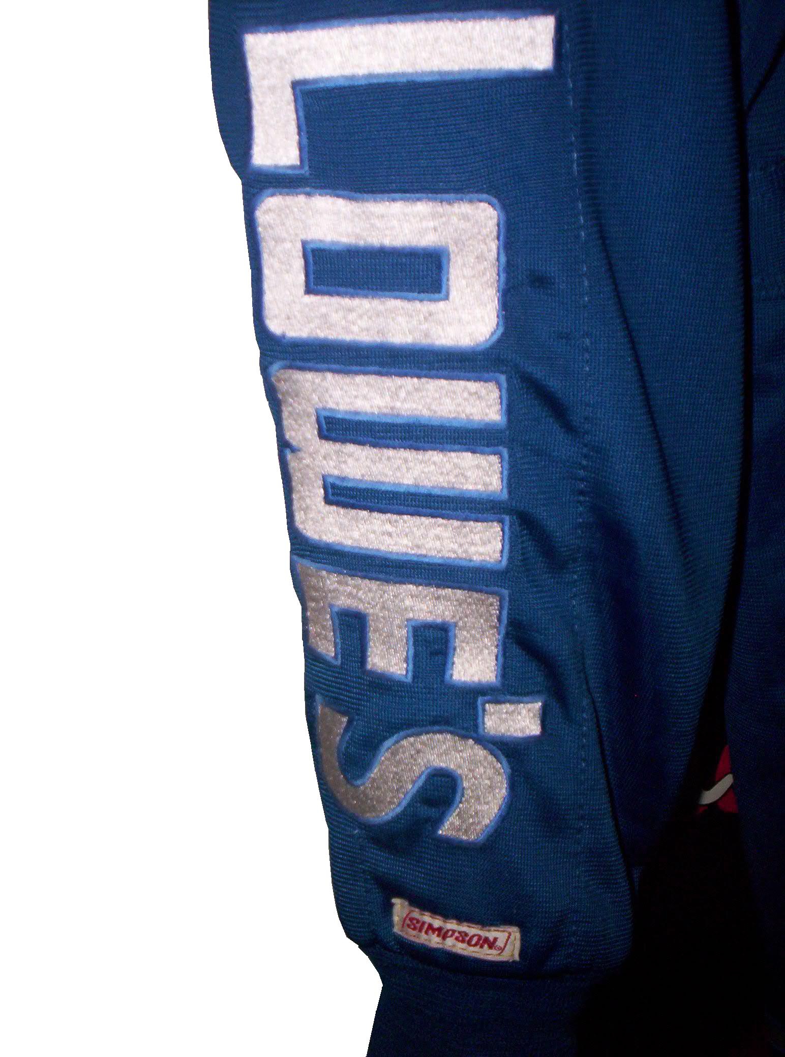
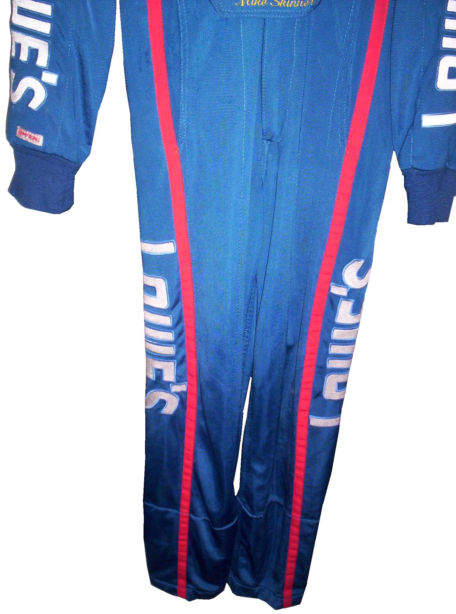
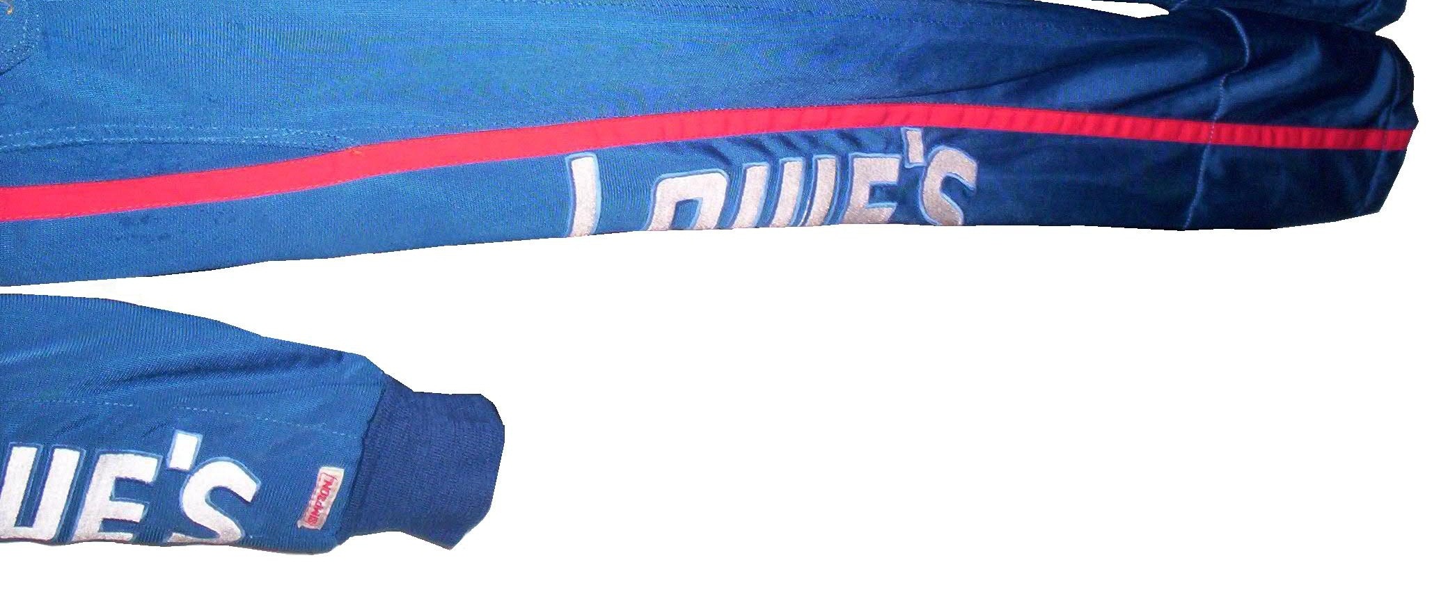
Since then, SFI has certified safety equipment, and their certification is the standard in North America. This small patch is usually sewn into the inside wrist area on the left sleeve. This example, from a Terry Labonte suit from 2008, indicates that the suit meets “3.2A/5” standards. According to their site, this certification is standard for driver suits, and this suit would need re-certification in the next 5 years, or 2013. This certification is standard for many NASCAR suits, as shown below.12-stremme-sfi36-said-sfi

10-labonte-sfi 12-miller-sfi

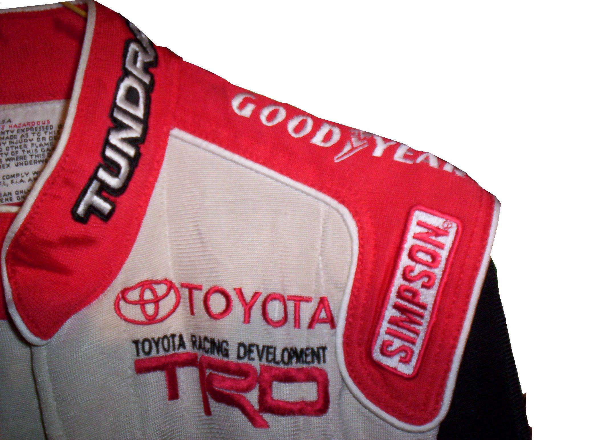
For suits made internationally, the certification comes from a different group, the FIA Institute. Like SFI, the FIA Institute has the exact same goal, to make sure auto racing is safe, and that the equipment that drivers wear is as safe as possible. Unlike SFI however, FIA certification ends up in one of two places, either on the back of the neck,36-barron-neck

or inside the belt,

9-kahne-fia

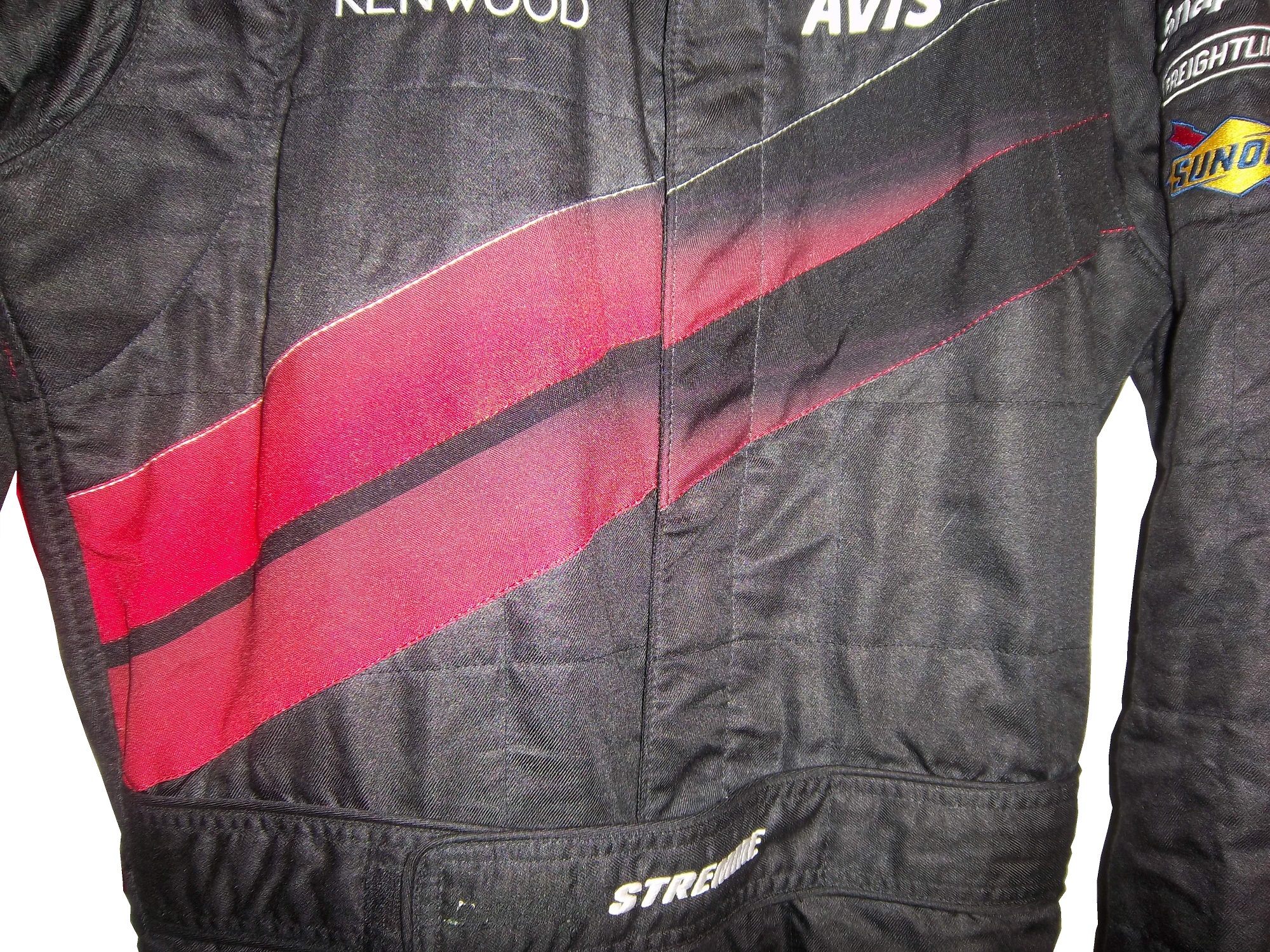
Both certifications serve the same purpose and both are mandated in racing today. These certifications also appear on driver gloves,90-stricklingloves-ltag

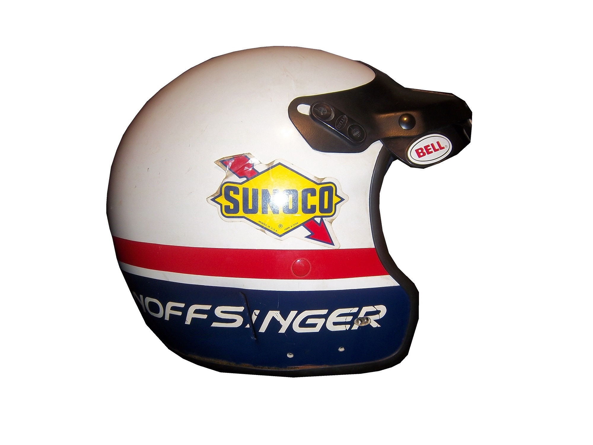
and even helmets, usually on the HANS anchormcdonalds-2 - Copy

Moving on to more 2013 paint schemes…

Trevor Bayne #6 Valvoline Ford Mustang Love this scheme! This brings back some fond memories of Mark Martin behind the wheel back in the 1990’s. The color and design scheme are amazing, so it gets an A

Regan Smith #7 Tax Slayer/Hellman’s Chevy Camaro Same as the 5 and 88, so nothing really to say here…

Brad Keselowski #22 Hertz Ford Mustang Only Penske can ruin one of the best color schemes with an awful design. Seriously what is the design on the front? It kills this scheme. Final Grade: D

Travis Pastrana #60 Ford Mustang What the Hell? Did Lisa Frank design this car? I’d love to comment on the color scheme, but just looking at the picture is enough! I didn’t think it was possible to make a scheme worse than the Kyle Bush Sponsafier car, but here we are! Final Grade: F’

By the way, I never thought I would reference Lisa Frank in this blog…

Jamie McMurray #1 Cessna Chevy SS Cessna has figured out the way to a good paint scheme, simple colors and simple design. It works very well and earns an A grade.

Casey Mears #13 Geico Ford Fusion Eww…just eww. The color scheme is dreadfull, and the designs on the side are painful to look at. It passed because of the logo and number design. Final Grade: D-

Kyle Busch #18 Interstate Batteries Toyota Camry Great color scheme, and good basic design, but there is something with this car I find annoying. The driver’s name is on the windshield and above the door, so why is it on the top of the hood? Not just on the top of the hood, but UPSIDE DOWN as well? Seriously? It makes no sense, and takes the final grade down to a B

Advertisement

NASCAR Helmets Over The Years

By David G. Firestonemcconnell-5

The evolution of the racing helmet in NASCAR for the most part was slow, in the beginning. NASCAR was officially founded in 1947, two years after World War II ended. Many of the helmets worn during the 1940’s and 1950’s were little more than repainted army and air force helmets. These helmets were basic at best, and as protection for the dangers of racing, these helmets were inadequate at best. During the 1950’s, many drivers switched from military headgear to motorcycle helmets. In the 1960’s, motorcycle-style helmets became the norm.mcconnell-5

The above helmet was worn by Jim McConnell, who raced and promoted races in Maine, and went on to found Beech Ridge Motor Speedway in Scarborough, Maine. This is a racing helmet, but it looks more like Wyatt’s Captain America helmet from Easy Rider, in its basic design. It has an open face, no microphone equipment, and is rather thin. Although there would be advancements in helmet technology, the open-face design would remain popular until the 1980’s.Noffsinger-1

This helmet was worn by Brad Noffsinger in 1988, it is the same general design, though it is much thicker, has some advancements in visor technology, and had some microphone technology in it as well. Although these helmets have since been banned, they remained legal for as long as they did for one simple reason: Advanced visibility. NASCAR did not want to have a crash caused by decreased visibility due to a rule mandating full-face helmets.musgrave1

The Ted Musgrave helmet mentioned in a previous post is a perfect example. The bottom part covering the chin does to a certain extent reduce visibility for a driver. The logic makes sense, in that if there was a crash caused by reduced visibility, so for the 1990’s and 2000, the open-face was legal…then came the 2001 Daytona 500. That race saw the death of Dale Earnhardt Sr. from a Basilar skull fracture, which as tragic as it was, wasn’t the first death due to sub-par safety equipment. John Nemechek, Adam Petty, Kenny Irwin Jr., and Tony Roper had all been killed in similar accidents. Only after Earnhardt’s death, did the HANS device come to light, and eventually became mandatory in NASCAR, and eventually, across the board in racing. Now the helmets used in NASCAR look like this:mcdonalds-1This is a helmet worn between 2004 and 2005 by either Regan Smith or Jason Keller. As you can see, it has a number of advancements, including the visor, and air intakes, but the biggest advancement is these small bolts towards the back.mcdonalds-2 - Copy

These are where the HANS device connects to the helmet. The HANS device was mandated after the death of Dale Earnhardt Sr. to prevent Basilar skull fracture deaths. This device has worked very well. The HANS device works by attaching the device to the helmet, and then being secured by the shoulder straps, as seen below:

As advanced as this helmet is, there is always room for improvement. What new form will the racing helmet of tomorrow take? Only time will tell.

On to Paint Schemes, we have a lot of ground to cover today…

First in the Camping World Truck Series

Chris Cockrum #07 Accu-Tech/Homesmart Toyota Tundra Decent color scheme, good stripe pattern, logos are easy to see. Solid A grade.

Sean Coor #82 Warriors in the Workplace Ford F-Series Simple yet bold. Great use of matte black, great number design and color scheme. The logo is easy to see and stands out. No distracting stripes or patterns. Solid A grade.

Next up, the Nationwide Series

Sam Hornish Jr. #12 Wurth Tools Ford Mustang The doors look like they have race damage on them already, which is not a good sign. The color scheme is decent, but the Pennzoil stripes just kill it. The logos are easy to see, but the stripes are just awful. Final grade C+

Matt Kenseth #18 Reser’s Foods Toyota Camry. Numbers are great, color scheme is good, logos are easy to see, and the background design is visible, but not overpowering. The only thing keeping this scheme from a higher grade is the picture of the package on the side of the car. That drags the grade down to a B+ from an A

Now moving on to the Sprint Cup Series

Denny Hamlin #11 FedEx Toyota Camry There are a total of 4 variations of the FedEx scheme, Express, Freight, Ground and Office. Right off the bat, the front nose design and stripes are awful. The color schemes are great, as are the logos and numbers, but the stripes kill it. The best grade I can give is a C+ across the board.

Paul Menard #27 Menard’s Chevy SS Not the worst I have ever seen, but the yellow is way too bright, and the massive collection of sponsor stickers on the quarter panel is just ugly. Final Grade C-

The Epaulet…What It Was, and What It Is

12-miller-rshoulder - CopyThe mighty epaulet, every racing fan has seen them, but few understand what they are for. They are now mostly for fashion and sponsor exposure, but epaulets have a more interesting history than one might think.12-miller-lshoulder

Back in the 1950′s and 60′s, racing suits were supposed to provide fire protection, but early versions of the suit were very unreliable. Many drivers perished in fires, and sometimes, drivers were trapped within the car, unable to escape the raging inferno within their car. The solution? The epaulet. Mounted on both shoulders, epaulets were reinforced strips of fabric specifically designed to help pull an injured or unconscious driver from a burning car. Epaulets quickly became an integral part of the driver suit.10-labonte-rshoulder

As racing technology became more advanced, the need for epaulets for safety began to decrease, but this was happening at a time when coverage was increasing and sponsorship was rising. It did not take that long for sponsors to realize that they could slap a logo on the epaulet and get the company name more visible on pictures and TV interviews. As such the epaulet made the successful transition from safety feature to fashion accessory.

10-labonte-lshoulder

As in-car cameras began to become commonplace across racing, epaulets evolved with them. I mentioned in a previous post that Christian Fittipaldi favored epaulet styles used in F1 and IndyCar. When Sparco first came to NASCAR in the early 2000′s, they brought their epaulet style with them, and it quickly became the standard for NASCAR epaulet style. Most driver suits worn in NASCAR today involve some variation of the Sparco epaulet. They have evolved very well over the years, and are a familiar part of the driver suit

Moving on to paint schemes…

First the NASCAR Camping Word Truck Series

Ty Dillon #3 Bass Pro Shops Chevy Silverado Bass Pro Shops has a great scheme this year, both in the Cup series, and this scheme is just good. Nothing wrong, everything right, Final grade: A+

Brendan Gaughn #62 South Point Hotel and Casino Chevy Silverardo This scheme is very simple, and looks really good. The color scheme is solid, and brings back memories of Rusty Wallace driving for Miller Genuine Draft. The lettering is easy to read, and stands out. Final Grade: A

Now on to the Sprint cup Series…

Trevor Bayne #21 Ford Motorcraft/Quick Lane Ford Fusion I think this is a prototype, but that said, this is still a classic scheme. It has a great color scheme, number design, and is just a solid scheme all around. Final Grade A+

Jeff Burton #31 Cheerios Chevy SS This scheme is rather under designed for my taste. The color scheme is decent, but the gray Cheerio design is hard to see, and looks more like soda carbonation rather than breakfast cereal. Final Grade C+   On a related note some more pics from the Caterpillar scheme have been released, and they are still using the same scheme from last year.  It is pretty good, so my final grade will not change.

Austin Dillon #33 Honey Honey Nut Cheerios Chevy SS Now this is just awful. The color scheme is bad, and the HONEY NUT CHEERIOS lettering is nearly invisible. The bright blue Kroger logo looks out of place, and the tailpipe decals with rookie stripe just takes more away from an already bad scheme. Final Grade F-

Birds and Sports

Quick, what do Randy Johnson, Dave Winfield, and Dale Earnhardt Sr. all have in common? Well for starters, all were very talented, and all are Hall of Famers, but that isn’t all. The unique thing about these three players is that each one of them has accidentally killed a bird while playing sports. Dave Winfield was playing in Toronto in 1983, and was playing catch with a bat boy, when a seagull flew into the path of the ball, and was hit and killed as a result. This was a total accident, but the fans were so upset that Winfield was arrested for animal cruelty. Police later dropped the charges, and Winfield was released. In 2001, Randy Johnson was pitching a spring training game, when he hit a dove with a pitch in a freak accident. A number of animal rights groups were upset, but no charges were filed.

Dale Earnhardt Sr.’s story is by far the strangest. At the 1991 Daytona 500, Earnhardt was a heavy favorite to win the race. Davey Allison won the pole, Hut Stricklin was 2nd, and Earnhardt was 3rd. Allison led the first lap, and Earnhardt took the lead during the 2nd lap. During that same lap, Earnhardt’s Chevy Lumina struck a seagull on the back stretch. Although this might not seem that bad, it seriously damaged the car, affecting the air intake, and raising the temperature of the engine. Emergency repairs took place, and while Earnhardt finished 5th, he wasn’t in contention for the lead after the seagull incident.

The really weird thing is that for many years, the seagull incident was a metaphor for Dale Sr.’s record at the Daytona 500. No discussion on his 19 futile attempts to win the Daytona 500 would be complete without mentioning the seagull incident. While other attempts to win the 500 ended with flat tires, or running out of gas, or just plain wrecks, the seagull incident stands out, along with the 1997 flip.

The 1997 Daytona 500 had the other unique incident at Daytona. During the 1997 event, Earnhardt was, again, a heavy favorite to win the event, and on lap 188, he was in a four-way battle for the lead, and he got into a wreck with the 28 car of Ernie Irvan, and rolled his car on the back-stretch. Irvan’s hood flies into the crowd and causes a number of injuries to fans. Earnhardt’s car lands on its wheels and Dale gets out of the car and heads to the ambulance. As he does so, he notices that his car has all four tires on it, so being Dale Earnhardt, he gets out of the ambulance and walks over to the car, and asks the guy attaching the car to the wrecker to see if the engine will fire, and it fired. He climbs back into his car and drives back to pit road, where is car is patched up as best could be done, and he finished the race 5 laps down. This is the only incident where a die-cast was made of a wrecked car. Speaking to reporters after the race, Earnhardt said “Well I just wanted to get back in the race and try to make laps, and we runnin’ for a championship…I got in the ambulance and I looked back at the car and said “man the wheels is still on that thing.” I got out of the ambulance and and asked the guy inside the car and he was hooking it up, I said “see if it would crank,” and he cranked it up, I said “get out, give me the car back” so I drove it back around and we taped it up.” It is a moment that still brings chills to my spine and this is 15 years later.

Image

I am proud to say that I own a piece of each car from the two above stories. From the 1991 Daytona 500, I own a small piece of the passenger-side fender, which still has race damage present. As seen below:

 Image

From the 1997 Daytona 500 I have this piece of what remained of the car after the event. Interestingly, the car was repaired, and raced at Talladega later that season. The race damage is clearly visible on it:

 Image

Moving on to paint schemes…

Kyle Busch #18 M&Ms Toyota Camry Very solid scheme here. Not only is the color scheme great, it looks even better than last year, with a clean front. The cleaner lines of the new car just make this scheme so much better as well. Final Grade A+

Jeff Burton #31 Caterpillar Hybrid Excavator Chevy SS Another great scheme, though the tailpipe decals are really ugly, and the yellow roof number is really ugly. Final Grade B+

And we also have some driver suit photos and videos

Joey Logano #22 Shell/Pennzoil Ford Fusion This was posted on Logano’s Facebook page, and all I can say is… Hey look kids! It’s Ronald McDonald! Joking aside, this seriously looks like a McDonald’s suit, but with Shell and Pennzoil logos. That being said, it’s not a bad suit, the television logos are good, and it gets a final grade of an A

Jimmie Johnson #48 Lowes Chevy SS This video, from Hendrick Motorsports YouTube page shows Johnson’s new suit.  Very solid, with a great color scheme and basic design. I could to without the white collar, but that is only a minor complaint for a great suit, and it gets an A!

Television Logos

By David Firestone

I recently did a post focusing on Christian Fittipaldi, and the unusual way his suit displayed the so-called television logos.  But these logos have a unique history all their own.  One of the first examples on an in-car camera being used was the 1979 Daytona 500.  At that time driver suits mostly looked like this: That is Buddy Baker after winning the pole at Bristol that same year.  As can be clearly seen, no logos of any kind on the legs, or sleeves.  For much of the early and late 1980′s that was mostly the case.  Even though by 1989 there were opportunities to add logos in good places, in many instances this did not occur.  There are instances where there were logos on the legs and sleeves, and the position in many of them is consistent with today.

In the late 1990′s, TV logos were still, for the most part off the radar screen.  But around 1997, sponsors started taking the hint, and adding these logos.  Although it was not popular across the board,  it steadily gained momentum, and by 2004 these logos began to be the rule rather than the exception.    Granted in-car cameras were somewhat more nomadic then they are now, but even still it is kind of amazing that these logos took as long as they did to catch on.  Here is an example of a televison logo.  This logo comes from a Mike Skinner suit from 1997:31-skinner-rsleeve2 - Copy


This is how it appears when the driver’s arms are at their sides.  When the driver has his arms at the wheel, or crossed, the logo appears like this:31-skinner-rsleeve2

It seems so simple, and it is surprising that it took that long to figure this out.  In fact, in a number of instances, logos on sleeves looked like this, The Ted Musgrave suit from a previous post:15-musgrave-rsleeve1

While that looks good outside the car, inside the driver compartment, it looks like this to an in-car:15-musgrave-rsleeve1 - Copy

Not good for an in-car, the logo is next to impossible to read.  The legs have gotten the same treatment, in some cases the logo looks like this Ricky Craven model from 1996:41-craven - Copy

But to an in-car camera, the logos look like this:41-craven-legs - Copy

Again, the logo is impossible to read.  The proper alignment looks like this:31-skinner-legs

This is the proper alignment, when the driver is in the car, and the camera is to the side, the logo appears as such:31-skinner-legs - Copy

The whole point of sponsorship in racing is brand exposure, and these logos are a perfect example of this.  I still love the fact that even the drivers who almost never have an in-car camera have these logos.

Moving on to more 2013 paint schemes….

Ryan Newman #39 Wix Filters Chevy SS  “Black with lime green and silver shark fins is a really great design” said no one ever.  Final Grade: F

Moving on to the Nationwide Series…

Austin Dillon #3 Advocare Chevy Camaro  I’m not a fan of power blue in most cases, but here it just works.  The RCR 3 always looks good, the logos are good, and the whole car looks sold.  Final Grade: A

Regan Smith #5 Tax Slayer/Hellmans Chevy Camaro  Could someone please explain to me why Dale Jr. and Regan Smith are running identical paint schemes in the Nationwide Series this year?  The only differences between the two cars are the numbers and name rail.  The Hellmans scheme stays at a B-, but the Tax Slayer scheme looks better from the layout shown here, and it has earned the A rating.

Brad Keselowski #22 Discount Tires Ford Mustang This would be an A grade, if not for the Discount Tire logo…why does it look like it was designed by a 5 year old in art class?  The letters are so horribly aligned, it takes the scheme from classic to comical.  I’m shocked that it isn’t written in Comic Sans with the D backwards.  It is really sad, because it takes away from an otherwise great scheme, and takes the final grade from A to B-

Ty Dillon #33 Ritz/Wesco/Armour Chevy SS Three schemes to discuss.  The Wesco scheme is good but if the door numbers were a different color than the stripes, it would get a better grade than B-.  The Ritz scheme is completely solid, with great colors, great design, and great logos, and gets an A.  The Armour scheme is decent, but the numbers could use a more visible outline.  There is also a logo just behind the door number that is next to invisible.  Final Grade B+

New Paint Schemes and Some IndyCar News…

We start off today with a unique story from IndyCar.  Ryan Hunter-Reay won the Izod IndyCar Series Championship last season, and as such has the right to use the number 1 on his car.  He normally used 28 as his car number, because 28 million people worldwide are affected by cancer, and his mother passed away from cancer in 2009.  So he is using a number 1 with a rather unique twist.  Also mentioned that Marco Andretti will switch to number 25 from 26 next year.

Moving on to NASCAR paint schemes, let’s look at the Nationwide Series first.  Two Chevy schemes and one Ford scheme have been released so far

Sam Hornish-#12 Alliance Ford Mustang  Could someone explain to me why in the world it has door handle decals?  And why does it have a blue line on the door that looks like race damage?  I really want to defend this scheme, but no, just no.  Final Grade: C

Kevin Harvick-#33 Hunt Brothers Pizza Chevy Camaro    First off, the Camaro looks really good on its own, and this paint scheme works quite well.  The door-handle decal is visible, but not as bold as the Hornish car.  The green/white contrast works well, and the decal package on the front looks really good.  The stripes on the sides work very well, and are not as haphazard of some schemes I have seen for this season.  Final Grade: A

Dale Earnhardt Jr./Cole Whitt-#88 Tax Slayer Chevy Camaro  Decent color scheme at work here, but what is with the pink roll cage?  The red black and white scheme has a similar color in the front stripe at the nose.  It’s visually distracting, and pointless.  The powder blue/pink stripe takes away from a great scheme and takes the final grade from an A to a B-.  Get rid of the blue, and it would be an A

Now we look at the Sprint Cup Schemes

Kasey Kahne-#5 Time Warner Cable Chevy SS  Awful color scheme, check.  Door and panel design that is supposed to be edgy but is really a cliche, check.  The most unoriginal sponsor logo in NASCAR, check.  Ok, I think we’re all done here, Final Grade: D

Ryan Newman-#39 Quicken Loans Chevy SS  Want to have some fun, open the Kahne link, and this link in two different tabs, and switch back and forth to see how “original” this scheme is.   Clearly both were designed by the same person, they look almost identical, except the fronts are a little different, and the color scheme on the Newman car is much better.  Final Grade: C-

Jeff Gordon-#24 Drive to End Hunger Chevy SS Yuck! They took one of the best color schemes ever and ruined it!  But these shots do feature a new design that will be used in NASCAR in 2013, and that is a sponsor decal on the roof.  The close-up of the rear-end shows the decent taillight decals, and the unnecessary tailpipe decals, as well as the updated Chevy logo.  Final Grade: D-

Been a long day, will be back tomorrow.

Phantom Sponsorships.

By David Firestone

12-stremme

At first glace, this driver suit looks like it has no primary sponsorship at all, but dig deeper and you find the real story behind it.

From 2000 to 2008, car #12 in the Sprint Cup was driven by Ryan Newman and sponsored by Alltel Wireless. In 2002, Ryan Newman’s first full season the series was sponsored by Winston cigarettes and called the Winston Cup Series. In 2004, Winston left the series and Nextell took over as the series sponsor. At that time, there were a number of wireless companies sponsoring cars in the Cup series, including Cingular and Alltel. As they were under contract with teams before the Nextell sponsorship took effect, they were allowed to stay as car sponsors in the Cup series under a grandfather clause.

The first phantom sponsorship happened in 2007, when Cingular merged with AT&T. That set into motion a chain of events that began early in the season, when AT&T tried to re-brand the 31 car driven by Jeff Burton, and Sprint said that it was a violation of the grandfather clause. After a number of injunctions and legal wrangling, came the 2007 Sharpie 500 at Bristol in August, when NASCAR, under pressure from Sprint told the 31 team that they could not have any AT&T logos on the car, hauler, pit shirts, driver or crew uniforms, or helmets. The result was this unique scheme.

800px-JeffBurton2007BristolAugustRacehttp://www.flickr.com/photos/98572459@N00

Eventually a settlement was reached where the Cup team could keep AT&T decals on the car for the rest of the season, but would have to find a new sponsorship for the next season. This deal was met, and the next year, Jeff Burton drove a Caterpillar sponsored car.

In 2009, the Alltel sponsorship changed because Verizon purchased most of Alltell’s assets. Instead of a long court battle, Verizon, who was also sponsoring Roger Penske’s IndyCar teams basically sponsored the team but focused on their Nationwide Series with car logos, as the restrictions on Verizon were not in effect in the Nationwide Series, and allowed car #12 driven by David Stremme to run a Penske Racing scheme for the car they were paying for. That resulted in this very stylish David Stremme driver suit, currently in my personal collection.

12-stremme

The thing I find interesting is the fact that even though the car was running Penske decals, no mention of Penske is visible on the collars or shoulders, and no television logos are present.

12-stremme-collar

I also think it is interesting that the red stripes across the chest look like Verizon logos, but are just different enough to throw Sprint off the scent.

12-stremme-flogo

Unless the primary sponsor of the series changes again, with seems unlikely in the foreseeable future, I can’t imagine this happening again. It also should be noted that both AT&T and Sprint took flak for their actions during the controversy. I really hope this doesn’t happen again in racing, ever.

When Using Yellow, Keep It Mellow

When Jimmie Johnson’s team unveiled the car that would race in the Shootout this year, I felt compelled to write a blog on the issue of yellow cars.  Yellow is the same as any other color, it can work very well when used properly.  The problem is that many teams won’t use it properly.  Some colors work well bold and bright, and some don’t.  So let me make the case both for and against yellow as the main paint scheme in racing…

The Case For Yellow…

Yellow in racing seems to work well if the shade used isn’t overly bright.  A perfect example is Ricky Stenhouse Jr.’s Schoolbus scheme from last year. Dr. Frank W. Cyr picked school bus yellow in 1939 for its visibility, and the fact that black lettering on the shade of yellow is very visible in semi-darkness.  It also works very well on race cars.  Another example of yellow being chosen for easy visibility is the Yellow Cab Company in Chicago when president John D. Hertz chose yellow for his taxi cabs, a fact that Aric Almirola demonstrated in 2012 at New Hampshire.

One example of a longtime shade of yellow is Penzoil.  They have used the same shade of yellow for decades, and no matter what, it always looks good.  As long as the shade of yellow is not overpowering it will look good…which brings me to…

The Argument Against Yellow.

Apparently highlighter yellow is the top shade for any team that uses yellow, and it always looks bad.  Unlike red or silver when it comes to yellow, the brighter it is, the worse it looks.  If you don’t believe me look at the following examples…do I have to say anything more? I think not.  I’m shocked that more teams are not figuring this out, but it seems that every year the shades of yellow get worse.

Neon yellow is a terrible color, and it is used way to liberally in racing in this day in age.

In related news two other paint schemes were released..

Kasey Kahne #5 Quaker State Chevy SS Meh…Not bad, the door looks like a Carolina Hurricanes logo, but other than that it’s a mediocre scheme with decent color.  Final Grade: C

Carl Edwards #99 Aflac Ford Fusion I didn’t think it was possible, but we actually have a color scheme worse than the Seattle SeahawksThat shade of green is even worse than some of the shades of yellow I mentioned!  If it was silver, or for that matter any other color it would work, but this scheme gets a bad grade for a bad color…Final Grade: F!

The Curious Case of The Bugle of Christian Fittipaldi

By David Firestone

Christian Fittipaldi is a Brazilian race driver who raced in F1, Champ Car and eventually NASCAR. Although he had two wins in Champ Car, his F1 and NASCAR careers were fruitless. His NASCAR career lasted from 2002-2003, and during that time he raced in a total of 16 races, with 2 DNQ’s. With the exception of the 2003 Daytona 500, all of his races were for Petty Enterprises, and he raced in all 3 of their teams at the time, cars #43, 44, and 45. His final two races were for car #44, which at the time was sponsored by Bugles.

44-fittipaldib

In 2011, I bought the Bugles driver suit Fittipaldi wore for those final two races. When I got the suit, I saw it had some…irregularities to it. The most prominent feature are the television logos on the sleeves.

44-Fittipaldi-llogo 44-Fittipaldi-rlogo

Notice anything odd? The TV logos on the sleeves are incorrectly positioned…for NASCAR. I found this to be a bit odd, as there seems to be no logical reason for the logos to be set the way that they are. These logos, introduced in the 1990′s as a way for the primary sponsor of the car to advertise to the in-car cameras, should be positioned so that the logo appears clearly. These logos are designed for a camera mounted in the area where the passenger seat would be, as seen at 0:48 in the video below:

The logos are upside down. I was trying to understand why this was done, and then I watched the Indianapolis 500, and watching the in-car views, and suddenly, it all made sense, as seem below:

It became clear rather quickly that the TV logos are correct for F1 and IndyCar in-car cameras, but not correct for NASCAR ones. It seems that this car was designed for an open-wheel car, but not a stock car. The evidence on the shoulders is further proof…

44-Fittipaldi-rshoulder 44-Fittipaldi-lshoulder

I’ve never seen any shoulder design like that of this suit before. The V pattern with the Goodyear logos on both sides. This is not unique to this suit, the shoulder designs of an earlier Christian Fittipaldi suit are the same as this one, though the logos are not visible on the back.

45-fittipaldi-rshoulder 45-fittipaldi-lshoulder

So we have two anomalies to this suit, but why did this happen? This suit was worn in 2003, and these logos were developed an implemented in the mid 1990′s. My theory to the answer can be found in two things, who wore the suit, and who made the suit. Fittipaldi was an open-wheel driver, and frequently wore suits made by an Italian company named Momo. Although Momo makes NASCAR equipment now, back in 2003, they were new to the NASCAR game, and as such were not as used to designing for NASCAR in-car cameras. As such, they designed the suit for an open-wheel car.

Granted Momo wasn’t as familiar with the design of stock cars, and their in car camera placement, but even so, wasn’t there somebody examining the suit? Wasn’t a team representative present at any point in the process? How does a mistake like that happen? The thing that really gets me is this…that was from the same season, and was made by the same company, but clearly the logos are correct in this shot…if they get it right once, why can’t they get it right again? How did that mistake happen? Well it did, and although there was no harm done, it does look pretty goofy…

Moving on to new paint schemes, let’s look at some…

First in the Nationwide Series

Regan Smith #5 Hellman’s Chevy Camaro The yellow is ok, a bit too bright for my taste, but I have seen much worse. The stripes look good, great colors and they are easy to figure out unlike some others. Final Grade: B+ Tone down the yellow a bit and it would be an ANow onto the Sprint Cup:

Matt Kenseth #20 Husky Toyota Camry Not much really to say, mediocre color scheme, no real design to comment on, the logos are plain Jane enough, it’s a bland scheme that earns a C grade. A mediocre grade for a mediocre scheme.

Aric Almirola #43 Smithfield Foods Ford Fusion Basically the scheme is unchanged from last year, and that is a good thing. I love this scheme, great color, great design, looks good, the logos are easy to see, and I give it an A. Extra credit was given for the use of Petty Blue.

Bobby Labonte #47 House Autry House Foods Toyota Camry The design is simple, but good. The color scheme need some work. The red used is too bright, as is the blue. The logo group on the quarter-panel is awful. The really odd thing is that this is the first scheme of Labonte’s that has been released, and it is the scheme slated for the All-Star Race. Why in the world would the All-Star Race scheme be released before any of the regular season races? I just don’t understand the logic here. But that being said, the final grade is a B-. If the color wasn’t so bright, I could grade it higher.

A Trip Down Memory Lane…

One of my favorite drivers growing up was Ted Musgrave.  When I was watching NASCAR back in middle and high school, Musgrave drove the #16 Family Channel Ford for Roush Racing.  He was born in Waukegan, Illinois, which is close to my hometown of Evanston, and grew up racing in Wisconsin.  He is a Camping World Truck Series Champion.

hogan

We had family friends who lived in Elkhorn Wisconsin for many years Penny and Tom Hogan, and their two kids, Chris and Patrice.  We used to go up to their farm to visit them during the summer and over the holidays.  We always had fun with them.  I still look back on those days and it always brings a smile to my face.  Aunt Penny was one of the few people in my life who understood my love for NASCAR, and one night she was at a party where Ted Musgrave was attending.  She got me an autographed photo that is still near and dear to my heart:

mus1

I still have this photo to this day, and I look at it often.  That is still one of my favorite paint schemes of all time.  Aunt Penny was able to get me a second, personalized photo, which is still in my possession today:mus2

As the years went by, and the NASCAR race-used collectors market began to grow, I began buying driver suits, and I came across this one, worn by Musgrave in 1998:

Image

I love the fact that the logos on the sleeves are not only in the wrong position, but also the fact that they are the wrong typeface as well.  The logos at the end of the sleeves and on the sides of the legs are supposed to be sideways so that the in-car cameras can see them easily.  But I still missed that Family Channel Scheme, then in May of this year, I came across an ebay listing that I just couldn’t say no to, and I got this:

musgrave1

That is a Ted Musgrave helmet that he wore in qualifying in 1996.  I love everything about this helmet, and it is even signed on the top

musgrave6

Shortly thereafter, I came across this on ebay…

$(KGrHqQOKioE32UP7RJoBOE4qtiK4Q~~_12

That is a 1/4 scale version of the full size helmet I currently own.  I had to have a little fun with it, so I did this video:

That helmet is one of my favorite items and everytime I see it, I think back to the 90’s, and all the fun we had at the Hogans, and it always brings a smile to my face.