Paint Scheme Grades-November 21, 2015

Kasey Kahne #5 Great Clips Tribute Chevy SS-It’s amazing how changing the door number makes this scheme look much better. The yellow door number works with this scheme and it looks better, and earns a C+

Sam Hornish Jr. #9 Go Bowling/Gigablast Ford Fusion-Same as Medallion Bank, same B+ grade.

Sam Hornish Jr. #9 Cheney Brothers Ford Fusion-The curve around the door number is unnessicary, and it looks awful. Adding part of the paint scheme around it makes it look even worse. I can’t give this scheme a passing grade if my life depended on it. F

Greg Biffle #16 Bleacher Report Ford Fusion-It’s a solid design, though the color scheme could use some work. Still, it’s work a B+.

JJ Yeley #26 Overture Toyota Camry-Same as #23 Overture, same F grade.

Brett Moffitt #34 Fr8 Auctions Ford Fusion-The color scheme is great, can’t find fault with it, and the design is great as well, I like the flames. All in all, I give it an A+.

Cole Whitt #35 Speed Stick Ford Fusion-The color scheme works well with the design, which is simple and smooth. I like this scheme. A+

Cole Whitt #35 Ferguson Enterprises Ford Fusion-Simple design with a great color scheme will always earn an A+.

Landon Cassill #40 Interstate Moving/Precon Chevy SS-Get rid of those spikes at the bottom, and this would be a solid A scheme, but those ugly spikes take it down to a B+.

Jimmie Johnson #48 Lowe’s Tribute Chevy SS-It’s amazing how changing the door number makes this scheme look much better. The yellow door number works with this scheme and it looks better, and earns a B-

Brendan Gaughn #62 Prairie Auto Credit Chevy SS-Nothing wrong with this scheme! A+

Dale Earnhardt Jr. #88 Nationwide Tribute Chevy SS-If this was Diet Mountain Dew, the yellow numbers would work quite well, but with Nationwide, it clashes, and takes it down to a C+.

The Epaulet…What It Was, and What It Is

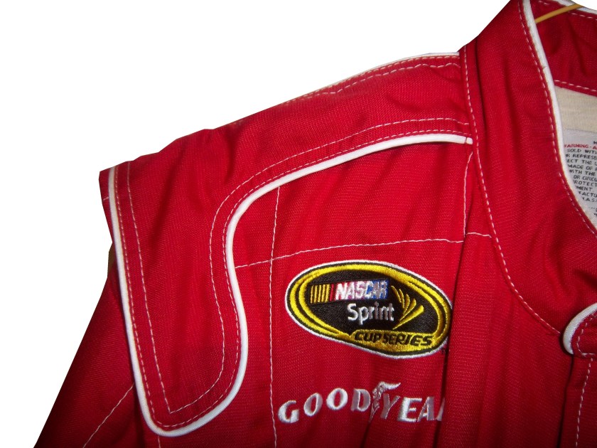
12-miller-rshoulder - CopyThe mighty epaulet, every racing fan has seen them, but few understand what they are for. They are now mostly for fashion and sponsor exposure, but epaulets have a more interesting history than one might think.12-miller-lshoulder

Back in the 1950′s and 60′s, racing suits were supposed to provide fire protection, but early versions of the suit were very unreliable. Many drivers perished in fires, and sometimes, drivers were trapped within the car, unable to escape the raging inferno within their car. The solution? The epaulet. Mounted on both shoulders, epaulets were reinforced strips of fabric specifically designed to help pull an injured or unconscious driver from a burning car. Epaulets quickly became an integral part of the driver suit.10-labonte-rshoulder

As racing technology became more advanced, the need for epaulets for safety began to decrease, but this was happening at a time when coverage was increasing and sponsorship was rising. It did not take that long for sponsors to realize that they could slap a logo on the epaulet and get the company name more visible on pictures and TV interviews. As such the epaulet made the successful transition from safety feature to fashion accessory.

10-labonte-lshoulder

As in-car cameras began to become commonplace across racing, epaulets evolved with them. I mentioned in a previous post that Christian Fittipaldi favored epaulet styles used in F1 and IndyCar. When Sparco first came to NASCAR in the early 2000′s, they brought their epaulet style with them, and it quickly became the standard for NASCAR epaulet style. Most driver suits worn in NASCAR today involve some variation of the Sparco epaulet. They have evolved very well over the years, and are a familiar part of the driver suit

Moving on to paint schemes…

First the NASCAR Camping Word Truck Series

Ty Dillon #3 Bass Pro Shops Chevy Silverado Bass Pro Shops has a great scheme this year, both in the Cup series, and this scheme is just good. Nothing wrong, everything right, Final grade: A+

Brendan Gaughn #62 South Point Hotel and Casino Chevy Silverardo This scheme is very simple, and looks really good. The color scheme is solid, and brings back memories of Rusty Wallace driving for Miller Genuine Draft. The lettering is easy to read, and stands out. Final Grade: A

Now on to the Sprint cup Series…

Trevor Bayne #21 Ford Motorcraft/Quick Lane Ford Fusion I think this is a prototype, but that said, this is still a classic scheme. It has a great color scheme, number design, and is just a solid scheme all around. Final Grade A+

Jeff Burton #31 Cheerios Chevy SS This scheme is rather under designed for my taste. The color scheme is decent, but the gray Cheerio design is hard to see, and looks more like soda carbonation rather than breakfast cereal. Final Grade C+   On a related note some more pics from the Caterpillar scheme have been released, and they are still using the same scheme from last year.  It is pretty good, so my final grade will not change.

Austin Dillon #33 Honey Honey Nut Cheerios Chevy SS Now this is just awful. The color scheme is bad, and the HONEY NUT CHEERIOS lettering is nearly invisible. The bright blue Kroger logo looks out of place, and the tailpipe decals with rookie stripe just takes more away from an already bad scheme. Final Grade F-