By David G. Firestone
NASCAR Sprint Cup Series
CHIP GANASSI RACING TEAM #1
Jamie McMurray #1 Cessna/Beechcraft Chevy SS–No Change A
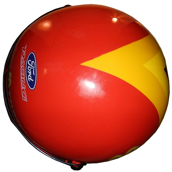
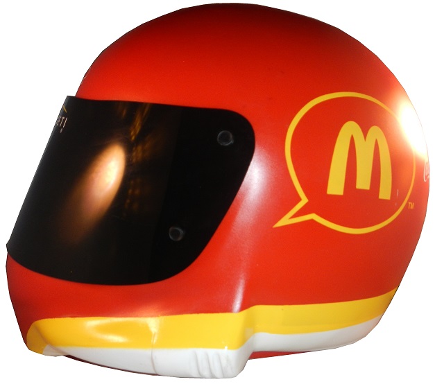
Jamie McMurray #1 McDonald’s Chevy SS–Same basic scheme, but with a new door design. B+
Jamie McMurray #1 Cessna/McDonald’s Chevy SS-Special dual scheme for the Daytona 500, black Cessna on the front, fade to red McDonald’s on the back. A+
Jamie McMurray #1 Sherwin Williams Chevy SS-New sponsor for 2015, Red, white and blue with a red line down the center, with the top fades blue to white on top, and white to blue on the bottom. B+
Jamie McMurray #1 Cessna/Dixie Chopper Chevy SS–New sponsor for 2015, same as Cessna/Beechcraft scheme A
Jamie McMurray #1 Energizer Eco Advanced Chevy SS–New sponsor for 2015, same as #42 scheme. D+
Jamie McMurray #1 Bass Pro Shops/Big Ceder Lodge Chevy SS–New scheme for 2015, black with an orange oval with hunting camo in the front. F
Jamie McMurray #1 Cushman Chevy SS-New sponsor for 2015, white with a red bumper, and a series of red wave stripes up the side. A+
TEAM PENSKE #2
Brad Keselowski #2 Miller Lite Ford Fusion–Same basic design as 2014, but with no gold stripe, vintage Miller Crest, or hop designs on the side. A+
Brad Keselowski #2 Alliance Truck Parts Ford Fusion–New redesign, similar in design to Joey Logano’s Shell/Pennzoil Ford, black replaces yellow as the primary color. A+
Brad Keselowski #2 Wurth Ford Fusion–Redesign from last season, follows the Shell/Pennzoil template. A+
Brad Keselowski #2 Detroit Genuine Parts Ford Fusion–New scheme for 2015, blue Penske template on a black background C-
Brad Keselowski #2 Miller Genuine Draft Ford Fusion–Throwback scheme that ran from 1990-1996 A+
Brad Keselowski #2 Miller High Life Ford Fusion–Based on the design that Bobby Allison won the 1983 Sprint Cup Championship. A+
Brad Keselowski #2 Miller Lite/Penske 25th Anniversary Ford Fusion-Same as Miller Lite scheme but with a special design on the hood. A+
Brad Keselowski #2 Miller Lite 1998 Throwback Ford Fusion–Based on the 1998 Rusty Wallace scheme, but with some subtle differences. Different logo on hood and sides, and a layers stripe on the stripes. A+
Brad Keselowski #2 Miller Lite 2007 Gold Throwback Ford Fusion–Based loosely on the 2007 gold scheme raced at the Sprint Unlimited and All-Star Race, new hood logo and designs, door and hood numbers covered by blue. B-
Brad Keselowski #2 Miller Lite 2010 Throwback Ford Fusion–Based on the Miller Lite scheme from 2010, with some changes to accommodate the Gen 6 car. B-
Brad Keselowski #2 Miller Lite/Careers for Veterans Ford Fusion-Same as Miller Lite but with Careers for Veterans on the quarter panel. A+
Brad Keselowski #2 Avaya Ford Fusion-New sponsor for 2015, red, white and black Penske template. A+
RICHARD CHILDRESS RACING #3
Austin Dillon #3 Cheerios Chevy SS–No change A+
Austin Dillon #3 Dow Chevy SS–No change B+
Austin Dillon #3 Bass Pro Shops Chevy SS–No Change F
Austin Dillon #3 American Ethanol Chevy SS–No Change A-
Austin Dillon #3 Dow Energy and Water Chevy SS–No change B-
Austin Dillon #3 Dow/WeatherTech Chevy SS-Same scheme as Dow B+
Austin Dillon #3 Dow Styrofoam Insulation Chevy SS-New sponsor for 2015, black with a downward fade to blue, and a Dow insulation motif on the front. C+
Austin Dillon #3 Dow Patriotic Chevy SS-New scheme for 2015, silver with an American flag motif on the sides, roof and hood. B+
STEWART-HAAS RACING #4
Kevin Harvick #4 Budweiser Chevy SS–No change A
Kevin Harvick #4 Jimmie Johns Chevy SS–No change A
Kevin Harvick #4 Outback Steakhouse–No Change A
Kevin Harvick #4 Ditech Chevy SS-New sponsor for 2015, blue, and white is the primary color scheme A+
Kevin Harvick #4 Hunt Brothers Pizza Chevy SS–New scheme for 2015, green, red, and white color scheme with a series of geometrical shapes across the side. F
Kevin Harvick #4 Budweiser Throwback Chevy SS-New scheme for 2015, yellow with red and black stripes on bottom, sublimated yellow stripes on side. A
Kevin Harvick #4 Folds of Honor/Budweiser/Folds of Honor Chevy SS-New scheme for 2015, slightly smaller logos on right side and hood. A+
HENDRICK MOTORSPORTS #5
Kasey Kahne #5 Great Clips Chevy SS–No Change D+
Kasey Kahne #5 Time Warner Cable Chevy SS–No Change C
Kasey Kahne #5 Farmers Insurance Chevy SS–Complete redesign from last year, black, and dark blue replaces light blue and silver, and the design has been completely revamped. C+
Kasey Kahne #5 Liftmaster Chevy SS-New sponsor for 2015, red and white redesign of the Time Warner scheme. C+
Kasey Kahne #5 Pepsi Chevy SS–No change B+
ROUSH-FENWAY RACING #6
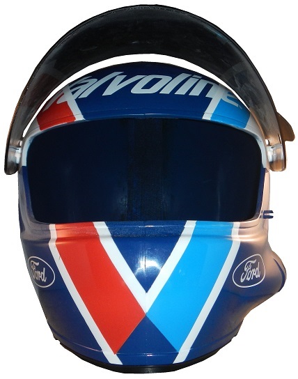
Trevor Bayne #6 Advocare Ford Fusion-New team, new sponsor, red, white and blue is the color scheme. A+
Trevor Bayne #6 Advocare Camo Ford Fusion-New scheme for 2015, blue with a white front, and a camo motif across. F
TOMMY BALDWIN RACING #7
Alex Bowman #7 Nikko/Toy State Chevy SS-New sponsor for 2015, Red borders a blue design on the sides and hood. D-
Alex Bowman #7 Accell Construction Chevy SS–No change. C-
Alex Bowman #7 DOC 360 Chevy SS-New sponsor for 2015, all black with DOC 360 logos on front and sides. A+
Alex Bowman #7 Chevy SS-All black with white numbers. A+
Alex Bowman #7 Golden Corral Chevy SS– C+
Alex Bowman #7 Chevy SS-All black with gold and white numbers. A+
Alex Bowman #7 Culer Chevy SS-New sponsor for 2015, dark blue, white, and green, with a wire-frame motif up the side. C+
Alex Bowman #7 Racing Rewards Chevy SS-Green with a red paint stripe diagonally up the side. C+
RICHARD PETTY MOTORSPORTS #9
Sam Hornish Jr. #9 Twisted Tea Ford Fusion–No Change A
Sam Hornish Jr. #9 Camping World/Medallion Bank Ford Fusion-New sponsor set for 2015, a redesign of the Fresh From Florida #43 scheme. F
Sam Hornish Jr. #9 Medallion Bank Ford Fusion-New sponsor for 2015, same as Camping World Scheme, but with a darker green. F
Sam Hornish Jr. #9 Medallion Bank/Mercury Marine Ford Fusion-New sponsor for 2015, same as Camping World Scheme, but with a red, white and blue as a color scheme. B+
Sam Hornish Jr. #9 Lyons Financial Ford Fusion–Redesign of the Medallion Bank scheme, with a Lyons Financial logo on the hood. F
Sam Hornish Jr. #9 Nature Blast/Medallion Bank Ford Fusion-New sponsor for 2015, light green and dark green diagonal stripes up the side. F
Sam Hornish Jr. #9 Victory Junction/Shop.com Ford Fusion-New sponsor for 2015, blue with a series of small white strips in a grid pattern on the side, and an oval with the sponsor on a white background. C+
STEWART-HAAS RACING #10
Danica Patrick #10 Aspen Dental Chevy SS–Same basic design as last year, but the blue ovals on the white are more pronounced. C
Danica Patrick #10 GoDaddy Chevy SS–New redesign with more black and less orange. F
Danica Patrick #10 GoDaddy/TaxAct Chevy SS-New sponsor combo for the Sprint Unlimited, front of the car retains traditional GoDaddy design, whereas back quarter panel is TaxAct. C-
Danica Patrick #10 TaxAct Chevy SS-One race sponsor, will run at Martinsville in March, red, white and black scheme, with diagonal design up the doors. C-
Danica Patrick #10 Mobil 1/Aspen Dental Chevy SS–New sponsor/scheme for 2015, a rehash of Tony Stewart’s #14 Mobil 1/ Bass Pro Shops scheme. C+
Danica Patrick #10 GoDaddy Small Biz Force Chevy SS-Same as GoDaddy but with #smallbizforce on the hood. F
JOE GIBBS RACING #11
Denny Hamlin #11 FedEx Express Toyota Camry–New redesign with a much simpler front and more design on the sides. A+
Denny Hamln #11 FedEx Office Toyota Camry–Same redesign as FedEx Express A+
Denny Hamlin #11 FedEx Freight Toyota Camry–Same redesign as FedEx Express A+
Denny Hamlin #11 FedEx Ground Toyota Camry–Same redesign as FedEx Express A+
Denny Hamlin #11 SportClips Toyota Camry–New redesign with a new door design C-
Denny Hamlin Autism Speaks Toyota Camry–New scheme for 2015, same as FedEx schemes but with an Autism Speaks color scheme. A+
GERMAIN RACING #13
Casey Mears #13 Geico Chevy SS–No Change. D-
Casey Mears #13 Geico/Squidward Chevy SS-New sponsor for 2015, blue and aqua with a Squidward tentacles motif. F
Casey Mears #13 Geico Millitary Chevy SS–No Change. F
STEWART-HAAS RACING #14
Tony Stewart #14 Bass Pro Shops/Mobil 1 Chevy SS–Same color scheme as last year, but with a new design on the side. C+
Tony Stewart #14 Mobil 1/Bass Pro Shops Chevy SS–Same color scheme as last year, but with a new design on the side. C+
Tony Stewart #14 Code 3 Associates/Mobil1 Chevy SS–No Change C+
Tony Stewart #14 Mobil 1/Rush Truck Centers Chevy SS–No Change A+
Tony Stewart #14 Mobil 1/Bass Pro Shops American Salute Chevy SS–New scheme for 2015, white takes over for blue as the primary color, scheme is much simpler. A-
Tony Stewart #14 Bass Pro Shops/Arctic Cat Chevy SS-New sponsor for 2015, same as Bass Pro Shops but with Artic Cat on the sides. F
Tony Stewart #14 Bass Pro Shop Throwback/Mobil 1 Chevy SS-New scheme for 2015, silver on top, red stripes across car, bottom is black, vintage Bass Pro Shops log on hood. C+
MICHAEL WALTRIP RACING #15
Clint Bowyer #15 5 Hour Energy Toyota Camry–No Change B+
Clint Bowyer #15 Peak Toyota Camry–No Change B
Clint Bowyer #15 Maxwell House Toyota Camry-New sponsor for 2015, blue with orange and white wave designs on bottom. A
Clint Bowyer #15 Cherry 5-hour ENERGY benefiting Special Operations Warrior Foundation Toyota Camry–Same scheme as last year, with a few minor associate changes. B+
Clint Bowyer #15 AAA Insurance Toyota Camry–No Change. B+
Clint Bowyer #15 Jack Links/Big Machine Records Toyota Camry-New sponsor for 2015, Bowyer template with a red, white, and black color combo. B+
ROUSH-FENWAY RACING #16
Greg Biffle #16 Cheez Its Ford Fusion-New sponsor for 2015, red with a cheese colored stripe and crackers on the side. A+
Greg Biffle #16 Clean Harbors Ford Fusion-New sponsor for 2015, red white and black design A-
Greg Biffle #16 Ortho Fire Ant Killer Ford Fusion–No change A-
Greg Biffle #16 Ortho Home Defense Ford Fusion-New sponsor, white design with a red and yellow stripe on the bottom, with a net design on the side. A
Greg Biffle #16 Ortho Bug-B-Gon Ford Fusion-New sponsor, new design, red, black, and white is the primary color scheme. A+
Greg Biffle #16 Cheez It/Patrick Starr Ford Fusion-New sponsor for 2015, red with an underwater motif and Patrick Starr on the hood. F
Greg Biffle #16 Safety Kleen Ford Fusion-New sponsor for 2015, green, yellow, white, and black with an overly complex design on the sides. F
ROUSH-FENWAY RACING #17
Ricky Stenhouse Jr. #17 Fastenal Ford Fusion-New primary sponsor, blue, and white is the color scheme. A
Ricky Stenhouse Jr. #17 Fifth-Third Bank Ford Fusion–Same color scheme as 2014, but with a new, simpler side design. A+
Ricky Stenhouse Jr. #17 NOS Ford Fusion–Same color scheme as 2014, but with an updated design. B-
Ricky Stenhouse Jr. #17 Zest Ford Fusion–No Change. F
Ricky Stenhouse Jr. #17 Fastenal Patriotic Ford Fusion–New scheme for 2015, much more subtle patriotic design, with a star and stripe motif, which replaces the American motif. B+
Ricky Stenhouse Jr. #17 Ford EcoBoost Ford Fusion–New scheme for 2015, same as Carl Edwards in 2014. F
Ricky Stenhouse Jr. #17 Juicy Juice Ford Fusion-New scheme for 2015, green with red stripe and yellow dots. A
JOE GIBBS RACING #18
Kyle Busch #18 Interstate Batteries Toyota Camry–No Change F-
Kyle Busch #18 M&M’s Crispy Toyota Camry-New design for 2015, with a green background and more emphasis on M&M’s Crispy, as well as a new hood logo. B-
David Ragan #18 Snickers Xtreme Toyota Camry-New scheme for 2015, brown with a series of fades around the Xtreme logo. D+
Kyle Busch #18 Pedigree Toyota Camry–New scheme for 2015, orange with white and blue on the bottom. A+
Erik Jones #18 M&M’s Red Nose Day Toyota Camry-New scheme for 2015, yellow with red noses replacing most of the M&M designs. Red Nose Day is an event to raise money for kids in poverty by having fun via a telethon staring a lot of comedians and stars. A+
Kyle Busch #18 Skittles Toyota Camry–No Change. A+
JOE GIBBS RACING #19
Carl Edwards #19 Stanley Toyota Camry-New team and new sponsor, yellow, black, and white is the color scheme. B+
Carl Edwards #19 Aaris Toyota Camry-New team and new sponsor, reddish orange with the Aaris logo used as part of the side stripe. A
Carl Edwards #19 Comcast Business Toyota Camry-New sponsor for 2015, blue, silver and white, with a stripe that starts on the bottom, covers the car number, and takes over the top at the back. D-
Carl Edwards #19 SportClips Toyota Camry-New sponsor, same design as Denny Hamlin. C-
Carl Edwards #19 Subway Toyota Camry–New sponsor for Joe Gibbs, much simpler design. A+
Carl Edwards #19 Stanley/Cook’s Children’s Hospital Toyota Camry–Slight redesign of the Stanley scheme, with one paitent name from each state on the car. B+
JOE GIBBS RACING #20
Matt Kenseth #20 DeWalt Toyota Camry-New sponsor, black, green, yellow, and white is the color scheme.-A+
Matt Kenseth #20 Dollar General Toyota Camry–Much simpler than the 2014 scheme, with fewer side designs. A
WOOD BROTHERS RACING #21
Ryan Blaney #21 Motorcraft/Quicklane Ford Fusion–No Change A+
Ryan Blaney #21 Maryn Winters Motorcraft JDRF Ford Fusion-Designed by Maryn Winters, an 8 year old with type 1 diabetes, the car features a flower and park theme across the whole car. A+
TEAM PENSKE #22
Joey Logano #22 Shell/Pennzoil Ford Fusion–No change D
Joey Logano #22 AAA Ford Fusion–The AAA logo has been straightened up in 2015. D
Joey Logano #22 Southern California AAA Ford Fusion–Redesign of the AAA scheme, with Southern California AAA logo in place of the standard AAA logo. D
Joey Logano #22 Pennzoil Platnum Ford Fusion–No Change F
Joey Logano #22 Auto Trader.com Ford Fusion–New scheme for 2015 Ford Fusion-Redesign using the Penske Template. D-
Joey Logano #22 Snap On Ford Fusion–New sponsor for 2015, scheme mirrors that of Cruz Pedregon’s funny car. A+
Joey Logano #22 Shell/Pennzoil Indy 500 Ford Fusion–New scheme for 2015, designed to match Helio Castroneves’ Indy 500 car. A+
BK RACING #23
J.J. Yeley #23 Dr. Pepper/Maxim Fantasy Sports Toyota Camry-New sponsor for the Daytona 500. Black on top, white on the bottom, red stripe in between, Dr Pepper style logo on the door number.-B-
JJ Yeley #23 Dr Pepper Toyota Camry–Slight redesign for 2015, car keeps the red on top, new number design, and white on bottom. B-
J.J. Yeley #23 American Cancer Society Toyota Camry-New sponsor for 2015, white, red and blue with a supplanted design on the blue, and a thunderbolt motif. C-
Alex Bowman #23 Dr. Pepper Throwback Toyota Camry-New scheme for 2015, all red with some sublimated I’m a Pepper logos and vintage Dr. Pepper and I’m a Pepper logos on the quarter panel. A+
JJ Yeley #23 We Salute You Toyota Camry-New scheme for 2015, white, with a patriotic motif on the sides and back. Donation of $10 will get a fallen soldier’s name on the hood and quarter panel. A+
JJ Yeley #23 Heinz Toyota Camry-Black with Heinz bottles on sides and back. A+
HENDRICK MOTORSPORTS #24
Jeff Gordon #24 3M Chevy SS-New design for 2015, silver, with red accents and numbers, with a white hood design that extends over the roof and deck-lid. A+
Jeff Gordon #24 Axalta Chevy SS–No Change A+
Jeff Gordon #24 Pepsi Chevy SS-No Change A+
Jeff Gordon #24 Drive to End Hunger Chevy SS–Much simpler redesign, with new hood logo and same color scheme A+
Jeff Gordon #24 Panasonic Toughbook Chevy SS–No Change A+
Jeff Gordon #24 Axalta/Fix Auto Chevy SS–Same basic Axalta scheme, but with Fix Auto on the side. A+
Jeff Gordon #24 Axalta/Penn State Chevy SS-New scheme for 2015, all blue with a slight blue twist design on the sides. B+
Jeff Gordon #24 Red Cross Chevy SS-New sponsor for 2015, all black with red accents. A
HENDRICK MOTORSPORTS #25
Chase Elliott #25 NAPA Chevy SS-New sponsor and car number for 2015, blue is the primary sponsor, with a yellow design on the side. B
BK RACING #26
Jeb Burton #26 Live Deals Ford Fusion-New sponsor for the Daytona 500, will have similar design as JJ Yeley, but with orange, black, and white. B-
Jeb Burton #26 Maxim Toyota Camry-New sponsor for 2015, white with black lettering. A+
Jeb Burton #26 Maxim Red Toyota Camry–Red redesign of the white Maxim scheme, with BK Racing letter circle. A-
Jeb Burton #26 Estes Toyota Camry-New sponsor for 2015, black on top, red stripe down the middle, yellow stripes on bottom. D+
Jeb Burton #26 Maxim Fantasy Sports/Estes Toyota Camry-Red with Maxim Fantasy Sports on hood, and Estes on quarter panel. A+
RICHARD CHILDRESS RACING #27
Paul Menard #27 Pittsburgh Paints/Menard’s Chevy SS–No change A
Paul Menard #27 Menard’s/Serta Chevy SS–Same basic scheme as 2014, but with more blue on the sides than last year. C+
Paul Menard #27 Menard’s/Peak Chevy SS–Some slight changes to the stripes, and roof F
Paul Menard #27 Menard’s/Duracel Chevy SS–New scheme for 2015, using a black, yellow, and gold version of the Menard’s template. A+
Paul Menard #27 Menard’s/Quaker State Chevy SS–No change C
Paul Menard #27 Menard’s/FVP Chevy SS-New sponsor for 2015, standard Paul Menard Template with silver designs for FVP. A
Paul Menard #27 Menard’s/Sylvania Chevy SS-Red and yellow version of the Menard’s template. D-
Paul Menard #27 Menard’s/Schrock Chevy SS-New scheme for 2015, 2015 Menard’s template with purple stripes. B+
Paul Menard #27 Moen/Menard’s Chevy SS-Menard’s Template with black and blue stripes across the sides. A+
RAB RACING #29
Justin Marks #29 American Born Moonshine Toyota Camry-New sponsor for the Daytona 500, has a wood finished look, with white lettering. A+
TMG RACING #30
Ron Horniday #30 Smokey Mountain Herbal Snuff Chevy SS-New team and sponsor for 2015. Two-tone green design with white lettering and yellow accents. C-
Ron Horniday #30 Toyota Camry-Matte black with blue and white lettering. A+
RICHARD CHILDRESS RACING #31
Ryan Newman #31 Cat Chevy SS–Same color scheme, but the car as a whole has been redesigned A+
Ryan Newman #31 Quicken Loans Chevy SS–No change A
Ryan Newman #31 Granger Chevy SS-New sponsor for 2015, green, red and white, with some designs on the side. B +
Ryan Newman #31 Caterpillar Throwback Chevy SS-Yellow with black stripes up the center and vintage logos. A+
Ryan Newman #31 Wix Filters Chevy SS–No Change. F
Ryan Newman #31 Cat/Quicken Loans Chevy SS–New scheme for 2015, a more straight design replaces the curved design featured on last year’s car. C-
GO FAS RACING #32
Go FAS Racing #32 Keen Parts Ford Fusion–Simpler redesign and a much simpler color scheme. B+
Go FAS Racing #32 C&J Energy Services Ford Fusion–Same color scheme, but with a different and much more complex side design F
Mike Bliss #32 Draft Demons Ford Fusion-New sponsor for 2015, red and black diagonal stripes with a fire motif at the bottom. A
Mike Bliss #32 King Taco Ford Fusion-New sponsor for 2015, red, gold and white, with a circular design on the sides, and vintage lettering on the quarter panels and hood. B+
Mike Bliss #32 Keen Parts/Corvetteparts.net Ford Fusion–New design for 2015, light blue has been eliminated entierly, replaced with black and grey. Cutting edge design replaced 1960’s design. F
Mike Bliss #32 Rimrock Ford Fusion-New sponsor for 2015, black with red and green designs on the side. F
Mike Bliss #32 Texas Tech Ford Fusion-New sponsor for 2015, red fade to black with a large Texas Tech logo on the back. A
Mike Bliss #32 Alpha Floors/JoeUSA.com Ford Fusion-New scheme for 2015, all white with logos on the hood. A+
Joey Gase #32 Donate For Life/Corvette Parts Ford Fusion-New sponsor for 2015, same as Corvette Parts. F
Mike Bliss #32 Rimrock Devlin/Corvette Parts Ford Fusion-Same as Corvette Parts but with Rimrock Devlin on side. F
Travis Kvapil #32 Victorypress.biz Ford Fusion-All white with Victorypress.biz logo on side. A+
RICHARD CHILDRESS RACING/CIRCLE SPORT RACING #33
Ty Dillon #33 Yuengling Brewery Chevy SS-New sponsor, red, white, and blue is the primary color scheme. A+
Ty Dillon #33 Cheerios Chevy SS-New sponsor for the Daytona 500, based on Austin Dillon’s Cheerios scheme, but with a Kroger’s logo on the hood. A
Brian Scott #33 White Tail Lodge Chevy SS–No change. D-
Alex Kennedy #33 Dream Factory Chevy SS–No Change. B
Michael Annett #33 Pilot/Flying J Chevy SS-This one requires an explanation. At Atlanta, Michael Annett didn’t get his car through inspection in time, and didn’t get to qualify. Brian Scott offered his ride to Annett that weekend, and so the car was repainted. A+
Alex Kennedy #33 Honor and Remember Chevy SS-New sponsor for 2015, red, yellow, and white, diagonal stripes up the sides, and a flag motif on the hood. B-
Ty Dillon #33 Nexium Chevy SS-Blue and yellow color scheme, yellow on hood, with a right angle design that extends to the door. A-
Ty Dillon #33 Plankton Chevy SS-New sponsor for 2015, pink with the character’s face on the hood, which fades to blue towards the back. Krabby Patties are located behind the door number, and the character is depicted behind the rear wheel. F
Brian Scott #33 Kraft Singles Chevy SS-Patriotic motif with a series of geometrical designs on the sides. F
FRONT ROW MOTORSPORTS #34
David Ragan #34 KFC Ford Fusion–Redesign for 2015, all white front, KFC style stripes on the back. A+
David Ragan #34 CSX Ford Fusion–Same basic scheme, though the word bubble on the hood has been replaced with a CSX logo. A+
David Ragan #34 Southern Belle Seafood Ford Fusion-New sponsor for 2015, blue, white, and red, follows the “Front Row Motorsports Template” with a stripe that curves above and around the door number, that separates the colors of the car. A+
Chris Buescher #34 A&W Ford Fusion–No Change. A+
Brett Moffitt #34 Dockside Logistics Ford Fusion–No change. A+
FRONT ROW MOTORSPORTS #35
Cole Whitt #35 Speed Stick Gear Ford Fusion–No Change A
Cole Whitt #35 Rinnai Filters Ford Fusion–Same scheme as 2014, different team. A+
Cole Whit #35 Sprouts Ford Fusion-New sponsor for 2015, red and blue, with a fruit design on the side. A+
Cole Whitt #35 Ford Fusion-All white with orange and black letters. A+
Cole Whitt #35 Standard Plumbing Toyota Camry-New sponsor for 2015, all white with red oval Standard Plumbing logos. A+
Cole Whitt #35 Tweaker Energy Shot Ford Fusion-New sponsor for 2015. All black with Tweaker Energy Shot logos on sides and hood. A+
FRONT ROW MOTORSPORTS #38
David Gilliland #38 Love’s Travel Stops Ford Fusion–No change A
David Gilliland #38 MDS Ford Fusion–Same scheme as 2014, but different team. A-
David Gilliland #38 The Pete Store Ford Fusion–Almost the same as last year, with a slight change in the curve behind the driver letters. A+
David Gilliland #38 Farm Rich Ford Fusion–New team for Farm Rich, same scheme as last year. A+
David Gilliland #38 Love’s Support the Troops Ford Fusion–No change. F
HILLMAN-SMITH MOTORSPORTS #40
Landon Cassill #40 Snap 24-7 Fitness Chevy SS–Slight redesign from last year, with the black quarter panel replaced with red. A+
Landon Cassill #40 Cars For Sale Chevy SS–No Change C-
Landon Cassill #40 CRC 1-Tank Renew Chevy SS–No Change. B-
Landon Cassill #40 Percon Chevy SS-All red with Percon logos on the hood and sides. A+
Landon Cassill #40 Newton Business Supplies Chevy SS–New team, same scheme. B-
Landon Cassill #40 CRC Knock’er Loose Chevy SS-New sponsor for 2015, green with red lettering and a black design on the hood and designs. F
Landon Cassill #40 Link-Belt Chevy SS-New sponsor for 2015, all black with Link-Belt logos on the sides and hood. A+
Landon Cassill #40 Snap Fitness Patriotic Chevy SS-New scheme for 2015, battered American Flag motif. A+
Landon Cassill #40 CRC Brakleen Chevy SS–No change. A
CHIP GANASSI RACING TEAM #42
Kyle Larson #42 Target Chevy SS– Same basic design as 2014, but with some sponsor changes on the quarter panel. B-
Kyle Larson #42 White Target Chevy SS–Same basic design as 2014, but with some sponsor changes on the quarter panel. B-
Kyle Larson #42 Energizer Eco Advanced Chevy SS–New scheme for 2015, different stripe color, fewer logos on the side. D
Kyle Larson #42 Axe White Chevy SS-All white with silver Target logos, and silver Axe logos. A
Kyle Larson #42 Viva Vantage Chevy SS-New sponsor for 2015, dark blue with white lettering, and a wave pattern across the sides. A+
Kyle Larson #42 Target Camo Chevy SS–No Change. F.
Kyle Larson #42 Target Bullseye Chevy SS-New scheme for 2015, same basic scheme, but with Bullseye the dog on the sides and hood. A+
RICHARD PETTY MOTORSPORTS #43
Aric Almoriola #43 Eckrich Ford Fusion–Same basic design, but with a Nathans logo on the rear. C+
Aric Almirola #43 Smithfield Ford Fusion–No change B+
Aric Almirola #43 Fresh From Florida Ford Fusion–No Change. F
Aric Almirola #43 STP Ford Fusion–No Change. A+
Aric Almirola #43 Smithfield/Cheney Brothers Ford Fusion–Slight redesign of the Smithfield scheme, with a Cheney Brothers logo B+
Aric Almirola #43 United States Air Force Ford Fusion–No Change. A+
Aric Almirola #43 Nathan’s Hot Dogs Ford Fusion–Same basic scheme as 2014, but a blue roof replaces the yellow roof. B+
TEAM XTREME RACING #44
Reed Sorenson #44 Golden Corral Chevy SS-New sponsor for 2015, same design as 2015 #36. A
Travis Kvapil #44 Phoenix Warehouse Chevy SS–No Change F
HSCOTT MOTORSPORTS #46
Michael Annett #46 Pilot/Flying J Chevy SS-New car number and design. White is the primary color, with red and yellow accents on the sides and front. A+
Michael Annett #46 Cypress HQ Chevy SS–New team for Cypress in 2015, some slight stripe changes on the quarter panel, and a darker blue. F
Michael Annett #46 Northland Oil Chevy SS-New sponsor for 2015, red with black design and white lettering. D-
Michael Annett #46 Philmor Chevy SS-New Sponsor for 2015, yellow, orange and red, with a series of differing designs on the front, sides and back. F
Michael Annett #46 Allstate Peterbuilt Chevy SS-Same basic scheme as last year, with some slight associate sponsor changes, and a new rear quarter panel. A
Michael Annett #46 Bene-Fit Chevy SS–New sponsor for 2015, same as Cypress HQ scheme. F
Michael Annett #46 Pilot/Flying J/Sherwin Williams Chevy SS-New sponsor for 2015, white with red logos, and a large Sherwin Williams can on the side. A+
JTG DAUGHTERY RACING #47
AJ Allmendinger #47 Better Than Bullion Chevy SS-New Sponsor for 2015, all black with a gold stripe running down the side. A+
AJ Allmendinger #47 Bush’s Best Chevy SS–Same basic scheme, some logos have changed on the side. B+
AJ Allmendinger #47 Clorox Chevy SS–Same basic scheme, some logos have changed on the side. A
AJ Allmendinger #47 House Autry Chevy SS-New primary sponsor for 2015, Red sides, with blue roof and posts. A+
AJ Allmendinger #47 Bush’s Chilli Beans Chevy SS-New sponsor, yellow to orange to yellow fade across whole car. A
AJ Allmendinger #47 Hungry Jack Chevy SS–Same basic scheme, some logos have changed on the side. A
AJ Allmendinger #47 Kingsford Chevy SS–Same basic scheme, some logos have changed on the side. A
AJ Allmendinger #47 Scott Chevy SS–Same basic scheme, some logos have changed on the side. A
AJ Allmendinger #47 Bush’s Grilling Beans Chevy SS–Same basic scheme, some logos have changed on the side. A
AJ Allmendinger #47 Kroger Chevy SS–No change A
AJ Allmendinger #47 Kroger/Scotts Chevy SS-New scheme for 2015, red on the front, white curve with sponsors on the back sides, the hood is blue and white, the roof is blue. A+
HENDRICK MOTORSPORTS #48
Jimmie Johnson #48 Lowe’s Chevy SS–New design, bears a resemblance to the old Kobalt tools scheme from 2009. C-
Jimmie Johnson #48 Kobalt Chevy SS–New design, redesigned version of the current Lowe’s scheme. C-
Jimmie Johnson #48 Lowes Pro Services Chevy SS-New design for 2015, same as current Lowe’s scheme, but with PRO SERVICES written on hood and quarter panels. C-
Jimmie Johnson #48 Lowes/Jimmie Johnson Foundation Chevy SS–New scheme for 2015, black with a dark blue stripe across the hood and roof. A+
HSCOTT MOTORSPORTS #51
Justin Allgaier #51 Brandt Chevy SS–Same primary design, but the door number has reversed colors. A+
Justin Allgaier #51 Switch Hitch/Fraternal Order of Eagles Chevy SS-New sponsor set for 2015, all black with yellow and orange stripes that go around the side of the car. D-
Justin Allgaier #51 Flipping Ships Chevy SS-New sponsor for 2015, dark blue, with a fade from top to bottom, and a sublimated wave design. B+
Justin Allgaier #51 Auto-Owners Insurance Chevy SS–New scheme for 2015, redesign of the old scheme. White has been mostly replaced with dark blue and black. B+
Justin Allgaier #51 AccuDoc Solutions/FOE Chevy SS-Same as FOE, but with AccuDoc on hood. D+
Justin Allagaier #51 SEM Chevy SS-New sponsor for 2015, black with white and red SEM logos on sides and hood. A+
Justin Allgaier #51 Switch Hitch Chevy SS-Black with an orange stripe up the side. A+
MICHAEL WALTRIP RACING #55
Brian Vickers #55 Aaron’s Toyota Camry–Same basic design as last year, the nose has been changed, the main blue is slightly darker, and the gold has been replaced with light blue A+
Brett Moffitt #55 Aaron’s 60th Anniversary Toyota Camry-New scheme for 2015, colors are reversed, new logo on the hood. A+
Brian Vickers #55 Janssen Toyota Camry-Blue, yellow, and orange with a wave pattern across the side. A+
Brett Moffitt #55 Aaron’s/Steve Byrnes Tribute Toyota Camry-Same as Aaron’s but with A fitting tribute to a tragic death. A+
David Ragan #55 Aaron’s/Spongebob Toyota Camry-New sponsor for 2015, blue to purple fade, yellow on the quarter panel, with Spongebob on the hood. D-
PREMIUM MOTORSPORTS #62
Brian Scott #62 Shore Lodge Chevy SS-New sponsor for the Daytona 500, Black with white lettering and silver designs. B-
Brendan Gaughn #62 Diathrive Chevy SS-New sponsor for 2015, black, with a blue and white arch up the side. C+
Brendan Gaughn #62 Chevy SS-Black with red and yellow numbers, A+
Brendan Gaughn #62 Vydox Plus Chevy SS-New sponsor for 2015, white with a blue fade on the hood and roof, with a red oval on the bottom of the quarter panel. A
Brendan Gaughn #62 Low T Central Chevy SS-All black with Low T Central logos on the hood and quarter panels. A+
Brendan Gaughn #62 Chevy SS-New scheme for 2015, all black with red, black, and yellow letters. A+
PREMIUM MOTORSPORTS #66
Mike Wallace #66 Crazy Vapors/X8 Energy Gum Toyota Camry-New sponsor for 2015, Hood has Crazy Vapors green stripe design, side has X8 abstract design. F
Tanner Berryhill #66 Chevy SS-New scheme for 2015, all black with silver, white and blue letters. A+
FURNITURE ROW RACING #78
Martin Truex Jr. #78 Furniture Row Chevy SS–No Change A+
Martin Truex Jr. #78 Furniture Row Racing/Colorado Freedom Memorial Chevy SS-Same as Furniture Row but with Colorado Freedom Memorial and World Vision on quarter panel. A+
BK RACING #83
Johnny Sauter #83 Dustless Blasting Toyota Camry-New sponsor for 2015, green stripes up the hood and roof, white design with Dr Pepper style door numbers. B-
Matt Dibenedetto #83 Burger King Toyota Camry–Slight redesign for 2015, black takes over as primary color, Dr. Pepper design around door numbers. B-
Matt Dibenedetto #83 Dr Pepper Toyota Camry-Same as Burger King. B-
BK Racing #83 Cosmo Motors Toyota Camry-New scheme for 2015, black with red and grey wave patterns on the sides. C-
Matt DiBenedetto #83 Dan Bilzerian Toyota Camry-White with Dan Bilzerian on hood, and logos on side. A+
HENDRICK MOTORSPORTS #88
Dale Earnhardt Jr. #88 Nationwide Chevy SS–No Change B+
Dale Earnhardt Jr. #88 Diet Mountain Dew Chevy SS–No major changes,except a Nationwide logo replaces the National Guard logo. D-
Dale Earnhardt Jr. #88 Kelly Blue Book Chevy SS–Same basic design but blue has replaced white as the primary color. B
Dale Earnhardt Jr. #88 Mountain Dew Dewshine Chevy SS-New scheme for 2015, green background with gold lettering and white front bumper. A+
Dale Earnhardt Jr. #88 Mountain Dew Baja Blast Chevy SS-New sponsor for 2015, silver front, with black wave pattern on the quarter panel. D-
Dale Earnhardt Jr. #88 Amp Energy Passionfruit Chevy SS– New scheme for 2015, all black with a series of blue and yellow designs on the sides and roof. D+
Dale Earnhardt Jr. #88 Nationwide Patriotic Chevy SS-Black on top, silver stripe down center, American flag motif on bottom. A+
LEVINE FAMILY RACING #95
Michael McDowell #95 Thrivent Financial Ford Fusion–Redesign of last year’s scheme, another example of logo as a stripe pattern. A
Michael McDowell #95 K-Love Ford Fusion–Template has been redesigned, and the city outline on the rear quarterpanel has been removed. A
Michael McDowell #95 Thrivent Financial Silver Ford Fusion-Redesign of Thrivent Financial scheme, with the logo on the sides removed, and silver replaces the red on the sides. A
Michael McDowell #95 WRL Contractors/Thrivent Financial/Larry the Lobster Ford Fusion-New sponsor for 2015, white with blue and purple stripes on the hood and sides, yellow quarter panel with Larry the Lobster. D-
Michael McDowell #95 Thrivent Financial Ford Fusion– A
PHIL PARSONS RACING #98
Josh Wise #98 Phoenix Construction Ford Fusion-New sponsor for 2015, all white with red lettering, and red and black numbers A+
Josh Wise #98 Mike Curb 200th Start Ford Fusion-Same as Phoenix Warehouse, but with a different quarter panel and hood design. A+
Josh Wise #98 Ford Fusion-White with black and red lettering, A+
Josh Wise #98 Steve Byrnes Tribute Ford Fusion-Simple dedication to the memory of Steve Byrnes, who passed away from cancer this season. A+
Josh Wise #98 Royal Teak Ford Fusion-New sponsor for 2015, all white with black and blue letters. A+
Verizon IndyCar Series
Will Power #1 Verizon Chevy-White top, red stripe across side, black bottom. A+
Juan Pablo Montoya #2 Verizon Chevy-White top, black stripe across side, red bottom. A+
Helio Castroneves #3 Hitachi Chevy– Black with a white and red stripe up the center. A+
Helio Castroneves #3 Verizon Chevy-Same as Juan Pablo Montoya. A+
Helio Castroneves #3 AAA Chevy-Same as Juan Pablo Montoya, but with AAA color scheme. A+
Stefano Coletti #4 KV Racing Chevy-Silver with red front spoiler, tail, and mirrors. C+
Conor Daly #5 MAVTV Honda-Black and orange with MAV-TV logos on sides. B-
JR Hildebrand #6 Preferred Freezers/Ocean Spray Chevy-White with Preferred Freezers on side wings, and Ocean Spray behind driver. A+
James Jakes #7 Mediatech Honda-Aqua sides and top, white stripe across sides. C-
Sage Karem #8 GE LED Bulb Chevy-Blue with a purple and white stripe up the side. A+
Sage Karem #8 Comfort Revolution Chevy-Yellow with black side pods, and a black stripe on the side. C+
Scott Dixon #9 Target Chevy-Red with Target logos. A+
Scott Dixon #9 Coca Cola Chevy-Red with white side panels and Coca Cola logos. B+
Scott Dixon #9 Jurassic Park Chevy-Black with grey designs and white lettering. A+
Tony Kanaan #10 Netdata Chevy-Blue with red nose and tail, Netdata logos on side. A+
Sebastien Bourdais #11 Hydroxycut Chevy-Black and green with a series of designs on side. F
Sebastien Bourdais #11 Mistic Electroic Cigarette Chevy-Black and green with a series of designs on side. F
Takuma Sato #14 ABC Building Supply Chevy-Red, white and blue with a series of stripes on sides and top. D-
Graham Rahal #15 Mi-Jack Honda-Orange with MiJack logos on side. A+
Graham Rahal #15 Steak N’ Shake Honda-Red with Steak N’ Shake logos on side. A+
Sebastian Saavedra #17 AFS Racing Chevy-Black and yellow with a stripe on the side. C+
Sebastian Saavedra #17 AFS Racing Chevy-Red and yellow with a series of stripes on the side. C+
Rodolfo Gonzalez #18 Dale Coyne Racing Honda-Blue and white with some design on nose. B+
James Davison #19 Dale Coyne Racing Honda-Same as #18. B+
Ed Carpenter #20 Fuzzy’s Vodka Chevy-Black with gold stripe and mirrors. A+
Ed Carpenter #20 Fuzzy’s Vodka Chevy-White and black, with gold stripe in between. A+
Simon Pagenaud #22 Team Penske Chevy-All black with red and white top. A+
Simon Pagenaud #22 Penske Truck Leasing Chevy-White, yellow, and blue with a curve up the side. C+
Townsend Bell #24 Robert Graham Chevy-Black with a Jeff Gordon motif. A+
Justin Wilson #25 Andretti Autosport Chevy-Blue, silver and red. A+
Carlos Munoz #26 AndrettiTV.com Honda-Green, black and white, wide stripes on side. C-
Marco Andretti #27 Snapple Honda-Yellow and blue. A+
Marco Andretti #27 Snapple Honda-White with a large blue stripe across the sides. B+
Ryan Hunter-Reay #28 DHL Honda-Yellow with red DHL logos on side. A+
Simona de Silvestro #29 TE Connectivity Honda-Orange and white stripe pattern. C+
Oriol Servia #32 Mi-Jack Honda-Yellow with black side wings and tail. A+
Oriol Servia #32 Late Show With David Letterman Honda-Same as Mi-Jack but with Late Show with David Letterman logos on side. A+
Jack Hawksworth #41 ABC Building Supply Honda-Same as Takuma Sato’s #14. D-
Conor Daly #43 Smithfield Honda-Exact same design as Aric Almirola’s Sprint Cup Car. A+
Alex Tagliani #48 Alfe Honda-Black and white with a throwback look. A+
Pippa Mann #62 Susan G. Komen Honda-Pink and white. F.
Josef Newgarden #67 Hartman Oil Chevy-Black with gold accents. A+
Charlie Kimball #83 NovoLog Flex Pen Chevy-Orange and blue with a series of stripes on sides and nose. D+
Charlie Kimball #83 Levemir Flex Touch Chevy-Green and blue with a series of stripes on sides. D+
Bryan Clauson #88 Jonathan Byrd Chevy-Red, white and black with stripes on sides. B+
Buddy Lazier #91 Wynn Iowa Partners Research Chevy-White with a fade to light blue. F
Gabby Chaves #98 Bowers and Wilkins Honda-Black with white logos on sides. A+
NHRA
TOP FUEL
Antron Brown Matco Tools Toyota-All white with blue stripes and logos going up the sides and top. A
Antron Brown Matco Tools Distributors Toyota-Black and white with the names of Matco distributors all over the car. B+
Troy Buff Bill Miller Engineering/Okuma dragster-All black with Bill Miller Engineering logo on sides.
Dave Connolly C&J Energy Services Dragster-Grey and black with a huge C&J Energy Services motif on sides and top. F
Richie Crampton Lucas Oil Toyota-Red, white and blue with vintage Lucas Oil logos on sides and top. A+
Richie Crampton Geico Toyota-Black and yellow with Lucas Oil and Geico logos on sides and hood.
Larry Dixon Tiger Toyota-Black with larger TIGER logos on side. A+
Brittany Force Chevy-Black with John Force Racing and Brittany Force on sides. A+
Brittany Force Monster Chevy-Black with Monster and John Force logos on sides and top. A+
Jenna Haddock Patriot Dodge-Black with Patriot logos on side. A+
Doug Herbert John and James Dodge-Grey and red with a series of photos and designs on the side. C-
Chris Karamesinies Lucas Oil Dodge-Black with a series of logos on the sides and a red canopy. A+
Dom Lagana Rapisarda Dragster-Black with Rapisarda logos on sides. A+
Shawn Langon Knuckle Sandwich Toyota-Black with dark Knuckle Sandwich lettering on the sides and top. C-
Shawn Langdon Bass Pro Shops Toyota– Black with Bass Pro Shops and a camo motif near the back, and Toyota and Knuckle Sandwich logos on the front. C-
Doug Kalitta Mac Tools Toyota-Red, white and yellow, with a series of geometrical designs on the sides. D-
Ike Maier-No photo found
Spencer Massey Red Fuel Dodge-Black with Red Fuel logos on the sides, and an oval motif that runs up the sides. D
Spencer Massey Sandvik Dodge-Yellow and green with a diagonal square motif. D
Cory McClenathan-No photo found
Terry McMillen Amile Oil Dragster-Black with a gator head motif. A+
Clay Millican Great Clips/Parts Plus Toyota-Black Great Clips motif on the front, and white Parts Plus motif on back. C-
Luigi Novelli National Machine Repair Dragster-Black at the back with a diagonal yellow stripe leading to the red front. A+
Leah Prtichett Gumout Toyota-Black sides with large Gumout logos, red top with GUMOUT written up the top. C+
Tony Schumacher US Army Dodge-Black with Camo up the sides and gold ARMY letters. A
JR Todd Red Line Oil Toyota-Blue rear, large Red Line Oil logo on sides, fades to the black front. D-
Billy Torrence Capco Toyota Camry-Black with red lettering and camo-esque design on front. D-
Steve Torrence-See above.
TJ Zizzo-No photo found
FUNNY CAR
Blake Alexander Monroe Shocks Dodge-New scheme fo2015, all black with Monroe Shocks logos on side. A+
Jeff Arend Bucky’s Chevy-All black with Bucky’s logos on sides and hood. A+
Jack Beckman Infinite Hero Challenge Dodge-Black with Infinite Hero Challenge logos on sides and hood.
Bob Bode Ar-Bee’s/Taylor Motorsports Products Toyota-Red Ar-Bee’s on side, yellow Taylor Motorsports Products logos on hood. D+
Ron Capps NAPA Dodge-Blue with yellow around the scoops, and a sublimated design on the scoops, NAPA logos on sides and hood. A
Alexis DeJoria-Patron Incendio Toyota-Red, Yellow, and black with an oval motif. B-
Jeff Diehl JDR Toyota-Blue, white and black, angle design on sides, around JDR logos. B-
Courtney Force Traxas Chevy SS-Multi-colored stripe design across whole car. F
John Force Chevy Chevy SS-White with a black stripe at the bottom with Chevy logos on sides and hood. A+
Terry Haddock Diamond Technologies Toyota-Black with Diamond Technologies logos on sides and hood. A+
Matt Hagan Mopar Dodge-Black with blue and yellow paint streak designs up the sides, sideways Mopar logo on sides, straight Mopar on hood. C+
Matt Hagan Rocky Boots Dodge-Green with red and black stripes up the sides and hood, straight Rocky Boots logo on sides and hood. A+
John Hale ALO Drink Dodge-White with green and yellow stripes up the sides. C-
John Hale Moon Eyes Dodge-All white with Moon Eyes logos on sides and hood. A+
Chad Head Head Inc Toyota-Red, Black and silver with a tattoo design up the sides, and red hood with a Head Inc. logo. F
Chad Head Areoburner Toyota-White with red stripes on front and back, with Taylor Areoburner logos on sides and hood. C-
Robert Height AAA Chevy SS-An original take on the AAA design, cutting edge design on sides, blue and white up the sides. B+
Tommy Johnson Jr. Make A Wish Foundation Dodge Charger-Light blue front, fades to dark blue with a cloud motif around the scoops. B-
Dom Lagana Nitro Ninja Toyota-Black with red and white oval on sides, Nitro Ninja on sides. A+
Cruz Pedregon Snap On Toyota-Black with white Snap On logos and a red stripe up the side. A+
Cruz Pedregon Snap On Own It Toyota-Black sides with Snap On logos, red Own It and red stripe up the roof. B-
Cruz Pedregon Wix Filers Toyota-Black with green stripes and Wix Filters logos up the sides and hood. C-
Tony Pedregon American Racing Custom Wheels Toyota-Black with red and gold American Racing Custom Wheels logos up the sides and on the hood. A+
Tony Pedregon Mark Christopher Auto Center Toyota-Black with Mark Christopher logos on sides and hood. A+
Tony Pedregon Micro Strategies Toyota-White with a blue front. A+
Tim Wilkerson Levi Ray and Shoop Ford-Red, yellow, white and black stripes across front, all white sides with Levi Ray and Shoop logos on sides. C-
Del Worsham DHL Toyota-Yellow with DHL on sides and hood, large black stripes on hood, small stripes on sides. C-


