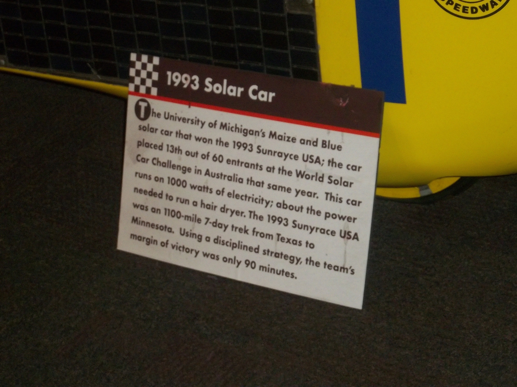
By David G. Firestone
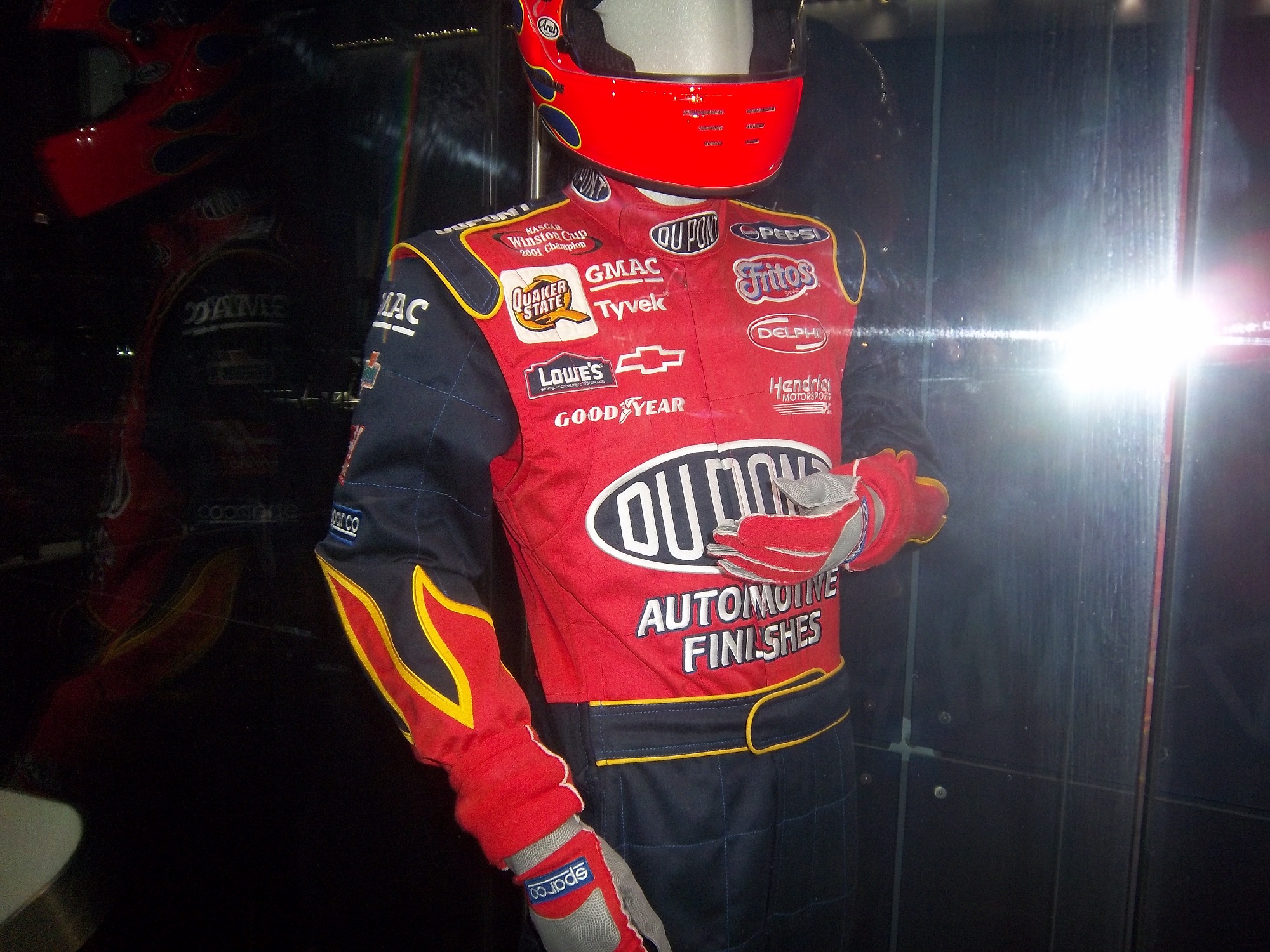
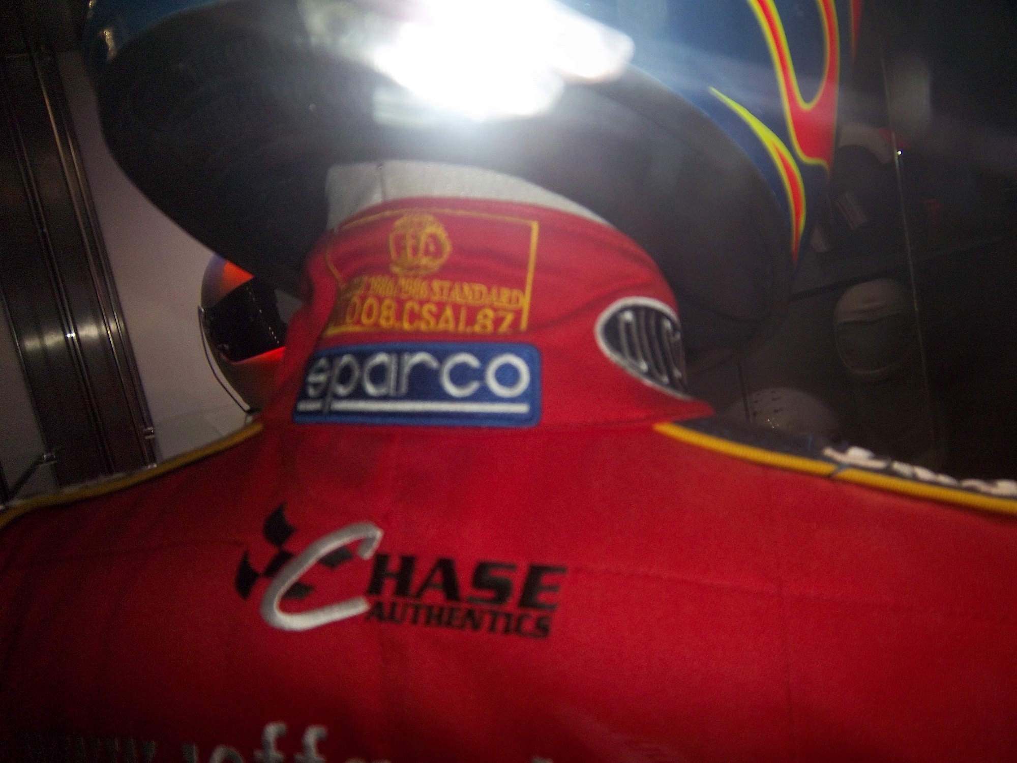
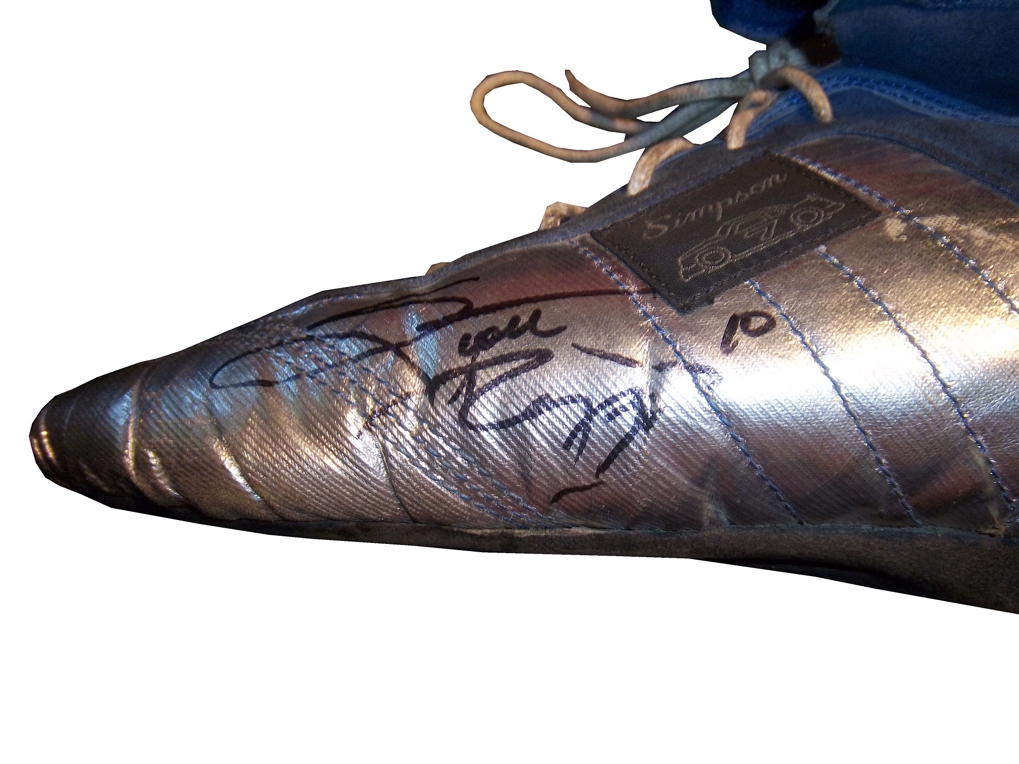
We’ve all seen them in telecasts and photos, but what many of us do not realize is what they are and what they do. I am talking about the arm gusset. Arm gussets are seen at the top of the sleeve on a driver suit, under the shoulder. They are a flexible piece of Nomex specifically designed to do two things. One is protect the driver, the other is give the driver some freedom of movement.

Arm Gussets are almost always present on race-worn driver suits. Anyone who has worn a one-piece full body jumpsuit can attest to the fact that it restricts freedom of body movement. The gusset takes some of that restriction away. This is important when it comes to driving, because it gives the driver one less thing to concentrate on, and in the worst case scenario, can help a driver escape a burning vehicle much quicker.

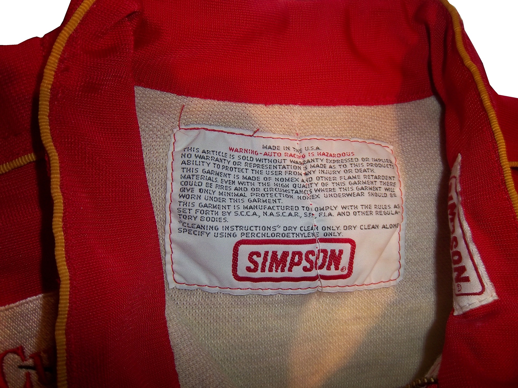
Gussets have very little variation, though I have seen one unusual one. In this Ricky Craven suit from 1996, the front of the sleeves look like they are attached to the body, whereas the back has a gusset in it. This would be done for driver preference of course, bur I have never seen a half gusset before or since.


This Lake Speed suit from 1997 is store bought, as opposed to custom designed, and it has no gussets. This suit would have some restriction of movement. Again this can come down to driver choice.

The need for protection vs. the need for driver comfort is a major conflict in the world of racing safety. The gusset is a major meeting point between the two sides involved, and the drivers love them.
RIP Jason Leffler…you will be missed.
Now on to paint schemes.
Jame McMurray #1 Parade Magazine Chevy SS-Great color scheme, great design, nothing wrong at all, A+
Jame McMurray #1 Banana Boat Chevy SS-A scheme that could be a B+ is ruined by an awful color scheme. That orange is the worst I have ever seen on a race car. It takes this scheme and takes to a D-
Jamie McMurray #1 Bad Boy Buggies Chevy SS-An attempt to be innovative with design fails horribly here. The color scheme is decent, but the design is awful.
Marcos Ambrose #9 Stanley/DeWalt Racing for a Miracle Ford Fusion-This is a major improvement over what they currently run. This just works! A+
Denny Hamlin #11 Sport Clips Toyota Camry-Seriously? Why does it look like a sperm is painted in red on the side of the car? The red/white/black color scheme works, but the door design is just awful! D-
Denny Hamlin #11 Fedex/Autism Speaks Toyota Camry-Much better! The puzzle design, and solid color scheme look really good here. The red 11 is amazing too! Can’t give this anything but an A+
Tony Stewart #14 Code 3 Chevy SS-Love the scheme, love the simple design and great color scheme. Works very well and earns an A+
Clint Bowyer #15 5-Hour Energy Patriotic Toyota Camry-How is this patriotic? Oh….I get it…the stars….just one problem…THE COLOR SCHEME IS WRONG! If it was red white and blue I would like this, but this is just awful! You want to honor America, but can’t get the color scheme right? F-
Greg Biffle #16 Fastenal Ford Fusion-Since minor variations of this scheme were run by Biffle, Ricky Stenhouse, and Carl Edwards with minor variations between them, I will grade them all here. Solid scheme, good color scheme, A+ for all 3.
Greg Biffle #16 3M/Ace/Rite Aid Ford Fusion-The color scheme is good, but the door design is too busy. If it was one single color, it would work quite well, but being a mix of black, blue, red, and white it just looks confusing. It works, but not as well as it could, and earns a C+
Jeff Gordon #24 Axalta Chevy SS-Another DuPont scheme with different logos that works very well. Good color scheme and design. A+
Paul Menard #27 Menard’s/Libman Chevy SS-The Libman green hood design just looks horrible on the yellow background of the car. The green is too light, and if it were darker it might work, but this scheme earns a D
Kevin Harvick #29 Budweiser Patriotic Chevy SS-This is another patriotic scheme that works very well with a good design. A+
J.J. Yeley #36 Click it or Ticket Chevy SS-Good design, but awful color scheme. The green and blue is just horrible. If one or the other was used it might work, but this is horrific. F
Ryan Newman #39 Quicken Loans Patriotic Chevy SS-Meh. The design needs work. Too much going on with the front of the car to earn anything above a C
Aric Almirola #43 Air Force Ford Fusion-Great design, simple design with a great color scheme. A+
Bobby Labonte #47 Bush’s Grilling Beans Toyota Camry-The overall design and color scheme is good, but the major flaw here is that the quarter panel has 5 different logos, most of which clash with the Bush’s scheme. It takes an A scheme and drags it down to a C
Jimmie Johnson #48 Lowes Patriotic Chevy SS-The only bad thing I can say about this is that the red should be a little darker. Other than that, this scheme earns an A
Jimmie Johnson #48 Monsters University Chevy SS-If the blue was darker, I would like it more, but the blue is too light. Other than that, this is a solid scheme. B+
Martin Truex Jr. #56 Napa Patriotic Toyota Camry-Perfect…that is all I can say. A+