Thoughts On A Bad Situation

By David G. Firestone

I was ready to present a behind the scenes video this week, but I’m gonna put that on the back burner until next week. Last Saturday was the inaugural Grand Prix of Indianapolis, an IndyCar race on the road course at Indianapolis Motor Speedway. The race as a whole was fun, but it did have some issues. There was a huge wreck on the standing start, fortunately all were Ok. The same cannot be said for James Hinchcliffe.

The 2011 Rookie of The Year suffered a concussion when he was hit by a piece of flying debris. Watching it live, it looked like after he had gotten hit, he pulled off the track and he was stunned by what had happened. The report was, at the time, that he had hurt his hand. The race went on, no caution flag flew because the safety crew was able to get the car out of harms way quickly. It looked like everything was normal, then suddenly the camera shows Hinchcliffe on a stretcher being led away seemingly in distress. He was loaded onto an ambulance, and was taken to the hospital. He was diagnosed with a concussion and his future status for the season is yet to be determined.

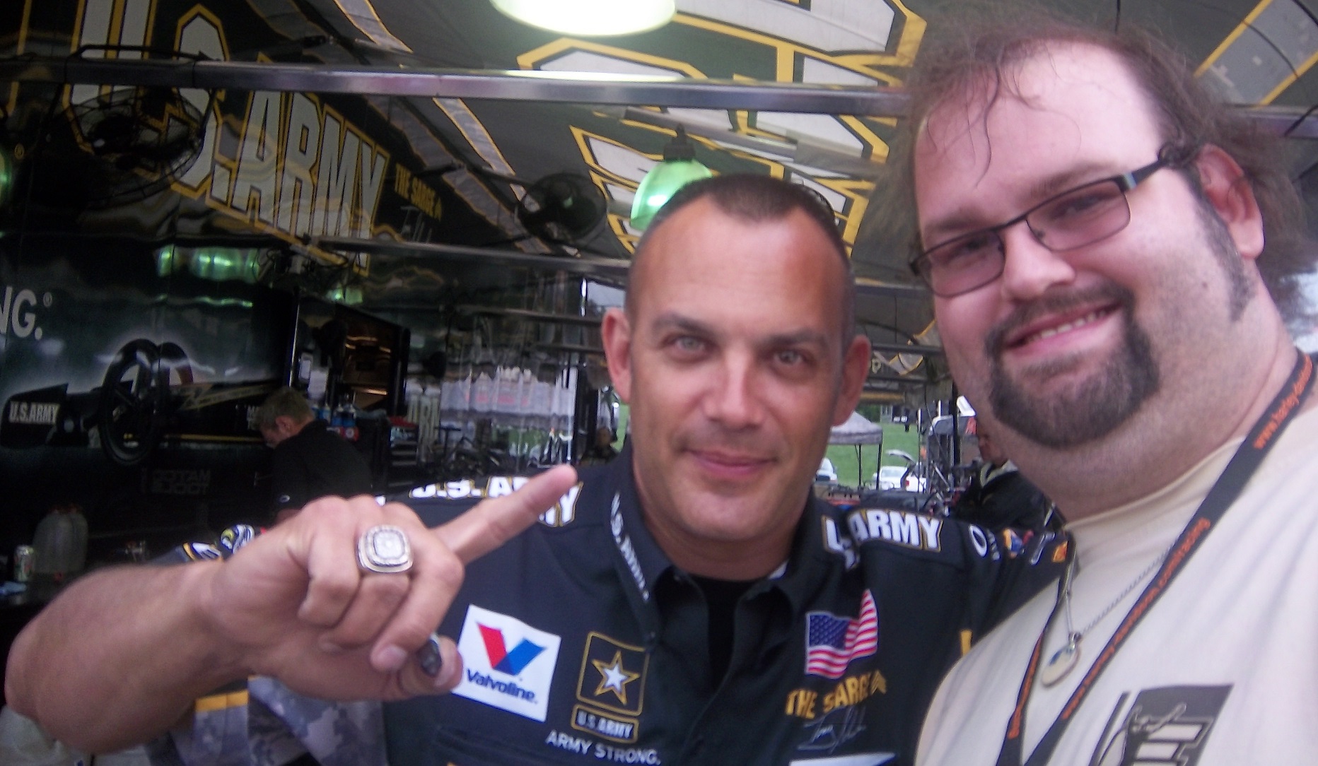
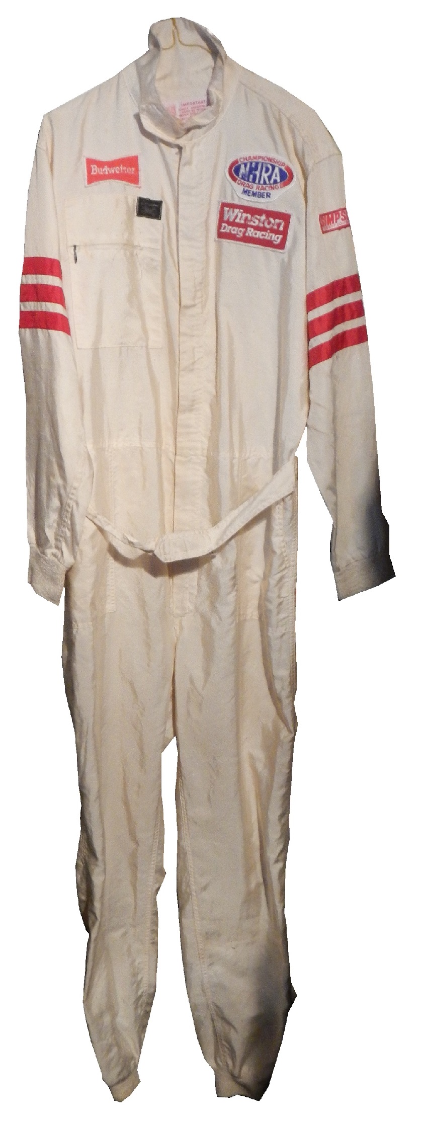
This incident reminded me of something Tony Schumacher said last year. I was in his hospitality tent listening to him make a speech, and he took a number of questions. One of them concerned the canopy he has over his cockpit. He stated that it took some time to convince the NHRA to allow a cockpit canopy. He stated that he is really scared of hitting a bird with his helmet, stating that “I’ve taken a few out with my tail, and if you catch one of those with your helmet, you’re getting coloring books for Christmas for the rest of your life.”

I’m wondering if in the near future canopies will come to IndyCar. With the current safety culture in racing, I’m kind of shocked it hasn’t yet. Racing fans will complain that it breaks tradition, but at the same time, nobody wants another Dan Wheldon. Fans do not want to watch a driver to die. I think that canopies will come to IndyCar, I want them to come to IndyCar, and I think that safety should take precedence over tradition.

The other factor that needs to be discussed is that there is a parallel to the recent concussion lawsuit filed with the NFL. The information that was gained from that suit was that no helmet can definitely prevent all head injuries. As such, a canopy could very well prevent a fatality in that respect. Give the driver an extra layer of protection so that he could walk away. These canopies are not plexiglass, they are the same exact material used to make F-16 bulletproof canopies. It is a very durable material that could have prevented what happened to Hinchcliffe.

Shifting gears now, I want to discuss something else. Starting in a couple of weeks, I will be restarting Wheel Reviews. I started with Rush, an amazing F1 movie by Ron Howard about James Hunt and Niki Lauda in the 1976 F1 season. So what I am going to do is to alternate the paint scheme reviews and Wheel Reviews. I’ve got 13 movies in total to review so far, and I hope to find some more. With that, we move on to…

PAINT SCHEME REVIEWS!

Jamie McMurray #1 Bass Pro Shops/National Wild Turkey Federation Chevy SS As Bass Pro Shops schemes go this year, this one is really good. Good color scheme, good design scheme, no camo, A

Danica Patrick #10 GoDaddy Cares Chevy SS Same scheme but with a bunch of logos on the hood, instead of just one. F

Casey Mears #13 Geico Chevy SS Once again, it needs to be said…CAMO DOES NOT WORK ON RACE CARS! I’l give this an F!

Tony Stewart #14 Mobil 1/Bass Pro Shops Chevy SS Some patriotic schemes go too far, but this works. The stripe across the front and door takes an A grade down to a B-

Clint Bowyer #15 Charter Toyota Camry Clint’s already bad paint scheme with an even worse color scheme…F

Joey Logano #22 Pennzoil Platnum Ford Fusion much too overdesigned, the blue stripes look awful, and the yellow door number is hideous…F

Ryan Newman #31 Cat/Quicken Loans Chevy SS What in the blue hell is going on here? I’ve liked Ryan’s schemes this year but this is an F scheme, even though I like the color scheme.

Landon Cassill #40 Cars For Sale Chevy SS I like the design, but to be honest, I don’t know where I stand on the color scheme. The red is good, but the when it comes to yellow/green I’m not sure if I like it or hate it. I’ll give it a C

Aric Almirola #43 US Air Force Ford Fusion I’ve been tough on military schemes this year, but this is the best one! The dark blue sky theme, with two small fighters with light clouds works perfectly, and earns an A+. See, military schemes CAN be done well without camo.

AJ Allmendinger #47 Freightliner/Sullivan Palatek Chevy SS Classic look, good color scheme, A+

Jimmie Johnson #48 Lowes Patriotic Chevy SS Only one word can sum up this scheme…overdesigned. F

Martin Truex Jr. #78 Furniture Row/Colorado Freedom Memorial Chevy SS Nothing wrong with this scheme! A+

Ryan Truex #83 Burger King Toyota Camry Great simple design, and I love the Borla Exhaust design adds a unique look. A+

Showing Some Love for the NHRA!

100_3556By David G. Firestone

While the bulk of The Driver Suit Blog is devoted to NASCAR, which, admittedly is my favorite form of auto racing, I do follow other forms of racing, and collect items from many different forms of racing. I am a fan of NHRA drag racing, and I attend races when I can. I have a decent collection of NHRA memorabilia, so this week, I’m gonna show some love for drag racing.

First, let’s get some factual history out of the way. Founded in 1951 by Wally Parks, the National Hot Rod Association or NHRA was created to act as a governing body for the sport of drag racing. Parks had previously founded Motor Trend and Hot Rod magazines, and was a racing enthusiast . The NHRA has 80,000 members, 95% of which are non-professional drivers. While there are hundreds of drag racing classes, The three most popular and well-known are top fuel, funny cars and pro stocks.

Top fuel dragsters are 25 feet long, have the engine mounted behind the driver to provide weight to the rear tires, which are 36 inches high by 17 inches wide. They run on a 90/10 fuel mix, 90% nitromethane and 10% methanol.100_3531Funny cars are designed with a frame, engine, suspension and cockpit with a fiberglass body that raises up to allow access to the car. The name “funny car” came to be because the early models in the 1960’s had the rear wheel base moved forward, and huge rear tires. They didn’t look “stock” so they were called “funny.”100_3545Pro stocks are an interesting design. Whereas top fuel and funny cars use nitro burning supercharged V8’s, by rule, pro stocks can’t use superchargers, turbochargers, or nitrous oxide. They also run on 118 octane racing fuel. Little consideration is given aerodynamically, and the cars can be hard to handle.alderman1

In regards to race-used equipment, I have this timing belt from Bob Tasca’s Motorcraft Funny car, this one used in his first qualifying session at the Ford Thunder Valley Nationals in Bristol Tennessee. This run he had a 4.15 second, 306 MPH run. This thing is HUGE, measuring over 64 inches in circumference and 3 inches across.tasca-belt2 tasca-belt1As well as an ignition coil and a spark plug from Morgan Lucas Racing. Ignition coils are used to turn on cars in general, but this MSD 8142 is designed to fire up these 8000 horsepower engines, which need a lot of electricity to start and operate. I was fortunate enough to have Tony Schumacher and Ron Capps autograph it in person.mlr-coil3 mlr-coil6 mlr-coil5 mlr-coil4 mlr-coil1 mlr-coil7 mlr-plug

One thing I wanted was a race-used piston. I recently got one, but it is in two different pieces. The piston rod itself was used and autographed by top fuel driver Bob Vandergriff, and the piston head was used and autographed by Brandon Bernstein, son of drag racing legend Kenny Bernstein. The piston head is 3 inches in diameter, and the piston rod is almost a foot long!vandergriff1 vandergriff2 bernstein-piston1 bernstein-piston2

One of the more oddball items I have is this 1987 Budweiser/NHRA driver suit. Here is what I can say definitively about this suit: It was made in 1987, shows a lot of use, is not safety certified, and shows the Simpson open-wheel tag. Other than that, I don’t know much about this suit and I’m still working on it.budweiser budweiser-lchest budweiser-rchest budweiserb budweiser-blogoNow we move on to die-casts. In my die cast article, I mentioned that I have a 1:32 Cruz Pedregon 1998 die cast from his days with Joe Gibbs Racing.pedregon-1 pedregon-2 pedregon-3 pedregon-4 pedregon-5 pedregon-6 pedregon-7 pedregon-8 pedregon-9 pedregon-11 pedregon-10

During my recent vacation, I found myself at a baseball card store. I bought a bunch of NASCAR die casts, as well as a Darrell Alderman 1:24 pro stock from 1997, where the doors open, and the hood comes off.alderman1 alderman2 alderman3 alderman4 alderman5 alderman6 alderman7 alderman8 alderman9 alderman10 alderman11 alderman12Also from 1997, this Tony Pedregon 1:24 funny car die cast, with a body that is removabletpedregon-1 tpedregon-2 tpedregon-3 tpedregon-4 tpedregon-5 tpedregon-6 tpedregon-7 tpedregon-8 tpedregon-9 tpedregon-10 tpedregon-11My personal favorite die cast is this Bob Vandergriff 1:24 top fuel die cast.vandergriff-1 vandergriff-2 vandergriff-3

Now we move from NHRA to NASCAR with…

PAINT SCHEME REVIEWS

Jamie McMurray #1 Cessna Chevy SS  Not the worst patriotic scheme I have seen, but it it a bit overdone.  Giving it a C+

Kevin Harvick #4 Hunt Brothers Pizza Chevy SS  It’s a bit overdesigned, but the green looks good(I hate most shades of green used in NASCAR) and it earns a C

Danica Patrick # 10 GoDaddy Chevy SS  I didn’t think this was possible, but they took one of the ugliest schemes in racing and found a way to make it worse…the hood speaks for itself, and it says “I’m getting an F-!”

Greg Biffle 3M Window Film Ford Fusion What in the blue Hell is going on here?  This is the worst Greg Biffle scheme I have seen this year and considering how bad his schemes have been that is saying a lot.  F-

Travis Kvapil #32 Keen Parts Ford Fusion  Awful color scheme, and the goofy pyscadelic side design just looks awful.  I’m also laughing at corvetteparts.net painted on the side of a FORD!  F-

David Ragan #34 KFC Ford Fusion  Great color choice, smooth look, great all around design, I will give them an A+

Landon Cassill #40 Atlantic Plumbing and Utilities Chevy SS  Good color scheme, and the simple yet attractive design works well.  A

Kurt Busch #41 Haas Made in America Chevy SS  When it comes to patriotic schemes, it is hit or miss, and this is a hit.  The stars and stripes look good, and the overall design is solid enough to earn an A.

Josh Wise #98 DogeCoin Ford Fusion Such colors! Very design! So good! A+

Before I go I need to cover an update to a story I discussed last week.  I had discussed Swan Racing going under due to lack of sponsorship.  I did not get a chance to discuss that Swan Racing has gone under, but the two cars, #26 and #30 have found new homes.  BK Racing is now the new home for the #26, and XXXtreme Motorsports is home for the #30, though it will change to #44, and keep the current owner points.  It is always sad when a team has to close, but at least the equipment did not go to waste.  Sadly, Parker Kligerman is now out of a ride for the foreseeable future.

Two Great Pieces of Advice for Anyone With A Hobby

By David G. Firestone

If I could give a new collector two pieces of advice, they would be 1: In this hobby, when you stop learning, it stops being fun and 2: Research, research, research. Research is critical in any hobby, and that is, for the most part, why The Driver Suit Blog exists. I put a lot of research into this hobby, and I will give some pointers to help my fellow collectors.

First, always get a picture of the item you are going to buy beforehand. This is useful for a number of reasons. First, you can photo match the item. If you are not able to find an exact photo of the suit, helmet or accessory, you can “style match” the item. Style matching is finding evidence that the driver or crew member wore a design similar to the item in question. Drivers wear multiple versions of the same suit for a number of reasons. Nomex is a great material, however, if the suit catches fire, the Nomex will change color, and will not protect the area of the burn after the fire. So if a driver gets into a fiery crash in practice, and the suit gets damaged on the arm. The suit will have to be replaced for the race, because it is very possible that a similar crash could occur during the race, and wearing the damaged suit would wind up burning the driver.

Figuring out WHEN the suit was worn can be tricky, but in addition to photo matching, you can do a driver search on Racing Reference. Racing Reference is a site devoted entirely to racing stats, and for every race they list, they have driver, owner and sponsor information. So for example, let’s take this Stevie Reeves suit:96-reeves

The primary sponsor is Big A Auto Parts, and is a Busch Series suit. So you go to his driver page:reeves1

and clicking the races in his Nationwide Series Statistics section, you can look at each of his sponsors.reeves2 In this case, he was only sponsored by Big A Auto Parts in 1997. So it can be concluded that the suit was worn in 1997.

In some cases, you will not be able to find a photo of the driver wearing the suit, that is just the law of the land. When searching for a photo, I use Getty Images, Google, YouTube, and eBay. It might seem strange that I use eBay but it works quite well and I have had a lot of success. People sell photos, press kits, hero cards and other such things on eBay, and this is a gold mine. In some cases, I have no luck in searching for photos, and I will take a break, get something to eat, play with the cat, take the dog for a walk, and I will have a moment when I realize I should change a parameter of the search. Sometimes it works, other times it does not.

When it comes to learning, when you stop, the hobby stops being fun. I’ve been collecting sports memorabilia since I was 5, and I’m constantly learning new things about it all the time. Never stop learning, because every hobby is constantly changing, and new information can be very useful.

I also have to cover this story. I gave Swan Racing a lot of bad reviews for paint schemes last year, and I said this year, they stand a good chance of winning the Schemie for most improved paint scheme set. Well, it looks as though they will have to shut down due to a lack of sponsorship. As it stands right now, the team is shutting down and Cole Whitt does not have a ride for Richmond. I will update the story as I learn more information.

Now we move on to…

PAINT SCHEME REVIEWS

Brad Keselowski #2 Detroit Genuine Parts Ford Fusion  Great design, great color scheme, I like the black B post, A+

Kevin Harvick #4 Budweiser Chevy SS The Coca Cola 600 is held as the July 4th race, and as such, NASCAR teams like to run patriotic schemes. The scheme as a whole is good, and red, white and blue is a great color scheme. I give it an A. Something else to note: Notice that the name on the windshield is in a patriotic design, as opposed to white lettering on a black background. Is this going to be run by all teams? Stay Tuned!

Kasey Kahne #5 Farmers/Thank A Million Teachers Chevy SS I really hate the huge FARMERS lettering on the side of the car, and I’m guessing that the design on the lettering is a photo mosiac. The color scheme is not good, and there are a number of dark designs on the black background which are almost impossible to see. I support the idea of Thank a Million Teachers, but this scheme looks awful, and earns an F

Tony Stewart #14 Bass Pro Shops/Ducks Unlimited Chevy SS Sadly this is the best Bass Pro Shops scheme I have seen in 2014, and it is a C+ design so that isn’t saying much. Why can’t we go back to this?

Greg Biffle #16 Scotch Ford Fusion  Greg’s paint scheme downward spiral continues, with this horrid scheme!  The green and plaid doesn’t work with the Biffle template, and it just looks like a mangled mess that earns an F grade!

Paul Menard #27 Menard’s/Certainteed Chevy SS This scheme works! I love the color scheme, and the design is really good. A+

Paul Menard #27 Menard’s/Pittsburgh Paints Chevy SS I love this scheme! The color works well, the design is original. It stands out, and it just plain works! A+

David Stremme #33 Newton Building Supplies Chevy SS Red and white is a good color combination, and if the side did not have the small rectangle just behind the front wheel, I would give it an A, but it takes it down to a B+

Kyle Larson #42 Target 25th Anniversary Chevy SS Really simple design, and a good color scheme. I will tentatively give this scheme an A until I see the real scheme.

Kyle Larson #42 Axe Peace Chevy SS  Decent color scheme, but much too overdesigned.  Too much visual noise, and i just don’t like it.  The green number look awful as well.  D-

Ryan Truex #83 VooDoo BBQ Toyota Camry color scheme is not great, and the car in general is way too overdesigned.  I can’t give this scheme anything less than a D-

Carl Edwards #99 Fordalwaysracing.com Ford Fusion See Brad Keselowski Above…A+

Also, NASCAR.com has come up with their staff picks for the best paint schemes in the Sprint Cup, Nationwide Series, and Camping World Truck Series. I can’t say I disagree with most of their choices in this respect!


The Sprint Unlimited Preview

By David G. Firestone

The 36th Sprint Unlimited starts tonight at 8:15 ET on Fox. This marks the beginning of the Daytona 500 and the beginning of the NASCAR season. I will be looking forward to it, and I will enjoy it as always.

The field will feature pole award winners and past winners of the event. These include:
· Denny Hamlin (4 poles)
· Kyle Busch (3 poles)
· Joey Logano (2 poles)
· Jimmie Johnson (2 poles)
· Matt Kenseth (2 poles)
· Ryan Newman (2 poles)
· Dale Earnhardt Jr. (2 poles)
· Jeff Gordon (2 poles)
· Carl Edwards (2 poles)
· Marcos Ambrose (1 pole)
· Kurt Busch (1 pole)
· Kevin Harvick (1 pole)
· Brad Keselowski (1 pole)
· Mark Martin (1 pole)
· Jamie McMurray (1 pole)
· Danica Patrick (1 pole)
· Ricky Stenhouse Jr. (1 pole)
· Terry Labonte (past winner: 1985)
· Tony Stewart (past winner: 2001, 2002 and 2007)

The event will feature a number of segments which were voted on by NASCAR fans including myself, and many of you. The first segment will feature laps followed by a second segment of laps, and then a third segment of laps. Many special paint schemes will be run for this race, as is traditional. My personal favorite is the Miller Lite Throwback scheme being run by Brad Keselowski.

Now some factoids about the race.

*There are, in total, Chevy drivers, Ford drivers and Toyota drivers.

*Chevy has 20 wins, Ford has 7 wins, and Toyota has 1 win.

*Mark Martin has competed in 20 consecutive events from 1989-2008.

*Dale Earnhardt Sr. has won 6 events, more than anyone else in 1980, 1986, 1988, 1991, 1993, and 1995 and went on to win the Sprint Cup Championship 4 times in 1980, 1986, 1991, and 1993, he is one of 7 drives to do so.

*From 1979-2011 the event was sponsored by Anheuser-Busch, first called the Busch Clash which was the brainchild of Monty Roberts, brand manager of Busch Beer, who sponsored the Pole Award. It remained the Busch Clash until 1998, when Budweiser took over the Pole Award, and it was renamed the Budweiser Shootout. In 2012, Sprint, the series sponsor took over the sponsorship after Budweiser announced they would drop the sponsorship in favor of sponsoring the Duel Races that determine the starting order of the Daytona 500.

*Petty Enterprises was not eligible to run the Shootout because of a rule stating that only drivers that ran the Busch/Budweiser pole award decal were eligible to enter the shootout. Richard Petty and his family did not support alcohol sponsorship or decals on race cars. So John Andretti, Bobby Hamilton, Jeff Green, and Aric Almirola who all had a number of poles with Petty Enterprises were not eligible to participate. I find it interesting that Petty has reversed course on the alcohol sponsorship rule, since Kasey Kahne was sponsored by Budweiser, and Marcos Ambrose will run at least one race sponsored by Twisted Tea.

*Buddy Baker won the inaugural Sprint Unlimited in 1979, which was a 20 lap sprint.

*Since many top drivers were excluded from the race due to not winning a pole award, they moved to the TV booth as color commentators. These included Dale Earnhardt Sr. in 1981, Richard Petty and AJ Foyt in 1982 and 1983, Neil Bonnett in 1993, Darrell Waltrip in 1994, 1995, 1997, and 1999, and Kenny Wallace in 1998.

*There has never been a driver who has won the Sprint Unlimited, Budweiser Duel and Daytona 500 in the same year. Drivers have won 2 of 3 in a season, but never scored the hat trick.

*One of the first instances of a special paint scheme being used specifically for the Sprint Unlimited was the Chroma Premier scheme run by Jeff Gordon in 1997. He followed it up the next year with the legendary Chroma-lusion scheme, which feature a paint that changed color. Since then, special schemes have become commonplace.

*Richard Childress Racing has 8 Sprint Unlimited wins, most of any team. Hendrick Motorsports has 6 wins, and Joe Gibbs Racing has 5 wins.

The Unlimited starts tonight at 8 PM ET on Fox Sports 1, and I look forward to watching the event as I hope the rest of you do too.

Though I have had a VERY busy week, I still have time for…

Paint Scheme Reviews!

Kasey Kahne #5 Time Warner Cable Chevy SS It is a good color scheme, but the design on the side needs a little tweaking. Get rid of the needless zig-zag pattern and it works a whole lot better. It is still a decent scheme, so I will give it a C

Michael Annett #7 Pilot/Flying J Chevy SS Good color scheme, but the awful template is back for Tommy Baldwin. It is really sad, because this could be a great scheme, but the template takes it from an A to a C-

Michael Annett #7 Accell Construction Chevy SS See Above

Marcos Ambrose #9 Mac Tools Ford Fusion Good color scheme here, and decent design, worth a B

Clint Bowyer #15 AAA Insurance Toyota Camry Great color scheme, good design, worth a B+

Kyle Busch #18 M&M’s Peanut Toyota Camry I like this, it has a great shade of yellow, hard to find in NASCAR these days, and the peanut motif works very well. It is an original design, and I’ll give it an A

Trevor Bayne #21 Motorcraft Ford Fusion  This is why The Wood Brothers won the Paint Schemies and took the top spot in the Paint Scheme Leaderboard.  A++

Joey Logano #22 Autotrader.com Ford Fusion  Sometimes orange works, sometimes it doesn’t.  This is an example of an orange scheme that just doesn’t work.  If the white was taken out completely it might work, but this is just horrid, and I give it an F

Cole Whitt #26 Speed Stick Gear Toyota Camry This is one of the few schemes that has both a classic and modern look at the same time, and paired with a great color scheme, it earns an A

Paul Menard #27 Menard’s/Peak Chevy SS Good design, awful color scheme, D+

Terry Labonte #32 C&J Energy Services Ford Fusion I’ll give it a C+ until I can see a picture WITHOUT an Instagram filter!

David Ragan #34 CSX Ford Fusion  What in the hell is going on here?  Why is the hood decal upside down?  Why in the world would they do that?  Were they drunk when they decaled the car?  The only thing that I can guess is that it is designed for an in-car camera…but that makes no sense either!  F-

David Gilliland #38 Loves Truck Stops Ford Fusion  Good color scheme, decent design, plus unlike David Ragan, the hood decal is in the correct position, A-

Bobby Labonte #52 Phoenix Racing/HScott Motorsports Chevy SS Great color scheme, very simple yet attractive design, can’t say anything bad about it, A+

Michael Waltrip #66 Blue Def Toyota Camry While I like the field motif, it looks too much like the Windows XP Bliss background for me to take it seriously. I’ll give it a B-

Dale Earnhardt Jr. #88 Kelley Blue Book Chevy SS  During my Daytona Preseason Thunder article, I said I wanted to see the #88 they used on a real car.   I got my wish, and I like this design overall.  The metallic gold is a bold choice, it doesn’t always work well.  I give it an A+

BUT WAIT, THERE’S MORE!

As many of you know, I don’t just research and collect driver suits and racing items, I collect and research many other things.  I recently had a column run in Uni-Watch concerning some lettering from the 1958 Washington Senators, and you can read my column here.

MOMO and Christian Fittipaldi…A Match Made In Heaven

44-fittipaldiBy David G. Firestone

These last few weeks have been hell in Chicago weather-wise.  I have been under the weather myself, but this week, I wanted to touch on something that I covered in depth last year. After watching the Rolex 24 at Daytona, I learned that MOMO is celebrating its 50 anniversary this year. I first learned about MOMO when I covered Christian Fittipaldi’s Driver Suits back at the beginning of the blog. MOMO is one of the more ubiquitous racing safety companies in racing.sccatrack-blogo

MOMO is short for “Moretti-Monza” which is Giampiero Moretti’s last name and Monza, a town in the Province of Milan. Giampiero Moretti was a driver who won the 1998 24 Hours of Daytona. He created a company specifically to make racing products. MOMO has gradually expanded over the years, and is now involved heavily in almost all forms of auto racing.

One thing I have noticed is that MOMO steering wheels are used very heavily in NASCAR. Whenever there are in-car cameras, there is always one located near the ignition behind the steering wheel, and almost every one of them has a MOMO logo on them. They are also very involved in F1, and IndyCar racing in terms of parts. When the best and most recognizable teams in the biggest forms of auto racing all use the same group for their parts, it proves that MOMO is the best in what they do.

I also mention Christian Fittipaldi because he won the Rolex 24 at Daytona in an Action Express Coyote Corvette DP. This is his second win, his first one coming in 2004 in a Bell Motorsports Doran JE4-Pontiac. As covered earlier in the year, I own two Christian Fittipaldi MOMO driver suits. In all honesty, these two suits were my first introduction to MOMO as a brand. MOMO however has a large presence in auto racing.fittipaldiIn the SCCA Miami Grand Prix, these suits were issued to track workers. MOMO stated that these would be fireproofed for one race only. It feels like an old school chemical dipped suit, but I have no proof of that. It does not appear to have been worn, but it probably is not fireproof any more though. sccatrack sccatrackb2014 is the 50th anniversary of what I’m going to call “The dark week,” May 24-30 1964 when the World 600 and Indy 500 took place. Three drivers were killed by fire, which changed the safety culture of racing forever. I will cover that issue in depth later in the season.

Paint Scheme Reviews

Marcos Ambrose #9 Stanley Ford Fusion Though a tad over designed, the car does has a clean look, and a great color scheme, so I will give it an A-

Marcos Ambros3 #9 DeWalt Ford Fusion See Above

Kyle Busch #18 Skittles Toyota Camry When I first heard about Skittles returning to NASCAR, I thought it would look like this or this, so naturally I was worried, but I like this simple and attractive design. A+

Kyle Busch #18 Peanut M&M’s Toyota Camry Decent scheme, good color scheme, A-

Matt Kenseth #20 Dollar General Toyota Camry My major complaint was the black and silver stripes on the sides were too big and promenent. They solved that issue this season, and the car looks better. In fact, I’ll give it a B!

Jeff Gordon #24 AXALTA Chevy SS Classic Jeff Gordon design, and I like the blue on the flames, and the black flames on the back. A+

Paul Menard #27 Menards/Richmond Chevy SS Love this scheme, great design and color scheme, A+

Paul Menard #27 Menards/Serta Chevy SS Same scheme as last year, same C+ grade

Eric McClure #35 Hefty/Arm and Hammer Ford Fusion Good color scheme, but the car looks over deisgned and it doesn’t look good at all. D+

Kurt Busch #41 Haas Chevy SS Great design and color scheme, A+

Kurt Busch #41 Slate Water Heaters Chevy SS Kurt is running a really good template this year, and this is another example. The condensation design is overdone, and it takes an A scheme down to a B-, otherwise it is a great design.

Aric Almirola #43 STP Ford Fusion This is one of my favorite schemes this year! A classic design, with great colors and a great look earns an A+

AJ Allmendinger #47 Kroger/USO Chevy SS Though the scheme is the same as last year, JTG Daugherty Racing has switched from Toyota to Chevy this season. That being said, I like this scheme, and I will give it an A

AJ Allmendinger #47 Bushes Baked Beans Chevy SS Simple design, great color scheme, A

AJ Allmendinger #47 Kingsford Chevy SS See Above

AJ Allmendinger #47 Scotts Chevy SS See Above

AJ Allmendinger #47 Clorox Chevy SS See Above

AJ Allmendinger #47 Charter Communication Chevy SS I like the overall design, but that is an awful shade of green. Green is not a great color for a race car, neither is yellow, so yellowish-green definitly doesn’t work. I’ll be generous and give it a C-

Joe Nemechek #66 Land Castle Title Toyota Camry If the bottom was a single color stripe, I would give it very high marks, but the over design makes it look awful. C-

Michael McDowell #95 K-Love Ford Fusion Not only is McDowell and Levine Family Racing running a better template this year, the K-Love scheme actually improves on it. I can’t give this scheme anything lower than an A

Carl Edwards #99 Subway Ford Fusion A bad design from last year, earns a D-

Two Birthdays in January…

100_4380By David G. Firestone
On the first anniversary of the founding of The Driver Suit Blog I felt it appropriate to analyze the first two NASCAR driver suits I ever bought. I started in the driver suit hobby in March of 2010, with a Bill Sedgwick Die Hard driver suit from the Craftsman Truck Series in 1996. 17-sedgwickI purchased this specific item for a number of reasons, first, it was well within my price range, and second, I wanted a low-end example that I can look at and get a general feel for aspects that I will see in other driver suits.
Some of the stuff I learned from this particular suit helped me understand the very basics of design aspects on race-worn driver suits. Some of the aspects I discovered from that were completely different and it was through subsequent research that I began to understand driver suits more. I have kept it for as long as I have is because I love the suit, and I even though I have had it for almost 4 years, I still find aspects about it that interest me.
The suit is custom designed for Darrell Waltrip’s Craftsman Truck Series team. Sedgwick drove the #17 Chevy C-1500 for the entire 1996 season, whereas Waltrip drove the #5 truck for a very limited schedule. Sedgwick had 3 top 5’s and 8 top 10’s in the 23 of the 24 races that year, and led a total of 8 laps. Sedgwick was released at the end of the season.17-sedgwick
The triple-layer suit is custom designed for Sedgwick, with the Sears Die Hard logos on the collar and shoulder epaulets,17-sedgwick-collar 17-sedgwick-rshoulder 17-sedgwick-lshoulderSears Die Hard logos across the front and Sedgwick’s name on the right chest,17-sedgwick-rchest17-sedgwick-lchestno arm gussets,17-sedgwick-rsleeve1 17-sedgwick-lsleeve1no adornment on the belt,17-sedgwick-beltTV logos and safety stripes on the legs,17-sedgwick-legsTV logos on the sleeves,17-sedgwick-rsleeve2 17-sedgwick-lsleeve2and a huge logo across the back.17-sedgwickb 17-sedgwickb-logoI purchased a press kit for this suit, which I covered in December, concerning this suit, and I realized that the suit Sedgwick is wearing in the promotional photo is the same suit that is in my collection. I keep the press kit in my authentication binder with the rest of my COA’s and LOA’s17-sedgwick-presskit1 17-sedgwick-presskit3 17-sedgwick-presskit2 17-sedgwick 17-sedgwick-presskit2The other suit I bought, my first Winston Cup suit was a Lake Speed suit from 1997, this one is a bit different. In 1997, Speed was racing for Melling Racing, which in 1997 was a shell of its former self. Melling had 34 victories and the 1988 Winston Cup Championship, but by 1997, they had no real sponsorship, and had not won a race since 1991. During that season Lake Speed didn’t score a top 5, top 10, or victory, and only led 3 laps in the 25 races he raced in that year.9-speedDue to the lack of sponsorship, Speed didn’t have the luxury of having a custom-made suit that season so he wore what appears to be a store bought suit. It looks like the suit was purchased either from a store or a catalog, and customized for Lake’s use. There are no large sponsor logos on the collar,9-speed-collarshoulder epaulets,9-speed-rshoulder 9-speed-lshouldertorso,9-speed-bsleeves,9-speed-rsleeve1 9-speed-rsleeve2 9-speed-lsleeve1 9-speed-lsleeve2or legs.9-speed-legsThe legs have a cuff cut, as opposed to a boot cut like the Bill Sedgwick suit has.
Everyone who has a hobby or an interest started somewhere. With me, it was with these two driver suits. No matter what you do in your hobby, or how high you fly in your hobby, you were a rookie, and you started from somewhere. Never forget where you came from. These two suits are a reminder of what I was, and I love these two.
Before we get to paint schemes, I need to say something to my readers. When I started this project one year ago, I never thought it would take off as much as it did. I have a group of really awesome readers and followers. I also owe a special thanks to Paul Lukas of Uni-Watch, because if I had never written my two articles for Uni-Watch in 2013, I would never have done the research I did for them, and I would never have had the frustration of not finding research from the collector’s perspective, and The Driver Suit would never have been born. To all my readers, from the bottom of my heart, I say thank you! Stay Tuned because 2014 will be even better than 2013!

Paint Scheme Reveiws

Jamie McMurray #1 Cessna Chevy SS Black with silver numbers and white trim looks simple and really good. I can’t say anything bad about this scheme, and bonus points for improving the door number design. A+

Jamie McMurray #1 McDonald’s Chevy SS Same great design as last year, same A grade.

Austin Dillon #3 Dow Chevy SS Take the white stripe down the side off, and it will be a solid A scheme. The white does not look good at all. The red/white/black color scheme works very well, and it is decently designed, so I will give it a B+

Danica Patrick #10 Go Daddy Chevy SS Not only does Go Daddy continue to use the worst shade of yellow in NASCAR, they also have given the worst shade of orange a more prominent role in the car. Givng this car an F is a very fair grade.

Denny Hamlin #11 FedEx Ground Toyota Camry Same scheme as last year, same C+ grade

Denny Hamlin #11 FedEx Freight Toyota Camry Same scheme as last year, same C+ grade

Denny Hamlin #11 FedEx Office Toyota Camry Same scheme as last year, same C+ grade

Denny Hamlin #11 FedEx Express Toyota Camry Same scheme as last year, same C+ grade

Casey Mears #13 Geico Ford Fusion The yellow they use is awful, and the side design is just too loud,  I’ll give it a D

Ricky Stenhouse Jr. #17 NOS Ford Fusion I love this color scheme, however, I don’t love the side design. It has too many different different designs, all of which would work on their own but combined they look like a jumbled mess. I really want to like this scheme, but I just can’t, so I’ll give it a C-

Ricky Stenhouse Jr. #17 Fifth-Third Bank Ford Fusion Everything I just said about NOS applies here. C-

Clint Bowyer #15 5 Hour Energy Toyota Camry Same scheme as last year, same B+ grade.

Kyle Busch #18 M&M’s Toyota Camry Same scheme as last year, same A+ grade.

Ryan Newman #31 Cat Chevy SS New season, new driver, new scheme that looks great and earns an A

Kurt Busch #41 Haas CNC Chevy SS Great color scheme and a very simple desgin look very good here. I also like the matte black used, and the door numbers look really solid. Can’t give this scheme anything less than an A

Kyle Larson #42 Target Chevy SS The scheme looks decent, I like the white on the back, though I do not like the Target logos at the bottom. That takes a scheme that was an A grade to a B-

Brian Vickers #55 Aaron’s Toyota Camry A good scheme, and the 55 lettering looks really good here, and the gold is a nice touch. A

Martin Truex Jr. #78 Furniture Row Chevy SS Simple, and perfect. A+

Dale Earnhardt Jr. #88 Diet Mountain Dew Chevy SS Same scheme as last year, but I never gave it a grade. So here is my analysis Not a great scheme, too much needless design on the side of the car, and the silver background is just brutal. The red lettering on a green background is unattractive at best, and all in all, this is a D- grade.

Michael McDowell #95 Levine Family Racing Ford Fusion This scheme is so much better than last year’s scheme, and just for that I’ll give it a B

Carl Edwards #99 Aflac Ford Fusion This has a terrible color scheme, with lime green, neon blue, black and white. The wing design is not only ugly but would work better starting at the door and working behind.

“Press Kit” Does NOT Mean Ironing a Uniform!

By David G. Firestone17-sedgwick-presskit1

Hope you all had a great holiday season, whatever you celebrate. I turned 32 on Thursday, and am celebrating the first year of the The Driver Suit Blog. Ok, enough sappy stuff, on to this week’s column.We’ve discussed photo-matching before, but here is something regarding photo matching that many people don’t know about, using press kits to photo match a suit. Press Kits are defined on Wikipedia as “a prepackaged set of promotional materials of a person, company, or organization distributed to the media for promotional use.” In sports, these are usually distributed to the media, prior to the start of the season, and usually contain information about players, statistics on players, history of the teams, photos, and the occasional gift.

NASCAR teams distribute these to the media before and during the season, and they often find their way into the hands of collectors. These kits are fun to collect, and I enjoy looking at the various driver suits that the drivers are wearing. These have a serious side in the collectors market, as they can easily be used for photo-matching.17-sedgwick-presskit2This is an example of a NASCAR press kit, this one from 1996. Bill Sedgwick was the driver of the #17 Die Hard Chevy C-1500. The team was owned by Darrell Waltrip, who also raced for the team in a number of events. In 1996, he started 23 of the 24 races in the Craftsman Truck Series, and had a decent season, with 3 top 5’s and 8 top 10’s, including a 2nd place finish at Milwaukee. He finished the season in 14th place. During the season, this press kit was distributed to the media. It comes in a custom folder,17-sedgwick-presskit1 17-sedgwick-presskit16and contains race statistics17-sedgwick-presskit4 17-sedgwick-presskit5 17-sedgwick-presskit6 17-sedgwick-presskit7 a driver profile17-sedgwick-presskit9,an owner profile17-sedgwick-presskit10 17-sedgwick-presskit11,sponsor information,17-sedgwick-presskit8technical information, 17-sedgwick-presskit12 17-sedgwick-presskit13 17-sedgwick-presskit14a bumper sticker,17-sedgwick-presskit15and a photo of both Darrell and Bill.17-sedgwick-presskit2I own Sedgwick’s suit from that season, it was the first driver suit I ever bought.17-sedgwick 17-sedgwickb

17-sedgwick-presskit2  17-sedgwick17-sedgwick-presskit2I tried to find a picture of any kind of him wearing the suit, but had no luck, until I found the press kit, and the black and white photo of him wearing the suit. So I bought it and photo matched the suit. Photo-matching, though time-consuming, it is a part of this hobby that is a necessary evil. If you buy a driver suit, helmet, or anything else worn by a driver, finding pictures or video of the driver wearing the suit is crucial to authenticating the suit. Sometimes traditional manners come up empty, and a press kit is the only way. Kits typically run between $5 and $30, so they can be pricy, but the upside to this is that when it works, you have indisputable proof that this suit was worn by the driver in question.

This last year, I took exception with a display at the Museum of Science and Industry concerning an obviously fake helmet that is being passed off as real.  I recently went back there after sending my argument that the sign should be changed.  Last time I went the display had been emptied:100_3811Recently, I went back and went back to the display, and saw this:gh1 - CopyThe display has been restored, and it looks really good except…gh2 - CopyTHE SIGN HASN’T BEEN CHANGED!  I want to love this display, I really do, but I can’t ignore the fact that there is a fake item being represented as real.  I have seen items from museum collections go up for sale to the public, and I have to make sure a fake item doesn’t get misrepresented as real.

PAINT SCHEME REVIEWS

Tony Stewart #14 Mobil 1 Chevy SS  The color scheme is good, but the design is horrid!  The contrast between the black and the white looks awful.  As much as I want to defend this scheme, I can’t.  F

Tony Stewart #14 Bass Pro Shop Chevy SS  Same scheme as last year, same C- grade.  Also, it appears that the last name on the windshield has larger lettering than last year.

Tony Stewart #14 Rush Truck Centers Chevy SS Same Scheme as last year, same A grade

Matt Kenseth #20 Home Depot/Huskey Toyota Camry   I would give this scheme an A grade, but the yellow back bumper ruins it.  The clash between the two just works awkward, and it takes an A scheme down to a C


Parts and Recreation

By David G. Firestonepettyrotor1

You know me for driver suits, but i also collect other things besides suits. Aside from helmets and other uniform items, i also collect other race-used items from the cars. Racing is half man half machine, and items from the machine make unique collectibles as well.

One of the most obvious things is sheet metal. Stock cars consist of a roll cage which contains the engine, suspension, and driver compartment. Covering that is what is called “sheet metal” which is a thin metal that has the shape of the car and where the paint scheme is added. The cars are “skinned” after each race. The sheet metal from cars has become a huge collectors market. Pieces can be as small as 1 inch squared, such as this Carl Edwards pieceedwards6, or huge, such as this Sterling Marlin door.marlin

Tires are also popular to collect as well. Tires can be purchased whole, but since they can weigh as much as 90 pounds, they are often cut up and the pieces are sold, like sheet metal. This example, used by Kevin Harvick in the 2002 Daytona 500 is an example. it gives a good example of the thickness of the tire, and the cords are visible as well.harvick-tire1 harvick-tire2  100_4233   This Kyle Petty/John Andretti card has two small pieces of tire, each used by the respective driver in the card. These are popular, and everything from suits to caps, to sheet metal wind up in cards.petty-card1 petty-card2

Race-used lug nuts go hand in hand with tires. Lug nuts are used once, and then sold after the race, such as these Tony Stewart examples. Lug nuts are Super glued to the rim, and one of these still has superglue residue on it.stewartlugnut-1 stewartlugnut-2 stewartlugnut-9

Mechanical components, especially engine components are interesting to collect, as there is no better representation of man and machine than a part of the heart of the machine. For example, I have a brake rotor used by John Andretti in the 1998 Bank of America 500 at Charlotte, which has been signed by Richard Petty. pettyrotor1 pettyrotor2 pettyrotor3 pettyrotor4This is a set released after Jimmie Johnson won his first sprint cup title back in 2006. johnsongroupIt contains a series of pieces used by Johnson, including a piece of sheet metal from his door,johnsonsheet

a spark plug,johnsonplug

a valve spring,johnsonspring

a piece of the track bar,johnsonrod

and a lifter.johnsonlifter

i also have a spark plug from Morgan Lucas Racing in the NHRAmlr-plug

an ignition coil from Morgan Lucas Racing, which has been signed by Tony Schumacher and Ron Cappsmlr-coil3 mlr-coil2 mlr-coil4 mlr-coil5 mlr-coil6 mlr-coil1 mlr-coil7

and a timing belt from Bob Tasca,tasca-belt1 tasca-belt2

I discussed this pit board from Chad McCumbee earlier in the yearmccumbee-pit-1 mccumbee-pit-2 mccumbee-pit-3 mccumbee-pit-4 mccumbee-pit-5

one last item from the equipment collection is this piece of Daytona International Speedwaydaytona1 daytona2 daytona3 daytona4

Jamie McMurray #1 Cessna Chevy SS Black with silver numbers and white trim looks simple and really good. I can’t say anything bad about this scheme, and bonus points for improving the door number design. A+

Jamie McMurray #1 McDonald’s Chevy SS Same great design as last year, same A grade.

Austin Dillon #3 Dow Chevy SS Take the white stripe down the side off, and it will be a solid A scheme. The white does not look good at all. The red/white/black color scheme works very well, and it is decently designed, so I will give it a B+

Danica Patrick #10 Go Daddy Chevy SS Not only does Go Daddy continue to use the worst shade of yellow in NASCAR, they also have given the worst shade of orange a more prominent role in the car. Givng this car an F is a very fair grade.

Denny Hamlin #11 FedEx Ground Toyota Camry Same scheme as last year, same C+ grade

Denny Hamlin #11 FedEx Freight Toyota Camry Same scheme as last year, same C+ grade

Denny Hamlin #11 FedEx Office Toyota Camry Same scheme as last year, same C+ grade

Denny Hamlin #11 FedEx Express Toyota Camry Same scheme as last year, same C+ grade

Casey Mears #13 Geico Ford Fusion The yellow they use is awful, and the side design is just too lowd, Ricky Stenhouse Jr. NOS Ford Fusion I love this color scheme, however, I don’t love the side design. It has too many different different designs, all of which would work on their own but combined they look like a jumbled mess. I really want to like this scheme, but I just can’t, so I’ll give it a C-

Clint Bowyer #15 5 Hour Energy Toyota Camry Same scheme as last year, same B+ grade.

Kyle Busch #18 M&M’s Toyota Camry Same scheme as last year, same A+ grade.

Kurt Busch #41 Haas CNC Chevy SS Great color scheme and a very simple desgin look very good here. I also like the matte black used, and the door numbers look really solid. Can’t give this scheme anything less than an A

Dale Earnhardt Jr. #88 Diet Mountain Dew Chevy SS Same scheme as last year, but I never gave it a grade. So here is my analysis Not a great scheme, too much needless design on the side of the car, and the silver background is just brutal. The red lettering on a green background is unattractive at best, and all in all, this is a D- grade.

Carl Edwards #99 Aflac Ford Fusion This has a terrible color scheme, with lime green, neon blue, black and white. The wing design is not only ugly but would work better starting at the door and working behind.

Paint Scheme Leaderboard Part 4-The Grand Finale

By David G. Firestone

The focus group of one has had its meetings, and has made its decisions.  Here are all 50 teams that ran the Sprint Cup this year ranked first to last on their paint schemes:

#1-Wood Brothers #21-A classic design scheme that just seems to get better with age. The Henry Ford design combines classic and modern elements for an amazing look.

#2-Hendrick Motorsports #48 Jimmie Johnson went with a very classic look, with a day scheme and a night scheme, which worked very well. Johnson did not have a bad look all year.

#3-Michael Waltrip Racing #55 Simple traditional designs. That is the secret to their success on the leaderboard. Color schemes are great as well. Nothing wrong with these schemes.

#4-Furniture Row Racing #78 When it came down to picking a number 1 for Chevy, for both the Paint Schemie and the Leaderboard, I had to flip a coin to pick a number 1, and Johnson won. Kurt Busch ran a series of very solid schemes, not a lot to comment on and it always looks good.

#5-Joe Gibbs Racing #18 Like Jimmie Johnson and Kurt Busch on the Chevy side, the Toyota winner for both the Paint Schemie and Leaderboard was decided by a coin flip. More modern than the 55, all these schemes are good, with amazing paint schemes and really good design.

#6-Richard Petty Motorsports #43 This team combines classic and modern looks, and uses Petty Blue very effectively. The Transportation Impact scheme was not good at all, and kept the 43 team out of the top spot.  Extra Credit for the Maurice Petty Tribute Scheme.

#7-BK Racing #83 Great designs all around, but the hood needs work. Why is it black when the rest of the car is red?

#8-BK Racing #93 See Above, but the Old Dominion scheme drags it down.

#9-Penske Racing #12-Though only raced for one race, the SKF design worked very well. A great color and great design scheme. If this had been raced for multiple races, I would have ranked it higher, but it is still a solid scheme.

#10-Richard Childress Racing #29 The Bad Boy Buggies scheme is bad, and the Rheem/Budweiser combo scheme is awful, but aside from those, Kevin Harvick has had a very good season, paint scheme wise

#11-Earnhardt Ganassi Racing #42 Get rid of the Axe Apollo scheme and the Camouflage scheme, and Juan Pablo Montoya would have the top spot.

#12-Richard Petty Motorsports #9 This set earned a place in the top 5 because it improved by a lot over the course of the season. It has a great color scheme, but the early schemes were not great, but since Stanley redesigned their logo, and made some changes to the car, it is a very nice set.

#13-Phoenix Racing/Turner Scott #51 Guy Roofing and Hendrick Cars are hideous, but apart from that, they have run a great set of paint schemes. Bonus points given for the Neil Bonnett throwback scheme.

#14-Michael Waltrip Racing #56 The Get Back and Give Back scheme is horrid, but the rest of the schemes are really good.

#15-JTG Daugherty Racing #47 Most of what they ran this year was great, but the Bushes Baked Beans car has an odd overall design, and a weird color scheme. The Clorox scheme has a bad color scheme, as does the Charter scheme, as does the Wounded Warrior Project scheme.

#16-Roush Fenway Racing #17 A pinkwashing scheme as well as the Valvoline NexGen scheme kick Ricky Stenhouse Jr. out of the top spot. Sad thing too, as Ricky had a very solid year when it comes to paint schemes

#17-Joe Gibbs Racing #81 Alert Energy is awful. Double Mint is awesome.

#18-Penske Racing #2 While I miss the beer colored wheels from last year, Keselowski has had a decent year, the color scheme is great, though there is too much white on the car. The Redd’s Apple Ale scheme was great, but the Fan Mosaic and Patriotic schemes need some work.

#19-Roush Fenway Racing #16 Greg Biffle had a lot of great schemes, but he had a number of awful ones , including a pinkwashing scheme as well. Get rid of the pinkwashing scheme, the Scotchguard, give blood, and Megulars schemes, and he would be in the top 5.

#20-Richard Childress Racing #27 The yellow is too bright, but other than that, the schemes are really good.

#21-Stewart Haas Racing #14 Some of these schemes are good, others not so much.

#22Hendrick Motorsports #88 Dale Jr. runs good schemes most of the time, but Soldiers of Steel, Orange Amp Energy, and Camouflage are just brutal. Additional points lost for a pinkwashing scheme.

#23-Joe Gibbs Racing #20 If the Dollar General was more plain, and did not have the orange back, I would love to give Matt Kenseth a higher spot, and a pinkwashing scheme does not help.

#24-Earnhardt Ganassi Racing #1 Bad Boy Buggies is even worse here, and the Bass Pro Shop schemes are awful. A number of good schemes here as well.

#25-FAS Lane Racing #32 The Oxy Water scheme, and the gray scale C&J Energy Services schemes do not work, but the rest of the schemes they ran do

#26-Front Row Motorsports #38 The template they run works very well when the color scheme matches that of the sponsor. When it doesn’t match, it looks awful.

#27-Front Row Motorsports #35, See above

#28-Front Row Motorsports #34, See above, aside from the CSX scheme, which looks great, and the Peanut Patch scheme which looks awful.

#29-Tommy Baldwin Racing #36 This team looks better without a primary sponsor than they do with one.

#30-Max Q Motorsports #37 Simple, yet attractive. Would be higher if they ran more races.

#31-Joe Gibbs Racing #11 The Jason Leffler tribute scheme and the FedEx delivery manager schemes are great, but the rest are just awful. I miss the Gen 5 schemes

#32-Nemco Racing #87 The word that can best describe this set is dull. Not bad, but not spectacular.

#33-Circle Team Sport #40 Interstate Moving is really good. Moon Shine Attitude Attire is really awful, and their pinkwashing scheme is even worse.

#34-Roush Fenway Racing #99 Geek Squad and Fastenal work well, the rest…not so much.

#35-Richard Childress Racing #31 A few good schemes but most of them are mediocre at best.

#36-Hendrick Motorsports #24 See Above

#37-Stewart Haas Racing #10 Worst shades of yellow in NASCAR, and the pinkwashing scheme is so much worse.

#38-Michael Waltrip Racing #15 Clint has consistently run cars with great color schemes, but awful designs. Except for Duck Dynasty, and pinkwashing, which are just hideous.

#39-Humphrey Smith Racing #19 Another car that just looks better without a primary sponsor.

#40-Germain Racing #13 Nothing really wrong, but nothing really right with these schemes.

#41-Penske Racing #22 Red and yellow is a really great color scheme, but the design is all wrong. This design gets even worse with the AAA scheme, which has an even better color scheme. The Pennzoil scheme is good, but not good enough to save the set.

#42-Stewart Haas Racing #39 I have to give them credit, their schemes are mostly awful, but at least they are creative.

#43-Tommy Baldwin Racing #7 Worst. Door. Number. Ever. The rest of the car isn’t good either, and a pinkwashing scheme doesn’t help.

#44-Phil Parsons Racing# 98 The schemes come in one of two food groups, bland or awful. Great colors, but the designs are horrid.

#45-Levine Family Racing #95 Worst template in NASCAR.

#46-Hendrick Motorsports #5 Innovation can be a bad thing. This, for example is what happens when you let Karl Benjamin design your cars.

#47-Circle Sport/RCR #33 It amazes me how two different teams can use the same car number, and both can put awful designs on their cars. Special credit for the Honey Nut Cheerios scheme, which is just horrific.

#48-Xxxtreme Motorsports #44 Yuck.

#49-Hamilton-Means Racing #52 Paulie Harraka had a great scheme, but Brian Keselowski…not so much.

#50-Swan Racing #30/26 Please tell me this is an experiment on how to make the worst paint scheme in history? Is Swan Racing competing with Travis Pastrana for the most obnoxious paint scheme in NASCAR?

Paint Scheme Leaderboard Part 2- Chevy

By David G. Firestone

Last week, I ranked the Ford teams based on their paint schemes, and this week I will do the Chevy teams and next week I’ll rank the Toyota teams, so without further ado all the Chevy teams ranked from best to worst:

#1 Hendrick Motorsports #48 Jimmie Johnson went with a very classic look, with a day scheme and a night scheme, which worked very well. Johnson did not have a bad look all year.

#2 Furniture Row Racing #78 When it came down to picking a number 1 for Chevy, for both the Paint Schemie and the Leaderboard, I had to flip a coin to pick a number 1, and Johnson won. Kurt Busch ran a series of very solid schemes, not a lot to comment on and it always looks good.

#3 Richard Childress Racing #29 The Bad Boy Buggies scheme is bad, and the Rheem/Budweiser combo scheme is awful, but aside from those, Kevin Harvick has had a very good season, paint scheme wise

#4 Earnhardt Ganassi Racing #42 Get rid of the Axe Apollo scheme and the Camouflage scheme, and Juan Pablo Montoya would have the top spot.

#5 Phoenix Racing/Turner Scott #51 Guy Roofing and Hendrick Cars are hideous, but apart from that, they have run a great set of paint schemes. Bonus points given for the Neil Bonnett throwback scheme.

#6 Richard Childress Racing #27 The yellow is too bright, but other than that, the schemes are really good.

#7 Stewart Haas Racing #14 Some of these schemes are good, others not so much.

#8 Hendrick Motorsports #88 Dale Jr. runs good schemes most of the time, but Soldiers of Steel, Orange Amp Energy, and Camouflage are just brutal. Additional points lost for a pinkwashing scheme.

#9 Earnhardt Ganassi Racing #1 Bad Boy Buggies is even worse here, and the Bass Pro Shop schemes are awful. A number of good schemes here as well.

#10 Tommy Baldwin Racing #36 This team looks better without a primary sponsor than they do with one.

#11 Max Q Motorsports #37 Simple, yet attractive. Would be higher if they ran more races.

#12 Circle Team Sport #40 Interstate Moving is really good. Moon Shine Attitude Attire is really awful, and their pinkwashing scheme is even worse.

#13 Richard Childress Racing #31 A few good schemes but most of them are mediocre at best.

#14-Hendrick Motorsports #24 See Above

#14 Stewart Haas Racing #10 Worst shades of yellow in NASCAR, and the pinkwashing scheme is so much worse.

#15 Stewart Haas Racing #39 I have to give them credit, their schemes are mostly awful, but at least they are creative.

#16 Tommy Baldwin Racing #7 Worst. Door. Number. Ever. The rest of the car isn’t good either, and a pinkwashing scheme doesn’t help.

#17 Hendrick Motorsports #5 Innovation can be a bad thing. This, for example is what happens when you let Karl Benjamin design your cars.

#19 Circle Sport/RCR #33 It amazes me how two different teams can use the same car number, and both can put awful designs on their cars. Special credit for the Honey Nut Cheerios scheme, which is just horrific.