From here on out, I will publish a complete list of 2015 paint schemes that have been announced, on Wednesdays. I will grade them as normal on Saturdays. Again these should be taken with a grain of salt as they can and often are changed between now and the next season. So without further ado, the first 2015 trackers!
We all have at least one place that we always remember fondly from our childhood. It could be a restaurant, a park, the home of a close friend, or family member, or a park. We all have at least one, probably many. It is always sad when one of these places goes away. Well this happened to me this last week, when an Evanston institution began the process of moving.
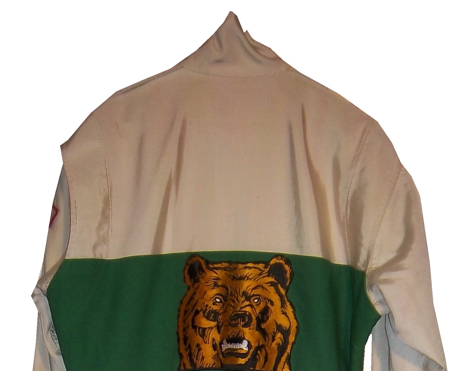
Tom Thumb in Downtown Evanston was a place that I and a number of my friends spent a great deal of our childhood. Some of us were skateboarders, some of us were RC car fanatics, some of us, like me were model builders and die cast collectors. It had been in the same place for 49 years, but they announced that they were going to move after a zoning decision was made to replace the current building with a two-story building for two restaurants. So, on July 12, after 49 years as an Evanston institution, it closed. I went there on the 12, and made, with a heavy heart, my last purchase.This was a sad day because I am a huge NASCAR fan, and for many years, Tom Thumb was the only store in Evanston that sold NASCAR stuff. It was also one of, if not the oldest skate shop in the midwest. I went there, looked around the store where I spend my childhood, took it all in, and bought my last purchase, this 1997 Darrell Waltrip 25th Anniversary set.I bought this for two reasons. The first is that I love this set, I remember many of these schemes from races I watched in 1997. They all look really good, and they bring back memories. The second reason, and I didn’t even think about this until I started doing some work for next week. During my research, I was grumbling about how many different paint schemes each car runs every week, and it dawned on me that this might be the first example of that in the Sprint Cup Series.
You never had this much variety in paint schemes before 1997. Each team ran one scheme for the majority of the season, maybe 2 or 3 different schemes and special schemes for the All-Star race, and possibly the Busch Clash. But Darrell Waltrip ran, in total, 7 different schemes, each based on a specific era in his career. Each had Western Auto Parts America as the primary sponsor, but were based for past sponsors. He started with Gatorade, which he ran for DiGard Motorsports, from 1975-1980. He won two Coca Cola 600’s(1978, 1979) a Winston 500(1977) the Southern 500(1978,1979)as well as 22 other races during that time.In 1981, he left DiGard for Junior Johnson Motorsports, and was sponsored by Mountain Dew, where he won 24 races including the 1982 Winston 500, the 1981 Busch Clash, and two of his three Sprint Cup ChampionshipsPepsi replaced Mountain Dew and created The Pepsi Challenger which he ran in 1983 for Junior Johnson. He won 6 races for PepsiAfter Pepsi left, Budweiser took over the sponsorship, and from 1984-1986, he won 13 races, the 1985 Winston Cup Championship, the Inagural All-Star Race in 1985, the 1985 Southern 500, and the Winston 500. I find love how they call it “Red” instead of Budweiser since this was marketed to kids at the time.In 1987, he made the move to Hendrick Motorsports, and picked up Tide as a sponsor. He won the 1989 Daytona 500, The 1988 and 1989 Coca Cola 600’s and 6 other races. I loved that it was identical to the scheme used by Ricky Ruddthat same season.From 1990-1997, he raced the #17 for Hendrick Motorsports in 1990, and then founded Darrell Waltrip Motorsports, which raced this scheme from 1990 to 1997. He won 5 races, but was never to get his former glory back. Western Auto left the team after 1997, and Darrell Waltrip Motorsports shut down shortly after the start of the 1998 season.The last scheme is one of the most innovative schemes in the history of NASCAR. His legendary Chrome scheme. Darrell loved chrome, using chrome numbers, and a chrome helmet. This was supposed to be used for just a single race, but it was raced a number of times that season. Nothing like this had ever been done in NASCAR before. There had been chrome numbers, but never a chrome car. This car was so far ahead of it’s time. Darrell even had a Chrome driver suit that he wore with this car!1997 would be the beginning of the end for Darrell Waltrip. He shut down his Winston Cup team in 1998, and joined Dale Earnhardt Inc. midway through the season. He would race for just two more seasons before fully retiring in 2000.
The idea of 7 different schemes seems like standard opperating procedure today, but back in 1997, this was revolutionary. This was unheard of. These schemes were all good, and they worked well, but this surprised some fans. 17 years later, this is the norm rather than the exception. If I did the paint scheme reveiws back in 1997, I would write one article at the beginning of the season, one before the all-star race, and maybe one midway through the season. There were no changes to paint scheme, or if there were, they were very rare.
Tom Thumb will reopen eventually. But whavever the new location, it will never have the same feel as the decades old building were it was once housed. I will miss it. I really will. But I find a bit of irony in that I bought the beginning of an era at the end of another era. I will visit Tom Thumb when they reopen, and I wish them the best of luck. From the residents of Evanston to Tom Thumb, we will miss you, and we wish you the best of luck in your new location!
We also have a paint scheme related news item to discuss. This last week, NASCAR announced that the Chase for the NASCAR Sprint Cup would have some new features on their cars. Specifically, all Chase contenders will have a yellow splitter cover, a yellow window stripe with black letters, yellow roof numbers, and a special Chase for the NASCAR Sprint Cup decal. I’ve been speculalting that this might come to be, and now I have proof. I am not going to discuss how I think it will look, until I have a good idea as to who is in the Chase, and how it will look on their cars. Here is an illustration of how it looks.
With that out of the way, we move on to…
PAINT SCHEME REVIEWS
Kasey Kahne #5 Great Clips/Shark Week Chevy SS Another case where it looks like two different designers created the car without speaking to each other. It looks awful. The color scheme is good, so it passes, though just bearly with a D-
Greg Biffle #16 3M Throwback Ford Fusions Greg Biffle is holding a contest to pick a throwback sheme for his race at Pocono in August. I would normally grade all four of these seperatley, however they all have the same traits, so I will grade them at once. All four have really good color schemes, and really nice logos, but they are all plagues with modern car numbers as well as modern designs. They simply look awful. I will vote for none of these schemes and give them all an F-
Morgan Shepherd #33 ThunderCoal Chevy SS I liked the other ThunderCoal scheme, but this is just awful. Too many neon colors, and it is needlessly overdesigned. I give it an F
Michael McDowell #95 JPO Absorbents Ford Fusion Another great Levine Family Racing scheme. It is hard to believe how bad they were last year. Great color and design scheme equals an A+ scheme.
The 2014 Sprint All Star race is behind us, and as usual, there were a myriad of different paint schemes. Some were good, others not so much, but I have to say there were a lot of great schemes in this year’s race. Let’s start with the Sprint Showdown. Unlike in previous years, The Showdown took place on Friday, and the All-Star Race was on Saturday. The Showdown was a great event, which saw Clint Bowyer winning, AJ Allmendinger finishing second, and in the upset of the year, Josh Wise winning the Sprint Fan vote, and advancing to the All Star Race. Let’s get to the grades:
#10 Cole Whitt #26 Speed Stick Gear Toyota Camry This is one of the few schemes that has both a classic and modern look at the same time, and paired with a great color scheme, it earns an A
#13 Austin Dillon #3 Dow Chevy SS While I like the color scheme and number and logo designs, the white stripe up the side kills the look. It takes an A scheme to a B+ scheme.
#14 Kyle Larson #42 Target Chevy SS The scheme looks decent, I like the red on the back, though I do not like the Target logos at the bottom. That takes a scheme that was an A grade to a B-
#16 Michael Annett #7 Pilot/Flying J Chevy SS Good color scheme, but the awful template is back for Tommy Baldwin. It is really sad, because this could be a great scheme, but the template takes it from an A to a C-
#19 JJ Yeley #44 Phoenix Warehouse Chevy SS My first thought when I saw this scheme was it looked like the color scheme from the 1994-1995 NBA All-Star Game jerseys which is a decent color scheme. But to say the car is overdesigned is an understatement. This scheme is awful. Not even a great color scheme can help this car pass. F
Now we move on to the All-Star Race, which saw Jamie McMurray pull an upset and take the win, thus guaranteeing him entry into the event for the next 10 years. Overall there were a lot of great schemes, though I wish more teams would run special schemes.
#5 David Ragan #34 Taco Bell Ford Fusion Overall design and color schemes are good, and the only complaint is that the Taco Bell logo should be in color as opposed to black and white. A+
#11 Jeff Gordon #24 Drive to End Hunger Chevy SS Great overall design, great color scheme, though the D on the hood reversed to miror the curves of the hood looks odd. Still it’s a good scheme and Ill give it an A
#12 Dale Earnhardt Jr. #88 National Guard Chevy SS The new metallic numbers work, and the overall design is decent, since it incorporates the design used on the numbers. I’ll give it an B+
#13 Denny Hamlin #11 FedEx Express Toyota Camry The front nose design and stripes are awful. The color schemes are great, as are the logos and numbers, but the stripes kill it. The best grade I can give is a C+
#15 Kasey Kahne #5 Time Warner Cable Chevy SS It is a good color scheme, but the design on the side needs a little tweaking. Get rid of the needless zig-zag pattern and it works a whole lot better. It is still a decent scheme, so I will give it a C
#17 Matt Kenseth #20 Home Depot/Huskey Toyota Camry I would give this scheme an A grade, but the yellow back bumper ruins it. The clash between the two just works awkward, and it takes an A scheme down to a C
#19 Ryan Newman #31 Cat/Quicken Loans Chevy SS What in the blue hell is going on here? I’ve liked Ryan’s schemes this year but this is an F scheme, even though I like the color scheme.
#22 Greg Biffle#16 3M Ford Fusion-The sides and roof have gotten worse from last year. I have to give it an F in that respect.
Also, check this video out concerning how different pit stops in open wheel racing were between 1950 and today:
The video shows how far we have come in pit stops, but we also have come a long way in driver uniforms.
By David G. Firestone
50 years ago this week, events over the course of 6 days in May of 1964 changed the culture, cars, and uniforms of auto racing forever. Three deaths in two races over those six days demonstrated that current safety methods were ineffective at best, and 3 talented drivers lost their lives. The 1964 World 600 and the 1964 Indianapolis 500 helped introduce reenforced fuel tanks and Nomex driver suits, among other things. 50 years later, those events are still being felt
The World 600 began in the early afternoon on May 24, 1964. For the first six laps, it was business as usual, but on lap 7, on the backstretch, Junior Johnson and Ned Jarrett wrecked, and Glenn “Fireball” Roberts swerved to avoid them, and wrecked. He was trapped in the car by the pedals, and his car caught fire. Ned Jarrett ran and pulled Roberts from the car, and paramedics took him to the hospital. 39 days after the wreck, while still in the hospital from his injuries, he died from pneumonia.
NASCAR had rules concerning “fire retardant” uniforms but these were inadequate at best. These uniforms were cotton coveralls traditionally used by workmen that had been dipped in a number of fire retardant materials including Borax. These were not only ineffective, but were extremely uncomfortable to wear. They were known for inflaming the skin, and aggravating asthma. Fireball was not wearing these coveralls during that race, because he had a doctor’s note stating he should not wear them. There is some debate over what the doctor’s note was for, either for asthma or skin hives. It llustrates why these uniforms were not popular, they were so uncomfortable to wear that drivers did not want to wear them.
6 days later, on May 30, the 48th Indianapolis 500 was held. Dave MacDonald started 14th, and Eddie Sachs started 17th when the green flag dropped. MacDonald was racing a car built by racing innovator Mickey Thompson, which by all accounts was badly built and difficult to drive. The first lap led into the second, which saw Dave MacDonald lose control of his car and smash into the inside wall. The fuel tank instantly ignited and the car went across the track, and collected a number of other cars, including Eddie Sachs car, which also exploded on impact. Sachs was killed by the impact, but MacDonald was seriously burned, and his lungs were scorched, the lung damage proved to be fatal.
Inspired by these events, the Nomex firesuit was introduced in 1967 as a replacement for the cotton coveralls dipped in chemicals. It was a lot more comfortable and safer than chemical-dipped cotton, so drivers were more willing to wear them. Like most new safety equipment in sports, it took a while to catch on. Nomex was created in 1967, for NASA. Its main use at the time was for the Apollo Command Module parachutes. NASA needed a material that could stand up to the heat of reentering the earth’s atmosphere, and still remain fully functional.
Bill Simpson is credited with introducing Nomex to driver suits. The story goes that Simpson started making Nomex suits after learning about the material from astronaut Pete Conrad while Simpson was working as a consultant for NASA. One of the pivital moments in the history of the suit was when Simpson had heard that a competitor had been badmouthing his products, and so, in something he said later was “the dumbest thing I have ever done,” challenged the competitor to a “burn off.” Simpson put on his suit and lit himself on fire. He later recreated this for a Mazda commercial.
Why did it take so long to make critical changes to driver uniforms? The events that took place in 1964 were tragic, and it clearly illustrated why the old system didn’t work. The only change made immediately after the events was the rule that fire retardant suits were now mandatory, regardless of how it made the driver feel. In today’s sports safety culture, there would be focus groups, meetings within the sanctioning body, and changes within a few months after the event. But by 1964 standards, just rigidly enforcing the rule was the best course of action. Remember that in 1964 race car drivers were seen as somewhat expendable. Driver deaths in racing were stunningly common back then. As such, while there was a need for improvement, it was not a priority for sanctioning bodies. The sad fact is that back then, driver deaths were part of the allure of racing. People would go to these events and hope to see a fatal crash, as crass as that sounds. As for the suits themselves, the only other options besides chemical dipped cotton was aluminized cotton or aluminized kevlar, which was not more comfortable, as it was like wearing aluminum foil.
So what did these pre-Nomex driver suits look like? They looked like this. This is a driver suit made by Hinchman in Indianapolis. It is basically a polyester suit that is customizedto thedriver’spreference. It is not all that different than a jumpsuit that one would wear to work. It is a very flimsy material, has no cuffson the arms or legs, and, most amazingly, the tag states that the suit is “Untreated, will burn, must be dipped.” This suit was worn circa 1972, which is indicated by the “Archie Bunker for President” patch sewn into the chest. Like any new safety technology in sports, it takes time for it to become the standard, and for Nomex, this is no exception.
This race, along with the 1955 24 Hours of Le Mans and the 2001 Daytona 500 have their legacies written in death, but unlike other similar events, the lessons they had to teach were learned, and the racing world as a whole is better for them. The deaths in these events were not in vain, and others are alive because of them. 50 years later, those 6 days in May 1964 are still having an impact on racing.
By David G. Firestone
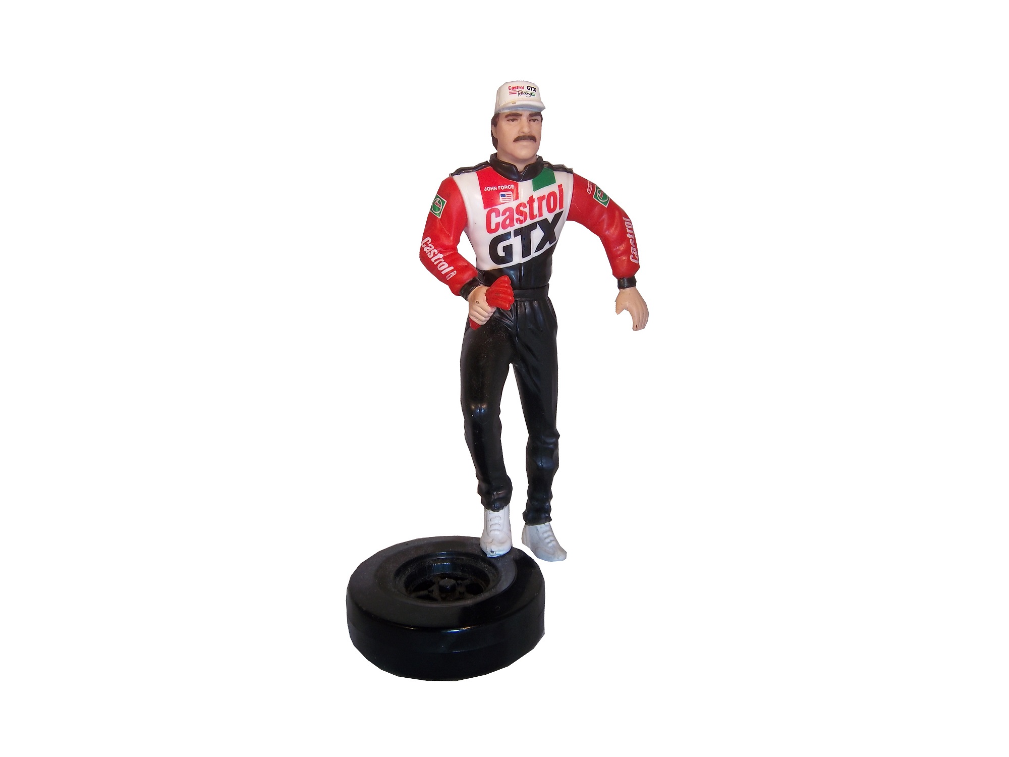
While I typically watched NASCAR growing up, I did also watch IndyCar. That was before “the split” which diluted the value the sport so much that to this day it is still suffering, 6 years after the unification of Champ Car and the Indy Racing League. I got tired of politics and wanted to watch racing, I didn’t care who was sanctioning it. I still watch IndyCar racing and I collect race-used stuff.
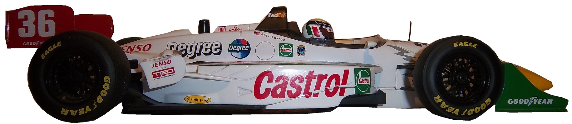
I mentioned this a few months ago, when I discussed video matching. My first open wheel driver suit is this Alex Barron suit from 1998.
Not only is this my first open wheel suit, it was also my first suit that featured an FIA safety certification on the back of the neck. Having dealt in NASCAR suits, I didn’t know what to make of it, and through some research, I eventually learned what it was and what it meant.The chest features a FedEx Championship Series patch, probably my favorite sanctioning body patch ever,
and logos for Toyota and Denso.This being my first Sparco driver suit, The cowl tags, and location of the warranty tags were out of place, as compared to a NASCAR driver suit.One thing I do find interesting is that there are no television logos on the sleeves and legs, but as the video at the end shows, that was not uncommon, but more on that later.
The collar has an unusual design. Most collar designs feature either logos on the side, or logos across the front, or sometimes both. This one is unique in that it features a DEGREE logo on the front, as well as a CASTROL logo on the right side, but nothing on the left side…I’ve never seen that before or since, and I can’t understand the need for that particular design…it just looks odd.Alex’s name is embroidered into the belt, and something I love about open wheel suits is that because it is an international sport, much more so than NASCAR, the driver usually has their home country flag embroidered next to their name on their suit, as this suit shows.I also have a 1/18 die cast of Barron’s very sharp looking car from 1998. It is the only die cast I have that has a driver in it. I love the fact that he is wearing a very accurate version of his driver suit.Now as I mentioned, this was the suit Barron wore during his most infamous moment, his crash at Road America, where he wound up on top of Bryan Herta. Someone recently uploaded the whole race to YouTube, and when watching it, notice that nobody has logos for the in-car camera. I find that rather interesting, since it would be very easy to place logos on the sleeves, and it was commonplace in other forms of racing. But it is an interesting race.
Now we have another piece of news to discuss. In the realm of NCAA sports, the two major factions in uniforms are Nike and Under Armour. Nike has a deal with Denny Hamlin for driver suits, and I was wondering when Under Armour would jump on the band wagon, and this week, we got our answer. Under Armour, who has signed deals with Michael Waltrip Racing and Henrdick Motorsports to outfit teams with apparel. This deal does not include the drivers themselves but the car numbers are fair play. I find it a bit unusual that the deal provides apparel for all members of the team, pit crew members, front office personel, and everyone EXCEPT the faces of the franchises. Now that might change in the near future, but for now that is how the deal works. You can read more about the deal here.
Greg Biffle #16 Give Kids A Smile Ford Fusion Man! Greg Biffle really wants the Paint Schemie Awards for Most Degraded Paint Schemes, and Worst Paint Scheme Set with another F scheme. Horrible design, and an ugly paint scheme.
Ricky Stenhouse Jr. #17 Ford EcoBoot Ford Fusion I like the color scheme, I like the overall scheme, and my only complaint is that the orange numbers on the roof should be on the door. Still it is an A scheme
Parker Kligerman #30 Swan Energy Toyota Camry Just when I thought Swan had learned the error of their ways, and were improving their paint schemes, along comes this one. Now we are back to square one, and this scheme earns a D+
Travis Kvapil #32 Keen Parts Ford Fusion Decent design, good color scheme, but the logo on the hood is very difficult to see. That is a major issue. When a sponsor pays for a car, the hood design should be easy to see, but this isn’t easy, and I give it a C-
Aric Almirola #43 Ekrich Ford Fusion The red on the roof is pointless, and it takes away from a great scheme. If the roof were Petty Blue, and the red was just a stripe on the bottom, I would give this scheme an A+ but with the red roof, it goes down to a B-
I have been neglecting the Paint Scheme grades for the last few weeks, so after this brief post, we will focus on those this week. I want to clarify a term that I use regularly. I use the word “overdesigned” and what it basically means is that the paint scheme has design for design sake. The scheme has design that serves no real purpose, and was just added needlessly. Most things we own are, to a certain extent, over designed, mainly to prevent damage from regular use. But when a car uses needless design in a paint scheme, more often than not, it looks awful.
The other news items I wanted to get to are from Formula 1. I’m not an F1 fan per se, but I felt that these deserved some time on the DSB. First there was a major shift in how cars are numbered in F1. It used to be that were ever the driver finished in the previous season is what his car number was. Now the change has been made and instead it is that the drivers pick a number and then use that for their entire careers. Sky Sports covered the driver’s number choices in full, and I’m now a Daniel Ricardo fan! The 2014 F1 helmet designs have been released and the designs speak for themselves. This last item is about the man who is in charge of painting Lewis Hamilton’s Silver Arrow for the German-based Mercedes GP Petronas Formula One Team, my favorite team appearance wise in F1. Now we move on to…
Paint Scheme Reviews
Austin Dillon #3 American Ethanol Chevy SS For many years, green was considered an unlucky color in auto racing. That said, this is a decent scheme. The green used is very good, and the overall design is good. The green around the vent on the side is needless, but this scheme still works. A-
Austin Dillon #3 Bad Boy Buggies/Realtree Chevy SS I’m seriously considering giving any camo paint scheme an automatic F because not one that I have seen in the last 5 years looks good at all. This scheme is just awful. The white/camo scheme is hideous and I’m embarrassed to have to grade it. F
Jeff Gordon #24 Texas A&M Engineering Chevy SS Decent color scheme, but the side design is odd. It has a little too much design. The crooked Texas A&M logo looks odd here too. Still it is a decent design and earns a C+
Paul Menard #27 Menards/Quaker State Chevy SS Quaker State has a great shade of green, and it should be the dominant color of the car. The yellow base with green accents looks awkward. I’ll give it a C
Travis Kvapil #32 Ask More Get More Ford Fusion Two different schemes in two weeks is unusual and for whatever reason, the new car was a bit over designed. It still has a decent look and earns a B+
David Ragan #34 Taco Bell Ford Fusion Overall design and color schemes are good, and the only complaint is that the Taco Bell logo should be in color as opposed to black and white. A+
JJ Yeley #44 Phoenix Warehouse Chevy SS My first thought when I saw this scheme was it looked like the color scheme from the 1994-1995 NBA All-Star Game jerseys which is a decent color scheme. But to say the car is overdesigned is an understatement. This scheme is awful. Not even a great color scheme can help this car pass. F
Jeff Burton #66 Toyota Toyota Camry The stripe down the side is much too big, and the hood design looks odd. The color scheme is good, but the overall design is a D+
Dale Earnhardt Jr. #88 Mountain Dew Kickstart Chevy SS The black and green color scheme is good, and the side is a bit overdeisgned. If the green stripes were scaled back, it would work better. It is work a B- grade.
The 36th Sprint Unlimited starts tonight at 8:15 ET on Fox. This marks the beginning of the Daytona 500 and the beginning of the NASCAR season. I will be looking forward to it, and I will enjoy it as always.
The event will feature a number of segments which were voted on by NASCAR fans including myself, and many of you. The first segment will feature laps followed by a second segment of laps, and then a third segment of laps. Many special paint schemes will be run for this race, as is traditional. My personal favorite is the Miller Lite Throwback scheme being run by Brad Keselowski.
Now some factoids about the race.
*There are, in total, Chevy drivers, Ford drivers and Toyota drivers.
*Chevy has 20 wins, Ford has 7 wins, and Toyota has 1 win.
*Mark Martin has competed in 20 consecutive events from 1989-2008.
*Dale Earnhardt Sr. has won 6 events, more than anyone else in 1980, 1986, 1988, 1991, 1993, and 1995 and went on to win the Sprint Cup Championship 4 times in 1980, 1986, 1991, and 1993, he is one of 7 drives to do so.
*From 1979-2011 the event was sponsored by Anheuser-Busch, first called the Busch Clash which was the brainchild of Monty Roberts, brand manager of Busch Beer, who sponsored the Pole Award. It remained the Busch Clash until 1998, when Budweiser took over the Pole Award, and it was renamed the Budweiser Shootout. In 2012, Sprint, the series sponsor took over the sponsorship after Budweiser announced they would drop the sponsorship in favor of sponsoring the Duel Races that determine the starting order of the Daytona 500.
*Petty Enterprises was not eligible to run the Shootout because of a rule stating that only drivers that ran the Busch/Budweiser pole award decal were eligible to enter the shootout. Richard Petty and his family did not support alcohol sponsorship or decals on race cars. So John Andretti, Bobby Hamilton, Jeff Green, and Aric Almirola who all had a number of poles with Petty Enterprises were not eligible to participate. I find it interesting that Petty has reversed course on the alcohol sponsorship rule, since Kasey Kahne was sponsored by Budweiser, and Marcos Ambrose will run at least one race sponsored by Twisted Tea.
*Buddy Baker won the inaugural Sprint Unlimited in 1979, which was a 20 lap sprint.
*Since many top drivers were excluded from the race due to not winning a pole award, they moved to the TV booth as color commentators. These included Dale Earnhardt Sr. in 1981, Richard Petty and AJ Foyt in 1982 and 1983, Neil Bonnett in 1993, Darrell Waltrip in 1994, 1995, 1997, and 1999, and Kenny Wallace in 1998.
*There has never been a driver who has won the Sprint Unlimited, Budweiser Duel and Daytona 500 in the same year. Drivers have won 2 of 3 in a season, but never scored the hat trick.
*One of the first instances of a special paint scheme being used specifically for the Sprint Unlimited was the Chroma Premier scheme run by Jeff Gordon in 1997. He followed it up the next year with the legendary Chroma-lusion scheme, which feature a paint that changed color. Since then, special schemes have become commonplace.
*Richard Childress Racing has 8 Sprint Unlimited wins, most of any team. Hendrick Motorsports has 6 wins, and Joe Gibbs Racing has 5 wins.
The Unlimited starts tonight at 8 PM ET on Fox Sports 1, and I look forward to watching the event as I hope the rest of you do too.
Though I have had a VERY busy week, I still have time for…
Paint Scheme Reviews!
Kasey Kahne #5 Time Warner Cable Chevy SS It is a good color scheme, but the design on the side needs a little tweaking. Get rid of the needless zig-zag pattern and it works a whole lot better. It is still a decent scheme, so I will give it a C
Michael Annett #7 Pilot/Flying J Chevy SS Good color scheme, but the awful template is back for Tommy Baldwin. It is really sad, because this could be a great scheme, but the template takes it from an A to a C-
Kyle Busch #18 M&M’s Peanut Toyota Camry I like this, it has a great shade of yellow, hard to find in NASCAR these days, and the peanut motif works very well. It is an original design, and I’ll give it an A
Joey Logano #22 Autotrader.com Ford Fusion Sometimes orange works, sometimes it doesn’t. This is an example of an orange scheme that just doesn’t work. If the white was taken out completely it might work, but this is just horrid, and I give it an F
Cole Whitt #26 Speed Stick Gear Toyota Camry This is one of the few schemes that has both a classic and modern look at the same time, and paired with a great color scheme, it earns an A
David Ragan #34 CSX Ford Fusion What in the hell is going on here? Why is the hood decal upside down? Why in the world would they do that? Were they drunk when they decaled the car? The only thing that I can guess is that it is designed for an in-car camera…but that makes no sense either! F-
Dale Earnhardt Jr. #88 Kelley Blue Book Chevy SS During my Daytona Preseason Thunder article, I said I wanted to see the #88 they used on a real car. I got my wish, and I like this design overall. The metallic gold is a bold choice, it doesn’t always work well. I give it an A+
BUT WAIT, THERE’S MORE!
As many of you know, I don’t just research and collect driver suits and racing items, I collect and research many other things. I recently had a column run in Uni-Watch concerning some lettering from the 1958 Washington Senators, and you can read my column here.
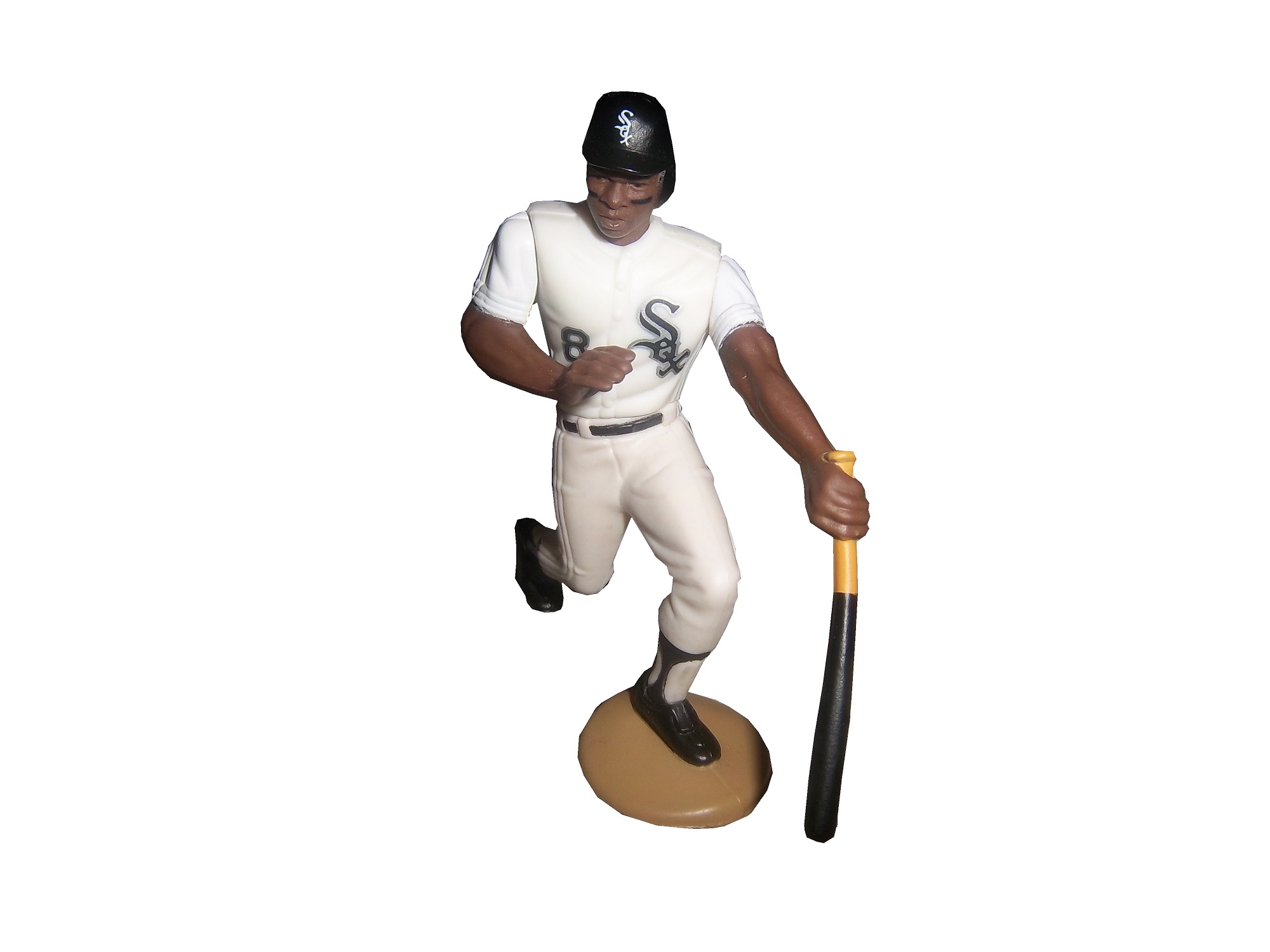
In my last column, I mentioned that Starting Lineup and Winner’s Circle figures made in the 1980’s and 1990’s censored alcohol and tobacco logos. But when it comes to these figures, how do the uniforms the figures portray stack up to their real-life counterparts?
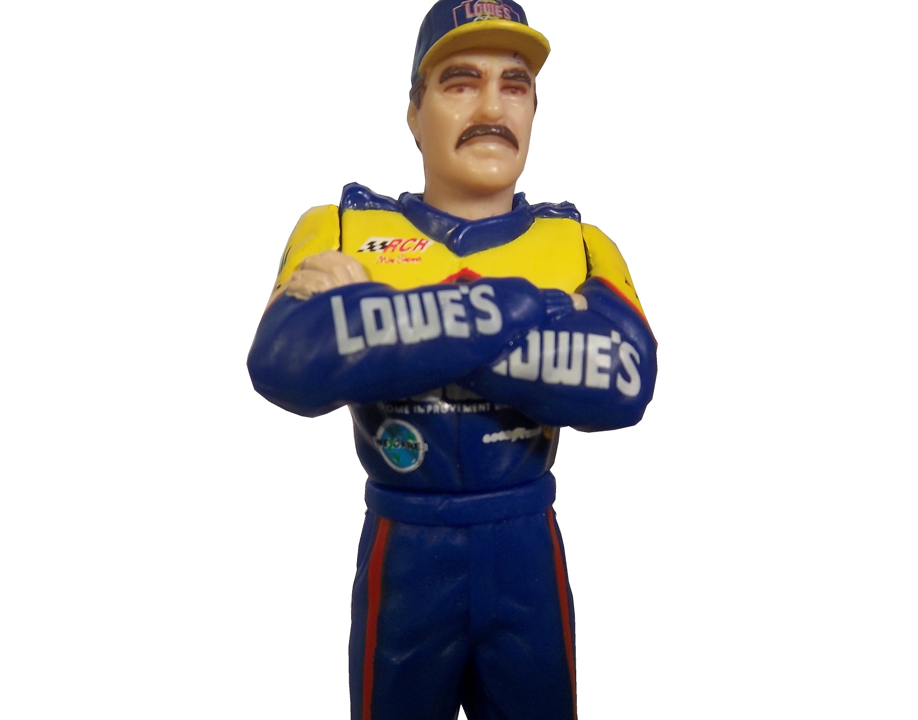
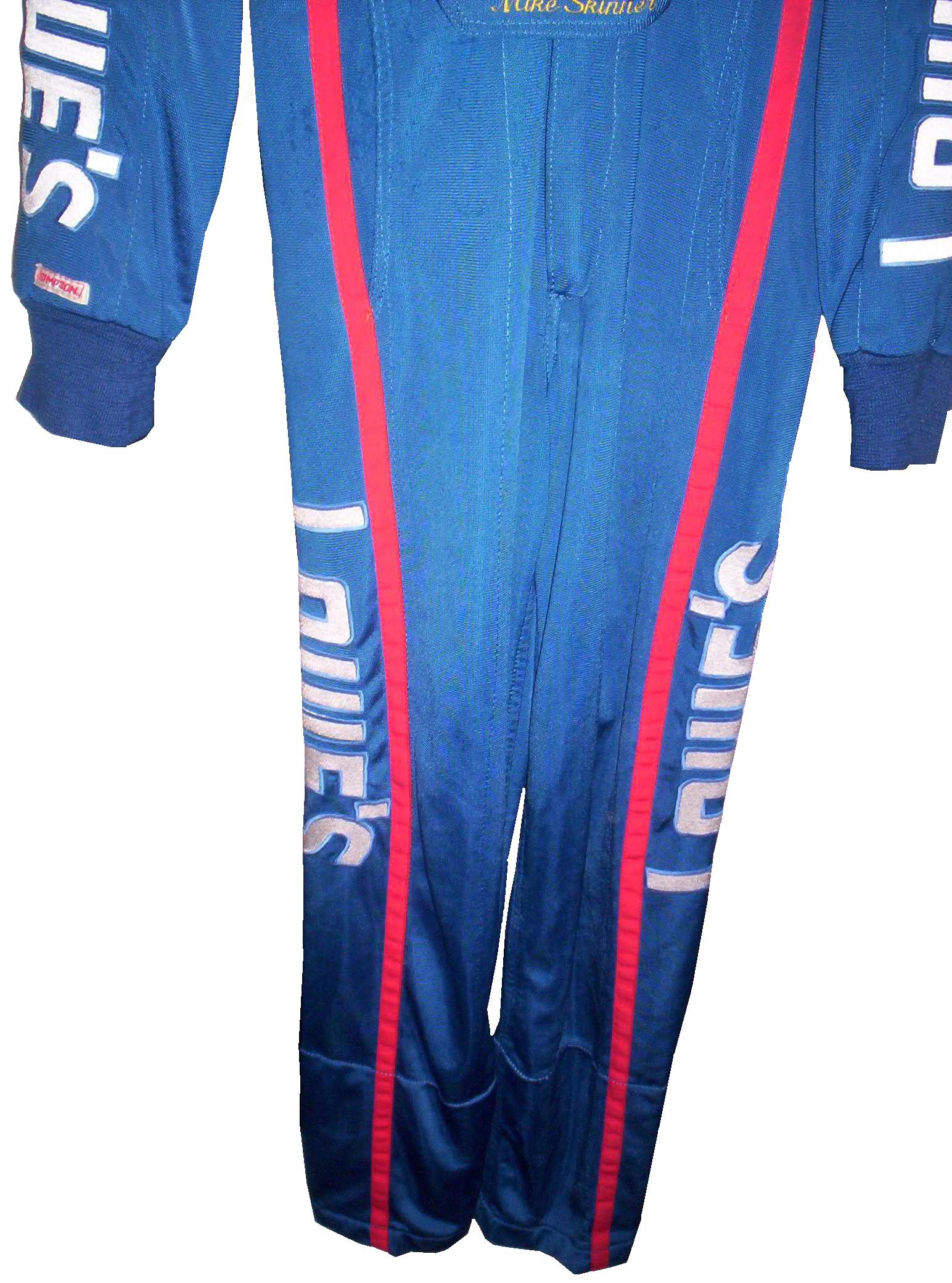
First, lets discuss the figures themselves. Created by Kenner starting in 1988, Starting Lineup was a line of action figures based on baseball starts. As time went on, the line expanded from just baseball to football, basketball, hockey, and racing. The figures are 4 inches tall. For racing, Starting Lineup figures were packaged under the Winner’s Circle brand. The drivers features were championship-level or rookie of the year drivers. One of those was Mike Skinner released in 1998, which is in perfect condition, though has been removed from the package.
The driver suit it is based on is Mike Skinner’s 1997 race-used driver suit from his rookie of the year campaign. It was purchased from the Jeff Hamilton collection, and came with a letter stating as such. It shows nice use, and Jeff has signed the right chest. It also features something I have seen on a few other suits from that era, but from nowhere else, the Future Suit inscription. I have been waiting a while to discuss this. Custom suits from 1997 have something written on the back of the neck. On the Skinner suit it reads “Future-Suit-2-2252.
This Stevie Reeves suit from 1997 has a similar inscription
This Lake Speed suit from 1997 was purchased off the rack, and does not bear the inscription,
Interestingly, suits from 1996 and before,
and suits from 1998 and after,
do not have this inscription. From what I have been able to gather, this was an inventory number for customized suits. But I do not understand why it seems to only be used on suits from 1997. Ok, getting off track here, getting back to Finish Line figures….
Taking a look at this figure as compared to the real-life driver suit this figure is based on, it is very accurate. The bottom torso logos, and television logos on the sleeves are identical. The chest is missing the Chevy and Winston Cup logos, and has the name, whereas on the real suit the name is on the belt. They still did a very good job though.
The logos on the upper right sleeves are identical on both the figure and the real suit.
The scale and position of the LOWES logo on the back of the figure as compared to the back of the real suit is identical as well.
The position, location, and size of the television logos on the legs are perfect as well. They really did a great job with this figure.
The detail in this figure is amazing, because Finish Line’s Starting Lineup counterparts lacked some details. Baseball figures from the same set in the same year, such as this Albert Belle figure often lacked pinstripes.
Other examples include recycling of bodies. Every Finish Line figure is basically 4 different body parts, head, upper body, legs, and arms. These were taken, painted appropriately and then attached to each other. That is why all the figures look alike, but with minor differences.
I can vividly remember buying these as a kid. When I got my first, a Dan Pasqua 1989 White Sox figure for my birthday, I was excited. Now, 23 years later, I have the ability to take a toy from my childhood, and compare it side by side to the uniform it is based on. I can honestly say I never thought it would happen, but I am thrilled to take the opportunity.
Tailgating Time!
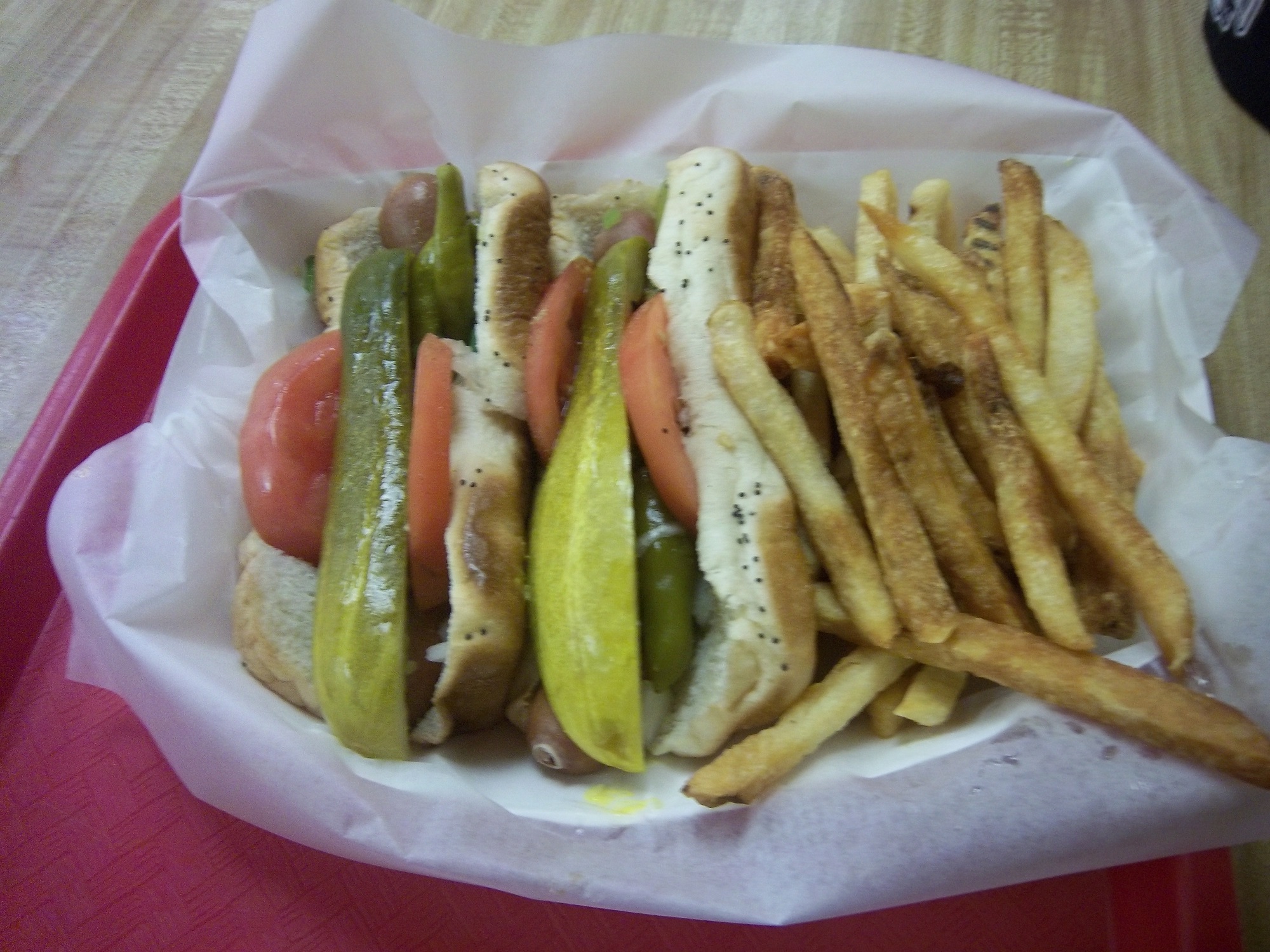
Chicago-Style Hot Dogs
In honor of the Chase for the NASCAR Sprint Cup Championship starting at Chicago, I will do a couple of Tailgating Time recipes featuring Chicago food products. The first is Chicago-style Hot Dogs. This classic has been enjoyed in Chicago since the Great Depression. It has been enjoyed by those in the Chicago-land area for some time.
You Will Need:
2 packages Vienna Beef hot dogs
2 packages S. Rosen’s Mary Ann Buns-Both come in packages of 8
1 Chopped white onion
1 Sliced Tomato
1 Jar Yellow Mustard
1 Jar Sweet pickle relish with mint,
2 Jars of pickled sport peppers
Celery salt
Chicago-Style dogs are traditionally boiled or steamed. If it is grilled, it is referred to as a “char-dog.” Once the hot dogs are done cooking, place the hot dogs in the bun, and then put the condiments in this order: mustard, relish, onion, tomato, sport peppers, pickle spear, celery salt. Ketchup on these dogs is UNACCEPTABLE! The final product will look like this:
Classic Maxwell Street Polish Sausages
Anyone from Chicago will recognize this dish, and those from all over the country will enjoy this dish as well. This recipe needs both a hot plate as well as a grill. For a group of 6 people, you will need:
12 kielbasa links
12 sausage buns
1 large jar yellow mustard
6 large sweet onions
1 jar Olive Oil
First, on the pan, saute the sweet onions in a bit of olive oil on low for an hour and a half with a touch of thyme and salt. This might seem like a while, but the results are worth it.
While the onions are cooking, fire up the grill, wait until it is hot, and cook the kielbasa links until they show some char on the outside.
A few minutes before the kielbasa and onions are done cooking, pour the mustard into a bowl, this will help in the serving process.
Take the buns and smear the insides of the bun with mustard using a rubber spatula. Take the sausage and place one piece in each bun, and cover the top of the sausage with the now caramelized onions. The final product will look like this:
Paint Scheme Reviews!
Marcos Ambrose #9 DeWALT/ACE/CMN Ford Fusion Good overall design however my main issue with the scheme is the very small writing on the side of the car. Designing a car with lettering too small to show up on the track that can be seen on the track or on television makes no sense at all. That said, this is still a good scheme, and I will give it a B
Greg Biffle #16 3M/Scotchguard Ford Fusion Everything I just said about the Marcos Ambrose scheme above applies here, as the Scotchguard logo is much too small. But the scheme is good and I will give it a B
Kyle Busch #18 M&M’s American Heritage Toyota Camry Kyle has great schemes, and this is no exception. The American Heritage chocolate line features chocolate made as it was back in 1750. The scheme has some light changes, including the American Heritage logo, and a stereotypical colonial hat on the quarter panel. It works very well, and it earns an A
Paul Menard #27 Menards/Quaker State Chevy SS Green and gold is always a great scheme, but the spike design just does not work at all. I can give it a C at best, but the spikes are just awful.
Ken Schrader #32 Safe Skies Locks Ford Fusion It is a very basic paint scheme however basic can be very good, as this scheme shows. Looks very smooth and very good, and has a great color scheme. It earns an A
David Ragan #34 Farm Rich Ford Fusion Mediocre color scheme, but what they did is that they took that color scheme and designed the car to look like the rolling hills of a farm, with the Farm Rich logo acting as the sun, which works very well, and I have to give this scheme an A
Josh Wise #35 The Pete Store Ford Fusion The template this team uses works well when they have a logo with the matching colors. This example works very well, and earns an A
Last week was the All-Star Showdown and the All-Star Race. These two events are magnets for special paint schemes. The top two finishers from the Showdown move to the All-Star Race. I have graded both events, starting with the Showdown. It is ranked from best to worst.
3 David Gilliland #38 Long John Silvers Ford Fusion Good color scheme, and the basic design used with that scheme on this car just makes it stand out. I’m not a fan of yellow on race cars in most cases, but I’ll overlook it this time because it is just so good. A+
4 Jeff Burton #31 Cat Chevy SS The scheme is solid, has good colors, great number designs and a good pattern used. Final Grade: A
6 Aric Almirola #43 Smithfield Ford Fusion Lose the design on the doors and it would be perfect. Other than that this scheme is perfect and earns a solid A
8 Terry Labonte #32 Oxy Water Ford Fusion I don’t know why, but I like this scheme. Normally I wouldn’t like the color scheme and basic design but for whatever reason, I like this. A-
9 Juan Pablo Montoya #42 Target Chevy SS Great color, great number design, and the pattern used is a lot more subtle than last year’s scheme. The quarter-panels have too many associate sponsors and looks too cluttered, keeping the Final Grade at a B.
10 Bobby Labonte #47 House Autry House Foods Toyota Camry The design is simple, but good. The color scheme need some work. The red used is too bright, as is the blue. The logo group on the quarter-panel is awful. B-. If the color wasn’t so bright, I could grade it higher.
15 Dave Blaney #7 Sany Chevy SS Great color scheme ruined by bad door design and generic racing number design. The design is just disgusting to look at, and it gets a D-
16 Casey Mears #13 Geico Ford Fusion Eww…just eww. The color scheme is dreadful, and the designs on the side are painful to look at. It passed because of the logo and number design. Final Grade: D-
17 David Stremme #30 Lean 1 Toyota Camry The best way I can describe this scheme is that there is nothing good about it. Anything they could have messed up with this scheme, they did. It gets an F
Now on to the All-Star Race. Jamie McMurray, and Ricky Stenhouse Jr. transferred in from their performances in the Showdown, and Danica Patrick was voted in. As such, their grades will be mentioned here.
2 David Ragan #34 CSX Play It Safe Ford Fusion This is a very solid scheme, with great colors, great design and an overall great look. CSX did this scheme very well and it gets an A+
3 Kyle Bush #18 Snickers Bites Toyota Camry A paint scheme that has a great color scheme, and illustrates the theory that less is more. Nothing bad about this Scheme-A+
14 Denny Hamlin #11 FedEx Express Toyota Camry The front nose design and stripes are awful. The color scheme is great, but the stripes kill it. The best grade I can give is a C+
15 Greg Biffle #16 3M Filtrete Ford Fusion-Could you please pick a color scheme and stick with it? Two different color schemes on the same car is just awful. But they are two good color schemes. C-
18 Matt Kenseth #20 Husky Toyota Camry Not much really to say, mediocre color scheme, no real design to comment on, the logos are plain Jane enough, it’s a bland scheme that earns a C grade. A mediocre grade for a mediocre scheme.
The Awful
19 Marcos Ambrose #9 Stanley/DeWalt Ford Fusion Is it normal to get seasick while looking at a paint scheme? The Petty Blue just does not work here, and the oval around the letters is pointless. The car looks awful even though it has a great color scheme and great sponsor logos. D
20 Kurt Busch #78 Furniture Row Military Appreciation Night Chevy SS I love the matte black that Furniture Row usually uses, so this is kind of disappointing. That said, the color are good, but the hood design needs work. The MILITARY APPRECIATION banner is much to small and it is hard to see at speed. A good scheme that has been ruined and earns a D-
Before I leave, I have two more pieces of business. First off, I would also like to extend congratulations to Tim Flock, Jack Ingram, Dale Jarrett, Maurice Petty, and Glen “Fireball” Roberts for being elected to the 2014 class of the NASCAR Hall of Fame.
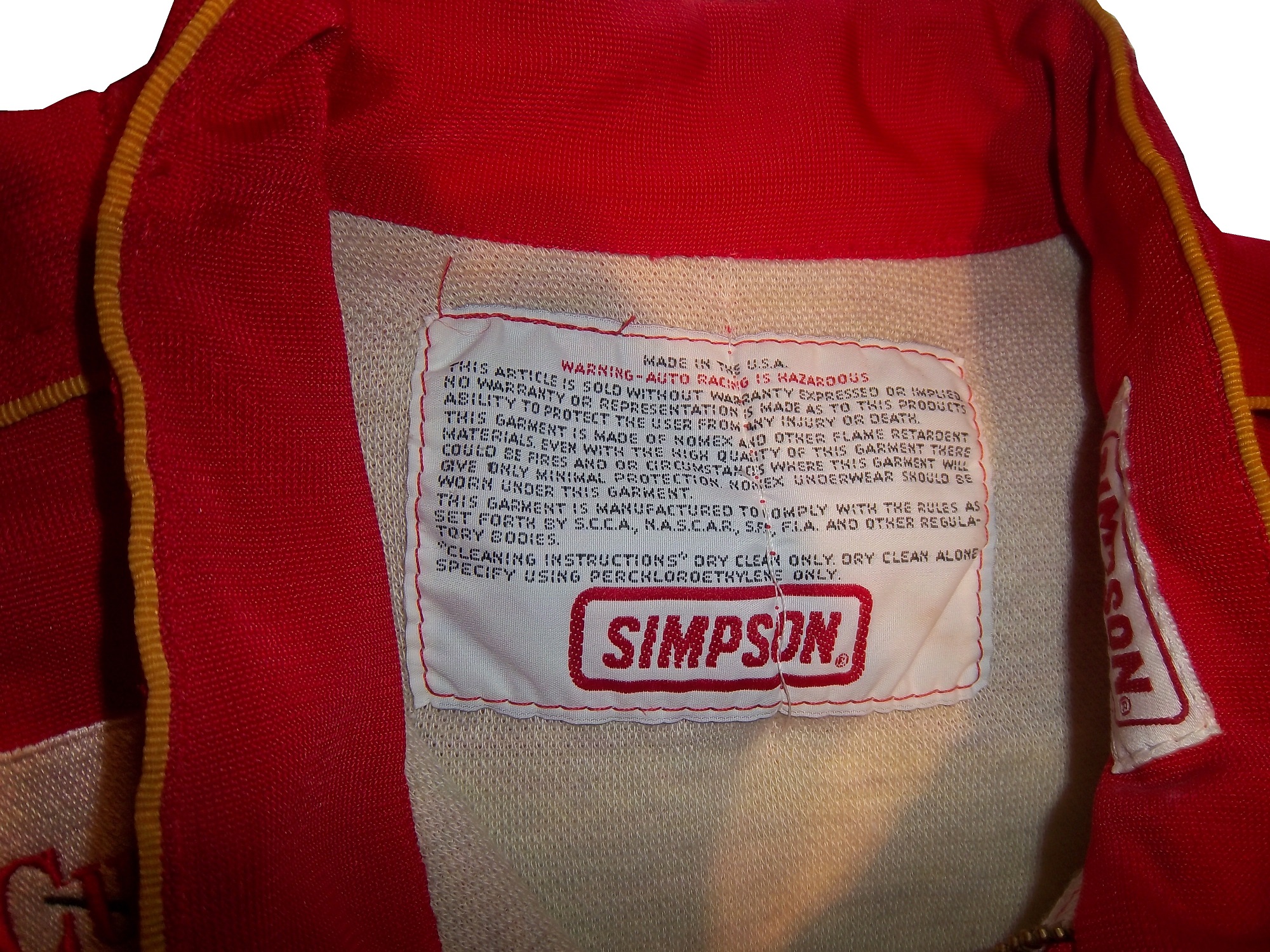
This week, we take a look at a suit feature that is unseen by most race fans. Every suit has one, the so called “Liability Tag. ”-Every piece of racing equipment has some form of “liability tag” which basically states that anything that happens to the wearer of the item is the wearer’s fault and not the company’s fault. The Simpson tag, which has remained virtually unchanged since the 1980’s reads as follows:
“Warning-Auto Racing is Hazardous-this Article is sold without warranty expressed or implied. No warranty or representation is made as to this product’s ability to protect the user from any injury or death. This garment is made of Nomex and other flame retardant materials. Even with the high quality of this garment there could be fires or circumstances where this garment will give only minimal protection. Nomex underwear should be worn under this garment. This garment is manufactured to comply with the rules as set forth by S.C.C.A., N.A.S.C.A.R. , S.F.I., F.I.A., and other regulatory bodies.”Cleaning Instructions” Dry clean only. Dry clean alone. Specify using perchloroethylene only.”
Sparco’s tags are located behind the zipper andhave two different statements. Older suits have this tag:
“Although this product is manufactured from special materials that satisfy certain safety standards and may carry the approval of various authorities for its use in specific circumstances the manufacturer or supplier can not be held liable for its protective qualities under all activities, circumstances, and conditions.”
Newer Sparco tags have this warning in both English and Italian:
“It is important to carefully read the user’s handbook concerning the care of the garment. This suit will offer protection from fire and the transmission of heat for a limited time, but it does not offer total protection against any kind of hear or fire. The fabric used to make this suit is subject to aging. It is recommended that the suit is inspected frequently for any signs of wear or damage that may result in a loss of protection to the wearer. If the suit has been worn extensively and shows signs of war or damage it is recommended to wear another suit. Sparco is not responsible for any damages the suit incurs from improper use of the suit bu the user, or any third party. Through improper care of the suit, misuse of the suit, or discoloration of the suit from perspiration, or any use of the product after the expiration date, as described in the instruction manual. Do not leave this garment under sunlight, or any artificial light. This suit is not intended for use in go-karts.”
Impact! Suits use this simple warning:
“Motorsports are dangerous. the user of this product assumes the risk of injury or death. No warranty or representation is made that this product will protect the user from injury or death”
This is by no means unique. Almost all sports equipment to a certain extent has this type of warning. This example is from an XFL helmet.
On to Paint Schemes…from here on out, I will only review Sprint Cup paint schemes.
Kevin Harvick #29 Jimmy Johns Chevy SS Great color and design, but I still don’t understand why Jimmy Johns sponsors Harvick instead of Jimmie Johnson…still a solid A scheme
Josh Wise #35 Blockbuster Ford Fusion Didn’t Blockbuster go bankrupt? Apparently they have enough money for a one race deal…though the color scheme of the logos, and the car are different…C-
Why did the roof logos come to NASCAR? I stated during Winter Testing that I thought that the logos would show up on roof cameras…but they can’t. The logos on the roof are all but invisible to the in-cars, and are next to impossible to see at speed on the regular cameras circling the track. The whole point of sponsorship is for the logos to be seen, but the roof logos defy that, so really, they are useless
Fox debuted several new cameras, including a revamped zipline camera called the CAMCAT that flies over the track, and a gyroscopic camera that stays level even when the car is on a banking. The new zip line camera is really good, and the gyroscopic camera gives the fan a really good idea of how banked the track really is.
The new cars in general look really good, and I was wrong about the names on the windshields. They do look good, and they are easy to see with the in-cars. I don’t approve of the manufacturer logos on windshield on either side of the name though. In addition to the larger roof flaps, the cowl flaps are visibly bigger, and have been moved to the hood.
The orange Home Depot back bumper on the Dollar General Toyota driven by Matt Kenseth looks really weird. As does the door design on the Target Chevy.
Man! Kevin Harvick’s car looks really good, as does Dale Jr’s! Martin Truex in the Napa Toyota is the most improved paint scheme of the whole field.
The cars seem to be sparking more than they did last year. They also look “cleaner” than they did last year. They have cleaner lines and cleaner windshields.
Speaking of windshields and windows the side windows need to be attached better. During the wreck, one car lost a side window, and Carl Edwards lost a side window in the final laps of the race. NASCAR needs to look into that.
The fan picks format worked really well, and I hope this shows up again during the All-Star Race
Now on to photo matching.
One of the best ways to authenticate a driver suit as having been worn by the driver is to find a photo of the driver wearing the suit. In many instances, this is not possible. In other instances the driver wears several different suits throughout the season, and finding the exact suit can be difficult. Let’s take a look at a Ricky Craven suit from 1996.
Upon closer inspection, this suit in the photo and the suit in my collection are not the same.
The location of the yellow RACING embroidery is in a different location, the leg stripes in the photo are white whereas the suit I own has green leg stripes…but modifications are not uncommon, and the name and GOODYEAR logos are in different places as well.
This card is from 1996, and shows Craven clearly wearing the suit in my collection.
The RACING, GOODYEAR, and name are all in the correct place. The only difference is that the ALARM SOUTH and MANHEIM AUCTIONS logos are not seen in the card, but on the suit they were clearly added later. They are patches on the suit whereas everything else is embroidered on the suit.
Jeb Burton #4 Arrowhead Chevy Silverado Color scheme is great, but the door design is a little overdone. The Arrowhead sponsorship could be used better with an arrowhead design on the door. Still it is a decent design that earns a B-
Justin Lofton #6 MADVAPES Chevy Silverado The early 1990’s called, they want their design back. All joking aside, this is actually a good scheme. The color scheme is great, and the design, while loud, is attractive. Final Grade A
Ron Horniday #9 Smokey Mountain Herbal Snuff Chevy Silverado First off, I thought snuff was banned as a sponsor from NASCAR…oh well…anyway, the design is good, and the color scheme is good, thought the gold could be a little bolder. Final Grade A-
Kyle Busch #51 Toyota Care Toyota Tundra. Normally I would give this a bad grade, but give the fact that it is Kyle’s truck, the design and color schemes just scream Kyle Busch, so it is rather appropriate. I also love the Days of Thunder numbers and ROWDY above the door…A-
Dakoda Armstrong #60 Winfield Chevy Silverado This I will not forgive for one simple reason…THE SPONSOR LETTING IS NEXT TO INVISIBLE ON THE WHITE BACKGROUND! The point of sponsorship is to make your logo and lettering as visible as possible! As such, this scheme gets an F
David Starr #81 BYF/Chasco Toyota Tundra Good color scheme and simple yet attractive design work well here. I like the Lone Star logo on David Starr’s truck as well…A+
Moving on to Nationwide Schemes
Brad Sweet #5/Dale Earnhardt Jr. #88 Great Clips Chevy Camaro This looks like a paint scheme that was thrown together at the last minute by an art student. The color scheme is odd, and the design is just weird. What does this has to do with a barber shop? Final Grade D+
Kasey Kahne #5 Great Clips Chevy SS Huh? What does this design have to do with a barber shop? This design looks like the team didn’t have enough of one single color and went with a patchwork design to make it work…but it doesn’t work, and it gets a D+ grade
Dave Blaney #7 Sany Chevy SS Great color scheme ruined by bad door design and generic racing number design. The design is just disgusting to look at, and it gets a D- The paint scheme saved it.
Michael Waltrip #26 Sandy Hook Support Fund Toyota Camry Are you serious? I think it is really disgusting that a support fund for a school shooting is sponsoring a car for the Daytona 500! I don’t know who thought this was a good idea, but it is just awful. I’m so sickened by the sponsor, I will just give the scheme an F-
Terry Labonte #32 C&J Energy Services Ford Fusion Is Terry trying to pull a Grey Ghost? If it wasn’t for the yellow decals, I would be convinced that this photo is in black and white. If the flames were red, or yellow, or even blue I could give it a higher grade, but I can’t give this scheme anything but a D
Regan Smith #51 Guy Roofing Chevy SS Decent color scheme, the number change is not good from last year, and the basic design is decent, so I give it a C
Brian Keselowski #52 Wreaths Across America Toyota Camry Not bad, not bad at all. Great color scheme and decent design. The hood design needs a little work, the left side looks odd with a white box, while the right side has no box at all, but that is a minor complaint for an A grade


