From here on out, I will publish a complete list of 2015 paint schemes that have been announced, on Wednesdays. I will grade them as normal on Saturdays. Again these should be taken with a grain of salt as they can and often are changed between now and the next season. So without further ado, the first 2015 trackers!
We all have at least one place that we always remember fondly from our childhood. It could be a restaurant, a park, the home of a close friend, or family member, or a park. We all have at least one, probably many. It is always sad when one of these places goes away. Well this happened to me this last week, when an Evanston institution began the process of moving.
Tom Thumb in Downtown Evanston was a place that I and a number of my friends spent a great deal of our childhood. Some of us were skateboarders, some of us were RC car fanatics, some of us, like me were model builders and die cast collectors. It had been in the same place for 49 years, but they announced that they were going to move after a zoning decision was made to replace the current building with a two-story building for two restaurants. So, on July 12, after 49 years as an Evanston institution, it closed. I went there on the 12, and made, with a heavy heart, my last purchase.This was a sad day because I am a huge NASCAR fan, and for many years, Tom Thumb was the only store in Evanston that sold NASCAR stuff. It was also one of, if not the oldest skate shop in the midwest. I went there, looked around the store where I spend my childhood, took it all in, and bought my last purchase, this 1997 Darrell Waltrip 25th Anniversary set.I bought this for two reasons. The first is that I love this set, I remember many of these schemes from races I watched in 1997. They all look really good, and they bring back memories. The second reason, and I didn’t even think about this until I started doing some work for next week. During my research, I was grumbling about how many different paint schemes each car runs every week, and it dawned on me that this might be the first example of that in the Sprint Cup Series.
You never had this much variety in paint schemes before 1997. Each team ran one scheme for the majority of the season, maybe 2 or 3 different schemes and special schemes for the All-Star race, and possibly the Busch Clash. But Darrell Waltrip ran, in total, 7 different schemes, each based on a specific era in his career. Each had Western Auto Parts America as the primary sponsor, but were based for past sponsors. He started with Gatorade, which he ran for DiGard Motorsports, from 1975-1980. He won two Coca Cola 600’s(1978, 1979) a Winston 500(1977) the Southern 500(1978,1979)as well as 22 other races during that time.In 1981, he left DiGard for Junior Johnson Motorsports, and was sponsored by Mountain Dew, where he won 24 races including the 1982 Winston 500, the 1981 Busch Clash, and two of his three Sprint Cup ChampionshipsPepsi replaced Mountain Dew and created The Pepsi Challenger which he ran in 1983 for Junior Johnson. He won 6 races for PepsiAfter Pepsi left, Budweiser took over the sponsorship, and from 1984-1986, he won 13 races, the 1985 Winston Cup Championship, the Inagural All-Star Race in 1985, the 1985 Southern 500, and the Winston 500. I find love how they call it “Red” instead of Budweiser since this was marketed to kids at the time.In 1987, he made the move to Hendrick Motorsports, and picked up Tide as a sponsor. He won the 1989 Daytona 500, The 1988 and 1989 Coca Cola 600’s and 6 other races. I loved that it was identical to the scheme used by Ricky Ruddthat same season.From 1990-1997, he raced the #17 for Hendrick Motorsports in 1990, and then founded Darrell Waltrip Motorsports, which raced this scheme from 1990 to 1997. He won 5 races, but was never to get his former glory back. Western Auto left the team after 1997, and Darrell Waltrip Motorsports shut down shortly after the start of the 1998 season.The last scheme is one of the most innovative schemes in the history of NASCAR. His legendary Chrome scheme. Darrell loved chrome, using chrome numbers, and a chrome helmet. This was supposed to be used for just a single race, but it was raced a number of times that season. Nothing like this had ever been done in NASCAR before. There had been chrome numbers, but never a chrome car. This car was so far ahead of it’s time. Darrell even had a Chrome driver suit that he wore with this car!1997 would be the beginning of the end for Darrell Waltrip. He shut down his Winston Cup team in 1998, and joined Dale Earnhardt Inc. midway through the season. He would race for just two more seasons before fully retiring in 2000.
The idea of 7 different schemes seems like standard opperating procedure today, but back in 1997, this was revolutionary. This was unheard of. These schemes were all good, and they worked well, but this surprised some fans. 17 years later, this is the norm rather than the exception. If I did the paint scheme reveiws back in 1997, I would write one article at the beginning of the season, one before the all-star race, and maybe one midway through the season. There were no changes to paint scheme, or if there were, they were very rare.
Tom Thumb will reopen eventually. But whavever the new location, it will never have the same feel as the decades old building were it was once housed. I will miss it. I really will. But I find a bit of irony in that I bought the beginning of an era at the end of another era. I will visit Tom Thumb when they reopen, and I wish them the best of luck. From the residents of Evanston to Tom Thumb, we will miss you, and we wish you the best of luck in your new location!
We also have a paint scheme related news item to discuss. This last week, NASCAR announced that the Chase for the NASCAR Sprint Cup would have some new features on their cars. Specifically, all Chase contenders will have a yellow splitter cover, a yellow window stripe with black letters, yellow roof numbers, and a special Chase for the NASCAR Sprint Cup decal. I’ve been speculalting that this might come to be, and now I have proof. I am not going to discuss how I think it will look, until I have a good idea as to who is in the Chase, and how it will look on their cars. Here is an illustration of how it looks.
With that out of the way, we move on to…
PAINT SCHEME REVIEWS
Kasey Kahne #5 Great Clips/Shark Week Chevy SS Another case where it looks like two different designers created the car without speaking to each other. It looks awful. The color scheme is good, so it passes, though just bearly with a D-
Greg Biffle #16 3M Throwback Ford Fusions Greg Biffle is holding a contest to pick a throwback sheme for his race at Pocono in August. I would normally grade all four of these seperatley, however they all have the same traits, so I will grade them at once. All four have really good color schemes, and really nice logos, but they are all plagues with modern car numbers as well as modern designs. They simply look awful. I will vote for none of these schemes and give them all an F-
Morgan Shepherd #33 ThunderCoal Chevy SS I liked the other ThunderCoal scheme, but this is just awful. Too many neon colors, and it is needlessly overdesigned. I give it an F
Michael McDowell #95 JPO Absorbents Ford Fusion Another great Levine Family Racing scheme. It is hard to believe how bad they were last year. Great color and design scheme equals an A+ scheme.
The 2014 Sprint All Star race is behind us, and as usual, there were a myriad of different paint schemes. Some were good, others not so much, but I have to say there were a lot of great schemes in this year’s race. Let’s start with the Sprint Showdown. Unlike in previous years, The Showdown took place on Friday, and the All-Star Race was on Saturday. The Showdown was a great event, which saw Clint Bowyer winning, AJ Allmendinger finishing second, and in the upset of the year, Josh Wise winning the Sprint Fan vote, and advancing to the All Star Race. Let’s get to the grades:
#10 Cole Whitt #26 Speed Stick Gear Toyota Camry This is one of the few schemes that has both a classic and modern look at the same time, and paired with a great color scheme, it earns an A
#13 Austin Dillon #3 Dow Chevy SS While I like the color scheme and number and logo designs, the white stripe up the side kills the look. It takes an A scheme to a B+ scheme.
#14 Kyle Larson #42 Target Chevy SS The scheme looks decent, I like the red on the back, though I do not like the Target logos at the bottom. That takes a scheme that was an A grade to a B-
#16 Michael Annett #7 Pilot/Flying J Chevy SS Good color scheme, but the awful template is back for Tommy Baldwin. It is really sad, because this could be a great scheme, but the template takes it from an A to a C-
#19 JJ Yeley #44 Phoenix Warehouse Chevy SS My first thought when I saw this scheme was it looked like the color scheme from the 1994-1995 NBA All-Star Game jerseys which is a decent color scheme. But to say the car is overdesigned is an understatement. This scheme is awful. Not even a great color scheme can help this car pass. F
Now we move on to the All-Star Race, which saw Jamie McMurray pull an upset and take the win, thus guaranteeing him entry into the event for the next 10 years. Overall there were a lot of great schemes, though I wish more teams would run special schemes.
#5 David Ragan #34 Taco Bell Ford Fusion Overall design and color schemes are good, and the only complaint is that the Taco Bell logo should be in color as opposed to black and white. A+
#11 Jeff Gordon #24 Drive to End Hunger Chevy SS Great overall design, great color scheme, though the D on the hood reversed to miror the curves of the hood looks odd. Still it’s a good scheme and Ill give it an A
#12 Dale Earnhardt Jr. #88 National Guard Chevy SS The new metallic numbers work, and the overall design is decent, since it incorporates the design used on the numbers. I’ll give it an B+
#13 Denny Hamlin #11 FedEx Express Toyota Camry The front nose design and stripes are awful. The color schemes are great, as are the logos and numbers, but the stripes kill it. The best grade I can give is a C+
#15 Kasey Kahne #5 Time Warner Cable Chevy SS It is a good color scheme, but the design on the side needs a little tweaking. Get rid of the needless zig-zag pattern and it works a whole lot better. It is still a decent scheme, so I will give it a C
#17 Matt Kenseth #20 Home Depot/Huskey Toyota Camry I would give this scheme an A grade, but the yellow back bumper ruins it. The clash between the two just works awkward, and it takes an A scheme down to a C
#19 Ryan Newman #31 Cat/Quicken Loans Chevy SS What in the blue hell is going on here? I’ve liked Ryan’s schemes this year but this is an F scheme, even though I like the color scheme.
#22 Greg Biffle#16 3M Ford Fusion-The sides and roof have gotten worse from last year. I have to give it an F in that respect.
Also, check this video out concerning how different pit stops in open wheel racing were between 1950 and today:
The video shows how far we have come in pit stops, but we also have come a long way in driver uniforms.
By David G. Firestone
50 years ago this week, events over the course of 6 days in May of 1964 changed the culture, cars, and uniforms of auto racing forever. Three deaths in two races over those six days demonstrated that current safety methods were ineffective at best, and 3 talented drivers lost their lives. The 1964 World 600 and the 1964 Indianapolis 500 helped introduce reenforced fuel tanks and Nomex driver suits, among other things. 50 years later, those events are still being felt
The World 600 began in the early afternoon on May 24, 1964. For the first six laps, it was business as usual, but on lap 7, on the backstretch, Junior Johnson and Ned Jarrett wrecked, and Glenn “Fireball” Roberts swerved to avoid them, and wrecked. He was trapped in the car by the pedals, and his car caught fire. Ned Jarrett ran and pulled Roberts from the car, and paramedics took him to the hospital. 39 days after the wreck, while still in the hospital from his injuries, he died from pneumonia.
NASCAR had rules concerning “fire retardant” uniforms but these were inadequate at best. These uniforms were cotton coveralls traditionally used by workmen that had been dipped in a number of fire retardant materials including Borax. These were not only ineffective, but were extremely uncomfortable to wear. They were known for inflaming the skin, and aggravating asthma. Fireball was not wearing these coveralls during that race, because he had a doctor’s note stating he should not wear them. There is some debate over what the doctor’s note was for, either for asthma or skin hives. It llustrates why these uniforms were not popular, they were so uncomfortable to wear that drivers did not want to wear them.
6 days later, on May 30, the 48th Indianapolis 500 was held. Dave MacDonald started 14th, and Eddie Sachs started 17th when the green flag dropped. MacDonald was racing a car built by racing innovator Mickey Thompson, which by all accounts was badly built and difficult to drive. The first lap led into the second, which saw Dave MacDonald lose control of his car and smash into the inside wall. The fuel tank instantly ignited and the car went across the track, and collected a number of other cars, including Eddie Sachs car, which also exploded on impact. Sachs was killed by the impact, but MacDonald was seriously burned, and his lungs were scorched, the lung damage proved to be fatal.
Inspired by these events, the Nomex firesuit was introduced in 1967 as a replacement for the cotton coveralls dipped in chemicals. It was a lot more comfortable and safer than chemical-dipped cotton, so drivers were more willing to wear them. Like most new safety equipment in sports, it took a while to catch on. Nomex was created in 1967, for NASA. Its main use at the time was for the Apollo Command Module parachutes. NASA needed a material that could stand up to the heat of reentering the earth’s atmosphere, and still remain fully functional.
Bill Simpson is credited with introducing Nomex to driver suits. The story goes that Simpson started making Nomex suits after learning about the material from astronaut Pete Conrad while Simpson was working as a consultant for NASA. One of the pivital moments in the history of the suit was when Simpson had heard that a competitor had been badmouthing his products, and so, in something he said later was “the dumbest thing I have ever done,” challenged the competitor to a “burn off.” Simpson put on his suit and lit himself on fire. He later recreated this for a Mazda commercial.
Why did it take so long to make critical changes to driver uniforms? The events that took place in 1964 were tragic, and it clearly illustrated why the old system didn’t work. The only change made immediately after the events was the rule that fire retardant suits were now mandatory, regardless of how it made the driver feel. In today’s sports safety culture, there would be focus groups, meetings within the sanctioning body, and changes within a few months after the event. But by 1964 standards, just rigidly enforcing the rule was the best course of action. Remember that in 1964 race car drivers were seen as somewhat expendable. Driver deaths in racing were stunningly common back then. As such, while there was a need for improvement, it was not a priority for sanctioning bodies. The sad fact is that back then, driver deaths were part of the allure of racing. People would go to these events and hope to see a fatal crash, as crass as that sounds. As for the suits themselves, the only other options besides chemical dipped cotton was aluminized cotton or aluminized kevlar, which was not more comfortable, as it was like wearing aluminum foil.
So what did these pre-Nomex driver suits look like? They looked like this. This is a driver suit made by Hinchman in Indianapolis. It is basically a polyester suit that is customizedto thedriver’spreference. It is not all that different than a jumpsuit that one would wear to work. It is a very flimsy material, has no cuffson the arms or legs, and, most amazingly, the tag states that the suit is “Untreated, will burn, must be dipped.” This suit was worn circa 1972, which is indicated by the “Archie Bunker for President” patch sewn into the chest. Like any new safety technology in sports, it takes time for it to become the standard, and for Nomex, this is no exception.
This race, along with the 1955 24 Hours of Le Mans and the 2001 Daytona 500 have their legacies written in death, but unlike other similar events, the lessons they had to teach were learned, and the racing world as a whole is better for them. The deaths in these events were not in vain, and others are alive because of them. 50 years later, those 6 days in May 1964 are still having an impact on racing.
I was ready to present a behind the scenes video this week, but I’m gonna put that on the back burner until next week. Last Saturday was the inaugural Grand Prix of Indianapolis, an IndyCar race on the road course at Indianapolis Motor Speedway. The race as a whole was fun, but it did have some issues. There was a huge wreck on the standing start, fortunately all were Ok. The same cannot be said for James Hinchcliffe.
The 2011 Rookie of The Year suffered a concussion when he was hit by a piece of flying debris. Watching it live, it looked like after he had gotten hit, he pulled off the track and he was stunned by what had happened. The report was, at the time, that he had hurt his hand. The race went on, no caution flag flew because the safety crew was able to get the car out of harms way quickly. It looked like everything was normal, then suddenly the camera shows Hinchcliffe on a stretcher being led away seemingly in distress. He was loaded onto an ambulance, and was taken to the hospital. He was diagnosed with a concussion and his future status for the season is yet to be determined.
This incident reminded me of something Tony Schumacher said last year. I was in his hospitality tent listening to him make a speech, and he took a number of questions. One of them concerned the canopy he has over his cockpit. He stated that it took some time to convince the NHRA to allow a cockpit canopy. He stated that he is really scared of hitting a bird with his helmet, stating that “I’ve taken a few out with my tail, and if you catch one of those with your helmet, you’re getting coloring books for Christmas for the rest of your life.”
I’m wondering if in the near future canopies will come to IndyCar. With the current safety culture in racing, I’m kind of shocked it hasn’t yet. Racing fans will complain that it breaks tradition, but at the same time, nobody wants another Dan Wheldon. Fans do not want to watch a driver to die. I think that canopies will come to IndyCar, I want them to come to IndyCar, and I think that safety should take precedence over tradition.
The other factor that needs to be discussed is that there is a parallel to the recent concussion lawsuit filed with the NFL. The information that was gained from that suit was that no helmet can definitely prevent all head injuries. As such, a canopy could very well prevent a fatality in that respect. Give the driver an extra layer of protection so that he could walk away. These canopies are not plexiglass, they are the same exact material used to make F-16 bulletproof canopies. It is a very durable material that could have prevented what happened to Hinchcliffe.
Shifting gears now, I want to discuss something else. Starting in a couple of weeks, I will be restarting Wheel Reviews. I started with Rush, an amazing F1 movie by Ron Howard about James Hunt and Niki Lauda in the 1976 F1 season. So what I am going to do is to alternate the paint scheme reviews and Wheel Reviews. I’ve got 13 movies in total to review so far, and I hope to find some more. With that, we move on to…
Ryan Newman #31 Cat/Quicken Loans Chevy SS What in the blue hell is going on here? I’ve liked Ryan’s schemes this year but this is an F scheme, even though I like the color scheme.
Landon Cassill #40 Cars For Sale Chevy SS I like the design, but to be honest, I don’t know where I stand on the color scheme. The red is good, but the when it comes to yellow/green I’m not sure if I like it or hate it. I’ll give it a C
Aric Almirola #43 US Air Force Ford Fusion I’ve been tough on military schemes this year, but this is the best one! The dark blue sky theme, with two small fighters with light clouds works perfectly, and earns an A+. See, military schemes CAN be done well without camo.
The 36th Sprint Unlimited starts tonight at 8:15 ET on Fox. This marks the beginning of the Daytona 500 and the beginning of the NASCAR season. I will be looking forward to it, and I will enjoy it as always.
The event will feature a number of segments which were voted on by NASCAR fans including myself, and many of you. The first segment will feature laps followed by a second segment of laps, and then a third segment of laps. Many special paint schemes will be run for this race, as is traditional. My personal favorite is the Miller Lite Throwback scheme being run by Brad Keselowski.
Now some factoids about the race.
*There are, in total, Chevy drivers, Ford drivers and Toyota drivers.
*Chevy has 20 wins, Ford has 7 wins, and Toyota has 1 win.
*Mark Martin has competed in 20 consecutive events from 1989-2008.
*Dale Earnhardt Sr. has won 6 events, more than anyone else in 1980, 1986, 1988, 1991, 1993, and 1995 and went on to win the Sprint Cup Championship 4 times in 1980, 1986, 1991, and 1993, he is one of 7 drives to do so.
*From 1979-2011 the event was sponsored by Anheuser-Busch, first called the Busch Clash which was the brainchild of Monty Roberts, brand manager of Busch Beer, who sponsored the Pole Award. It remained the Busch Clash until 1998, when Budweiser took over the Pole Award, and it was renamed the Budweiser Shootout. In 2012, Sprint, the series sponsor took over the sponsorship after Budweiser announced they would drop the sponsorship in favor of sponsoring the Duel Races that determine the starting order of the Daytona 500.
*Petty Enterprises was not eligible to run the Shootout because of a rule stating that only drivers that ran the Busch/Budweiser pole award decal were eligible to enter the shootout. Richard Petty and his family did not support alcohol sponsorship or decals on race cars. So John Andretti, Bobby Hamilton, Jeff Green, and Aric Almirola who all had a number of poles with Petty Enterprises were not eligible to participate. I find it interesting that Petty has reversed course on the alcohol sponsorship rule, since Kasey Kahne was sponsored by Budweiser, and Marcos Ambrose will run at least one race sponsored by Twisted Tea.
*Buddy Baker won the inaugural Sprint Unlimited in 1979, which was a 20 lap sprint.
*Since many top drivers were excluded from the race due to not winning a pole award, they moved to the TV booth as color commentators. These included Dale Earnhardt Sr. in 1981, Richard Petty and AJ Foyt in 1982 and 1983, Neil Bonnett in 1993, Darrell Waltrip in 1994, 1995, 1997, and 1999, and Kenny Wallace in 1998.
*There has never been a driver who has won the Sprint Unlimited, Budweiser Duel and Daytona 500 in the same year. Drivers have won 2 of 3 in a season, but never scored the hat trick.
*One of the first instances of a special paint scheme being used specifically for the Sprint Unlimited was the Chroma Premier scheme run by Jeff Gordon in 1997. He followed it up the next year with the legendary Chroma-lusion scheme, which feature a paint that changed color. Since then, special schemes have become commonplace.
*Richard Childress Racing has 8 Sprint Unlimited wins, most of any team. Hendrick Motorsports has 6 wins, and Joe Gibbs Racing has 5 wins.
The Unlimited starts tonight at 8 PM ET on Fox Sports 1, and I look forward to watching the event as I hope the rest of you do too.
Though I have had a VERY busy week, I still have time for…
Paint Scheme Reviews!
Kasey Kahne #5 Time Warner Cable Chevy SS It is a good color scheme, but the design on the side needs a little tweaking. Get rid of the needless zig-zag pattern and it works a whole lot better. It is still a decent scheme, so I will give it a C
Michael Annett #7 Pilot/Flying J Chevy SS Good color scheme, but the awful template is back for Tommy Baldwin. It is really sad, because this could be a great scheme, but the template takes it from an A to a C-
Kyle Busch #18 M&M’s Peanut Toyota Camry I like this, it has a great shade of yellow, hard to find in NASCAR these days, and the peanut motif works very well. It is an original design, and I’ll give it an A
Joey Logano #22 Autotrader.com Ford Fusion Sometimes orange works, sometimes it doesn’t. This is an example of an orange scheme that just doesn’t work. If the white was taken out completely it might work, but this is just horrid, and I give it an F
Cole Whitt #26 Speed Stick Gear Toyota Camry This is one of the few schemes that has both a classic and modern look at the same time, and paired with a great color scheme, it earns an A
David Ragan #34 CSX Ford Fusion What in the hell is going on here? Why is the hood decal upside down? Why in the world would they do that? Were they drunk when they decaled the car? The only thing that I can guess is that it is designed for an in-car camera…but that makes no sense either! F-
Dale Earnhardt Jr. #88 Kelley Blue Book Chevy SS During my Daytona Preseason Thunder article, I said I wanted to see the #88 they used on a real car. I got my wish, and I like this design overall. The metallic gold is a bold choice, it doesn’t always work well. I give it an A+
BUT WAIT, THERE’S MORE!
As many of you know, I don’t just research and collect driver suits and racing items, I collect and research many other things. I recently had a column run in Uni-Watch concerning some lettering from the 1958 Washington Senators, and you can read my column here.
The focus group of one has had its meetings, and has made its decisions. Here are all 50 teams that ran the Sprint Cup this year ranked first to last on their paint schemes:
#1-Wood Brothers #21-A classic design scheme that just seems to get better with age. The Henry Ford design combines classic and modern elements for an amazing look.
#3-Michael Waltrip Racing #55 Simple traditional designs. That is the secret to their success on the leaderboard. Color schemes are great as well. Nothing wrong with these schemes.
#4-Furniture Row Racing #78 When it came down to picking a number 1 for Chevy, for both the Paint Schemie and the Leaderboard, I had to flip a coin to pick a number 1, and Johnson won. Kurt Busch ran a series of very solid schemes, not a lot to comment on and it always looks good.
#5-Joe Gibbs Racing #18 Like Jimmie Johnson and Kurt Busch on the Chevy side, the Toyota winner for both the Paint Schemie and Leaderboard was decided by a coin flip. More modern than the 55, all these schemes are good, with amazing paint schemes and really good design.
#9-Penske Racing #12-Though only raced for one race, the SKF design worked very well. A great color and great design scheme. If this had been raced for multiple races, I would have ranked it higher, but it is still a solid scheme.
#12-Richard Petty Motorsports #9 This set earned a place in the top 5 because it improved by a lot over the course of the season. It has a great color scheme, but the early schemes were not great, but since Stanley redesigned their logo, and made some changes to the car, it is a very nice set.
#26-Front Row Motorsports #38 The template they run works very well when the color scheme matches that of the sponsor. When it doesn’t match, it looks awful.
#40-Germain Racing #13 Nothing really wrong, but nothing really right with these schemes.
#41-Penske Racing #22 Red and yellow is a really great color scheme, but the design is all wrong. This design gets even worse with the AAA scheme, which has an even better color scheme. The Pennzoil scheme is good, but not good enough to save the set.
#42-Stewart Haas Racing #39 I have to give them credit, their schemes are mostly awful, but at least they are creative.
#47-Circle Sport/RCR #33 It amazes me how two different teams can use the same car number, and both can put awful designs on their cars. Special credit for the Honey Nut Cheerios scheme, which is just horrific.
#50-Swan Racing #30/26 Please tell me this is an experiment on how to make the worst paint scheme in history? Is Swan Racing competing with Travis Pastrana for the most obnoxious paint scheme in NASCAR?
Last week, I ranked the Ford teams based on their paint schemes, and this week I will do the Chevy teams and next week I’ll rank the Toyota teams, so without further ado all the Chevy teams ranked from best to worst:
#2 Furniture Row Racing #78 When it came down to picking a number 1 for Chevy, for both the Paint Schemie and the Leaderboard, I had to flip a coin to pick a number 1, and Johnson won. Kurt Busch ran a series of very solid schemes, not a lot to comment on and it always looks good.
#19 Circle Sport/RCR #33 It amazes me how two different teams can use the same car number, and both can put awful designs on their cars. Special credit for the Honey Nut Cheerios scheme, which is just horrific.
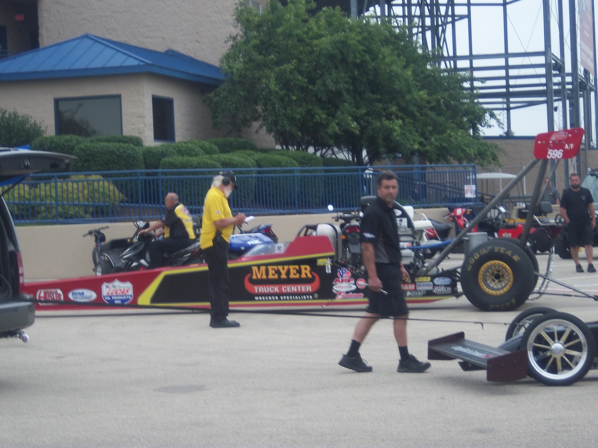
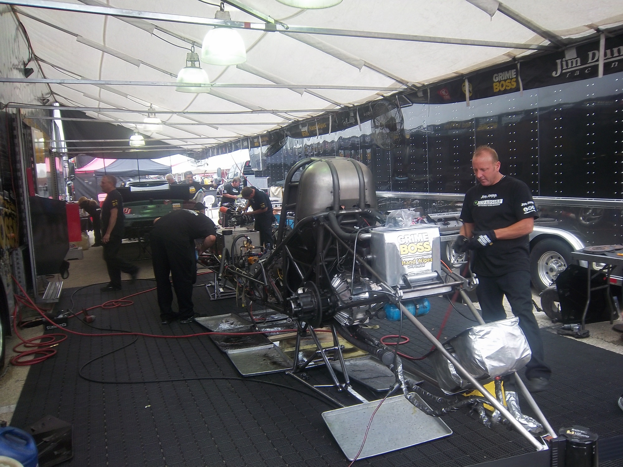
I had a post ready to go concerning collar designs, but I’ve decided to save that for next week. I’m still on vacation, and last Saturday I went to see the 16th annual O’Reilly Auto Parts Route 66 NHRA Nationals presented by Super Start Batteries, in Joliet. I had the chance to get VIP tickets, so I went with Argie, a friend from work, and some of her friends, and took the chance to mix business with pleasure.
It was a mixture of Mello Yello Drag Racing Series regulars, and some minor league drivers, but it was fun. The first thing I learned was how loud these cars really are. I’ve been to NASCAR races, and I’ve heard the engines running, but NHRA engines are so much louder than I had thought. For a while, I was standing in the spectator area on track level, and as they warmed up, you felt the vibrations of the engine. I’m standing about 75 feet away from the starting line, and when they went by, you felt it in every part of your body, a split second after they passed you. Needless to say, it was AWESOME!
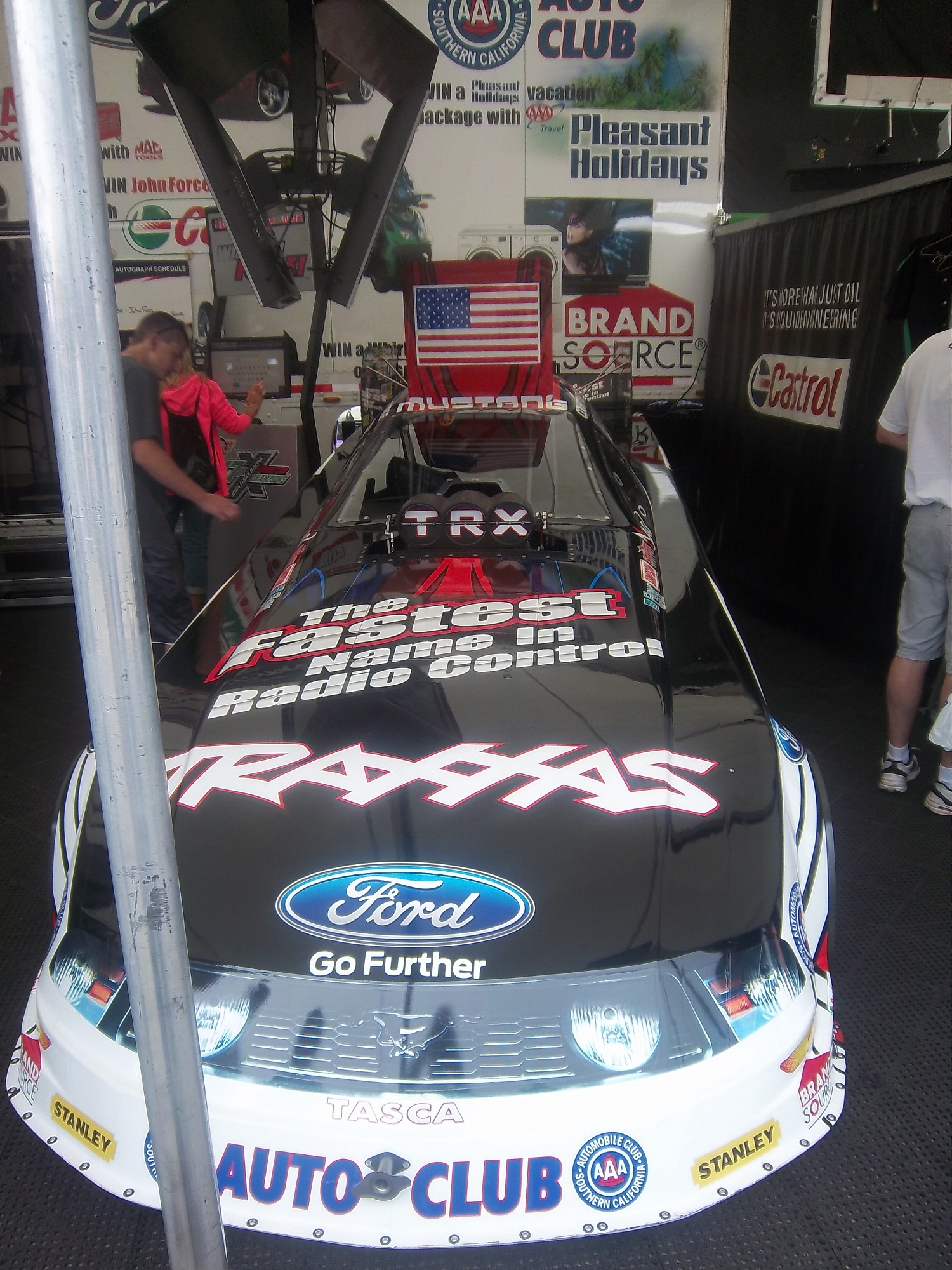
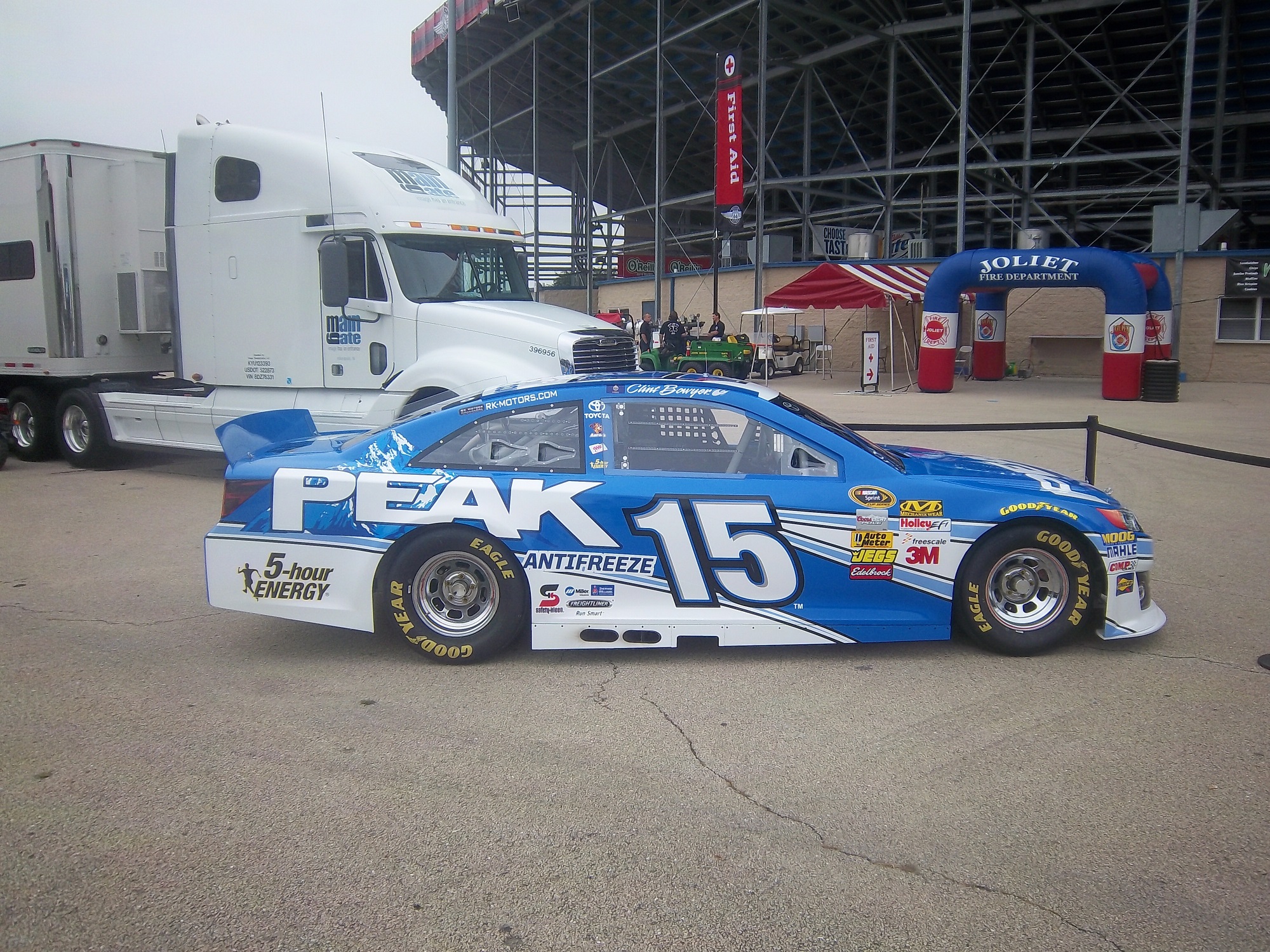
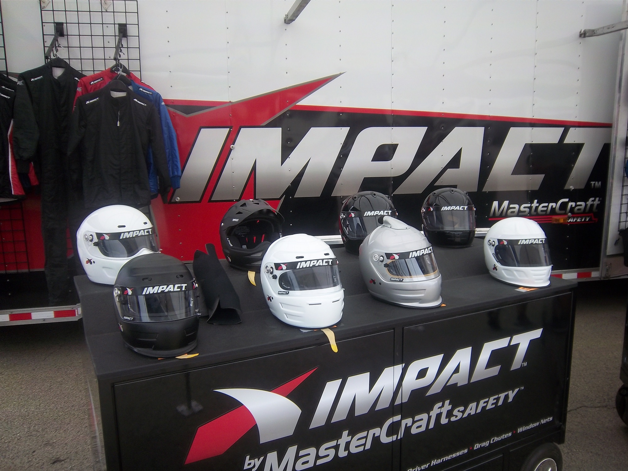
One thing I did enjoy was checking out the different kinds of cars, from top fuel dragsters, to super stocks,to funny cars, The scoreboard tells the fans who won, and what their times and speeds were, each side having its own scoreboard with lights around the sponsor logo to tell you who won.I also checked out the tires on these cars, and man, they are huge! They look like they are twice the size of NASCAR tires.Speaking of which, I got a chance to check out the new Gen 6 Sprint Cup car, as Clint Bowyer’s Toyota Camry show car made an appearance…it looks amazing!They even had a jet dragster, but I didn’t get to see it on the track…oh well.One of the fun things about these events is that you can check out the pit area, so I did, checked out all sorts of cars, and the various equipment and stages of preparation and equipment used in them. Impact Racing had a booth there, and they had the various designs of helmets sold for race use. Aside from NASCAR, IndyCar and motocross designs, they had drag racing helmets. Drag racing helmets feature a visor design similar to wrap-around sunglasses. Top fuel and funny cars have their own designs, with funny car having an air filer, since the nitro-methane engine sits in front of the driver, instead of behind, like in a top fuel dragster. Many of the teams sell off equipment from the cars after the various events are done, and I took full advantage, acquiring a timing belt from Bob Tasca’s Motorcraft Funny car, this one used in his first qualifying session at the Ford Thunder Valley Nationals in Bristol Tennessee. This run he had a 4.15 second, 306 MPH run. This thing is HUGE, measuring over 64 inches in circumference and 3 inches across.
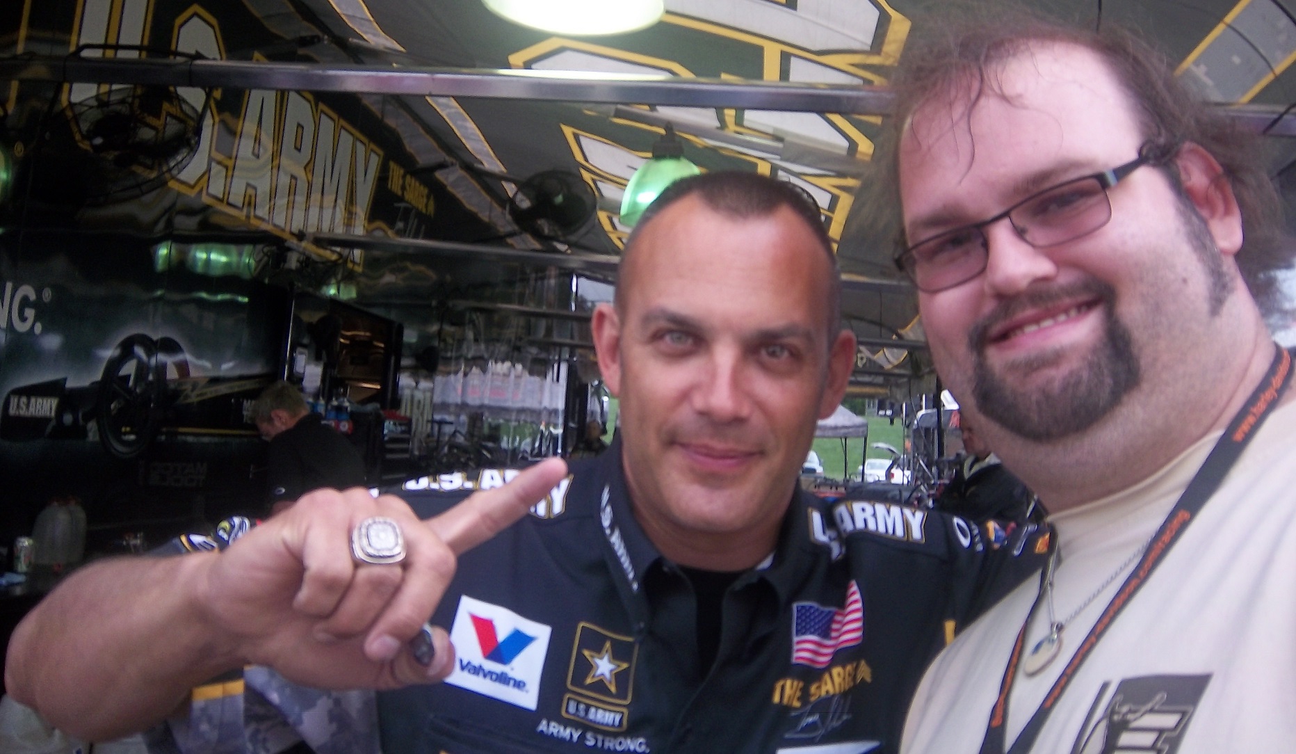
As well as an ignition coil and a spark plug from Morgan Lucas Racing. Ignition coils are used to turn on cars in general, but this MSD 8142 is designed to fire up these 8000 horsepower engines, which need a lot of electricity to start and operate. I was fortunate enough to have Tony Schumacher and Ron Capps autograph it in person.
My VIP ticket got me into the Don Schumacher Racing hospitality area. That was a lot of fun. We got to watch his car get prepared. Since the U.S. Army is his primary sponsor, DSR had some Army recruiters and soldiers speak. Though speaking to a crowd is not always easy when you have 2 8000 horsepower cars racing nearby. Then Tony Schumacher got up and gave a speech, and discussed his helmet, which prompted this question from me:
Afterwards, I was able to get a photo with him,and got to watch the engine test. This video looks tame, but unless you see it in person, you don’t have any idea how loud it really is, and I was 15 feet away when I shot that video!
Then I had dinner,and called it a day. I had a great time, and I will go back any chance I get!
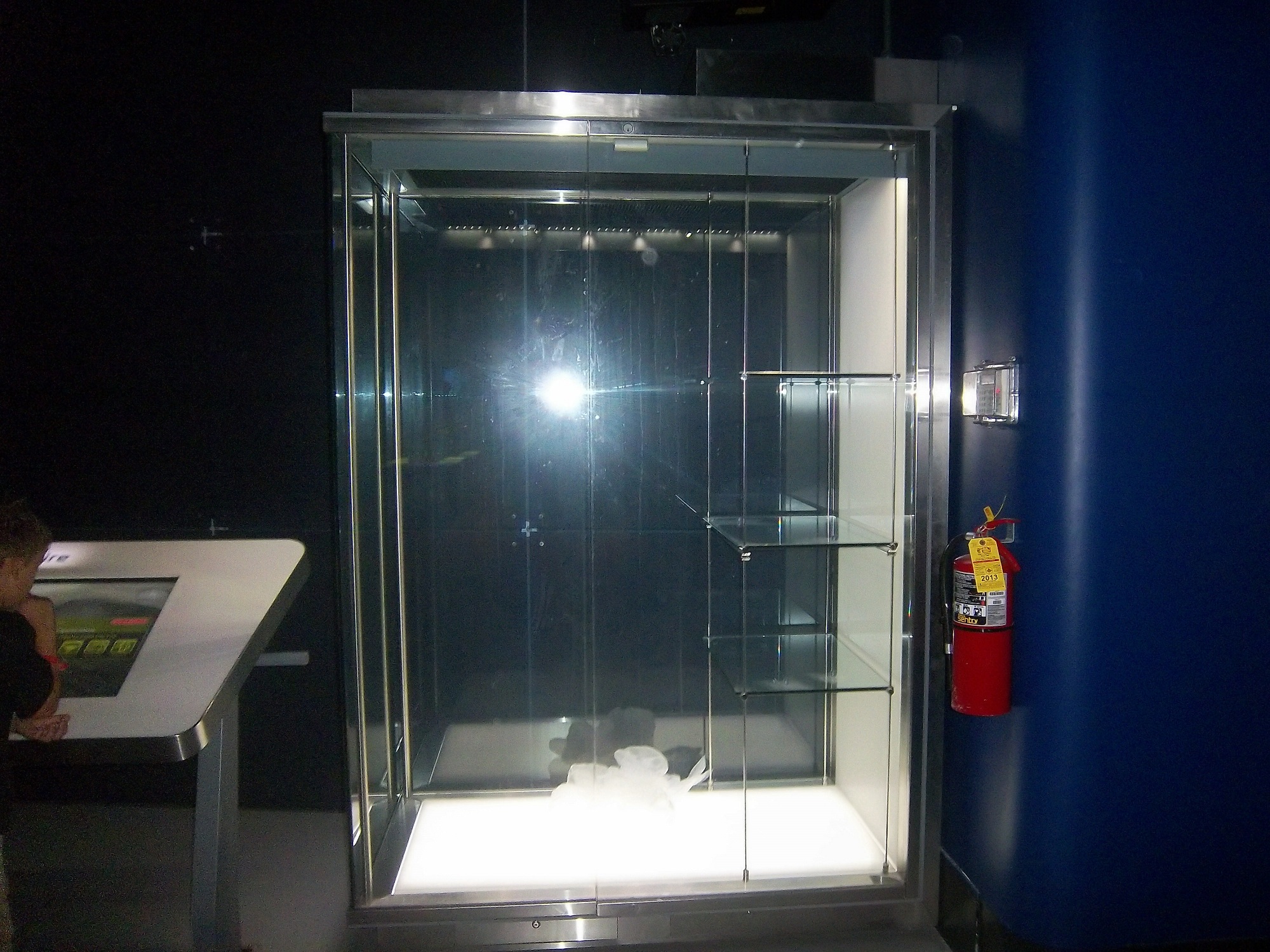
In other news, I went back to the Museum of Science and Industry, and I went to the Jeff Gordon suit exhibit, and was shocked to see this:THE ENTIRE DISPLAY had been emptied out of the display case. At first I didn’t know what had happened, so I asked at the information desk. They, in turn, told me that pipes located above the display had been leaking, and that the items had been removed. I hope that when the display is fixed, the issues I discussed in a previous blog will have been fixed, I will keep you posted.
And since I’m here, Let’s talk paint schemes…shall we?
Jamie McMurray #1 Hellmann’s 100th Anniversary Chevy SS The yellow or green on the contingency decals is pointless, and it takes away from what is a very solid scheme, with simple design and great color. I give it a B+, almost an A, just not enough.
Tony Stewart #14 Ducks Unlimited Chevy SS Although it is just his normal scheme with DUCKS UNLIMITED instead of MOBIL 1 on the quarter panel, I hate his new look. The black scheme from before Kansas was really good, but this is just horrible. Too much orange, not enough black or camo. F
Clint Bowyer #15 Toyota Camry 30th Anniversary Toyota Camry Ok, so is this a red car, a black car, or a silver car…I’m really lost here. The nose and front panels look red, but the hood and back quarter panels look black, and the roof is silver. They took one of the best color schemes in racing, and made it horrible! The only thing giving this scheme a passing grade is the color scheme, but even that can’t keep it above a D-
Aric Almirola #43 Go Bowling Ford Fusion I love what they did here. The bowling ball nose and pin design give a great impression, and the color scheme works very well here. A+
AJ Allmendinger #47 Scotts Toyota Camry Simple and attractive, with a very nice simple color scheme…But could someone explain to me why in this rendering the windshield decal reads AJ ALLMENDINGER instead of just ALLMENDINGER? The only time a first name is on the windshield is in the case of Kurt and Kyle Busch. There is no other Allmendinger racing in the Sprint Cup. That said, this scheme earns an A
Brian Vickers #55 Aaron’s/Louisville Cardinals Toyota Camry The color scheme is amazing, and the basic simple design of the car works well. The hood has some needless design, which does affect the grade, but even so, it still earns an A-
Martin Truex Jr. #56 NAPA Batteries/Get Back and Give Back Toyota Camry Another example of why most teams only USE ONE COLOR AND DESIGN SCHEME! The nose features BDU digital camouflage in light and dark green, which works well. The doors feature Truex’s normal scheme, again good color and design, and the back features a blue/black digital camouflage, again which would work well by itself. The problem is that the combination of the three make for an awful look. This scheme is one of the worst so far this year, and it earns the F- grade it deserves. I fully support our Armed Forces, but this scheme is horrible!
Carl Edwards #99 UPS Ford Fusion I know I covered this scheme in a previous post, but this photo illustrates why I hate UPS as a car sponsor. No matter what, UPS cars have one thing in common, and that is that the driver suit can look really good, whereas the car will look awful. In this case, the car has pointless designs and needlessly added colors, whereas the driver suit is simple and attractive. So my previous grade of D- still applies.
And finally, while I don’t normally do Nationwide paint schemes anymore, I had to do this one. Kurt Busch has had a throwback at Talladega reminiscent of Neil Bonnett’s Country Time scheme from the 1980’s, and last night, he had had an amazing scheme taken from Days of Thunder…I love that scheme because I love the movie. The boxy design of the Camaro works well with the scheme, as it is much similar to the design of the Lumina. Keep it up Kurt!
Like shoulder epaulets, the collar of a driver suit has made a transition. It has gone from safety accessory to fashion piece, but unlike the epaulet, it is not only ornamental. Because the collar is still a piece of safety equipment. It goes without saying that fire is an ever present danger in auto racing. The collar protects the neck from burns. This may seem minor, but many people who die from burns die from infection. When the skin is compromised, it can’t stop germs from getting inside the body, and as such makes infection a serious risk during burn injuries.
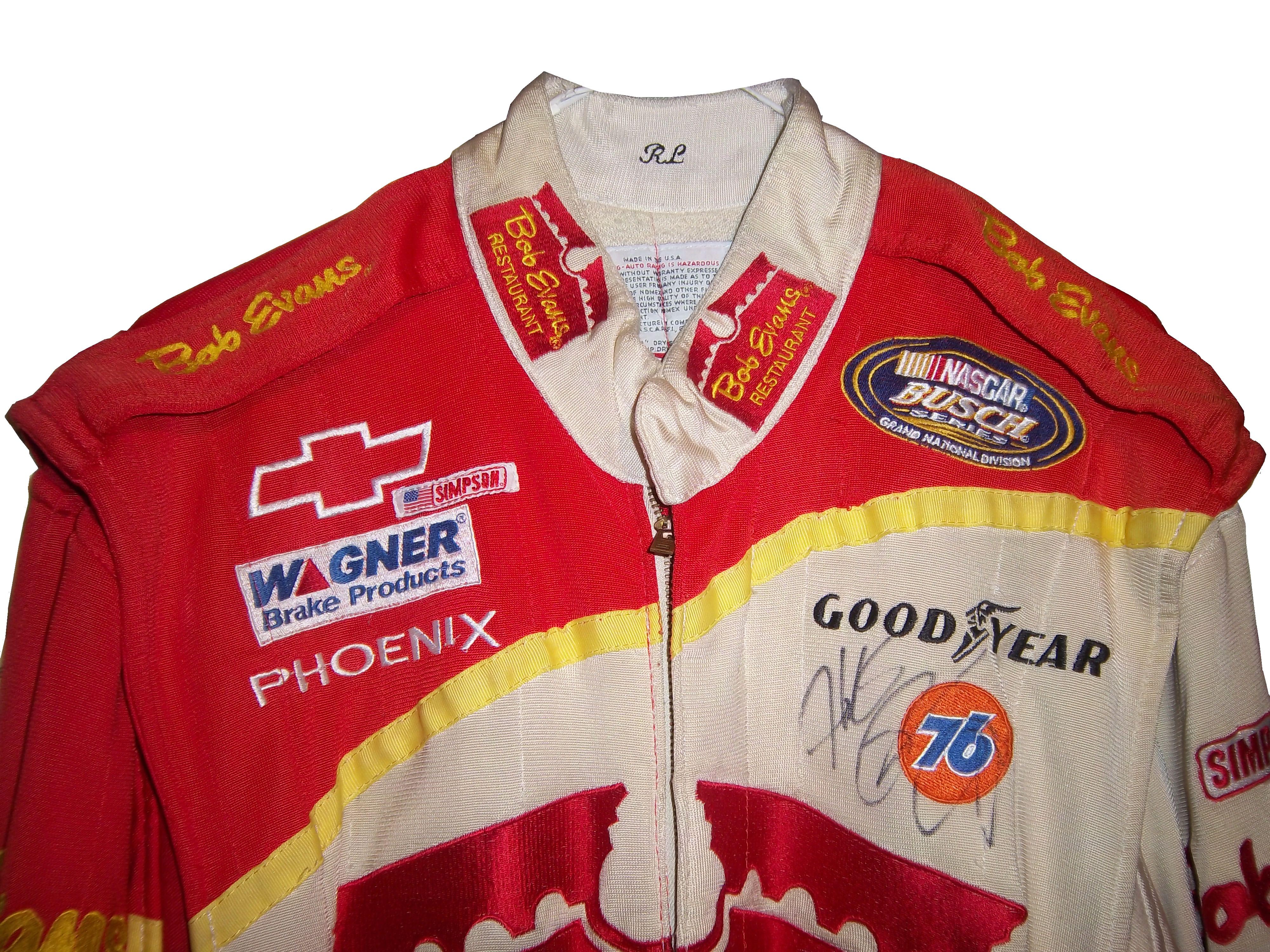
But the fashion aspect of collars is interesting as well. With the standard alignment of sponsors on the top of the suit, the Series logo, tire manufacturer logo, car manufacturer logo, and other sponsor logos are on the top, and the primary sponsor logos are present on the collar and epaulets. This Randy Lajoie example shows how the suit appears during an televised interview:
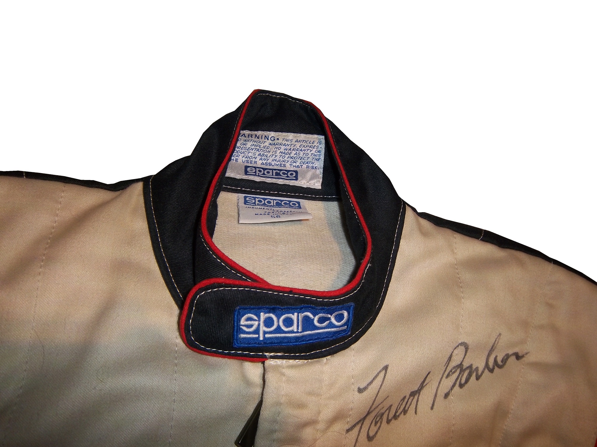
Note a couple of things: First, the fabric on the collar overlaps just a bit here, but when the driver wears it, it meets perfectly at the center of the neck. Second, it allows the driver to breathe easily. Comfort Vs. Safety is a constant debate. This is one kind of collar, the other kind of collar is what I call the Velcro collar, as shown in this Alex Barron suit from 1998:
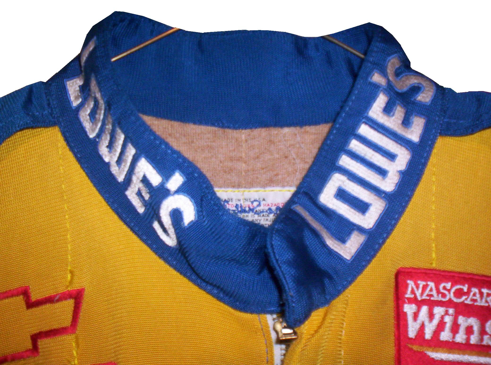
The Velcro collar is exactly what it sounds like, a collar with a strap which Velcros shut. This provides a little more protection in case of fire. It also has another use, as sponsor ads are popular to put on the front of the Velcro strap. This has been used quite often over the years…
This is due to the fact that for quite some time the open face helmet was used, and the collar provided extra fire protection where the helmet failed. In this day in age, helmets come standard with Nomex socks on the bottom, so the collar, while still a key safety feature, is not as critical. But for sponsor logo placement, it really can’t be beat.
If the collar does not have a Velcro closure, then the primary sponsor logo is sewn into either side of the collar. Like the Lajoie example above, or this Mike Skinner example below, this can be used very effectively as a place for sponsor logos.
Like most other aspects of the driver suit, the choice of Velcro or not comes down to driver preference. Kyle Bush, as well as older brother Kurt favor the Velcro style, whereas Tony Stewart and Carl Edwards prefer the non-Velcro variety. Many pit crew shirts have a similar design to the driver design as well.
Editor’s note: For the next two weeks I will be on a very badly needed vacation. I will still have articles ready to go, but I won’t be commenting on up do date issues until I get back. I will still check in from time to time.
Greg Biffle #16 3M/Give Kids a Smile Ford Fusion The same bland paint scheme that I described as “There’s nothing really wrong here, but nothing really right here either. The side design looks forced, the black roof is idiotic, the color scheme is good, but the number design looks too cliche. It makes no sense, but 3M schemes never do.” It has a small Give Kids a Smile logo on the hood, that is all but invisible. I gave it a C and it will stay at a C.
Austin Dillon #33 American Ethanol Chevy SS While I hate the shade of green used here, this scheme looks pretty decent. The designs around the front brake vent are unnessicary, but I still like them. If the green were a bit darker, I could give it a better grade than a C+.
AJ Allmendinger #47 Charter Toytoa Camry The hood design is interesting here. It is designed in the same light as television logos on driver suits. It is a unique idea that works and I hope will catch on. The color scheme is great, and I love the overall design. A
Brian Vickers #55 Aaron’s/Louisville Cardinals Toyota Camry The color scheme is good, but the Fruit Stripe Gum design seen on the Louisville Cardinals shorts is ugly. The whole Zubaz design scheme is horrible on sports uniforms, and even worse on this car. I have nothing against the Louisville Cardinals, but this is horrible. F
With the sad passing of Dick Trickle, as well as the All-Star Race, and the Memorial Day trifecta next week, I decided today I needed a change of pace, and I wouldn’t think about racing or driver suits today. So with my uncle in town, we went to the Museum of Science and Industry in Chicago. It’s an amazing museum with a lot of fun things to see and do, and we had a great time.
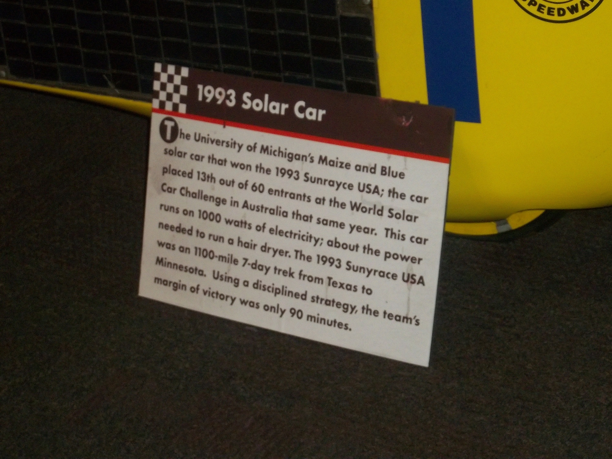
They have an exhibit that I saw concerning vintage cars, and a number of race cars. They have the winning car from the 1993 Sunrace USA
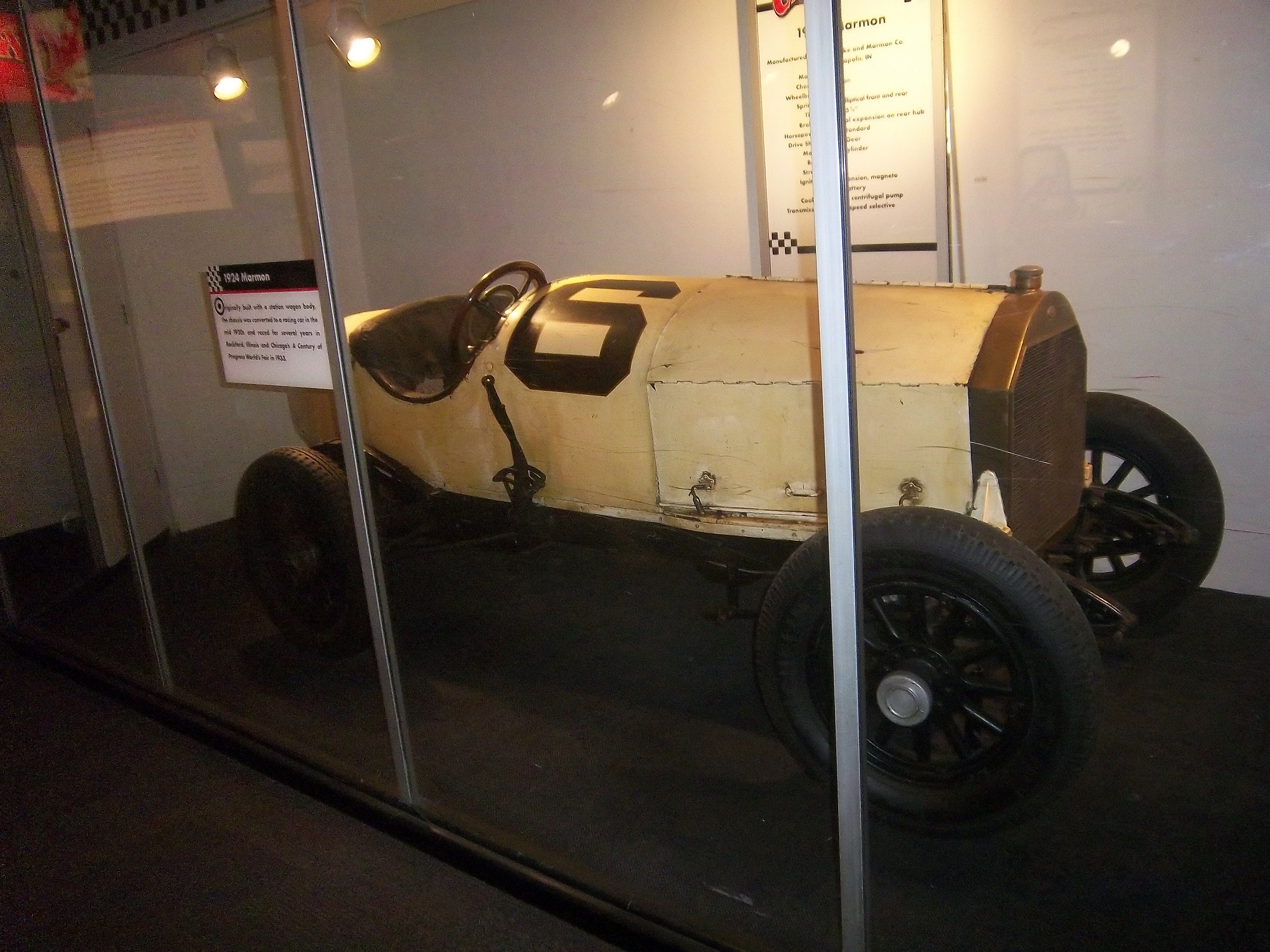
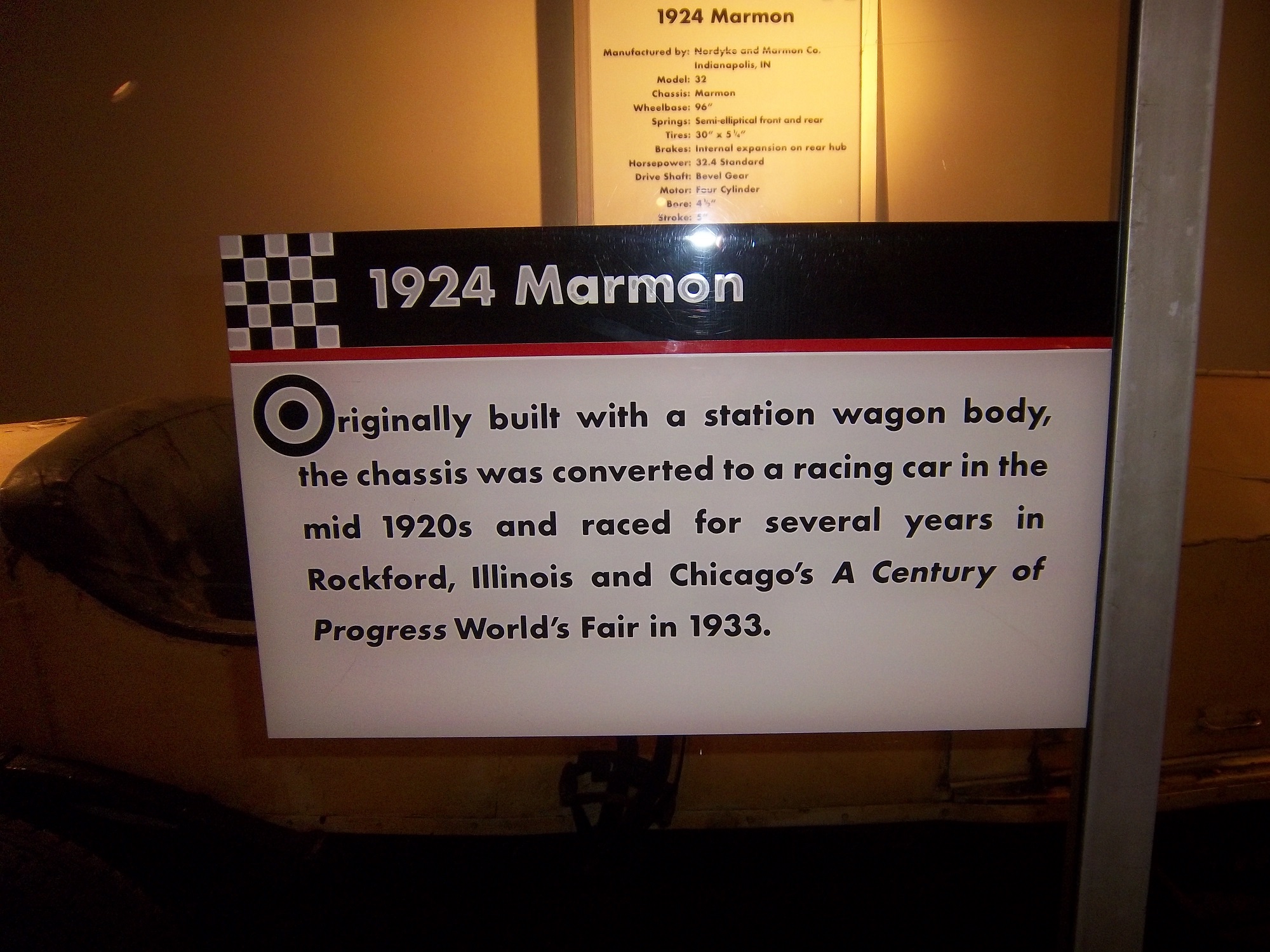
A 1924 Marmon race car
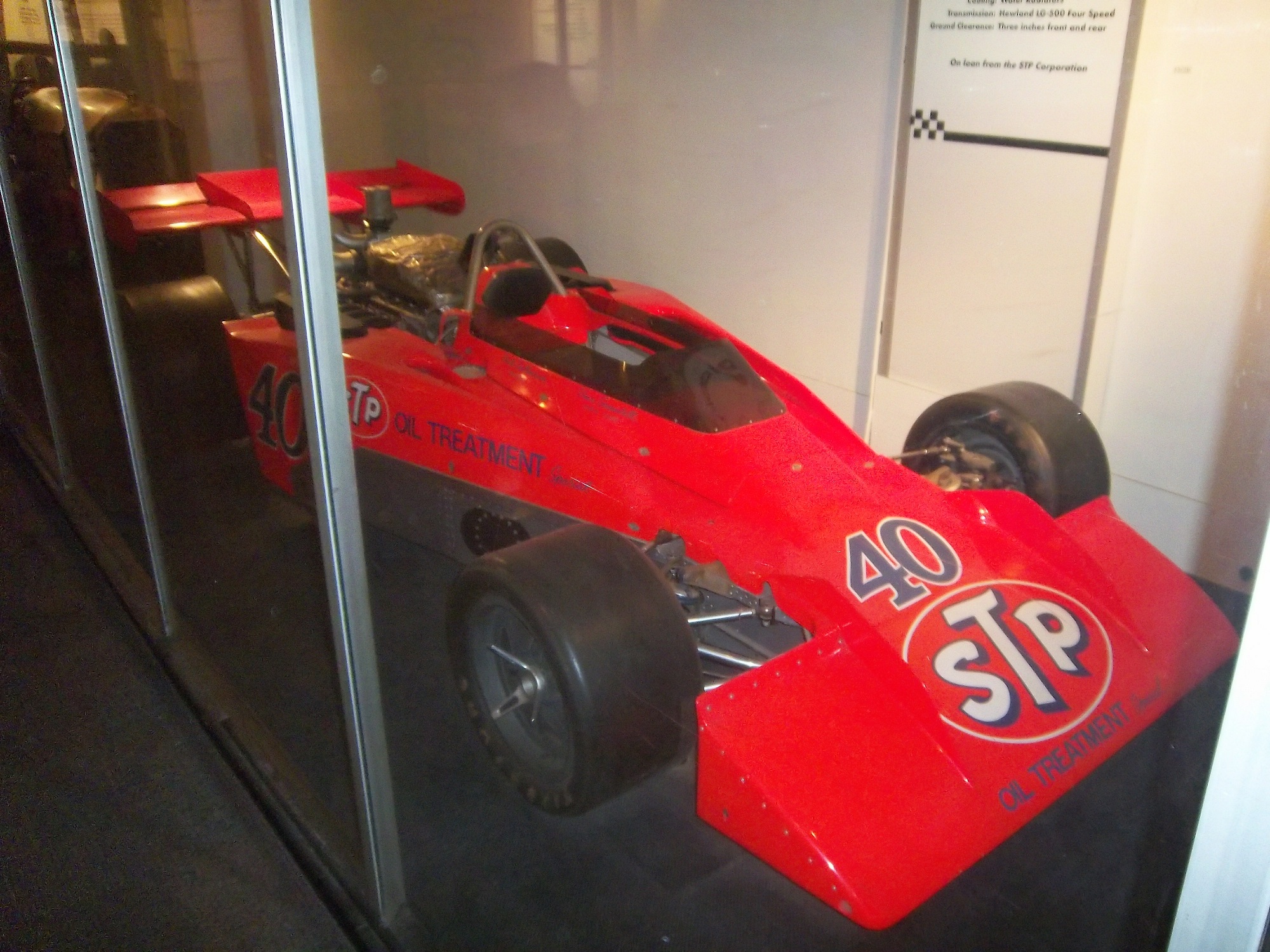
Wally Dallenbach’s car from the 1972 Indy 500
and Al Unser’s 1978 Lola race car that won the triple crown
The Spirit Of America, which held the land speed record from August 1963 to October 1964, and still holds the record for world’s longest skid mark is also on display as well.
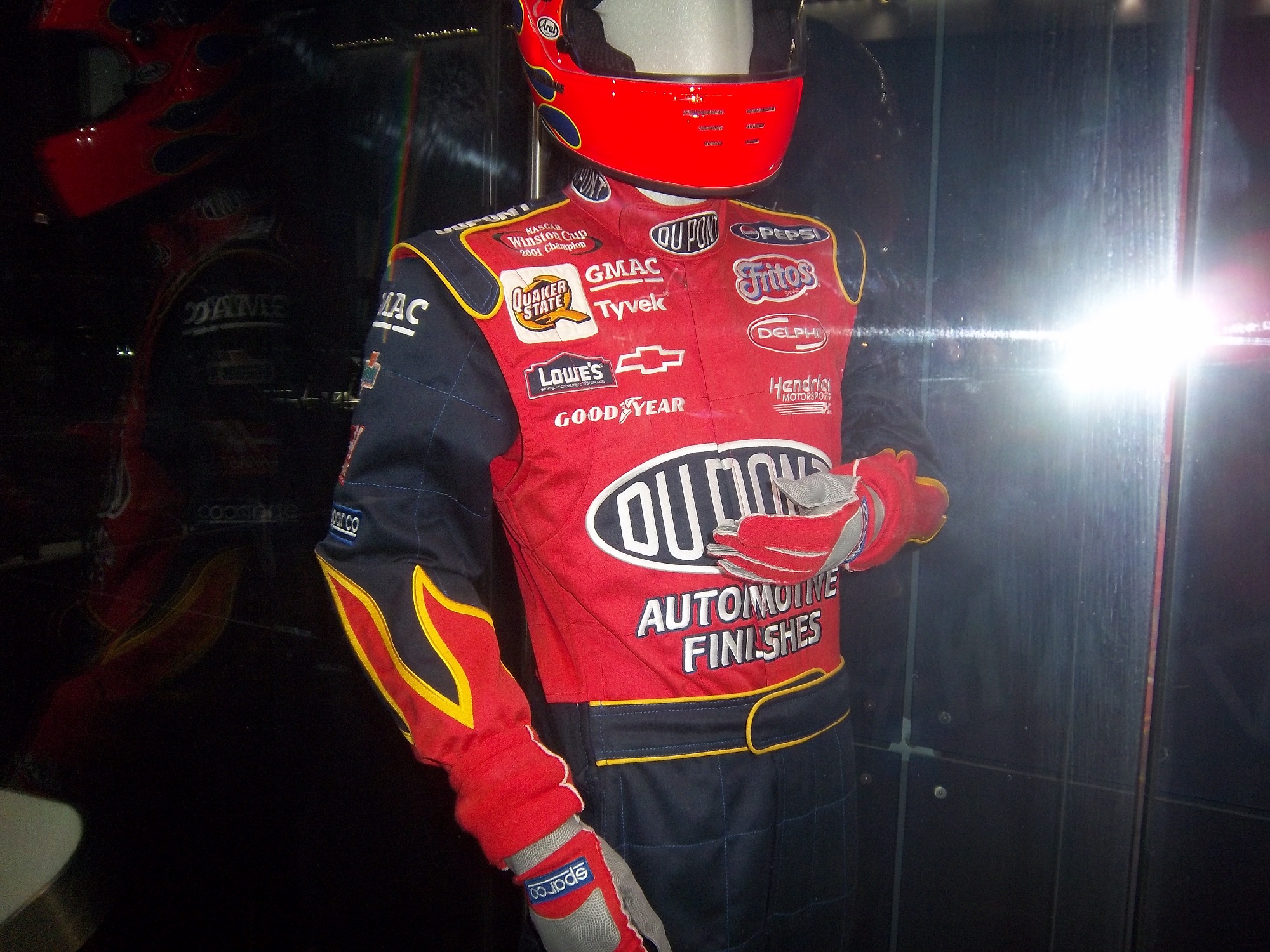
There is a new exhibit as well, Science Storms, an impressive state of the art exhibit detailing the science of natural phenomena, and how modern society has to interact with it. It is on two floors in the main gallery. On the second floor, there are displays for physics, magnetism, electricity, and fire among other things. At the end of the balcony, there is a large Tesla coil mounted in the ceiling. Nearby, I was shocked to see this display:That is a Jeff Gordon driver suit, with a similar helmet.
A helmet that has been bi-sected to display the fire protection that the helmet
A helmet used for fire testing, and a Nomex hood.
A racing helmet and matching goggles from the 1950,s and a 1975 drag racing helmet worn by Dennis Baca
and some Nomex undergarments and a Sparco bag.
Now first off, why is the picture of Jeff Gordon from 2011 when the suit is from 2002? I think that it would be better if the picture of Gordon featured him wearing the suit on display. But that’s a minor complaint compared to some of the other issues the display has. The bag in the display clearly states “Jeff Gordon 2003.” So that might lead one to believe that the suit was from 2003. However after doing some research, the suit is from 2002. Looking at a 2003 suit, The Quaker State logo is different, the Lowes logo is gone, and the GMAC and Goodyear logos are in different places. So kudos to the museum for catching that.
The biggest issue is with the helmet cut in half. The sign clearly states “Jeff Gordon’s Helmet, Circa 2002.” Just taking a look at it, and I can clearly tell it’s not race-worn. I can tell for a number of reasons. Let’s start with the obvious fact that the color schemes on the helmet and driver suit are completely different. Second off, there are no ventilation ports or microphone equipment present. Since Gordon was wearing the vent on the left side of his helmet, the fact it is not there is very telling. Considering that DuPont Automotive Finishes paid nearly $12 million total to sponsor Gordon in 2002, his sponsor logos are conspicuously absent, and for a helmet that was supposedly worn for an entire racing season, it seems to be in very VERY good condition, almost new. It should also be noted that there are no HANS anchors present. At first I thought it was because the helmet was not meant to have them, but it turns out they were either supposed to be there, or have been removed. Why this occurred is not clear, but it clearly was NOT worn by Jeff Gordon. In fact, I would be shocked if he ever held this helmet.
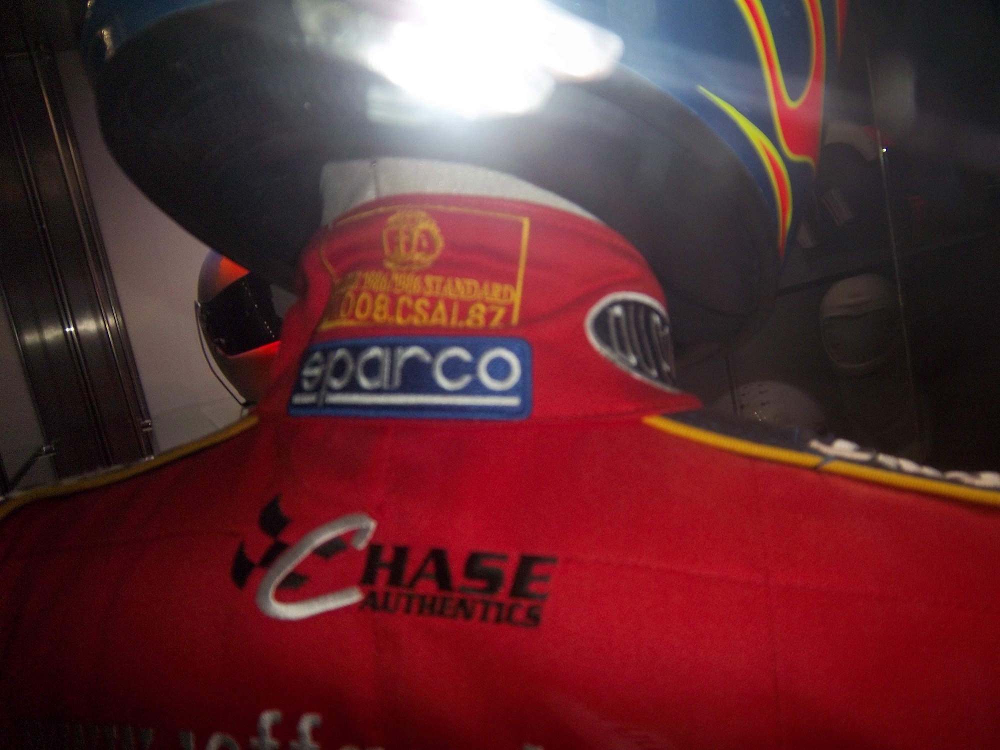
But there is one other issue with this display. The whole display is geared around fire protection, but there is no mention of safety certification. This is not a minor complaint, as the suit has a FIA certification on the back of the neck, but in the display is almost invisible.
That picture, as bad as it is, is the best I can do, because the side of the display is inaccessible to viewers. If a display discussing fire safety, at least mention that the suit is certified to do just that!
Outside of that display, I had a great time at the Museum of Science and Industry, and I can look past those complaints to say that it is a really nice display that tells viewers a lot about racing safety. So if you are ever in Chicago, stop on over. I promise it is worth the time!
Now on to NASCAR All-Star Showdown Special Schemes…
Greg Biffle #16 3M Filtrete Ford Fusion-Could you please pick a color scheme and stick with it? Two different color schemes on the same car is just awful. But they are two good color schemes. C-


