
This week, we examine a Steve Grissom 1998 Kodiak Helmet.
Tag: winston cup
Introduction to Sports Memorabilia-Derrike Cope 1998 Race-Worn Helmet
For the 11th Season Premier of Introduction to Sports Memorabilia, we examine a Derrike Cope 1998 Gumout Helmet, which he has autographed twice.. From here on out, I will upload new videos on Mondays.
Two Birthdays in January…
 By David G. Firestone
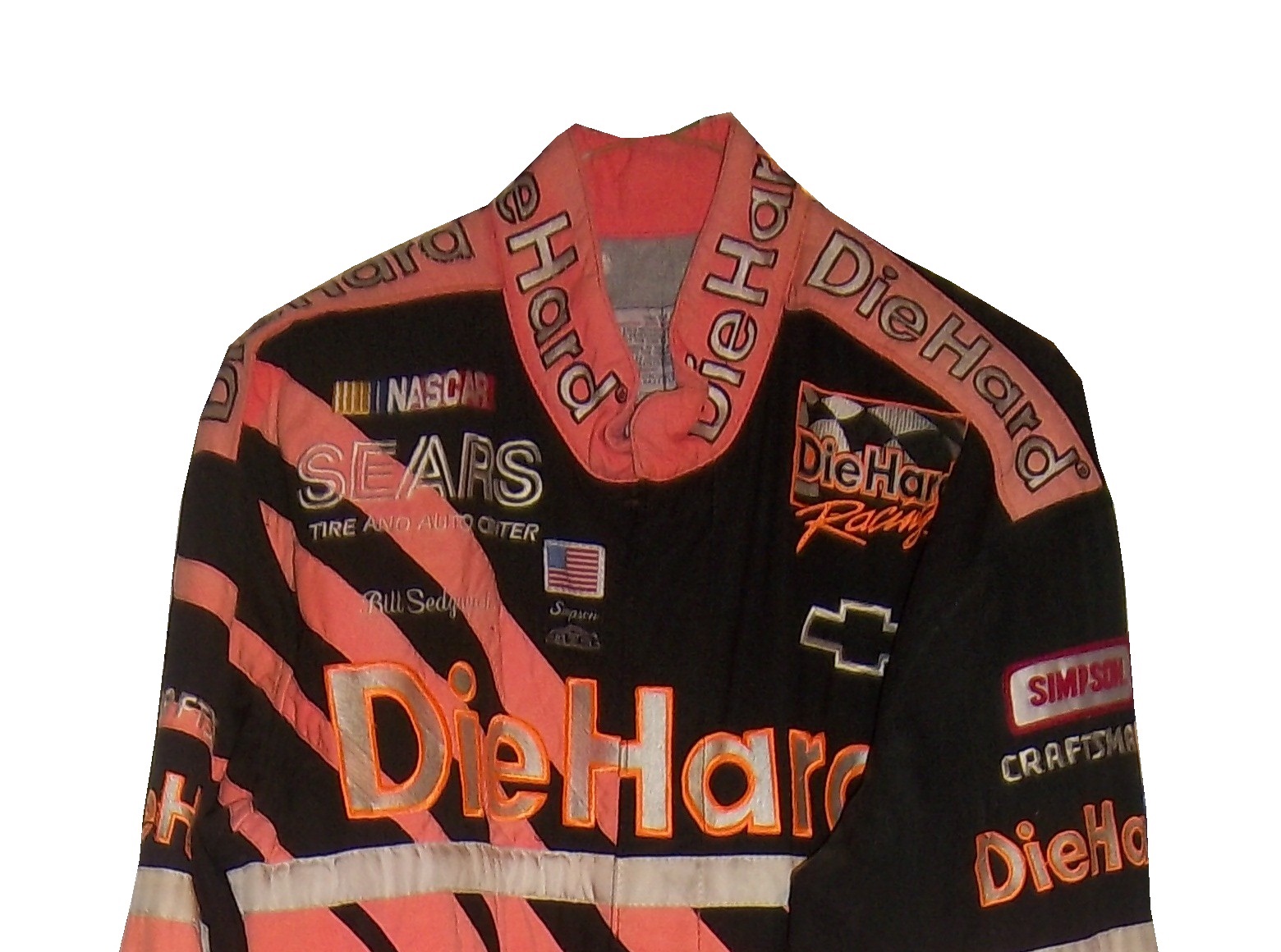
On the first anniversary of the founding of The Driver Suit Blog I felt it appropriate to analyze the first two NASCAR driver suits I ever bought. I started in the driver suit hobby in March of 2010, with a Bill Sedgwick Die Hard driver suit from the Craftsman Truck Series in 1996.  I purchased this specific item for a number of reasons, first, it was well within my price range, and second, I wanted a low-end example that I can look at and get a general feel for aspects that I will see in other driver suits.
Some of the stuff I learned from this particular suit helped me understand the very basics of design aspects on race-worn driver suits. Some of the aspects I discovered from that were completely different and it was through subsequent research that I began to understand driver suits more. I have kept it for as long as I have is because I love the suit, and I even though I have had it for almost 4 years, I still find aspects about it that interest me.
The suit is custom designed for Darrell Waltrip’s Craftsman Truck Series team. Sedgwick drove the #17 Chevy C-1500 for the entire 1996 season, whereas Waltrip drove the #5 truck for a very limited schedule. Sedgwick had 3 top 5’s and 8 top 10’s in the 23 of the 24 races that year, and led a total of 8 laps. Sedgwick was released at the end of the season.
The triple-layer suit is custom designed for Sedgwick, with the Sears Die Hard logos on the collar and shoulder epaulets,

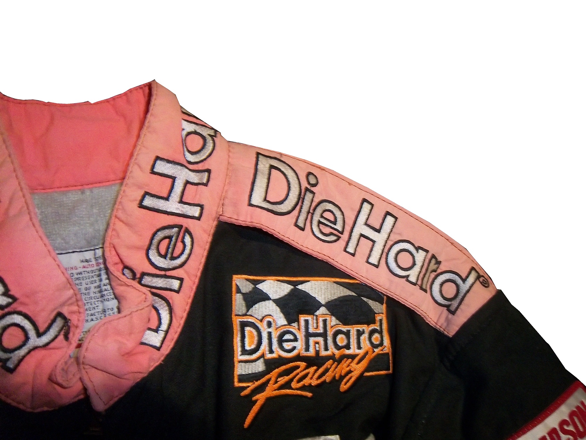 Sears Die Hard logos across the front and Sedgwick’s name on the right chest,
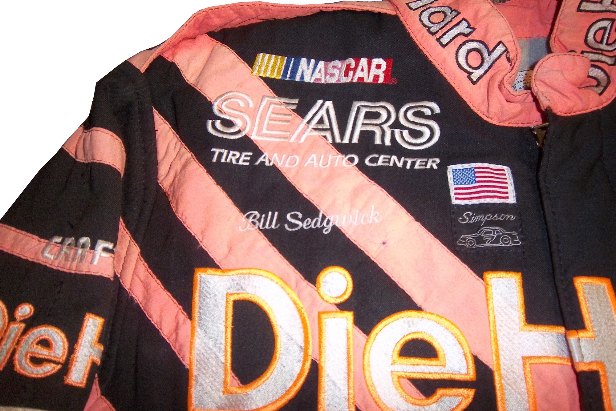
 no arm gussets,
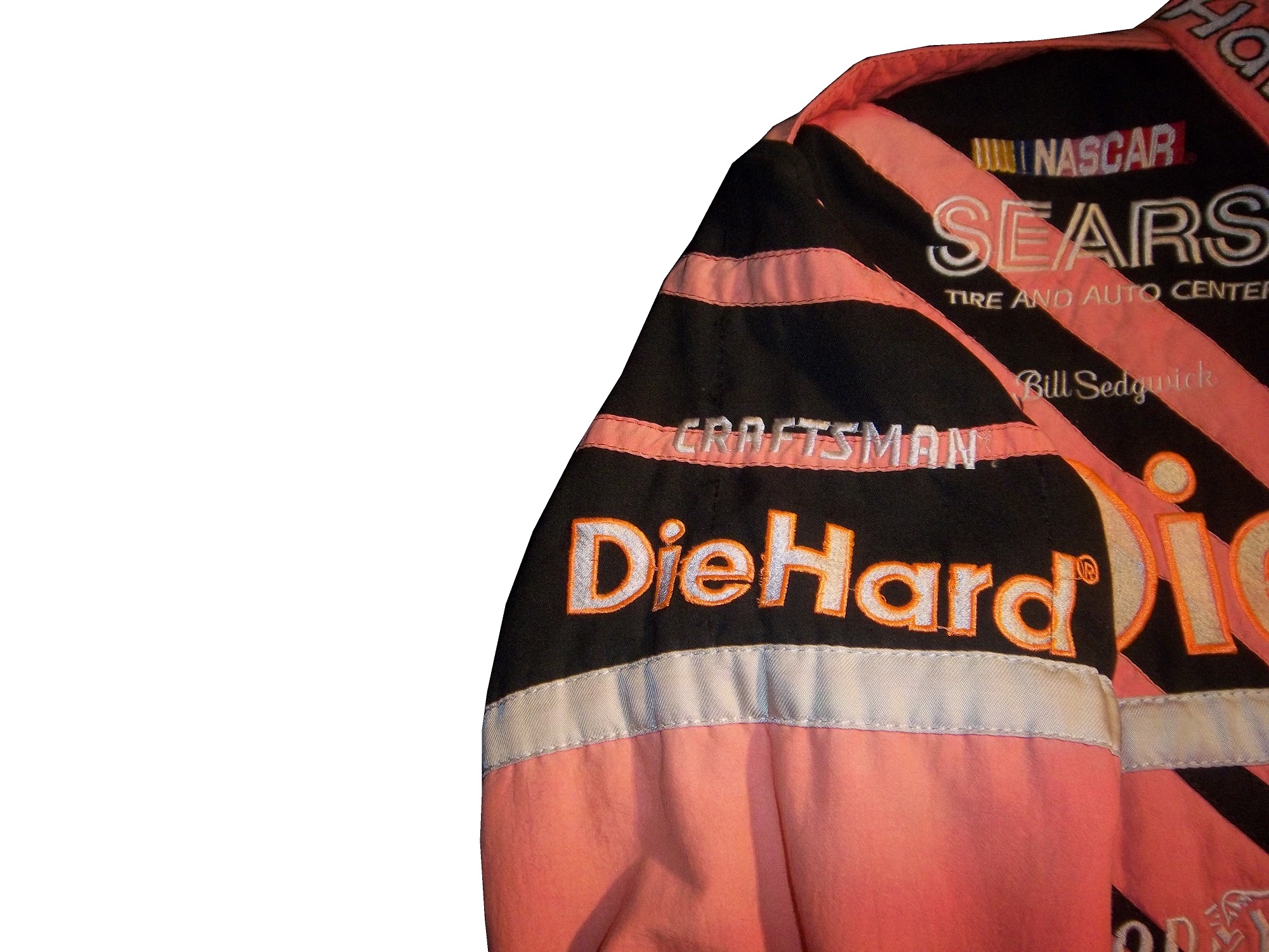
 no adornment on the belt,
 TV logos and safety stripes on the legs,
 TV logos on the sleeves,
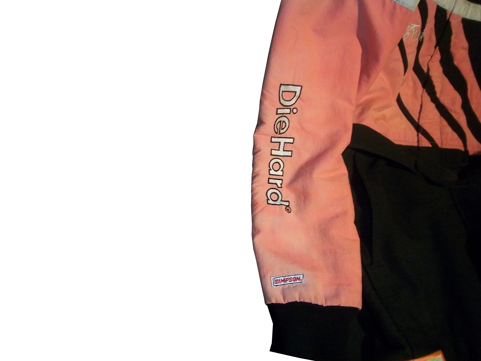
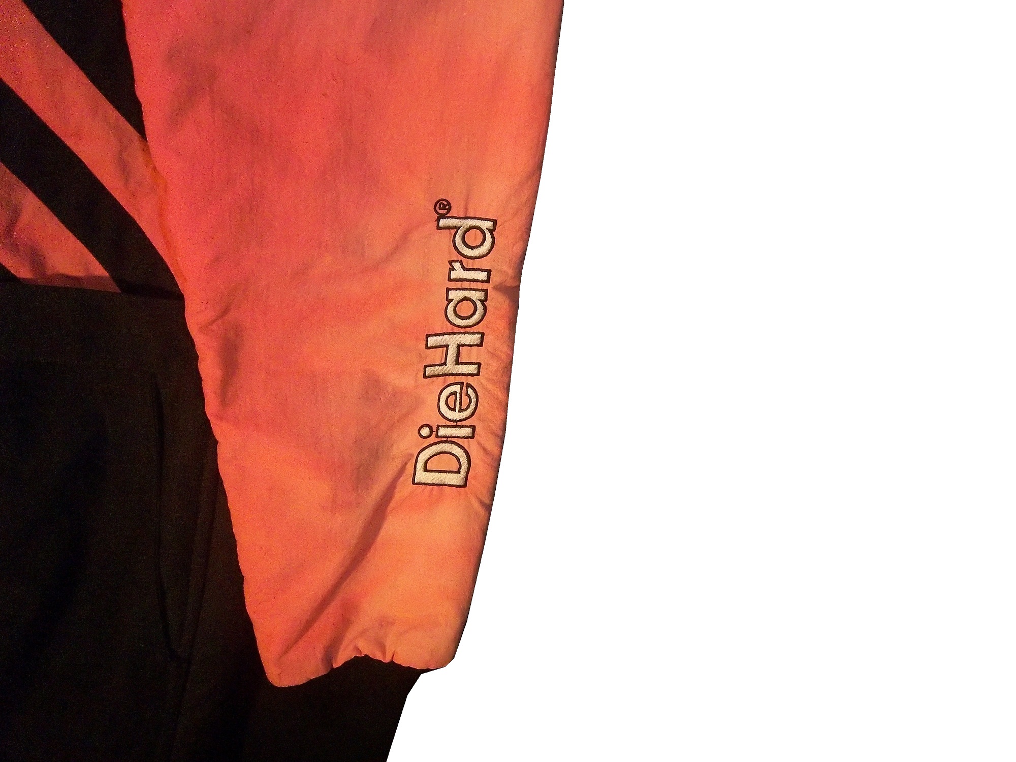 and a huge logo across the back.
![]() I purchased a press kit for this suit, which I covered in December, concerning this suit, and I realized that the suit Sedgwick is wearing in the promotional photo is the same suit that is in my collection. I keep the press kit in my authentication binder with the rest of my COA’s and LOA’s
I purchased a press kit for this suit, which I covered in December, concerning this suit, and I realized that the suit Sedgwick is wearing in the promotional photo is the same suit that is in my collection. I keep the press kit in my authentication binder with the rest of my COA’s and LOA’s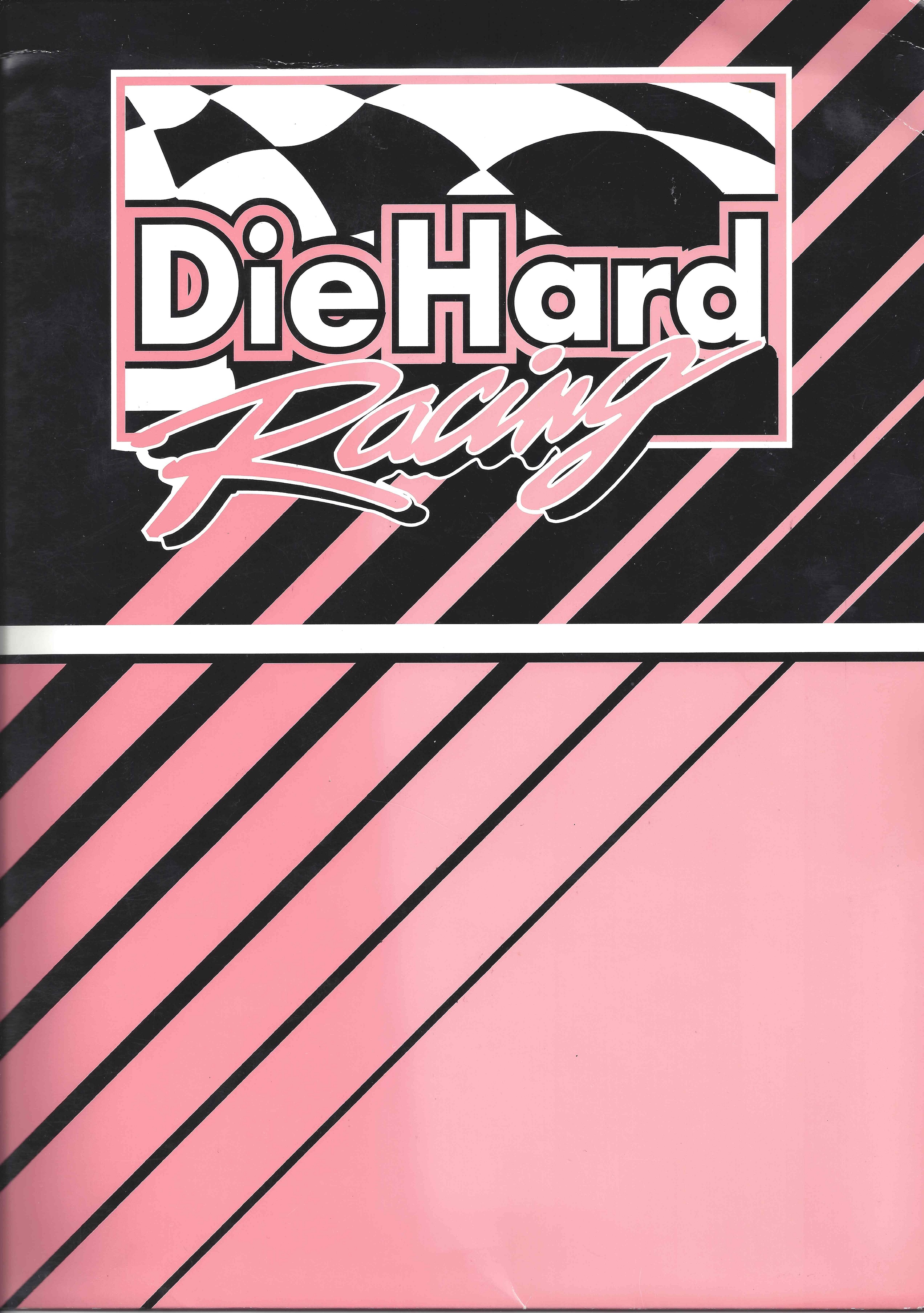


 The other suit I bought, my first Winston Cup suit was a Lake Speed suit from 1997, this one is a bit different. In 1997, Speed was racing for Melling Racing, which in 1997 was a shell of its former self. Melling had 34 victories and the 1988 Winston Cup Championship, but by 1997, they had no real sponsorship, and had not won a race since 1991. During that season Lake Speed didn’t score a top 5, top 10, or victory, and only led 3 laps in the 25 races he raced in that year.
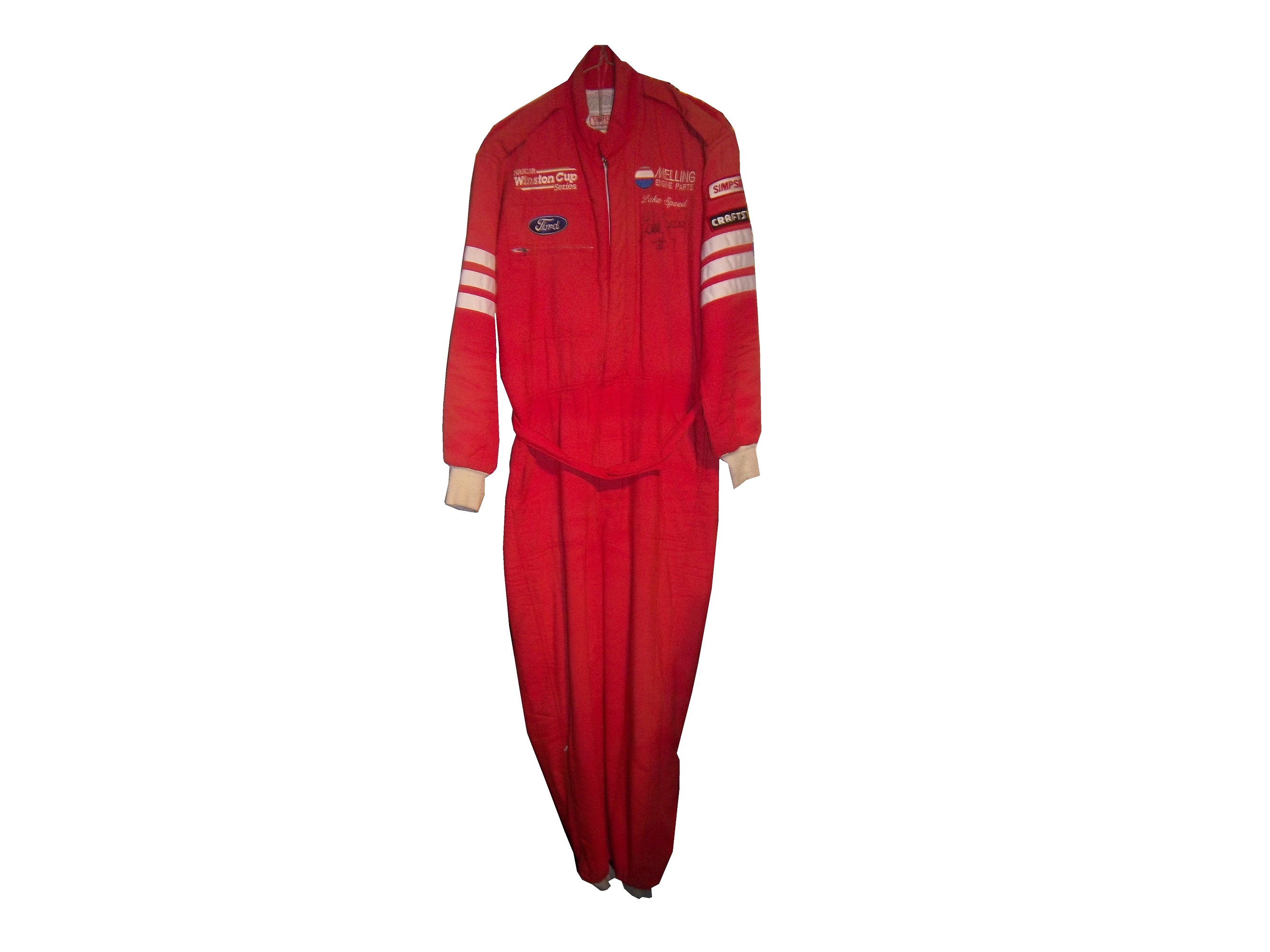 Due to the lack of sponsorship, Speed didn’t have the luxury of having a custom-made suit that season so he wore what appears to be a store bought suit. It looks like the suit was purchased either from a store or a catalog, and customized for Lake’s use. There are no large sponsor logos on the collar,
 shoulder epaulets,
 torso,
 sleeves,
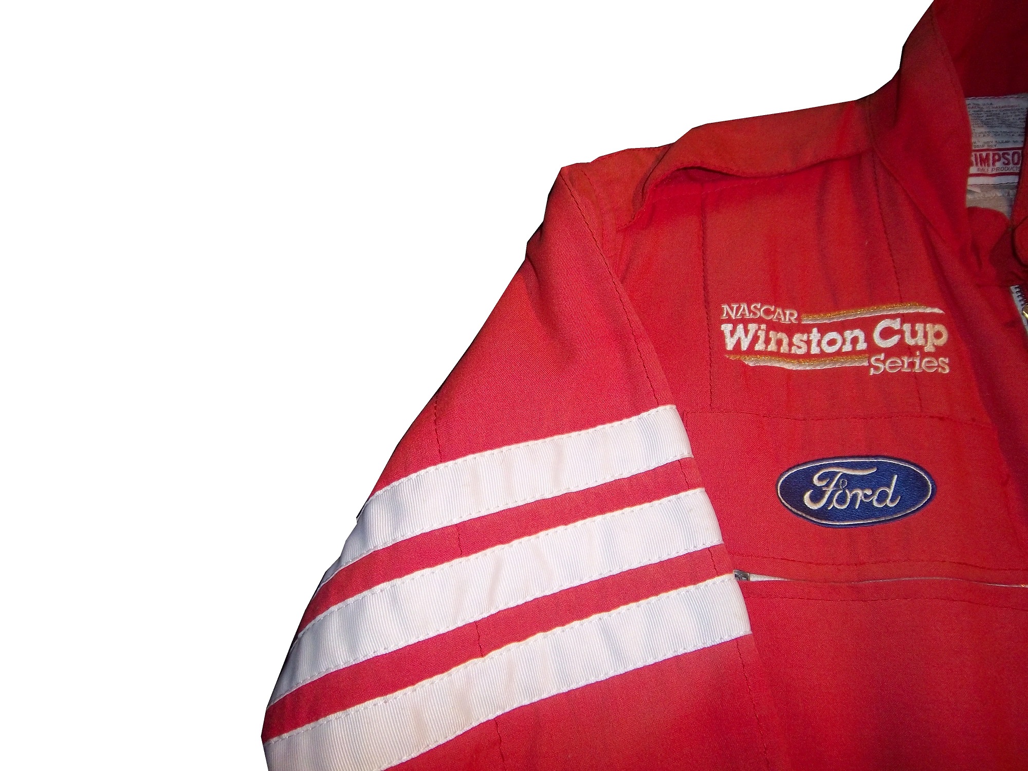

 or legs.
 The legs have a cuff cut, as opposed to a boot cut like the Bill Sedgwick suit has.
Everyone who has a hobby or an interest started somewhere. With me, it was with these two driver suits. No matter what you do in your hobby, or how high you fly in your hobby, you were a rookie, and you started from somewhere. Never forget where you came from. These two suits are a reminder of what I was, and I love these two.
Before we get to paint schemes, I need to say something to my readers. When I started this project one year ago, I never thought it would take off as much as it did. I have a group of really awesome readers and followers. I also owe a special thanks to Paul Lukas of Uni-Watch, because if I had never written my two articles for Uni-Watch in 2013, I would never have done the research I did for them, and I would never have had the frustration of not finding research from the collector’s perspective, and The Driver Suit would never have been born. To all my readers, from the bottom of my heart, I say thank you! Stay Tuned because 2014 will be even better than 2013!
Paint Scheme Reveiws
Jamie McMurray #1 Cessna Chevy SS Black with silver numbers and white trim looks simple and really good. I can’t say anything bad about this scheme, and bonus points for improving the door number design. A+
Jamie McMurray #1 McDonald’s Chevy SS Same great design as last year, same A grade.
Austin Dillon #3 Dow Chevy SS Take the white stripe down the side off, and it will be a solid A scheme. The white does not look good at all. The red/white/black color scheme works very well, and it is decently designed, so I will give it a B+
Danica Patrick #10 Go Daddy Chevy SS Not only does Go Daddy continue to use the worst shade of yellow in NASCAR, they also have given the worst shade of orange a more prominent role in the car. Givng this car an F is a very fair grade.
Denny Hamlin #11 FedEx Ground Toyota Camry Same scheme as last year, same C+ grade
Denny Hamlin #11 FedEx Freight Toyota Camry Same scheme as last year, same C+ grade
Denny Hamlin #11 FedEx Office Toyota Camry Same scheme as last year, same C+ grade
Denny Hamlin #11 FedEx Express Toyota Camry Same scheme as last year, same C+ grade
Casey Mears #13 Geico Ford Fusion The yellow they use is awful, and the side design is just too loud, I’ll give it a D
Ricky Stenhouse Jr. #17 NOS Ford Fusion I love this color scheme, however, I don’t love the side design. It has too many different different designs, all of which would work on their own but combined they look like a jumbled mess. I really want to like this scheme, but I just can’t, so I’ll give it a C-
Ricky Stenhouse Jr. #17 Fifth-Third Bank Ford Fusion Everything I just said about NOS applies here. C-
Clint Bowyer #15 5 Hour Energy Toyota Camry Same scheme as last year, same B+ grade.
Kyle Busch #18 M&M’s Toyota Camry Same scheme as last year, same A+ grade.
Ryan Newman #31 Cat Chevy SS New season, new driver, new scheme that looks great and earns an A
Kurt Busch #41 Haas CNC Chevy SS Great color scheme and a very simple desgin look very good here. I also like the matte black used, and the door numbers look really solid. Can’t give this scheme anything less than an A
Kyle Larson #42 Target Chevy SS The scheme looks decent, I like the white on the back, though I do not like the Target logos at the bottom. That takes a scheme that was an A grade to a B-
Brian Vickers #55 Aaron’s Toyota Camry A good scheme, and the 55 lettering looks really good here, and the gold is a nice touch. A
Martin Truex Jr. #78 Furniture Row Chevy SS Simple, and perfect. A+
Dale Earnhardt Jr. #88 Diet Mountain Dew Chevy SS Same scheme as last year, but I never gave it a grade. So here is my analysis Not a great scheme, too much needless design on the side of the car, and the silver background is just brutal. The red lettering on a green background is unattractive at best, and all in all, this is a D- grade.
Michael McDowell #95 Levine Family Racing Ford Fusion This scheme is so much better than last year’s scheme, and just for that I’ll give it a B
Carl Edwards #99 Aflac Ford Fusion This has a terrible color scheme, with lime green, neon blue, black and white. The wing design is not only ugly but would work better starting at the door and working behind.
Neck Backs…A Hotbed for Unique Customizations.
 The driver suit is almost always customized for the driver, and as such, the driver has the option of adding customizations to the suit. This may come in the form of size,
and belt design,
but the back of the neck is a unique place for customizations. The designs that are placed on the back of the neck are as unique as the driver themselves.
I’ve gone at length to discuss the FIA certification which is frequently sewn into the back of the neck. This is a prominent feature in Formula 1 and IndyCar. That is standard issue, so no real need to comment on it any more.
n NASCAR, the back of the neck can be used for a myriad of different customizations. One of the most common is a car number, such as this Christian Fittipaldi suit, 
and another common feature can be sponsor logos, such as this Randy LaJoie Bob Evans suit from 1999-2000,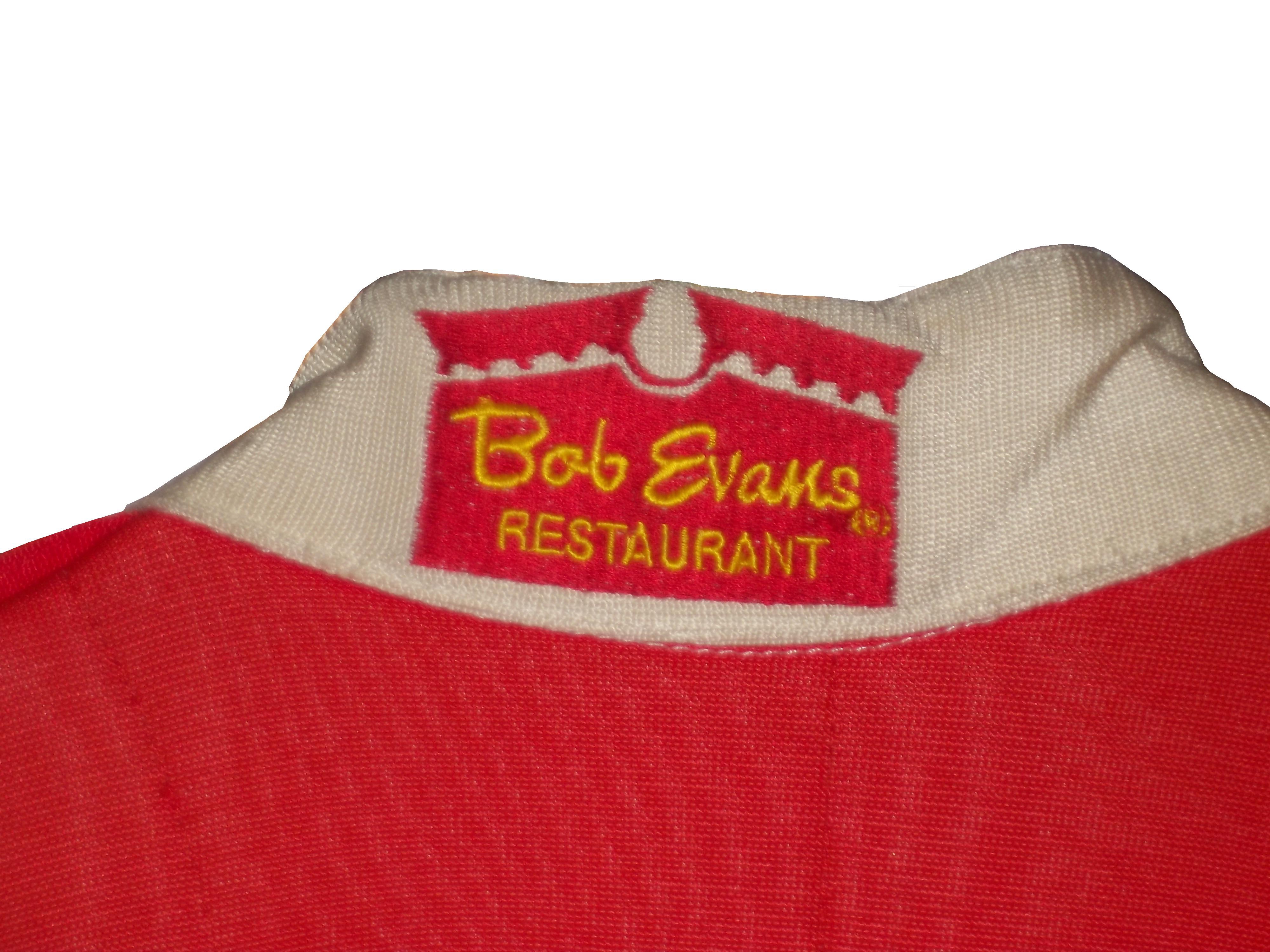
and this Joey Miller Craftsman Truck Series suit from 2005.
This Kasey Kahne suit has the Evernham Motorsports logo sewn into the back of the neck.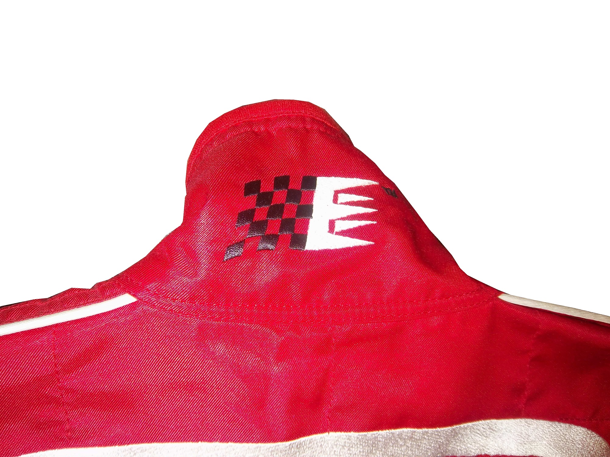
And Roger Penske likes to have the American Flag on the back of the neck of his suits, as evidenced by this David Stremme suit from 2009.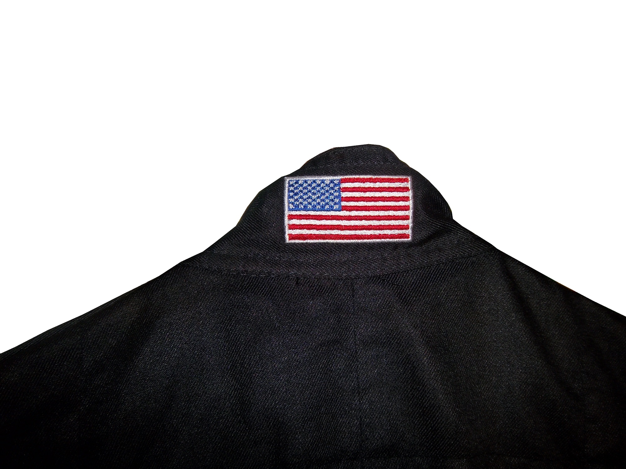
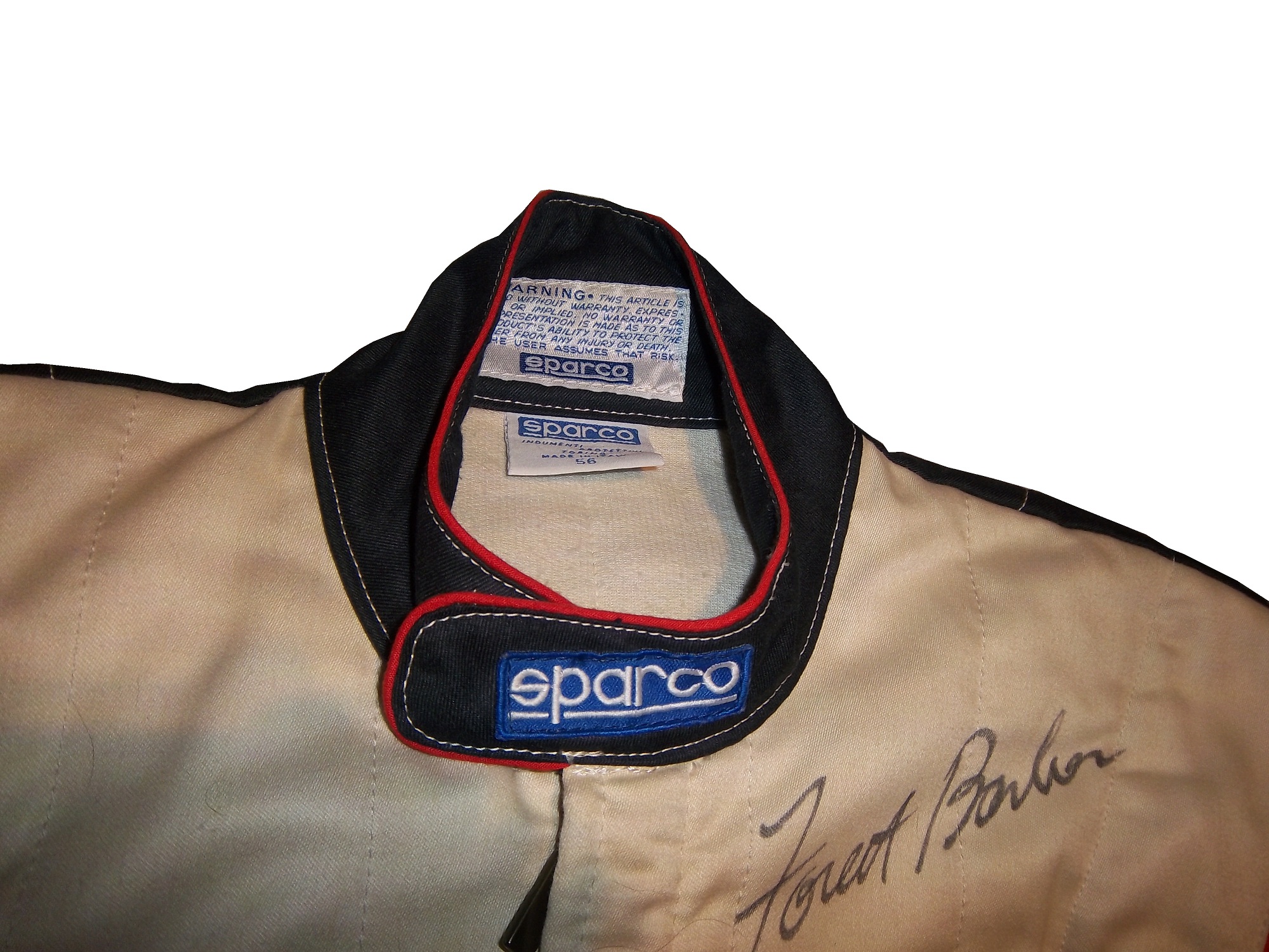
Older Simpson driver suits have been known to have an inventory number sewn here, as exampled by this Mike Skinner suit from 1997,
and this Stevie Reeves example, again from 1997.
But for my money, the personal customizations are more fun when they are as unique as the driver is. In this Terry Labonte suit, Terry has added a Texas logo.
My favorite customization is from a Boris Said suit from 2005. Said has added a Boris Badenov design to the back of his neck.
It’s the little things that make a suit personal, and these are some of those little things. Who says a driver suit can’t be fun.
And of course, it goes without saying that the neck is frequently left blank, as exampled by this Nort Northam suit from 1988.
Jamie McMurray #1 Cessna Patriotic Chevy SS Pretty good scheme here, red white and blue is always a solid scheme, but the one gripe I have is the pointless circle around the door number. While it gives the car a vintage look, it is just out of place here. Even still, this scheme is a solid A-
Brad Keselowski #2 Miller Lite Patriotic Ford Fusion Solid scheme, nothing to complain about, A+
Kasey Kahne #5 Hendrick Cars Chevy SS Red white and black is a very solid color scheme, and the design, while a bit convoluted looks really good. It has a hurricane-esquire design that looks really good. A-
Danica Patrick #10 Go Daddy .US Chevy SS The simple design of this scheme looks really good…but what is going on with the colors? Why is the car painted in Russian dressing green? Russian dressing is good, but not as a color scheme. The red white and blue designs clash, and it just looks awful. D-
Clint Bowyer #15 Peak Blue DEF Toyota Camry I gave this scheme a B grade, and the logo change on the hood does nothing to either add or subtract for this grade. B
Greg Biffle #16 3M Statue Of Liberty Ford Fusion Amazing how a better color scheme, as well as the Statue of Liberty design take a C grade and bring it up to a B
Kyle Busch #18 Interstate Batteries All Battery Center Toyota Camry Now THIS is what an Interstate Batteries scheme should be! The classic dark green, gold and white color scheme is amazing, and the design is simple yet very attractive. Giving this scheme an A+ is not saying enough about how great this scheme is!
Jeff Gordon #24 Axalta Standox Chevy SS White flames on a blue background? Seriously? I could forgive it if it was blue flames on a white background, blue flames look really good. But white flames? This design ruins a great color scheme AND a great design scheme TOGETHER! Now that is impressive! F-
Kevin Harvick #29 Budweiser Folds of Honor Chevy SS The Patriotic schemes worked quite well this year, and this is another example of that. A-
Jeff Burton #31 Quikset Chevy SS Decent color scheme but the design needs a little work. If the red was on the hood, roof and deck-lid and the black was on the sides, I would give it an A, but the shark-fin design is brutal on the eyes, and serves no real purpose. As such, I can only give it a C-
JJ Yeley #36 Golden Coral Patriotic Chevy SS Another A grade Patriotic scheme.
AJ Allmendinger #51 Neil Bonnett Throwback Chevy SS While I like most throwback schemes, this one, while accurate, has the worst color scheme I have ever seen. It just screams 1980’s. Hot pink and neon yellow really stands out, and not in a good way. Still, I do miss Neil, and they were pretty accurate, so I will give this scheme a B
Carl Edwards #99 Subway Ahhvocado Ford Fusion Good color scheme and a simple design. I’m not a fan of avocados on sandwiches, but this is a good solid A scheme.
Collar Guard…Not a Product, but a Safety Feature.
 By David G. Firestone
Like shoulder epaulets, the collar of a driver suit has made a transition. It has gone from safety accessory to fashion piece, but unlike the epaulet, it is not only ornamental. Because the collar is still a piece of safety equipment. It goes without saying that fire is an ever present danger in auto racing. The collar protects the neck from burns. This may seem minor, but many people who die from burns die from infection. When the skin is compromised, it can’t stop germs from getting inside the body, and as such makes infection a serious risk during burn injuries.
But the fashion aspect of collars is interesting as well. With the standard alignment of sponsors on the top of the suit, the Series logo, tire manufacturer logo, car manufacturer logo, and other sponsor logos are on the top, and the primary sponsor logos are present on the collar and epaulets. This Randy Lajoie example shows how the suit appears during an televised interview: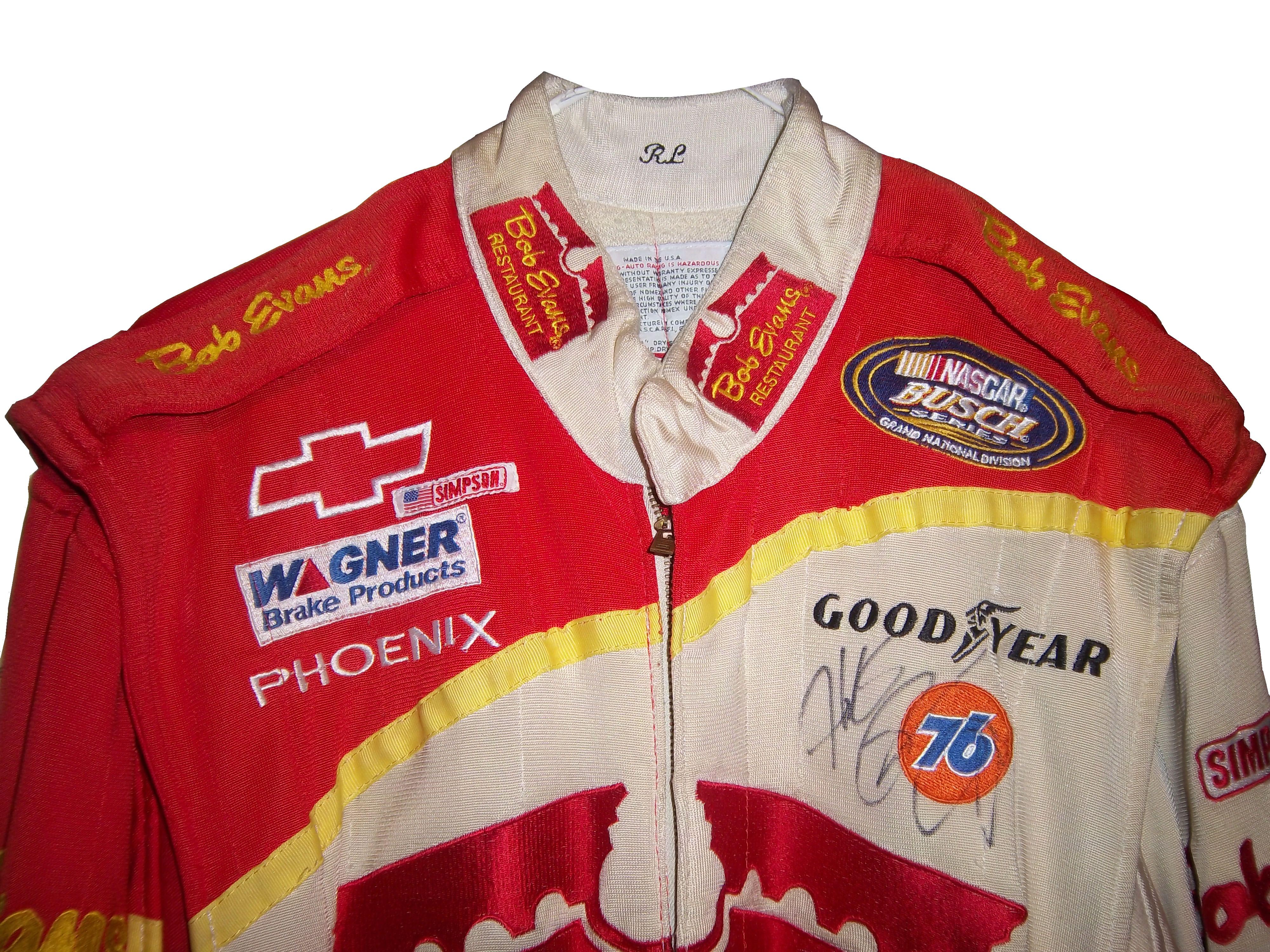
Note a couple of things: First, the fabric on the collar overlaps just a bit here, but when the driver wears it, it meets perfectly at the center of the neck. Second, it allows the driver to breathe easily. Comfort Vs. Safety is a constant debate. This is one kind of collar, the other kind of collar is what I call the Velcro collar, as shown in this Alex Barron suit from 1998:
The Velcro collar is exactly what it sounds like, a collar with a strap which Velcros shut. This provides a little more protection in case of fire. It also has another use, as sponsor ads are popular to put on the front of the Velcro strap. This has been used quite often over the years…
This is due to the fact that for quite some time the open face helmet was used, and the collar provided extra fire protection where the helmet failed. In this day in age, helmets come standard with Nomex socks on the bottom, so the collar, while still a key safety feature, is not as critical. But for sponsor logo placement, it really can’t be beat.
If the collar does not have a Velcro closure, then the primary sponsor logo is sewn into either side of the collar. Like the Lajoie example above, or this Mike Skinner example below, this can be used very effectively as a place for sponsor logos.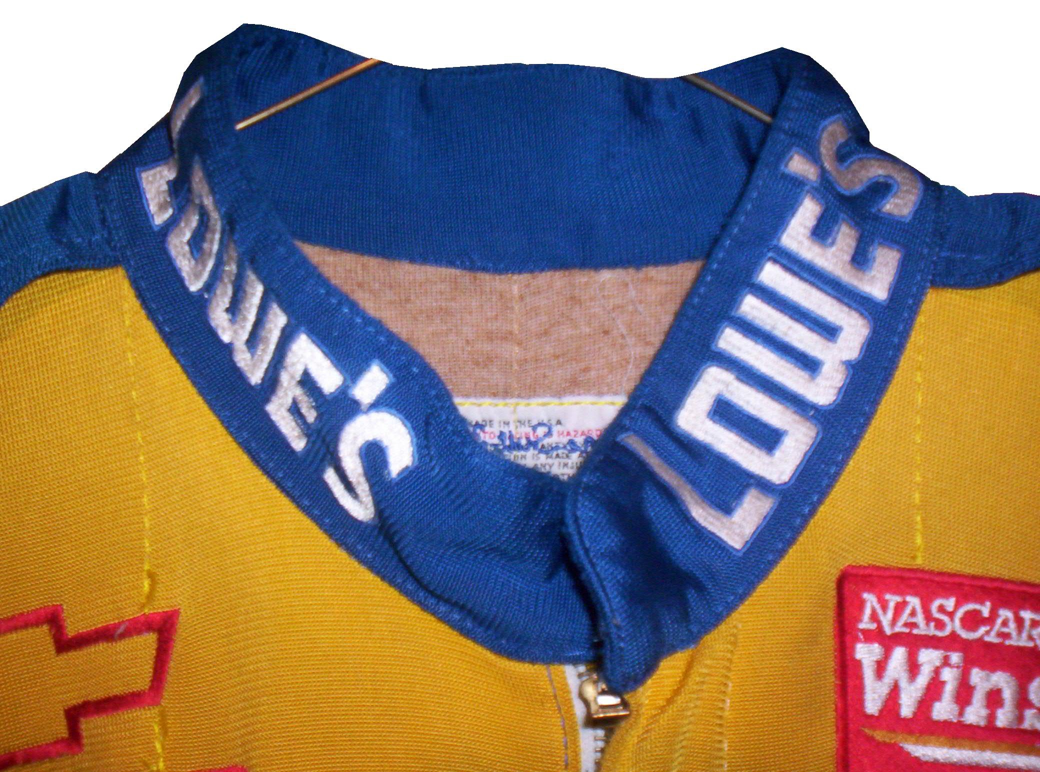
Like most other aspects of the driver suit, the choice of Velcro or not comes down to driver preference. Kyle Bush, as well as older brother Kurt favor the Velcro style, whereas Tony Stewart and Carl Edwards prefer the non-Velcro variety. Many pit crew shirts have a similar design to the driver design as well.
Editor’s note: For the next two weeks I will be on a very badly needed vacation. I will still have articles ready to go, but I won’t be commenting on up do date issues until I get back. I will still check in from time to time.
Moving on to paint schemes…
Denny Hamlin #11 FedEx Express 2005 Toyota Camry Done as a memorial to Jason Leffler, this is a replica of the scheme that Leffler ran in 2005 during FedEx’s first season as a full-time NASCAR sponsor. It is very faithfull to the original scheme. It also has a great design and color scheme, and earns an A
Greg Biffle #16 3M/Give Kids a Smile Ford Fusion The same bland paint scheme that I described as “There’s nothing really wrong here, but nothing really right here either. The side design looks forced, the black roof is idiotic, the color scheme is good, but the number design looks too cliche. It makes no sense, but 3M schemes never do.” It has a small Give Kids a Smile logo on the hood, that is all but invisible. I gave it a C and it will stay at a C.
David Stremme #30 Window Wax Toyota Camry Ugh! This is bad, I can live with the color scheme, but the design is bad. It gets a D
Austin Dillon #33 American Ethanol Chevy SS While I hate the shade of green used here, this scheme looks pretty decent. The designs around the front brake vent are unnessicary, but I still like them. If the green were a bit darker, I could give it a better grade than a C+.
AJ Allmendinger #47 Charter Toytoa Camry The hood design is interesting here. It is designed in the same light as television logos on driver suits. It is a unique idea that works and I hope will catch on. The color scheme is great, and I love the overall design. A
Brian Vickers #55 Aaron’s/Louisville Cardinals Toyota Camry The color scheme is good, but the Fruit Stripe Gum design seen on the Louisville Cardinals shorts is ugly. The whole Zubaz design scheme is horrible on sports uniforms, and even worse on this car. I have nothing against the Louisville Cardinals, but this is horrible. F
Dale Earnhardt Jr #88 National Guard Solider of Steel Chevy SS Solid simple scheme with good colors, but the Superman Logo on the hood is next to invisible.
All-Star Race Weekend Events and Fun
 By David G. Firestone
With the sad passing of Dick Trickle, as well as the All-Star Race, and the Memorial Day trifecta next week, I decided today I needed a change of pace, and I wouldn’t think about racing or driver suits today. So with my uncle in town, we went to the Museum of Science and Industry in Chicago. It’s an amazing museum with a lot of fun things to see and do, and we had a great time.
They have an exhibit that I saw concerning vintage cars, and a number of race cars. They have the winning car from the 1993 Sunrace USA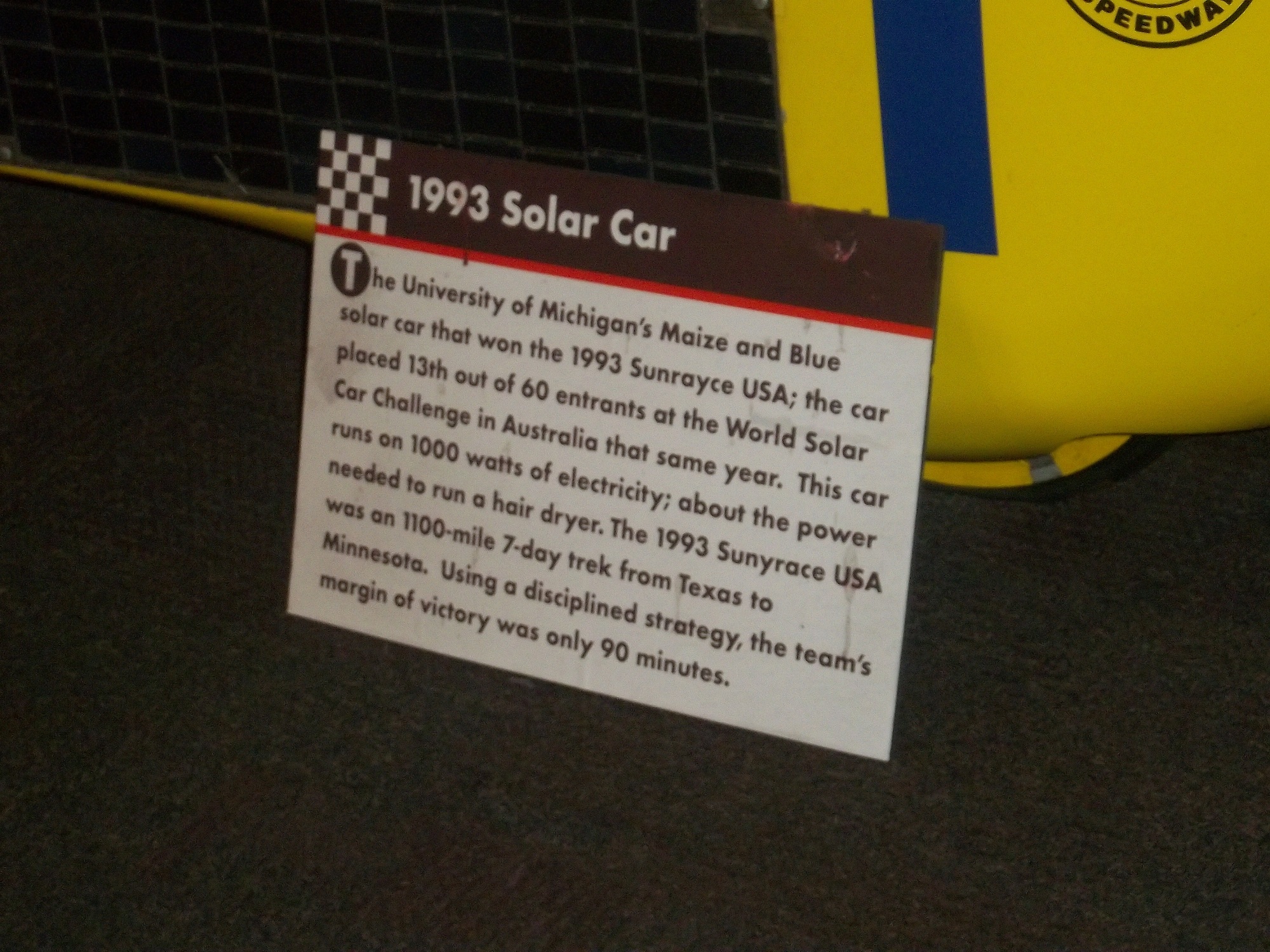
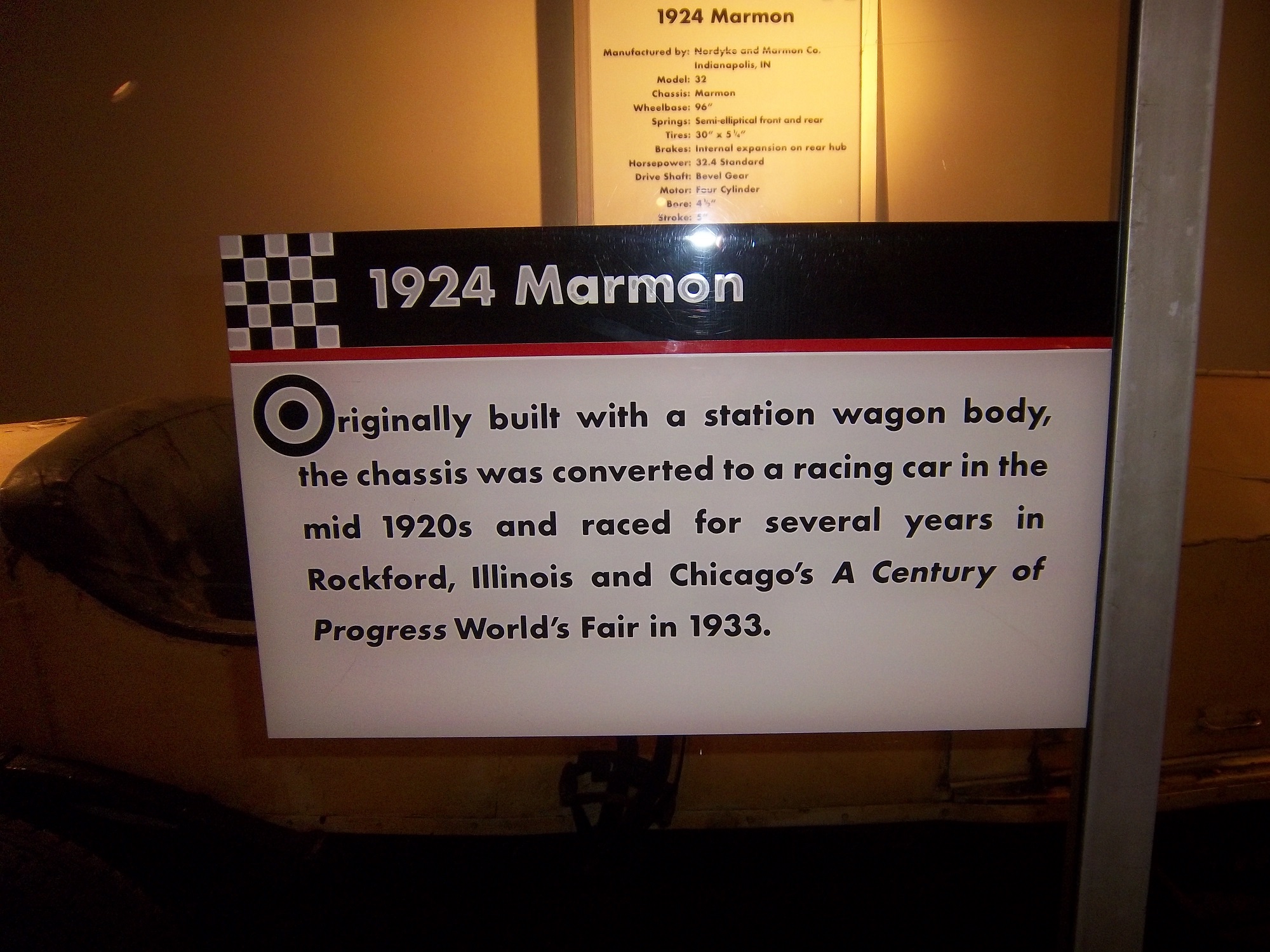
A 1924 Marmon race car 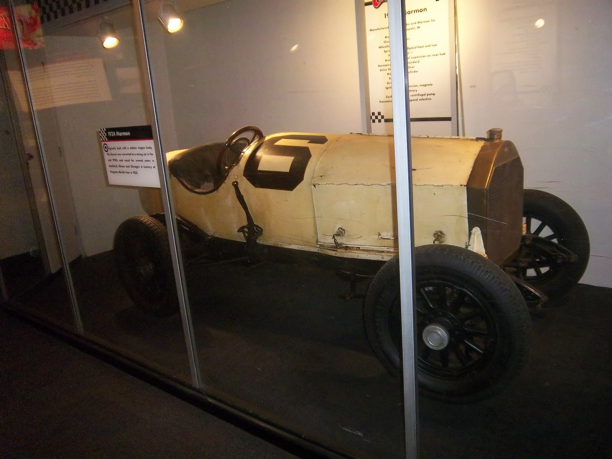
Wally Dallenbach’s car from the 1972 Indy 500 
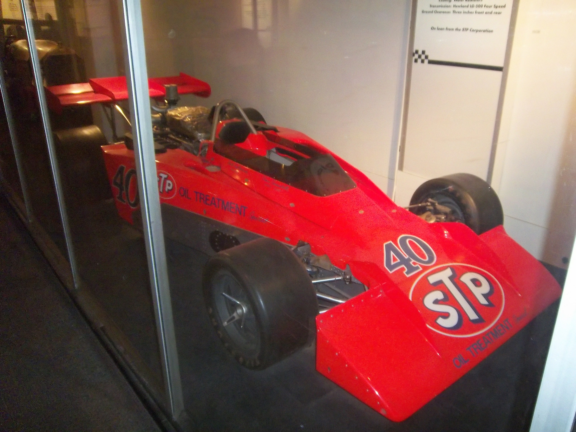
and Al Unser’s 1978 Lola race car that won the triple crown 

The Spirit Of America, which held the land speed record from August 1963 to October 1964, and still holds the record for world’s longest skid mark is also on display as well.
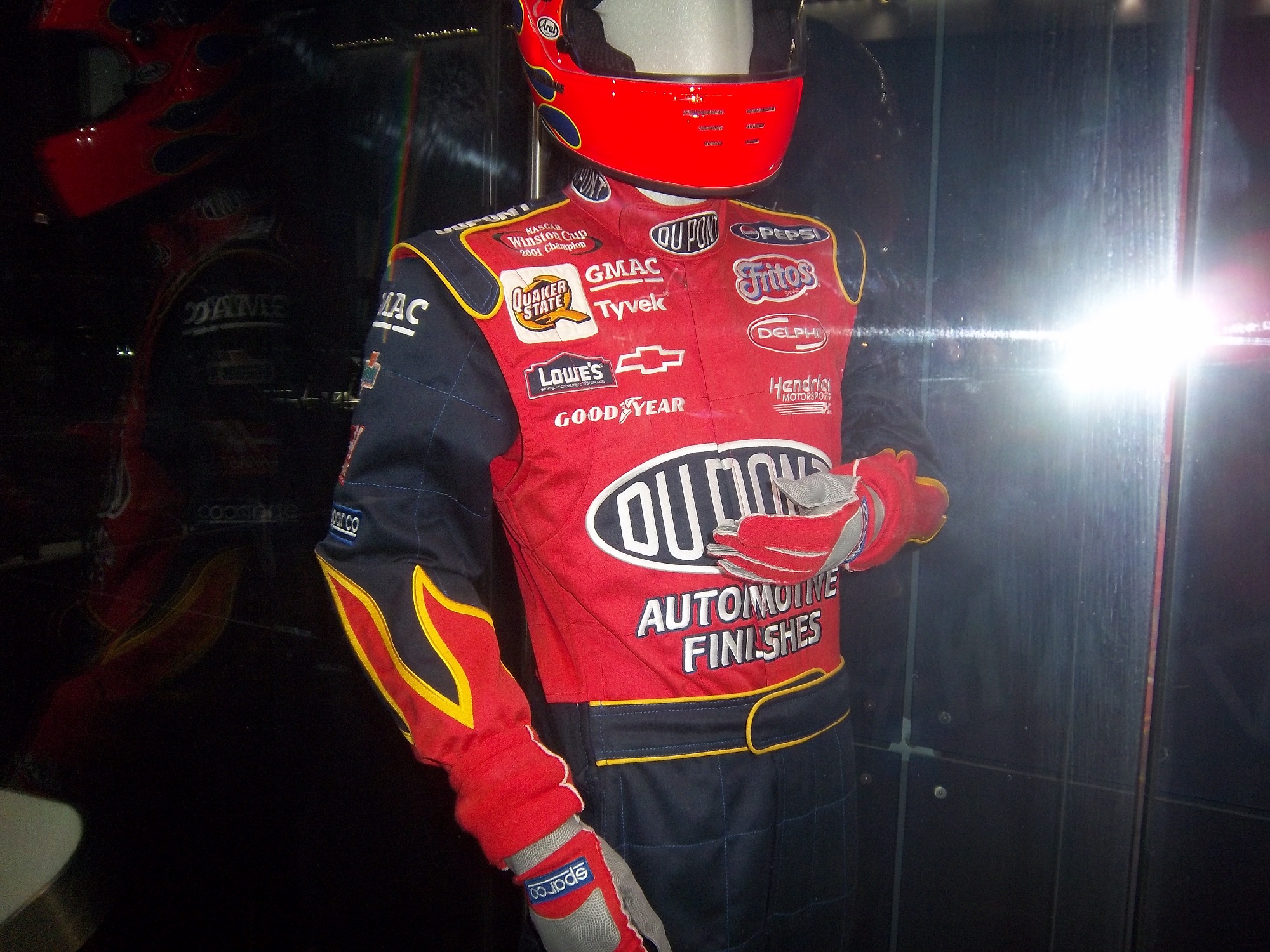
There is a new exhibit as well, Science Storms, an impressive state of the art exhibit detailing the science of natural phenomena, and how modern society has to interact with it. It is on two floors in the main gallery. On the second floor, there are displays for physics, magnetism, electricity, and fire among other things. At the end of the balcony, there is a large Tesla coil mounted in the ceiling. Nearby, I was shocked to see this display: That is a Jeff Gordon driver suit, with a similar helmet.


A helmet that has been bi-sected to display the fire protection that the helmet
A helmet used for fire testing, and a Nomex hood.
A racing helmet and matching goggles from the 1950,s and a 1975 drag racing helmet worn by Dennis Baca
and some Nomex undergarments and a Sparco bag. 

Now first off, why is the picture of Jeff Gordon from 2011 when the suit is from 2002? I think that it would be better if the picture of Gordon featured him wearing the suit on display. But that’s a minor complaint compared to some of the other issues the display has. The bag in the display clearly states “Jeff Gordon 2003.” So that might lead one to believe that the suit was from 2003. However after doing some research, the suit is from 2002. Looking at a 2003 suit, The Quaker State logo is different, the Lowes logo is gone, and the GMAC and Goodyear logos are in different places. So kudos to the museum for catching that.
The biggest issue is with the helmet cut in half. The sign clearly states “Jeff Gordon’s Helmet, Circa 2002.” Just taking a look at it, and I can clearly tell it’s not race-worn. I can tell for a number of reasons. Let’s start with the obvious fact that the color schemes on the helmet and driver suit are completely different. Second off, there are no ventilation ports or microphone equipment present. Since Gordon was wearing the vent on the left side of his helmet, the fact it is not there is very telling. Considering that DuPont Automotive Finishes paid nearly $12 million total to sponsor Gordon in 2002, his sponsor logos are conspicuously absent, and for a helmet that was supposedly worn for an entire racing season, it seems to be in very VERY good condition, almost new. It should also be noted that there are no HANS anchors present. At first I thought it was because the helmet was not meant to have them, but it turns out they were either supposed to be there, or have been removed. Why this occurred is not clear, but it clearly was NOT worn by Jeff Gordon. In fact, I would be shocked if he ever held this helmet. 

But there is one other issue with this display. The whole display is geared around fire protection, but there is no mention of safety certification. This is not a minor complaint, as the suit has a FIA certification on the back of the neck, but in the display is almost invisible.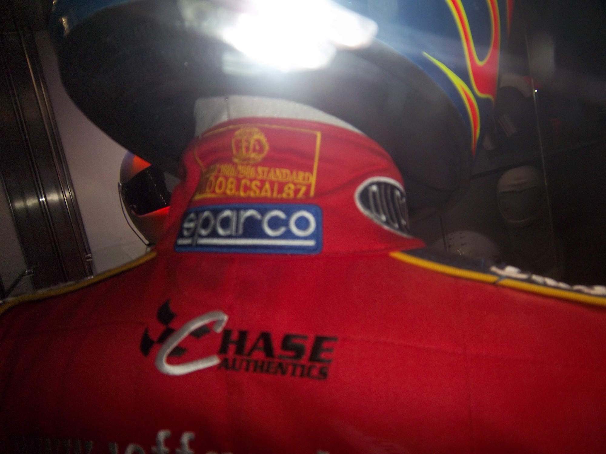
That picture, as bad as it is, is the best I can do, because the side of the display is inaccessible to viewers. If a display discussing fire safety, at least mention that the suit is certified to do just that!
Outside of that display, I had a great time at the Museum of Science and Industry, and I can look past those complaints to say that it is a really nice display that tells viewers a lot about racing safety. So if you are ever in Chicago, stop on over. I promise it is worth the time!
Now on to NASCAR All-Star Showdown Special Schemes…
First the All-Star Showdown Schemes…
Jamie McMurray #1 Bass Pro Shops/NWTF Chevy SS-Great Color Scheme, Awful design, C+
Danica Patrick #10 Go Daddy Cares Chevy SS-The racing stripe makes the scheme look better, and the hood logo is good as well A
Mike Bliss #19 Gentry Plastics Inc. Toyota Camry-Good color scheme and simple design work well here, A
Landon Cassill #33 Bicycle NASCAR Playing Cards Chevy SS-Decent color scheme, but the design is all over the place, way too chaotic, C-
JJ Yeley #36 World TradeX Chevy SS– Not much to say here…other than make the logo bigger. D-
Brian Keselowski #52 Supportmillitary.org Toyoa Camry-Eww…Too much going on, with the oversized camo in too many different colors, and the door design which is awful. F-
Now On to All-Star Race Schemes.
Brad Keselwoski #2 Miller Lite Fan Mosiac Ford Fusion. It looks really good, and the pictures of the fans give it a condensation on the can effect that is really cool. A+
Greg Biffle #16 3M Filtrete Ford Fusion-Could you please pick a color scheme and stick with it? Two different color schemes on the same car is just awful. But they are two good color schemes. C-
Kevin Harvick #29 Budweiser/Rheem Chevy SS-Good color scheme, and I like the two different designs on the side. A-
Ryan Newman #39 Aspen Dental Chevy SS-Good colors, but awful design…what does this have to do with teeth? C-
Jimmie Johnson #48 Lowes Patriotic Chevy SS-Not the best scheme he has run all year, but I would love to see the car in that shade of red on the bottom C-
To Boot or Not to Boot…That is the Question
By David G. Firestone
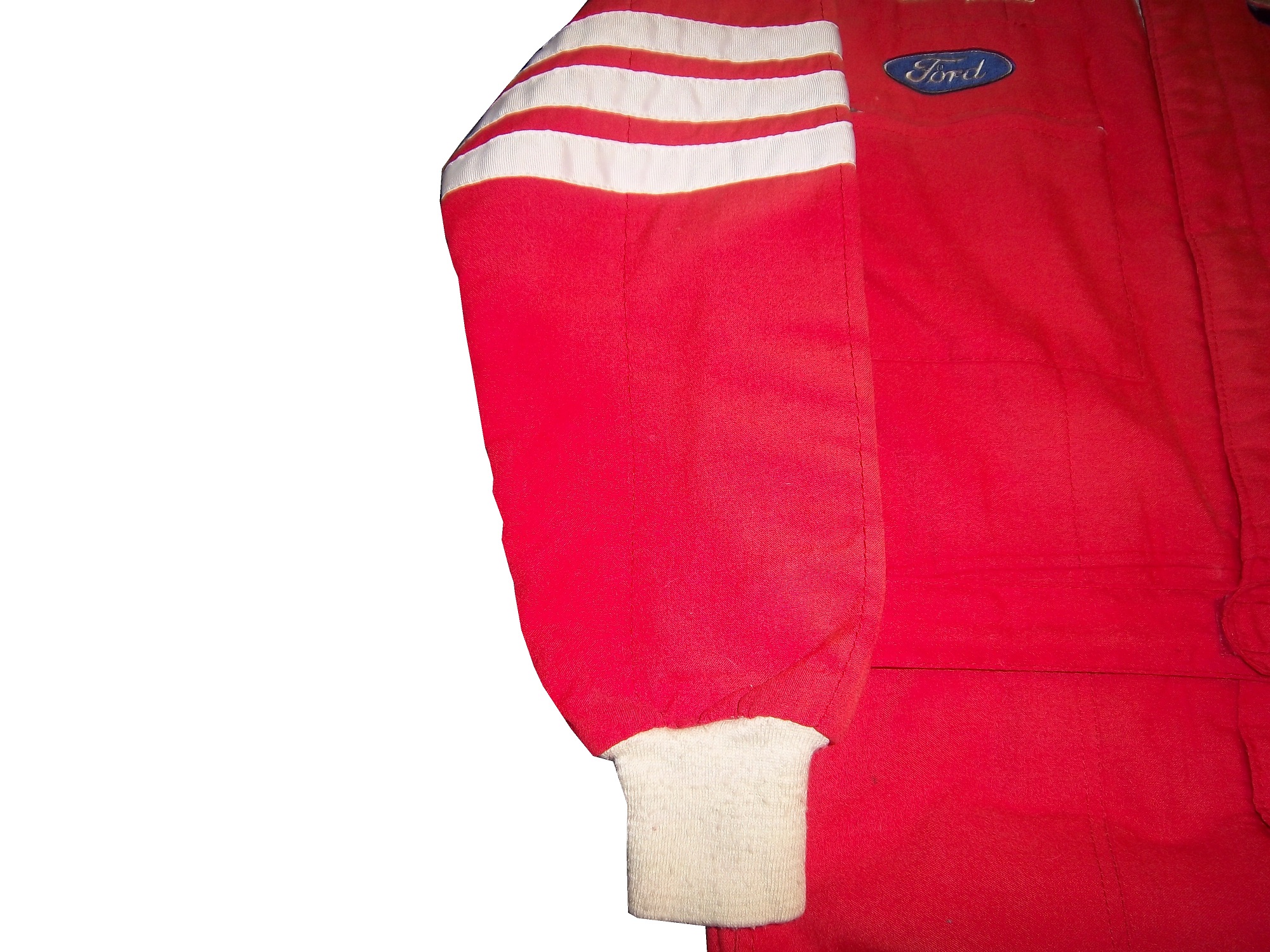
I love exploring and discussing the lesser-known aspects of driver suits, and one thing that most fans don’t get to see are the cuffs are the end of the legs. In NASCAR, that is because there is a design feature in suits called the “boot cut.”

As seen above, the boot cut features a cuff within a cuff. In NASCAR this is not just for aesthetic reasons. NASCAR, and other stock car classes feature the engine in front of the driver. In the very likely event of an engine catching fire the cuff helps keep the driver’s legs protected, as demonstrated below…
The other style of cuff is just called “cuff.” It is a predominant feature seen in F1 and IndyCar suits. Since the engine and fuel tanks are located behind the driver, and because of the restricted space within the driver compartment, the cuff style is a popular choice. On occasion, cuff cuts can be seen on NASCAR suits as well. Early NASCAR suits feature cuff cuts, but in the 1980’s, the boot cut became the standard choice.
On to the paint scheme reviews…
Clint Bowyer #15 Napa Filers Toyota Camry It looks to me like this scheme was created by taking 2 previous schemes and combining them into one horrific scheme. The color is good, but the design is so awful it earns an F- and I’m being very generous with my grade here.
Terry Labonte #32 Oxy Water Ford Fusion I don’t know why, but I like this scheme. Normally I wouldn’t like the color scheme and basic design but for whatever reason, I like this. A-
David Ragan #34 Dockside Logistics Ford Fusion I can’t be the only one who thinks that Dockside Logistics is ripping off the basic logo design and color scheme from Game Stop…right? That aside, this is a really good scheme, good color scheme, and a great design. A+
David Gilliland #38 Long John Silvers Ford Fusion I’m really reviewing a lot of Fords today, and many of them, including this one are good. Long John Silvers has a good color scheme, and the basic design used with that scheme on this car just makes it stand out. I’m not a fan of yellow on race cars in most cases, but I’ll overlook it this time because it is just so good. A+
David Ragan #38 A&W Ford Fusion The same design as the Long John Silvers car, but with a somewhat more difficult color scheme. But they pulled it off. It looks really good. A+
Austin Dillon #51 Tag Heuer Eye-wear Chevy SS Finally a Chevy to review, and it is a good one! Black, red and white is almost always a good bet for a race car, and the classic racing stripe design really works with this car. A+
Kurt Busch #78 Denver Mattress/Serta Chevy SS The simplest design in NASCAR but with a Serta logo on the side, instead of a Denver Mattress logo. It works and works well enough to earn a solid A grade.
Malcom McDowell #98 Ambient Edge Air Conditioning Ford Fusion It has a classic look to it, with a good color scheme. Gets a Solid A
That’s it for this week. Next week, I will be working on another project, so I won’t be adding another article for two weeks.
Warranty Labels…Unseen by Many
 By David G. Firestone
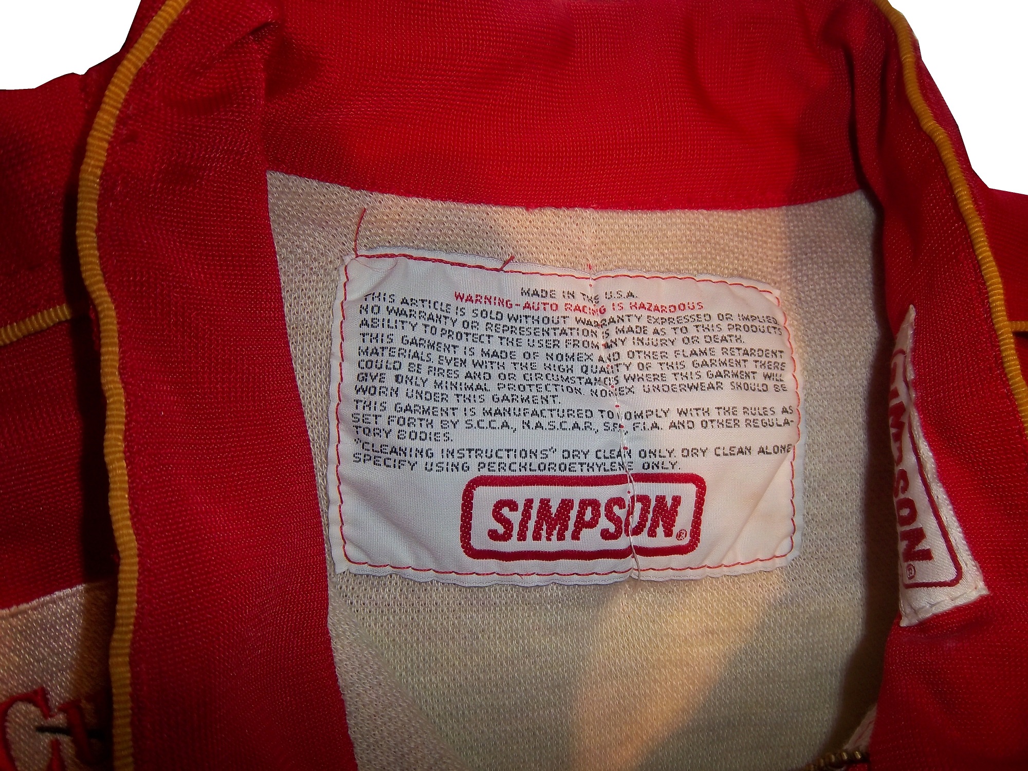
This week, we take a look at a suit feature that is unseen by most race fans. Every suit has one, the so called “Liability Tag. ”-Every piece of racing equipment has some form of “liability tag” which basically states that anything that happens to the wearer of the item is the wearer’s fault and not the company’s fault. The Simpson tag, which has remained virtually unchanged since the 1980’s reads as follows:
“Warning-Auto Racing is Hazardous-this Article is sold without warranty expressed or implied. No warranty or representation is made as to this product’s ability to protect the user from any injury or death. This garment is made of Nomex and other flame retardant materials. Even with the high quality of this garment there could be fires or circumstances where this garment will give only minimal protection. Nomex underwear should be worn under this garment. This garment is manufactured to comply with the rules as set forth by S.C.C.A., N.A.S.C.A.R. , S.F.I., F.I.A., and other regulatory bodies.”Cleaning Instructions” Dry clean only. Dry clean alone. Specify using perchloroethylene only.”
Sparco’s tags are located behind the zipper andhave two different statements. Older suits have this tag:
“Although this product is manufactured from special materials that satisfy certain safety standards and may carry the approval of various authorities for its use in specific circumstances the manufacturer or supplier can not be held liable for its protective qualities under all activities, circumstances, and conditions.”
Newer Sparco tags have this warning in both English and Italian:
“It is important to carefully read the user’s handbook concerning the care of the garment. This suit will offer protection from fire and the transmission of heat for a limited time, but it does not offer total protection against any kind of hear or fire. The fabric used to make this suit is subject to aging. It is recommended that the suit is inspected frequently for any signs of wear or damage that may result in a loss of protection to the wearer. If the suit has been worn extensively and shows signs of war or damage it is recommended to wear another suit. Sparco is not responsible for any damages the suit incurs from improper use of the suit bu the user, or any third party. Through improper care of the suit, misuse of the suit, or discoloration of the suit from perspiration, or any use of the product after the expiration date, as described in the instruction manual. Do not leave this garment under sunlight, or any artificial light. This suit is not intended for use in go-karts.”
Impact! Suits use this simple warning:
“Motorsports are dangerous. the user of this product assumes the risk of injury or death. No warranty or representation is made that this product will protect the user from injury or death”
This is by no means unique. Almost all sports equipment to a certain extent has this type of warning. This example is from an XFL helmet. 


On to Paint Schemes…from here on out, I will only review Sprint Cup paint schemes.
Paul Menard #27 Rheem Chevy SS/Serta Chevy SS Basically the same scheme as his regular scheme, but with two different hood logos…nothing really to say here…C-
Kevin Harvick #29 Jimmy Johns Chevy SS Great color and design, but I still don’t understand why Jimmy Johns sponsors Harvick instead of Jimmie Johnson…still a solid A scheme
Jeff Burton #31 Qwik-Set Chevy SS Grey…so much grey…so bland…so boring…C-
Josh Wise #35 Blockbuster Ford Fusion Didn’t Blockbuster go bankrupt? Apparently they have enough money for a one race deal…though the color scheme of the logos, and the car are different…C-
Scott Riggs No Label Watches Ford Fusion A great color scheme ruined by awful number design and medicore car design. C-
Michael Waltrip Aarons/Alabama Crimsion Tide Toyota Camry Decent color scheme and a simple, yet elegant design that works for both the car, and Alabama. It earns a solid B+
The Epaulet…What It Was, and What It Is
 The mighty epaulet, every racing fan has seen them, but few understand what they are for. They are now mostly for fashion and sponsor exposure, but epaulets have a more interesting history than one might think.
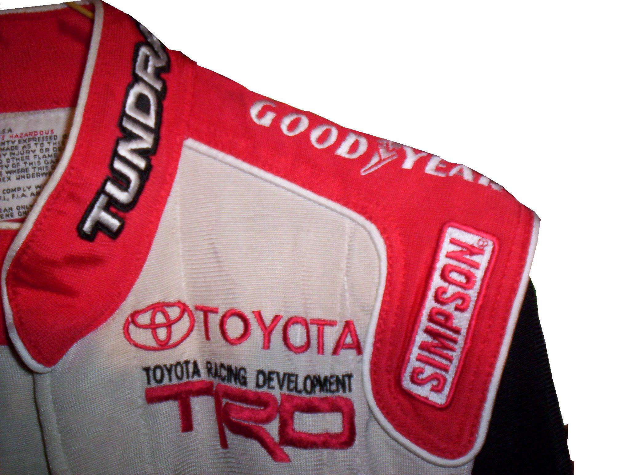
Back in the 1950′s and 60′s, racing suits were supposed to provide fire protection, but early versions of the suit were very unreliable. Many drivers perished in fires, and sometimes, drivers were trapped within the car, unable to escape the raging inferno within their car. The solution? The epaulet. Mounted on both shoulders, epaulets were reinforced strips of fabric specifically designed to help pull an injured or unconscious driver from a burning car. Epaulets quickly became an integral part of the driver suit.
As racing technology became more advanced, the need for epaulets for safety began to decrease, but this was happening at a time when coverage was increasing and sponsorship was rising. It did not take that long for sponsors to realize that they could slap a logo on the epaulet and get the company name more visible on pictures and TV interviews. As such the epaulet made the successful transition from safety feature to fashion accessory.

As in-car cameras began to become commonplace across racing, epaulets evolved with them. I mentioned in a previous post that Christian Fittipaldi favored epaulet styles used in F1 and IndyCar. When Sparco first came to NASCAR in the early 2000′s, they brought their epaulet style with them, and it quickly became the standard for NASCAR epaulet style. Most driver suits worn in NASCAR today involve some variation of the Sparco epaulet. They have evolved very well over the years, and are a familiar part of the driver suit
Moving on to paint schemes…
First the NASCAR Camping Word Truck Series
Ty Dillon #3 Bass Pro Shops Chevy Silverado Bass Pro Shops has a great scheme this year, both in the Cup series, and this scheme is just good. Nothing wrong, everything right, Final grade: A+
Brendan Gaughn #62 South Point Hotel and Casino Chevy Silverardo This scheme is very simple, and looks really good. The color scheme is solid, and brings back memories of Rusty Wallace driving for Miller Genuine Draft. The lettering is easy to read, and stands out. Final Grade: A
Now on to the Sprint cup Series…
Trevor Bayne #21 Ford Motorcraft/Quick Lane Ford Fusion I think this is a prototype, but that said, this is still a classic scheme. It has a great color scheme, number design, and is just a solid scheme all around. Final Grade A+
Jeff Burton #31 Cheerios Chevy SS This scheme is rather under designed for my taste. The color scheme is decent, but the gray Cheerio design is hard to see, and looks more like soda carbonation rather than breakfast cereal. Final Grade C+ On a related note some more pics from the Caterpillar scheme have been released, and they are still using the same scheme from last year. It is pretty good, so my final grade will not change.
Austin Dillon #33 Honey Honey Nut Cheerios Chevy SS Now this is just awful. The color scheme is bad, and the HONEY NUT CHEERIOS lettering is nearly invisible. The bright blue Kroger logo looks out of place, and the tailpipe decals with rookie stripe just takes more away from an already bad scheme. Final Grade F-
Birds and Sports
Quick, what do Randy Johnson, Dave Winfield, and Dale Earnhardt Sr. all have in common? Well for starters, all were very talented, and all are Hall of Famers, but that isn’t all. The unique thing about these three players is that each one of them has accidentally killed a bird while playing sports. Dave Winfield was playing in Toronto in 1983, and was playing catch with a bat boy, when a seagull flew into the path of the ball, and was hit and killed as a result. This was a total accident, but the fans were so upset that Winfield was arrested for animal cruelty. Police later dropped the charges, and Winfield was released. In 2001, Randy Johnson was pitching a spring training game, when he hit a dove with a pitch in a freak accident. A number of animal rights groups were upset, but no charges were filed.
Dale Earnhardt Sr.’s story is by far the strangest. At the 1991 Daytona 500, Earnhardt was a heavy favorite to win the race. Davey Allison won the pole, Hut Stricklin was 2nd, and Earnhardt was 3rd. Allison led the first lap, and Earnhardt took the lead during the 2nd lap. During that same lap, Earnhardt’s Chevy Lumina struck a seagull on the back stretch. Although this might not seem that bad, it seriously damaged the car, affecting the air intake, and raising the temperature of the engine. Emergency repairs took place, and while Earnhardt finished 5th, he wasn’t in contention for the lead after the seagull incident.
The really weird thing is that for many years, the seagull incident was a metaphor for Dale Sr.’s record at the Daytona 500. No discussion on his 19 futile attempts to win the Daytona 500 would be complete without mentioning the seagull incident. While other attempts to win the 500 ended with flat tires, or running out of gas, or just plain wrecks, the seagull incident stands out, along with the 1997 flip.
The 1997 Daytona 500 had the other unique incident at Daytona. During the 1997 event, Earnhardt was, again, a heavy favorite to win the event, and on lap 188, he was in a four-way battle for the lead, and he got into a wreck with the 28 car of Ernie Irvan, and rolled his car on the back-stretch. Irvan’s hood flies into the crowd and causes a number of injuries to fans. Earnhardt’s car lands on its wheels and Dale gets out of the car and heads to the ambulance. As he does so, he notices that his car has all four tires on it, so being Dale Earnhardt, he gets out of the ambulance and walks over to the car, and asks the guy attaching the car to the wrecker to see if the engine will fire, and it fired. He climbs back into his car and drives back to pit road, where is car is patched up as best could be done, and he finished the race 5 laps down. This is the only incident where a die-cast was made of a wrecked car. Speaking to reporters after the race, Earnhardt said “Well I just wanted to get back in the race and try to make laps, and we runnin’ for a championship…I got in the ambulance and I looked back at the car and said “man the wheels is still on that thing.” I got out of the ambulance and and asked the guy inside the car and he was hooking it up, I said “see if it would crank,” and he cranked it up, I said “get out, give me the car back” so I drove it back around and we taped it up.” It is a moment that still brings chills to my spine and this is 15 years later.

I am proud to say that I own a piece of each car from the two above stories. From the 1991 Daytona 500, I own a small piece of the passenger-side fender, which still has race damage present. As seen below:

From the 1997 Daytona 500 I have this piece of what remained of the car after the event. Interestingly, the car was repaired, and raced at Talladega later that season. The race damage is clearly visible on it:

Moving on to paint schemes…
Kyle Busch #18 M&Ms Toyota Camry Very solid scheme here. Not only is the color scheme great, it looks even better than last year, with a clean front. The cleaner lines of the new car just make this scheme so much better as well. Final Grade A+
Jeff Burton #31 Caterpillar Hybrid Excavator Chevy SS Another great scheme, though the tailpipe decals are really ugly, and the yellow roof number is really ugly. Final Grade B+
And we also have some driver suit photos and videos
Joey Logano #22 Shell/Pennzoil Ford Fusion This was posted on Logano’s Facebook page, and all I can say is… Hey look kids! It’s Ronald McDonald! Joking aside, this seriously looks like a McDonald’s suit, but with Shell and Pennzoil logos. That being said, it’s not a bad suit, the television logos are good, and it gets a final grade of an A
Jimmie Johnson #48 Lowes Chevy SS This video, from Hendrick Motorsports YouTube page shows Johnson’s new suit. Very solid, with a great color scheme and basic design. I could to without the white collar, but that is only a minor complaint for a great suit, and it gets an A!
