
Tag: nascar winston cup
Vintage Box Break-1994 Finish Line Gold Part 3
We crack open another 1994 Finish Line Gold box on Vintage Box Breaks.
Ted Musgrave-My Favorite Driver to Collect Part 2
 By David G. Firestone
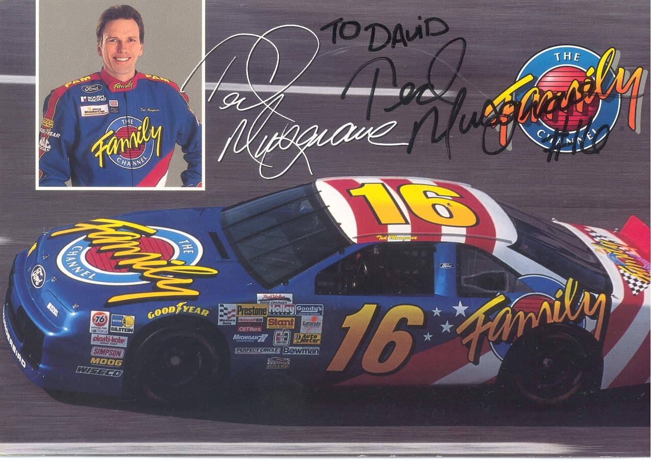
Last week, I discussed my favorite driver to collect, and this week I will examine his most well-known sponsor. From 1994-1997 Musgrave was sponsored by the Family Channel. The distinctive patriotic red white and blue design with that Family Channel logo was eye catching. The Family Channel logo was classic 1990’s design. It was also an idea whose time had come, and is still a great idea.
It was founded by Pat Robertson in 1977 as the CBN Satellite Service, which focused on Christian Broadcast Network programing. By 1981, it had re-branded as the CBN Cable Network, which began to focus more on family-friendly programing. It was a channel where families could watch together without needless violence, and gratuitous sex, something that should be redone today. The major moment was in 1990 when the channel became too profitable for the non-profit Christian Broadcast Network, and was transferred to International Family Entertainment, Inc. The CBN Cable Network became The Family Channel, and began to air recent dramas and sitcoms, as well as cartoons. In 1994, to gain visibility, The Family Channel joined forces with Roush Racing to create the #16 Family Channel Ford Thunderbird. This partnership lasted for 3 years, and Ted raced in 124 races, with 15 top 5’s and 36 top 10’s.
During the 1997 season, The Family Channel was purchased by Fox Kids Worldwide Inc. which was a joint venture between News Corporation, and Saban which re-branded the channel as Fox Family channel. This was out of necessity, as the average age of the viewer under the Family Channel banner was much older, and Fox Family set about trying to win back the younger viewers. The channel was used for everything from movies to cartoons, to Fox programing to Major League baseball. It became clear when the channel went from 10th in ratings to 17th in Nielsen ratings, that something was not working. Many outside observers felt that the push for younger viewers alienated the previous viewers.
In July 2001, almost 4 years to the date, the channel was sold to ABC and re-branded it ABC Family, which still operates to this day. It has come up with a format that amalgamates the two different styles of network. Though it hasn’t regained its previous glory, it has created a network that is family-friendly and appeals to families, not just young kids.
The #16 race team it spawned has had just as interesting a history. Roush had started in NASCAR in 1988, with Mark Martin as a driver and Stroh’s Light as the sponsor. They had a lot of success as a combo, and a second team was created in 1992. Wally Dallenbach Jr. started driving the Keystone Beer sponsored #16 Ford Thunderbird in 1992. Changes came in 1994, When Ted Musgrave was taken on as a sponsor. Ted was kept on until midway through the 1998 season, when he was let go from the team, and replaced with Kevin Lepage.
In 1999, TV Guide became one of the primary sponsors, and Lepage had a decent start to the season. As 1999 went on, Primestar left, TV Guide stayed and Lepage slipped in the points standings. I own a Kevin Lepage race-worn and signed helmet from 1999. It has the distinctive red and yellow scheme that TV Guide was known for. 


 In 2000, Family Click took over as a sponsor, but Lepage slightly improved finishing 26th . At the end of the season, Family Click left the team, Lepage was released, and the #16 team disappeared for the entire 2001 season.
In 2002, the #16 Roush Racing Ford came back to NASCAR with Greg Biffle. They ran a limited schedule with 7 races started of the 10 races Biffle attempted to qualify for. In 2003, Biffle raced in the #16 Ford full-time, winning the Winston Cup Rookie of the Year award. Biffle continues to race in the #16 Ford full time and has had a lot of success, having won 19 races between 2003 and 2013. This team has a very bright future ahead of it.
Now on to…
PAINT SCHEME REVIEWS
Greg Biffle #16 Megulars Ford Fusion Best scheme Greg Biffle has run all year…and since that this is a C+ scheme, that is really sad. The color scheme is good, but the car design is awful.
Travis Kvpail #32 SK Handtools Ford Fusion Great design, great color scheme A+
David Stremme #33 Mace Chevy SS Great design, great color scheme, and I think that this is the first self-defense spray I have seen sponsor a car, so A+
David Reuitmann #35 MDS Ford Fusion Great color scheme, great design scheme, works very well, A+
Justin Allgaier #51 SEM Chevy SS Great color scheme, great design scheme, works very well, A+
Justin Allgaier #51 AccuDoc Chevy SS Decent color scheme, yellow is a bit too bright, otherwise a great scheme, A-
Dave Blaney #77 Humphrey Racing Ford Fusion Great color scheme, great design scheme, works very well, A+
Josh Wise #98 Trench Shoring Chevy SS Great color scheme, great design scheme, works very well, A+
Ted Musgrave-My Favorite Driver to Collect Part 1
By David G. Firestone
During a conversation over lunch a few weeks ago, I was asked by a co-worker if I have a favorite driver to collect. My response was “Ted Musgrave” but the longer I thought, the deeper it went. I began to think about why he is my favorite driver to collect, as opposed to Dale Earnhardt Sr. who was my favorite driver to watch on track. From there I began to think about sponsors and teams, and for the next 2 weeks, we will examine these three factors, driver, sponsor and team in depth.
We will start with the driver. Theodore “Ted” Musgrave was born in Waukegan Illinois, which is roughly 28 miles from Evanston where I grew up. Having a hometown driver from your area in the Sprint Cup Series is always a plus. He raced for many years in Wisconsin, and began to drive for the ASA in 1987, winning one event before moving to NASCAR in 1989, where he raced a full Busch Series season. In 1990, he raced 4 Winston Cup events, before joining the series full time in 1991. He would lose the Rookie of the Year award to Bobby Hamilton. He raced for the #55 Jasper Engines machine from 1991-1993, for two different owners.
In 1994 he joined Roush Racing driving the #16 Family Channel Ford Thunderbird. Joining Mark Martin boosted his status immediately. The familiar patriotic red white and blue Thunderbird was an attention getter and he had a number of races that he should have won. In a feature for Winston Cup Illustrated, a number of drivers who hadn’t won a race were featured, and each of these drivers had reasons why they haven’t won as part of the article. For Musgrave, this part of the article read “It’s puzzling.” He had a decent career with Roush, but in 1998, Roush let Musgrave go, and replaced him with Kevin Lepage. After leaving Roush, Musgrave joined NASCAR Hall of Fame owner Bud Moore for two races for Rescue Engine Formula, then bounced aground the Sprint Cup until 2003.
In 2001, he had started driving for the Craftsman Truck Series full-time, and here he found his true calling in NASCAR. From 2001-2010 he won 17 races, had 80 top 5’s and 109 top 10’s. He would win the Truck Series title in 2005, while driving the #1 MOPAR Dodge Ram. That season, he had 1 win, 11 top 5’s, 15 top 10’s as well as an average finish of 9.4 in the 25 races held that year. After that, he raced for 3 more years, but only scored one more win. He retired after 2010.
Now I covered this to some extent in January of 2013, but let’s delve further. I have two Ted Musgrave driver suits, this first one is from 1995.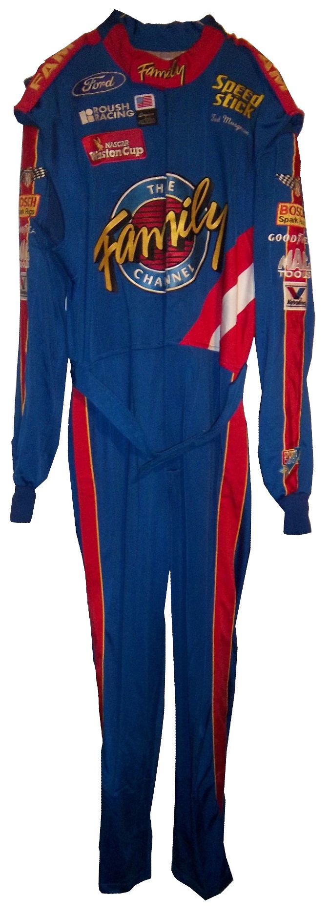
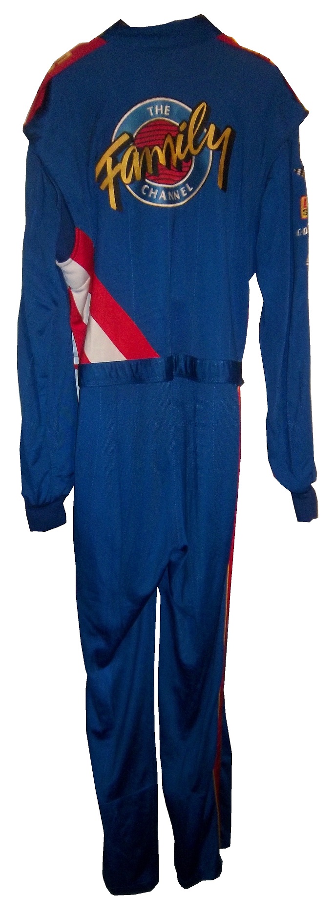

It has the familiar Family Channel motif. 
 It also has a ROUSH RACING and NASCAR WINSTON CUP SERIES logos.
  No television logos exist on the arms or legs.
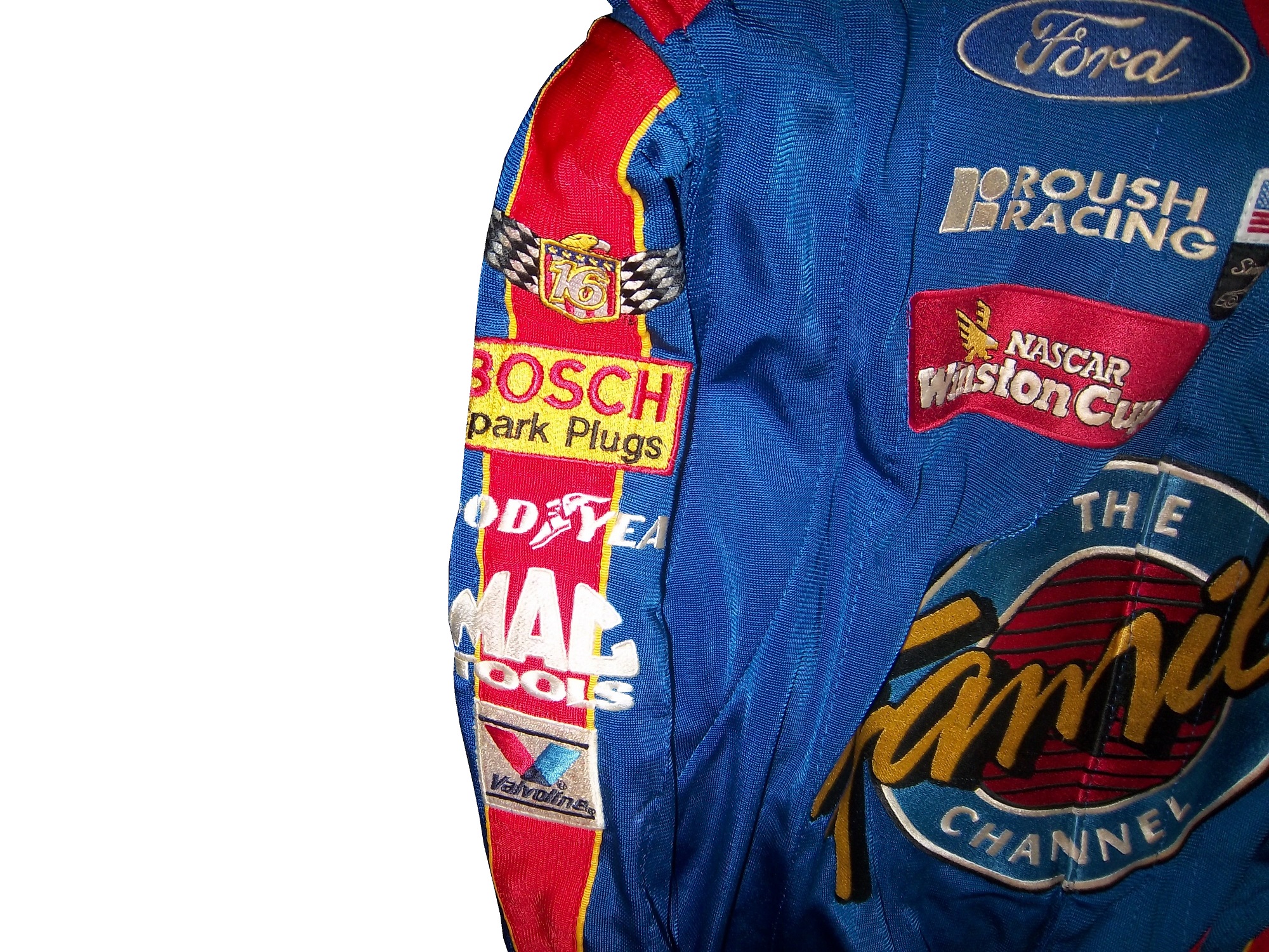

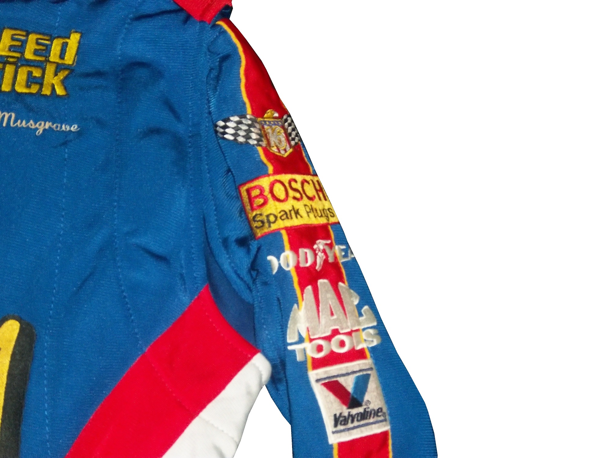
 And that classic name on the chest design that bit the dust shortly thereafter.
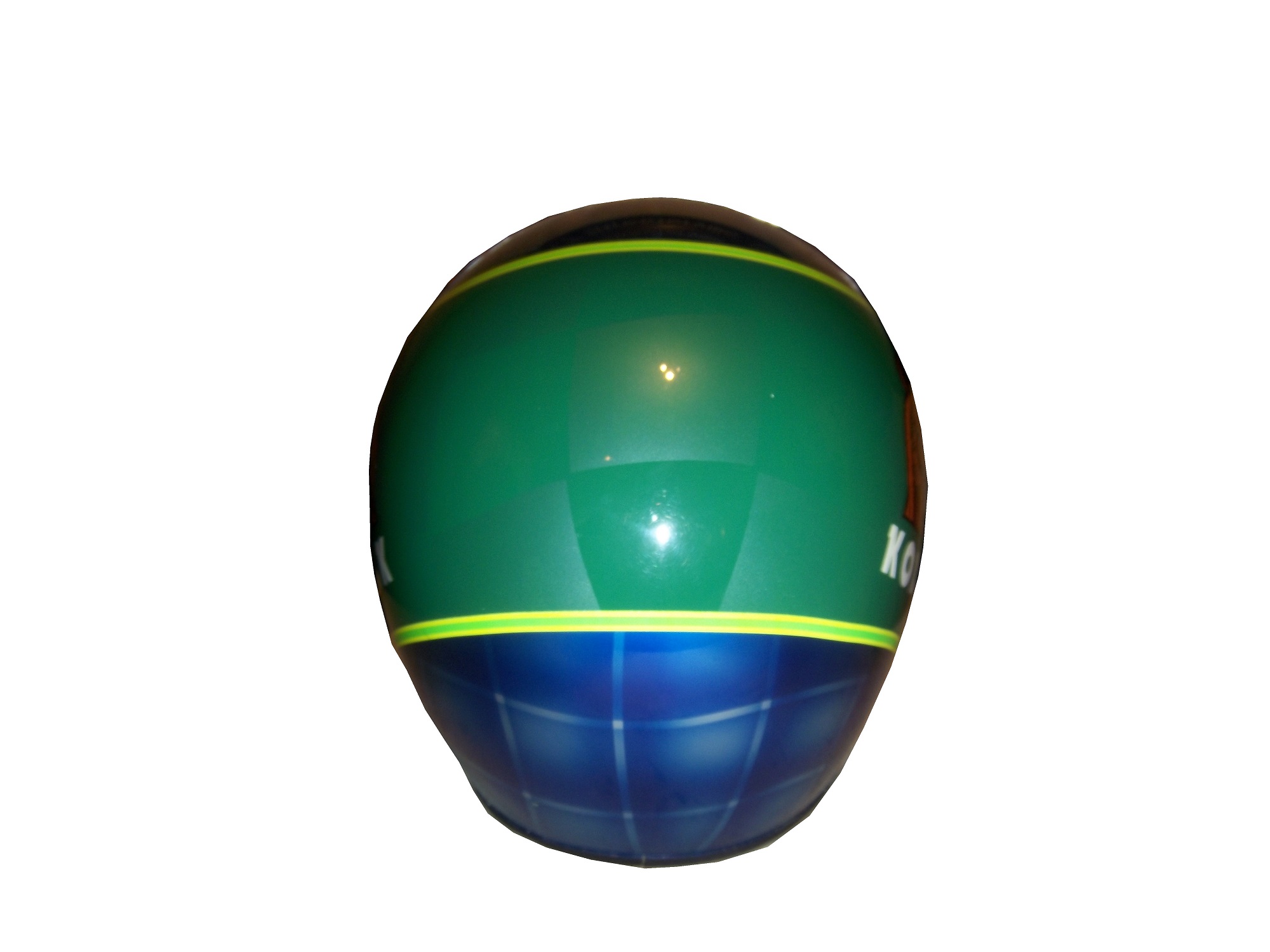
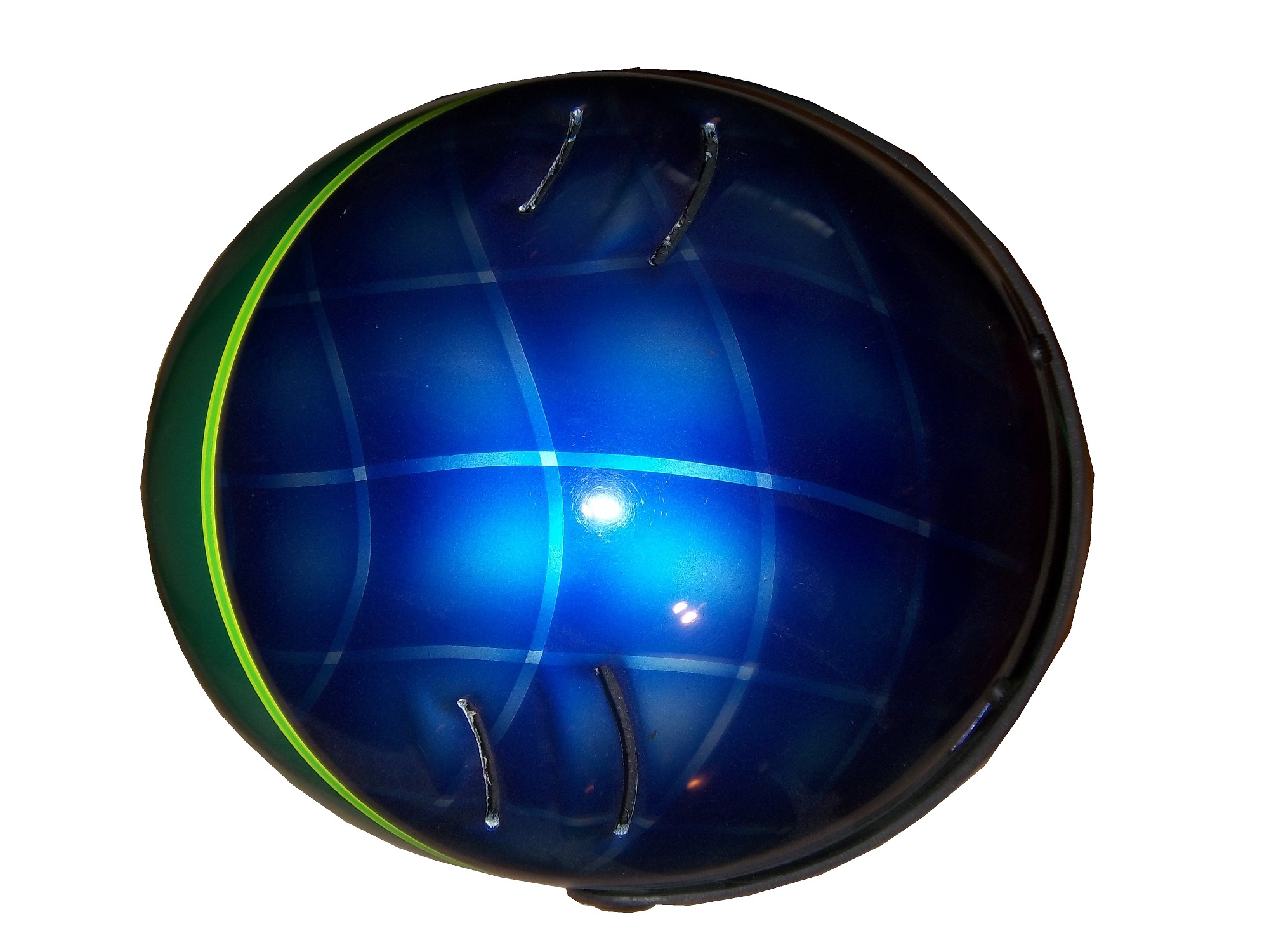
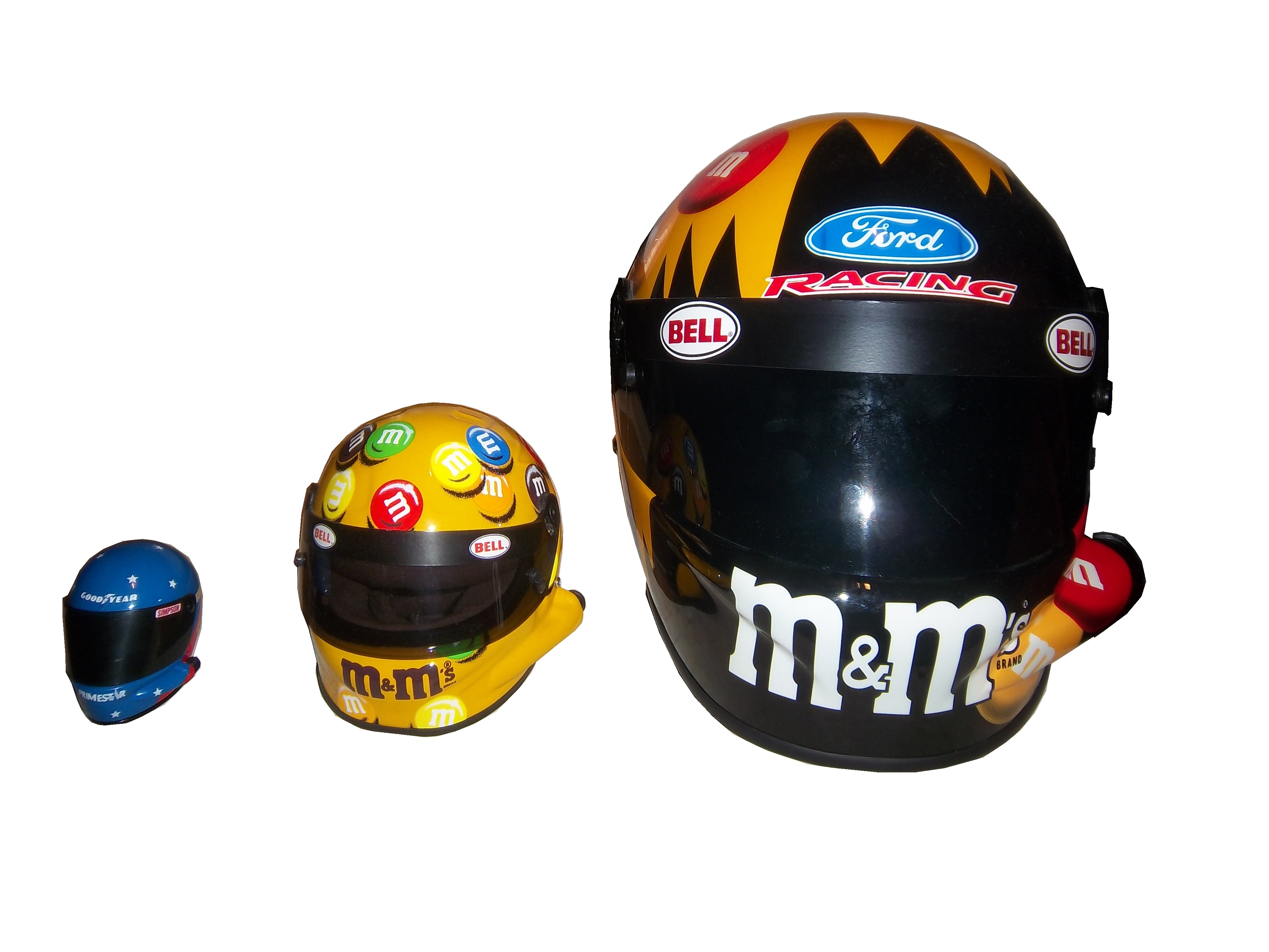
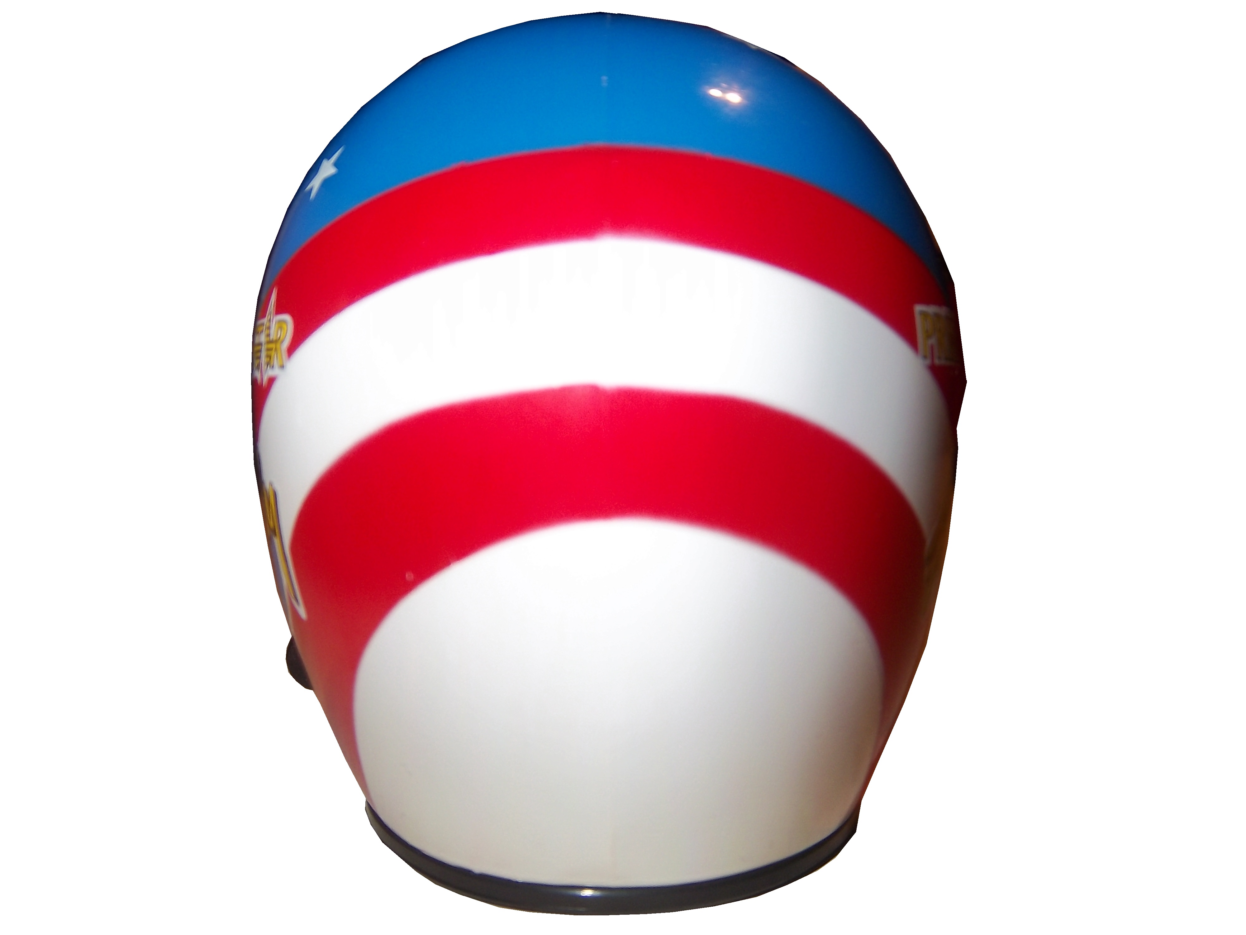
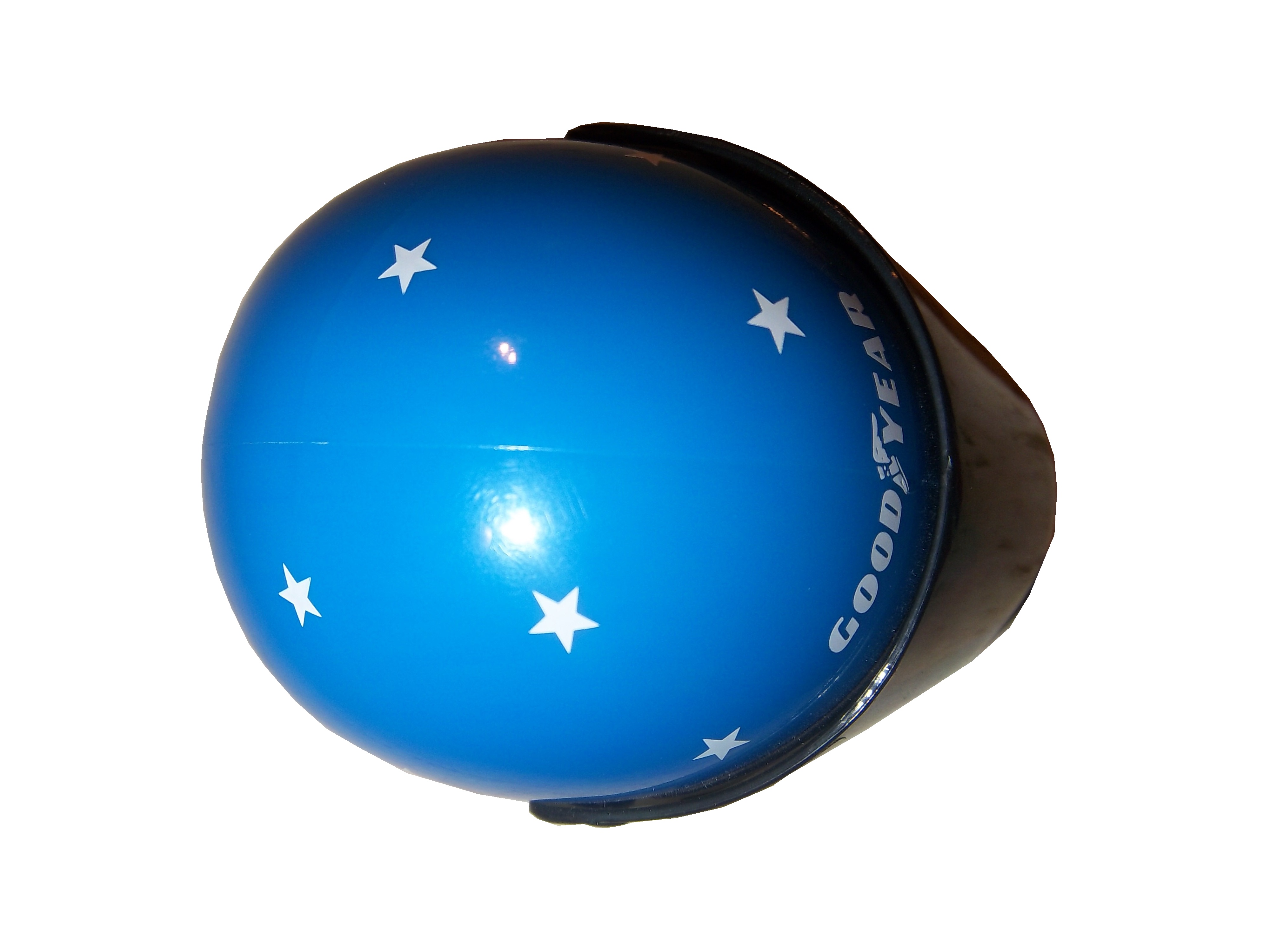
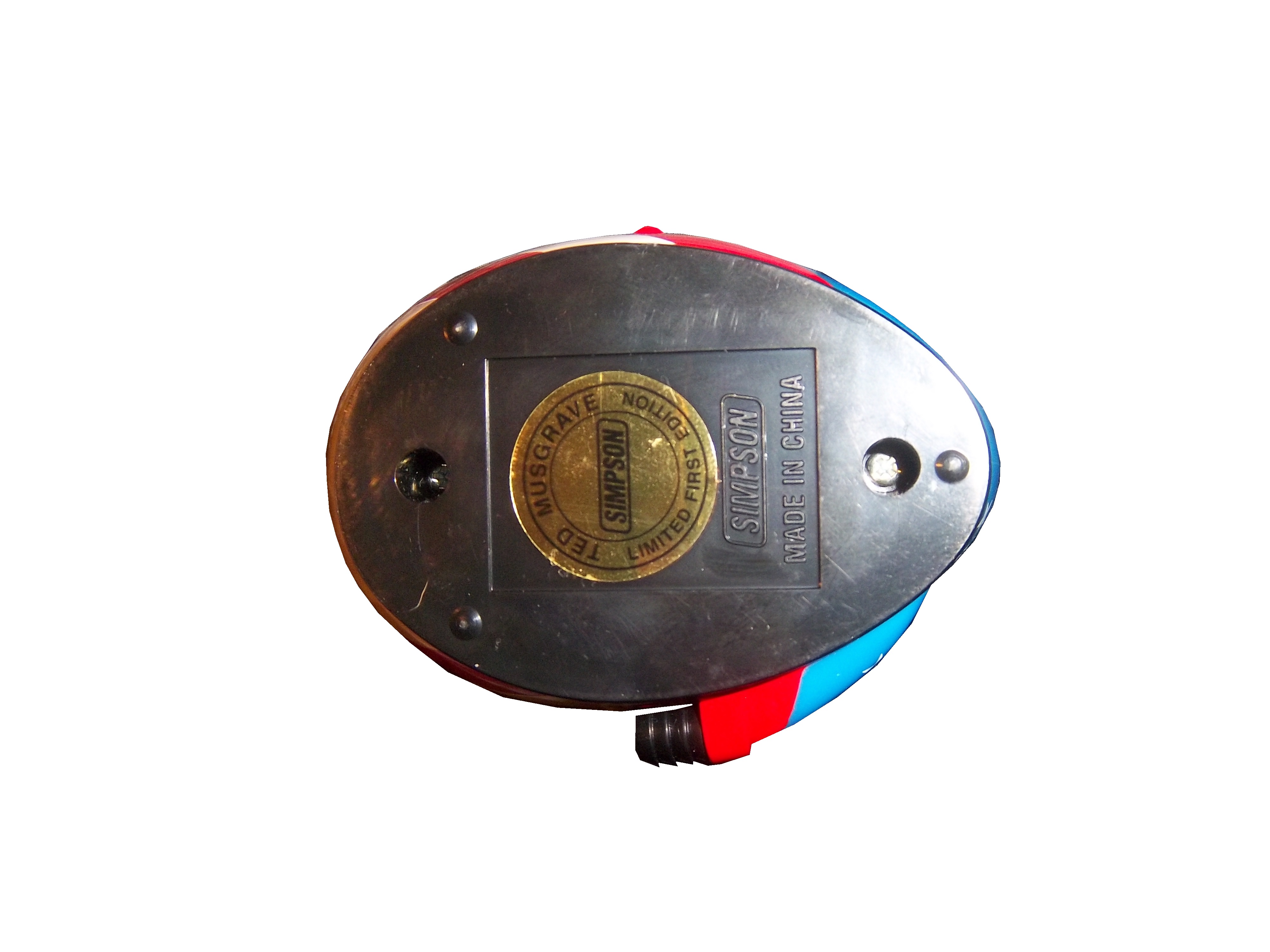
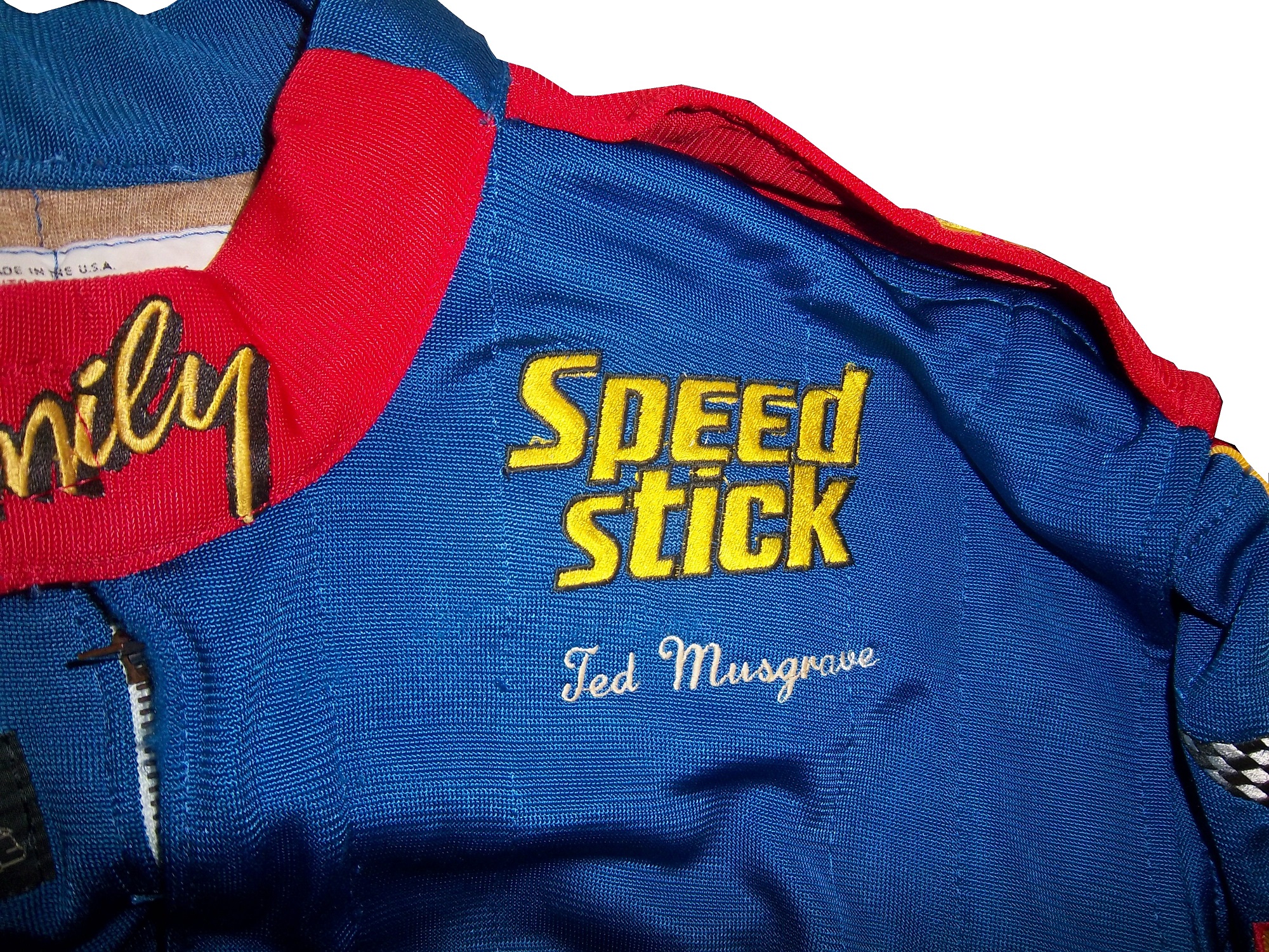 From 1996, I have this helmet.
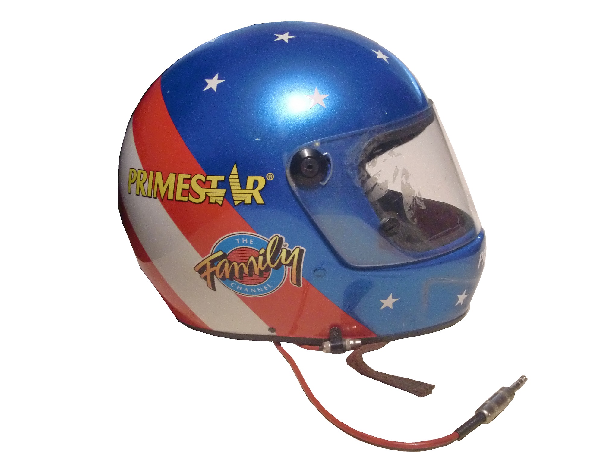
It is clearly from 1996 as Primestar joined the team in 1996, and the design was changed from stars and stripes to red and blue in 1996. 
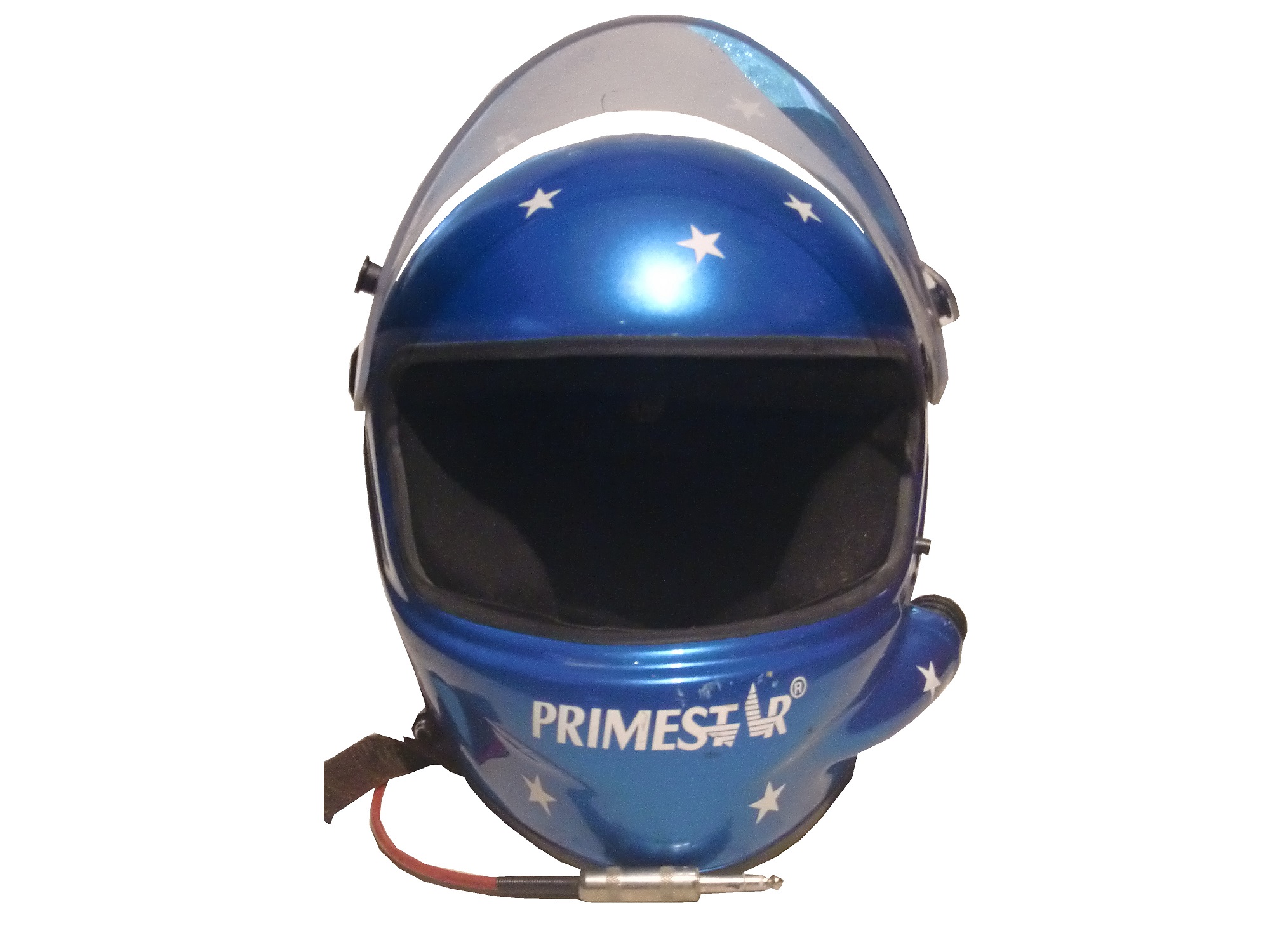

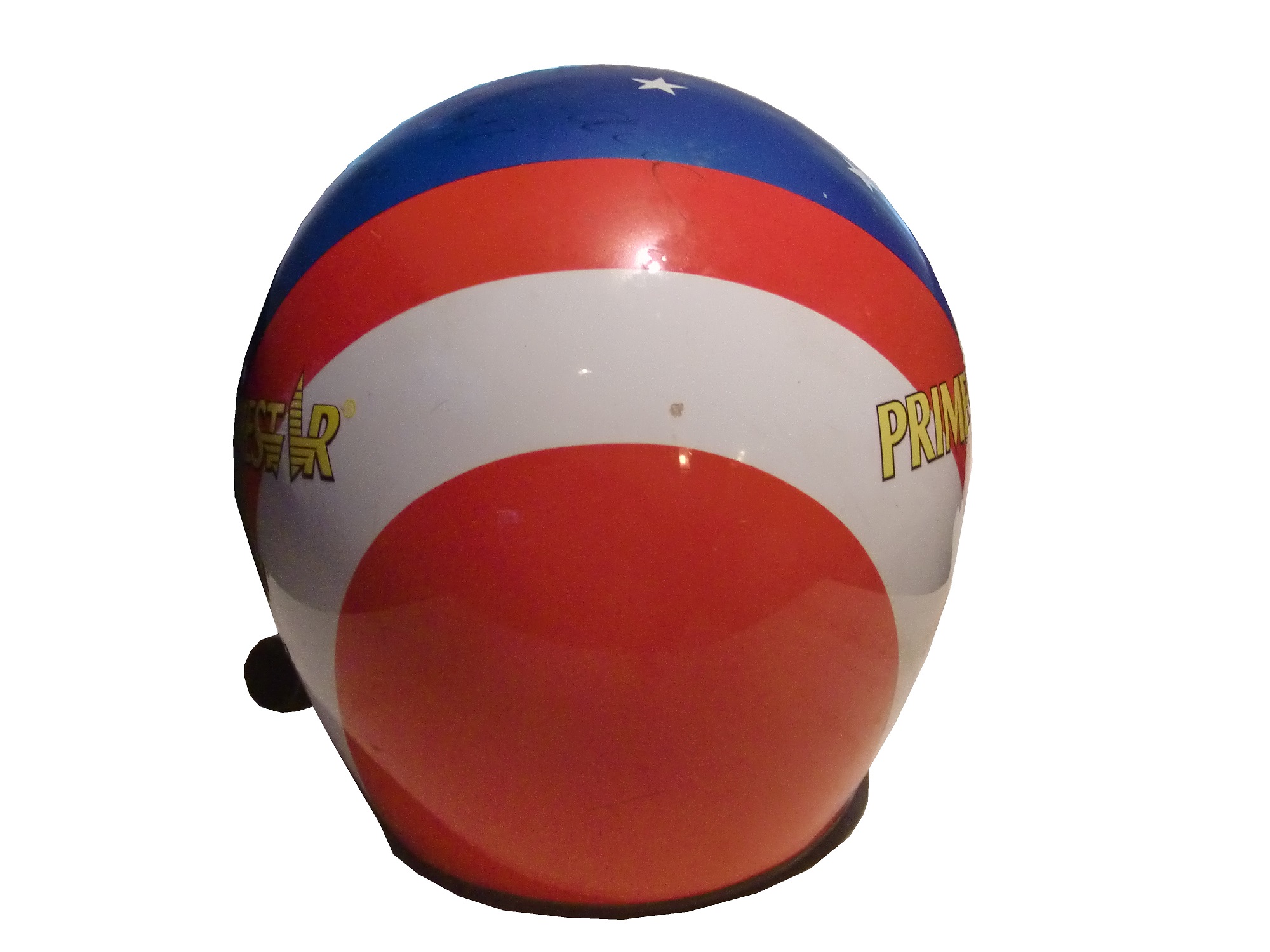
Ted has autographed the helmet, though the signature has faded. This helmet was also the inspiration for a mini helmet, also released in 1996, which is very accurate.
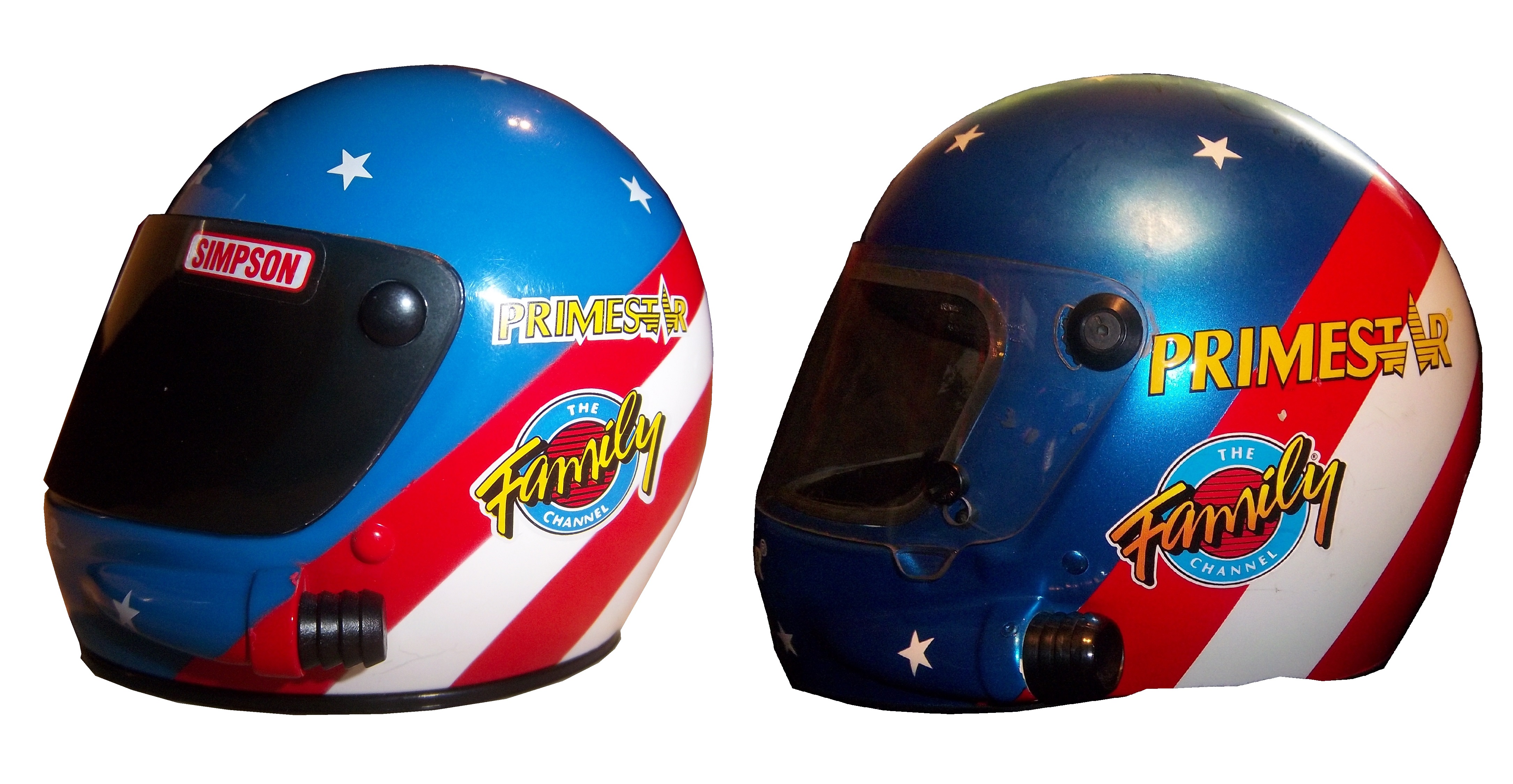

I also have this suit from 1998, which was designed after Musgrave was released from Roush Racing.

It has TV logos, though not in the “proper” configuration for NASCAR,

 a NASCAR 50th Anniversary logo,
 and Ted’s name on the belt.
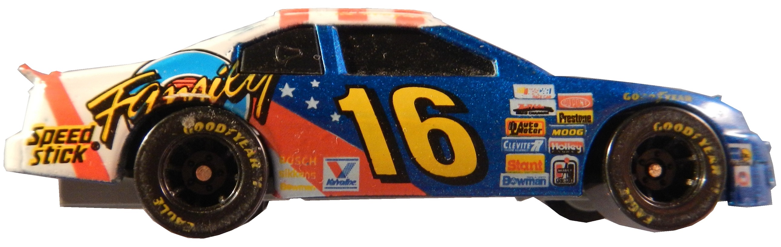
 When it comes to die casts, I have 4, two from 1996,
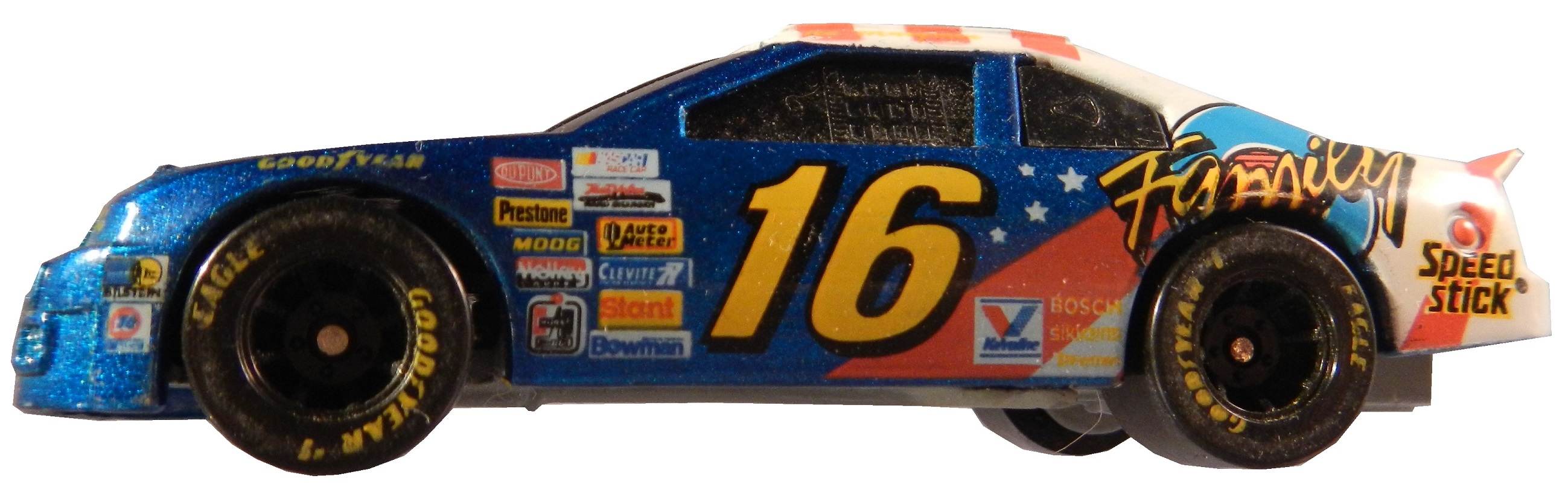


 as well as a 1996 hauler,
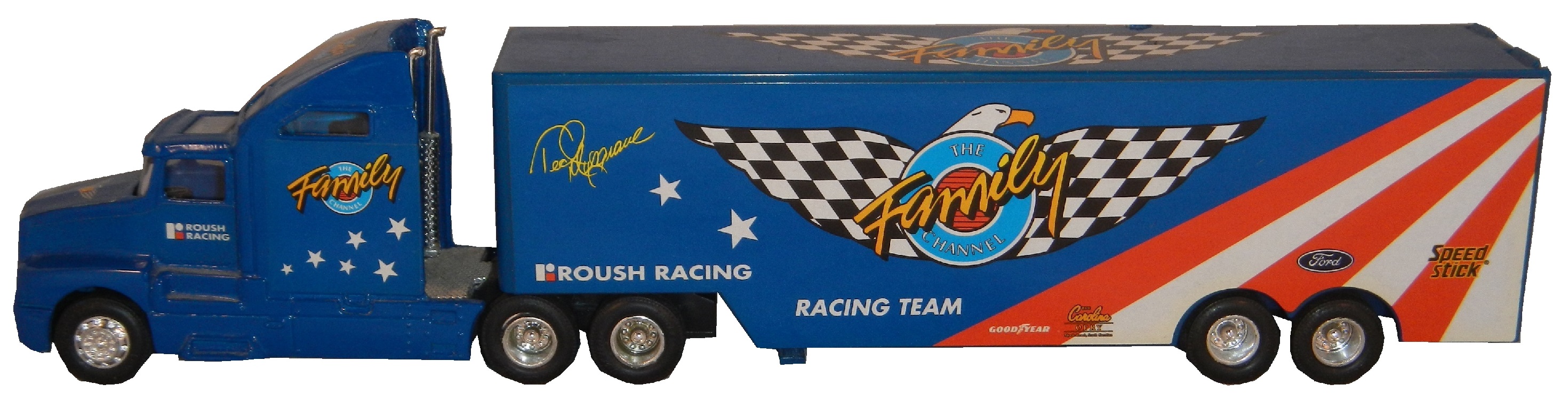

 and a die cast from 1997.

 This is a large piece of sheet metal from his days with Germain Racing, which Ted has autographed on the side.
My last two pieces of Ted Musgrave memorabilia are two of the oldest and most cherished pieces in my collection. These two autographed hero cars were given to me from a family friend. She had encountered Ted Musgrave at a party and happened to get these from him directly. I love and treasure these two cards and never get tired of looking at them.
Next week, we will look at his most well-known sponsor, The Family Channel, but now on to…
Paint Scheme Reviews!
Ryan Newman #31 Kwikset Chevy SS Looks exactly like Kurt Busch’s scheme, and it earns the same A+ grade
Landon Cassill #40 CRC Brakleen Chevy SS I like the color scheme, and the design is good. My only complaint is that it doesn’t clarify that CRC Brakleen is a brake fluid. Still it earns an A
Brian Vickers #55 Treatmyclot.com Toyota Camry A good scheme, and the 55 lettering looks really good here, and the gold is a nice touch. The treatmyclot.com logo works better than the Aarons logo, A+
Sponsor Profiiles-Kodiak Tobacco
 By David G. Firestone
As this week’s column is being posted, I am boarding the Texas Eagle in Tucson Arizona, awaiting the train ride back to Chicago to begin. I’ve spent the last week away from the deep freeze of Chicago, and in the warm weather in Arizona.
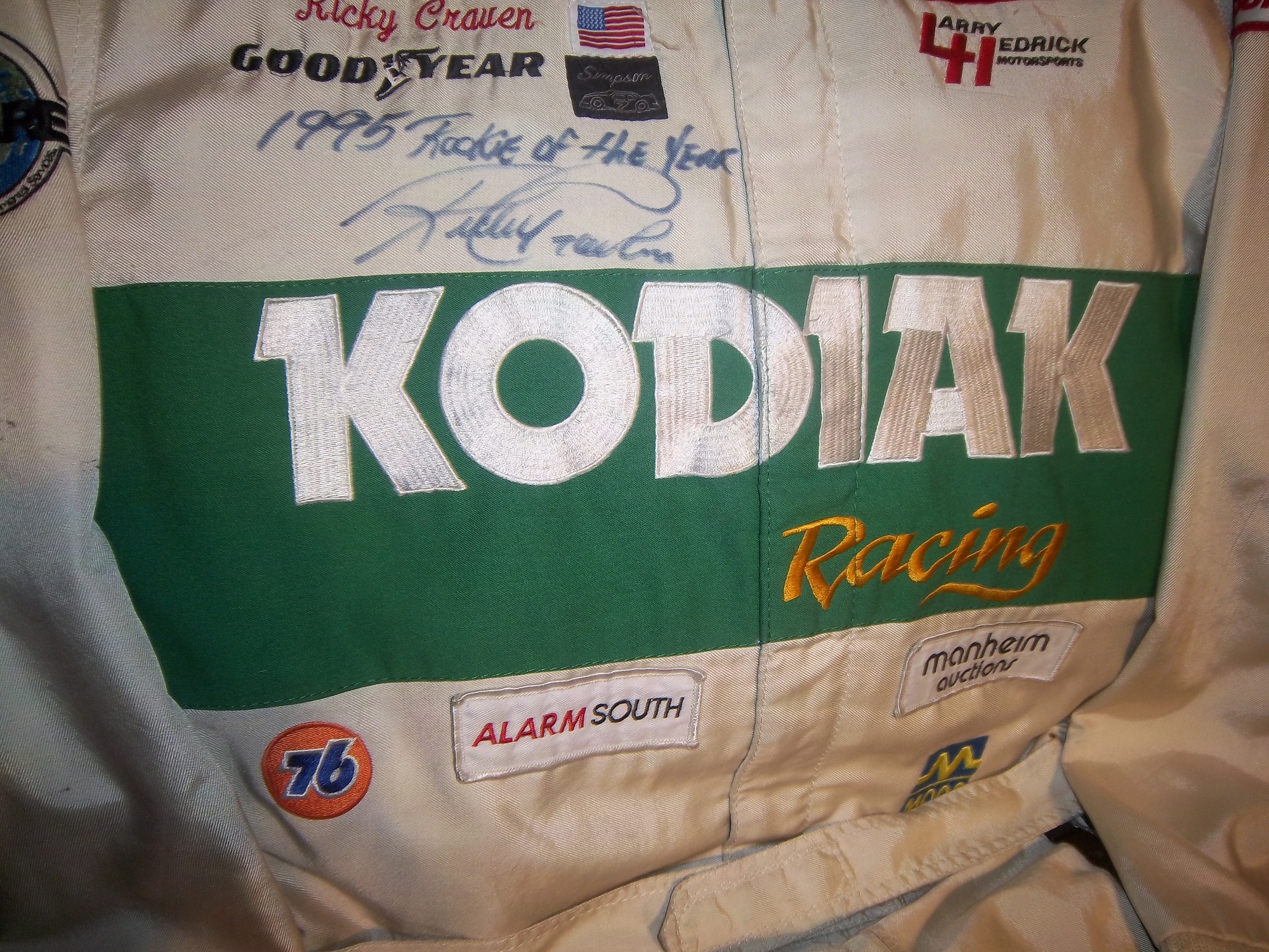
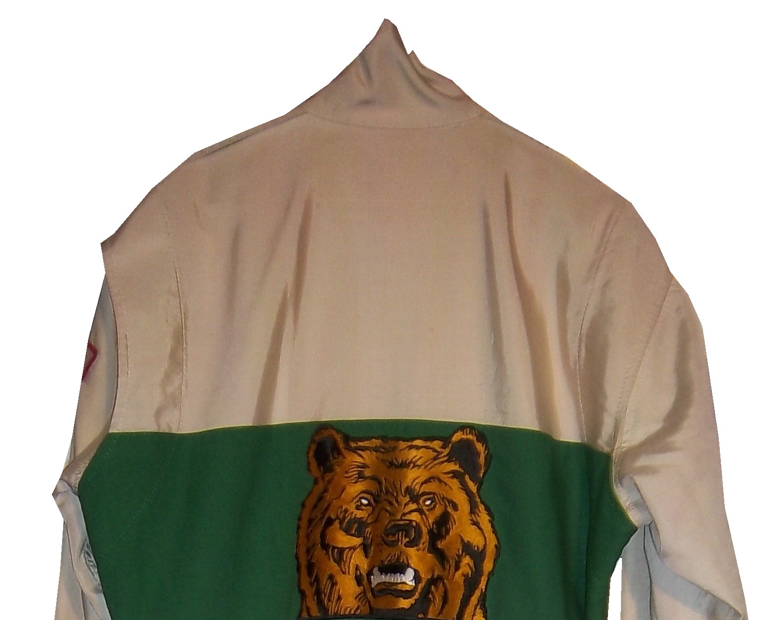
The colors of the desert are deep and bold. Just like those of one of my favorite racing sponsors to collect, Kodiak Tobacco. Kodiak is a subsidiary of Reynolds American, which also owns Kool, Winston, Salem, Doral, Capri, and Camel cigarettes, and Grizzly tobacco. They were a major sponsor of NASCAR in the 1980’s and 1990’s. They sponsored Rusty Wallace, Ricky Rudd(as Levi Garrett) Ken Schrader, Ricky Craven, Steve Grissom, and Stacy Compton. They have one of my favorite shades of green used in racing. Interestingly, for many years, green was considered an unlucky color in racing. The most promenent item in my collection is this Ricky Craven suit from 1996.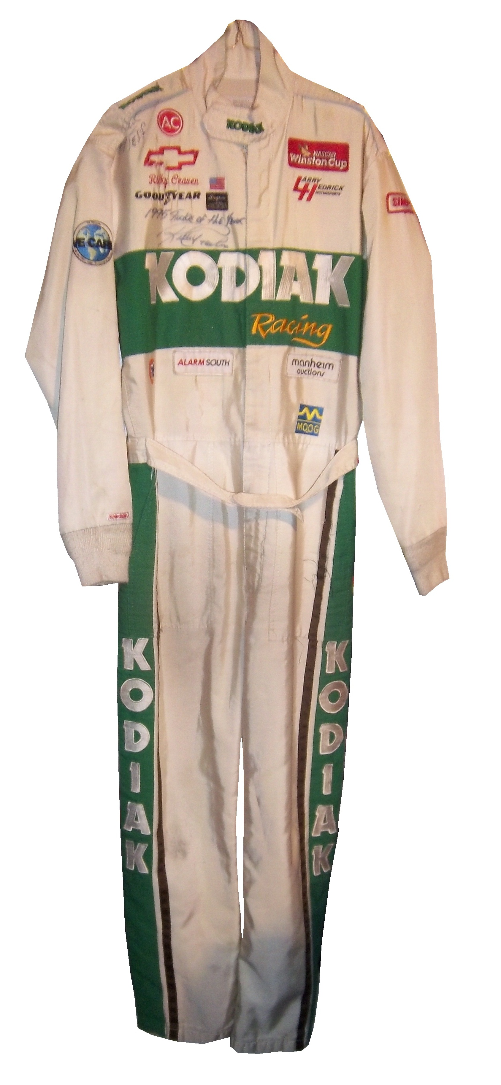
It does show signs of use, but the big question is “was this worn in the 1996 Winston Select?” which was the race that Ricky Craven suffered his worst wreck…
I asked Ricky about that via Twitter, and got this Private message in response.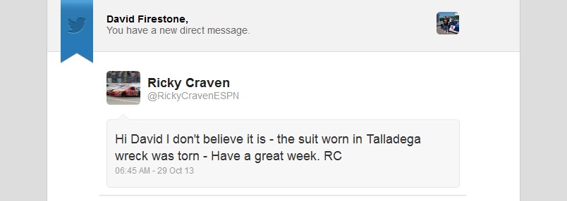
So we can eliminate this as that suit he wore in that event. But I have been able to photo-match this suit to a trading card released later in the year. I can’t say when exactly this suit was worn, but it was worn. The design of suits to in-car cameras and replica jackets is still in its infancy, so there is little consideration to either, so it does have both a modern and vintage look at the same time.


 I also have a small Ricky Craven mini helmet also from 1996.

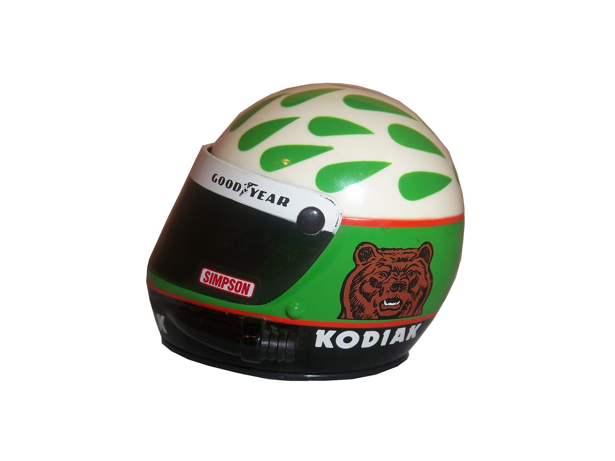
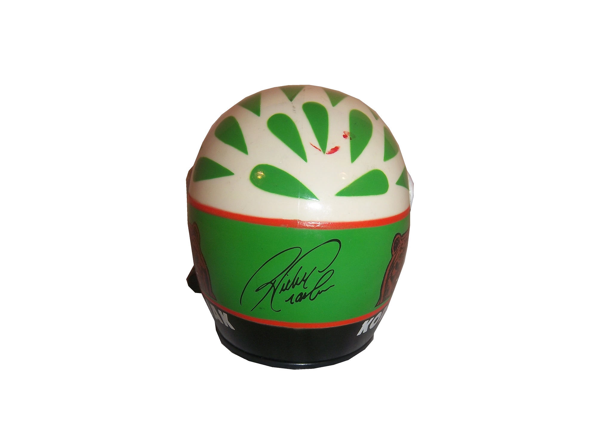
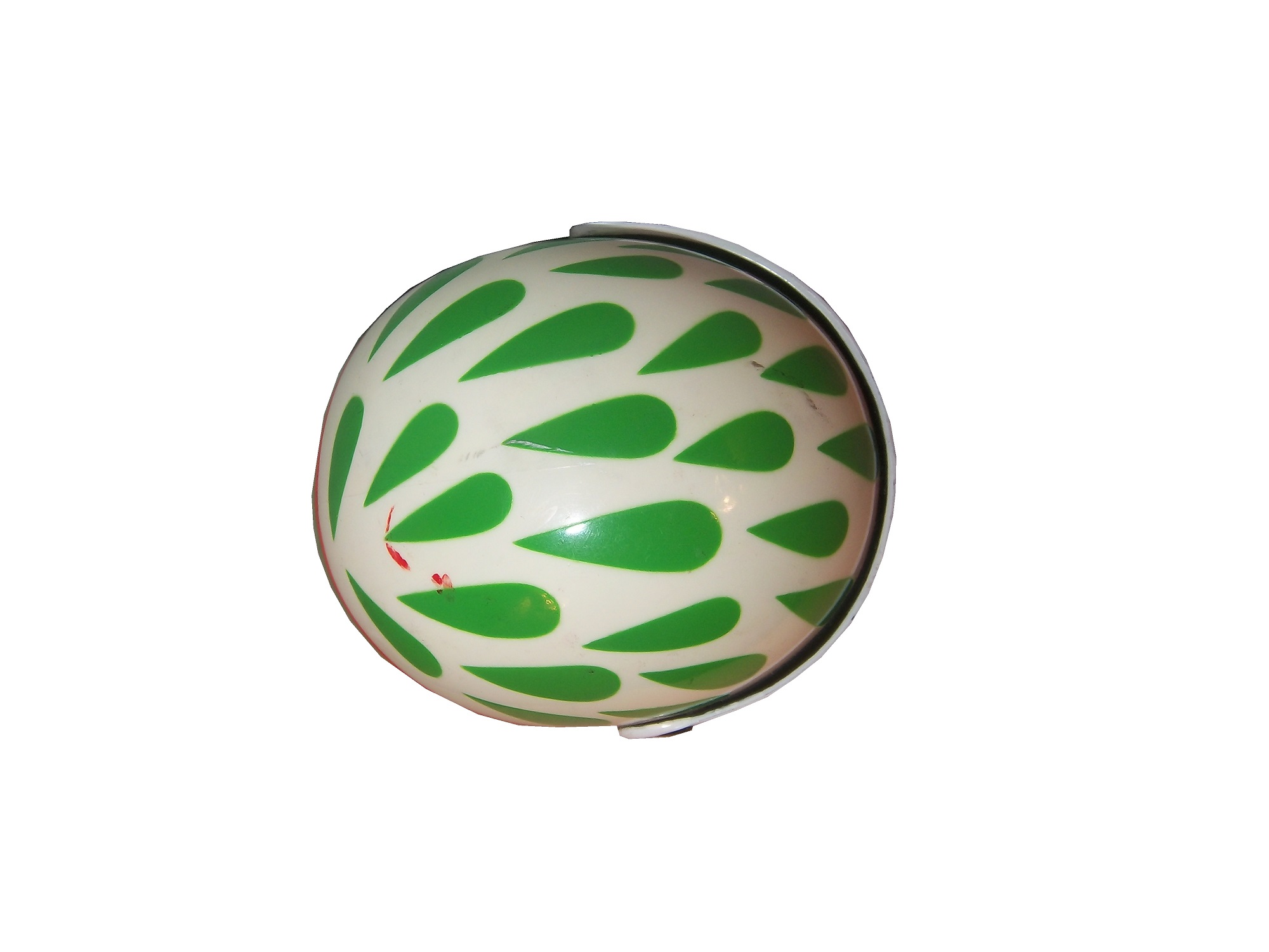

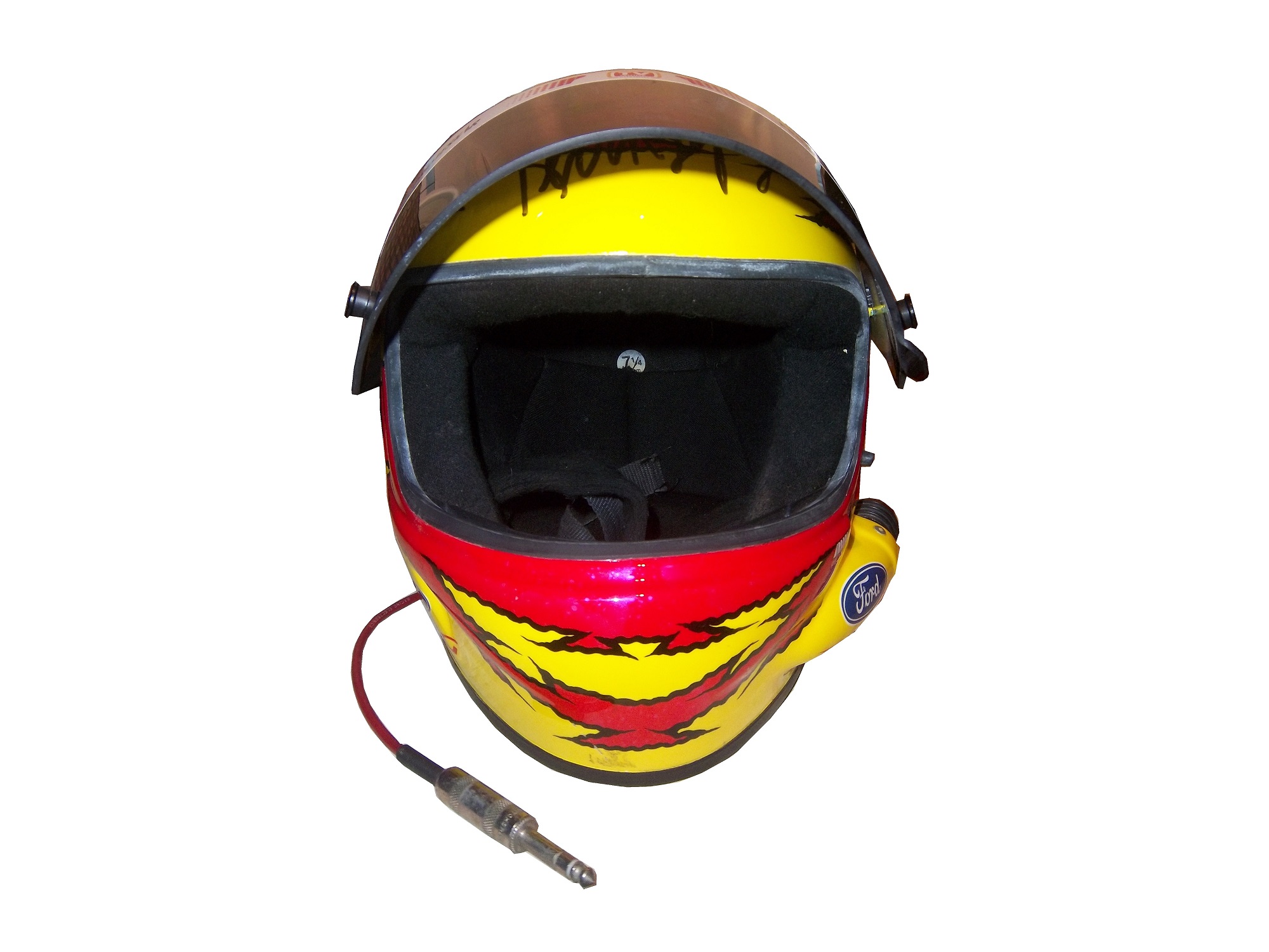
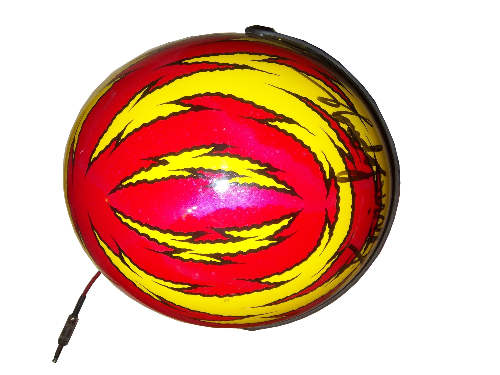
Ricky Craven left Larry Hedrick Motorsports and Kodiak for Hendrick Motorsports in 1997, and Steve Grissom took over. In 1998, in his second year for Hedrick and Kodiak, Grissom donned this customized race helmet.


It is in great condition, though it has had the microphone equipment removed. The color scheme is that same shade of green that had graced the side of Rusty Wallace’s car during his 1989 Winston Cup Championship. The blue is used in the design of Kodiak Ice packaging, and works surprisingly well. Grissom ran a Kodiak Ice scheme once in 1998, at the Pepsi Southern 500.
I also have a 1/64 die cast car of similar vintage.


Kodiak is one of the many sponsors in NASCAR that I miss. Tobacco advertising has been severely restricted and Kodiak was a casualty. I do miss it but the times have changed.
Again, there will be no paint scheme reviews until next week, when I get back home. I look forward to getting back to normal after a week of relaxation.
MOMO and Christian Fittipaldi…A Match Made In Heaven
 By David G. Firestone
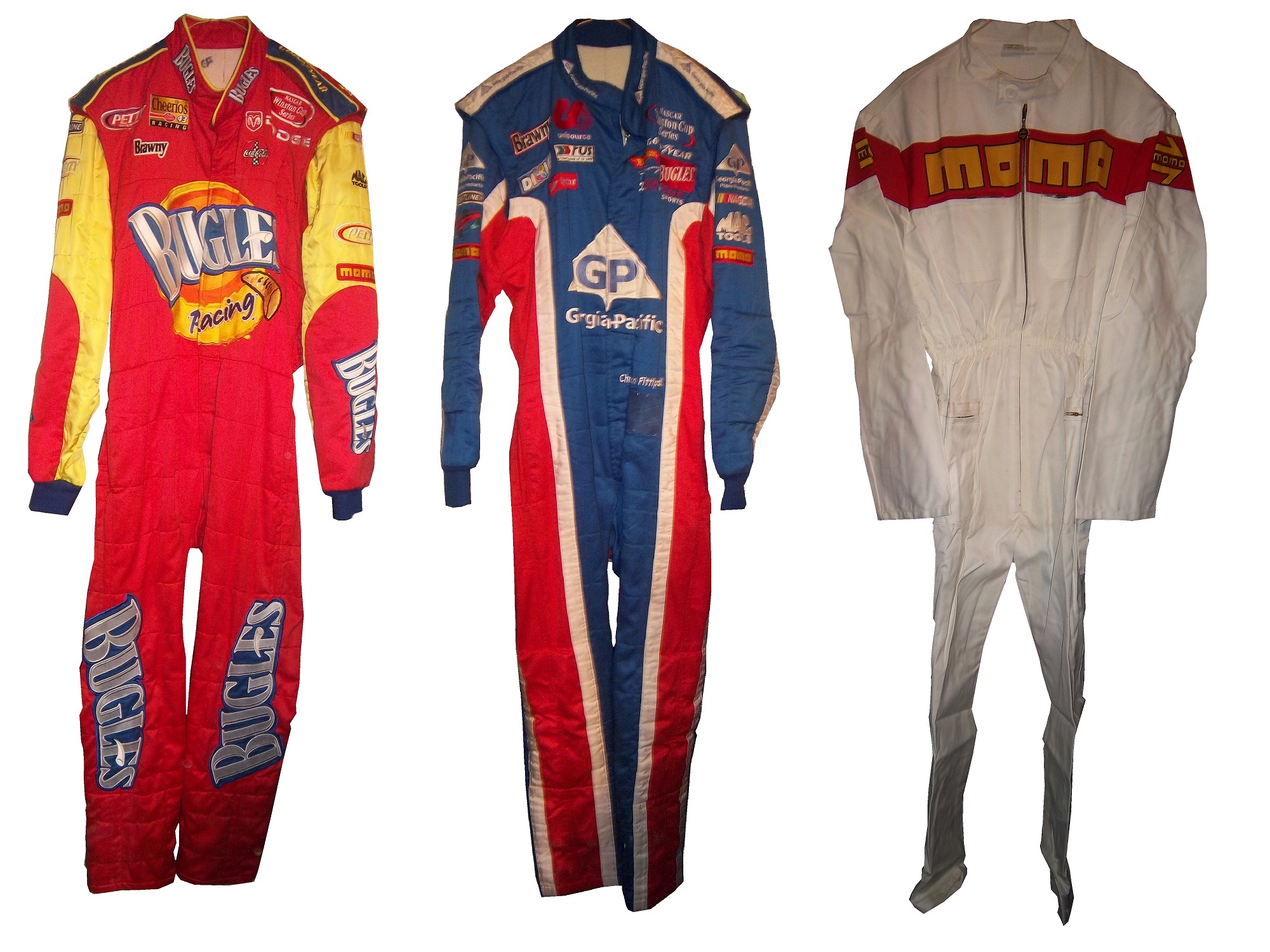
These last few weeks have been hell in Chicago weather-wise. I have been under the weather myself, but this week, I wanted to touch on something that I covered in depth last year. After watching the Rolex 24 at Daytona, I learned that MOMO is celebrating its 50 anniversary this year. I first learned about MOMO when I covered Christian Fittipaldi’s Driver Suits back at the beginning of the blog. MOMO is one of the more ubiquitous racing safety companies in racing.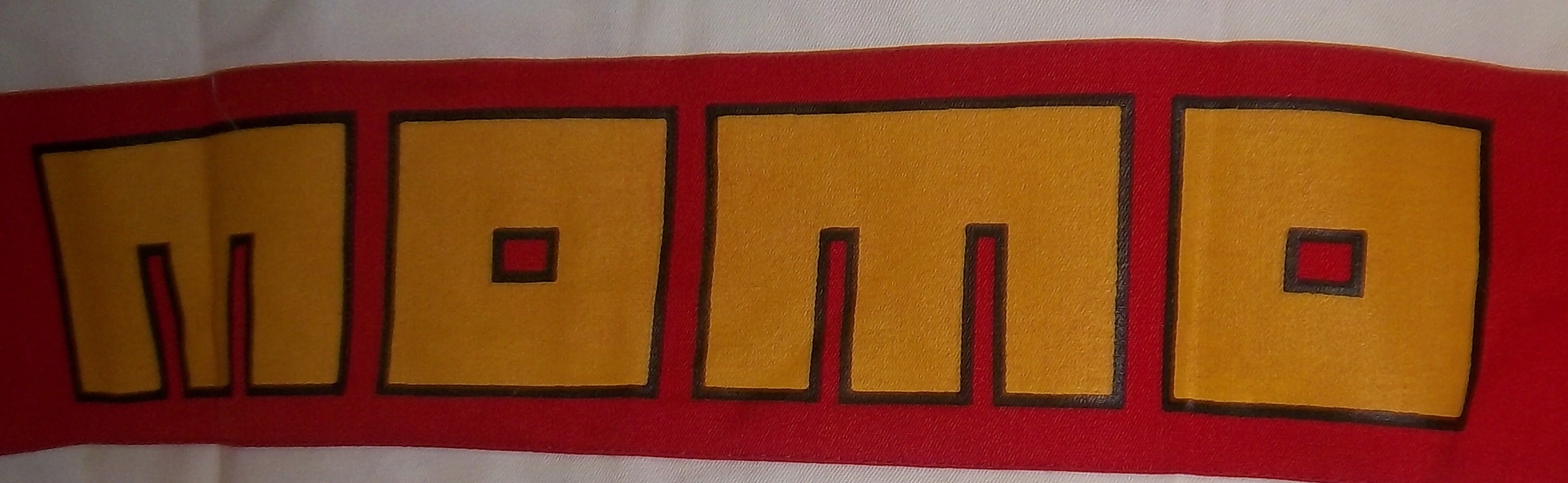
MOMO is short for “Moretti-Monza” which is Giampiero Moretti’s last name and Monza, a town in the Province of Milan. Giampiero Moretti was a driver who won the 1998 24 Hours of Daytona. He created a company specifically to make racing products. MOMO has gradually expanded over the years, and is now involved heavily in almost all forms of auto racing.
One thing I have noticed is that MOMO steering wheels are used very heavily in NASCAR. Whenever there are in-car cameras, there is always one located near the ignition behind the steering wheel, and almost every one of them has a MOMO logo on them. They are also very involved in F1, and IndyCar racing in terms of parts. When the best and most recognizable teams in the biggest forms of auto racing all use the same group for their parts, it proves that MOMO is the best in what they do.
I also mention Christian Fittipaldi because he won the Rolex 24 at Daytona in an Action Express Coyote Corvette DP. This is his second win, his first one coming in 2004 in a Bell Motorsports Doran JE4-Pontiac. As covered earlier in the year, I own two Christian Fittipaldi MOMO driver suits. In all honesty, these two suits were my first introduction to MOMO as a brand. MOMO however has a large presence in auto racing.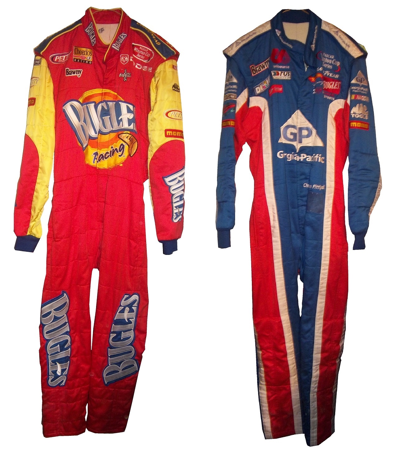 In the SCCA Miami Grand Prix, these suits were issued to track workers. MOMO stated that these would be fireproofed for one race only. It feels like an old school chemical dipped suit, but I have no proof of that. It does not appear to have been worn, but it probably is not fireproof any more though.
 2014 is the 50th anniversary of what I’m going to call “The dark week,” May 24-30 1964 when the World 600 and Indy 500 took place. Three drivers were killed by fire, which changed the safety culture of racing forever. I will cover that issue in depth later in the season.
Paint Scheme Reviews
Marcos Ambrose #9 Stanley Ford Fusion Though a tad over designed, the car does has a clean look, and a great color scheme, so I will give it an A-
Marcos Ambros3 #9 DeWalt Ford Fusion See Above
Kyle Busch #18 Skittles Toyota Camry When I first heard about Skittles returning to NASCAR, I thought it would look like this or this, so naturally I was worried, but I like this simple and attractive design. A+
Kyle Busch #18 Peanut M&M’s Toyota Camry Decent scheme, good color scheme, A-
Matt Kenseth #20 Dollar General Toyota Camry My major complaint was the black and silver stripes on the sides were too big and promenent. They solved that issue this season, and the car looks better. In fact, I’ll give it a B!
Jeff Gordon #24 AXALTA Chevy SS Classic Jeff Gordon design, and I like the blue on the flames, and the black flames on the back. A+
Paul Menard #27 Menards/Richmond Chevy SS Love this scheme, great design and color scheme, A+
Paul Menard #27 Menards/Serta Chevy SS Same scheme as last year, same C+ grade
Eric McClure #35 Hefty/Arm and Hammer Ford Fusion Good color scheme, but the car looks over deisgned and it doesn’t look good at all. D+
Kurt Busch #41 Haas Chevy SS Great design and color scheme, A+
Kurt Busch #41 Slate Water Heaters Chevy SS Kurt is running a really good template this year, and this is another example. The condensation design is overdone, and it takes an A scheme down to a B-, otherwise it is a great design.
Aric Almirola #43 STP Ford Fusion This is one of my favorite schemes this year! A classic design, with great colors and a great look earns an A+
AJ Allmendinger #47 Kroger/USO Chevy SS Though the scheme is the same as last year, JTG Daugherty Racing has switched from Toyota to Chevy this season. That being said, I like this scheme, and I will give it an A
AJ Allmendinger #47 Bushes Baked Beans Chevy SS Simple design, great color scheme, A
AJ Allmendinger #47 Kingsford Chevy SS See Above
AJ Allmendinger #47 Scotts Chevy SS See Above
AJ Allmendinger #47 Clorox Chevy SS See Above
AJ Allmendinger #47 Charter Communication Chevy SS I like the overall design, but that is an awful shade of green. Green is not a great color for a race car, neither is yellow, so yellowish-green definitly doesn’t work. I’ll be generous and give it a C-
Joe Nemechek #66 Land Castle Title Toyota Camry If the bottom was a single color stripe, I would give it very high marks, but the over design makes it look awful. C-
Michael McDowell #95 K-Love Ford Fusion Not only is McDowell and Levine Family Racing running a better template this year, the K-Love scheme actually improves on it. I can’t give this scheme anything lower than an A
Carl Edwards #99 Subway Ford Fusion A bad design from last year, earns a D-
Neck Backs…A Hotbed for Unique Customizations.
 The driver suit is almost always customized for the driver, and as such, the driver has the option of adding customizations to the suit. This may come in the form of size,
and belt design,
but the back of the neck is a unique place for customizations. The designs that are placed on the back of the neck are as unique as the driver themselves.
I’ve gone at length to discuss the FIA certification which is frequently sewn into the back of the neck. This is a prominent feature in Formula 1 and IndyCar. That is standard issue, so no real need to comment on it any more.
n NASCAR, the back of the neck can be used for a myriad of different customizations. One of the most common is a car number, such as this Christian Fittipaldi suit, 
and another common feature can be sponsor logos, such as this Randy LaJoie Bob Evans suit from 1999-2000,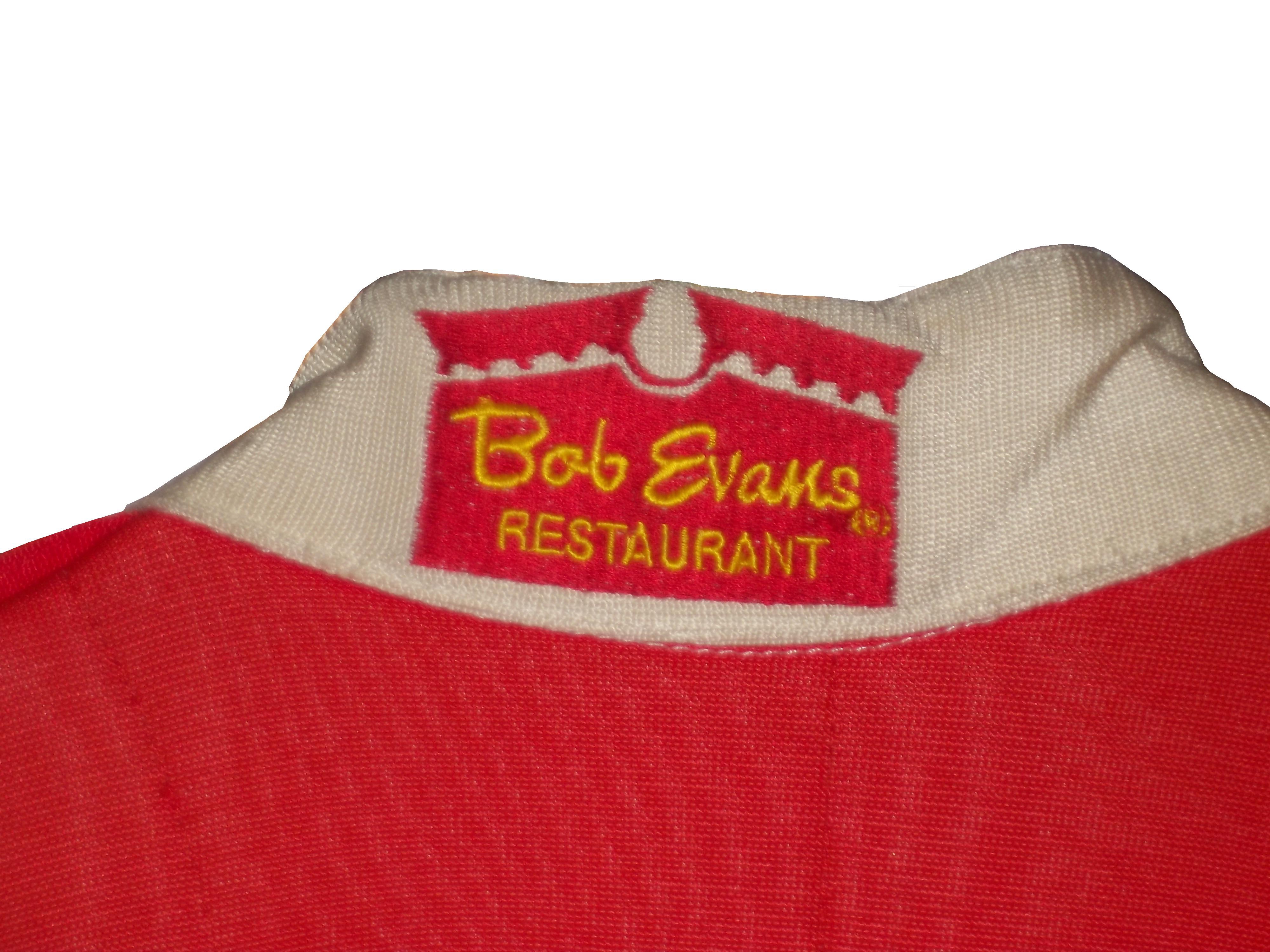
and this Joey Miller Craftsman Truck Series suit from 2005.
This Kasey Kahne suit has the Evernham Motorsports logo sewn into the back of the neck.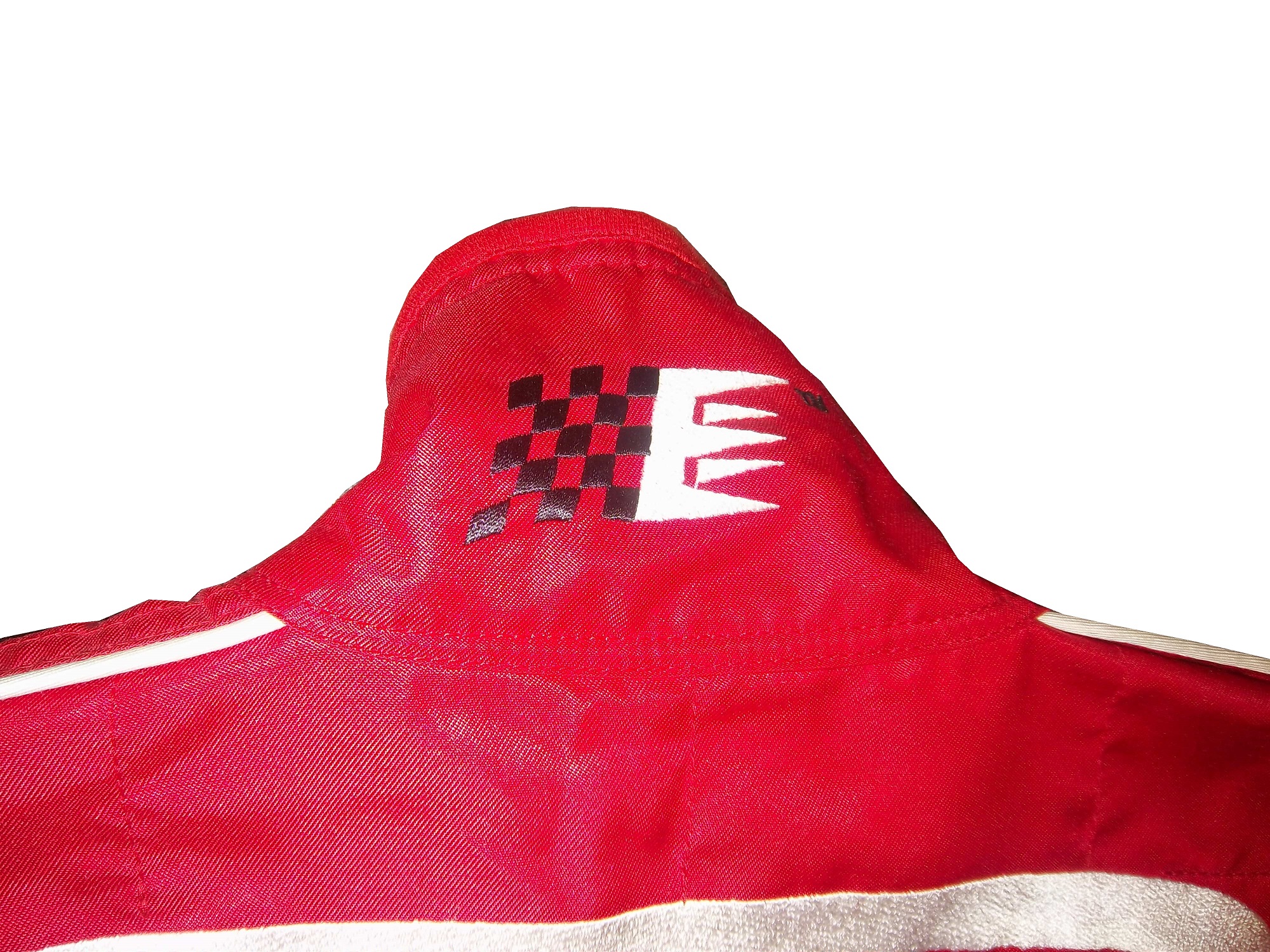
And Roger Penske likes to have the American Flag on the back of the neck of his suits, as evidenced by this David Stremme suit from 2009.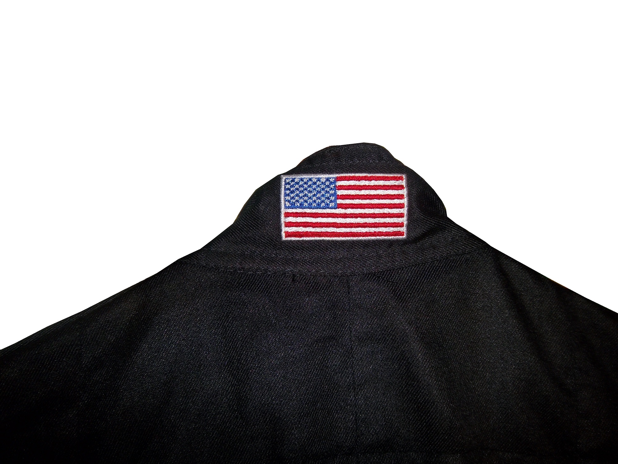
Older Simpson driver suits have been known to have an inventory number sewn here, as exampled by this Mike Skinner suit from 1997,
and this Stevie Reeves example, again from 1997.
But for my money, the personal customizations are more fun when they are as unique as the driver is. In this Terry Labonte suit, Terry has added a Texas logo.
My favorite customization is from a Boris Said suit from 2005. Said has added a Boris Badenov design to the back of his neck.
It’s the little things that make a suit personal, and these are some of those little things. Who says a driver suit can’t be fun.
And of course, it goes without saying that the neck is frequently left blank, as exampled by this Nort Northam suit from 1988.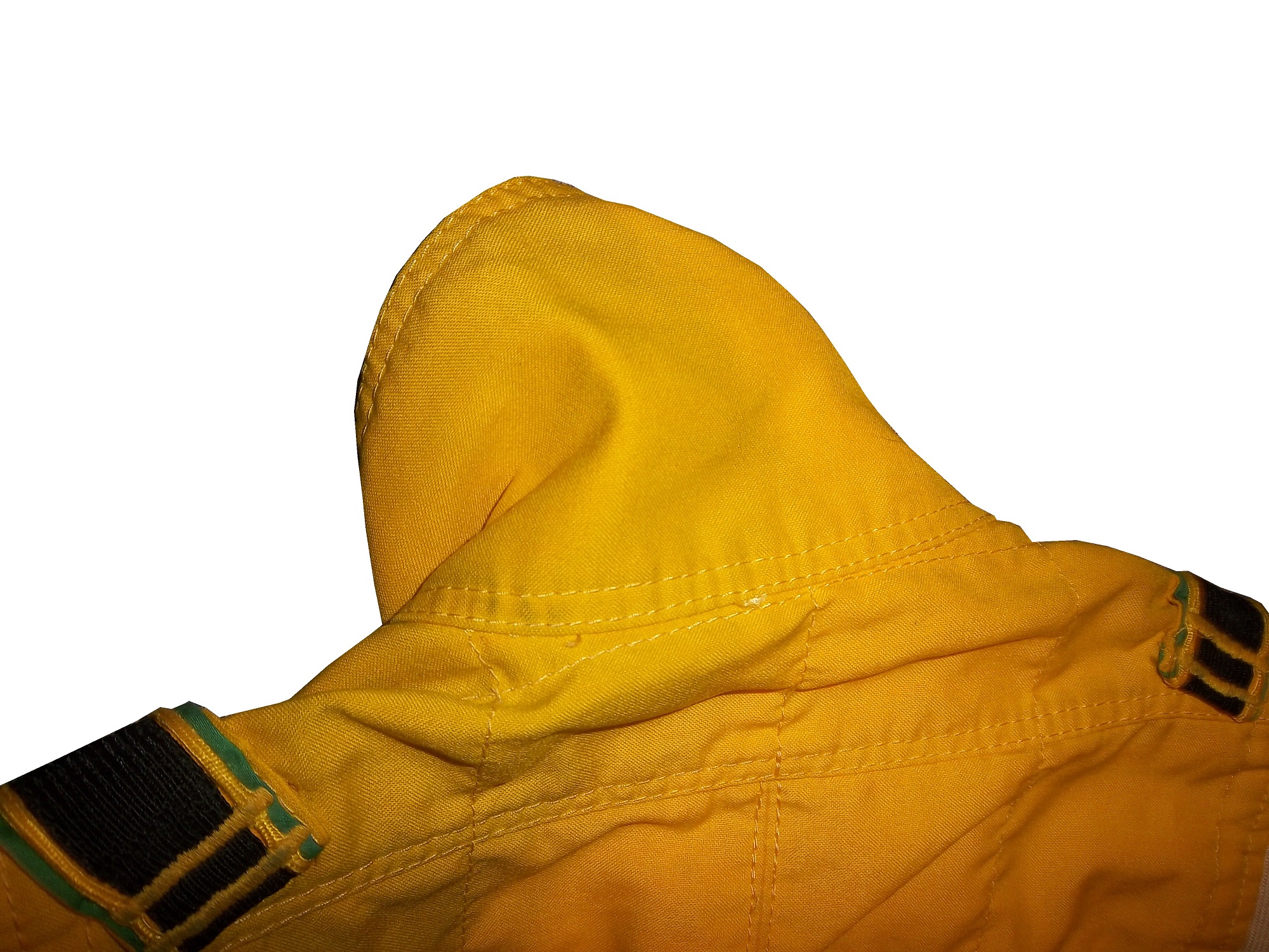
Jamie McMurray #1 Cessna Patriotic Chevy SS Pretty good scheme here, red white and blue is always a solid scheme, but the one gripe I have is the pointless circle around the door number. While it gives the car a vintage look, it is just out of place here. Even still, this scheme is a solid A-
Brad Keselowski #2 Miller Lite Patriotic Ford Fusion Solid scheme, nothing to complain about, A+
Kasey Kahne #5 Hendrick Cars Chevy SS Red white and black is a very solid color scheme, and the design, while a bit convoluted looks really good. It has a hurricane-esquire design that looks really good. A-
Danica Patrick #10 Go Daddy .US Chevy SS The simple design of this scheme looks really good…but what is going on with the colors? Why is the car painted in Russian dressing green? Russian dressing is good, but not as a color scheme. The red white and blue designs clash, and it just looks awful. D-
Clint Bowyer #15 Peak Blue DEF Toyota Camry I gave this scheme a B grade, and the logo change on the hood does nothing to either add or subtract for this grade. B
Greg Biffle #16 3M Statue Of Liberty Ford Fusion Amazing how a better color scheme, as well as the Statue of Liberty design take a C grade and bring it up to a B
Kyle Busch #18 Interstate Batteries All Battery Center Toyota Camry Now THIS is what an Interstate Batteries scheme should be! The classic dark green, gold and white color scheme is amazing, and the design is simple yet very attractive. Giving this scheme an A+ is not saying enough about how great this scheme is!
Jeff Gordon #24 Axalta Standox Chevy SS White flames on a blue background? Seriously? I could forgive it if it was blue flames on a white background, blue flames look really good. But white flames? This design ruins a great color scheme AND a great design scheme TOGETHER! Now that is impressive! F-
Kevin Harvick #29 Budweiser Folds of Honor Chevy SS The Patriotic schemes worked quite well this year, and this is another example of that. A-
Jeff Burton #31 Quikset Chevy SS Decent color scheme but the design needs a little work. If the red was on the hood, roof and deck-lid and the black was on the sides, I would give it an A, but the shark-fin design is brutal on the eyes, and serves no real purpose. As such, I can only give it a C-
JJ Yeley #36 Golden Coral Patriotic Chevy SS Another A grade Patriotic scheme.
AJ Allmendinger #51 Neil Bonnett Throwback Chevy SS While I like most throwback schemes, this one, while accurate, has the worst color scheme I have ever seen. It just screams 1980’s. Hot pink and neon yellow really stands out, and not in a good way. Still, I do miss Neil, and they were pretty accurate, so I will give this scheme a B
Carl Edwards #99 Subway Ahhvocado Ford Fusion Good color scheme and a simple design. I’m not a fan of avocados on sandwiches, but this is a good solid A scheme.
Collar Guard…Not a Product, but a Safety Feature.
 By David G. Firestone
Like shoulder epaulets, the collar of a driver suit has made a transition. It has gone from safety accessory to fashion piece, but unlike the epaulet, it is not only ornamental. Because the collar is still a piece of safety equipment. It goes without saying that fire is an ever present danger in auto racing. The collar protects the neck from burns. This may seem minor, but many people who die from burns die from infection. When the skin is compromised, it can’t stop germs from getting inside the body, and as such makes infection a serious risk during burn injuries.
But the fashion aspect of collars is interesting as well. With the standard alignment of sponsors on the top of the suit, the Series logo, tire manufacturer logo, car manufacturer logo, and other sponsor logos are on the top, and the primary sponsor logos are present on the collar and epaulets. This Randy Lajoie example shows how the suit appears during an televised interview: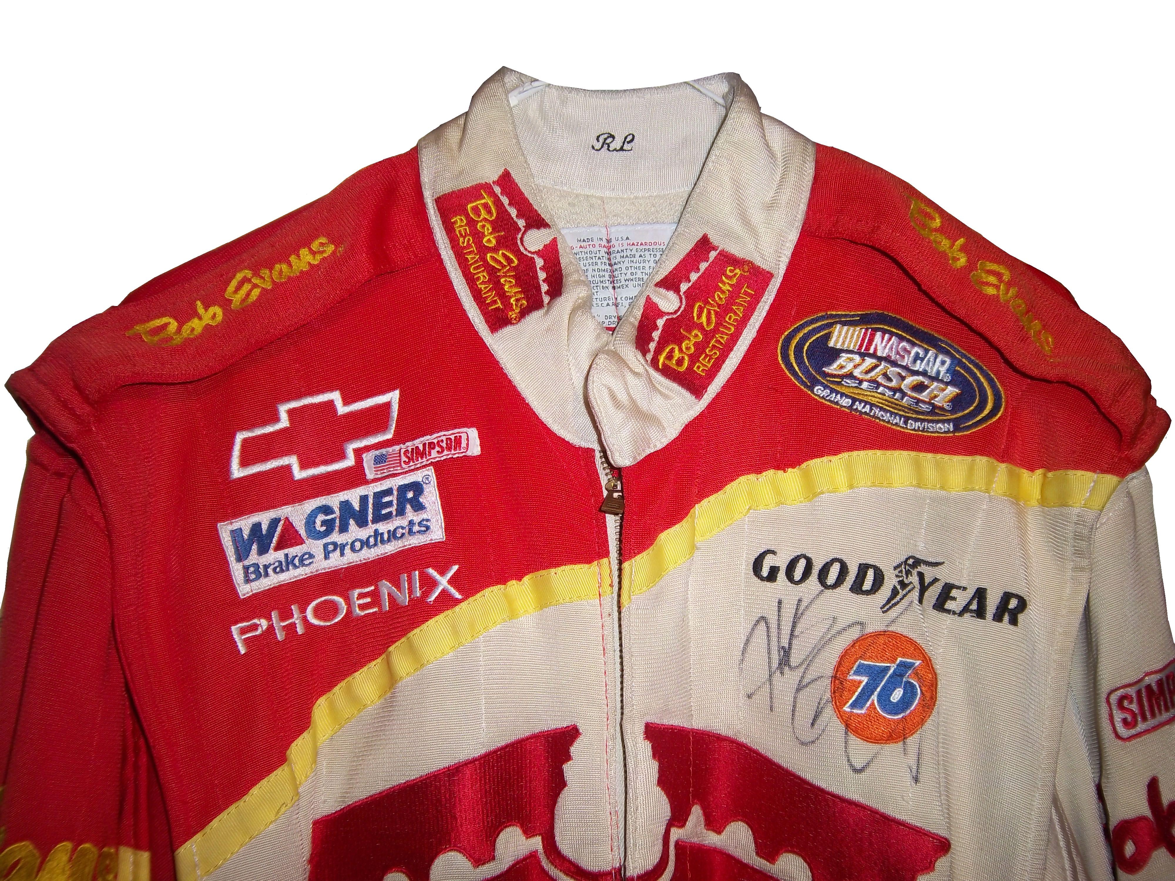
Note a couple of things: First, the fabric on the collar overlaps just a bit here, but when the driver wears it, it meets perfectly at the center of the neck. Second, it allows the driver to breathe easily. Comfort Vs. Safety is a constant debate. This is one kind of collar, the other kind of collar is what I call the Velcro collar, as shown in this Alex Barron suit from 1998:
The Velcro collar is exactly what it sounds like, a collar with a strap which Velcros shut. This provides a little more protection in case of fire. It also has another use, as sponsor ads are popular to put on the front of the Velcro strap. This has been used quite often over the years…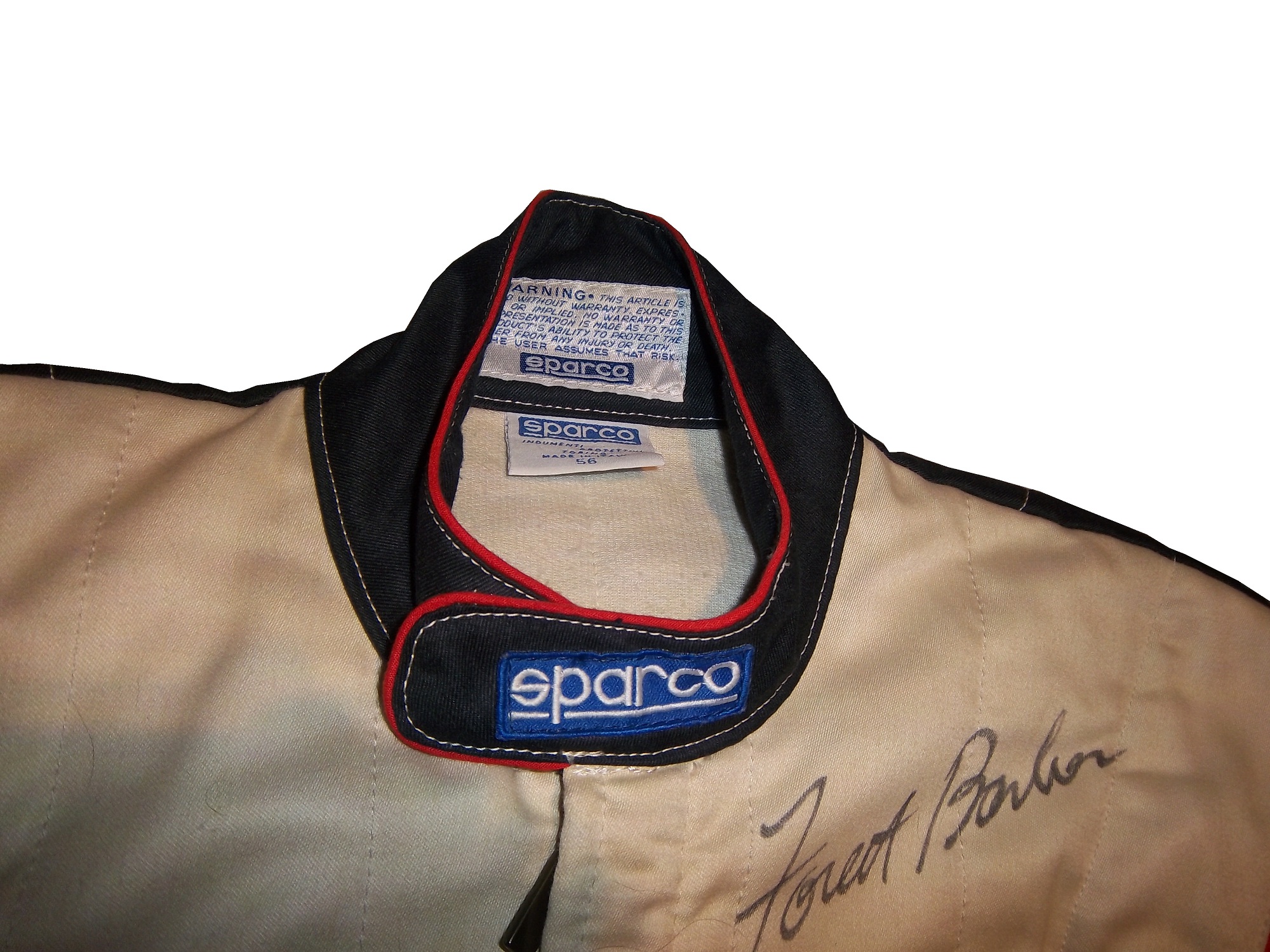
This is due to the fact that for quite some time the open face helmet was used, and the collar provided extra fire protection where the helmet failed. In this day in age, helmets come standard with Nomex socks on the bottom, so the collar, while still a key safety feature, is not as critical. But for sponsor logo placement, it really can’t be beat.
If the collar does not have a Velcro closure, then the primary sponsor logo is sewn into either side of the collar. Like the Lajoie example above, or this Mike Skinner example below, this can be used very effectively as a place for sponsor logos.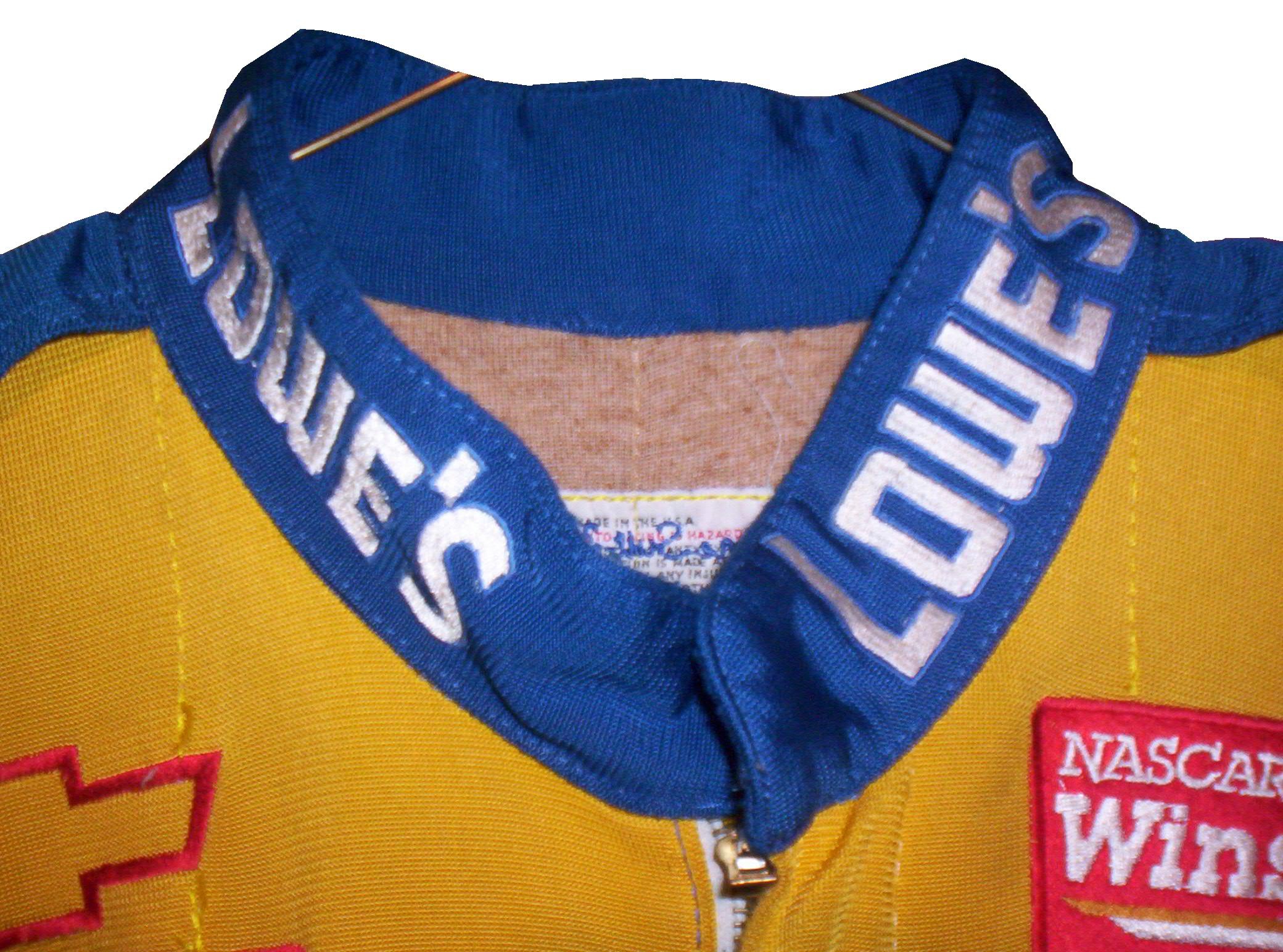
Like most other aspects of the driver suit, the choice of Velcro or not comes down to driver preference. Kyle Bush, as well as older brother Kurt favor the Velcro style, whereas Tony Stewart and Carl Edwards prefer the non-Velcro variety. Many pit crew shirts have a similar design to the driver design as well.
Editor’s note: For the next two weeks I will be on a very badly needed vacation. I will still have articles ready to go, but I won’t be commenting on up do date issues until I get back. I will still check in from time to time.
Moving on to paint schemes…
Denny Hamlin #11 FedEx Express 2005 Toyota Camry Done as a memorial to Jason Leffler, this is a replica of the scheme that Leffler ran in 2005 during FedEx’s first season as a full-time NASCAR sponsor. It is very faithfull to the original scheme. It also has a great design and color scheme, and earns an A
Greg Biffle #16 3M/Give Kids a Smile Ford Fusion The same bland paint scheme that I described as “There’s nothing really wrong here, but nothing really right here either. The side design looks forced, the black roof is idiotic, the color scheme is good, but the number design looks too cliche. It makes no sense, but 3M schemes never do.” It has a small Give Kids a Smile logo on the hood, that is all but invisible. I gave it a C and it will stay at a C.
David Stremme #30 Window Wax Toyota Camry Ugh! This is bad, I can live with the color scheme, but the design is bad. It gets a D
Austin Dillon #33 American Ethanol Chevy SS While I hate the shade of green used here, this scheme looks pretty decent. The designs around the front brake vent are unnessicary, but I still like them. If the green were a bit darker, I could give it a better grade than a C+.
AJ Allmendinger #47 Charter Toytoa Camry The hood design is interesting here. It is designed in the same light as television logos on driver suits. It is a unique idea that works and I hope will catch on. The color scheme is great, and I love the overall design. A
Brian Vickers #55 Aaron’s/Louisville Cardinals Toyota Camry The color scheme is good, but the Fruit Stripe Gum design seen on the Louisville Cardinals shorts is ugly. The whole Zubaz design scheme is horrible on sports uniforms, and even worse on this car. I have nothing against the Louisville Cardinals, but this is horrible. F
Dale Earnhardt Jr #88 National Guard Solider of Steel Chevy SS Solid simple scheme with good colors, but the Superman Logo on the hood is next to invisible.
49 Years Later…Those 6 Days in May Are Still Being Felt.
By David G. Firestone
When Glenn “Fireball” Roberts was elected to the NASCAR Hall-Of-Fame on May 22, I felt the need to do this article. Fireball’s racing career was a Hall of Fame worthy, no one can argue that, but it was the wreck that led to his death that has had the most lasting effect. His election to the Hall-Of-Fame came 2 days shy of the 49th anniversary of the 1964 World 600. During that race, he was involved in a wreck on the 7th lap, and suffered an 80% body burn. While fire protection was mandatory in NASCAR, and many other racing groups, the way this was accomplished was by taking a pair of cotton coveralls, and dipping them into chemicals, which made them fireproof, but were uncomfortable to wear. Roberts was asthmatic, and the chemicals were aggravating his asthma. So he had a doctor’s note stating as such, and was not wearing any fire protection for that tragic event.
6 days later, on May 30, the 48th Indianapolis 500 was held. On lap 2, Dave MacDonald spun and crashed, which ignited a huge fire, due to the car being badly designed, poorly built, and having a large amount of fuel on board. Eddie Sachs was involved, and was killed due to blunt force trauma. Bobby Unser was burned, as was Robbie Dunman. Dave MacDonald had his lungs scorched by the flames, and was very badly burned, and passed away later in the day.
These two tragic events would, in the long run, have a very bright silver lining. Shortly after these took place, the safety culture of racing improved with the introduction of Nomex. Nomex offered better comfort and fire protection. There were Nomex suits being used in racing, though at that time they were experimental. After those 6 days in May of 1964, Nomex became, and still is the standard for racing suits. SFI was founded thereafter in order to make sure that the suits are up to par, and are safe. The proof that these suits are safe is the fact that other than the addition of extra layers and some cosmetic design changes, the suits remain largely the same.
Interestingly, the driver suit changes were not the only safety changes made after that incident. The cars themselves got a makeover. USAC, in charge of the Indy 500 at the time, mandated that the Indy cars had a new fuel cell design added to them. This fuel cel, which was used in military helicopters at the time, was designed to help prevent a huge explosion in a wreck. In addition, the standard fuel in Indy car was changed to methanol, instead of gasoline. On the NASCAR side, changes were slower to come, but they did come, and now races are much safer.
The major lesson here is that safety is evolutionary and that these accidents, as tragic as they are, all have lessons to be learned. With the 6 days in ’64, it was that fire protection needs to be a forefront of racing safety. With the 1955 24 Hours of Le Mans disaster, which saw one driver and 83 spectators killed, and another 120 injured the lesson was that spectator safety should be a very serious consideration in track design. With Ayrton Senna’s and Roland Ratzenberger’s deaths in the 1994 San Marino Grand Prix, the lesson was that car design needs to be more safety focused than what it was. With Dale Earnhardt’s death in the 2001 Daytona 500, The lesson is that sanctioning bodies in racing should be proactive with safety instead of reactive. These lessons have all been learned, and driver safety has been improved, but as has been said many times after these incidents, you can never take the risk of death out of racing.
Replica Helmets…and Why We Need Them in Racing
 By David Firestone
When I started this blog, I wanted to appeal to two different groups, racing enthusiasts and collectors. I think that this post should appeal to both groups. The MLB, NFL, and NHL have a product that is very useful, for autographs, and for fans alike…the replica helmet. Replica helmets have been made for the NFL for over 15 years now, and baseball replica helmets date back further than that. NHL minis, although more recent, are becoming a fan favorite…so why not racing replica helmets?


This has been tried before. In the late 1990’s Simpson released a series of ¼ scale mini-helmets. These helmets were reasonably accurate replicas of the real thing, but only 3 inches long. Although the design was good, the product was costly for the time, and very small, which made it very impractical for autographs.
The autograph issue is important because something that mini-helmets in baseball, and football are frequently used for autographs from players. These helmets are half-scale, and are very accurate to the helmets worn by the players. Similar to the football mini-helmet, this half-scale mini-helmet would fit the bill very well.
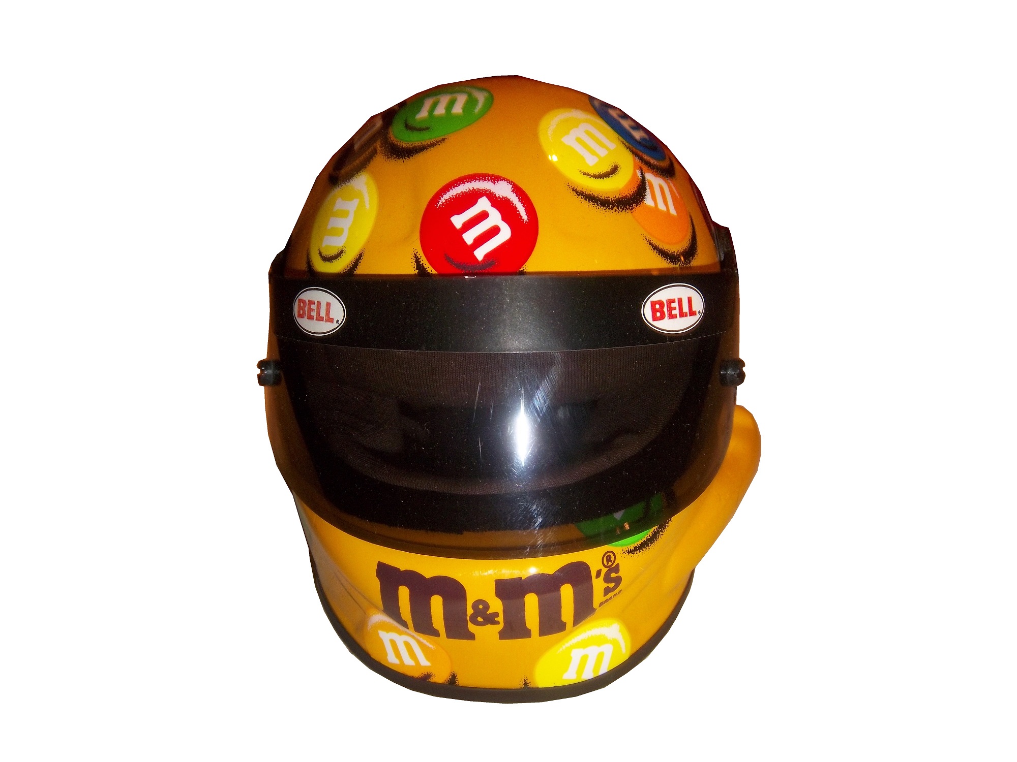


It is a replica of Elliot Sadler’s M&M’s Bell helmet from 2003-2006. It measures 5 inches in length and is very easy for drivers to sign. A search on ebay reveals that there are minis, but not on a cohesive levels. I think that fans would love to own a mini-helmet of their favorite driver, and buy new ones each season.
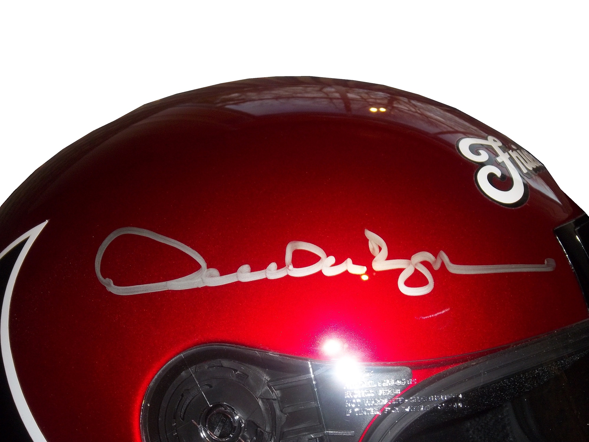
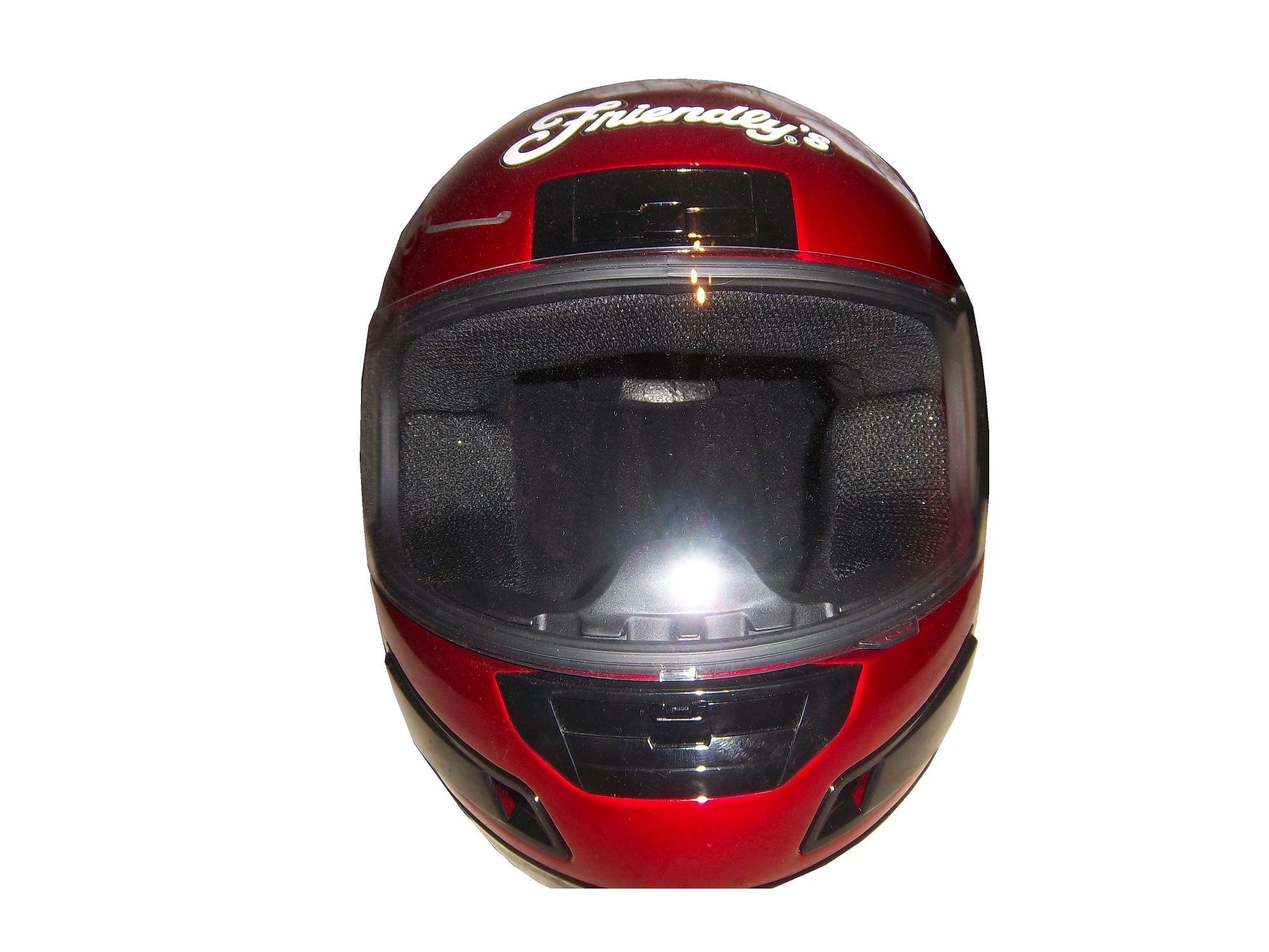
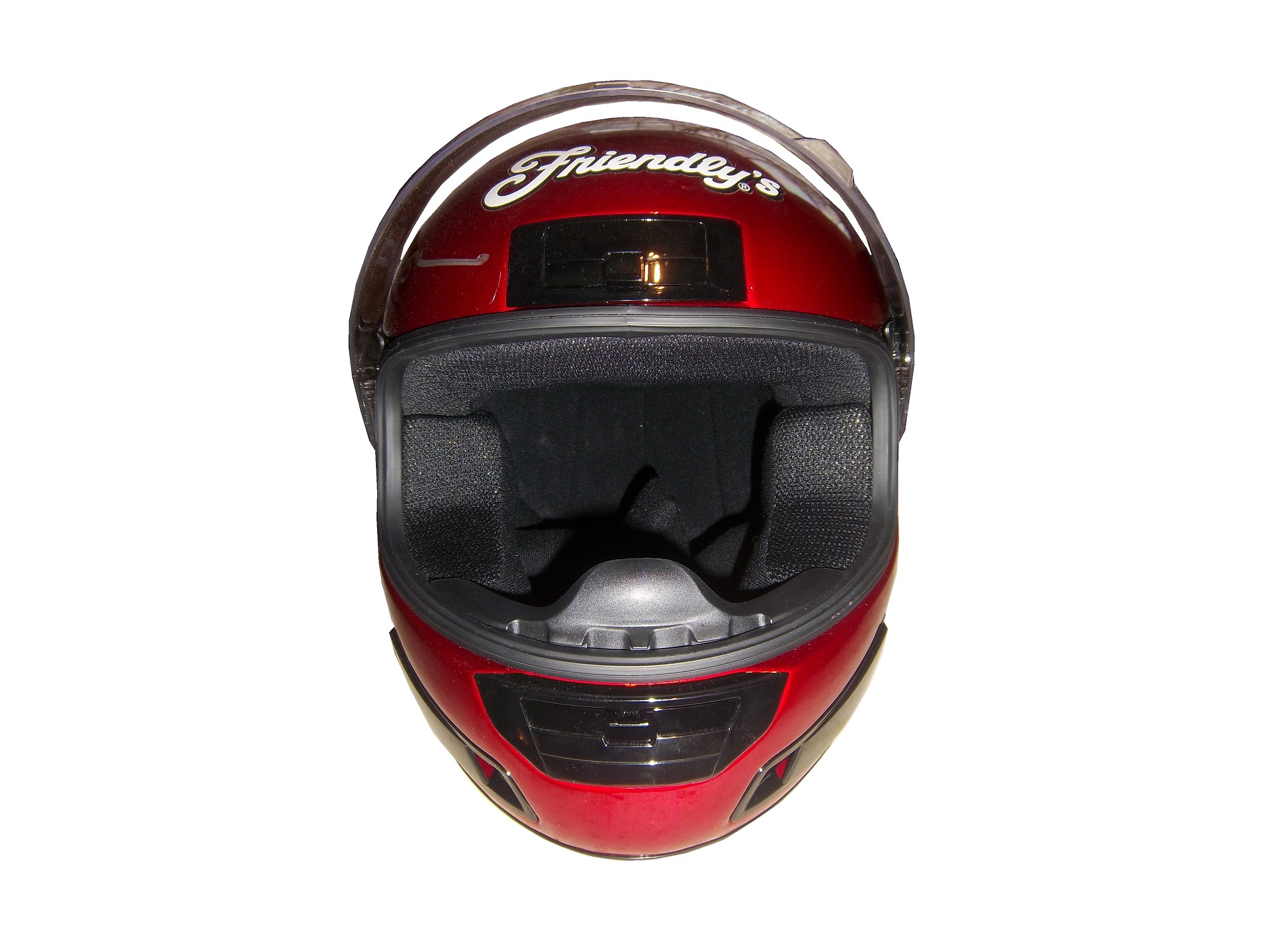
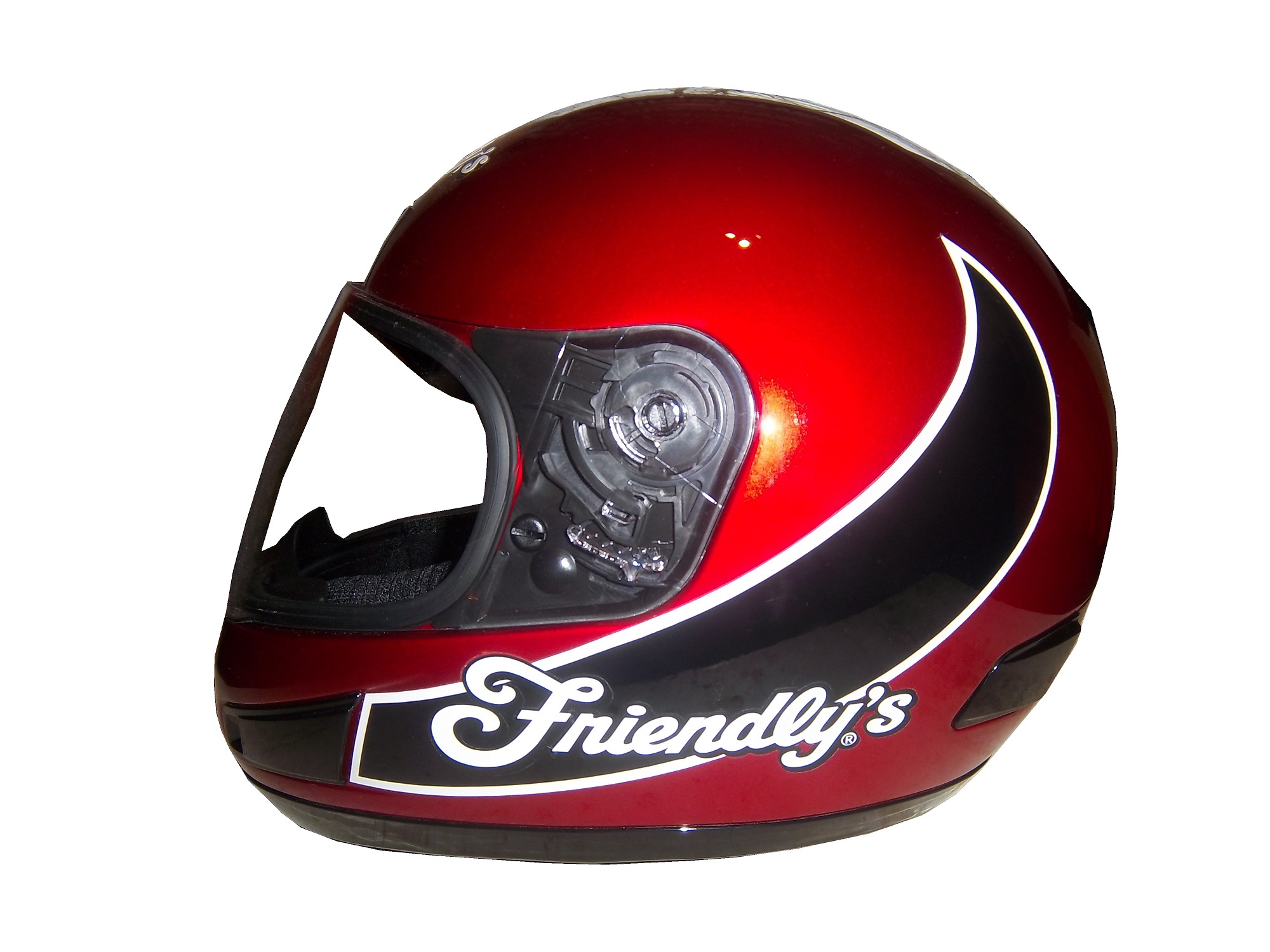
To answer the next question, yes there are full-size helmets, but they come in two different food groups. The first are helmets that are clearly replicas, such as this Derrike Cope Friendly’s replica from 2003. This example is clearly a motorcycle helmet, that has Friendly’s decals attached to the. Derrike has autographed the helmet on the right side. It looks good, but it is still clearly a replica.


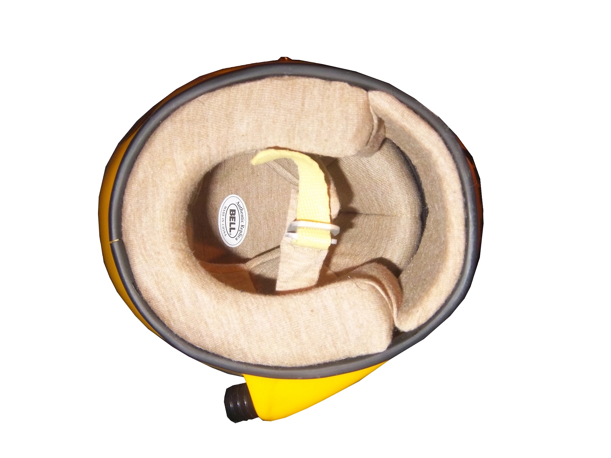
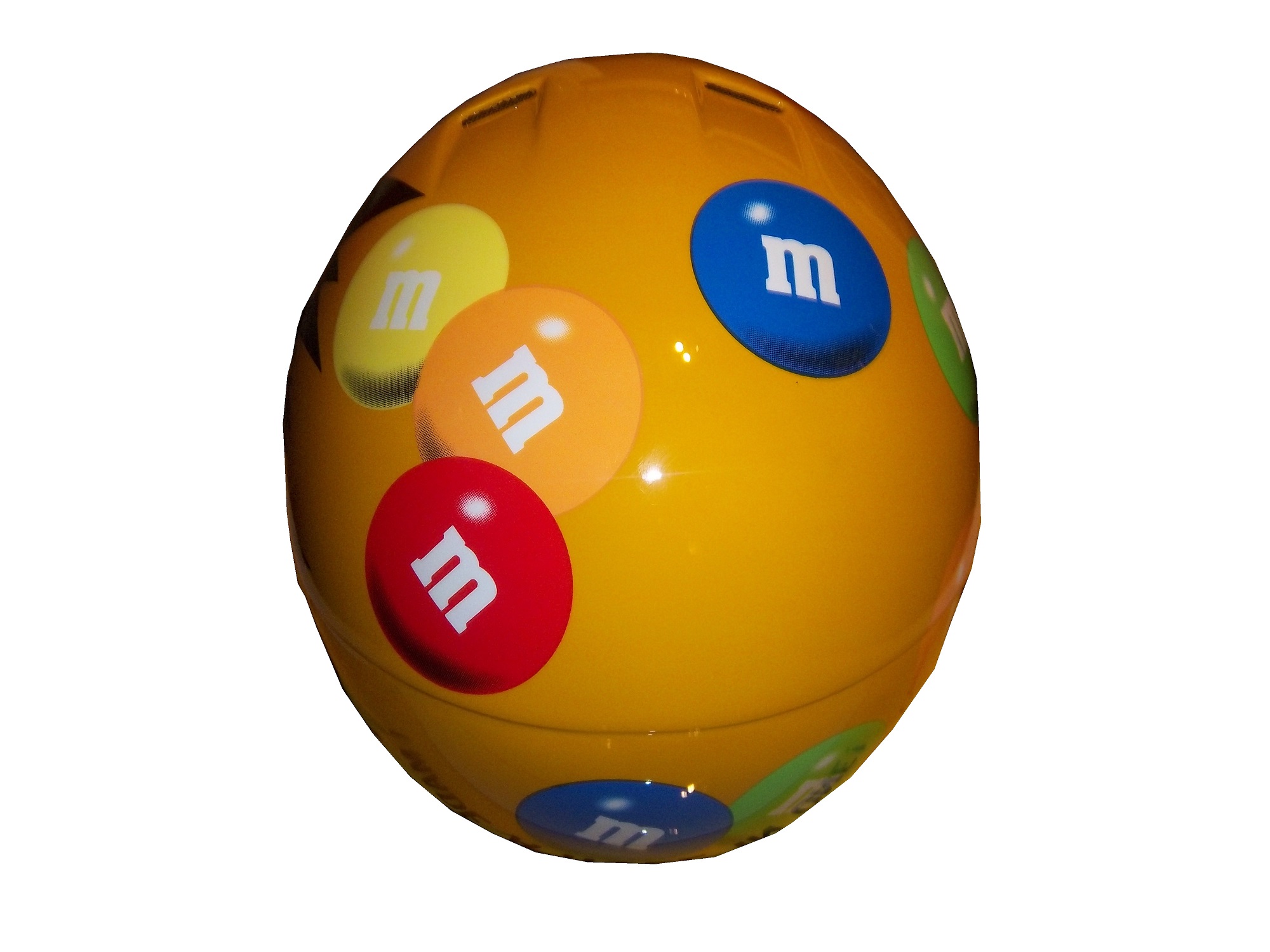
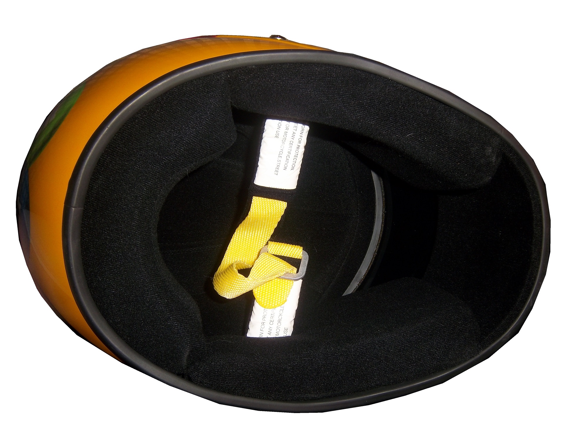
The other food group in full-size replica helmet is the helmet designed to be as accurate as possible. This example, again an Elliot Sadler M&M’s replica is clearly marked as being a replica and for display. It is actually very accurate, including a ventilation hose attachment on the right side. This type of helmet was common for a while, until the HANS restrictions forced the ventilation attachment to the top. This not only works very well for autographs, but looks really nice on itself. 


 I think that the helmet companies that make driver helmets would be willing to make these helmets for the racing fan base, and I think that the racing fan base would love them as collectables!
Paint Scheme Time!
Clint Boywer #15 Gander Mtn. Toyota Camry Color scheme…good. Car design…ugh. But the thing that really irritates me is that with the gun debate in this country the hood reads “With rights comes responsibility.” Seriously? I thought Michael Waltrip’s Newton scheme at the Daytona 500 was bad, but this is just beyond bad. KEEP POLITICS AND RACING SEPARATE! F– grade!
Jeff Burton #31 Childress Institute Chevy SS The only bad thing I can say about this scheme is that the door numbers are orange. If they were white with orange borders, I would love this scheme. Even so, it earns a C grade.
Joe Nemechek #87 Maddie’s Place Rocks! Toyota Camry They took a good scheme, with good colors and just made it look so much worse! The design is just awful, and the color scheme doesn’t help. It went from a B to a D in one week.
That’s it for this week, except for some April Fools Fun…
