MOMO and Christian Fittipaldi…A Match Made In Heaven

44-fittipaldiBy David G. Firestone

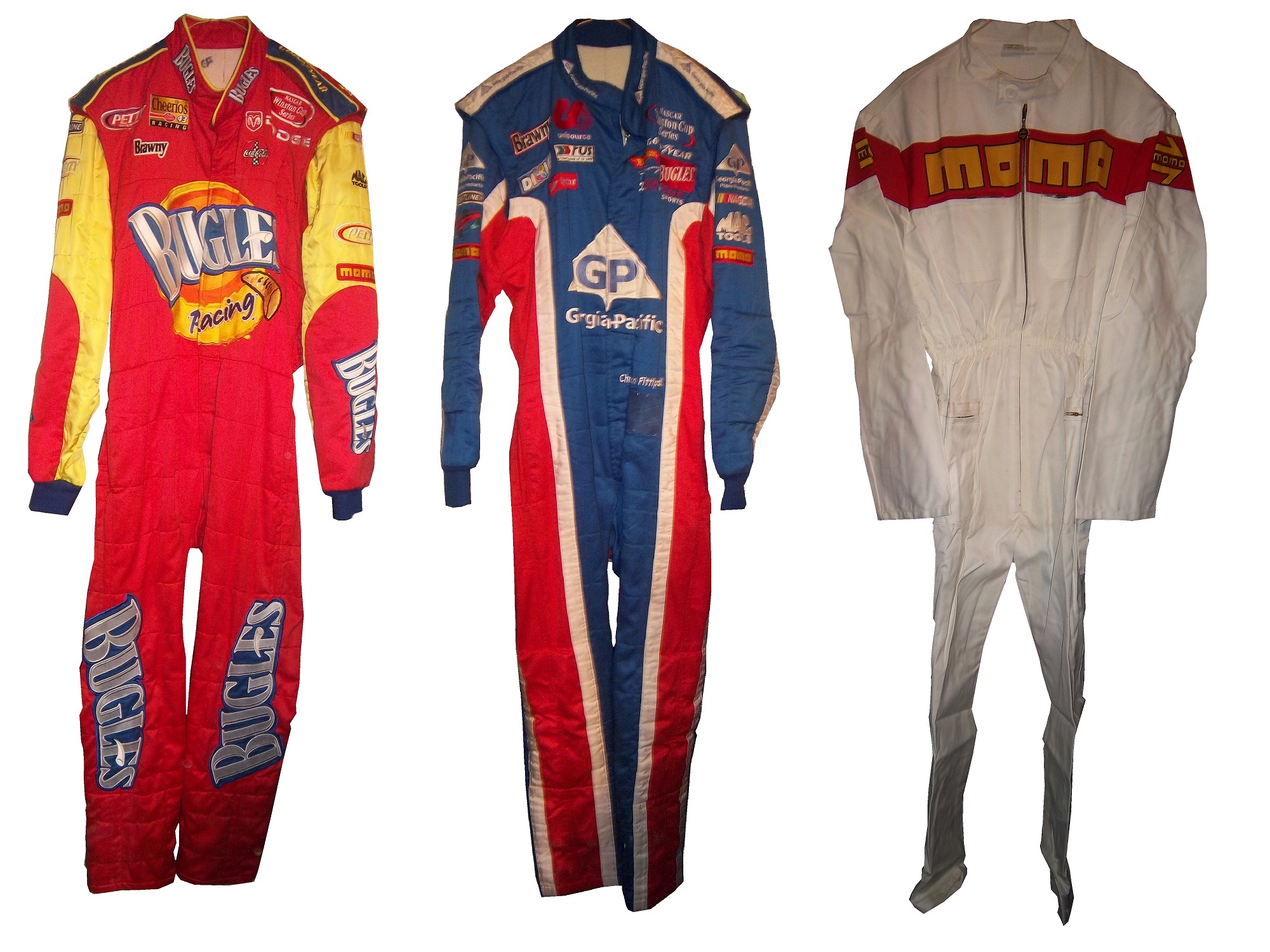
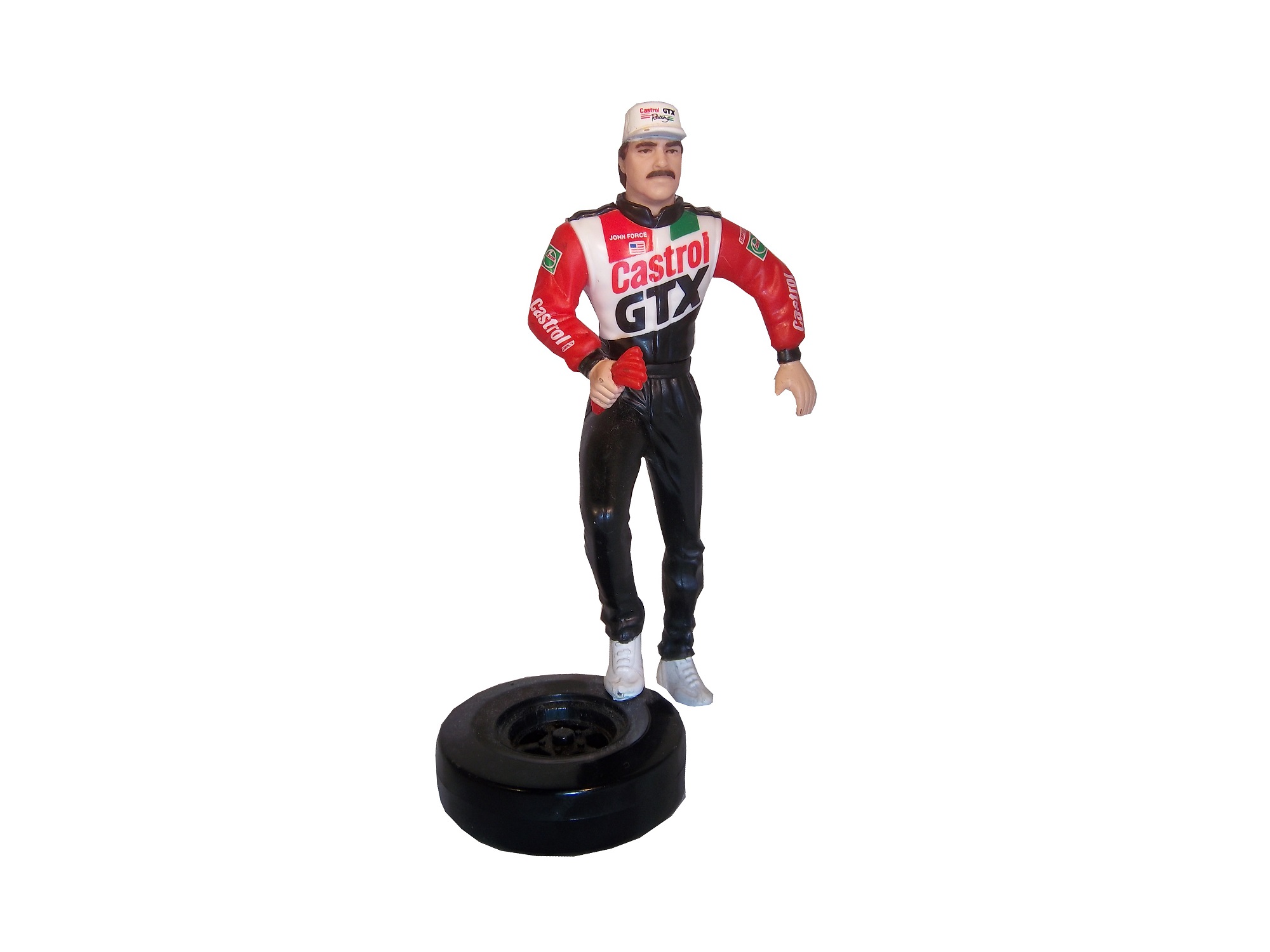
These last few weeks have been hell in Chicago weather-wise.  I have been under the weather myself, but this week, I wanted to touch on something that I covered in depth last year. After watching the Rolex 24 at Daytona, I learned that MOMO is celebrating its 50 anniversary this year. I first learned about MOMO when I covered Christian Fittipaldi’s Driver Suits back at the beginning of the blog. MOMO is one of the more ubiquitous racing safety companies in racing.sccatrack-blogo

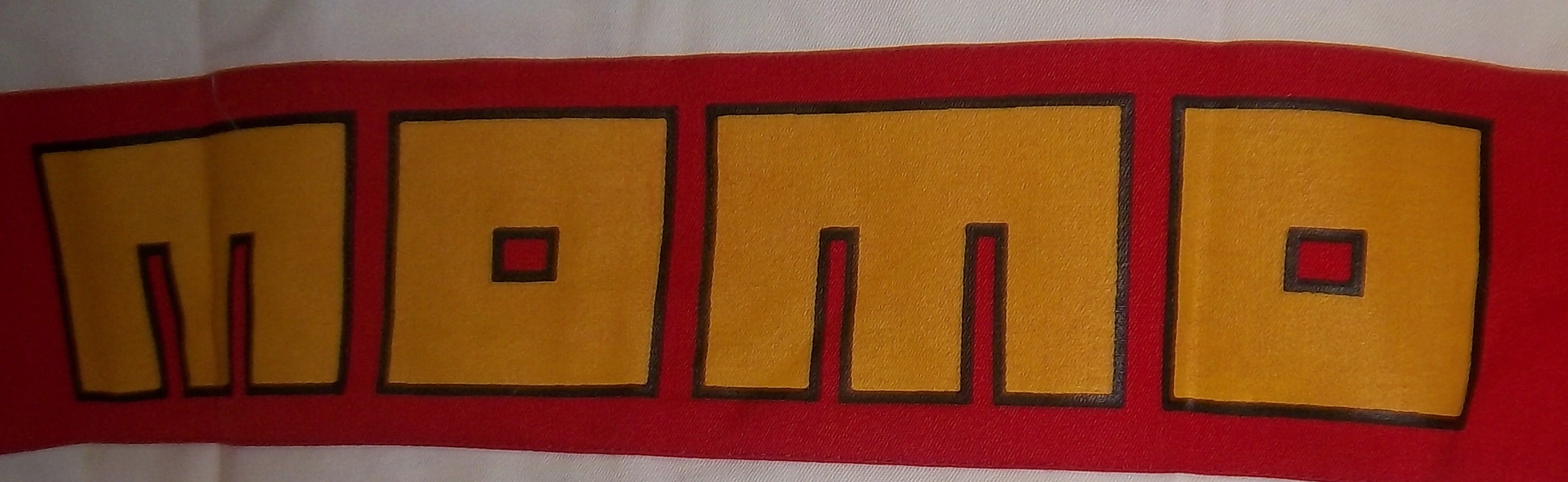
MOMO is short for “Moretti-Monza” which is Giampiero Moretti’s last name and Monza, a town in the Province of Milan. Giampiero Moretti was a driver who won the 1998 24 Hours of Daytona. He created a company specifically to make racing products. MOMO has gradually expanded over the years, and is now involved heavily in almost all forms of auto racing.

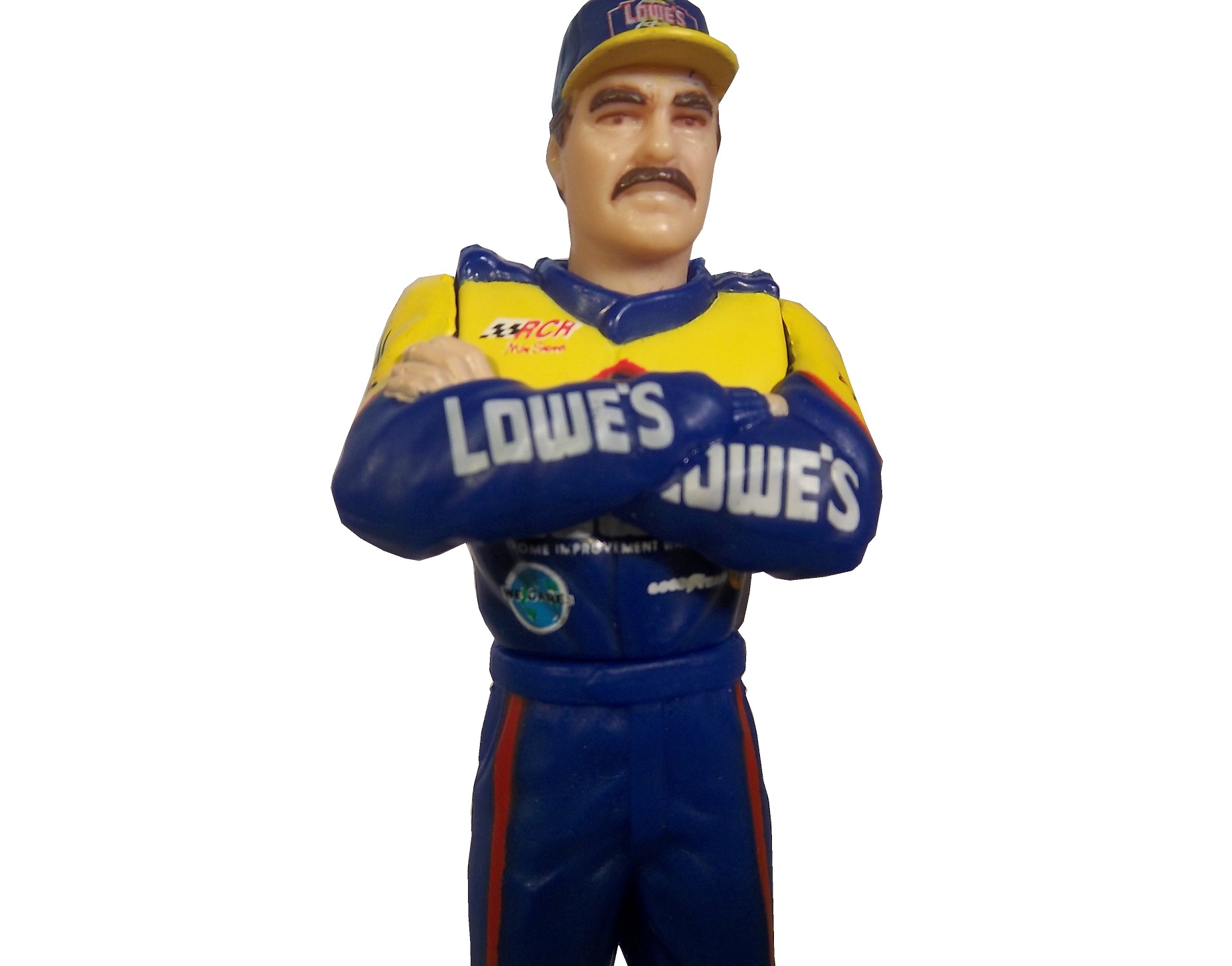
One thing I have noticed is that MOMO steering wheels are used very heavily in NASCAR. Whenever there are in-car cameras, there is always one located near the ignition behind the steering wheel, and almost every one of them has a MOMO logo on them. They are also very involved in F1, and IndyCar racing in terms of parts. When the best and most recognizable teams in the biggest forms of auto racing all use the same group for their parts, it proves that MOMO is the best in what they do.

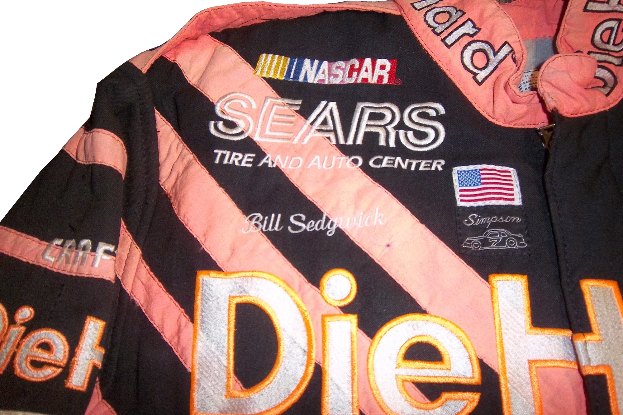
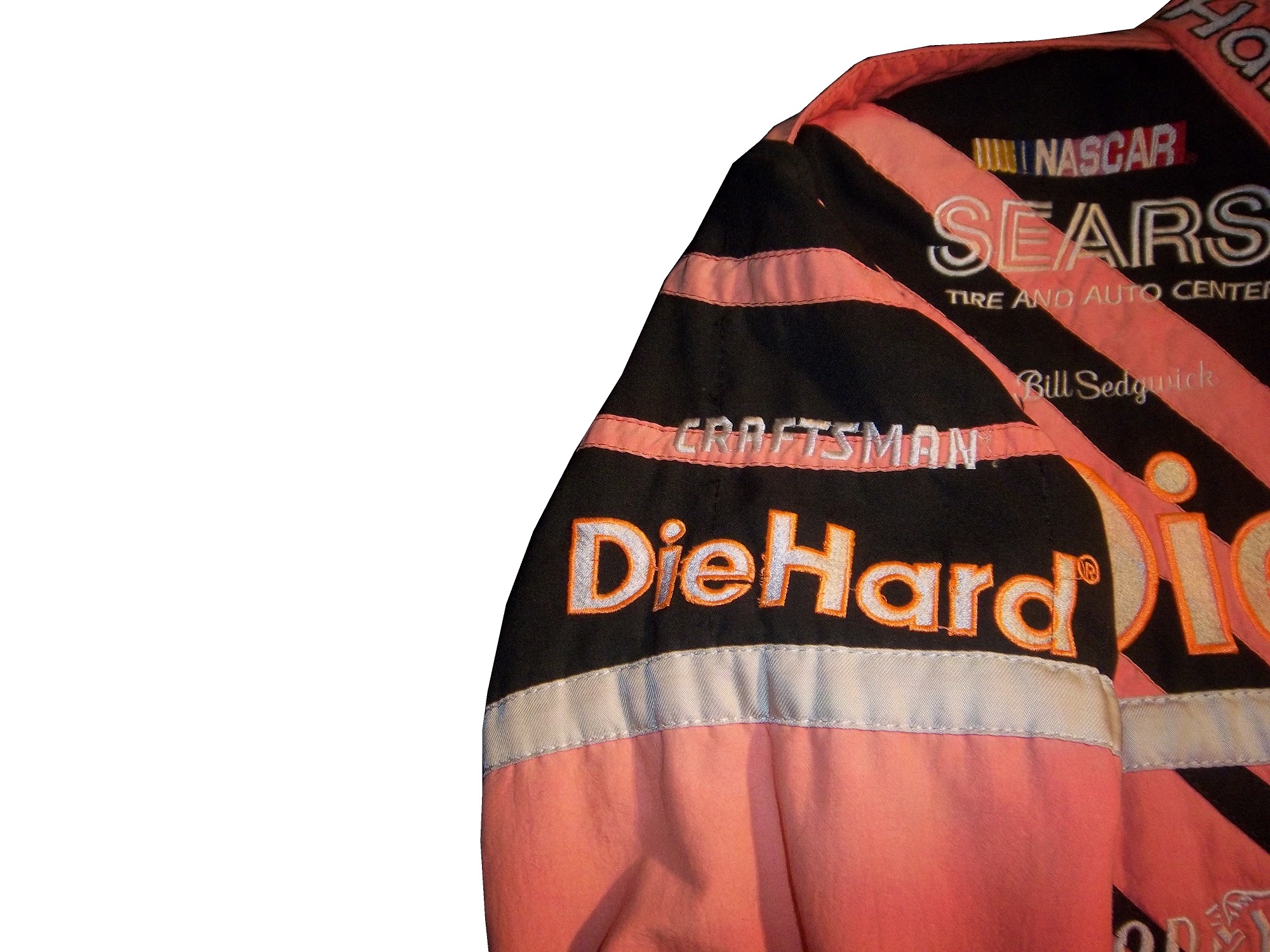
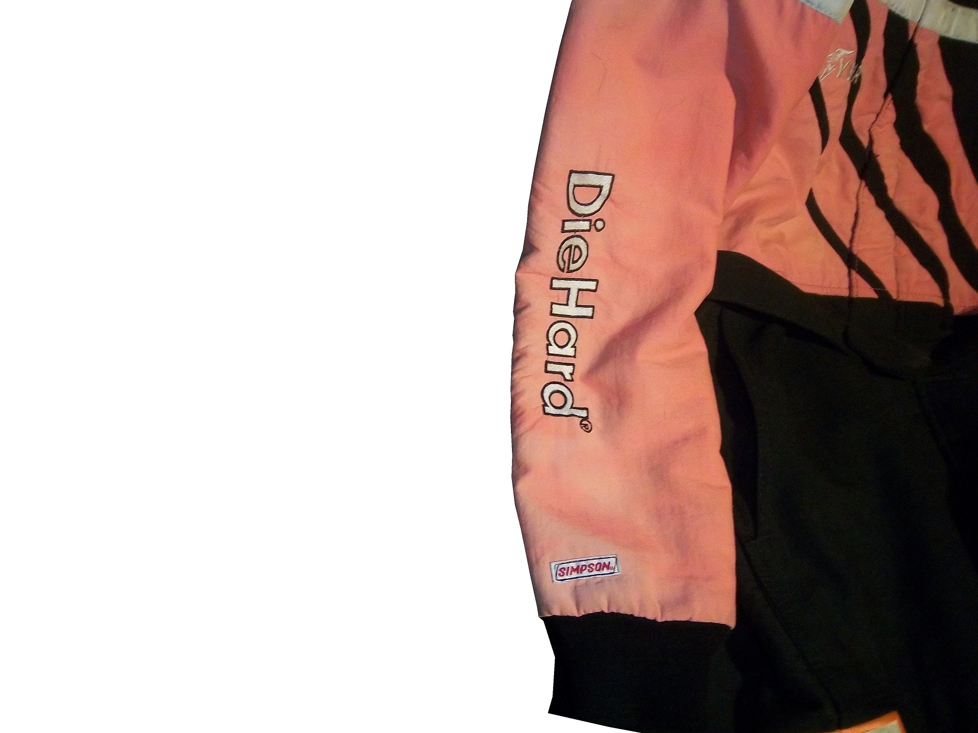
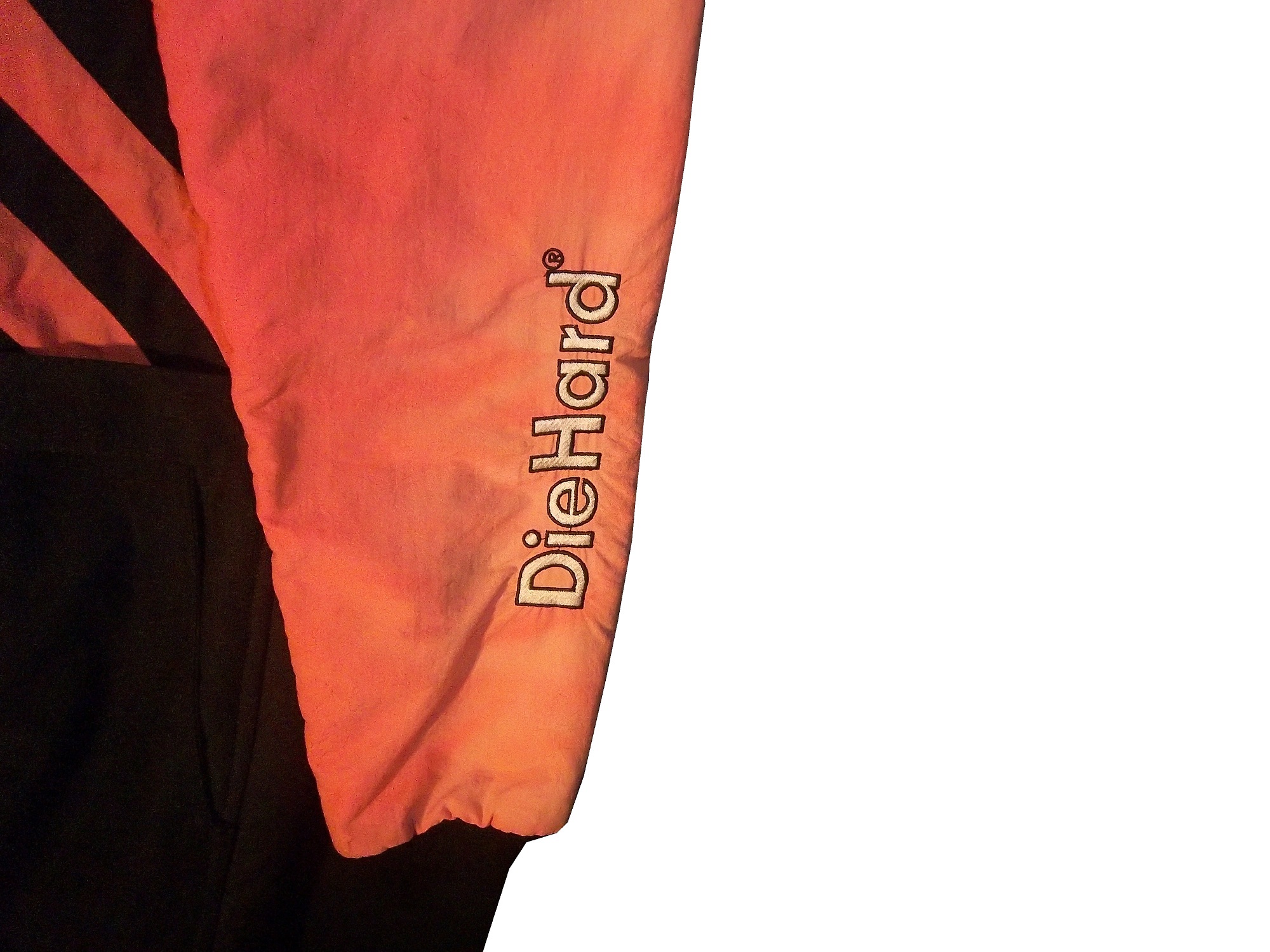
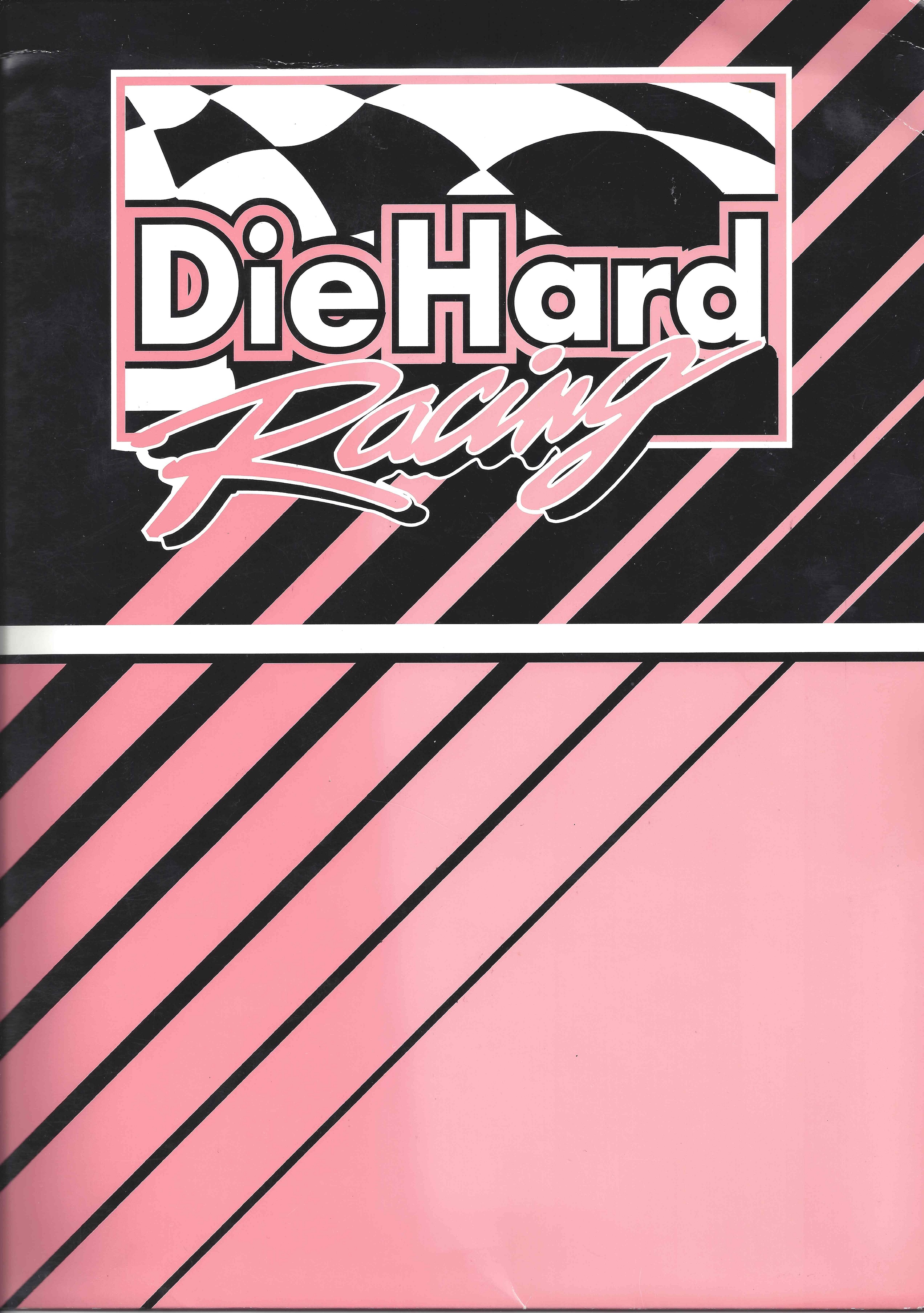
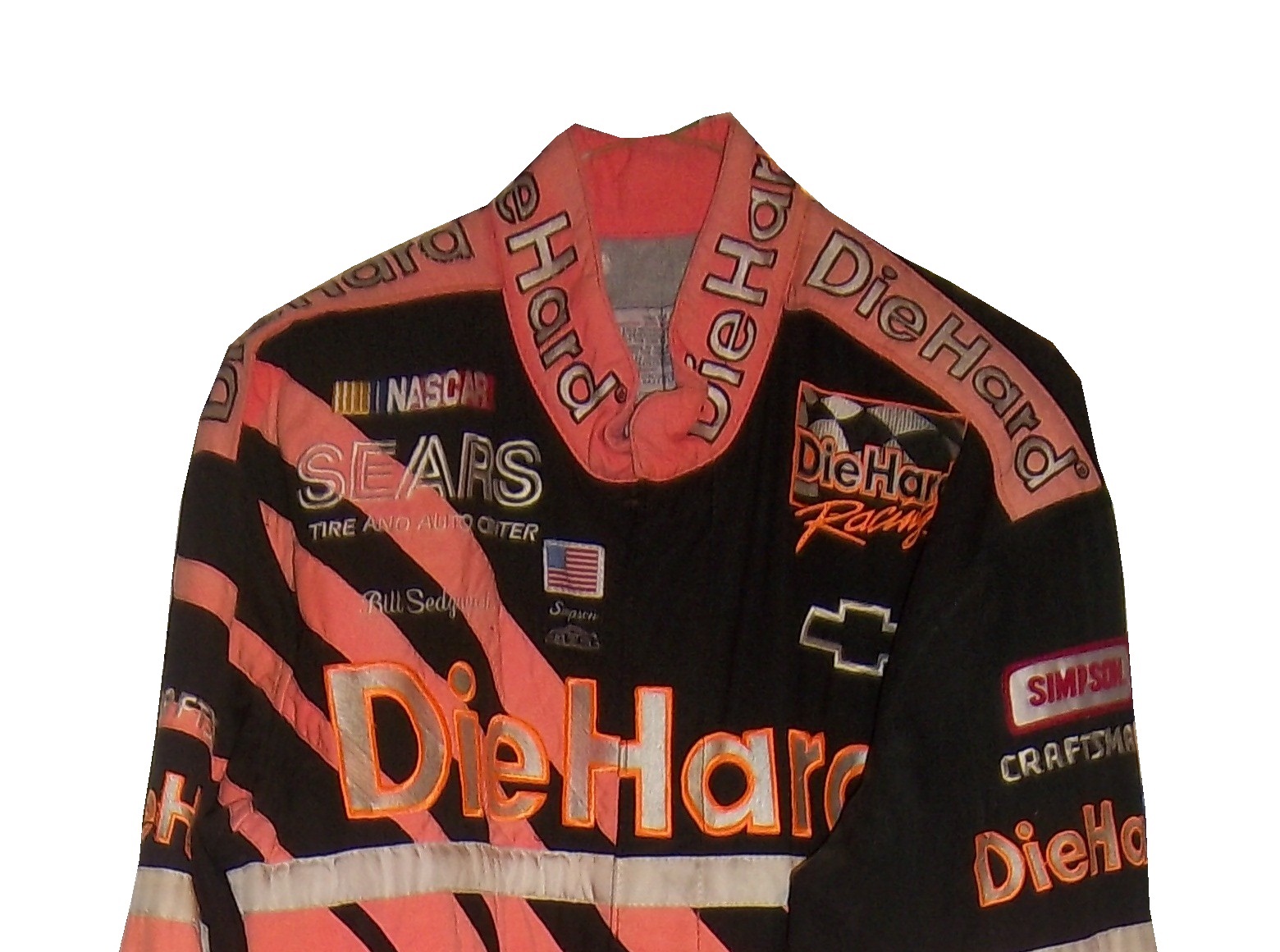
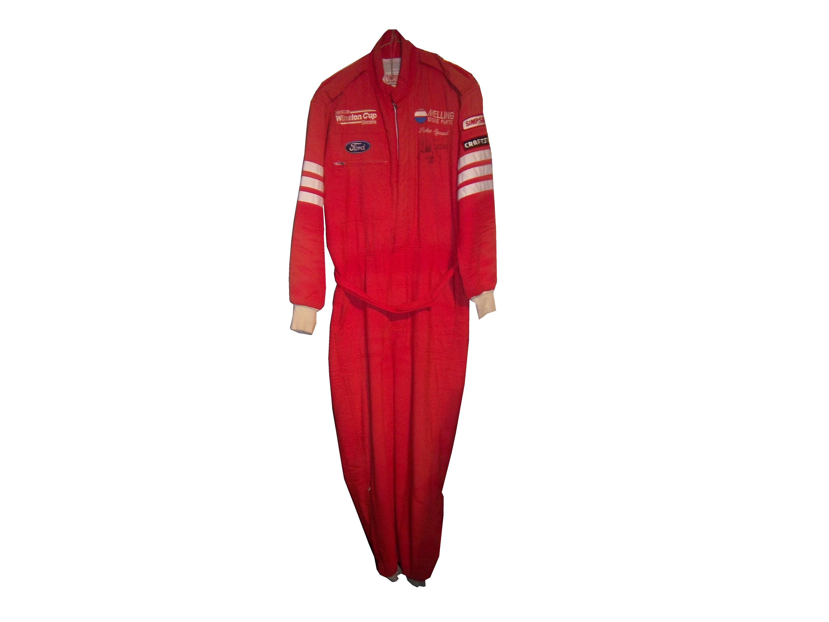
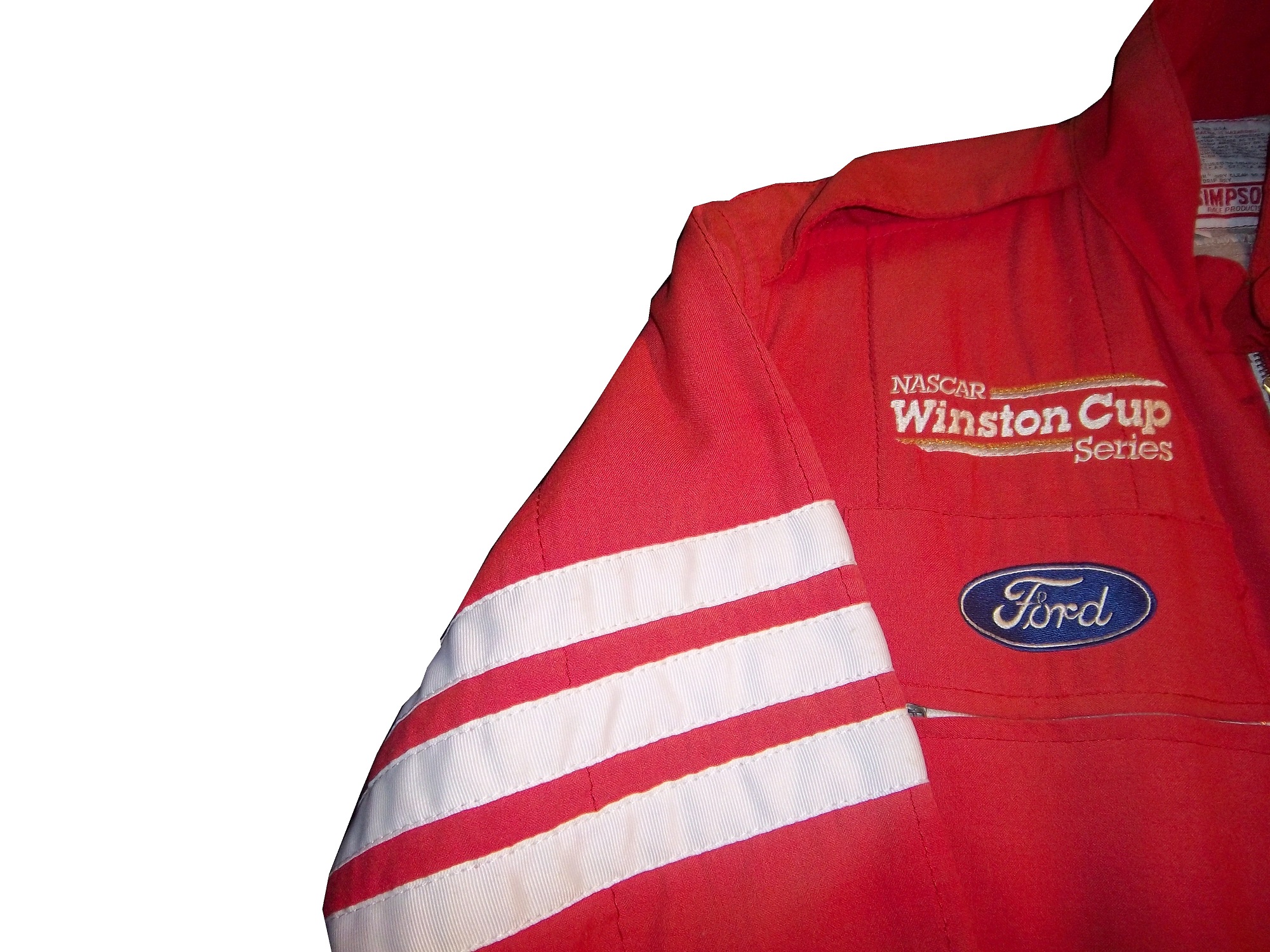
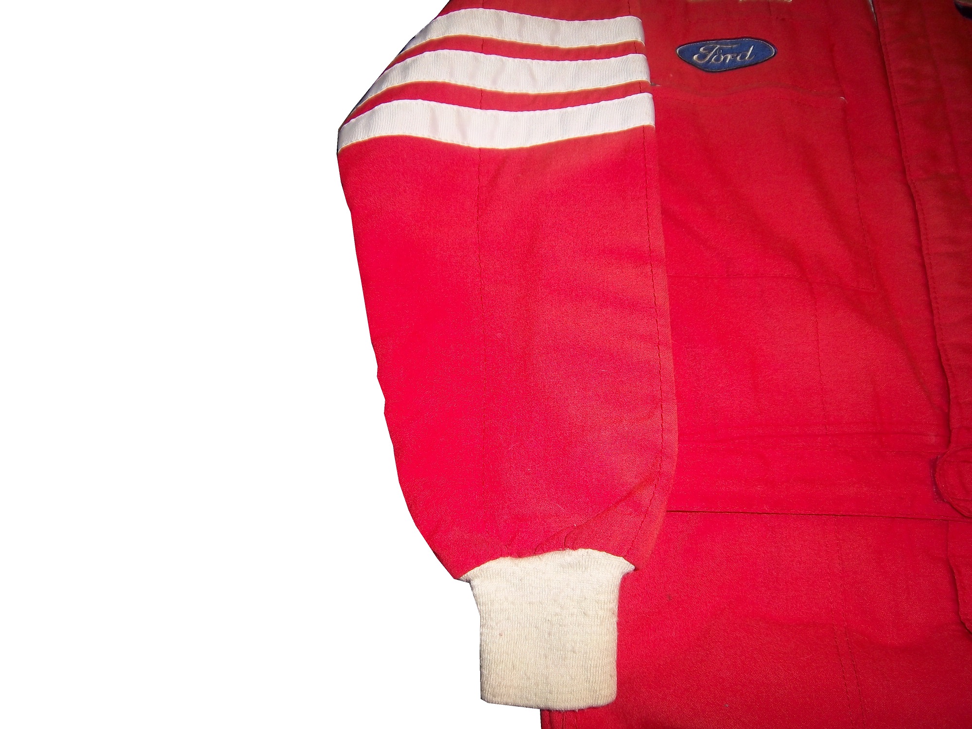
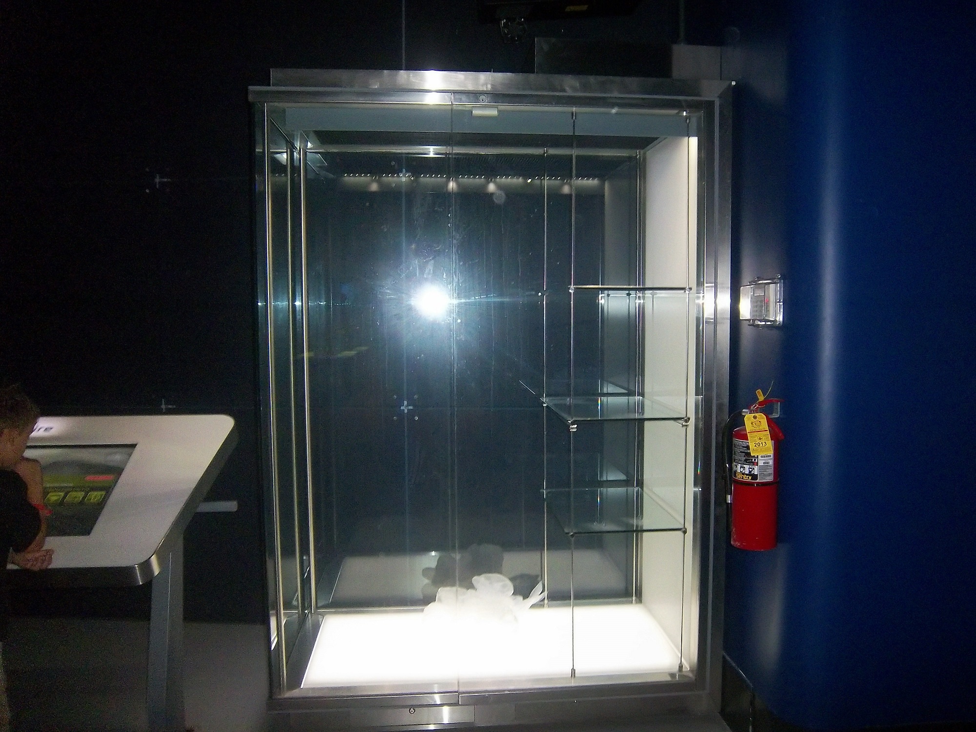
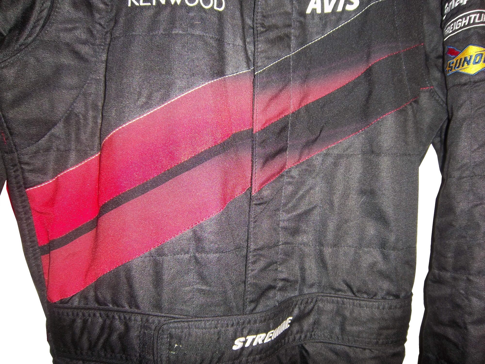
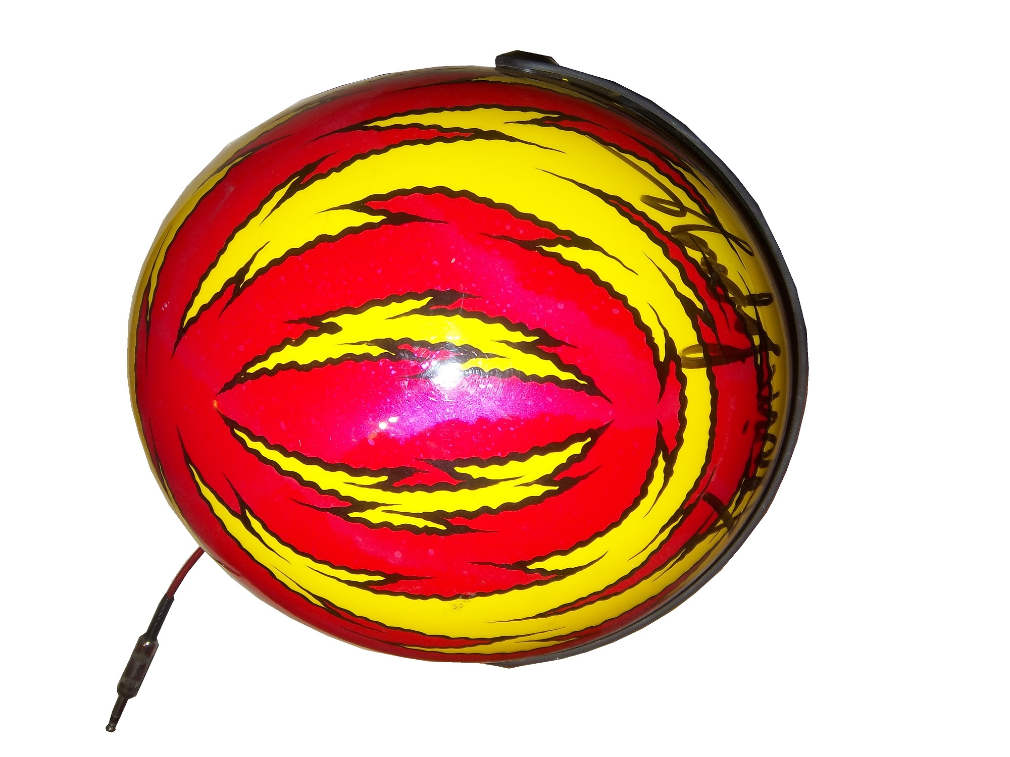
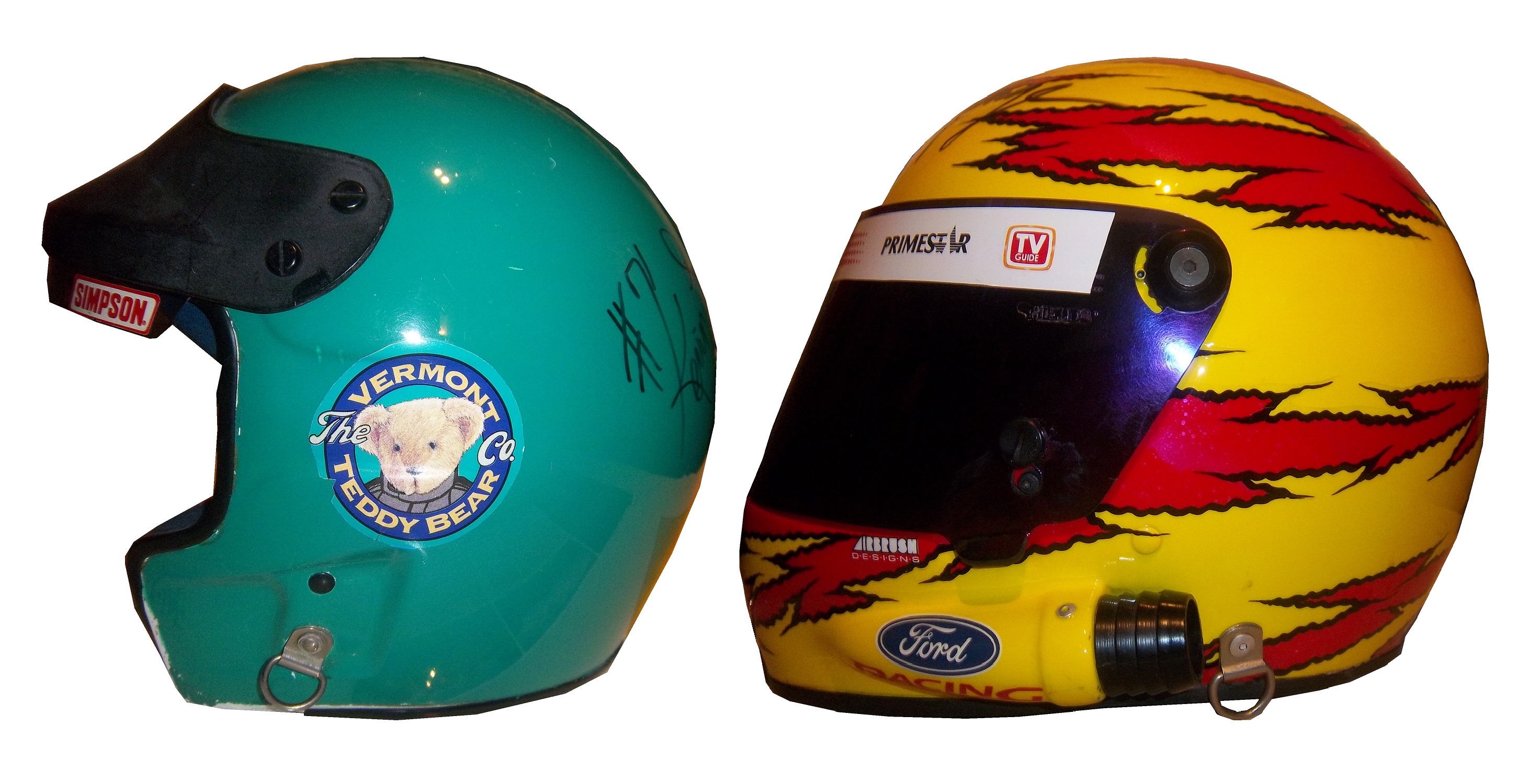
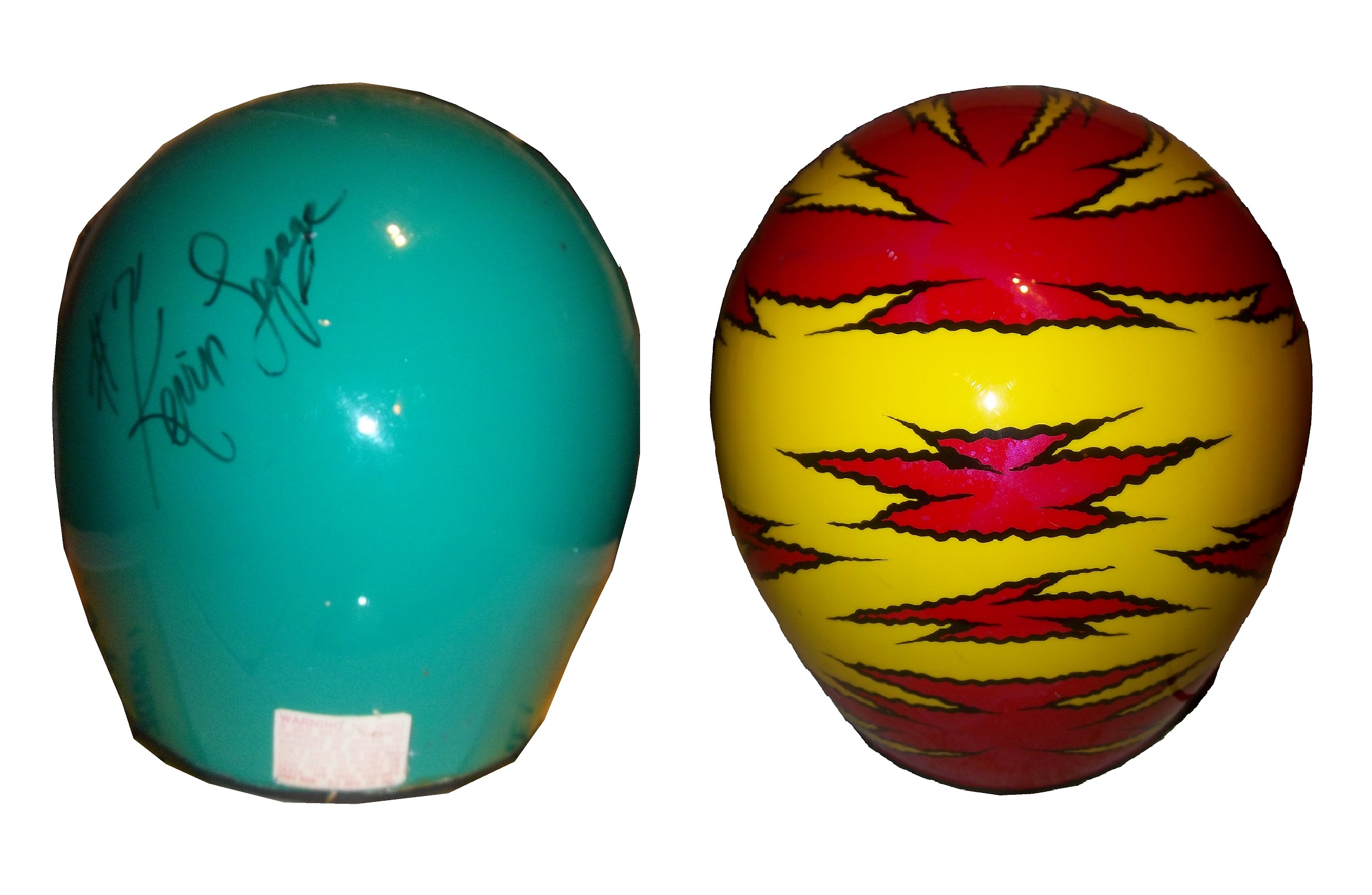
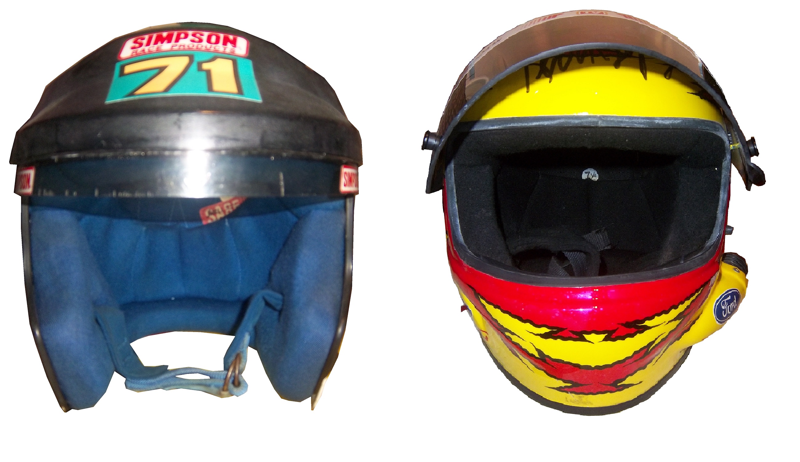
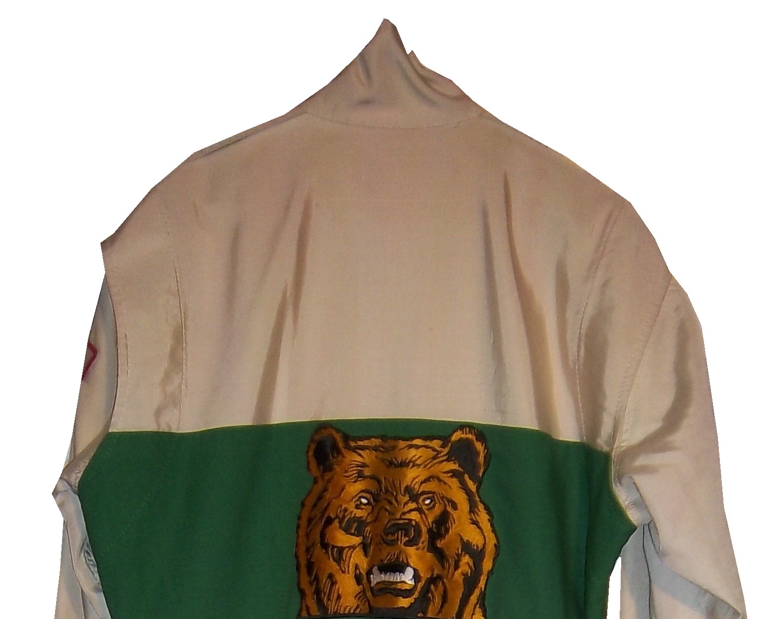
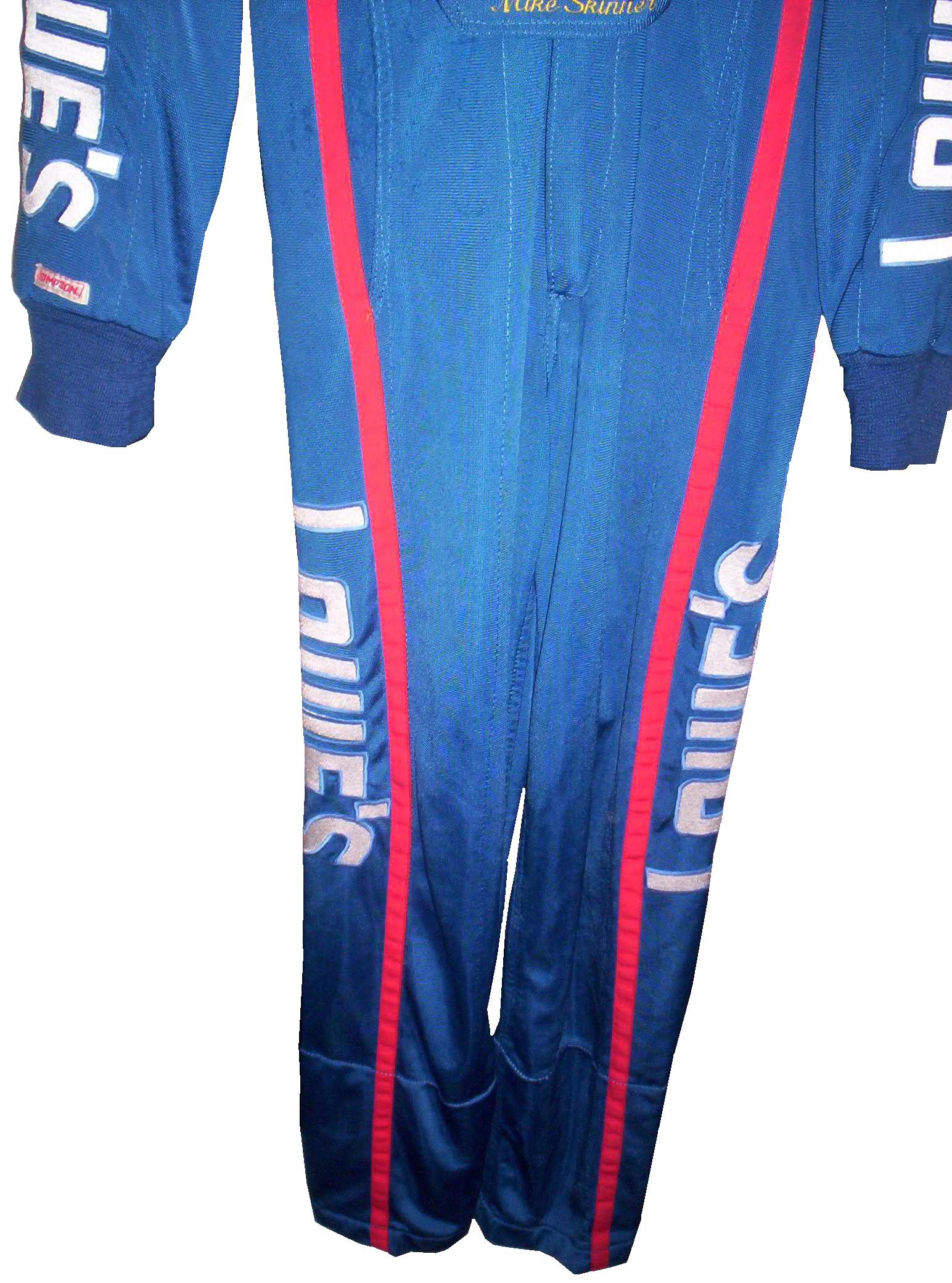
I also mention Christian Fittipaldi because he won the Rolex 24 at Daytona in an Action Express Coyote Corvette DP. This is his second win, his first one coming in 2004 in a Bell Motorsports Doran JE4-Pontiac. As covered earlier in the year, I own two Christian Fittipaldi MOMO driver suits. In all honesty, these two suits were my first introduction to MOMO as a brand. MOMO however has a large presence in auto racing.fittipaldi
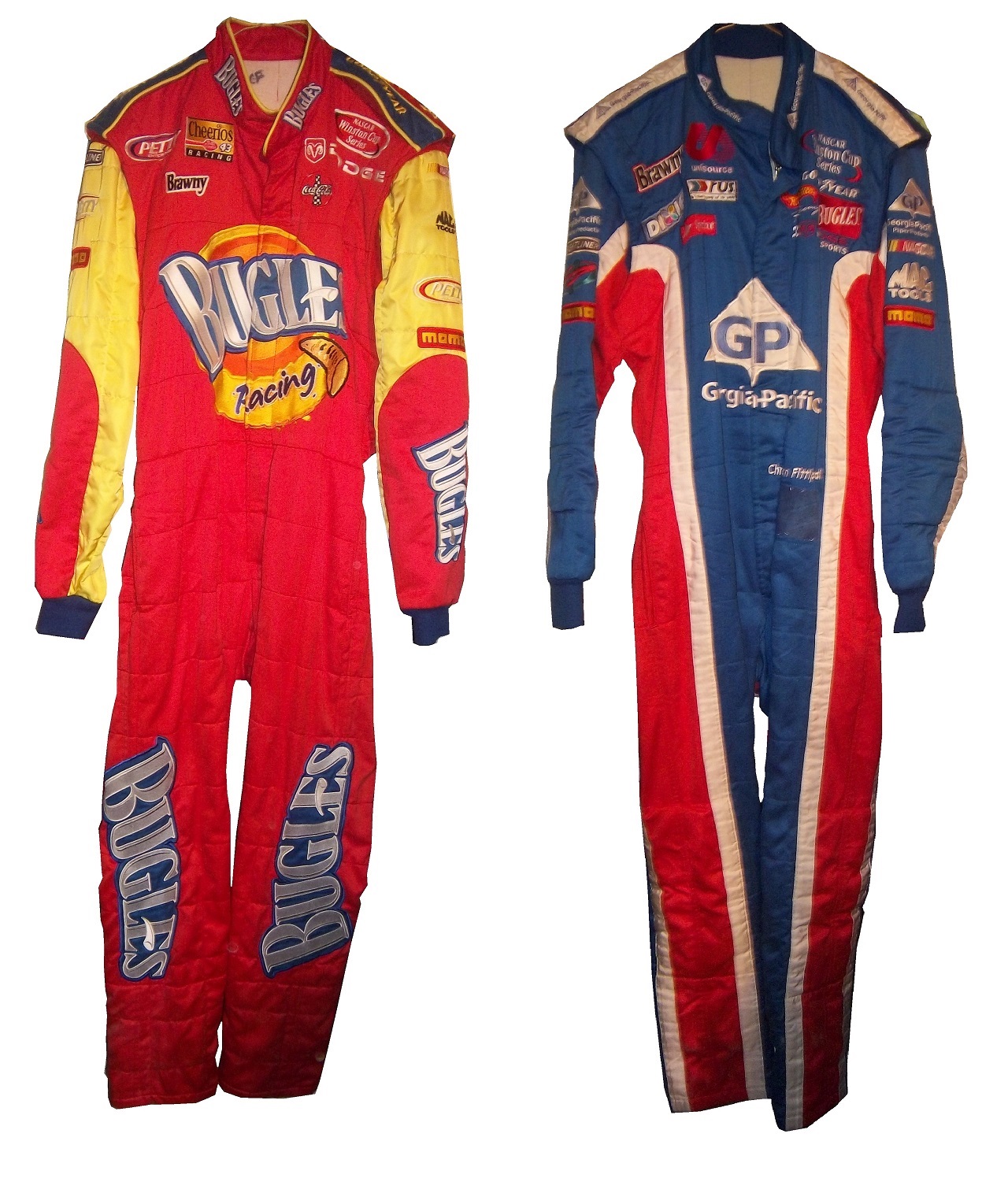
In the SCCA Miami Grand Prix, these suits were issued to track workers. MOMO stated that these would be fireproofed for one race only. It feels like an old school chemical dipped suit, but I have no proof of that. It does not appear to have been worn, but it probably is not fireproof any more though. sccatrack sccatrackb
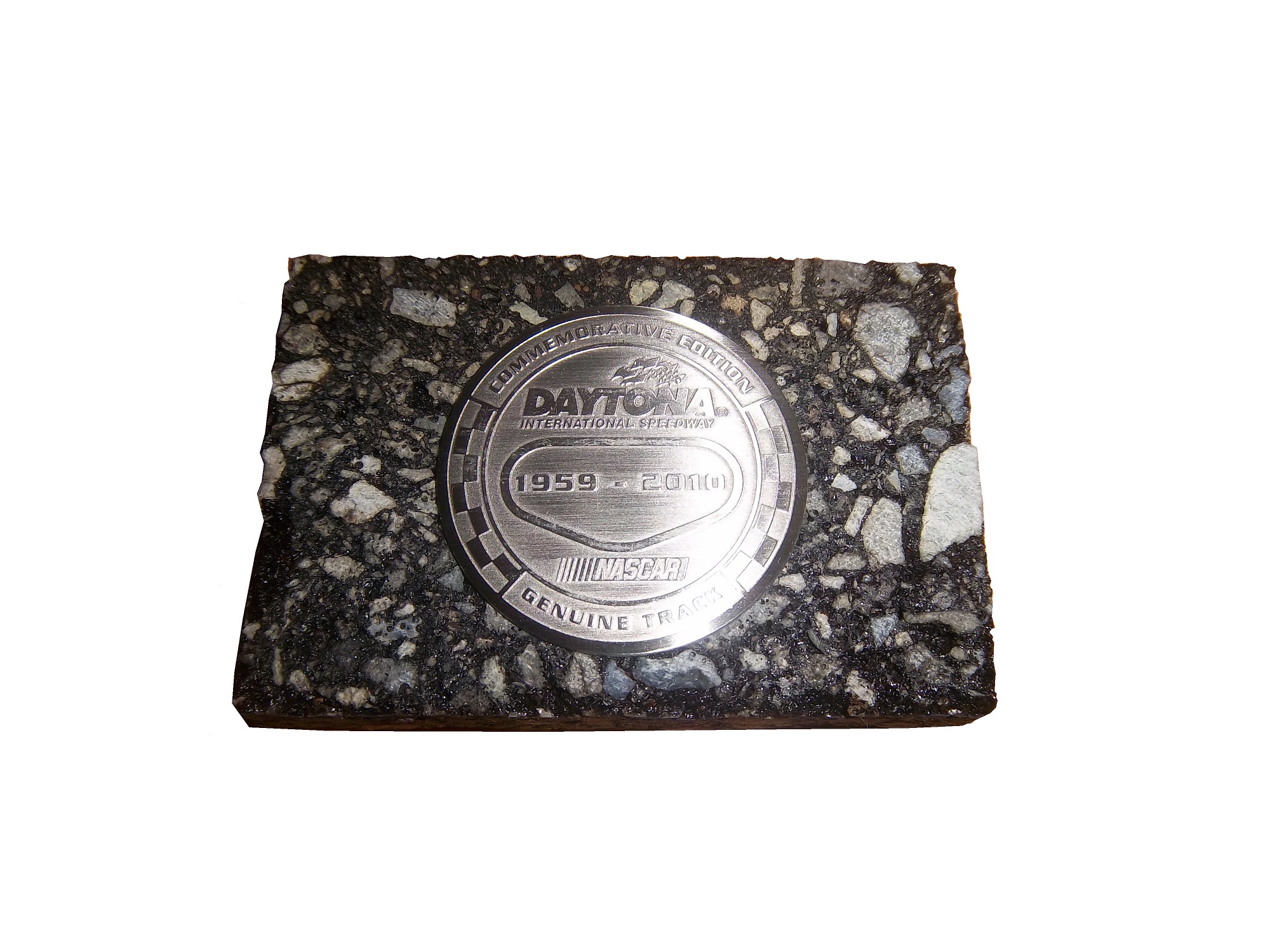
2014 is the 50th anniversary of what I’m going to call “The dark week,” May 24-30 1964 when the World 600 and Indy 500 took place. Three drivers were killed by fire, which changed the safety culture of racing forever. I will cover that issue in depth later in the season.

Paint Scheme Reviews

Marcos Ambrose #9 Stanley Ford Fusion Though a tad over designed, the car does has a clean look, and a great color scheme, so I will give it an A-

Marcos Ambros3 #9 DeWalt Ford Fusion See Above

Kyle Busch #18 Skittles Toyota Camry When I first heard about Skittles returning to NASCAR, I thought it would look like this or this, so naturally I was worried, but I like this simple and attractive design. A+

Kyle Busch #18 Peanut M&M’s Toyota Camry Decent scheme, good color scheme, A-

Matt Kenseth #20 Dollar General Toyota Camry My major complaint was the black and silver stripes on the sides were too big and promenent. They solved that issue this season, and the car looks better. In fact, I’ll give it a B!

Jeff Gordon #24 AXALTA Chevy SS Classic Jeff Gordon design, and I like the blue on the flames, and the black flames on the back. A+

Paul Menard #27 Menards/Richmond Chevy SS Love this scheme, great design and color scheme, A+

Paul Menard #27 Menards/Serta Chevy SS Same scheme as last year, same C+ grade

Eric McClure #35 Hefty/Arm and Hammer Ford Fusion Good color scheme, but the car looks over deisgned and it doesn’t look good at all. D+

Kurt Busch #41 Haas Chevy SS Great design and color scheme, A+

Kurt Busch #41 Slate Water Heaters Chevy SS Kurt is running a really good template this year, and this is another example. The condensation design is overdone, and it takes an A scheme down to a B-, otherwise it is a great design.

Aric Almirola #43 STP Ford Fusion This is one of my favorite schemes this year! A classic design, with great colors and a great look earns an A+

AJ Allmendinger #47 Kroger/USO Chevy SS Though the scheme is the same as last year, JTG Daugherty Racing has switched from Toyota to Chevy this season. That being said, I like this scheme, and I will give it an A

AJ Allmendinger #47 Bushes Baked Beans Chevy SS Simple design, great color scheme, A

AJ Allmendinger #47 Kingsford Chevy SS See Above

AJ Allmendinger #47 Scotts Chevy SS See Above

AJ Allmendinger #47 Clorox Chevy SS See Above

AJ Allmendinger #47 Charter Communication Chevy SS I like the overall design, but that is an awful shade of green. Green is not a great color for a race car, neither is yellow, so yellowish-green definitly doesn’t work. I’ll be generous and give it a C-

Joe Nemechek #66 Land Castle Title Toyota Camry If the bottom was a single color stripe, I would give it very high marks, but the over design makes it look awful. C-

Michael McDowell #95 K-Love Ford Fusion Not only is McDowell and Levine Family Racing running a better template this year, the K-Love scheme actually improves on it. I can’t give this scheme anything lower than an A

Carl Edwards #99 Subway Ford Fusion A bad design from last year, earns a D-

Two Birthdays in January…

100_4380By David G. Firestone
On the first anniversary of the founding of The Driver Suit Blog I felt it appropriate to analyze the first two NASCAR driver suits I ever bought. I started in the driver suit hobby in March of 2010, with a Bill Sedgwick Die Hard driver suit from the Craftsman Truck Series in 1996. 17-sedgwickI purchased this specific item for a number of reasons, first, it was well within my price range, and second, I wanted a low-end example that I can look at and get a general feel for aspects that I will see in other driver suits.
Some of the stuff I learned from this particular suit helped me understand the very basics of design aspects on race-worn driver suits. Some of the aspects I discovered from that were completely different and it was through subsequent research that I began to understand driver suits more. I have kept it for as long as I have is because I love the suit, and I even though I have had it for almost 4 years, I still find aspects about it that interest me.
The suit is custom designed for Darrell Waltrip’s Craftsman Truck Series team. Sedgwick drove the #17 Chevy C-1500 for the entire 1996 season, whereas Waltrip drove the #5 truck for a very limited schedule. Sedgwick had 3 top 5’s and 8 top 10’s in the 23 of the 24 races that year, and led a total of 8 laps. Sedgwick was released at the end of the season.17-sedgwick
The triple-layer suit is custom designed for Sedgwick, with the Sears Die Hard logos on the collar and shoulder epaulets,17-sedgwick-collar 17-sedgwick-rshoulder 17-sedgwick-lshoulderSears Die Hard logos across the front and Sedgwick’s name on the right chest,17-sedgwick-rchest17-sedgwick-lchestno arm gussets,17-sedgwick-rsleeve1 17-sedgwick-lsleeve1no adornment on the belt,17-sedgwick-beltTV logos and safety stripes on the legs,17-sedgwick-legsTV logos on the sleeves,17-sedgwick-rsleeve2 17-sedgwick-lsleeve2and a huge logo across the back.17-sedgwickb 17-sedgwickb-logoI purchased a press kit for this suit, which I covered in December, concerning this suit, and I realized that the suit Sedgwick is wearing in the promotional photo is the same suit that is in my collection. I keep the press kit in my authentication binder with the rest of my COA’s and LOA’s17-sedgwick-presskit1 17-sedgwick-presskit3 17-sedgwick-presskit2 17-sedgwick 17-sedgwick-presskit2The other suit I bought, my first Winston Cup suit was a Lake Speed suit from 1997, this one is a bit different. In 1997, Speed was racing for Melling Racing, which in 1997 was a shell of its former self. Melling had 34 victories and the 1988 Winston Cup Championship, but by 1997, they had no real sponsorship, and had not won a race since 1991. During that season Lake Speed didn’t score a top 5, top 10, or victory, and only led 3 laps in the 25 races he raced in that year.9-speedDue to the lack of sponsorship, Speed didn’t have the luxury of having a custom-made suit that season so he wore what appears to be a store bought suit. It looks like the suit was purchased either from a store or a catalog, and customized for Lake’s use. There are no large sponsor logos on the collar,9-speed-collarshoulder epaulets,9-speed-rshoulder 9-speed-lshouldertorso,9-speed-bsleeves,9-speed-rsleeve1 9-speed-rsleeve2 9-speed-lsleeve1 9-speed-lsleeve2or legs.9-speed-legsThe legs have a cuff cut, as opposed to a boot cut like the Bill Sedgwick suit has.
Everyone who has a hobby or an interest started somewhere. With me, it was with these two driver suits. No matter what you do in your hobby, or how high you fly in your hobby, you were a rookie, and you started from somewhere. Never forget where you came from. These two suits are a reminder of what I was, and I love these two.
Before we get to paint schemes, I need to say something to my readers. When I started this project one year ago, I never thought it would take off as much as it did. I have a group of really awesome readers and followers. I also owe a special thanks to Paul Lukas of Uni-Watch, because if I had never written my two articles for Uni-Watch in 2013, I would never have done the research I did for them, and I would never have had the frustration of not finding research from the collector’s perspective, and The Driver Suit would never have been born. To all my readers, from the bottom of my heart, I say thank you! Stay Tuned because 2014 will be even better than 2013!

Paint Scheme Reveiws

Jamie McMurray #1 Cessna Chevy SS Black with silver numbers and white trim looks simple and really good. I can’t say anything bad about this scheme, and bonus points for improving the door number design. A+

Jamie McMurray #1 McDonald’s Chevy SS Same great design as last year, same A grade.

Austin Dillon #3 Dow Chevy SS Take the white stripe down the side off, and it will be a solid A scheme. The white does not look good at all. The red/white/black color scheme works very well, and it is decently designed, so I will give it a B+

Danica Patrick #10 Go Daddy Chevy SS Not only does Go Daddy continue to use the worst shade of yellow in NASCAR, they also have given the worst shade of orange a more prominent role in the car. Givng this car an F is a very fair grade.

Denny Hamlin #11 FedEx Ground Toyota Camry Same scheme as last year, same C+ grade

Denny Hamlin #11 FedEx Freight Toyota Camry Same scheme as last year, same C+ grade

Denny Hamlin #11 FedEx Office Toyota Camry Same scheme as last year, same C+ grade

Denny Hamlin #11 FedEx Express Toyota Camry Same scheme as last year, same C+ grade

Casey Mears #13 Geico Ford Fusion The yellow they use is awful, and the side design is just too loud,  I’ll give it a D

Ricky Stenhouse Jr. #17 NOS Ford Fusion I love this color scheme, however, I don’t love the side design. It has too many different different designs, all of which would work on their own but combined they look like a jumbled mess. I really want to like this scheme, but I just can’t, so I’ll give it a C-

Ricky Stenhouse Jr. #17 Fifth-Third Bank Ford Fusion Everything I just said about NOS applies here. C-

Clint Bowyer #15 5 Hour Energy Toyota Camry Same scheme as last year, same B+ grade.

Kyle Busch #18 M&M’s Toyota Camry Same scheme as last year, same A+ grade.

Ryan Newman #31 Cat Chevy SS New season, new driver, new scheme that looks great and earns an A

Kurt Busch #41 Haas CNC Chevy SS Great color scheme and a very simple desgin look very good here. I also like the matte black used, and the door numbers look really solid. Can’t give this scheme anything less than an A

Kyle Larson #42 Target Chevy SS The scheme looks decent, I like the white on the back, though I do not like the Target logos at the bottom. That takes a scheme that was an A grade to a B-

Brian Vickers #55 Aaron’s Toyota Camry A good scheme, and the 55 lettering looks really good here, and the gold is a nice touch. A

Martin Truex Jr. #78 Furniture Row Chevy SS Simple, and perfect. A+

Dale Earnhardt Jr. #88 Diet Mountain Dew Chevy SS Same scheme as last year, but I never gave it a grade. So here is my analysis Not a great scheme, too much needless design on the side of the car, and the silver background is just brutal. The red lettering on a green background is unattractive at best, and all in all, this is a D- grade.

Michael McDowell #95 Levine Family Racing Ford Fusion This scheme is so much better than last year’s scheme, and just for that I’ll give it a B

Carl Edwards #99 Aflac Ford Fusion This has a terrible color scheme, with lime green, neon blue, black and white. The wing design is not only ugly but would work better starting at the door and working behind.

“Press Kit” Does NOT Mean Ironing a Uniform!

By David G. Firestone17-sedgwick-presskit1

Hope you all had a great holiday season, whatever you celebrate. I turned 32 on Thursday, and am celebrating the first year of the The Driver Suit Blog. Ok, enough sappy stuff, on to this week’s column.We’ve discussed photo-matching before, but here is something regarding photo matching that many people don’t know about, using press kits to photo match a suit. Press Kits are defined on Wikipedia as “a prepackaged set of promotional materials of a person, company, or organization distributed to the media for promotional use.” In sports, these are usually distributed to the media, prior to the start of the season, and usually contain information about players, statistics on players, history of the teams, photos, and the occasional gift.

NASCAR teams distribute these to the media before and during the season, and they often find their way into the hands of collectors. These kits are fun to collect, and I enjoy looking at the various driver suits that the drivers are wearing. These have a serious side in the collectors market, as they can easily be used for photo-matching.17-sedgwick-presskit2This is an example of a NASCAR press kit, this one from 1996. Bill Sedgwick was the driver of the #17 Die Hard Chevy C-1500. The team was owned by Darrell Waltrip, who also raced for the team in a number of events. In 1996, he started 23 of the 24 races in the Craftsman Truck Series, and had a decent season, with 3 top 5’s and 8 top 10’s, including a 2nd place finish at Milwaukee. He finished the season in 14th place. During the season, this press kit was distributed to the media. It comes in a custom folder,17-sedgwick-presskit1 17-sedgwick-presskit16and contains race statistics17-sedgwick-presskit4 17-sedgwick-presskit5 17-sedgwick-presskit6 17-sedgwick-presskit7 a driver profile17-sedgwick-presskit9,an owner profile17-sedgwick-presskit10 17-sedgwick-presskit11,sponsor information,17-sedgwick-presskit8technical information, 17-sedgwick-presskit12 17-sedgwick-presskit13 17-sedgwick-presskit14a bumper sticker,17-sedgwick-presskit15and a photo of both Darrell and Bill.17-sedgwick-presskit2I own Sedgwick’s suit from that season, it was the first driver suit I ever bought.17-sedgwick 17-sedgwickb

17-sedgwick-presskit2  17-sedgwick17-sedgwick-presskit2I tried to find a picture of any kind of him wearing the suit, but had no luck, until I found the press kit, and the black and white photo of him wearing the suit. So I bought it and photo matched the suit. Photo-matching, though time-consuming, it is a part of this hobby that is a necessary evil. If you buy a driver suit, helmet, or anything else worn by a driver, finding pictures or video of the driver wearing the suit is crucial to authenticating the suit. Sometimes traditional manners come up empty, and a press kit is the only way. Kits typically run between $5 and $30, so they can be pricy, but the upside to this is that when it works, you have indisputable proof that this suit was worn by the driver in question.

This last year, I took exception with a display at the Museum of Science and Industry concerning an obviously fake helmet that is being passed off as real.  I recently went back there after sending my argument that the sign should be changed.  Last time I went the display had been emptied:100_3811Recently, I went back and went back to the display, and saw this:gh1 - CopyThe display has been restored, and it looks really good except…gh2 - CopyTHE SIGN HASN’T BEEN CHANGED!  I want to love this display, I really do, but I can’t ignore the fact that there is a fake item being represented as real.  I have seen items from museum collections go up for sale to the public, and I have to make sure a fake item doesn’t get misrepresented as real.

PAINT SCHEME REVIEWS

Tony Stewart #14 Mobil 1 Chevy SS  The color scheme is good, but the design is horrid!  The contrast between the black and the white looks awful.  As much as I want to defend this scheme, I can’t.  F

Tony Stewart #14 Bass Pro Shop Chevy SS  Same scheme as last year, same C- grade.  Also, it appears that the last name on the windshield has larger lettering than last year.

Tony Stewart #14 Rush Truck Centers Chevy SS Same Scheme as last year, same A grade

Matt Kenseth #20 Home Depot/Huskey Toyota Camry   I would give this scheme an A grade, but the yellow back bumper ruins it.  The clash between the two just works awkward, and it takes an A scheme down to a C


Parts and Recreation

By David G. Firestonepettyrotor1

You know me for driver suits, but i also collect other things besides suits. Aside from helmets and other uniform items, i also collect other race-used items from the cars. Racing is half man half machine, and items from the machine make unique collectibles as well.

One of the most obvious things is sheet metal. Stock cars consist of a roll cage which contains the engine, suspension, and driver compartment. Covering that is what is called “sheet metal” which is a thin metal that has the shape of the car and where the paint scheme is added. The cars are “skinned” after each race. The sheet metal from cars has become a huge collectors market. Pieces can be as small as 1 inch squared, such as this Carl Edwards pieceedwards6, or huge, such as this Sterling Marlin door.marlin

Tires are also popular to collect as well. Tires can be purchased whole, but since they can weigh as much as 90 pounds, they are often cut up and the pieces are sold, like sheet metal. This example, used by Kevin Harvick in the 2002 Daytona 500 is an example. it gives a good example of the thickness of the tire, and the cords are visible as well.harvick-tire1 harvick-tire2  100_4233   This Kyle Petty/John Andretti card has two small pieces of tire, each used by the respective driver in the card. These are popular, and everything from suits to caps, to sheet metal wind up in cards.petty-card1 petty-card2

Race-used lug nuts go hand in hand with tires. Lug nuts are used once, and then sold after the race, such as these Tony Stewart examples. Lug nuts are Super glued to the rim, and one of these still has superglue residue on it.stewartlugnut-1 stewartlugnut-2 stewartlugnut-9

Mechanical components, especially engine components are interesting to collect, as there is no better representation of man and machine than a part of the heart of the machine. For example, I have a brake rotor used by John Andretti in the 1998 Bank of America 500 at Charlotte, which has been signed by Richard Petty. pettyrotor1 pettyrotor2 pettyrotor3 pettyrotor4This is a set released after Jimmie Johnson won his first sprint cup title back in 2006. johnsongroupIt contains a series of pieces used by Johnson, including a piece of sheet metal from his door,johnsonsheet

a spark plug,johnsonplug

a valve spring,johnsonspring

a piece of the track bar,johnsonrod

and a lifter.johnsonlifter

i also have a spark plug from Morgan Lucas Racing in the NHRAmlr-plug

an ignition coil from Morgan Lucas Racing, which has been signed by Tony Schumacher and Ron Cappsmlr-coil3 mlr-coil2 mlr-coil4 mlr-coil5 mlr-coil6 mlr-coil1 mlr-coil7

and a timing belt from Bob Tasca,tasca-belt1 tasca-belt2

I discussed this pit board from Chad McCumbee earlier in the yearmccumbee-pit-1 mccumbee-pit-2 mccumbee-pit-3 mccumbee-pit-4 mccumbee-pit-5

one last item from the equipment collection is this piece of Daytona International Speedwaydaytona1 daytona2 daytona3 daytona4

Jamie McMurray #1 Cessna Chevy SS Black with silver numbers and white trim looks simple and really good. I can’t say anything bad about this scheme, and bonus points for improving the door number design. A+

Jamie McMurray #1 McDonald’s Chevy SS Same great design as last year, same A grade.

Austin Dillon #3 Dow Chevy SS Take the white stripe down the side off, and it will be a solid A scheme. The white does not look good at all. The red/white/black color scheme works very well, and it is decently designed, so I will give it a B+

Danica Patrick #10 Go Daddy Chevy SS Not only does Go Daddy continue to use the worst shade of yellow in NASCAR, they also have given the worst shade of orange a more prominent role in the car. Givng this car an F is a very fair grade.

Denny Hamlin #11 FedEx Ground Toyota Camry Same scheme as last year, same C+ grade

Denny Hamlin #11 FedEx Freight Toyota Camry Same scheme as last year, same C+ grade

Denny Hamlin #11 FedEx Office Toyota Camry Same scheme as last year, same C+ grade

Denny Hamlin #11 FedEx Express Toyota Camry Same scheme as last year, same C+ grade

Casey Mears #13 Geico Ford Fusion The yellow they use is awful, and the side design is just too lowd, Ricky Stenhouse Jr. NOS Ford Fusion I love this color scheme, however, I don’t love the side design. It has too many different different designs, all of which would work on their own but combined they look like a jumbled mess. I really want to like this scheme, but I just can’t, so I’ll give it a C-

Clint Bowyer #15 5 Hour Energy Toyota Camry Same scheme as last year, same B+ grade.

Kyle Busch #18 M&M’s Toyota Camry Same scheme as last year, same A+ grade.

Kurt Busch #41 Haas CNC Chevy SS Great color scheme and a very simple desgin look very good here. I also like the matte black used, and the door numbers look really solid. Can’t give this scheme anything less than an A

Dale Earnhardt Jr. #88 Diet Mountain Dew Chevy SS Same scheme as last year, but I never gave it a grade. So here is my analysis Not a great scheme, too much needless design on the side of the car, and the silver background is just brutal. The red lettering on a green background is unattractive at best, and all in all, this is a D- grade.

Carl Edwards #99 Aflac Ford Fusion This has a terrible color scheme, with lime green, neon blue, black and white. The wing design is not only ugly but would work better starting at the door and working behind.

Paint Scheme Leaderboard Part 4-The Grand Finale

By David G. Firestone

The focus group of one has had its meetings, and has made its decisions.  Here are all 50 teams that ran the Sprint Cup this year ranked first to last on their paint schemes:

#1-Wood Brothers #21-A classic design scheme that just seems to get better with age. The Henry Ford design combines classic and modern elements for an amazing look.

#2-Hendrick Motorsports #48 Jimmie Johnson went with a very classic look, with a day scheme and a night scheme, which worked very well. Johnson did not have a bad look all year.

#3-Michael Waltrip Racing #55 Simple traditional designs. That is the secret to their success on the leaderboard. Color schemes are great as well. Nothing wrong with these schemes.

#4-Furniture Row Racing #78 When it came down to picking a number 1 for Chevy, for both the Paint Schemie and the Leaderboard, I had to flip a coin to pick a number 1, and Johnson won. Kurt Busch ran a series of very solid schemes, not a lot to comment on and it always looks good.

#5-Joe Gibbs Racing #18 Like Jimmie Johnson and Kurt Busch on the Chevy side, the Toyota winner for both the Paint Schemie and Leaderboard was decided by a coin flip. More modern than the 55, all these schemes are good, with amazing paint schemes and really good design.

#6-Richard Petty Motorsports #43 This team combines classic and modern looks, and uses Petty Blue very effectively. The Transportation Impact scheme was not good at all, and kept the 43 team out of the top spot.  Extra Credit for the Maurice Petty Tribute Scheme.

#7-BK Racing #83 Great designs all around, but the hood needs work. Why is it black when the rest of the car is red?

#8-BK Racing #93 See Above, but the Old Dominion scheme drags it down.

#9-Penske Racing #12-Though only raced for one race, the SKF design worked very well. A great color and great design scheme. If this had been raced for multiple races, I would have ranked it higher, but it is still a solid scheme.

#10-Richard Childress Racing #29 The Bad Boy Buggies scheme is bad, and the Rheem/Budweiser combo scheme is awful, but aside from those, Kevin Harvick has had a very good season, paint scheme wise

#11-Earnhardt Ganassi Racing #42 Get rid of the Axe Apollo scheme and the Camouflage scheme, and Juan Pablo Montoya would have the top spot.

#12-Richard Petty Motorsports #9 This set earned a place in the top 5 because it improved by a lot over the course of the season. It has a great color scheme, but the early schemes were not great, but since Stanley redesigned their logo, and made some changes to the car, it is a very nice set.

#13-Phoenix Racing/Turner Scott #51 Guy Roofing and Hendrick Cars are hideous, but apart from that, they have run a great set of paint schemes. Bonus points given for the Neil Bonnett throwback scheme.

#14-Michael Waltrip Racing #56 The Get Back and Give Back scheme is horrid, but the rest of the schemes are really good.

#15-JTG Daugherty Racing #47 Most of what they ran this year was great, but the Bushes Baked Beans car has an odd overall design, and a weird color scheme. The Clorox scheme has a bad color scheme, as does the Charter scheme, as does the Wounded Warrior Project scheme.

#16-Roush Fenway Racing #17 A pinkwashing scheme as well as the Valvoline NexGen scheme kick Ricky Stenhouse Jr. out of the top spot. Sad thing too, as Ricky had a very solid year when it comes to paint schemes

#17-Joe Gibbs Racing #81 Alert Energy is awful. Double Mint is awesome.

#18-Penske Racing #2 While I miss the beer colored wheels from last year, Keselowski has had a decent year, the color scheme is great, though there is too much white on the car. The Redd’s Apple Ale scheme was great, but the Fan Mosaic and Patriotic schemes need some work.

#19-Roush Fenway Racing #16 Greg Biffle had a lot of great schemes, but he had a number of awful ones , including a pinkwashing scheme as well. Get rid of the pinkwashing scheme, the Scotchguard, give blood, and Megulars schemes, and he would be in the top 5.

#20-Richard Childress Racing #27 The yellow is too bright, but other than that, the schemes are really good.

#21-Stewart Haas Racing #14 Some of these schemes are good, others not so much.

#22Hendrick Motorsports #88 Dale Jr. runs good schemes most of the time, but Soldiers of Steel, Orange Amp Energy, and Camouflage are just brutal. Additional points lost for a pinkwashing scheme.

#23-Joe Gibbs Racing #20 If the Dollar General was more plain, and did not have the orange back, I would love to give Matt Kenseth a higher spot, and a pinkwashing scheme does not help.

#24-Earnhardt Ganassi Racing #1 Bad Boy Buggies is even worse here, and the Bass Pro Shop schemes are awful. A number of good schemes here as well.

#25-FAS Lane Racing #32 The Oxy Water scheme, and the gray scale C&J Energy Services schemes do not work, but the rest of the schemes they ran do

#26-Front Row Motorsports #38 The template they run works very well when the color scheme matches that of the sponsor. When it doesn’t match, it looks awful.

#27-Front Row Motorsports #35, See above

#28-Front Row Motorsports #34, See above, aside from the CSX scheme, which looks great, and the Peanut Patch scheme which looks awful.

#29-Tommy Baldwin Racing #36 This team looks better without a primary sponsor than they do with one.

#30-Max Q Motorsports #37 Simple, yet attractive. Would be higher if they ran more races.

#31-Joe Gibbs Racing #11 The Jason Leffler tribute scheme and the FedEx delivery manager schemes are great, but the rest are just awful. I miss the Gen 5 schemes

#32-Nemco Racing #87 The word that can best describe this set is dull. Not bad, but not spectacular.

#33-Circle Team Sport #40 Interstate Moving is really good. Moon Shine Attitude Attire is really awful, and their pinkwashing scheme is even worse.

#34-Roush Fenway Racing #99 Geek Squad and Fastenal work well, the rest…not so much.

#35-Richard Childress Racing #31 A few good schemes but most of them are mediocre at best.

#36-Hendrick Motorsports #24 See Above

#37-Stewart Haas Racing #10 Worst shades of yellow in NASCAR, and the pinkwashing scheme is so much worse.

#38-Michael Waltrip Racing #15 Clint has consistently run cars with great color schemes, but awful designs. Except for Duck Dynasty, and pinkwashing, which are just hideous.

#39-Humphrey Smith Racing #19 Another car that just looks better without a primary sponsor.

#40-Germain Racing #13 Nothing really wrong, but nothing really right with these schemes.

#41-Penske Racing #22 Red and yellow is a really great color scheme, but the design is all wrong. This design gets even worse with the AAA scheme, which has an even better color scheme. The Pennzoil scheme is good, but not good enough to save the set.

#42-Stewart Haas Racing #39 I have to give them credit, their schemes are mostly awful, but at least they are creative.

#43-Tommy Baldwin Racing #7 Worst. Door. Number. Ever. The rest of the car isn’t good either, and a pinkwashing scheme doesn’t help.

#44-Phil Parsons Racing# 98 The schemes come in one of two food groups, bland or awful. Great colors, but the designs are horrid.

#45-Levine Family Racing #95 Worst template in NASCAR.

#46-Hendrick Motorsports #5 Innovation can be a bad thing. This, for example is what happens when you let Karl Benjamin design your cars.

#47-Circle Sport/RCR #33 It amazes me how two different teams can use the same car number, and both can put awful designs on their cars. Special credit for the Honey Nut Cheerios scheme, which is just horrific.

#48-Xxxtreme Motorsports #44 Yuck.

#49-Hamilton-Means Racing #52 Paulie Harraka had a great scheme, but Brian Keselowski…not so much.

#50-Swan Racing #30/26 Please tell me this is an experiment on how to make the worst paint scheme in history? Is Swan Racing competing with Travis Pastrana for the most obnoxious paint scheme in NASCAR?

Paint Scheme Leaderboard Part 3- Toyota

By David G. Firestone

The Paint Scheme Leaderboard continues with Toyota today. This has been a stressful series, and it will be even more so next week, when I rank all 50 teams in order from best to worst. Enough complaining, on to the schemes.

#1 Michael Waltrip Racing #55 Simple traditional designs. That is the secret to their success on the leaderboard. Color schemes are great as well. Nothing wrong with these schemes.

#2 Joe Gibbs Racing #18 Like Jimmie Johnson and Kurt Busch on the Chevy side, the Toyota winner for both the Paint Schemie and Leaderboard was decided by a coin flip. More modern than the 55, all these schemes are good, with amazing paint schemes and really good design.

#3 BK Racing #83 Great designs all around, but the hood needs work. Why is it black when the rest of the car is red?

#4 BK Racing #93 See Above, but the Old Dominion scheme drags it down.

#5 Michael Waltrip Racing #56 The Get Back and Give Back scheme is horrid, but the rest of the schemes are really good.

#6 JTG Daugherty Racing #47 Most of what they ran this year was great, but the Bushes Baked Beans car has an odd overall design, and a weird color scheme. The Clorox scheme has a bad color scheme, as does the Charter scheme, as does the Wounded Warrior Project scheme.

#7 Joe Gibbs Racing #81 Alert Energy is awful. Double Mint is awesome.

#8 Joe Gibbs Racing #20 If the Dollar General was more plain, and did not have the orange back, I would love to give Matt Kenseth a higher spot, and a pinkwashing scheme does not help.

#9 Joe Gibbs Racing #11 The Jason Leffler tribute scheme and the FedEx delivery manager schemes are great, but the rest are just awful. I miss the Gen 5 schemes

#10 Nemco Racing #87 The word that can best describe this set is dull. Not bad, but not spectacular.

#11 Michael Waltrip Racing #15 Clint has consistently run cars with great color schemes, but awful designs. Except for Duck Dynasty, and pinkwashing, which are just hideous.

#12 Humphrey Smith Racing #19 Another car that just looks better without a primary sponsor.

#13 Hamilton-Means Racing #52 Paulie Harraka had a great scheme, but Brian Keselowski…not so much.

#14 Swan Racing #30/26 Please tell me this is an experiment on how to make the worst paint scheme in history? Is Swan Racing competing with Travis Pastrana for the most obnoxious paint scheme in NASCAR?

Next Week, The big finale, all 49 teams ranked from best to worst!

Nomex-The Core Of Driver Suits

By David G. Firestonenomex1

I must have said the word Nomex a thousand times on this blog, but what exactly is Nomex? In short, it is a flame-resistant meta-aramid cloth material. It is an aramid material, which is the same thing as Kevlar, but it is not as strong as a bulletproof vest, but it has great thermal, as well as chemical resistance, which makes it great for racing firesuits.Untitled

The development of the Nomex firesuit has been a long road. This road has seen its share of driver deaths and injuries. Before the Coca Cola 600, I discussed the deaths of Fireball Roberts, Eddie Sachs, and Dave McDonald in fire-related crashes over the course of 6 days in 1964. What took place from there would cross the paths of racing and a young drag racer.

Bill Simpson was born in Hermosa Beach, California in 1940. He took up drag racing at a young age, and at age 18, broke both arms in a drag racing crash. As he recuperated, he thought of safety in racing for the first time. He developed the idea of an X shaped parachute, and using materials from his uncle’s army surplus shop, developed a functional drag racing parachute. Don Garlits noticed the new parachutes, and took an interest, which helped the Simpson Drag Chute company to form. As time went on, he started making other racing equipment, which caught the attention of drivers, and, oddly enough, NASA. During a project, he met Pete Conrad, who introduced the now 27 year old Simpson to Nomex in 1967.

Nomex was created in 1967, for NASA. Far from the uses it has today, its main use at the time was for the Apollo Command Module parachutes. NASA needed a material that could stand up to the heat of reentering the earth’s atmosphere, and still remain fully functional. Simpson saw what the material could do, and decided it would work well to make driver suits, and other uniform items.nomex1nomex2

Contrary to what most people think, Nomex is not fire PROOF, rather it is fire RETARDENT. It does burn, but burns at a much slower rate, and that protects the driver in the event of a fire. Bill Simpson decided to show how much better this material was by having a “burn off.” He put on one of his Simpson racing suits, doused himself in gasoline, and lit himself on fire. Though he was fully engulfed in flames, he was not hurt. Though he admits that is was a bad idea, it sold drivers on Nomex. Even today, 46 years later, Nomex is still the go-to material for driver suits.nomex3

Nomex is used for many other things. Nomex sheet is used in power cords for insulation. Fire-fighters use Nomex for protection in saving lives. Fighter pilots wear Nomex suits in case of cockpit fires. Nomex was developed for NASA and NASA still uses a lot of Nomex. It is used in what NASA refers to as the “Thermal Micrometeoroid Garment of the Extravehicular Mobility Unit”, or in regular English, the “outer layer of a spacesuit.” The spacesuits that space shuttle astronauts wore on liftoff and touchdown were primarily made of Nomex. Almost every project that NASA has done in the last 40 years involves Nomex in one form or another, so it is a very versatile material.

Interestingly, as safety concerns increased, and safety equipment changes for the better, you begin to see that Nomex is beginning to have competition in the driver suit market in terms of fire protection. While I’m typically a traditionalist when it comes to sports uniforms, for driver suits that is a great thing. Developing a new material that serves the same purpose as Nomex, but can do it better and longer is a great thing. Eventually, Nomex will go the way of typewriters, film cameras, the printing press, and the floppy disk as an invention that is obsolete but changed the world.

Paint Scheme Reviews!

Some new 2014 schemes released this week:

Danica Patrick #10 Apsen Dental Chevy SS  Even though this scheme is better than the *ahem* current Aspen Dental scheme, it still does not look good.  But it is still an improvement, and I’ll give it a C

Ryan Newman #31 Quicken Loans Chevy SS  Great color scheme-Check, Awesome use of Northwestern stripes-Check, classic design-Check, A+ Grade, Double-Check!

Dale Earnhardt Jr. #88 National Guard Chevy SS  The numbers kill what is otherwise a great scheme.  I like everything else, but the color of the numbers looks really odd, and I can’t really say it adds to the car at all.  Still it is a decent scheme, so I’ll give it a B

Now we move on to 2013

Denny Hamlin #11 FedEx One Rate Toyota Camry  Very clean look, with a very good color scheme, can’t say anything bad about this, A+

Greg Biffle #16 Pink 3M Ford Fusion  Pinkwashing is an automatic F.  I hate it when companies use causes like this to move products, so I show no mercy in this sence.

Ricky Stenhouse Jr. #17 Pink 3M Ford Fusion  See Above, F

Ricky Stenhouse Jr. #17 My Best Buy Ford Fusion The blue used on this scheme is a tad too light, but it is still a decent scheme, though the lighter blue takes it from the A grade Best Buy had to an A-

Joey Logano #22 Shell/Pennzoil/Hertz Ford Fusion I’ll be honest, I want to give this scheme a better grade, but the Hertz logo just looks out of place here, and it is awkward on an already iffy scheme.  Best I can give it is a D-

Cole Whitt #30 Black Clover Toyota Camry  Swan Racing seems to go out of its way to design bad paint schemes this year, and this scheme is no exception.  It has no redeeming features at all, and earns an F-

Jeff Burton #31 Sleep Innovations Chevy SS  Great color scheme, though the design on the front is a bit overdone, still a good looking scheme that earns a solid B+

Aric Almirola #41 Maurice Petty Tribute Ford Fusion  Tribute schemes have worked very well across the board, and this is no exception.  Simple, timeless, yet attractive, a great tribute to a great engine builder.  Extra points for using Maurice’s #41 for the weekend.  Interestingly, Maurice raced in a total of 26 Sprint Cup races, and had 7 top 5’s and 16 top 10’s during the 1960’s.

Travis Kvapli #93 Dr. Pepper Toyota Camry  An A+ scheme all around.

They Pay the Bills, So They Design The Suit

By David G. Firestone96-reeves-flogoFrom a design aspect, no other factor contributes as much as the primary sponsor or sponsors of the car. Everything from the colors to the torso design, to the television logos, to the shoulder epaulet and collar design depends on the primary sponsor. While this has been the case for the most part, how the primary sponsor is displayed can vary quite a bit.

Currently, the standard design for a primary sponsor logo is to have a large logo across the front of the lower torso, and on the back on the upper torso. These Christian Fittipaldi designs from 2002-2003 are great examples of that. The Georgia Pacific design from 2002 has a decent sized logo on the front bottom torso, and the same logo higher up on the back torso.45-fittipaldi-flogo 45-fittipaldi-blogoThe Bugles example from 2003 has identical logo placement for the Bugles logo.44-Fittipaldi-flogo 44-Fittipaldi-blogoMany driver suits feature this same logo placement.96-reeves-flogo 96-reeves-blogo 90-stricklin-flogo 90-stricklin-blogo 31-skinner-flogo 31-skinner-blogo 17-sedgwick-flogo 17-sedgwickb-logo 16-musgrave-flogo 16-musgrave-blogo 15-sprague-flogo 15-sprague-blogo 1-lajoie-flogo 1-lajoie-blogo 12-miller-flogo 12-miller-blogo

Taking a look at this Ricky Craven example from 1996, it features a design aspect that was very heavily used. The torso features a plan color, with a stripe across it with the sponsor name on that stripe. Dale Earnhardt Sr. used this design for many years, as did Rusty Wallace, Dick Trickle, and Steve Grissom among others. It is a fairly straightforward design, but it works very well.41-craven-flogo 41-craven-blogoOther suits have the primary sponsor logo present, but the logo is underwhelming. This design is exampled by this Bobby Hillin Jr. Moroso driver suit from 1991,20-hillinThis Lake Speed example from 1997,9-speed

and this Ted Musgrave example from 1998.15-musgrave-lchest 15-musgrave-blogo

In very rare instances, a primary sponsor is excluded from the suit altogether. One example is this Terry Labonte suit I covered earlier this year. That example was made for Terry to wear in a very last minute driver change. Another example is this David Stremme suit from 2009. I covered this issue earlier in the year, but to sum it up, because of a conflict between Verizon, the sponsor of Stremme’s car, and Sprint, the title sponsor of the Sprint Cup race, Verizon was not allowed to have their logos on Stremme’s car and driver suit. As such, Stremme raced a Dodge sponsorship, and wore this suit.12-stremme-flogo 12-stremme-blogoOne of the newer designs that is frequently seen is what I call the leg stripe design. This Kasey Kahne example shows a leg design that has a large white stripe running up the red background, with the DODGE television logo running up the leg. Sponsors can make their logos stand out more with this design, so it is becoming more popular every year.9-kahne-legsThis Scott Wimmer example is from 2002, and is rather unique in this category.23-wimmer-legsIt needs an explanation…The suit was worn for the entire 2002 season, which had a Siemens sponsorship for the first 25 races. After Siemens left the team, Scott Wimmer went on to win 4 of the next 9 races in an unsponsored black car with red and yellow flames…while wearing this suit.

While I get that the team not buying another suit for Wimmer to wear…it just looks weird.

Now this is another suit that needs an explanation. Nort Northam is a Porsche dealer based in Florida. He was a race car driver from 1979-1992, and his career was not great, with no wins, and two podiums. In 1988, he raced in the Sunbank 24 at Daytona, now called the Rolex 24 at Daytona in a Porsche owned by fellow driver Karl Durkheimer.56-Northam 56-Northamb

During that race, he wore this driver suit. It appears on this suit that a sponsor patch has been removed or fallen off. Now to understand the basic design, you need to understand that Nort raced in two races a year, and having a suit custom designed would be a needless expense. As such, his name, and two sponsor patches did the trick. Not fancy, but effective. This late 1980’s SCCA example is also a minimalist design, but it sticks to the “80’s stripe” design as the Ricky Craven example.

The last thing about primary sponsors is that sometimes, primary sponsor designs follow other sports uniform trends. This example from 1998 was worn by Jeremy Mayfield. At that time, gigantic logos across the fronts of uniforms were the big thing, and that was not good. This fad did not last long, thank heavens!

Driver Suit Blog “Wheel Reviews”

Last night, I went to see the movie “Rush” and I have to say, it was really good.  It has been said “you love your rivals, because you need someone to beat.” Nowhere is this more evident than Rush. Directed by Ron Howard and starring Daniel Brühl as Niki Lauda and Chris Hemsworth as James Hunt, Rush is the story of the rivalry between the two, from their days in Formula 3 in 1970, to Formula 1 in the 1970’s. For fans of racing movies, it is a true masterpiece.

The film takes the perspectives of the two drivers. Lauda is represented in the film as a talented driver who is great with setting up a race car. He is a driver who takes what he does very seriously. Hunt on the other hand is more of a playboy. He is a great driver, but his fast and furious lifestyle is a distraction from his true talent. Both are talented, but when Hesketh Racing, Hunt’s team can’t find sponsorship for the upcoming 1976 season, Hunt loses his ride. After his wife leaves for a ski trip, Hunt gets a ride with McLaren after Emerson Fittipaldi leaves to race for his cousin.

In 1976, Hunt struggles for the first part of the year, while Lauda, fresh off his 1975 World Championship is always a factor in the points standings. Hunt’s luck changes at the Spanish Grand Prix, where he beats Lauda, though he is disqualified for his car being less than an inch over regulation. Hunt’s wife divorces him, and driven by this, his season turns around. Though Lauda struggles at this point, the points standings are close coming into the German Grand Prix

The 1976 German Grand Prix was a critical point in this story, as the points battle was heating up. This race was at the the “Old Nürburgring” one of the most difficult tracks in the world. The weather was stormy, which kicks up the danger. Knowing the track as well as he did, Lauda called a meeting of the drivers and stated that the race should be canceled because of the conditions. Hunt thinks it is just a trick to take a race out of the schedule, and the cancellation is voted down. Lauda is seriously hurt in a wreck, and he is hospitalized. Hunt blames himself for the wreck. The story from there is the story of the 1976 Formula 1 World Championship.

The cars in the movie were very accurate, in some cases, vintage equipment was used. The tires used were made by Goodyear, and had the lettering in white as opposed to the yellow lettering that they currently use. The crew uniforms were very accurate as well. The driver uniforms were very well done, as were the helmets. Something that I noticed about them was that I couldn’t see any safety certification visible.

All in all, this is a great movie, and racing fans will enjoy this movie, so I give it an A!

Paint Scheme Reviews

Jamie McMurray #1 Liftmaster Chevy SS Good color scheme and decent desisn add up to an A- grade

Clint Bowyer #15 Raspberry 5-Hour Energy/Living Beyond Breast Cancer Toyota Camry I hate pinkwashing and I hate raspberries, so this gets an automatic F

Kyle Busch #18 M&M’s Halloween Toyota Camry The leaf designs on the bottom of the doors just look odd, and it takes a solid A scheme, to an A-. It does have great overall design and great colors, but the leaves just kill it.

Matt Kenseth #20 Home Depot/Let’s Do This Toyota Camry The overall scheme is great, and has a great color scheme. The problem is that the back end is yellow, which just looks odd when compared to the rest of the car. If the back was black, it would match quite well, but this is just bad. I want to give this scheme a higher grade, but the best I can do is a B-

JJ Yeley #36 Drive Sober Arrive Alive Chevy SS Great color scheme, great colors, and a cause that is easy to support add up to an A+ scheme.

Ryan Newman #39 Slate Water Heaters Chevy SS While I don’t get the silver design at the bottom of the car, this is a great scheme, and gets an A+

Ryan Truex #51 Shooters Sporting Center Chevy SS The yellow outline on the numbers is brutal, and the Shooters Sporting Center logo is just awful. C- is the best I can do.

Open or Closed…Which Helmet Would You Have Chosen?

By David G. Firestone

[Editor’s Note: Originally, this week was a post dedicated to primary sponsor logos. However, I had this column on the shelf for a while, but given recent events in the NFL, which fellow uniform blogger Paul Lukas has covered in depth, I felt that this article concerning helmet safety in NASCAR would be appropriate to run this week, with the primary sponsor logo column running next week. DF]

lepagePrior to the tragic events of the 2001 Daytona 500, drivers had to make a choice that in this day in age seems absolutely absurd. From the beginning of NASCAR to that tragic day drivers had their choice of helmets, and they were open-faced,lepage94-2or full-face.lepage99-2

To examine the merits and demerits of both helmets let’s take a look at one example of each, both worn by the same driver, Kevin Lepage. First, the open-faced helmetlepage94-1 lepage94-2 lepage94-4 lepage94-3 lepage94-6 lepage94-5

Worn in the Nationwide Series in 1994 and 1995 during his rookie and sophomore seasons, this helmet bears a decal from high-end plush toy company Vermont Teddy Bears. It shows very heavy use, with scratches and scuff marks, has had the microphone equipment removed, and Lepage has signed the back of the helmet in black Sharpie.

Now let’s look at the full-face helmet,lepage99-1 lepage99-2 lepage99-3 lepage99-5 lepage99-6 lepage99-7 lepage99-8

Worn by Lepage in the 1999 Winston Cup season, this helmet was painted for the combination Primestar/TV Guide #16 Ford. Like the open-faced helmet, it shows scratches and scuff marks, and Lepage has signed the top of the helmet above the visor. Unlike the open-faced helmet, this helmet still has the microphone equipment.

Now on to the comparison…

Looking at the helmets from the inside, there was no real difference between the two. Both are the same basic design, with the same inner liner and filler.lepage7

The left sides of the helmets differ greatly. Notice that there is a hose attachment near the Ford logo on the full-faced helmet. This is to accommodate the “hotbox” attachment. Hotboxes are designed to force air into the driver’s face to help keep them cool. This is not a luxury, as driver compartments can reach as high as 160 degrees Fahrenheit, and drivers typically wear 3-4 layers of Nomex during a race. Keep in mind that in-car drinking systems are not standard as of 2000, and the hotbox is a great tool for driver comfort.lepage5

Microphone equipment is added to the helmet on the right side. The only difference between these two helmets is that the microphone has been removed on the open-faced helmet.lepage1

The back of the helmets are virtually identical except for the paint schemes and the liability tag present.lepage6

The front of the helmet is the key to making the decision. Everything else thus far is a minor issue. The question was asked then, and is asked now, why were these helmets legal for as long as they were? These pictures should answer that question:lepage3 lepage4

The bottom of the helmet underneath the visor gives an extra bit of safety in case of fire, BUT takes away about 2-3 inches of visibility. That 3 inches might not seem like that much, but in a race car, trying to keep situational awareness of what the car is doing, those 3 inches are as critical as you can imagine. NASCAR at the time had the opinion that if they had the restriction in place, that the obstruction could cause a driver to lose that situational awareness, and lead to a wreck. NASCAR felt that any rule that could cause a wreck is a bad idea, and rightfully so. How often in the wake and investigation of accidents does it reveal that a rule, regulation, or guideline cause an accident? It happens quite often. NASCAR at the time felt that imposing a rule that all helmets should be full-faced that is could very easily lead to an accident, and as such, allowed open-faced helmets to avoid that from happening.

It was a rule that was easy to understand, but would lead to tragedy. It led to this design, which itself is now becoming obsolete:mcdonalds-1 mcdonalds-6 mcdonalds-7 mcdonalds-4 mcdonalds-3 mcdonalds-9 mcdonalds-10 mcdonalds-12Now, even the best full-faced helmet designs from the 1990’s are now a distant memory and the current helmet design has taken over. It might seem like unfair, but if these rules were in place at the 2001 Daytona 500, we would have never lost a true legend.

Paint Scheme Reviews!

Jamie McMurray #1 Linksys Chevy SS Clean lines and a great color scheme make for an A+ scheme!

Matt Kenseth #20 Husky/500th Start Toyota Camry The gray-scale design does not work here at all. The rest of the car looks very good, but the black and dark gray color scheme needs work. If the Husky red is where the gray is, it would work better, but the best grade I can give is a C-

Michael McDowell #51 SEM Chevy SS Classic design with a great color scheme, A+

And we have a 2014 leak…

Austin Dillon #3 Cheerios Chevy SS This is the best Cheerios scheme I have ever seen! The goofy bagel design is gone, and has been replaced with a couple of racing stripes. I also love the black around the #3. If this is the final design, it will be a great car, and I give it an A+!

Figure This Out!

By David G. Firestone

In my last column, I mentioned that Starting Lineup and Winner’s Circle figures made in the 1980’s and 1990’s censored alcohol and tobacco logos. But when it comes to these figures, how do the uniforms the figures portray stack up to their real-life counterparts?

First, lets discuss the figures themselves. Created by Kenner starting in 1988, Starting Lineup was a line of action figures based on baseball starts. As time went on, the line expanded from just baseball to football, basketball, hockey, and racing. The figures are 4 inches tall. For racing, Starting Lineup figures were packaged under the Winner’s Circle brand. The drivers features were championship-level or rookie of the year drivers. One of those was Mike Skinner released in 1998, which is in perfect condition, though has been removed from the package.31-skinner2 31-skinner

The driver suit it is based on is Mike Skinner’s 1997 race-used driver suit from his rookie of the year campaign. It was purchased from the Jeff Hamilton collection, and came with a letter stating as such. It shows nice use, and Jeff has signed the right chest. It also features something I have seen on a few other suits from that era, but from nowhere else, the Future Suit inscription. I have been waiting a while to discuss this. Custom suits from 1997 have something written on the back of the neck. On the Skinner suit it reads “Future-Suit-2-2252.31-skinner-future

This Stevie Reeves suit from 1997 has a similar inscription96-reeves-neck

This Lake Speed suit from 1997 was purchased off the rack, and does not bear the inscription,9-speed-b

Interestingly, suits from 1996 and before,41-craven-neck

and suits from 1998 and after,15-musgrave-blogo

do not have this inscription. From what I have been able to gather, this was an inventory number for customized suits. But I do not understand why it seems to only be used on suits from 1997. Ok, getting off track here, getting back to Finish Line figures….

Taking a look at this figure as compared to the real-life driver suit this figure is based on, it is very accurate. The bottom torso logos, and television logos on the sleeves are identical. The chest is missing the Chevy and Winston Cup logos, and has the name, whereas on the real suit the name is on the belt. They still did a very good job though.31-skinner4 31-skinnerb

The logos on the upper right sleeves are identical on both the figure and the real suit.31-skinner-rsleeve1 31-skinner7

The scale and position of the LOWES logo on the back of the figure as compared to the back of the real suit is identical as well.31-skinner6 31-skinner-rsleeve2 - Copy1

The position, location, and size of the television logos on the legs are perfect as well. They really did a great job with this figure.31-skinner11 31-skinner-legs

The detail in this figure is amazing, because Finish Line’s Starting Lineup counterparts lacked some details. Baseball figures from the same set in the same year, such as this Albert Belle figure often lacked pinstripes.8-belle4 8-belle1 8-belle2 8-belle3

Other examples include recycling of bodies. Every Finish Line figure is basically 4 different body parts, head, upper body, legs, and arms. These were taken, painted appropriately and then attached to each other. That is why all the figures look alike, but with minor differences.88-jarrett2 31-skinner2 17-waltrip2 force2

I can vividly remember buying these as a kid. When I got my first, a Dan Pasqua 1989 White Sox figure for my birthday, I was excited. Now, 23 years later, I have the ability to take a toy from my childhood, and compare it side by side to the uniform it is based on. I can honestly say I never thought it would happen, but I am thrilled to take the opportunity.

Tailgating Time!

Chicago-Style Hot Dogs

In honor of the Chase for the NASCAR Sprint Cup Championship starting at Chicago, I will do a couple of Tailgating Time recipes featuring Chicago food products. The first is Chicago-style Hot Dogs. This classic has been enjoyed in Chicago since the Great Depression. It has been enjoyed by those in the Chicago-land area for some time.

You Will Need:

2 packages Vienna Beef hot dogs

2 packages S. Rosen’s Mary Ann Buns-Both come in packages of 8

1 Chopped white onion

1 Sliced Tomato

1 Jar Yellow Mustard

1 Jar Sweet pickle relish with mint,

2 Jars of pickled sport peppers

Celery salt

Chicago-Style dogs are traditionally boiled or steamed. If it is grilled, it is referred to as a “char-dog.” Once the hot dogs are done cooking, place the hot dogs in the bun, and then put the condiments in this order: mustard, relish, onion, tomato, sport peppers, pickle spear, celery salt. Ketchup on these dogs is UNACCEPTABLE! The final product will look like this:5

Classic Maxwell Street Polish Sausages

Anyone from Chicago will recognize this dish, and those from all over the country will enjoy this dish as well. This recipe needs both a hot plate as well as a grill. For a group of 6 people, you will need:

12 kielbasa links

12 sausage buns

1 large jar yellow mustard

6 large sweet onions

1 jar Olive Oil

First, on the pan, saute the sweet onions in a bit of olive oil on low for an hour and a half with a touch of thyme and salt. This might seem like a while, but the results are worth it.

While the onions are cooking, fire up the grill, wait until it is hot, and cook the kielbasa links until they show some char on the outside.

A few minutes before the kielbasa and onions are done cooking, pour the mustard into a bowl, this will help in the serving process.

Take the buns and smear the insides of the bun with mustard using a rubber spatula. Take the sausage and place one piece in each bun, and cover the top of the sausage with the now caramelized onions. The final product will look like this:29

Paint Scheme Reviews!

Marcos Ambrose #9 DeWALT/ACE/CMN Ford Fusion Good overall design however my main issue with the scheme is the very small writing on the side of the car. Designing a car with lettering too small to show up on the track that can be seen on the track or on television makes no sense at all. That said, this is still a good scheme, and I will give it a B

Greg Biffle #16 3M/Scotchguard Ford Fusion Everything I just said about the Marcos Ambrose scheme above applies here, as the Scotchguard logo is much too small. But the scheme is good and I will give it a B

Ricky Stenhouse Jr. #17 Ford Ecoboost Ford Fusion Great color scheme, great design, works very well, and it gets an A

Kyle Busch #18 M&M’s American Heritage Toyota Camry Kyle has great schemes, and this is no exception. The American Heritage chocolate line features chocolate made as it was back in 1750. The scheme has some light changes, including the American Heritage logo, and a stereotypical colonial hat on the quarter panel. It works very well, and it earns an A

Jeff Gordon #24 Drive to End Hunger/Fan Names on Hood Chevy SS Taking a terrible paint scheme to begin with, and adding tiny lettering to the hood is a great way to earn an F

Paul Menard #27 Menards/Quaker State Chevy SS Green and gold is always a great scheme, but the spike design just does not work at all. I can give it a C at best, but the spikes are just awful.

Jeff Burton #31 Utility Trailers Chevy SS Great color scheme and great design. This scheme earns an A

Ken Schrader #32 Safe Skies Locks Ford Fusion It is a very basic paint scheme however basic can be very good, as this scheme shows. Looks very smooth and very good, and has a great color scheme. It earns an A

David Ragan #34 Farm Rich Ford Fusion Mediocre color scheme, but what they did is that they took that color scheme and designed the car to look like the rolling hills of a farm, with the Farm Rich logo acting as the sun, which works very well, and I have to give this scheme an A

Josh Wise #35 The Pete Store Ford Fusion The template this team uses works well when they have a logo with the matching colors. This example works very well, and earns an A

Dale Earnhardt Jr. #88 Time Warner Cable Chevy SS The blue is too bright, but the overall scheme is good, though I do wish Time Warner could pick a better logo. A