Replica Helmets…and Why We Need Them in Racing

replica helmetsBy David Firestone

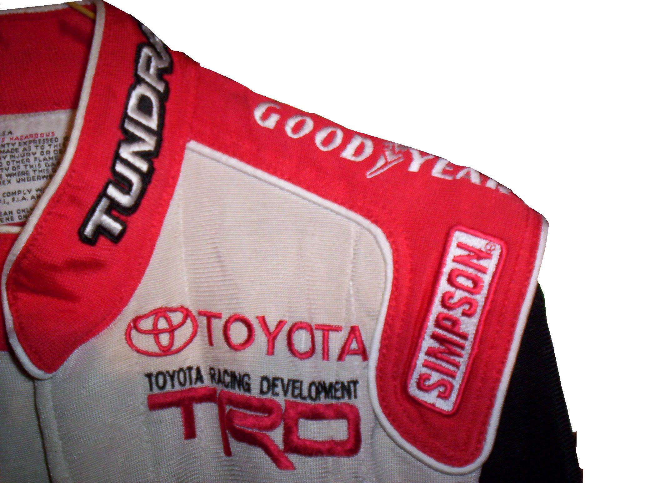
When I started this blog, I wanted to appeal to two different groups, racing enthusiasts and collectors. I think that this post should appeal to both groups. The MLB, NFL, and NHL have a product that is very useful, for autographs, and for fans alike…the replica helmet. Replica helmets have been made for the NFL for over 15 years now, and baseball replica helmets date back further than that. NHL minis, although more recent, are becoming a fan favorite…so why not racing replica helmets?

16-musgrave-replica4 16-musgrave-replica2 16-musgrave-replica3 16-musgrave-replica1 16-musgrave-replica5 16-musgrave-replica6 16-musgrave-replica7

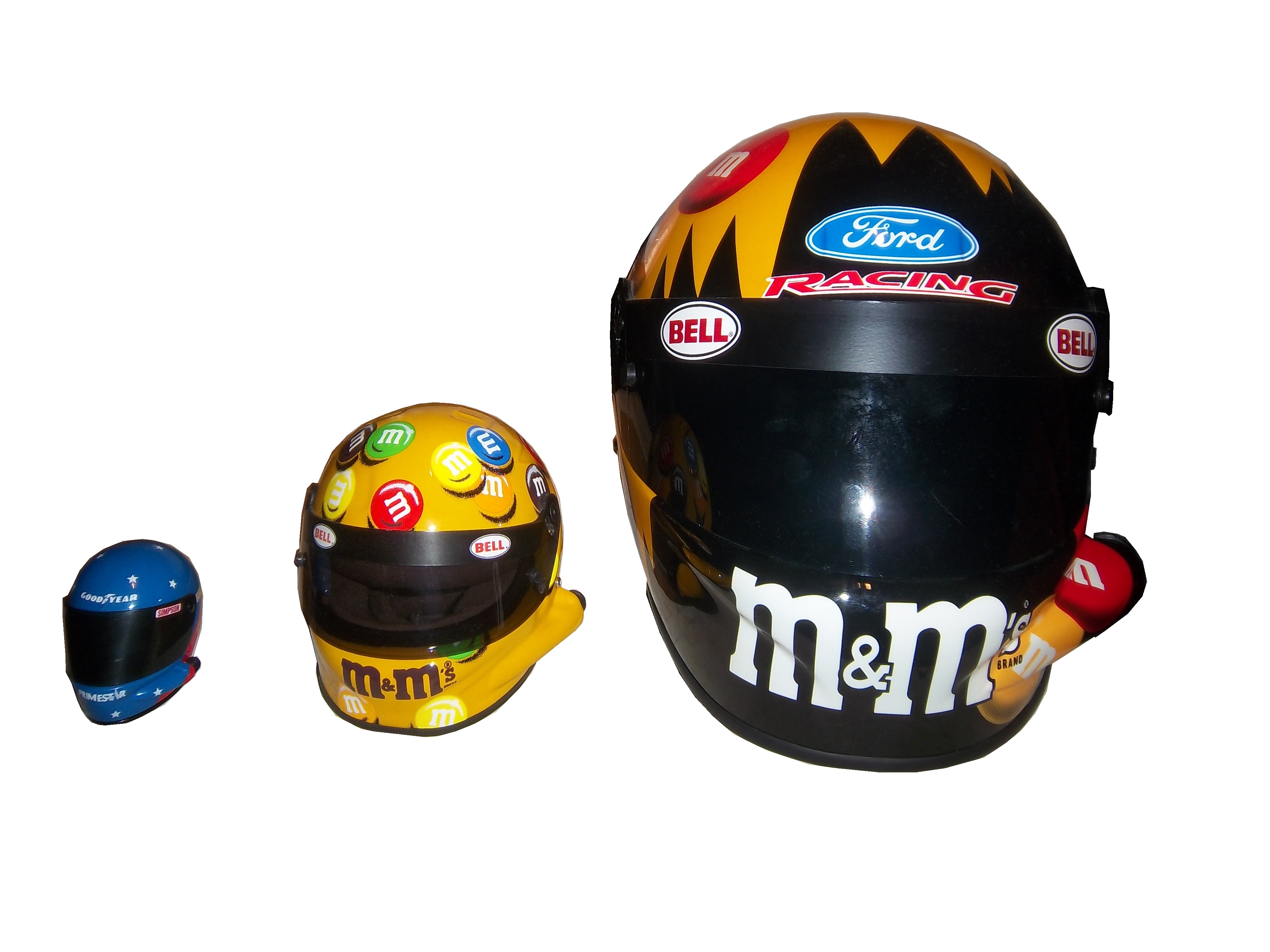
This has been tried before. In the late 1990’s Simpson released a series of ¼ scale mini-helmets. These helmets were reasonably accurate replicas of the real thing, but only 3 inches long. Although the design was good, the product was costly for the time, and very small, which made it very impractical for autographs.replica helmets - Copy

The autograph issue is important because something that mini-helmets in baseball, and football are frequently used for autographs from players. These helmets are half-scale, and are very accurate to the helmets worn by the players. Similar to the football mini-helmet, this half-scale mini-helmet would fit the bill very well.38-sadler-small1 38-sadler-small-2 38-sadler-small-3 38-sadler-small-4 38-sadler-small5 38-sadler-small6 38-sadler-small7

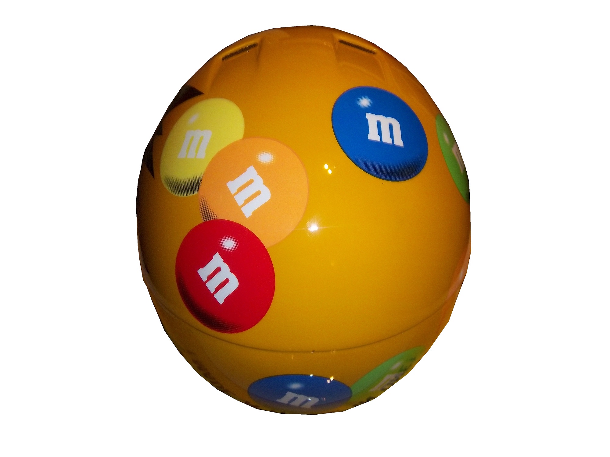
It is a replica of Elliot Sadler’s M&M’s Bell helmet from 2003-2006. It measures 5 inches in length and is very easy for drivers to sign. A search on ebay reveals that there are minis, but not on a cohesive levels. I think that fans would love to own a mini-helmet of their favorite driver, and buy new ones each season.

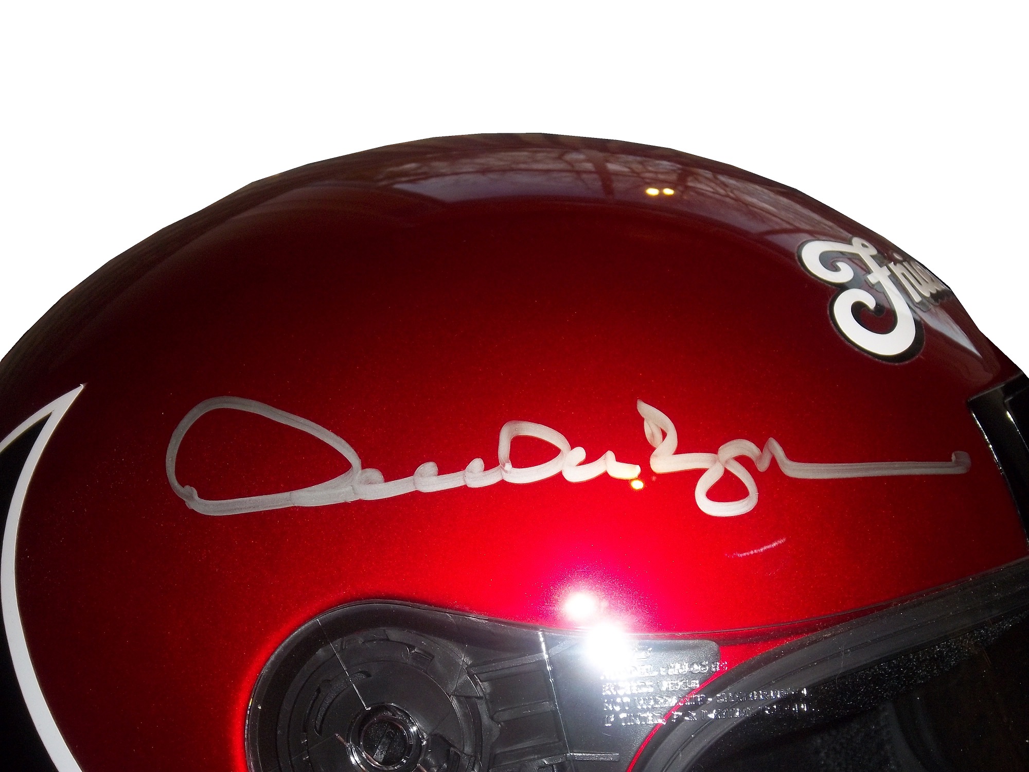
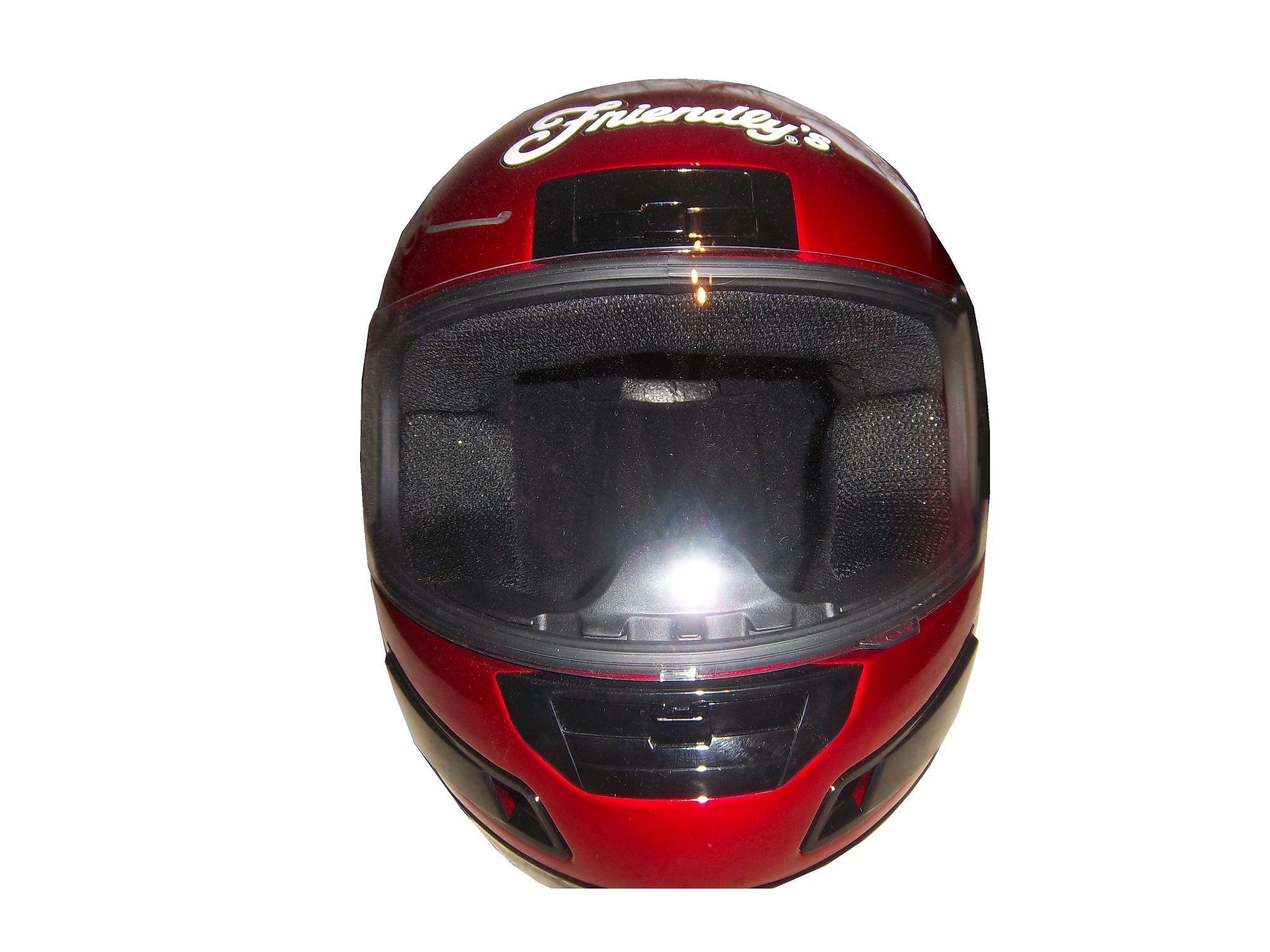
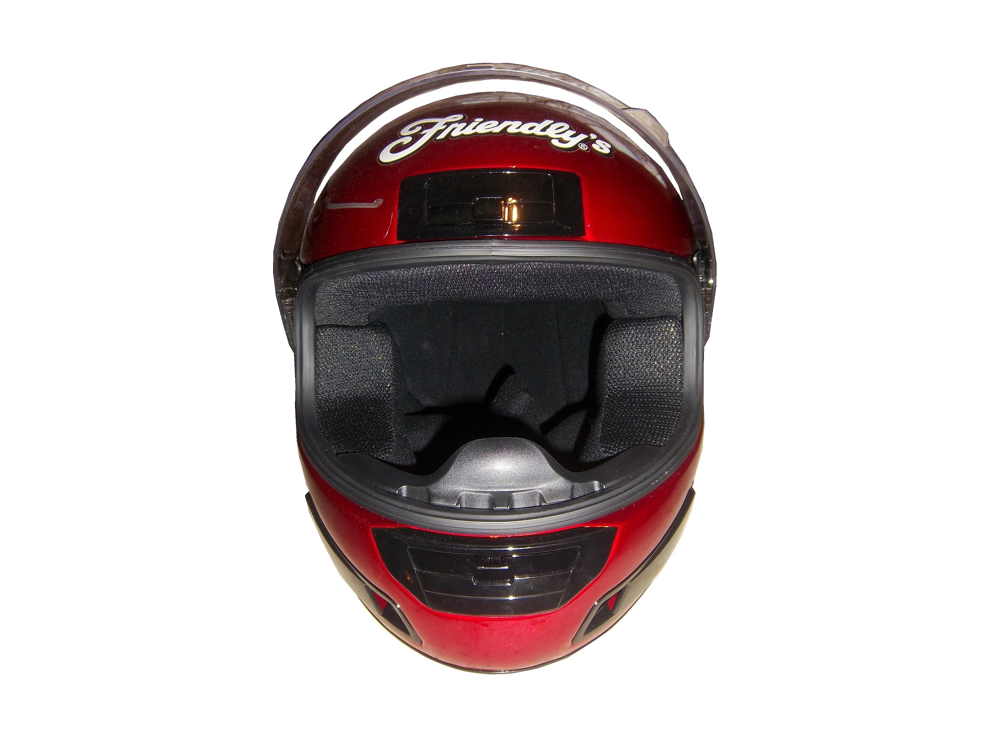
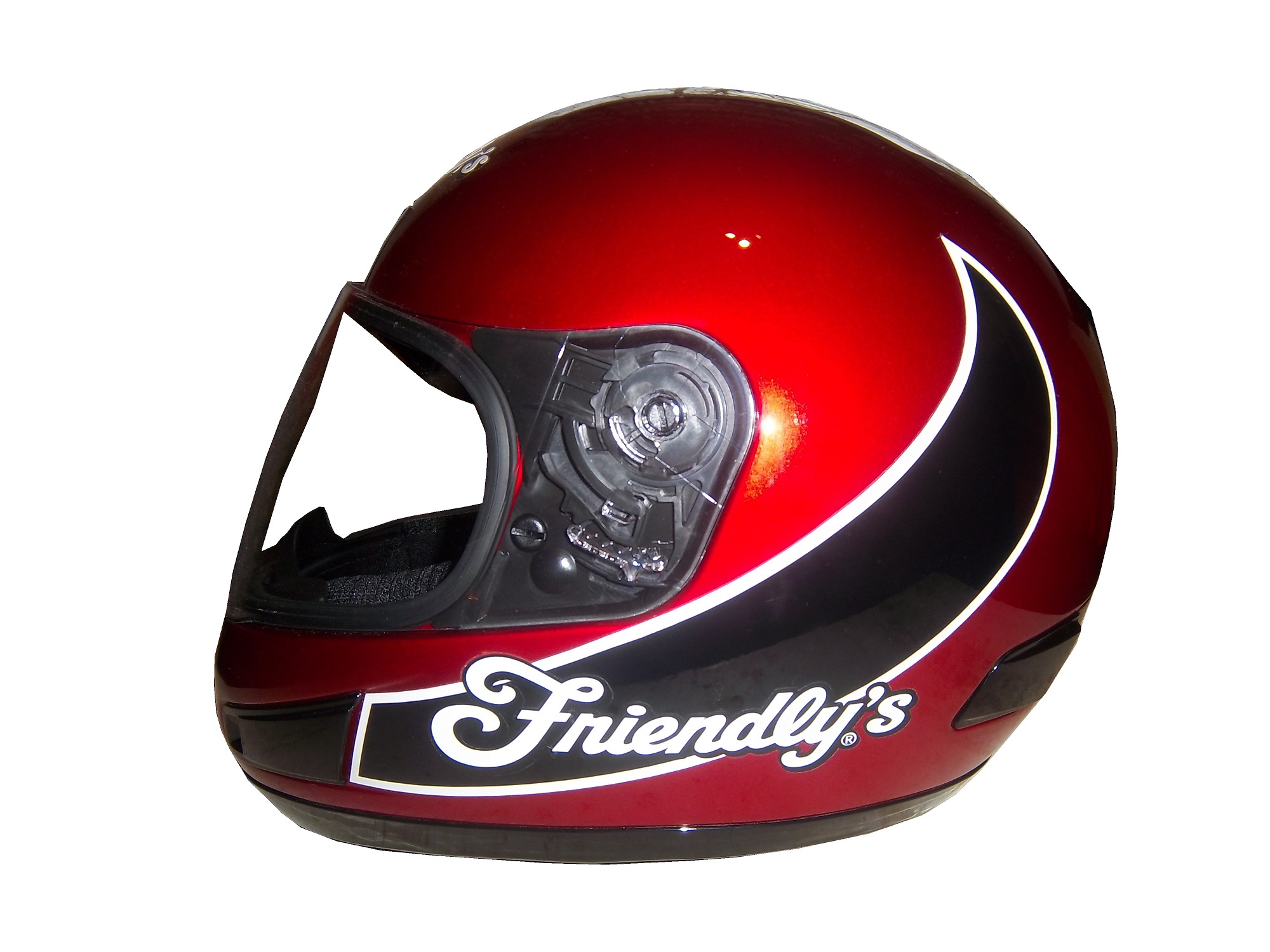
To answer the next question, yes there are full-size helmets, but they come in two different food groups. The first are helmets that are clearly replicas, such as this Derrike Cope Friendly’s replica from 2003. This example is clearly a motorcycle helmet, that has Friendly’s decals attached to the. Derrike has autographed the helmet on the right side. It looks good, but it is still clearly a replica.cope-helmet-1 cope-helmet-2 cope-helmet-3 cope-helmet-4 cope-helmet-5 cope-helmet-6 cope-helmet-7 cope-helmet-8

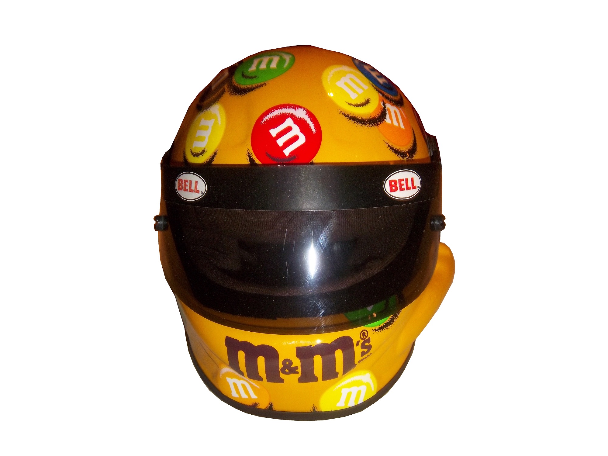
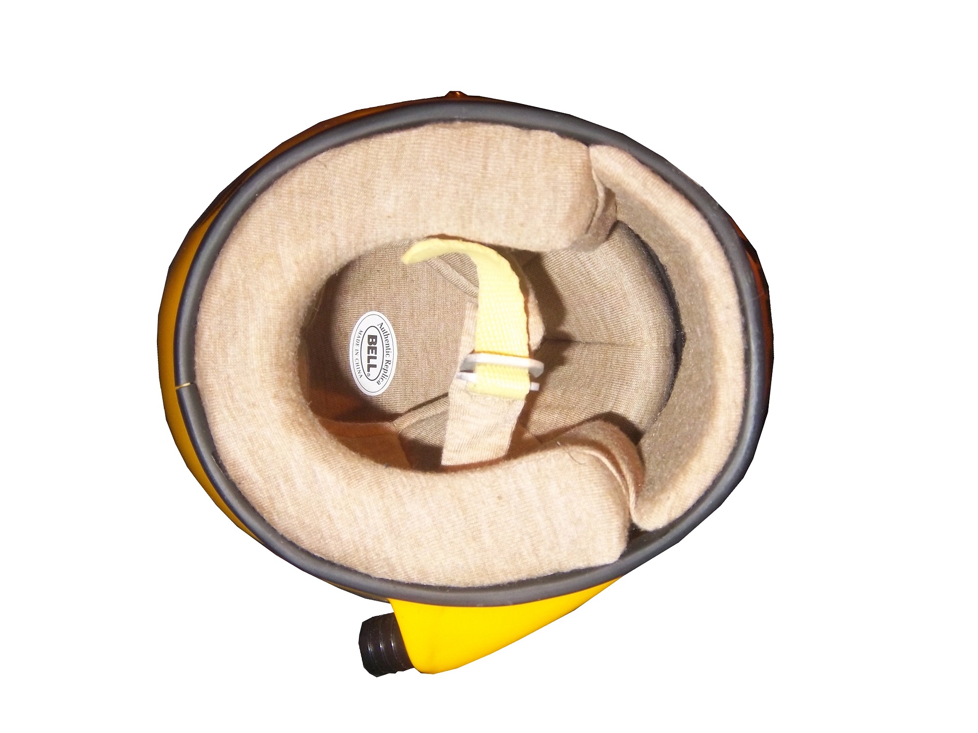
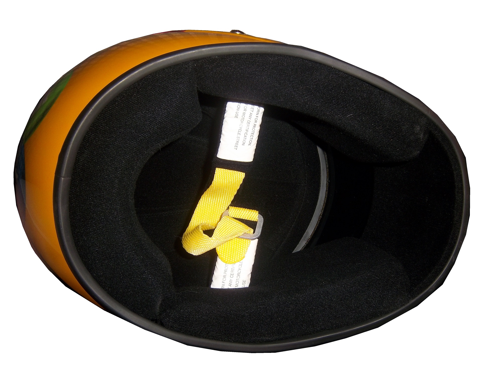
The other food group in full-size replica helmet is the helmet designed to be as accurate as possible. This example, again an Elliot Sadler M&M’s replica is clearly marked as being a replica and for display. It is actually very accurate, including a ventilation hose attachment on the right side. This type of helmet was common for a while, until the HANS restrictions forced the ventilation attachment to the top. This not only works very well for autographs, but looks really nice on itself. 38-sadler-large4 38-sadler-large2 38-sadler-large3 38-sadler-large1 38-sadler-large5 38-sadler-large6 38-sadler-large7 38-sadler-large8 I think that the helmet companies that make driver helmets would be willing to make these helmets for the racing fan base, and I think that the racing fan base would love them as collectables!100_2501

Paint Scheme Time!

Clint Boywer #15 Gander Mtn. Toyota Camry Color scheme…good. Car design…ugh. But the thing that really irritates me is that with the gun debate in this country the hood reads “With rights comes responsibility.” Seriously? I thought Michael Waltrip’s Newton scheme at the Daytona 500 was bad, but this is just beyond bad. KEEP POLITICS AND RACING SEPARATE! F– grade!

Jeff Burton #31 Childress Institute Chevy SS The only bad thing I can say about this scheme is that the door numbers are orange. If they were white with orange borders, I would love this scheme. Even so, it earns a C grade.

Joe Nemechek #87 Maddie’s Place Rocks! Toyota Camry  They took a good scheme, with good colors and just made it look so much worse!  The design is just awful, and the color scheme doesn’t help.  It went from a B to a D in one week.

That’s it for this week, except for some April Fools Fun…

The Epaulet…What It Was, and What It Is

12-miller-rshoulder - CopyThe mighty epaulet, every racing fan has seen them, but few understand what they are for. They are now mostly for fashion and sponsor exposure, but epaulets have a more interesting history than one might think.12-miller-lshoulder

Back in the 1950′s and 60′s, racing suits were supposed to provide fire protection, but early versions of the suit were very unreliable. Many drivers perished in fires, and sometimes, drivers were trapped within the car, unable to escape the raging inferno within their car. The solution? The epaulet. Mounted on both shoulders, epaulets were reinforced strips of fabric specifically designed to help pull an injured or unconscious driver from a burning car. Epaulets quickly became an integral part of the driver suit.10-labonte-rshoulder

As racing technology became more advanced, the need for epaulets for safety began to decrease, but this was happening at a time when coverage was increasing and sponsorship was rising. It did not take that long for sponsors to realize that they could slap a logo on the epaulet and get the company name more visible on pictures and TV interviews. As such the epaulet made the successful transition from safety feature to fashion accessory.

10-labonte-lshoulder

As in-car cameras began to become commonplace across racing, epaulets evolved with them. I mentioned in a previous post that Christian Fittipaldi favored epaulet styles used in F1 and IndyCar. When Sparco first came to NASCAR in the early 2000′s, they brought their epaulet style with them, and it quickly became the standard for NASCAR epaulet style. Most driver suits worn in NASCAR today involve some variation of the Sparco epaulet. They have evolved very well over the years, and are a familiar part of the driver suit

Moving on to paint schemes…

First the NASCAR Camping Word Truck Series

Ty Dillon #3 Bass Pro Shops Chevy Silverado Bass Pro Shops has a great scheme this year, both in the Cup series, and this scheme is just good. Nothing wrong, everything right, Final grade: A+

Brendan Gaughn #62 South Point Hotel and Casino Chevy Silverardo This scheme is very simple, and looks really good. The color scheme is solid, and brings back memories of Rusty Wallace driving for Miller Genuine Draft. The lettering is easy to read, and stands out. Final Grade: A

Now on to the Sprint cup Series…

Trevor Bayne #21 Ford Motorcraft/Quick Lane Ford Fusion I think this is a prototype, but that said, this is still a classic scheme. It has a great color scheme, number design, and is just a solid scheme all around. Final Grade A+

Jeff Burton #31 Cheerios Chevy SS This scheme is rather under designed for my taste. The color scheme is decent, but the gray Cheerio design is hard to see, and looks more like soda carbonation rather than breakfast cereal. Final Grade C+   On a related note some more pics from the Caterpillar scheme have been released, and they are still using the same scheme from last year.  It is pretty good, so my final grade will not change.

Austin Dillon #33 Honey Honey Nut Cheerios Chevy SS Now this is just awful. The color scheme is bad, and the HONEY NUT CHEERIOS lettering is nearly invisible. The bright blue Kroger logo looks out of place, and the tailpipe decals with rookie stripe just takes more away from an already bad scheme. Final Grade F-

Birds and Sports

Quick, what do Randy Johnson, Dave Winfield, and Dale Earnhardt Sr. all have in common? Well for starters, all were very talented, and all are Hall of Famers, but that isn’t all. The unique thing about these three players is that each one of them has accidentally killed a bird while playing sports. Dave Winfield was playing in Toronto in 1983, and was playing catch with a bat boy, when a seagull flew into the path of the ball, and was hit and killed as a result. This was a total accident, but the fans were so upset that Winfield was arrested for animal cruelty. Police later dropped the charges, and Winfield was released. In 2001, Randy Johnson was pitching a spring training game, when he hit a dove with a pitch in a freak accident. A number of animal rights groups were upset, but no charges were filed.

Dale Earnhardt Sr.’s story is by far the strangest. At the 1991 Daytona 500, Earnhardt was a heavy favorite to win the race. Davey Allison won the pole, Hut Stricklin was 2nd, and Earnhardt was 3rd. Allison led the first lap, and Earnhardt took the lead during the 2nd lap. During that same lap, Earnhardt’s Chevy Lumina struck a seagull on the back stretch. Although this might not seem that bad, it seriously damaged the car, affecting the air intake, and raising the temperature of the engine. Emergency repairs took place, and while Earnhardt finished 5th, he wasn’t in contention for the lead after the seagull incident.

The really weird thing is that for many years, the seagull incident was a metaphor for Dale Sr.’s record at the Daytona 500. No discussion on his 19 futile attempts to win the Daytona 500 would be complete without mentioning the seagull incident. While other attempts to win the 500 ended with flat tires, or running out of gas, or just plain wrecks, the seagull incident stands out, along with the 1997 flip.

The 1997 Daytona 500 had the other unique incident at Daytona. During the 1997 event, Earnhardt was, again, a heavy favorite to win the event, and on lap 188, he was in a four-way battle for the lead, and he got into a wreck with the 28 car of Ernie Irvan, and rolled his car on the back-stretch. Irvan’s hood flies into the crowd and causes a number of injuries to fans. Earnhardt’s car lands on its wheels and Dale gets out of the car and heads to the ambulance. As he does so, he notices that his car has all four tires on it, so being Dale Earnhardt, he gets out of the ambulance and walks over to the car, and asks the guy attaching the car to the wrecker to see if the engine will fire, and it fired. He climbs back into his car and drives back to pit road, where is car is patched up as best could be done, and he finished the race 5 laps down. This is the only incident where a die-cast was made of a wrecked car. Speaking to reporters after the race, Earnhardt said “Well I just wanted to get back in the race and try to make laps, and we runnin’ for a championship…I got in the ambulance and I looked back at the car and said “man the wheels is still on that thing.” I got out of the ambulance and and asked the guy inside the car and he was hooking it up, I said “see if it would crank,” and he cranked it up, I said “get out, give me the car back” so I drove it back around and we taped it up.” It is a moment that still brings chills to my spine and this is 15 years later.

Image

I am proud to say that I own a piece of each car from the two above stories. From the 1991 Daytona 500, I own a small piece of the passenger-side fender, which still has race damage present. As seen below:

 Image

From the 1997 Daytona 500 I have this piece of what remained of the car after the event. Interestingly, the car was repaired, and raced at Talladega later that season. The race damage is clearly visible on it:

 Image

Moving on to paint schemes…

Kyle Busch #18 M&Ms Toyota Camry Very solid scheme here. Not only is the color scheme great, it looks even better than last year, with a clean front. The cleaner lines of the new car just make this scheme so much better as well. Final Grade A+

Jeff Burton #31 Caterpillar Hybrid Excavator Chevy SS Another great scheme, though the tailpipe decals are really ugly, and the yellow roof number is really ugly. Final Grade B+

And we also have some driver suit photos and videos

Joey Logano #22 Shell/Pennzoil Ford Fusion This was posted on Logano’s Facebook page, and all I can say is… Hey look kids! It’s Ronald McDonald! Joking aside, this seriously looks like a McDonald’s suit, but with Shell and Pennzoil logos. That being said, it’s not a bad suit, the television logos are good, and it gets a final grade of an A

Jimmie Johnson #48 Lowes Chevy SS This video, from Hendrick Motorsports YouTube page shows Johnson’s new suit.  Very solid, with a great color scheme and basic design. I could to without the white collar, but that is only a minor complaint for a great suit, and it gets an A!

Phantom Sponsorships.

By David Firestone

12-stremme

At first glace, this driver suit looks like it has no primary sponsorship at all, but dig deeper and you find the real story behind it.

From 2000 to 2008, car #12 in the Sprint Cup was driven by Ryan Newman and sponsored by Alltel Wireless. In 2002, Ryan Newman’s first full season the series was sponsored by Winston cigarettes and called the Winston Cup Series. In 2004, Winston left the series and Nextell took over as the series sponsor. At that time, there were a number of wireless companies sponsoring cars in the Cup series, including Cingular and Alltel. As they were under contract with teams before the Nextell sponsorship took effect, they were allowed to stay as car sponsors in the Cup series under a grandfather clause.

The first phantom sponsorship happened in 2007, when Cingular merged with AT&T. That set into motion a chain of events that began early in the season, when AT&T tried to re-brand the 31 car driven by Jeff Burton, and Sprint said that it was a violation of the grandfather clause. After a number of injunctions and legal wrangling, came the 2007 Sharpie 500 at Bristol in August, when NASCAR, under pressure from Sprint told the 31 team that they could not have any AT&T logos on the car, hauler, pit shirts, driver or crew uniforms, or helmets. The result was this unique scheme.

800px-JeffBurton2007BristolAugustRacehttp://www.flickr.com/photos/98572459@N00

Eventually a settlement was reached where the Cup team could keep AT&T decals on the car for the rest of the season, but would have to find a new sponsorship for the next season. This deal was met, and the next year, Jeff Burton drove a Caterpillar sponsored car.

In 2009, the Alltel sponsorship changed because Verizon purchased most of Alltell’s assets. Instead of a long court battle, Verizon, who was also sponsoring Roger Penske’s IndyCar teams basically sponsored the team but focused on their Nationwide Series with car logos, as the restrictions on Verizon were not in effect in the Nationwide Series, and allowed car #12 driven by David Stremme to run a Penske Racing scheme for the car they were paying for. That resulted in this very stylish David Stremme driver suit, currently in my personal collection.

12-stremme

The thing I find interesting is the fact that even though the car was running Penske decals, no mention of Penske is visible on the collars or shoulders, and no television logos are present.

12-stremme-collar

I also think it is interesting that the red stripes across the chest look like Verizon logos, but are just different enough to throw Sprint off the scent.

12-stremme-flogo

Unless the primary sponsor of the series changes again, with seems unlikely in the foreseeable future, I can’t imagine this happening again. It also should be noted that both AT&T and Sprint took flak for their actions during the controversy. I really hope this doesn’t happen again in racing, ever.

Some Thoughts on 2013 Paint Schemes So Far

I discussed the basic design changes for the 2013 redesigned schemes.  Today, I thought I would look at some of the schemes that have been released, and give my thoughts on them. 

Let’s look at the Chevy schemes first.

Jamie McMurray  The basic scheme is solid here.  The Bass Pro Shop “lightning bolt” used in last year’s scheme is gone, and a single Golden Arch has taken its place.  The car has a cleaner look as a result.  I like the design of the car number here as well, and the goldenrod yellow works rather well.  Final Grade: A-

Kasey Kahne  I really hope this is a prototype design,,,the color scheme is all wrong, there are too many light colors, and the door design is just brutal.  The tailpipe decals which are already bad have a silver border around them, which just makes them stand out even more. Of the Chevy schemes released, this is the worst.  Final Grade: D+  

Danica Patrick  Last year Danica’s car was painful to look at.  However if this is the final design for Danica, I like it.  The yellow is much more subdued, giving it an overall better appearance.  Also the orange and black stripes at the bottom give it a bolder look as well.  The numbers need work though, as the generic racing font doesn’t do the car any favors.  Final Grade: B+

Tony Stewart  Both of Tony Stewart’s paint schemes leave something to be desired.  The Bass Pro Shop scheme is the better of the two.  The total lack of white on the Bass Pro Shop scheme give the car a good look, and the stripes give a cleaner line.  The orange on the bottom needs to be a little darker, but it;s a great scheme.  Mobil 1 on the other hand has too much white, an awful set of stripes that seem to be non-sequitur with each other.  The overall color scheme is all over the place and is very confusing to look at.  In addition, the white on the back doesn’t help.  Final Grade: C+

Jeff Gordon Are you kidding?  Black flames on a car that is totally black outline in blue?  Pepsi has a great shade of blue and a great logo and yet they manage to screw it up by trying the Pepsi Max design to be edgy.  I’m a fan of black cars, but this just falls flat. Final Grade: C- 

Kevin Harvick  Ok, let’s make this clear:  This is what a Budweiser scheme should look like, this is not.  This is one of my favorite schemes so far, it looks like a Budweiser car should look like, so my Final Grade: A

Jeff Burton From what I’ve seen the Cat car looks about the same as it did last year which is actually a good thing, because the scheme is solid, has good colors, great number designs and a good pattern used.  Final Grade: A

Juan Pablo Montoya Great color, great number design, and the pattern used is a lot more sublte than last year’s scheme.  The quarter-panels have too many associate sponsors and looks too cluttered, keeping the Final Grade at a B.

Jimmie Johnson  Less is more and this paint scheme proves that.  The Z-28 stripes, good color scheme, and clean design gives the Lowes car a simple yet elegant design that just works.  The Jimmie Johnson Foundation scheme is a little cluttered, but it still works.  Final Grade: A

Dale Earnhardt Jr.  The Diet Dew scheme isn’t great, the design is pointlessly complex, and the red on green number design is just brutal.  If you look at this picture of the National Guard scheme you will see that one of the major changes to Chevy’s driver suits is the full Chevy logo, as opposed to just a red bow tie like last year.  This design was used in IndyCar last year and looks better than the old design.

Moving on to Ford…

Brad Keselowski  The scheme is decent, but the dark red lettering on the dark blue background is very hard to see.  Miller needs to rethink that part of the design, but other than that it’s a good scheme…though I still miss the beer-colored wheels from last year!  Final Grade is a C

Marcos Ambrose  Is it normal to get seasick while looking at a paint scheme?  The Petty Blue just does not work here, and the oval around the letters is pointless.  The car looks awful even though it has a great color scheme and great sponsor logos.  Final Grade: D

Greg Biffle  There’s nothing really wrong here, but nothing really right here either.  The side design looks forced, the black roof is idiotic, the color scheme is good, but the number design looks too cliche.  It makes no sense, but 3M schemes never do, so I’ll give it a C

Ricky Stenhouse Jr.  The Best Buy scheme looks good.  The number design, color scheme, and simplistic design give the car a good look.  The Zest scheme on the other hand has an awful scheme, and like Kasey Kahne’s scheme, has too many light colors and not enough dark to make the scheme work.  The Final grade is a C overall, an A for Best Buy and a D for Zest.

Trevor Bayne Timeless, plain and simple.  This scheme works well, and if it’s not broken, don’t fix it.  Final Grade: A

Joey Logano This scheme could very easily be mistaken for McDonald’s.  The red wheels don’t do it any favors, and the Penzoil scheme is too simplistic.  Sometimes less is more when it comes to car design.  Final grade: D-

Carl Edwards  The stripes work well here, and the color scheme is good.  Unlike the Zest scheme, this scheme uses enough dark blue to make it work.  The UPS scheme however is a disaster.  The dark brown really works, but the various shades of gold, orange and red make the design look like a sad rainbow.  The white numbers don’t help that much either.  Final Grade is a C, A for Fastenal, D for UPS

And finally a look at Toyota’s schemes thusfar

Matt Kensith  This Dollar General scheme could be good if some of the black stripes go, and what is up with the DG design on the bottom of the quarter-panels?  The yellow-to-orange fade on the back doesn’t work either.  Final Grade: D

Clint Bowyer  The dual blue and white scheme is popular this year, and this scheme is one example.  The basic design would work better without some of the stripes on the front.  Otherwise it’s a solid scheme with a B grade.

and last but not least, Martin Truex Jr.  Simple, elegant with a great color scheme, great logos and great number design.  Final Grade: A

I will add more input when more schemes are released.