Paint Scheme Grades…A Change to the Format

By David G. Firestone

So after giving this some thought after the 2015 tracker, I decided that I need to do more on this blog.  Toward that end, starting on Fridays, I will post paint scheme grades.  I will work on them during the week up to Thursdays, and then post them on Friday morning.  Once the 2015 season starts, I will move this to Wednesdays.  So without further ado…paint scheme reviews!  Let’s start with 2015 grades from new schemes featured on Wednesday…

Brad Keselowski #2 Miller Lite Ford Fusion The same basic scheme as 2014, but the hop design, gold trim, and old Miller crest have been removed, and the look is much smoother and cleaner. I didn’t think they could improve on an A+ design, but they proved me wrong, so I’ll give it an A++!

Austin Dillon #3 Cheerios Chevy SS Good color scheme, great design, A+

Austin Dillon #3 Dow Chevy SS While I like the color scheme and number and logo designs, the white stripe up the side kills the look. It takes an A scheme to a B+ scheme.

Kevin Harvick #4 Budweiser Chevy SS– Same Scheme as last year, same grade, A

Kevin Harvick #4 Jimmie Johns Chevy SS Great color and design, but I still don’t understand why Jimmy Johns sponsors Harvick instead of Jimmie Johnson…still a solid A scheme

Kevin Harvick #4 Outback Steakhouse Same Scheme as last year, same grade, A

Kevin Harvick #4 Ditech Chevy SS New sponsor for 2015, and it has a great look. The blue as a whole is good, and the contrasting blue on the door numbers looks really good. The door design gives the appearance of an old school brake duct, and this car just looks great! I give it an A+!

Kasey Kahne #5 Great Clips Chevy SS Same scheme as this year, same D+ grade

Kasey Kahne #5 Time Warner Cable Chevy SS It is a good color scheme, but the design on the side needs a little tweaking. Get rid of the needless zig-zag pattern and it works a whole lot better. It is still a decent scheme, so I will give it a C

Trevor Bayne #6 Advocare Ford Fusion New team, new design for 2015. I love the basic design, and the color scheme is great. However the candy cane stripes on the nose are pointless, and take away from the overall design. I’ll give it an A-

Danica Patrick #10 Aspen Dental Chevy SS Same scheme as last year, same C grade

Tony Stewart #14 Bass Pro Shops/Mobil 1 Chevy SS A perfect example of why camo does not work on race cars. If it were just the orange and black, I would give it an A- but the camo takes it down to a B- and the white takes it down to a C+

Tony Stewart #14 Mobil 1/Bass Pro Shops Chevy SS Much smoother look, much better design, I’ll give it an A

Tony Stewart #14 Code 3 Associates/Mobil1 Chevy SS Same design as last year, same C grade

Greg Biffle #16 Ortho Bug-B-Gon Ford Fusion Red and black is a great color scheme, and the fade effects are pretty cool too. The ant design is really good, so for the first time in a while, Greg earns an A+

Ricky Stenhouse Jr. #17 Fastenal Ford Fusion New design for 2014, great color scheme, blue and white is highly underrated, and a good design earns an A

Joey Logano #22 Shell/Pennzoil Ford Fusion Same design as last year, same D grade

Paul Menard #27 Pittsburgh Paints/Menard’s Chevy SS Same design as last year, same A grade

Ryan Newman #31 Cat Chevy SS Same color scheme as last year, but with a much smoother and simpler design. I can’t give it anything less than an A+ so I won’t

Ryan Newman #31 Quicken Loans Chevy SS Same scheme as last year, same A+ grade.

Kurt Busch #41Haas CNC Chevy SS Complete redesign, and like Brad Keselowski, I didn’t think they could improve on an A+ design but I was wrong. A+

Kurt Busch #41 Slate Water Heaters Chevy SS Same scheme as last year, same B- grade

Aric Almirola #43 Smithfield Ford Fusion One of the rare instances where I will change a grade. I didn’t like this design initally, I gave it a D+, but it has grown on me, and I think it deserves a B-

Now on to 2014

Jamie McMurray #1 Cessna/McDonalds Monopoly Chevy SS Another instance of two different car designs clashing with each other, and it does not look good at all. D-

Kasey Kahne #5 Pepsi Chevy SS Good color scheme, but much too overdesigned. C-

Trevor Bayne #6 Advocare Ford Fusion See Above

Danica Patrick #10 Go Daddy Chevy SS-Pinkwashing is an automatic F.

Matt Kenseth #20 Home Depot Toyota Camry A fitting end to 15 years of NASCAR sponsorship is with a C- design. Love the color scheme, hate the overall design scheme.

Joey Logano #22 Pennzoil Platnum Ford Fusion Contrasting colors and being over designed to the point of absurdity earns this scheme a solid F.

Cole Whitt #26 Moen Toyota Camry Great color scheme, great overall design, A+

Blake Koch #32 Leaf Filter Ford Fusion Good color scheme, much too over designed, C-

Timmy Hill #33 Retro Infinity Chevy SS Great color scheme, much too over designed. C-

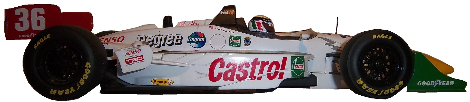
Reed Sorenson #36 Zing Znag Chevy SS It has pinkwashing elements which earn it an automatic F

Corey LaJoie #77 Essex Homes Ford Fusion great design, mediocre color scheme earn this scheme an A-

Ryan Truex #83 Painters Ice Cream Toyota Camry Great color scheme, and simple smooth design earn this scheme an A+

Michael McDowell #95 Pieter’s Pals Ford Fusion Another great A+ Levine Family Racing scheme!

Commemorative Patches…and Why I HATE Them!

301650thanniversarylogoBy David G. Firestone

Derek Jeter has had his  number retired. Several teams this year have various anniversaries they are celebrating.  All of them are wearing commemorative patches on their uniforms.  Why is this important to The Driver Suit Blog? Because too much salt will ruin the soup.  What does that mean, well, I saw that Jeter was wearing a patch to commemorate his upcoming retirement, and, well it got me thinking, and I’d like to talk about this issue, which has been getting on my nerves for a while. Sports uniforms in 2014 are designed to move merchandise, and this is the case in racing. I can’t begin to put the blame for this on NASCAR, so I won’t. But I do think that what happened in 1998 is a perfect example of why it doesn’t really work.

In 1998, NASCAR turned 50. In 1948, Bill France Sr. saw the potential for a unified stock car racing series, so at the Streamline Hotel in Daytona Beach, a series of meetings took place. France was in charge of the National Championship Stock Car Circuit or NCSSC, which was founded in 1947, but when the AAA refused to fund the series, France had to make do. Fonty Flock would win the 1947 NCSSC Championship. In December, the meetings took place at the Streamline, and the Series was supposed to be renamed the National Stock Car Racing Association, or NSCRA, but that name was used by a rival organization, so on December 14, 1947, the name NASCAR or National Association of Stock Car Racing Association. NASCAR itself was founded on February 21, 1948.

On February 15, 1998, almost 50 years to that day, the 1998 racing season began in great style with Dale Earnhardt Sr. winning the Daytona 500. NASCAR as a whole celebrated the anniversary in grand style, with NASCAR’s 50 Greatest Drivers being named, and the sports history was celebrated. For an event like this, you need a good logo for it, so this design was utilized to commemorate the 1998 season.301650thanniversarylogoI vividly remember seeing this patch in Winston Cup Illustrated before the season start, and I can remember thinking “I am going to get so sick of seeing this patch by season’s end.” Well I was sick of it, and that was long before the end of the season. NASCAR smeared this patch on everything. Every NASCAR telecast had this logo. Anything and everything, and I mean EVERYTHING, sold by NASCAR in 1998 had this logo. Not even the iconic Barbie doll was immune from this plague. You couldn’t turn around in 1998 without seeing this logo. NASCAR wanted it that way. They used this logo to sell merchandise. That was the whole line of reasoning. This logo will sell merchandise, yes we are thrilled to be 50, but really they just want to move merch.

Every driver suit had this patch somewhere, as this Ted Musgrave example from that season shows.15-musgrave-lsleeve1 Decals would up on helmets as well. grissom-1NASCAR used this to move merchandise, but it was so overused in telecasts and car designs, that I intentionally didn’t buy that much NASCAR stuff during that time. I could not wait for the season to end, and I didn’t have to look at that logo again.  Sports uniforms as a whole are using more of these patches to sell merchandise, and frankly it’s now completely out of control.  Sports jerseys retail about $100 on the low end, and these patches are used to sell more of them.   Is a logo like that really worth shelling out $100 for a new jersey, or shirt, or jacket?  I’m gonna say no.

After the 1998 season, the logo did go away, but not before another major issue with these types of logos come up. When these logos are being used, merchandise sells. When the season ends, and a new season begins, the logos aren’t selling as much, and the retailers who sell merchandise have a lot of this stuff that they have to put on sale to move it. This is not a small issue for retailers, as many of them are mom and pop stores whose profit margins are razor thin enough. In many instances, these items will be sold at a loss to make room for new merchandise.  People will say that these are “collector’s items” but prices on eBay would lead me to believe that this is not the case.  They make money for a short time, and lose money in the long term.  This has become the case in general with commemorative logos on merchandise.

If this logo had been used on merchandise, but hadn’t been used in the telecasts as much as it was, I would be willing to work with it a bit more, but even in 2014, 16 years after the fact, my hatred for this logo is still with me. Words can’t say how much I hate seeing this logo again.  What I’m about to say next might seem odd, but it is the truth…I don’t think it’s a bad logo. In fact, I think it’s a good logo, but I was so sick of seeing it, that I hate it.  When you as a fan would watch a 3 hour long race, and had to see this logo in the corner while the race was on, and at every commercial break, it got really old, really fast.

It’s a problem with sports uniforms that’s endemic. It started with anniversaries, and moved on to number retirements, old stadiums closing, new stadiums opening, announcers retiring, players about to retire, and even anniversaries of tragic events. It has gotten out of hand. It moves merchandise in the short term, which is good, but too much salt will ruin the soup every time. Commemorative patches need to be toned down…way down.

Editor’s Note, we are now in October, and now starts the Pinktober, Pinkwashing, call it whatever you want, but for the next month, sports teams across the country will be using pink on uniforms and equipment to raise money for in support of breast cancer. Much of this does not go to serious research, but to more “feel good” charities that don’t really help. Toward that end, all pinkwashing schemes will earn an automatic F. If someone is bold enough to try pinkwashing and camo, it will earn them a one rank loss on the Paint Scheme Leaderboard, and automatic disqualification for the best paint scheme set in the Schemies.

First, we have some 2015 Schemes…

Kasey Kahne #5 Farmers Insurance Chevy SS It has a good color scheme, and while it’s overdesigned, it still looks better than the current scheme. I’ll give it a C+

Ty Dillon #33 Yuengling Brewery Chevy SS I love the faded glory design, I think it works well, and I’ll give it an A+

Now onto the 2014 schemes…

Jamie McMurray #1 McDonald’s Monopoly Chevy SS Overall design is good, I like the color scheme, and it is a great looking car, A+

Michael Annett #7 Cypress Chevy SS Overdesigned and has a goofy color scheme earns an F every time.

Clint Bowyer #15 Five Hour Energy Pink Lemonade Toyota Camry Pinkwashing earns an automatic F.

Ricky Stenhouse Jr. #17 Cargill Beef Ford Fusion I like the black flames on the blue background, but the orange and white stripes take away from it. It kills a great look with a great color scheme, and takes it from an A to a B-

Timmy Hill #32 US Chrome Ford Fusion Great simple design with a great color scheme earns an A+

Josh Wise #98 Vapor Station Ford Fusion Good design, good color scheme, A+

I Love The Tide Ride!

32-hamilton-blogo-copyBy David G. Firestone

When I did The Paint Schemies last year, I also did a Top 10 list of Sponsors I Miss In NASCAR. Number 7 was Tide detergent. Tide was a major sponsor of NASCAR from the 1980’s to the mid 2000’s. That orange, yellow, white and blue car was distinctive without going too far. The scheme never evolved because it didn’t have to. It was one of the best schemes ever.

Like The Family Channel and Kodiak, I sometimes buy racing stuff because it is from the Tide Ride. Started in 1987, the “Tide Ride” was a staple in the Sprint Cup Series, and was used heavily until 2006, when the sponsorship left PPI Racing, and wasn’t seen in NASCAR since. Some of the most memorable Tide Ride moments were the 1989 Daytona 500 where Darrell Waltrip did the Icky Shuffle in victory lane, the 1997 Brickyard 400 won by Ricky Rudd, and the 2003 Carolina Dodge Dealers 400 which is tied as the closest race in NASCAR history, won by Ricky Craven over Kurt Busch.

One of my favorite items is a Bobby Hamilton driver suit circa 2004-2005. 32-hamilton 32-hamiltonbThis design can be seen in photos from 2004 and 2005, so I’m not exactly sure when it was used. Unlike most suits I have seen, it has the car number on the collar.32-hamilton-collar It has a white top, 32-hamilton-rchest 32-hamilton-lchestand on the torso logo, there is a yellow and blue stripe in a diagonal arrangement. 32-hamilton-flogoOn the back of the suit, the Tide logo is on the same place in the front, with the same stripe pattern as the front. 32-hamilton-blogoThe belt has Bobby Hamilton Jr. on the front 32-hamilton-beltand http://www.ppi-racing.com on the back.32-hamilton-rbelt  The suit has no TV logos on the sleeves or legs.32-hamilton-rshoulder 32-hamilton-rsleeve1 32-hamilton-rsleeve2 32-hamilton-lshoulder 32-hamilton-lsleeve1 32-hamilton-lsleeve2 32-hamilton-legs

Ricky Rudd was Tide’s driver in the 1990’s, and there is a lot of Rudd merchandise. For example, this Simpson mini helmet from the late 1990’s. It is a perfect replica of his late 1990’s helmet, but in a 1/4 scale. 10-rudd1 10-rudd2 10-rudd3 10-rudd4 10-rudd5 10-rudd6This Ricky Rudd 1/24 scale die-cast from 1998 goes with it…10-rudd1 10-rudd2 10-rudd3

The last Tide Ride item I have is this 1:87 replica hauler. This was a perfect replica of what Ricky used during his time with Hendrick and was sponsored by Tide.rudd1 rudd3 rudd2

Now we move on to…

PAINT SCHEME REVIEWS!  

Before we start, I have something I need to address, earlier this week, I discussed why I did not like the new paint scheme elements for the Chase drivers. I thought a long time about how I would approach this in the paint scheme grades, and decided that since the drivers were forced into this situation, that I would not hold it against them in the grading rules. So the Chase schemes, unless they are new schemes will not be affected since this was not of their choosing.

We have a couple of 2015 schemes, courtesy of Joe Gibbs Racing

Carl Edwards #19 Stanley/DeWalt Toyota Camry The color scheme is good, the side design could be a little more toned down, and again, I’m taking this with a grain of salt, since there can be design changes before the season starts, but this is a solid B+ design.

Matt Keseth #20 DeWalt/Stanley Toyota Camry…The Killer Bees have returned! Good solid design with a great color scheme earns an A+, and like Carl Edwards above, I’m taking it with a grain of salt.

Now on to the 2014 Schemes…

Jamie McMurray #1 Belkin/WEMO Chevy SS Lime green does not work on a race car. It has a good design scheme but the color scheme is awful! I can’t help but give it a D-

Kevin Harvick #4 Budweiser Designate a Driver Chevy SS Good color scheme, decent design scheme, A

Michael Annett #7 Cypress HQ Chevy SS No. Redeeming. Design. Elements. Whatsoever. F.

Michael Annett #7 Golden Coral/Feed the Children Chevy SS See Above. F.

David Ragan #34 Clean Harbors Ford Fusion Same scheme as The Pete Store, same A+ Grade

David Gilliland #38 Love’s Truck Stops Ford Fusion The only bad thing I can say about this scheme is I don’t like the back bumper design. Other than that, great color scheme and reasonably simple design. Final Grade: B+

David Gilliland #38 Love’s Truck Stops/Jack Czapla Ford Fusion See Above

Justin Allgaier #51 Plan B Sales Chevy SS See Michael Annett above. F

DSCN1117Home  Beer Brew Project:Final Update

After two weeks of brewing, and two weeks of carbonation, I finally got to enjoy the fruits of my labor.  After work last night, I cracked one of these babies open, and I have to say that it was really good!  I will definitive do this again!

Why I Hate Politics and Paint Scheme Update

By David G. Firestone

I have a lot of paint schemes to discuss and we will get to that shortly. I wanted to discuss something that took place before the Coke Zero 400 last week. It is a bit murky, but here is what took place.

Charlie Crist is a former governor of Florida, and a former Republican. After a brief hiatus from politics, he has annoucned his intentions to run for the Governor of Florida as a democrat. He had plans to run the #98 Phil Parsons Racing Ford driven by Josh Wise. After this was announced however, the Republican Party of Florida filed a lawsuit stating that it was a campaign contribution worth more than $3,000. Remember, this was the same team that was crowd funded by Reddit and Dogecoin at Talladega, and that sponsorship cost about $55,000. It was later reported that the Charlie Crist decals had been removed from the car. Phil Parsons Racing stated the deal was in response to a series of negative ads toward Crist, and that the Crist decals were part of a deal with recording artist Lee Brice. They also stated that they didn’t pull the sponsorship due to the lawsuit, and that the $25,000 sponsorship would be returned.

I frankly don’t buy any of that for a second. I think that it was because of the lawsuit, and that Phil Parsons Racing did not want to get thrown under the bus because of it. They tried to handle it as diplomatic as possible, but it still sounds sketchy. The other reason I have a huge problem with this is because the simple fact that politics and racing don’t mix. Look at what’s happened with F1 and IndyCar. Politics are a constant issue in the sport, and I for one am tired of it. Look at the Ayrton Senna/Alan Prost battle in the 1990’s! Look at The Split! Politics ruins racing!

This is not the first time a politician with deep pockets has sponsored a race car, but I hope that this is the last time. I’m not against politics, I’m against forcing it into something it has no place being in! If tobacco, cel phone carriers, and hard liqour have or had been banned from sponsoring cars, then so should politicians.

Ok enough serious stuff, on to…

PAINT SCHEME REVIEWS!

Jamie McMurray #1 Cessna/Hawker Chevy SS Nothing bad to say here…A+

Jamie McMurray #1 Lexar Chevy SS Great Color Scheme, great design, A+

Austin Dillon #3 Great Stuff Chevy SS Color scheme is good, the design looks very odd. The gold numbers and chain design does not suit the car at all, and if they were left off, I would give it an A, but this scheme earns a B-

Austin Dillon #3 NRA Museum Chevy SS Good color scheme, decent design, B+

Austin Dillon #3 Cheerios Protien Chevy SS Much too overdeisgned, decent color scheme, C-

Kasey Kahne #5 Team Stream Chevy SS Good color scheme, but Kasey loves to drive overdesigned cars, and this is no exception. I’m giving it a C which is a very fair grade here.

Kasey Kahne #5 Farmers Chevy SS Good color scheme, decent design, B+

Marcos Ambrose #9 Black and Decker Ford Fusion Good color scheme, Good design, A

Danica Patrick #10 GoDaddy/Florida Lottery Chevy SS It looks like two people designed this car, and they didn’t talk to each other while designing it. Both sets of color schemes are awful, and both design schemes are awful. F-

Greg Biffle #16 3M/DAV Ford Fusion Green usually doesn’t look good, camo never looks good, so this scheme earns an F

Greg Biffle #16 3M Aerospace Ford Fusion See Above F

Greg Biffle #16 NESN 30th Anniversary Ford Fusion A bit less overdesigned, at least by Greg Biffle’s standards, and I do like the Red Sox and Bruins logos as well, so I will give it a C

Greg Biffle #16 3M Ford Fusion Good color scheme, decent design, B+. Nice change for Greg Biffle.

Kyle Busch #18 Interstate Battery Center Toyota Camry No. Redeeming. Features. Whatsoever. F-

Ricky Stenhouse Jr. #17 Cargil Ford Fusion Much MUCH TOO OVER DESIGNED! F

Jeff Gordon Panasonic Toughbook Chevy SS Blue and white work very well, and while it is a bit over designed, it works, and I’ll give it an A

Jeff Gordon #24 Pepsi Chevy SS Great color scheme, great design scheme, A+

Cole Whitt #26 Rinnai Toyota Camry The color scheme is good, and the design is great, so it gets an A+

Cole Whitt #26 Tapout Muscle Recovery Toyota Camry Simple design, great color scheme, A+

Boris Said #32 7-Eleven Ford Fusion I normally hate green on race cars, but this works well. I like the design scheme too, and I give it an A

Bobby Labonte #33 Thunder Coal Chevy SS Great simple design and a great color scheme, A+

Alex Kennedy #33 MediaCast Chevy SS The color scheme is awful, and the design is worse. F

Reed Sorenson #36 Theme Park Connection Chevy SS Ugly design, good color scheme, C-

David Gilliland #38 Long John Silvers Free Fish and Fries Ford Fusion Great design, great color scheme, great look, A+

David Gilliland #38 Love’s Truck Stops Ford Fusions CAMO DOES NOT WORK ON RACE CARS! F

Landon Cassill #40 Snap Fitness Chevy SS So So design, good color scheme C+

Kyle Larson #42 Target Chevy SS Whadaya Know? An A+ Patriotic scheme!

Aric Almirola #43 Waffle House/Smithfield Ford Fusion The understated patriotic design scheme works well, and the color scheme works well too. B-

Justin Algaier #51 CSSUSA Chevy SS Looks good, overall design is good, color scheme is good, and I’ll give it an A

Brian Vickers #55 Aarons/Florida State Toyota Camry Good design with a good design color scheme, A

Brett Moffit #66 Toyota Toyota Camry Good color scheme, simple design, looks very good, A

Tommy Drissi #66 Hercules Toyota Camry I don’t even know where to begin…it just looks awful. F

Martin Truex Jr. #78 World Vision Chevy SS Good color scheme decent design, B-

Dale Earnhardt Jr. #88 Kelly Blue Book Chevy SS A decent scheme, but a bit overdeisgned. Color scheme looks good. B

Dale Earnhardt Jr. #88 National Guard Chevy SS See David Gilliland Love’s above. F

Michael McDowell #95 K-Love Ford Fusion I like the color scheme, and the overall design is another good Levine Family Racing scheme that earns an A

Josh Wise #98 Dogecoin Ford Fusion Good simple design with a good color scheme equals an A grade

Josh Wise #98 Phil Parsons Racing Ford Fusion Since this design is what was raced, I will grade it as such. The color scheme is decent, but it is a tad too overdesigned. It is a D+ look.

Bill Brach Vintage Suit

headerBy David G. Firestone

A couple of weeks ago, I discussed the events in 1964 that led to the invention of the Nomex driver suit. I also briefly discussed what one of these pre-Nomex suits looked like. Well that was meant as a Uni-Watch article, and was written differently than I would normally write it. It didn’t run on Uni-Watch for a myriad of reasons not worth getting in to. So for this week, I will analyze the suit in Driver Suit Blog style

Before Nomex became the standard for driver suits, racing was living in the dark ages. Drivers would race in whatever they were wearing when they came to the track. Little if any consideration was given to fire safety. As such, many drivers perished in on-track fires. Even when the fire retardant suits began to spring up, they were of little value. Prior to 1967, and for some time after, your standard driver suit was little more than a cotton or polyester suit dipped in borax and other chemicals. This made them fire retardant, but very uncomfortable to wear. Nomex made the driver suit safe and comfortable to wear.

But what did these suits look like? Well this is an example of a polyester suit. It was worn by an Indianapolis based driver named Bill Brach. He was a member of the Murat Shrine in Indianapolis, and he raced in this suit.brach brachbThe suit itself dates to 1972 at least, because of an Archie Bunker For President patch.brach-rchestIt has a tag that says “Untreated, will burn,should be dipped.”brach-collar brach-tagThe polyester material is very flimsy, and is ripped in one part.brach-wearIt has a classic racing stripe up the side, similar to what Paul Newman wore in LeMans.brach-lchestThe belt has a metal-clasp to close it, unlike most suits, which use Velcrobrach-beltThe sleeves can be unzipped for comfort, which compromises the fire protection.brach-lsleeve2 brach-lsleeve3The back has MURAT 500 SHRINE CLUB in chain stitching on the back.brach-blogo

This is an example of a suit from yesteryear. One that has been made obsolete. It is delicate, thin, and in a fire was of limited value. Nomex has become the standard, and suits like this are now simply relics.

Paint Scheme Reviews

Jamie McMurray #1 Keurig Chevy SS Great color scheme, simple design, A+

Brad Keselowski #2 Miller Lite Ford Fusion Too overdesiged. Not a good look. Good color scheme. B-

Brad Keselowski #2 Redd’s Apple Ale Ford Fusion Black and Red is always a good scheme, and the overall design is good. The sticking point for me with this scheme is that APPLE ALE is almost invisible on the quarter panel. So for a final grade, it gets a B-

Kevin Harvick #4 Budweiser Folds of Honor Chevy SS A good patriotic scheme. A

Denny Hamln #11 FedEx/Autism Speaks Toyota Camry This is, by far, the best design Denny has run all year! I can’t say anything bad about it! A+

Clint Bowyer #15 RK Motors Charlotte Toyota Camry Same bad 5 Hour Energy scheme, but with an even worse color scheme. F

Greg Biffle #16 Fastenal Ford Fusion What’s worse than camo? Blue camo! F

Ricky Stenhouse Jr. #17 Fastenal Ford Fusion A mediocre scheme, that is much too overdesigned. D-

Ricky Stenhouse Jr. #17 Cargill/Winn Dixie Ford Fusion Great color scheme, and I love the flame design on the side. A+

Kyle Busch #18 M&M’s Toyota Camry Good color scheme, good design, A+

Ryan Newman #31 Quicken Loans Chevy SS Good design, great color scheme, A

Ryan Newman #31 Wix Filters Chevy SS Awful design, and awful color scheme, F

Alex Kennedy #33 Dream Factory Chevy SS Yeah it is a tad overdesigned, but it is for a charity to help children with life-threatening illnesses. So I’ll give it a B

Reed Sorenson #36 Click it or Ticket Chevy SS Another potentially good design with a great color scheme ruined by an overly complex design. B-

David Ragan #38 The Pete Store Ford Fusion Good color scheme, great design, A+

Landon Cassill #40 CRC Brakeleen Chevy SS Good design, good color scheme, Solid A.

Landon Cassill #40 NBS Chevy SS Great design, and a good shade of green…something not seen in NASCAR much. A+

Kurt Busch #41 Haas Chevy SS If the black were blue, and the red and white stripes were kept, I would like it more, but this scheme earns a C.

Kyle Larson #42 Cottonelle Chevy SS The blue looks decent, but the target logos on blue look awkward. The 42 would look better in white than dark blue as well. C+

Aric Almirola #43 Nathans Hot Dogs Ford Fusion As much as I like Nathans Hot Dogs, this is awful! The clash between the green and blue is horrific, and I can’t give this a passing grade.

Justin Allgaier #51 Hendrickcars.com Chevy SS I like the color scheme, but the car is a bit too overdesigned. Still it earns a C

Dave Blaney #77 Fochler Veterans Law / Valor 4 Vets Ford Fusion Really good patriotic scheme here, nothing wrong, A+

Dale Earnhardt Jr. #88 National Guard/Superman Chevy SS I love the red and yellow numbers, and the overall color scheme is great. The design is a bit overdesigned though, and it brings it down to a B.

Michael McDowell #95 JPO Absorbents Ford Fusion Levine Family Racing keeps cranking out good schemes, and this A scheme is no exception. Good color and design schemes.

Michael McDowell #95 JTS/Black Dragon Ford Fusion See Above…A

Michael McDowell #95 K-Love Ford Fusion Good design, but the sky blue is awful. It just looks awful. B-

Josh Wise #98 Reddit/iRacing Ford Fusion Good design, great color scheme, A

Carl Edwards #99 Fastenal Ford Fusion See Ricky Stenhouse Above…D-

Thoughts On A Bad Situation

By David G. Firestone

I was ready to present a behind the scenes video this week, but I’m gonna put that on the back burner until next week. Last Saturday was the inaugural Grand Prix of Indianapolis, an IndyCar race on the road course at Indianapolis Motor Speedway. The race as a whole was fun, but it did have some issues. There was a huge wreck on the standing start, fortunately all were Ok. The same cannot be said for James Hinchcliffe.

The 2011 Rookie of The Year suffered a concussion when he was hit by a piece of flying debris. Watching it live, it looked like after he had gotten hit, he pulled off the track and he was stunned by what had happened. The report was, at the time, that he had hurt his hand. The race went on, no caution flag flew because the safety crew was able to get the car out of harms way quickly. It looked like everything was normal, then suddenly the camera shows Hinchcliffe on a stretcher being led away seemingly in distress. He was loaded onto an ambulance, and was taken to the hospital. He was diagnosed with a concussion and his future status for the season is yet to be determined.

This incident reminded me of something Tony Schumacher said last year. I was in his hospitality tent listening to him make a speech, and he took a number of questions. One of them concerned the canopy he has over his cockpit. He stated that it took some time to convince the NHRA to allow a cockpit canopy. He stated that he is really scared of hitting a bird with his helmet, stating that “I’ve taken a few out with my tail, and if you catch one of those with your helmet, you’re getting coloring books for Christmas for the rest of your life.”

I’m wondering if in the near future canopies will come to IndyCar. With the current safety culture in racing, I’m kind of shocked it hasn’t yet. Racing fans will complain that it breaks tradition, but at the same time, nobody wants another Dan Wheldon. Fans do not want to watch a driver to die. I think that canopies will come to IndyCar, I want them to come to IndyCar, and I think that safety should take precedence over tradition.

The other factor that needs to be discussed is that there is a parallel to the recent concussion lawsuit filed with the NFL. The information that was gained from that suit was that no helmet can definitely prevent all head injuries. As such, a canopy could very well prevent a fatality in that respect. Give the driver an extra layer of protection so that he could walk away. These canopies are not plexiglass, they are the same exact material used to make F-16 bulletproof canopies. It is a very durable material that could have prevented what happened to Hinchcliffe.

Shifting gears now, I want to discuss something else. Starting in a couple of weeks, I will be restarting Wheel Reviews. I started with Rush, an amazing F1 movie by Ron Howard about James Hunt and Niki Lauda in the 1976 F1 season. So what I am going to do is to alternate the paint scheme reviews and Wheel Reviews. I’ve got 13 movies in total to review so far, and I hope to find some more. With that, we move on to…

PAINT SCHEME REVIEWS!

Jamie McMurray #1 Bass Pro Shops/National Wild Turkey Federation Chevy SS As Bass Pro Shops schemes go this year, this one is really good. Good color scheme, good design scheme, no camo, A

Danica Patrick #10 GoDaddy Cares Chevy SS Same scheme but with a bunch of logos on the hood, instead of just one. F

Casey Mears #13 Geico Chevy SS Once again, it needs to be said…CAMO DOES NOT WORK ON RACE CARS! I’l give this an F!

Tony Stewart #14 Mobil 1/Bass Pro Shops Chevy SS Some patriotic schemes go too far, but this works. The stripe across the front and door takes an A grade down to a B-

Clint Bowyer #15 Charter Toyota Camry Clint’s already bad paint scheme with an even worse color scheme…F

Joey Logano #22 Pennzoil Platnum Ford Fusion much too overdesigned, the blue stripes look awful, and the yellow door number is hideous…F

Ryan Newman #31 Cat/Quicken Loans Chevy SS What in the blue hell is going on here? I’ve liked Ryan’s schemes this year but this is an F scheme, even though I like the color scheme.

Landon Cassill #40 Cars For Sale Chevy SS I like the design, but to be honest, I don’t know where I stand on the color scheme. The red is good, but the when it comes to yellow/green I’m not sure if I like it or hate it. I’ll give it a C

Aric Almirola #43 US Air Force Ford Fusion I’ve been tough on military schemes this year, but this is the best one! The dark blue sky theme, with two small fighters with light clouds works perfectly, and earns an A+. See, military schemes CAN be done well without camo.

AJ Allmendinger #47 Freightliner/Sullivan Palatek Chevy SS Classic look, good color scheme, A+

Jimmie Johnson #48 Lowes Patriotic Chevy SS Only one word can sum up this scheme…overdesigned. F

Martin Truex Jr. #78 Furniture Row/Colorado Freedom Memorial Chevy SS Nothing wrong with this scheme! A+

Ryan Truex #83 Burger King Toyota Camry Great simple design, and I love the Borla Exhaust design adds a unique look. A+

Showing Some Love for the NHRA!

100_3556By David G. Firestone

While the bulk of The Driver Suit Blog is devoted to NASCAR, which, admittedly is my favorite form of auto racing, I do follow other forms of racing, and collect items from many different forms of racing. I am a fan of NHRA drag racing, and I attend races when I can. I have a decent collection of NHRA memorabilia, so this week, I’m gonna show some love for drag racing.

First, let’s get some factual history out of the way. Founded in 1951 by Wally Parks, the National Hot Rod Association or NHRA was created to act as a governing body for the sport of drag racing. Parks had previously founded Motor Trend and Hot Rod magazines, and was a racing enthusiast . The NHRA has 80,000 members, 95% of which are non-professional drivers. While there are hundreds of drag racing classes, The three most popular and well-known are top fuel, funny cars and pro stocks.

Top fuel dragsters are 25 feet long, have the engine mounted behind the driver to provide weight to the rear tires, which are 36 inches high by 17 inches wide. They run on a 90/10 fuel mix, 90% nitromethane and 10% methanol.100_3531Funny cars are designed with a frame, engine, suspension and cockpit with a fiberglass body that raises up to allow access to the car. The name “funny car” came to be because the early models in the 1960’s had the rear wheel base moved forward, and huge rear tires. They didn’t look “stock” so they were called “funny.”100_3545Pro stocks are an interesting design. Whereas top fuel and funny cars use nitro burning supercharged V8’s, by rule, pro stocks can’t use superchargers, turbochargers, or nitrous oxide. They also run on 118 octane racing fuel. Little consideration is given aerodynamically, and the cars can be hard to handle.alderman1

In regards to race-used equipment, I have this timing belt from Bob Tasca’s Motorcraft Funny car, this one used in his first qualifying session at the Ford Thunder Valley Nationals in Bristol Tennessee. This run he had a 4.15 second, 306 MPH run. This thing is HUGE, measuring over 64 inches in circumference and 3 inches across.tasca-belt2 tasca-belt1As well as an ignition coil and a spark plug from Morgan Lucas Racing. Ignition coils are used to turn on cars in general, but this MSD 8142 is designed to fire up these 8000 horsepower engines, which need a lot of electricity to start and operate. I was fortunate enough to have Tony Schumacher and Ron Capps autograph it in person.mlr-coil3 mlr-coil6 mlr-coil5 mlr-coil4 mlr-coil1 mlr-coil7 mlr-plug

One thing I wanted was a race-used piston. I recently got one, but it is in two different pieces. The piston rod itself was used and autographed by top fuel driver Bob Vandergriff, and the piston head was used and autographed by Brandon Bernstein, son of drag racing legend Kenny Bernstein. The piston head is 3 inches in diameter, and the piston rod is almost a foot long!vandergriff1 vandergriff2 bernstein-piston1 bernstein-piston2

One of the more oddball items I have is this 1987 Budweiser/NHRA driver suit. Here is what I can say definitively about this suit: It was made in 1987, shows a lot of use, is not safety certified, and shows the Simpson open-wheel tag. Other than that, I don’t know much about this suit and I’m still working on it.budweiser budweiser-lchest budweiser-rchest budweiserb budweiser-blogoNow we move on to die-casts. In my die cast article, I mentioned that I have a 1:32 Cruz Pedregon 1998 die cast from his days with Joe Gibbs Racing.pedregon-1 pedregon-2 pedregon-3 pedregon-4 pedregon-5 pedregon-6 pedregon-7 pedregon-8 pedregon-9 pedregon-11 pedregon-10

During my recent vacation, I found myself at a baseball card store. I bought a bunch of NASCAR die casts, as well as a Darrell Alderman 1:24 pro stock from 1997, where the doors open, and the hood comes off.alderman1 alderman2 alderman3 alderman4 alderman5 alderman6 alderman7 alderman8 alderman9 alderman10 alderman11 alderman12Also from 1997, this Tony Pedregon 1:24 funny car die cast, with a body that is removabletpedregon-1 tpedregon-2 tpedregon-3 tpedregon-4 tpedregon-5 tpedregon-6 tpedregon-7 tpedregon-8 tpedregon-9 tpedregon-10 tpedregon-11My personal favorite die cast is this Bob Vandergriff 1:24 top fuel die cast.vandergriff-1 vandergriff-2 vandergriff-3

Now we move from NHRA to NASCAR with…

PAINT SCHEME REVIEWS

Jamie McMurray #1 Cessna Chevy SS  Not the worst patriotic scheme I have seen, but it it a bit overdone.  Giving it a C+

Kevin Harvick #4 Hunt Brothers Pizza Chevy SS  It’s a bit overdesigned, but the green looks good(I hate most shades of green used in NASCAR) and it earns a C

Danica Patrick # 10 GoDaddy Chevy SS  I didn’t think this was possible, but they took one of the ugliest schemes in racing and found a way to make it worse…the hood speaks for itself, and it says “I’m getting an F-!”

Greg Biffle 3M Window Film Ford Fusion What in the blue Hell is going on here?  This is the worst Greg Biffle scheme I have seen this year and considering how bad his schemes have been that is saying a lot.  F-

Travis Kvapil #32 Keen Parts Ford Fusion  Awful color scheme, and the goofy pyscadelic side design just looks awful.  I’m also laughing at corvetteparts.net painted on the side of a FORD!  F-

David Ragan #34 KFC Ford Fusion  Great color choice, smooth look, great all around design, I will give them an A+

Landon Cassill #40 Atlantic Plumbing and Utilities Chevy SS  Good color scheme, and the simple yet attractive design works well.  A

Kurt Busch #41 Haas Made in America Chevy SS  When it comes to patriotic schemes, it is hit or miss, and this is a hit.  The stars and stripes look good, and the overall design is solid enough to earn an A.

Josh Wise #98 DogeCoin Ford Fusion Such colors! Very design! So good! A+

Before I go I need to cover an update to a story I discussed last week.  I had discussed Swan Racing going under due to lack of sponsorship.  I did not get a chance to discuss that Swan Racing has gone under, but the two cars, #26 and #30 have found new homes.  BK Racing is now the new home for the #26, and XXXtreme Motorsports is home for the #30, though it will change to #44, and keep the current owner points.  It is always sad when a team has to close, but at least the equipment did not go to waste.  Sadly, Parker Kligerman is now out of a ride for the foreseeable future.

F1 and NASCAR Discussions

By David G. Firestone

Gonna be a bit of a long entry today, but I have a few things that I really need to discuss, that I haven’t been able to get to until today. I typically write a DSB article a few weeks in advance, and work on it over the weeks before it runs, but given the circumstances, I needed to write a fresh article for this week. Now while the site focuses mainly on NASCAR, I watch other forms of racing, including F1. The F1 race at Bahrain on Sunday was one of the best F1 races I have ever seen. That said, F1 is dealing with a controversy this season, that I need to address

F1 implemented in 2014, a series of regulations designed at making the sport more eco-friendly, or so they say. Engines are also now supercharged, and a redesign of the bodywork has that regulates that the nose of the car is much lower. Since during the off season teams were not able to observe each other, each team showed up to the Australian Grand Prix with a different nose design. These new regulations also had the effect of making the engine sound somewhat quieter. This change in engine noise did not go unnoticed, and many fans complained. There was even discussion of a lawsuit for failing to deliver what was promised by the promoters.

I’m a racing fan, and I understand that the sound of the engines is a huge part of the ambiance of the event. I get it. But at the same time, engine changes are going to happen. Engines will evolve. In fact, if you were to take an F1 engine from 2004, and put it in a current chassis, the car would not be competitive. I get what engine noise means, but sometimes you have to take the bad with the good. The racing has been better this season, and I personally will take the lower engine volume for the better racing.

One other rule new to the 2014 F1 season is a new mandate that the last race of the F1 season, the Abu Dhabi Grand Prix will have double points, to keep the championship points battle alive. What I’d like to see, is for the last TWO races, The Brazillian Grand Prix and the Abu Dhabi Grand Prix to have double points. I think that the last two races having double points would have a major impact on the championship, and would bring more spectators, both live and on television to the event.

A few more things from F1, first the United States Grand Prix in Austin Texas has been moved from November 9 to November 2 to accommodate a Texas A&M football game. What this does also is to move the race away from the season finale of the Sprint Cup Series season. This will give it more visibility in the United States, since it does not have to compete as much with NASCAR for attention. My favorite change in 2014 is that Williams F1 switched to Mercedes engines, and got Martini as a sponsor. They have utilized a very attractive vintage scheme. God that is a beautiful scheme!

The next topic here is something that has been bugging me for a while this year. I watch NASCAR at every given opportunity, I love the broadcast team on Fox, I love Darrell and Michael Waltrip, but I really, REALLY wish they would just shut up about this rookie class. I really do. I get rookies, I get rookie phenoms, but I do not want to hear anymore about this “amazing rookie class.”

I get that in recent years that rookie classes have been lackluster. I get that. Rookie classes can be legendary, like 1979 with Dale Earnhardt Sr., Terry Labonte and Harry Gant, or embarrassing, like 1990, with, Rob Moroso, Jack Pennington, Jerry O’Neil, and Jeff Purvis. I also get that there hasn’t been a decent rookie class since 2006. That said, this rookie class, is not as good as the broadcasters like to talk about.

Darrel said on numerous occasions that this is the largest rookie class since 1994. Ok, I get that, but let’s look at who was in that class, Steve Grissom, Joe Nemechek, Loy Allen, Jr., John Andretti, Jeremy Mayfield, Mike Wallace, Ward Burton, Rich Bickle, Billy Standridge, Rodney Orr, and Jeff Burton who won the Rookie of the Year. Loy Allen Jr. Mike Wallace, Steve Grissom, Rich and Billy Standridge were all busts. Orr was tragically killed before the Daytona 500. Andretti has two wins, Ward Burton has 5 wins, including the 2002 Daytona 500, ONLY BECAUSE STERLING MARLIN ILLEGALLY REPAIRED HIS CAR UNDER A RED FLAG, Joe Nemechek has 4 wins. Jeff Burton was the best of the lot with 21 wins. But the fact is that what it had in driver numbers, it lacked in talent. I’m seeing this same thing with this rookie class

Let’s look at each driver individually, and try to understand why they are in the Sprint Cup Series. Gonna do this in no particualr order, and we will start with Parker Kligerman. He was decent in the Truck Series, with 25 top 10’s in 50 races, with 1 win. He finished in the top 10 in HALF of the races he started in! Ok, so he moves to the Nationwide Series, and falls to 18 top 10’s in 51 races. Ok, still not bad, but he does not have a win. He has raced since 2009, so he raced in 51 races in 4 years. Um…you think he needs some more padding? He has some talent, but it needs to be developed. Unlike some of the other drivers he has some potential.

Cole Whitt is next. Not one win in any of the Big 3 Series. Like Kligerman, he has 18 top 10’s in 51 races. Unlike Kligerman, he was bland in the Truck Series. He’s an underwhelming driver in an overwhelming series. To top that off, he signs with Swan Racing! Swan Racing is to NASCAR as the New York Mets are to baseball…a total embarrassment. No top 10’s, and they have led 5 LAPS IN 3 YEARS! 5 LAPS IN 56 RACES! THEY AVERAGE A LEAD LAP EVERY 11 RACES! They are a total embarrassment to auto racing!

Michael Annett is one of the more underrated drivers, in my mind, in this rookie class. He has a lot of potential, and I think that with the right team, he might win a few races, but I don’t think he will do much more than that. Again, no races won in any of the big series.

BK Racing made the perplexing decision to fire two veteran drivers and replace them with rookies. I don’t disagree with hiring rookies, but Alex Bowman, and Ryan Truex don’t have the results to warrant the move. Again, why do teams insist on moving inexperienced rookies with minimal exposure to the schedule to the Sprint Cup?

Now Kyle Larson on the other hand, is a contender. He has a Truck Series win, and a Nationwide Series win, and in 10 Sprint Cup starts, he has two top 10’s, including a 2nd place finish. He was one bad restart away from winning the race. I think this kid is a contender for the championship. Even when he doesn’t win, he is strong behind the wheel, and I think he is one of two contenders for the Rookie of the Year.

The other contender is Austin Dillon. In 55 races, he has 5 wins, 34 top 10’s and won the Truck Series Championship in 2011. When he moved to the Nationwide Series, he had, in 77 races he has two wins, 53 top 10’s, and won the championship in 2013, without winning a race. In 19 Sprint Cup races, he has a top 10, and I think he is the front runner for the Sprint Cup Rookie of the Year.

So of the 7 contenders for Rookie of the Year, we really only have two contenders. I get it. I really do not want to hear any more about the rookies, so guys, please, stop talking about them!

Now on a positive note…

Paint Scheme Reviews!

Jamie McMurray #1 Beechcraft Chevy SS Great color scheme, great design, great scheme A+

Austin Dillon #3 Bass Pro Shop Chevy SS Camo and orange never work, and this is the worst example I have seen yet. Why can’t the #3 Bass Pro Shop car look like this? This is an F scheme, and I’m being polite!

Denny Hamlin #11 SportClips Toyota Camry Good color scheme, but much too overdesigned. D-

Alex Bowman #23 Dr. Pepper Toyota Camry Like the silver, and the design scheme is very good. A

David Gilliland #38 A&W Ford Fusion Front Row Racing uses a really good template and the color scheme works very well. A

Aric Almirola #43 Fresh From Florida Ford Fusion(try saying that 3 times fast!) Aric has had some great schemes this year, but this is awful. Bad color scheme, much too overdesigned, and it just looks awful. F

Justin Allgaier #51 AWX Performance Plus Chevy SS Great color scheme and a great design scheme earn an A grade.

Brian Vickers # 55 Aaron’s/Florida State Toyota Camry Good design, great color scheme, an A scheme all around

Carl Edwards #99 Ford EcoBoost Ford Fusion It looks like the designer had a stroke while designing the car. The color scheme is good, and that is the only good thing I can say about this scheme. It has earned an F

Item Spotlight-Alex Barron 1998 Champ Car Driver Suit

By David G. Firestone
While I typically watched NASCAR growing up, I did also watch IndyCar. That was before “the split” which diluted the value the sport so much that to this day it is still suffering, 6 years after the unification of Champ Car and the Indy Racing League. I got tired of politics and wanted to watch racing, I didn’t care who was sanctioning it. I still watch IndyCar racing and I collect race-used stuff.

I mentioned this a few months ago, when I discussed video matching. My first open wheel driver suit is this Alex Barron suit from 1998.36-barron

Not only is this my first open wheel suit, it was also my first suit that featured an FIA safety certification on the back of the neck. Having dealt in NASCAR suits, I didn’t know what to make of it, and through some research, I eventually learned what it was and what it meant.36-barron-neck 36-barron-fia2The chest features a FedEx Championship Series patch, probably my favorite sanctioning body patch ever,
and logos for Toyota and Denso.36-barron-lchest 36-barron-rchest 36-barron-flogoThis being my first Sparco driver suit, The cowl tags, and location of the warranty tags were out of place, as compared to a NASCAR driver suit.36-barron-tag 36-barron-tag2One thing I do find interesting is that there are no television logos on the sleeves and legs, but as the video at the end shows, that was not uncommon, but more on that later.36-barron-rsleeve2 36-barron--lsleeve2 36-barron-legs
The collar has an unusual design. Most collar designs feature either logos on the side, or logos across the front, or sometimes both. This one is unique in that it features a DEGREE logo on the front, as well as a CASTROL logo on the right side, but nothing on the left side…I’ve never seen that before or since, and I can’t understand the need for that particular design…it just looks odd.36-barron-collarAlex’s name is embroidered into the belt, and something I love about open wheel suits is that because it is an international sport, much more so than NASCAR, the driver usually has their home country flag embroidered next to their name on their suit, as this suit shows.36-barron-beltI also have a 1/18 die cast of Barron’s very sharp looking car from 1998. It is the only die cast I have that has a driver in it. I love the fact that he is wearing a very accurate version of his driver suit.36i-barron-2 36i-barron-3 36i-barron-1Now as I mentioned, this was the suit Barron wore during his most infamous moment, his crash at Road America, where he wound up on top of Bryan Herta. Someone recently uploaded the whole race to YouTube, and when watching it, notice that nobody has logos for the in-car camera. I find that rather interesting, since it would be very easy to place logos on the sleeves, and it was commonplace in other forms of racing. But it is an interesting race.

Now we have another piece of news to discuss.  In the realm of NCAA sports, the two major factions in uniforms are Nike and Under Armour.  Nike has a deal with Denny Hamlin for driver suits, and I was wondering when Under Armour would jump on the band wagon, and this week, we got our answer.  Under Armour, who has signed deals with Michael Waltrip Racing and Henrdick Motorsports to outfit teams with apparel.  This deal does not include the drivers themselves but the car numbers are fair play.  I find it a bit unusual that the deal provides apparel for all members of the team, pit crew members, front office personel, and everyone EXCEPT the faces of the franchises.  Now that might change in the near future, but for now that is how the deal works.  You can read more about the deal here.

Now we move to…

PAINT SCHEME REVIEWS!

Jamie McMurray #1 Bell Helicopters Chevy SS Great look, great color scheme, A+

Austin Dillon #3 Dow Powerhouse Solar Chevy SS The side is somewhat over designed, but I like the product placement on the roof. The color scheme is great so I will give it a B

Denny Hamlin #11 FedEx Office March Of Dimes Toyota Camry Decent color scheme, but the side is a bit overdesigned, and has a messy look to it. C+

Clint Bowyer #15 Willy’s Duck Diner/Buck Commander Toyota Camry Too much camo. Camo doesn’t work they way designers want it to on a car and I give it a D

Greg Biffle #16 Give Kids A Smile Ford Fusion Man! Greg Biffle really wants the Paint Schemie Awards for Most Degraded Paint Schemes, and Worst Paint Scheme Set with another F scheme. Horrible design, and an ugly paint scheme.

Greg Biffle #16 3M Areospace Ford Fusion Take the worst aspects of Greg Biffle 2014 schemes, and add a liberal amount of camo, and you have an F scheme

Ricky Stenhouse Jr. #17 Ford EcoBoot Ford Fusion I like the color scheme, I like the overall scheme, and my only complaint is that the orange numbers on the roof should be on the door.  Still it is an A scheme

Cole Whitt #26 Swan Energy Toyota Camry Simple design and a great color scheme earns an A+

Cole Whitt #26 Swan Energy Toyota Camry Simple design and a great color scheme earns an A+

Paul Menard #27 Menards/Duracel Chevy SS This is the best Menard scheme I have seen! Duracel works very well on the hood, and I give it an A

Parker Kligerman #30 Swan Energy Toyota Camry Just when I thought Swan had learned the error of their ways, and were improving their paint schemes, along comes this one. Now we are back to square one, and this scheme earns a D+

Parker Kligerman #30 SMS Audio Toyota Camry Well things for Swan are looking up, this is a pretty cool design. It works very well, and has a great color scheme. A+

Ryan Newman #31 Quicken Loans Billion Dollar Bracket Challenge Chevy SS I understand what they tried to do, but the scheme as a whole is just bland, boring, and C+.

Travis Kvapil #32 Keen Parts Ford Fusion  Decent design, good color scheme, but the logo on the hood is very difficult to see.  That is a major issue.  When a sponsor pays for a car, the hood design should be easy to see, but this isn’t easy, and I give it a C-

Aric Almirola #43 Ekrich Ford Fusion The red on the roof is pointless, and it takes away from a great scheme. If the roof were Petty Blue, and the red was just a stripe on the bottom, I would give this scheme an A+ but with the red roof, it goes down to a B-

Michael McDowell #95 Triangle Office Equipment Levine Family Racing keeps up the fight with Swan Racing to win the Most Improved Paint Schemie Award with another beautiful A+ scheme!

The Sprint Unlimited Preview

By David G. Firestone

The 36th Sprint Unlimited starts tonight at 8:15 ET on Fox. This marks the beginning of the Daytona 500 and the beginning of the NASCAR season. I will be looking forward to it, and I will enjoy it as always.

The field will feature pole award winners and past winners of the event. These include:
· Denny Hamlin (4 poles)
· Kyle Busch (3 poles)
· Joey Logano (2 poles)
· Jimmie Johnson (2 poles)
· Matt Kenseth (2 poles)
· Ryan Newman (2 poles)
· Dale Earnhardt Jr. (2 poles)
· Jeff Gordon (2 poles)
· Carl Edwards (2 poles)
· Marcos Ambrose (1 pole)
· Kurt Busch (1 pole)
· Kevin Harvick (1 pole)
· Brad Keselowski (1 pole)
· Mark Martin (1 pole)
· Jamie McMurray (1 pole)
· Danica Patrick (1 pole)
· Ricky Stenhouse Jr. (1 pole)
· Terry Labonte (past winner: 1985)
· Tony Stewart (past winner: 2001, 2002 and 2007)

The event will feature a number of segments which were voted on by NASCAR fans including myself, and many of you. The first segment will feature laps followed by a second segment of laps, and then a third segment of laps. Many special paint schemes will be run for this race, as is traditional. My personal favorite is the Miller Lite Throwback scheme being run by Brad Keselowski.

Now some factoids about the race.

*There are, in total, Chevy drivers, Ford drivers and Toyota drivers.

*Chevy has 20 wins, Ford has 7 wins, and Toyota has 1 win.

*Mark Martin has competed in 20 consecutive events from 1989-2008.

*Dale Earnhardt Sr. has won 6 events, more than anyone else in 1980, 1986, 1988, 1991, 1993, and 1995 and went on to win the Sprint Cup Championship 4 times in 1980, 1986, 1991, and 1993, he is one of 7 drives to do so.

*From 1979-2011 the event was sponsored by Anheuser-Busch, first called the Busch Clash which was the brainchild of Monty Roberts, brand manager of Busch Beer, who sponsored the Pole Award. It remained the Busch Clash until 1998, when Budweiser took over the Pole Award, and it was renamed the Budweiser Shootout. In 2012, Sprint, the series sponsor took over the sponsorship after Budweiser announced they would drop the sponsorship in favor of sponsoring the Duel Races that determine the starting order of the Daytona 500.

*Petty Enterprises was not eligible to run the Shootout because of a rule stating that only drivers that ran the Busch/Budweiser pole award decal were eligible to enter the shootout. Richard Petty and his family did not support alcohol sponsorship or decals on race cars. So John Andretti, Bobby Hamilton, Jeff Green, and Aric Almirola who all had a number of poles with Petty Enterprises were not eligible to participate. I find it interesting that Petty has reversed course on the alcohol sponsorship rule, since Kasey Kahne was sponsored by Budweiser, and Marcos Ambrose will run at least one race sponsored by Twisted Tea.

*Buddy Baker won the inaugural Sprint Unlimited in 1979, which was a 20 lap sprint.

*Since many top drivers were excluded from the race due to not winning a pole award, they moved to the TV booth as color commentators. These included Dale Earnhardt Sr. in 1981, Richard Petty and AJ Foyt in 1982 and 1983, Neil Bonnett in 1993, Darrell Waltrip in 1994, 1995, 1997, and 1999, and Kenny Wallace in 1998.

*There has never been a driver who has won the Sprint Unlimited, Budweiser Duel and Daytona 500 in the same year. Drivers have won 2 of 3 in a season, but never scored the hat trick.

*One of the first instances of a special paint scheme being used specifically for the Sprint Unlimited was the Chroma Premier scheme run by Jeff Gordon in 1997. He followed it up the next year with the legendary Chroma-lusion scheme, which feature a paint that changed color. Since then, special schemes have become commonplace.

*Richard Childress Racing has 8 Sprint Unlimited wins, most of any team. Hendrick Motorsports has 6 wins, and Joe Gibbs Racing has 5 wins.

The Unlimited starts tonight at 8 PM ET on Fox Sports 1, and I look forward to watching the event as I hope the rest of you do too.

Though I have had a VERY busy week, I still have time for…

Paint Scheme Reviews!

Kasey Kahne #5 Time Warner Cable Chevy SS It is a good color scheme, but the design on the side needs a little tweaking. Get rid of the needless zig-zag pattern and it works a whole lot better. It is still a decent scheme, so I will give it a C

Michael Annett #7 Pilot/Flying J Chevy SS Good color scheme, but the awful template is back for Tommy Baldwin. It is really sad, because this could be a great scheme, but the template takes it from an A to a C-

Michael Annett #7 Accell Construction Chevy SS See Above

Marcos Ambrose #9 Mac Tools Ford Fusion Good color scheme here, and decent design, worth a B

Clint Bowyer #15 AAA Insurance Toyota Camry Great color scheme, good design, worth a B+

Kyle Busch #18 M&M’s Peanut Toyota Camry I like this, it has a great shade of yellow, hard to find in NASCAR these days, and the peanut motif works very well. It is an original design, and I’ll give it an A

Trevor Bayne #21 Motorcraft Ford Fusion  This is why The Wood Brothers won the Paint Schemies and took the top spot in the Paint Scheme Leaderboard.  A++

Joey Logano #22 Autotrader.com Ford Fusion  Sometimes orange works, sometimes it doesn’t.  This is an example of an orange scheme that just doesn’t work.  If the white was taken out completely it might work, but this is just horrid, and I give it an F

Cole Whitt #26 Speed Stick Gear Toyota Camry This is one of the few schemes that has both a classic and modern look at the same time, and paired with a great color scheme, it earns an A

Paul Menard #27 Menard’s/Peak Chevy SS Good design, awful color scheme, D+

Terry Labonte #32 C&J Energy Services Ford Fusion I’ll give it a C+ until I can see a picture WITHOUT an Instagram filter!

David Ragan #34 CSX Ford Fusion  What in the hell is going on here?  Why is the hood decal upside down?  Why in the world would they do that?  Were they drunk when they decaled the car?  The only thing that I can guess is that it is designed for an in-car camera…but that makes no sense either!  F-

David Gilliland #38 Loves Truck Stops Ford Fusion  Good color scheme, decent design, plus unlike David Ragan, the hood decal is in the correct position, A-

Bobby Labonte #52 Phoenix Racing/HScott Motorsports Chevy SS Great color scheme, very simple yet attractive design, can’t say anything bad about it, A+

Michael Waltrip #66 Blue Def Toyota Camry While I like the field motif, it looks too much like the Windows XP Bliss background for me to take it seriously. I’ll give it a B-

Dale Earnhardt Jr. #88 Kelley Blue Book Chevy SS  During my Daytona Preseason Thunder article, I said I wanted to see the #88 they used on a real car.   I got my wish, and I like this design overall.  The metallic gold is a bold choice, it doesn’t always work well.  I give it an A+

BUT WAIT, THERE’S MORE!

As many of you know, I don’t just research and collect driver suits and racing items, I collect and research many other things.  I recently had a column run in Uni-Watch concerning some lettering from the 1958 Washington Senators, and you can read my column here.