By David G. Firestone
CHIP GANASSI RACING TEAM #1
Jamie McMurray #1 Cessna/Beechcraft Chevy SS–New scheme for 2016, blue top, reverse wave formation across sides, white bottom, with silver accents. B+
Jamie McMurray #1 Sherwin Williams Chevy SS–New scheme for 2016, main design has been moved slightly to the rear. 150’th anniversary logo added to hood.B+
Jamie McMurray #1 McDonald’s Chevy SS–New scheme for 2016, red and yellow front with a spike transition to rear. A+
Jamie McMurray #1 McDonalds/Cessna Chevy SS–New scheme for 2016, red and blue amalgamation of McDonald’s and Cessna. B-
Jamie McMurray #1 Credit One Chevy SS-New sponsor for 2016, blue, purple and white, with a series of designs across whole car. F
Jamie McMurray #1 Bad Boy/Beechcraft Chevy SS-New sponsor for 2016, same as Beechcraft, but with Bad Boy on the hood. B+
TEAM PENSKE #2
Brad Keselowski #2 Miller Lite Ford Fusion–Same basic scheme as 2015, but Miller has been removed from hood, similar 2014. A+
Brad Keselowski #2 Alliance Truck Parts Ford Fusion–No Change. A+
Brad Keselowski #2 Wurth Ford Fusion–No Change. A+
Brad Keselowski #2 Auto Trader Ford Fusion–New sponsor for 2016, same as #22 Auto Trader. D-
Brad Keselowski #2 SKF Ford Fusion–New scheme for 2016, similar to 2015 scheme, but fits to Penske Template. A+
Brad Keselowski #2 Thomas Build Buses Ford Fusion-New sponsor for 2016, Penske Template, red front, black back. A+
RICHARD CHILDRESS RACING #3
Austin Dillon #3 Dow Chevy SS–Same basic scheme, but the hood logo is slightly larger. B+
Austin Dillon #3 Cheerios Chevy SS–No change. A+
Austin Dillon #3 American Ethanol Chevy SS–No change. A-
Austin Dillon #3 Dow Intellifresh Chevy SS–New sponsor for 2016, same as Dow Energy and Water. B-
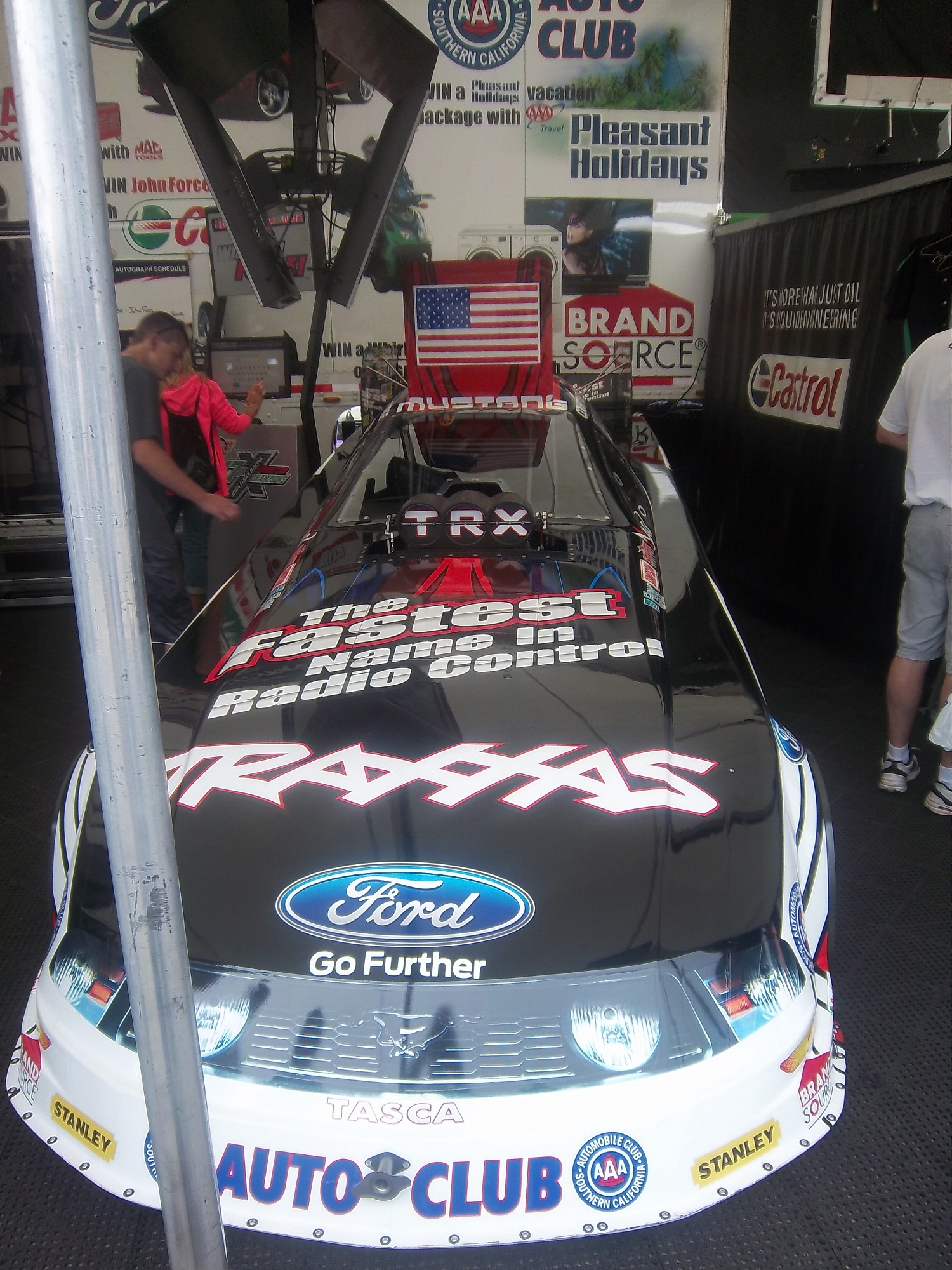
Austin Dillon #3 AAA Chevy SS–New sponsor for 2016, similar to Robert Hight’s funny car, but with colors rearranged. D+
Austin Dillon #3 Dow FlexoLyt Chevy SS-New sponsor for 2016, same as Intellifresh B-
Austin Dillon #3 Bass Pro Shops/Ranger Boats Chevy SS-New sponsor for 2016, black with camo and orange diagonal triangle on side. B+
STEWART-HAAS RACING #4
Kevin Harvick #4 Busch Chevy SS-New sponsor for 2015, designed around a Busch throwback can. A+
Kevin Harvick #4 Busch Light Chevy SS-New sponsor for 2015, designed around a Busch Light can. A+
Kevin Harvick #4 Jimmy John’s Chevy SS–No change. A+
Kevin Harvick #4 Outback Chevy SS–New scheme for 2016, mountain design starts near brake duct, instead of at front of car. B+
Kevin Harvick #4 Ditech Chevy SS–No change. A+
Kevin Harvick #4 Mobil 1 Chevy SS-New scheme for 2016, white background, with the Pegasus wing starting at the side of the front, extending to the door numbers. A+
HENDRICK MOTORSPORTS #5
Kasey Kahne #5 Farmers Insurance Chevy SS–No Change. C+
Kasey Kahne #5 Great Clips Chevy SS–No Change. D+
Kasey Kahne #5 Liftmaster Chevy SS–New scheme for 2016, geometrical designs on side changed. C
Kasey Kahne #5 Panasonic Toughbook Chevy SS-New sponsor for 2016, blue fade to black, with a couple of wave stripes, and some fade designs on side. A+
Kasey Kahne #5 Quicken Loans Chevy SS–New scheme for 2016, red with hockey stick designs on sides, as well as geometrical designs on front and back. C+
ROUSH-FEWNAY RACING #6
Trevor Bayne #6 Advocare Ford Fusion–New scheme for 2016, white with blue line and checkered flag on bottom. A+
TOMMY BALDWIN RACING #7
Alex Bowman #7 Road Rippers Chevy SS-New scheme for 2015, shark motif on front, fades to fire motif and logo on back. F
Regan Smith #7 Golden Corral/Niko Toy State Chevy SS-New scheme for 2016, amalgamation of Golden Corral and Niko Toy State. F
Regan Smith #7 Nikko Street Bratz Chevy SS-New sponsor for 2016, blue and white with a series of designs across sides. F
Regan Smith #7 Chevy SS-Black with white and blue numbers and stripe across bottom. A+
Regan Smith #7 APC Chevy SS-New sponsor for 2016, black with white and blue numbers and stripe across bottom, APC logo on hood. A+
Regan Smith #7 AIPAC Chevy SS-New sponsor for 2016, black with white and blue numbers and stripe across bottom, AIPAC logo on hood. A+
Regan Smith #7 Fire Alarm Services Chevy SS-New sponsor for 2016, black with yellow hood, and orange city motif on sides. A+
Regan Smith #7 Nikko/Road Rippers Alan Kulwicki Throwback Chevy SS–New scheme for 2016, based on the “Underbird” design used by Kulwicki in 1992. C+
STEWART-HAAS RACING #10
Danica Patrick #10 Nature’s Bakery Chevy SS-New sponsor for 2016, blue with white lettering on sides, white and black stripe across hood and roof. A+
Danica Patrick #10 TaxAct Chevy SS-New sponsor for 2016, white front, red TaxAct X logo, gray back. A+
Danica Patrick #10 Nature’s Pride Pumpkin Spice Chevy SS-New sponsor for 2016, same basic scheme as Nature’s Pride, but with orange and red color scheme, and some slight redesigns on the side. A+
Danica Patrick #10 Mobil 1 Chevy SS-New scheme for 2016, Bass Pro Shops has left, so the Mobil 1 scheme features a white background, with the Pegasus wing starting at the side of the front, extending to the door numbers. A+
Danica Patrick #10 Aspen Dental Chevy SS–New scheme for 2016, similar to Clint Bowyer’s template, but with a Post-It esque design. F
JOE GIBBS RACING #11
Denny Hamlin #11 FedEx Express Toyota Camry–Slight redesign for 2016, hood logo moved slightly to the right, side stripes wider. A+
Denny Hamlin #11 FedEx Freight Toyota Camry–Slight redesign for 2016, hood logo moved slightly to the right, side stripes wider. A+
Denny Hamlin #11 FedEx Ground Toyota Camry–Slight redesign for 2016, hood logo moved slightly to the right, side stripes wider. A+
Denny Hamlin #11 FedEx Office Toyota Camry–Slight redesign for 2016, hood logo moved slightly to the right, side stripes wider. A+
Denny Hamlin #11 SportClips Toyota Camry–No Change. C-
GERMAIN RACING #13
Casey Mears #13 Geico Chevy SS–New scheme for 2016, much more subdued version of the 2015 scheme. A+
Casey Mears #13 Geico Millitary Chevy SS–New scheme for 2016, black with camo motif across car. F
STEWART-HAAS RACING #14
Tony Stewart #14 Mobil 1 Chevy SS–New scheme for 2016, the Mobil 1 scheme features a white background, with the Pegasus wing starting at the side of the front, extending to the door numbers. A+
Tony Stewart #14 Code 3 Associates/Mobil 1 Chevy SS–Slight redesign, removal of Bass Pro Shops logo, cleaner rear end of the car. A+
Tony Stewart #14 Rush Truck Stops/Mobil 1 Chevy SS–Slight redesign, removal of Bass Pro Shops logo, cleaner rear end of the car. A+
Tony Stewart #14 Bass Pro Shops Chevy SS–No Change. C+
Brian Vickers #14 Janssen Chevy SS–New scheme for 2016, simple curve replaces the wave pattern from 2015. A+
Brian Vickers #14 TaxAct Millitary Chevy SS-New sponsor for 2016, similar to TaxAct but with camouflage motif. C+
HSCOTT MOTORSPORTS #15
Clint Bowyer #15 Five-Hour Energy Chevy SS–New scheme for 2015, the front stripe has been moved up to the top of the side, and the roof matches with the design. A+
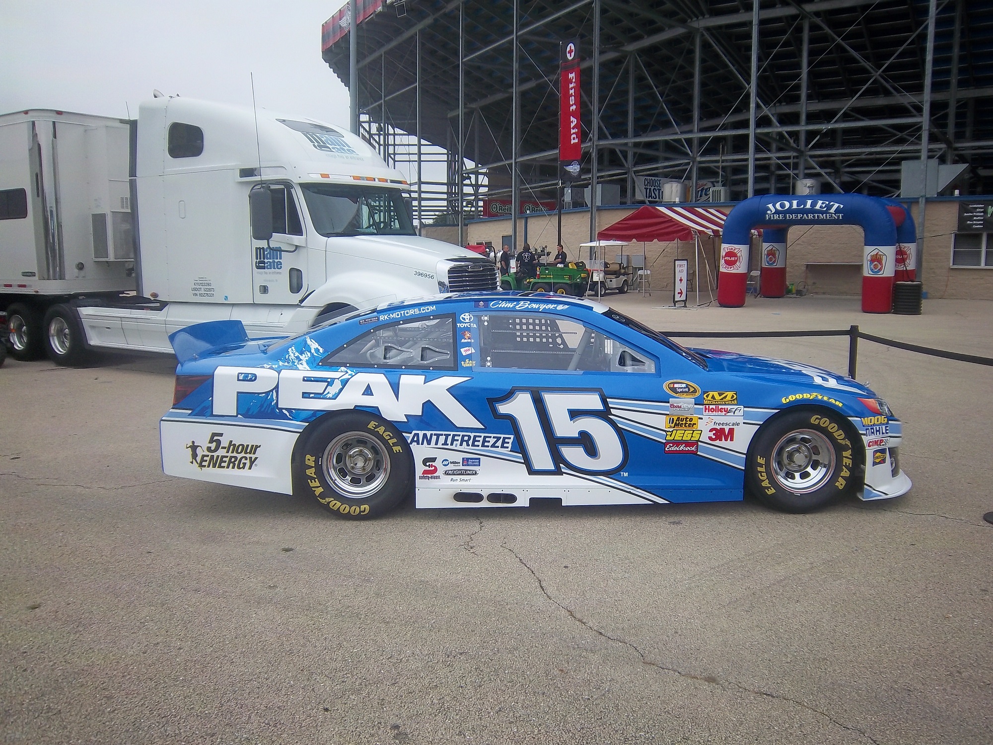
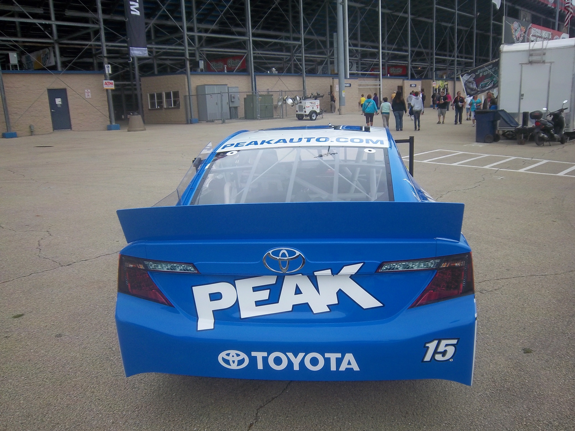
Clint Bowyer #15 Peak Chevy SS–New scheme for 2015, Blue with white geometrical designs on side. A+
Clint Bowyer #15 Visine Chevy SS-New sponsor for 2016, same as 5-Hour Energy, but with black, white, and blue color scheme. B+
Clint Bowyer #15 Aaron’s Chevy SS–No Change. A+
ROUSH-FEWNAY RACING #16
Greg Bffle #16 Cheez-its Ford Fusion–New scheme for 2015, stripe has been extended down tot he bottom of the car, some slight rearangment of the crackers on the side of the car. A+
Greg Biffle #16 KFC Nashville Hot Ford Fusion–New sponsor for 2016, all red with fire designs on quarter panel, and KFC stripes on roof. A+
Greg Biffle #16 Kleen Performance Products Ford Fusion–No Change. B+
Greg Biffle #16 Roush Performance Ford Fusion–New scheme for 2016, black with red and white check pattern design on side. A+
ROUSH-FEWNAY RACING #17
Ricky Stenhouse Jr. #17 Fastenal Ford Fusion–No Change. A
Ricky Stenhouse Jr. #17 Ford Eco-Boost Ford Fusion–New scheme for 2016, much simpler design, with red added on top. B+
Ricky Stenhouse Jr. #17 Sunny D Ford Fusion-New sponsor for 2016, orange front, rainbow sunburst pattern across sides, blue hood, roof, and decklid. F
Ricky Stenhouse Jr. #17 Zest Ford Fusion–New scheme for 2016, much simper design, with soap motif. C+
Ricky Stenhouse Jr. #17 Fastenal Throwback Ford Fusion–New scheme for 2016, based on Darrell Waltrip’s 1975 scheme. A+
JOE GIBBS RACING #18
Kyle Busch #18 Interstate Batteries Chevy SS–Slight redesign for 2015, stripes are wider, black stripe on bottom gone. F
Kyle Busch #18 Skittles Toyota Camry–No Change. A+
Kyle Busch #18 M&M’s Toyota Camry–New scheme for 2016, similar to 2014 scheme, but with vintage characters to celebrate M&M’s 75th anniversary. A+
Kyle Busch #18 M&M’s Throwback Toyota Camry-New scheme for 2016, vintage look with vintage characters, yellow, with brown letters. A+
Kyle Busch #18 Banfield Pet Hospital Toyota Camry-New sponsor for 2016, blue with diagonal logo on hood, EKG motif on sides, injured cute pet pictures on quarter panel. A+
JOE GIBBS RACING #19
Carl Edwards #19 Stanley Toyota Camry–No Change. B+
Carl Edwards #19 Stanley Toyota Camry–Slight redesign for 2016, logos are bigger, outlines are bolder. A
Carl Edwards #19 Subway Toyota Camry–New scheme for 2016, green replaces black, box motif replaces stripe motif. B+
Carl Edwards #19 Comcast Business Toyota Camry–No Change. D-
JOE GIBBS RACING #20
Matt Kenseth #20 Dollar General Toytota Camry–Slight redesign for 2016, black stripe across bottom now gone. A+
Matt Kenseth #20 DeWalt USA Toyota Camry–No Change. A+
Matt Kenseth #20 DeWalt Toyota Camry–No Change. A+
WOOD BROTHERS RACING #21
Ryan Blaney #21 Motorcraft Ford Fusion–No Change. A+
TEAM PENSKE #22
Joey Logano #22 Shell/Pennzoil Ford Fusion–No change D
Joey Logano #22 AAA Ford Fusion–No Change. D
Joey Logano #22 Auto Trader Ford Fusion–No Change. D-
Joey Logano #22 AAA of Southern California Ford Fusion–No Change. D
Joey Logano #22 Pennzoil Ford Fusion–New scheme for 2016, all yellow, with some lighter yellow geometrical designs across car. A+
BK RACING #23
David Ragan #23 Dr. Pepper Toyota Camry–New scheme for 2016, white hood, different designs on sides. B+
HENDRICK MOTORSPORTS #24
Chase Elliott #24 NAPA Chevy SS-New sponsor for 2015, blue with white stripes across side which start at brake duct. A+
Chase Elliott #24 3M Chevy SS–New scheme for 2015, black and white replaces silver, extra geometrical designs on sides. B+
Chase Elliott #24 Kelly Blue Book Chevy SS–New scheme for 2016, same basic color scheme but gold has been removed. Scheme has been redesigned into a more haphazardly designed stripe pattern. C+
Chase Elliot #24 Sun Energy Chevy SS-New sponsor for 2016, black background with solar flare inspired design fades to blue towards wheel well, and finishes with red gradient on back. F
BK RACING #26
Robert Richardson #26 Stalk It Toyota Camry-New sponsor for 2016, black with large blue and white stripe across sides, and Stalk It logos on hood and sides. A+
RICHARD CHILDRESS RACING #27
Paul Menard #27 Menard’s/Moen Chevy SS–New scheme for 2016, black front, extending into Menard’s template, yellow rear. B-
Paul Menard #27 Menard’s/Peak Chevy SS–New scheme for 2016, redesigned to match Clint Bowyer’s Peak Chevy. A+
Paul Menard #27 Valvoline/Menard’s Chevy SS-New sponsor for 2016, follows new Menard’s template, white Valvoline front, yellow Menard’s rear. F
Paul Menard #27 Menard’s/Dutch Boy Chevy SS-New sponsor for 2016, Menard’s template, with peeling blue and white paint design. F
Paul Menard #27 Richmond/Menard’s Chevy SS–New scheme for 2016, same basic color scheme with new Menard’s template. A+
Paul Menard #27 Menard’s/FVP Chevy SS–New scheme for 2016, New Menard’s template with FVP colors. A+
Paul Menard #27 Menard’s/Libman Chevy SS–New scheme for 2016, Menard’s 2016 template with green Libman motif on front, Menard’s on back. A+
Paul Menard #27 Menard’s/Rockstar Chevy SS-New sponsor for 2016, Menard’s template with black Rockstar front. A+
Paul Menard #27 Menard’s/Tarkett Chevy SS-New scheme for 2016, Menard’s template with blue front for Tarkett. A+
THE MOTORSPORTS GROUP #30
Josh Wise #30 Toyota Camry-Plain white with blue, black, and white numbers. A+
Josh Wise #30 Toyota Camry-Plain black with blue, black, and white numbers. A+
Josh Wise #30 Crawfest/City of New Braunfels Chevy SS-New sponsor for 2016, same as all black with Crawfest/City of New Braunfels logo on hood. A+
RICHARD CHILDRESS RACING #31
Ryan Newman #31 Cat Chevy SS–Slight redesign for 2016, yellow stripes are narrower, and hood logo is slightly larger. A+
Ryan Newman #31 Granger Chevy SS–No change. B +
Ryan Newman #31 Wix Filters Chevy SS–New scheme for 2016, one large multi-colored stripe replaces the multi-stripe on the sides, design extends to hood. F
GO FAS RACING #32
Jeffery Earnhardt #32 Can-Am/Kappa Ford Fusion-New sponsor for 2016, black, green, and yellow, with a series of geometrical designs across whole car. F
Jeffery Earnhardt #32 Keen Parts/Corvette Parts Ford Fusion–New sponsor for 2016, black, white, and yellow, with a series of geometrical designs across whole car. F
Bobby Labonte #32 C&J Energy Services Ford Fusion–No Change. F
Joey Gase #32 JT Concrete Inc Ford Fusion-New sponsor for 2016, white with blue and white lettering. A+
Joey Gase #32 Donate Life Ford Fusion–New scheme for 2016, all white with Donate Life logo on hood, and Allo-Source logo on quarter panels. A+
Jeffery Earnhardt #32 Visone/Corvette Parts Ford Fusion-New sponsor for 2016, same as Corvette Parts. F
FRONT ROW MOTORSPORTS #34
Chris Buescher #34 Love’s Truck Stops Ford Fusion–New scheme for 2016, Front Row Template has been reversed, red replaces back as secondary color. A+
Chris Buescher #34 Dockside Logistics Ford Fusion–New scheme for 2016, all white with Dockside Logistics logos on sides and hood. A+
Chris Buescher #34 CSX Play it Safe Ford Fusion–No Change. A+
FRONT ROW MOTORSPORTS #35
David Gilliland #35 Ford Fusion-White with black and red letters. A+
FRONT ROW MOTORSPORTS #38
Landon Cassill #38 Florida Lottery Ford Fusion–No Change. C+
Landon Cassill #38 FR8 Auctions Ford Fusion–No Change. A+
Landon Cassill #38 MDS Ford Fusion–New scheme for 2016, all white with MDS logos on sides and hood. A+
Landon Cassill #38 Snap Fitnaess Ford Fusion–New scheme for 2015, all red with Snap Fitness logos on sides and hood. A+
HILLMAN RACING #40
Reed Sorenson #40 CRC Brakleen Chevy SS–New scheme for 2016, black replaces red as primary color. D-
STEWART-HAAS RACING #41
Kurt Busch #41 Monster Energy Chevy SS-New sponsor for 2016, black with yellow and white numbers and lettering. A+
Kurt Busch #41 Haas Automation Chevy SS–New scheme for 2016, red front, fades to black rear end. A+
Kurt Busch #41 Haas Automation/Monster Energy Chevy SS-New scheme for 2016, red front, fades to black rear end. A+
Kurt Busch #41 Monster Energy/Haas Automation Chevy SS-New scheme for 2016, same as Monster Energy, but with Haas on rear. A+
Kurt Busch #41 State Water Heaters Chevy SS–No Change. B+
CHIP GANASSI RACING TEAM #42
Kyle Larson #42 Target Chevy SS–New scheme for 2016, vertical fade from red to white replaces side fade from 2015. A+
RICHARD PETTY MOTORSPORTS #43
Aric Almirola #43 Smithfield Ford Fusion–Slight redesign for 2016, roof numbers turn from yellow to red. B+
Aric Almiroa #43 U.S. Air Force Ford Fusion–New scheme for 2016, same basic scheme, but with more lightning. A+
Aric Almirola #43 STP Ford Fusion–New scheme for 2014, STP colors with stripes that correspond to the door logos. B-
Aric Almirola #43 Waffle House Ford Fusion–New scheme for 2016, yellow replaces patriotic motif. D-
RICHARD PETTY MOTORSPORTS #44
Brian Scott #44 Twisted Tea Ford Fusion–Aside from the number change, no significant changes for 2016. A
Brian Scott #44 Albertsons’s Ford Fusion-New sponsor for 2016, all blue with white hood. A+
Brian Scott #44 Vonn’s Ford Fusion-New sponsor for 2016, same as Albertson’s, but with Vonn’s on the hood.. A+
Brian Scott #44 Goody’s Ford Fusion-New sponsor for 2016, blue with a honeycomb pattern, with yellow stripes on bottom and front. B+
Brian Scott #44 Go Bowling Ford Fusion–New scheme for 2016, bowling ball motif returns, blue sides, and white lettering. A+
Brian Scott #44 Albertson’s/Tom Thumb Ford Fusion-New scheme for 2016, Tom Thumb debuts on sides, other than that, same as Albertson’s. A+
Brian Scott #44 Shore Lodge Ford Fusion–New scheme for 2016, same as 2015 scheme, but with side stripe removed, and Petty door design on sides. C+
HSCOTT MOTORSPORTS #46
Michael Annett #46 Pilot/Flying J Chevy SS–No Change. A+
Michael Annett #46 Pilot/Flying J Chevy SS-New scheme for 2016, all red with white front. A+
JTG DAUGHERTY RACING #47
AJ Allmendinger #47 Kroger/Stoffer’s/Lean Cuisine Chevy SS–New scheme for 2016, same as Kroger/Scott, minus the stars. A+
AJ Allmendinger #47 Kroger/Scott Chevy SS-New scheme for 2016, same as Kroger/Scott, minus the stars. A+
AJ Allmendinger #47 Food For Less Chevy SS–No Change. A+
AJ Allmendinger #47 Louisiana Hot Sauce Chevy SS-New sponsor for 2016, dark red, with flames on sides. A+
AJ Allmendinger #47 Kroger/Coffee Mate/Butterfinger Chevy SS-New scheme for 2016, same as Kroger, but with Coffee Mate and Butterfinger logos on sides and hood. A+
AJ Allmendinger #47 Bush’s Baked Beans Chevy SS–No Change. B+
HENDRICK MOTORSPORTS #48
Jimmie Johnson #48 Lowe’s Chevy SS–Slight redesign for 2016, stripes are narrower, and hood logo is slightly forward. C-
Jimmie Johnson #48 Lowe’s/Kobalt Chevy SS–Slight redesign for 2016, stripes are narrower, and hood logo is slightly forward. C-
Jimmie Johnson #48 Lowe’s Pro Services–Slight redesign for 2016, stripes are narrower, and hood logo is slightly forward. C-
Jimmie Johnson #48 Lowe’s/Superman Chevy SS-New scheme for 2016, designed to look like Superman’s suit. A+
Jimmie Johnson Lowe’s Red Vest Chevy SS–New scheme for 2016, Jimmie Johnson Foundation logo replaces the Lowe’s Template. D-
Jimmie Johnson #48 Lowe’s Chevy SS– New scheme for 2016, same as basic scheme, yellow numbers replace white. B+
PREMIUM MOTORSPORTS #55
Reed Sorenson #55 Chevy SS-All black with white and blue numbers. A+
CIRCLE SPORT/LEAVINE FAMILY RACING #59
Michael McDowell #59 Thrivent Financial Chevy SS–New scheme for 2016, same as #95, with door numbers reversed. B+
FURNITURE ROW RACING #78
Marin Truex Jr. #78 Furniture Row Toyota Camry–Other than the switch from Chevy to Toyota, there are no major changes. A+
Martin Truex Jr. #78 Auto Owner’s Insurance Chevy SS-New sponsor for 2016, vertical fade from bottom to top, light blue fades up to dark blue. A+
Martin Truex Jr. #78 Bass Pro Shops Chevy SS-New sponsor for 2016, orange with trace amounts of black and camo. F
BK RACING #83
Michael Waltrip #83 Maxwell House Toyota Camry–No Change. A+
Matt DiBendetto #83 Sewanee University Toyota Camry-New sponsor for 2016, blue with white and gold logos on quarter panels, gold stripe on bottom, blue designs on side. B+
Matt DiBenedetto #83 Cosmo Motors Toyota Camry–New scheme for 2016, all black with Cosmo Motors logos on sides and hood. A+
Matt DiBenedetto #83 Schluter Systems Toyota Camry-New sponsor for 2016, cream top, with stripes, and a waffle design on the bottom. D-
Matt DiBenedetto #83 Cosmo Motors Toyota Camry–No Change. C-
HENDRICK MOTORSPORTS #88
Dale Earnhardt Jr. #88 TaxSlayer Chevy SS-New sponsor for 2016, red top and front, white bottom and back, gold designs separate the two. A+
Dale Earnhardt Jr. #88 Nationwide Chevy SS–New scheme for 2015, reminiscent of old Mountain Dew/Amp Energy scheme. A+
Dale Earnhardt Jr. #88 Axalta Chevy SS-New sponsor for 2016, red top, fade to yellow bottom, across whole car. A+
Dale Earnhardt Jr. #88 Nationwide/Batman Chevy SS-New scheme for 2016, designed to look like Batman’s armor. A+
Dale Earnhardt Jr. #88 Nationwide Grey Ghost Chevy SS–New scheme for 2016, based on the Grey Ghost that Buddy Baker used to win the 1980 Daytona 500. A+
BK RACING #93
Matt DiBenedetto #93 Dustless Blasting Toyota Camry–No Change. B–
CIRCLE SPORT/LEAVINE FAMILY RACING #95
Ty Dillon #95 Cheerios Chevy SS–New sponsor and manufacturer for 2016 for Leavine Family Racing, after having merged with Circle Sport, and aligned with RCR. Aside from the new number, and a larger Kroger’s logo, no change. A+
Michael McDowell #95 Thrivent Financial Chevy SS–New scheme for 2016, looks similar in design to the 2014, with a black, red, and white color scheme. B+
Michael McDowell #95 K-Love Chevy SS–New scheme for 2016, simpler template. A+
Michael McDowell #95 Monte Carlo Casino Chevy SS-New Scheme for 2016, same as WRL Contractors from 2014. A+
Ty Dillon #95 Nexium 24 Chevy SS–Aside from new team, no change. A-
PREMIUM MOTORSPORTS #98
Cole Whitt #98 Premium Motorsports RTIC Coolers Toyota Camry-New sponsor for 2016, black with RTIC Coolers logo on sides and hood. A+
Cole Whitt #98 Tweaker Energy Chevy SS–No Change. A+
Cole Whitt #98 Speed Stick Chevy SS–No Change. A+
Cole Whitt #98 Rinnai Ford Fusion–New scheme for 2016, all black with Rinnai logos on sides and hood. A+
Cole Whitt #98 Chevy SS-All black with white and blue numbers. A+
Cole Whitt #98 RTIC Coolers Toyota Camry-New sponsor for 2016, black with RTIC Coolers logo on sides and hood, with a new hood design. A+