All-Star Race Weekend Events and Fun

100_3196 By David G. Firestone

With the sad passing of Dick Trickle, as well as the All-Star Race, and the Memorial Day trifecta next week, I decided today I needed a change of pace, and I wouldn’t think about racing or driver suits today. So with my uncle in town, we went to the Museum of Science and Industry in Chicago. It’s an amazing museum with a lot of fun things to see and do, and we had a great time.

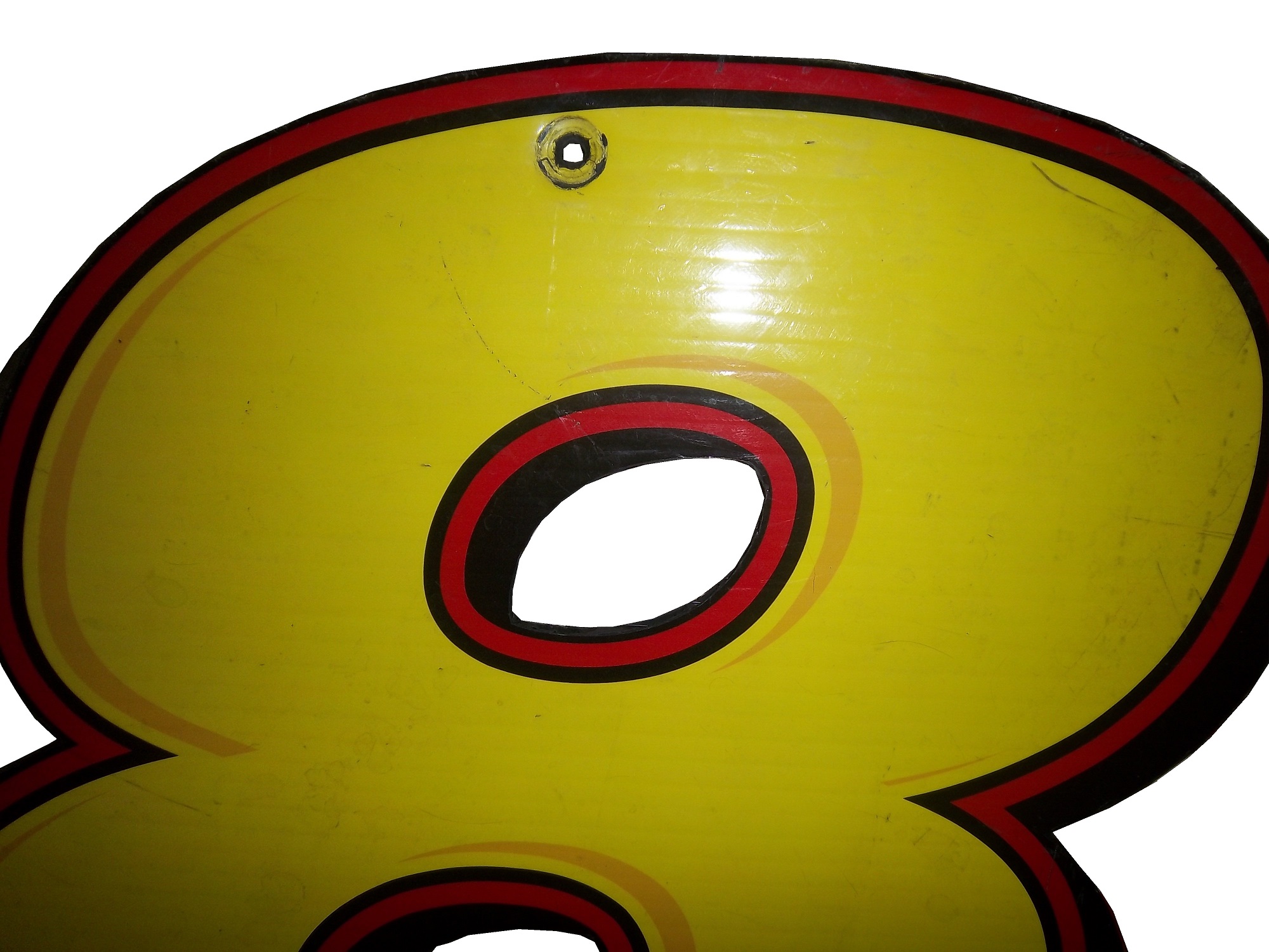
They have an exhibit that I saw concerning vintage cars, and a number of race cars. They have the winning car from the 1993 Sunrace USA100_3197

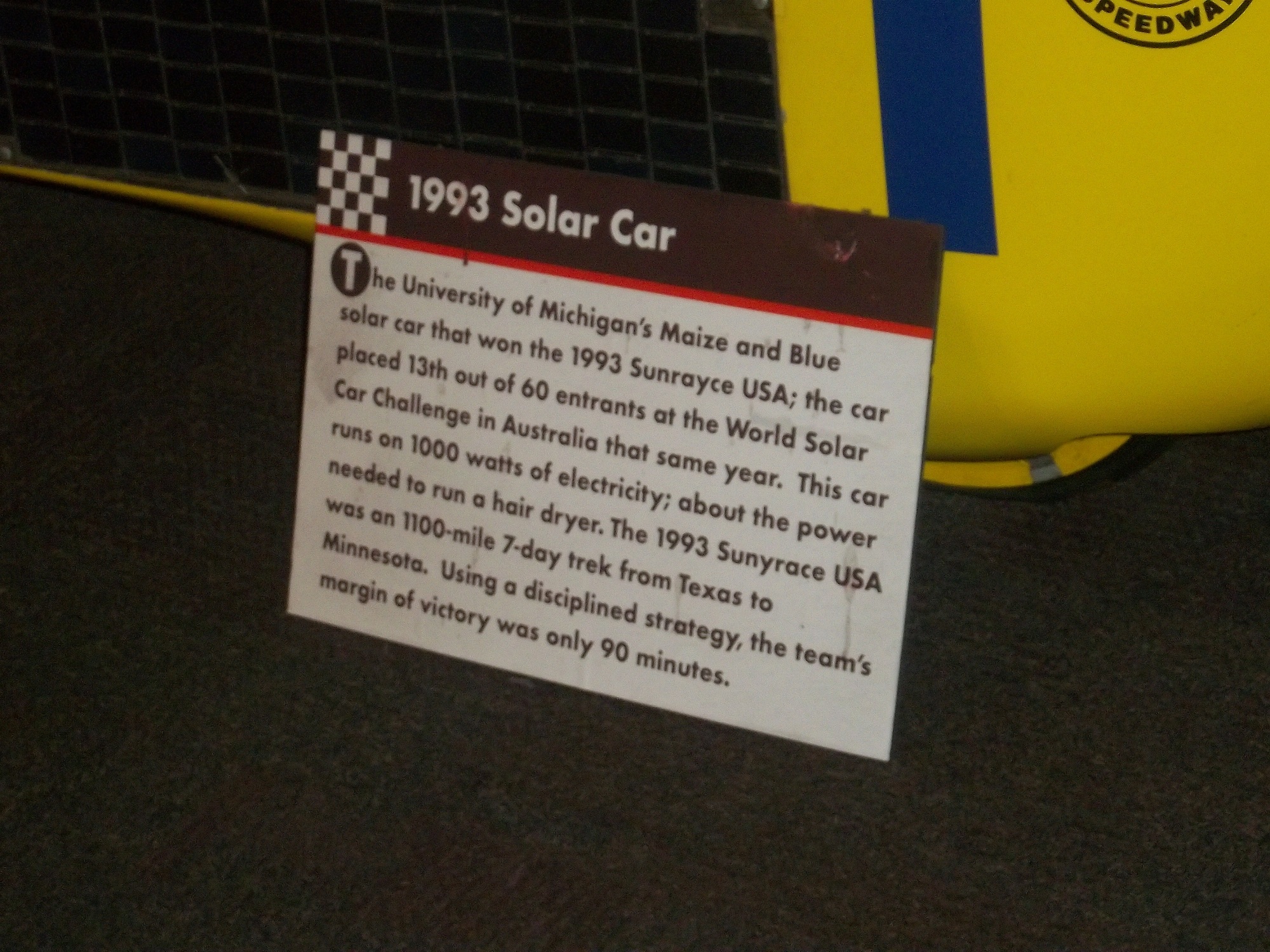
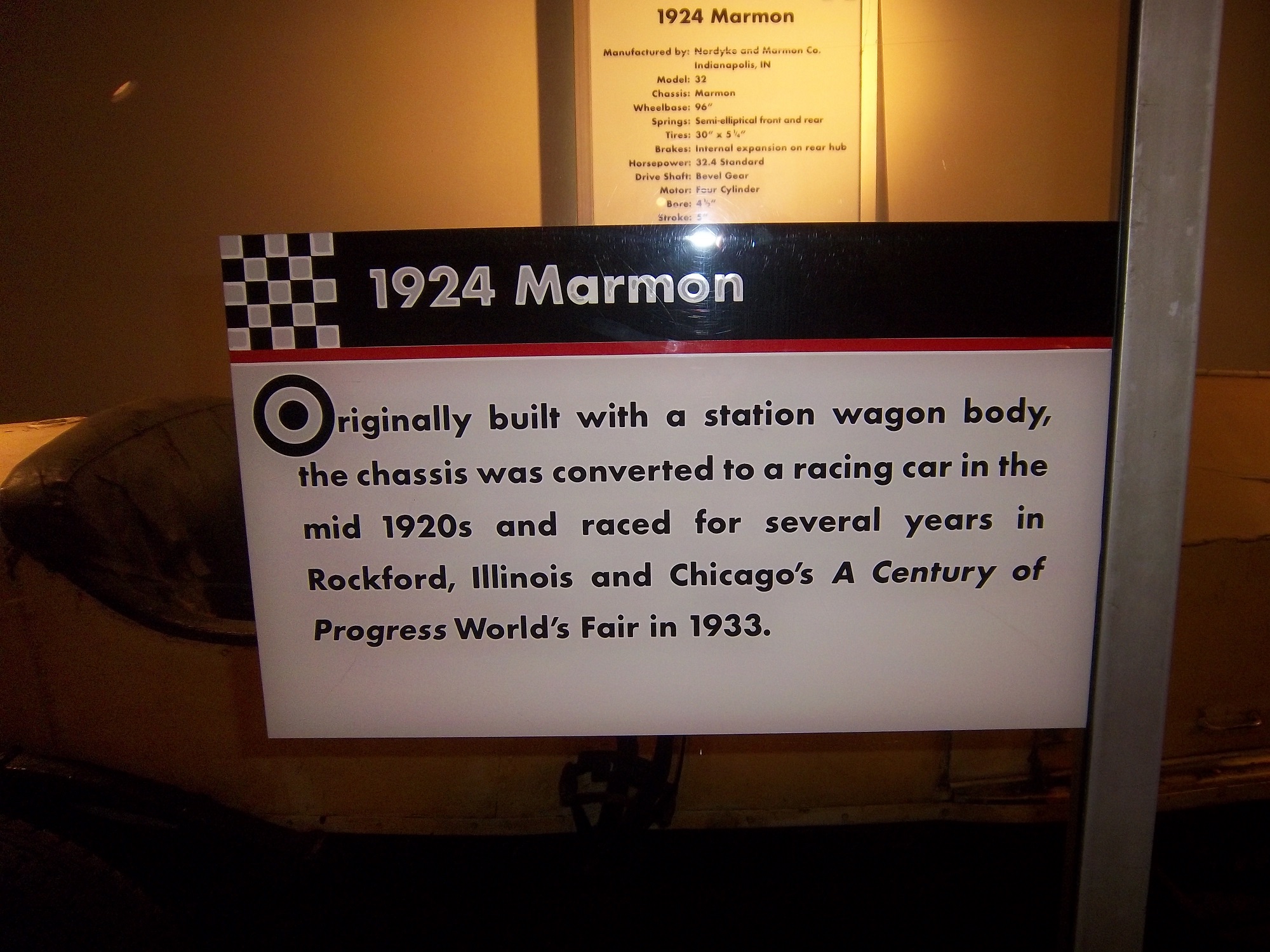
A 1924 Marmon race car 100_3194 100_3195

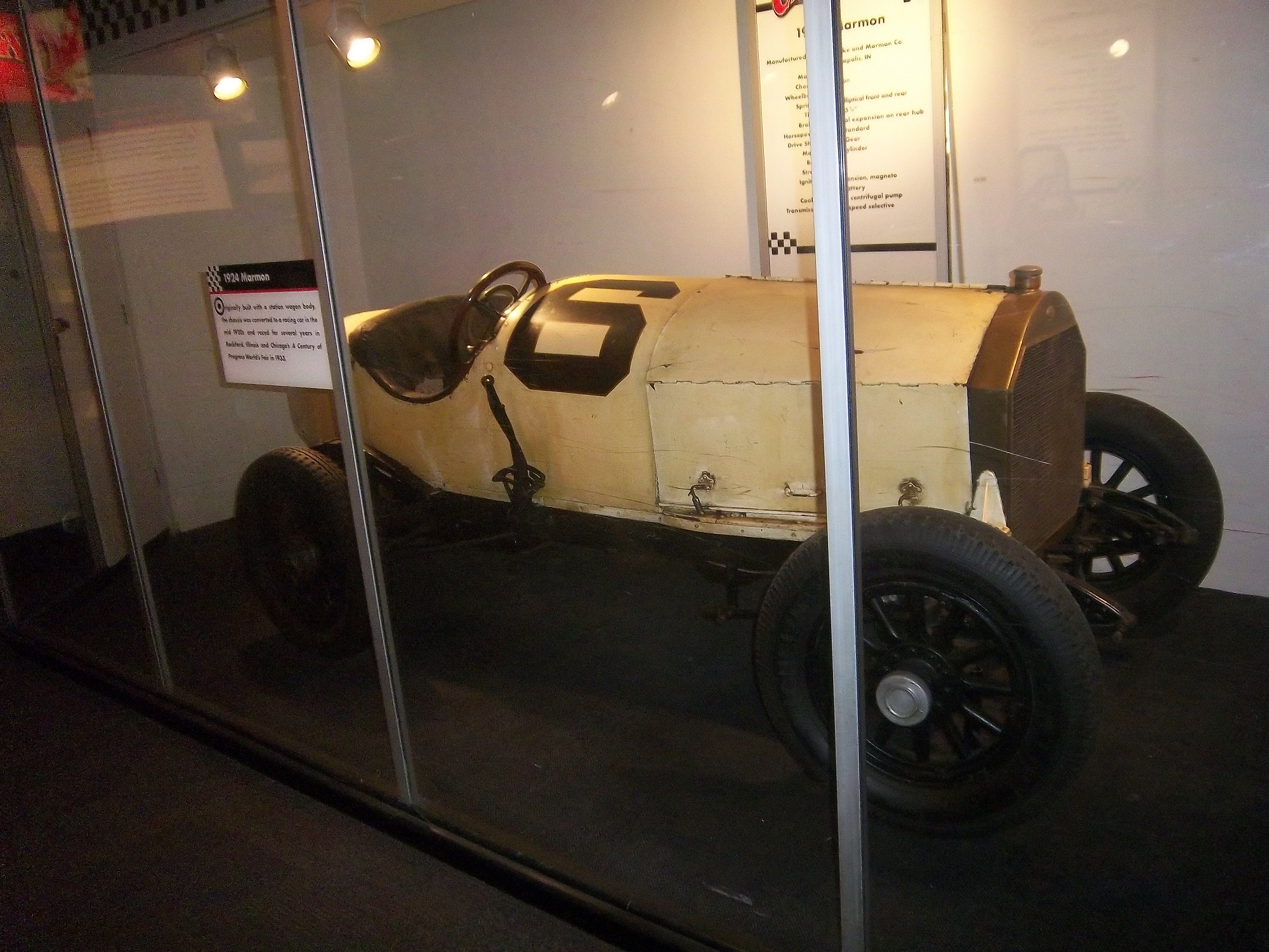
Wally Dallenbach’s car from the 1972 Indy 500 100_3193 100_3192

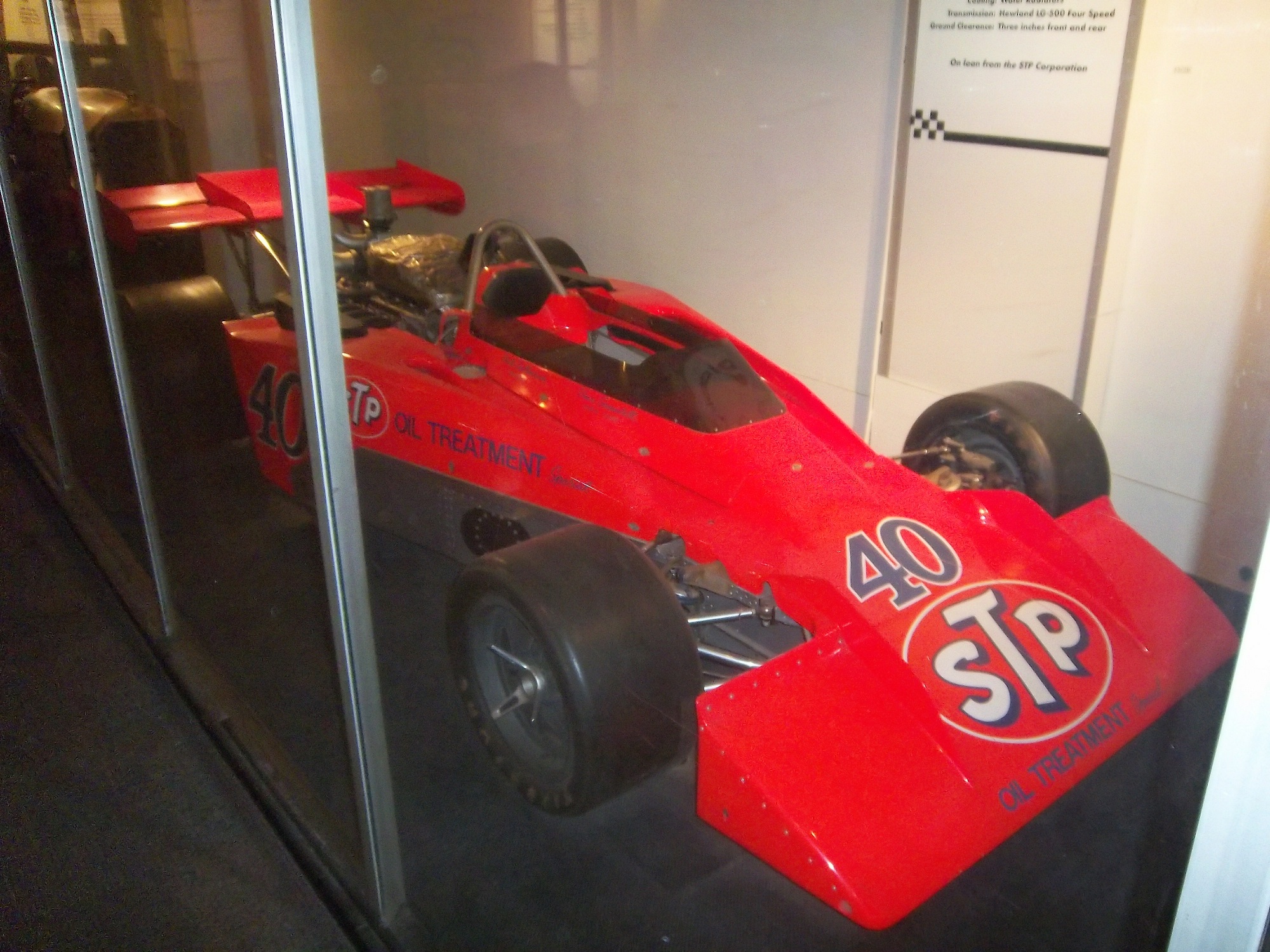
and Al Unser’s 1978 Lola race car that won the triple crown 100_3190 100_3191

The Spirit Of America, which held the land speed record from August 1963 to October 1964, and still holds the record for world’s longest skid mark is also on display as well.100_3185

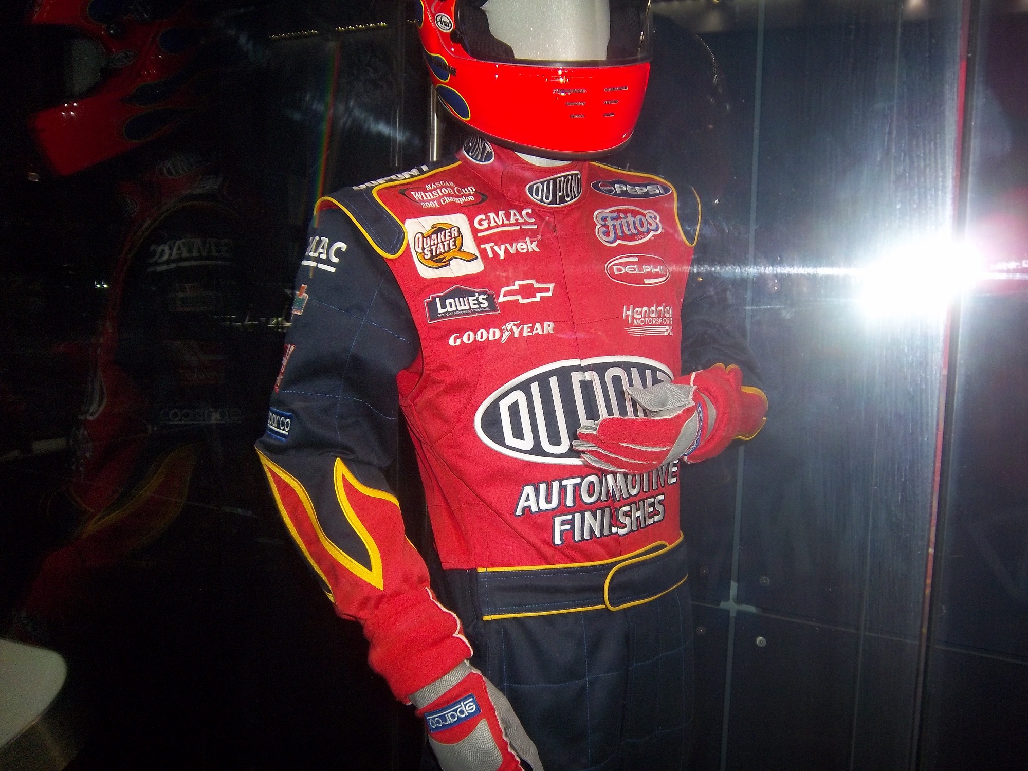
There is a new exhibit as well, Science Storms, an impressive state of the art exhibit detailing the science of natural phenomena, and how modern society has to interact with it. It is on two floors in the main gallery. On the second floor, there are displays for physics, magnetism, electricity, and fire among other things. At the end of the balcony, there is a large Tesla coil mounted in the ceiling. Nearby, I was shocked to see this display:IMAG0047That is a Jeff Gordon driver suit, with a similar helmet. 100_3176 100_3175 100_3177 100_3171

A helmet that has been bi-sected to display the fire protection that the helmet100_3180

A helmet used for fire testing, and a Nomex hood.100_3181

A racing helmet and matching goggles from the 1950,s and a 1975 drag racing helmet worn by Dennis Baca100_3182

and some Nomex undergarments and a Sparco bag. 100_3178 100_3179

Now first off, why is the picture of Jeff Gordon from 2011 when the suit is from 2002? I think that it would be better if the picture of Gordon featured him wearing the suit on display. But that’s a minor complaint compared to some of the other issues the display has. The bag in the display clearly states “Jeff Gordon 2003.” So that might lead one to believe that the suit was from 2003. However after doing some research, the suit is from 2002. Looking at a 2003 suit, The Quaker State logo is different, the Lowes logo is gone, and the GMAC and Goodyear logos are in different places. So kudos to the museum for catching that.

The biggest issue is with the helmet cut in half. The sign clearly states “Jeff Gordon’s Helmet, Circa 2002.” Just taking a look at it, and I can clearly tell it’s not race-worn. I can tell for a number of reasons. Let’s start with the obvious fact that the color schemes on the helmet and driver suit are completely different. Second off, there are no ventilation ports or microphone equipment present. Since Gordon was wearing the vent on the left side of his helmet, the fact it is not there is very telling. Considering that DuPont Automotive Finishes paid nearly $12 million total to sponsor Gordon in 2002, his sponsor logos are conspicuously absent, and for a helmet that was supposedly worn for an entire racing season, it seems to be in very VERY good condition, almost new. It should also be noted that there are no HANS anchors present. At first I thought it was because the helmet was not meant to have them, but it turns out they were either supposed to be there, or have been removed. Why this occurred is not clear, but it clearly was NOT worn by Jeff Gordon. In fact, I would be shocked if he ever held this helmet. 100_3180 100_3180 - Copy100_3180 - Copy - Copy

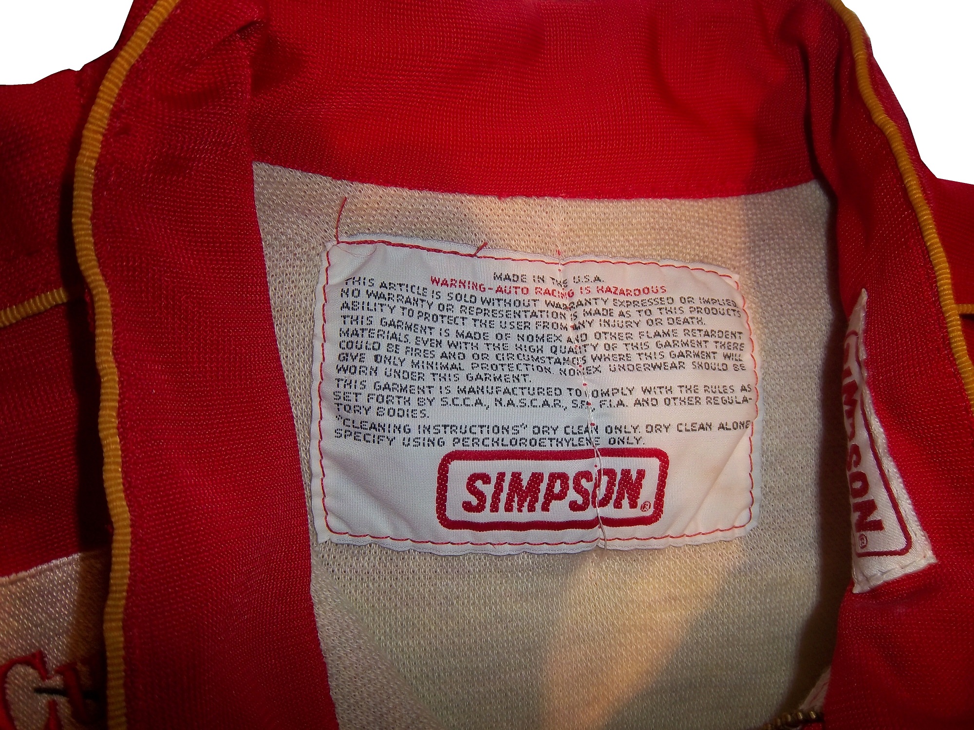
But there is one other issue with this display. The whole display is geared around fire protection, but there is no mention of safety certification. This is not a minor complaint, as the suit has a FIA certification on the back of the neck, but in the display is almost invisible.100_3184

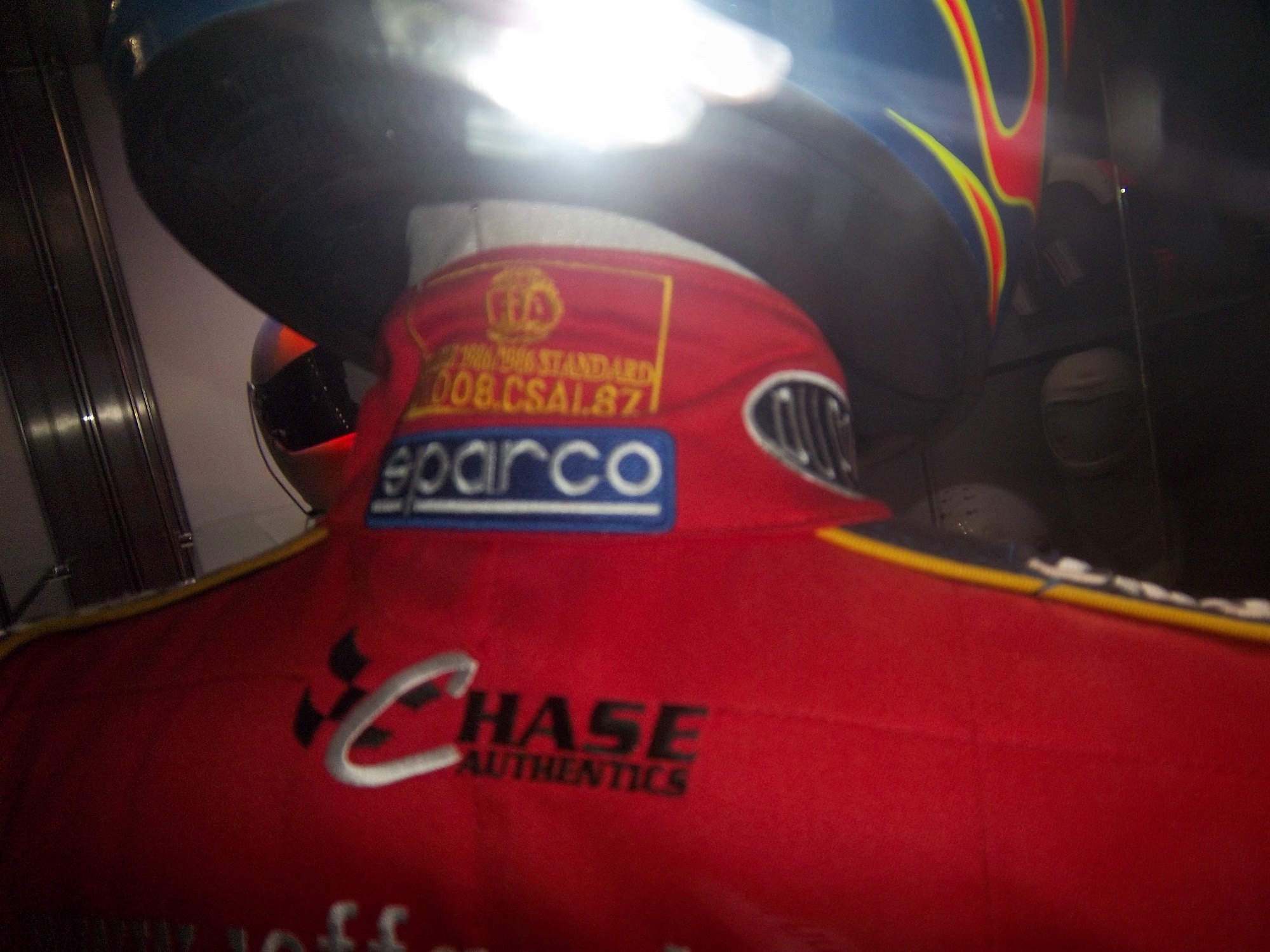
That picture, as bad as it is, is the best I can do, because the side of the display is inaccessible to viewers. If a display discussing fire safety, at least mention that the suit is certified to do just that!

Outside of that display, I had a great time at the Museum of Science and Industry, and I can look past those complaints to say that it is a really nice display that tells viewers a lot about racing safety. So if you are ever in Chicago, stop on over. I promise it is worth the time!

Now on to NASCAR All-Star Showdown Special Schemes…

First the All-Star Showdown Schemes…

Jamie McMurray #1 Bass Pro Shops/NWTF Chevy SS-Great Color Scheme, Awful design, C+

Danica Patrick #10 Go Daddy Cares Chevy SS-The racing stripe makes the scheme look better, and the hood logo is good as well  A

Mike Bliss #19 Gentry Plastics Inc. Toyota Camry-Good color scheme and simple design work well here, A

Landon Cassill #33 Bicycle NASCAR Playing Cards Chevy SS-Decent color scheme, but the design is all over the place, way too chaotic, C-

JJ Yeley #36 World TradeX Chevy SS– Not much to say here…other than make the logo bigger.  D-

Brian Keselowski #52 Supportmillitary.org Toyoa Camry-Eww…Too much going on, with the oversized camo in too many different colors, and the door design which is awful.  F-

Now On to All-Star Race Schemes.

Brad Keselwoski #2 Miller Lite Fan Mosiac Ford Fusion.  It looks really good, and the pictures of the fans give it a condensation on the can effect that is really cool.  A+

Greg Biffle #16 3M Filtrete Ford Fusion-Could you please pick a color scheme and stick with it?  Two different color schemes on the same car is just awful. But they are two good color schemes. C-

Kevin Harvick #29 Budweiser/Rheem Chevy SS-Good color scheme, and I like the two different designs on the side.  A-

Ryan Newman #39 Aspen Dental Chevy SS-Good colors, but awful design…what does this have to do with teeth?  C-

Jimmie Johnson #48 Lowes Patriotic Chevy SS-Not the best scheme he has run all year, but I would love to see the car in that shade of red on the bottom C-

Pit Boards…Unique and Under-Appreciated.

By David Firestone

Today, I thought we should discuss an item that everyone sees, but not everyone understands…the mighty pit board. Pit Boards are an item that most average collector wouldn’t think that would come up for sale, but they do. I am a proud owner of one myself:mccumbee-pit-1

This beauty of an item is from MRD Motorsports, and was used between 2007 and 2009 for Chad McCumbee and Blake Bjorklund, amongst others. Made from a thick plastic inside, with the color design made with a plastic similar to many campaign signs, it shows very nice use, with scratches and scuff marks. There are two types of pit boards. One type hangs above the pit lane, to help indicate to the driver where his pit is. This board almost always has the car number and holes cut into it to cut down on wind resistance. This is an example of one used by MRD.

The other type, like the one shown above, is to indicate to the car where to stop in the pit. In years past, a crew member would stand behind the board and the car would drive up to him, as shown at 6:49 at the video here…

http://youtu.be/w4v_ya596eg?t=6m46s

Since this was as dangerous as one thinks it is, in the 1990’s, pit crews switched to the “lollipop” form still used today.  The board is held on a long pole and held where the driver can see and hit it to stop at their stall, as seen below:

http://youtu.be/ilJ5qxhBbaI

Boards are often customized to driver preference.  Kevin Harvick is known for his “Happy Face” pit board.  Some drivers use sponsor names, other use car numbers.  It all looks confusing on pit road sometimes.  In this example, the MRD Motorsports board has the car number design on it.  This board shows where the pole was attached to the board.mccumbee-pit-2 mccumbee-pit-3

And it also shows numerous scratches and scuff marks from race use.mccumbee-pit-3 mccumbee-pit-4


The back of this board is plain black.  That is due to MRD being a low budget team, with limited resources.mccumbee-pit-5


A quick search on ebay and other sites shows that these items frequently sold as collectors items after a race.  These are unique items, and for NASCAR fans are conversation pieces.

And now on to Paint Schemes…

Brian Vickers #11 FedEx Delivery Manager Toyota Camry  Good simple scheme with great colors and design, gets an A

Sam Hornish Jr. #12 SKF Ford Fusion  Good color scheme, but it looks like a cross between Joey Logano’s scheme and Aric Almirola’s schemes.  I give it a B+

Tony Stewart #14 Mobil 1/Bass Pro Shop Chevy SS The color scheme is good, but the overall design isn’t as good as the regular scheme. Too much going on. The best grade it can earn is a C

Clint Bowyer #15 Toyota Toyota Camry Not much to complain about here, good color scheme and simple design and an A grade

Clint Bowyer #15 KFC I Ate The Bones Toyota Camry KFC has great lettering and a great shade of red, and both are not represented here very well.  That said, I don’t hate this scheme, colors are good, but what is with the hood design?  The KFC logo is too small, and the hood has some creepy guy with a bowl cut as the most promising feature.  All things considered, it earns a C-

Kyle Busch #18 M&M’s M’ Prove America Toyota Camry Good scheme with a great color scheme and good design. Nothing wrong with this solid A scheme.

Kyle Busch #18 Doublemint Gum Toyota Camry Just like Kyle’s scheme on the 18, I love the color scheme, love the simple design, love the fact that the 81 is the 18 backwards, love this scheme, A+

David Ragan #34 Detail Doctor Ford Fusion  Decent color scheme and decent design.  C-

Juan Pablo Montoya #42 Clorox 100th Anniversary Chevy SS  Surprise!  Happy Birthday!  The blue and white is good but the rest looks too goofy to be good.  It looks like a birthday party for a 4 year old.  Lose the confetti and streamers and I would like it much more, this scheme earns a D+

Aric Almirola #43 Enrich/Smithfield/Farmland Ford Fusion Lose the design on the doors and it would be perfect. Other than that these three schemes, different only by the hood and quarter panel sponsors are perfect and earn solid A schemes

Aric Almirola #43 Transportation Impact Ford Fusion Black white and lime green? Seriously? And the black front makes it look like the car was in a wreck and had the nose replaced. Not a good look at all. The door design is awful and the quarter panel is even worse! I can’t give this scheme a passing grade and it gets an F!

Aric Almirola #43 Jani-King/STP Gas Booster Ford Fusion This scheme makes up for the Transportation Impact scheme with simple perfection, and an A grade

Aric Almirola #43 STP/Farmland Ford Fusion OK, last Almirola scheme…I promise! A good throwback scheme is ruined with the door number design. Get rid of the oval design and it would get an A, whereas this scheme earns a B-

Scott Riggs #44 No Label Watches Ford Fusion An awful scheme made much worse by a horrible color scheme that earns an F- grade.

Scott Riggs #44 JPO Absorbents Ford Fusion Why do many racing teams have wave designs?  It is not a good design, and in this case it takes a good color scheme and ruins it earning a D grade.

Bobby Labonte #47 Clorox 100th Anniversary Toyota Camry Did anyone look at the main color of the car before it was painted?  This looks awful!  Montoya’s version looks better, but not by much.  D-

Jimmie Johnson #48 Lowes “Reverse” Chevy SS  Looks really good, and really stands out in nighttime racing.  Color scheme is good, as Lowe’s often is.  A+

Jimmie Johnson #48 Lowe’s “Emerald” Chevy SS  Decent color scheme, though if if were reversed it would look even better.  Even still it is good enough to earn an A-

Martin Truex Jr. #56 NAPA Brakes Toyota Camry Simple design, good color scheme, but the Twitter handle on the back of the roof is distracting and it looks awful.  It takes an A scheme to a B-

Kurt Busch #78 Furniture Row Military Appreciation Night Chevy SS I love the matte black that Furniture Row usually uses, so this is kind of disappointing. That said, the color are good, but the hood design needs work. The MILITARY APPRECIATION banner is much to small and it is hard to see at speed. A good scheme that has been ruined and earns a D-

Elliot Sadler #81 Double-Mint Gum Toyota Camry Just like Kyle’s scheme on the 18, I love the color scheme, love the simple design, love the fact that the 81 is the 18 backwards, love this scheme, A+

Dale Earnhardt Jr. #88 National Guard Chevy SS What the hell?  The blue and white scheme works well with this design, but camo and black?  It just looks awful.  I love Dale Jr. but I can’t defend this scheme at all. F-

Scott Speed #95 Tracking Point/JTS Truck Sales Ford Fusion Good color scheme, but awful design. The diamond plate decals does nothing to help, and it earns a D-

Michael McDowell #98 Curb Record/ The Bobby Bones Show Ford Fusion Love the color schemes and design. Bonus points for the diagonal hood logo. Not many people can make the diagonal logo work, but it works here, A+

Carl Edwards #99 Geek Squad Ford Fusion.  Not much to say here, really simple design and it looks alright…C+

Carl Edwards #99 Cheez Its/Frosted Flakes Ford Fusion.  These two schemes are awful.  Too much going on, too many colors, no consistency, not a good pair of schemes at all, F

Richard Lasater and His Helmet

By David G. Firestone

Spent the last week just being insanely busy, with Passover and the Chicago Sun Times Collectables Convention, but now back to work. I’ve discussed the safety aspects of race gear, but today, I’m going in a bit of a different direction. Even in today’s safety-conscious racing environment, injuries are always a possibility. Denny Hamlin suffered a fractured vertebrae, and Dale Earnhardt Jr. has suffered a concussion in the last few years. Wrecks can be hell on drivers, but what about the uniform protecting them? What would a helmet from a wreck like this look like?

Well the helmet looks like this:lasater-1 lasater-2 lasater-3 lasater-4 lasater-5 lasater-6 lasater-7

For a helmet that went through a scary-looking wreck, it is in good shape…and that is not by accident. It was worn by Richard Lasater throughout the 1993 season. At the 1993 Fram Filter 500K, Lasater was involved in that scary wreck, and wasn’t seriously hurt. As for overall damage, it is mainly scratches, scrapes and dings, no cracks or serious damage.

The helmet kept Lasater safe and suffered minor damage because that is what it was designed to do. After the race, he autographed the helmet and it wound up in my collection. This helmet shows better than any other helmet I have the reasons why proper equipment is needed in racing.

On to Paint Schemes…

Jamie McMurray #1 Bass Pro Shops Chevy SS White? Seriously? Did the designers not realize that the white looks awful? The black and orange color scheme works, but white? I don’t get this scheme at all, and it gets an F grade

Marcos Ambrose #9 MAC Tools Ford Fusion Good color choices here. The basic design is solid. I can do without the quarter panel design, but it is still a good scheme with a B grade-

Danica Patrick #10 Go Daddy St. Patrick’s Day Chevy SS I would like to thank the 1978 Cincinnati Reds for being one of the first teams to wear green on St. Patrick’s Day for encouraging this awful F grade scheme.-

Denny Hamlin #11 Fedex March of Dimes Toyota Camry There are two schemes that fans voted for. With Hamlin on the shelf for a while, Mark Martin and Brian Vickers will share the 11 ride. That said, scheme #1 I don’t hate, but it has something odd going on with the hood and nose design…I swear it looks like the two parts were designed by different people who never interacted with each other, and that earns it a C grade Scheme #2, the better of the two schemes, not only looks more like a FedEx scheme, it is simpler and much cleaner as well, and earns an A grade.

Tony Stewart #14 Rush Truck Centers Chevy SS Good color and design schemes here. A Grade

Kyle Bush #18 Snickers Bites Toyota Camry A paint scheme that has a great color scheme, and illustrates the theory that less is more. Nothing bad about this Scheme-A+

Jeff Gordon #24 Imron Elite Real Truck Paint Chevy SS Based off the classic Jeff Gordon Scheme, it looks really good, and it works as a paint scheme. Great color scheme used here…A+

Jeff Gordon Cromax Pro Chevy SS Another good DuPont inspired scheme with a great color scheme and great design-A+

Ken Schrader #32 Federated Auto Parts Ford Fusion Federated Auto Parts always has great looking cars, and they do not disappoint here. Great color scheme and great design earn a great grade of A+

Timmy Hill #32 U.S. Chrome Ford Fusion NASCAR rules prevent using chrome in most NASCAR paint scheme aspects, which is kind of disappointing since this scheme should have a bit of chrome in it. Even so, it is still a solid A scheme, with great colors and simple, yet elegant design

Josh Wise #35 MDS Ford Fusion The color scheme of the car, and the color scheme of the logos match! As a direct result, the car looks so much better! This scheme earns a B grade because the deisgn on the quarter panel needs some work.

Ryan Newman #39 HAAS Automation Chevy SS Great color scheme, good basic design, I love the diagonal hood logo, A+ Scheme

Brian Vickers #55 RK Motors Toyota Camry Basic design with an uninspired color scheme. The car is just blah. I can’t give this scheme anything except a C-

Brian Vickers #55 Jet Edge Toyota Camry A better color scheme takes the grade from C to B

Joe Nemecheck #87 Maddies Place Rocks Toyota Camry Simple design, decent color scheme, good hood logo, Final grade B

Dale Earnhardt Jr. #88 Amp Energy Chevy SS Orange? Amp’s main can color is green. It’s not a bad design, but using a color that isn’t really used on the packaging earns this scheme a C-

To Boot or Not to Boot…That is the Question

By David G. Firestone100_2474-copy1


I love exploring and discussing the lesser-known aspects of driver suits, and one thing that most fans don’t get to see are the cuffs are the end of the legs. In NASCAR, that is because there is a design feature in suits called the “boot cut.”77

9-kahne-legs

As seen above, the boot cut features a cuff within a cuff. In NASCAR this is not just for aesthetic reasons. NASCAR, and other stock car classes feature the engine in front of the driver. In the very likely event of an engine catching fire the cuff helps keep the driver’s legs protected, as demonstrated below…

The other style of cuff is just called “cuff.” It is a predominant feature seen in F1 and IndyCar suits. Since the engine and fuel tanks are located behind the driver, and because of the restricted space within the driver compartment, the cuff style is a popular choice. On occasion, cuff cuts can be seen on NASCAR suits as well.  Early NASCAR suits feature cuff cuts, but in the 1980’s, the boot cut became the standard choice.100_2474-copy1 - Copy

On to the paint scheme reviews…

Clint Bowyer #15 Napa Filers Toyota Camry It looks to me like this scheme was created by taking 2 previous schemes and combining them into one horrific scheme. The color is good, but the design is so awful it earns an F- and I’m being very generous with my grade here.

Terry Labonte #32 Oxy Water Ford Fusion I don’t know why, but I like this scheme. Normally I wouldn’t like the color scheme and basic design but for whatever reason, I like this. A-

David Ragan #34 Dockside Logistics Ford Fusion I can’t be the only one who thinks that Dockside Logistics is ripping off the basic logo design and color scheme from Game Stop…right? That aside, this is a really good scheme, good color scheme, and a great design. A+

David Gilliland #38 Long John Silvers Ford Fusion I’m really reviewing a lot of Fords today, and many of them, including this one are good. Long John Silvers has a good color scheme, and the basic design used with that scheme on this car just makes it stand out. I’m not a fan of yellow on race cars in most cases, but I’ll overlook it this time because it is just so good. A+

David Ragan #38 A&W Ford Fusion The same design as the Long John Silvers car, but with a somewhat more difficult color scheme. But they pulled it off. It looks really good. A+

Austin Dillon #51 Tag Heuer Eye-wear Chevy SS Finally a Chevy to review, and it is a good one! Black, red and white is almost always a good bet for a race car, and the classic racing stripe design really works with this car. A+

Kurt Busch #78 Denver Mattress/Serta Chevy SS The simplest design in NASCAR but with a Serta logo on the side, instead of a Denver Mattress logo. It works and works well enough to earn a solid A grade.

Malcom McDowell #98 Ambient Edge Air Conditioning Ford Fusion It has a classic look to it, with a good color scheme. Gets a Solid A

That’s it for this week. Next week, I will be working on another project, so I won’t be adding another article for two weeks.

Warranty Labels…Unseen by Many

90-stricklin-tagBy David G. Firestone

This week, we take a look at a suit feature that is unseen by most race fans. Every suit has one, the so called “Liability Tag. ”-Every piece of racing equipment has some form of “liability tag” which basically states that anything that happens to the wearer of the item is the wearer’s fault and not the company’s fault. The Simpson tag, which has remained virtually unchanged since the 1980’s reads as follows:

“Warning-Auto Racing is Hazardous-this Article is sold without warranty expressed or implied. No warranty or representation is made as to this product’s ability to protect the user from any injury or death. This garment is made of Nomex and other flame retardant materials. Even with the high quality of this garment there could be fires or circumstances where this garment will give only minimal protection. Nomex underwear should be worn under this garment. This garment is manufactured to comply with the rules as set forth by S.C.C.A., N.A.S.C.A.R. , S.F.I., F.I.A., and other regulatory bodies.”Cleaning Instructions” Dry clean only. Dry clean alone. Specify using perchloroethylene only.”36-barron-tag2

Sparco’s tags are located behind the zipper andhave two different statements. Older suits have this tag:

“Although this product is manufactured from special materials that satisfy certain safety standards and may carry the approval of various authorities for its use in specific circumstances the manufacturer or supplier can not be held liable for its protective qualities under all activities, circumstances, and conditions.”barber-tag1

Newer Sparco tags have this warning in both English and Italian:

“It is important to carefully read the user’s handbook concerning the care of the garment. This suit will offer protection from fire and the transmission of heat for a limited time, but it does not offer total protection against any kind of hear or fire. The fabric used to make this suit is subject to aging. It is recommended that the suit is inspected frequently for any signs of wear or damage that may result in a loss of protection to the wearer. If the suit has been worn extensively and shows signs of war or damage it is recommended to wear another suit. Sparco is not responsible for any damages the suit incurs from improper use of the suit bu the user, or any third party. Through improper care of the suit, misuse of the suit, or discoloration of the suit from perspiration, or any use of the product after the expiration date, as described in the instruction manual. Do not leave this garment under sunlight, or any artificial light. This suit is not intended for use in go-karts.”12-stremme-tag


Impact! Suits use this simple warning:

“Motorsports are dangerous. the user of this product assumes the risk of injury or death. No warranty or representation is made that this product will protect the user from injury or death”

This is by no means unique.  Almost all sports equipment to a certain extent has this type of warning.  This example is from an XFL helmet. outlaws-helmet9 outlaws-helmet10 outlaws-helmet7

On to Paint Schemes…from here on out, I will only review Sprint Cup paint schemes.

Paul Menard #27 Rheem Chevy SS/Serta Chevy SS Basically the same scheme as his regular scheme, but with two different hood logos…nothing really to say here…C-

Kevin Harvick #29 Jimmy Johns Chevy SS Great color and design, but I still don’t understand why Jimmy Johns sponsors Harvick instead of Jimmie Johnson…still a solid A scheme

Jeff Burton #31 Qwik-Set Chevy SS Grey…so much grey…so bland…so boring…C-

Josh Wise #35 Blockbuster Ford Fusion Didn’t Blockbuster go bankrupt? Apparently they have enough money for a one race deal…though the color scheme of the logos, and the car are different…C-

Scott Riggs No Label Watches Ford Fusion A great color scheme ruined by awful number design and medicore car design. C-

Michael Waltrip Aarons/Alabama Crimsion Tide Toyota Camry Decent color scheme and a simple, yet elegant design that works for both the car, and Alabama. It earns a solid B+

Some Thoughts on the Sprint Unlimited and An Introduction to Photo matching

Here are my thoughts on the Generation 6 car after the Sprint Unlimited

Here is a video showing the new cars in action…

Why did the roof logos come to NASCAR? I stated during Winter Testing that I thought that the logos would show up on roof cameras…but they can’t. The logos on the roof are all but invisible to the in-cars, and are next to impossible to see at speed on the regular cameras circling the track. The whole point of sponsorship is for the logos to be seen, but the roof logos defy that, so really, they are useless

Fox debuted several new cameras, including a revamped zipline camera called the CAMCAT that flies over the track, and a gyroscopic camera that stays level even when the car is on a banking. The new zip line camera is really good, and the gyroscopic camera gives the fan a really good idea of how banked the track really is.

The new cars in general look really good, and I was wrong about the names on the windshields. They do look good, and they are easy to see with the in-cars. I don’t approve of the manufacturer logos on windshield on either side of the name though. In addition to the larger roof flaps, the cowl flaps are visibly bigger, and have been moved to the hood.

The orange Home Depot back bumper on the Dollar General Toyota driven by Matt Kenseth looks really weird. As does the door design on the Target Chevy.

Man! Kevin Harvick’s car looks really good, as does Dale Jr’s! Martin Truex in the Napa Toyota is the most improved paint scheme of the whole field.

The cars seem to be sparking more than they did last year. They also look “cleaner” than they did last year. They have cleaner lines and cleaner windshields.

Speaking of windshields and windows the side windows need to be attached better. During the wreck, one car lost a side window, and Carl Edwards lost a side window in the final laps of the race. NASCAR needs to look into that.

The fan picks format worked really well, and I hope this shows up again during the All-Star Race

Now on to photo matching.

One of the best ways to authenticate a driver suit as having been worn by the driver is to find a photo of the driver wearing the suit. In many instances, this is not possible. In other instances the driver wears several different suits throughout the season, and finding the exact suit can be difficult. Let’s take a look at a Ricky Craven suit from 1996.41-craven

This suit was difficult to photo match but I thought I had in this photo from Fuller Motorsports and Collectibles.41-craven-4

Upon closer inspection, this suit in the photo and the suit in my collection are not the same.41-craven-1


The location of the yellow RACING embroidery is in a different location, the leg stripes in the photo are white whereas the suit I own has green leg stripes…but modifications are not uncommon, and the name and GOODYEAR logos are in different places as well.41-craven-3 41-craven-2


This card is from 1996, and shows Craven clearly wearing the suit in my collection.41-craven-5


The RACING, GOODYEAR, and name are all in the correct place. The only difference is that the ALARM SOUTH and MANHEIM AUCTIONS logos are not seen in the card, but on the suit they were clearly added later. They are patches on the suit whereas everything else is embroidered on the suit.41-craven-7 41-craven-6

Now on to paint schemes…a lot of ground to cover

We start with the Truck Series

Dusty Davis #1 Accell Chevy Silverado Good Color scheme, simple yet attracive design, final grade: A

Jeb Burton #4 Arrowhead Chevy Silverado Color scheme is great, but the door design is a little overdone. The Arrowhead sponsorship could be used better with an arrowhead design on the door. Still it is a decent design that earns a B-

Justin Lofton #6 MADVAPES Chevy Silverado The early 1990’s called, they want their design back. All joking aside, this is actually a good scheme. The color scheme is great, and the design, while loud, is attractive. Final Grade A

John Wes Townley #7 Zaxby’s Toyota Tundra There is nothing right with this design. Everything here is just awful, and earns the F grade it deserves.

Max Gresham #8 AMWINS Chevy Silverado The side stripes are good, the color scheme is good, and it gets an A grade

Ron Horniday #9 Smokey Mountain Herbal Snuff Chevy Silverado First off, I thought snuff was banned as a sponsor from NASCAR…oh well…anyway, the design is good, and the color scheme is good, thought the gold could be a little bolder. Final Grade A-

Jennifer Jo Cobb #10 Driven2Honor.org Chevy Silverado No redeeming factors at all…F-

Brad Keselowski #19 DrawTite/National Watermelon Association/Reese Racing Ford F-Series The Reese and DrawTite schemes are A grades, but the National Watermelon Association scheme gets an A+ for the graphics on the bed of the truck that make it look filled with watermelons..that is just awesome!

Ryan Blaney #29 Cooper Standard Ford F-Series Another great color and design scheme, and I love the yellow wheels…A+

James Buescher #31 Rheem Chevy Silverado The Same as Kevin Harvick, and it is a good scheme…A

Devin Jones #35 Veristor Chevy Silverado Good colors bad design…C

Ryan Sieg #39 Pull-A-Part Chevy Silverado Good color scheme, but mediocre side design…C-

Kyle Busch #51 Toyota Care Toyota Tundra. Normally I would give this a bad grade, but give the fact that it is Kyle’s truck, the design and color schemes just scream Kyle Busch, so it is rather appropriate. I also love the Days of Thunder numbers and ROWDY above the door…A-

Darrell Wallace Jr. #54 Toyota Care Toyota Tundra I’ll forgive this one as well…A-

Dakoda Armstrong #60 Winfield Chevy Silverado This I will not forgive for one simple reason…THE SPONSOR LETTING IS NEXT TO INVISIBLE ON THE WHITE BACKGROUND! The point of sponsorship is to make your logo and lettering as visible as possible! As such, this scheme gets an F

David Starr #81 BYF/Chasco Toyota Tundra Good color scheme and simple yet attractive design work well here. I like the Lone Star logo on David Starr’s truck as well…A+

Moving on to Nationwide Schemes

Brad Sweet #5/Dale Earnhardt Jr. #88 Great Clips Chevy Camaro This looks like a paint scheme that was thrown together at the last minute by an art student. The color scheme is odd, and the design is just weird. What does this has to do with a barber shop? Final Grade D+

Paul Menard #33 Menards Chevy Camaro Pretty much the same scheme as his Sprint Cup Scheme…Same grade too C-

Parker Kligerman #77 Toyota Toyota Camry You can never go wrong with a plain black car with white lettering…A+

Now on to the Sprint Cup

Jamie McMurray #1 Race With Insulin Chevy SS A good design based on Charlie Kimball’s IndyCar race car that has a simple yet good design, and a great color scheme. My only complaint here is that the stripe doesn’t go far enough back. Final Grade: B+

Kasey Kahne #5 Great Clips Chevy SS Huh? What does this design have to do with a barber shop? This design looks like the team didn’t have enough of one single color and went with a patchwork design to make it work…but it doesn’t work, and it gets a D+ grade

Dave Blaney #7 Sany Chevy SS Great color scheme ruined by bad door design and generic racing number design. The design is just disgusting to look at, and it gets a D- The paint scheme saved it.

Kyle Busch #18 Interstate All Battery Center Toyota Camry This is a design that has elemets from the Dale Jarret and Bobby Labonte eras. I love this design! Great color scheme, simple nostalgic design, and it gets an A!

Mike Bliss #19 G Oil Toyota Camry This is a very weird design…the weed design doesn’t do the car any favors, and the doors and quarter panels are worse. Green, black and white is usually a good scheme, but here is just falls flat. I love how the nose makes it look like the car has a piece of cilantro stuck in its teeth and that boost the grade to a C-

Trevor Bayne #21 Motorcraft Quick Lane Ford Fusion This is based on the 1963 Daytona 500 winning car Tiny Lund drove and it looks really good! I can’t give this scheme any lower than an A so I won’t.

Michael Waltrip #26 Sandy Hook Support Fund Toyota Camry Are you serious? I think it is really disgusting that a support fund for a school shooting is sponsoring a car for the Daytona 500! I don’t know who thought this was a good idea, but it is just awful. I’m so sickened by the sponsor, I will just give the scheme an F-

Terry Labonte #32 C&J Energy Services Ford Fusion Is Terry trying to pull a Grey Ghost? If it wasn’t for the yellow decals, I would be convinced that this photo is in black and white. If the flames were red, or yellow, or even blue I could give it a higher grade, but I can’t give this scheme anything but a D

David Ragan #34 Peanut Patch Ford Fusion Good Color scheme, good overall general design, good scheme, Final Grade: A

Regan Smith #51 Guy Roofing Chevy SS Decent color scheme, the number change is not good from last year, and the basic design is decent, so I give it a C

Brian Keselowski #52 Wreaths Across America Toyota Camry Not bad, not bad at all. Great color scheme and decent design. The hood design needs a little work, the left side looks odd with a white box, while the right side has no box at all, but that is a minor complaint for an A grade

Mark Martin Aarons Toyota Camry Great design, great colors and simple designs that look good, it gets an A

David Reutimann #83 Burger King/Dr. Pepper Toyota Camry. Great classic design with a great color scheme that gets an A+

Travis Kvapil #93 Burger King/ Dr. Pepper Toyota Camry See Above, A+

Aspects of the Current Helmet Design

By David Firestone

As I mentioned in the last post, the SFI/FIA Certifications on current helmets are located on the HANS anchors. I also discussed the advancements in helmets over the last 12 years in my post on the evolution of helmets. But what makes the current helmet design so effective? Let’s take a look at one.mcdonalds-1

This example is an Impact! Air Vapor helmet worn by either Regan Smith in 2005 or Jason Keller in 2006. It was used in the Nationwide Series for Team Rensi Motorsports, founded by former McDonald’s Executive Sam Rensi. It carried a McDonald’s sponsorship.mcdonalds-4

It was made by Impact! Race Products in Brownsburg, Indiana. Impact has a unique history. After Dale Earnhardt Sr.’s death in 2001, Bill Simpson, who had founded Simpson Race Products resigned after NASCAR had blamed Earnhardt’s death partially on a seat belt failure. He had a one year non-compete contract with Simpson, and after that expired, he went to found Impact. Because Bill Simpson was a race driver, he understood the needs of drivers, and both Simpson and Impact followed that philosophy. Let’s take a closer look at some of the features of this helmet.

This is an Air Vapor helmet, used by a number of drivers on the NASCAR circuit. It is made out of a carbon composite material, which is both lightweight and very durable. It has been custom painted with McDonald’s colors and some very cool “ghost skulls.” The helmet has a number of unique curves, and grooves designed to help air flow around the helmet and keep the visor fog-free.mcdonalds-6

The visor is much narrower than older Simpson models, and the gold tint is shading for the visor. The Impact strip across the top does not obstruct the driver’s vision at all, as it covers the area of the visor over the opaque section of the helmet.mcdonalds-10 mcdonalds-12 mcdonalds-8

The Microphone equipment is still present and in good condition. The microphone is one of the most critical safety features, as spotters are mandatory at every race, and they tell the driver everything going on around them. The driver can also tell the crew chief what, if anything, needs to be done to the car during pit stops. The telephone cord-style cable plugs into the seat, and the seat is connected to the electrical system in the car.

Finally, the ventilation intake is located on the top of the helmet. This is connected to a hose, which in turn is connected to a “hot box” mounted in a window behind the driver. The hot box has a gas scrubber on it, which cleans up the air, and cools it before blowing it on the driver. Considering that the driver compartment can reach temperatures of over 160 degrees Fahrenheit, this is a critical piece of equipment. Older models, like this Ted Musgrave model from 1996, have the intake located on the side. However, since the HANS device became mandatory, the intake has moved to the top to accommodate the device.musgrave4

mcdonalds-4

Now on to paint schemes…

Nationwide Series schemes first…

Ryan Reed #16 Drive to Stop Diabetes Ford Mustang Good color scheme, red white and black is always a good choice, but the design on the side is confusing to look at. If the design next to the front wheels is removed, I could give it a better grade, but with that design it gets a C.

Kyle Busch #54 Monster Energy Toyota Camry I like matte black, and simple designs in race cars, so this design is one of my favorites. I can’t give this scheme anything less than an A

Steven Wallace #66 Richard Tocado Ford Mustang Great scheme…only way this could be any better is if the lettering, numbers and stripes were in gold, like Rusty’s 1990’s MGD scheme…A grade.

Johanna Long #70 Foretravel Motor coaches Chevy Camaro A very solid scheme with a great color scheme, great design, and an A grade…very solid!

Now on to the Sprint Cup Schemes

Dave Blaney #7 Florida Lottery Chevy SS The color scheme is mediocre, with too many light colors and not enough dark. The lettering is just awful, and the car number looks like something that a small town driver would use, not a Sprint Cup driver would. I’ll be generous and give this scheme a D+

Ricky Stenhouse Jr. #17 NOS Energy/Valvoline NextGen Ford Fusion I love this scheme. Orange and blue is a great scheme to work with, there is not a lot of needless design on the sides, the lettering and numbers look good. So this scheme gets an A. Ricky’s Valvoline NextGen scheme is the same as the Nationwide Series car Trevor Bayne drives, and it gets the same A grade.

Kevin Harvick #29 Rheem Chevy SS Yet more proof that red white and black is a great color scheme. I’m not a fan of the curvy design on the nose that leads to the stripes, but as good as this scheme is, it is a flaw I will overlook. Though I’m not a fan of the ads on the roof, again I’ll overlook that. The black on white numbers are a unique twist, that gives the car a cleaner look. Final Grade: A

Terry Labonte #32 C&J Energy Sources Ford Fusion If there were no contingency decals present, I would think this is just a black and white picture. Silver is a great color for cars, and the black white and silver scheme works well in most applications, but this scheme just falls flat. Final Grade C-…just too meh to be good.

JJ Yeley #36 Accell Construction/Golden Corral/United Mining Equipment Chevy SS Three schemes here, first the Accell Construction scheme, which uses a great color scheme, but the side design is just brutal to look at. The Golden Corral scheme is great, with a great color and simple design schemes, and is amazing to look at. The United Mining Equipment scheme has a good color scheme. The stripes are bad, but I like the coal design on the doors and roof. Accell Construction gets an F, Golden Corral gets an A, and United Mining Equipment gets a B

David Ragan #38 Love’s Truck Stops Ford Fusion The only bad thing I can say about this scheme is I don’t like the back bumper design. Other than that, great color scheme and reasonably simple design. Final Grade: B+

Carl Edwards #99 Subway/Kelloggs Ford Fusion The green stripes look more like seaweed, and ruin what could have been a great scheme. The Kellogg’s/Cheez It’s scheme is way too cartoonish to be taken seriously, so both schemes get an F grade.

The SFI and FIA patches…Why they are as critical as they are.

fia 1By David Firestone

Many race fans have seen these small patches on driver suits, and may have wondered what they are. What many do not realize is that these small patches have a very critical role in driver safety. These small patches are the safety certification patches. These small patches state that this uniform part has been examined by one of the two groups, and determined to meet the standards set by the group. For North American made equipment that group is SFI.

sfi

According to their website, SFI was founded in 1963 as part of Speed Equipment Manufacturers Association or SEMA, as a safety group. Back then, the safety culture wasn’t as rigorous as it is today, and there were not many standards in place. SEMA started the safety certification with SFI or SEMA Foundation, Inc certification. If the equipment didn’t meet SFI standards, the participant could be denied entrance to the event. Eventually, SFI left SEMA and became its own independent group.

Since then, SFI has certified safety equipment, and their certification is the standard in North America. This small patch is usually sewn into the inside wrist area on the left sleeve. This example, from a Terry Labonte suit from 2008, indicates that the suit meets “3.2A/5” standards. According to their site, this certification is standard for driver suits, and this suit would need re-certification in the next 5 years, or 2013. This certification is standard for many NASCAR suits, as shown below.12-stremme-sfi36-said-sfi

10-labonte-sfi 12-miller-sfi

For suits made internationally, the certification comes from a different group, the FIA Institute. Like SFI, the FIA Institute has the exact same goal, to make sure auto racing is safe, and that the equipment that drivers wear is as safe as possible. Unlike SFI however, FIA certification ends up in one of two places, either on the back of the neck,36-barron-neck

or inside the belt,

9-kahne-fia

Both certifications serve the same purpose and both are mandated in racing today. These certifications also appear on driver gloves,90-stricklingloves-ltag

and even helmets, usually on the HANS anchormcdonalds-2 - Copy

Moving on to more 2013 paint schemes…

Trevor Bayne #6 Valvoline Ford Mustang Love this scheme! This brings back some fond memories of Mark Martin behind the wheel back in the 1990’s. The color and design scheme are amazing, so it gets an A

Regan Smith #7 Tax Slayer/Hellman’s Chevy Camaro Same as the 5 and 88, so nothing really to say here…

Brad Keselowski #22 Hertz Ford Mustang Only Penske can ruin one of the best color schemes with an awful design. Seriously what is the design on the front? It kills this scheme. Final Grade: D

Travis Pastrana #60 Ford Mustang What the Hell? Did Lisa Frank design this car? I’d love to comment on the color scheme, but just looking at the picture is enough! I didn’t think it was possible to make a scheme worse than the Kyle Bush Sponsafier car, but here we are! Final Grade: F’

By the way, I never thought I would reference Lisa Frank in this blog…

Jamie McMurray #1 Cessna Chevy SS Cessna has figured out the way to a good paint scheme, simple colors and simple design. It works very well and earns an A grade.

Casey Mears #13 Geico Ford Fusion Eww…just eww. The color scheme is dreadfull, and the designs on the side are painful to look at. It passed because of the logo and number design. Final Grade: D-

Kyle Busch #18 Interstate Batteries Toyota Camry Great color scheme, and good basic design, but there is something with this car I find annoying. The driver’s name is on the windshield and above the door, so why is it on the top of the hood? Not just on the top of the hood, but UPSIDE DOWN as well? Seriously? It makes no sense, and takes the final grade down to a B