I have a lot of paint schemes to discuss and we will get to that shortly. I wanted to discuss something that took place before the Coke Zero 400 last week. It is a bit murky, but here is what took place.
Charlie Crist is a former governor of Florida, and a former Republican. After a brief hiatus from politics, he has annoucned his intentions to run for the Governor of Florida as a democrat. He had plans to run the #98 Phil Parsons Racing Ford driven by Josh Wise. After this was announced however, the Republican Party of Florida filed a lawsuit stating that it was a campaign contribution worth more than $3,000. Remember, this was the same team that was crowd funded by Reddit and Dogecoin at Talladega, and that sponsorship cost about $55,000. It was later reported that the Charlie Crist decals had been removed from the car. Phil Parsons Racing stated the deal was in response to a series of negative ads toward Crist, and that the Crist decals were part of a deal with recording artist Lee Brice. They also stated that they didn’t pull the sponsorship due to the lawsuit, and that the $25,000 sponsorship would be returned.
I frankly don’t buy any of that for a second. I think that it was because of the lawsuit, and that Phil Parsons Racing did not want to get thrown under the bus because of it. They tried to handle it as diplomatic as possible, but it still sounds sketchy. The other reason I have a huge problem with this is because the simple fact that politics and racing don’t mix. Look at what’s happened with F1 and IndyCar. Politics are a constant issue in the sport, and I for one am tired of it. Look at the Ayrton Senna/Alan Prost battle in the 1990’s! Look at The Split! Politics ruins racing!
This is not the first time a politician with deep pockets has sponsored a race car, but I hope that this is the last time. I’m not against politics, I’m against forcing it into something it has no place being in! If tobacco, cel phone carriers, and hard liqour have or had been banned from sponsoring cars, then so should politicians.
Austin Dillon #3 Great Stuff Chevy SS Color scheme is good, the design looks very odd. The gold numbers and chain design does not suit the car at all, and if they were left off, I would give it an A, but this scheme earns a B-
Kasey Kahne #5 Team Stream Chevy SS Good color scheme, but Kasey loves to drive overdesigned cars, and this is no exception. I’m giving it a C which is a very fair grade here.
Danica Patrick #10 GoDaddy/Florida Lottery Chevy SS It looks like two people designed this car, and they didn’t talk to each other while designing it. Both sets of color schemes are awful, and both design schemes are awful. F-
Josh Wise #98 Phil Parsons Racing Ford Fusion Since this design is what was raced, I will grade it as such. The color scheme is decent, but it is a tad too overdesigned. It is a D+ look.
A couple of weeks ago, I discussed the events in 1964 that led to the invention of the Nomex driver suit. I also briefly discussed what one of these pre-Nomex suits looked like. Well that was meant as a Uni-Watch article, and was written differently than I would normally write it. It didn’t run on Uni-Watch for a myriad of reasons not worth getting in to. So for this week, I will analyze the suit in Driver Suit Blog style
Before Nomex became the standard for driver suits, racing was living in the dark ages. Drivers would race in whatever they were wearing when they came to the track. Little if any consideration was given to fire safety. As such, many drivers perished in on-track fires. Even when the fire retardant suits began to spring up, they were of little value. Prior to 1967, and for some time after, your standard driver suit was little more than a cotton or polyester suit dipped in borax and other chemicals. This made them fire retardant, but very uncomfortable to wear. Nomex made the driver suit safe and comfortable to wear.
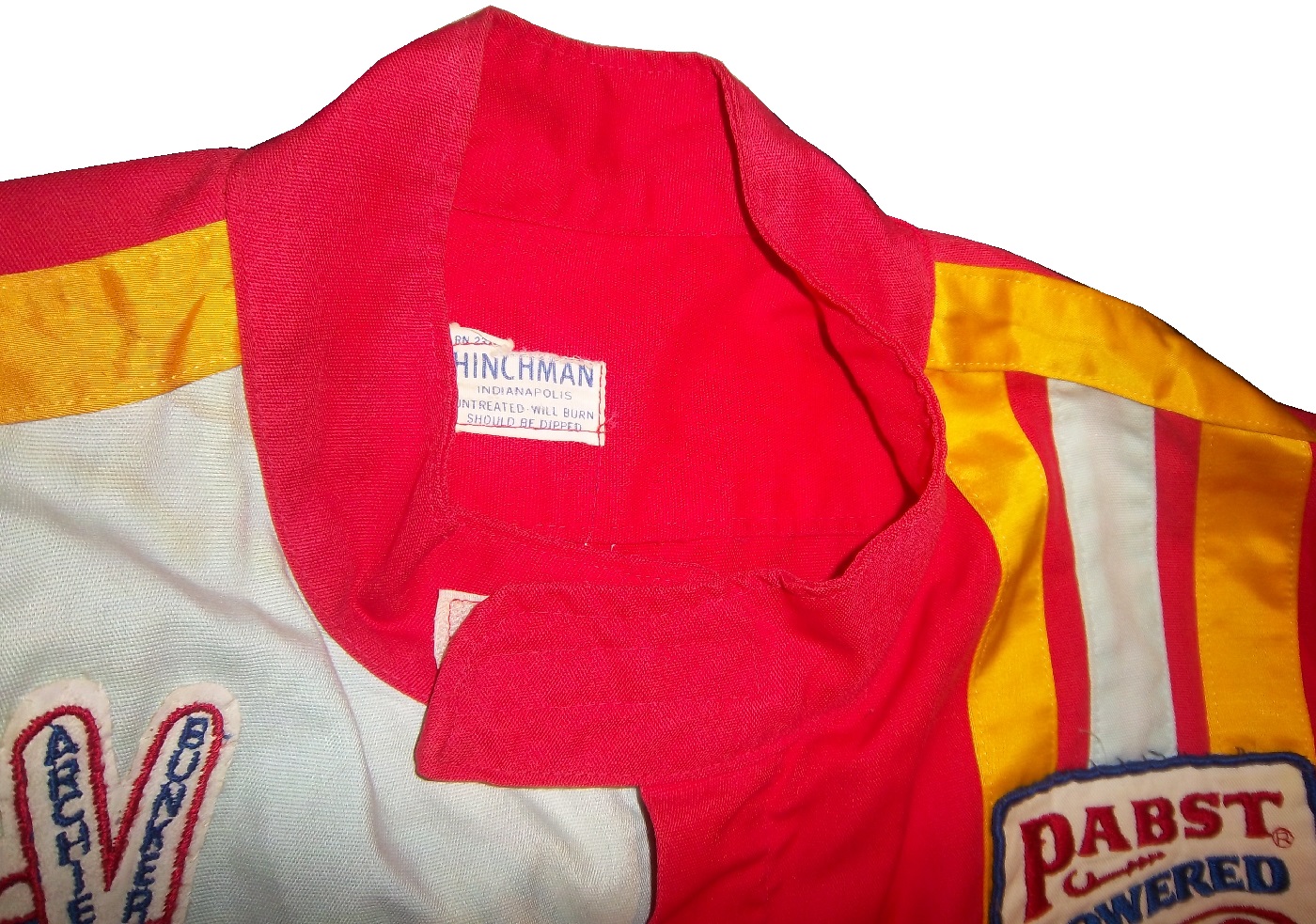
But what did these suits look like? Well this is an example of a polyester suit. It was worn by an Indianapolis based driver named Bill Brach. He was a member of the Murat Shrine in Indianapolis, and he raced in this suit.The suit itself dates to 1972 at least, because of an Archie Bunker For President patch.It has a tag that says “Untreated, will burn,should be dipped.”The polyester material is very flimsy, and is ripped in one part.It has a classic racing stripe up the side, similar to what Paul Newman wore in LeMans.The belt has a metal-clasp to close it, unlike most suits, which use VelcroThe sleeves can be unzipped for comfort, which compromises the fire protection.The back has MURAT 500 SHRINE CLUB in chain stitching on the back.
This is an example of a suit from yesteryear. One that has been made obsolete. It is delicate, thin, and in a fire was of limited value. Nomex has become the standard, and suits like this are now simply relics.
Brad Keselowski #2 Redd’s Apple Ale Ford FusionBlack and Red is always a good scheme, and the overall design is good. The sticking point for me with this scheme is that APPLE ALE is almost invisible on the quarter panel. So for a final grade, it gets a B-
Alex Kennedy #33 Dream Factory Chevy SS Yeah it is a tad overdesigned, but it is for a charity to help children with life-threatening illnesses. So I’ll give it a B
Kurt Busch #41 Haas Chevy SS If the black were blue, and the red and white stripes were kept, I would like it more, but this scheme earns a C.
Kyle Larson #42 Cottonelle Chevy SS The blue looks decent, but the target logos on blue look awkward. The 42 would look better in white than dark blue as well. C+
Aric Almirola #43 Nathans Hot Dogs Ford Fusion As much as I like Nathans Hot Dogs, this is awful! The clash between the green and blue is horrific, and I can’t give this a passing grade.
The 2014 Sprint All Star race is behind us, and as usual, there were a myriad of different paint schemes. Some were good, others not so much, but I have to say there were a lot of great schemes in this year’s race. Let’s start with the Sprint Showdown. Unlike in previous years, The Showdown took place on Friday, and the All-Star Race was on Saturday. The Showdown was a great event, which saw Clint Bowyer winning, AJ Allmendinger finishing second, and in the upset of the year, Josh Wise winning the Sprint Fan vote, and advancing to the All Star Race. Let’s get to the grades:
#10 Cole Whitt #26 Speed Stick Gear Toyota Camry This is one of the few schemes that has both a classic and modern look at the same time, and paired with a great color scheme, it earns an A
#13 Austin Dillon #3 Dow Chevy SS While I like the color scheme and number and logo designs, the white stripe up the side kills the look. It takes an A scheme to a B+ scheme.
#14 Kyle Larson #42 Target Chevy SS The scheme looks decent, I like the red on the back, though I do not like the Target logos at the bottom. That takes a scheme that was an A grade to a B-
#16 Michael Annett #7 Pilot/Flying J Chevy SS Good color scheme, but the awful template is back for Tommy Baldwin. It is really sad, because this could be a great scheme, but the template takes it from an A to a C-
#19 JJ Yeley #44 Phoenix Warehouse Chevy SS My first thought when I saw this scheme was it looked like the color scheme from the 1994-1995 NBA All-Star Game jerseys which is a decent color scheme. But to say the car is overdesigned is an understatement. This scheme is awful. Not even a great color scheme can help this car pass. F
Now we move on to the All-Star Race, which saw Jamie McMurray pull an upset and take the win, thus guaranteeing him entry into the event for the next 10 years. Overall there were a lot of great schemes, though I wish more teams would run special schemes.
#5 David Ragan #34 Taco Bell Ford Fusion Overall design and color schemes are good, and the only complaint is that the Taco Bell logo should be in color as opposed to black and white. A+
#11 Jeff Gordon #24 Drive to End Hunger Chevy SS Great overall design, great color scheme, though the D on the hood reversed to miror the curves of the hood looks odd. Still it’s a good scheme and Ill give it an A
#12 Dale Earnhardt Jr. #88 National Guard Chevy SS The new metallic numbers work, and the overall design is decent, since it incorporates the design used on the numbers. I’ll give it an B+
#13 Denny Hamlin #11 FedEx Express Toyota Camry The front nose design and stripes are awful. The color schemes are great, as are the logos and numbers, but the stripes kill it. The best grade I can give is a C+
#15 Kasey Kahne #5 Time Warner Cable Chevy SS It is a good color scheme, but the design on the side needs a little tweaking. Get rid of the needless zig-zag pattern and it works a whole lot better. It is still a decent scheme, so I will give it a C
#17 Matt Kenseth #20 Home Depot/Huskey Toyota Camry I would give this scheme an A grade, but the yellow back bumper ruins it. The clash between the two just works awkward, and it takes an A scheme down to a C
#19 Ryan Newman #31 Cat/Quicken Loans Chevy SS What in the blue hell is going on here? I’ve liked Ryan’s schemes this year but this is an F scheme, even though I like the color scheme.
#22 Greg Biffle#16 3M Ford Fusion-The sides and roof have gotten worse from last year. I have to give it an F in that respect.
Also, check this video out concerning how different pit stops in open wheel racing were between 1950 and today:
The video shows how far we have come in pit stops, but we also have come a long way in driver uniforms.
By David G. Firestone
50 years ago this week, events over the course of 6 days in May of 1964 changed the culture, cars, and uniforms of auto racing forever. Three deaths in two races over those six days demonstrated that current safety methods were ineffective at best, and 3 talented drivers lost their lives. The 1964 World 600 and the 1964 Indianapolis 500 helped introduce reenforced fuel tanks and Nomex driver suits, among other things. 50 years later, those events are still being felt
The World 600 began in the early afternoon on May 24, 1964. For the first six laps, it was business as usual, but on lap 7, on the backstretch, Junior Johnson and Ned Jarrett wrecked, and Glenn “Fireball” Roberts swerved to avoid them, and wrecked. He was trapped in the car by the pedals, and his car caught fire. Ned Jarrett ran and pulled Roberts from the car, and paramedics took him to the hospital. 39 days after the wreck, while still in the hospital from his injuries, he died from pneumonia.
NASCAR had rules concerning “fire retardant” uniforms but these were inadequate at best. These uniforms were cotton coveralls traditionally used by workmen that had been dipped in a number of fire retardant materials including Borax. These were not only ineffective, but were extremely uncomfortable to wear. They were known for inflaming the skin, and aggravating asthma. Fireball was not wearing these coveralls during that race, because he had a doctor’s note stating he should not wear them. There is some debate over what the doctor’s note was for, either for asthma or skin hives. It llustrates why these uniforms were not popular, they were so uncomfortable to wear that drivers did not want to wear them.
6 days later, on May 30, the 48th Indianapolis 500 was held. Dave MacDonald started 14th, and Eddie Sachs started 17th when the green flag dropped. MacDonald was racing a car built by racing innovator Mickey Thompson, which by all accounts was badly built and difficult to drive. The first lap led into the second, which saw Dave MacDonald lose control of his car and smash into the inside wall. The fuel tank instantly ignited and the car went across the track, and collected a number of other cars, including Eddie Sachs car, which also exploded on impact. Sachs was killed by the impact, but MacDonald was seriously burned, and his lungs were scorched, the lung damage proved to be fatal.
Inspired by these events, the Nomex firesuit was introduced in 1967 as a replacement for the cotton coveralls dipped in chemicals. It was a lot more comfortable and safer than chemical-dipped cotton, so drivers were more willing to wear them. Like most new safety equipment in sports, it took a while to catch on. Nomex was created in 1967, for NASA. Its main use at the time was for the Apollo Command Module parachutes. NASA needed a material that could stand up to the heat of reentering the earth’s atmosphere, and still remain fully functional.
Bill Simpson is credited with introducing Nomex to driver suits. The story goes that Simpson started making Nomex suits after learning about the material from astronaut Pete Conrad while Simpson was working as a consultant for NASA. One of the pivital moments in the history of the suit was when Simpson had heard that a competitor had been badmouthing his products, and so, in something he said later was “the dumbest thing I have ever done,” challenged the competitor to a “burn off.” Simpson put on his suit and lit himself on fire. He later recreated this for a Mazda commercial.
Why did it take so long to make critical changes to driver uniforms? The events that took place in 1964 were tragic, and it clearly illustrated why the old system didn’t work. The only change made immediately after the events was the rule that fire retardant suits were now mandatory, regardless of how it made the driver feel. In today’s sports safety culture, there would be focus groups, meetings within the sanctioning body, and changes within a few months after the event. But by 1964 standards, just rigidly enforcing the rule was the best course of action. Remember that in 1964 race car drivers were seen as somewhat expendable. Driver deaths in racing were stunningly common back then. As such, while there was a need for improvement, it was not a priority for sanctioning bodies. The sad fact is that back then, driver deaths were part of the allure of racing. People would go to these events and hope to see a fatal crash, as crass as that sounds. As for the suits themselves, the only other options besides chemical dipped cotton was aluminized cotton or aluminized kevlar, which was not more comfortable, as it was like wearing aluminum foil.
So what did these pre-Nomex driver suits look like? They looked like this. This is a driver suit made by Hinchman in Indianapolis. It is basically a polyester suit that is customizedto thedriver’spreference. It is not all that different than a jumpsuit that one would wear to work. It is a very flimsy material, has no cuffson the arms or legs, and, most amazingly, the tag states that the suit is “Untreated, will burn, must be dipped.” This suit was worn circa 1972, which is indicated by the “Archie Bunker for President” patch sewn into the chest. Like any new safety technology in sports, it takes time for it to become the standard, and for Nomex, this is no exception.
This race, along with the 1955 24 Hours of Le Mans and the 2001 Daytona 500 have their legacies written in death, but unlike other similar events, the lessons they had to teach were learned, and the racing world as a whole is better for them. The deaths in these events were not in vain, and others are alive because of them. 50 years later, those 6 days in May 1964 are still having an impact on racing.
I was ready to present a behind the scenes video this week, but I’m gonna put that on the back burner until next week. Last Saturday was the inaugural Grand Prix of Indianapolis, an IndyCar race on the road course at Indianapolis Motor Speedway. The race as a whole was fun, but it did have some issues. There was a huge wreck on the standing start, fortunately all were Ok. The same cannot be said for James Hinchcliffe.
The 2011 Rookie of The Year suffered a concussion when he was hit by a piece of flying debris. Watching it live, it looked like after he had gotten hit, he pulled off the track and he was stunned by what had happened. The report was, at the time, that he had hurt his hand. The race went on, no caution flag flew because the safety crew was able to get the car out of harms way quickly. It looked like everything was normal, then suddenly the camera shows Hinchcliffe on a stretcher being led away seemingly in distress. He was loaded onto an ambulance, and was taken to the hospital. He was diagnosed with a concussion and his future status for the season is yet to be determined.
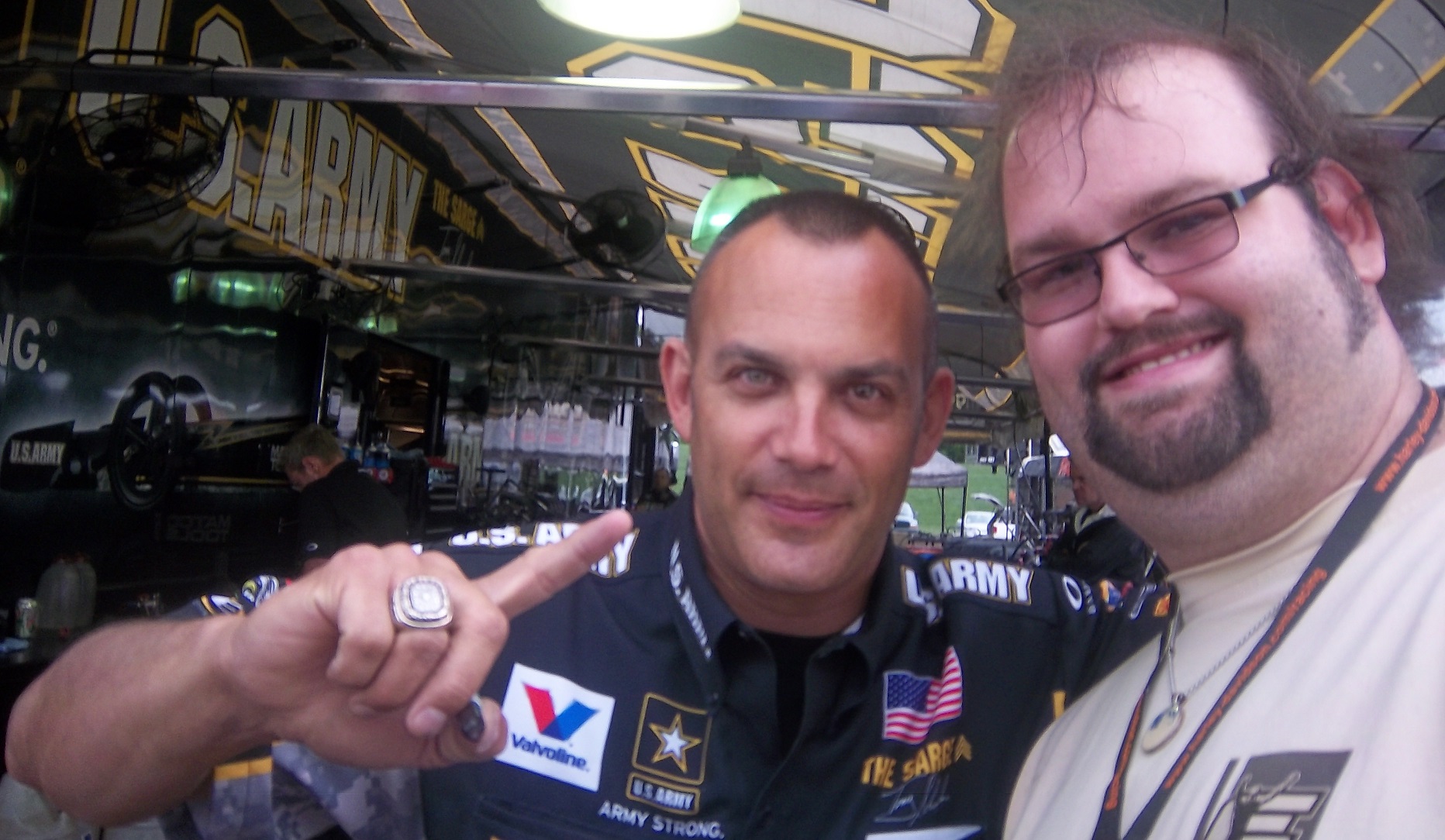
This incident reminded me of something Tony Schumacher said last year. I was in his hospitality tent listening to him make a speech, and he took a number of questions. One of them concerned the canopy he has over his cockpit. He stated that it took some time to convince the NHRA to allow a cockpit canopy. He stated that he is really scared of hitting a bird with his helmet, stating that “I’ve taken a few out with my tail, and if you catch one of those with your helmet, you’re getting coloring books for Christmas for the rest of your life.”
I’m wondering if in the near future canopies will come to IndyCar. With the current safety culture in racing, I’m kind of shocked it hasn’t yet. Racing fans will complain that it breaks tradition, but at the same time, nobody wants another Dan Wheldon. Fans do not want to watch a driver to die. I think that canopies will come to IndyCar, I want them to come to IndyCar, and I think that safety should take precedence over tradition.
The other factor that needs to be discussed is that there is a parallel to the recent concussion lawsuit filed with the NFL. The information that was gained from that suit was that no helmet can definitely prevent all head injuries. As such, a canopy could very well prevent a fatality in that respect. Give the driver an extra layer of protection so that he could walk away. These canopies are not plexiglass, they are the same exact material used to make F-16 bulletproof canopies. It is a very durable material that could have prevented what happened to Hinchcliffe.
Shifting gears now, I want to discuss something else. Starting in a couple of weeks, I will be restarting Wheel Reviews. I started with Rush, an amazing F1 movie by Ron Howard about James Hunt and Niki Lauda in the 1976 F1 season. So what I am going to do is to alternate the paint scheme reviews and Wheel Reviews. I’ve got 13 movies in total to review so far, and I hope to find some more. With that, we move on to…
Ryan Newman #31 Cat/Quicken Loans Chevy SS What in the blue hell is going on here? I’ve liked Ryan’s schemes this year but this is an F scheme, even though I like the color scheme.
Landon Cassill #40 Cars For Sale Chevy SS I like the design, but to be honest, I don’t know where I stand on the color scheme. The red is good, but the when it comes to yellow/green I’m not sure if I like it or hate it. I’ll give it a C
Aric Almirola #43 US Air Force Ford Fusion I’ve been tough on military schemes this year, but this is the best one! The dark blue sky theme, with two small fighters with light clouds works perfectly, and earns an A+. See, military schemes CAN be done well without camo.
The Driver Suit Blog is my favorite project I have ever undertaken. I’ve gotten a few people who ask about the origins of The Driver Suit Blog, and so this week, we will start with how it came to be. The origins are rooted in my game-used memorabilia collection. I started in hockey, and looked at the various game wear patterns on jerseys. I then would get into other forms of memorabilia, and would analyze them for an old website. In 2008, I went to the National Sports Collector’s Convention in Rosemont, and came away with a late 1960’s Oakland A’s jersey. As fate would have it, when I got home, I was looking for something on my computer and found Windows Movie Maker on my XP based hard drive. I decided on a whim to make a video about it, and with that Introduction to Sports Memorabilia was born.
I started into driver suits in 2010, and researched the suits the same way I research every other game-used item. I had a lot of trouble finding information for a collector about the various aspects of driver suits and race-worn memorabilia. So I just did what I could, research wise. In 2012, I asked Paul Lukas if I could guest write a column for Uni-Watch. Now the blog was never a thought prior to this article, but as work progressed, it dawned on me that I could start a blog for driver suit and racing memorabilia collectors. So in January 2013, The Driver Suit Blog was born.
The paint scheme grading was born out of frustration. I had been working on a Christian Fittipaldi article, and it wasn’t long enough, so I started grading paint schemes to fill some extra space. I kept doing it, and it has become a part of the blog. The same can be said for Tailgating Time, which was also based on a Uni-Watch feature known as Cuilinary Corner. Tailgating Time was designed for tailgaters, to give them recipies that can be cooked on a grill or hot plate at a track, but are something more than just burgers and hot dogs.
Where will the blog go from here? I will continue my work for driver suit collectors, giving them tips on how to analyze driver suits. Tailgating Time will return, but I can’t say for sure when this will happen. I have a lot of stuff planned so stay tuned.
I also want to take a moment to thank my readers. Without you guys, this would have never taken off, and I just want to say thanks. I also owe a huge debt to Paul Lukas. Without him, the Driver Suit Blog would have never been created. Paul, next time you are in Evanston, hit me up, we’ll go out for a beer!
Next week, we will go behind the scenes and examine how a Driver Suit Blog article comes to be. One other thing that I will start in a couple of weeks is I will do more Wheel Reviews for The Driver Suit Blog, but for now, we conclude with
PAINT SCHEME REVIEWS!
Ryan Blaney #12 SKF Ford Fusion I gave this exact same scheme an A last year, and it earned 9th place on the Paint Scheme Leaderboard as well. This scheme still earns an A+
Cole Whitt #26 Iowa Chop House Toyota Camry When it comes to great paint schemes for the #26, BK Racing picked up where Swan Racing left off. Great color and design schemes, A+
AJ Allmedinger #47 Hungry Jack Toyota Camry What is this new deal with diagonal curved stripes across the side? It just looks awkward. It has a great color scheme, but the design just looks bad. C-
Jimmie Johnson #48 Lowes/Valspar Chevy SS Jimmy’s same great classic design with a very nice red rear end. I love a great shade of red on a race car, and this is a great shade of red. A+
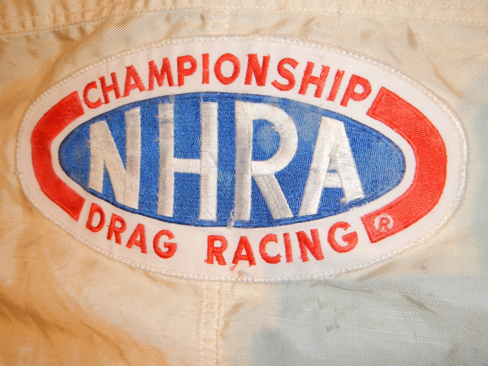
While the bulk of The Driver Suit Blog is devoted to NASCAR, which, admittedly is my favorite form of auto racing, I do follow other forms of racing, and collect items from many different forms of racing. I am a fan of NHRA drag racing, and I attend races when I can. I have a decent collection of NHRA memorabilia, so this week, I’m gonna show some love for drag racing.
First, let’s get some factual history out of the way. Founded in 1951 by Wally Parks, the National Hot Rod Association or NHRA was created to act as a governing body for the sport of drag racing. Parks had previously founded Motor Trend and Hot Rod magazines, and was a racing enthusiast . The NHRA has 80,000 members, 95% of which are non-professional drivers. While there are hundreds of drag racing classes, The three most popular and well-known are top fuel, funny cars and pro stocks.
Top fuel dragsters are 25 feet long, have the engine mounted behind the driver to provide weight to the rear tires, which are 36 inches high by 17 inches wide. They run on a 90/10 fuel mix, 90% nitromethane and 10% methanol.Funny cars are designed with a frame, engine, suspension and cockpit with a fiberglass body that raises up to allow access to the car. The name “funny car” came to be because the early models in the 1960’s had the rear wheel base moved forward, and huge rear tires. They didn’t look “stock” so they were called “funny.”Pro stocks are an interesting design. Whereas top fuel and funny cars use nitro burning supercharged V8’s, by rule, pro stocks can’t use superchargers, turbochargers, or nitrous oxide. They also run on 118 octane racing fuel. Little consideration is given aerodynamically, and the cars can be hard to handle.
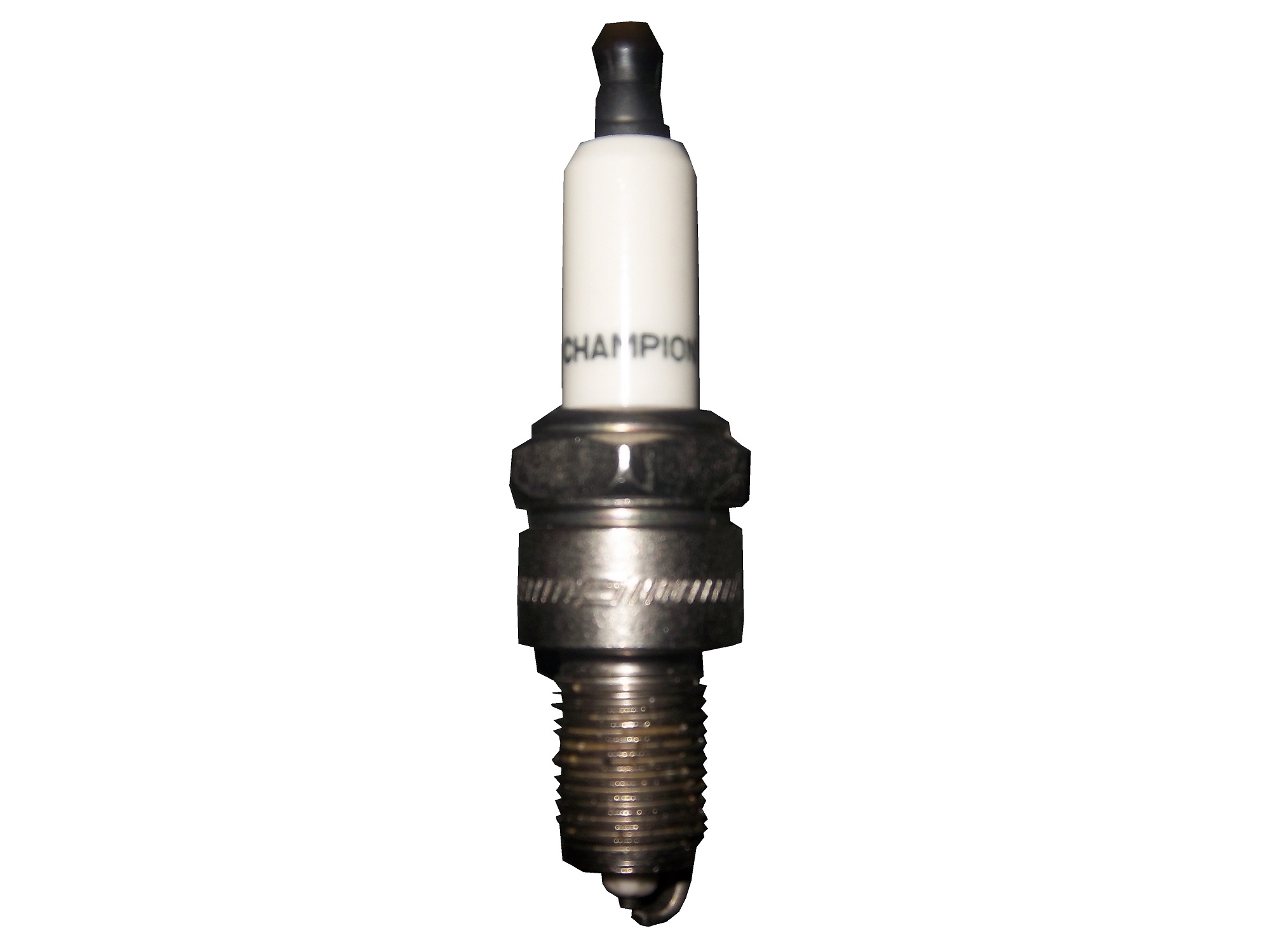
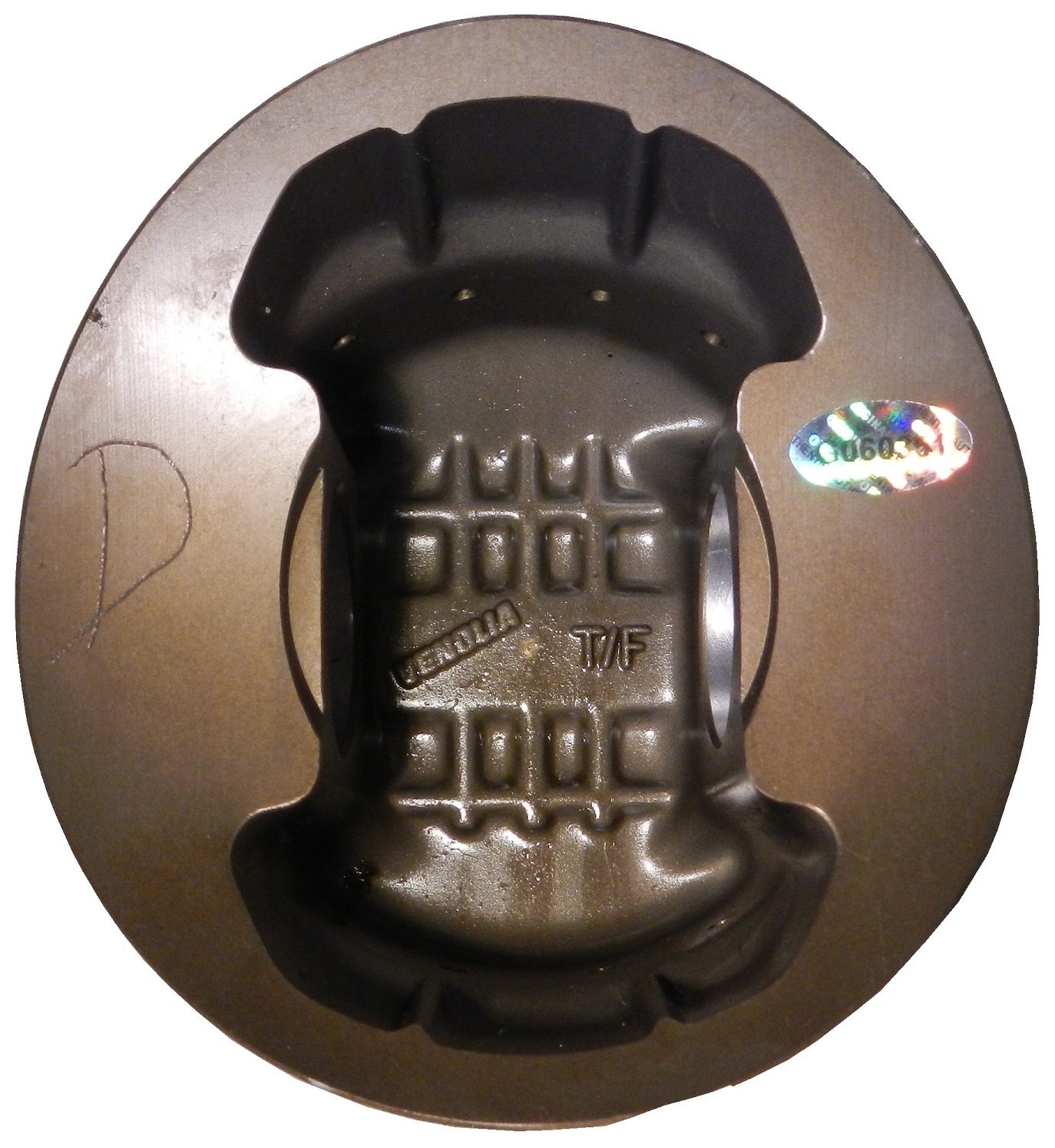
In regards to race-used equipment, I have this timing belt from Bob Tasca’s Motorcraft Funny car, this one used in his first qualifying session at the Ford Thunder Valley Nationals in Bristol Tennessee. This run he had a 4.15 second, 306 MPH run. This thing is HUGE, measuring over 64 inches in circumference and 3 inches across.As well as an ignition coil and a spark plug from Morgan Lucas Racing. Ignition coils are used to turn on cars in general, but this MSD 8142 is designed to fire up these 8000 horsepower engines, which need a lot of electricity to start and operate. I was fortunate enough to have Tony Schumacher and Ron Capps autograph it in person.
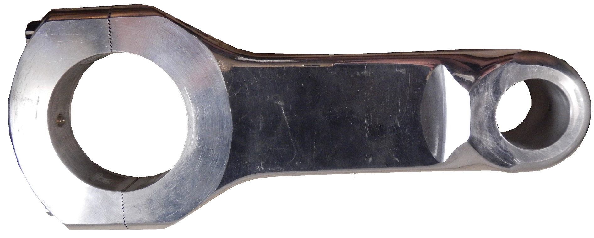
One thing I wanted was a race-used piston. I recently got one, but it is in two different pieces. The piston rod itself was used and autographed by top fuel driver Bob Vandergriff, and the piston head was used and autographed by Brandon Bernstein, son of drag racing legend Kenny Bernstein. The piston head is 3 inches in diameter, and the piston rod is almost a foot long!
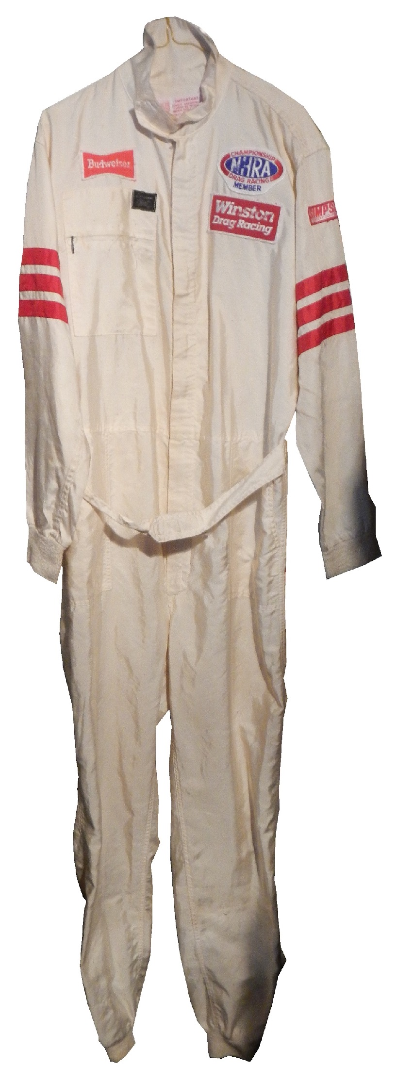
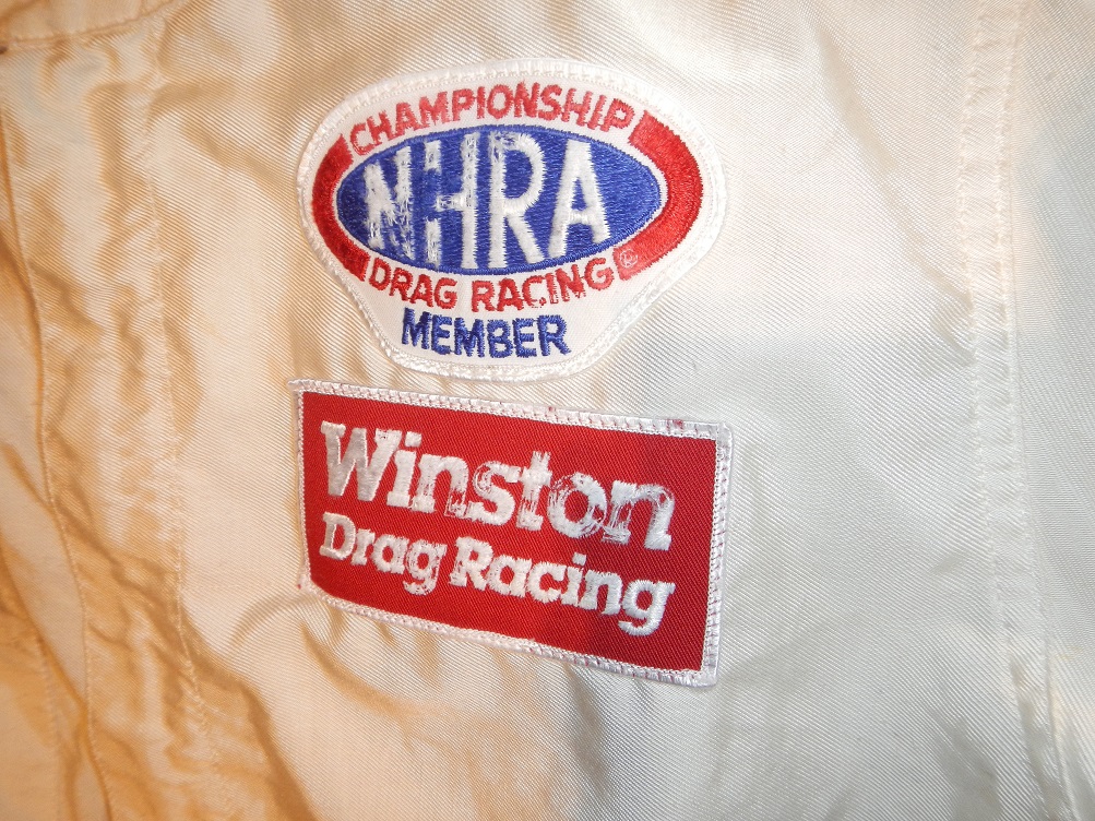
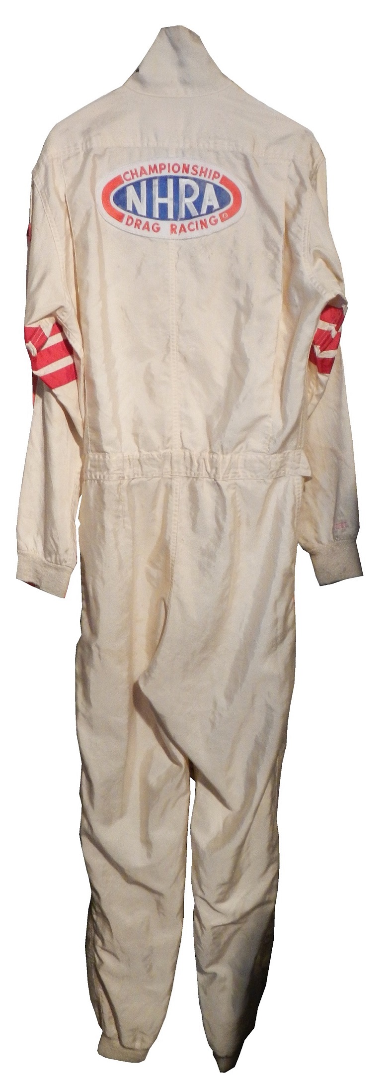
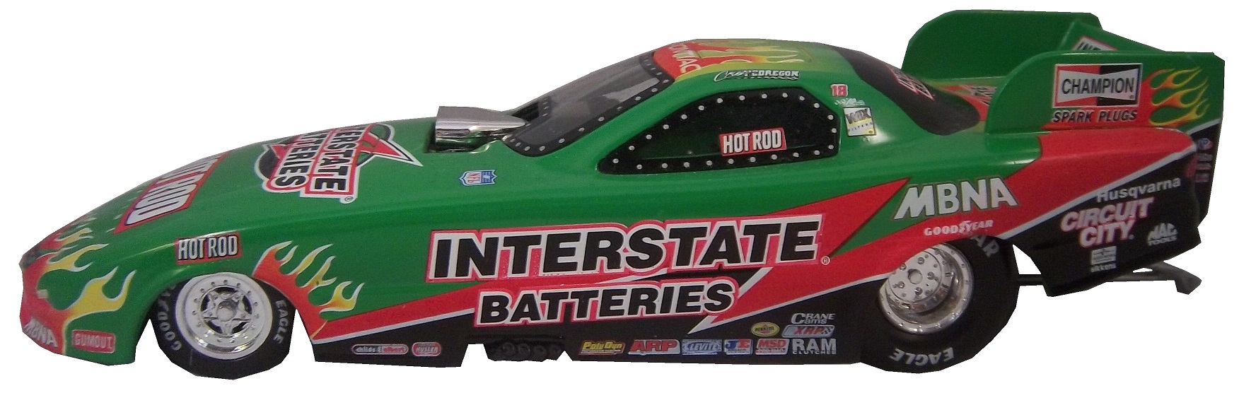
One of the more oddball items I have is this 1987 Budweiser/NHRA driver suit. Here is what I can say definitively about this suit: It was made in 1987, shows a lot of use, is not safety certified, and shows the Simpson open-wheel tag. Other than that, I don’t know much about this suit and I’m still working on it.Now we move on to die-casts. In my die cast article, I mentioned that I have a 1:32 Cruz Pedregon 1998 die cast from his days with Joe Gibbs Racing.
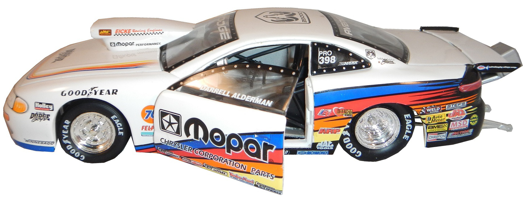
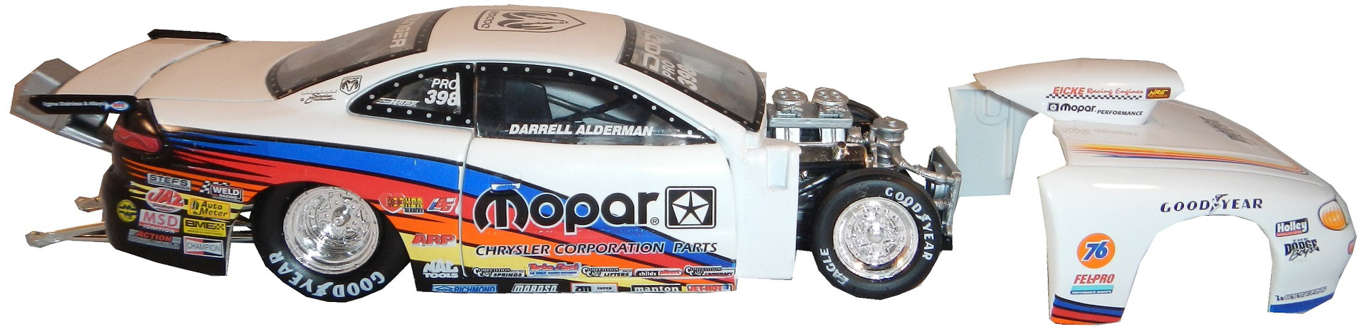
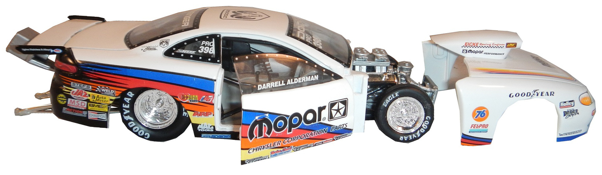
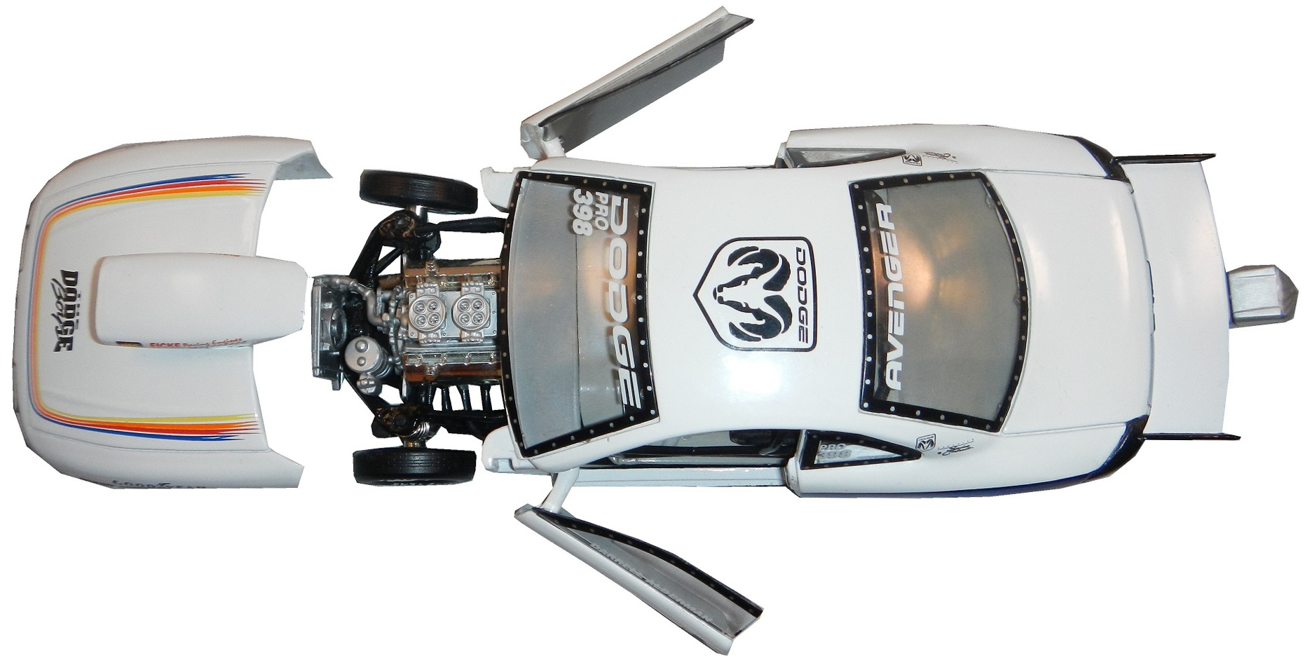
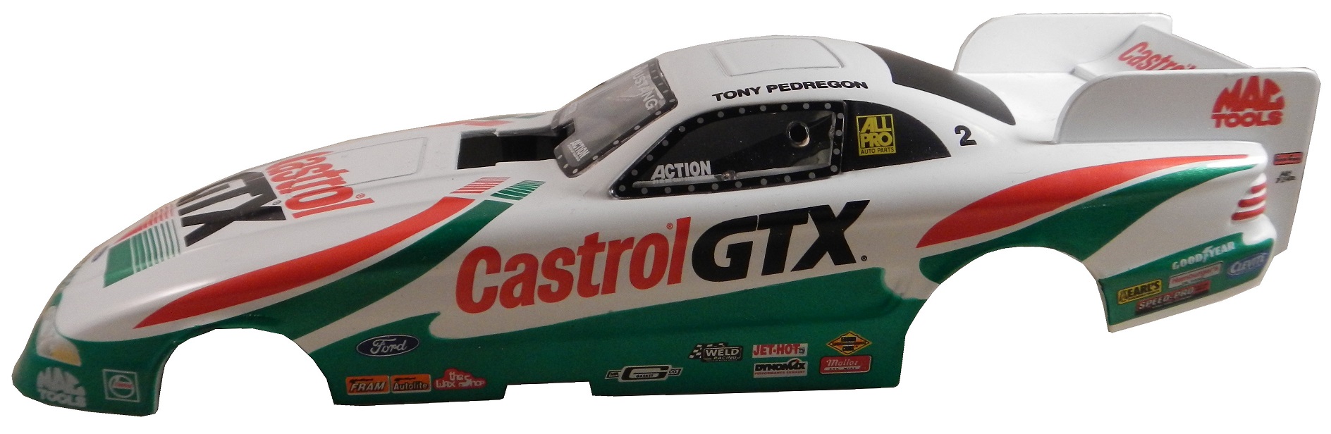
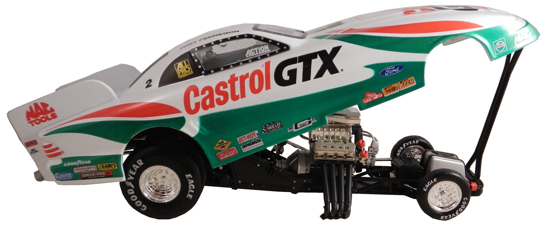
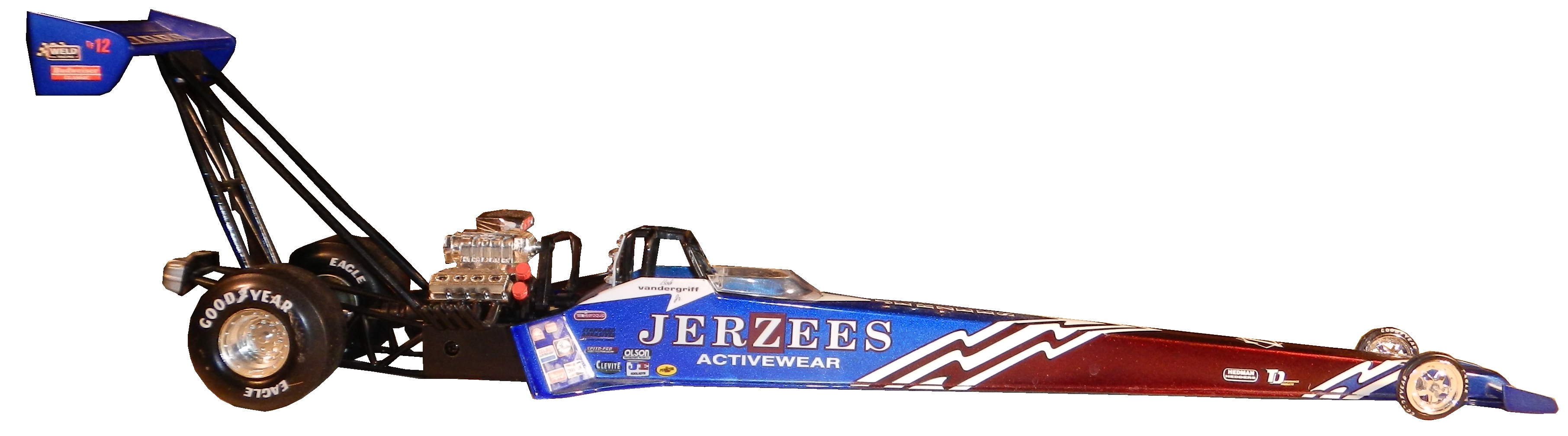
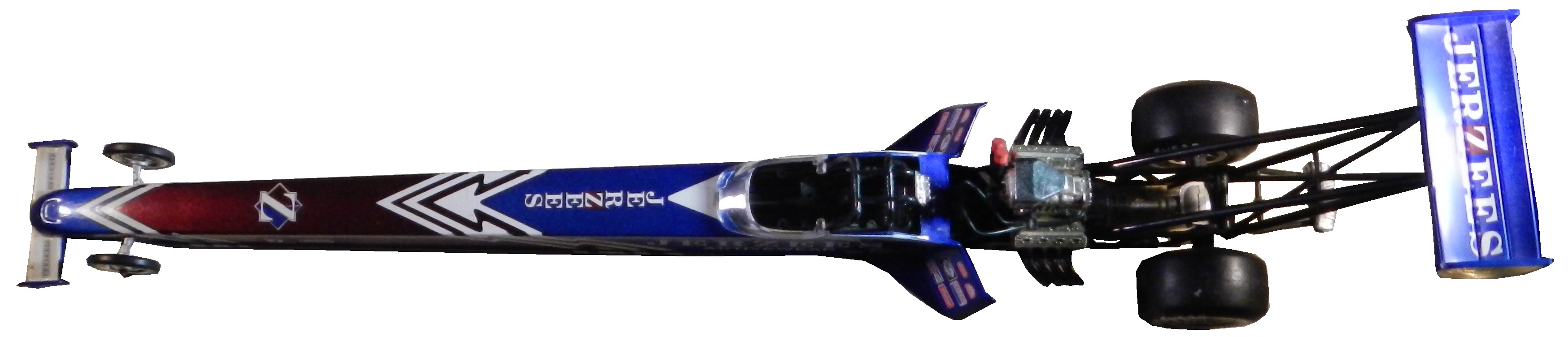
During my recent vacation, I found myself at a baseball card store. I bought a bunch of NASCAR die casts, as well as a Darrell Alderman 1:24 pro stock from 1997, where the doors open, and the hood comes off.Also from 1997, this Tony Pedregon 1:24 funny car die cast, with a body that is removableMy personal favorite die cast is this Bob Vandergriff 1:24 top fuel die cast.
Danica Patrick # 10 GoDaddy Chevy SS I didn’t think this was possible, but they took one of the ugliest schemes in racing and found a way to make it worse…the hood speaks for itself, and it says “I’m getting an F-!”
Greg Biffle 3M Window Film Ford Fusion What in the blue Hell is going on here? This is the worst Greg Biffle scheme I have seen this year and considering how bad his schemes have been that is saying a lot. F-
Travis Kvapil #32 Keen Parts Ford Fusion Awful color scheme, and the goofy pyscadelic side design just looks awful. I’m also laughing at corvetteparts.net painted on the side of a FORD! F-
Kurt Busch #41 Haas Made in America Chevy SS When it comes to patriotic schemes, it is hit or miss, and this is a hit. The stars and stripes look good, and the overall design is solid enough to earn an A.
Before I go I need to cover an update to a story I discussed last week. I had discussed Swan Racing going under due to lack of sponsorship. I did not get a chance to discuss that Swan Racing has gone under, but the two cars, #26 and #30 have found new homes. BK Racing is now the new home for the #26, and XXXtreme Motorsports is home for the #30, though it will change to #44, and keep the current owner points. It is always sad when a team has to close, but at least the equipment did not go to waste. Sadly, Parker Kligerman is now out of a ride for the foreseeable future.
If I could give a new collector two pieces of advice, they would be 1: In this hobby, when you stop learning, it stops being fun and 2: Research, research, research. Research is critical in any hobby, and that is, for the most part, why The Driver Suit Blog exists. I put a lot of research into this hobby, and I will give some pointers to help my fellow collectors.
First, always get a picture of the item you are going to buy beforehand. This is useful for a number of reasons. First, you can photo match the item. If you are not able to find an exact photo of the suit, helmet or accessory, you can “style match” the item. Style matching is finding evidence that the driver or crew member wore a design similar to the item in question. Drivers wear multiple versions of the same suit for a number of reasons. Nomex is a great material, however, if the suit catches fire, the Nomex will change color, and will not protect the area of the burn after the fire. So if a driver gets into a fiery crash in practice, and the suit gets damaged on the arm. The suit will have to be replaced for the race, because it is very possible that a similar crash could occur during the race, and wearing the damaged suit would wind up burning the driver.
Figuring out WHEN the suit was worn can be tricky, but in addition to photo matching, you can do a driver search on Racing Reference. Racing Reference is a site devoted entirely to racing stats, and for every race they list, they have driver, owner and sponsor information. So for example, let’s take this Stevie Reeves suit:
The primary sponsor is Big A Auto Parts, and is a Busch Series suit. So you go to his driver page:
and clicking the races in his Nationwide Series Statistics section, you can look at each of his sponsors. In this case, he was only sponsored by Big A Auto Parts in 1997. So it can be concluded that the suit was worn in 1997.
In some cases, you will not be able to find a photo of the driver wearing the suit, that is just the law of the land. When searching for a photo, I use Getty Images, Google, YouTube, and eBay. It might seem strange that I use eBay but it works quite well and I have had a lot of success. People sell photos, press kits, hero cards and other such things on eBay, and this is a gold mine. In some cases, I have no luck in searching for photos, and I will take a break, get something to eat, play with the cat, take the dog for a walk, and I will have a moment when I realize I should change a parameter of the search. Sometimes it works, other times it does not.
When it comes to learning, when you stop, the hobby stops being fun. I’ve been collecting sports memorabilia since I was 5, and I’m constantly learning new things about it all the time. Never stop learning, because every hobby is constantly changing, and new information can be very useful.
I also have to cover this story. I gave Swan Racing a lot of bad reviews for paint schemes last year, and I said this year, they stand a good chance of winning the Schemie for most improved paint scheme set. Well, it looks as though they will have to shut down due to a lack of sponsorship. As it stands right now, the team is shutting down and Cole Whitt does not have a ride for Richmond. I will update the story as I learn more information.
Kevin Harvick #4 Budweiser Chevy SS The Coca Cola 600 is held as the July 4th race, and as such, NASCAR teams like to run patriotic schemes. The scheme as a whole is good, and red, white and blue is a great color scheme. I give it an A. Something else to note: Notice that the name on the windshield is in a patriotic design, as opposed to white lettering on a black background. Is this going to be run by all teams? Stay Tuned!
Kasey Kahne #5 Farmers/Thank A Million Teachers Chevy SS I really hate the huge FARMERS lettering on the side of the car, and I’m guessing that the design on the lettering is a photo mosiac. The color scheme is not good, and there are a number of dark designs on the black background which are almost impossible to see. I support the idea of Thank a Million Teachers, but this scheme looks awful, and earns an F
Greg Biffle #16 Scotch Ford Fusion Greg’s paint scheme downward spiral continues, with this horrid scheme! The green and plaid doesn’t work with the Biffle template, and it just looks like a mangled mess that earns an F grade!
David Stremme #33 Newton Building Supplies Chevy SS Red and white is a good color combination, and if the side did not have the small rectangle just behind the front wheel, I would give it an A, but it takes it down to a B+
Kyle Larson #42 Axe Peace Chevy SS Decent color scheme, but much too overdesigned. Too much visual noise, and i just don’t like it. The green number look awful as well. D-
Ryan Truex #83 VooDoo BBQ Toyota Camry color scheme is not great, and the car in general is way too overdesigned. I can’t give this scheme anything less than a D-
Gonna be a bit of a long entry today, but I have a few things that I really need to discuss, that I haven’t been able to get to until today. I typically write a DSB article a few weeks in advance, and work on it over the weeks before it runs, but given the circumstances, I needed to write a fresh article for this week. Now while the site focuses mainly on NASCAR, I watch other forms of racing, including F1. The F1 race at Bahrain on Sunday was one of the best F1 races I have ever seen. That said, F1 is dealing with a controversy this season, that I need to address
F1 implemented in 2014, a series of regulations designed at making the sport more eco-friendly, or so they say. Engines are also now supercharged, and a redesign of the bodywork has that regulates that the nose of the car is much lower. Since during the off season teams were not able to observe each other, each team showed up to the Australian Grand Prix with a different nose design. These new regulations also had the effect of making the engine sound somewhat quieter. This change in engine noise did not go unnoticed, and many fans complained. There was even discussion of a lawsuit for failing to deliver what was promised by the promoters.
I’m a racing fan, and I understand that the sound of the engines is a huge part of the ambiance of the event. I get it. But at the same time, engine changes are going to happen. Engines will evolve. In fact, if you were to take an F1 engine from 2004, and put it in a current chassis, the car would not be competitive. I get what engine noise means, but sometimes you have to take the bad with the good. The racing has been better this season, and I personally will take the lower engine volume for the better racing.
One other rule new to the 2014 F1 season is a new mandate that the last race of the F1 season, the Abu Dhabi Grand Prix will have double points, to keep the championship points battle alive. What I’d like to see, is for the last TWO races, The Brazillian Grand Prix and the Abu Dhabi Grand Prix to have double points. I think that the last two races having double points would have a major impact on the championship, and would bring more spectators, both live and on television to the event.
A few more things from F1, first the United States Grand Prix in Austin Texas has been moved from November 9 to November 2 to accommodate a Texas A&M football game. What this does also is to move the race away from the season finale of the Sprint Cup Series season. This will give it more visibility in the United States, since it does not have to compete as much with NASCAR for attention. My favorite change in 2014 is that Williams F1 switched to Mercedes engines, and got Martini as a sponsor. They have utilized a very attractive vintage scheme. God that is a beautiful scheme!
The next topic here is something that has been bugging me for a while this year. I watch NASCAR at every given opportunity, I love the broadcast team on Fox, I love Darrell and Michael Waltrip, but I really, REALLY wish they would just shut up about this rookie class. I really do. I get rookies, I get rookie phenoms, but I do not want to hear anymore about this “amazing rookie class.”
I get that in recent years that rookie classes have been lackluster. I get that. Rookie classes can be legendary, like 1979 with Dale Earnhardt Sr., Terry Labonte and Harry Gant, or embarrassing, like 1990, with, Rob Moroso, Jack Pennington, Jerry O’Neil, and Jeff Purvis. I also get that there hasn’t been a decent rookie class since 2006. That said, this rookie class, is not as good as the broadcasters like to talk about.
Darrel said on numerous occasions that this is the largest rookie class since 1994. Ok, I get that, but let’s look at who was in that class, Steve Grissom, Joe Nemechek, Loy Allen, Jr., John Andretti, Jeremy Mayfield, Mike Wallace, Ward Burton, Rich Bickle, Billy Standridge, Rodney Orr, and Jeff Burton who won the Rookie of the Year. Loy Allen Jr. Mike Wallace, Steve Grissom, Rich and Billy Standridge were all busts. Orr was tragically killed before the Daytona 500. Andretti has two wins, Ward Burton has 5 wins, including the 2002 Daytona 500, ONLY BECAUSE STERLING MARLIN ILLEGALLY REPAIRED HIS CAR UNDER A RED FLAG, Joe Nemechek has 4 wins. Jeff Burton was the best of the lot with 21 wins. But the fact is that what it had in driver numbers, it lacked in talent. I’m seeing this same thing with this rookie class
Let’s look at each driver individually, and try to understand why they are in the Sprint Cup Series. Gonna do this in no particualr order, and we will start with Parker Kligerman. He was decent in the Truck Series, with 25 top 10’s in 50 races, with 1 win. He finished in the top 10 in HALF of the races he started in! Ok, so he moves to the Nationwide Series, and falls to 18 top 10’s in 51 races. Ok, still not bad, but he does not have a win. He has raced since 2009, so he raced in 51 races in 4 years. Um…you think he needs some more padding? He has some talent, but it needs to be developed. Unlike some of the other drivers he has some potential.
Cole Whitt is next. Not one win in any of the Big 3 Series. Like Kligerman, he has 18 top 10’s in 51 races. Unlike Kligerman, he was bland in the Truck Series. He’s an underwhelming driver in an overwhelming series. To top that off, he signs with Swan Racing! Swan Racing is to NASCAR as the New York Mets are to baseball…a total embarrassment. No top 10’s, and they have led 5 LAPS IN 3 YEARS! 5 LAPS IN 56 RACES! THEY AVERAGE A LEAD LAP EVERY 11 RACES! They are a total embarrassment to auto racing!
Michael Annett is one of the more underrated drivers, in my mind, in this rookie class. He has a lot of potential, and I think that with the right team, he might win a few races, but I don’t think he will do much more than that. Again, no races won in any of the big series.
BK Racing made the perplexing decision to fire two veteran drivers and replace them with rookies. I don’t disagree with hiring rookies, but Alex Bowman, and Ryan Truex don’t have the results to warrant the move. Again, why do teams insist on moving inexperienced rookies with minimal exposure to the schedule to the Sprint Cup?
Now Kyle Larson on the other hand, is a contender. He has a Truck Series win, and a Nationwide Series win, and in 10 Sprint Cup starts, he has two top 10’s, including a 2nd place finish. He was one bad restart away from winning the race. I think this kid is a contender for the championship. Even when he doesn’t win, he is strong behind the wheel, and I think he is one of two contenders for the Rookie of the Year.
The other contender is Austin Dillon. In 55 races, he has 5 wins, 34 top 10’s and won the Truck Series Championship in 2011. When he moved to the Nationwide Series, he had, in 77 races he has two wins, 53 top 10’s, and won the championship in 2013, without winning a race. In 19 Sprint Cup races, he has a top 10, and I think he is the front runner for the Sprint Cup Rookie of the Year.
So of the 7 contenders for Rookie of the Year, we really only have two contenders. I get it. I really do not want to hear any more about the rookies, so guys, please, stop talking about them!
Austin Dillon #3 Bass Pro Shop Chevy SS Camo and orange never work, and this is the worst example I have seen yet. Why can’t the #3 Bass Pro Shop car look like this? This is an F scheme, and I’m being polite!
Aric Almirola #43 Fresh From Florida Ford Fusion(try saying that 3 times fast!) Aric has had some great schemes this year, but this is awful. Bad color scheme, much too overdesigned, and it just looks awful. F
Carl Edwards #99 Ford EcoBoost Ford Fusion It looks like the designer had a stroke while designing the car. The color scheme is good, and that is the only good thing I can say about this scheme. It has earned an F
By David G. Firestone
While I typically watched NASCAR growing up, I did also watch IndyCar. That was before “the split” which diluted the value the sport so much that to this day it is still suffering, 6 years after the unification of Champ Car and the Indy Racing League. I got tired of politics and wanted to watch racing, I didn’t care who was sanctioning it. I still watch IndyCar racing and I collect race-used stuff.
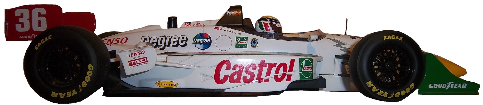
I mentioned this a few months ago, when I discussed video matching. My first open wheel driver suit is this Alex Barron suit from 1998.
Not only is this my first open wheel suit, it was also my first suit that featured an FIA safety certification on the back of the neck. Having dealt in NASCAR suits, I didn’t know what to make of it, and through some research, I eventually learned what it was and what it meant.The chest features a FedEx Championship Series patch, probably my favorite sanctioning body patch ever,
and logos for Toyota and Denso.This being my first Sparco driver suit, The cowl tags, and location of the warranty tags were out of place, as compared to a NASCAR driver suit.One thing I do find interesting is that there are no television logos on the sleeves and legs, but as the video at the end shows, that was not uncommon, but more on that later.
The collar has an unusual design. Most collar designs feature either logos on the side, or logos across the front, or sometimes both. This one is unique in that it features a DEGREE logo on the front, as well as a CASTROL logo on the right side, but nothing on the left side…I’ve never seen that before or since, and I can’t understand the need for that particular design…it just looks odd.Alex’s name is embroidered into the belt, and something I love about open wheel suits is that because it is an international sport, much more so than NASCAR, the driver usually has their home country flag embroidered next to their name on their suit, as this suit shows.I also have a 1/18 die cast of Barron’s very sharp looking car from 1998. It is the only die cast I have that has a driver in it. I love the fact that he is wearing a very accurate version of his driver suit.Now as I mentioned, this was the suit Barron wore during his most infamous moment, his crash at Road America, where he wound up on top of Bryan Herta. Someone recently uploaded the whole race to YouTube, and when watching it, notice that nobody has logos for the in-car camera. I find that rather interesting, since it would be very easy to place logos on the sleeves, and it was commonplace in other forms of racing. But it is an interesting race.
Now we have another piece of news to discuss. In the realm of NCAA sports, the two major factions in uniforms are Nike and Under Armour. Nike has a deal with Denny Hamlin for driver suits, and I was wondering when Under Armour would jump on the band wagon, and this week, we got our answer. Under Armour, who has signed deals with Michael Waltrip Racing and Henrdick Motorsports to outfit teams with apparel. This deal does not include the drivers themselves but the car numbers are fair play. I find it a bit unusual that the deal provides apparel for all members of the team, pit crew members, front office personel, and everyone EXCEPT the faces of the franchises. Now that might change in the near future, but for now that is how the deal works. You can read more about the deal here.
Greg Biffle #16 Give Kids A Smile Ford Fusion Man! Greg Biffle really wants the Paint Schemie Awards for Most Degraded Paint Schemes, and Worst Paint Scheme Set with another F scheme. Horrible design, and an ugly paint scheme.
Ricky Stenhouse Jr. #17 Ford EcoBoot Ford Fusion I like the color scheme, I like the overall scheme, and my only complaint is that the orange numbers on the roof should be on the door. Still it is an A scheme
Parker Kligerman #30 Swan Energy Toyota Camry Just when I thought Swan had learned the error of their ways, and were improving their paint schemes, along comes this one. Now we are back to square one, and this scheme earns a D+
Travis Kvapil #32 Keen Parts Ford Fusion Decent design, good color scheme, but the logo on the hood is very difficult to see. That is a major issue. When a sponsor pays for a car, the hood design should be easy to see, but this isn’t easy, and I give it a C-
Aric Almirola #43 Ekrich Ford Fusion The red on the roof is pointless, and it takes away from a great scheme. If the roof were Petty Blue, and the red was just a stripe on the bottom, I would give this scheme an A+ but with the red roof, it goes down to a B-
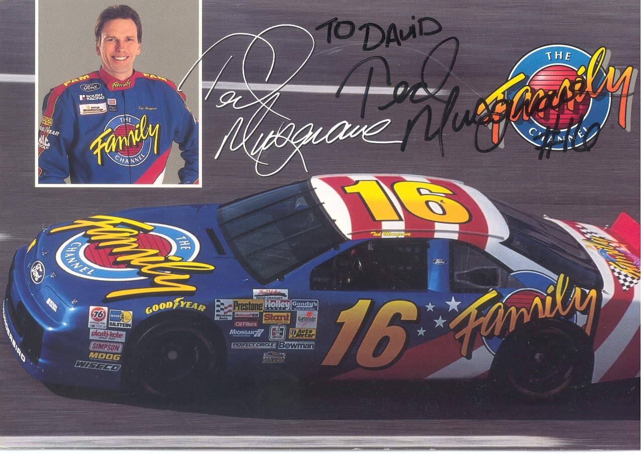
Last week, I discussed my favorite driver to collect, and this week I will examine his most well-known sponsor. From 1994-1997 Musgrave was sponsored by the Family Channel. The distinctive patriotic red white and blue design with that Family Channel logo was eye catching. The Family Channel logo was classic 1990’s design. It was also an idea whose time had come, and is still a great idea.
It was founded by Pat Robertson in 1977 as the CBN Satellite Service, which focused on Christian Broadcast Network programing. By 1981, it had re-branded as the CBN Cable Network, which began to focus more on family-friendly programing. It was a channel where families could watch together without needless violence, and gratuitous sex, something that should be redone today. The major moment was in 1990 when the channel became too profitable for the non-profit Christian Broadcast Network, and was transferred to International Family Entertainment, Inc. The CBN Cable Network became The Family Channel, and began to air recent dramas and sitcoms, as well as cartoons. In 1994, to gain visibility, The Family Channel joined forces with Roush Racing to create the #16 Family Channel Ford Thunderbird. This partnership lasted for 3 years, and Ted raced in 124 races, with 15 top 5’s and 36 top 10’s.
During the 1997 season, The Family Channel was purchased by Fox Kids Worldwide Inc. which was a joint venture between News Corporation, and Saban which re-branded the channel as Fox Family channel. This was out of necessity, as the average age of the viewer under the Family Channel banner was much older, and Fox Family set about trying to win back the younger viewers. The channel was used for everything from movies to cartoons, to Fox programing to Major League baseball. It became clear when the channel went from 10th in ratings to 17th in Nielsen ratings, that something was not working. Many outside observers felt that the push for younger viewers alienated the previous viewers.
In July 2001, almost 4 years to the date, the channel was sold to ABC and re-branded it ABC Family, which still operates to this day. It has come up with a format that amalgamates the two different styles of network. Though it hasn’t regained its previous glory, it has created a network that is family-friendly and appeals to families, not just young kids.
The #16 race team it spawned has had just as interesting a history. Roush had started in NASCAR in 1988, with Mark Martin as a driver and Stroh’s Light as the sponsor. They had a lot of success as a combo, and a second team was created in 1992. Wally Dallenbach Jr. started driving the Keystone Beer sponsored #16 Ford Thunderbird in 1992. Changes came in 1994, When Ted Musgrave was taken on as a sponsor. Ted was kept on until midway through the 1998 season, when he was let go from the team, and replaced with Kevin Lepage.
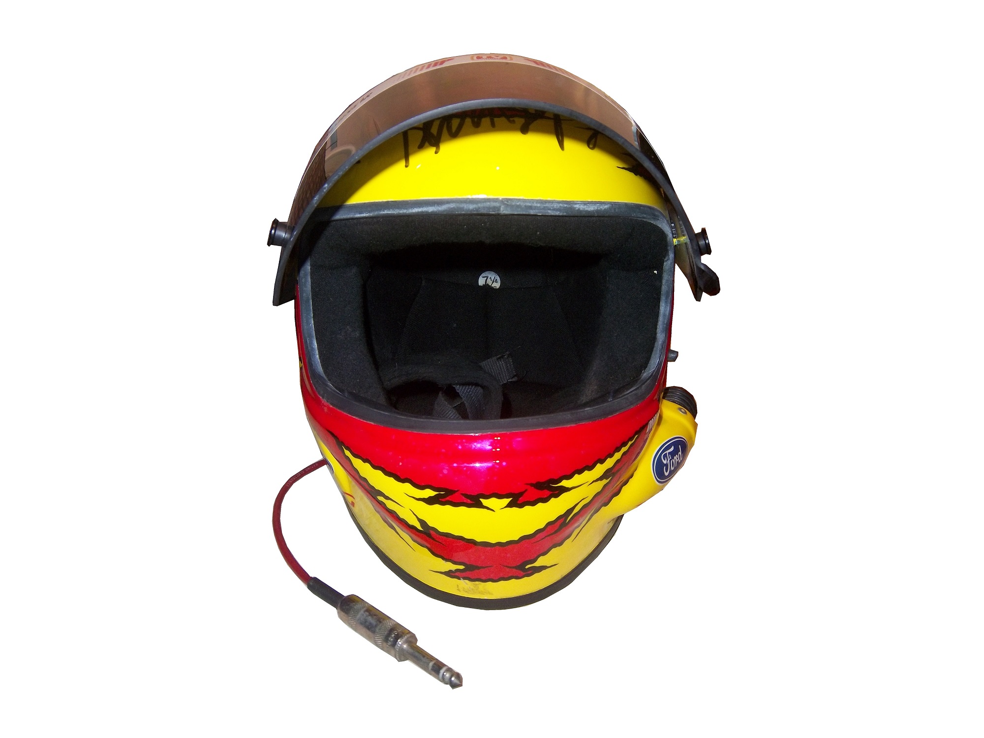
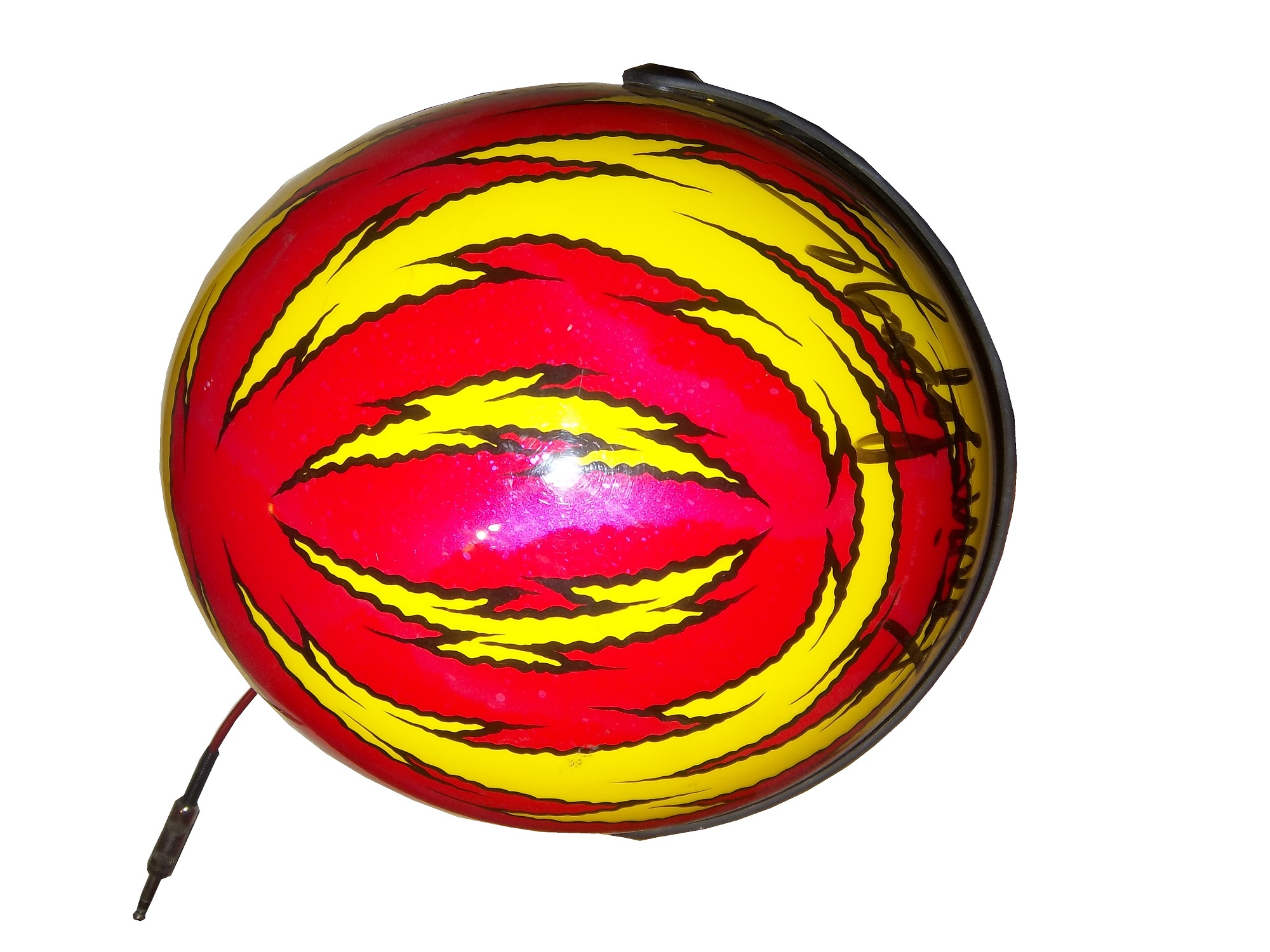
In 1999, TV Guide became one of the primary sponsors, and Lepage had a decent start to the season. As 1999 went on, Primestar left, TV Guide stayed and Lepage slipped in the points standings. I own a Kevin Lepage race-worn and signed helmet from 1999. It has the distinctive red and yellow scheme that TV Guide was known for. In 2000, Family Click took over as a sponsor, but Lepage slightly improved finishing 26th . At the end of the season, Family Click left the team, Lepage was released, and the #16 team disappeared for the entire 2001 season.
In 2002, the #16 Roush Racing Ford came back to NASCAR with Greg Biffle. They ran a limited schedule with 7 races started of the 10 races Biffle attempted to qualify for. In 2003, Biffle raced in the #16 Ford full-time, winning the Winston Cup Rookie of the Year award. Biffle continues to race in the #16 Ford full time and has had a lot of success, having won 19 races between 2003 and 2013. This team has a very bright future ahead of it.
Now on to…
PAINT SCHEME REVIEWS
Greg Biffle #16 Megulars Ford Fusion Best scheme Greg Biffle has run all year…and since that this is a C+ scheme, that is really sad. The color scheme is good, but the car design is awful.
David Stremme #33 Mace Chevy SS Great design, great color scheme, and I think that this is the first self-defense spray I have seen sponsor a car, so A+


