Which Way Does Your Favorite Team Lean?

99-edwards1By David G. Firestone

Number designs are an important detail in American auto racing, especially NASCAR, where the number is used on all of the merchandise sold to fans. The number is an identity for the driver and for the fans. While I was watching the Camping World RV Sales 301, for some reason, I noticed that the majorty of the car number are slanted. As the race went on, I noticed that almost all of them were slanted to the right. The Carl Edwards die cast above shows what I mean. Let’s look at the driver’s side car number up close.99-edwards1 - CopyAs you can see, the numbers are slanted with the top slanted to the right of the bottom. This gives the illusion that the numbers are being blown back by the speed of the car. I kept thinking about this and I decieded to see just who uses which slant when designing numbers for race cars. I wound up doing the NASCAR Sprint Cup Series, the Verizon IndyCar Series, and Formula 1. Here is what my research found…

NASCAR SPRINT CUP SERIES

Jamie McMurray-1-Straight

Brad Keselowski-2-Right

Austin Dillon-3-Left

Kevin Harvick-4-Right

Kasey Kahne-5-Right

Michael Annett-7-Right

Marcos Ambrose-9-Right

Danica Patrick-10-Right

Denny Hamlin-11-Right

Ryan Blaney/Juan Pablo Montoya-12-Right

Casey Mears-13-Right

Tony Stewart-14-Right

Clint Bowyer-15-Right

Greg Biffle-16-Right

Ricky Stenhouse Jr.-17-Right

Kyle Busch-18-Right

Matt Kenseth-20-Right

Trevor Bayne-21-Straight

Joey Logano-22-Right

Alex-Bowman-23-Right

Jeff Gordon-24-Right

Cole Whitt-26-Right

Paul Menard-27-Right

Joe Nemecheck-29-Right

Parker Kligerman-30-Right

Ryan Newman-31-Left

Travis Kvapil/Blake Koch/Boris Said/Eddie MacDonald-32-Right/Straight

RCR/Circle Sport-33-Left(RCR)/Right/(Circle Sport)

David Ragan-34-Right

David Reutimann-35-Right

Reed Sorenson-36-Right

David Gilliland-38-Right

Landon Cassill-40-Right

Kurt Busch-41-Right

Kyle Larson-42-Right

Aric Almirola-43-Right

JJ Yeley-44-Right

AJ Allmendinger-47-Right

Jimmie Johnson-48-Right

Justin Allgaier-51-Right

Bobby Labonte-52-Right

Brian Vickers-55-Right

Michael Waltrip/Joe Nemechek-66-Right

Dave Blaney-77-Straight

Martin Truex Jr.-78-Right

Ryan Truex-83-Right

Joe Nemecheck-87-Right

Dale Earnhardt Jr.-88-Left

BK Racing-93-Right

Michael McDowell-95-Right

Josh Wise-98-Right

Carl Edwards-99-Right

VERIZON INDYCAR SERIES

Juan Pablo Montoya-2-Straight

Helio Castroneves-3-Straight

Jacques Villeneuve-5-Right

Townsend Bell-6-Right

Mikhail Aleshin-7-Right

Ryan Briscoe-8-Straight

Scott Dixon-9-Straight

Tony Kanaan-10-Straight

Sebastien Bourdais-11-Right

Will Power-12-Straight

Takuma Sato-14-Straight

Graham Rahal-15-Right

Oriol Servia-16-Right

Sebastian Saavedra-17-Straight

Carlos Huertas-18-Right

Justin Wilson-19-Right

Ed Carpenter/Mike Conway-20-Right

JR Hilderbrand-21-Right

Sage Karan-22-Right

Marco Andretti-25-Right

Kurt Busch/Franck Montagny-26-Right

James Hinchcliffe-27-Right

Ryan Hunter-Reay-28-Right

James Davison-33-Straight

Carlos Munoz-34-Right

Martin Plowman-41-Straight

Pippa Mann-63-Right

Josef Newgarden-67-Straight

Alex Tagliani-68-Straight

Simon Pagenaud-77-Right

Charlie Kimball-83-Straight

Buddy Lazier-91-Right

Jack Hawksworth-98-Straight

FORMULA 1

Sebastian Vettel-1-Straight

Daniel Ricciardo-3-Straight

Max Chilton-4-Straight

Nico Rosberg-6-Straight

Kimi Raikkonen-7-Straight

Romain Grosjean-8-Right

Marcus Ericsson-9-Straight

Kamui Kobayashi-10-Straight

Sergio Perez-11-Right

Pastor Maldonado-13-Right

Fernando Alonso-14-Right

Jules Bianchi-17-Straight

Felipe Massa-19-Straight

Kevin Magnussen-20-Straight

Esteban Gutierrez-21-Straight

Jenson Button-22-Straight

Jean-Eric Vergne-25-Straight

Daniil Kvyat-26 Straight

Nico Hulkenberg-27-Straight

Lewis Hamilton-44-Straight

Valtteri Bottas-77-Straight

Adrian Sutil-99-Straight

Ok, that’s a lot to swallow, so let’s add the total number of number designs and look at the data:

*NASCAR-54          *IndyCar-33            *Formula 1-22         *Totals-109

Right-47-87%         Right-19-58%            Right-4-18%             Right-70-64%

Straight-3-5.5%    Straight-14-42%        Straight-18-82%     Straight-35-32%

Left-4-7%                 Left-0-0%                    Left-0-0%                  Left-4-4%

The Sprint Cup car numbers overwhelmingly are designed to lean to the right. In fact, only 6 of the 54 teams don’t use numbers that lean to the right. In IndyCar, it is much more down the middle, with 19 cars with right leaning numbers and 14 straight leaning numbers. Formula 1 is the straightest series, with only 4 of the 22 numbers being slanted. NASCAR is the only group of the series that has left-leaning numbers, all 3 of which 3, 31, and 33, are raced by Richard Childress Racing.

It is one of those odd idiosyncrasies of racing design that a lot of people see but don’t notice.  In fact, I didn’t notice until a couple weeks ago that the numbers seem to lean from one side to another.  I also am curious as to why so many teams choose to have the car numbers lean to the right.  I’m not saying it looks bad, they, for the most part, look really good.

Now we continue our theme with…

PAINT SCHEME REVIEWS!

Austin Dillon #3 Mycogen Seeds Chevy SS The red black and white scheme works very well, and it has a really good design that works well and earns an A

Kevin Harvick #4 Mobil 1 Chevy SS For a Mobil 1 design, this is pretty good. It is a lot less clutter, and shorter stripes than Tony Stewart’s car, and the color scheme is good. A+

Juan Pablo Montoya #12 Go Penske Ford Fusion Great simple design, decent color scheme earns an A-

Greg Biffle #16 3M 1942 Throwback Ford Fusion An perfect example of why throwback schemes fail. A classic logo which I have to admit looks really good, on a modern car, with modern design, modern numbers, and modern logos. It just looks out of place. F

Jeff Gordon #24 Axalta/Maaco Chevy SS The red, yellow and black color scheme works, except the blue and white Maaco logo scheme contrasts with it. The Pepsi globe looks odd there too, so I can’t give it any higher than a C-

Cole Whitt #26 Toyota of Scranton Racing Toyota Camry Great color scheme, great simple design, A+

David Ragan #34 MDS Ford Fusion Great simple design, decent color scheme earns an A-

David Ragan #34 A&W Root Beer Float Day Ford Fusion The color is good, the basic design scheme is good, but the Root Beer Float Day logos are too small. Even in this picture they look too small and are hard to see. If I am looking at a picture and I think it is too small, how do you think it will look on the track? C-

Reed Sorenson #36 Red Rocks Cafe Chevy SS The red black and white scheme works very well, and it has a really good design that works well and earns an A

Reed Sorenson #36 Zing Zang Chevy SS The overall design looks like a Richard Petty Motorsports car, the color schemes are all over the place, and the logo looks too much like a Mountain Dew logo. I give it a D-

Bobby Labonte #37 Accell Construction Chevy SS Good color scheme, but the awful template is back for Tommy Baldwin. It is really sad, because this could be a great scheme, but the template takes it from an A to a C-

Landon Cassill #40 Cars For Sale Chevy SS The yellow is too bright, and the gray and black numbers look too dark on the side. The design is mediocre and I’ll give it a C-

Kurt Busch #41 Haas Automotion Chevy SS This is a perfect example of why gray-scale color schemes don’t work. By itself it is a good look, but the Monster Energy logo, the Goodyear logo, and the contigency logos ruin the look. If it were all gray-scale, I would give it an A, but because of those flaws, it earns a B-

Aric Almirola #43 Go Bowling Ford Fusion I love what they did here. The bowling ball nose and pin design give a great impression, and the color scheme works very well here. A+

Justin Allgaier #51 Collision Cure Chevy SS Yellow black and blue is a bold color scheme choice, but this works. The design is simple, and it has a really good unique look, and I’ll give it an A

Dale Earnhardt Jr. #88 Michael Baker International Chevy SS Basically this is the National Guard scheme with a different color scheme, and let me tell you, it just doesn’t work. I love the new number design, but blue and black just doesn’t work. The overall color scheme is not great either, and it shows. It takes an A+ scheme and takes it down to a C+

Michael McDowell #95 Thrivent Financial Ford Fusion Levine Family Racing has improved leaps and bounds over last year and it shows. Great color scheme, great design, A+

Why I Hate Politics and Paint Scheme Update

By David G. Firestone

I have a lot of paint schemes to discuss and we will get to that shortly. I wanted to discuss something that took place before the Coke Zero 400 last week. It is a bit murky, but here is what took place.

Charlie Crist is a former governor of Florida, and a former Republican. After a brief hiatus from politics, he has annoucned his intentions to run for the Governor of Florida as a democrat. He had plans to run the #98 Phil Parsons Racing Ford driven by Josh Wise. After this was announced however, the Republican Party of Florida filed a lawsuit stating that it was a campaign contribution worth more than $3,000. Remember, this was the same team that was crowd funded by Reddit and Dogecoin at Talladega, and that sponsorship cost about $55,000. It was later reported that the Charlie Crist decals had been removed from the car. Phil Parsons Racing stated the deal was in response to a series of negative ads toward Crist, and that the Crist decals were part of a deal with recording artist Lee Brice. They also stated that they didn’t pull the sponsorship due to the lawsuit, and that the $25,000 sponsorship would be returned.

I frankly don’t buy any of that for a second. I think that it was because of the lawsuit, and that Phil Parsons Racing did not want to get thrown under the bus because of it. They tried to handle it as diplomatic as possible, but it still sounds sketchy. The other reason I have a huge problem with this is because the simple fact that politics and racing don’t mix. Look at what’s happened with F1 and IndyCar. Politics are a constant issue in the sport, and I for one am tired of it. Look at the Ayrton Senna/Alan Prost battle in the 1990’s! Look at The Split! Politics ruins racing!

This is not the first time a politician with deep pockets has sponsored a race car, but I hope that this is the last time. I’m not against politics, I’m against forcing it into something it has no place being in! If tobacco, cel phone carriers, and hard liqour have or had been banned from sponsoring cars, then so should politicians.

Ok enough serious stuff, on to…

PAINT SCHEME REVIEWS!

Jamie McMurray #1 Cessna/Hawker Chevy SS Nothing bad to say here…A+

Jamie McMurray #1 Lexar Chevy SS Great Color Scheme, great design, A+

Austin Dillon #3 Great Stuff Chevy SS Color scheme is good, the design looks very odd. The gold numbers and chain design does not suit the car at all, and if they were left off, I would give it an A, but this scheme earns a B-

Austin Dillon #3 NRA Museum Chevy SS Good color scheme, decent design, B+

Austin Dillon #3 Cheerios Protien Chevy SS Much too overdeisgned, decent color scheme, C-

Kasey Kahne #5 Team Stream Chevy SS Good color scheme, but Kasey loves to drive overdesigned cars, and this is no exception. I’m giving it a C which is a very fair grade here.

Kasey Kahne #5 Farmers Chevy SS Good color scheme, decent design, B+

Marcos Ambrose #9 Black and Decker Ford Fusion Good color scheme, Good design, A

Danica Patrick #10 GoDaddy/Florida Lottery Chevy SS It looks like two people designed this car, and they didn’t talk to each other while designing it. Both sets of color schemes are awful, and both design schemes are awful. F-

Greg Biffle #16 3M/DAV Ford Fusion Green usually doesn’t look good, camo never looks good, so this scheme earns an F

Greg Biffle #16 3M Aerospace Ford Fusion See Above F

Greg Biffle #16 NESN 30th Anniversary Ford Fusion A bit less overdesigned, at least by Greg Biffle’s standards, and I do like the Red Sox and Bruins logos as well, so I will give it a C

Greg Biffle #16 3M Ford Fusion Good color scheme, decent design, B+. Nice change for Greg Biffle.

Kyle Busch #18 Interstate Battery Center Toyota Camry No. Redeeming. Features. Whatsoever. F-

Ricky Stenhouse Jr. #17 Cargil Ford Fusion Much MUCH TOO OVER DESIGNED! F

Jeff Gordon Panasonic Toughbook Chevy SS Blue and white work very well, and while it is a bit over designed, it works, and I’ll give it an A

Jeff Gordon #24 Pepsi Chevy SS Great color scheme, great design scheme, A+

Cole Whitt #26 Rinnai Toyota Camry The color scheme is good, and the design is great, so it gets an A+

Cole Whitt #26 Tapout Muscle Recovery Toyota Camry Simple design, great color scheme, A+

Boris Said #32 7-Eleven Ford Fusion I normally hate green on race cars, but this works well. I like the design scheme too, and I give it an A

Bobby Labonte #33 Thunder Coal Chevy SS Great simple design and a great color scheme, A+

Alex Kennedy #33 MediaCast Chevy SS The color scheme is awful, and the design is worse. F

Reed Sorenson #36 Theme Park Connection Chevy SS Ugly design, good color scheme, C-

David Gilliland #38 Long John Silvers Free Fish and Fries Ford Fusion Great design, great color scheme, great look, A+

David Gilliland #38 Love’s Truck Stops Ford Fusions CAMO DOES NOT WORK ON RACE CARS! F

Landon Cassill #40 Snap Fitness Chevy SS So So design, good color scheme C+

Kyle Larson #42 Target Chevy SS Whadaya Know? An A+ Patriotic scheme!

Aric Almirola #43 Waffle House/Smithfield Ford Fusion The understated patriotic design scheme works well, and the color scheme works well too. B-

Justin Algaier #51 CSSUSA Chevy SS Looks good, overall design is good, color scheme is good, and I’ll give it an A

Brian Vickers #55 Aarons/Florida State Toyota Camry Good design with a good design color scheme, A

Brett Moffit #66 Toyota Toyota Camry Good color scheme, simple design, looks very good, A

Tommy Drissi #66 Hercules Toyota Camry I don’t even know where to begin…it just looks awful. F

Martin Truex Jr. #78 World Vision Chevy SS Good color scheme decent design, B-

Dale Earnhardt Jr. #88 Kelly Blue Book Chevy SS A decent scheme, but a bit overdeisgned. Color scheme looks good. B

Dale Earnhardt Jr. #88 National Guard Chevy SS See David Gilliland Love’s above. F

Michael McDowell #95 K-Love Ford Fusion I like the color scheme, and the overall design is another good Levine Family Racing scheme that earns an A

Josh Wise #98 Dogecoin Ford Fusion Good simple design with a good color scheme equals an A grade

Josh Wise #98 Phil Parsons Racing Ford Fusion Since this design is what was raced, I will grade it as such. The color scheme is decent, but it is a tad too overdesigned. It is a D+ look.

The Sprint Unlimited Preview

By David G. Firestone

The 36th Sprint Unlimited starts tonight at 8:15 ET on Fox. This marks the beginning of the Daytona 500 and the beginning of the NASCAR season. I will be looking forward to it, and I will enjoy it as always.

The field will feature pole award winners and past winners of the event. These include:
· Denny Hamlin (4 poles)
· Kyle Busch (3 poles)
· Joey Logano (2 poles)
· Jimmie Johnson (2 poles)
· Matt Kenseth (2 poles)
· Ryan Newman (2 poles)
· Dale Earnhardt Jr. (2 poles)
· Jeff Gordon (2 poles)
· Carl Edwards (2 poles)
· Marcos Ambrose (1 pole)
· Kurt Busch (1 pole)
· Kevin Harvick (1 pole)
· Brad Keselowski (1 pole)
· Mark Martin (1 pole)
· Jamie McMurray (1 pole)
· Danica Patrick (1 pole)
· Ricky Stenhouse Jr. (1 pole)
· Terry Labonte (past winner: 1985)
· Tony Stewart (past winner: 2001, 2002 and 2007)

The event will feature a number of segments which were voted on by NASCAR fans including myself, and many of you. The first segment will feature laps followed by a second segment of laps, and then a third segment of laps. Many special paint schemes will be run for this race, as is traditional. My personal favorite is the Miller Lite Throwback scheme being run by Brad Keselowski.

Now some factoids about the race.

*There are, in total, Chevy drivers, Ford drivers and Toyota drivers.

*Chevy has 20 wins, Ford has 7 wins, and Toyota has 1 win.

*Mark Martin has competed in 20 consecutive events from 1989-2008.

*Dale Earnhardt Sr. has won 6 events, more than anyone else in 1980, 1986, 1988, 1991, 1993, and 1995 and went on to win the Sprint Cup Championship 4 times in 1980, 1986, 1991, and 1993, he is one of 7 drives to do so.

*From 1979-2011 the event was sponsored by Anheuser-Busch, first called the Busch Clash which was the brainchild of Monty Roberts, brand manager of Busch Beer, who sponsored the Pole Award. It remained the Busch Clash until 1998, when Budweiser took over the Pole Award, and it was renamed the Budweiser Shootout. In 2012, Sprint, the series sponsor took over the sponsorship after Budweiser announced they would drop the sponsorship in favor of sponsoring the Duel Races that determine the starting order of the Daytona 500.

*Petty Enterprises was not eligible to run the Shootout because of a rule stating that only drivers that ran the Busch/Budweiser pole award decal were eligible to enter the shootout. Richard Petty and his family did not support alcohol sponsorship or decals on race cars. So John Andretti, Bobby Hamilton, Jeff Green, and Aric Almirola who all had a number of poles with Petty Enterprises were not eligible to participate. I find it interesting that Petty has reversed course on the alcohol sponsorship rule, since Kasey Kahne was sponsored by Budweiser, and Marcos Ambrose will run at least one race sponsored by Twisted Tea.

*Buddy Baker won the inaugural Sprint Unlimited in 1979, which was a 20 lap sprint.

*Since many top drivers were excluded from the race due to not winning a pole award, they moved to the TV booth as color commentators. These included Dale Earnhardt Sr. in 1981, Richard Petty and AJ Foyt in 1982 and 1983, Neil Bonnett in 1993, Darrell Waltrip in 1994, 1995, 1997, and 1999, and Kenny Wallace in 1998.

*There has never been a driver who has won the Sprint Unlimited, Budweiser Duel and Daytona 500 in the same year. Drivers have won 2 of 3 in a season, but never scored the hat trick.

*One of the first instances of a special paint scheme being used specifically for the Sprint Unlimited was the Chroma Premier scheme run by Jeff Gordon in 1997. He followed it up the next year with the legendary Chroma-lusion scheme, which feature a paint that changed color. Since then, special schemes have become commonplace.

*Richard Childress Racing has 8 Sprint Unlimited wins, most of any team. Hendrick Motorsports has 6 wins, and Joe Gibbs Racing has 5 wins.

The Unlimited starts tonight at 8 PM ET on Fox Sports 1, and I look forward to watching the event as I hope the rest of you do too.

Though I have had a VERY busy week, I still have time for…

Paint Scheme Reviews!

Kasey Kahne #5 Time Warner Cable Chevy SS It is a good color scheme, but the design on the side needs a little tweaking. Get rid of the needless zig-zag pattern and it works a whole lot better. It is still a decent scheme, so I will give it a C

Michael Annett #7 Pilot/Flying J Chevy SS Good color scheme, but the awful template is back for Tommy Baldwin. It is really sad, because this could be a great scheme, but the template takes it from an A to a C-

Michael Annett #7 Accell Construction Chevy SS See Above

Marcos Ambrose #9 Mac Tools Ford Fusion Good color scheme here, and decent design, worth a B

Clint Bowyer #15 AAA Insurance Toyota Camry Great color scheme, good design, worth a B+

Kyle Busch #18 M&M’s Peanut Toyota Camry I like this, it has a great shade of yellow, hard to find in NASCAR these days, and the peanut motif works very well. It is an original design, and I’ll give it an A

Trevor Bayne #21 Motorcraft Ford Fusion  This is why The Wood Brothers won the Paint Schemies and took the top spot in the Paint Scheme Leaderboard.  A++

Joey Logano #22 Autotrader.com Ford Fusion  Sometimes orange works, sometimes it doesn’t.  This is an example of an orange scheme that just doesn’t work.  If the white was taken out completely it might work, but this is just horrid, and I give it an F

Cole Whitt #26 Speed Stick Gear Toyota Camry This is one of the few schemes that has both a classic and modern look at the same time, and paired with a great color scheme, it earns an A

Paul Menard #27 Menard’s/Peak Chevy SS Good design, awful color scheme, D+

Terry Labonte #32 C&J Energy Services Ford Fusion I’ll give it a C+ until I can see a picture WITHOUT an Instagram filter!

David Ragan #34 CSX Ford Fusion  What in the hell is going on here?  Why is the hood decal upside down?  Why in the world would they do that?  Were they drunk when they decaled the car?  The only thing that I can guess is that it is designed for an in-car camera…but that makes no sense either!  F-

David Gilliland #38 Loves Truck Stops Ford Fusion  Good color scheme, decent design, plus unlike David Ragan, the hood decal is in the correct position, A-

Bobby Labonte #52 Phoenix Racing/HScott Motorsports Chevy SS Great color scheme, very simple yet attractive design, can’t say anything bad about it, A+

Michael Waltrip #66 Blue Def Toyota Camry While I like the field motif, it looks too much like the Windows XP Bliss background for me to take it seriously. I’ll give it a B-

Dale Earnhardt Jr. #88 Kelley Blue Book Chevy SS  During my Daytona Preseason Thunder article, I said I wanted to see the #88 they used on a real car.   I got my wish, and I like this design overall.  The metallic gold is a bold choice, it doesn’t always work well.  I give it an A+

BUT WAIT, THERE’S MORE!

As many of you know, I don’t just research and collect driver suits and racing items, I collect and research many other things.  I recently had a column run in Uni-Watch concerning some lettering from the 1958 Washington Senators, and you can read my column here.

Paint Scheme Leaderboard Part 4-The Grand Finale

By David G. Firestone

The focus group of one has had its meetings, and has made its decisions.  Here are all 50 teams that ran the Sprint Cup this year ranked first to last on their paint schemes:

#1-Wood Brothers #21-A classic design scheme that just seems to get better with age. The Henry Ford design combines classic and modern elements for an amazing look.

#2-Hendrick Motorsports #48 Jimmie Johnson went with a very classic look, with a day scheme and a night scheme, which worked very well. Johnson did not have a bad look all year.

#3-Michael Waltrip Racing #55 Simple traditional designs. That is the secret to their success on the leaderboard. Color schemes are great as well. Nothing wrong with these schemes.

#4-Furniture Row Racing #78 When it came down to picking a number 1 for Chevy, for both the Paint Schemie and the Leaderboard, I had to flip a coin to pick a number 1, and Johnson won. Kurt Busch ran a series of very solid schemes, not a lot to comment on and it always looks good.

#5-Joe Gibbs Racing #18 Like Jimmie Johnson and Kurt Busch on the Chevy side, the Toyota winner for both the Paint Schemie and Leaderboard was decided by a coin flip. More modern than the 55, all these schemes are good, with amazing paint schemes and really good design.

#6-Richard Petty Motorsports #43 This team combines classic and modern looks, and uses Petty Blue very effectively. The Transportation Impact scheme was not good at all, and kept the 43 team out of the top spot.  Extra Credit for the Maurice Petty Tribute Scheme.

#7-BK Racing #83 Great designs all around, but the hood needs work. Why is it black when the rest of the car is red?

#8-BK Racing #93 See Above, but the Old Dominion scheme drags it down.

#9-Penske Racing #12-Though only raced for one race, the SKF design worked very well. A great color and great design scheme. If this had been raced for multiple races, I would have ranked it higher, but it is still a solid scheme.

#10-Richard Childress Racing #29 The Bad Boy Buggies scheme is bad, and the Rheem/Budweiser combo scheme is awful, but aside from those, Kevin Harvick has had a very good season, paint scheme wise

#11-Earnhardt Ganassi Racing #42 Get rid of the Axe Apollo scheme and the Camouflage scheme, and Juan Pablo Montoya would have the top spot.

#12-Richard Petty Motorsports #9 This set earned a place in the top 5 because it improved by a lot over the course of the season. It has a great color scheme, but the early schemes were not great, but since Stanley redesigned their logo, and made some changes to the car, it is a very nice set.

#13-Phoenix Racing/Turner Scott #51 Guy Roofing and Hendrick Cars are hideous, but apart from that, they have run a great set of paint schemes. Bonus points given for the Neil Bonnett throwback scheme.

#14-Michael Waltrip Racing #56 The Get Back and Give Back scheme is horrid, but the rest of the schemes are really good.

#15-JTG Daugherty Racing #47 Most of what they ran this year was great, but the Bushes Baked Beans car has an odd overall design, and a weird color scheme. The Clorox scheme has a bad color scheme, as does the Charter scheme, as does the Wounded Warrior Project scheme.

#16-Roush Fenway Racing #17 A pinkwashing scheme as well as the Valvoline NexGen scheme kick Ricky Stenhouse Jr. out of the top spot. Sad thing too, as Ricky had a very solid year when it comes to paint schemes

#17-Joe Gibbs Racing #81 Alert Energy is awful. Double Mint is awesome.

#18-Penske Racing #2 While I miss the beer colored wheels from last year, Keselowski has had a decent year, the color scheme is great, though there is too much white on the car. The Redd’s Apple Ale scheme was great, but the Fan Mosaic and Patriotic schemes need some work.

#19-Roush Fenway Racing #16 Greg Biffle had a lot of great schemes, but he had a number of awful ones , including a pinkwashing scheme as well. Get rid of the pinkwashing scheme, the Scotchguard, give blood, and Megulars schemes, and he would be in the top 5.

#20-Richard Childress Racing #27 The yellow is too bright, but other than that, the schemes are really good.

#21-Stewart Haas Racing #14 Some of these schemes are good, others not so much.

#22Hendrick Motorsports #88 Dale Jr. runs good schemes most of the time, but Soldiers of Steel, Orange Amp Energy, and Camouflage are just brutal. Additional points lost for a pinkwashing scheme.

#23-Joe Gibbs Racing #20 If the Dollar General was more plain, and did not have the orange back, I would love to give Matt Kenseth a higher spot, and a pinkwashing scheme does not help.

#24-Earnhardt Ganassi Racing #1 Bad Boy Buggies is even worse here, and the Bass Pro Shop schemes are awful. A number of good schemes here as well.

#25-FAS Lane Racing #32 The Oxy Water scheme, and the gray scale C&J Energy Services schemes do not work, but the rest of the schemes they ran do

#26-Front Row Motorsports #38 The template they run works very well when the color scheme matches that of the sponsor. When it doesn’t match, it looks awful.

#27-Front Row Motorsports #35, See above

#28-Front Row Motorsports #34, See above, aside from the CSX scheme, which looks great, and the Peanut Patch scheme which looks awful.

#29-Tommy Baldwin Racing #36 This team looks better without a primary sponsor than they do with one.

#30-Max Q Motorsports #37 Simple, yet attractive. Would be higher if they ran more races.

#31-Joe Gibbs Racing #11 The Jason Leffler tribute scheme and the FedEx delivery manager schemes are great, but the rest are just awful. I miss the Gen 5 schemes

#32-Nemco Racing #87 The word that can best describe this set is dull. Not bad, but not spectacular.

#33-Circle Team Sport #40 Interstate Moving is really good. Moon Shine Attitude Attire is really awful, and their pinkwashing scheme is even worse.

#34-Roush Fenway Racing #99 Geek Squad and Fastenal work well, the rest…not so much.

#35-Richard Childress Racing #31 A few good schemes but most of them are mediocre at best.

#36-Hendrick Motorsports #24 See Above

#37-Stewart Haas Racing #10 Worst shades of yellow in NASCAR, and the pinkwashing scheme is so much worse.

#38-Michael Waltrip Racing #15 Clint has consistently run cars with great color schemes, but awful designs. Except for Duck Dynasty, and pinkwashing, which are just hideous.

#39-Humphrey Smith Racing #19 Another car that just looks better without a primary sponsor.

#40-Germain Racing #13 Nothing really wrong, but nothing really right with these schemes.

#41-Penske Racing #22 Red and yellow is a really great color scheme, but the design is all wrong. This design gets even worse with the AAA scheme, which has an even better color scheme. The Pennzoil scheme is good, but not good enough to save the set.

#42-Stewart Haas Racing #39 I have to give them credit, their schemes are mostly awful, but at least they are creative.

#43-Tommy Baldwin Racing #7 Worst. Door. Number. Ever. The rest of the car isn’t good either, and a pinkwashing scheme doesn’t help.

#44-Phil Parsons Racing# 98 The schemes come in one of two food groups, bland or awful. Great colors, but the designs are horrid.

#45-Levine Family Racing #95 Worst template in NASCAR.

#46-Hendrick Motorsports #5 Innovation can be a bad thing. This, for example is what happens when you let Karl Benjamin design your cars.

#47-Circle Sport/RCR #33 It amazes me how two different teams can use the same car number, and both can put awful designs on their cars. Special credit for the Honey Nut Cheerios scheme, which is just horrific.

#48-Xxxtreme Motorsports #44 Yuck.

#49-Hamilton-Means Racing #52 Paulie Harraka had a great scheme, but Brian Keselowski…not so much.

#50-Swan Racing #30/26 Please tell me this is an experiment on how to make the worst paint scheme in history? Is Swan Racing competing with Travis Pastrana for the most obnoxious paint scheme in NASCAR?

Paint Scheme Leaderboard Part 3- Toyota

By David G. Firestone

The Paint Scheme Leaderboard continues with Toyota today. This has been a stressful series, and it will be even more so next week, when I rank all 50 teams in order from best to worst. Enough complaining, on to the schemes.

#1 Michael Waltrip Racing #55 Simple traditional designs. That is the secret to their success on the leaderboard. Color schemes are great as well. Nothing wrong with these schemes.

#2 Joe Gibbs Racing #18 Like Jimmie Johnson and Kurt Busch on the Chevy side, the Toyota winner for both the Paint Schemie and Leaderboard was decided by a coin flip. More modern than the 55, all these schemes are good, with amazing paint schemes and really good design.

#3 BK Racing #83 Great designs all around, but the hood needs work. Why is it black when the rest of the car is red?

#4 BK Racing #93 See Above, but the Old Dominion scheme drags it down.

#5 Michael Waltrip Racing #56 The Get Back and Give Back scheme is horrid, but the rest of the schemes are really good.

#6 JTG Daugherty Racing #47 Most of what they ran this year was great, but the Bushes Baked Beans car has an odd overall design, and a weird color scheme. The Clorox scheme has a bad color scheme, as does the Charter scheme, as does the Wounded Warrior Project scheme.

#7 Joe Gibbs Racing #81 Alert Energy is awful. Double Mint is awesome.

#8 Joe Gibbs Racing #20 If the Dollar General was more plain, and did not have the orange back, I would love to give Matt Kenseth a higher spot, and a pinkwashing scheme does not help.

#9 Joe Gibbs Racing #11 The Jason Leffler tribute scheme and the FedEx delivery manager schemes are great, but the rest are just awful. I miss the Gen 5 schemes

#10 Nemco Racing #87 The word that can best describe this set is dull. Not bad, but not spectacular.

#11 Michael Waltrip Racing #15 Clint has consistently run cars with great color schemes, but awful designs. Except for Duck Dynasty, and pinkwashing, which are just hideous.

#12 Humphrey Smith Racing #19 Another car that just looks better without a primary sponsor.

#13 Hamilton-Means Racing #52 Paulie Harraka had a great scheme, but Brian Keselowski…not so much.

#14 Swan Racing #30/26 Please tell me this is an experiment on how to make the worst paint scheme in history? Is Swan Racing competing with Travis Pastrana for the most obnoxious paint scheme in NASCAR?

Next Week, The big finale, all 49 teams ranked from best to worst!

The First Question…Where Do You Buy This Stuff?

By David G. Firestone100_2479 100_3147

I discuss the various aspects of race-worn and race used collectibles on this blog, and in researching something, I had received a suggestion that sounded like a great idea. The idea that was posed was “You may want to mention where people can actually buy these suits as well.” So I think I will.

The most obvious place to purchase race-worn and race-used items is eBay. Now this is not as simple as it might sound. In the Sports Memorabilia, Cards and Fan Shop section, entering the term “Suit”is a good place to start. Entering the term “driver” can be a mixed bag, and the term “firesuit” as well as “driver suit” work well. If that is not to your liking, search “driver suitfiresuit” “driver firesuit” “NASCAR uniform” “racing uniform” or “driver uniform” in the Any Categories setting.

Another, less likely place on eBay is the Safety Equipment section on eBay motors. Reason being that not all race-worn driver suits end up in collections, many of them are recycled and sold to racers who need a quality firesuit but do not have the resources to spend the thousands needed for a customized one. In fact, many auctions that are geared towards collectors also mention the size in case the suit is bought by a racer.

I have a couple of sellers that I buy from on a regular basis. One of my favorites is Just For Fun Collectibles. They have an amazing selection, and some of the best prices for stuff I have ever seen. I have bought a lot from them, and I always enjoy buying from them. The other seller I buy from regularly is Race Image. Both are based in North Carolina, and Race Image buys regularly from race teams, and resells the items both on their site and on eBay. Like Just For Fun, I have bought a lot from them, and I always enjoy buying from them.  Raceusedrescued is another great seller, who has a whole lot of NASCAR stuff.

Using legitimate auction sites can be iffy, not as many people are into race-worn and race-used memorabilia, as are into baseball, or football. But one place that regularly sells race-worn material is Paragon Auctions. They have had a lot of race-worn driver suits for sale in their auctions. Other groups, such as Heritage Auctions and American Memorabilia both have had a lot of suits sell through their auctions.

But with all the places to buy items, doing the research before you buy is critical. That is why I started The Driver Suit Blog, to give collectors the resources and information that they need to do the hobby, and do it right. I’m not someone who just buys these because they look nice, throw them in a closet, and never think about them. I look at them, admire them, and I understand how much work went into designing them. I love this hobby, and I fully support it, and I want to help collectors advance in this hobby in any way I can. That is why I put the time and effort I do into this blog.

Next week, I will announce the 2013 Driver Suit Blog Paint Schemie Awards. The Schemies are a series of awards given out for paint schemes in the Sprint Cup series. For every category, there are two awards given, First and Worst. First awards are given to the best schemes of the year, and worst…well that is pretty self-explanatory, isn’t it?

Tailgating Time!

I took my chili recipe I previously mentioned, and  changed the recipe slightly.

You will need:
2 pounds beef chorizo sausage
1 onions, chopped
1 (7 ounce) can diced tomatoes-drained
1 (7 ounce) cans smoked chipotle salsa
1 (12 ounce) can kidney beans-drained
1 cup water
Chili powder and garlic powder to taste
In a large saucepan over medium heat, combine the chorizo and onion and saute until meat is browned and onion is tender. Add the diced tomatoes, smoked chipotle salsa,beans and water.
Season with the chili powder, and garlic powder to taste. Bring to a boil, reduce heat to low, cover and let simmer for 15 minutes.

Paint Scheme Reviews

First we start with 2014 schemes…

Brad Keselowski #2 Miller Lite Retro Ford Fusion This scheme is perfect. There is nothing that can be done to improve it. A+

Marcos Ambrose #9 Twisted Tea Ford Fusion A good color scheme is in play here. I like the shades of yellow, green and blue used here. The overall design works well with the color scheme, and I will give it an A.

Now on to 2013 schemes…

Jamie McMurray #1 Lexar Chevy SS  Decent color scheme, and if you get rid of the flash drives at the bottom, it would be an A scheme.  This scheme is good, and earns a B+

Dave Blaney #7 Ultra Wheels Chevy SS This is the first time that this car actually looks good…provided you get rid of that door number. B+

Clint Bowyer #15 5-Hour Energy Sour Apple Toyota Camry Another example of why camouflage does NOT work on race cars. What does camouflage have to do with sour apples? This scheme does not work, and it gets an F

Greg Biffle #16 Scotch Ford Fusion  Eww…the green design clashes with the red, and the plaid design is atrocious.  F

Ricky Stenhouse Jr. #17 RFR Driven Chevy SS  Ricky has run a lot of great schemes this year, and this scheme is not an exception.  Great color and simple design earns this scheme an A.

Ryan Newman #39 Quicken Loans-Salute to Veterans Day Chevy SS This scheme is a bit more complex in the grade that I gave it, and requires some explanation.  This scheme features pictures of United States Military Veterans on the side as a tribute to them.  They have earned a place on the car, and have earned the respect as a nation, and an A+++ grade.

Landon Cassill #40 Pirate Oilfield Chevy SS Looks good, great color scheme, simple design, A+

Juan Pablo Montoya #42 Target Camouflage Chevy SS Camo just doesn’t work for race cars, an this is no exception. While they did try to keep the red, it just looks awful, and I’ll give it an F

Bobby Labonte #47 Wounded Warrior Project Toyota Camry Camo doesn’t ever look good on a race car, and this is another example. It looks better than this though…

Kyle Larson #51 Visit Dallas Chevy SS I love color scheme, and I love the skyline on the hood. I’m disappointed that the skyline isn’t on the side of the car, it would look good on the door, but it is still a solid A scheme.

Dale Earnhardt Jr. National Guard Breast Cancer Awareness Chevy SS Pinkwashing is an automatic F grade.

Dale Earnhardt Jr. Amp Gold Chevy SS Not a bad color scheme, though the dot design does not look good at all. I’ll be generous and give it a B-


Arm Gussets…Comfortable AND Safe!

By David G. Firestone

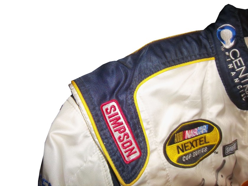
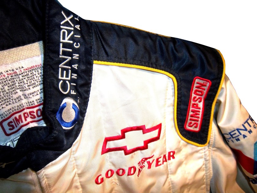
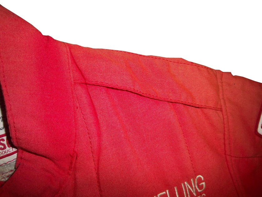
We’ve all seen them in telecasts and photos, but what many of us do not realize is what they are and what they do. I am talking about the arm gusset. Arm gussets are seen at the top of the sleeve on a driver suit, under the shoulder. They are a flexible piece of Nomex specifically designed to do two things. One is protect the driver, the other is give the driver some freedom of movement.10-labonte-rshoulder 10-labonte-lshoulder

Arm Gussets are almost always present on race-worn driver suits. Anyone who has worn a one-piece full body jumpsuit can attest to the fact that it restricts freedom of body movement. The gusset takes some of that restriction away. This is important when it comes to driving, because it gives the driver one less thing to concentrate on, and in the worst case scenario, can help a driver escape a burning vehicle much quicker.36-said-rshoulder 36-said-lshoulder

Gussets have very little variation, though I have seen one unusual one. In this Ricky Craven suit from 1996, the front of the sleeves look like they are attached to the body, whereas the back has a gusset in it. This would be done for driver preference of course, bur I have never seen a half gusset before or since.100_3458 100_3457 100_3456

This Lake Speed suit from 1997 is store bought, as opposed to custom designed, and it has no gussets. This suit would have some restriction of movement. Again this can come down to driver choice.9-speed-rshoulder 9-speed-lshoulder

The need for protection vs. the need for driver comfort is a major conflict in the world of racing safety. The gusset is a major meeting point between the two sides involved, and the drivers love them.

RIP Jason Leffler…you will be missed.

Now on to paint schemes.

Jame McMurray #1 Parade Magazine Chevy SS-Great color scheme, great design, nothing wrong at all, A+

Jame McMurray #1 Banana Boat Chevy SS-A scheme that could be a B+ is ruined by an awful color scheme. That orange is the worst I have ever seen on a race car. It takes this scheme and takes to a D-

Jamie McMurray #1 Bad Boy Buggies Chevy SS-An attempt to be innovative with design fails horribly here. The color scheme is decent, but the design is awful.

Marcos Ambrose #9 Stanley/DeWalt Racing for a Miracle Ford Fusion-This is a major improvement over what they currently run. This just works! A+

Denny Hamlin #11 Sport Clips Toyota Camry-Seriously? Why does it look like a sperm is painted in red on the side of the car? The red/white/black color scheme works, but the door design is just awful! D-

Denny Hamlin #11 Fedex/Autism Speaks Toyota Camry-Much better! The puzzle design, and solid color scheme look really good here. The red 11 is amazing too! Can’t give this anything but an A+

Tony Stewart #14 Code 3 Chevy SS-Love the scheme, love the simple design and great color scheme.  Works very well and earns an A+

Clint Bowyer #15 5-Hour Energy Patriotic Toyota Camry-How is this patriotic? Oh….I get it…the stars….just one problem…THE COLOR SCHEME IS WRONG! If it was red white and blue I would like this, but this is just awful! You want to honor America, but can’t get the color scheme right? F-

Greg Biffle #16 Fastenal Ford Fusion-Since minor variations of this scheme were run by Biffle, Ricky Stenhouse, and Carl Edwards with minor variations between them, I will grade them all here. Solid scheme, good color scheme, A+ for all 3.

Greg Biffle #16 3M/Ace/Rite Aid Ford Fusion-The color scheme is good, but the door design is too busy. If it was one single color, it would work quite well, but being a mix of black, blue, red, and white it just looks confusing. It works, but not as well as it could, and earns a C+

Jeff Gordon #24 Axalta Chevy SS-Another DuPont scheme with different logos that works very well. Good color scheme and design. A+

Paul Menard #27 Menard’s/Libman Chevy SS-The Libman green hood design just looks horrible on the yellow background of the car. The green is too light, and if it were darker it might work, but this scheme earns a D

Kevin Harvick #29 Budweiser Patriotic Chevy SS-This is another patriotic scheme that works very well with a good design. A+

J.J. Yeley #36 Click it or Ticket Chevy SS-Good design, but awful color scheme. The green and blue is just horrible. If one or the other was used it might work, but this is horrific. F

Ryan Newman #39 Quicken Loans Patriotic Chevy SS-Meh.  The design needs work.  Too much going on with the front of the car to earn anything above a C

Aric Almirola #43 Air Force Ford Fusion-Great design, simple design with a great color scheme. A+

Bobby Labonte #47 Bush’s Grilling Beans Toyota Camry-The overall design and color scheme is good, but the major flaw here is that the quarter panel has 5 different logos, most of which clash with the Bush’s scheme. It takes an A scheme and drags it down to a C

Jimmie Johnson #48 Lowes Patriotic Chevy SS-The only bad thing I can say about this is that the red should be a little darker. Other than that, this scheme earns an A

Jimmie Johnson #48 Monsters University Chevy SS-If the blue was darker, I would like it more, but the blue is too light. Other than that, this is a solid scheme. B+

Martin Truex Jr. #56 Napa Patriotic Toyota Camry-Perfect…that is all I can say. A+

Some Issues with the New Gen 6 Car

By David G. Firestone

I would like to discuss some issues that have come up in recent weeks with the new Gen 6 car. These issues seem minor, but with this new car, they need to be addressed. And because these issues are issues, it leads to a conclusion that is kind of stunning in my mind.

Two issues revolve around Denny Hamilin. The first is his $25,000 fine for “criticizing the product.” and I’ll get to that in just a minute. The other one is his massive L1 Compression fracture that he suffered at Fontana. This injury should never have happened, but it did. The Gen 5 cars, as unattractive as they were design-wise, were safety-focused. The discussion on how safe they were ended with Michael McDowell’s scary wreck during qualifying at Texas in 2008. The car suffered serious damage, but McDowell was unhurt. This wreck was just as bad, but Hamlin is out of the car until he is fully healed.

NASCAR needs to be safety-focused, putting driver and fan safety before anything else. The fact that Denny has an L1 compression fracture because of a wreck is proof that there is a lot of room for improvement in the Gen 6 car. That isn’t the only issue with the car that needs to be addressed. The car seems to change with each race. At a super speedway, the spoiler is lower than it is at other tracks. At intermediate tracks the roof cameras are not used for reasons that have yet to be explained to the general public. It almost seems as though NASCAR is making the rules up as they go along. Please pick a design and setup and stick with it.

The other issue that needs to be discussed is penalties surrounding the new car. Denny Hamlin was fined $25,000 for saying that the car has room for improvement. Why was he fined for that? I understand that the car was designed by many different people, who put a lot of time and effort into it, but here is the thing…the people who designed the car are not the ones who are the focal point of racing, the driver is. If the drivers are complaining about the car not being competitive, and not driving the way it is supposed to, it should be addressed. The Gen 4 and Gen 5 cars went through a lot of refining, and so should the Gen 6 car.

One penalty that was issued was to Penske Racing for having suspension parts unapproved by NASCAR. Although all of Ford’s engines come from Roush Yates, many teams use their own designs for equipment used in the car. As such, these parts have to be approved by NASCAR. Obviously these parts weren’t approved. Yet Penske, Brad Keselwoski, and Joey Logano are swearing up and down that they were legal, and working in a gray area. If the parts are unapproved, they are unapproved.

The other major penalty was to Matt Kenseth for having a connector rod that was 3 grams under the minimum weight required by NASCAR. My concern with this issue is that the engine in question came from Toyota Racing Development. TRD knows what the rules and regulations are, and they knew what the parts should have been. I do not believe for a second that of the people involved with making the engine, not one of them knew didn’t realize that the parts were illegal. They knew what it was, and they sent it out anyway. That brings up an important question. 8 teams in the Sprint Cup work with TRD. In total that accounts for 10 different teams. Each team has a primary and backup car. There is also an additional engine at the teams disposal. So for each Toyota team there are 3 engines for use. If Matt Kenseth is running illegal equipment, who else is?

On to paint schemes…

Brad Keselowski #2 Redd’s Apple Ale Ford Fusion Black and Red is always a good scheme, and the overall design is good. The sticking point for me with this scheme is that APPLE ALE is almost invisible on the quarter panel. So for a final grade, it gets a B-

Tony Stewart #14 National Wild Turkey Federation Chevy SS Good color scheme and overall design, but the major issue I have is with the NATIONAL WILD TURKEY being on a curve and not as visible It gets a B-

Jeff Gordon #24 AARP Chase Card Chevy SS The color and designs are all over the place, and the giant credit card on the hood is pretty ugly. Not good at all, F

Kevin Harvick Bell Helicopters Chevy SS A simple design with a good color scheme. Not much else to say other than good job, and it gets an A grade.

Jeff Burton #31 Airgas-Bulwark Chevy SS Meh. That sums it up. Uninspired color scheme, and bland design give it a mediocre look and a C- grade.

Jeff Burton #31 American Ethanol Chevy SS Good color scheme and design. A-

David Ragan #34 CSX Play It Safe Ford Fusion This is a very solid scheme, with great colors, great design and an overall great look. CSX did this scheme very well and it gets an A+

JJ Yeley #36 NASCAR Day Chevy SS Another simple yet attractive scheme that works very well. Nothing more to say than great job, and enjoy your A grade.

David Gilliland #38 EZ Pawn Ford Fusion Good color scheme though the design is a bit over complex. As such it gets a B+.

Ryan Newman #39 Code 3 Associates Chevy SS Ok, you can have either flames OR a racing stripe, but not both. Because the combo takes a good design and makes it into a horrible design. The only thing giving this scheme a passing grade is the color scheme being as good as it is, but it earns a D-

Bobby Labonte #47 Pine Sol Toyota Camry Yet another simple yet amazing good scheme that earns an A grade!

Elliot Sadler #81 Alert Energy Gum Toyota Camry A good scheme with a consistent design and a decent color scheme that earns a B+ grade.

Travis Kvapil #93 Dominion Raceway Toyota Camry Am I the only one who thinks it is odd that a speedway that doesn’t exist yet is sponsoring a car for one race? That aside, the door design needs work, but the color scheme is solid, and I give it a B-

The Curious Case of The Bugle of Christian Fittipaldi

By David Firestone

Christian Fittipaldi is a Brazilian race driver who raced in F1, Champ Car and eventually NASCAR. Although he had two wins in Champ Car, his F1 and NASCAR careers were fruitless. His NASCAR career lasted from 2002-2003, and during that time he raced in a total of 16 races, with 2 DNQ’s. With the exception of the 2003 Daytona 500, all of his races were for Petty Enterprises, and he raced in all 3 of their teams at the time, cars #43, 44, and 45. His final two races were for car #44, which at the time was sponsored by Bugles.

44-fittipaldib

In 2011, I bought the Bugles driver suit Fittipaldi wore for those final two races. When I got the suit, I saw it had some…irregularities to it. The most prominent feature are the television logos on the sleeves.

44-Fittipaldi-llogo 44-Fittipaldi-rlogo

Notice anything odd? The TV logos on the sleeves are incorrectly positioned…for NASCAR. I found this to be a bit odd, as there seems to be no logical reason for the logos to be set the way that they are. These logos, introduced in the 1990′s as a way for the primary sponsor of the car to advertise to the in-car cameras, should be positioned so that the logo appears clearly. These logos are designed for a camera mounted in the area where the passenger seat would be, as seen at 0:48 in the video below:

The logos are upside down. I was trying to understand why this was done, and then I watched the Indianapolis 500, and watching the in-car views, and suddenly, it all made sense, as seem below:

It became clear rather quickly that the TV logos are correct for F1 and IndyCar in-car cameras, but not correct for NASCAR ones. It seems that this car was designed for an open-wheel car, but not a stock car. The evidence on the shoulders is further proof…

44-Fittipaldi-rshoulder 44-Fittipaldi-lshoulder

I’ve never seen any shoulder design like that of this suit before. The V pattern with the Goodyear logos on both sides. This is not unique to this suit, the shoulder designs of an earlier Christian Fittipaldi suit are the same as this one, though the logos are not visible on the back.

45-fittipaldi-rshoulder 45-fittipaldi-lshoulder

So we have two anomalies to this suit, but why did this happen? This suit was worn in 2003, and these logos were developed an implemented in the mid 1990′s. My theory to the answer can be found in two things, who wore the suit, and who made the suit. Fittipaldi was an open-wheel driver, and frequently wore suits made by an Italian company named Momo. Although Momo makes NASCAR equipment now, back in 2003, they were new to the NASCAR game, and as such were not as used to designing for NASCAR in-car cameras. As such, they designed the suit for an open-wheel car.

Granted Momo wasn’t as familiar with the design of stock cars, and their in car camera placement, but even so, wasn’t there somebody examining the suit? Wasn’t a team representative present at any point in the process? How does a mistake like that happen? The thing that really gets me is this…that was from the same season, and was made by the same company, but clearly the logos are correct in this shot…if they get it right once, why can’t they get it right again? How did that mistake happen? Well it did, and although there was no harm done, it does look pretty goofy…

Moving on to new paint schemes, let’s look at some…

First in the Nationwide Series

Regan Smith #5 Hellman’s Chevy Camaro The yellow is ok, a bit too bright for my taste, but I have seen much worse. The stripes look good, great colors and they are easy to figure out unlike some others. Final Grade: B+ Tone down the yellow a bit and it would be an ANow onto the Sprint Cup:

Matt Kenseth #20 Husky Toyota Camry Not much really to say, mediocre color scheme, no real design to comment on, the logos are plain Jane enough, it’s a bland scheme that earns a C grade. A mediocre grade for a mediocre scheme.

Aric Almirola #43 Smithfield Foods Ford Fusion Basically the scheme is unchanged from last year, and that is a good thing. I love this scheme, great color, great design, looks good, the logos are easy to see, and I give it an A. Extra credit was given for the use of Petty Blue.

Bobby Labonte #47 House Autry House Foods Toyota Camry The design is simple, but good. The color scheme need some work. The red used is too bright, as is the blue. The logo group on the quarter-panel is awful. The really odd thing is that this is the first scheme of Labonte’s that has been released, and it is the scheme slated for the All-Star Race. Why in the world would the All-Star Race scheme be released before any of the regular season races? I just don’t understand the logic here. But that being said, the final grade is a B-. If the color wasn’t so bright, I could grade it higher.