By David G. Firestone
CHIP GANASSI RACING TEAM #1
Jamie McMurray #1 GearWrench Chevy SS-New sponsor for 2017, black, with yellow, and red stripes across bottom. A
Jamie McMurray #1 Cessna Chevy SS–No change. B+
Jamie McMurray #1 Cessna/McDonald’s Chevy SS–New scheme for 2017, blue front, red rear, stripes between. A
Jamie McMurray #1 McDonald’s Chevy SS–No change. A
Jamie McMurray #1 McDonald’s Grand Mac Chevy SS-New scheme for 2017, black, with green front and cutting edge design. A
Jamie McMurray #1 McDonald’s/Cessna Chevy SS-New scheme for 2017, same as Cessna/McDonald’s, but with colors reversed. A
TEAM PENSKE #2
Brad Keselowski #2 Miller Lite Ford Fusion–No Change A
Brad Keselowski #2 Alliance Truck Parts Ford Fusion–No Change. A
Brad Keselowski #2 Wurth Ford Fusion–No Change. A
Brad Keselowski #2 Auto Trader Ford Fusion–No Change D-
Brad Keselowski #2 SKF Ford Fusion–No Change. A
RICHARD CHILDRESS RACING #3
Austin Dillon #3 Dow Chevy SS–New scheme for 2017, black front, with red designs near wheel well, white fade across quarter panels. A-
Austin Dillon #3 AAA Chevy SS–New scheme for 2017, same basic scheme, but with a few minor stripe changes. D+
Austin Dillon #3 American Ethanol Chevy SS–New sponsor for 2017, same basic scheme as 2016, but many of the stripes have been removed. A
Austin Dillon #3 Dow/Quikrete Chevy SS-New sponsor for 2017, same as Dow but with Quikrete on quarter panels. A-
STEWART-HAAS RACING #4
Kevin Harvick #4 Busch Ford Fusion–New scheme for 2017, all blue with more detail in the mountains. A
Kevin Harvick #4 Jimmy John’s Ford Fusion–No Change. A
Kevin Harvick #4 Busch Light Ford Fusion–New scheme for 2017, same as 2017 Busch, but with Busch Light on quarter panel. A
HENDRICK MOTORSPORTS #5
Kasey Kahne #5 Farmers Insurance Chevy SS–No Change. C+
Kasey Kahne #5 Great Clips Chevy SS–No Change. D+
Kasey Kahne #5 Liftmaster Chevy SS–New scheme for 2017, silver, with black door, and red stripes. A
Kasey Kahne #5 UniFrst Chevy SS–No Change. A
ROUSH-FENWAY RACING #6
Trevor Bayne #6 Liberty National Ford Fusion-New sponsor for 2017, blue with silver and white across sides, white roof. B-
Trevor Bayne #6 Performance Plus Motor Oil Ford Fusion–Except for the change from 16 to 6, no change. B-
Trevor Bayne #6 Advocare Ford Fusion–New scheme for 2017, white with multi-colored checkerboard pattern on bottom. A
TOMMY BALDWIN RACING #7
Elliott Sadler #7 Golden Corral Chevy SS–No change.A
STEWART-HAAS RACING #10
Danica Patrick #10 Code 3 Associates Ford Fusion-New sponsor for 2017, white front, green stripe, and blue bottom. A
Danica Patrick #10 Aspen Dental Ford Fusion–New scheme for 2017, lighter blue, Post-It motif replaced by silver wing, and some minor color changes. F
Danica Patrick #10 TaxAct Ford Fusion–New scheme for 2017, same basic scheme as 2016, but side and front stripes are bigger. A
JOE GIBBS RACING #11
Denny Hamlin #11 FedEx Toyota Camry–New scheme for 2017, lighter blue, with an orange paintbrush design on sides. B-
GERMAIN RACING #13
Ty Dillon #13 Geico Chevy SS-No change. A
Ty Dillon #13 Twisted Tea Chevy SS–Aside from the new team, no change. A
STEWART-HAAS RACING #14
Clint Bowyer #14 Mobil 1 Ford Fusion-New scheme for 2017, white top, red and white stripe across side, blue bottom. A
PREMIUM MOTORSPORTS #15
Michael Waltrip #15 Aaron’s Toyota Camry-New scheme for 2017, blue photo motif across car, white hood, yellow door numbers. D-
ROUSH-FENWAY RACING #17
Ricky Stenhouse Jr. #17 Sunny D Ford Fusion–No change. F
Rickey Stenhouse Jr. #17 Fastenal Comemorative Ford Fusion–New scheme for 2017, same basic scheme, but the colors have been reversed. A
Ricky Stenhouse Jr. #17 Fastenal Ford Fusion–No change. A
JOE GIBBS RACING #18
Kyle Busch #18 M&M’s Toyota Camry–Aside from moving the characters around, no major changes for 2017. A
JOE GIBBS RACING #19
Daniel Suarez #19 Arris Toyota Camry–Same basic scheme as 2016, Aaris replaces Surfboard. A
Daniel Suarez #19 Stanley Toyota Camry–No change. B+
JOE GIBBS RACING #20
Matt Kenseth #20 DeWalt/Flexwolt Toyota Camry–New scheme for 2017, yellow, with black stripes up the sides and hood. A
Matt Kenseth #20 Interstate Batteries Toyota Camry–New sponsor for 2017, same as 2016 #18. F
Matt Kenseth #20 Tide Pods Toyota Camry–New scheme for 2017 orange front with subtle designs, blue rear with subtle designs. F
WOOD BROTHER RACING #21
Ryan Blaney #21 Motorcraft Ford Fusion–No Change. A
TEAM PENSKE #22
Joey Logano #22 Shell/Pennzoil Ford Fusion–No change D
Joey Logano #22 AAA Ford Fusion–No Change. D
Joey Logano #22 Auto Trader Ford Fusion–No Change. D-
Joey Logano #22 AAA of Southern California Ford Fusion–No Change. D
Joey Logano #22 Pennzoil Ford Fusion–New scheme for 2016, all yellow, with some lighter yellow geometrical designs across car. A
BK RACING #23
Joey Gase #23 Best Furnishing Toyota Camry-New sponsor for 2017, blue with paintbrush style white and yellow designs across side. F
Joey Gase #23 Schluter Systems Toyota Camry–New scheme for 2017, same basic scheme, but stripes have been replaced by geometric designs D-
Joey Gase #23 Dr. Pepper Toyota Camry–New scheme for 2017, same basic scheme as 2016, but angled lines replace curved lines. B+
HENDRICK MOTORSPORTS #24
Chase Elliott #24 NAPA Auto Parts Chevy SS–New scheme for 2017, same basic scheme as 2016, but with yellow accents across sides. A
Chase Elliott #24 Kelly Blue Book Chevy SS–New scheme for 2017, design similar to #11 FedEx. A
Chase Elliott #24 Sun Energy Chevy SS–No Change. F
Chase Elliott #24 Hooters Chevy SS-New scheme for 2017, white sides with orange stripes, orange roof. C-
RICHARD CHILDRESS RACING #27
Paul Menard #27 Menard’s/Richmond Chevy SS–New scheme for 2017, black front, yellow sides, black at bottom of wheel well. A
Paul Menard #27 Menard’s/Peak Chevy SS–New scheme for 2017, new Menard’s template with Peak colors. A
RICHARD CHILDRESS RACING #31
Ryan Newman #31 CAT Chevy SS–New scheme for 2017, white with black cutting edge design on front, black stripe across hood and top of car. B-
Ryan Newman #31 Granger Chevy SS–New scheme for 2017, red replaces green, black replaces white and red.
GO FAS RACING #32
Matt DiBenedetto #32 EJ Wade Foundation Ford Fusion–New scheme for 2017, white with blue ribbon design on sides.F
CIRCLE SPORT/TMG MOTORSPORTS #33
Jeffery Earnhardt #33 Starter Chevy SS–Aside from the new team, no change.A
FRONT ROW MOTORSPORTS #34
Landon Cassill #34 Love’s Truck Stops Ford Fusion–No change. A
JTG DAUGHERTY RACING #37
Chris Buescher #37 Cottonelle Chevy SS-New team for 2017, white sides with blue roof and bottom. A
Chris Buescher #37 Kroger Checklist Chevy SS-New scheme for 2017, same as #47 Kroger. B+
FRONT ROW MOTORSPORTS #38
David Ragan #38 Camping World/Good Sam Ford Fusion-New sponsor for 2017, blue front, yellow and red oval design on rear. B-
David Ragan #38 Jacob Companies Ford Fusion–New sponsor for 2017, blue with white and silver zig-zag design across car.C-
STEWART-HAAS RACING #41
Kurt Busch #41 Monster Ford Fusion–No Change. A
Kurt Busch #41 Haas Ford Fusion–No Change. A
Kurt Busch #41 Mobil 1 Ford Fusion-New sponsor for 2017, same as #14, but with green replacing blue. A
Kurt Busch #41 Mobil 1 Annual Protection Chevy SS-New scheme for 2017, same as other SHR Mobil 1 schemes, but with gold trim. A
CHIP GANASSI RACING TEAM #42
Kyle Larson #42 Credit One Chevy SS–Aside from the new car number, no change. F
Kyle Larson #42 Target Chevy SS–No change. A
RICHARD PETTY MOTORSPORTS #43
Aric Almirola #43 Smithfield Ford Fusion–No Change. B+
Aric Almiroa #43 U.S. Air Force Ford Fusion–New scheme for 2016, same basic scheme, but with more lightning. A
Aric Almirola #43 STP Ford Fusion–No change. B-
Aric Almirola #43 Fresh From Florida Ford Fusion–No change. F
JTG DAUGHERTY RACING #47
AJ Allmendinger #47 Kroger/Stouffers/Cheez It’s Chevy SS–New scheme for 2017, white with blue diagonal stripes, and black and red curves across sides. B+
HENDRICK MOTORSPORTS #48
Jimmie Johnson #48 Lowe’s Chevy SS–New scheme for 2016, light blue with diagonal stripes and geometric patterns on side. F
Jimmie Johnson #48 Lowe’s/Kobalt Chevy SS–New scheme for 2016, dark blue with diagonal stripes and geometric patterns on side. F
RICK WARE RACING #51
Timmy Hill #51 Spoonful Music Foundation Chevy SS-New team for 2017, white with racing stripe design on hood, plain white sides. A
TRISTAR MOTORSPORTS #72
Cole Whitt #72 Florida Lottery Ford Fusion–New scheme for 2017, black sides, orange and blue hood to roof. D-
BEARD RACING #75
Brendan Gaughan #75 Beard Oil Chevy SS-New team for 2017, all black with white logos and numbers. A
FURNITURE ROW RACING #77
Erik Jones #77 5-Hour Energy Toyota Camry–New team for 2017, red front, red and yellow lightning stripe across black sides, red rear. C-
Erik Jones #77 5-Hour Energy Extra Stength Toyota Camry-New scheme for 2017, same as 2017 5-Hour Energy, but with Extra Strength on sides and hood. C-
FURNITURE ROW RACING #78
Martin Truex Jr. #78 Furniture Row Toyota Camry–No change. A
Martin Truex Jr. #78 Auto Owner’s Insurance Toyota Camry–No change. A
Martin Truex Jr. #78 Bass Pro Shops Toyota Camry–New scheme for 2017, red and black stripes with a camo stripe at the bottom. C-
Martin Truex Jr. #78 5-Hour Energy Toyota Camry-New sponsor for 2017, same as #77.C-
BK RACING #83
Corey LaJoie #83 Dustless Blasting Toyota Camry–No change.B-
HENDRICK MOTORSPORTS #88
Dale Earnhardt Jr. #88 Nationwide Chevy SS–New scheme for 2017, blue design similar to last year’s. with blue vertical stripes next to silver door numbers. A
Dale Earnhardt Jr. #88 Axalta Chevy SS-New scheme for 2017, yellow front, a series of red and yellow geometrical designs across sides, red rear. F
LEAVINE FAMILY RACING #95
Michael McDowell #95 K-LOVE Chevy SS–New scheme for 2017, same colors, but with stripes across front half of sides. A
GAUNT BROS RACING #96
DJ Kennington #96 Lordco Toyota Camry-New team for 2017, blue front, black middle, white rear, curve stripes between the three. C-

 By David G. Firestone
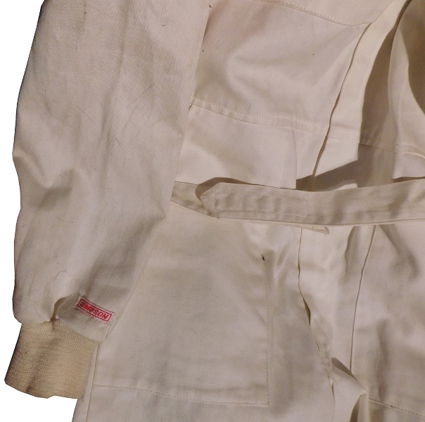
 The cowl tag is a Simpson non Nomex variation, with two flag tags. One is a size tag indicating M, the other is a made on tag indicating it was made in 8/91.
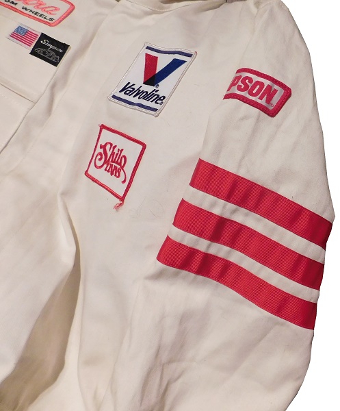
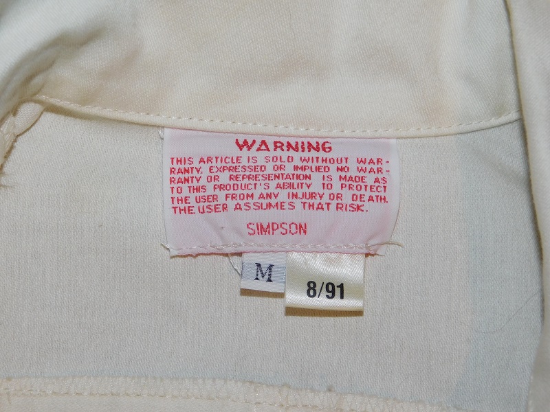 Here is the first indication that this was used in SCORE, the right chest patch features an ULTRA CUSTOM WHEEL patch sewn into it.
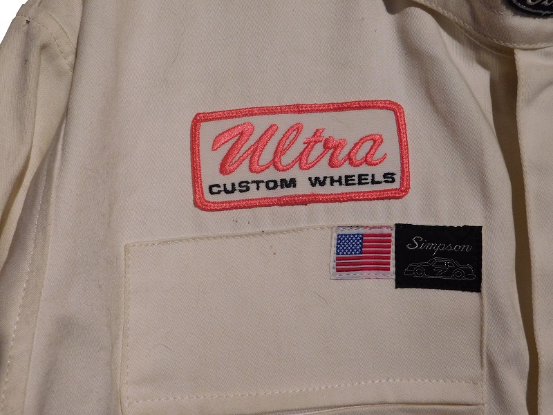 Evidence indicating that these suits date to 1994-1995 is on the left chest. Sewn into the material, which feels rather unusual, almost like a dipped polyester, is a VALVOLINE patch, and a SHILO INN patch. These two logos are clearly visible in all photos of Robby’s CART rides in 1994 and 1995. All of the chest logos are also visible in what few photos I’ve been able to find of Robby’s SCORE rides in 1995.
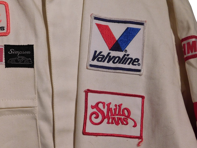 The front torso doesn’t have any logos adorning it, nor does the belt.
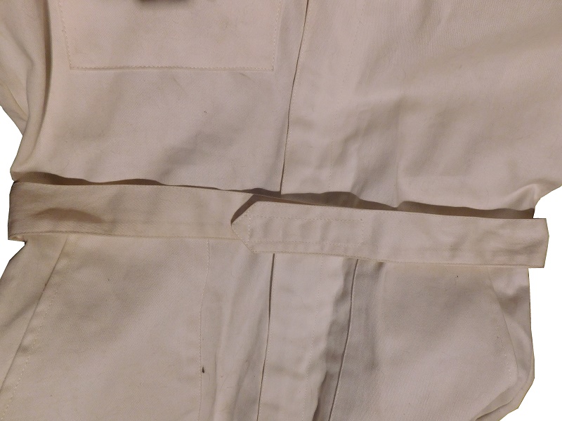
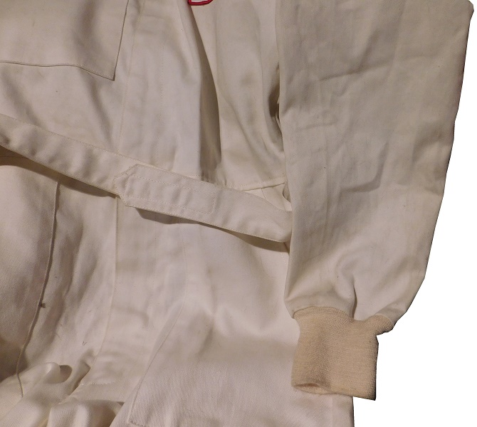
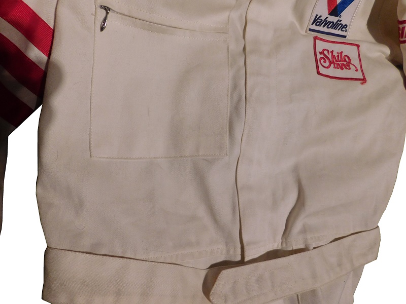
 The legs are unadorned, and have standard cuffs.
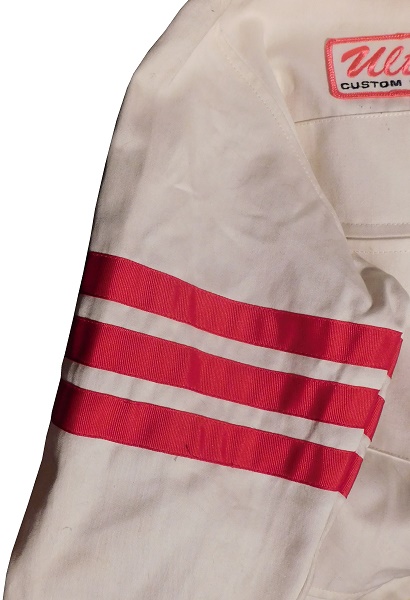
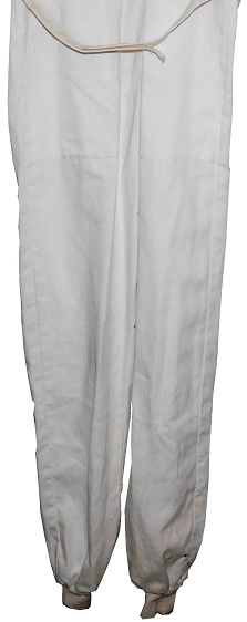 The shoulders have no adornment, and the sleeves have three red stripes on the upper sleeve, and nothing on the lower sleeve. The left sleeve has a SIMPSON patch.
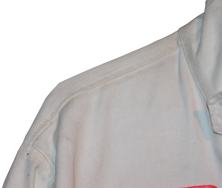
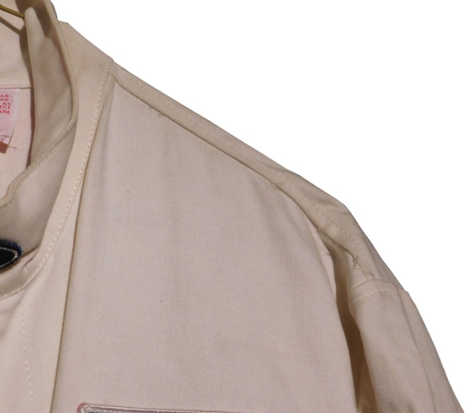
 The back of the suit shows some light wear.
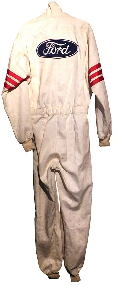 The back of the neck has no adornment at all.
 The back torso has a large FORD blue oval patch sewn into it.
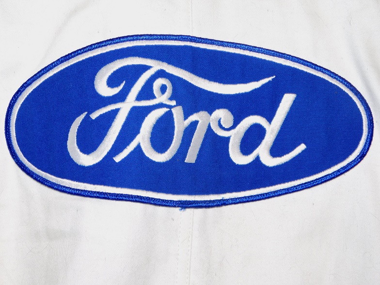 I’m fully convinced this is a SCORE suit and not a CART suit. First off, no crew member would be dumb enough not to wear a Nomex suit. Second, the lack of customization is a telling piece of evidence. Between photos and videos, I’ve been able to determine that Gordon wore a blue suit in CART. While there is evidence that Gordon at the very least wore a suit with some customization, for a SCORE crew in that era, it doesn’t seem so far fetched that they would wear a cheap suit with some patches while working on the truck. Based on all of the above evidence, I can safely say that this is a SCORE pit crew suit from 1994-1995, more than likely 1994.


