Richard Lasater and His Helmet

By David G. Firestone

Spent the last week just being insanely busy, with Passover and the Chicago Sun Times Collectables Convention, but now back to work. I’ve discussed the safety aspects of race gear, but today, I’m going in a bit of a different direction. Even in today’s safety-conscious racing environment, injuries are always a possibility. Denny Hamlin suffered a fractured vertebrae, and Dale Earnhardt Jr. has suffered a concussion in the last few years. Wrecks can be hell on drivers, but what about the uniform protecting them? What would a helmet from a wreck like this look like?

Well the helmet looks like this:lasater-1 lasater-2 lasater-3 lasater-4 lasater-5 lasater-6 lasater-7

For a helmet that went through a scary-looking wreck, it is in good shape…and that is not by accident. It was worn by Richard Lasater throughout the 1993 season. At the 1993 Fram Filter 500K, Lasater was involved in that scary wreck, and wasn’t seriously hurt. As for overall damage, it is mainly scratches, scrapes and dings, no cracks or serious damage.

The helmet kept Lasater safe and suffered minor damage because that is what it was designed to do. After the race, he autographed the helmet and it wound up in my collection. This helmet shows better than any other helmet I have the reasons why proper equipment is needed in racing.

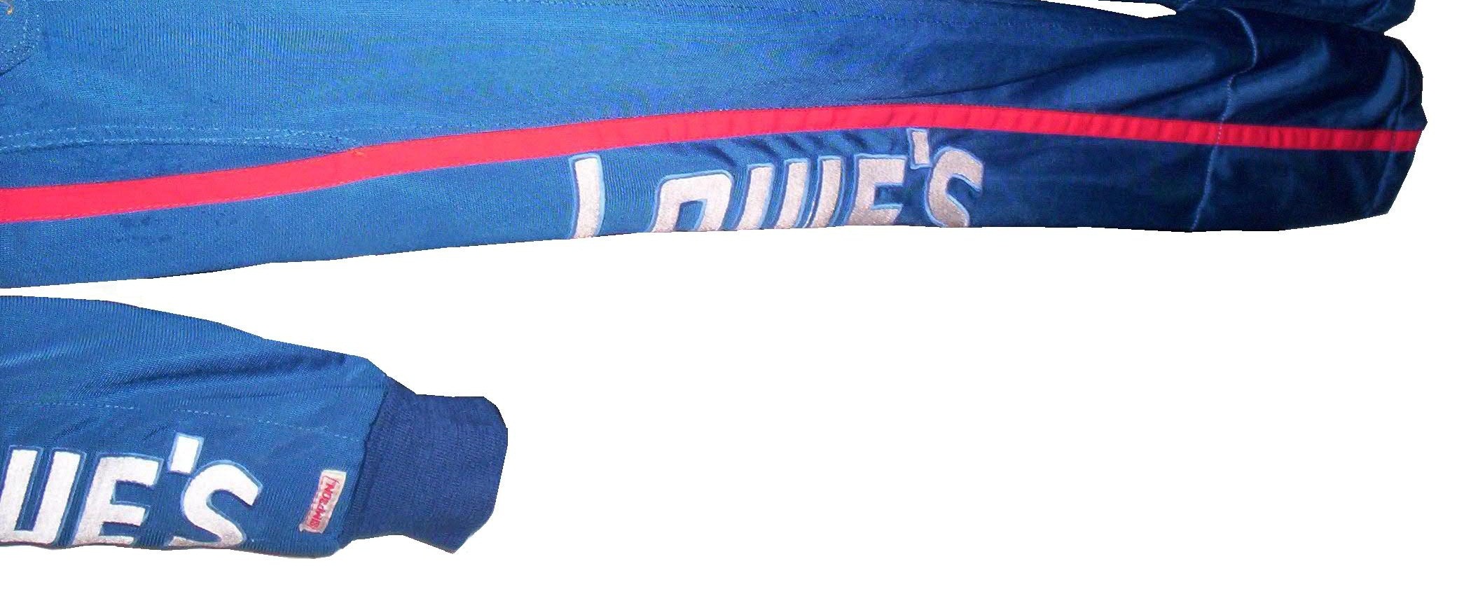
On to Paint Schemes…

Jamie McMurray #1 Bass Pro Shops Chevy SS White? Seriously? Did the designers not realize that the white looks awful? The black and orange color scheme works, but white? I don’t get this scheme at all, and it gets an F grade

Marcos Ambrose #9 MAC Tools Ford Fusion Good color choices here. The basic design is solid. I can do without the quarter panel design, but it is still a good scheme with a B grade-

Danica Patrick #10 Go Daddy St. Patrick’s Day Chevy SS I would like to thank the 1978 Cincinnati Reds for being one of the first teams to wear green on St. Patrick’s Day for encouraging this awful F grade scheme.-

Denny Hamlin #11 Fedex March of Dimes Toyota Camry There are two schemes that fans voted for. With Hamlin on the shelf for a while, Mark Martin and Brian Vickers will share the 11 ride. That said, scheme #1 I don’t hate, but it has something odd going on with the hood and nose design…I swear it looks like the two parts were designed by different people who never interacted with each other, and that earns it a C grade Scheme #2, the better of the two schemes, not only looks more like a FedEx scheme, it is simpler and much cleaner as well, and earns an A grade.

Tony Stewart #14 Rush Truck Centers Chevy SS Good color and design schemes here. A Grade

Kyle Bush #18 Snickers Bites Toyota Camry A paint scheme that has a great color scheme, and illustrates the theory that less is more. Nothing bad about this Scheme-A+

Jeff Gordon #24 Imron Elite Real Truck Paint Chevy SS Based off the classic Jeff Gordon Scheme, it looks really good, and it works as a paint scheme. Great color scheme used here…A+

Jeff Gordon Cromax Pro Chevy SS Another good DuPont inspired scheme with a great color scheme and great design-A+

Ken Schrader #32 Federated Auto Parts Ford Fusion Federated Auto Parts always has great looking cars, and they do not disappoint here. Great color scheme and great design earn a great grade of A+

Timmy Hill #32 U.S. Chrome Ford Fusion NASCAR rules prevent using chrome in most NASCAR paint scheme aspects, which is kind of disappointing since this scheme should have a bit of chrome in it. Even so, it is still a solid A scheme, with great colors and simple, yet elegant design

Josh Wise #35 MDS Ford Fusion The color scheme of the car, and the color scheme of the logos match! As a direct result, the car looks so much better! This scheme earns a B grade because the deisgn on the quarter panel needs some work.

Ryan Newman #39 HAAS Automation Chevy SS Great color scheme, good basic design, I love the diagonal hood logo, A+ Scheme

Brian Vickers #55 RK Motors Toyota Camry Basic design with an uninspired color scheme. The car is just blah. I can’t give this scheme anything except a C-

Brian Vickers #55 Jet Edge Toyota Camry A better color scheme takes the grade from C to B

Joe Nemecheck #87 Maddies Place Rocks Toyota Camry Simple design, decent color scheme, good hood logo, Final grade B

Dale Earnhardt Jr. #88 Amp Energy Chevy SS Orange? Amp’s main can color is green. It’s not a bad design, but using a color that isn’t really used on the packaging earns this scheme a C-

The Epaulet…What It Was, and What It Is

12-miller-rshoulder - CopyThe mighty epaulet, every racing fan has seen them, but few understand what they are for. They are now mostly for fashion and sponsor exposure, but epaulets have a more interesting history than one might think.12-miller-lshoulder

Back in the 1950′s and 60′s, racing suits were supposed to provide fire protection, but early versions of the suit were very unreliable. Many drivers perished in fires, and sometimes, drivers were trapped within the car, unable to escape the raging inferno within their car. The solution? The epaulet. Mounted on both shoulders, epaulets were reinforced strips of fabric specifically designed to help pull an injured or unconscious driver from a burning car. Epaulets quickly became an integral part of the driver suit.10-labonte-rshoulder

As racing technology became more advanced, the need for epaulets for safety began to decrease, but this was happening at a time when coverage was increasing and sponsorship was rising. It did not take that long for sponsors to realize that they could slap a logo on the epaulet and get the company name more visible on pictures and TV interviews. As such the epaulet made the successful transition from safety feature to fashion accessory.

10-labonte-lshoulder

As in-car cameras began to become commonplace across racing, epaulets evolved with them. I mentioned in a previous post that Christian Fittipaldi favored epaulet styles used in F1 and IndyCar. When Sparco first came to NASCAR in the early 2000′s, they brought their epaulet style with them, and it quickly became the standard for NASCAR epaulet style. Most driver suits worn in NASCAR today involve some variation of the Sparco epaulet. They have evolved very well over the years, and are a familiar part of the driver suit

Moving on to paint schemes…

First the NASCAR Camping Word Truck Series

Ty Dillon #3 Bass Pro Shops Chevy Silverado Bass Pro Shops has a great scheme this year, both in the Cup series, and this scheme is just good. Nothing wrong, everything right, Final grade: A+

Brendan Gaughn #62 South Point Hotel and Casino Chevy Silverardo This scheme is very simple, and looks really good. The color scheme is solid, and brings back memories of Rusty Wallace driving for Miller Genuine Draft. The lettering is easy to read, and stands out. Final Grade: A

Now on to the Sprint cup Series…

Trevor Bayne #21 Ford Motorcraft/Quick Lane Ford Fusion I think this is a prototype, but that said, this is still a classic scheme. It has a great color scheme, number design, and is just a solid scheme all around. Final Grade A+

Jeff Burton #31 Cheerios Chevy SS This scheme is rather under designed for my taste. The color scheme is decent, but the gray Cheerio design is hard to see, and looks more like soda carbonation rather than breakfast cereal. Final Grade C+   On a related note some more pics from the Caterpillar scheme have been released, and they are still using the same scheme from last year.  It is pretty good, so my final grade will not change.

Austin Dillon #33 Honey Honey Nut Cheerios Chevy SS Now this is just awful. The color scheme is bad, and the HONEY NUT CHEERIOS lettering is nearly invisible. The bright blue Kroger logo looks out of place, and the tailpipe decals with rookie stripe just takes more away from an already bad scheme. Final Grade F-

Television Logos

By David Firestone

I recently did a post focusing on Christian Fittipaldi, and the unusual way his suit displayed the so-called television logos.  But these logos have a unique history all their own.  One of the first examples on an in-car camera being used was the 1979 Daytona 500.  At that time driver suits mostly looked like this: That is Buddy Baker after winning the pole at Bristol that same year.  As can be clearly seen, no logos of any kind on the legs, or sleeves.  For much of the early and late 1980′s that was mostly the case.  Even though by 1989 there were opportunities to add logos in good places, in many instances this did not occur.  There are instances where there were logos on the legs and sleeves, and the position in many of them is consistent with today.

In the late 1990′s, TV logos were still, for the most part off the radar screen.  But around 1997, sponsors started taking the hint, and adding these logos.  Although it was not popular across the board,  it steadily gained momentum, and by 2004 these logos began to be the rule rather than the exception.    Granted in-car cameras were somewhat more nomadic then they are now, but even still it is kind of amazing that these logos took as long as they did to catch on.  Here is an example of a televison logo.  This logo comes from a Mike Skinner suit from 1997:31-skinner-rsleeve2 - Copy


This is how it appears when the driver’s arms are at their sides.  When the driver has his arms at the wheel, or crossed, the logo appears like this:31-skinner-rsleeve2

It seems so simple, and it is surprising that it took that long to figure this out.  In fact, in a number of instances, logos on sleeves looked like this, The Ted Musgrave suit from a previous post:15-musgrave-rsleeve1

While that looks good outside the car, inside the driver compartment, it looks like this to an in-car:15-musgrave-rsleeve1 - Copy

Not good for an in-car, the logo is next to impossible to read.  The legs have gotten the same treatment, in some cases the logo looks like this Ricky Craven model from 1996:41-craven - Copy

But to an in-car camera, the logos look like this:41-craven-legs - Copy

Again, the logo is impossible to read.  The proper alignment looks like this:31-skinner-legs

This is the proper alignment, when the driver is in the car, and the camera is to the side, the logo appears as such:31-skinner-legs - Copy

The whole point of sponsorship in racing is brand exposure, and these logos are a perfect example of this.  I still love the fact that even the drivers who almost never have an in-car camera have these logos.

Moving on to more 2013 paint schemes….

Ryan Newman #39 Wix Filters Chevy SS  “Black with lime green and silver shark fins is a really great design” said no one ever.  Final Grade: F

Moving on to the Nationwide Series…

Austin Dillon #3 Advocare Chevy Camaro  I’m not a fan of power blue in most cases, but here it just works.  The RCR 3 always looks good, the logos are good, and the whole car looks sold.  Final Grade: A

Regan Smith #5 Tax Slayer/Hellmans Chevy Camaro  Could someone please explain to me why Dale Jr. and Regan Smith are running identical paint schemes in the Nationwide Series this year?  The only differences between the two cars are the numbers and name rail.  The Hellmans scheme stays at a B-, but the Tax Slayer scheme looks better from the layout shown here, and it has earned the A rating.

Brad Keselowski #22 Discount Tires Ford Mustang This would be an A grade, if not for the Discount Tire logo…why does it look like it was designed by a 5 year old in art class?  The letters are so horribly aligned, it takes the scheme from classic to comical.  I’m shocked that it isn’t written in Comic Sans with the D backwards.  It is really sad, because it takes away from an otherwise great scheme, and takes the final grade from A to B-

Ty Dillon #33 Ritz/Wesco/Armour Chevy SS Three schemes to discuss.  The Wesco scheme is good but if the door numbers were a different color than the stripes, it would get a better grade than B-.  The Ritz scheme is completely solid, with great colors, great design, and great logos, and gets an A.  The Armour scheme is decent, but the numbers could use a more visible outline.  There is also a logo just behind the door number that is next to invisible.  Final Grade B+