The SFI and FIA patches…Why they are as critical as they are.

fia 1By David Firestone

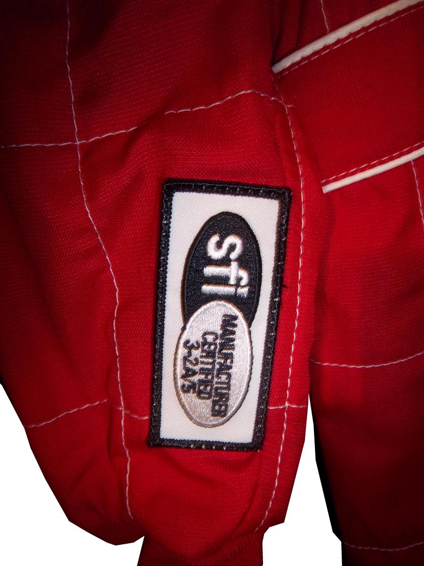
Many race fans have seen these small patches on driver suits, and may have wondered what they are. What many do not realize is that these small patches have a very critical role in driver safety. These small patches are the safety certification patches. These small patches state that this uniform part has been examined by one of the two groups, and determined to meet the standards set by the group. For North American made equipment that group is SFI.

sfi

According to their website, SFI was founded in 1963 as part of Speed Equipment Manufacturers Association or SEMA, as a safety group. Back then, the safety culture wasn’t as rigorous as it is today, and there were not many standards in place. SEMA started the safety certification with SFI or SEMA Foundation, Inc certification. If the equipment didn’t meet SFI standards, the participant could be denied entrance to the event. Eventually, SFI left SEMA and became its own independent group.

Since then, SFI has certified safety equipment, and their certification is the standard in North America. This small patch is usually sewn into the inside wrist area on the left sleeve. This example, from a Terry Labonte suit from 2008, indicates that the suit meets “3.2A/5” standards. According to their site, this certification is standard for driver suits, and this suit would need re-certification in the next 5 years, or 2013. This certification is standard for many NASCAR suits, as shown below.12-stremme-sfi36-said-sfi
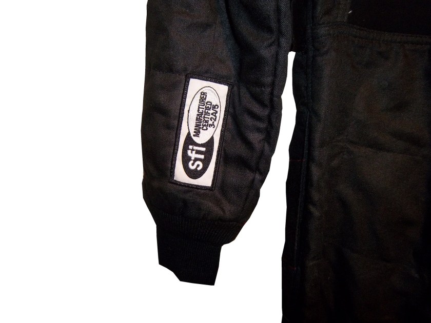
10-labonte-sfi 12-miller-sfi

For suits made internationally, the certification comes from a different group, the FIA Institute. Like SFI, the FIA Institute has the exact same goal, to make sure auto racing is safe, and that the equipment that drivers wear is as safe as possible. Unlike SFI however, FIA certification ends up in one of two places, either on the back of the neck,36-barron-neck
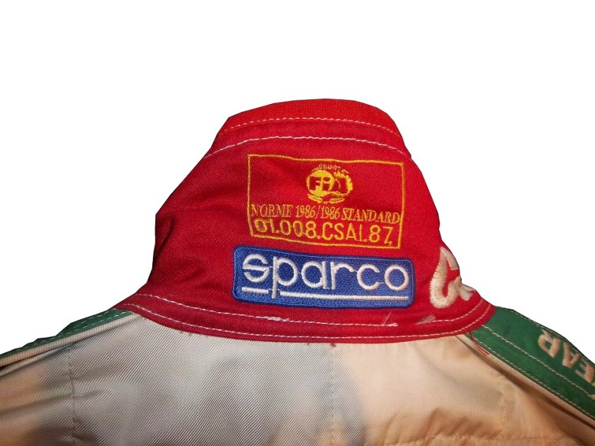
or inside the belt,

9-kahne-fia

Both certifications serve the same purpose and both are mandated in racing today. These certifications also appear on driver gloves,90-stricklingloves-ltag

and even helmets, usually on the HANS anchormcdonalds-2 - Copy

Moving on to more 2013 paint schemes…

Trevor Bayne #6 Valvoline Ford Mustang Love this scheme! This brings back some fond memories of Mark Martin behind the wheel back in the 1990’s. The color and design scheme are amazing, so it gets an A

Regan Smith #7 Tax Slayer/Hellman’s Chevy Camaro Same as the 5 and 88, so nothing really to say here…

Brad Keselowski #22 Hertz Ford Mustang Only Penske can ruin one of the best color schemes with an awful design. Seriously what is the design on the front? It kills this scheme. Final Grade: D

Travis Pastrana #60 Ford Mustang What the Hell? Did Lisa Frank design this car? I’d love to comment on the color scheme, but just looking at the picture is enough! I didn’t think it was possible to make a scheme worse than the Kyle Bush Sponsafier car, but here we are! Final Grade: F’

By the way, I never thought I would reference Lisa Frank in this blog…

Jamie McMurray #1 Cessna Chevy SS Cessna has figured out the way to a good paint scheme, simple colors and simple design. It works very well and earns an A grade.

Casey Mears #13 Geico Ford Fusion Eww…just eww. The color scheme is dreadfull, and the designs on the side are painful to look at. It passed because of the logo and number design. Final Grade: D-

Kyle Busch #18 Interstate Batteries Toyota Camry Great color scheme, and good basic design, but there is something with this car I find annoying. The driver’s name is on the windshield and above the door, so why is it on the top of the hood? Not just on the top of the hood, but UPSIDE DOWN as well? Seriously? It makes no sense, and takes the final grade down to a B

Television Logos

By David Firestone

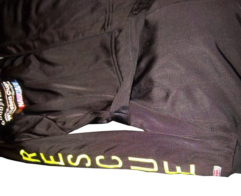
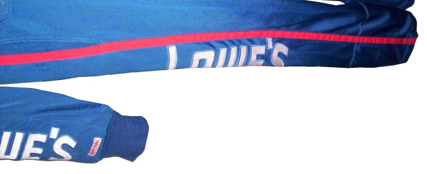
I recently did a post focusing on Christian Fittipaldi, and the unusual way his suit displayed the so-called television logos.  But these logos have a unique history all their own.  One of the first examples on an in-car camera being used was the 1979 Daytona 500.  At that time driver suits mostly looked like this: That is Buddy Baker after winning the pole at Bristol that same year.  As can be clearly seen, no logos of any kind on the legs, or sleeves.  For much of the early and late 1980′s that was mostly the case.  Even though by 1989 there were opportunities to add logos in good places, in many instances this did not occur.  There are instances where there were logos on the legs and sleeves, and the position in many of them is consistent with today.

In the late 1990′s, TV logos were still, for the most part off the radar screen.  But around 1997, sponsors started taking the hint, and adding these logos.  Although it was not popular across the board,  it steadily gained momentum, and by 2004 these logos began to be the rule rather than the exception.    Granted in-car cameras were somewhat more nomadic then they are now, but even still it is kind of amazing that these logos took as long as they did to catch on.  Here is an example of a televison logo.  This logo comes from a Mike Skinner suit from 1997:31-skinner-rsleeve2 - Copy


This is how it appears when the driver’s arms are at their sides.  When the driver has his arms at the wheel, or crossed, the logo appears like this:31-skinner-rsleeve2

It seems so simple, and it is surprising that it took that long to figure this out.  In fact, in a number of instances, logos on sleeves looked like this, The Ted Musgrave suit from a previous post:15-musgrave-rsleeve1

While that looks good outside the car, inside the driver compartment, it looks like this to an in-car:15-musgrave-rsleeve1 - Copy

Not good for an in-car, the logo is next to impossible to read.  The legs have gotten the same treatment, in some cases the logo looks like this Ricky Craven model from 1996:41-craven - Copy

But to an in-car camera, the logos look like this:41-craven-legs - Copy

Again, the logo is impossible to read.  The proper alignment looks like this:31-skinner-legs

This is the proper alignment, when the driver is in the car, and the camera is to the side, the logo appears as such:31-skinner-legs - Copy

The whole point of sponsorship in racing is brand exposure, and these logos are a perfect example of this.  I still love the fact that even the drivers who almost never have an in-car camera have these logos.

Moving on to more 2013 paint schemes….

Ryan Newman #39 Wix Filters Chevy SS  “Black with lime green and silver shark fins is a really great design” said no one ever.  Final Grade: F

Moving on to the Nationwide Series…

Austin Dillon #3 Advocare Chevy Camaro  I’m not a fan of power blue in most cases, but here it just works.  The RCR 3 always looks good, the logos are good, and the whole car looks sold.  Final Grade: A

Regan Smith #5 Tax Slayer/Hellmans Chevy Camaro  Could someone please explain to me why Dale Jr. and Regan Smith are running identical paint schemes in the Nationwide Series this year?  The only differences between the two cars are the numbers and name rail.  The Hellmans scheme stays at a B-, but the Tax Slayer scheme looks better from the layout shown here, and it has earned the A rating.

Brad Keselowski #22 Discount Tires Ford Mustang This would be an A grade, if not for the Discount Tire logo…why does it look like it was designed by a 5 year old in art class?  The letters are so horribly aligned, it takes the scheme from classic to comical.  I’m shocked that it isn’t written in Comic Sans with the D backwards.  It is really sad, because it takes away from an otherwise great scheme, and takes the final grade from A to B-

Ty Dillon #33 Ritz/Wesco/Armour Chevy SS Three schemes to discuss.  The Wesco scheme is good but if the door numbers were a different color than the stripes, it would get a better grade than B-.  The Ritz scheme is completely solid, with great colors, great design, and great logos, and gets an A.  The Armour scheme is decent, but the numbers could use a more visible outline.  There is also a logo just behind the door number that is next to invisible.  Final Grade B+

New Paint Schemes and Some IndyCar News…

We start off today with a unique story from IndyCar.  Ryan Hunter-Reay won the Izod IndyCar Series Championship last season, and as such has the right to use the number 1 on his car.  He normally used 28 as his car number, because 28 million people worldwide are affected by cancer, and his mother passed away from cancer in 2009.  So he is using a number 1 with a rather unique twist.  Also mentioned that Marco Andretti will switch to number 25 from 26 next year.

Moving on to NASCAR paint schemes, let’s look at the Nationwide Series first.  Two Chevy schemes and one Ford scheme have been released so far

Sam Hornish-#12 Alliance Ford Mustang  Could someone explain to me why in the world it has door handle decals?  And why does it have a blue line on the door that looks like race damage?  I really want to defend this scheme, but no, just no.  Final Grade: C

Kevin Harvick-#33 Hunt Brothers Pizza Chevy Camaro    First off, the Camaro looks really good on its own, and this paint scheme works quite well.  The door-handle decal is visible, but not as bold as the Hornish car.  The green/white contrast works well, and the decal package on the front looks really good.  The stripes on the sides work very well, and are not as haphazard of some schemes I have seen for this season.  Final Grade: A

Dale Earnhardt Jr./Cole Whitt-#88 Tax Slayer Chevy Camaro  Decent color scheme at work here, but what is with the pink roll cage?  The red black and white scheme has a similar color in the front stripe at the nose.  It’s visually distracting, and pointless.  The powder blue/pink stripe takes away from a great scheme and takes the final grade from an A to a B-.  Get rid of the blue, and it would be an A

Now we look at the Sprint Cup Schemes

Kasey Kahne-#5 Time Warner Cable Chevy SS  Awful color scheme, check.  Door and panel design that is supposed to be edgy but is really a cliche, check.  The most unoriginal sponsor logo in NASCAR, check.  Ok, I think we’re all done here, Final Grade: D

Ryan Newman-#39 Quicken Loans Chevy SS  Want to have some fun, open the Kahne link, and this link in two different tabs, and switch back and forth to see how “original” this scheme is.   Clearly both were designed by the same person, they look almost identical, except the fronts are a little different, and the color scheme on the Newman car is much better.  Final Grade: C-

Jeff Gordon-#24 Drive to End Hunger Chevy SS Yuck! They took one of the best color schemes ever and ruined it!  But these shots do feature a new design that will be used in NASCAR in 2013, and that is a sponsor decal on the roof.  The close-up of the rear-end shows the decent taillight decals, and the unnecessary tailpipe decals, as well as the updated Chevy logo.  Final Grade: D-

Been a long day, will be back tomorrow.