Paint Scheme Grades…A Change to the Format

By David G. Firestone

So after giving this some thought after the 2015 tracker, I decided that I need to do more on this blog.  Toward that end, starting on Fridays, I will post paint scheme grades.  I will work on them during the week up to Thursdays, and then post them on Friday morning.  Once the 2015 season starts, I will move this to Wednesdays.  So without further ado…paint scheme reviews!  Let’s start with 2015 grades from new schemes featured on Wednesday…

Brad Keselowski #2 Miller Lite Ford Fusion The same basic scheme as 2014, but the hop design, gold trim, and old Miller crest have been removed, and the look is much smoother and cleaner. I didn’t think they could improve on an A+ design, but they proved me wrong, so I’ll give it an A++!

Austin Dillon #3 Cheerios Chevy SS Good color scheme, great design, A+

Austin Dillon #3 Dow Chevy SS While I like the color scheme and number and logo designs, the white stripe up the side kills the look. It takes an A scheme to a B+ scheme.

Kevin Harvick #4 Budweiser Chevy SS– Same Scheme as last year, same grade, A

Kevin Harvick #4 Jimmie Johns Chevy SS Great color and design, but I still don’t understand why Jimmy Johns sponsors Harvick instead of Jimmie Johnson…still a solid A scheme

Kevin Harvick #4 Outback Steakhouse Same Scheme as last year, same grade, A

Kevin Harvick #4 Ditech Chevy SS New sponsor for 2015, and it has a great look. The blue as a whole is good, and the contrasting blue on the door numbers looks really good. The door design gives the appearance of an old school brake duct, and this car just looks great! I give it an A+!

Kasey Kahne #5 Great Clips Chevy SS Same scheme as this year, same D+ grade

Kasey Kahne #5 Time Warner Cable Chevy SS It is a good color scheme, but the design on the side needs a little tweaking. Get rid of the needless zig-zag pattern and it works a whole lot better. It is still a decent scheme, so I will give it a C

Trevor Bayne #6 Advocare Ford Fusion New team, new design for 2015. I love the basic design, and the color scheme is great. However the candy cane stripes on the nose are pointless, and take away from the overall design. I’ll give it an A-

Danica Patrick #10 Aspen Dental Chevy SS Same scheme as last year, same C grade

Tony Stewart #14 Bass Pro Shops/Mobil 1 Chevy SS A perfect example of why camo does not work on race cars. If it were just the orange and black, I would give it an A- but the camo takes it down to a B- and the white takes it down to a C+

Tony Stewart #14 Mobil 1/Bass Pro Shops Chevy SS Much smoother look, much better design, I’ll give it an A

Tony Stewart #14 Code 3 Associates/Mobil1 Chevy SS Same design as last year, same C grade

Greg Biffle #16 Ortho Bug-B-Gon Ford Fusion Red and black is a great color scheme, and the fade effects are pretty cool too. The ant design is really good, so for the first time in a while, Greg earns an A+

Ricky Stenhouse Jr. #17 Fastenal Ford Fusion New design for 2014, great color scheme, blue and white is highly underrated, and a good design earns an A

Joey Logano #22 Shell/Pennzoil Ford Fusion Same design as last year, same D grade

Paul Menard #27 Pittsburgh Paints/Menard’s Chevy SS Same design as last year, same A grade

Ryan Newman #31 Cat Chevy SS Same color scheme as last year, but with a much smoother and simpler design. I can’t give it anything less than an A+ so I won’t

Ryan Newman #31 Quicken Loans Chevy SS Same scheme as last year, same A+ grade.

Kurt Busch #41Haas CNC Chevy SS Complete redesign, and like Brad Keselowski, I didn’t think they could improve on an A+ design but I was wrong. A+

Kurt Busch #41 Slate Water Heaters Chevy SS Same scheme as last year, same B- grade

Aric Almirola #43 Smithfield Ford Fusion One of the rare instances where I will change a grade. I didn’t like this design initally, I gave it a D+, but it has grown on me, and I think it deserves a B-

Now on to 2014

Jamie McMurray #1 Cessna/McDonalds Monopoly Chevy SS Another instance of two different car designs clashing with each other, and it does not look good at all. D-

Kasey Kahne #5 Pepsi Chevy SS Good color scheme, but much too overdesigned. C-

Trevor Bayne #6 Advocare Ford Fusion See Above

Danica Patrick #10 Go Daddy Chevy SS-Pinkwashing is an automatic F.

Matt Kenseth #20 Home Depot Toyota Camry A fitting end to 15 years of NASCAR sponsorship is with a C- design. Love the color scheme, hate the overall design scheme.

Joey Logano #22 Pennzoil Platnum Ford Fusion Contrasting colors and being over designed to the point of absurdity earns this scheme a solid F.

Cole Whitt #26 Moen Toyota Camry Great color scheme, great overall design, A+

Blake Koch #32 Leaf Filter Ford Fusion Good color scheme, much too over designed, C-

Timmy Hill #33 Retro Infinity Chevy SS Great color scheme, much too over designed. C-

Reed Sorenson #36 Zing Znag Chevy SS It has pinkwashing elements which earn it an automatic F

Corey LaJoie #77 Essex Homes Ford Fusion great design, mediocre color scheme earn this scheme an A-

Ryan Truex #83 Painters Ice Cream Toyota Camry Great color scheme, and simple smooth design earn this scheme an A+

Michael McDowell #95 Pieter’s Pals Ford Fusion Another great A+ Levine Family Racing scheme!

Which Way Does Your Favorite Team Lean?

99-edwards1By David G. Firestone

Number designs are an important detail in American auto racing, especially NASCAR, where the number is used on all of the merchandise sold to fans. The number is an identity for the driver and for the fans. While I was watching the Camping World RV Sales 301, for some reason, I noticed that the majorty of the car number are slanted. As the race went on, I noticed that almost all of them were slanted to the right. The Carl Edwards die cast above shows what I mean. Let’s look at the driver’s side car number up close.99-edwards1 - CopyAs you can see, the numbers are slanted with the top slanted to the right of the bottom. This gives the illusion that the numbers are being blown back by the speed of the car. I kept thinking about this and I decieded to see just who uses which slant when designing numbers for race cars. I wound up doing the NASCAR Sprint Cup Series, the Verizon IndyCar Series, and Formula 1. Here is what my research found…

NASCAR SPRINT CUP SERIES

Jamie McMurray-1-Straight

Brad Keselowski-2-Right

Austin Dillon-3-Left

Kevin Harvick-4-Right

Kasey Kahne-5-Right

Michael Annett-7-Right

Marcos Ambrose-9-Right

Danica Patrick-10-Right

Denny Hamlin-11-Right

Ryan Blaney/Juan Pablo Montoya-12-Right

Casey Mears-13-Right

Tony Stewart-14-Right

Clint Bowyer-15-Right

Greg Biffle-16-Right

Ricky Stenhouse Jr.-17-Right

Kyle Busch-18-Right

Matt Kenseth-20-Right

Trevor Bayne-21-Straight

Joey Logano-22-Right

Alex-Bowman-23-Right

Jeff Gordon-24-Right

Cole Whitt-26-Right

Paul Menard-27-Right

Joe Nemecheck-29-Right

Parker Kligerman-30-Right

Ryan Newman-31-Left

Travis Kvapil/Blake Koch/Boris Said/Eddie MacDonald-32-Right/Straight

RCR/Circle Sport-33-Left(RCR)/Right/(Circle Sport)

David Ragan-34-Right

David Reutimann-35-Right

Reed Sorenson-36-Right

David Gilliland-38-Right

Landon Cassill-40-Right

Kurt Busch-41-Right

Kyle Larson-42-Right

Aric Almirola-43-Right

JJ Yeley-44-Right

AJ Allmendinger-47-Right

Jimmie Johnson-48-Right

Justin Allgaier-51-Right

Bobby Labonte-52-Right

Brian Vickers-55-Right

Michael Waltrip/Joe Nemechek-66-Right

Dave Blaney-77-Straight

Martin Truex Jr.-78-Right

Ryan Truex-83-Right

Joe Nemecheck-87-Right

Dale Earnhardt Jr.-88-Left

BK Racing-93-Right

Michael McDowell-95-Right

Josh Wise-98-Right

Carl Edwards-99-Right

VERIZON INDYCAR SERIES

Juan Pablo Montoya-2-Straight

Helio Castroneves-3-Straight

Jacques Villeneuve-5-Right

Townsend Bell-6-Right

Mikhail Aleshin-7-Right

Ryan Briscoe-8-Straight

Scott Dixon-9-Straight

Tony Kanaan-10-Straight

Sebastien Bourdais-11-Right

Will Power-12-Straight

Takuma Sato-14-Straight

Graham Rahal-15-Right

Oriol Servia-16-Right

Sebastian Saavedra-17-Straight

Carlos Huertas-18-Right

Justin Wilson-19-Right

Ed Carpenter/Mike Conway-20-Right

JR Hilderbrand-21-Right

Sage Karan-22-Right

Marco Andretti-25-Right

Kurt Busch/Franck Montagny-26-Right

James Hinchcliffe-27-Right

Ryan Hunter-Reay-28-Right

James Davison-33-Straight

Carlos Munoz-34-Right

Martin Plowman-41-Straight

Pippa Mann-63-Right

Josef Newgarden-67-Straight

Alex Tagliani-68-Straight

Simon Pagenaud-77-Right

Charlie Kimball-83-Straight

Buddy Lazier-91-Right

Jack Hawksworth-98-Straight

FORMULA 1

Sebastian Vettel-1-Straight

Daniel Ricciardo-3-Straight

Max Chilton-4-Straight

Nico Rosberg-6-Straight

Kimi Raikkonen-7-Straight

Romain Grosjean-8-Right

Marcus Ericsson-9-Straight

Kamui Kobayashi-10-Straight

Sergio Perez-11-Right

Pastor Maldonado-13-Right

Fernando Alonso-14-Right

Jules Bianchi-17-Straight

Felipe Massa-19-Straight

Kevin Magnussen-20-Straight

Esteban Gutierrez-21-Straight

Jenson Button-22-Straight

Jean-Eric Vergne-25-Straight

Daniil Kvyat-26 Straight

Nico Hulkenberg-27-Straight

Lewis Hamilton-44-Straight

Valtteri Bottas-77-Straight

Adrian Sutil-99-Straight

Ok, that’s a lot to swallow, so let’s add the total number of number designs and look at the data:

*NASCAR-54          *IndyCar-33            *Formula 1-22         *Totals-109

Right-47-87%         Right-19-58%            Right-4-18%             Right-70-64%

Straight-3-5.5%    Straight-14-42%        Straight-18-82%     Straight-35-32%

Left-4-7%                 Left-0-0%                    Left-0-0%                  Left-4-4%

The Sprint Cup car numbers overwhelmingly are designed to lean to the right. In fact, only 6 of the 54 teams don’t use numbers that lean to the right. In IndyCar, it is much more down the middle, with 19 cars with right leaning numbers and 14 straight leaning numbers. Formula 1 is the straightest series, with only 4 of the 22 numbers being slanted. NASCAR is the only group of the series that has left-leaning numbers, all 3 of which 3, 31, and 33, are raced by Richard Childress Racing.

It is one of those odd idiosyncrasies of racing design that a lot of people see but don’t notice.  In fact, I didn’t notice until a couple weeks ago that the numbers seem to lean from one side to another.  I also am curious as to why so many teams choose to have the car numbers lean to the right.  I’m not saying it looks bad, they, for the most part, look really good.

Now we continue our theme with…

PAINT SCHEME REVIEWS!

Austin Dillon #3 Mycogen Seeds Chevy SS The red black and white scheme works very well, and it has a really good design that works well and earns an A

Kevin Harvick #4 Mobil 1 Chevy SS For a Mobil 1 design, this is pretty good. It is a lot less clutter, and shorter stripes than Tony Stewart’s car, and the color scheme is good. A+

Juan Pablo Montoya #12 Go Penske Ford Fusion Great simple design, decent color scheme earns an A-

Greg Biffle #16 3M 1942 Throwback Ford Fusion An perfect example of why throwback schemes fail. A classic logo which I have to admit looks really good, on a modern car, with modern design, modern numbers, and modern logos. It just looks out of place. F

Jeff Gordon #24 Axalta/Maaco Chevy SS The red, yellow and black color scheme works, except the blue and white Maaco logo scheme contrasts with it. The Pepsi globe looks odd there too, so I can’t give it any higher than a C-

Cole Whitt #26 Toyota of Scranton Racing Toyota Camry Great color scheme, great simple design, A+

David Ragan #34 MDS Ford Fusion Great simple design, decent color scheme earns an A-

David Ragan #34 A&W Root Beer Float Day Ford Fusion The color is good, the basic design scheme is good, but the Root Beer Float Day logos are too small. Even in this picture they look too small and are hard to see. If I am looking at a picture and I think it is too small, how do you think it will look on the track? C-

Reed Sorenson #36 Red Rocks Cafe Chevy SS The red black and white scheme works very well, and it has a really good design that works well and earns an A

Reed Sorenson #36 Zing Zang Chevy SS The overall design looks like a Richard Petty Motorsports car, the color schemes are all over the place, and the logo looks too much like a Mountain Dew logo. I give it a D-

Bobby Labonte #37 Accell Construction Chevy SS Good color scheme, but the awful template is back for Tommy Baldwin. It is really sad, because this could be a great scheme, but the template takes it from an A to a C-

Landon Cassill #40 Cars For Sale Chevy SS The yellow is too bright, and the gray and black numbers look too dark on the side. The design is mediocre and I’ll give it a C-

Kurt Busch #41 Haas Automotion Chevy SS This is a perfect example of why gray-scale color schemes don’t work. By itself it is a good look, but the Monster Energy logo, the Goodyear logo, and the contigency logos ruin the look. If it were all gray-scale, I would give it an A, but because of those flaws, it earns a B-

Aric Almirola #43 Go Bowling Ford Fusion I love what they did here. The bowling ball nose and pin design give a great impression, and the color scheme works very well here. A+

Justin Allgaier #51 Collision Cure Chevy SS Yellow black and blue is a bold color scheme choice, but this works. The design is simple, and it has a really good unique look, and I’ll give it an A

Dale Earnhardt Jr. #88 Michael Baker International Chevy SS Basically this is the National Guard scheme with a different color scheme, and let me tell you, it just doesn’t work. I love the new number design, but blue and black just doesn’t work. The overall color scheme is not great either, and it shows. It takes an A+ scheme and takes it down to a C+

Michael McDowell #95 Thrivent Financial Ford Fusion Levine Family Racing has improved leaps and bounds over last year and it shows. Great color scheme, great design, A+

Why I Hate Politics and Paint Scheme Update

By David G. Firestone

I have a lot of paint schemes to discuss and we will get to that shortly. I wanted to discuss something that took place before the Coke Zero 400 last week. It is a bit murky, but here is what took place.

Charlie Crist is a former governor of Florida, and a former Republican. After a brief hiatus from politics, he has annoucned his intentions to run for the Governor of Florida as a democrat. He had plans to run the #98 Phil Parsons Racing Ford driven by Josh Wise. After this was announced however, the Republican Party of Florida filed a lawsuit stating that it was a campaign contribution worth more than $3,000. Remember, this was the same team that was crowd funded by Reddit and Dogecoin at Talladega, and that sponsorship cost about $55,000. It was later reported that the Charlie Crist decals had been removed from the car. Phil Parsons Racing stated the deal was in response to a series of negative ads toward Crist, and that the Crist decals were part of a deal with recording artist Lee Brice. They also stated that they didn’t pull the sponsorship due to the lawsuit, and that the $25,000 sponsorship would be returned.

I frankly don’t buy any of that for a second. I think that it was because of the lawsuit, and that Phil Parsons Racing did not want to get thrown under the bus because of it. They tried to handle it as diplomatic as possible, but it still sounds sketchy. The other reason I have a huge problem with this is because the simple fact that politics and racing don’t mix. Look at what’s happened with F1 and IndyCar. Politics are a constant issue in the sport, and I for one am tired of it. Look at the Ayrton Senna/Alan Prost battle in the 1990’s! Look at The Split! Politics ruins racing!

This is not the first time a politician with deep pockets has sponsored a race car, but I hope that this is the last time. I’m not against politics, I’m against forcing it into something it has no place being in! If tobacco, cel phone carriers, and hard liqour have or had been banned from sponsoring cars, then so should politicians.

Ok enough serious stuff, on to…

PAINT SCHEME REVIEWS!

Jamie McMurray #1 Cessna/Hawker Chevy SS Nothing bad to say here…A+

Jamie McMurray #1 Lexar Chevy SS Great Color Scheme, great design, A+

Austin Dillon #3 Great Stuff Chevy SS Color scheme is good, the design looks very odd. The gold numbers and chain design does not suit the car at all, and if they were left off, I would give it an A, but this scheme earns a B-

Austin Dillon #3 NRA Museum Chevy SS Good color scheme, decent design, B+

Austin Dillon #3 Cheerios Protien Chevy SS Much too overdeisgned, decent color scheme, C-

Kasey Kahne #5 Team Stream Chevy SS Good color scheme, but Kasey loves to drive overdesigned cars, and this is no exception. I’m giving it a C which is a very fair grade here.

Kasey Kahne #5 Farmers Chevy SS Good color scheme, decent design, B+

Marcos Ambrose #9 Black and Decker Ford Fusion Good color scheme, Good design, A

Danica Patrick #10 GoDaddy/Florida Lottery Chevy SS It looks like two people designed this car, and they didn’t talk to each other while designing it. Both sets of color schemes are awful, and both design schemes are awful. F-

Greg Biffle #16 3M/DAV Ford Fusion Green usually doesn’t look good, camo never looks good, so this scheme earns an F

Greg Biffle #16 3M Aerospace Ford Fusion See Above F

Greg Biffle #16 NESN 30th Anniversary Ford Fusion A bit less overdesigned, at least by Greg Biffle’s standards, and I do like the Red Sox and Bruins logos as well, so I will give it a C

Greg Biffle #16 3M Ford Fusion Good color scheme, decent design, B+. Nice change for Greg Biffle.

Kyle Busch #18 Interstate Battery Center Toyota Camry No. Redeeming. Features. Whatsoever. F-

Ricky Stenhouse Jr. #17 Cargil Ford Fusion Much MUCH TOO OVER DESIGNED! F

Jeff Gordon Panasonic Toughbook Chevy SS Blue and white work very well, and while it is a bit over designed, it works, and I’ll give it an A

Jeff Gordon #24 Pepsi Chevy SS Great color scheme, great design scheme, A+

Cole Whitt #26 Rinnai Toyota Camry The color scheme is good, and the design is great, so it gets an A+

Cole Whitt #26 Tapout Muscle Recovery Toyota Camry Simple design, great color scheme, A+

Boris Said #32 7-Eleven Ford Fusion I normally hate green on race cars, but this works well. I like the design scheme too, and I give it an A

Bobby Labonte #33 Thunder Coal Chevy SS Great simple design and a great color scheme, A+

Alex Kennedy #33 MediaCast Chevy SS The color scheme is awful, and the design is worse. F

Reed Sorenson #36 Theme Park Connection Chevy SS Ugly design, good color scheme, C-

David Gilliland #38 Long John Silvers Free Fish and Fries Ford Fusion Great design, great color scheme, great look, A+

David Gilliland #38 Love’s Truck Stops Ford Fusions CAMO DOES NOT WORK ON RACE CARS! F

Landon Cassill #40 Snap Fitness Chevy SS So So design, good color scheme C+

Kyle Larson #42 Target Chevy SS Whadaya Know? An A+ Patriotic scheme!

Aric Almirola #43 Waffle House/Smithfield Ford Fusion The understated patriotic design scheme works well, and the color scheme works well too. B-

Justin Algaier #51 CSSUSA Chevy SS Looks good, overall design is good, color scheme is good, and I’ll give it an A

Brian Vickers #55 Aarons/Florida State Toyota Camry Good design with a good design color scheme, A

Brett Moffit #66 Toyota Toyota Camry Good color scheme, simple design, looks very good, A

Tommy Drissi #66 Hercules Toyota Camry I don’t even know where to begin…it just looks awful. F

Martin Truex Jr. #78 World Vision Chevy SS Good color scheme decent design, B-

Dale Earnhardt Jr. #88 Kelly Blue Book Chevy SS A decent scheme, but a bit overdeisgned. Color scheme looks good. B

Dale Earnhardt Jr. #88 National Guard Chevy SS See David Gilliland Love’s above. F

Michael McDowell #95 K-Love Ford Fusion I like the color scheme, and the overall design is another good Levine Family Racing scheme that earns an A

Josh Wise #98 Dogecoin Ford Fusion Good simple design with a good color scheme equals an A grade

Josh Wise #98 Phil Parsons Racing Ford Fusion Since this design is what was raced, I will grade it as such. The color scheme is decent, but it is a tad too overdesigned. It is a D+ look.

Bill Brach Vintage Suit

headerBy David G. Firestone

A couple of weeks ago, I discussed the events in 1964 that led to the invention of the Nomex driver suit. I also briefly discussed what one of these pre-Nomex suits looked like. Well that was meant as a Uni-Watch article, and was written differently than I would normally write it. It didn’t run on Uni-Watch for a myriad of reasons not worth getting in to. So for this week, I will analyze the suit in Driver Suit Blog style

Before Nomex became the standard for driver suits, racing was living in the dark ages. Drivers would race in whatever they were wearing when they came to the track. Little if any consideration was given to fire safety. As such, many drivers perished in on-track fires. Even when the fire retardant suits began to spring up, they were of little value. Prior to 1967, and for some time after, your standard driver suit was little more than a cotton or polyester suit dipped in borax and other chemicals. This made them fire retardant, but very uncomfortable to wear. Nomex made the driver suit safe and comfortable to wear.

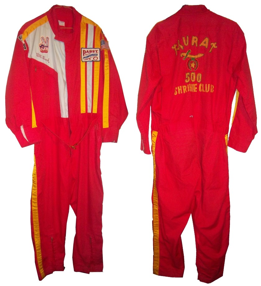
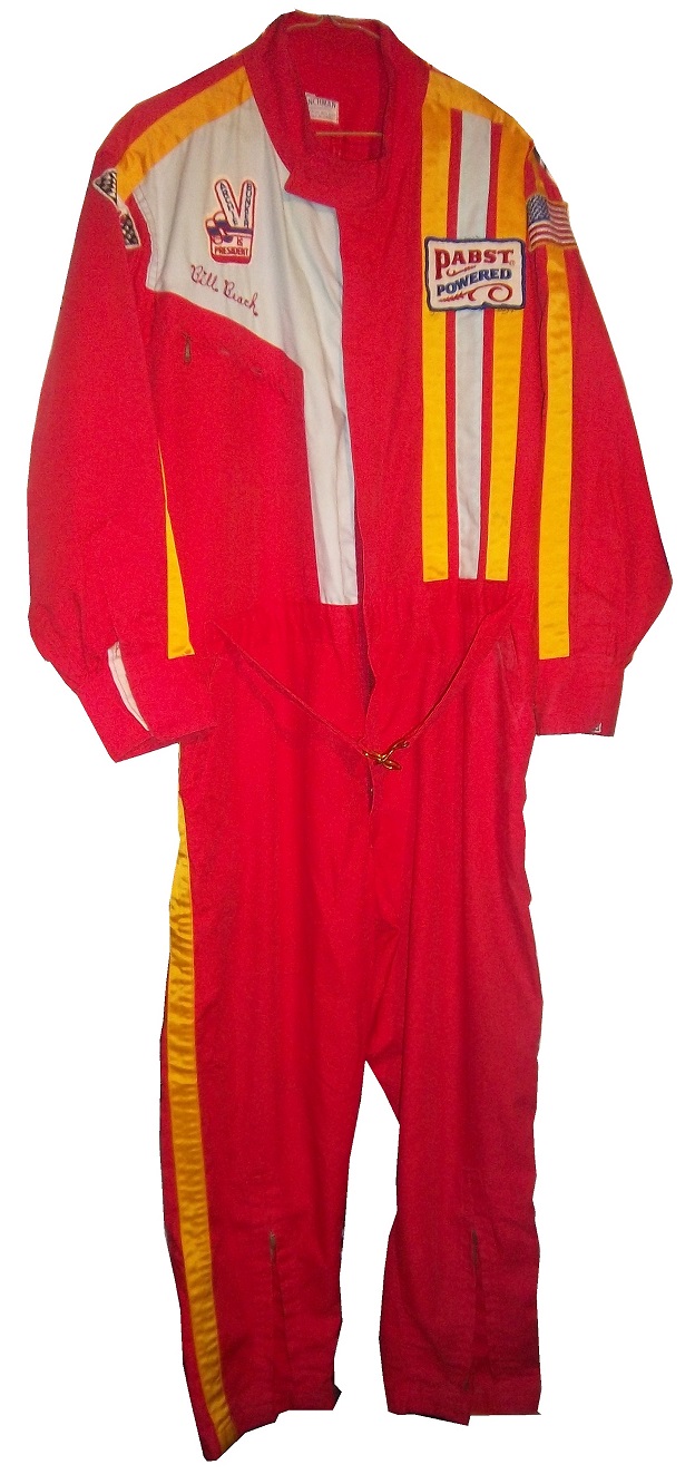
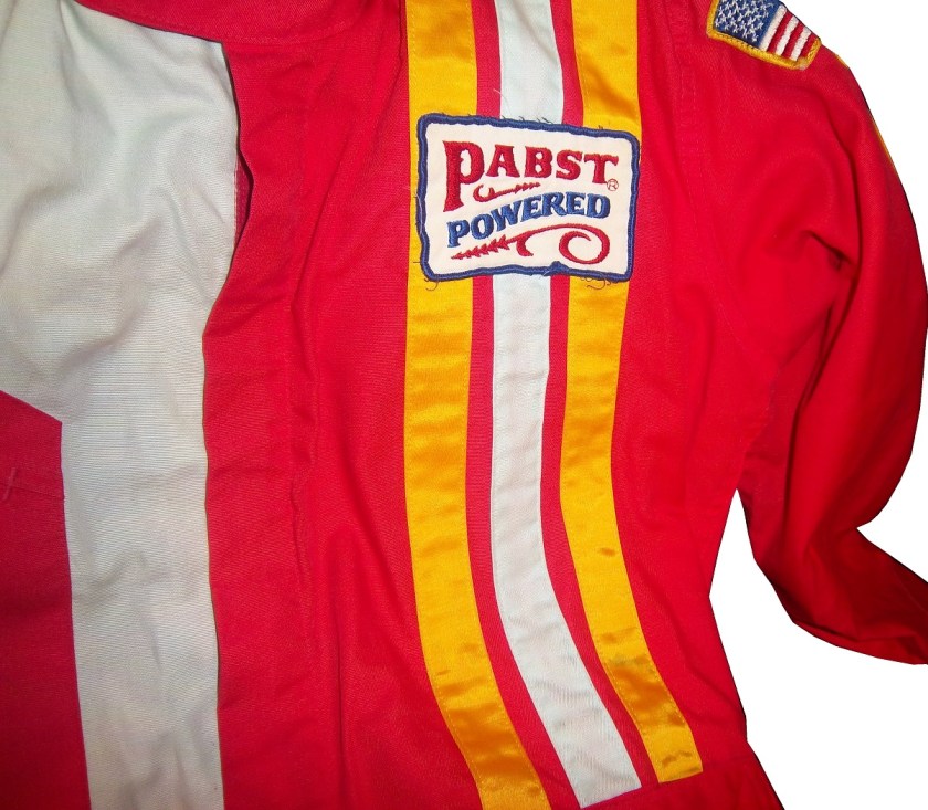
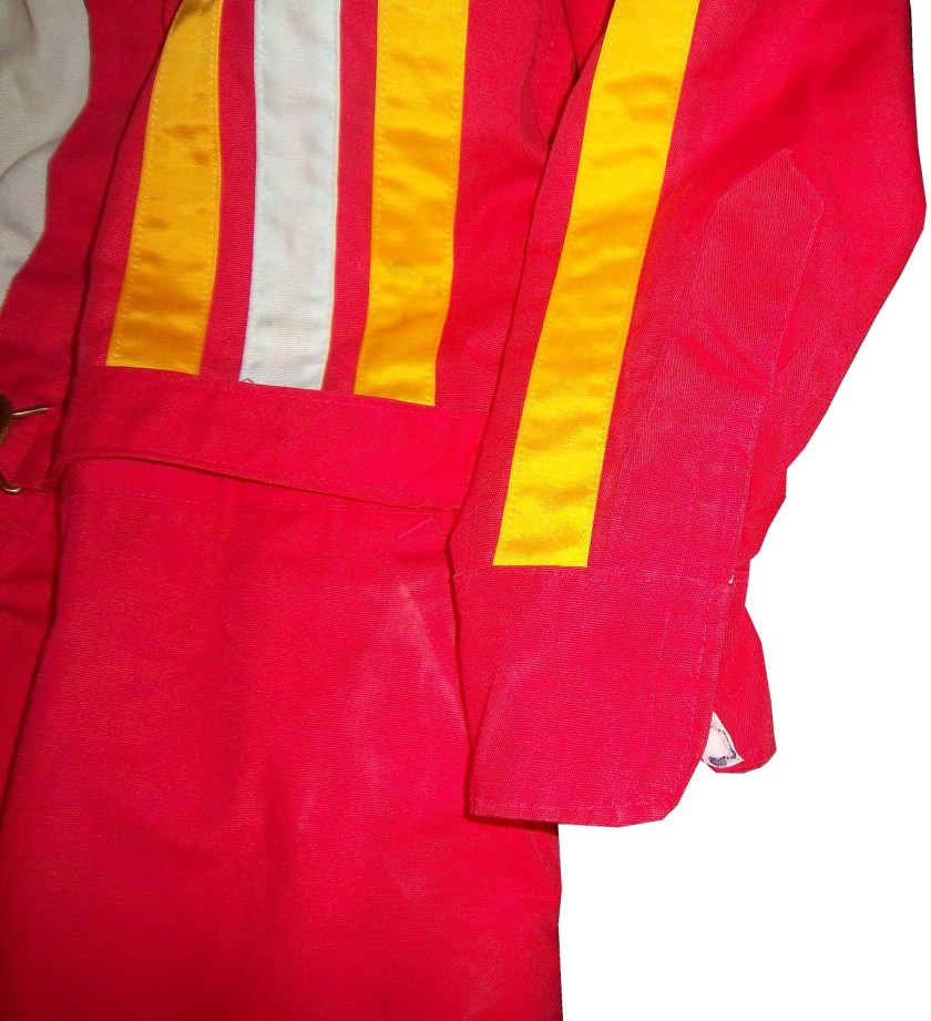
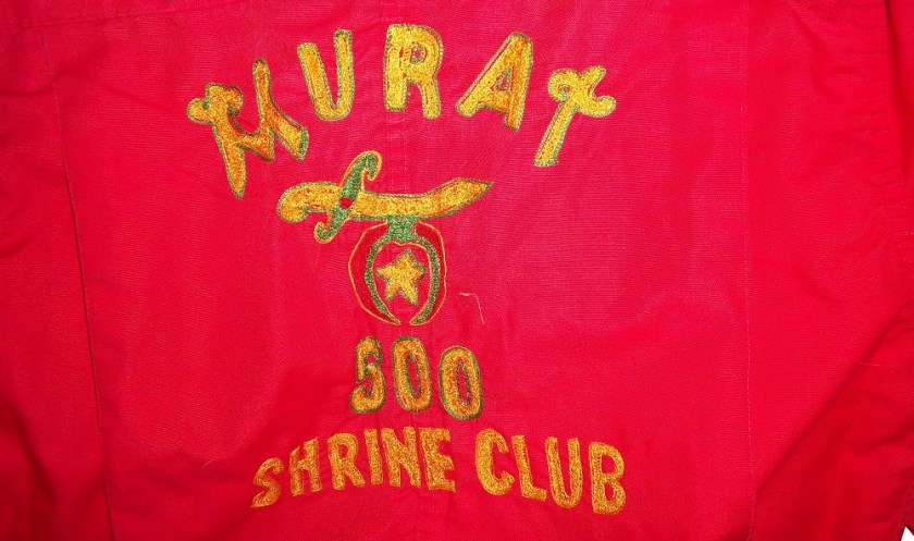
But what did these suits look like? Well this is an example of a polyester suit. It was worn by an Indianapolis based driver named Bill Brach. He was a member of the Murat Shrine in Indianapolis, and he raced in this suit.brach brachbThe suit itself dates to 1972 at least, because of an Archie Bunker For President patch.brach-rchestIt has a tag that says “Untreated, will burn,should be dipped.”brach-collar brach-tagThe polyester material is very flimsy, and is ripped in one part.brach-wearIt has a classic racing stripe up the side, similar to what Paul Newman wore in LeMans.brach-lchestThe belt has a metal-clasp to close it, unlike most suits, which use Velcrobrach-beltThe sleeves can be unzipped for comfort, which compromises the fire protection.brach-lsleeve2 brach-lsleeve3The back has MURAT 500 SHRINE CLUB in chain stitching on the back.brach-blogo

This is an example of a suit from yesteryear. One that has been made obsolete. It is delicate, thin, and in a fire was of limited value. Nomex has become the standard, and suits like this are now simply relics.

Paint Scheme Reviews

Jamie McMurray #1 Keurig Chevy SS Great color scheme, simple design, A+

Brad Keselowski #2 Miller Lite Ford Fusion Too overdesiged. Not a good look. Good color scheme. B-

Brad Keselowski #2 Redd’s Apple Ale Ford Fusion Black and Red is always a good scheme, and the overall design is good. The sticking point for me with this scheme is that APPLE ALE is almost invisible on the quarter panel. So for a final grade, it gets a B-

Kevin Harvick #4 Budweiser Folds of Honor Chevy SS A good patriotic scheme. A

Denny Hamln #11 FedEx/Autism Speaks Toyota Camry This is, by far, the best design Denny has run all year! I can’t say anything bad about it! A+

Clint Bowyer #15 RK Motors Charlotte Toyota Camry Same bad 5 Hour Energy scheme, but with an even worse color scheme. F

Greg Biffle #16 Fastenal Ford Fusion What’s worse than camo? Blue camo! F

Ricky Stenhouse Jr. #17 Fastenal Ford Fusion A mediocre scheme, that is much too overdesigned. D-

Ricky Stenhouse Jr. #17 Cargill/Winn Dixie Ford Fusion Great color scheme, and I love the flame design on the side. A+

Kyle Busch #18 M&M’s Toyota Camry Good color scheme, good design, A+

Ryan Newman #31 Quicken Loans Chevy SS Good design, great color scheme, A

Ryan Newman #31 Wix Filters Chevy SS Awful design, and awful color scheme, F

Alex Kennedy #33 Dream Factory Chevy SS Yeah it is a tad overdesigned, but it is for a charity to help children with life-threatening illnesses. So I’ll give it a B

Reed Sorenson #36 Click it or Ticket Chevy SS Another potentially good design with a great color scheme ruined by an overly complex design. B-

David Ragan #38 The Pete Store Ford Fusion Good color scheme, great design, A+

Landon Cassill #40 CRC Brakeleen Chevy SS Good design, good color scheme, Solid A.

Landon Cassill #40 NBS Chevy SS Great design, and a good shade of green…something not seen in NASCAR much. A+

Kurt Busch #41 Haas Chevy SS If the black were blue, and the red and white stripes were kept, I would like it more, but this scheme earns a C.

Kyle Larson #42 Cottonelle Chevy SS The blue looks decent, but the target logos on blue look awkward. The 42 would look better in white than dark blue as well. C+

Aric Almirola #43 Nathans Hot Dogs Ford Fusion As much as I like Nathans Hot Dogs, this is awful! The clash between the green and blue is horrific, and I can’t give this a passing grade.

Justin Allgaier #51 Hendrickcars.com Chevy SS I like the color scheme, but the car is a bit too overdesigned. Still it earns a C

Dave Blaney #77 Fochler Veterans Law / Valor 4 Vets Ford Fusion Really good patriotic scheme here, nothing wrong, A+

Dale Earnhardt Jr. #88 National Guard/Superman Chevy SS I love the red and yellow numbers, and the overall color scheme is great. The design is a bit overdesigned though, and it brings it down to a B.

Michael McDowell #95 JPO Absorbents Ford Fusion Levine Family Racing keeps cranking out good schemes, and this A scheme is no exception. Good color and design schemes.

Michael McDowell #95 JTS/Black Dragon Ford Fusion See Above…A

Michael McDowell #95 K-Love Ford Fusion Good design, but the sky blue is awful. It just looks awful. B-

Josh Wise #98 Reddit/iRacing Ford Fusion Good design, great color scheme, A

Carl Edwards #99 Fastenal Ford Fusion See Ricky Stenhouse Above…D-

Paint Scheme Grades, Some F1 News and Clarification of a Term

By David G. Firestone

I have been neglecting the Paint Scheme grades for the last few weeks, so after this brief post, we will focus on those this week.  I want to clarify a term that I use regularly.  I use the word “overdesigned” and what it basically means is that the paint scheme has design for design sake.  The scheme has design that serves no real purpose, and was just added needlessly.  Most things we own are, to a certain extent, over designed, mainly to prevent damage from regular use.  But when a car uses needless design in a paint scheme, more often than not, it looks awful.

The other news items I wanted to get to are from Formula 1.  I’m not an F1 fan per se, but I felt that these deserved some time on the DSB.  First there was a major shift in how cars are numbered in F1.  It used to be that were ever the driver finished in the previous season is what his car number was.  Now the change has been made and instead it is that the drivers pick a number and then use that for their entire careers.  Sky Sports covered the driver’s number choices in full, and I’m now a Daniel Ricardo fan!  The 2014 F1 helmet designs have been released and the designs speak for themselves.  This last item is about the man who is in charge of painting Lewis Hamilton’s Silver Arrow for the German-based Mercedes GP Petronas Formula One Team, my favorite team appearance wise in F1.  Now we move on to…

Paint Scheme Reviews

Austin Dillon #3 American Ethanol Chevy SS For many years, green was considered an unlucky color in auto racing. That said, this is a decent scheme. The green used is very good, and the overall design is good. The green around the vent on the side is needless, but this scheme still works. A-

Austin Dillon #3 Bad Boy Buggies/Realtree Chevy SS I’m seriously considering giving any camo paint scheme an automatic F because not one that I have seen in the last 5 years looks good at all. This scheme is just awful. The white/camo scheme is hideous and I’m embarrassed to have to grade it. F

Greg Biffle #16 Red Cross Give Blood/3M Ford Fusion One of Greg’s best schemes he has ever run. I can’t say anything bad. It has a simple yet attractive design, and a great color scheme. A+

Ricky Stenhouse Jr. #17 Zest Ford Fusion Same scheme as last year, same F grade.

Kyle Busch #18 Interstate Batteries Toyota Camry Same scheme as last year, same B Grade

Jeff Gordon #24 Texas A&M Engineering Chevy SS Decent color scheme, but the side design is odd. It has a little too much design. The crooked Texas A&M logo looks odd here too. Still it is a decent design and earns a C+

Paul Menard #27 Menards/Quaker State Chevy SS Quaker State has a great shade of green, and it should be the dominant color of the car. The yellow base with green accents looks awkward. I’ll give it a C

Parker Kligerman #30 Swan Racing Toyota Camry Simple design and a great color scheme earns an A+

Parker Kligerman #30 Swan Racing Toyota Camry Simple design and a great color scheme earns an A+

Travis Kvapil #32 Ask More Get More Ford Fusion Yellow, white and black is a great color scheme. Overall design is great and the car has a great look to it. A+

Travis Kvapil #32 Ask More Get More Ford Fusion Two different schemes in two weeks is unusual and for whatever reason, the new car was a bit over designed. It still has a decent look and earns a B+

Timmy Hill #33 Circle Sport Chevy SS Simple design and a great color scheme earns an A+

David Ragan #34 Taco Bell Ford Fusion Overall design and color schemes are good, and the only complaint is that the Taco Bell logo should be in color as opposed to black and white.  A+

David Ragan #34 Dockside Logistics Ford Fusion  The car looks great, with a great color scheme and great design scheme…A+

David Ragan #34 Farm Rich Ford Fusion  Good color scheme and I love the rolling hills effect…A+

Reed Sorenson #36 Tommy Baldwin Racing Chevy SS Simple design and a great color scheme earns an A+

David Gilliland #38 Long John Silvers Ford Fusion Great design, great color scheme, great look, A+

Landon Cassill #40 Nabi Tablet Chevy SS Good color scheme, but the the car, like the Nabi Tablet is overdesigned, and earns a C

Landon Cassill #40 CRC Industries / K&W FiberLock Chevy SS A very simple design, though the yellowish-green is unattractive. If the green was darker it would work better. C+

Kyle Larson #42 Clorox Chevy SS AJ Allemdinger has a good Clorox scheme, this is an awful scheme . Why did they choose that shade of yellow instead of white? I can’t give this a passing grade. F

Aric Almirola #43 Farmland Ford Fusion Simple design and a great color scheme earns an A+

JJ Yeley #44 Phoenix Warehouse Chevy SS My first thought when I saw this scheme was it looked like the color scheme from the 1994-1995 NBA All-Star Game jerseys which is a decent color scheme. But to say the car is overdesigned is an understatement. This scheme is awful. Not even a great color scheme can help this car pass. F

AJ Allmendinger #47 Bush’s Grilling Beans Chevy SS  Great color scheme and a simple design earns an A+

Justin Allgaier #51 SEM Chevy SS Simple design, great color scheme, looks great, A+

Brian Vickers #55 Xarelto Toytoa Camry Good simple design with a great color scheme earns an A.

Jeff Burton #66 Toyota Toyota Camry The stripe down the side is much too big, and the hood design looks odd. The color scheme is good, but the overall design is a D+

Joe Nemechek #87 SmartBen Toyota Camry Simple design, great color scheme, looks great, A+

Dale Earnhardt Jr. #88 Mountain Dew Kickstart Chevy SS The black and green color scheme is good, and the side is a bit overdeisgned. If the green stripes were scaled back, it would work better. It is work a B- grade.

Michael McDowell #95 WRL Contractors Ford Fusion Levine Family Racing continues to get back into my good graces with another A scheme with great design and a great color scheme.

Carl Edwards #99 Kelloggs/Cheez Its Ford Fusion Too many colors, and the car is overdesigned. F