To Boot or Not to Boot…That is the Question

By David G. Firestone100_2474-copy1


I love exploring and discussing the lesser-known aspects of driver suits, and one thing that most fans don’t get to see are the cuffs are the end of the legs. In NASCAR, that is because there is a design feature in suits called the “boot cut.”77

9-kahne-legs

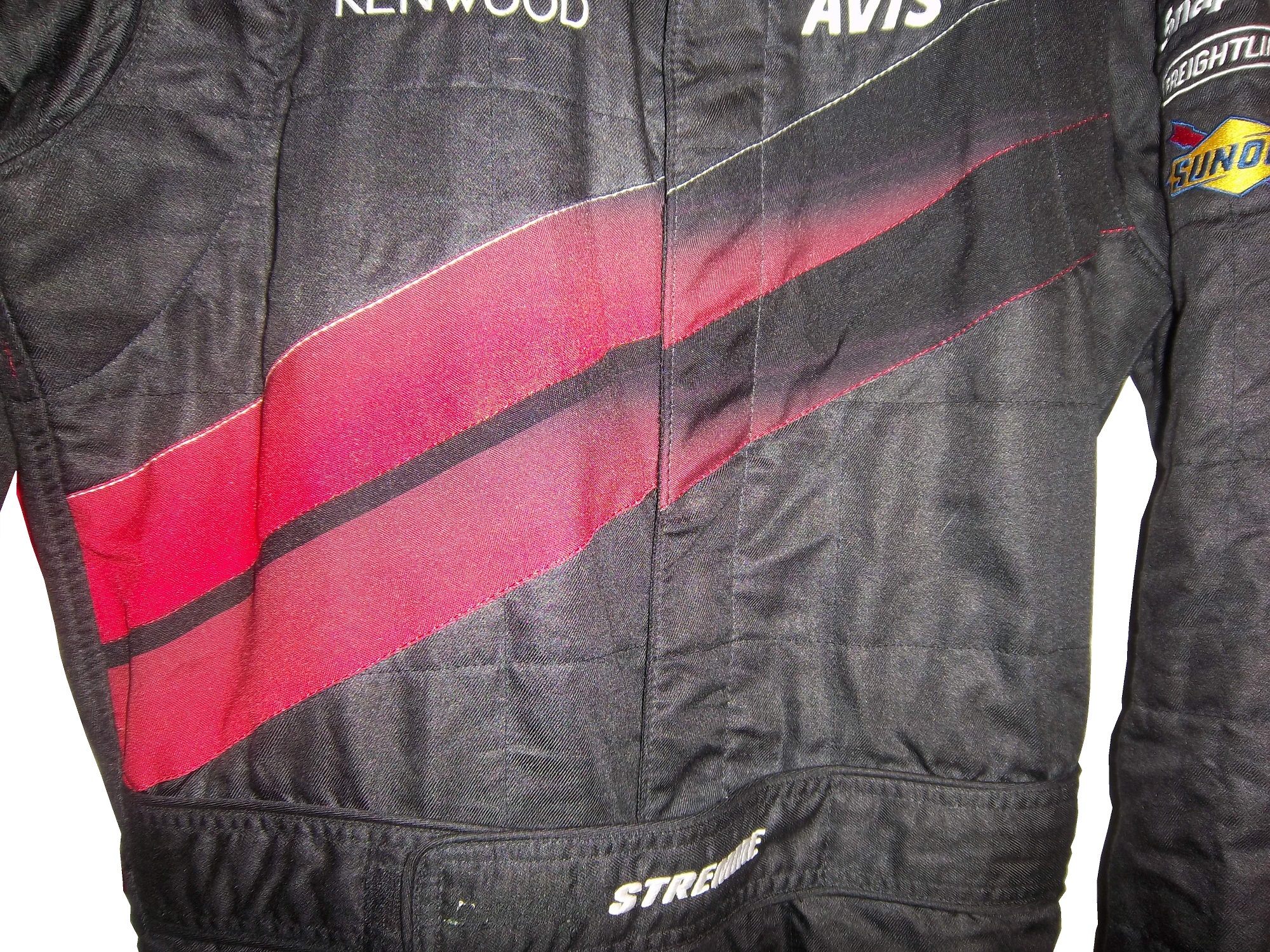
As seen above, the boot cut features a cuff within a cuff. In NASCAR this is not just for aesthetic reasons. NASCAR, and other stock car classes feature the engine in front of the driver. In the very likely event of an engine catching fire the cuff helps keep the driver’s legs protected, as demonstrated below…

The other style of cuff is just called “cuff.” It is a predominant feature seen in F1 and IndyCar suits. Since the engine and fuel tanks are located behind the driver, and because of the restricted space within the driver compartment, the cuff style is a popular choice. On occasion, cuff cuts can be seen on NASCAR suits as well.  Early NASCAR suits feature cuff cuts, but in the 1980’s, the boot cut became the standard choice.100_2474-copy1 - Copy

On to the paint scheme reviews…

Clint Bowyer #15 Napa Filers Toyota Camry It looks to me like this scheme was created by taking 2 previous schemes and combining them into one horrific scheme. The color is good, but the design is so awful it earns an F- and I’m being very generous with my grade here.

Terry Labonte #32 Oxy Water Ford Fusion I don’t know why, but I like this scheme. Normally I wouldn’t like the color scheme and basic design but for whatever reason, I like this. A-

David Ragan #34 Dockside Logistics Ford Fusion I can’t be the only one who thinks that Dockside Logistics is ripping off the basic logo design and color scheme from Game Stop…right? That aside, this is a really good scheme, good color scheme, and a great design. A+

David Gilliland #38 Long John Silvers Ford Fusion I’m really reviewing a lot of Fords today, and many of them, including this one are good. Long John Silvers has a good color scheme, and the basic design used with that scheme on this car just makes it stand out. I’m not a fan of yellow on race cars in most cases, but I’ll overlook it this time because it is just so good. A+

David Ragan #38 A&W Ford Fusion The same design as the Long John Silvers car, but with a somewhat more difficult color scheme. But they pulled it off. It looks really good. A+

Austin Dillon #51 Tag Heuer Eye-wear Chevy SS Finally a Chevy to review, and it is a good one! Black, red and white is almost always a good bet for a race car, and the classic racing stripe design really works with this car. A+

Kurt Busch #78 Denver Mattress/Serta Chevy SS The simplest design in NASCAR but with a Serta logo on the side, instead of a Denver Mattress logo. It works and works well enough to earn a solid A grade.

Malcom McDowell #98 Ambient Edge Air Conditioning Ford Fusion It has a classic look to it, with a good color scheme. Gets a Solid A

That’s it for this week. Next week, I will be working on another project, so I won’t be adding another article for two weeks.

Warranty Labels…Unseen by Many

90-stricklin-tagBy David G. Firestone

This week, we take a look at a suit feature that is unseen by most race fans. Every suit has one, the so called “Liability Tag. ”-Every piece of racing equipment has some form of “liability tag” which basically states that anything that happens to the wearer of the item is the wearer’s fault and not the company’s fault. The Simpson tag, which has remained virtually unchanged since the 1980’s reads as follows:

“Warning-Auto Racing is Hazardous-this Article is sold without warranty expressed or implied. No warranty or representation is made as to this product’s ability to protect the user from any injury or death. This garment is made of Nomex and other flame retardant materials. Even with the high quality of this garment there could be fires or circumstances where this garment will give only minimal protection. Nomex underwear should be worn under this garment. This garment is manufactured to comply with the rules as set forth by S.C.C.A., N.A.S.C.A.R. , S.F.I., F.I.A., and other regulatory bodies.”Cleaning Instructions” Dry clean only. Dry clean alone. Specify using perchloroethylene only.”36-barron-tag2

Sparco’s tags are located behind the zipper andhave two different statements. Older suits have this tag:

“Although this product is manufactured from special materials that satisfy certain safety standards and may carry the approval of various authorities for its use in specific circumstances the manufacturer or supplier can not be held liable for its protective qualities under all activities, circumstances, and conditions.”barber-tag1

Newer Sparco tags have this warning in both English and Italian:

“It is important to carefully read the user’s handbook concerning the care of the garment. This suit will offer protection from fire and the transmission of heat for a limited time, but it does not offer total protection against any kind of hear or fire. The fabric used to make this suit is subject to aging. It is recommended that the suit is inspected frequently for any signs of wear or damage that may result in a loss of protection to the wearer. If the suit has been worn extensively and shows signs of war or damage it is recommended to wear another suit. Sparco is not responsible for any damages the suit incurs from improper use of the suit bu the user, or any third party. Through improper care of the suit, misuse of the suit, or discoloration of the suit from perspiration, or any use of the product after the expiration date, as described in the instruction manual. Do not leave this garment under sunlight, or any artificial light. This suit is not intended for use in go-karts.”12-stremme-tag


Impact! Suits use this simple warning:

“Motorsports are dangerous. the user of this product assumes the risk of injury or death. No warranty or representation is made that this product will protect the user from injury or death”

This is by no means unique.  Almost all sports equipment to a certain extent has this type of warning.  This example is from an XFL helmet. outlaws-helmet9 outlaws-helmet10 outlaws-helmet7

On to Paint Schemes…from here on out, I will only review Sprint Cup paint schemes.

Paul Menard #27 Rheem Chevy SS/Serta Chevy SS Basically the same scheme as his regular scheme, but with two different hood logos…nothing really to say here…C-

Kevin Harvick #29 Jimmy Johns Chevy SS Great color and design, but I still don’t understand why Jimmy Johns sponsors Harvick instead of Jimmie Johnson…still a solid A scheme

Jeff Burton #31 Qwik-Set Chevy SS Grey…so much grey…so bland…so boring…C-

Josh Wise #35 Blockbuster Ford Fusion Didn’t Blockbuster go bankrupt? Apparently they have enough money for a one race deal…though the color scheme of the logos, and the car are different…C-

Scott Riggs No Label Watches Ford Fusion A great color scheme ruined by awful number design and medicore car design. C-

Michael Waltrip Aarons/Alabama Crimsion Tide Toyota Camry Decent color scheme and a simple, yet elegant design that works for both the car, and Alabama. It earns a solid B+

The Epaulet…What It Was, and What It Is

12-miller-rshoulder - CopyThe mighty epaulet, every racing fan has seen them, but few understand what they are for. They are now mostly for fashion and sponsor exposure, but epaulets have a more interesting history than one might think.12-miller-lshoulder

Back in the 1950′s and 60′s, racing suits were supposed to provide fire protection, but early versions of the suit were very unreliable. Many drivers perished in fires, and sometimes, drivers were trapped within the car, unable to escape the raging inferno within their car. The solution? The epaulet. Mounted on both shoulders, epaulets were reinforced strips of fabric specifically designed to help pull an injured or unconscious driver from a burning car. Epaulets quickly became an integral part of the driver suit.10-labonte-rshoulder

As racing technology became more advanced, the need for epaulets for safety began to decrease, but this was happening at a time when coverage was increasing and sponsorship was rising. It did not take that long for sponsors to realize that they could slap a logo on the epaulet and get the company name more visible on pictures and TV interviews. As such the epaulet made the successful transition from safety feature to fashion accessory.

10-labonte-lshoulder

As in-car cameras began to become commonplace across racing, epaulets evolved with them. I mentioned in a previous post that Christian Fittipaldi favored epaulet styles used in F1 and IndyCar. When Sparco first came to NASCAR in the early 2000′s, they brought their epaulet style with them, and it quickly became the standard for NASCAR epaulet style. Most driver suits worn in NASCAR today involve some variation of the Sparco epaulet. They have evolved very well over the years, and are a familiar part of the driver suit

Moving on to paint schemes…

First the NASCAR Camping Word Truck Series

Ty Dillon #3 Bass Pro Shops Chevy Silverado Bass Pro Shops has a great scheme this year, both in the Cup series, and this scheme is just good. Nothing wrong, everything right, Final grade: A+

Brendan Gaughn #62 South Point Hotel and Casino Chevy Silverardo This scheme is very simple, and looks really good. The color scheme is solid, and brings back memories of Rusty Wallace driving for Miller Genuine Draft. The lettering is easy to read, and stands out. Final Grade: A

Now on to the Sprint cup Series…

Trevor Bayne #21 Ford Motorcraft/Quick Lane Ford Fusion I think this is a prototype, but that said, this is still a classic scheme. It has a great color scheme, number design, and is just a solid scheme all around. Final Grade A+

Jeff Burton #31 Cheerios Chevy SS This scheme is rather under designed for my taste. The color scheme is decent, but the gray Cheerio design is hard to see, and looks more like soda carbonation rather than breakfast cereal. Final Grade C+   On a related note some more pics from the Caterpillar scheme have been released, and they are still using the same scheme from last year.  It is pretty good, so my final grade will not change.

Austin Dillon #33 Honey Honey Nut Cheerios Chevy SS Now this is just awful. The color scheme is bad, and the HONEY NUT CHEERIOS lettering is nearly invisible. The bright blue Kroger logo looks out of place, and the tailpipe decals with rookie stripe just takes more away from an already bad scheme. Final Grade F-

Birds and Sports

Quick, what do Randy Johnson, Dave Winfield, and Dale Earnhardt Sr. all have in common? Well for starters, all were very talented, and all are Hall of Famers, but that isn’t all. The unique thing about these three players is that each one of them has accidentally killed a bird while playing sports. Dave Winfield was playing in Toronto in 1983, and was playing catch with a bat boy, when a seagull flew into the path of the ball, and was hit and killed as a result. This was a total accident, but the fans were so upset that Winfield was arrested for animal cruelty. Police later dropped the charges, and Winfield was released. In 2001, Randy Johnson was pitching a spring training game, when he hit a dove with a pitch in a freak accident. A number of animal rights groups were upset, but no charges were filed.

Dale Earnhardt Sr.’s story is by far the strangest. At the 1991 Daytona 500, Earnhardt was a heavy favorite to win the race. Davey Allison won the pole, Hut Stricklin was 2nd, and Earnhardt was 3rd. Allison led the first lap, and Earnhardt took the lead during the 2nd lap. During that same lap, Earnhardt’s Chevy Lumina struck a seagull on the back stretch. Although this might not seem that bad, it seriously damaged the car, affecting the air intake, and raising the temperature of the engine. Emergency repairs took place, and while Earnhardt finished 5th, he wasn’t in contention for the lead after the seagull incident.

The really weird thing is that for many years, the seagull incident was a metaphor for Dale Sr.’s record at the Daytona 500. No discussion on his 19 futile attempts to win the Daytona 500 would be complete without mentioning the seagull incident. While other attempts to win the 500 ended with flat tires, or running out of gas, or just plain wrecks, the seagull incident stands out, along with the 1997 flip.

The 1997 Daytona 500 had the other unique incident at Daytona. During the 1997 event, Earnhardt was, again, a heavy favorite to win the event, and on lap 188, he was in a four-way battle for the lead, and he got into a wreck with the 28 car of Ernie Irvan, and rolled his car on the back-stretch. Irvan’s hood flies into the crowd and causes a number of injuries to fans. Earnhardt’s car lands on its wheels and Dale gets out of the car and heads to the ambulance. As he does so, he notices that his car has all four tires on it, so being Dale Earnhardt, he gets out of the ambulance and walks over to the car, and asks the guy attaching the car to the wrecker to see if the engine will fire, and it fired. He climbs back into his car and drives back to pit road, where is car is patched up as best could be done, and he finished the race 5 laps down. This is the only incident where a die-cast was made of a wrecked car. Speaking to reporters after the race, Earnhardt said “Well I just wanted to get back in the race and try to make laps, and we runnin’ for a championship…I got in the ambulance and I looked back at the car and said “man the wheels is still on that thing.” I got out of the ambulance and and asked the guy inside the car and he was hooking it up, I said “see if it would crank,” and he cranked it up, I said “get out, give me the car back” so I drove it back around and we taped it up.” It is a moment that still brings chills to my spine and this is 15 years later.

Image

I am proud to say that I own a piece of each car from the two above stories. From the 1991 Daytona 500, I own a small piece of the passenger-side fender, which still has race damage present. As seen below:

 Image

From the 1997 Daytona 500 I have this piece of what remained of the car after the event. Interestingly, the car was repaired, and raced at Talladega later that season. The race damage is clearly visible on it:

 Image

Moving on to paint schemes…

Kyle Busch #18 M&Ms Toyota Camry Very solid scheme here. Not only is the color scheme great, it looks even better than last year, with a clean front. The cleaner lines of the new car just make this scheme so much better as well. Final Grade A+

Jeff Burton #31 Caterpillar Hybrid Excavator Chevy SS Another great scheme, though the tailpipe decals are really ugly, and the yellow roof number is really ugly. Final Grade B+

And we also have some driver suit photos and videos

Joey Logano #22 Shell/Pennzoil Ford Fusion This was posted on Logano’s Facebook page, and all I can say is… Hey look kids! It’s Ronald McDonald! Joking aside, this seriously looks like a McDonald’s suit, but with Shell and Pennzoil logos. That being said, it’s not a bad suit, the television logos are good, and it gets a final grade of an A

Jimmie Johnson #48 Lowes Chevy SS This video, from Hendrick Motorsports YouTube page shows Johnson’s new suit.  Very solid, with a great color scheme and basic design. I could to without the white collar, but that is only a minor complaint for a great suit, and it gets an A!

Phantom Sponsorships.

By David Firestone

12-stremme

At first glace, this driver suit looks like it has no primary sponsorship at all, but dig deeper and you find the real story behind it.

From 2000 to 2008, car #12 in the Sprint Cup was driven by Ryan Newman and sponsored by Alltel Wireless. In 2002, Ryan Newman’s first full season the series was sponsored by Winston cigarettes and called the Winston Cup Series. In 2004, Winston left the series and Nextell took over as the series sponsor. At that time, there were a number of wireless companies sponsoring cars in the Cup series, including Cingular and Alltel. As they were under contract with teams before the Nextell sponsorship took effect, they were allowed to stay as car sponsors in the Cup series under a grandfather clause.

The first phantom sponsorship happened in 2007, when Cingular merged with AT&T. That set into motion a chain of events that began early in the season, when AT&T tried to re-brand the 31 car driven by Jeff Burton, and Sprint said that it was a violation of the grandfather clause. After a number of injunctions and legal wrangling, came the 2007 Sharpie 500 at Bristol in August, when NASCAR, under pressure from Sprint told the 31 team that they could not have any AT&T logos on the car, hauler, pit shirts, driver or crew uniforms, or helmets. The result was this unique scheme.

800px-JeffBurton2007BristolAugustRacehttp://www.flickr.com/photos/98572459@N00

Eventually a settlement was reached where the Cup team could keep AT&T decals on the car for the rest of the season, but would have to find a new sponsorship for the next season. This deal was met, and the next year, Jeff Burton drove a Caterpillar sponsored car.

In 2009, the Alltel sponsorship changed because Verizon purchased most of Alltell’s assets. Instead of a long court battle, Verizon, who was also sponsoring Roger Penske’s IndyCar teams basically sponsored the team but focused on their Nationwide Series with car logos, as the restrictions on Verizon were not in effect in the Nationwide Series, and allowed car #12 driven by David Stremme to run a Penske Racing scheme for the car they were paying for. That resulted in this very stylish David Stremme driver suit, currently in my personal collection.

12-stremme

The thing I find interesting is the fact that even though the car was running Penske decals, no mention of Penske is visible on the collars or shoulders, and no television logos are present.

12-stremme-collar

I also think it is interesting that the red stripes across the chest look like Verizon logos, but are just different enough to throw Sprint off the scent.

12-stremme-flogo

Unless the primary sponsor of the series changes again, with seems unlikely in the foreseeable future, I can’t imagine this happening again. It also should be noted that both AT&T and Sprint took flak for their actions during the controversy. I really hope this doesn’t happen again in racing, ever.

A Trip Down Memory Lane…

One of my favorite drivers growing up was Ted Musgrave.  When I was watching NASCAR back in middle and high school, Musgrave drove the #16 Family Channel Ford for Roush Racing.  He was born in Waukegan, Illinois, which is close to my hometown of Evanston, and grew up racing in Wisconsin.  He is a Camping World Truck Series Champion.

hogan

We had family friends who lived in Elkhorn Wisconsin for many years Penny and Tom Hogan, and their two kids, Chris and Patrice.  We used to go up to their farm to visit them during the summer and over the holidays.  We always had fun with them.  I still look back on those days and it always brings a smile to my face.  Aunt Penny was one of the few people in my life who understood my love for NASCAR, and one night she was at a party where Ted Musgrave was attending.  She got me an autographed photo that is still near and dear to my heart:

mus1

I still have this photo to this day, and I look at it often.  That is still one of my favorite paint schemes of all time.  Aunt Penny was able to get me a second, personalized photo, which is still in my possession today:mus2

As the years went by, and the NASCAR race-used collectors market began to grow, I began buying driver suits, and I came across this one, worn by Musgrave in 1998:

Image

I love the fact that the logos on the sleeves are not only in the wrong position, but also the fact that they are the wrong typeface as well.  The logos at the end of the sleeves and on the sides of the legs are supposed to be sideways so that the in-car cameras can see them easily.  But I still missed that Family Channel Scheme, then in May of this year, I came across an ebay listing that I just couldn’t say no to, and I got this:

musgrave1

That is a Ted Musgrave helmet that he wore in qualifying in 1996.  I love everything about this helmet, and it is even signed on the top

musgrave6

Shortly thereafter, I came across this on ebay…

$(KGrHqQOKioE32UP7RJoBOE4qtiK4Q~~_12

That is a 1/4 scale version of the full size helmet I currently own.  I had to have a little fun with it, so I did this video:

That helmet is one of my favorite items and everytime I see it, I think back to the 90’s, and all the fun we had at the Hogans, and it always brings a smile to my face.