
To accommodate the beginning of Passover, I decided to upload this week’s episode of ITSM a day early. We look at Another old school NASCAR helmet, this one worn by Tracy Leslie, will be examined.
Tag: helmet
Introduction to Sports Memorabilia-Richard Lastaer Race Worn Helmet
This week, on Introduction to Sports Memorabilia, we examine a helmet worn by former NASCAR driver Richard Lasater, worn during his horrific crash at Talladega in 1993. The helmet did its job and he was able to walk away.
Introduction to Sports Memorabilia-Kevin Lepage Helmets
This week, on Introduction to Sports Memorabilia, we examine two Kevin Lepage race worn and Signed driver helmets, the first from his rookie campaign in the Busch Grand National Series in 1994, and the second from his time at Roush Racing in 1999.
Introduction to Sports Memorabilia-Steve Grissom 1998 Race-Worn Helmet
This week, we examine a Steve Grissom 1998 Kodiak Helmet.
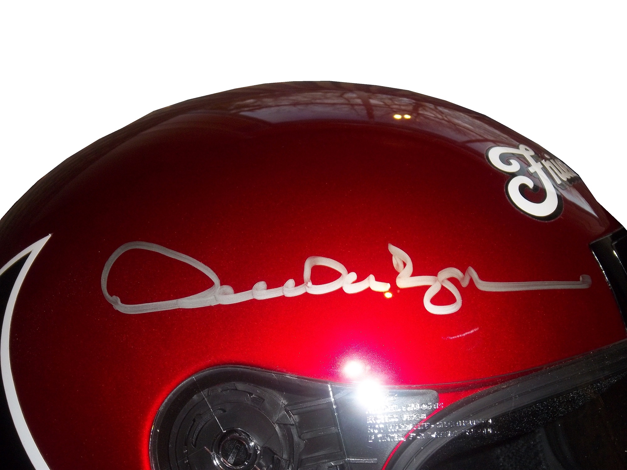
Introduction to Sports Memorabilia-Derrike Cope 1998 Race-Worn Helmet
For the 11th Season Premier of Introduction to Sports Memorabilia, we examine a Derrike Cope 1998 Gumout Helmet, which he has autographed twice.. From here on out, I will upload new videos on Mondays.
Open or Closed…Which Helmet Would You Have Chosen?
By David G. Firestone
[Editor’s Note: Originally, this week was a post dedicated to primary sponsor logos. However, I had this column on the shelf for a while, but given recent events in the NFL, which fellow uniform blogger Paul Lukas has covered in depth, I felt that this article concerning helmet safety in NASCAR would be appropriate to run this week, with the primary sponsor logo column running next week. DF]
 Prior to the tragic events of the 2001 Daytona 500, drivers had to make a choice that in this day in age seems absolutely absurd. From the beginning of NASCAR to that tragic day drivers had their choice of helmets, and they were open-faced,
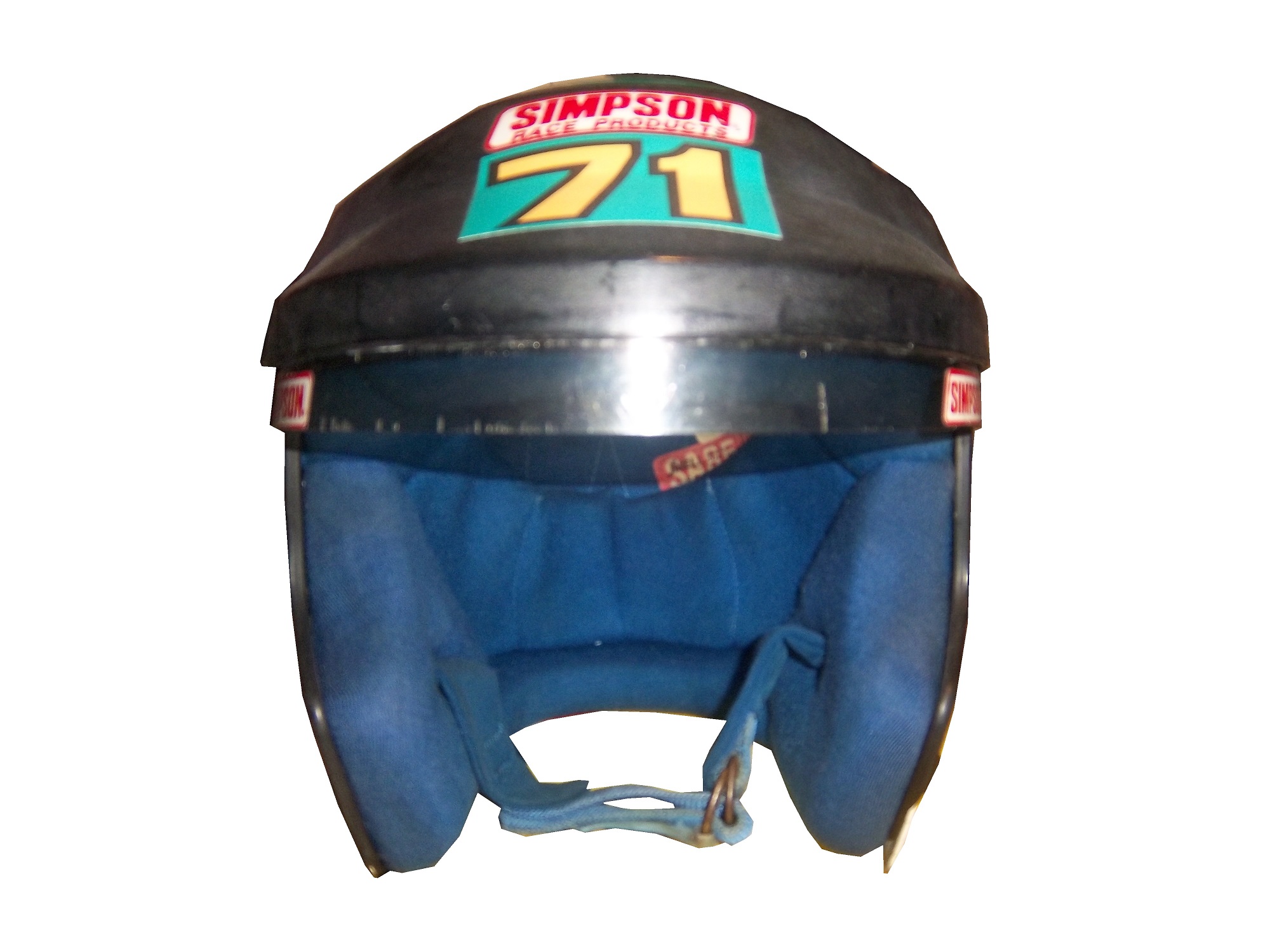 or full-face.
To examine the merits and demerits of both helmets let’s take a look at one example of each, both worn by the same driver, Kevin Lepage. First, the open-faced helmet


Worn in the Nationwide Series in 1994 and 1995 during his rookie and sophomore seasons, this helmet bears a decal from high-end plush toy company Vermont Teddy Bears. It shows very heavy use, with scratches and scuff marks, has had the microphone equipment removed, and Lepage has signed the back of the helmet in black Sharpie.
Now let’s look at the full-face helmet,
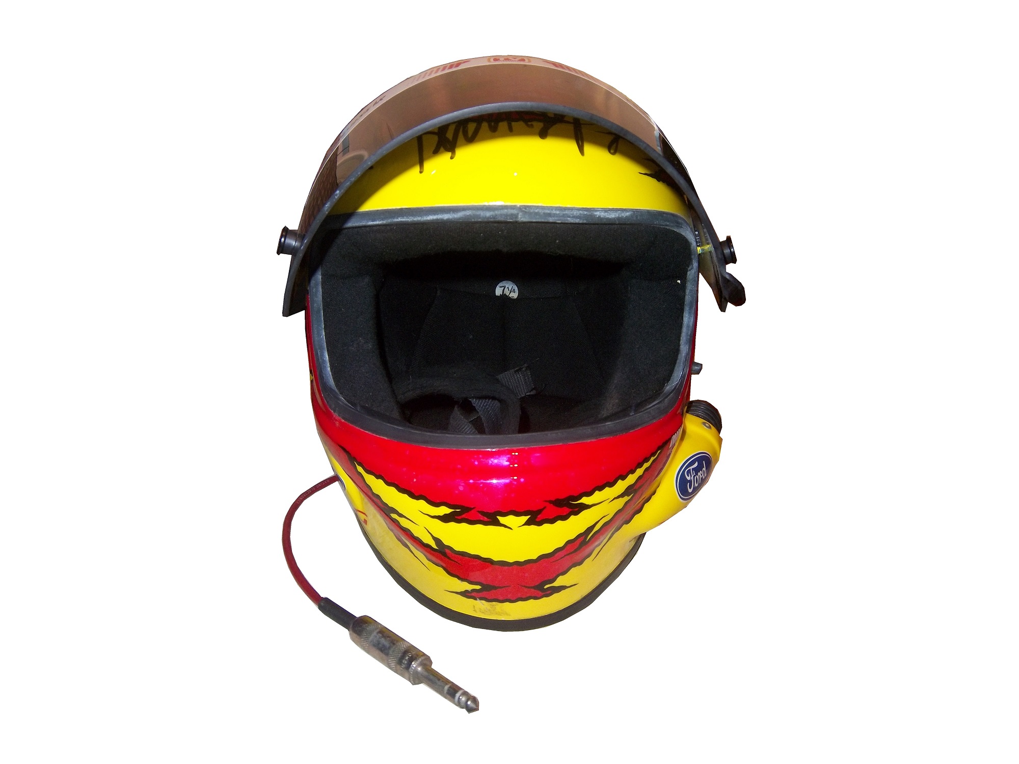


Worn by Lepage in the 1999 Winston Cup season, this helmet was painted for the combination Primestar/TV Guide #16 Ford. Like the open-faced helmet, it shows scratches and scuff marks, and Lepage has signed the top of the helmet above the visor. Unlike the open-faced helmet, this helmet still has the microphone equipment.
Now on to the comparison…
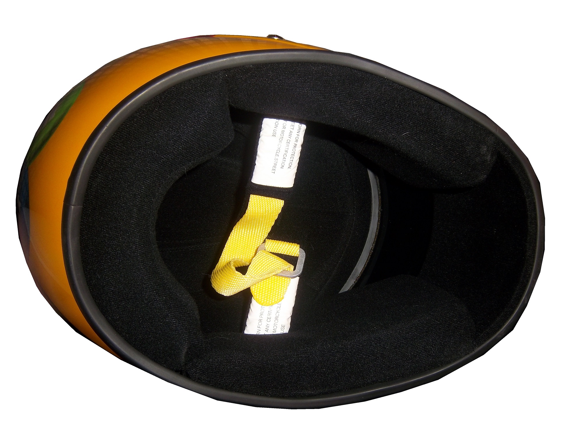
Looking at the helmets from the inside, there was no real difference between the two. Both are the same basic design, with the same inner liner and filler.
The left sides of the helmets differ greatly. Notice that there is a hose attachment near the Ford logo on the full-faced helmet. This is to accommodate the “hotbox” attachment. Hotboxes are designed to force air into the driver’s face to help keep them cool. This is not a luxury, as driver compartments can reach as high as 160 degrees Fahrenheit, and drivers typically wear 3-4 layers of Nomex during a race. Keep in mind that in-car drinking systems are not standard as of 2000, and the hotbox is a great tool for driver comfort.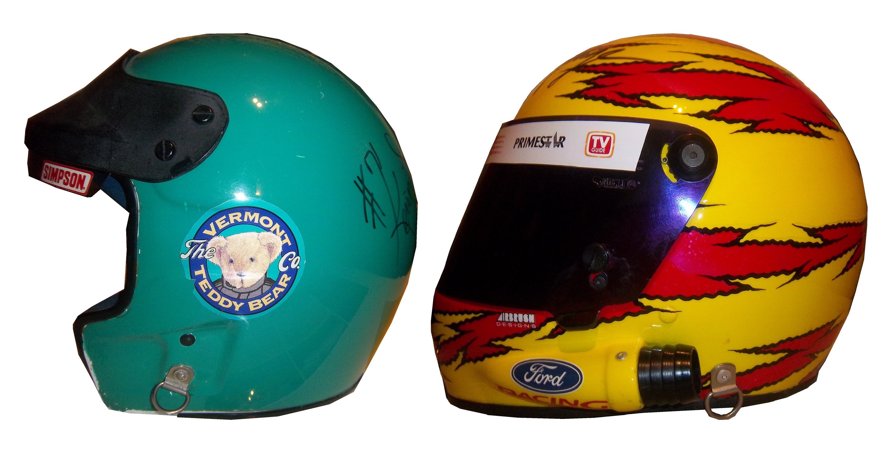
Microphone equipment is added to the helmet on the right side. The only difference between these two helmets is that the microphone has been removed on the open-faced helmet.
The back of the helmets are virtually identical except for the paint schemes and the liability tag present.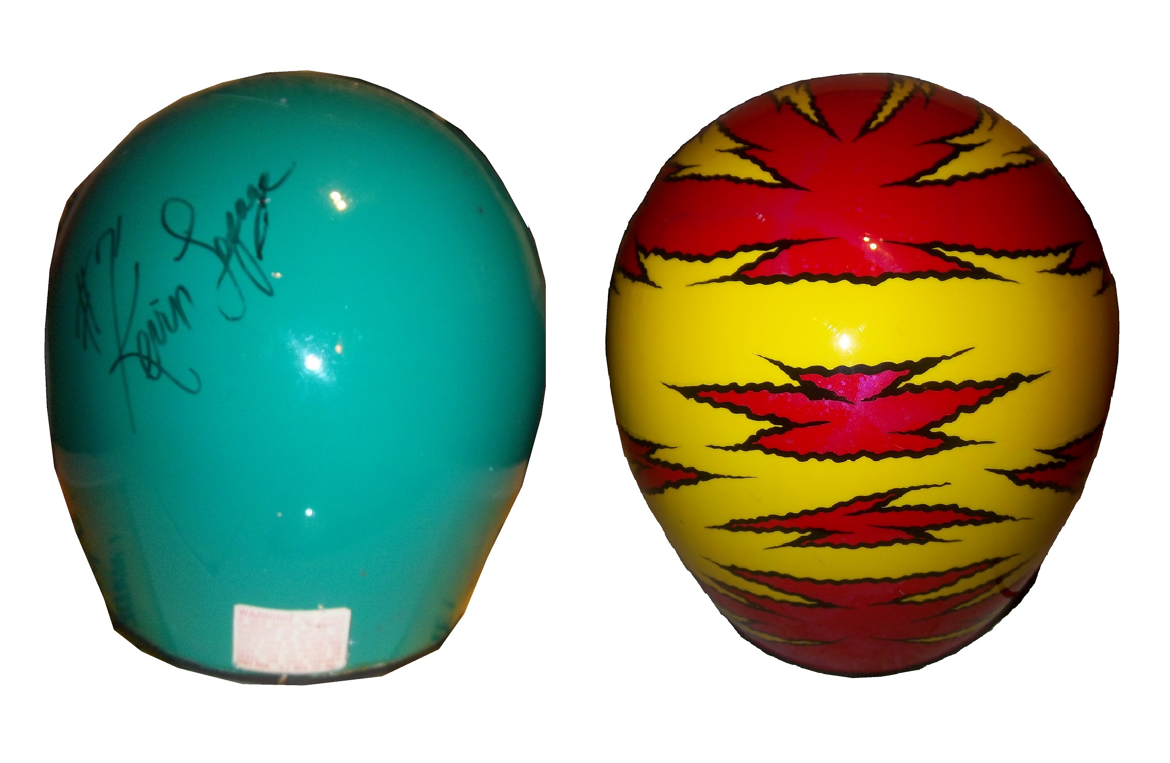
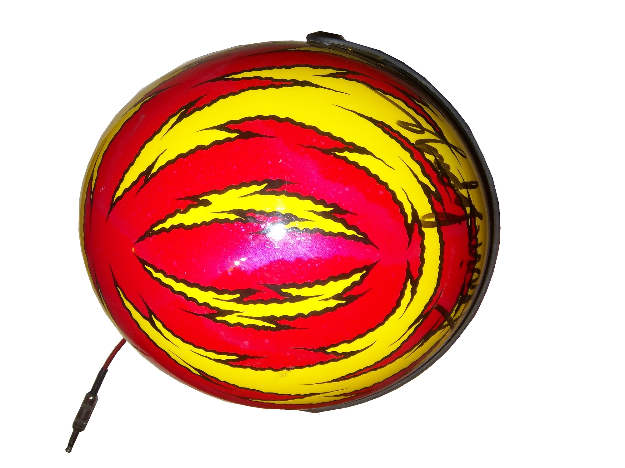
The front of the helmet is the key to making the decision. Everything else thus far is a minor issue. The question was asked then, and is asked now, why were these helmets legal for as long as they were? These pictures should answer that question:
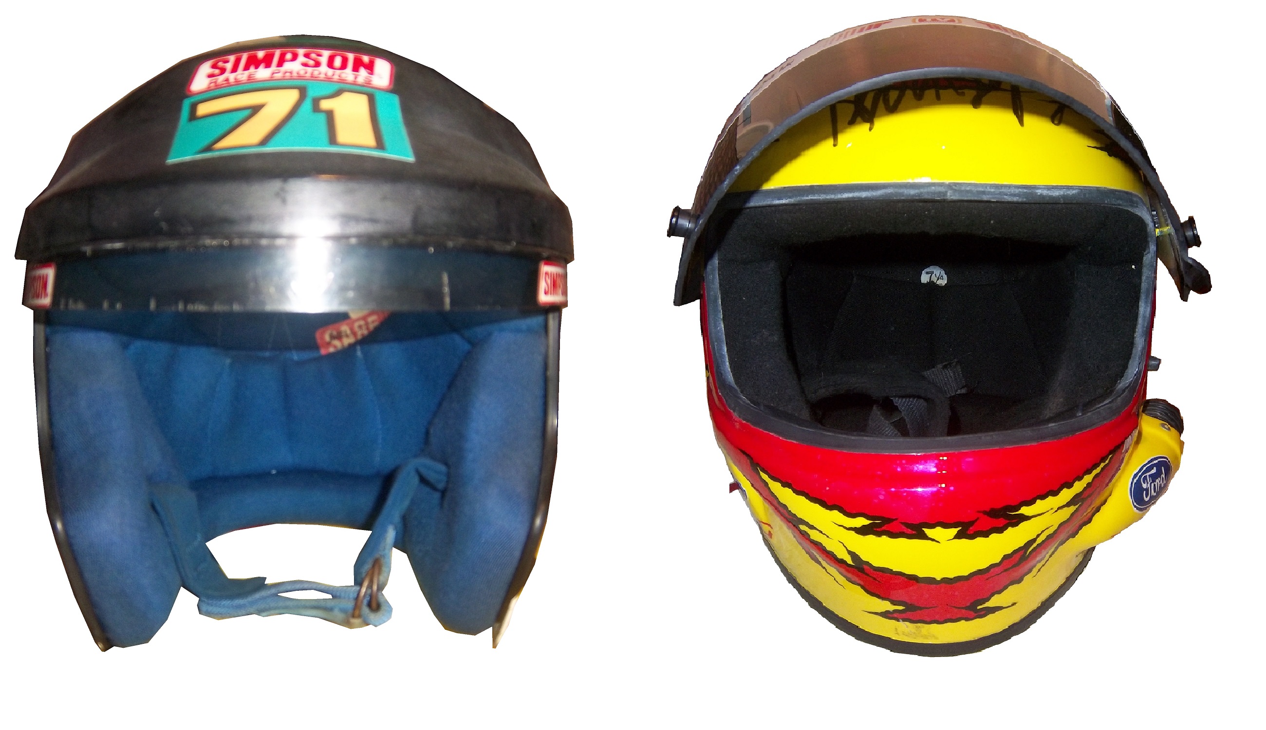
The bottom of the helmet underneath the visor gives an extra bit of safety in case of fire, BUT takes away about 2-3 inches of visibility. That 3 inches might not seem like that much, but in a race car, trying to keep situational awareness of what the car is doing, those 3 inches are as critical as you can imagine. NASCAR at the time had the opinion that if they had the restriction in place, that the obstruction could cause a driver to lose that situational awareness, and lead to a wreck. NASCAR felt that any rule that could cause a wreck is a bad idea, and rightfully so. How often in the wake and investigation of accidents does it reveal that a rule, regulation, or guideline cause an accident? It happens quite often. NASCAR at the time felt that imposing a rule that all helmets should be full-faced that is could very easily lead to an accident, and as such, allowed open-faced helmets to avoid that from happening.
It was a rule that was easy to understand, but would lead to tragedy. It led to this design, which itself is now becoming obsolete:


 Now, even the best full-faced helmet designs from the 1990’s are now a distant memory and the current helmet design has taken over. It might seem like unfair, but if these rules were in place at the 2001 Daytona 500, we would have never lost a true legend.
Paint Scheme Reviews!
Jamie McMurray #1 Linksys Chevy SS Clean lines and a great color scheme make for an A+ scheme!
Matt Kenseth #20 Husky/500th Start Toyota Camry The gray-scale design does not work here at all. The rest of the car looks very good, but the black and dark gray color scheme needs work. If the Husky red is where the gray is, it would work better, but the best grade I can give is a C-
Michael McDowell #51 SEM Chevy SS Classic design with a great color scheme, A+
And we have a 2014 leak…
Austin Dillon #3 Cheerios Chevy SS This is the best Cheerios scheme I have ever seen! The goofy bagel design is gone, and has been replaced with a couple of racing stripes. I also love the black around the #3. If this is the final design, it will be a great car, and I give it an A+!
Replica Helmets…and Why We Need Them in Racing
 By David Firestone
When I started this blog, I wanted to appeal to two different groups, racing enthusiasts and collectors. I think that this post should appeal to both groups. The MLB, NFL, and NHL have a product that is very useful, for autographs, and for fans alike…the replica helmet. Replica helmets have been made for the NFL for over 15 years now, and baseball replica helmets date back further than that. NHL minis, although more recent, are becoming a fan favorite…so why not racing replica helmets?


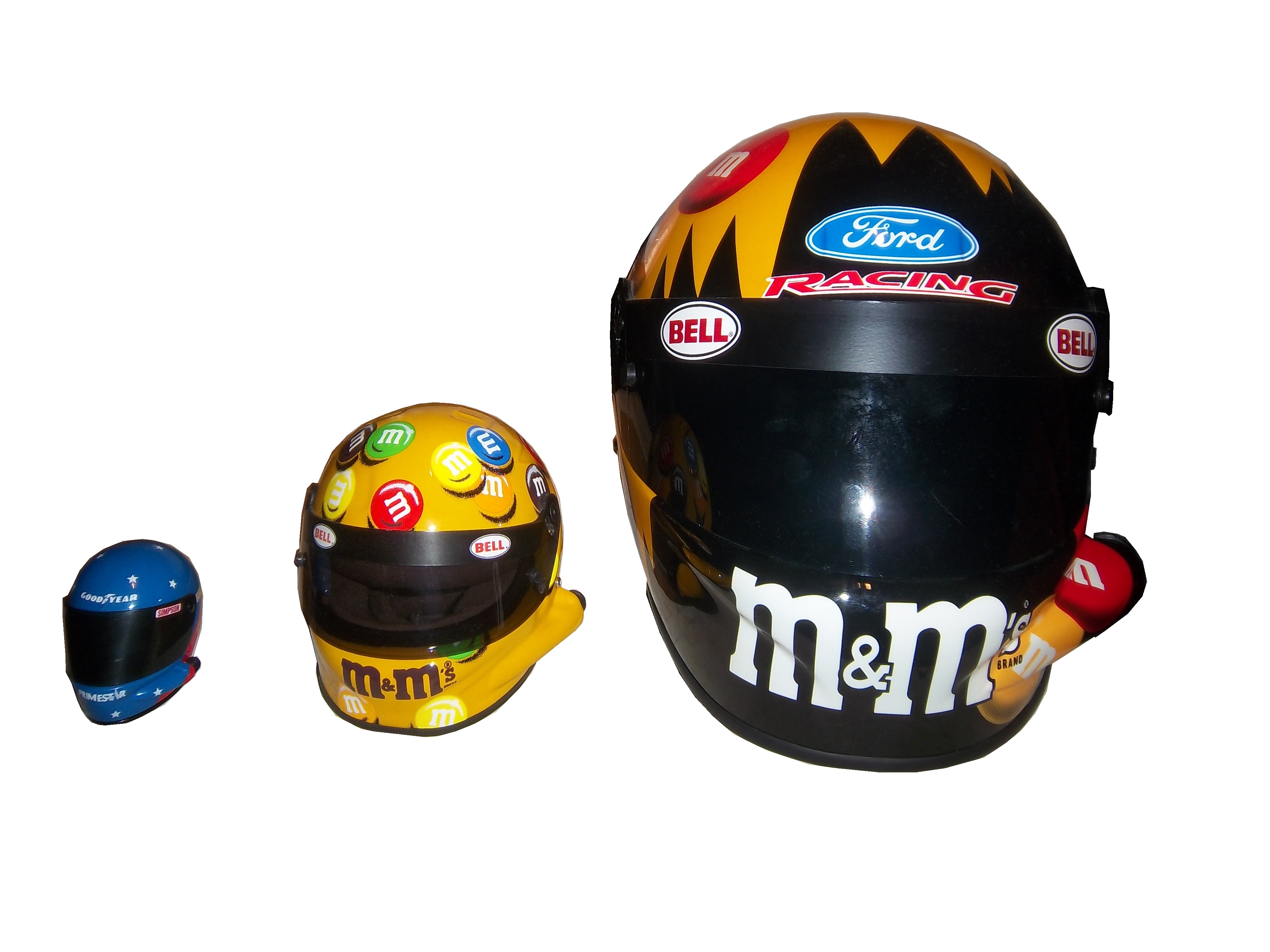
This has been tried before. In the late 1990’s Simpson released a series of ¼ scale mini-helmets. These helmets were reasonably accurate replicas of the real thing, but only 3 inches long. Although the design was good, the product was costly for the time, and very small, which made it very impractical for autographs.
The autograph issue is important because something that mini-helmets in baseball, and football are frequently used for autographs from players. These helmets are half-scale, and are very accurate to the helmets worn by the players. Similar to the football mini-helmet, this half-scale mini-helmet would fit the bill very well.
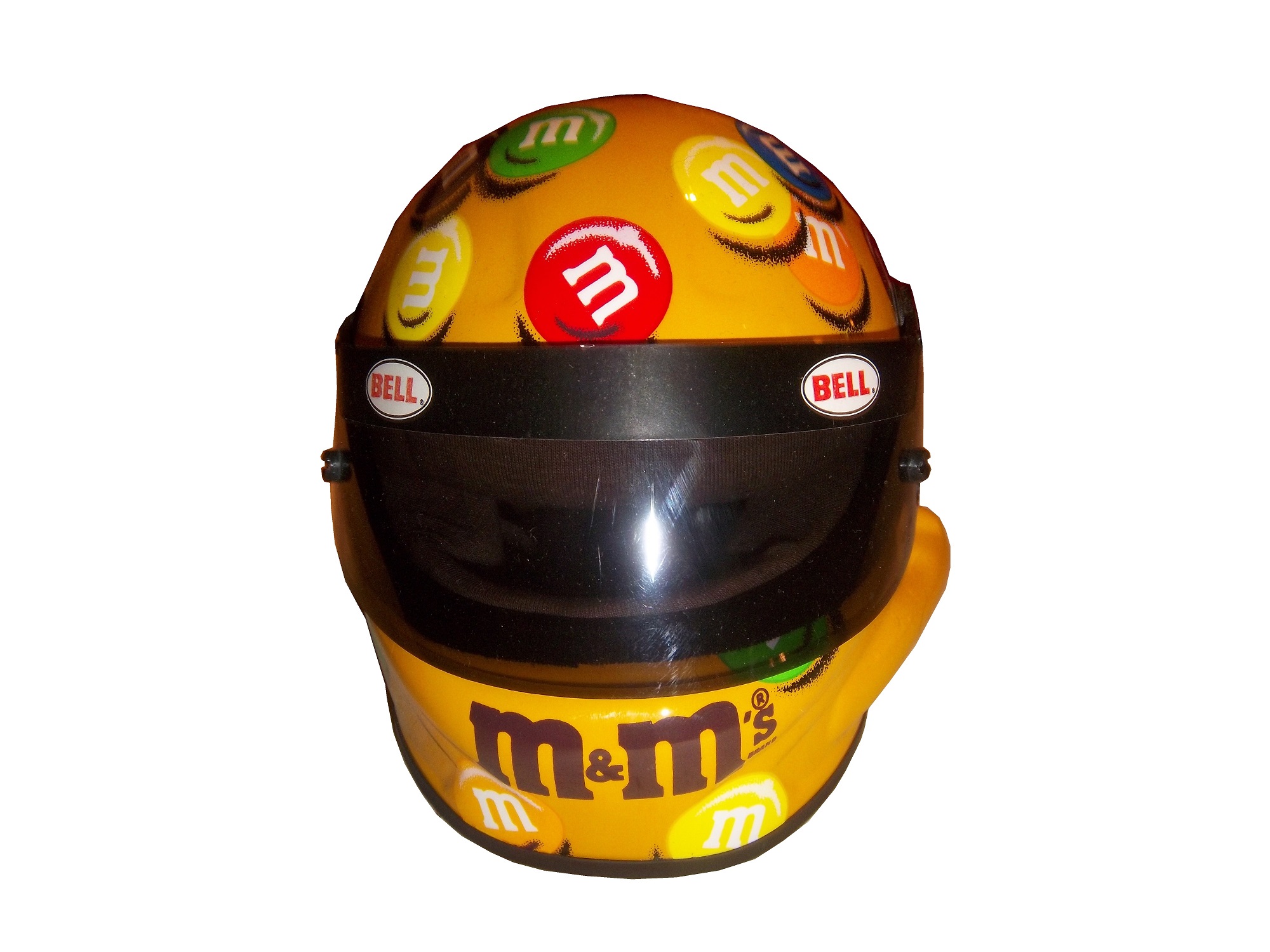


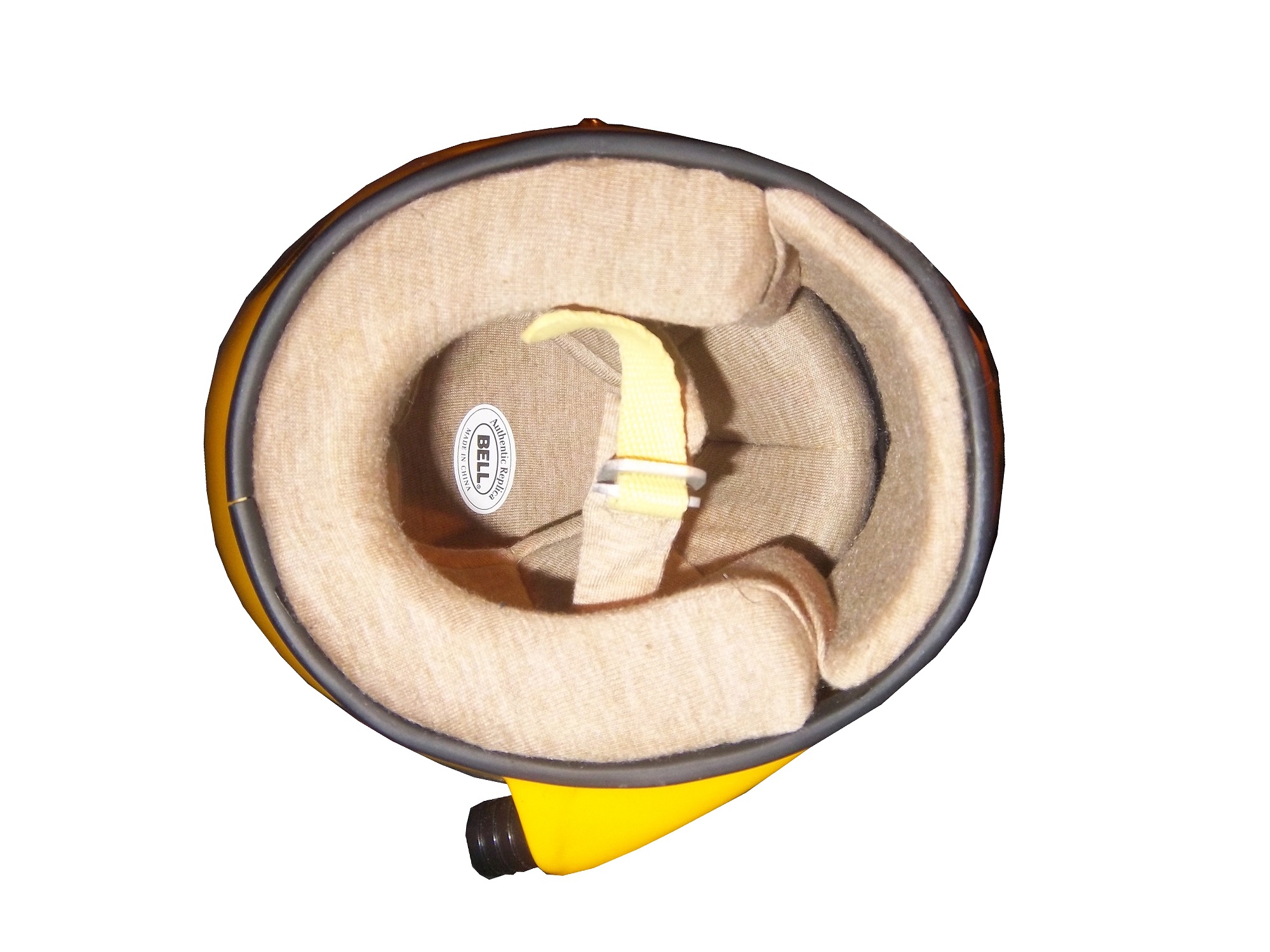
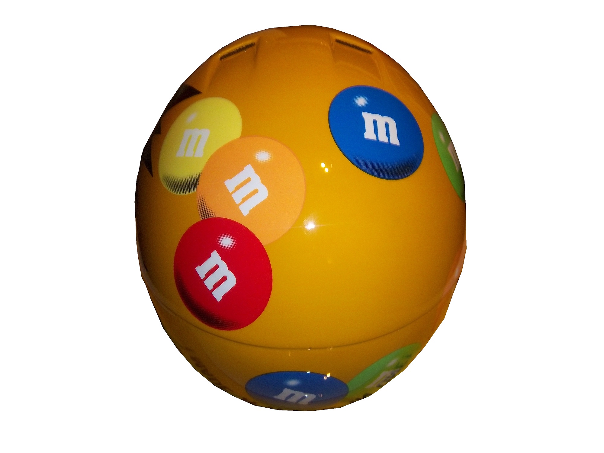
It is a replica of Elliot Sadler’s M&M’s Bell helmet from 2003-2006. It measures 5 inches in length and is very easy for drivers to sign. A search on ebay reveals that there are minis, but not on a cohesive levels. I think that fans would love to own a mini-helmet of their favorite driver, and buy new ones each season.
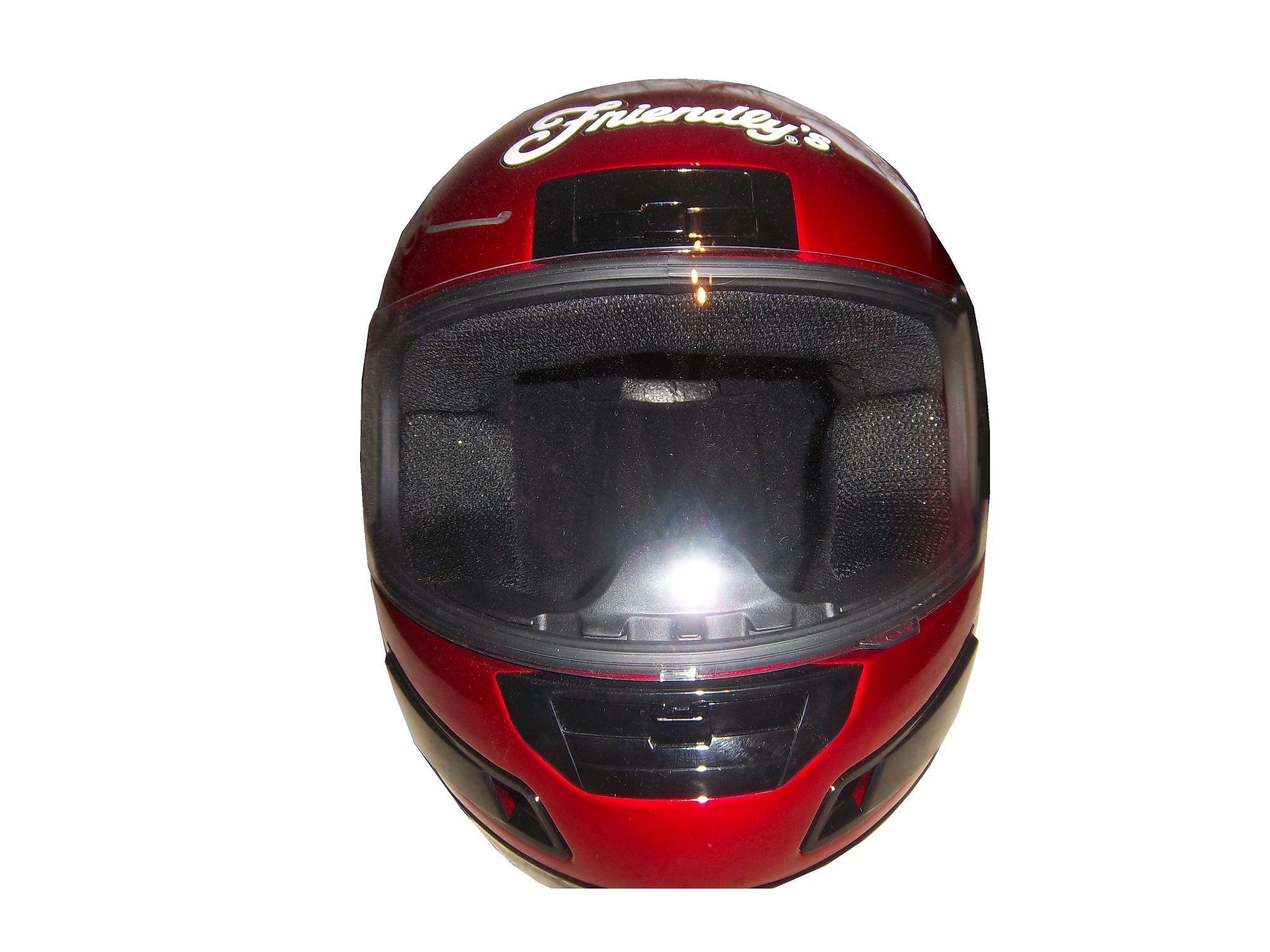
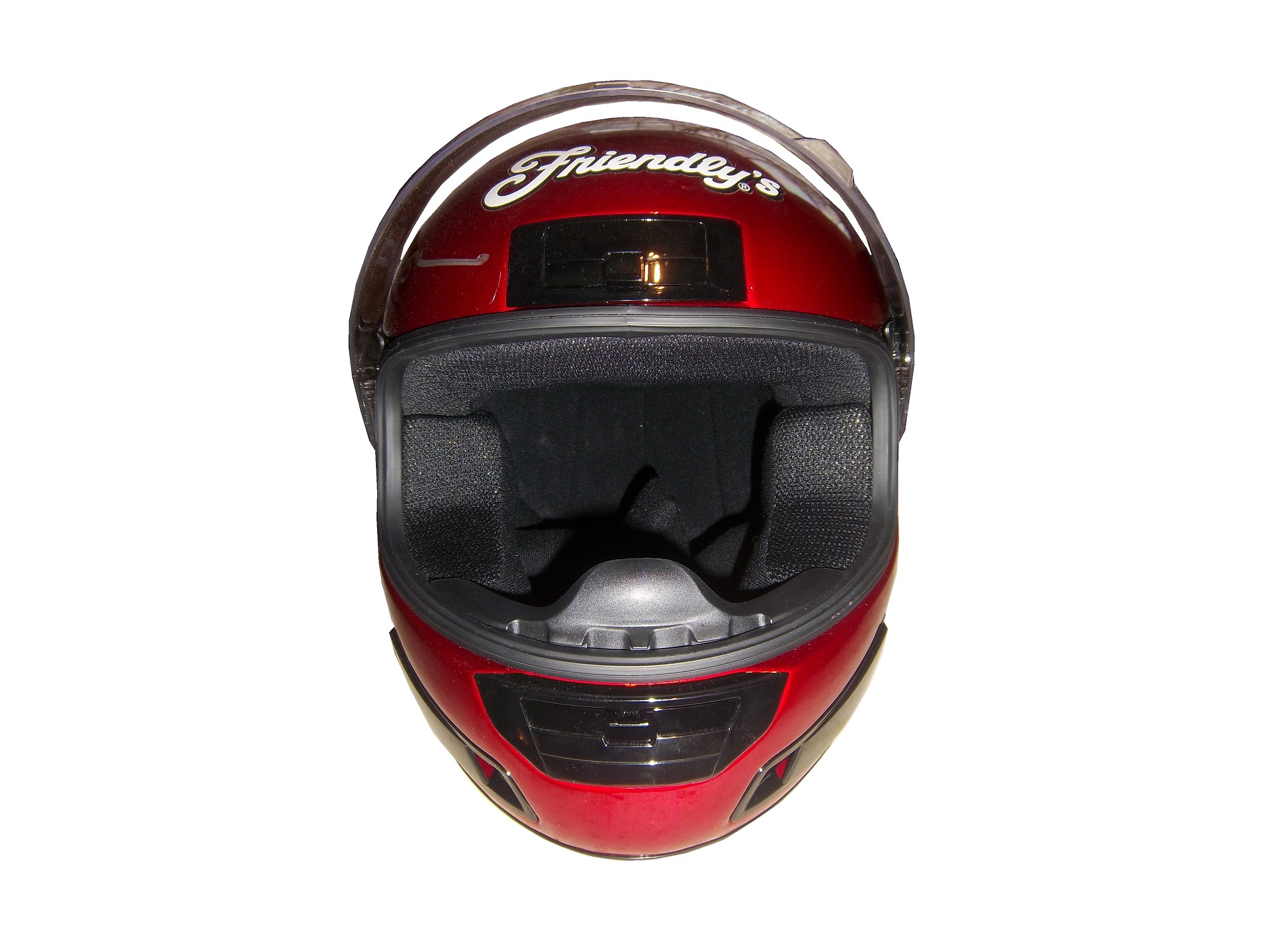
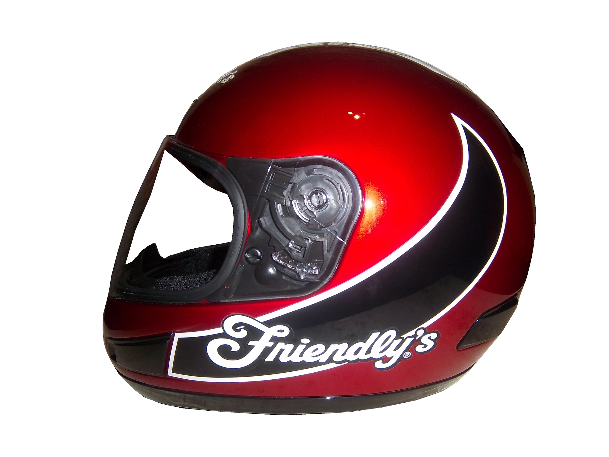
To answer the next question, yes there are full-size helmets, but they come in two different food groups. The first are helmets that are clearly replicas, such as this Derrike Cope Friendly’s replica from 2003. This example is clearly a motorcycle helmet, that has Friendly’s decals attached to the. Derrike has autographed the helmet on the right side. It looks good, but it is still clearly a replica.


The other food group in full-size replica helmet is the helmet designed to be as accurate as possible. This example, again an Elliot Sadler M&M’s replica is clearly marked as being a replica and for display. It is actually very accurate, including a ventilation hose attachment on the right side. This type of helmet was common for a while, until the HANS restrictions forced the ventilation attachment to the top. This not only works very well for autographs, but looks really nice on itself. 


 I think that the helmet companies that make driver helmets would be willing to make these helmets for the racing fan base, and I think that the racing fan base would love them as collectables!
Paint Scheme Time!
Clint Boywer #15 Gander Mtn. Toyota Camry Color scheme…good. Car design…ugh. But the thing that really irritates me is that with the gun debate in this country the hood reads “With rights comes responsibility.” Seriously? I thought Michael Waltrip’s Newton scheme at the Daytona 500 was bad, but this is just beyond bad. KEEP POLITICS AND RACING SEPARATE! F– grade!
Jeff Burton #31 Childress Institute Chevy SS The only bad thing I can say about this scheme is that the door numbers are orange. If they were white with orange borders, I would love this scheme. Even so, it earns a C grade.
Joe Nemechek #87 Maddie’s Place Rocks! Toyota Camry They took a good scheme, with good colors and just made it look so much worse! The design is just awful, and the color scheme doesn’t help. It went from a B to a D in one week.
That’s it for this week, except for some April Fools Fun…
Richard Lasater and His Helmet
By David G. Firestone
Spent the last week just being insanely busy, with Passover and the Chicago Sun Times Collectables Convention, but now back to work. I’ve discussed the safety aspects of race gear, but today, I’m going in a bit of a different direction. Even in today’s safety-conscious racing environment, injuries are always a possibility. Denny Hamlin suffered a fractured vertebrae, and Dale Earnhardt Jr. has suffered a concussion in the last few years. Wrecks can be hell on drivers, but what about the uniform protecting them? What would a helmet from a wreck like this look like?
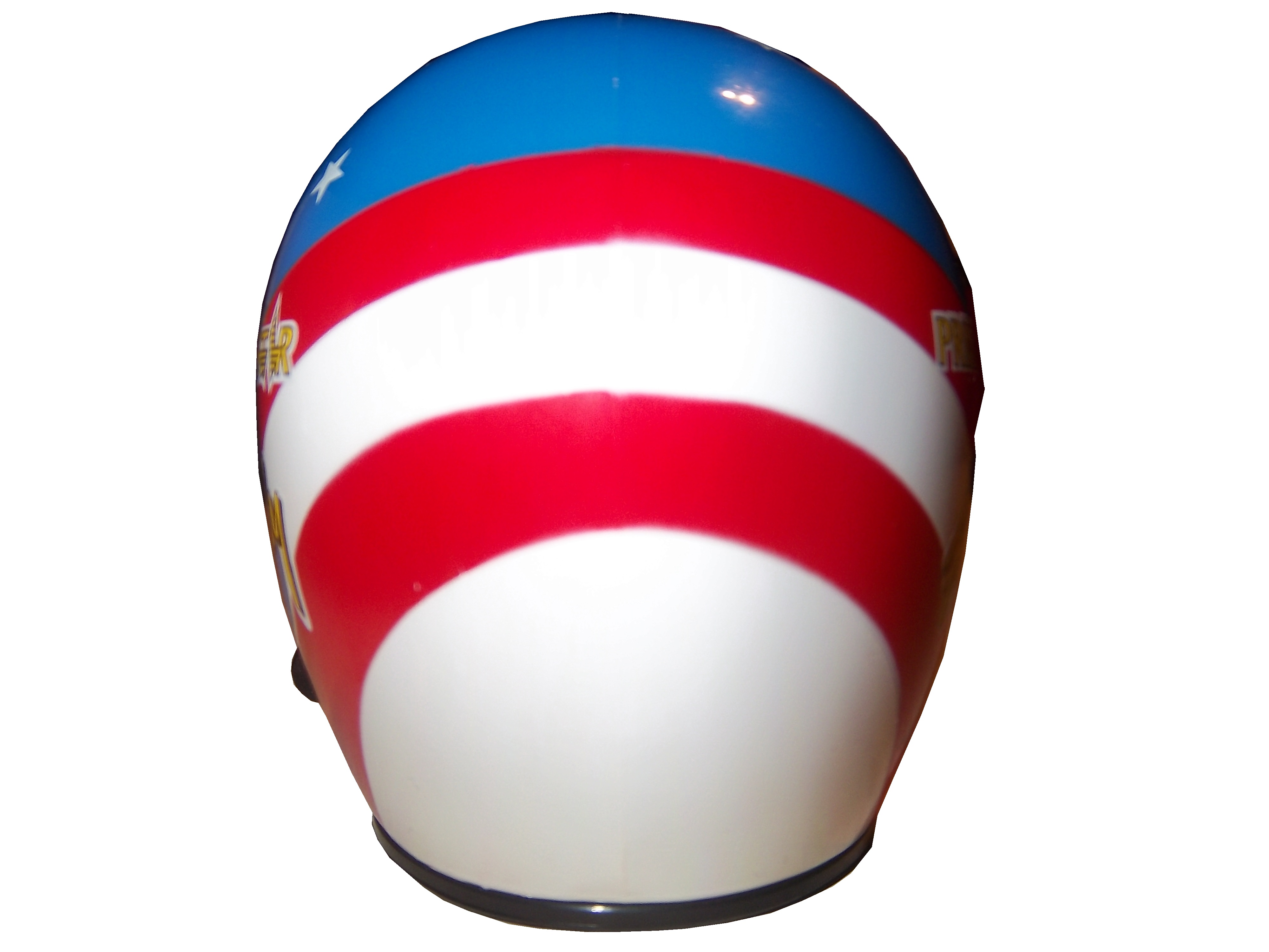
Well the helmet looks like this:


For a helmet that went through a scary-looking wreck, it is in good shape…and that is not by accident. It was worn by Richard Lasater throughout the 1993 season. At the 1993 Fram Filter 500K, Lasater was involved in that scary wreck, and wasn’t seriously hurt. As for overall damage, it is mainly scratches, scrapes and dings, no cracks or serious damage.
The helmet kept Lasater safe and suffered minor damage because that is what it was designed to do. After the race, he autographed the helmet and it wound up in my collection. This helmet shows better than any other helmet I have the reasons why proper equipment is needed in racing.
On to Paint Schemes…
Jamie McMurray #1 Bass Pro Shops Chevy SS White? Seriously? Did the designers not realize that the white looks awful? The black and orange color scheme works, but white? I don’t get this scheme at all, and it gets an F grade
Marcos Ambrose #9 MAC Tools Ford Fusion Good color choices here. The basic design is solid. I can do without the quarter panel design, but it is still a good scheme with a B grade-
Danica Patrick #10 Go Daddy St. Patrick’s Day Chevy SS I would like to thank the 1978 Cincinnati Reds for being one of the first teams to wear green on St. Patrick’s Day for encouraging this awful F grade scheme.-
Denny Hamlin #11 Fedex March of Dimes Toyota Camry There are two schemes that fans voted for. With Hamlin on the shelf for a while, Mark Martin and Brian Vickers will share the 11 ride. That said, scheme #1 I don’t hate, but it has something odd going on with the hood and nose design…I swear it looks like the two parts were designed by different people who never interacted with each other, and that earns it a C grade Scheme #2, the better of the two schemes, not only looks more like a FedEx scheme, it is simpler and much cleaner as well, and earns an A grade.
Tony Stewart #14 Rush Truck Centers Chevy SS Good color and design schemes here. A Grade
Kyle Bush #18 Snickers Bites Toyota Camry A paint scheme that has a great color scheme, and illustrates the theory that less is more. Nothing bad about this Scheme-A+
Jeff Gordon #24 Imron Elite Real Truck Paint Chevy SS Based off the classic Jeff Gordon Scheme, it looks really good, and it works as a paint scheme. Great color scheme used here…A+
Jeff Gordon Cromax Pro Chevy SS Another good DuPont inspired scheme with a great color scheme and great design-A+
Ken Schrader #32 Federated Auto Parts Ford Fusion Federated Auto Parts always has great looking cars, and they do not disappoint here. Great color scheme and great design earn a great grade of A+
Timmy Hill #32 U.S. Chrome Ford Fusion NASCAR rules prevent using chrome in most NASCAR paint scheme aspects, which is kind of disappointing since this scheme should have a bit of chrome in it. Even so, it is still a solid A scheme, with great colors and simple, yet elegant design
Josh Wise #35 MDS Ford Fusion The color scheme of the car, and the color scheme of the logos match! As a direct result, the car looks so much better! This scheme earns a B grade because the deisgn on the quarter panel needs some work.
Ryan Newman #39 HAAS Automation Chevy SS Great color scheme, good basic design, I love the diagonal hood logo, A+ Scheme
Brian Vickers #55 RK Motors Toyota Camry Basic design with an uninspired color scheme. The car is just blah. I can’t give this scheme anything except a C-
Brian Vickers #55 Jet Edge Toyota Camry A better color scheme takes the grade from C to B
Joe Nemecheck #87 Maddies Place Rocks Toyota Camry Simple design, decent color scheme, good hood logo, Final grade B
Dale Earnhardt Jr. #88 Amp Energy Chevy SS Orange? Amp’s main can color is green. It’s not a bad design, but using a color that isn’t really used on the packaging earns this scheme a C-
Aspects of the Current Helmet Design
By David Firestone
As I mentioned in the last post, the SFI/FIA Certifications on current helmets are located on the HANS anchors. I also discussed the advancements in helmets over the last 12 years in my post on the evolution of helmets. But what makes the current helmet design so effective? Let’s take a look at one.
This example is an Impact! Air Vapor helmet worn by either Regan Smith in 2005 or Jason Keller in 2006. It was used in the Nationwide Series for Team Rensi Motorsports, founded by former McDonald’s Executive Sam Rensi. It carried a McDonald’s sponsorship.
It was made by Impact! Race Products in Brownsburg, Indiana. Impact has a unique history. After Dale Earnhardt Sr.’s death in 2001, Bill Simpson, who had founded Simpson Race Products resigned after NASCAR had blamed Earnhardt’s death partially on a seat belt failure. He had a one year non-compete contract with Simpson, and after that expired, he went to found Impact. Because Bill Simpson was a race driver, he understood the needs of drivers, and both Simpson and Impact followed that philosophy. Let’s take a closer look at some of the features of this helmet.
This is an Air Vapor helmet, used by a number of drivers on the NASCAR circuit. It is made out of a carbon composite material, which is both lightweight and very durable. It has been custom painted with McDonald’s colors and some very cool “ghost skulls.” The helmet has a number of unique curves, and grooves designed to help air flow around the helmet and keep the visor fog-free.
The visor is much narrower than older Simpson models, and the gold tint is shading for the visor. The Impact strip across the top does not obstruct the driver’s vision at all, as it covers the area of the visor over the opaque section of the helmet. 
The Microphone equipment is still present and in good condition. The microphone is one of the most critical safety features, as spotters are mandatory at every race, and they tell the driver everything going on around them. The driver can also tell the crew chief what, if anything, needs to be done to the car during pit stops. The telephone cord-style cable plugs into the seat, and the seat is connected to the electrical system in the car.
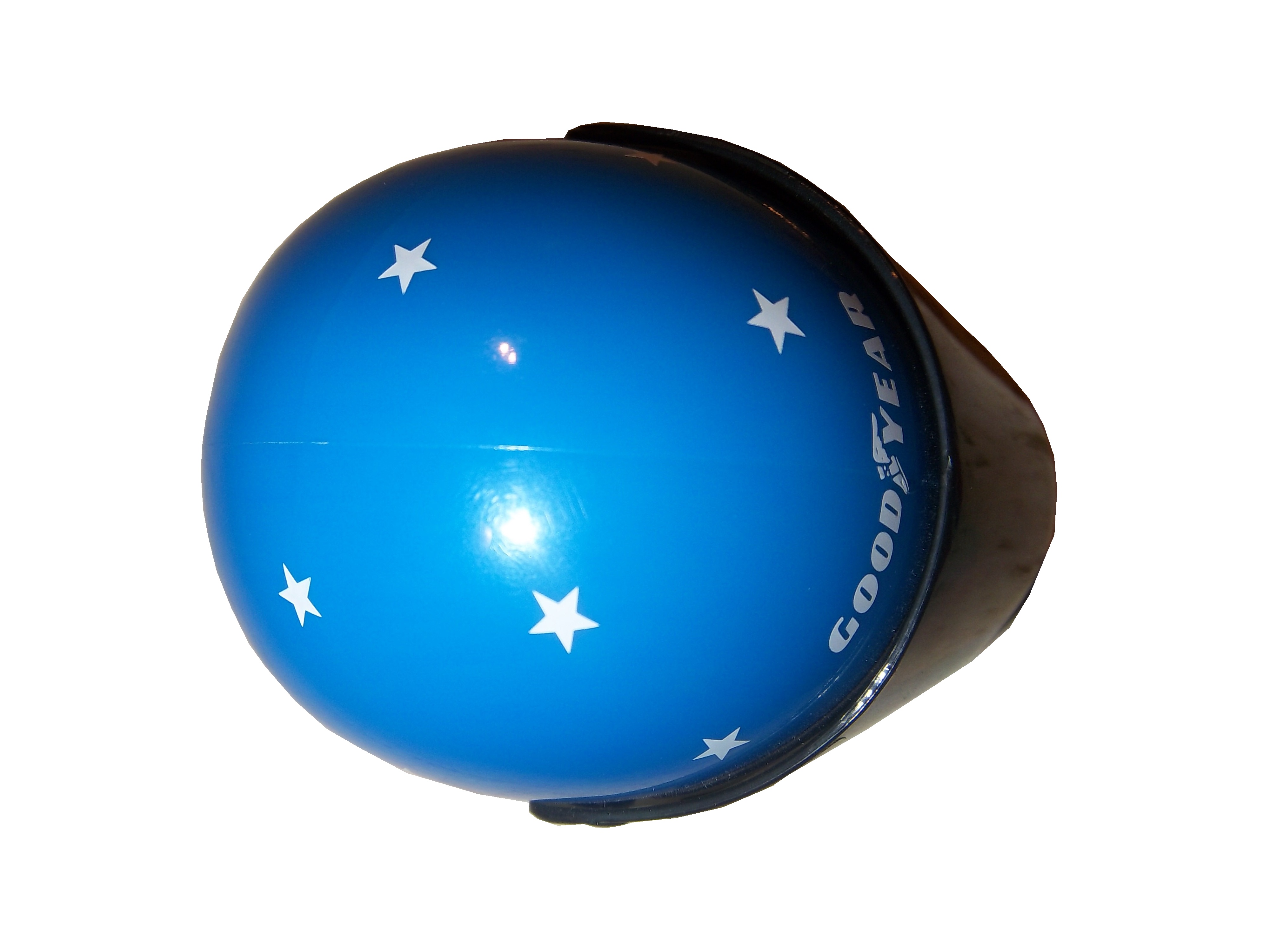
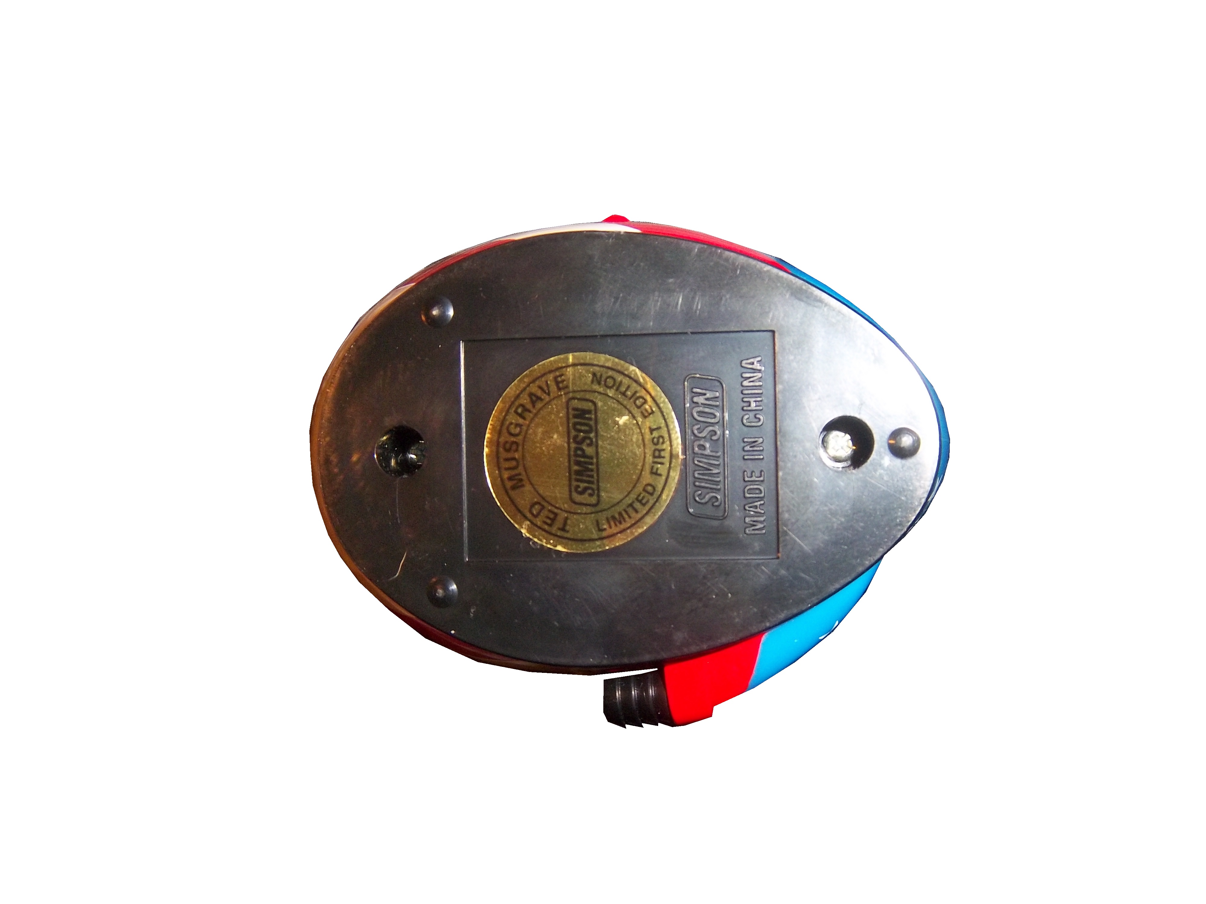
Finally, the ventilation intake is located on the top of the helmet. This is connected to a hose, which in turn is connected to a “hot box” mounted in a window behind the driver. The hot box has a gas scrubber on it, which cleans up the air, and cools it before blowing it on the driver. Considering that the driver compartment can reach temperatures of over 160 degrees Fahrenheit, this is a critical piece of equipment. Older models, like this Ted Musgrave model from 1996, have the intake located on the side. However, since the HANS device became mandatory, the intake has moved to the top to accommodate the device.
Now on to paint schemes…
Nationwide Series schemes first…
Ryan Reed #16 Drive to Stop Diabetes Ford Mustang Good color scheme, red white and black is always a good choice, but the design on the side is confusing to look at. If the design next to the front wheels is removed, I could give it a better grade, but with that design it gets a C.
Kyle Busch #54 Monster Energy Toyota Camry I like matte black, and simple designs in race cars, so this design is one of my favorites. I can’t give this scheme anything less than an A
Steven Wallace #66 Richard Tocado Ford Mustang Great scheme…only way this could be any better is if the lettering, numbers and stripes were in gold, like Rusty’s 1990’s MGD scheme…A grade.
Johanna Long #70 Foretravel Motor coaches Chevy Camaro A very solid scheme with a great color scheme, great design, and an A grade…very solid!
Now on to the Sprint Cup Schemes
Dave Blaney #7 Florida Lottery Chevy SS The color scheme is mediocre, with too many light colors and not enough dark. The lettering is just awful, and the car number looks like something that a small town driver would use, not a Sprint Cup driver would. I’ll be generous and give this scheme a D+
Ricky Stenhouse Jr. #17 NOS Energy/Valvoline NextGen Ford Fusion I love this scheme. Orange and blue is a great scheme to work with, there is not a lot of needless design on the sides, the lettering and numbers look good. So this scheme gets an A. Ricky’s Valvoline NextGen scheme is the same as the Nationwide Series car Trevor Bayne drives, and it gets the same A grade.
Kevin Harvick #29 Rheem Chevy SS Yet more proof that red white and black is a great color scheme. I’m not a fan of the curvy design on the nose that leads to the stripes, but as good as this scheme is, it is a flaw I will overlook. Though I’m not a fan of the ads on the roof, again I’ll overlook that. The black on white numbers are a unique twist, that gives the car a cleaner look. Final Grade: A
Terry Labonte #32 C&J Energy Sources Ford Fusion If there were no contingency decals present, I would think this is just a black and white picture. Silver is a great color for cars, and the black white and silver scheme works well in most applications, but this scheme just falls flat. Final Grade C-…just too meh to be good.
JJ Yeley #36 Accell Construction/Golden Corral/United Mining Equipment Chevy SS Three schemes here, first the Accell Construction scheme, which uses a great color scheme, but the side design is just brutal to look at. The Golden Corral scheme is great, with a great color and simple design schemes, and is amazing to look at. The United Mining Equipment scheme has a good color scheme. The stripes are bad, but I like the coal design on the doors and roof. Accell Construction gets an F, Golden Corral gets an A, and United Mining Equipment gets a B
David Ragan #38 Love’s Truck Stops Ford Fusion The only bad thing I can say about this scheme is I don’t like the back bumper design. Other than that, great color scheme and reasonably simple design. Final Grade: B+
Carl Edwards #99 Subway/Kelloggs Ford Fusion The green stripes look more like seaweed, and ruin what could have been a great scheme. The Kellogg’s/Cheez It’s scheme is way too cartoonish to be taken seriously, so both schemes get an F grade.
NASCAR Helmets Over The Years
By David G. Firestone
The evolution of the racing helmet in NASCAR for the most part was slow, in the beginning. NASCAR was officially founded in 1947, two years after World War II ended. Many of the helmets worn during the 1940’s and 1950’s were little more than repainted army and air force helmets. These helmets were basic at best, and as protection for the dangers of racing, these helmets were inadequate at best. During the 1950’s, many drivers switched from military headgear to motorcycle helmets. In the 1960’s, motorcycle-style helmets became the norm.
The above helmet was worn by Jim McConnell, who raced and promoted races in Maine, and went on to found Beech Ridge Motor Speedway in Scarborough, Maine. This is a racing helmet, but it looks more like Wyatt’s Captain America helmet from Easy Rider, in its basic design. It has an open face, no microphone equipment, and is rather thin. Although there would be advancements in helmet technology, the open-face design would remain popular until the 1980’s.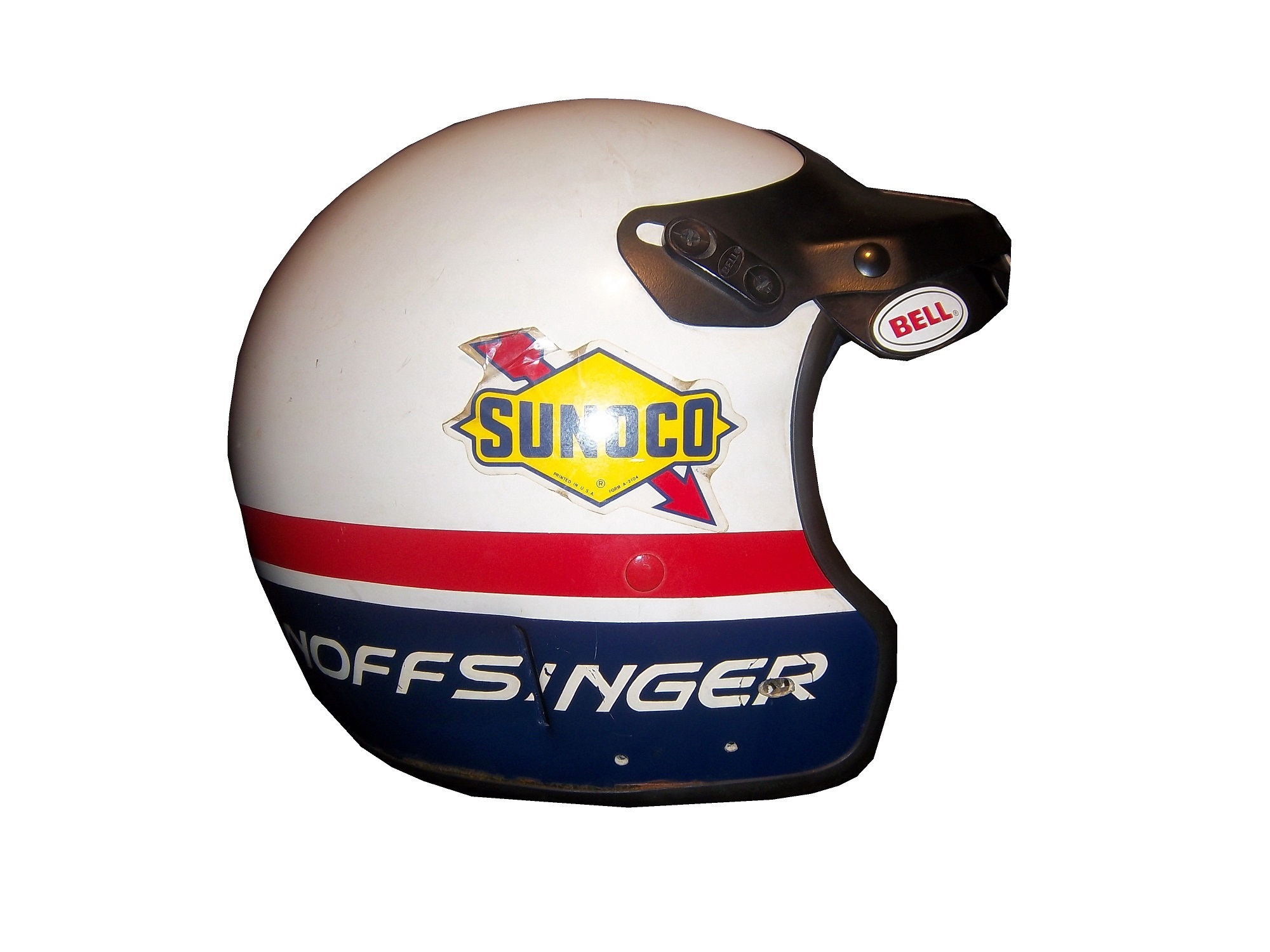
This helmet was worn by Brad Noffsinger in 1988, it is the same general design, though it is much thicker, has some advancements in visor technology, and had some microphone technology in it as well. Although these helmets have since been banned, they remained legal for as long as they did for one simple reason: Advanced visibility. NASCAR did not want to have a crash caused by decreased visibility due to a rule mandating full-face helmets.
The Ted Musgrave helmet mentioned in a previous post is a perfect example. The bottom part covering the chin does to a certain extent reduce visibility for a driver. The logic makes sense, in that if there was a crash caused by reduced visibility, so for the 1990’s and 2000, the open-face was legal…then came the 2001 Daytona 500. That race saw the death of Dale Earnhardt Sr. from a Basilar skull fracture, which as tragic as it was, wasn’t the first death due to sub-par safety equipment. John Nemechek, Adam Petty, Kenny Irwin Jr., and Tony Roper had all been killed in similar accidents. Only after Earnhardt’s death, did the HANS device come to light, and eventually became mandatory in NASCAR, and eventually, across the board in racing. Now the helmets used in NASCAR look like this:This is a helmet worn between 2004 and 2005 by either Regan Smith or Jason Keller. As you can see, it has a number of advancements, including the visor, and air intakes, but the biggest advancement is these small bolts towards the back.
These are where the HANS device connects to the helmet. The HANS device was mandated after the death of Dale Earnhardt Sr. to prevent Basilar skull fracture deaths. This device has worked very well. The HANS device works by attaching the device to the helmet, and then being secured by the shoulder straps, as seen below:
As advanced as this helmet is, there is always room for improvement. What new form will the racing helmet of tomorrow take? Only time will tell.
On to Paint Schemes, we have a lot of ground to cover today…
First in the Camping World Truck Series
Chris Cockrum #07 Accu-Tech/Homesmart Toyota Tundra Decent color scheme, good stripe pattern, logos are easy to see. Solid A grade.
Sean Coor #82 Warriors in the Workplace Ford F-Series Simple yet bold. Great use of matte black, great number design and color scheme. The logo is easy to see and stands out. No distracting stripes or patterns. Solid A grade.
Next up, the Nationwide Series
Sam Hornish Jr. #12 Wurth Tools Ford Mustang The doors look like they have race damage on them already, which is not a good sign. The color scheme is decent, but the Pennzoil stripes just kill it. The logos are easy to see, but the stripes are just awful. Final grade C+
Matt Kenseth #18 Reser’s Foods Toyota Camry. Numbers are great, color scheme is good, logos are easy to see, and the background design is visible, but not overpowering. The only thing keeping this scheme from a higher grade is the picture of the package on the side of the car. That drags the grade down to a B+ from an A
Now moving on to the Sprint Cup Series
Denny Hamlin #11 FedEx Toyota Camry There are a total of 4 variations of the FedEx scheme, Express, Freight, Ground and Office. Right off the bat, the front nose design and stripes are awful. The color schemes are great, as are the logos and numbers, but the stripes kill it. The best grade I can give is a C+ across the board.
Paul Menard #27 Menard’s Chevy SS Not the worst I have ever seen, but the yellow is way too bright, and the massive collection of sponsor stickers on the quarter panel is just ugly. Final Grade C-
