By David Firestone
As I mentioned in the last post, the SFI/FIA Certifications on current helmets are located on the HANS anchors. I also discussed the advancements in helmets over the last 12 years in my post on the evolution of helmets. But what makes the current helmet design so effective? Let’s take a look at one.
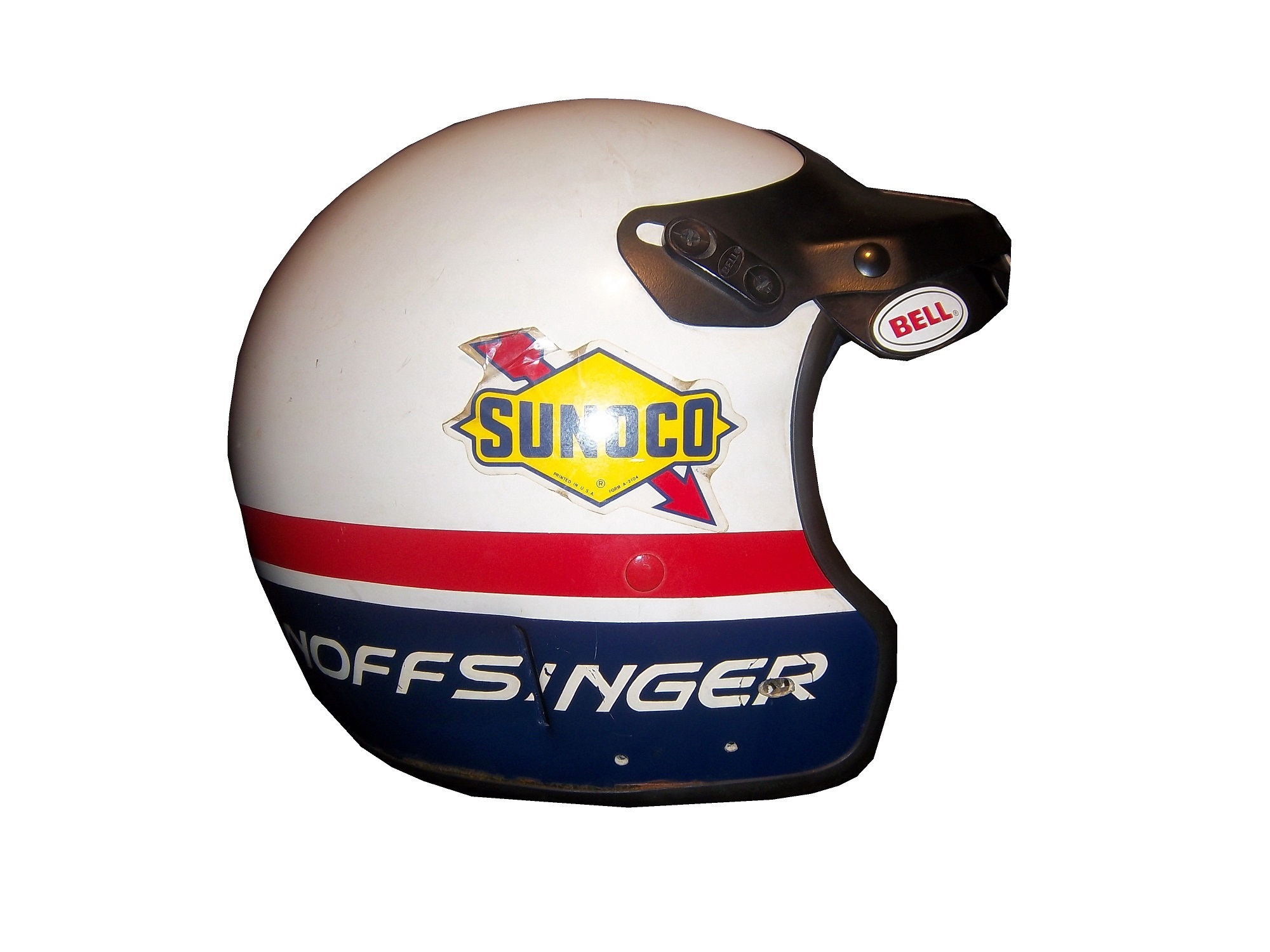
This example is an Impact! Air Vapor helmet worn by either Regan Smith in 2005 or Jason Keller in 2006. It was used in the Nationwide Series for Team Rensi Motorsports, founded by former McDonald’s Executive Sam Rensi. It carried a McDonald’s sponsorship.
It was made by Impact! Race Products in Brownsburg, Indiana. Impact has a unique history. After Dale Earnhardt Sr.’s death in 2001, Bill Simpson, who had founded Simpson Race Products resigned after NASCAR had blamed Earnhardt’s death partially on a seat belt failure. He had a one year non-compete contract with Simpson, and after that expired, he went to found Impact. Because Bill Simpson was a race driver, he understood the needs of drivers, and both Simpson and Impact followed that philosophy. Let’s take a closer look at some of the features of this helmet.
This is an Air Vapor helmet, used by a number of drivers on the NASCAR circuit. It is made out of a carbon composite material, which is both lightweight and very durable. It has been custom painted with McDonald’s colors and some very cool “ghost skulls.” The helmet has a number of unique curves, and grooves designed to help air flow around the helmet and keep the visor fog-free.
The visor is much narrower than older Simpson models, and the gold tint is shading for the visor. The Impact strip across the top does not obstruct the driver’s vision at all, as it covers the area of the visor over the opaque section of the helmet.


The Microphone equipment is still present and in good condition. The microphone is one of the most critical safety features, as spotters are mandatory at every race, and they tell the driver everything going on around them. The driver can also tell the crew chief what, if anything, needs to be done to the car during pit stops. The telephone cord-style cable plugs into the seat, and the seat is connected to the electrical system in the car.
Finally, the ventilation intake is located on the top of the helmet. This is connected to a hose, which in turn is connected to a “hot box” mounted in a window behind the driver. The hot box has a gas scrubber on it, which cleans up the air, and cools it before blowing it on the driver. Considering that the driver compartment can reach temperatures of over 160 degrees Fahrenheit, this is a critical piece of equipment. Older models, like this Ted Musgrave model from 1996, have the intake located on the side. However, since the HANS device became mandatory, the intake has moved to the top to accommodate the device.
Now on to paint schemes…
Nationwide Series schemes first…
Ryan Reed #16 Drive to Stop Diabetes Ford Mustang Good color scheme, red white and black is always a good choice, but the design on the side is confusing to look at. If the design next to the front wheels is removed, I could give it a better grade, but with that design it gets a C.
Kyle Busch #54 Monster Energy Toyota Camry I like matte black, and simple designs in race cars, so this design is one of my favorites. I can’t give this scheme anything less than an A
Steven Wallace #66 Richard Tocado Ford Mustang Great scheme…only way this could be any better is if the lettering, numbers and stripes were in gold, like Rusty’s 1990’s MGD scheme…A grade.
Johanna Long #70 Foretravel Motor coaches Chevy Camaro A very solid scheme with a great color scheme, great design, and an A grade…very solid!
Now on to the Sprint Cup Schemes
Dave Blaney #7 Florida Lottery Chevy SS The color scheme is mediocre, with too many light colors and not enough dark. The lettering is just awful, and the car number looks like something that a small town driver would use, not a Sprint Cup driver would. I’ll be generous and give this scheme a D+
Ricky Stenhouse Jr. #17 NOS Energy/Valvoline NextGen Ford Fusion I love this scheme. Orange and blue is a great scheme to work with, there is not a lot of needless design on the sides, the lettering and numbers look good. So this scheme gets an A. Ricky’s Valvoline NextGen scheme is the same as the Nationwide Series car Trevor Bayne drives, and it gets the same A grade.
Kevin Harvick #29 Rheem Chevy SS Yet more proof that red white and black is a great color scheme. I’m not a fan of the curvy design on the nose that leads to the stripes, but as good as this scheme is, it is a flaw I will overlook. Though I’m not a fan of the ads on the roof, again I’ll overlook that. The black on white numbers are a unique twist, that gives the car a cleaner look. Final Grade: A
Terry Labonte #32 C&J Energy Sources Ford Fusion If there were no contingency decals present, I would think this is just a black and white picture. Silver is a great color for cars, and the black white and silver scheme works well in most applications, but this scheme just falls flat. Final Grade C-…just too meh to be good.
JJ Yeley #36 Accell Construction/Golden Corral/United Mining Equipment Chevy SS Three schemes here, first the Accell Construction scheme, which uses a great color scheme, but the side design is just brutal to look at. The Golden Corral scheme is great, with a great color and simple design schemes, and is amazing to look at. The United Mining Equipment scheme has a good color scheme. The stripes are bad, but I like the coal design on the doors and roof. Accell Construction gets an F, Golden Corral gets an A, and United Mining Equipment gets a B
David Ragan #38 Love’s Truck Stops Ford Fusion The only bad thing I can say about this scheme is I don’t like the back bumper design. Other than that, great color scheme and reasonably simple design. Final Grade: B+
Carl Edwards #99 Subway/Kelloggs Ford Fusion The green stripes look more like seaweed, and ruin what could have been a great scheme. The Kellogg’s/Cheez It’s scheme is way too cartoonish to be taken seriously, so both schemes get an F grade.