My Statement Regarding the events of the Federated Auto Parts 400

By David G. Firestone

I normally don’t do two posts in one week, but after the events of the last two weeks in NASCAR, I felt compelled to state my feelings on the matter. Obviously, what took place at and after the Federated Auto Parts 400 is shocking to say the least. As a NASCAR fan, and collector, I felt that I had to say something.

First, I’ll discuss Joey Logano and David Ragan. Obviously what happened was that Ragan allowed Logano to pass him, to get a position, to get points needed to make the chase. It does need to be noted that on a very technical basis, the two are “partners” as they are both Ford drivers. However, it is still a violation of the rules, but at the same time, I can’t really blame Ragan. Front Row Motorsports is a middle-shelf team that has flashes of success, but is not a championship team. Ragan had nothing to gain in that race at that point. Logano had everything to lose at that point. He is having a great year, with a new team, and I think he can win the Sprint Cup this year. That said, it is a violation of the rules, and the rules are the rules.

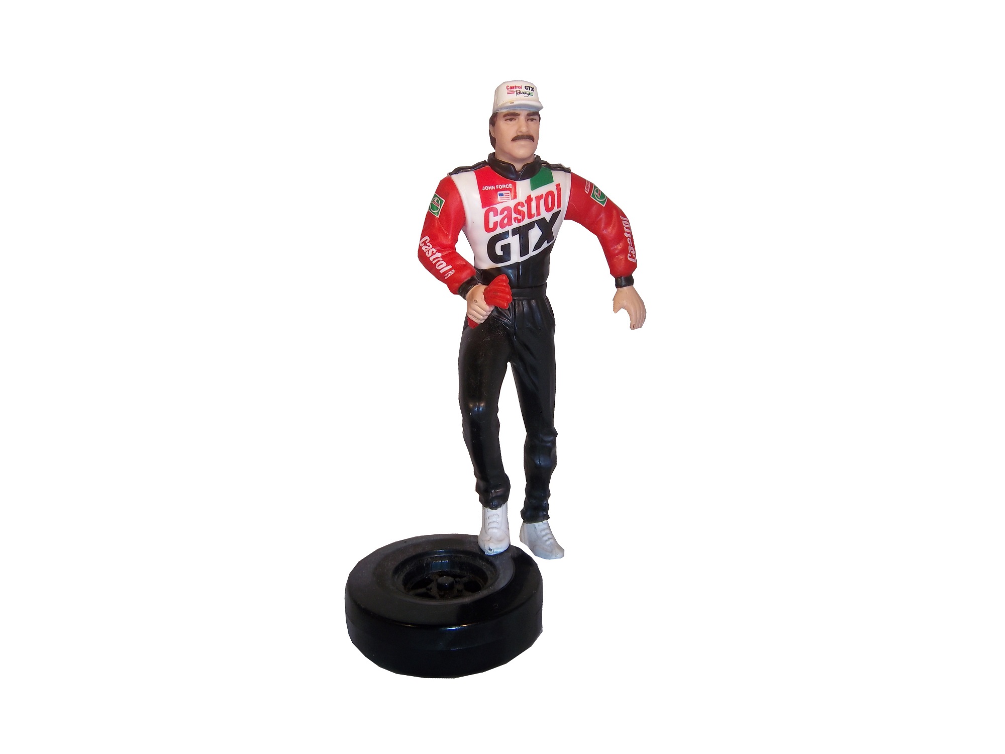
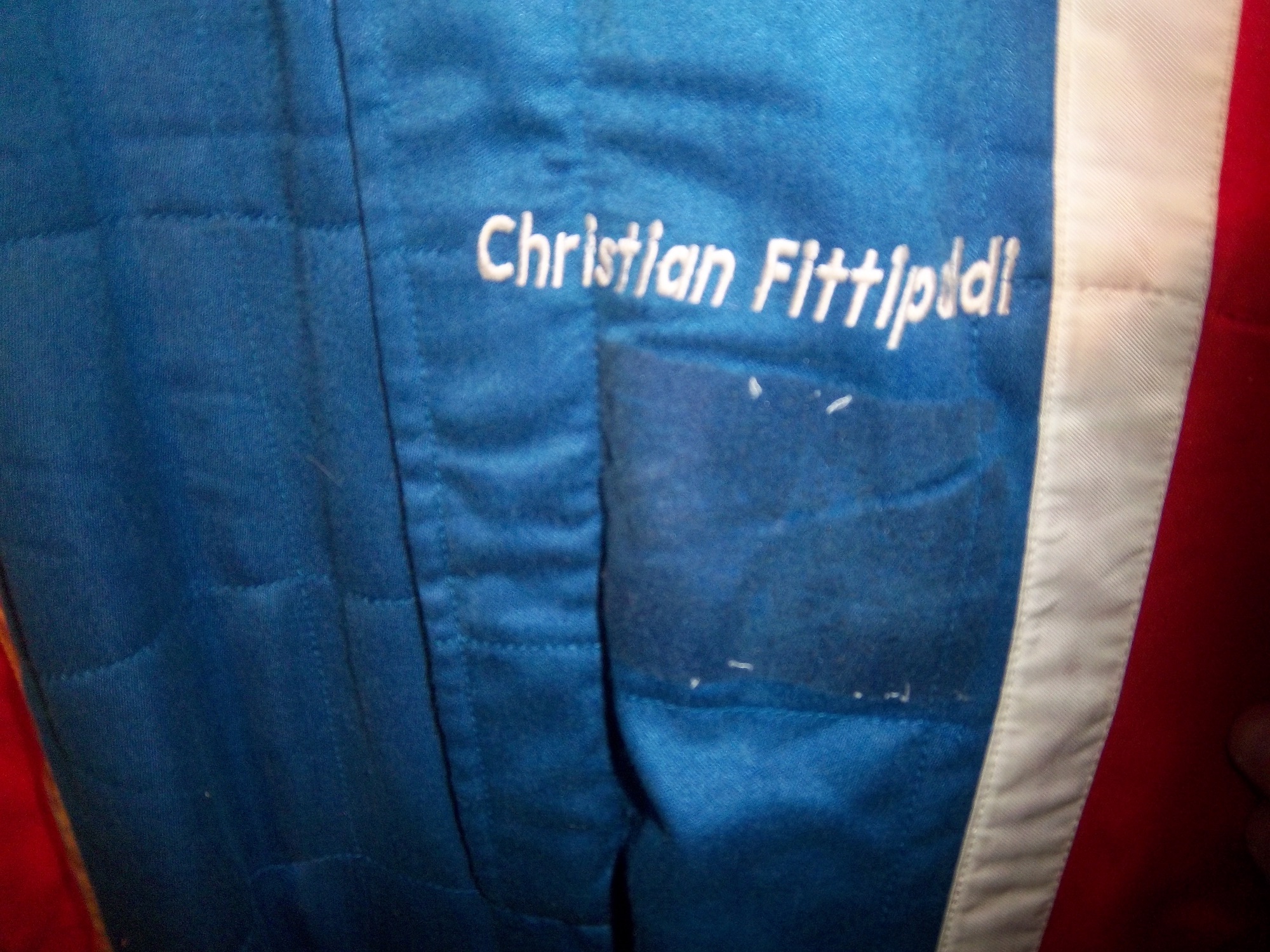
Now we turn to the Michael Waltrip situation. Michael Waltrip and his older brother Darrell are old school stock car drivers. Old school drivers are notorious for trying to and finding ways around the rules. However, unlike the old days, in this day in age, cars are very closely inspected, and radio chatter is monitored by fans and officials alike. That is why this whole situation is as important as it is.

Now clearly what took place is that with 10 laps to go, Ryan Newman was leading the race, and with the points they way they were, he would make the Chase with a win. Martin Truex Jr. who would miss the Chase with Newman’s win is trying his best to make as many positions as he can to get as many points as he can to make the Chase, and give his teammate Clint Bowyer an advantage. Bowyer is being given info on the situation via team radio, and was obviously given a very poorly coded radio message to intentionally spin out to bring out a caution, and start a round of pit stops. When all pit stops are said and done, Newman is far back in the pack, and is out of the Chase Points wise. The race restarts, and on lap 198, Brian Vickers, the third driver for Michael Waltrip Racing, was ordered by his spotter Ty Norris, who is also the general manager and vice president for Michael Waltrip Racing to make a green flag pit stop, which gives Truex another boost in the point standings.

When the checkered flag flew, both Logano and Truex were in the Chase, and Jeff Gordon, and Ryan Newman were out. Gordon and Newman were disappointed, but they handled it well. Almost instantly, the issue came to light, starting with ESPN’s coverage. The commentators knew something was up, and it was clear from the in-car camera that the spin was intentional. Between Richmond and Chicago, the investigation led to the biggest penalty in the history of NASCAR, with a $300,000 fine and 50 owner point reduction for all 3 teams, all crew chiefs, were placed on probation, and Ty Norris was suspended indefinitely. Because of this, Truex was removed from the Chase, and Ryan Newman was added. Furthermore, with the Logano/Ragan situation, a 13th driver, Jeff Gordon, was added to the Chase.

Drivers know when they have in-cars, so it makes no sense that he would intentionally spin out. If Brian Vickers, who did not have an in-car had spun out, it would have been much more difficult to make a case. Also, if Vickers had pitted under green to fix some damage, it would have been much harder to prove something would have happened.

If this was a unique incident for Michael Waltrip Racing, I think that it could be forgiven at the end of the season, but let’s take a trip back to 2007, specifically, the days leading up to the Twin 125’s before they Daytona 500. Evernham Motorsports and Roush Fenway were caught with “illegal modifications” for their cars, and fines and suspensions were levied. Michael Waltrip Racing was caught with an illegal fuel additive in his primary car, and was fined 100 points for the violation.

NAPA, who had sponsored Waltrip since his 2001 Daytona 500 win had said that they would stand by him, but if something like this happened again, that would not be guaranteed. Well something like that happened again. This morning, NAPA announced that they will not sponsor MWR anymore after this season, which is understandable. NAPA is a very loyal sponsor, so clearly what happened was that they decided that the cheating was going to continue until they said something. It is sad, but it happened.

My question is this, a very valid argument could be made that Truex himself did not do anything intentionally wrong, and that he was thrown under the bus because of the actions of his teammates. Another argument can be made that NASCAR stated when announcing the penalty, that they could not prove that Bowyer spun intentionally. Taking all the evidence into consideration, it appears that Truex had no idea what was going on around him, and that his teammates kept this information from him. I think with the penalties NASCAR levied against MWR, that Truex did in fact get thrown under the bus. At the same time, the rule comes across as a “hand of one is the hand of all” rule, which means that if your team cheats to help you, you are just as responsible for what happens.

To summarize, I think that NASCAR did what they felt was right, and I feel as though NAPA had to do what they they thought was right. Do I agree with it? Absolutely! NASCAR and its sponsors need to make it as clear as they can that cheating will not be tolerated. The rules are the rules, and even if the drivers disagree with them, they have to be followed.

Figure This Out!

By David G. Firestone

In my last column, I mentioned that Starting Lineup and Winner’s Circle figures made in the 1980’s and 1990’s censored alcohol and tobacco logos. But when it comes to these figures, how do the uniforms the figures portray stack up to their real-life counterparts?

First, lets discuss the figures themselves. Created by Kenner starting in 1988, Starting Lineup was a line of action figures based on baseball starts. As time went on, the line expanded from just baseball to football, basketball, hockey, and racing. The figures are 4 inches tall. For racing, Starting Lineup figures were packaged under the Winner’s Circle brand. The drivers features were championship-level or rookie of the year drivers. One of those was Mike Skinner released in 1998, which is in perfect condition, though has been removed from the package.31-skinner2 31-skinner

The driver suit it is based on is Mike Skinner’s 1997 race-used driver suit from his rookie of the year campaign. It was purchased from the Jeff Hamilton collection, and came with a letter stating as such. It shows nice use, and Jeff has signed the right chest. It also features something I have seen on a few other suits from that era, but from nowhere else, the Future Suit inscription. I have been waiting a while to discuss this. Custom suits from 1997 have something written on the back of the neck. On the Skinner suit it reads “Future-Suit-2-2252.31-skinner-future

This Stevie Reeves suit from 1997 has a similar inscription96-reeves-neck

This Lake Speed suit from 1997 was purchased off the rack, and does not bear the inscription,9-speed-b

Interestingly, suits from 1996 and before,41-craven-neck

and suits from 1998 and after,15-musgrave-blogo

do not have this inscription. From what I have been able to gather, this was an inventory number for customized suits. But I do not understand why it seems to only be used on suits from 1997. Ok, getting off track here, getting back to Finish Line figures….

Taking a look at this figure as compared to the real-life driver suit this figure is based on, it is very accurate. The bottom torso logos, and television logos on the sleeves are identical. The chest is missing the Chevy and Winston Cup logos, and has the name, whereas on the real suit the name is on the belt. They still did a very good job though.31-skinner4 31-skinnerb

The logos on the upper right sleeves are identical on both the figure and the real suit.31-skinner-rsleeve1 31-skinner7

The scale and position of the LOWES logo on the back of the figure as compared to the back of the real suit is identical as well.31-skinner6 31-skinner-rsleeve2 - Copy1

The position, location, and size of the television logos on the legs are perfect as well. They really did a great job with this figure.31-skinner11 31-skinner-legs

The detail in this figure is amazing, because Finish Line’s Starting Lineup counterparts lacked some details. Baseball figures from the same set in the same year, such as this Albert Belle figure often lacked pinstripes.8-belle4 8-belle1 8-belle2 8-belle3

Other examples include recycling of bodies. Every Finish Line figure is basically 4 different body parts, head, upper body, legs, and arms. These were taken, painted appropriately and then attached to each other. That is why all the figures look alike, but with minor differences.88-jarrett2 31-skinner2 17-waltrip2 force2

I can vividly remember buying these as a kid. When I got my first, a Dan Pasqua 1989 White Sox figure for my birthday, I was excited. Now, 23 years later, I have the ability to take a toy from my childhood, and compare it side by side to the uniform it is based on. I can honestly say I never thought it would happen, but I am thrilled to take the opportunity.

Tailgating Time!

Chicago-Style Hot Dogs

In honor of the Chase for the NASCAR Sprint Cup Championship starting at Chicago, I will do a couple of Tailgating Time recipes featuring Chicago food products. The first is Chicago-style Hot Dogs. This classic has been enjoyed in Chicago since the Great Depression. It has been enjoyed by those in the Chicago-land area for some time.

You Will Need:

2 packages Vienna Beef hot dogs

2 packages S. Rosen’s Mary Ann Buns-Both come in packages of 8

1 Chopped white onion

1 Sliced Tomato

1 Jar Yellow Mustard

1 Jar Sweet pickle relish with mint,

2 Jars of pickled sport peppers

Celery salt

Chicago-Style dogs are traditionally boiled or steamed. If it is grilled, it is referred to as a “char-dog.” Once the hot dogs are done cooking, place the hot dogs in the bun, and then put the condiments in this order: mustard, relish, onion, tomato, sport peppers, pickle spear, celery salt. Ketchup on these dogs is UNACCEPTABLE! The final product will look like this:5

Classic Maxwell Street Polish Sausages

Anyone from Chicago will recognize this dish, and those from all over the country will enjoy this dish as well. This recipe needs both a hot plate as well as a grill. For a group of 6 people, you will need:

12 kielbasa links

12 sausage buns

1 large jar yellow mustard

6 large sweet onions

1 jar Olive Oil

First, on the pan, saute the sweet onions in a bit of olive oil on low for an hour and a half with a touch of thyme and salt. This might seem like a while, but the results are worth it.

While the onions are cooking, fire up the grill, wait until it is hot, and cook the kielbasa links until they show some char on the outside.

A few minutes before the kielbasa and onions are done cooking, pour the mustard into a bowl, this will help in the serving process.

Take the buns and smear the insides of the bun with mustard using a rubber spatula. Take the sausage and place one piece in each bun, and cover the top of the sausage with the now caramelized onions. The final product will look like this:29

Paint Scheme Reviews!

Marcos Ambrose #9 DeWALT/ACE/CMN Ford Fusion Good overall design however my main issue with the scheme is the very small writing on the side of the car. Designing a car with lettering too small to show up on the track that can be seen on the track or on television makes no sense at all. That said, this is still a good scheme, and I will give it a B

Greg Biffle #16 3M/Scotchguard Ford Fusion Everything I just said about the Marcos Ambrose scheme above applies here, as the Scotchguard logo is much too small. But the scheme is good and I will give it a B

Ricky Stenhouse Jr. #17 Ford Ecoboost Ford Fusion Great color scheme, great design, works very well, and it gets an A

Kyle Busch #18 M&M’s American Heritage Toyota Camry Kyle has great schemes, and this is no exception. The American Heritage chocolate line features chocolate made as it was back in 1750. The scheme has some light changes, including the American Heritage logo, and a stereotypical colonial hat on the quarter panel. It works very well, and it earns an A

Jeff Gordon #24 Drive to End Hunger/Fan Names on Hood Chevy SS Taking a terrible paint scheme to begin with, and adding tiny lettering to the hood is a great way to earn an F

Paul Menard #27 Menards/Quaker State Chevy SS Green and gold is always a great scheme, but the spike design just does not work at all. I can give it a C at best, but the spikes are just awful.

Jeff Burton #31 Utility Trailers Chevy SS Great color scheme and great design. This scheme earns an A

Ken Schrader #32 Safe Skies Locks Ford Fusion It is a very basic paint scheme however basic can be very good, as this scheme shows. Looks very smooth and very good, and has a great color scheme. It earns an A

David Ragan #34 Farm Rich Ford Fusion Mediocre color scheme, but what they did is that they took that color scheme and designed the car to look like the rolling hills of a farm, with the Farm Rich logo acting as the sun, which works very well, and I have to give this scheme an A

Josh Wise #35 The Pete Store Ford Fusion The template this team uses works well when they have a logo with the matching colors. This example works very well, and earns an A

Dale Earnhardt Jr. #88 Time Warner Cable Chevy SS The blue is too bright, but the overall scheme is good, though I do wish Time Warner could pick a better logo. A

A Great Series Needs a Great Logo!

By David G. Firestone10-labonte-rchestThe NASCAR Sprint Cup Series has a unique tradition that stretches back to the 1970’s, the Series Logo. Series Logos are now commonplace in most forms of racing, excluding Formula 1, which does not need a series logo. The evolution of the NASCAR Sprint Cup Series logo over the years in interesting.

1972-1981imagesThis logo is designed in classic 1970’s design, and can be seen on driver suits, as this Dale Earnhardt Sr. example from 1980 clearly shows.

1982-1988WCSnewThe “1 Car” logo was a major redesign, and features a logo, with NASCAR GRAND NATIONAL SERIES embroidered, and a 1980’s car. Very visible on driver suits from the era.

1989-199220-hillin-rchestA simple Winston logo, which, while underwhelming is very visible on this Bobby Hillin Jr. Suit, and this photo of Dale Earnhardt Sr. from 1992…and look who is next to him!

1993-199616-musgrave-rchestAgain an underwhelming yet attractive series logo. The interesting thing about logos from 1993-2001 is that there are two designs, red with white lettering that displayed better on light driver suits, and white with red lettering that displayed better on dark colored driver suits. Though the rule was rather ambiguous for a while.

1997-19999-speed-chestThis design went through some changes when Winston changed the design of their packaging. Starting in 1998, Winston went from a rounder typeface to a narrower and straighter typeface, as a young Tony Stewart is modeling.

1998:15-musgrave-lsleeve1Every team and driver ran the NASCAR 50th Anniversary logo on their cars and driver suits. Not bad at all.

2000-200190-stricklin-rchestA square design with an oval logo was used from 2000-2001, with the color-flipping returning. At this point, the discussion of who would replace Winston started, as due to legislation, cigarettes would not be allowed to sponsor auto racing within the next few years.

2002-200344-Fittipaldi-lchest The transitional oval logo. The Busch Grand National series had adopted an oval logo in 1995, and since the series would change sponsorships in 2004, this new logo would be the bridge between the old and the new.

2004-20079-kahne-rchestNew sponsor, new colors, new shape. Nextell Communications took over in 2004 and it became the Nextell Cup Series. This logo would remain constant until Sprint and Nextell merged, which led to:

2008-Present:10-labonte-rchestSame color scheme, same shape, same basic design.

The logo has become a marketing point for NASCAR teams and NASCAR itself. Die casts, driver uniform coats, t-shirts, pit crew shirts, and many other items carry these logos.

Now on to the Nationwide Series

1982-1994busch-beer-mountains RacingbgnlogoThese two logos were used for the Busch Grand National series. The plain Busch logo worked better and was used more often than the Busch Beer Series logo.

1995-2004NbgnsAn oval logo with the sponsor name, and GRAND NATIONAL SERIES added below. It was very marketable and worked quite well as a logo.

2004-2007NbsGrand National Series has been removed, and some minor redesigns to BUSCH and the NASCAR logo as well. 2006 featured the 25th Anniversary logo.

2007-PresentNnsComplete redesign for the NASCAR Nationwide Series which began when Nationwide took over the titular sponsorship of the series. Uneven oval with a Nationwide logo, and a NASCAR logo, with a new overall design and color scheme.

Last but certainly not least the Truck Series

1995:NstsFor the first season, the Truck Series was referred to as the “Super Truck Series by Craftsman.” It featured a decidedly early 1990’s logo. It lasted for only one season.

1996-2002NctsThe Craftsman Truck Series is a better name and the logo, while still bearing a 1990’s style design, is more refined and professional.

2003-2008Ncts2The entire logo is inside the oval, some minor color and typeface changes are present as well. 2005 featured the 10th anniversary logo.12-miller-rshoulder - Copy2009-PresentNcwtsThe same off-center oval design as the Nationwide Series and Sprint Cup logos, with a sponsor redesign for Camping World, who took over for Craftsman after 2009.

Paint Scheme Reviews!

Jamie McMurray #1 Bad Boy Buggies Chevy SS Not a bad scheme, colors work well, and the ovarall design is simple yet attractive, I give it an A+

Greg Biffle #16 Bondo/3M Ford Fusion The color scheme is good, but the red designs on a red background just look odd. If it was a white design, it would work well, but this just looks odd. Still, it’s odd, but not awful, so I will give it a C

Ricky Stenhouse #17 Nationwide Insurance Ford Fusion Um…This has a great color scheme and a great simple design, but this just does not work. Too much black, and not enough silver and blue. It would work well if the blue and silver were the predominant colors, and black was the where the silver is. I can give this a C

Austin Dillon #33 Advocare Chevy SS It works very well, great color scheme and great desgin…except for the black outline around the numbers. Why? The stripes don’t interfere with it at all. If it was just a small black outline around the edge of the numbers it would work, but the black negative space area is just distracting. Without the black, it would be an A, but this scheme earns a B-

David Ragan #34 Peanut Patch Hot Boiled Peanuts/Race Trac Ford Fusion While the color scheme brings back memories of the Houston Astros Tequila Sunrise jerseys, the overall design is good. I like the mountain-esque design, but the random peanuts scattered over the hood and quarter panels are just awful. I really want to give this a better grade, but a C- is the best I can do for this scheme.

Josh Wise #35 Carson-Newman University Ford Fusion Great color scheme, and great design…except for the eagle. Why is the eagle facing the back of the car? If the eagle was facing the front, I would give this scheme an A, but this just looks bad, and takes the grade down to a C

Landon Cassill #40 Moonshine Attitude Attire Chevy SS Ok, let me make this clear…hunting camouflage is not, has never been, and never will be an acceptable background color for a race car. It didn’t work for Duck Dynasty, and it doesn’t work for this car, and it gets an F

Aric Almirola #43 Rain Eater Wiper Blades/Charter Communications Ford Fusion This color scheme works very well, except for the hood logo, where the green logo is next to invisible on the Petty blue of the hood. But even so, the scheme as a whole works very well, so I’ll give it an A.

Ryan Truex #51 Seawatch Chevy SS Having never heard of Seawatch, I thought it was an activist group at first, but Seawatch is actually a very well established clam company based in Maryland. The overall design is really good, though the wave next to the rear wheel well is a bit out of place. Still it looked very good on the track, and I give it an A.

Justin Allgaier #51 Brandt Chevy SS A timeless design, with a great color scheme and a great design that earns an A

Dale Earnhardt Jr. #88 Race 2 Achieve/National Guard Chevy SS Race 2 Achieve is a program that teaches advanced math through the eyes of Hendrick Motorsports engineers. It shows how the engineers use Algebra II and trigonometry to solve problems on the race car. This is a great old-school scheme, with a great color scheme, and great overall simple design. A+

Dale Earnhardt Jr. #88 National Guard/Breast Cancer Awareness Chevy SS Oh God! October is coming therefore, the pinkwashing must start. For those who don’t know the term, “Pinkwashing” is the process of using pink ribbons and/or the pink color to sell products, many of which are inherently unhealthy, with a “portion of the proceeds going to support the fight against breast cancer.” Sadly, most of these funds do not go to serious research, but rather to “feel good” causes such as the Susan G. Komen foundation. Because it is used as a marketing gimmick, and I, as well as my mom who is a breast cancer survivor are opposed to pinkwashing, any and every pink paint scheme, regardless of how good it looks, will earn an automatic F- grade.

Michael McDowell #98 Victory Junction Ford Fusion Unlike Komen, Victory Junction is a cause most people can support. Founded by the Petty Family, after the death of Adam Petty, Victory Junction is a camp for children with terminal and chronic illnesses, so while they are there, they can forget about the troubles of life, and have fun. That said, this is a great scheme, with a very simple yet attractive design, and great colors. The only bad thing I can say about this scheme is that I would love the logo on the quarter panels. That one thing can’t take away from an A+ scheme.

A Prototype Pit Crew Suit…Say That Three Times Fast Part 1

By David G. Firestone.

johansen

Ok, for the next two weeks, I am going to focus on one single suit. This is a “prototype crew suit.” In other words, it is a prototype suit for a pit crew member. In that light, I will do two articles, one focusing on the “prototype” part and the other will focus on the “pit crew” part.

This is a prototype suit. What that means is that this suit was made up to see how various design aspects work. The designers will attach various aspects, stripes, sponsor patches, to a full-size mockup of a suit, usually a single-layer suit, to see how the suit will look like when finished. Since driver and pit crew suits can cost as much as $1500 each to make, this is a simpler and cheaper way to design a suit in full-size. A full size mockup looks very impressive. The designs can be changed as needed.

Prototype suits are made from a single-layer suit. Single-layer suits are cheaper to use, but provide little protection in case of fire, so they are not often used in race condition. Suit design has, in the last 20+ years gone from not an issue to very critical. Because suits are used for promotion for the primary sponsor, the design aspect is very important. Every aspect, from the colors, to the primary and associate sponsor patches, to the decorative design is taken into consideration.johansen

This particular suit was made for PDM racing, for use in the IndyCar Racing League in 2006. It was made for an individual by the name of Tom Johansen. It appears that Johansen is a crew member, and this suit was designed for his use. The logos are sewn on patches, the patches are placed on pieces of fabric, and then attached to the suit. From there, the suit starts to take shape, and the name is attached to the belt, and the logos are attached to the shoulder epaulets. In this example:

The right chest has a HONDA and a PDM RACING logo.johansen-rchestThe left chest has an INDY RACING LEAGUE logo and a ROYAL SPA logo.johansen-lchestThe belt has TOM JOHANSEN directly embroidered into it.johansen-beltThe legs are cuffed.johansen-legsThe sleeves have small logos on the top, and large SIMPSON logos present the bottom.johansen-rsleeve1 johansen-rsleeve2 johansen-lsleeve1 johansen-lsleeve2The shoulder epaulet have FIRESTONE logos present.johansen-rshoulder johansen-lshoulderThe back cowl has a HONDA logo that covers part of the tag.johansen-blogo johansen-tagThe back Torso has a large ROYAL SPA logo, Royal Spa being the primary sponsor at the time.seThe suit shows no wear to speak of, nor does it have any safety certification.

The question is asked, did this suit see race-use?  While the suit itself shows no wear, it seems likely that it did in some form see race use.  PDM Racing was always a sub-par team, and they were always a low-budget team.  An inside joke was that PDM stood for “Poor Dumb Mechanics.”  So the fact that this suit was made would indicate that it was used by Johansen.  However what part Tom Johansen served on the crew is unknown.   On the other hand, a single-layer suit such as this would not provide much protection for the wearer in the very real threat of a fire.  The suit material feels very light, and the wearer would have been seriously injured if a fire had taken place.  The deciding factor for me is that the suit shows no wear.  I have suits in my collection that have been worn for only a few races, but have a lot of visible wear, and for a pit crew suit, that is pretty telling.

Prototype suits provide little protection in case of fire, unlike pit crew suits which are designed to give the wearer as much protection as possible, which we will examine further next week.

Paint Scheme Time!

Jamie McMurray #1 Advil Chevy SS While I’m not a fan of the grid on the front, the car as a whole has a simple, yet attractive design, as well as a good color scheme. So I’ll overlook the grid and give this an A+

Brad Keselowski #2 Miller Lite/Luke Brian Ford Fusion I gave this basic scheme a C+ at the beginning of the year, and this new design doesn’t add or take away from the scheme, so I will leave it at a C

Alex Kennedy #19 Media Master Toyota Camry Nothing really remarkable here, just a simple white scheme with black numbers and green logos. Very simple, and very plain, C+

David Stremme #30 Genny Light Toyota Camry Too much needless decoration. A good color scheme, but there is way too much going on design wise on the side of the car. It just looks awful, and I give it a D-

David Ragain #34 Taco Bell Ford Fusion I have yet to cover Taco Bell this year, but this scheme has a great color scheme, great side design, and a very pronounced design on the hood, which really makes the car stand out, and gives it a better look. A+

Ryan Newman #39 Haas 30th Anniversary Chevy SS Haas has a great scheme already, and the all-black look really works well here. To give this scheme anything less than an A+ is unfair.

Ryan Newman #39 Quicken Loans/PTA Chevy SS The nicest thing I can say about this is that it looks like a unicorn threw up all over the car. F-

Brian Keselowski #52 Star Coach Race Tours Toyota Camry Are you f***ing kidding me? I have to give them credit, they took the worst scheme in NASCAR this year, and found a way to make it even worse. The color and design are horrific, and bonus points for putting blue lettering in the green camo, thus making it nearly invisible. Giving this scheme an F– does not go far enough! WORST SCHEME THIS YEAR!

Brian Vickers #55 Toyota Cares Toyota Camry Good color scheme, and decent design. It is pretty simple, and it works. A

And speaking of Brian Vickers, we got a look at the design for his 2014 Aarons Dream Machine Toyota Camry. The scheme has a more modern look, both in the overall design and door numbers. It is a great scheme, with a great color scheme. A+

NASCAR at the National Sports Collectors Convention

By David G. Firestone

While I’m primarily a driver uniform guy, I collect other stuff as well. I like game-worn and game-used memorabilia, space-flown stuff, and Presidential bill pens, amongst other things. Last Saturday, I spent the day at the National Sports Collectors Convention in Rosemont Illinois. The NSCC, or “The National” is the biggest sports memorabilia show in the United States, and features hundreds and hundreds of sports memorabilia dealers from all over the country.

I go to these conventions on a regular basis, and something that I noticed in recent years is that racing memorabilia is present at these shows more and more, as the racing memorabilia market expands. I go to these shows with an open mind. What I don’t want to do is to go there wanting something specific, and pass up the chance to get an item that I really want. I find myself making offers and deals on items I would never would have dreamed I would buy. I went to a show in March, and came away with this Don Kessinger 1968 MLB All-Star Game trophy/coffee pot.kessenger-trophy-2

While racing memorabilia has a bigger part in these shows, what I DON’T see are driver suits. These shows, especially the National, features dealer and stores from all over the country, and they can only bring so much of their inventory to these shows. Transporting a driver suit from one state to another for a sports memorabilia convention, can be problematic at best. I have however seen driver shoes, gloves, helmets, sheet metal, and pit crew clothes at these shows, and you never know, I may see a driver suit at a show in the near future. Die casts, especially autographed ones are abundant at conventions, and I usually pick up one or two of them.

I picked up this very spiffy Michael Waltrip autographed jacket base on his 2004 driver suit. This jacket is notable in that it is very accurate when compared to his suit.waltripcoat waltripcoatb

It has arm gussets, which I have never seen on a jacket before.waltripcoat-rsleeve1

The material feels like the material that the real suit is made from, and is as heavy as an on track suit. It has a belt, though the belt is black, whereas the suit belt is blue, and Waltrip’s signature is embriodered into the side of the jacket, where a Goodyear logo is embroidered.waltripcoat-rchest

Waltrip’s name would normally be sewn into the belt in yellow lettering on a blue background.waltripcoat-belt

The arm logos are very accurate, and just like the suit, there are no television logos on the ends of the sleeves.waltripcoat-rshoulder waltripcoat-rsleeve1 waltripcoat-rsleeve2 waltripcoat-lshoulder waltripcoat-lsleeve1 waltripcoat-lsleeve2

Michael signed the jacket on the front NAPA logo.waltripcoat-flogo

An identical NAPA logo is on the back.waltripcoat-blogo

And instead of a safety certification, there is a NAPA logo on the back of the neck.waltripcoat-neck

I also bought a coin and die set from the U.S. Mint. The large round object is a die used to press coins.coinddie2

Tailgating Time!

A classic tailgating recipie is chili. It works well in the late summer and fall, and is very easy. This is a recipie that I personally use, and it is unique and has a kick to it.

You will need:

2 pounds chorizo sausage

2 onions, chopped

2 (7 ounce) cans stewed tomatoes

2 (7 ounce) cans smoked chipotle peppers

2 (15 ounce) cans tomato sauce

2 (15 ounce) cans kidney beans

3 cups water

2 pinches chili powder

2 pinch garlic powder

salt and pepper to taste

In two large saucepans over medium heat, using one pan for half the ingredients each, combine the chorizo and onion and saute until meat is browned and onion is tender. Add the stewed tomatoes with juice, smoked chipotle peppers with juice, tomato sauce, beans and water.

Season with the chili powder, garlic powder, salt and ground black pepper to taste. Bring to a boil, reduce heat to low, cover and let simmer for 15 minutes.

Paint Scheme Reviews:

Jeff Burton #31 GutterClear 365 Chevy SS Um…Who did the decals on the quarter panel? Why is the logo bent over the top of the deck lid? It looks odd, and it doesn’t do the car any favors. The CAT logo on the light blue background looks forced and awkward. The bad part is that if those two flaws were fixed, this would be a very solid scheme. I love the colors, and the overall design looks amazing, but the rear sponsor is just awful. I will give this scheme a C+ It is good but it need some work.

Tomy Drissi #87 The Counselor Toyota Camry Good color scheme, great simple classic design. A+

Getting the Belt…Not Always a Bad Thing!

By David G. Firestone

One aspect of driver suits that has become a target for new customizations in the last 15-17 years is the belt. For many years, the belt was unadorned, or had a very small logo. Belts are a comfort feature, and typically made of the same material that the suit itself is made out of, with the same amount of layers and has a Velcro closure on it. Belts may incorporate a border made with an alternate color, to help it stand out.

Belts had no design or decoration on them for many years, as examined by this Ted Musgrave example from 1995,16-musgrave-beltthis Ricky Craven example from 1996,41-craven-beltand many more.barber-belt nunn-belt petty-belt 17-sedgwick-belt 9-speed-belt But it was around that time, that something began to happen. Looking at the Ted Musgrave suit from 1995, his name is embroidered into the left-chest area.16-musgrave-lshoulderIn 1998, this had changed so that his name is embroidered into the belt.15-musgrave-beltThis was popular in F1 and IndyCar for many years, and is still the way that names are presented on the driver suit.25-wallace-belt 23-wimmer-belt 12-stremme-belt 10-labonte-belt 15-sprague-belt 31-skinner-belt 36-said-belt1 90-stricklin-belt 96-reeves-belt Other examples, such as this Randy Lajoie example circa 1999-2000 will have a sponsor logo embroidered into the belt.1-lajoie-BELTKasey Kahne wore this suit in 2005 at an event, and it has a GOODYEAR logo on the front, and when the belt is opened, on the inside, the FIA certification is present here. 9-kahne-belt 9-kahne-fiaFormula 1 and IndyCar have a unique quirk to the design. Since the drivers come from all over the world, the flag from the driver’s home country is sewn into the belt, such as this Alex Barron example from 1998:36-barron-beltNot all belts are created equal. Christian Fittipaldi didn’t wear belts on two of his NASCAR suits. The first one, comes from 2002, while he was sponsored by Georgia Pacific, and instead of the belt, he just has his name sewn into the suit.45-fittipaldi-beltThis Christian Fittipaldi example from 2003 features no belt, and no name.44-fittipaldi-beltThis Nate Northam example from the 1988 Sunbank 24 at Daytona, now the Rolex 24 at Daytona, features a belt that is specifically designed to be removed.56-Northam-beltMany NASCAR action figures will feature the belt designs on them, and many of these figures are pretty accurate, but I think I’ll save that for another blog.

Tailgating Time!

Just for fun, I’ve decided to add a recipe that can easily be made while tailgating at the track. This is my recipe for beer-broiled brats. This works well in the fall, during the Chase, on a cooler day.

You will need:

1 6-pack of beer

1 16oz jar of sauerkraut

½ sliced onion

garlic salt and butter to taste

12 plain, uncooked bratwurst

Take the 6 pack, and pour it into a large pan. Place the pan on the grill or stove, and add 1/4 the jar of sauerkraut, the onions, salt and butter, and finally the brats. Bring to a boil and boil for 8 minutes.

Tip-Do NOT cut or puncture the brats in any way, the casing keeps the juice, and taste in the brats. For more flavor, let soak after cooking. DO NOT OVERBOIL THE BRATS, that is the best way to ruin them.

While the brats are boiling, prepare a grill. Gas or charcoal works either way. After boiling is done, remove from the liquid, and place on the hot grill, and cook 5 minutes per side. Brats are made from pork, and under-cooking them can be hazardous, You want to watch the race from the stands, not a hospital room.  Here is a video visualizing the process…

After grilling the brats, toast the buns on the grill for 20 seconds, place the brats in the buns, and serve. For sides, I would recommend some mustard potato salad, some potato or tortilla chips, and, of course, plenty of ice-cold beer!

This recipe will rock your tailgating party at the next race, and I will post more simple recipes for tailgating in the near future.

Paint Scheme Reviews

Jamie McMurray #1 McDonald’s/Monopoly Chevy SS The simple design is good, but the color scheme needs a lot of work. Beige does NOT work on race cars, and this is a perfect example. The Rich Uncle Pennybags(or Mr Monopoly) wearing sunglasses is not very attractive either, so I can give this scheme a C at best.

Kasey Kahne #5 Pepsi Max Chevy SS Are you kidding me? Is it too much to ask to pick a design scheme? You can have a cutting edge purple design which works, OR a matte black design that works, BUT YOU CAN’T HAVE BOTH! The purple, red and black design is good, but the design scheme is just horrible. Even with a good color scheme, this earns an F

Tony Stewart #14 Mobil1 Chevy SS Ok, now THIS is a great scheme! Simple design, great color scheme, great design all over, A+

Tony Stewart #14 Go Daddy Chevy SS This is, without a doubt, the best Go Daddy scheme EVER! Great simple design, amazing color scheme, and black works much better than yellow or green. A+

Clint Boyer #15 Peak/Duck Dynasty Toyota Camry Oh man, where do I start here? The color scheme would work without the baby blue stripe, the hunting camo roof is just awful, and the overall design just looks forced. This car looks like a bad photoshop job…F

Greg Biffle #16 3MSafety Ford Fusion The contrast between the white and black parts of the car would normally not work, but because it is a safety themed car, and safety coveralls are typically white or black with an orange and silver stripe on them to increase visibility, this scheme makes sense. The colors are good, and I give this scheme an A

Kyle Busch #18 M&M’s Peanut Butter Toyota Camry I ranked Kyles regular M&M’s scheme as an A+, and this scheme somehow improves on it. The orange background works even better than the regular scheme. I have to give this scheme an A+

Trevor Bayne #21 Motorcraft/Henry Ford Ford Fusion This is a solid scheme, I like the Henry Ford design. The black, white and gold scheme works very well, and it is an A scheme

Austin Dillon #33 Mycogen Seeds Chevy SS Meh. I like the color scheme, but the front to back arch is overdone, and the is unoriginal at best. I will give it a C

Ron Fellows #33 Canadian Tire Chevy SS Grey red and black can be tough to work with sometimes, but this scheme works very well. The red flames work well, and the otherwise basic design is very attractive. A

Victor Gonzalez Jr. #36 Mobil 1/IMCA Chevy SS This was a late entry into the race in Sonoma, Gonzalez is a “road course ringer” so there was not much time to design and decal a car, but that said, this is a great simple scheme, no pointless design, and a great color scheme. A+

Ryan Newman #39 Quicken Loans/Smurfs 2 Chevy SS Again, as with Kasey Kahne above, PICK A DESIGN SCHEME! You can either have a red and black scheme, or a red and white scheme, BUT NOT BOTH! It looks like someone designed a Smurf scheme, quickly realized that it needed to carry a Quicken Loans design as well, and tried to make a hybrid of the two, which is just awful, and earns an F

Landon Cassill #40 Interstate Moving Company Chevy SS Good color scheme, kinda reminds me of United Airlines back in the day, and a really simple smooth design. Good scheme and earns an A

Juan Pablo Montoya #42 Depends Chevy SS Is this a good look? Depends! Joking aside, this is not a very good scheme, the green logo works, but the black and grey scheme is awful.

Juan Pablo Montoya #42 Axe Apollo Chevy SS The Apollo Astronaut design is unique. It works very well, and although the design is convulted, it is very attractive. The color scheme works well and this scheme earns an A

Juan Pablo Montoya #42 Energizer Chevy SS From the wheel well forward it is a great scheme. From the driver door backward it is awful. Whatever look they were going for, they missed. It just looks horrible. Great colors, but awful design, D

Aric Almirola #43 Smithfield Helping Hungry Homes Ford Fusion A patriotic scheme, mixed with Petty Blue, that is not overdesigned. Giving this scheme an A is not going far enough to describe how good it is.

Jimmie Johnson #48 Lowes/Disney’s Planes Chevy SS While I like the color scheme and basic design, the hood logo is awful. The door number has a black outline, and it is very visible, but the hood logo which does not have a black outline is next to invisible, which defeats the purpose of having a logo on the car in the first place. That said, it is still a good design, and I will be generous and give it a B.

Paulie Harraka #52 HASA Pool Products Ford Fusion I like matte black, and the hood logo and basic color scheme are good. The smaller logos on the quarter panel are hard to see, but it gives the car a smaller, short track look. A

David Reutimann #83 Dr. Pepper Toyota Camry Dr Pepper has a great color scheme and great designs on their packaging, and this is reflected in this paint scheme. It works very well, and is a great complement to a bottle of Dr. Pepper. A

Tomi Drissi #87 The Wolverine Toyota Camry Many movie paint schemes don’t work, but this is not most movie paint schemes. It is simple, has a great color scheme, and has a great design, and earns an A

Travis Kvapil #93 Dr. Pepper Toyota Camry A design based on Diet Dr. Pepper, again a design faithful to the packaging, that works very well. Everything that I said about the Reutimann scheme above applies here, and this scheme earns an A

Travis Kvapil #83 Burger King Rib Sandwich Toyota Camry BK Racing has a lot of great schemes this year, and this is another one. Great color scheme, great overall design, and I like what they did with the rib sandwich. I’m not a “Rib-wich”guy, but I like this, and give it an A.

Neck Backs…A Hotbed for Unique Customizations.

36-saidThe driver suit is almost always customized for the driver, and as such, the driver has the option of adding customizations to the suit. This may come in the form of size,

and belt design,36-barron-belt


but the back of the neck is a unique place for customizations. The designs that are placed on the back of the neck are as unique as the driver themselves.36-barron-neck

I’ve gone at length to discuss the FIA certification which is frequently sewn into the back of the neck. This is a prominent feature in Formula 1 and IndyCar. That is standard issue, so no real need to comment on it any more.barber-neck

n NASCAR, the back of the neck can be used for a myriad of different customizations. One of the most common is a car number, such as this Christian Fittipaldi suit, 45-fittipaldi-bneck

and another common feature can be sponsor logos, such as this Randy LaJoie Bob Evans suit from 1999-2000,1-lajoie-neck

and this Joey Miller Craftsman Truck Series suit from 2005.12-miller-blogo

This Kasey Kahne suit has the Evernham Motorsports logo sewn into the back of the neck.9-kahne-neck

And Roger Penske likes to have the American Flag on the back of the neck of his suits, as evidenced by this David Stremme suit from 2009.12-stremme-neck

Older Simpson driver suits have been known to have an inventory number sewn here, as exampled by this Mike Skinner suit from 1997,31-skinner-future

and this Stevie Reeves example, again from 1997.96-reeves-neck

But for my money, the personal customizations are more fun when they are as unique as the driver is. In this Terry Labonte suit, Terry has added a Texas logo.10-labonte-neck

My favorite customization is from a Boris Said suit from 2005. Said has added a Boris Badenov design to the back of his neck.36-said-neck

It’s the little things that make a suit personal, and these are some of those little things. Who says a driver suit can’t be fun.

And of course, it goes without saying that the neck is frequently left blank, as exampled by this Nort Northam suit from 1988.56-Northam-neck

Jamie McMurray #1 Cessna Patriotic Chevy SS Pretty good scheme here, red white and blue is always a solid scheme, but the one gripe I have is the pointless circle around the door number. While it gives the car a vintage look, it is just out of place here. Even still, this scheme is a solid A-

Brad Keselowski #2 Miller Lite Patriotic Ford Fusion Solid scheme, nothing to complain about, A+

Kasey Kahne #5 Hendrick Cars Chevy SS Red white and black is a very solid color scheme, and the design, while a bit convoluted looks really good. It has a hurricane-esquire design that looks really good. A-

Danica Patrick #10 Go Daddy .US Chevy SS The simple design of this scheme looks really good…but what is going on with the colors? Why is the car painted in Russian dressing green? Russian dressing is good, but not as a color scheme. The red white and blue designs clash, and it just looks awful. D-

Clint Bowyer #15 Peak Blue DEF Toyota Camry I gave this scheme a B grade, and the logo change on the hood does nothing to either add or subtract for this grade. B

Greg Biffle #16 3M Statue Of Liberty Ford Fusion Amazing how a better color scheme, as well as the Statue of Liberty design take a C grade and bring it up to a B

Kyle Busch #18 Interstate Batteries All Battery Center Toyota Camry Now THIS is what an Interstate Batteries scheme should be! The classic dark green, gold and white color scheme is amazing, and the design is simple yet very attractive. Giving this scheme an A+ is not saying enough about how great this scheme is!

Jeff Gordon #24 Axalta Standox Chevy SS White flames on a blue background? Seriously? I could forgive it if it was blue flames on a white background, blue flames look really good. But white flames? This design ruins a great color scheme AND a great design scheme TOGETHER! Now that is impressive! F-

Kevin Harvick #29 Budweiser Folds of Honor Chevy SS The Patriotic schemes worked quite well this year, and this is another example of that. A-

Jeff Burton #31 Quikset Chevy SS Decent color scheme but the design needs a little work. If the red was on the hood, roof and deck-lid and the black was on the sides, I would give it an A, but the shark-fin design is brutal on the eyes, and serves no real purpose. As such, I can only give it a C-

JJ Yeley #36 Golden Coral Patriotic Chevy SS Another A grade Patriotic scheme.

AJ Allmendinger #51 Neil Bonnett Throwback Chevy SS While I like most throwback schemes, this one, while accurate, has the worst color scheme I have ever seen. It just screams 1980’s. Hot pink and neon yellow really stands out, and not in a good way. Still, I do miss Neil, and they were pretty accurate, so I will give this scheme a B

Carl Edwards #99 Subway Ahhvocado Ford Fusion Good color scheme and a simple design. I’m not a fan of avocados on sandwiches, but this is a good solid A scheme.

My Day at the NHRA in Joliet

100_3559I had a post ready to go concerning collar designs, but I’ve decided to save that for next week. I’m still on vacation, and last Saturday I went to see the 16th annual O’Reilly Auto Parts Route 66 NHRA Nationals presented by Super Start Batteries, in Joliet. I had the chance to get VIP tickets, so I went with Argie, a friend from work, and some of her friends, and took the chance to mix business with pleasure.

It was a mixture of Mello Yello Drag Racing Series regulars, and some minor league drivers, but it was fun. The first thing I learned was how loud these cars really are. I’ve been to NASCAR races, and I’ve heard the engines running, but NHRA engines are so much louder than I had thought. For a while, I was standing in the spectator area on track level, and as they warmed up, you felt the vibrations of the engine. I’m standing about 75 feet away from the starting line, and when they went by, you felt it in every part of your body, a split second after they passed you. Needless to say, it was AWESOME!

One thing I did enjoy was checking out the different kinds of cars, from top fuel dragsters, 100_3531 100_3532to super stocks,100_3543to funny cars, 100_3545 100_3546 100_3547 100_3552The scoreboard tells the fans who won, and what their times and speeds were, each side having its own scoreboard with lights around the sponsor logo to tell you who won.100_3544I also checked out the tires on these cars, and man, they are huge! They look like they are twice the size of NASCAR tires.100_3550Speaking of which, I got a chance to check out the new Gen 6 Sprint Cup car, as Clint Bowyer’s Toyota Camry show car made an appearance…it looks amazing!100_3535 100_3534 100_3533 100_3537 100_3536 100_3538 100_3539They even had a jet dragster, but I didn’t get to see it on the track…oh well.100_3560One of the fun things about these events is that you can check out the pit area, so I did, checked out all sorts of cars, and the various equipment and stages of preparation and equipment used in them.   100_3540 100_3541 100_3553 100_3554 100_3555 100_3557Impact Racing had a booth there, and they had the various designs of helmets sold for race use. Aside from NASCAR, IndyCar and motocross designs, they had drag racing helmets. Drag racing helmets feature a visor design similar to wrap-around sunglasses. Top fuel and funny cars have their own designs, with funny car having an air filer, since the nitro-methane engine sits in front of the driver, instead of behind, like in a top fuel dragster. 100_3548 100_3549Many of the teams sell off equipment from the cars after the various events are done, and I took full advantage, acquiring a timing belt from Bob Tasca’s Motorcraft Funny car, this one used in his first qualifying session at the Ford Thunder Valley Nationals in Bristol Tennessee. This run he had a 4.15 second, 306 MPH run. This thing is HUGE, measuring over 64 inches in circumference and 3 inches across. tasca-belt1 tasca-belt2

As well as an ignition coil and a spark plug from Morgan Lucas Racing. Ignition coils are used to turn on cars in general, but this MSD 8142 is designed to fire up these 8000 horsepower engines, which need a lot of electricity to start and operate. I was fortunate enough to have Tony Schumacher and Ron Capps autograph it in person. mlr-coil1 mlr-coil2 mlr-coil3 mlr-coil4 mlr-coil5 mlr-coil6 mlr-coil7

My VIP ticket got me into the Don Schumacher Racing hospitality area. That was a lot of fun. We got to watch his car get prepared. Since the U.S. Army is his primary sponsor, DSR had some Army recruiters and soldiers speak. Though speaking to a crowd is not always easy when you have 2 8000 horsepower cars racing nearby. Then Tony Schumacher got up and gave a speech, and discussed his helmet, which prompted this question from me:

Afterwards, I was able to get a photo with him,100_3556and got to watch the engine test. This video looks tame, but unless you see it in person, you don’t have any idea how loud it really is, and I was 15 feet away when I shot that video!

Then I had dinner,100_3558and called it a day. I had a great time, and I will go back any chance I get!

In other news, I went back to the Museum of Science and Industry, and I went to the Jeff Gordon suit exhibit, and was shocked to see this:100_3811THE ENTIRE DISPLAY had been emptied out of the display case.  At first I didn’t know what had happened, so I asked at the information desk.  They, in turn, told me that pipes located above the display had been leaking, and that the items had been removed.  I hope that when the display is fixed, the issues I discussed in a previous blog will have been fixed, I will keep you posted.

And since I’m here, Let’s talk paint schemes…shall we?

Jamie McMurray #1 Hellmann’s 100th Anniversary Chevy SS The yellow or green on the contingency decals is pointless, and it takes away from what is a very solid scheme, with simple design and great color. I give it a B+, almost an A, just not enough.

Casey Mears #13 Valvoline Next Gen Ford Fusion Not bad, not bad at all. I like the color scheme, which has both earth and motor oil tones in it, and the overall design is great. A+

Tony Stewart #14 Ducks Unlimited Chevy SS Although it is just his normal scheme with DUCKS UNLIMITED instead of MOBIL 1 on the quarter panel, I hate his new look. The black scheme from before Kansas was really good, but this is just horrible. Too much orange, not enough black or camo. F

Clint Bowyer #15 Toyota Camry 30th Anniversary Toyota Camry Ok, so is this a red car, a black car, or a silver car…I’m really lost here. The nose and front panels look red, but the hood and back quarter panels look black, and the roof is silver. They took one of the best color schemes in racing, and made it horrible! The only thing giving this scheme a passing grade is the color scheme, but even that can’t keep it above a D-

Aric Almirola #43 Go Bowling Ford Fusion I love what they did here. The bowling ball nose and pin design give a great impression, and the color scheme works very well here. A+

AJ Allmendinger #47 Scotts Toyota Camry Simple and attractive, with a very nice simple color scheme…But could someone explain to me why in this rendering the windshield decal reads AJ ALLMENDINGER instead of just ALLMENDINGER? The only time a first name is on the windshield is in the case of Kurt and Kyle Busch. There is no other Allmendinger racing in the Sprint Cup. That said, this scheme earns an A

Brian Vickers #55 Aaron’s/Louisville Cardinals Toyota Camry The color scheme is amazing, and the basic simple design of the car works well. The hood has some needless design, which does affect the grade, but even so, it still earns an A-

Martin Truex Jr. #56 NAPA Batteries/Get Back and Give Back Toyota Camry  Another example of why most teams only USE ONE COLOR AND DESIGN SCHEME!  The nose features BDU digital camouflage in light and dark green, which works well.  The doors feature Truex’s normal scheme, again good color and design, and the back features a blue/black digital camouflage, again which would work well by itself.  The problem is that the combination of the three make for an awful look.   This scheme is one of the worst so far this year, and it earns the F- grade it deserves.  I fully support our Armed Forces, but this scheme is horrible!

Carl Edwards #99 UPS Ford Fusion I know I covered this scheme in a previous post, but this photo illustrates why I hate UPS as a car sponsor. No matter what, UPS cars have one thing in common, and that is that the driver suit can look really good, whereas the car will look awful. In this case, the car has pointless designs and needlessly added colors, whereas the driver suit is simple and attractive. So my previous grade of D- still applies.

And finally, while I don’t normally do Nationwide paint schemes anymore, I had to do this one. Kurt Busch has had a throwback at Talladega reminiscent of Neil Bonnett’s Country Time scheme from the 1980’s, and last night, he had had an amazing scheme taken from Days of Thunder…I love that scheme because I love the movie. The boxy design of the Camaro works well with the scheme, as it is much similar to the design of the Lumina. Keep it up Kurt!

Collar Guard…Not a Product, but a Safety Feature.

1-lajoie-collarBy David G. Firestone

Like shoulder epaulets, the collar of a driver suit has made a transition. It has gone from safety accessory to fashion piece, but unlike the epaulet, it is not only ornamental. Because the collar is still a piece of safety equipment. It goes without saying that fire is an ever present danger in auto racing. The collar protects the neck from burns. This may seem minor, but many people who die from burns die from infection. When the skin is compromised, it can’t stop germs from getting inside the body, and as such makes infection a serious risk during burn injuries.

But the fashion aspect of collars is interesting as well. With the standard alignment of sponsors on the top of the suit, the Series logo, tire manufacturer logo, car manufacturer logo, and other sponsor logos are on the top, and the primary sponsor logos are present on the collar and epaulets. This Randy Lajoie example shows how the suit appears during an televised interview:1-lajoie-f

Note a couple of things: First, the fabric on the collar overlaps just a bit here, but when the driver wears it, it meets perfectly at the center of the neck. Second, it allows the driver to breathe easily. Comfort Vs. Safety is a constant debate. This is one kind of collar, the other kind of collar is what I call the Velcro collar, as shown in this Alex Barron suit from 1998:36-barron-collar

The Velcro collar is exactly what it sounds like, a collar with a strap which Velcros shut. This provides a little more protection in case of fire. It also has another use, as sponsor ads are popular to put on the front of the Velcro strap. This has been used quite often over the years…41-craven-collarbarber-collar

This is due to the fact that for quite some time the open face helmet was used, and the collar provided extra fire protection where the helmet failed. In this day in age, helmets come standard with Nomex socks on the bottom, so the collar, while still a key safety feature, is not as critical. But for sponsor logo placement, it really can’t be beat.

If the collar does not have a Velcro closure, then the primary sponsor logo is sewn into either side of the collar. Like the Lajoie example above, or this Mike Skinner example below, this can be used very effectively as a place for sponsor logos.31-skinner-collar

Like most other aspects of the driver suit, the choice of Velcro or not comes down to driver preference. Kyle Bush, as well as older brother Kurt favor the Velcro style, whereas Tony Stewart and Carl Edwards prefer the non-Velcro variety. Many pit crew shirts have a similar design to the driver design as well.

Editor’s note: For the next two weeks I will be on a very badly needed vacation. I will still have articles ready to go, but I won’t be commenting on up do date issues until I get back. I will still check in from time to time.

Moving on to paint schemes…

Denny Hamlin #11 FedEx Express 2005 Toyota Camry Done as a memorial to Jason Leffler, this is a replica of the scheme that Leffler ran in 2005 during FedEx’s first season as a full-time NASCAR sponsor. It is very faithfull to the original scheme. It also has a great design and color scheme, and earns an A

Greg Biffle #16 3M/Give Kids a Smile Ford Fusion The same bland paint scheme that I described as “There’s nothing really wrong here, but nothing really right here either.  The side design looks forced, the black roof is idiotic, the color scheme is good, but the number design looks too cliche.  It makes no sense, but 3M schemes never do.” It has a small Give Kids a Smile logo on the hood, that is all but invisible. I gave it a C and it will stay at a C.

David Stremme #30 Window Wax Toyota Camry Ugh! This is bad, I can live with the color scheme, but the design is bad. It gets a D

Austin Dillon #33 American Ethanol Chevy SS While I hate the shade of green used here, this scheme looks pretty decent. The designs around the front brake vent are unnessicary, but I still like them. If the green were a bit darker, I could give it a better grade than a C+.

AJ Allmendinger #47 Charter Toytoa Camry The hood design is interesting here. It is designed in the same light as television logos on driver suits. It is a unique idea that works and I hope will catch on. The color scheme is great, and I love the overall design. A

Brian Vickers #55 Aaron’s/Louisville Cardinals Toyota Camry The color scheme is good, but the Fruit Stripe Gum design seen on the Louisville Cardinals shorts is ugly. The whole Zubaz design scheme is horrible on sports uniforms, and even worse on this car. I have nothing against the Louisville Cardinals, but this is horrible. F

Dale Earnhardt Jr #88 National Guard Solider of Steel Chevy SS Solid simple scheme with good colors, but the Superman Logo on the hood is next to invisible.

Grading the 2013 All-Star Race

Last week was the All-Star Showdown and the All-Star Race.  These two events are magnets for special paint schemes.  The top two finishers from the Showdown move to the All-Star Race.  I have graded both events, starting with the Showdown.  It is ranked from best to worst.

The Good:

1 David Reutimann #83 Burger King/Dr. Pepper Toyota Camry. Great classic design with a great color scheme that gets an A+

2 Travis Kvapil #93 Burger King/ Dr. Pepper Toyota Camry See Above, A+

3 David Gilliland #38 Long John Silvers Ford Fusion Good color scheme, and the basic design used with that scheme on this car just makes it stand out. I’m not a fan of yellow on race cars in most cases, but I’ll overlook it this time because it is just so good. A+

4 Jeff Burton #31 Cat Chevy SS The scheme is solid, has good colors, great number designs and a good pattern used. Final Grade: A

5 Martin Truex Jr. #56 NAPA Toyota Camry Simple, elegant with a great color scheme, great logos and great number design.  Final Grade: A

Aric Almirola #43 Smithfield Ford Fusion Lose the design on the doors and it would be perfect. Other than that this scheme is perfect and earns a solid A

7 Mike Bliss #19 Gentry Plastics Inc. Toyota Camry-Good color scheme and simple design work well here, A

8 Terry Labonte #32 Oxy Water Ford Fusion I don’t know why, but I like this scheme. Normally I wouldn’t like the color scheme and basic design but for whatever reason, I like this. A-

Juan Pablo Montoya #42 Target Chevy SS Great color, great number design, and the pattern used is a lot more subtle than last year’s scheme. The quarter-panels have too many associate sponsors and looks too cluttered, keeping the Final Grade at a B.

10 Bobby Labonte #47 House Autry House Foods Toyota Camry The design is simple, but good. The color scheme need some work. The red used is too bright, as is the blue. The logo group on the quarter-panel is awful. B-. If the color wasn’t so bright, I could grade it higher.

The So-So

11 Joe Nemechek #87 Royal Teak Toyota Camry Good color scheme, simplistic design, not much to say here, C

12 Landon Cassill #33 Bicycle NASCAR Playing Cards Chevy SS-Decent color scheme, but the design is all over the place, way too chaotic, C-

13 Paul Menard #27 Serta Chevy SS Basically the same scheme as his regular scheme, but different hood logo…nothing really to say here…C-

14 JJ Yeley #36 World TradeX Chevy SS– Not much to say here…other than make the logo bigger. D-

15 Dave Blaney #7 Sany Chevy SS Great color scheme ruined by bad door design and generic racing number design. The design is just disgusting to look at, and it gets a D-

16 Casey Mears #13 Geico Ford Fusion Eww…just eww. The color scheme is dreadful, and the designs on the side are painful to look at. It passed because of the logo and number design. Final Grade: D-

17 David Stremme #30 Lean 1 Toyota Camry The best way I can describe this scheme is that there is nothing good about it. Anything they could have messed up with this scheme, they did. It gets an F

18 Scott Riggs #44 No Label Watches Ford Fusion An awful scheme made much worse by a horrible color scheme that earns an F- grade.

19 Michael McDowell #95 Levine Family Racing Ford Fusion There is nothing right about this scheme. F-

20 Brian Keselowski #52 Supportmillitary.org Toyoa Camry-Eww…Too much going on, with the oversized camo in too many different colors, and the door design which is awful. F-

Now on to the All-Star Race.  Jamie McMurray, and Ricky Stenhouse Jr. transferred in from their performances in the Showdown, and Danica Patrick was voted in.  As such, their grades will be mentioned here.

The Good

1 Brad Keselwoski #2 Miller Lite Fan Mosiac Ford Fusion.  It looks really good, and the pictures of the fans give it a condensation on the can effect that is really cool.  A+

2 David Ragan #34 CSX Play It Safe Ford Fusion This is a very solid scheme, with great colors, great design and an overall great look. CSX did this scheme very well and it gets an A+

3 Kyle Bush #18 Snickers Bites Toyota Camry A paint scheme that has a great color scheme, and illustrates the theory that less is more. Nothing bad about this Scheme-A+

4 Joey Logano #22 Pennzoil Ford Fusion Pennzoil has an amazing shade of yellow, and they really put it on display in this A+ scheme

5 Jeff Gordon Cromax Pro Chevy SS Another good DuPont inspired scheme with a great color scheme and great design-A+

6 Dale Earnhardt Jr. #88 National Guard Chevy SS Great scheme, nothing wrong, A+

7 Danica Patrick #10 Go Daddy Cares Chevy SS-The racing stripe makes the scheme look better, and the hood logo is good as well  A

8 Carl Edwards #99 Fastenal Ford Fusion The stripes work well here, and the color scheme is good. A

9 Ricky Stenhouse Jr. #17 Best Buy Ford Fusion  The number design, color scheme, and simplistic design give the car a good look. A

10 Kevin Harvick #29 Budweiser/Rheem Chevy SS-Good color scheme, and I like the two different designs on the side.  A-

11 Clint Bowyer #15 5 Hour Energy Toyota Camry Good color scheme, decent design, could use some work on the front. B+

12 Tony Stewart #14 National Wild Turkey Federation Chevy SS Good color scheme and overall design, but the major issue I have is with the NATIONAL WILD TURKEY being on a curve and not as visible It gets a B-

The So-So

13 Jamie McMurray #1 Bass Pro Shops/NWTF Chevy SS-Great Color Scheme, Awful design, C+

14 Denny Hamlin #11 FedEx Express Toyota Camry The front nose design and stripes are awful. The color scheme is great, but the stripes kill it. The best grade I can give is a C+

15 Greg Biffle #16 3M Filtrete Ford Fusion-Could you please pick a color scheme and stick with it?  Two different color schemes on the same car is just awful. But they are two good color schemes. C-

16 Ryan Newman #39 Aspen Dental Chevy SS-Good colors, but awful design…what does this have to do with teeth?  C-

17 Jimmie Johnson #48 Lowes Patriotic Chevy SS-Not the best scheme he has run all year, but I would love to see the car in that shade of red on the bottom C-

18 Matt Kenseth #20 Husky Toyota Camry Not much really to say, mediocre color scheme, no real design to comment on, the logos are plain Jane enough, it’s a bland scheme that earns a C grade. A mediocre grade for a mediocre scheme.

The Awful

19 Marcos Ambrose #9 Stanley/DeWalt Ford Fusion  Is it normal to get seasick while looking at a paint scheme?  The Petty Blue just does not work here, and the oval around the letters is pointless.  The car looks awful even though it has a great color scheme and great sponsor logos. D

20 Kurt Busch #78 Furniture Row Military Appreciation Night Chevy SS I love the matte black that Furniture Row usually uses, so this is kind of disappointing. That said, the color are good, but the hood design needs work. The MILITARY APPRECIATION banner is much to small and it is hard to see at speed. A good scheme that has been ruined and earns a D-

Before I leave, I have two more pieces of business.  First off, I would also like to extend congratulations to Tim Flock, Jack Ingram, Dale Jarrett, Maurice Petty, and Glen “Fireball” Roberts for being elected to the 2014 class of the NASCAR Hall of Fame.

Second off, RIP Dick Trickle.  You will be missed.