
By David Firestone
Today, I thought we should discuss an item that everyone sees, but not everyone understands…the mighty pit board. Pit Boards are an item that most average collector wouldn’t think that would come up for sale, but they do. I am a proud owner of one myself:
This beauty of an item is from MRD Motorsports, and was used between 2007 and 2009 for Chad McCumbee and Blake Bjorklund, amongst others. Made from a thick plastic inside, with the color design made with a plastic similar to many campaign signs, it shows very nice use, with scratches and scuff marks. There are two types of pit boards. One type hangs above the pit lane, to help indicate to the driver where his pit is. This board almost always has the car number and holes cut into it to cut down on wind resistance. This is an example of one used by MRD.
The other type, like the one shown above, is to indicate to the car where to stop in the pit. In years past, a crew member would stand behind the board and the car would drive up to him, as shown at 6:49 at the video here…
Since this was as dangerous as one thinks it is, in the 1990’s, pit crews switched to the “lollipop” form still used today. The board is held on a long pole and held where the driver can see and hit it to stop at their stall, as seen below:
Boards are often customized to driver preference. Kevin Harvick is known for his “Happy Face” pit board. Some drivers use sponsor names, other use car numbers. It all looks confusing on pit road sometimes. In this example, the MRD Motorsports board has the car number design on it. This board shows where the pole was attached to the board.
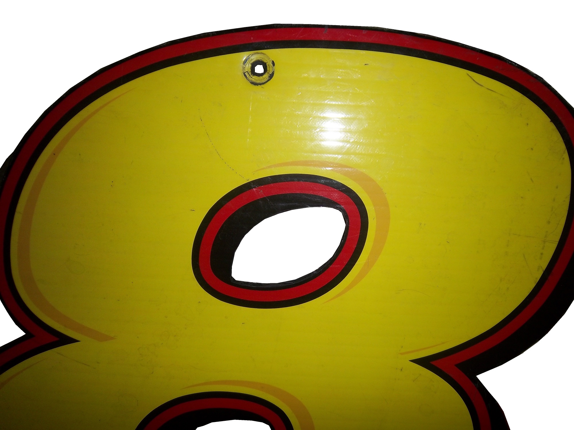
And it also shows numerous scratches and scuff marks from race use. 
The back of this board is plain black. That is due to MRD being a low budget team, with limited resources.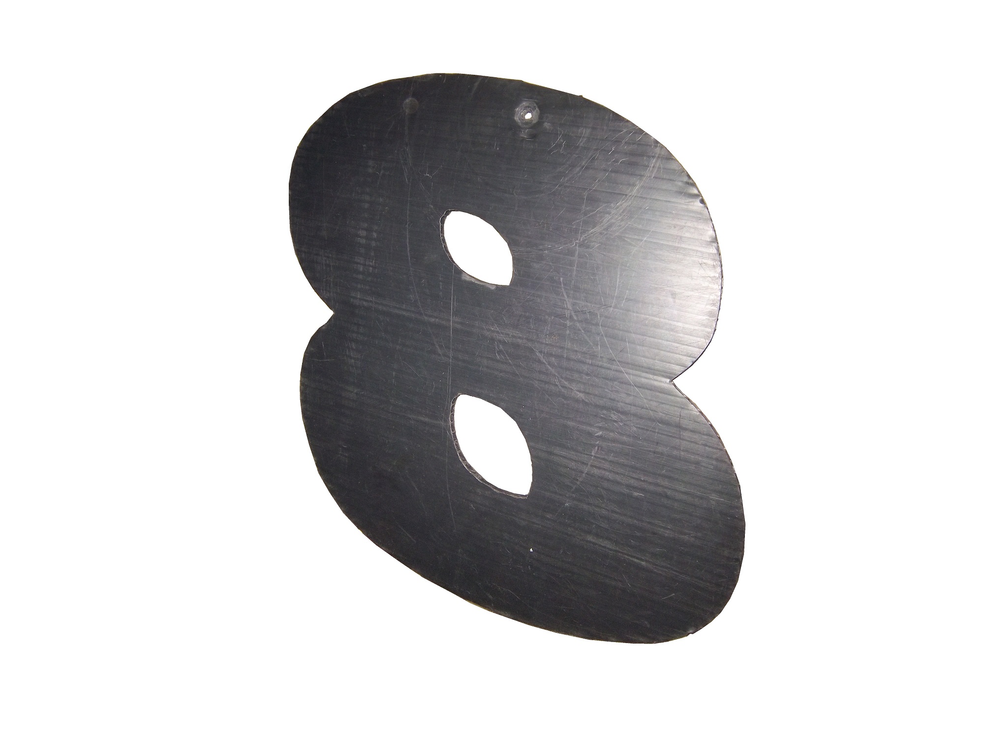
A quick search on ebay and other sites shows that these items frequently sold as collectors items after a race. These are unique items, and for NASCAR fans are conversation pieces.
And now on to Paint Schemes…
Brian Vickers #11 FedEx Delivery Manager Toyota Camry Good simple scheme with great colors and design, gets an A
Sam Hornish Jr. #12 SKF Ford Fusion Good color scheme, but it looks like a cross between Joey Logano’s scheme and Aric Almirola’s schemes. I give it a B+
Tony Stewart #14 Mobil 1/Bass Pro Shop Chevy SS The color scheme is good, but the overall design isn’t as good as the regular scheme. Too much going on. The best grade it can earn is a C
Clint Bowyer #15 Toyota Toyota Camry Not much to complain about here, good color scheme and simple design and an A grade
Clint Bowyer #15 KFC I Ate The Bones Toyota Camry KFC has great lettering and a great shade of red, and both are not represented here very well. That said, I don’t hate this scheme, colors are good, but what is with the hood design? The KFC logo is too small, and the hood has some creepy guy with a bowl cut as the most promising feature. All things considered, it earns a C-
Kyle Busch #18 M&M’s M’ Prove America Toyota Camry Good scheme with a great color scheme and good design. Nothing wrong with this solid A scheme.
Kyle Busch #18 Doublemint Gum Toyota Camry Just like Kyle’s scheme on the 18, I love the color scheme, love the simple design, love the fact that the 81 is the 18 backwards, love this scheme, A+
David Ragan #34 Detail Doctor Ford Fusion Decent color scheme and decent design. C-
Juan Pablo Montoya #42 Clorox 100th Anniversary Chevy SS Surprise! Happy Birthday! The blue and white is good but the rest looks too goofy to be good. It looks like a birthday party for a 4 year old. Lose the confetti and streamers and I would like it much more, this scheme earns a D+
Aric Almirola #43 Enrich/Smithfield/Farmland Ford Fusion Lose the design on the doors and it would be perfect. Other than that these three schemes, different only by the hood and quarter panel sponsors are perfect and earn solid A schemes
Aric Almirola #43 Transportation Impact Ford Fusion Black white and lime green? Seriously? And the black front makes it look like the car was in a wreck and had the nose replaced. Not a good look at all. The door design is awful and the quarter panel is even worse! I can’t give this scheme a passing grade and it gets an F!
Aric Almirola #43 Jani-King/STP Gas Booster Ford Fusion This scheme makes up for the Transportation Impact scheme with simple perfection, and an A grade
Aric Almirola #43 STP/Farmland Ford Fusion OK, last Almirola scheme…I promise! A good throwback scheme is ruined with the door number design. Get rid of the oval design and it would get an A, whereas this scheme earns a B-
Scott Riggs #44 No Label Watches Ford Fusion An awful scheme made much worse by a horrible color scheme that earns an F- grade.
Scott Riggs #44 JPO Absorbents Ford Fusion Why do many racing teams have wave designs? It is not a good design, and in this case it takes a good color scheme and ruins it earning a D grade.
Bobby Labonte #47 Clorox 100th Anniversary Toyota Camry Did anyone look at the main color of the car before it was painted? This looks awful! Montoya’s version looks better, but not by much. D-
Jimmie Johnson #48 Lowes “Reverse” Chevy SS Looks really good, and really stands out in nighttime racing. Color scheme is good, as Lowe’s often is. A+
Jimmie Johnson #48 Lowe’s “Emerald” Chevy SS Decent color scheme, though if if were reversed it would look even better. Even still it is good enough to earn an A-
Martin Truex Jr. #56 NAPA Brakes Toyota Camry Simple design, good color scheme, but the Twitter handle on the back of the roof is distracting and it looks awful. It takes an A scheme to a B-
Kurt Busch #78 Furniture Row Military Appreciation Night Chevy SS I love the matte black that Furniture Row usually uses, so this is kind of disappointing. That said, the color are good, but the hood design needs work. The MILITARY APPRECIATION banner is much to small and it is hard to see at speed. A good scheme that has been ruined and earns a D-
Elliot Sadler #81 Double-Mint Gum Toyota Camry Just like Kyle’s scheme on the 18, I love the color scheme, love the simple design, love the fact that the 81 is the 18 backwards, love this scheme, A+
Dale Earnhardt Jr. #88 National Guard Chevy SS What the hell? The blue and white scheme works well with this design, but camo and black? It just looks awful. I love Dale Jr. but I can’t defend this scheme at all. F-
Scott Speed #95 Tracking Point/JTS Truck Sales Ford Fusion Good color scheme, but awful design. The diamond plate decals does nothing to help, and it earns a D-
Michael McDowell #98 Curb Record/ The Bobby Bones Show Ford Fusion Love the color schemes and design. Bonus points for the diagonal hood logo. Not many people can make the diagonal logo work, but it works here, A+
Carl Edwards #99 Geek Squad Ford Fusion. Not much to say here, really simple design and it looks alright…C+
Carl Edwards #99 Cheez Its/Frosted Flakes Ford Fusion. These two schemes are awful. Too much going on, too many colors, no consistency, not a good pair of schemes at all, F


