Starting this week, and for the next four Fridays, we will rank the paint schemes of all 55 race teams in the NASCAR Sprint Cup. I will not grade any paint schemes until these rankings are done, but I will still update the Paint Scheme Tracker on Wednesday. The rankings were determined by the Paint Scheme Ranking Executive Committee, made up of myself, and Alejandro my black cat, though all he did was sleep through the proceedings. First up will be Chevy. I will also add the rank each scheme held last year. Teams that did not exist or run Chevy cars will be marked as NR for Not Ranked..
1-Hendrick Motorsports #48 Rank Last Year: 1st of 19-Classic, smooth looks with no needless clutter. Jimmie always runs great schemes
2-Stewart Haas Racing #4 Rank Last Year: NR-With the exception of Hunt Brothers Pizza, which uses an awful shade of green, Kevin has consistently run a series of great schemes.
3-Stewart Haas Racing #41 Rank Last Year: NR-The Slate scheme does not work, but all the other schemes work very well.
4-Richard Childress Racing #31 Rank Last Year: 13th of 19-A lot of great schemes this year, but Wix is overdone, and the Cat/Quicken Loans hybrid looks awful
5-Chip Ganassi Racing #1 Rank Last Year: 9th of 19- A pink-washing scheme and a terrible shade of green on the WEMO scheme cost this team the 2nd place spot,knocking them down to 5th. They have run a lot of great schemes this season
6-Furniture Row Racing #78 Rank Last Year: 2nd of 19-The World Vision scheme needs work, as the color does not support a fade, but the Furniture Row, and Colorado Freedom Memorial work very well.
7-Hendrick Motorsports #88 Rank Last Year: 8th of 19-National Guard, Mountain Dew, Kickstart, and Superman look good, and work well with the new number design, but Michael Baker, Kelly Blue Book, and Nationwide don’t at all.
8-Chip Ganassi Racing #42 Rank Last Year: 4th of 19-While Cottonelle, the Silver Scheme, and Energizer work very well, but the rest of their schemes are mediocre at best. The white on the back doesn’t work.
9-Beard Oil Racing #75 Rank Last Year: NR-If the sides had a sponsor, and the stripe at the bottom was eliminated, it would work a lot better.
10-JTG Daugherty Racing #47 Rank Last Year: NR-While Bush’s, Clorox, Scott’s, Sullivan/Palatek, Kingsford, and Bush’s Grilling Beans work well,Kroger/USO is overdone, Charter Communications uses a horrid shade of green, and Hungry Jack just looks terrible.
11-Hendrick Motorsports #24 Rank Last Year: 14th of 19-Drive to end Hunger is too overdone, and the upside down D on the hood looks terrible. Their orange scheme is even worse. Panasonic is mediocre at best. Pepsi looks good, and all of the Axalta schemes are really good.
12-Hillman Racing #40 Rank Last Year: NR-When the car doesn’t have a scheme, it looks very good. When it has a sponsor it looks awful.
13-HScott Motorsports #52 Rank Last Year: NR-The black scheme is good, but the orange Florida Lottery scheme is a trainwreck. Less is more on a paint scheme.
14-HScott Motorsports #51 Rank Last Year: 5th of 19-If the car is running a Brandt scheme it looks good, anything else looks terrible.
15-Richard Childress Racing #27 Rank Last Year: 6th of 19-Neon yellow looks terrible, when they use the stripes on the sides it looks even worse. The Pittsburgh Paints scheme looks really good though.
17-Tommy Baldwin Racing #37 Rank Last Year: NR-Accell Construction has a great color scheme, but the design scheme ruins it.
18-Tommy Baldwin Racing #36 Rank Last Year:10th of 19-Another example of a team where when the car is unsponsored, it looks better.
19-Stewart Haas Racing #14 Rank Last Year: 7th of 19-The over designing of the Bass Pro Shops schemes, as well as the use of orange and camo just look horrible. Mobil 1, Rush Truck Centers, and Code 3 look decent, but to some extent have issues. Mobil 1 is over designed, Rush uses too dark a yellow, Code 3 uses too bright a yellow.
20-Tommy Baldwin Racing #7 Rank Last Year:16th of 19-Allstate Peterbuilt, and Pilot-St Jude Children’s Network work well, as both have good color schemes and design schemes. Anything else just looks awful.
21-Richard Childress Racing #3 Rank Last Year:NR-Cheerios is very good, and has a classic look. Dow schemes have a great color scheme, but have mediocre design. Anything else looks terrible on this car.
22-Germain Racing #13 Rank Last Year:NR-The blue is too bright, as is the yellow. The car is overdesigned, and the whole car looks like a mess. The camo scheme is much worse.
23-Hendrick Motorsports #5 Rank Last Year:17th of 19-The only half decent scheme is Pepsi. Everything else is an over designed mess.
24-Stewart Haas Racing #10 Rank Last Year:14th of 19-The only scheme that doesn’t make my eyes hurt here is Aspen Dental. Terrible shades of orange and green, with ugly design. The pink-washing scheme is terrible.
25-Xxxtreme Motorsports #44 Rank Last Year:NR-Every single one of their cars is an ugly, over-designed mess that doesn’t look good at all.
When you say “driver suit” you think of names like Simpson, Sparco, Impact!, OMP, Stand 21, and Momo, you don’t automatically think of Oakley. Oakley started in 1975 as a sunglasses company by Jim Jannard in his garage in Foothill Ranch California. He got the name from Oakley, his English Setter. He went from working in his garage to one of the biggest sunglasses companies in the world. They design eyewear for athletes, the military, skiers, and, starting in the late 2000’s, motorsports apparel.
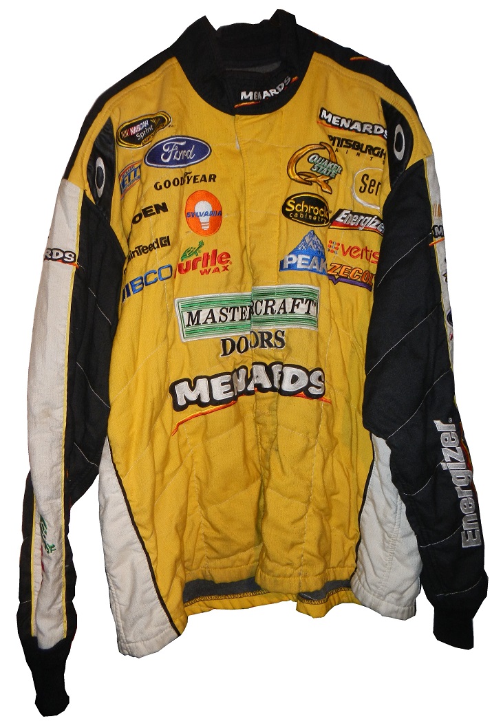
Oakley makes a number of racing items, the most prominent being driver suits. IndyCar drivers Justin Wilson, Ed Carpenter, Mike Conway, and Josef Newgarden all wear Oakley driver suits as do Alex Bowman, Ryan Truex, Martin Truex Jr., Clint Bowyer, Jeff Burton, Michael Waltrip, and Ricky Stenhouse Jr. in NASCAR and Tony Schumacher in the NHRA. While they make suits for the top drivers in the sport, for some reason they don’t seem to sell suits through their own site, you have to go to a third-party site to buy their racing suits…which to me seems odd, because no one else ever does that.This particular suit was worn by Jason Romesburg, who was the rear tire changer for Paul Menard in 2010. Menard had a decent season, with a top 5, and 6 top 10’s and 17 laps led. The suit shows heavy use, with the right cuff on the pant leg destroyed. In addition to the damage to the pant leg, what strikes me about this suit is that the material seems so light. While it is safety certified, it does not feel like a Nomex suit. It is very light for a suit of its size.
The suit is a two-piece and the jacket does not show as much wear as the pants, and I understand the reason. The logo about the Menard’s logo is for Mastercraft Doors. Paul Menard races with Menard’s on the quarter panel and a rotating set of sponsors on the hood. Mastercraft Doors was on the hood for 3 races in 2010, the Brickyard 400, the Carfax 400 at Michigan, and the Ford 400 at Homestead. While the jacket doesn’t show as much wear, it does show some staining on the sleeves. There are stains on the white area of the sleeves. Since Romesburg was a tire changer, this is to be expected.
The two piece suit is very popular with pit crews because it has the same fire protection as a one piece but with less restriction than a one piece. If you have ever worn a one-piece jumpsuit you know that it does restrict movement, as opposed to a jacket and pants of the exact same size. So when you are changing 4 tires in 14 seconds, you need every edge you get. What I don’t see on the jacket are arm gussets. These would be used to add movement without subtracting fire protection. I have two theories on this, either the suit fit well enough that they weren’t needed, or because the crews were switching jackets so often that expense or time dictated that arm gussets couldn’t be used.
One detail I love are the television logos on the sleeves. The dual logos on the sleeves look good and actually work well for both sponsors. The suit actually looks pretty good, but I do not like the quilt pattern on the legs, because it isn’t represented on the jacket, and it does look pretty odd in this respect. It does look like the two were designed and made by different people. I’m also amazed by how lackluster the warranty label is…That is the shortest warranty label I have ever seen on a modern suit. Let’s compare it to a Simpson tag…Wow that is a short warranty label, also, I don’t think a skull and crossbones don’t belong on this kind of suit, but it does say what it needs to say, just in a much shorter form than most driver suits.
In short, Oakley is making decent suits, and they are doing what they are designed to do, protect the driver from fire. I think Oakley suit could catch with minor league racers, provided they start marketing them better. The fact that they don’t sell them through their own website, and provide more info on the drivers who wear their suits make it hard to sell them to the general public. Puma, which has a lot of talent on its roster too, does not want to sell through its own website. Why they don’t is a mystery, as there is a lot of money in these suits, and people will pay for high quality suits made by a reputable company.
Before I get to the Paint Scheme Reviews, we have some breaking news on a story I had discussed in my Silly Season post a few weeks ago. I had mentioned at the time that Comcast was in negotiations with NASCAR to become the title sponsor of the Nationwide Series. Nationwide Insurance is leaving the series at the end of the season. Well it was announced on Wednesday that Comcast and NASCAR have come to a deal for a 10 year sponsorship of what will be called the Xfinity Series. It was not revealed how much the deal was worth, but we are talking hundreds of millions of dollars. I will be interested to see the series logo and what Xfinity does with the new deal. Now on to…
Jeff Gordon #24 Drive to End Hunger Chevy SS The front is a bit over designed, the ribbon on the side does work somewhat, and the orange, I’d never thought I would say this, is too dull. I’ll give it a C+
Joe Nemechek #66 Friedman Law Firm Toyota Camry Law firms can be good at what they do, and they are apparently great at designing race cars. Clean, simple, attractive with a good color scheme eans an A+
Clay Rogers #75 Beard Oil Chevy SS Beard Motorsports is making their debut with Clay Rogers at Richmond in the Beard Oil Chevy. Their first time car has a great design scheme and a great color scheme and earns an A+
Dale Earnhardt Jr. #88 Nationwide Chevy SS A great design with a great color scheme and a great simple design. My sticking point with this is that I do not like the silver numbers, the font design just doesn’t work. I’ll give it a B+
David Stremme #90Junie Donlavey Tribute Chevy SS Junie Donlavey passed away earlier this year, and Circle Sport Racing will run this design based on his 1972 Ford Gran Torino. It looks amazing, and I have to give it an A+
Josh Wise #98 Provident Metals Ford Fusion Looks good, good color scheme, decent design scheme. Too many stripes. I looked Provident Metals up and found that they are a precious metal dealer who make a currency called “Zombucks” which they jokingly market as “currency for the Apocalypse.” I’ll give it an A-
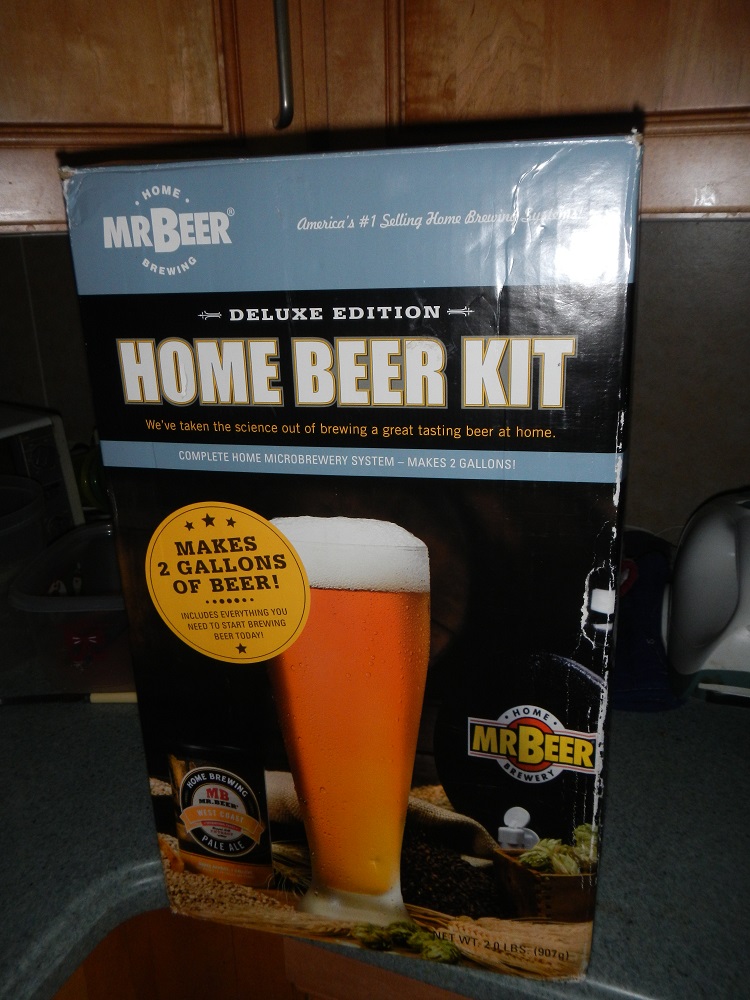
Home Beer Brewing Project Update…
Two weeks ago, I started the work on brewing beer using the Mr. Beer Homebrewing Kit. It fermented for two weeks, and I bottled it this week. The recipe will make 2 gallons of beer, which fits into four 2-liter bottles. I added the sugar to the bottles…added some liquid to the bottom to get the mixture started…then I bottled the four 2-liter bottles…Now I have to wait two more weeks for the carbination to complete….then I have to chill for two days prior to enjoying…Ugh! Well, I’ll keep you posted, and I’ll have some jam while I wait…
The 2014 Sprint All Star race is behind us, and as usual, there were a myriad of different paint schemes. Some were good, others not so much, but I have to say there were a lot of great schemes in this year’s race. Let’s start with the Sprint Showdown. Unlike in previous years, The Showdown took place on Friday, and the All-Star Race was on Saturday. The Showdown was a great event, which saw Clint Bowyer winning, AJ Allmendinger finishing second, and in the upset of the year, Josh Wise winning the Sprint Fan vote, and advancing to the All Star Race. Let’s get to the grades:
#10 Cole Whitt #26 Speed Stick Gear Toyota Camry This is one of the few schemes that has both a classic and modern look at the same time, and paired with a great color scheme, it earns an A
#13 Austin Dillon #3 Dow Chevy SS While I like the color scheme and number and logo designs, the white stripe up the side kills the look. It takes an A scheme to a B+ scheme.
#14 Kyle Larson #42 Target Chevy SS The scheme looks decent, I like the red on the back, though I do not like the Target logos at the bottom. That takes a scheme that was an A grade to a B-
#16 Michael Annett #7 Pilot/Flying J Chevy SS Good color scheme, but the awful template is back for Tommy Baldwin. It is really sad, because this could be a great scheme, but the template takes it from an A to a C-
#19 JJ Yeley #44 Phoenix Warehouse Chevy SS My first thought when I saw this scheme was it looked like the color scheme from the 1994-1995 NBA All-Star Game jerseys which is a decent color scheme. But to say the car is overdesigned is an understatement. This scheme is awful. Not even a great color scheme can help this car pass. F
Now we move on to the All-Star Race, which saw Jamie McMurray pull an upset and take the win, thus guaranteeing him entry into the event for the next 10 years. Overall there were a lot of great schemes, though I wish more teams would run special schemes.
#5 David Ragan #34 Taco Bell Ford Fusion Overall design and color schemes are good, and the only complaint is that the Taco Bell logo should be in color as opposed to black and white. A+
#11 Jeff Gordon #24 Drive to End Hunger Chevy SS Great overall design, great color scheme, though the D on the hood reversed to miror the curves of the hood looks odd. Still it’s a good scheme and Ill give it an A
#12 Dale Earnhardt Jr. #88 National Guard Chevy SS The new metallic numbers work, and the overall design is decent, since it incorporates the design used on the numbers. I’ll give it an B+
#13 Denny Hamlin #11 FedEx Express Toyota Camry The front nose design and stripes are awful. The color schemes are great, as are the logos and numbers, but the stripes kill it. The best grade I can give is a C+
#15 Kasey Kahne #5 Time Warner Cable Chevy SS It is a good color scheme, but the design on the side needs a little tweaking. Get rid of the needless zig-zag pattern and it works a whole lot better. It is still a decent scheme, so I will give it a C
#17 Matt Kenseth #20 Home Depot/Huskey Toyota Camry I would give this scheme an A grade, but the yellow back bumper ruins it. The clash between the two just works awkward, and it takes an A scheme down to a C
#19 Ryan Newman #31 Cat/Quicken Loans Chevy SS What in the blue hell is going on here? I’ve liked Ryan’s schemes this year but this is an F scheme, even though I like the color scheme.
#22 Greg Biffle#16 3M Ford Fusion-The sides and roof have gotten worse from last year. I have to give it an F in that respect.
Also, check this video out concerning how different pit stops in open wheel racing were between 1950 and today:
The video shows how far we have come in pit stops, but we also have come a long way in driver uniforms.
By David G. Firestone
50 years ago this week, events over the course of 6 days in May of 1964 changed the culture, cars, and uniforms of auto racing forever. Three deaths in two races over those six days demonstrated that current safety methods were ineffective at best, and 3 talented drivers lost their lives. The 1964 World 600 and the 1964 Indianapolis 500 helped introduce reenforced fuel tanks and Nomex driver suits, among other things. 50 years later, those events are still being felt
The World 600 began in the early afternoon on May 24, 1964. For the first six laps, it was business as usual, but on lap 7, on the backstretch, Junior Johnson and Ned Jarrett wrecked, and Glenn “Fireball” Roberts swerved to avoid them, and wrecked. He was trapped in the car by the pedals, and his car caught fire. Ned Jarrett ran and pulled Roberts from the car, and paramedics took him to the hospital. 39 days after the wreck, while still in the hospital from his injuries, he died from pneumonia.
NASCAR had rules concerning “fire retardant” uniforms but these were inadequate at best. These uniforms were cotton coveralls traditionally used by workmen that had been dipped in a number of fire retardant materials including Borax. These were not only ineffective, but were extremely uncomfortable to wear. They were known for inflaming the skin, and aggravating asthma. Fireball was not wearing these coveralls during that race, because he had a doctor’s note stating he should not wear them. There is some debate over what the doctor’s note was for, either for asthma or skin hives. It llustrates why these uniforms were not popular, they were so uncomfortable to wear that drivers did not want to wear them.
6 days later, on May 30, the 48th Indianapolis 500 was held. Dave MacDonald started 14th, and Eddie Sachs started 17th when the green flag dropped. MacDonald was racing a car built by racing innovator Mickey Thompson, which by all accounts was badly built and difficult to drive. The first lap led into the second, which saw Dave MacDonald lose control of his car and smash into the inside wall. The fuel tank instantly ignited and the car went across the track, and collected a number of other cars, including Eddie Sachs car, which also exploded on impact. Sachs was killed by the impact, but MacDonald was seriously burned, and his lungs were scorched, the lung damage proved to be fatal.
Inspired by these events, the Nomex firesuit was introduced in 1967 as a replacement for the cotton coveralls dipped in chemicals. It was a lot more comfortable and safer than chemical-dipped cotton, so drivers were more willing to wear them. Like most new safety equipment in sports, it took a while to catch on. Nomex was created in 1967, for NASA. Its main use at the time was for the Apollo Command Module parachutes. NASA needed a material that could stand up to the heat of reentering the earth’s atmosphere, and still remain fully functional.
Bill Simpson is credited with introducing Nomex to driver suits. The story goes that Simpson started making Nomex suits after learning about the material from astronaut Pete Conrad while Simpson was working as a consultant for NASA. One of the pivital moments in the history of the suit was when Simpson had heard that a competitor had been badmouthing his products, and so, in something he said later was “the dumbest thing I have ever done,” challenged the competitor to a “burn off.” Simpson put on his suit and lit himself on fire. He later recreated this for a Mazda commercial.
Why did it take so long to make critical changes to driver uniforms? The events that took place in 1964 were tragic, and it clearly illustrated why the old system didn’t work. The only change made immediately after the events was the rule that fire retardant suits were now mandatory, regardless of how it made the driver feel. In today’s sports safety culture, there would be focus groups, meetings within the sanctioning body, and changes within a few months after the event. But by 1964 standards, just rigidly enforcing the rule was the best course of action. Remember that in 1964 race car drivers were seen as somewhat expendable. Driver deaths in racing were stunningly common back then. As such, while there was a need for improvement, it was not a priority for sanctioning bodies. The sad fact is that back then, driver deaths were part of the allure of racing. People would go to these events and hope to see a fatal crash, as crass as that sounds. As for the suits themselves, the only other options besides chemical dipped cotton was aluminized cotton or aluminized kevlar, which was not more comfortable, as it was like wearing aluminum foil.
So what did these pre-Nomex driver suits look like? They looked like this. This is a driver suit made by Hinchman in Indianapolis. It is basically a polyester suit that is customizedto thedriver’spreference. It is not all that different than a jumpsuit that one would wear to work. It is a very flimsy material, has no cuffson the arms or legs, and, most amazingly, the tag states that the suit is “Untreated, will burn, must be dipped.” This suit was worn circa 1972, which is indicated by the “Archie Bunker for President” patch sewn into the chest. Like any new safety technology in sports, it takes time for it to become the standard, and for Nomex, this is no exception.
This race, along with the 1955 24 Hours of Le Mans and the 2001 Daytona 500 have their legacies written in death, but unlike other similar events, the lessons they had to teach were learned, and the racing world as a whole is better for them. The deaths in these events were not in vain, and others are alive because of them. 50 years later, those 6 days in May 1964 are still having an impact on racing.
The 36th Sprint Unlimited starts tonight at 8:15 ET on Fox. This marks the beginning of the Daytona 500 and the beginning of the NASCAR season. I will be looking forward to it, and I will enjoy it as always.
The event will feature a number of segments which were voted on by NASCAR fans including myself, and many of you. The first segment will feature laps followed by a second segment of laps, and then a third segment of laps. Many special paint schemes will be run for this race, as is traditional. My personal favorite is the Miller Lite Throwback scheme being run by Brad Keselowski.
Now some factoids about the race.
*There are, in total, Chevy drivers, Ford drivers and Toyota drivers.
*Chevy has 20 wins, Ford has 7 wins, and Toyota has 1 win.
*Mark Martin has competed in 20 consecutive events from 1989-2008.
*Dale Earnhardt Sr. has won 6 events, more than anyone else in 1980, 1986, 1988, 1991, 1993, and 1995 and went on to win the Sprint Cup Championship 4 times in 1980, 1986, 1991, and 1993, he is one of 7 drives to do so.
*From 1979-2011 the event was sponsored by Anheuser-Busch, first called the Busch Clash which was the brainchild of Monty Roberts, brand manager of Busch Beer, who sponsored the Pole Award. It remained the Busch Clash until 1998, when Budweiser took over the Pole Award, and it was renamed the Budweiser Shootout. In 2012, Sprint, the series sponsor took over the sponsorship after Budweiser announced they would drop the sponsorship in favor of sponsoring the Duel Races that determine the starting order of the Daytona 500.
*Petty Enterprises was not eligible to run the Shootout because of a rule stating that only drivers that ran the Busch/Budweiser pole award decal were eligible to enter the shootout. Richard Petty and his family did not support alcohol sponsorship or decals on race cars. So John Andretti, Bobby Hamilton, Jeff Green, and Aric Almirola who all had a number of poles with Petty Enterprises were not eligible to participate. I find it interesting that Petty has reversed course on the alcohol sponsorship rule, since Kasey Kahne was sponsored by Budweiser, and Marcos Ambrose will run at least one race sponsored by Twisted Tea.
*Buddy Baker won the inaugural Sprint Unlimited in 1979, which was a 20 lap sprint.
*Since many top drivers were excluded from the race due to not winning a pole award, they moved to the TV booth as color commentators. These included Dale Earnhardt Sr. in 1981, Richard Petty and AJ Foyt in 1982 and 1983, Neil Bonnett in 1993, Darrell Waltrip in 1994, 1995, 1997, and 1999, and Kenny Wallace in 1998.
*There has never been a driver who has won the Sprint Unlimited, Budweiser Duel and Daytona 500 in the same year. Drivers have won 2 of 3 in a season, but never scored the hat trick.
*One of the first instances of a special paint scheme being used specifically for the Sprint Unlimited was the Chroma Premier scheme run by Jeff Gordon in 1997. He followed it up the next year with the legendary Chroma-lusion scheme, which feature a paint that changed color. Since then, special schemes have become commonplace.
*Richard Childress Racing has 8 Sprint Unlimited wins, most of any team. Hendrick Motorsports has 6 wins, and Joe Gibbs Racing has 5 wins.
The Unlimited starts tonight at 8 PM ET on Fox Sports 1, and I look forward to watching the event as I hope the rest of you do too.
Though I have had a VERY busy week, I still have time for…
Paint Scheme Reviews!
Kasey Kahne #5 Time Warner Cable Chevy SS It is a good color scheme, but the design on the side needs a little tweaking. Get rid of the needless zig-zag pattern and it works a whole lot better. It is still a decent scheme, so I will give it a C
Michael Annett #7 Pilot/Flying J Chevy SS Good color scheme, but the awful template is back for Tommy Baldwin. It is really sad, because this could be a great scheme, but the template takes it from an A to a C-
Kyle Busch #18 M&M’s Peanut Toyota Camry I like this, it has a great shade of yellow, hard to find in NASCAR these days, and the peanut motif works very well. It is an original design, and I’ll give it an A
Joey Logano #22 Autotrader.com Ford Fusion Sometimes orange works, sometimes it doesn’t. This is an example of an orange scheme that just doesn’t work. If the white was taken out completely it might work, but this is just horrid, and I give it an F
Cole Whitt #26 Speed Stick Gear Toyota Camry This is one of the few schemes that has both a classic and modern look at the same time, and paired with a great color scheme, it earns an A
David Ragan #34 CSX Ford Fusion What in the hell is going on here? Why is the hood decal upside down? Why in the world would they do that? Were they drunk when they decaled the car? The only thing that I can guess is that it is designed for an in-car camera…but that makes no sense either! F-
Dale Earnhardt Jr. #88 Kelley Blue Book Chevy SS During my Daytona Preseason Thunder article, I said I wanted to see the #88 they used on a real car. I got my wish, and I like this design overall. The metallic gold is a bold choice, it doesn’t always work well. I give it an A+
BUT WAIT, THERE’S MORE!
As many of you know, I don’t just research and collect driver suits and racing items, I collect and research many other things. I recently had a column run in Uni-Watch concerning some lettering from the 1958 Washington Senators, and you can read my column here.
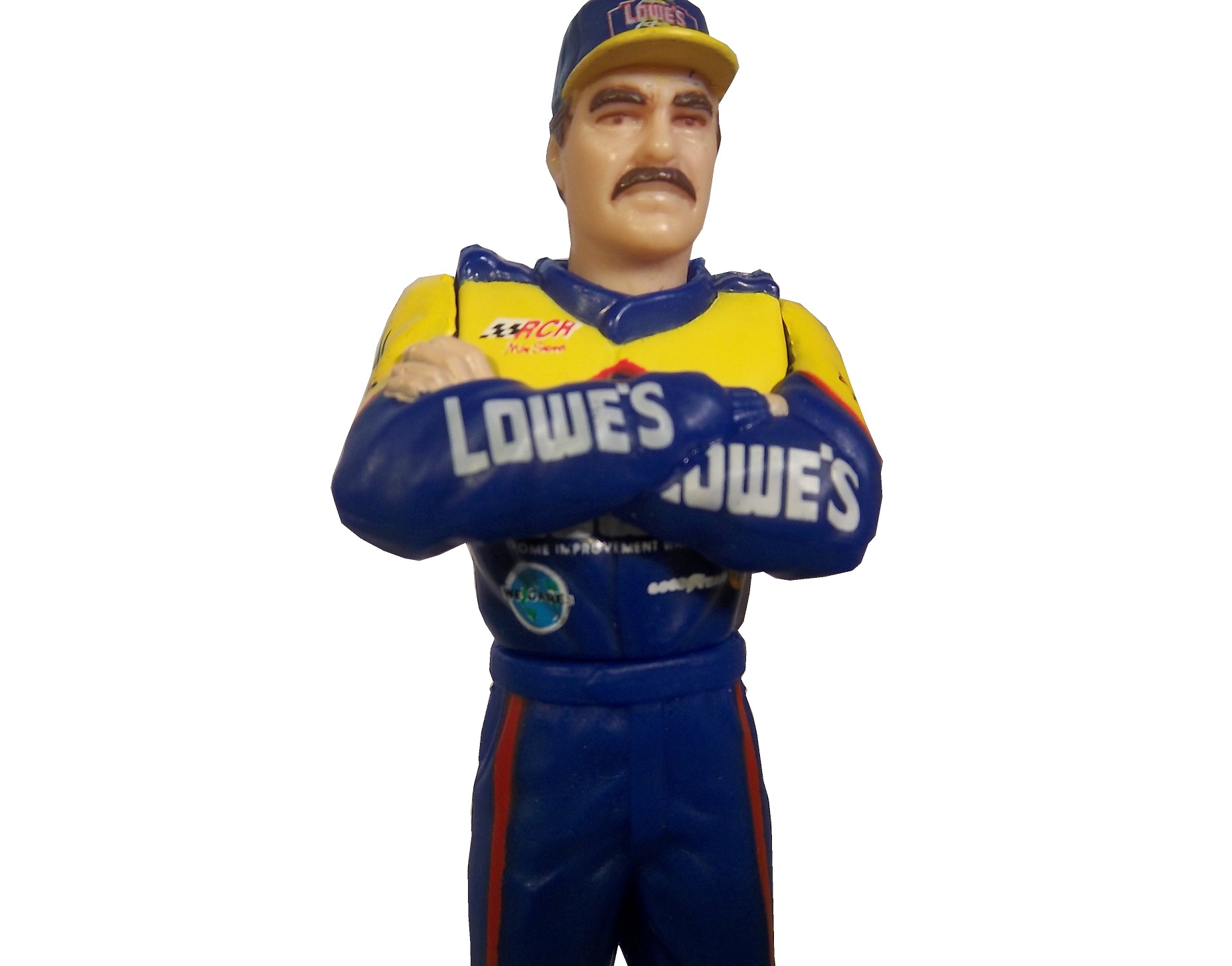
In my last column, I mentioned that Starting Lineup and Winner’s Circle figures made in the 1980’s and 1990’s censored alcohol and tobacco logos. But when it comes to these figures, how do the uniforms the figures portray stack up to their real-life counterparts?
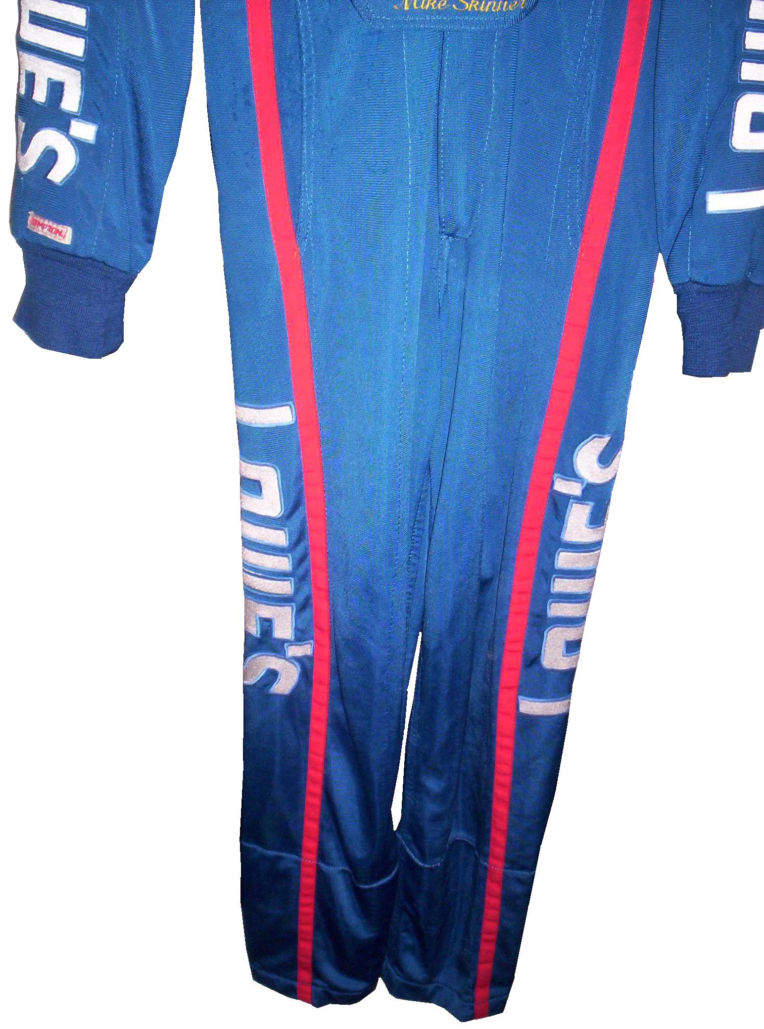
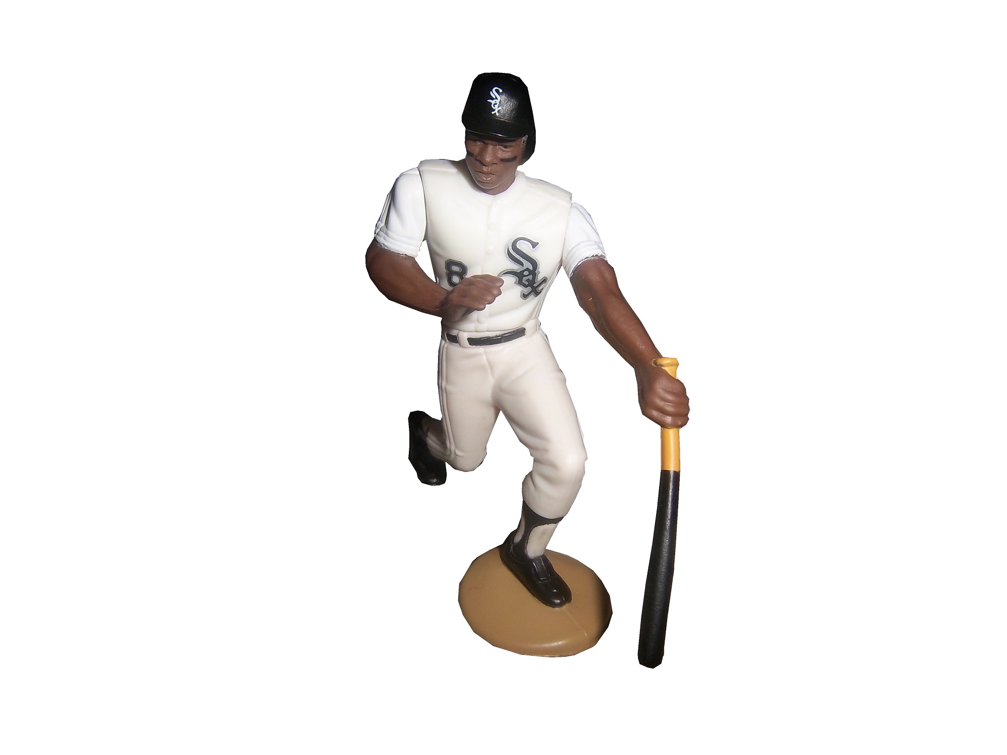
First, lets discuss the figures themselves. Created by Kenner starting in 1988, Starting Lineup was a line of action figures based on baseball starts. As time went on, the line expanded from just baseball to football, basketball, hockey, and racing. The figures are 4 inches tall. For racing, Starting Lineup figures were packaged under the Winner’s Circle brand. The drivers features were championship-level or rookie of the year drivers. One of those was Mike Skinner released in 1998, which is in perfect condition, though has been removed from the package.
The driver suit it is based on is Mike Skinner’s 1997 race-used driver suit from his rookie of the year campaign. It was purchased from the Jeff Hamilton collection, and came with a letter stating as such. It shows nice use, and Jeff has signed the right chest. It also features something I have seen on a few other suits from that era, but from nowhere else, the Future Suit inscription. I have been waiting a while to discuss this. Custom suits from 1997 have something written on the back of the neck. On the Skinner suit it reads “Future-Suit-2-2252.
This Stevie Reeves suit from 1997 has a similar inscription
This Lake Speed suit from 1997 was purchased off the rack, and does not bear the inscription,
Interestingly, suits from 1996 and before,
and suits from 1998 and after,
do not have this inscription. From what I have been able to gather, this was an inventory number for customized suits. But I do not understand why it seems to only be used on suits from 1997. Ok, getting off track here, getting back to Finish Line figures….
Taking a look at this figure as compared to the real-life driver suit this figure is based on, it is very accurate. The bottom torso logos, and television logos on the sleeves are identical. The chest is missing the Chevy and Winston Cup logos, and has the name, whereas on the real suit the name is on the belt. They still did a very good job though.
The logos on the upper right sleeves are identical on both the figure and the real suit.
The scale and position of the LOWES logo on the back of the figure as compared to the back of the real suit is identical as well.
The position, location, and size of the television logos on the legs are perfect as well. They really did a great job with this figure.
The detail in this figure is amazing, because Finish Line’s Starting Lineup counterparts lacked some details. Baseball figures from the same set in the same year, such as this Albert Belle figure often lacked pinstripes.
Other examples include recycling of bodies. Every Finish Line figure is basically 4 different body parts, head, upper body, legs, and arms. These were taken, painted appropriately and then attached to each other. That is why all the figures look alike, but with minor differences.
I can vividly remember buying these as a kid. When I got my first, a Dan Pasqua 1989 White Sox figure for my birthday, I was excited. Now, 23 years later, I have the ability to take a toy from my childhood, and compare it side by side to the uniform it is based on. I can honestly say I never thought it would happen, but I am thrilled to take the opportunity.
Tailgating Time!
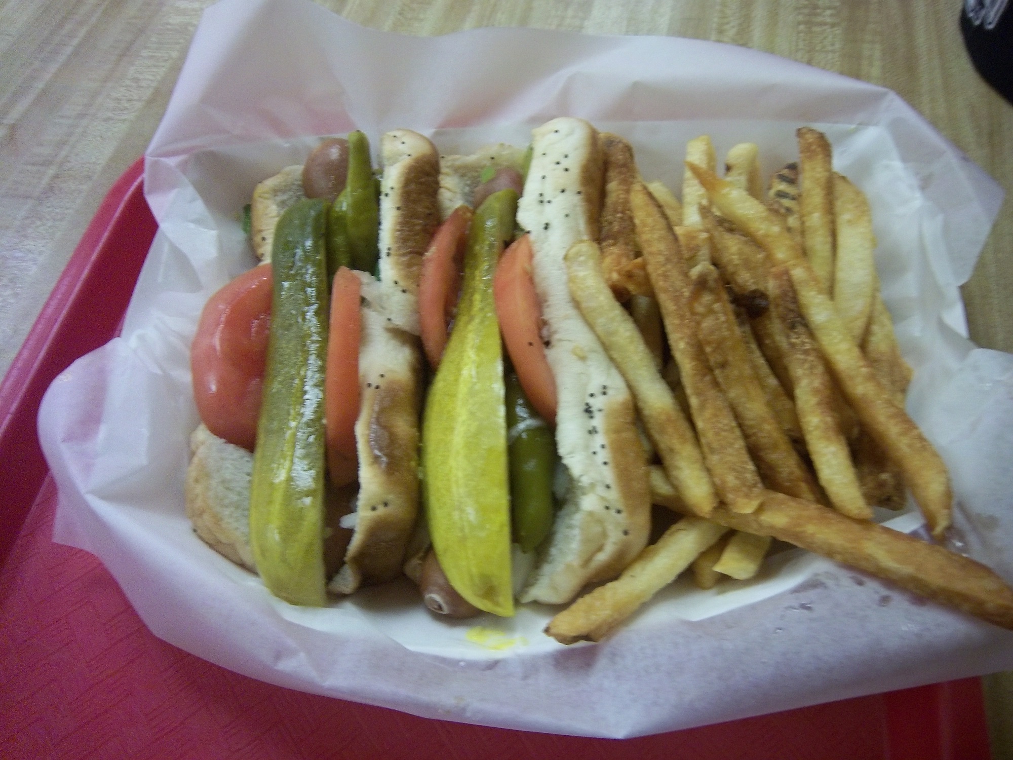
Chicago-Style Hot Dogs
In honor of the Chase for the NASCAR Sprint Cup Championship starting at Chicago, I will do a couple of Tailgating Time recipes featuring Chicago food products. The first is Chicago-style Hot Dogs. This classic has been enjoyed in Chicago since the Great Depression. It has been enjoyed by those in the Chicago-land area for some time.
You Will Need:
2 packages Vienna Beef hot dogs
2 packages S. Rosen’s Mary Ann Buns-Both come in packages of 8
1 Chopped white onion
1 Sliced Tomato
1 Jar Yellow Mustard
1 Jar Sweet pickle relish with mint,
2 Jars of pickled sport peppers
Celery salt
Chicago-Style dogs are traditionally boiled or steamed. If it is grilled, it is referred to as a “char-dog.” Once the hot dogs are done cooking, place the hot dogs in the bun, and then put the condiments in this order: mustard, relish, onion, tomato, sport peppers, pickle spear, celery salt. Ketchup on these dogs is UNACCEPTABLE! The final product will look like this:
Classic Maxwell Street Polish Sausages
Anyone from Chicago will recognize this dish, and those from all over the country will enjoy this dish as well. This recipe needs both a hot plate as well as a grill. For a group of 6 people, you will need:
12 kielbasa links
12 sausage buns
1 large jar yellow mustard
6 large sweet onions
1 jar Olive Oil
First, on the pan, saute the sweet onions in a bit of olive oil on low for an hour and a half with a touch of thyme and salt. This might seem like a while, but the results are worth it.
While the onions are cooking, fire up the grill, wait until it is hot, and cook the kielbasa links until they show some char on the outside.
A few minutes before the kielbasa and onions are done cooking, pour the mustard into a bowl, this will help in the serving process.
Take the buns and smear the insides of the bun with mustard using a rubber spatula. Take the sausage and place one piece in each bun, and cover the top of the sausage with the now caramelized onions. The final product will look like this:
Paint Scheme Reviews!
Marcos Ambrose #9 DeWALT/ACE/CMN Ford Fusion Good overall design however my main issue with the scheme is the very small writing on the side of the car. Designing a car with lettering too small to show up on the track that can be seen on the track or on television makes no sense at all. That said, this is still a good scheme, and I will give it a B
Greg Biffle #16 3M/Scotchguard Ford Fusion Everything I just said about the Marcos Ambrose scheme above applies here, as the Scotchguard logo is much too small. But the scheme is good and I will give it a B
Kyle Busch #18 M&M’s American Heritage Toyota Camry Kyle has great schemes, and this is no exception. The American Heritage chocolate line features chocolate made as it was back in 1750. The scheme has some light changes, including the American Heritage logo, and a stereotypical colonial hat on the quarter panel. It works very well, and it earns an A
Paul Menard #27 Menards/Quaker State Chevy SS Green and gold is always a great scheme, but the spike design just does not work at all. I can give it a C at best, but the spikes are just awful.
Ken Schrader #32 Safe Skies Locks Ford Fusion It is a very basic paint scheme however basic can be very good, as this scheme shows. Looks very smooth and very good, and has a great color scheme. It earns an A
David Ragan #34 Farm Rich Ford Fusion Mediocre color scheme, but what they did is that they took that color scheme and designed the car to look like the rolling hills of a farm, with the Farm Rich logo acting as the sun, which works very well, and I have to give this scheme an A
Josh Wise #35 The Pete Store Ford Fusion The template this team uses works well when they have a logo with the matching colors. This example works very well, and earns an A


