Paint Scheme Grades-August 6, 2016

By David G. Firestone

Austin Dillon #3 Dow Olympics Chevy SS-Reversing colors on a paint scheme can work, but this one just missed. I think that it would be better with the Olympics and a Patriotic theme. It’s not horrific though, and looks decent so I’ll give it a B-.

Austin Dillon #3 Dow Mycogen Seeds Chevy SS-The color scheme works well, but the design doesn’t work with the color scheme. If I was doing a field motif, green and brown would work, but this just looks odd. Again, like the Olympic scheme, it isn’t awful, and I’ll give it a B-.

Regan Smith #7 Mario Fiore Teddy Bear Pools Chevy SS-I’m a sucker for a great throwback, and this is a great throwback. It’s an obscure one, but it works well. I don’t understand naming a business “Teddy Bear Pools” but I’ll ignore it. A.

Denny Hamlin #11 FedEx Chevy SS-The team allowed Denny to design his own car for the Coke Zero 400, and it’s obvious he had some help. This scheme is bad for a number of reasons. First, the hood logo should match the red, not the white. Second, it looks like the team used SportClips for the basis. Third, it might not be the greatest idea to drive an all black car, with an all-black firesuit in Florida in July. It’s an overused look, that just didn’t work. The color scheme is decent, so I will give it a D-.

Tony Stewart #14 Haas Automation Chevy SS-The fade could be a bit more pronounced, but it’s still a great scheme. A-.

Tony Stewart #14 Mobil 1/Chevy Summer Selldown Chevy SS-Same as Mobil 1, same A grade.

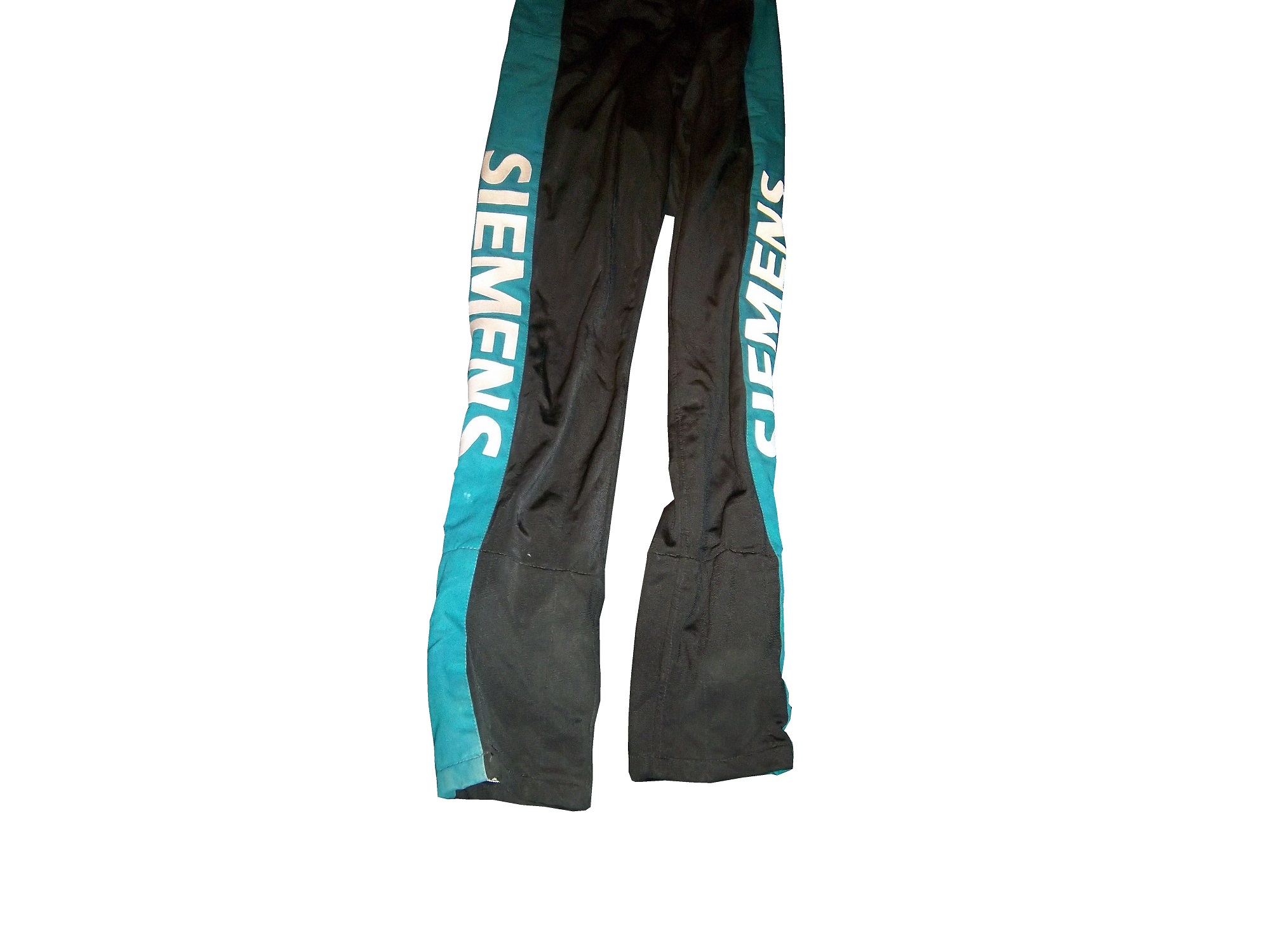
Clint Bowyer #15 5 Hour Energy/Knoxville Nationals Chevy SS-Same scheme as 5-Hour Energy, same A grade.

Greg Biffle #16 KFC Ford Fusion-I think the names on a race car trope is getting a bit out of hand, but that is my only complaint about this otherwise great KFC scheme. A-.

Greg Biffe #16 NESN Fuel Ford Fusion-NESN’s color scheme is great, but the designs are overused, and need some simplifying. It could work, better with a smoother design, but it’s not horrific. I give it a B-.

Carl Edwards #19 Arris Tony Stewart Throwback Toyota Camry-The Tony Stewart tribute is a great idea on paper, and in practice it works perfectly. It’s a great throwback, and since the color scheme is identical, it works very well. A.

Carl Edwards #19 SportClips Toyota Camry-Same as Denny Hamlin’s #11, same C grade.

Matt Kenseth #20 DeWalt/Flexvolt Toyota Camry-Get rid of DeWalt, and it would be an A scheme, but with the two different color and design schemes clashing, it takes an A grade down to a C-. The two different schemes by themselves work, but the combo doesn’t.

Ryan Blaney #21 Quicklane/Trading One Uniform For Another Ford Fusion-Replacing the traditional Wood Brothers red roof with a light blue one was a bold move, but I have to say that it looks really good. It doesn’t look like it would work, but it works perfectly. A

Ryan Blaney #21 Motorcraft Throwback Ford Fusion-Even for The Wood Brothers, this is an amazing scheme! I love a great throwback, and I think this might be the best throwback of the year. I can’t give it anything but an A.

David Ragan #23 Dr. Pepper Throwback Toyota Camry-Granted it’s more of a cop out of a throwback scheme, but it’s not terrible. I wish that Dr. Pepper and BK Racing would work a little harder with the scheme. Still it’s not a bad scheme, and it’s worth a B+.

David Ragan #23 Flaming Leprechaun Toyota Camry-Black with dark red flames could be hit or miss, and this is a hit. It works well, and looks good. Nothing wrong here. A

David Ragan #23 Brandies Machinery Toyota Camry-Same scheme as last year, same F grade.

David Ragan #23 Dr. Pepper/USA Network Toyota Camry-Same basic scheme as Dr. Pepper, same A grade.

Chase Eliott #24 NAPA Patriotic Chevy SS-It could work as a patriotic scheme, but it’s overdone, and it needs work. If the white roof was eliminated, and the patriotic elements condensed, it would work better, but as of right now, it earns a C+.

Paul Menard #27 Menard’s/Sylvania Chevy SSI’ve had a lot of good things to say about the Menard’s Template, but that ends with this scheme. The orange does not work with the yellow, and the whole car just looks awful. I can’t pass this scheme, so I’ll give it an F.

Paul Menard #27 Valvoline Throwback Chevy SS-While I like throwback schemes for the most part, this scheme just doesn’t work. Based on Al Unser’s 1993 Daytona 500 scheme, this is one of those instances where the color scheme is mediocre, that silver is just not good, and a design that just doesn’t work. As much as I get what was trying to be done, it was based on a terrible scheme in its first incarnation, and I have to give it an F.

Bobby Labonte #32 One Orlando Ford FusonSame scheme as last year, same F grade.

Eddie McDonald #32 Bentley’s Saloon Ford Fusion-New sponsor for 2016, orange, red, silver, and black with a series of modern designs up sides. F

Jeb Burton #32 Erie Insurance Ford Fusion-My only complaint is that the wave form is a bit overdone, which messes up the whole look. Other than that, its not a bad scheme at all, if not for being a tad overdone. B+

Kyle Larson #42 Energizer Chevy SS-It’s a decent scheme, but if the white were replaced by black, I would like it more. The design looks forced, and it doesn’t work as well. I’ll give it a C-.

Brian Scott #44 Shaw’s/Heinz Ford Fusion-Same scheme as Alberston’s, same A grade.

Michael Annett #46 St Jude’s Hospital Chevy SS-The silver background doesn’t work, but changing it to white would work very well. Other than that, it’s a really good scheme. B+

AJ Allmendinger #47 Kroger/Outshine/Drumstick Chevy SS-Same scheme as Kroger, same A grade.

AJ Allmendinger #47 Kroger/Clorox/Scott Chevy SS-Same scheme as Kroger, same A grade.

AJ Allmendinger #47 Scott’s Chevy SS-Same scheme as Kroger, same A grade.

Jimmie Johnson #48 Lowe’s/Jimmie Johnson Foundation Chevy SS-The black with stars works very well, but why in the world would you go with that door design? That design is just awful. Above and beyond that, why would you have nearly invisible stars on the sides and hood? It just looks awful! I give it an F.

Jimmie Johnson #48 Lowe’s Red Vest Chevy SS-Rather than replacing the blue elements with red, as in 2015, there was a whole new design for 2016, which is overdone, and just looks odd. I’m not sure what they were going for, but they missed. It’s ugly and confusing, and has earned an F.

Matt DiBenedetto #83 Anest Iwata Toyota Camry-Its a simple design, with a great color scheme, and it has a smooth look. I give it an A.

Matt DiBenedetto #83 Orange Crush Throwback Toyota Camry-Orange and blue can be hit or miss, depending on what shades are used, but this design, and this color scheme works very well, and earns an A

Matt DiBenedetto #83 Science Logic Toyota Camry-It’s never a good sign when I can compare a paint scheme to cheap hotel carpeting, but for this scheme, its spot on. The only thing giving this scheme a D+ is a good color scheme.

Ty Dillon #95 Chevy Summer Selldown Chevy SS-It could be better when it comes to the design, sunburst is finicky on race cars. The color scheme is great, so I’ll give it an B-.

Michael McDowell #95 Thrivent Financial Richard Childress Throwback Chevy SS-It’s a great throwback, and it is very faithful to the original. It can’t get any grade less than an A.

Cole Whitt #98 Speed Stick Reversed Chevy SS-As shown with the Olympic Dow scheme above, reversing the colors doesn’t always work. But this scheme shows that it can. Silver looks good as a background, and the blue works well. It earns an A.

Two Birthdays in January…

100_4380By David G. Firestone
On the first anniversary of the founding of The Driver Suit Blog I felt it appropriate to analyze the first two NASCAR driver suits I ever bought. I started in the driver suit hobby in March of 2010, with a Bill Sedgwick Die Hard driver suit from the Craftsman Truck Series in 1996. 17-sedgwickI purchased this specific item for a number of reasons, first, it was well within my price range, and second, I wanted a low-end example that I can look at and get a general feel for aspects that I will see in other driver suits.
Some of the stuff I learned from this particular suit helped me understand the very basics of design aspects on race-worn driver suits. Some of the aspects I discovered from that were completely different and it was through subsequent research that I began to understand driver suits more. I have kept it for as long as I have is because I love the suit, and I even though I have had it for almost 4 years, I still find aspects about it that interest me.
The suit is custom designed for Darrell Waltrip’s Craftsman Truck Series team. Sedgwick drove the #17 Chevy C-1500 for the entire 1996 season, whereas Waltrip drove the #5 truck for a very limited schedule. Sedgwick had 3 top 5’s and 8 top 10’s in the 23 of the 24 races that year, and led a total of 8 laps. Sedgwick was released at the end of the season.17-sedgwick
The triple-layer suit is custom designed for Sedgwick, with the Sears Die Hard logos on the collar and shoulder epaulets,17-sedgwick-collar 17-sedgwick-rshoulder 17-sedgwick-lshoulderSears Die Hard logos across the front and Sedgwick’s name on the right chest,17-sedgwick-rchest17-sedgwick-lchestno arm gussets,17-sedgwick-rsleeve1 17-sedgwick-lsleeve1no adornment on the belt,17-sedgwick-beltTV logos and safety stripes on the legs,17-sedgwick-legsTV logos on the sleeves,17-sedgwick-rsleeve2 17-sedgwick-lsleeve2and a huge logo across the back.17-sedgwickb 17-sedgwickb-logoI purchased a press kit for this suit, which I covered in December, concerning this suit, and I realized that the suit Sedgwick is wearing in the promotional photo is the same suit that is in my collection. I keep the press kit in my authentication binder with the rest of my COA’s and LOA’s17-sedgwick-presskit1 17-sedgwick-presskit3 17-sedgwick-presskit2 17-sedgwick 17-sedgwick-presskit2The other suit I bought, my first Winston Cup suit was a Lake Speed suit from 1997, this one is a bit different. In 1997, Speed was racing for Melling Racing, which in 1997 was a shell of its former self. Melling had 34 victories and the 1988 Winston Cup Championship, but by 1997, they had no real sponsorship, and had not won a race since 1991. During that season Lake Speed didn’t score a top 5, top 10, or victory, and only led 3 laps in the 25 races he raced in that year.9-speedDue to the lack of sponsorship, Speed didn’t have the luxury of having a custom-made suit that season so he wore what appears to be a store bought suit. It looks like the suit was purchased either from a store or a catalog, and customized for Lake’s use. There are no large sponsor logos on the collar,9-speed-collarshoulder epaulets,9-speed-rshoulder 9-speed-lshouldertorso,9-speed-bsleeves,9-speed-rsleeve1 9-speed-rsleeve2 9-speed-lsleeve1 9-speed-lsleeve2or legs.9-speed-legsThe legs have a cuff cut, as opposed to a boot cut like the Bill Sedgwick suit has.
Everyone who has a hobby or an interest started somewhere. With me, it was with these two driver suits. No matter what you do in your hobby, or how high you fly in your hobby, you were a rookie, and you started from somewhere. Never forget where you came from. These two suits are a reminder of what I was, and I love these two.
Before we get to paint schemes, I need to say something to my readers. When I started this project one year ago, I never thought it would take off as much as it did. I have a group of really awesome readers and followers. I also owe a special thanks to Paul Lukas of Uni-Watch, because if I had never written my two articles for Uni-Watch in 2013, I would never have done the research I did for them, and I would never have had the frustration of not finding research from the collector’s perspective, and The Driver Suit would never have been born. To all my readers, from the bottom of my heart, I say thank you! Stay Tuned because 2014 will be even better than 2013!

Paint Scheme Reveiws

Jamie McMurray #1 Cessna Chevy SS Black with silver numbers and white trim looks simple and really good. I can’t say anything bad about this scheme, and bonus points for improving the door number design. A+

Jamie McMurray #1 McDonald’s Chevy SS Same great design as last year, same A grade.

Austin Dillon #3 Dow Chevy SS Take the white stripe down the side off, and it will be a solid A scheme. The white does not look good at all. The red/white/black color scheme works very well, and it is decently designed, so I will give it a B+

Danica Patrick #10 Go Daddy Chevy SS Not only does Go Daddy continue to use the worst shade of yellow in NASCAR, they also have given the worst shade of orange a more prominent role in the car. Givng this car an F is a very fair grade.

Denny Hamlin #11 FedEx Ground Toyota Camry Same scheme as last year, same C+ grade

Denny Hamlin #11 FedEx Freight Toyota Camry Same scheme as last year, same C+ grade

Denny Hamlin #11 FedEx Office Toyota Camry Same scheme as last year, same C+ grade

Denny Hamlin #11 FedEx Express Toyota Camry Same scheme as last year, same C+ grade

Casey Mears #13 Geico Ford Fusion The yellow they use is awful, and the side design is just too loud,  I’ll give it a D

Ricky Stenhouse Jr. #17 NOS Ford Fusion I love this color scheme, however, I don’t love the side design. It has too many different different designs, all of which would work on their own but combined they look like a jumbled mess. I really want to like this scheme, but I just can’t, so I’ll give it a C-

Ricky Stenhouse Jr. #17 Fifth-Third Bank Ford Fusion Everything I just said about NOS applies here. C-

Clint Bowyer #15 5 Hour Energy Toyota Camry Same scheme as last year, same B+ grade.

Kyle Busch #18 M&M’s Toyota Camry Same scheme as last year, same A+ grade.

Ryan Newman #31 Cat Chevy SS New season, new driver, new scheme that looks great and earns an A

Kurt Busch #41 Haas CNC Chevy SS Great color scheme and a very simple desgin look very good here. I also like the matte black used, and the door numbers look really solid. Can’t give this scheme anything less than an A

Kyle Larson #42 Target Chevy SS The scheme looks decent, I like the white on the back, though I do not like the Target logos at the bottom. That takes a scheme that was an A grade to a B-

Brian Vickers #55 Aaron’s Toyota Camry A good scheme, and the 55 lettering looks really good here, and the gold is a nice touch. A

Martin Truex Jr. #78 Furniture Row Chevy SS Simple, and perfect. A+

Dale Earnhardt Jr. #88 Diet Mountain Dew Chevy SS Same scheme as last year, but I never gave it a grade. So here is my analysis Not a great scheme, too much needless design on the side of the car, and the silver background is just brutal. The red lettering on a green background is unattractive at best, and all in all, this is a D- grade.

Michael McDowell #95 Levine Family Racing Ford Fusion This scheme is so much better than last year’s scheme, and just for that I’ll give it a B

Carl Edwards #99 Aflac Ford Fusion This has a terrible color scheme, with lime green, neon blue, black and white. The wing design is not only ugly but would work better starting at the door and working behind.

Parts and Recreation

By David G. Firestonepettyrotor1

You know me for driver suits, but i also collect other things besides suits. Aside from helmets and other uniform items, i also collect other race-used items from the cars. Racing is half man half machine, and items from the machine make unique collectibles as well.

One of the most obvious things is sheet metal. Stock cars consist of a roll cage which contains the engine, suspension, and driver compartment. Covering that is what is called “sheet metal” which is a thin metal that has the shape of the car and where the paint scheme is added. The cars are “skinned” after each race. The sheet metal from cars has become a huge collectors market. Pieces can be as small as 1 inch squared, such as this Carl Edwards pieceedwards6, or huge, such as this Sterling Marlin door.marlin

Tires are also popular to collect as well. Tires can be purchased whole, but since they can weigh as much as 90 pounds, they are often cut up and the pieces are sold, like sheet metal. This example, used by Kevin Harvick in the 2002 Daytona 500 is an example. it gives a good example of the thickness of the tire, and the cords are visible as well.harvick-tire1 harvick-tire2  100_4233   This Kyle Petty/John Andretti card has two small pieces of tire, each used by the respective driver in the card. These are popular, and everything from suits to caps, to sheet metal wind up in cards.petty-card1 petty-card2

Race-used lug nuts go hand in hand with tires. Lug nuts are used once, and then sold after the race, such as these Tony Stewart examples. Lug nuts are Super glued to the rim, and one of these still has superglue residue on it.stewartlugnut-1 stewartlugnut-2 stewartlugnut-9

Mechanical components, especially engine components are interesting to collect, as there is no better representation of man and machine than a part of the heart of the machine. For example, I have a brake rotor used by John Andretti in the 1998 Bank of America 500 at Charlotte, which has been signed by Richard Petty. pettyrotor1 pettyrotor2 pettyrotor3 pettyrotor4This is a set released after Jimmie Johnson won his first sprint cup title back in 2006. johnsongroupIt contains a series of pieces used by Johnson, including a piece of sheet metal from his door,johnsonsheet

a spark plug,johnsonplug

a valve spring,johnsonspring

a piece of the track bar,johnsonrod

and a lifter.johnsonlifter

i also have a spark plug from Morgan Lucas Racing in the NHRAmlr-plug

an ignition coil from Morgan Lucas Racing, which has been signed by Tony Schumacher and Ron Cappsmlr-coil3 mlr-coil2 mlr-coil4 mlr-coil5 mlr-coil6 mlr-coil1 mlr-coil7

and a timing belt from Bob Tasca,tasca-belt1 tasca-belt2

I discussed this pit board from Chad McCumbee earlier in the yearmccumbee-pit-1 mccumbee-pit-2 mccumbee-pit-3 mccumbee-pit-4 mccumbee-pit-5

one last item from the equipment collection is this piece of Daytona International Speedwaydaytona1 daytona2 daytona3 daytona4

Jamie McMurray #1 Cessna Chevy SS Black with silver numbers and white trim looks simple and really good. I can’t say anything bad about this scheme, and bonus points for improving the door number design. A+

Jamie McMurray #1 McDonald’s Chevy SS Same great design as last year, same A grade.

Austin Dillon #3 Dow Chevy SS Take the white stripe down the side off, and it will be a solid A scheme. The white does not look good at all. The red/white/black color scheme works very well, and it is decently designed, so I will give it a B+

Danica Patrick #10 Go Daddy Chevy SS Not only does Go Daddy continue to use the worst shade of yellow in NASCAR, they also have given the worst shade of orange a more prominent role in the car. Givng this car an F is a very fair grade.

Denny Hamlin #11 FedEx Ground Toyota Camry Same scheme as last year, same C+ grade

Denny Hamlin #11 FedEx Freight Toyota Camry Same scheme as last year, same C+ grade

Denny Hamlin #11 FedEx Office Toyota Camry Same scheme as last year, same C+ grade

Denny Hamlin #11 FedEx Express Toyota Camry Same scheme as last year, same C+ grade

Casey Mears #13 Geico Ford Fusion The yellow they use is awful, and the side design is just too lowd, Ricky Stenhouse Jr. NOS Ford Fusion I love this color scheme, however, I don’t love the side design. It has too many different different designs, all of which would work on their own but combined they look like a jumbled mess. I really want to like this scheme, but I just can’t, so I’ll give it a C-

Clint Bowyer #15 5 Hour Energy Toyota Camry Same scheme as last year, same B+ grade.

Kyle Busch #18 M&M’s Toyota Camry Same scheme as last year, same A+ grade.

Kurt Busch #41 Haas CNC Chevy SS Great color scheme and a very simple desgin look very good here. I also like the matte black used, and the door numbers look really solid. Can’t give this scheme anything less than an A

Dale Earnhardt Jr. #88 Diet Mountain Dew Chevy SS Same scheme as last year, but I never gave it a grade. So here is my analysis Not a great scheme, too much needless design on the side of the car, and the silver background is just brutal. The red lettering on a green background is unattractive at best, and all in all, this is a D- grade.

Carl Edwards #99 Aflac Ford Fusion This has a terrible color scheme, with lime green, neon blue, black and white. The wing design is not only ugly but would work better starting at the door and working behind.

Paint Scheme Leaderboard Part 4-The Grand Finale

By David G. Firestone

The focus group of one has had its meetings, and has made its decisions.  Here are all 50 teams that ran the Sprint Cup this year ranked first to last on their paint schemes:

#1-Wood Brothers #21-A classic design scheme that just seems to get better with age. The Henry Ford design combines classic and modern elements for an amazing look.

#2-Hendrick Motorsports #48 Jimmie Johnson went with a very classic look, with a day scheme and a night scheme, which worked very well. Johnson did not have a bad look all year.

#3-Michael Waltrip Racing #55 Simple traditional designs. That is the secret to their success on the leaderboard. Color schemes are great as well. Nothing wrong with these schemes.

#4-Furniture Row Racing #78 When it came down to picking a number 1 for Chevy, for both the Paint Schemie and the Leaderboard, I had to flip a coin to pick a number 1, and Johnson won. Kurt Busch ran a series of very solid schemes, not a lot to comment on and it always looks good.

#5-Joe Gibbs Racing #18 Like Jimmie Johnson and Kurt Busch on the Chevy side, the Toyota winner for both the Paint Schemie and Leaderboard was decided by a coin flip. More modern than the 55, all these schemes are good, with amazing paint schemes and really good design.

#6-Richard Petty Motorsports #43 This team combines classic and modern looks, and uses Petty Blue very effectively. The Transportation Impact scheme was not good at all, and kept the 43 team out of the top spot.  Extra Credit for the Maurice Petty Tribute Scheme.

#7-BK Racing #83 Great designs all around, but the hood needs work. Why is it black when the rest of the car is red?

#8-BK Racing #93 See Above, but the Old Dominion scheme drags it down.

#9-Penske Racing #12-Though only raced for one race, the SKF design worked very well. A great color and great design scheme. If this had been raced for multiple races, I would have ranked it higher, but it is still a solid scheme.

#10-Richard Childress Racing #29 The Bad Boy Buggies scheme is bad, and the Rheem/Budweiser combo scheme is awful, but aside from those, Kevin Harvick has had a very good season, paint scheme wise

#11-Earnhardt Ganassi Racing #42 Get rid of the Axe Apollo scheme and the Camouflage scheme, and Juan Pablo Montoya would have the top spot.

#12-Richard Petty Motorsports #9 This set earned a place in the top 5 because it improved by a lot over the course of the season. It has a great color scheme, but the early schemes were not great, but since Stanley redesigned their logo, and made some changes to the car, it is a very nice set.

#13-Phoenix Racing/Turner Scott #51 Guy Roofing and Hendrick Cars are hideous, but apart from that, they have run a great set of paint schemes. Bonus points given for the Neil Bonnett throwback scheme.

#14-Michael Waltrip Racing #56 The Get Back and Give Back scheme is horrid, but the rest of the schemes are really good.

#15-JTG Daugherty Racing #47 Most of what they ran this year was great, but the Bushes Baked Beans car has an odd overall design, and a weird color scheme. The Clorox scheme has a bad color scheme, as does the Charter scheme, as does the Wounded Warrior Project scheme.

#16-Roush Fenway Racing #17 A pinkwashing scheme as well as the Valvoline NexGen scheme kick Ricky Stenhouse Jr. out of the top spot. Sad thing too, as Ricky had a very solid year when it comes to paint schemes

#17-Joe Gibbs Racing #81 Alert Energy is awful. Double Mint is awesome.

#18-Penske Racing #2 While I miss the beer colored wheels from last year, Keselowski has had a decent year, the color scheme is great, though there is too much white on the car. The Redd’s Apple Ale scheme was great, but the Fan Mosaic and Patriotic schemes need some work.

#19-Roush Fenway Racing #16 Greg Biffle had a lot of great schemes, but he had a number of awful ones , including a pinkwashing scheme as well. Get rid of the pinkwashing scheme, the Scotchguard, give blood, and Megulars schemes, and he would be in the top 5.

#20-Richard Childress Racing #27 The yellow is too bright, but other than that, the schemes are really good.

#21-Stewart Haas Racing #14 Some of these schemes are good, others not so much.

#22Hendrick Motorsports #88 Dale Jr. runs good schemes most of the time, but Soldiers of Steel, Orange Amp Energy, and Camouflage are just brutal. Additional points lost for a pinkwashing scheme.

#23-Joe Gibbs Racing #20 If the Dollar General was more plain, and did not have the orange back, I would love to give Matt Kenseth a higher spot, and a pinkwashing scheme does not help.

#24-Earnhardt Ganassi Racing #1 Bad Boy Buggies is even worse here, and the Bass Pro Shop schemes are awful. A number of good schemes here as well.

#25-FAS Lane Racing #32 The Oxy Water scheme, and the gray scale C&J Energy Services schemes do not work, but the rest of the schemes they ran do

#26-Front Row Motorsports #38 The template they run works very well when the color scheme matches that of the sponsor. When it doesn’t match, it looks awful.

#27-Front Row Motorsports #35, See above

#28-Front Row Motorsports #34, See above, aside from the CSX scheme, which looks great, and the Peanut Patch scheme which looks awful.

#29-Tommy Baldwin Racing #36 This team looks better without a primary sponsor than they do with one.

#30-Max Q Motorsports #37 Simple, yet attractive. Would be higher if they ran more races.

#31-Joe Gibbs Racing #11 The Jason Leffler tribute scheme and the FedEx delivery manager schemes are great, but the rest are just awful. I miss the Gen 5 schemes

#32-Nemco Racing #87 The word that can best describe this set is dull. Not bad, but not spectacular.

#33-Circle Team Sport #40 Interstate Moving is really good. Moon Shine Attitude Attire is really awful, and their pinkwashing scheme is even worse.

#34-Roush Fenway Racing #99 Geek Squad and Fastenal work well, the rest…not so much.

#35-Richard Childress Racing #31 A few good schemes but most of them are mediocre at best.

#36-Hendrick Motorsports #24 See Above

#37-Stewart Haas Racing #10 Worst shades of yellow in NASCAR, and the pinkwashing scheme is so much worse.

#38-Michael Waltrip Racing #15 Clint has consistently run cars with great color schemes, but awful designs. Except for Duck Dynasty, and pinkwashing, which are just hideous.

#39-Humphrey Smith Racing #19 Another car that just looks better without a primary sponsor.

#40-Germain Racing #13 Nothing really wrong, but nothing really right with these schemes.

#41-Penske Racing #22 Red and yellow is a really great color scheme, but the design is all wrong. This design gets even worse with the AAA scheme, which has an even better color scheme. The Pennzoil scheme is good, but not good enough to save the set.

#42-Stewart Haas Racing #39 I have to give them credit, their schemes are mostly awful, but at least they are creative.

#43-Tommy Baldwin Racing #7 Worst. Door. Number. Ever. The rest of the car isn’t good either, and a pinkwashing scheme doesn’t help.

#44-Phil Parsons Racing# 98 The schemes come in one of two food groups, bland or awful. Great colors, but the designs are horrid.

#45-Levine Family Racing #95 Worst template in NASCAR.

#46-Hendrick Motorsports #5 Innovation can be a bad thing. This, for example is what happens when you let Karl Benjamin design your cars.

#47-Circle Sport/RCR #33 It amazes me how two different teams can use the same car number, and both can put awful designs on their cars. Special credit for the Honey Nut Cheerios scheme, which is just horrific.

#48-Xxxtreme Motorsports #44 Yuck.

#49-Hamilton-Means Racing #52 Paulie Harraka had a great scheme, but Brian Keselowski…not so much.

#50-Swan Racing #30/26 Please tell me this is an experiment on how to make the worst paint scheme in history? Is Swan Racing competing with Travis Pastrana for the most obnoxious paint scheme in NASCAR?

Paint Scheme Leaderboard Part 3- Toyota

By David G. Firestone

The Paint Scheme Leaderboard continues with Toyota today. This has been a stressful series, and it will be even more so next week, when I rank all 50 teams in order from best to worst. Enough complaining, on to the schemes.

#1 Michael Waltrip Racing #55 Simple traditional designs. That is the secret to their success on the leaderboard. Color schemes are great as well. Nothing wrong with these schemes.

#2 Joe Gibbs Racing #18 Like Jimmie Johnson and Kurt Busch on the Chevy side, the Toyota winner for both the Paint Schemie and Leaderboard was decided by a coin flip. More modern than the 55, all these schemes are good, with amazing paint schemes and really good design.

#3 BK Racing #83 Great designs all around, but the hood needs work. Why is it black when the rest of the car is red?

#4 BK Racing #93 See Above, but the Old Dominion scheme drags it down.

#5 Michael Waltrip Racing #56 The Get Back and Give Back scheme is horrid, but the rest of the schemes are really good.

#6 JTG Daugherty Racing #47 Most of what they ran this year was great, but the Bushes Baked Beans car has an odd overall design, and a weird color scheme. The Clorox scheme has a bad color scheme, as does the Charter scheme, as does the Wounded Warrior Project scheme.

#7 Joe Gibbs Racing #81 Alert Energy is awful. Double Mint is awesome.

#8 Joe Gibbs Racing #20 If the Dollar General was more plain, and did not have the orange back, I would love to give Matt Kenseth a higher spot, and a pinkwashing scheme does not help.

#9 Joe Gibbs Racing #11 The Jason Leffler tribute scheme and the FedEx delivery manager schemes are great, but the rest are just awful. I miss the Gen 5 schemes

#10 Nemco Racing #87 The word that can best describe this set is dull. Not bad, but not spectacular.

#11 Michael Waltrip Racing #15 Clint has consistently run cars with great color schemes, but awful designs. Except for Duck Dynasty, and pinkwashing, which are just hideous.

#12 Humphrey Smith Racing #19 Another car that just looks better without a primary sponsor.

#13 Hamilton-Means Racing #52 Paulie Harraka had a great scheme, but Brian Keselowski…not so much.

#14 Swan Racing #30/26 Please tell me this is an experiment on how to make the worst paint scheme in history? Is Swan Racing competing with Travis Pastrana for the most obnoxious paint scheme in NASCAR?

Next Week, The big finale, all 49 teams ranked from best to worst!

They Pay the Bills, So They Design The Suit

By David G. Firestone96-reeves-flogoFrom a design aspect, no other factor contributes as much as the primary sponsor or sponsors of the car. Everything from the colors to the torso design, to the television logos, to the shoulder epaulet and collar design depends on the primary sponsor. While this has been the case for the most part, how the primary sponsor is displayed can vary quite a bit.

Currently, the standard design for a primary sponsor logo is to have a large logo across the front of the lower torso, and on the back on the upper torso. These Christian Fittipaldi designs from 2002-2003 are great examples of that. The Georgia Pacific design from 2002 has a decent sized logo on the front bottom torso, and the same logo higher up on the back torso.45-fittipaldi-flogo 45-fittipaldi-blogoThe Bugles example from 2003 has identical logo placement for the Bugles logo.44-Fittipaldi-flogo 44-Fittipaldi-blogoMany driver suits feature this same logo placement.96-reeves-flogo 96-reeves-blogo 90-stricklin-flogo 90-stricklin-blogo 31-skinner-flogo 31-skinner-blogo 17-sedgwick-flogo 17-sedgwickb-logo 16-musgrave-flogo 16-musgrave-blogo 15-sprague-flogo 15-sprague-blogo 1-lajoie-flogo 1-lajoie-blogo 12-miller-flogo 12-miller-blogo

Taking a look at this Ricky Craven example from 1996, it features a design aspect that was very heavily used. The torso features a plan color, with a stripe across it with the sponsor name on that stripe. Dale Earnhardt Sr. used this design for many years, as did Rusty Wallace, Dick Trickle, and Steve Grissom among others. It is a fairly straightforward design, but it works very well.41-craven-flogo 41-craven-blogoOther suits have the primary sponsor logo present, but the logo is underwhelming. This design is exampled by this Bobby Hillin Jr. Moroso driver suit from 1991,20-hillinThis Lake Speed example from 1997,9-speed

and this Ted Musgrave example from 1998.15-musgrave-lchest 15-musgrave-blogo

In very rare instances, a primary sponsor is excluded from the suit altogether. One example is this Terry Labonte suit I covered earlier this year. That example was made for Terry to wear in a very last minute driver change. Another example is this David Stremme suit from 2009. I covered this issue earlier in the year, but to sum it up, because of a conflict between Verizon, the sponsor of Stremme’s car, and Sprint, the title sponsor of the Sprint Cup race, Verizon was not allowed to have their logos on Stremme’s car and driver suit. As such, Stremme raced a Dodge sponsorship, and wore this suit.12-stremme-flogo 12-stremme-blogoOne of the newer designs that is frequently seen is what I call the leg stripe design. This Kasey Kahne example shows a leg design that has a large white stripe running up the red background, with the DODGE television logo running up the leg. Sponsors can make their logos stand out more with this design, so it is becoming more popular every year.9-kahne-legsThis Scott Wimmer example is from 2002, and is rather unique in this category.23-wimmer-legsIt needs an explanation…The suit was worn for the entire 2002 season, which had a Siemens sponsorship for the first 25 races. After Siemens left the team, Scott Wimmer went on to win 4 of the next 9 races in an unsponsored black car with red and yellow flames…while wearing this suit.

While I get that the team not buying another suit for Wimmer to wear…it just looks weird.

Now this is another suit that needs an explanation. Nort Northam is a Porsche dealer based in Florida. He was a race car driver from 1979-1992, and his career was not great, with no wins, and two podiums. In 1988, he raced in the Sunbank 24 at Daytona, now called the Rolex 24 at Daytona in a Porsche owned by fellow driver Karl Durkheimer.56-Northam 56-Northamb

During that race, he wore this driver suit. It appears on this suit that a sponsor patch has been removed or fallen off. Now to understand the basic design, you need to understand that Nort raced in two races a year, and having a suit custom designed would be a needless expense. As such, his name, and two sponsor patches did the trick. Not fancy, but effective. This late 1980’s SCCA example is also a minimalist design, but it sticks to the “80’s stripe” design as the Ricky Craven example.

The last thing about primary sponsors is that sometimes, primary sponsor designs follow other sports uniform trends. This example from 1998 was worn by Jeremy Mayfield. At that time, gigantic logos across the fronts of uniforms were the big thing, and that was not good. This fad did not last long, thank heavens!

Driver Suit Blog “Wheel Reviews”

Last night, I went to see the movie “Rush” and I have to say, it was really good.  It has been said “you love your rivals, because you need someone to beat.” Nowhere is this more evident than Rush. Directed by Ron Howard and starring Daniel Brühl as Niki Lauda and Chris Hemsworth as James Hunt, Rush is the story of the rivalry between the two, from their days in Formula 3 in 1970, to Formula 1 in the 1970’s. For fans of racing movies, it is a true masterpiece.

The film takes the perspectives of the two drivers. Lauda is represented in the film as a talented driver who is great with setting up a race car. He is a driver who takes what he does very seriously. Hunt on the other hand is more of a playboy. He is a great driver, but his fast and furious lifestyle is a distraction from his true talent. Both are talented, but when Hesketh Racing, Hunt’s team can’t find sponsorship for the upcoming 1976 season, Hunt loses his ride. After his wife leaves for a ski trip, Hunt gets a ride with McLaren after Emerson Fittipaldi leaves to race for his cousin.

In 1976, Hunt struggles for the first part of the year, while Lauda, fresh off his 1975 World Championship is always a factor in the points standings. Hunt’s luck changes at the Spanish Grand Prix, where he beats Lauda, though he is disqualified for his car being less than an inch over regulation. Hunt’s wife divorces him, and driven by this, his season turns around. Though Lauda struggles at this point, the points standings are close coming into the German Grand Prix

The 1976 German Grand Prix was a critical point in this story, as the points battle was heating up. This race was at the the “Old Nürburgring” one of the most difficult tracks in the world. The weather was stormy, which kicks up the danger. Knowing the track as well as he did, Lauda called a meeting of the drivers and stated that the race should be canceled because of the conditions. Hunt thinks it is just a trick to take a race out of the schedule, and the cancellation is voted down. Lauda is seriously hurt in a wreck, and he is hospitalized. Hunt blames himself for the wreck. The story from there is the story of the 1976 Formula 1 World Championship.

The cars in the movie were very accurate, in some cases, vintage equipment was used. The tires used were made by Goodyear, and had the lettering in white as opposed to the yellow lettering that they currently use. The crew uniforms were very accurate as well. The driver uniforms were very well done, as were the helmets. Something that I noticed about them was that I couldn’t see any safety certification visible.

All in all, this is a great movie, and racing fans will enjoy this movie, so I give it an A!

Paint Scheme Reviews

Jamie McMurray #1 Liftmaster Chevy SS Good color scheme and decent desisn add up to an A- grade

Clint Bowyer #15 Raspberry 5-Hour Energy/Living Beyond Breast Cancer Toyota Camry I hate pinkwashing and I hate raspberries, so this gets an automatic F

Kyle Busch #18 M&M’s Halloween Toyota Camry The leaf designs on the bottom of the doors just look odd, and it takes a solid A scheme, to an A-. It does have great overall design and great colors, but the leaves just kill it.

Matt Kenseth #20 Home Depot/Let’s Do This Toyota Camry The overall scheme is great, and has a great color scheme. The problem is that the back end is yellow, which just looks odd when compared to the rest of the car. If the back was black, it would match quite well, but this is just bad. I want to give this scheme a higher grade, but the best I can do is a B-

JJ Yeley #36 Drive Sober Arrive Alive Chevy SS Great color scheme, great colors, and a cause that is easy to support add up to an A+ scheme.

Ryan Newman #39 Slate Water Heaters Chevy SS While I don’t get the silver design at the bottom of the car, this is a great scheme, and gets an A+

Ryan Truex #51 Shooters Sporting Center Chevy SS The yellow outline on the numbers is brutal, and the Shooters Sporting Center logo is just awful. C- is the best I can do.

My Statement Regarding the events of the Federated Auto Parts 400

By David G. Firestone

I normally don’t do two posts in one week, but after the events of the last two weeks in NASCAR, I felt compelled to state my feelings on the matter. Obviously, what took place at and after the Federated Auto Parts 400 is shocking to say the least. As a NASCAR fan, and collector, I felt that I had to say something.

First, I’ll discuss Joey Logano and David Ragan. Obviously what happened was that Ragan allowed Logano to pass him, to get a position, to get points needed to make the chase. It does need to be noted that on a very technical basis, the two are “partners” as they are both Ford drivers. However, it is still a violation of the rules, but at the same time, I can’t really blame Ragan. Front Row Motorsports is a middle-shelf team that has flashes of success, but is not a championship team. Ragan had nothing to gain in that race at that point. Logano had everything to lose at that point. He is having a great year, with a new team, and I think he can win the Sprint Cup this year. That said, it is a violation of the rules, and the rules are the rules.

Now we turn to the Michael Waltrip situation. Michael Waltrip and his older brother Darrell are old school stock car drivers. Old school drivers are notorious for trying to and finding ways around the rules. However, unlike the old days, in this day in age, cars are very closely inspected, and radio chatter is monitored by fans and officials alike. That is why this whole situation is as important as it is.

Now clearly what took place is that with 10 laps to go, Ryan Newman was leading the race, and with the points they way they were, he would make the Chase with a win. Martin Truex Jr. who would miss the Chase with Newman’s win is trying his best to make as many positions as he can to get as many points as he can to make the Chase, and give his teammate Clint Bowyer an advantage. Bowyer is being given info on the situation via team radio, and was obviously given a very poorly coded radio message to intentionally spin out to bring out a caution, and start a round of pit stops. When all pit stops are said and done, Newman is far back in the pack, and is out of the Chase Points wise. The race restarts, and on lap 198, Brian Vickers, the third driver for Michael Waltrip Racing, was ordered by his spotter Ty Norris, who is also the general manager and vice president for Michael Waltrip Racing to make a green flag pit stop, which gives Truex another boost in the point standings.

When the checkered flag flew, both Logano and Truex were in the Chase, and Jeff Gordon, and Ryan Newman were out. Gordon and Newman were disappointed, but they handled it well. Almost instantly, the issue came to light, starting with ESPN’s coverage. The commentators knew something was up, and it was clear from the in-car camera that the spin was intentional. Between Richmond and Chicago, the investigation led to the biggest penalty in the history of NASCAR, with a $300,000 fine and 50 owner point reduction for all 3 teams, all crew chiefs, were placed on probation, and Ty Norris was suspended indefinitely. Because of this, Truex was removed from the Chase, and Ryan Newman was added. Furthermore, with the Logano/Ragan situation, a 13th driver, Jeff Gordon, was added to the Chase.

Drivers know when they have in-cars, so it makes no sense that he would intentionally spin out. If Brian Vickers, who did not have an in-car had spun out, it would have been much more difficult to make a case. Also, if Vickers had pitted under green to fix some damage, it would have been much harder to prove something would have happened.

If this was a unique incident for Michael Waltrip Racing, I think that it could be forgiven at the end of the season, but let’s take a trip back to 2007, specifically, the days leading up to the Twin 125’s before they Daytona 500. Evernham Motorsports and Roush Fenway were caught with “illegal modifications” for their cars, and fines and suspensions were levied. Michael Waltrip Racing was caught with an illegal fuel additive in his primary car, and was fined 100 points for the violation.

NAPA, who had sponsored Waltrip since his 2001 Daytona 500 win had said that they would stand by him, but if something like this happened again, that would not be guaranteed. Well something like that happened again. This morning, NAPA announced that they will not sponsor MWR anymore after this season, which is understandable. NAPA is a very loyal sponsor, so clearly what happened was that they decided that the cheating was going to continue until they said something. It is sad, but it happened.

My question is this, a very valid argument could be made that Truex himself did not do anything intentionally wrong, and that he was thrown under the bus because of the actions of his teammates. Another argument can be made that NASCAR stated when announcing the penalty, that they could not prove that Bowyer spun intentionally. Taking all the evidence into consideration, it appears that Truex had no idea what was going on around him, and that his teammates kept this information from him. I think with the penalties NASCAR levied against MWR, that Truex did in fact get thrown under the bus. At the same time, the rule comes across as a “hand of one is the hand of all” rule, which means that if your team cheats to help you, you are just as responsible for what happens.

To summarize, I think that NASCAR did what they felt was right, and I feel as though NAPA had to do what they they thought was right. Do I agree with it? Absolutely! NASCAR and its sponsors need to make it as clear as they can that cheating will not be tolerated. The rules are the rules, and even if the drivers disagree with them, they have to be followed.