
To accommodate the beginning of Passover, I decided to upload this week’s episode of ITSM a day early. We look at Another old school NASCAR helmet, this one worn by Tracy Leslie, will be examined.
F1 and NASCAR Discussions
By David G. Firestone
Gonna be a bit of a long entry today, but I have a few things that I really need to discuss, that I haven’t been able to get to until today. I typically write a DSB article a few weeks in advance, and work on it over the weeks before it runs, but given the circumstances, I needed to write a fresh article for this week. Now while the site focuses mainly on NASCAR, I watch other forms of racing, including F1. The F1 race at Bahrain on Sunday was one of the best F1 races I have ever seen. That said, F1 is dealing with a controversy this season, that I need to address
F1 implemented in 2014, a series of regulations designed at making the sport more eco-friendly, or so they say. Engines are also now supercharged, and a redesign of the bodywork has that regulates that the nose of the car is much lower. Since during the off season teams were not able to observe each other, each team showed up to the Australian Grand Prix with a different nose design. These new regulations also had the effect of making the engine sound somewhat quieter. This change in engine noise did not go unnoticed, and many fans complained. There was even discussion of a lawsuit for failing to deliver what was promised by the promoters.
I’m a racing fan, and I understand that the sound of the engines is a huge part of the ambiance of the event. I get it. But at the same time, engine changes are going to happen. Engines will evolve. In fact, if you were to take an F1 engine from 2004, and put it in a current chassis, the car would not be competitive. I get what engine noise means, but sometimes you have to take the bad with the good. The racing has been better this season, and I personally will take the lower engine volume for the better racing.
One other rule new to the 2014 F1 season is a new mandate that the last race of the F1 season, the Abu Dhabi Grand Prix will have double points, to keep the championship points battle alive. What I’d like to see, is for the last TWO races, The Brazillian Grand Prix and the Abu Dhabi Grand Prix to have double points. I think that the last two races having double points would have a major impact on the championship, and would bring more spectators, both live and on television to the event.
A few more things from F1, first the United States Grand Prix in Austin Texas has been moved from November 9 to November 2 to accommodate a Texas A&M football game. What this does also is to move the race away from the season finale of the Sprint Cup Series season. This will give it more visibility in the United States, since it does not have to compete as much with NASCAR for attention. My favorite change in 2014 is that Williams F1 switched to Mercedes engines, and got Martini as a sponsor. They have utilized a very attractive vintage scheme. God that is a beautiful scheme!
The next topic here is something that has been bugging me for a while this year. I watch NASCAR at every given opportunity, I love the broadcast team on Fox, I love Darrell and Michael Waltrip, but I really, REALLY wish they would just shut up about this rookie class. I really do. I get rookies, I get rookie phenoms, but I do not want to hear anymore about this “amazing rookie class.”
I get that in recent years that rookie classes have been lackluster. I get that. Rookie classes can be legendary, like 1979 with Dale Earnhardt Sr., Terry Labonte and Harry Gant, or embarrassing, like 1990, with, Rob Moroso, Jack Pennington, Jerry O’Neil, and Jeff Purvis. I also get that there hasn’t been a decent rookie class since 2006. That said, this rookie class, is not as good as the broadcasters like to talk about.
Darrel said on numerous occasions that this is the largest rookie class since 1994. Ok, I get that, but let’s look at who was in that class, Steve Grissom, Joe Nemechek, Loy Allen, Jr., John Andretti, Jeremy Mayfield, Mike Wallace, Ward Burton, Rich Bickle, Billy Standridge, Rodney Orr, and Jeff Burton who won the Rookie of the Year. Loy Allen Jr. Mike Wallace, Steve Grissom, Rich and Billy Standridge were all busts. Orr was tragically killed before the Daytona 500. Andretti has two wins, Ward Burton has 5 wins, including the 2002 Daytona 500, ONLY BECAUSE STERLING MARLIN ILLEGALLY REPAIRED HIS CAR UNDER A RED FLAG, Joe Nemechek has 4 wins. Jeff Burton was the best of the lot with 21 wins. But the fact is that what it had in driver numbers, it lacked in talent. I’m seeing this same thing with this rookie class
Let’s look at each driver individually, and try to understand why they are in the Sprint Cup Series. Gonna do this in no particualr order, and we will start with Parker Kligerman. He was decent in the Truck Series, with 25 top 10’s in 50 races, with 1 win. He finished in the top 10 in HALF of the races he started in! Ok, so he moves to the Nationwide Series, and falls to 18 top 10’s in 51 races. Ok, still not bad, but he does not have a win. He has raced since 2009, so he raced in 51 races in 4 years. Um…you think he needs some more padding? He has some talent, but it needs to be developed. Unlike some of the other drivers he has some potential.
Cole Whitt is next. Not one win in any of the Big 3 Series. Like Kligerman, he has 18 top 10’s in 51 races. Unlike Kligerman, he was bland in the Truck Series. He’s an underwhelming driver in an overwhelming series. To top that off, he signs with Swan Racing! Swan Racing is to NASCAR as the New York Mets are to baseball…a total embarrassment. No top 10’s, and they have led 5 LAPS IN 3 YEARS! 5 LAPS IN 56 RACES! THEY AVERAGE A LEAD LAP EVERY 11 RACES! They are a total embarrassment to auto racing!
Michael Annett is one of the more underrated drivers, in my mind, in this rookie class. He has a lot of potential, and I think that with the right team, he might win a few races, but I don’t think he will do much more than that. Again, no races won in any of the big series.
BK Racing made the perplexing decision to fire two veteran drivers and replace them with rookies. I don’t disagree with hiring rookies, but Alex Bowman, and Ryan Truex don’t have the results to warrant the move. Again, why do teams insist on moving inexperienced rookies with minimal exposure to the schedule to the Sprint Cup?
Now Kyle Larson on the other hand, is a contender. He has a Truck Series win, and a Nationwide Series win, and in 10 Sprint Cup starts, he has two top 10’s, including a 2nd place finish. He was one bad restart away from winning the race. I think this kid is a contender for the championship. Even when he doesn’t win, he is strong behind the wheel, and I think he is one of two contenders for the Rookie of the Year.
The other contender is Austin Dillon. In 55 races, he has 5 wins, 34 top 10’s and won the Truck Series Championship in 2011. When he moved to the Nationwide Series, he had, in 77 races he has two wins, 53 top 10’s, and won the championship in 2013, without winning a race. In 19 Sprint Cup races, he has a top 10, and I think he is the front runner for the Sprint Cup Rookie of the Year.
So of the 7 contenders for Rookie of the Year, we really only have two contenders. I get it. I really do not want to hear any more about the rookies, so guys, please, stop talking about them!
Now on a positive note…
Paint Scheme Reviews!
Jamie McMurray #1 Beechcraft Chevy SS Great color scheme, great design, great scheme A+
Austin Dillon #3 Bass Pro Shop Chevy SS Camo and orange never work, and this is the worst example I have seen yet. Why can’t the #3 Bass Pro Shop car look like this? This is an F scheme, and I’m being polite!
Denny Hamlin #11 SportClips Toyota Camry Good color scheme, but much too overdesigned. D-
Alex Bowman #23 Dr. Pepper Toyota Camry Like the silver, and the design scheme is very good. A
David Gilliland #38 A&W Ford Fusion Front Row Racing uses a really good template and the color scheme works very well. A
Aric Almirola #43 Fresh From Florida Ford Fusion(try saying that 3 times fast!) Aric has had some great schemes this year, but this is awful. Bad color scheme, much too overdesigned, and it just looks awful. F
Justin Allgaier #51 AWX Performance Plus Chevy SS Great color scheme and a great design scheme earn an A grade.
Brian Vickers # 55 Aaron’s/Florida State Toyota Camry Good design, great color scheme, an A scheme all around
Carl Edwards #99 Ford EcoBoost Ford Fusion It looks like the designer had a stroke while designing the car. The color scheme is good, and that is the only good thing I can say about this scheme. It has earned an F
Introduction to Sports Memorabilia-Richard Lastaer Race Worn Helmet
This week, on Introduction to Sports Memorabilia, we examine a helmet worn by former NASCAR driver Richard Lasater, worn during his horrific crash at Talladega in 1993. The helmet did its job and he was able to walk away.
Item Spotlight-Alex Barron 1998 Champ Car Driver Suit
By David G. Firestone
While I typically watched NASCAR growing up, I did also watch IndyCar. That was before “the split” which diluted the value the sport so much that to this day it is still suffering, 6 years after the unification of Champ Car and the Indy Racing League. I got tired of politics and wanted to watch racing, I didn’t care who was sanctioning it. I still watch IndyCar racing and I collect race-used stuff.
I mentioned this a few months ago, when I discussed video matching. My first open wheel driver suit is this Alex Barron suit from 1998.
Not only is this my first open wheel suit, it was also my first suit that featured an FIA safety certification on the back of the neck. Having dealt in NASCAR suits, I didn’t know what to make of it, and through some research, I eventually learned what it was and what it meant.
 The chest features a FedEx Championship Series patch, probably my favorite sanctioning body patch ever,
and logos for Toyota and Denso.

 This being my first Sparco driver suit, The cowl tags, and location of the warranty tags were out of place, as compared to a NASCAR driver suit.
 One thing I do find interesting is that there are no television logos on the sleeves and legs, but as the video at the end shows, that was not uncommon, but more on that later.


The collar has an unusual design. Most collar designs feature either logos on the side, or logos across the front, or sometimes both. This one is unique in that it features a DEGREE logo on the front, as well as a CASTROL logo on the right side, but nothing on the left side…I’ve never seen that before or since, and I can’t understand the need for that particular design…it just looks odd. Alex’s name is embroidered into the belt, and something I love about open wheel suits is that because it is an international sport, much more so than NASCAR, the driver usually has their home country flag embroidered next to their name on their suit, as this suit shows.
 I also have a 1/18 die cast of Barron’s very sharp looking car from 1998. It is the only die cast I have that has a driver in it. I love the fact that he is wearing a very accurate version of his driver suit.
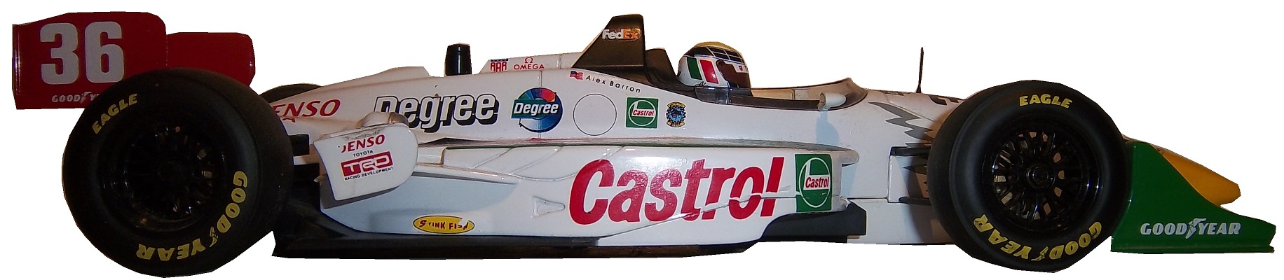

 Now as I mentioned, this was the suit Barron wore during his most infamous moment, his crash at Road America, where he wound up on top of Bryan Herta. Someone recently uploaded the whole race to YouTube, and when watching it, notice that nobody has logos for the in-car camera. I find that rather interesting, since it would be very easy to place logos on the sleeves, and it was commonplace in other forms of racing. But it is an interesting race.
Now we have another piece of news to discuss. In the realm of NCAA sports, the two major factions in uniforms are Nike and Under Armour. Nike has a deal with Denny Hamlin for driver suits, and I was wondering when Under Armour would jump on the band wagon, and this week, we got our answer. Under Armour, who has signed deals with Michael Waltrip Racing and Henrdick Motorsports to outfit teams with apparel. This deal does not include the drivers themselves but the car numbers are fair play. I find it a bit unusual that the deal provides apparel for all members of the team, pit crew members, front office personel, and everyone EXCEPT the faces of the franchises. Now that might change in the near future, but for now that is how the deal works. You can read more about the deal here.
Now we move to…
PAINT SCHEME REVIEWS!
Jamie McMurray #1 Bell Helicopters Chevy SS Great look, great color scheme, A+
Austin Dillon #3 Dow Powerhouse Solar Chevy SS The side is somewhat over designed, but I like the product placement on the roof. The color scheme is great so I will give it a B
Denny Hamlin #11 FedEx Office March Of Dimes Toyota Camry Decent color scheme, but the side is a bit overdesigned, and has a messy look to it. C+
Clint Bowyer #15 Willy’s Duck Diner/Buck Commander Toyota Camry Too much camo. Camo doesn’t work they way designers want it to on a car and I give it a D
Greg Biffle #16 Give Kids A Smile Ford Fusion Man! Greg Biffle really wants the Paint Schemie Awards for Most Degraded Paint Schemes, and Worst Paint Scheme Set with another F scheme. Horrible design, and an ugly paint scheme.
Greg Biffle #16 3M Areospace Ford Fusion Take the worst aspects of Greg Biffle 2014 schemes, and add a liberal amount of camo, and you have an F scheme
Ricky Stenhouse Jr. #17 Ford EcoBoot Ford Fusion I like the color scheme, I like the overall scheme, and my only complaint is that the orange numbers on the roof should be on the door. Still it is an A scheme
Cole Whitt #26 Swan Energy Toyota Camry Simple design and a great color scheme earns an A+
Cole Whitt #26 Swan Energy Toyota Camry Simple design and a great color scheme earns an A+
Paul Menard #27 Menards/Duracel Chevy SS This is the best Menard scheme I have seen! Duracel works very well on the hood, and I give it an A
Parker Kligerman #30 Swan Energy Toyota Camry Just when I thought Swan had learned the error of their ways, and were improving their paint schemes, along comes this one. Now we are back to square one, and this scheme earns a D+
Parker Kligerman #30 SMS Audio Toyota Camry Well things for Swan are looking up, this is a pretty cool design. It works very well, and has a great color scheme. A+
Ryan Newman #31 Quicken Loans Billion Dollar Bracket Challenge Chevy SS I understand what they tried to do, but the scheme as a whole is just bland, boring, and C+.
Travis Kvapil #32 Keen Parts Ford Fusion Decent design, good color scheme, but the logo on the hood is very difficult to see. That is a major issue. When a sponsor pays for a car, the hood design should be easy to see, but this isn’t easy, and I give it a C-
Aric Almirola #43 Ekrich Ford Fusion The red on the roof is pointless, and it takes away from a great scheme. If the roof were Petty Blue, and the red was just a stripe on the bottom, I would give this scheme an A+ but with the red roof, it goes down to a B-
Michael McDowell #95 Triangle Office Equipment Levine Family Racing keeps up the fight with Swan Racing to win the Most Improved Paint Schemie Award with another beautiful A+ scheme!
BREAKING AUTO RACING NEWS!
By David G. Firestone
NASCAR and the FIA announced this morning that starting in 2015, they will engage in a ride-swap program. Starting next Memorial Day, Formula 1 drivers will race in the Coca Cola 600, and NASCAR drivers will race in the Grand Prix of Monaco. NASCAR and F1 will race each others equipment in their respective races.In responding to the decision, FIA President Jean Todt stated that “Now we can bring a form of racing to America’s biggest stage that is under appreciated in the United States.” F1 Race Director Charlie Whiting stated “It’s going to be a serious challenge. The drivers and pit crews are not as prepared for this type of racing. We need to figure out new training and perperation methods for this 600 mile race. That said, I am really excited for our prospects!”
Brian France, Chairman and CEO of NASCAR stated “We are always on the lookout for new ways to promote the sport, and we are always looking for new venues and ideas for the Sprint Cup Series. Moncao will be a great way to bring a new, more international audience to NASCAR.” Mike Helton, President and COO of NASCAR stated “The new venue and the logistics will be very difficult, since many NASCAR drivers do not have that much experience in this form of racing.”
While the officials are very pleased at this new plan, the drivers are not as happy. Lewis Hamilton, who raced Tony Stewart’s Chevy at Watkins Glen a few years ago said “That type of driving is fun for a while, but I sure don’t want to race a 600 mile race in that car. Vision is restricted, the driver compartment is too hot, and I’m afraid of dehydration. While Tony Stewart could not be reached for comment, Kurt Busch was quoted as saying “Are you [Explative deleted] kidding me? We have to travel 10,000 [Explative deleted] miles to race in [Explative deleted] Monaco in [Explative deleted] F1 cars? I would rather [Explative deleted][Explative deleted][Explative deleted][Explative deleted] than race an F1 car!”
Fan reaction has been mixed. Some fans, like Alex Montgomerry of Charlotte complained “We look forward to the Coca Cola 600 all year, and now we have to watch a bunch of drivers we have never heard of race in cars they have never raced in?” William X. Jackson of Kannapolis North Carolina said “It will be a change, but I’m interested to see how it works out.” Rene Claude of Nice France said “While I am not a fan of NASCAR, I am interested in seeing how this race works out.” Claude D’Adele of Paris stated “If that happens, I, like many fans will not attend the race. I want to watch F1 drivers, not NASCAR drivers at Monaco!”
While the racing world is divided amongst those who are in favor, and those who are opposed, both NASCAR and F1 are convinced that this new partnership will increase fan interest for NASCAR internationally, and F1 in the United States.
Introduction to Sports Memorabilia-Kevin Lepage Helmets
This week, on Introduction to Sports Memorabilia, we examine two Kevin Lepage race worn and Signed driver helmets, the first from his rookie campaign in the Busch Grand National Series in 1994, and the second from his time at Roush Racing in 1999.
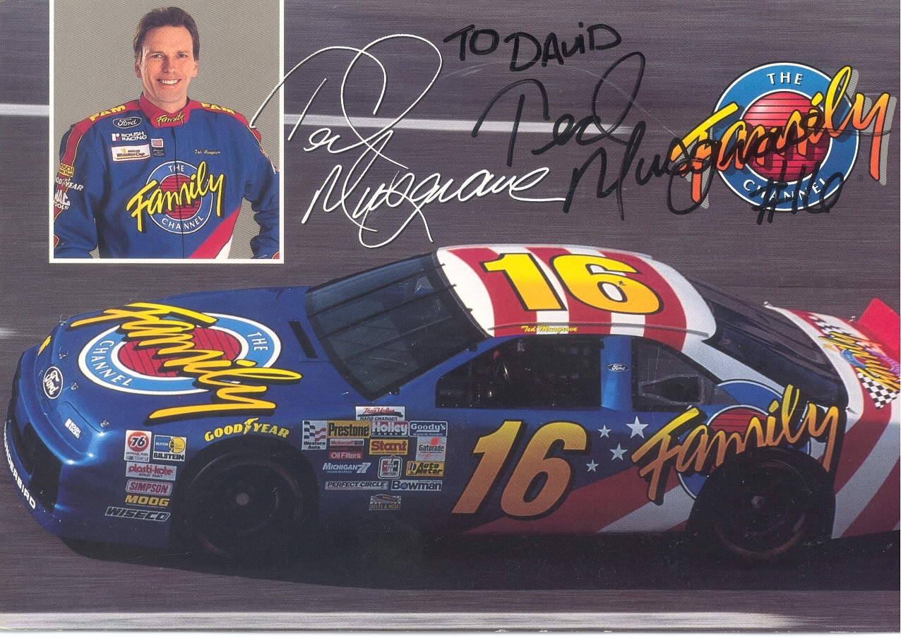
Ted Musgrave-My Favorite Driver to Collect Part 2
 By David G. Firestone
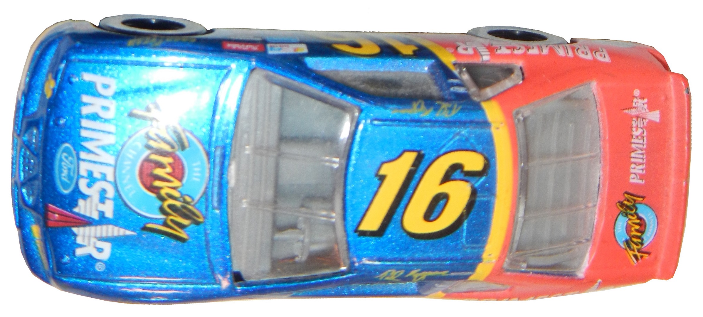
Last week, I discussed my favorite driver to collect, and this week I will examine his most well-known sponsor. From 1994-1997 Musgrave was sponsored by the Family Channel. The distinctive patriotic red white and blue design with that Family Channel logo was eye catching. The Family Channel logo was classic 1990’s design. It was also an idea whose time had come, and is still a great idea.
It was founded by Pat Robertson in 1977 as the CBN Satellite Service, which focused on Christian Broadcast Network programing. By 1981, it had re-branded as the CBN Cable Network, which began to focus more on family-friendly programing. It was a channel where families could watch together without needless violence, and gratuitous sex, something that should be redone today. The major moment was in 1990 when the channel became too profitable for the non-profit Christian Broadcast Network, and was transferred to International Family Entertainment, Inc. The CBN Cable Network became The Family Channel, and began to air recent dramas and sitcoms, as well as cartoons. In 1994, to gain visibility, The Family Channel joined forces with Roush Racing to create the #16 Family Channel Ford Thunderbird. This partnership lasted for 3 years, and Ted raced in 124 races, with 15 top 5’s and 36 top 10’s.
During the 1997 season, The Family Channel was purchased by Fox Kids Worldwide Inc. which was a joint venture between News Corporation, and Saban which re-branded the channel as Fox Family channel. This was out of necessity, as the average age of the viewer under the Family Channel banner was much older, and Fox Family set about trying to win back the younger viewers. The channel was used for everything from movies to cartoons, to Fox programing to Major League baseball. It became clear when the channel went from 10th in ratings to 17th in Nielsen ratings, that something was not working. Many outside observers felt that the push for younger viewers alienated the previous viewers.
In July 2001, almost 4 years to the date, the channel was sold to ABC and re-branded it ABC Family, which still operates to this day. It has come up with a format that amalgamates the two different styles of network. Though it hasn’t regained its previous glory, it has created a network that is family-friendly and appeals to families, not just young kids.
The #16 race team it spawned has had just as interesting a history. Roush had started in NASCAR in 1988, with Mark Martin as a driver and Stroh’s Light as the sponsor. They had a lot of success as a combo, and a second team was created in 1992. Wally Dallenbach Jr. started driving the Keystone Beer sponsored #16 Ford Thunderbird in 1992. Changes came in 1994, When Ted Musgrave was taken on as a sponsor. Ted was kept on until midway through the 1998 season, when he was let go from the team, and replaced with Kevin Lepage.
In 1999, TV Guide became one of the primary sponsors, and Lepage had a decent start to the season. As 1999 went on, Primestar left, TV Guide stayed and Lepage slipped in the points standings. I own a Kevin Lepage race-worn and signed helmet from 1999. It has the distinctive red and yellow scheme that TV Guide was known for. 


 In 2000, Family Click took over as a sponsor, but Lepage slightly improved finishing 26th . At the end of the season, Family Click left the team, Lepage was released, and the #16 team disappeared for the entire 2001 season.
In 2002, the #16 Roush Racing Ford came back to NASCAR with Greg Biffle. They ran a limited schedule with 7 races started of the 10 races Biffle attempted to qualify for. In 2003, Biffle raced in the #16 Ford full-time, winning the Winston Cup Rookie of the Year award. Biffle continues to race in the #16 Ford full time and has had a lot of success, having won 19 races between 2003 and 2013. This team has a very bright future ahead of it.
Now on to…
PAINT SCHEME REVIEWS
Greg Biffle #16 Megulars Ford Fusion Best scheme Greg Biffle has run all year…and since that this is a C+ scheme, that is really sad. The color scheme is good, but the car design is awful.
Travis Kvpail #32 SK Handtools Ford Fusion Great design, great color scheme A+
David Stremme #33 Mace Chevy SS Great design, great color scheme, and I think that this is the first self-defense spray I have seen sponsor a car, so A+
David Reuitmann #35 MDS Ford Fusion Great color scheme, great design scheme, works very well, A+
Justin Allgaier #51 SEM Chevy SS Great color scheme, great design scheme, works very well, A+
Justin Allgaier #51 AccuDoc Chevy SS Decent color scheme, yellow is a bit too bright, otherwise a great scheme, A-
Dave Blaney #77 Humphrey Racing Ford Fusion Great color scheme, great design scheme, works very well, A+
Josh Wise #98 Trench Shoring Chevy SS Great color scheme, great design scheme, works very well, A+
Introduction to Sports Memorabilia-Steve Grissom 1998 Race-Worn Helmet
This week, we examine a Steve Grissom 1998 Kodiak Helmet.
Ted Musgrave-My Favorite Driver to Collect Part 1
By David G. Firestone
During a conversation over lunch a few weeks ago, I was asked by a co-worker if I have a favorite driver to collect. My response was “Ted Musgrave” but the longer I thought, the deeper it went. I began to think about why he is my favorite driver to collect, as opposed to Dale Earnhardt Sr. who was my favorite driver to watch on track. From there I began to think about sponsors and teams, and for the next 2 weeks, we will examine these three factors, driver, sponsor and team in depth.
We will start with the driver. Theodore “Ted” Musgrave was born in Waukegan Illinois, which is roughly 28 miles from Evanston where I grew up. Having a hometown driver from your area in the Sprint Cup Series is always a plus. He raced for many years in Wisconsin, and began to drive for the ASA in 1987, winning one event before moving to NASCAR in 1989, where he raced a full Busch Series season. In 1990, he raced 4 Winston Cup events, before joining the series full time in 1991. He would lose the Rookie of the Year award to Bobby Hamilton. He raced for the #55 Jasper Engines machine from 1991-1993, for two different owners.
In 1994 he joined Roush Racing driving the #16 Family Channel Ford Thunderbird. Joining Mark Martin boosted his status immediately. The familiar patriotic red white and blue Thunderbird was an attention getter and he had a number of races that he should have won. In a feature for Winston Cup Illustrated, a number of drivers who hadn’t won a race were featured, and each of these drivers had reasons why they haven’t won as part of the article. For Musgrave, this part of the article read “It’s puzzling.” He had a decent career with Roush, but in 1998, Roush let Musgrave go, and replaced him with Kevin Lepage. After leaving Roush, Musgrave joined NASCAR Hall of Fame owner Bud Moore for two races for Rescue Engine Formula, then bounced aground the Sprint Cup until 2003.
In 2001, he had started driving for the Craftsman Truck Series full-time, and here he found his true calling in NASCAR. From 2001-2010 he won 17 races, had 80 top 5’s and 109 top 10’s. He would win the Truck Series title in 2005, while driving the #1 MOPAR Dodge Ram. That season, he had 1 win, 11 top 5’s, 15 top 10’s as well as an average finish of 9.4 in the 25 races held that year. After that, he raced for 3 more years, but only scored one more win. He retired after 2010.
Now I covered this to some extent in January of 2013, but let’s delve further. I have two Ted Musgrave driver suits, this first one is from 1995.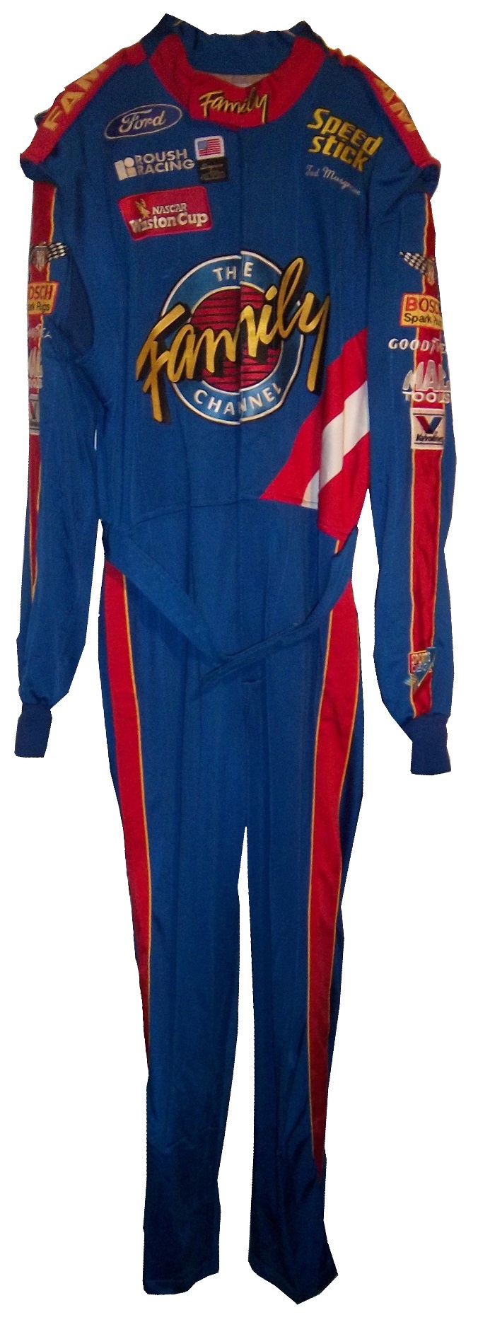
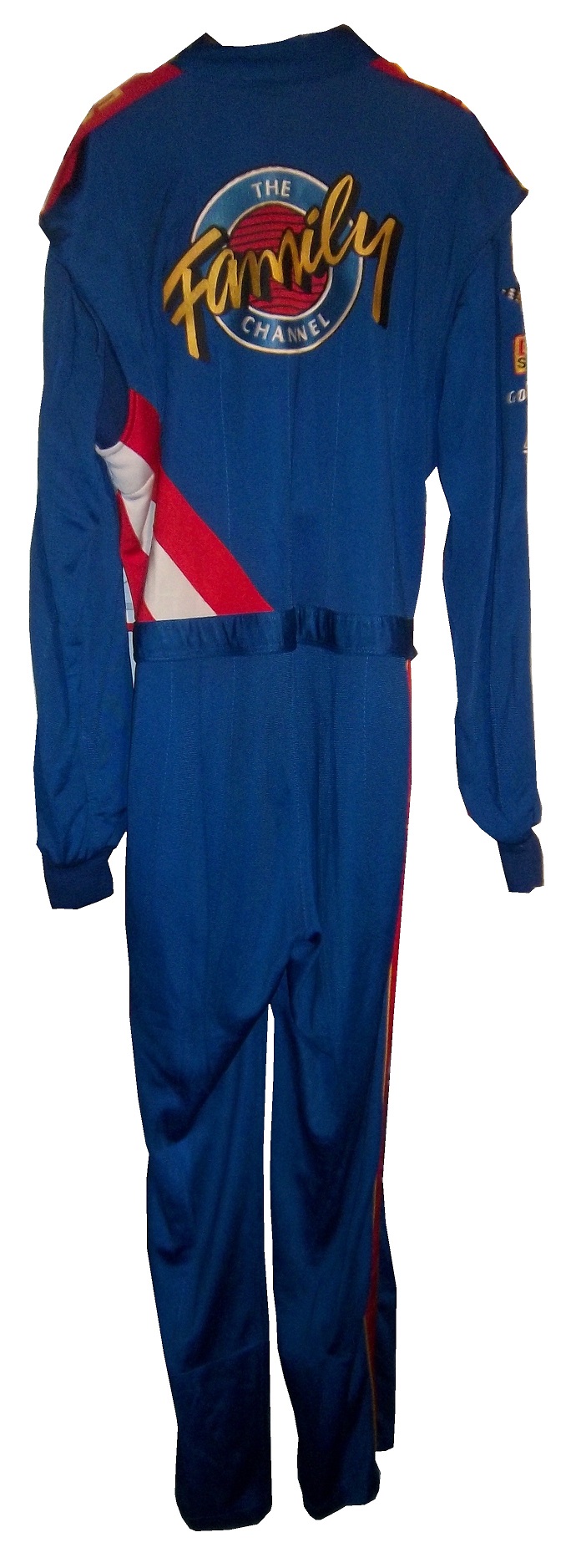

It has the familiar Family Channel motif. 
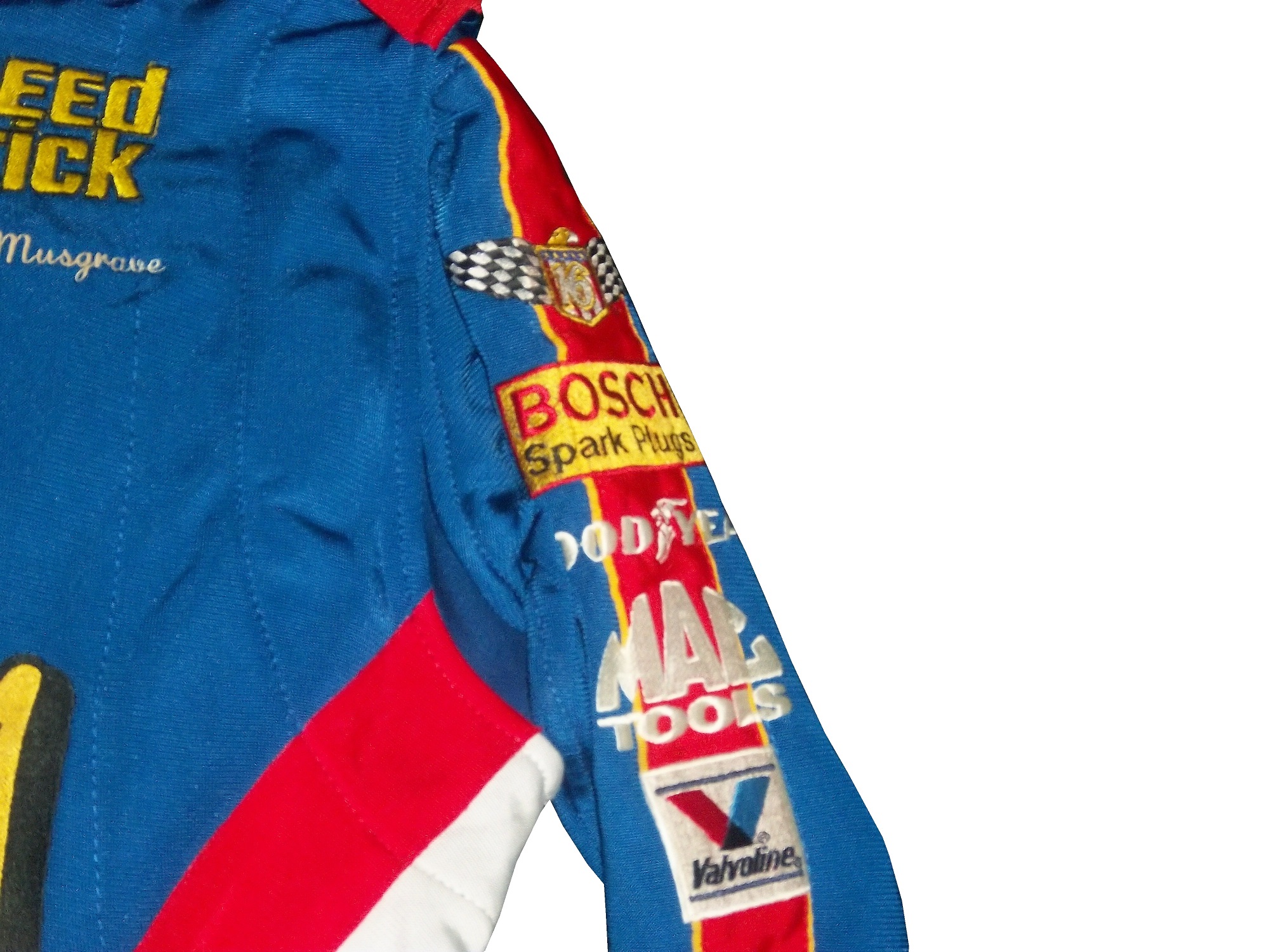
 It also has a ROUSH RACING and NASCAR WINSTON CUP SERIES logos.
  No television logos exist on the arms or legs.
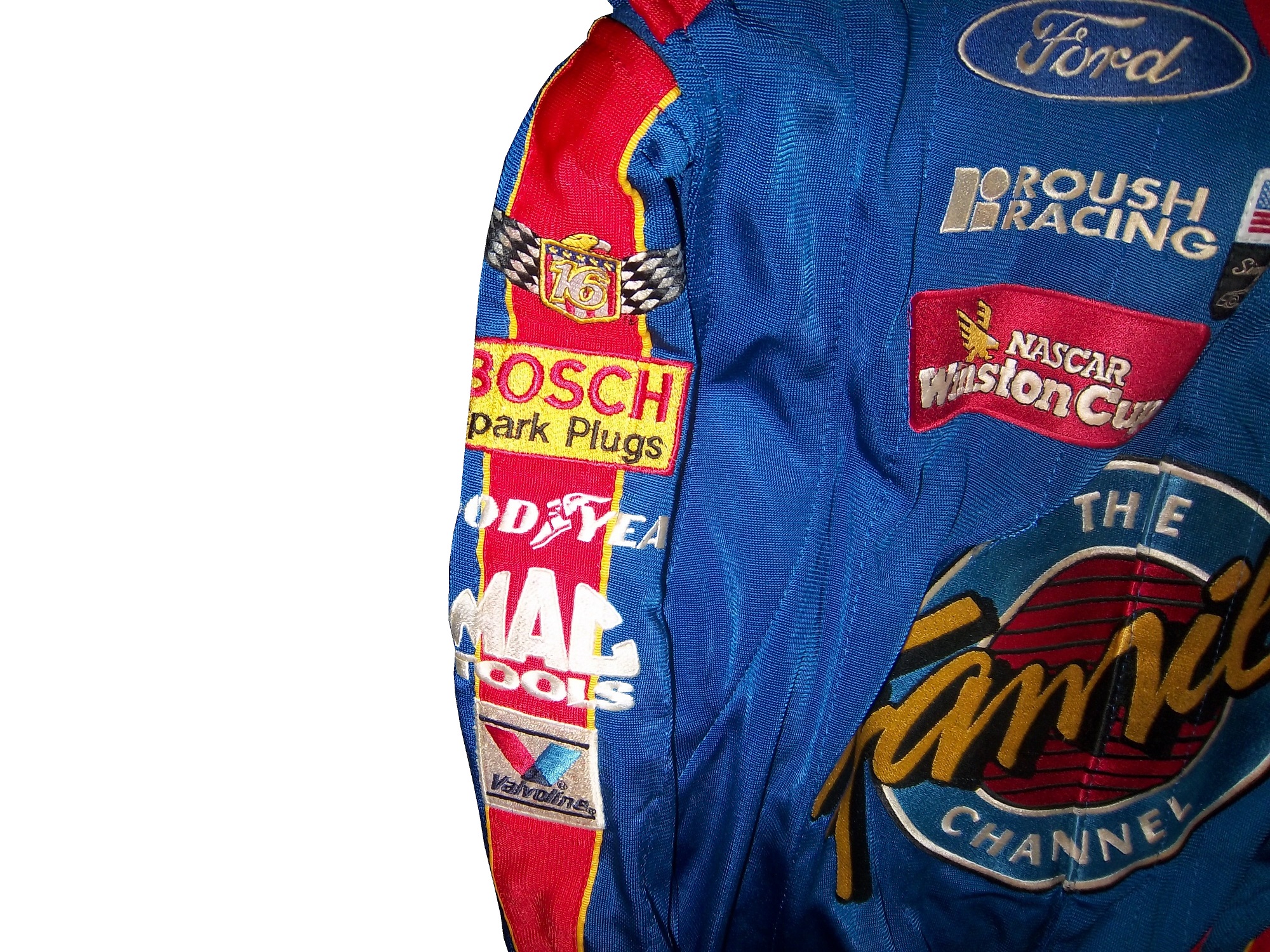

 And that classic name on the chest design that bit the dust shortly thereafter.
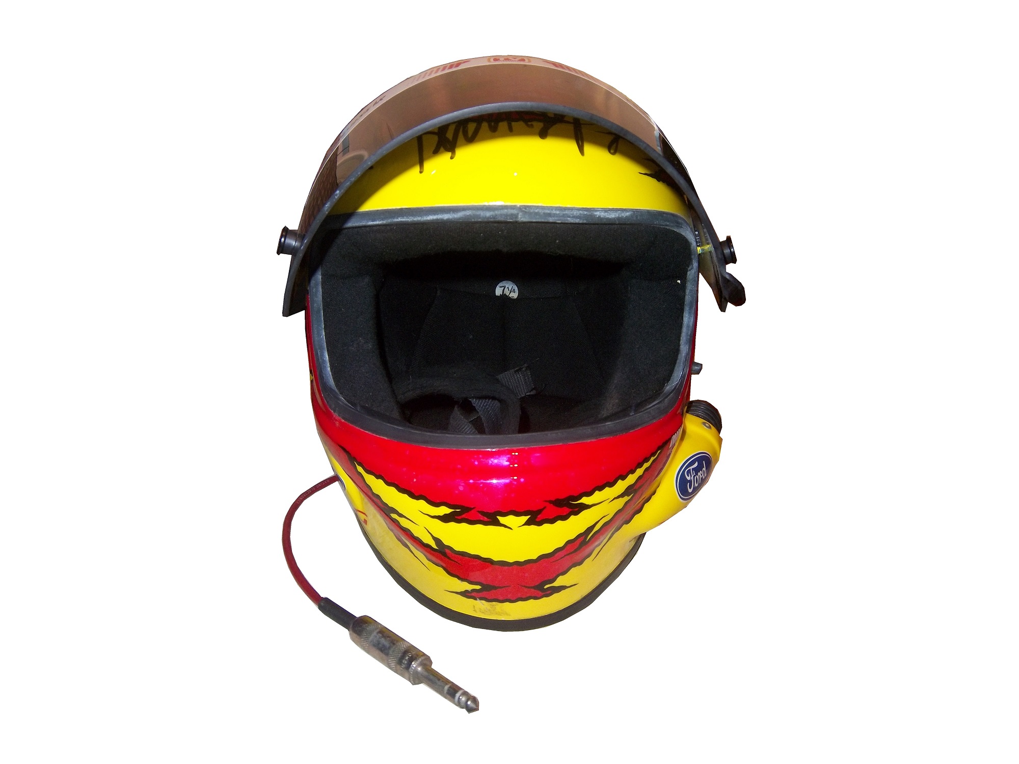
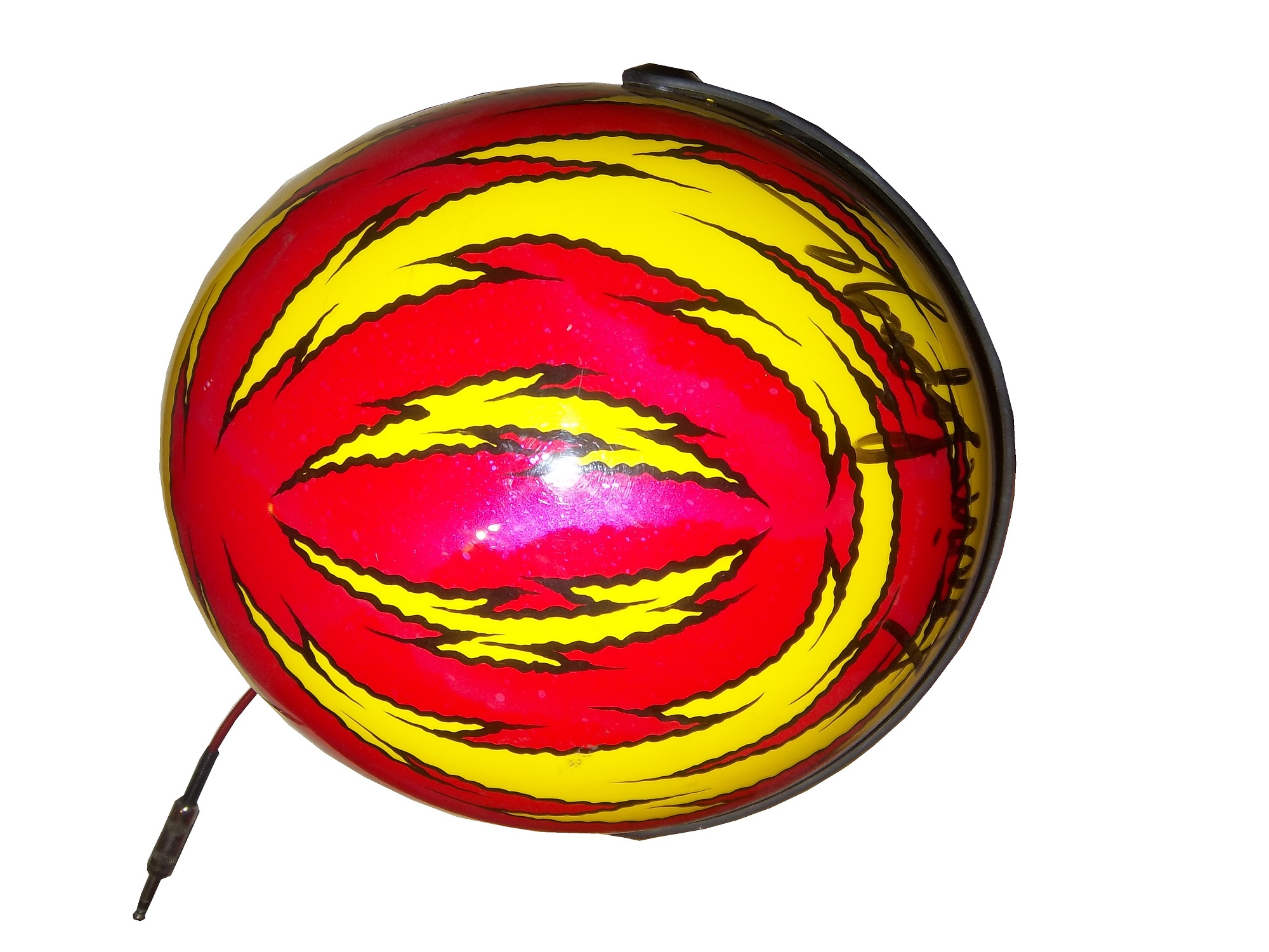
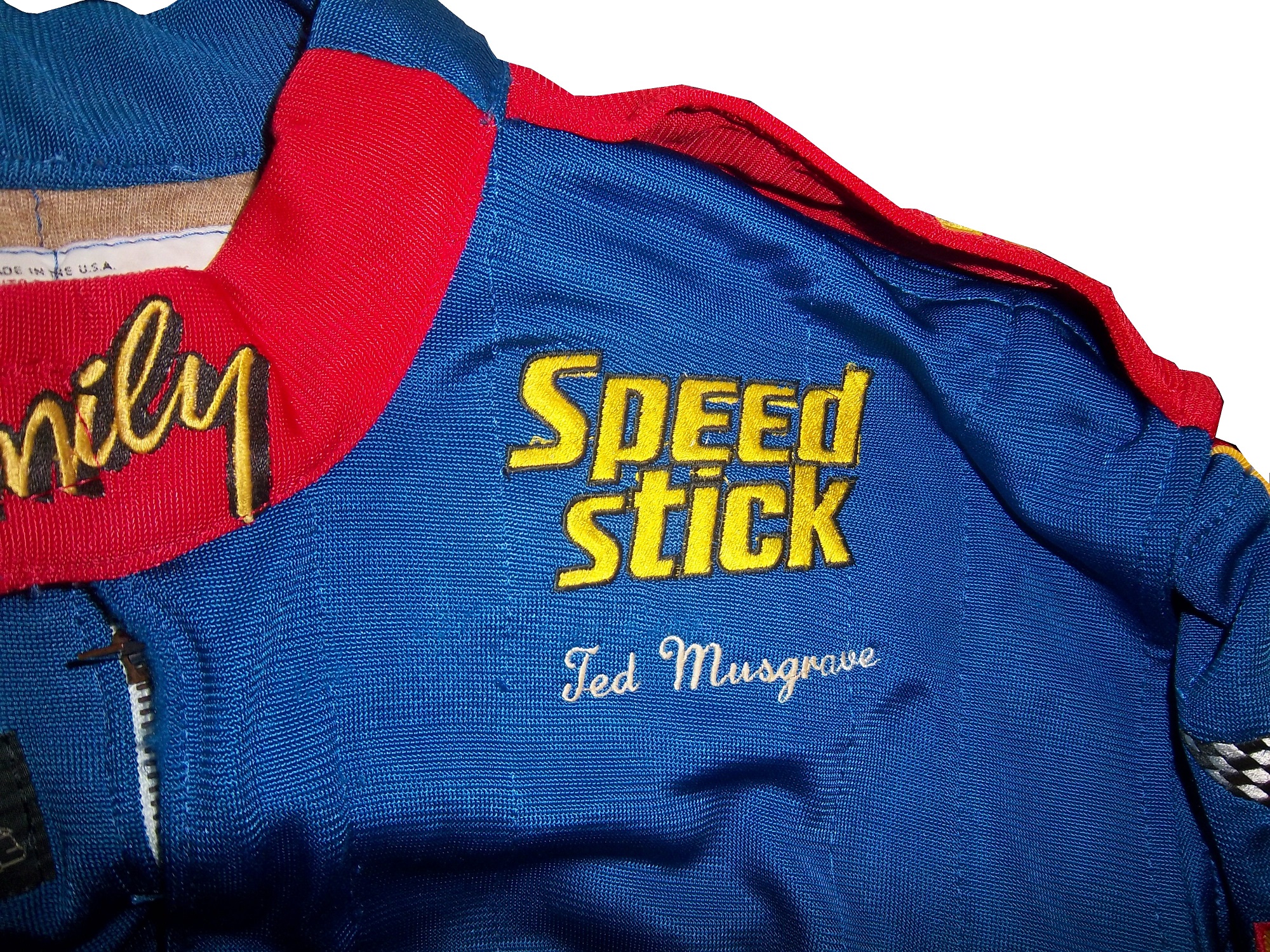 From 1996, I have this helmet.
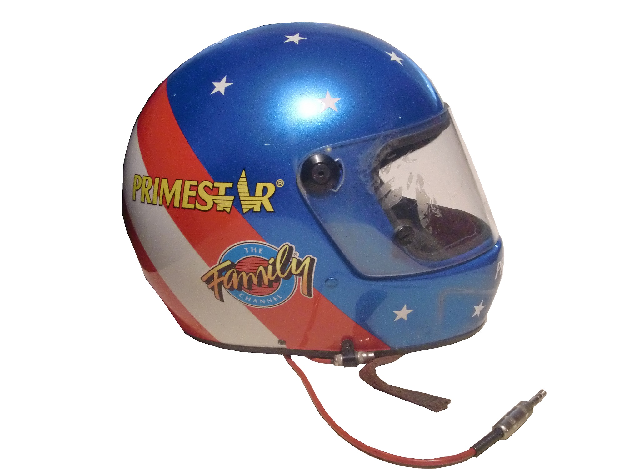
It is clearly from 1996 as Primestar joined the team in 1996, and the design was changed from stars and stripes to red and blue in 1996. 
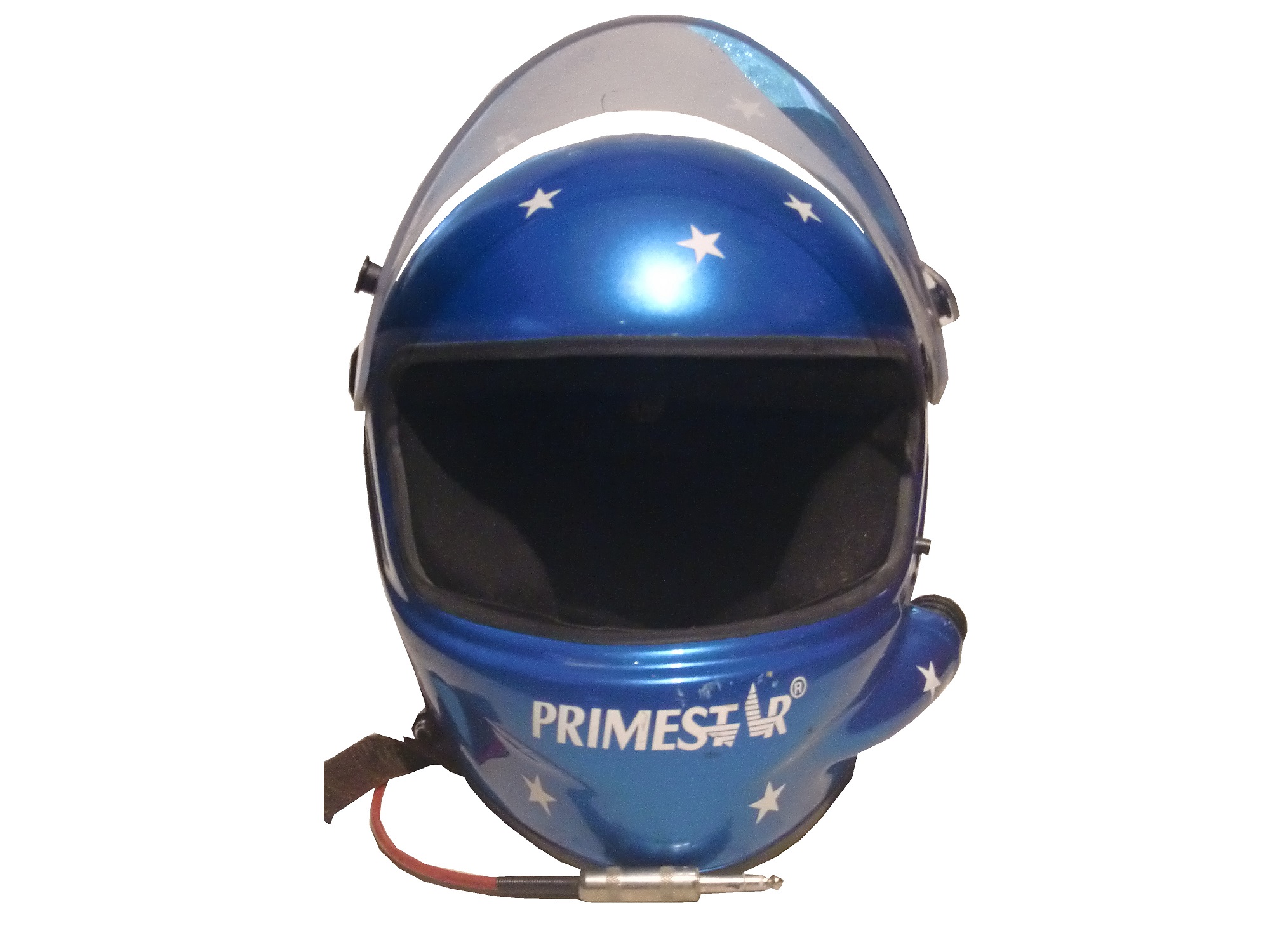

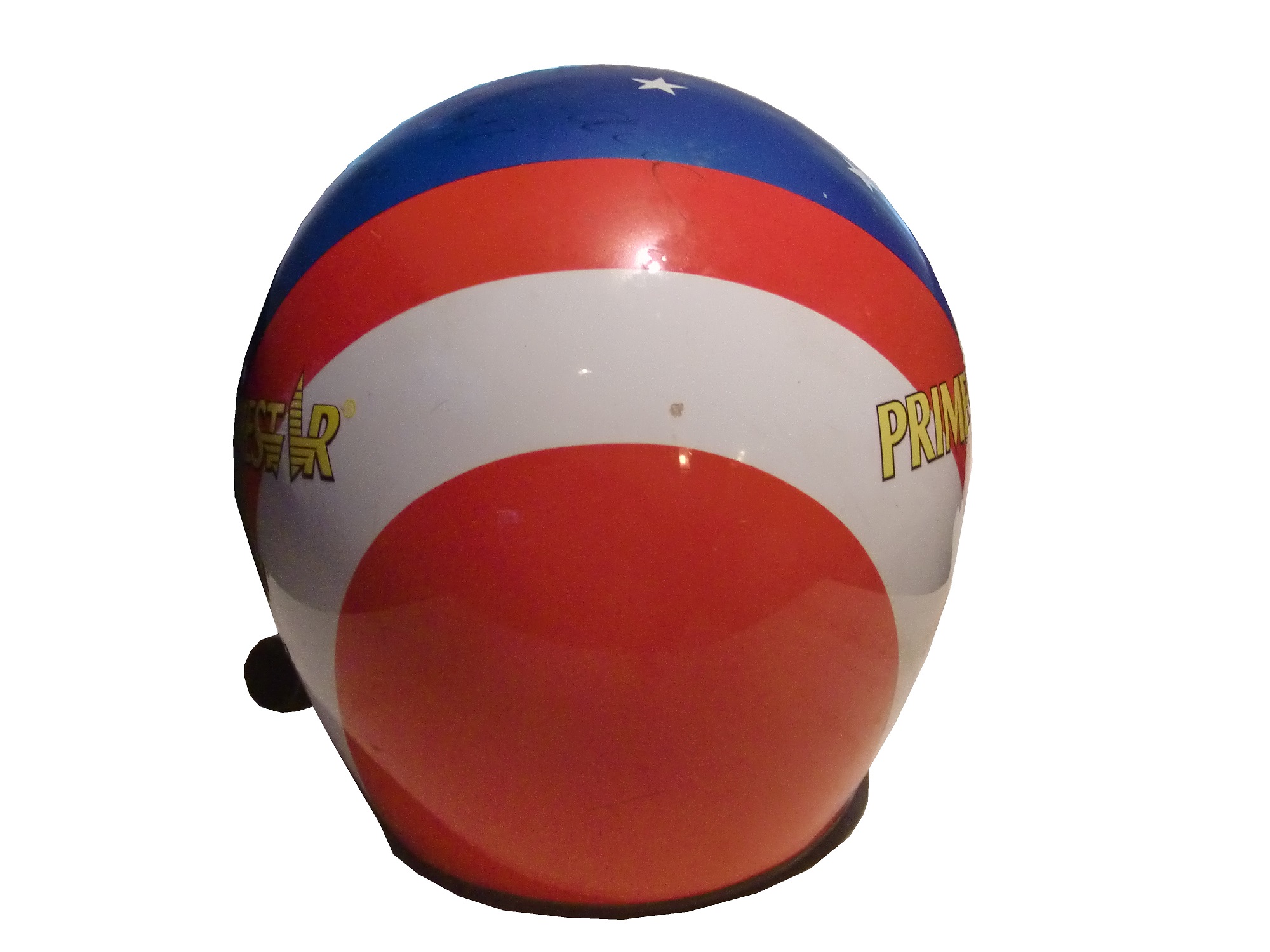
Ted has autographed the helmet, though the signature has faded. This helmet was also the inspiration for a mini helmet, also released in 1996, which is very accurate.
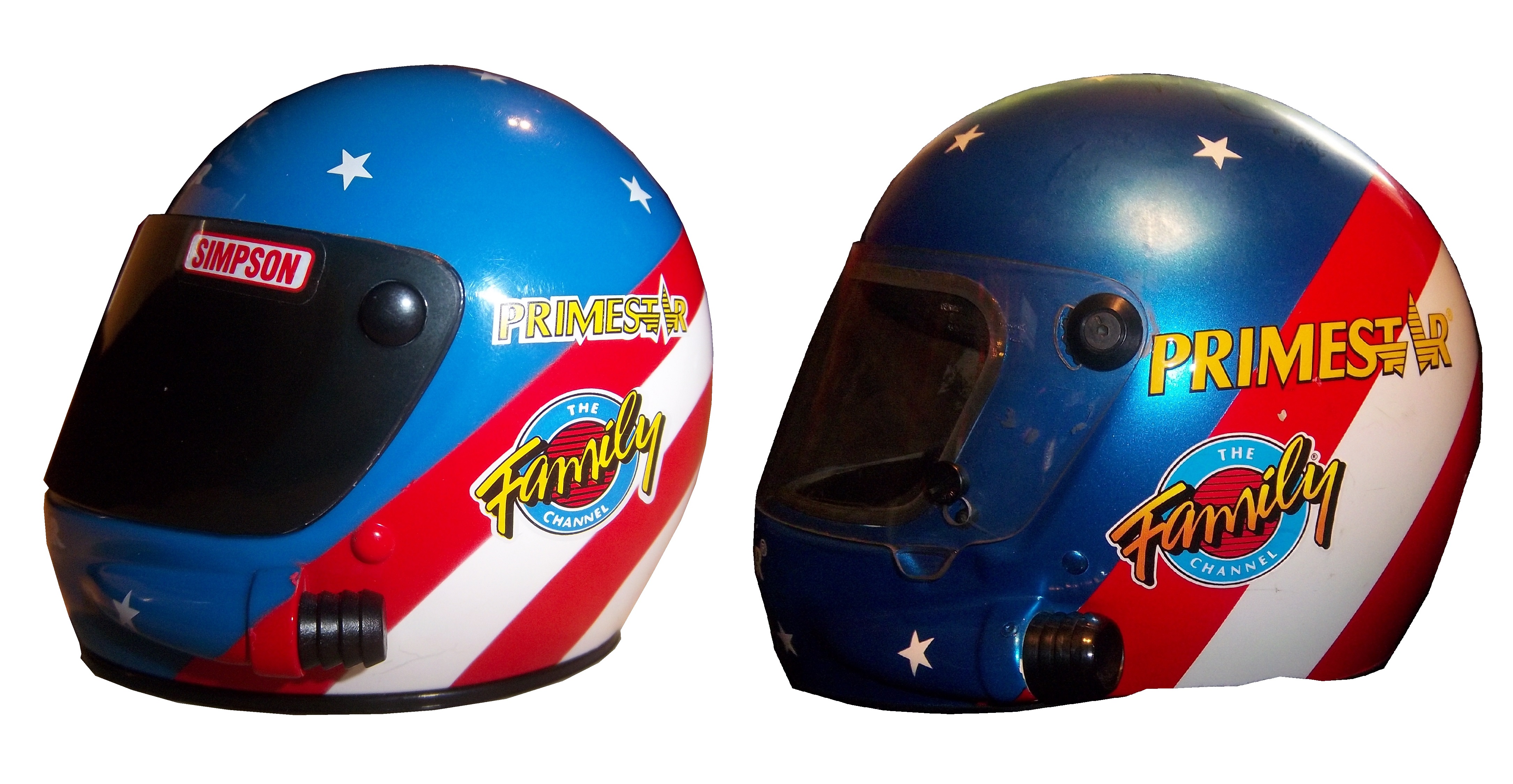

I also have this suit from 1998, which was designed after Musgrave was released from Roush Racing.

It has TV logos, though not in the “proper” configuration for NASCAR,

 a NASCAR 50th Anniversary logo,
 and Ted’s name on the belt.
 When it comes to die casts, I have 4, two from 1996,
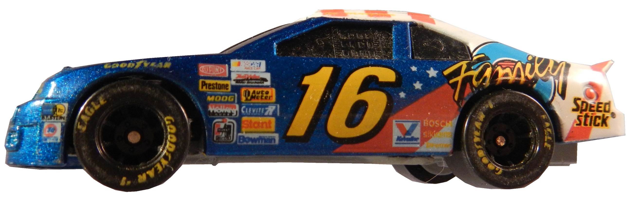
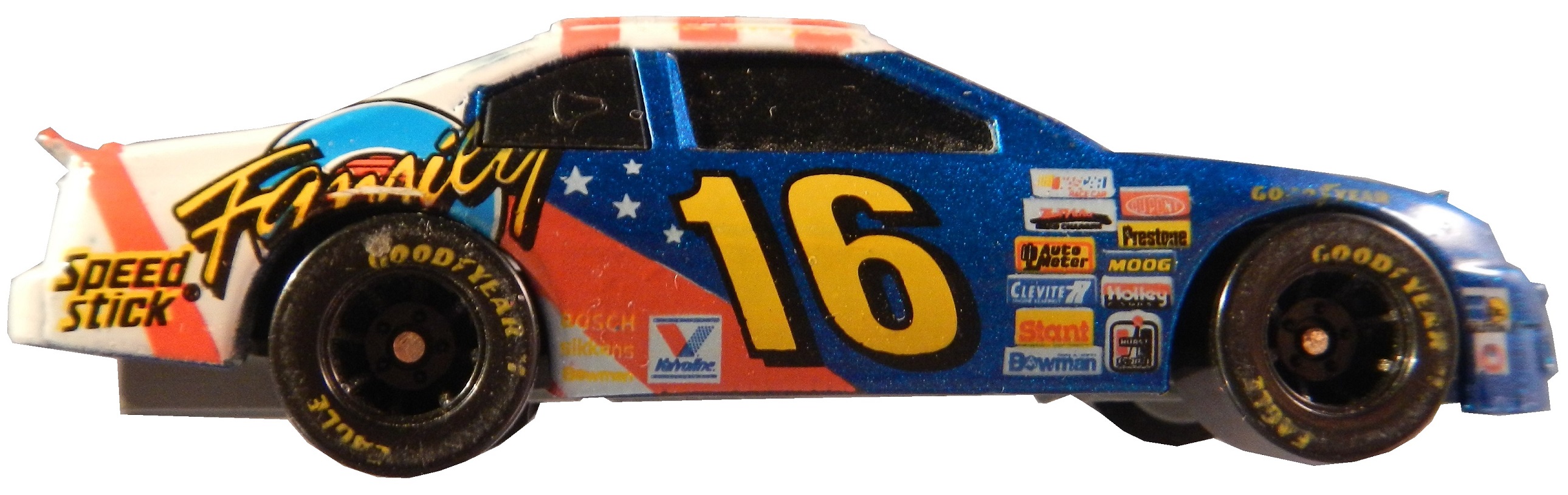


 as well as a 1996 hauler,
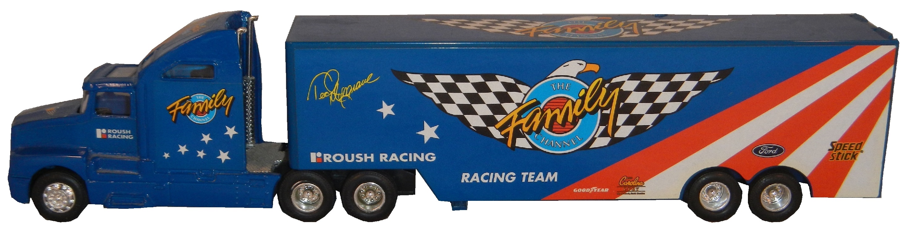

 and a die cast from 1997.

 This is a large piece of sheet metal from his days with Germain Racing, which Ted has autographed on the side.
My last two pieces of Ted Musgrave memorabilia are two of the oldest and most cherished pieces in my collection. These two autographed hero cars were given to me from a family friend. She had encountered Ted Musgrave at a party and happened to get these from him directly. I love and treasure these two cards and never get tired of looking at them.
Next week, we will look at his most well-known sponsor, The Family Channel, but now on to…
Paint Scheme Reviews!
Ryan Newman #31 Kwikset Chevy SS Looks exactly like Kurt Busch’s scheme, and it earns the same A+ grade
Landon Cassill #40 CRC Brakleen Chevy SS I like the color scheme, and the design is good. My only complaint is that it doesn’t clarify that CRC Brakleen is a brake fluid. Still it earns an A
Brian Vickers #55 Treatmyclot.com Toyota Camry A good scheme, and the 55 lettering looks really good here, and the gold is a nice touch. The treatmyclot.com logo works better than the Aarons logo, A+
Introduction to Sports Memorabilia-Derrike Cope 1998 Race-Worn Helmet
For the 11th Season Premier of Introduction to Sports Memorabilia, we examine a Derrike Cope 1998 Gumout Helmet, which he has autographed twice.. From here on out, I will upload new videos on Mondays.
