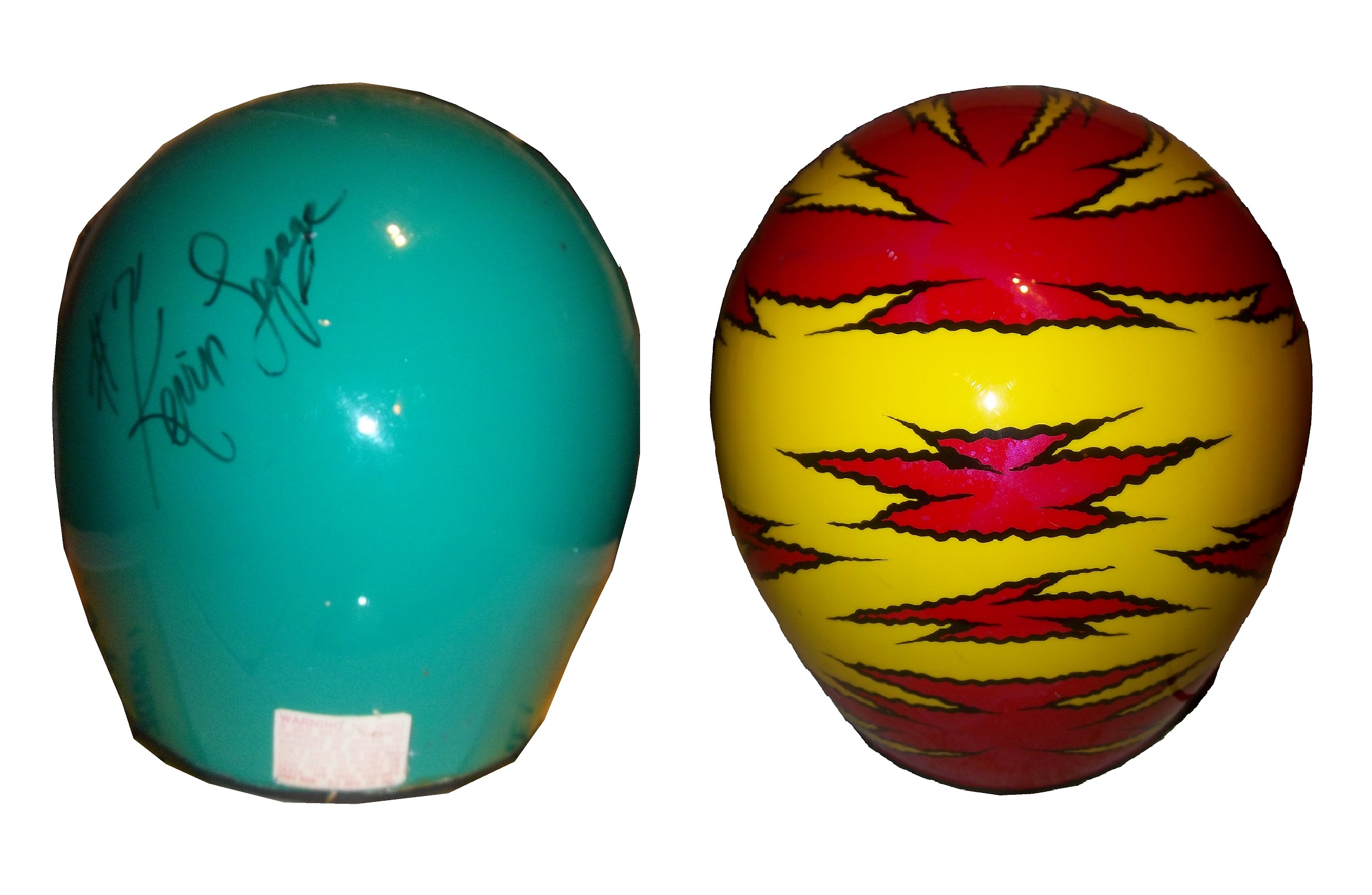
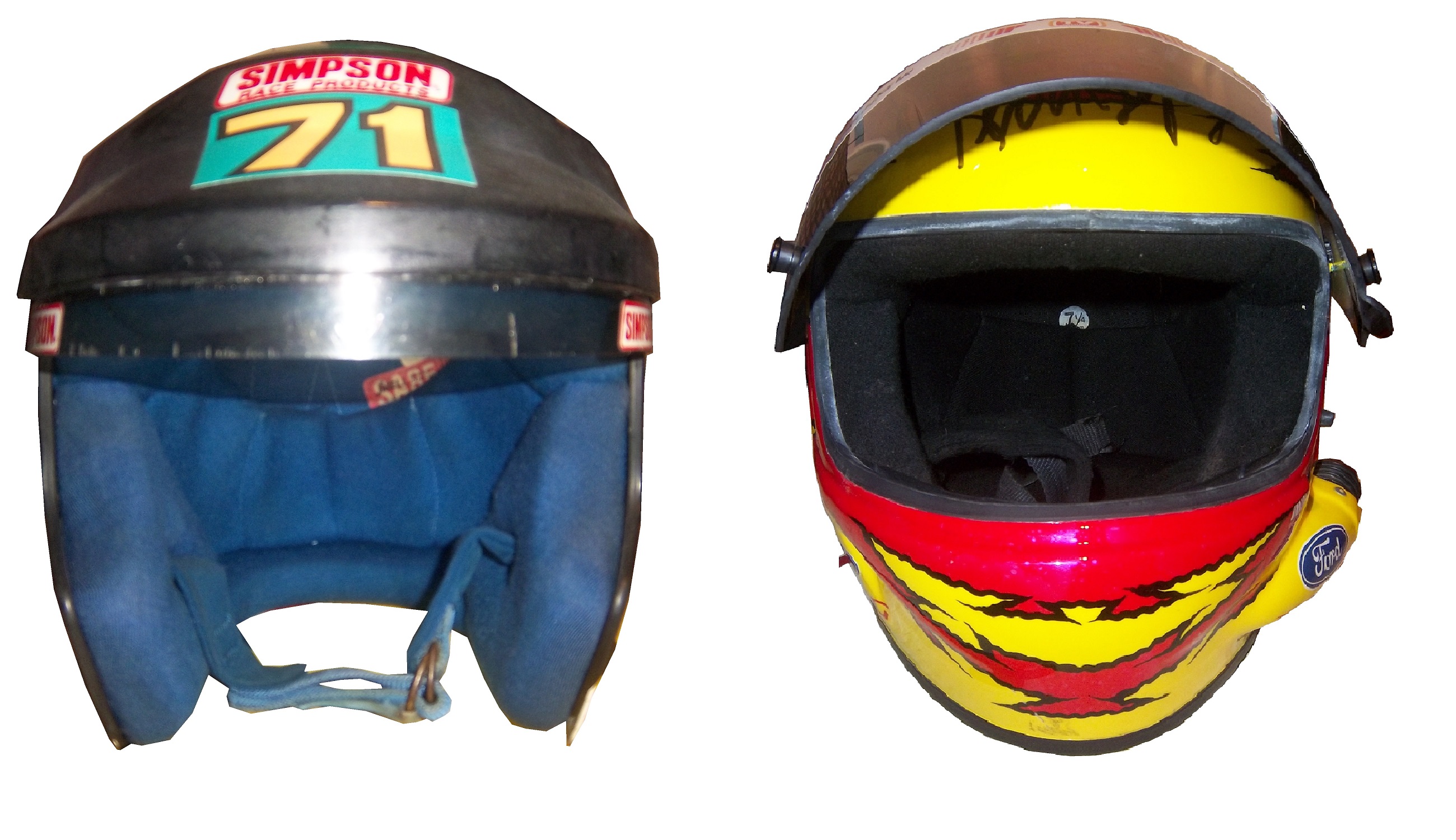
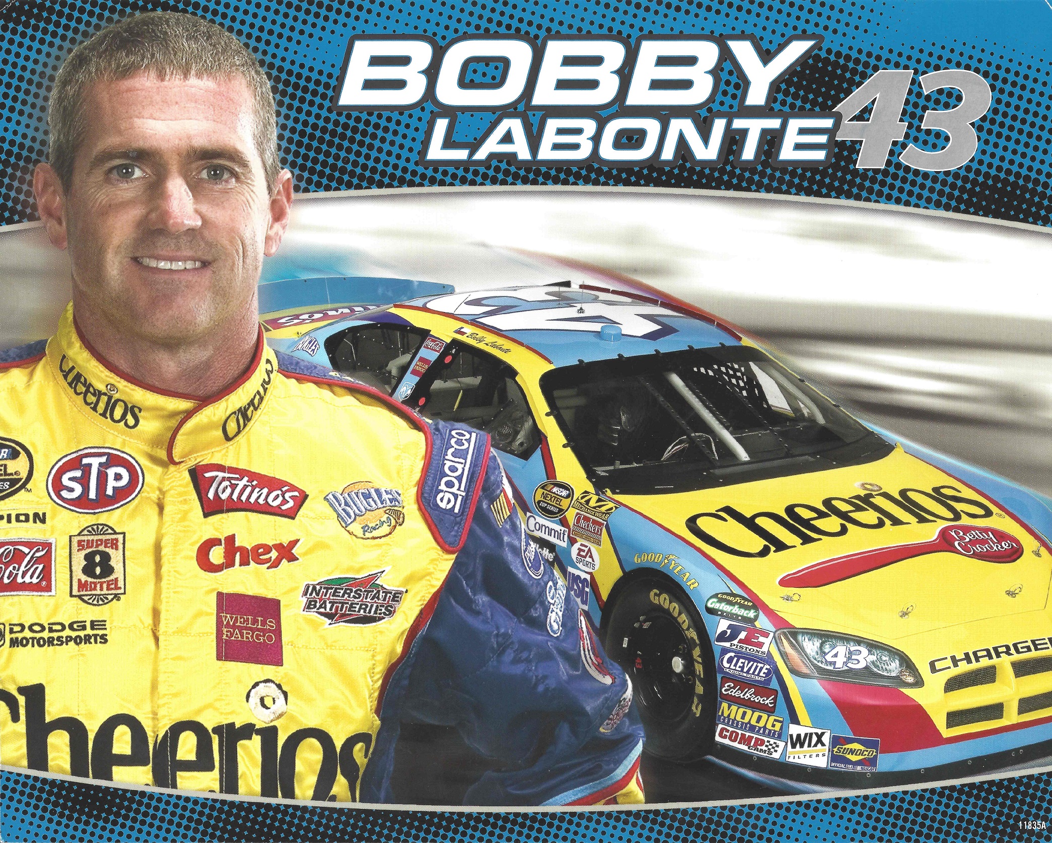
By David G. Firestone
In my last column, I mentioned that Starting Lineup and Winner’s Circle figures made in the 1980’s and 1990’s censored alcohol and tobacco logos. But when it comes to these figures, how do the uniforms the figures portray stack up to their real-life counterparts?
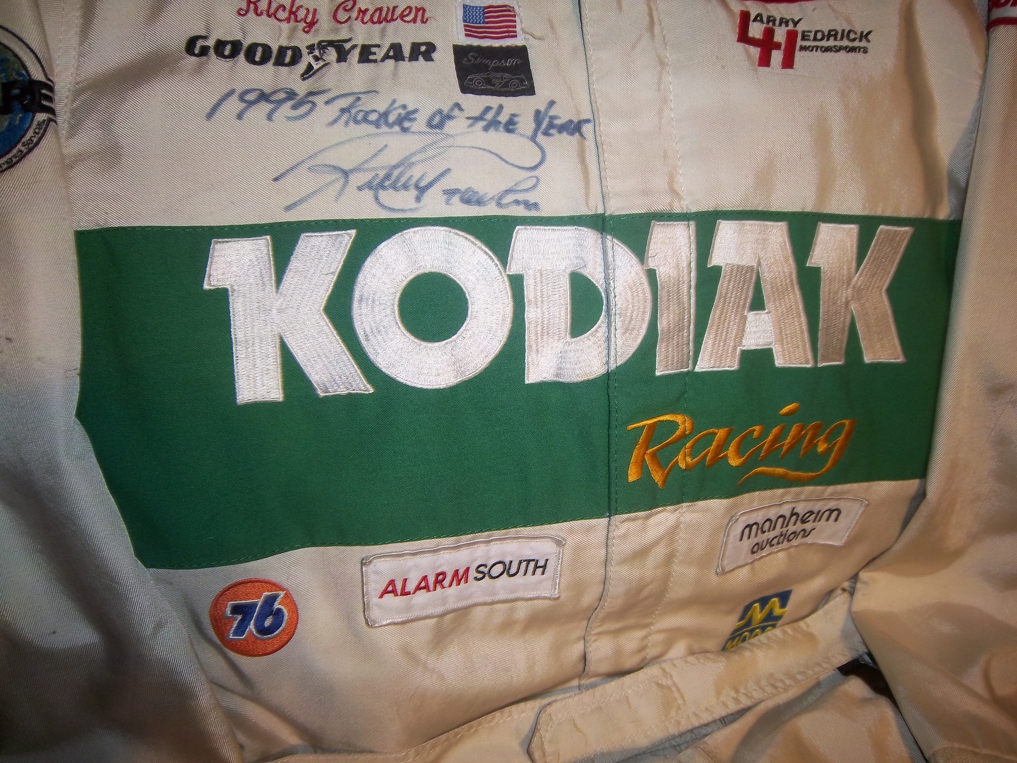
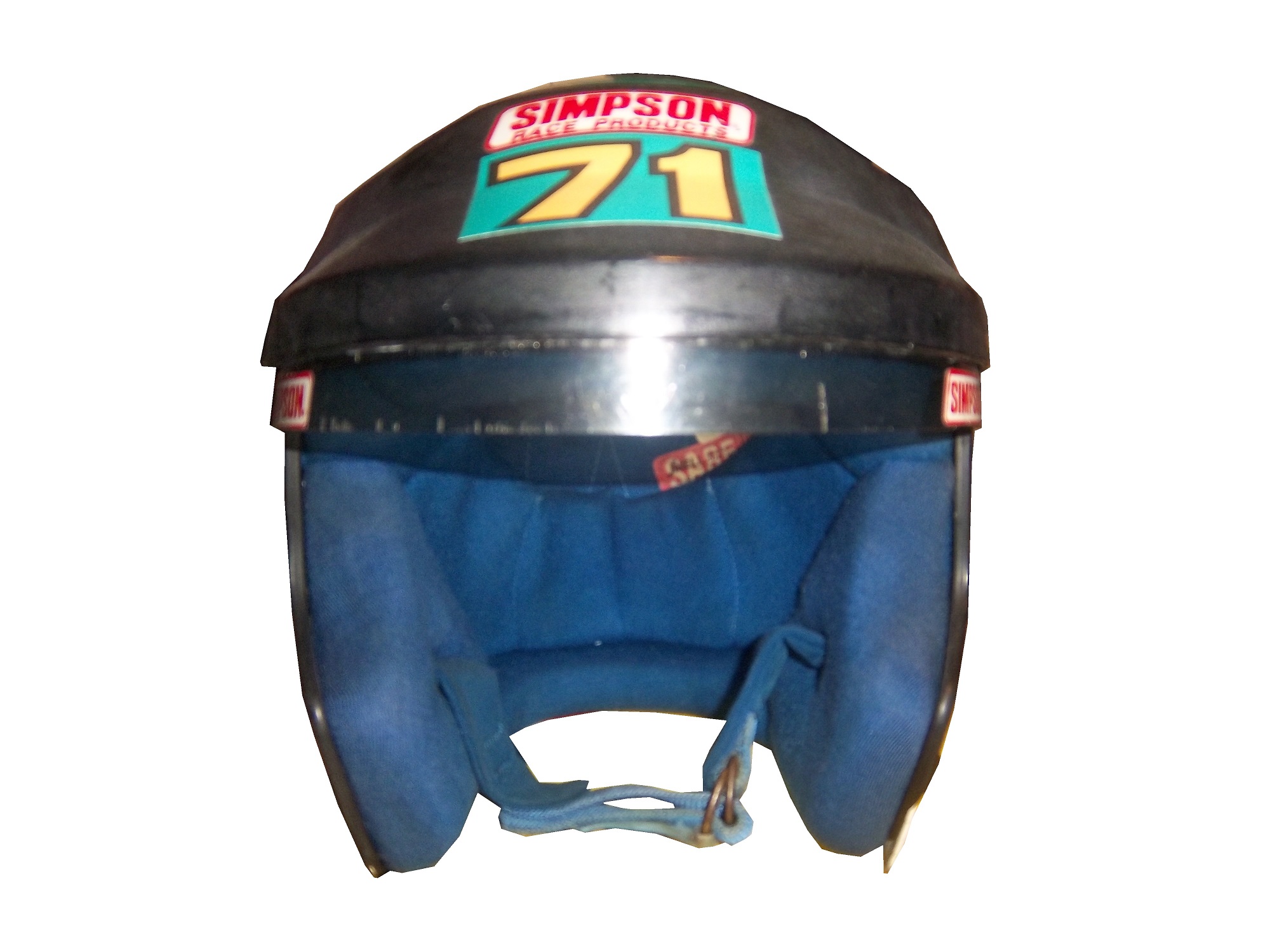
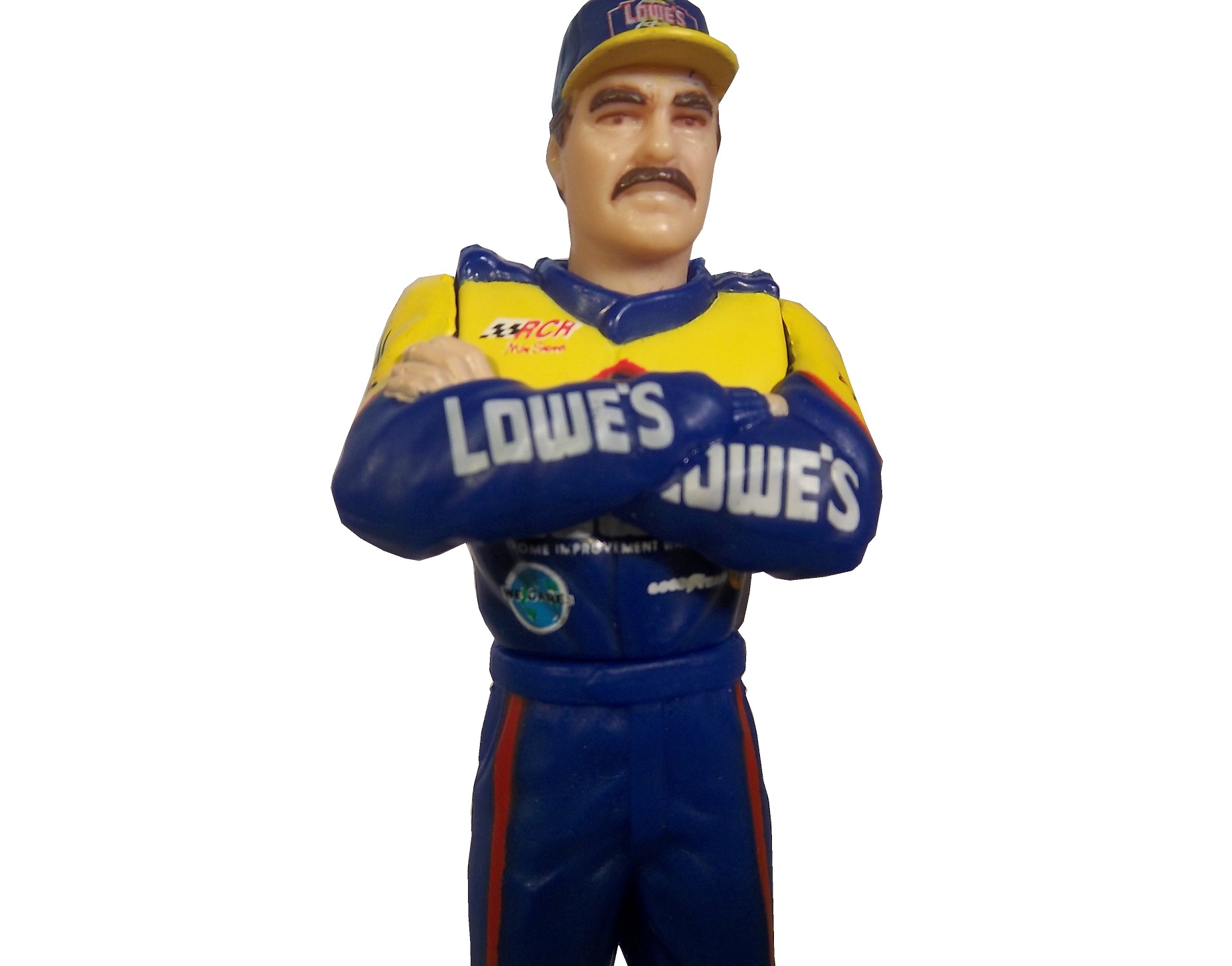
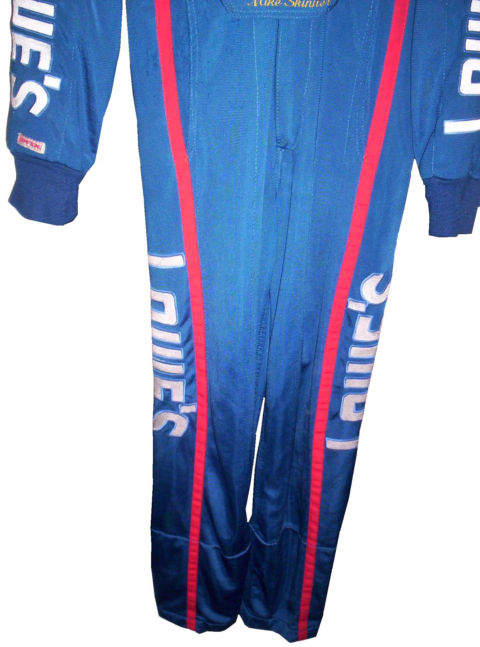
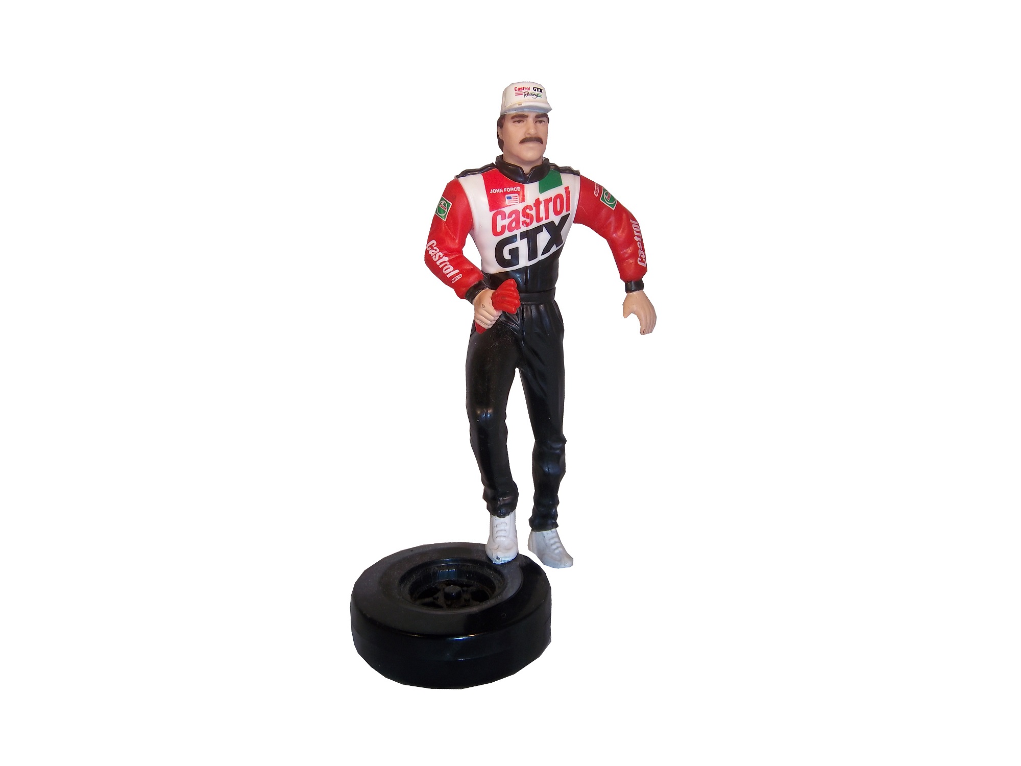
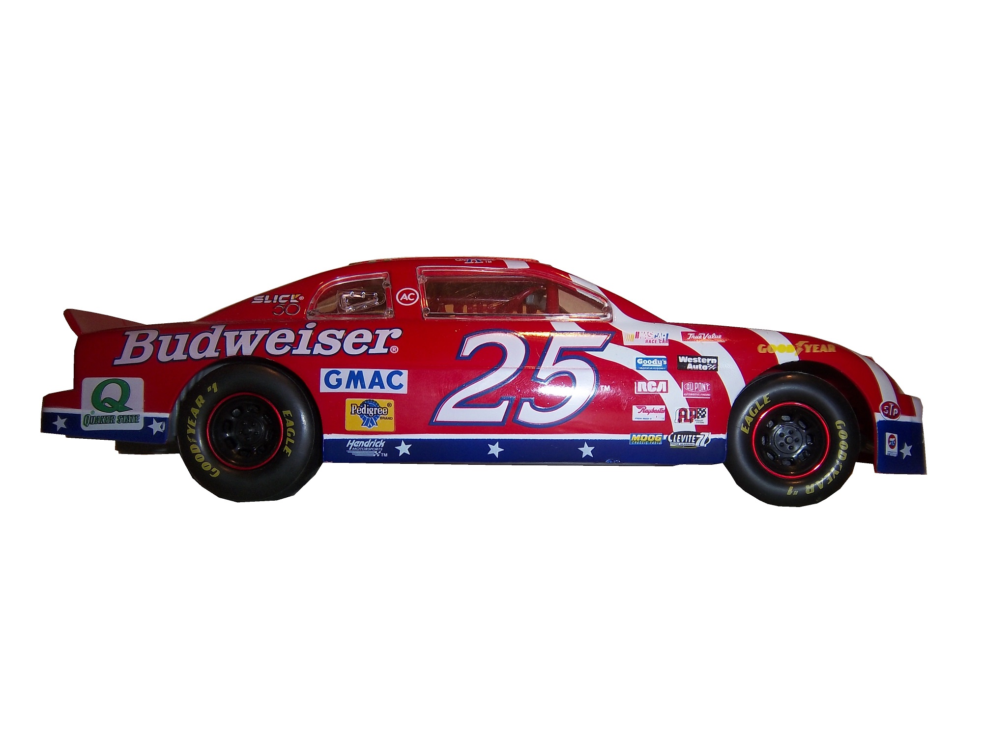
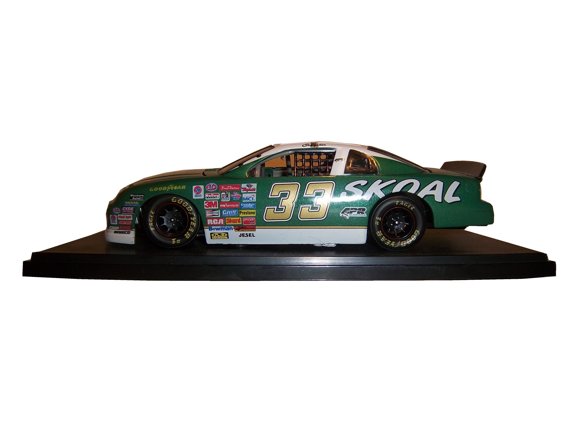
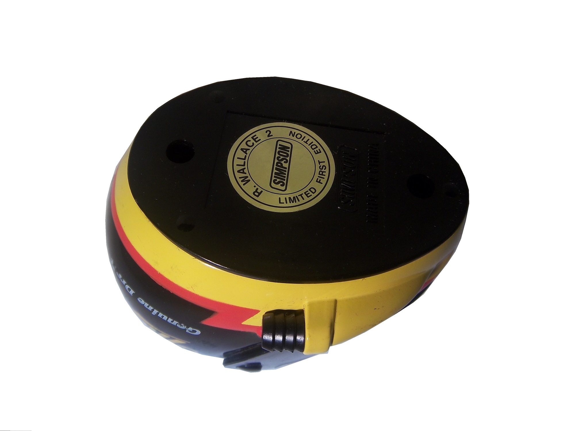
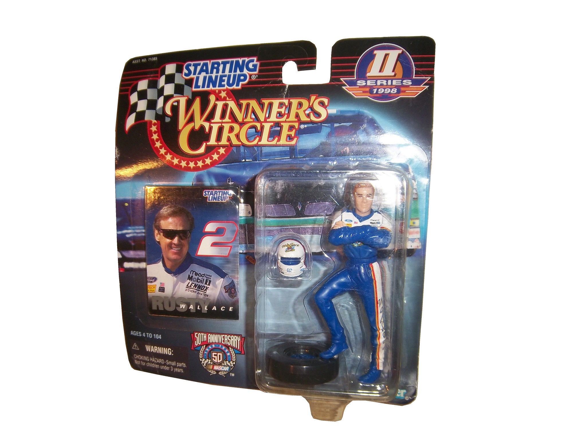
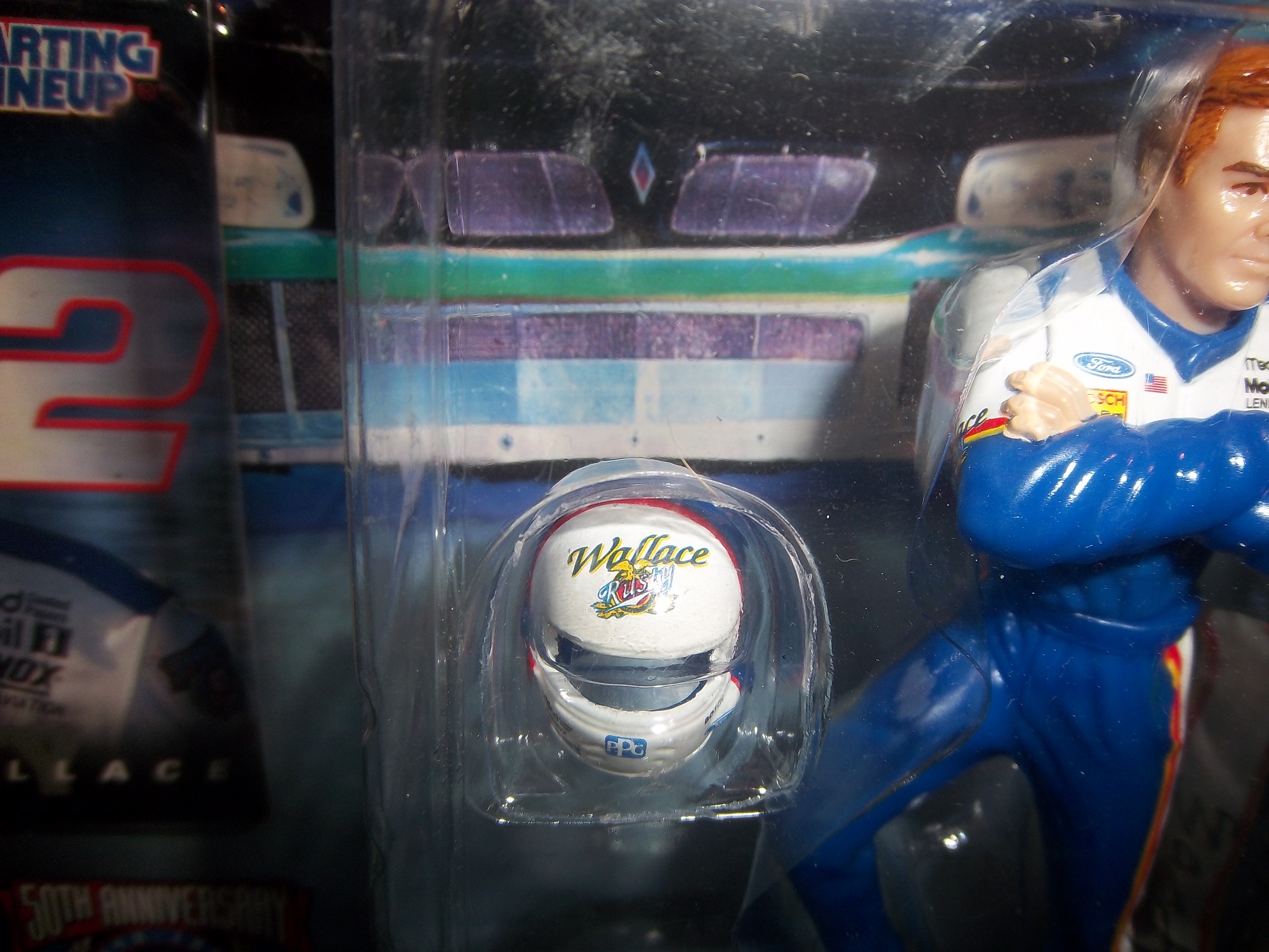
First, lets discuss the figures themselves. Created by Kenner starting in 1988, Starting Lineup was a line of action figures based on baseball starts. As time went on, the line expanded from just baseball to football, basketball, hockey, and racing. The figures are 4 inches tall. For racing, Starting Lineup figures were packaged under the Winner’s Circle brand. The drivers features were championship-level or rookie of the year drivers. One of those was Mike Skinner released in 1998, which is in perfect condition, though has been removed from the package.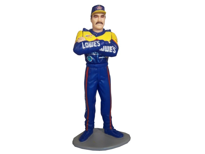

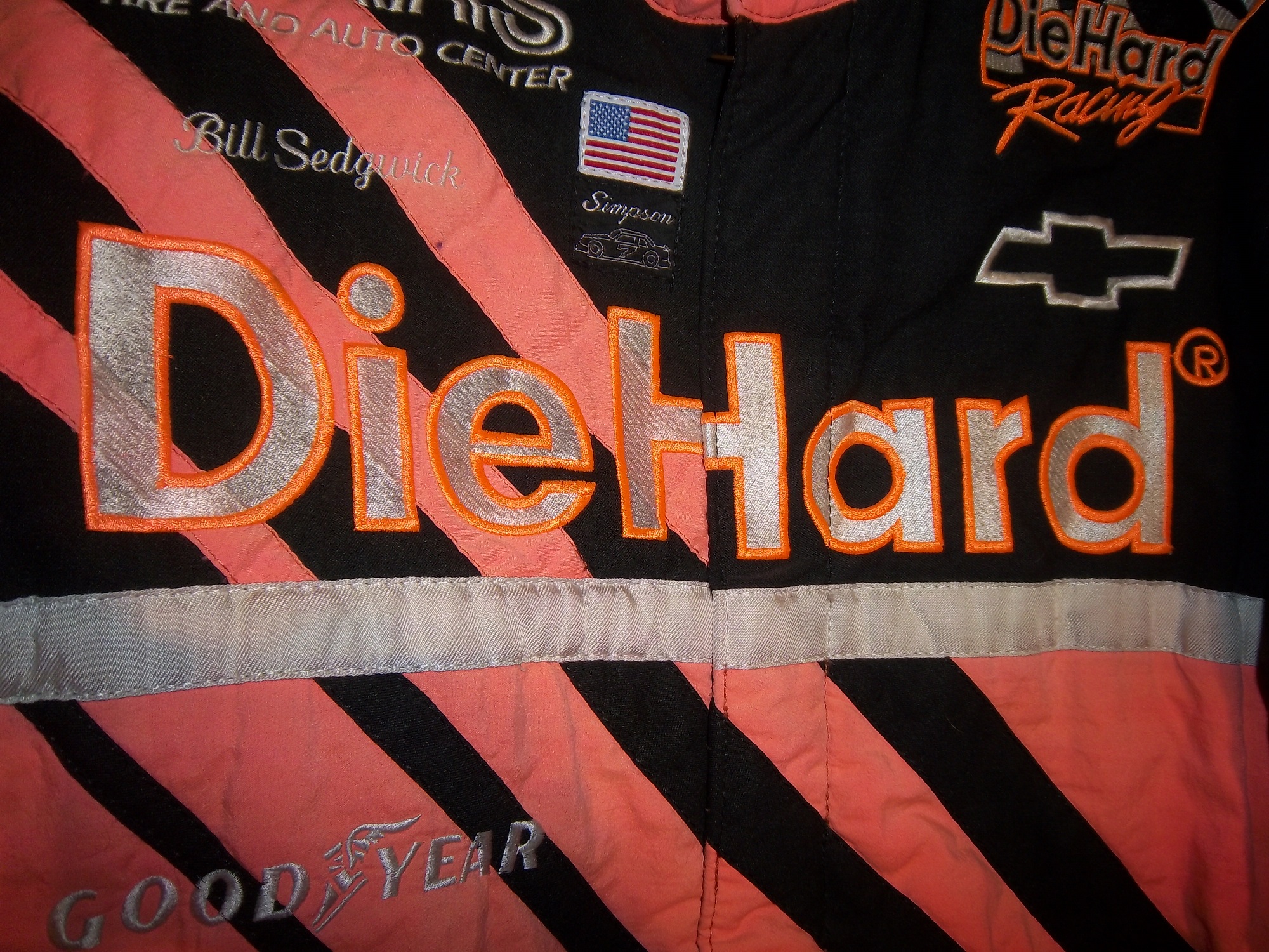
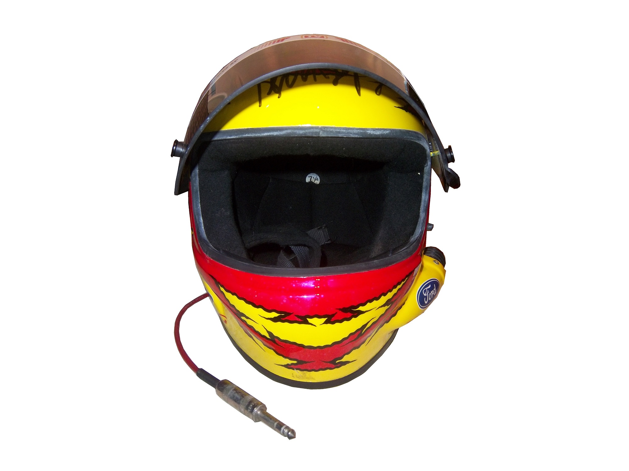
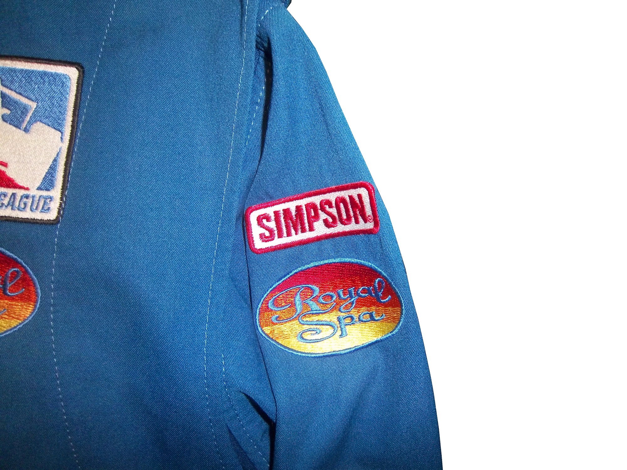
The driver suit it is based on is Mike Skinner’s 1997 race-used driver suit from his rookie of the year campaign. It was purchased from the Jeff Hamilton collection, and came with a letter stating as such. It shows nice use, and Jeff has signed the right chest. It also features something I have seen on a few other suits from that era, but from nowhere else, the Future Suit inscription. I have been waiting a while to discuss this. Custom suits from 1997 have something written on the back of the neck. On the Skinner suit it reads “Future-Suit-2-2252.
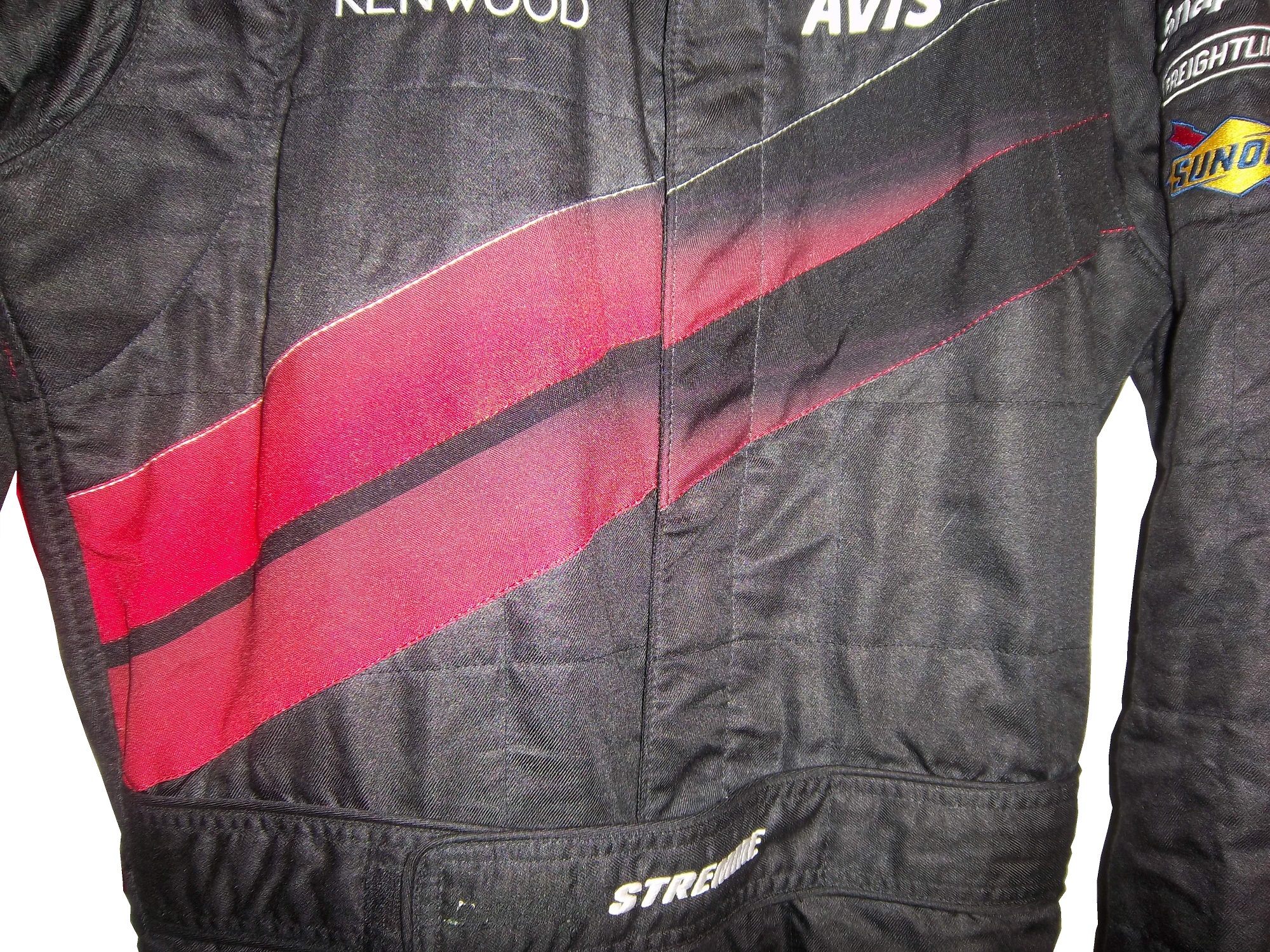
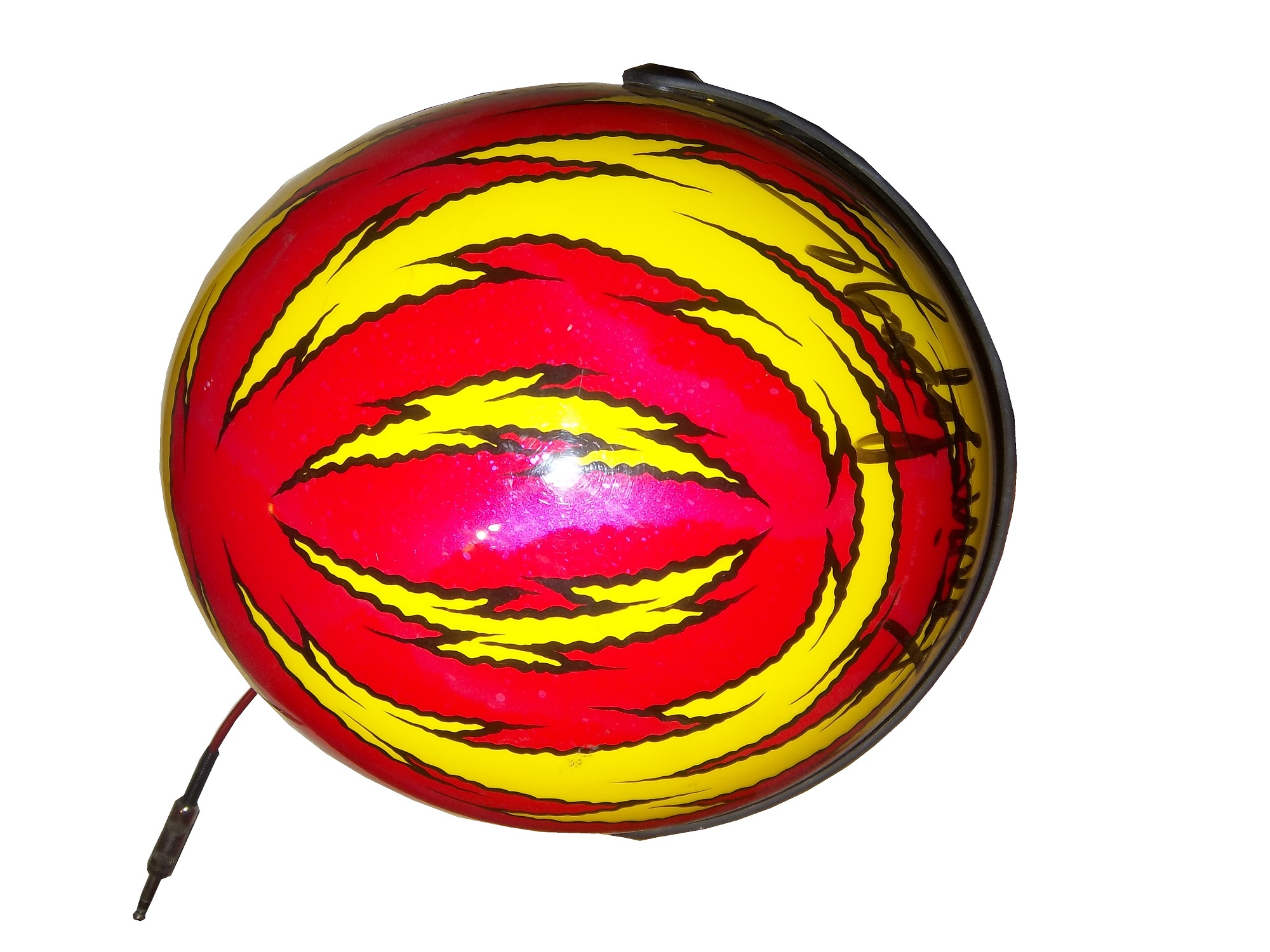
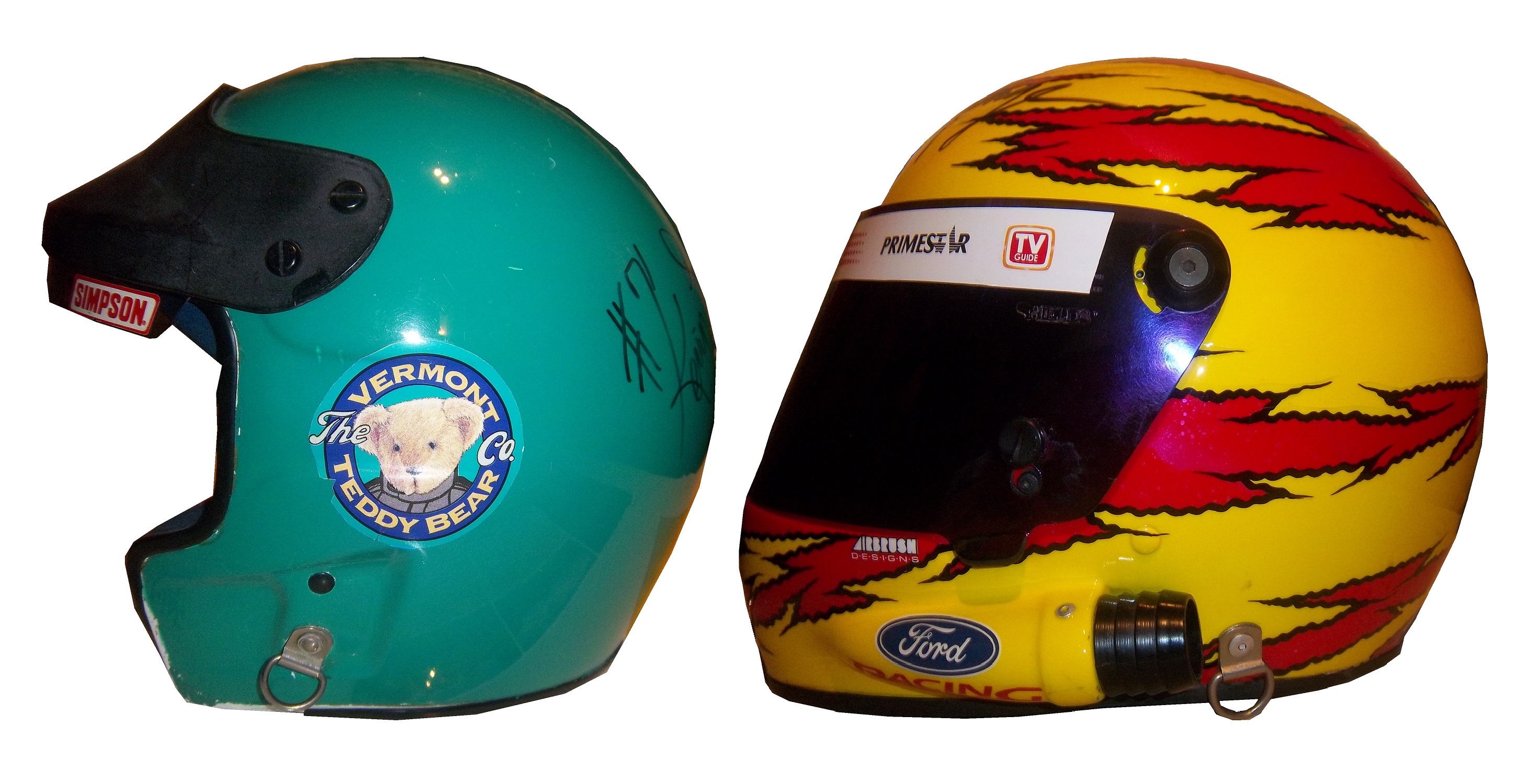
This Stevie Reeves suit from 1997 has a similar inscription
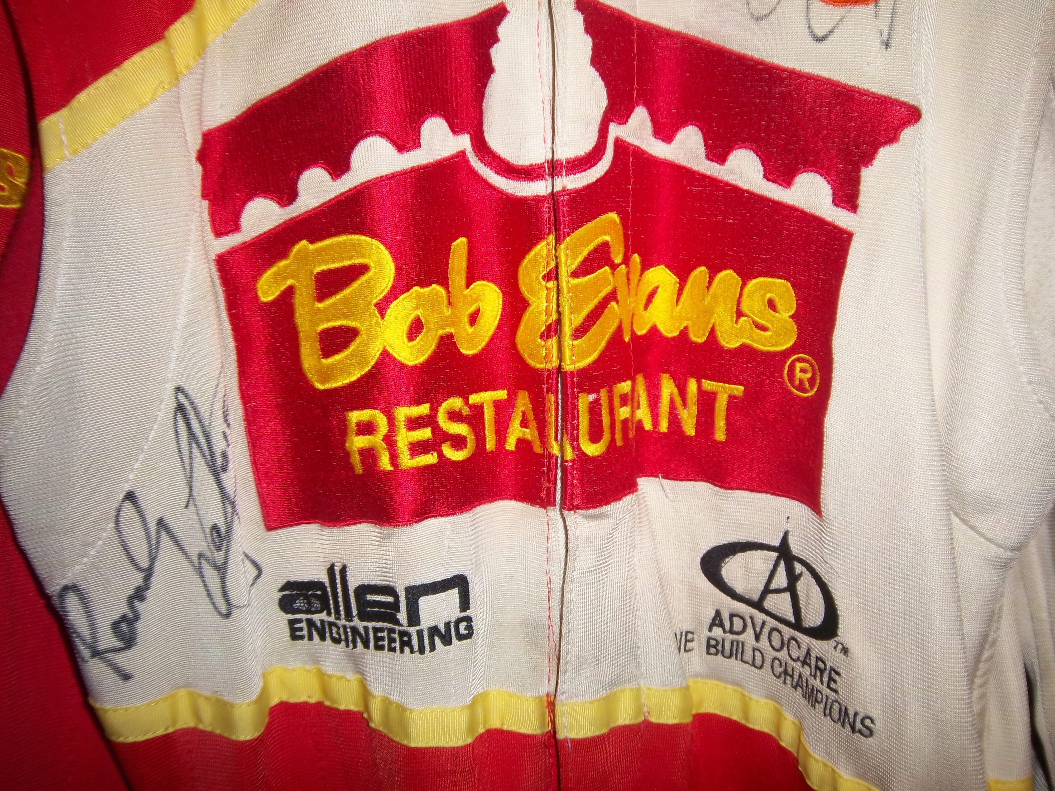
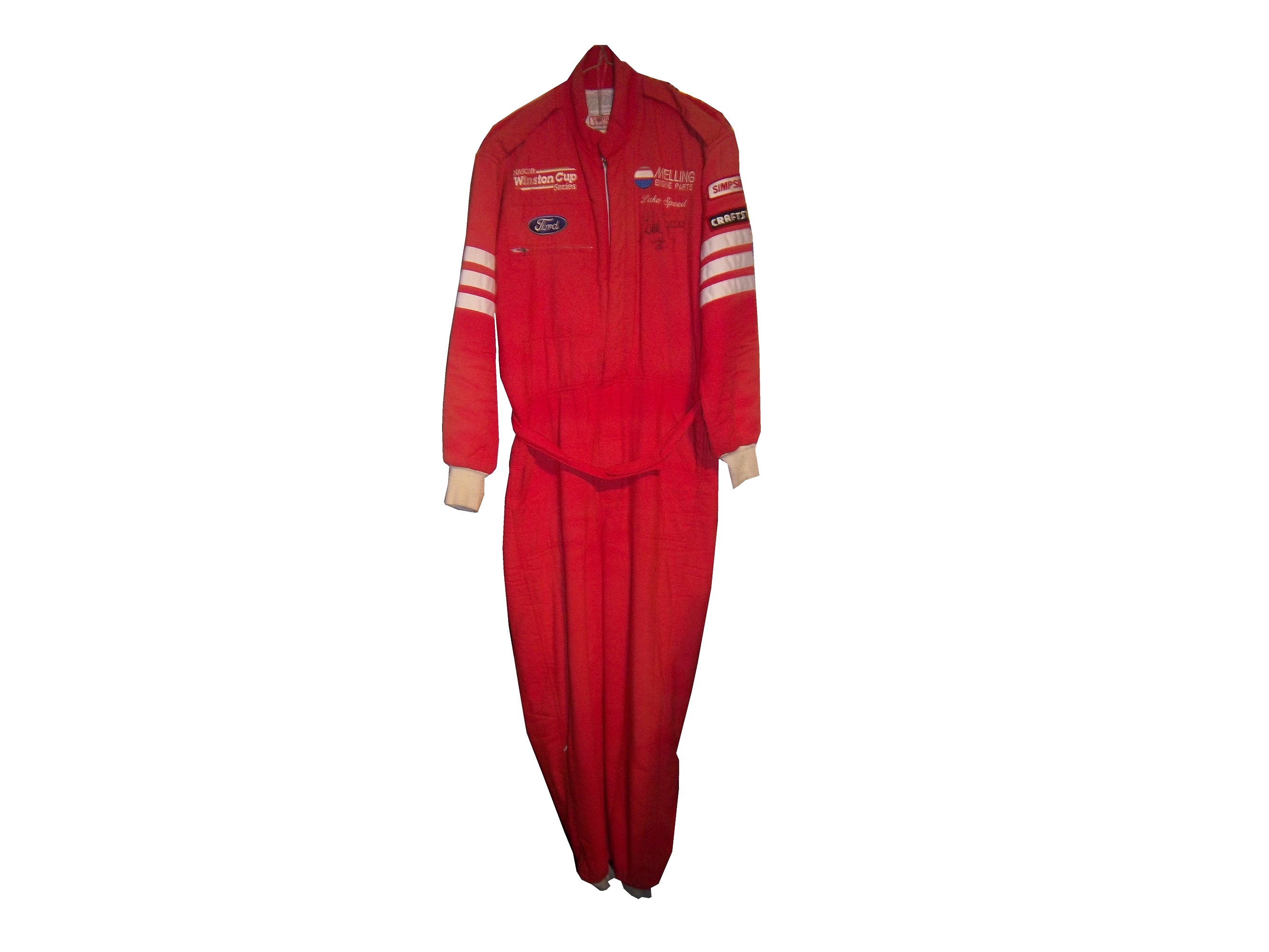
This Lake Speed suit from 1997 was purchased off the rack, and does not bear the inscription,
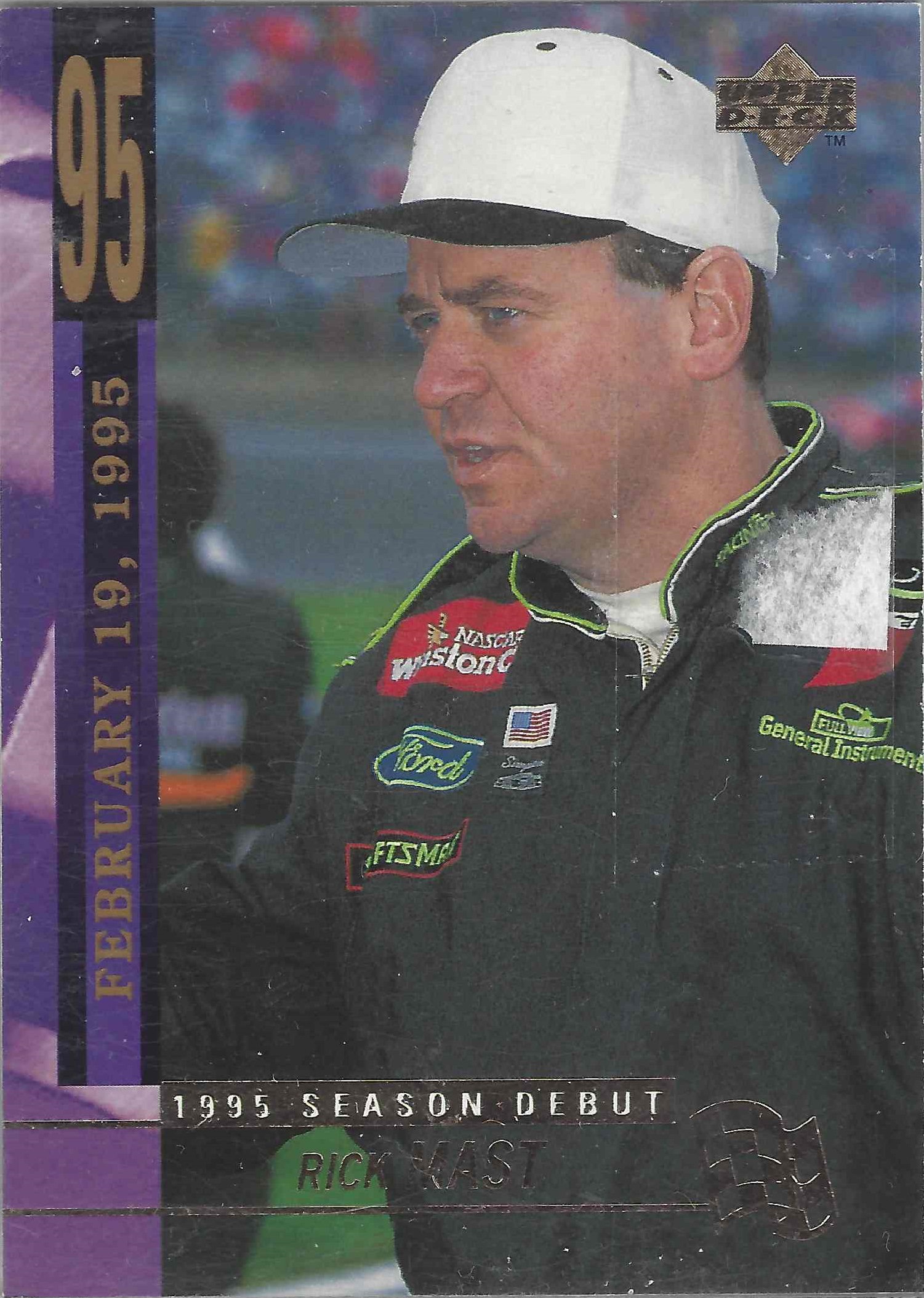
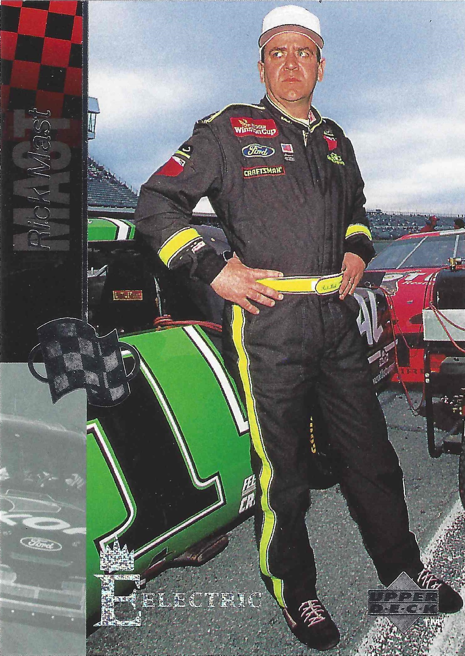
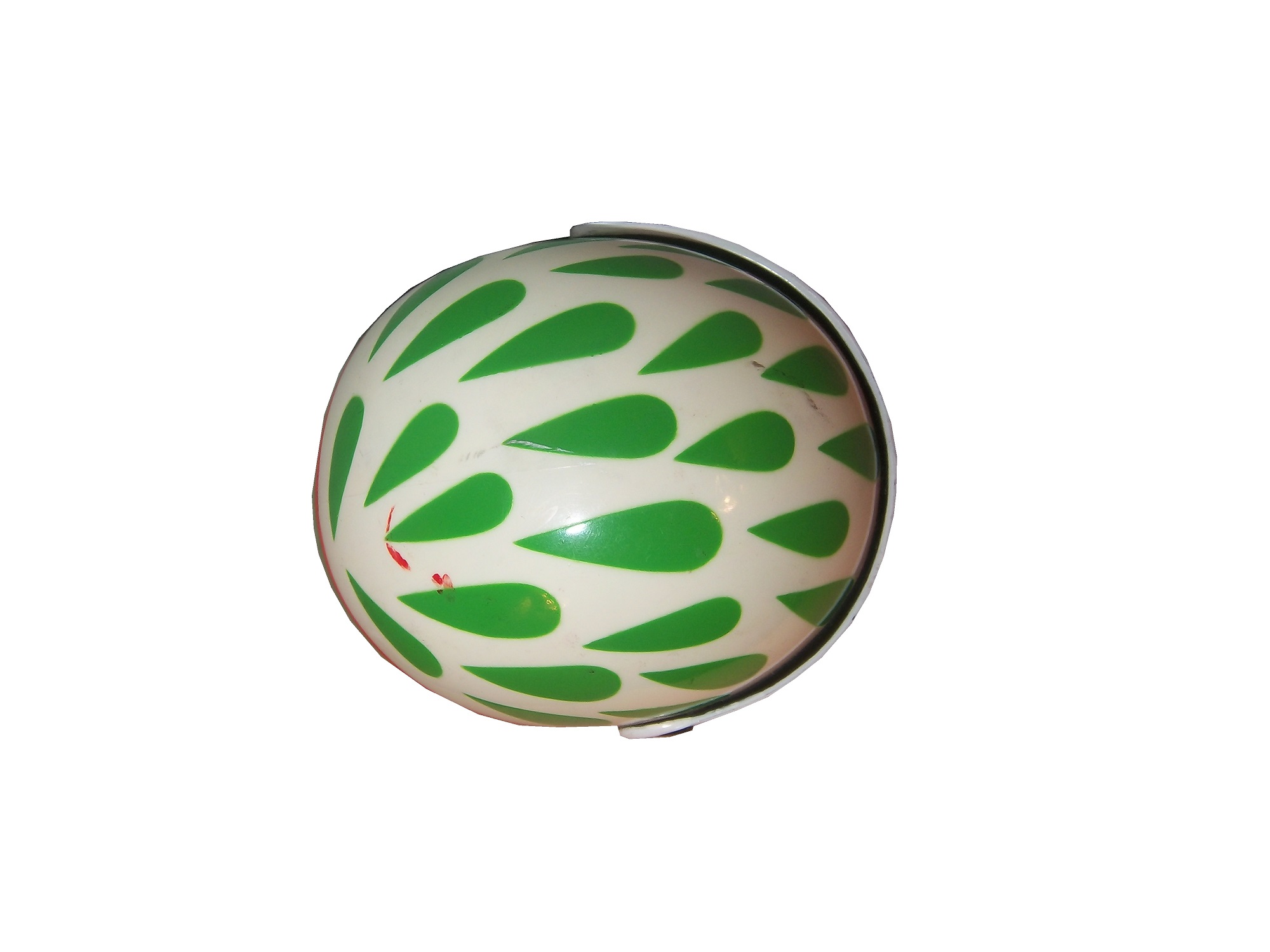
Interestingly, suits from 1996 and before,
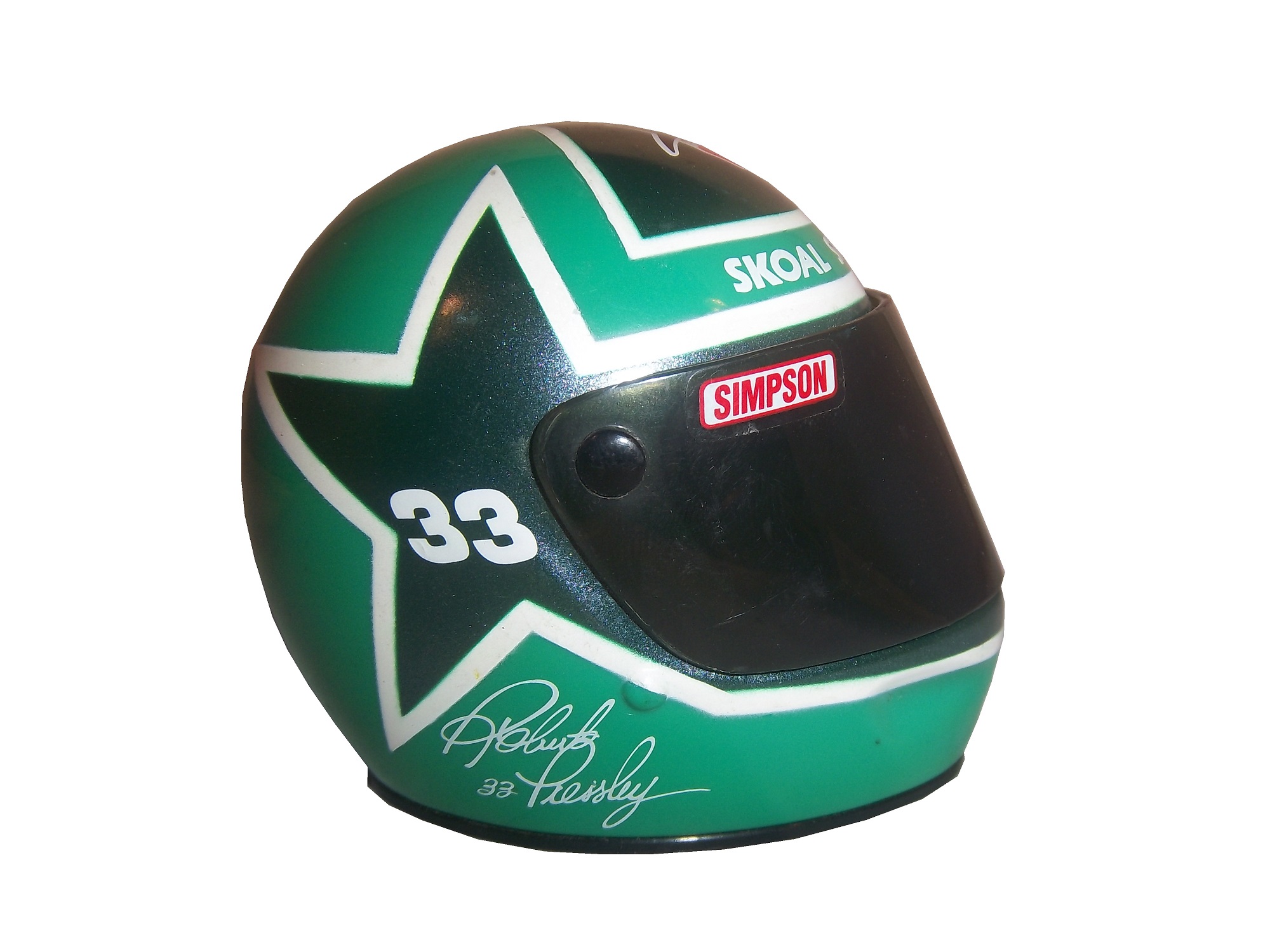
and suits from 1998 and after,
do not have this inscription. From what I have been able to gather, this was an inventory number for customized suits. But I do not understand why it seems to only be used on suits from 1997. Ok, getting off track here, getting back to Finish Line figures….
Taking a look at this figure as compared to the real-life driver suit this figure is based on, it is very accurate. The bottom torso logos, and television logos on the sleeves are identical. The chest is missing the Chevy and Winston Cup logos, and has the name, whereas on the real suit the name is on the belt. They still did a very good job though.

The logos on the upper right sleeves are identical on both the figure and the real suit.

The scale and position of the LOWES logo on the back of the figure as compared to the back of the real suit is identical as well.

The position, location, and size of the television logos on the legs are perfect as well. They really did a great job with this figure.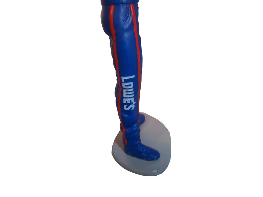

The detail in this figure is amazing, because Finish Line’s Starting Lineup counterparts lacked some details. Baseball figures from the same set in the same year, such as this Albert Belle figure often lacked pinstripes.


Other examples include recycling of bodies. Every Finish Line figure is basically 4 different body parts, head, upper body, legs, and arms. These were taken, painted appropriately and then attached to each other. That is why all the figures look alike, but with minor differences.


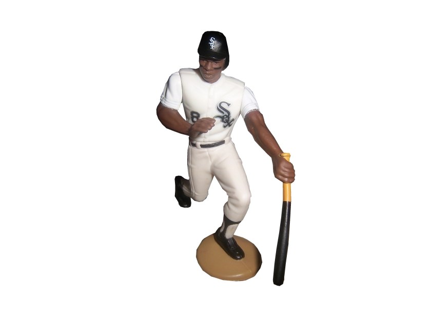
I can vividly remember buying these as a kid. When I got my first, a Dan Pasqua 1989 White Sox figure for my birthday, I was excited. Now, 23 years later, I have the ability to take a toy from my childhood, and compare it side by side to the uniform it is based on. I can honestly say I never thought it would happen, but I am thrilled to take the opportunity.
Tailgating Time!
Chicago-Style Hot Dogs
In honor of the Chase for the NASCAR Sprint Cup Championship starting at Chicago, I will do a couple of Tailgating Time recipes featuring Chicago food products. The first is Chicago-style Hot Dogs. This classic has been enjoyed in Chicago since the Great Depression. It has been enjoyed by those in the Chicago-land area for some time.
You Will Need:
2 packages Vienna Beef hot dogs
2 packages S. Rosen’s Mary Ann Buns-Both come in packages of 8
1 Chopped white onion
1 Sliced Tomato
1 Jar Yellow Mustard
1 Jar Sweet pickle relish with mint,
2 Jars of pickled sport peppers
Celery salt
Chicago-Style dogs are traditionally boiled or steamed. If it is grilled, it is referred to as a “char-dog.” Once the hot dogs are done cooking, place the hot dogs in the bun, and then put the condiments in this order: mustard, relish, onion, tomato, sport peppers, pickle spear, celery salt. Ketchup on these dogs is UNACCEPTABLE! The final product will look like this: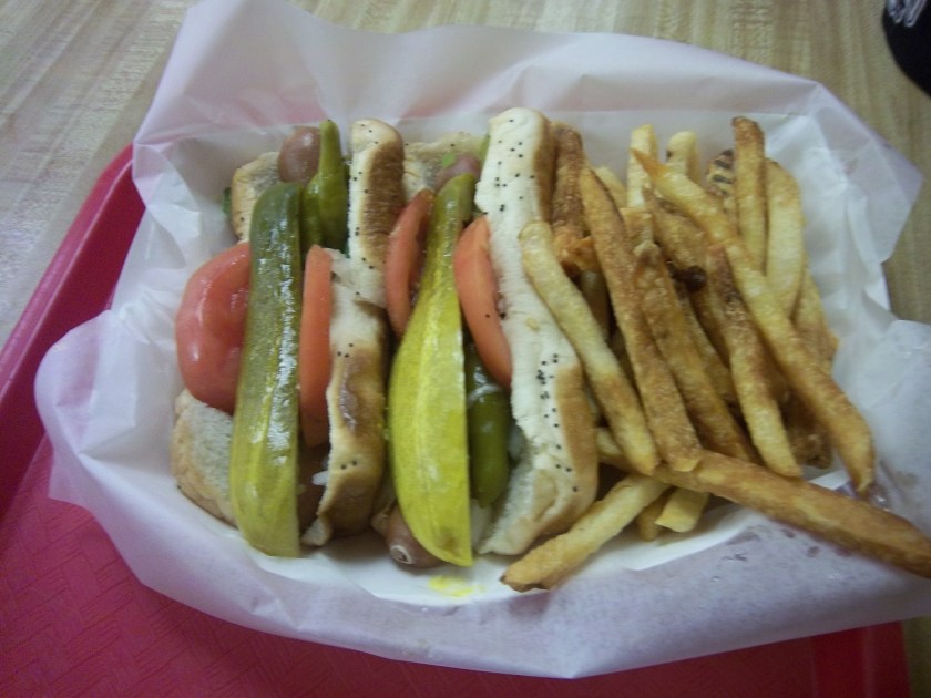
Classic Maxwell Street Polish Sausages
Anyone from Chicago will recognize this dish, and those from all over the country will enjoy this dish as well. This recipe needs both a hot plate as well as a grill. For a group of 6 people, you will need:
12 kielbasa links
12 sausage buns
1 large jar yellow mustard
6 large sweet onions
1 jar Olive Oil
First, on the pan, saute the sweet onions in a bit of olive oil on low for an hour and a half with a touch of thyme and salt. This might seem like a while, but the results are worth it.
While the onions are cooking, fire up the grill, wait until it is hot, and cook the kielbasa links until they show some char on the outside.
A few minutes before the kielbasa and onions are done cooking, pour the mustard into a bowl, this will help in the serving process.
Take the buns and smear the insides of the bun with mustard using a rubber spatula. Take the sausage and place one piece in each bun, and cover the top of the sausage with the now caramelized onions. The final product will look like this: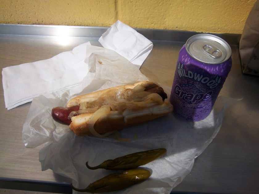
Paint Scheme Reviews!
Marcos Ambrose #9 DeWALT/ACE/CMN Ford Fusion Good overall design however my main issue with the scheme is the very small writing on the side of the car. Designing a car with lettering too small to show up on the track that can be seen on the track or on television makes no sense at all. That said, this is still a good scheme, and I will give it a B
Greg Biffle #16 3M/Scotchguard Ford Fusion Everything I just said about the Marcos Ambrose scheme above applies here, as the Scotchguard logo is much too small. But the scheme is good and I will give it a B
Ricky Stenhouse Jr. #17 Ford Ecoboost Ford Fusion Great color scheme, great design, works very well, and it gets an A
Kyle Busch #18 M&M’s American Heritage Toyota Camry Kyle has great schemes, and this is no exception. The American Heritage chocolate line features chocolate made as it was back in 1750. The scheme has some light changes, including the American Heritage logo, and a stereotypical colonial hat on the quarter panel. It works very well, and it earns an A
Jeff Gordon #24 Drive to End Hunger/Fan Names on Hood Chevy SS Taking a terrible paint scheme to begin with, and adding tiny lettering to the hood is a great way to earn an F
Paul Menard #27 Menards/Quaker State Chevy SS Green and gold is always a great scheme, but the spike design just does not work at all. I can give it a C at best, but the spikes are just awful.
Jeff Burton #31 Utility Trailers Chevy SS Great color scheme and great design. This scheme earns an A
Ken Schrader #32 Safe Skies Locks Ford Fusion It is a very basic paint scheme however basic can be very good, as this scheme shows. Looks very smooth and very good, and has a great color scheme. It earns an A
David Ragan #34 Farm Rich Ford Fusion Mediocre color scheme, but what they did is that they took that color scheme and designed the car to look like the rolling hills of a farm, with the Farm Rich logo acting as the sun, which works very well, and I have to give this scheme an A
Josh Wise #35 The Pete Store Ford Fusion The template this team uses works well when they have a logo with the matching colors. This example works very well, and earns an A
Dale Earnhardt Jr. #88 Time Warner Cable Chevy SS The blue is too bright, but the overall scheme is good, though I do wish Time Warner could pick a better logo. A


