By David G. Firestone
Another year has passed, and motorsports has been as active as ever. 2013 was a big year for NASCAR, F1, and IndyCar. Here are my final thoughts for the year that was in auto racing.
Starting with Formula 1,
*The cars all looked really good. Sebastian Vettel is the best driver in auto racing today, and proved it by winning 13 of the 19 races in 2013.
*While the modesty panel implemented by F1 to accommodate the so-called “platypus nose” Sebastian *Vettel gave a convincing argument against it by not using it, and dominating the series without it.
*The Pirelli tire strategy works very well, HOWEVER the durability of the tires is a continual issue. The British Grand Prix, which saw a very unusually high number of tire failures is an example. During that race 5 drivers, Lewis Hamilton, Esteban Gutiérrez, Felipe Massa, Jean-Éric Vergne and Sergio Pérez experienced tire blowouts, and a 6th , Fernando Alonso, had a tire deflate just below a pit stop. In my mind, Pirelli needs to do a lot of work.
*Politics, either team or sanctioning body, is a continuous issue. It needs to stop, as sometimes it can have an adverse effect on the fans.
Moving to IndyCar,
*The DW12’s are very solid, and very competitive. In 19 races, there were 10 different winners.
*Chip Ganassi had both a great year, and a terrible year. Scott Dixon took his Target Honda to victory lane 4 times, and became a 3-time Izod IndyCar Champion. Sadly, this came with a cost. At the 2nd Shell and Pennzoil Grand Prix of Houston on October 6, Dario Franchitti was involved in a very serious crash, where he was seriously hurt, and had to retire because of his injuries. Franchitti was one of the best driver in IndyCar and his retirement is a very serious loss for IndyCar.
*James Hinchcliffe proved he really is a contender winning 3 races. I think he will be a championship contender in the next couple of years, and I really think he will win a championship.
*The multiple race weekend works very well. Two races over the course of two days not only forces drivers to bring their A game more, it also gives the fans a unique experience. I hope they expand on this formula.
*Tony Kannan finally won the Indianapolis 500 after 11 attemps. That kind of a win racing fans enjoy, finally winning the race you have always dreamed of winning.
*The 2013 GoPro Indy Grand Prix of Sonoma saw one of the most controversial calls of 2013, with Scott Dixon hitting one of Will Power’s crew members. Now it appeared to many people, myself included, that a crew memeber for Power had intentionally walked in front of Dixon’s car, but IndyCar had to asses a drive through penalty for the indicent. Since the incident, the rules have been changed so that if something like this happens again, the crew that caused the incident will be penalzied.
*Similar to F1, Firestone has a two tire strategy, with black primary tires and red option tires. Red option tires have more grip, but are less durable than the black primary tires. While I understand the idea, the black primary/red option tire strategy at road courses needs some work. I would like to see more options in tire strategy, maybe add a third white option.
Next we go to NASCAR
*Fan safety in racing is an issue. The IndyCar crash in Houston that ended Dario Franchitti’s career also injured a number of fans. The Kyle Larson crash at the Nationwide Series race at Daytona, the Sky-cam incident at Charlotte, and the bush fire at Kansas are examples of that. Fans should be able to go to a race without worrying about getting hurt.
*The Gen 6 car is competitve, with 14 different winners in 36 races, points and non points events included. It does need work, as evidenced by Denny Hamlin’s crash at Fontana where he fractured his vertibrae. Also, the in-car camera policy, where roof cameras won’t be used at 1.5 mile tracks, but will be used in every other track is irritating. I would love for NASCAR to use a single formula for in-car cameras.
*The smaller door numbers do not look good at all. The older larger door numbers just look better.
*Michael Waltrip Racing and Front Row Motorsports owe the racing world a serious apology for their actions at New Hampshire. NAPA left Michael Waltrip Racing, and Martin Truex Jr found himself out of a ride as a direct result of the team’s actions. I think that the penalties were not harsh enough and I think that there will be more attempts to fix races in the same manner. I do not think that NASCAR has done enough to prevent this from happening again.
*I find it amazing that with all the discussion on concussions and the concussion lawsuits that infield care centers do not check for concussions as part of the examinations.
*The fact that there were two driver suspended for using derogitory language is upsetting to say the least. The suspensions for these are justified, for that kind of language should not be used, and it should not be tolerated.
*The Mudsummer Classic from Eldora Raceway was a great idea, it was a great race, and I would love to see a Nationwide Series race or even a Sprint Cup race on Eldora or a dirt track.
*This is something that has been bothering me and a lot of other people, start and park drivers in NASCAR. These are teams that show up to race, but for one reason or another are not able to run the full race. It begs the question, why show up if you aren’t there to win? If you know you can’t compete for the win, then don’t waste your time, and don’t waste my time.
*and finally, I miss Dodge in NASCAR.
My final thoughts are to the aesthetics of racing in 2013.
*There are a lot of people justifiably upset over the F1 Helmet Livery Rule, which if implemented would force drivers to only wear one helmet design for the whole season. I think it is a subtle way of forcing a rule that drivers can only wear one helmet over the course of the season in order to reduce the risk of head injury that can potentially be caused by switching to different helmets over the course of the season, but that is just me.
*Pink, Yellow and Camo are not great color for race cars.
*Ford needs to change the grill of the Fusion, as it frequently detaches from the car and can easily cause a caution during the course of the race.
The last part of this column is to remember those who lost their lives in the course of racing in 2013.
*Andrea Antonelli-Died in a Supersport World Championship Accidnet
*Josh Burton-Died in a sprint car crash
*Kurt Caselli-Died in a fall at the Baja 1000
*Christian Devereux-Died in a Historic Touring Cars crash
*Matija Duh-Died in a motorcycle race in Bahia Blanca.
*Sean Edwards-Died in a private event on track
*Tyrone Gilks-Australian motorcycle stunt rider, collision during practice
*Karl-Heinz Kalbfell-Died in a BMCRC Lansdowne Classic Series accident
*Jason Leffler-Died in a sprint car crash.
*Andrea Mamé-Died in a Blancpain Lamborghini Super Trofeo race in Circuit Paul Ricardtrack
*Sandor Pohl-Died in a BMCRC Lansdowne Classic Series accident
*Track Marshal Mark Robinson-Died in an accident during the Canadian Grand Prix
*Paul Mulcahy-Died in an accident in the Carrick-On-Suir Rally in Ireland
*Doriano Romboni-Died in a motorcross accident
*Allan Simonsen-Died in a crash at the 24 Hours of LeMans
*Paolo Zantelli-Died in a racing boar crash
As well as mourning those from the motorsports family who have passed on in 2013
*Bill Amick-Father of NASCAR Driver Lyndon Amick
*Walter Charles “Walt” Arfons-American land speed record holder
*Kevin Ash-Journalist killed while testing a new BMW Motorcycle
*William Earl “Bill” Ballew-Father of Truck Series owner Bill Ballew
*George Bignotti-The most successful chief mechanic in IndyCar history
*Bob Bilby-Former co-owner of Bobby Allison Motorsports
*Gordie Bonin-Former drag racer
*Wallie Branston-Canadian Motorsports Driver and Pioneer
*Vera Brewer-Mother of NASCAR Crew Chief and TV analyst Tim Brewer
*Dorothy Earles Campbell-Daughter of Martinsville Speedway founder H. Clay Earles and mother of current Martinsville President W. Clay Campbell
*John Cardinale-Sonoma Raceway vice president for media and community relations
*Fred Carrillo-Created one of the first successful racing connecting rods
*Joe Carver-Promoter for Langley Speedway
*Rene M. Charland-Former NASCAR driver
*Dave Charlton-Former South African Formula 1 Champion.
*Jack Choquette-Former NASCAR Modified Champion
*John Coombs-Former F1 and F2 driver and owner
*Harvey J. Crane Jr-Founder of Craine Cams
*Bert de Jong-Former rally car driver
*María de Villota-F1 testing driver
*Melanie Jane (Lyons) Deware-Wife of Nationwide Series team owner Scott Delaware
*Randy Earnhardt-Brother of Dale Earnhardt Sr., uncle of Dale Earnhardt Jr.
*Clyde Ellis-Former stock car driver
*John Ervin-Former crew chief for NASCAR legend Ned Jarrett
*Philippe Favre-Racing driver
*Melvin “Red” Foote-Former NASCAR driver
*Richmond Gage-Former USAC chief steward, NASCAR team member, and racing college professor.
*Floyd Ganassi-Father of racing owner Chip Ganassi
*William Giordano-Former NASCAR engine delivery man
*Sammy Gonzalez-Former EGR Employee
*Charles M. “Bud” Greene-Former employee of Penske Racing and Junior Johnson
*Monty Grice-Former Earnhardt Ganassi employee and dirt track chassis builder.
* Allred Hackett-Co owner of Caraway Speedway
*Rodney Wayne Halverson-Joe Gibbs Racing employee
*Elton Hildreth-Former NASCAR driver
*Frederick J. Hmiel-Father of NASCAR crew Shane Hmiel
*Eric Horn-Former crew member for Petty Enterprises and Robert Yates, as well as for Roush Yates Engines
*Kenneth Aray Houston-Brother of NASCAR driver Tommy Houston
*Roz Howard-Former NASCAR Convertible Division driver
*Stephen Odell Husketh-Former team owner
*Edward Dean Jeffries-Race car customizer
*Jean Peters Joy-Mother of broadcaster Mike Joy
*Sardar Joginder Singh Bhachu-Former Rally Car Driver
*Henri Julien-Former racing driver and team owner
*Art Malone-Former NASCAR and NHRA driver
Christopher J. Margolin-Former NASCAR technician
*Gilford Hicks Martin Sr-Father of crew chief Gil Martin
*Giancarlo Martini-Former F1 Driver and team owner
*RK Mast-Father of Rick Mast
*Dennis McCarson-Former NASCAR hauler driver and spotter
*Donald Gordon “Gordie” McKichan-Former NASCAR Crew Chief
*Virginia P. Means-Mother of NASCAR owner Jimmy Means
*Jason Mitchell-Writer for NASCAR Racing and the Wilkes Journal-Patriot
*Ida “Geneva” Mohamet Key-Mother of team owner Curtis W. Key, Sr
*Hal Needham-Former team owner, stuntman, and movie director for Stroker Ace
*Mauro Nesti-Eight-time European Hill Climb champion
*Bill Nilsson-Former motocross racer
*Nikki Park-Wife of Greg Park, CFO for Stewart Haas Racing
*Crystal Pauline Jones Pistone -Wife of Tiger Tom Pistone
*George “Jud” Pemberton Father of Robin, Ryan, Roman and Randy Pemberton
Lee Raymond Two Time ARCA Champion
*Rafael “Ralph” Sánchez-Founder of Homestead-Miami Speedway
*Marcy Scott-Promotion and Marketing Director for Atlanta Motor Speedway
*John Settlemyre: five-time Hickory Motor Speedway track champion
*Barbara Signore-Worked for Penske Motorsports, and ran the International Race of Champions
*Torrence “Jivie” Simpson Jr-Former NASCAR crew member, Charlotte Motor Speedway employee, and innovator
*Neal Sims-Former NASCAR writer and Journalist
*Jerry Steppe-Former pilot who flew NASCAR drivers to and from races.
* Mrs. Eva Mae (Tommie) Hege Stewart-Track Owner and mother of former NASCAR team owner Cliff Stewart
*Henry Taylor-Former Formula 1 driver
*Dave Tatman-Former Hendrick Motorsports engine builder
*Randall “Randy” Lee Tissot-Long time NASCAR driver
*Richard “Dick” Trickle-Former NASCAR driver
*Bill Warner-Former motorcycle racer and land speed holder.
*Harold Edward “Pappy” Wilcox-Longtime racing driver, first driver from Maine to race in the Sprint Cup
*Kramer Williamson-Former sprint car driver
*Cecil Ray Wilson-Long time member of Wood Brothers Racing

 By David G. Firestone
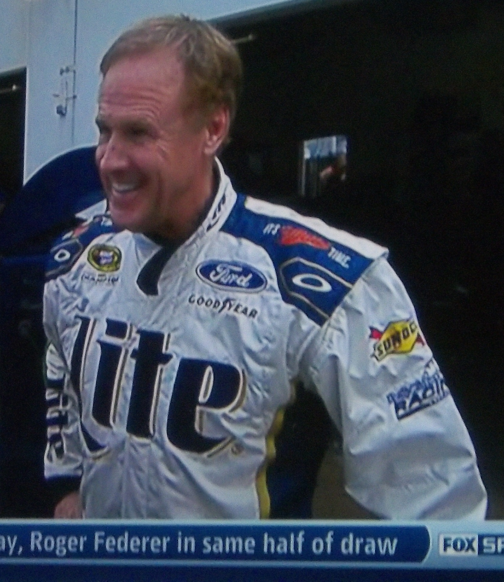


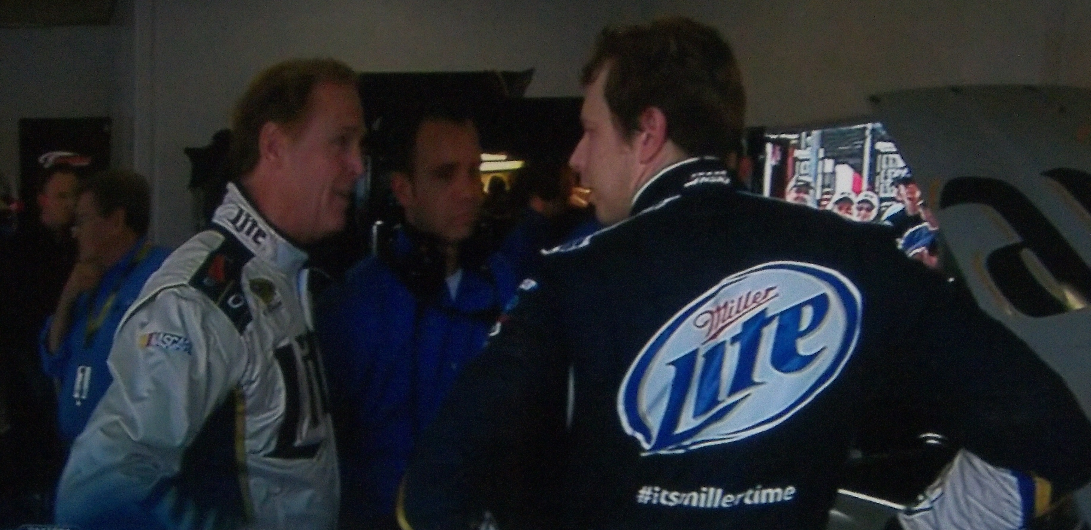
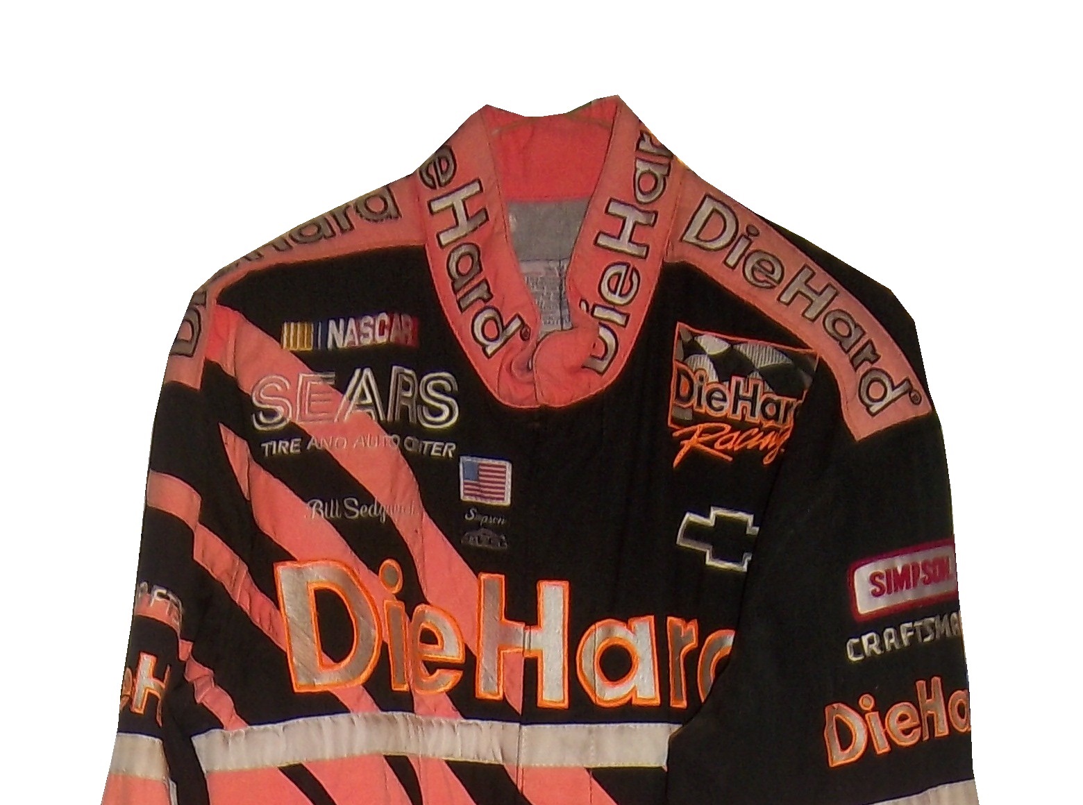
 Here are the suit brands that drivers were wearing at Daytona…


