
To accommodate the beginning of Passover, I decided to upload this week’s episode of ITSM a day early. We look at Another old school NASCAR helmet, this one worn by Tracy Leslie, will be examined.
Tag: race-worn
Introduction to Sports Memorabilia-Richard Lastaer Race Worn Helmet
This week, on Introduction to Sports Memorabilia, we examine a helmet worn by former NASCAR driver Richard Lasater, worn during his horrific crash at Talladega in 1993. The helmet did its job and he was able to walk away.
Introduction to Sports Memorabilia-Kevin Lepage Helmets
This week, on Introduction to Sports Memorabilia, we examine two Kevin Lepage race worn and Signed driver helmets, the first from his rookie campaign in the Busch Grand National Series in 1994, and the second from his time at Roush Racing in 1999.
Introduction to Sports Memorabilia-Steve Grissom 1998 Race-Worn Helmet
This week, we examine a Steve Grissom 1998 Kodiak Helmet.
Introduction to Sports Memorabilia-Derrike Cope 1998 Race-Worn Helmet
For the 11th Season Premier of Introduction to Sports Memorabilia, we examine a Derrike Cope 1998 Gumout Helmet, which he has autographed twice.. From here on out, I will upload new videos on Mondays.
The ONLY Time A Visor Looks Good!
By David G. Firestone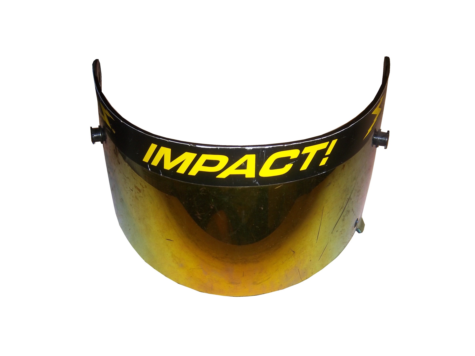
Some time ago, I did two posts focusing on one item, and for the next two weeks, I’ll do something similar. A part of the driver uniform that is seen by virtually everyone but not really discussed is the visor in the helmet. We see them on in-car cameras and on television, but we don’t think about them by itself that much. It seems like a minor part, but it has an interesting history.
From the 1920’s through the late 1980’s, helmets were primarily open-faced. This example is from the 1960’s, and was worn by Maine short track driver Jim McConnell.


These helmets are very simple in design, they just cover the whole head, except for the face. The downside to this is that when the sun shines in the driver’s eyes, or if the car is an open-cockpit the wind can and will force the drivers eyes closed, or fumes from the car can get in a driver’s eyes. As such, these helmets were worn with goggles.
As full-faced helmets took over, the visor came attached to the helmet. The early ones were basically plexi-glass but as safety certification got more advanced, the visors were and still are fire tested. They also have to stand impact testing as well. As the helmets became more advanced over the years, so did the visors. Let’s take a look at one:
This visor is from the McDonald’s helmet I covered earlier in the year. It is made of a very tough, but very light clear plastic. The visor is attached to the helmet by 3 screws, two that hold the visor to the helmet and a third that guides the visor and keep it in the proper place. There was a 4th one, but it was removed at the driver’s request. The visor has some unique features. At the bottom-left side there is a small flap, which is used by the driver to open the visor. Next to the small flap is a hole for a small peg. The peg goes in the hole, and holds the visors shut, but is small enough so that if a driver wants to open the helmet, they can do so with no trouble. Drivers frequently leave the visor open slightly, so two small knobs, one on each side so the driver can open or close the visor.
Notice that it has a yellow-ish tint. This is one of 3 options for drivers, dark tint, light tint, and clear. The visor is designed to be easily changed at the drivers request. Clear visors are used for night races, and tinted ones are used for sunny races. In the event a race goes from day to night, a driver can use a tinted tear off, so that when it gets dark, they can remove the tint and have a clear visor.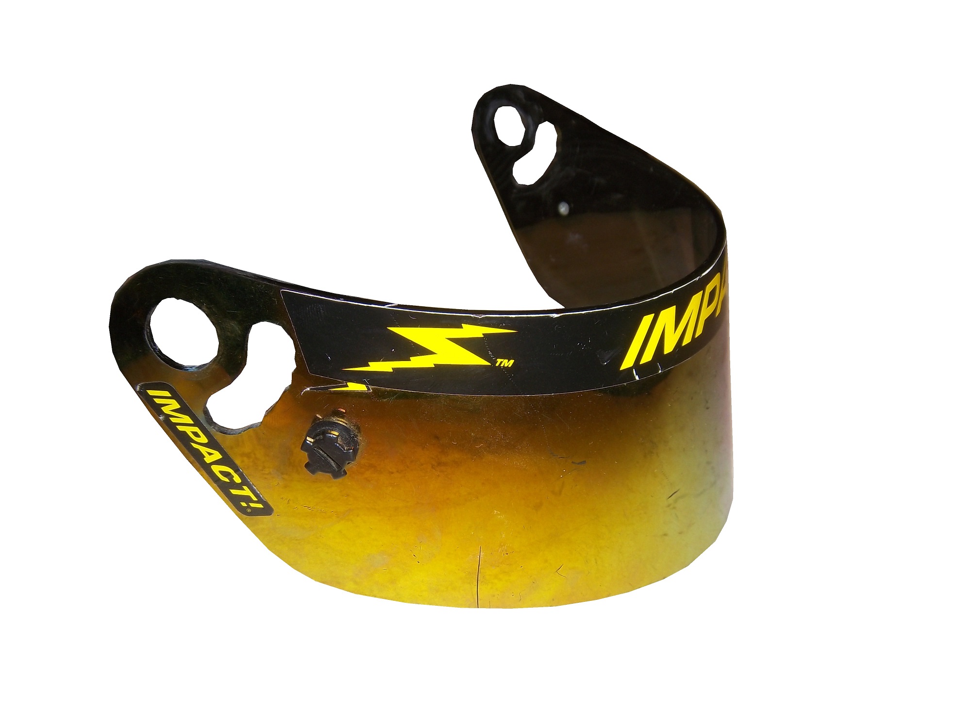

Like eyeglasses, visors get scratched over time. As such, they are changed often. Like most other items racing teams and drivers use, when they are no longed needed, they are sold to the general public. They are frequently autographed by drivers, and are a popular item to get signed by drivers. They are interesting to look at, and interesting to examine up-close. All helmet visors in this day in age have a sponsor stripe across the top, and we’ll cover that next week.
Paint Scheme Reviews
Danica Patrick #10 Go Daddy Chevy SS Pinkwashing is an automatic F
Greg Biffle #16 Sherwin Williams Ford Fusion See Above
Tony Raines #40 Moon Shine Attitude Attire Chevy SS See Above
and we have a new 2014 scheme
Kasey Kahne #5 Farmers Insurance Chevy SS It’s amazing what a different shade of paint can do to a paint scheme. This years Farmer’s scheme earned a D+ because of the primary color, this scheme earns a B+ because of the color. The design needs some work, but the whole scheme is a major improvement.
Open or Closed…Which Helmet Would You Have Chosen?
By David G. Firestone
[Editor’s Note: Originally, this week was a post dedicated to primary sponsor logos. However, I had this column on the shelf for a while, but given recent events in the NFL, which fellow uniform blogger Paul Lukas has covered in depth, I felt that this article concerning helmet safety in NASCAR would be appropriate to run this week, with the primary sponsor logo column running next week. DF]
 Prior to the tragic events of the 2001 Daytona 500, drivers had to make a choice that in this day in age seems absolutely absurd. From the beginning of NASCAR to that tragic day drivers had their choice of helmets, and they were open-faced,
 or full-face.
To examine the merits and demerits of both helmets let’s take a look at one example of each, both worn by the same driver, Kevin Lepage. First, the open-faced helmet


Worn in the Nationwide Series in 1994 and 1995 during his rookie and sophomore seasons, this helmet bears a decal from high-end plush toy company Vermont Teddy Bears. It shows very heavy use, with scratches and scuff marks, has had the microphone equipment removed, and Lepage has signed the back of the helmet in black Sharpie.
Now let’s look at the full-face helmet,
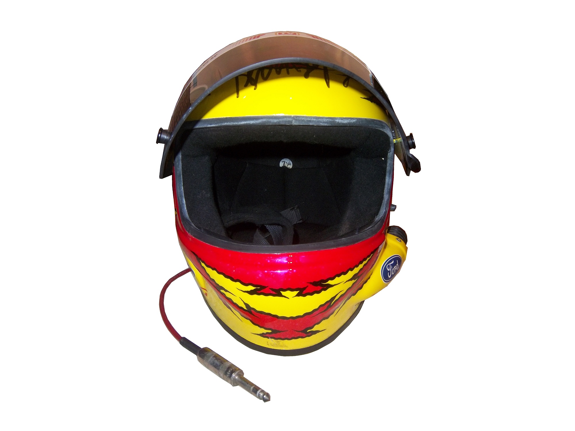


Worn by Lepage in the 1999 Winston Cup season, this helmet was painted for the combination Primestar/TV Guide #16 Ford. Like the open-faced helmet, it shows scratches and scuff marks, and Lepage has signed the top of the helmet above the visor. Unlike the open-faced helmet, this helmet still has the microphone equipment.
Now on to the comparison…
Looking at the helmets from the inside, there was no real difference between the two. Both are the same basic design, with the same inner liner and filler.
The left sides of the helmets differ greatly. Notice that there is a hose attachment near the Ford logo on the full-faced helmet. This is to accommodate the “hotbox” attachment. Hotboxes are designed to force air into the driver’s face to help keep them cool. This is not a luxury, as driver compartments can reach as high as 160 degrees Fahrenheit, and drivers typically wear 3-4 layers of Nomex during a race. Keep in mind that in-car drinking systems are not standard as of 2000, and the hotbox is a great tool for driver comfort.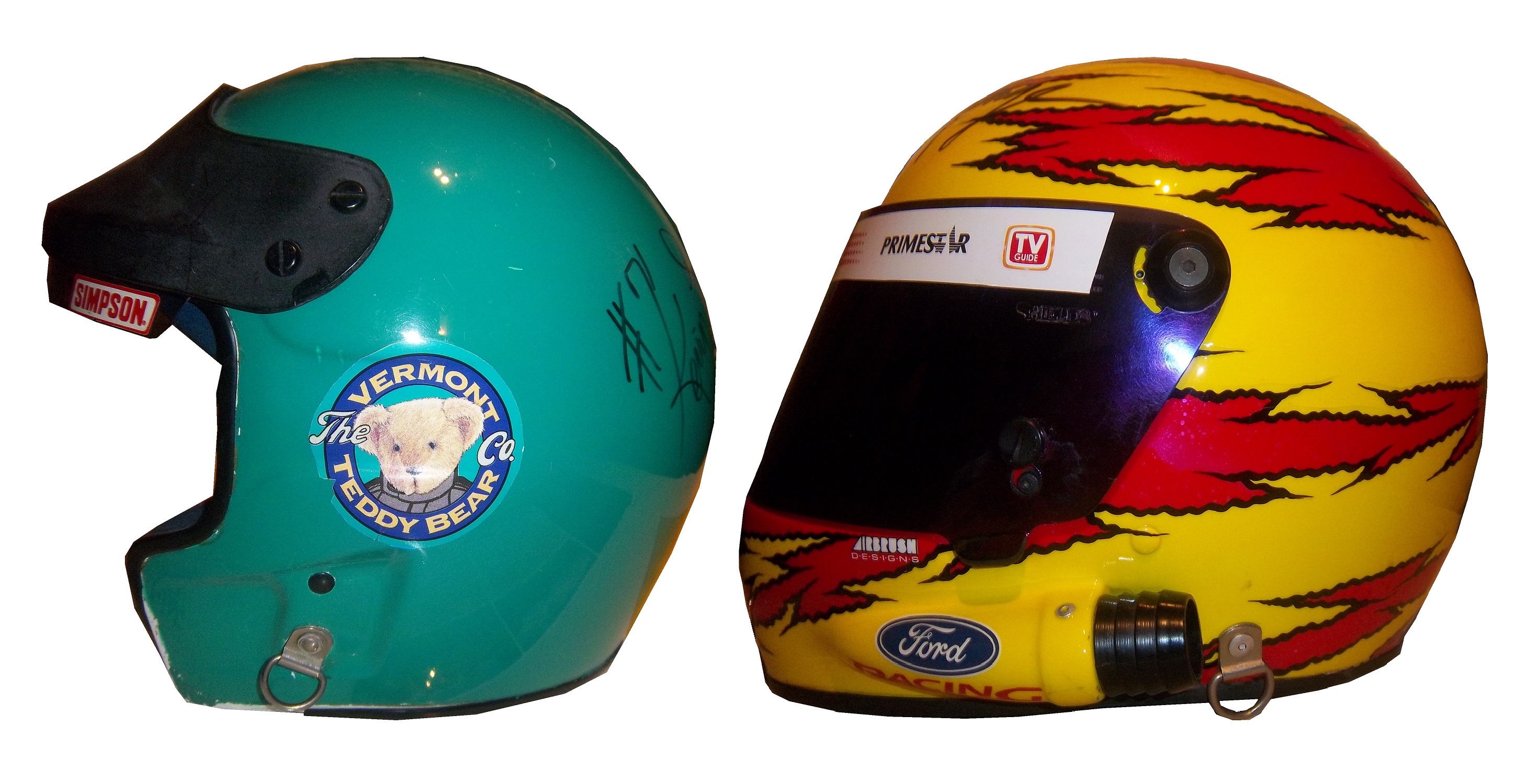
Microphone equipment is added to the helmet on the right side. The only difference between these two helmets is that the microphone has been removed on the open-faced helmet.
The back of the helmets are virtually identical except for the paint schemes and the liability tag present.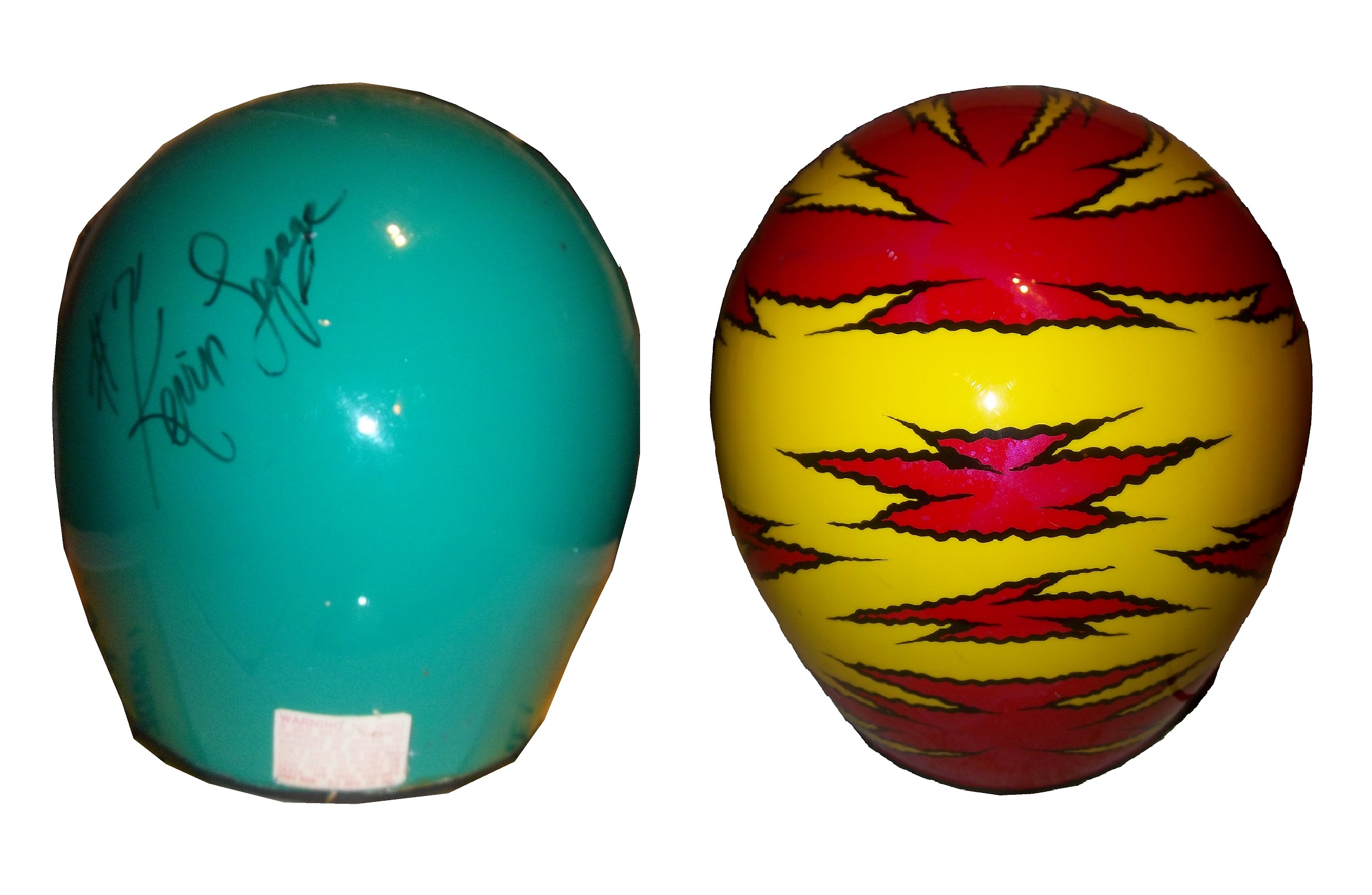
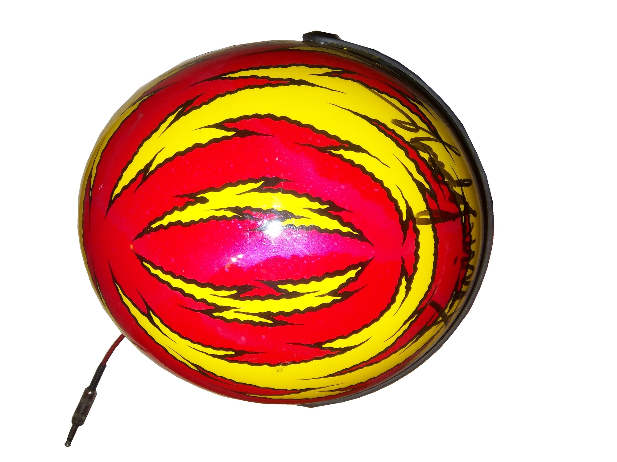
The front of the helmet is the key to making the decision. Everything else thus far is a minor issue. The question was asked then, and is asked now, why were these helmets legal for as long as they were? These pictures should answer that question:
The bottom of the helmet underneath the visor gives an extra bit of safety in case of fire, BUT takes away about 2-3 inches of visibility. That 3 inches might not seem like that much, but in a race car, trying to keep situational awareness of what the car is doing, those 3 inches are as critical as you can imagine. NASCAR at the time had the opinion that if they had the restriction in place, that the obstruction could cause a driver to lose that situational awareness, and lead to a wreck. NASCAR felt that any rule that could cause a wreck is a bad idea, and rightfully so. How often in the wake and investigation of accidents does it reveal that a rule, regulation, or guideline cause an accident? It happens quite often. NASCAR at the time felt that imposing a rule that all helmets should be full-faced that is could very easily lead to an accident, and as such, allowed open-faced helmets to avoid that from happening.
It was a rule that was easy to understand, but would lead to tragedy. It led to this design, which itself is now becoming obsolete:


 Now, even the best full-faced helmet designs from the 1990’s are now a distant memory and the current helmet design has taken over. It might seem like unfair, but if these rules were in place at the 2001 Daytona 500, we would have never lost a true legend.
Paint Scheme Reviews!
Jamie McMurray #1 Linksys Chevy SS Clean lines and a great color scheme make for an A+ scheme!
Matt Kenseth #20 Husky/500th Start Toyota Camry The gray-scale design does not work here at all. The rest of the car looks very good, but the black and dark gray color scheme needs work. If the Husky red is where the gray is, it would work better, but the best grade I can give is a C-
Michael McDowell #51 SEM Chevy SS Classic design with a great color scheme, A+
And we have a 2014 leak…
Austin Dillon #3 Cheerios Chevy SS This is the best Cheerios scheme I have ever seen! The goofy bagel design is gone, and has been replaced with a couple of racing stripes. I also love the black around the #3. If this is the final design, it will be a great car, and I give it an A+!
All-Star Race Weekend Events and Fun
 By David G. Firestone
With the sad passing of Dick Trickle, as well as the All-Star Race, and the Memorial Day trifecta next week, I decided today I needed a change of pace, and I wouldn’t think about racing or driver suits today. So with my uncle in town, we went to the Museum of Science and Industry in Chicago. It’s an amazing museum with a lot of fun things to see and do, and we had a great time.
They have an exhibit that I saw concerning vintage cars, and a number of race cars. They have the winning car from the 1993 Sunrace USA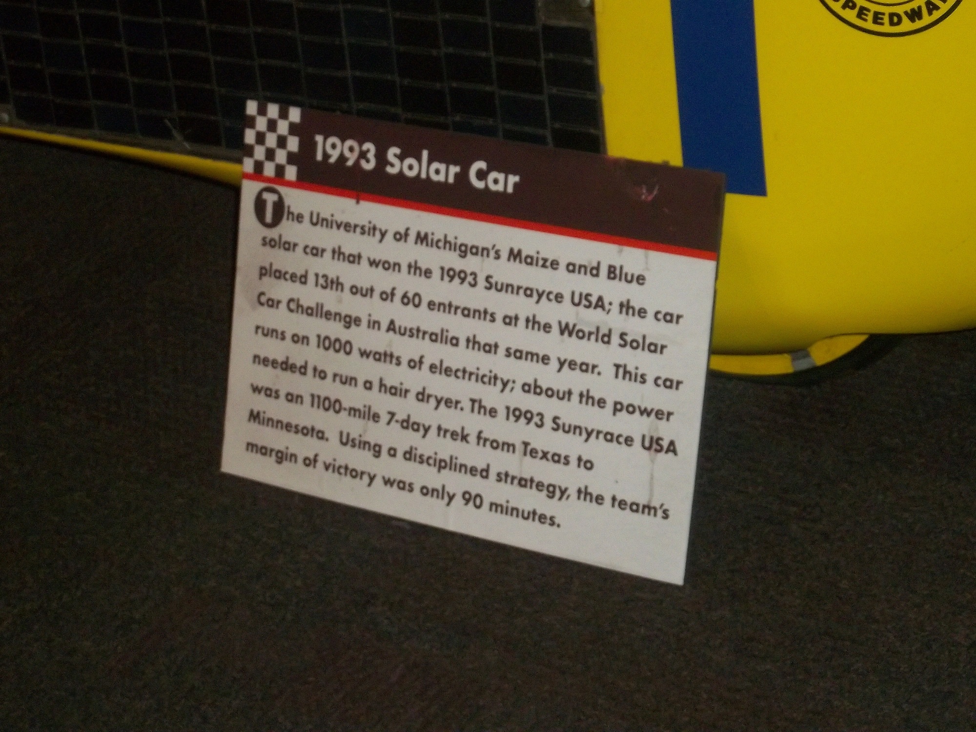
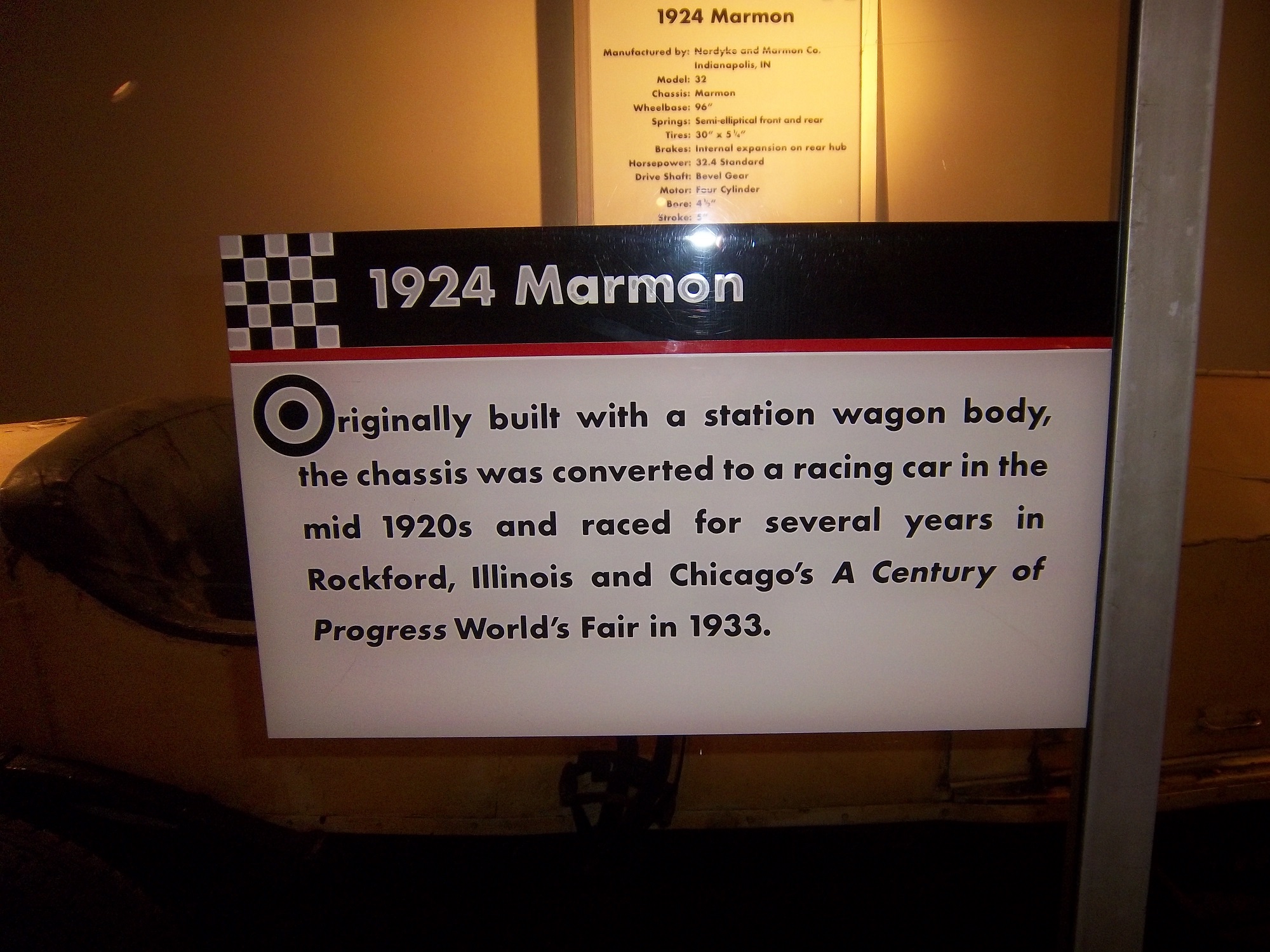
A 1924 Marmon race car 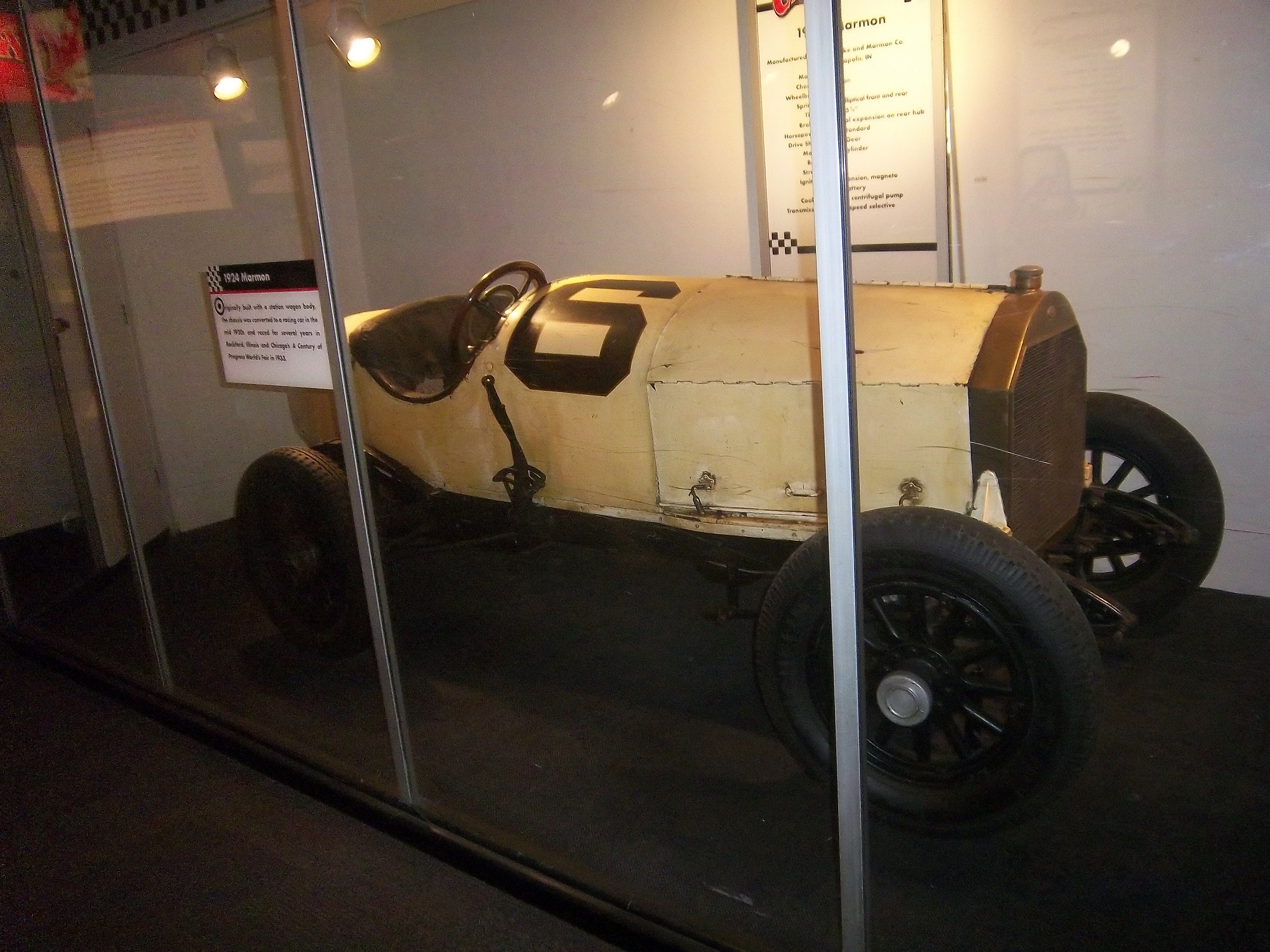
Wally Dallenbach’s car from the 1972 Indy 500 
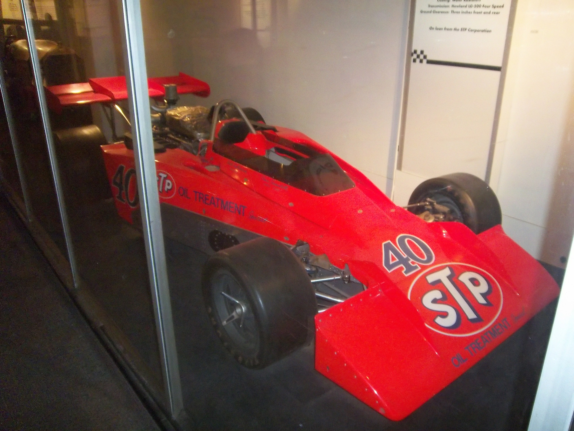
and Al Unser’s 1978 Lola race car that won the triple crown 

The Spirit Of America, which held the land speed record from August 1963 to October 1964, and still holds the record for world’s longest skid mark is also on display as well.
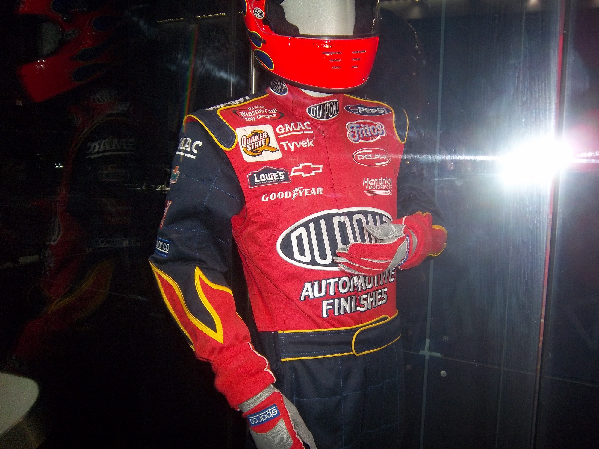
There is a new exhibit as well, Science Storms, an impressive state of the art exhibit detailing the science of natural phenomena, and how modern society has to interact with it. It is on two floors in the main gallery. On the second floor, there are displays for physics, magnetism, electricity, and fire among other things. At the end of the balcony, there is a large Tesla coil mounted in the ceiling. Nearby, I was shocked to see this display: That is a Jeff Gordon driver suit, with a similar helmet.


A helmet that has been bi-sected to display the fire protection that the helmet
A helmet used for fire testing, and a Nomex hood.
A racing helmet and matching goggles from the 1950,s and a 1975 drag racing helmet worn by Dennis Baca
and some Nomex undergarments and a Sparco bag. 

Now first off, why is the picture of Jeff Gordon from 2011 when the suit is from 2002? I think that it would be better if the picture of Gordon featured him wearing the suit on display. But that’s a minor complaint compared to some of the other issues the display has. The bag in the display clearly states “Jeff Gordon 2003.” So that might lead one to believe that the suit was from 2003. However after doing some research, the suit is from 2002. Looking at a 2003 suit, The Quaker State logo is different, the Lowes logo is gone, and the GMAC and Goodyear logos are in different places. So kudos to the museum for catching that.
The biggest issue is with the helmet cut in half. The sign clearly states “Jeff Gordon’s Helmet, Circa 2002.” Just taking a look at it, and I can clearly tell it’s not race-worn. I can tell for a number of reasons. Let’s start with the obvious fact that the color schemes on the helmet and driver suit are completely different. Second off, there are no ventilation ports or microphone equipment present. Since Gordon was wearing the vent on the left side of his helmet, the fact it is not there is very telling. Considering that DuPont Automotive Finishes paid nearly $12 million total to sponsor Gordon in 2002, his sponsor logos are conspicuously absent, and for a helmet that was supposedly worn for an entire racing season, it seems to be in very VERY good condition, almost new. It should also be noted that there are no HANS anchors present. At first I thought it was because the helmet was not meant to have them, but it turns out they were either supposed to be there, or have been removed. Why this occurred is not clear, but it clearly was NOT worn by Jeff Gordon. In fact, I would be shocked if he ever held this helmet. 

But there is one other issue with this display. The whole display is geared around fire protection, but there is no mention of safety certification. This is not a minor complaint, as the suit has a FIA certification on the back of the neck, but in the display is almost invisible.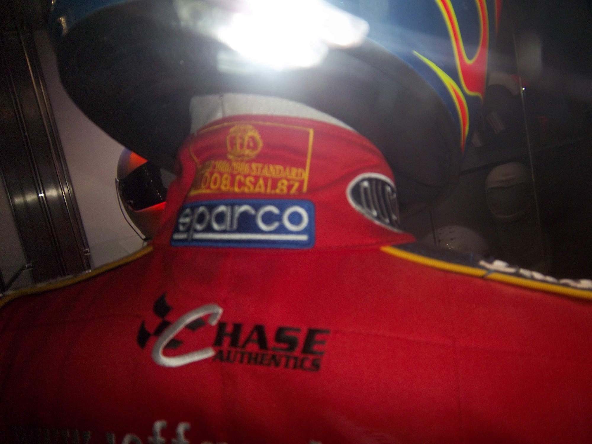
That picture, as bad as it is, is the best I can do, because the side of the display is inaccessible to viewers. If a display discussing fire safety, at least mention that the suit is certified to do just that!
Outside of that display, I had a great time at the Museum of Science and Industry, and I can look past those complaints to say that it is a really nice display that tells viewers a lot about racing safety. So if you are ever in Chicago, stop on over. I promise it is worth the time!
Now on to NASCAR All-Star Showdown Special Schemes…
First the All-Star Showdown Schemes…
Jamie McMurray #1 Bass Pro Shops/NWTF Chevy SS-Great Color Scheme, Awful design, C+
Danica Patrick #10 Go Daddy Cares Chevy SS-The racing stripe makes the scheme look better, and the hood logo is good as well A
Mike Bliss #19 Gentry Plastics Inc. Toyota Camry-Good color scheme and simple design work well here, A
Landon Cassill #33 Bicycle NASCAR Playing Cards Chevy SS-Decent color scheme, but the design is all over the place, way too chaotic, C-
JJ Yeley #36 World TradeX Chevy SS– Not much to say here…other than make the logo bigger. D-
Brian Keselowski #52 Supportmillitary.org Toyoa Camry-Eww…Too much going on, with the oversized camo in too many different colors, and the door design which is awful. F-
Now On to All-Star Race Schemes.
Brad Keselwoski #2 Miller Lite Fan Mosiac Ford Fusion. It looks really good, and the pictures of the fans give it a condensation on the can effect that is really cool. A+
Greg Biffle #16 3M Filtrete Ford Fusion-Could you please pick a color scheme and stick with it? Two different color schemes on the same car is just awful. But they are two good color schemes. C-
Kevin Harvick #29 Budweiser/Rheem Chevy SS-Good color scheme, and I like the two different designs on the side. A-
Ryan Newman #39 Aspen Dental Chevy SS-Good colors, but awful design…what does this have to do with teeth? C-
Jimmie Johnson #48 Lowes Patriotic Chevy SS-Not the best scheme he has run all year, but I would love to see the car in that shade of red on the bottom C-
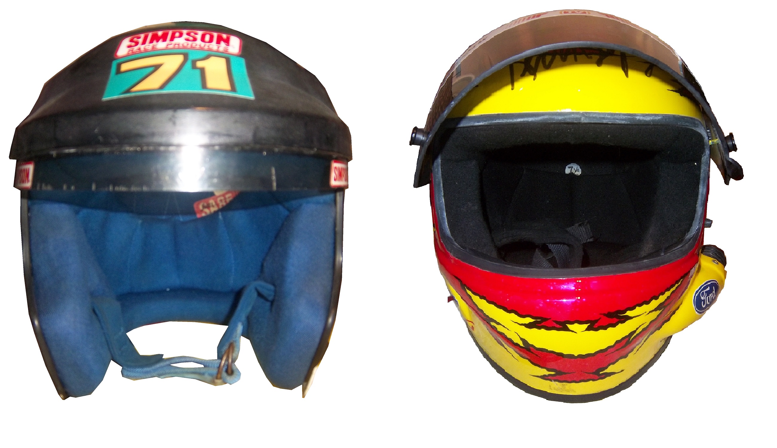
Richard Lasater and His Helmet
By David G. Firestone
Spent the last week just being insanely busy, with Passover and the Chicago Sun Times Collectables Convention, but now back to work. I’ve discussed the safety aspects of race gear, but today, I’m going in a bit of a different direction. Even in today’s safety-conscious racing environment, injuries are always a possibility. Denny Hamlin suffered a fractured vertebrae, and Dale Earnhardt Jr. has suffered a concussion in the last few years. Wrecks can be hell on drivers, but what about the uniform protecting them? What would a helmet from a wreck like this look like?
Well the helmet looks like this:


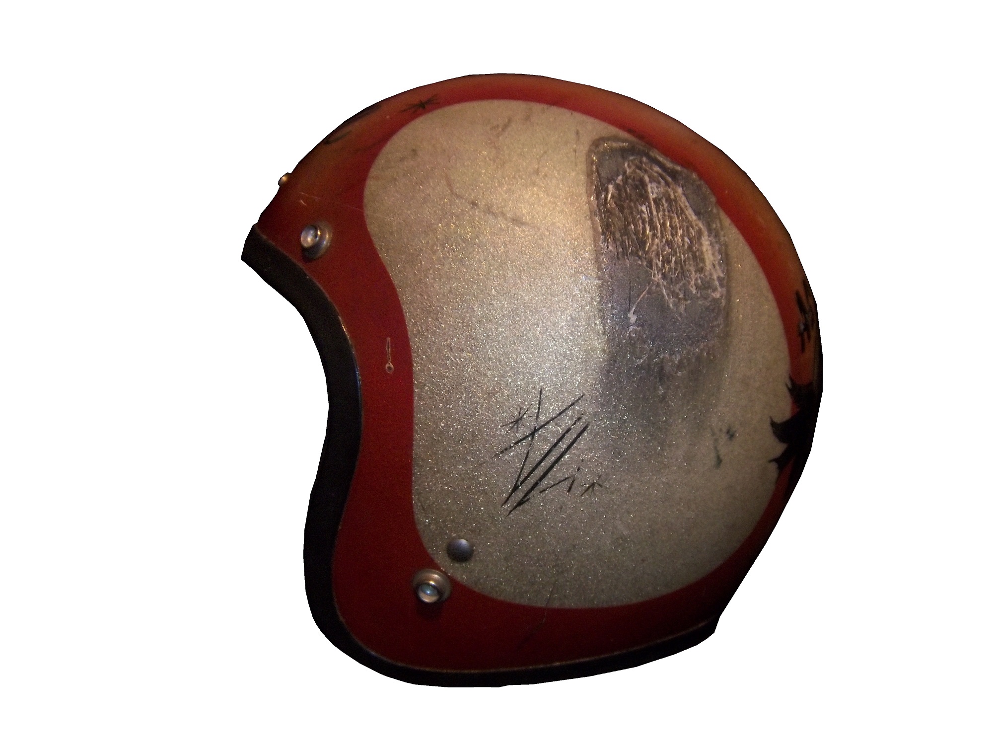
For a helmet that went through a scary-looking wreck, it is in good shape…and that is not by accident. It was worn by Richard Lasater throughout the 1993 season. At the 1993 Fram Filter 500K, Lasater was involved in that scary wreck, and wasn’t seriously hurt. As for overall damage, it is mainly scratches, scrapes and dings, no cracks or serious damage.
The helmet kept Lasater safe and suffered minor damage because that is what it was designed to do. After the race, he autographed the helmet and it wound up in my collection. This helmet shows better than any other helmet I have the reasons why proper equipment is needed in racing.
On to Paint Schemes…
Jamie McMurray #1 Bass Pro Shops Chevy SS White? Seriously? Did the designers not realize that the white looks awful? The black and orange color scheme works, but white? I don’t get this scheme at all, and it gets an F grade
Marcos Ambrose #9 MAC Tools Ford Fusion Good color choices here. The basic design is solid. I can do without the quarter panel design, but it is still a good scheme with a B grade-
Danica Patrick #10 Go Daddy St. Patrick’s Day Chevy SS I would like to thank the 1978 Cincinnati Reds for being one of the first teams to wear green on St. Patrick’s Day for encouraging this awful F grade scheme.-
Denny Hamlin #11 Fedex March of Dimes Toyota Camry There are two schemes that fans voted for. With Hamlin on the shelf for a while, Mark Martin and Brian Vickers will share the 11 ride. That said, scheme #1 I don’t hate, but it has something odd going on with the hood and nose design…I swear it looks like the two parts were designed by different people who never interacted with each other, and that earns it a C grade Scheme #2, the better of the two schemes, not only looks more like a FedEx scheme, it is simpler and much cleaner as well, and earns an A grade.
Tony Stewart #14 Rush Truck Centers Chevy SS Good color and design schemes here. A Grade
Kyle Bush #18 Snickers Bites Toyota Camry A paint scheme that has a great color scheme, and illustrates the theory that less is more. Nothing bad about this Scheme-A+
Jeff Gordon #24 Imron Elite Real Truck Paint Chevy SS Based off the classic Jeff Gordon Scheme, it looks really good, and it works as a paint scheme. Great color scheme used here…A+
Jeff Gordon Cromax Pro Chevy SS Another good DuPont inspired scheme with a great color scheme and great design-A+
Ken Schrader #32 Federated Auto Parts Ford Fusion Federated Auto Parts always has great looking cars, and they do not disappoint here. Great color scheme and great design earn a great grade of A+
Timmy Hill #32 U.S. Chrome Ford Fusion NASCAR rules prevent using chrome in most NASCAR paint scheme aspects, which is kind of disappointing since this scheme should have a bit of chrome in it. Even so, it is still a solid A scheme, with great colors and simple, yet elegant design
Josh Wise #35 MDS Ford Fusion The color scheme of the car, and the color scheme of the logos match! As a direct result, the car looks so much better! This scheme earns a B grade because the deisgn on the quarter panel needs some work.
Ryan Newman #39 HAAS Automation Chevy SS Great color scheme, good basic design, I love the diagonal hood logo, A+ Scheme
Brian Vickers #55 RK Motors Toyota Camry Basic design with an uninspired color scheme. The car is just blah. I can’t give this scheme anything except a C-
Brian Vickers #55 Jet Edge Toyota Camry A better color scheme takes the grade from C to B
Joe Nemecheck #87 Maddies Place Rocks Toyota Camry Simple design, decent color scheme, good hood logo, Final grade B
Dale Earnhardt Jr. #88 Amp Energy Chevy SS Orange? Amp’s main can color is green. It’s not a bad design, but using a color that isn’t really used on the packaging earns this scheme a C-
