Last week, I ranked the Ford teams based on their paint schemes, and this week I will do the Chevy teams and next week I’ll rank the Toyota teams, so without further ado all the Chevy teams ranked from best to worst:
#2 Furniture Row Racing #78 When it came down to picking a number 1 for Chevy, for both the Paint Schemie and the Leaderboard, I had to flip a coin to pick a number 1, and Johnson won. Kurt Busch ran a series of very solid schemes, not a lot to comment on and it always looks good.
#19 Circle Sport/RCR #33 It amazes me how two different teams can use the same car number, and both can put awful designs on their cars. Special credit for the Honey Nut Cheerios scheme, which is just horrific.
Last week, I had a column run on Uni-Watch, and I delayed this article until this week. Two weeks ago, we discussed visors, this week, we will discuss what has become known as the “helmet stripe.” Helmet stripes came from IndyCar and Formula 1 cars, which are open cockpit cars. Helmets are clearly visible to television cameras and fans. As a direct result, helmet design in Formula 1 has become its own unique art form. Helmet designs become a part of the driver identity. The other thing that these open cockpits allow is for sponsorship opportunity. As such, a small opaque stripe is used on helmet visors.
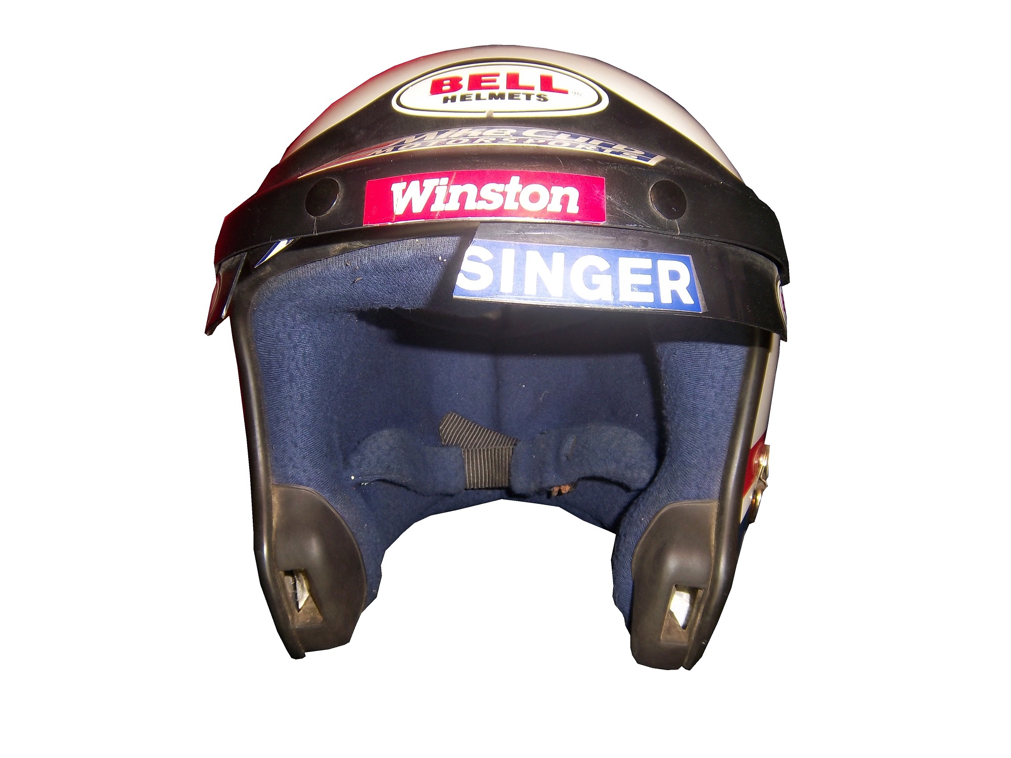
In NASCAR, the visor was slow to arrive. This is due to two reasons, first, many drivers up until the mid 1990’s chose to wear open-faced helmets. While these helmets had a shade to help keep the sun out of a driver’s eyes. While sponsor logos do show up, they were used for the driver’s name. This Brad Noffsinger example from 1988 is an example of that.
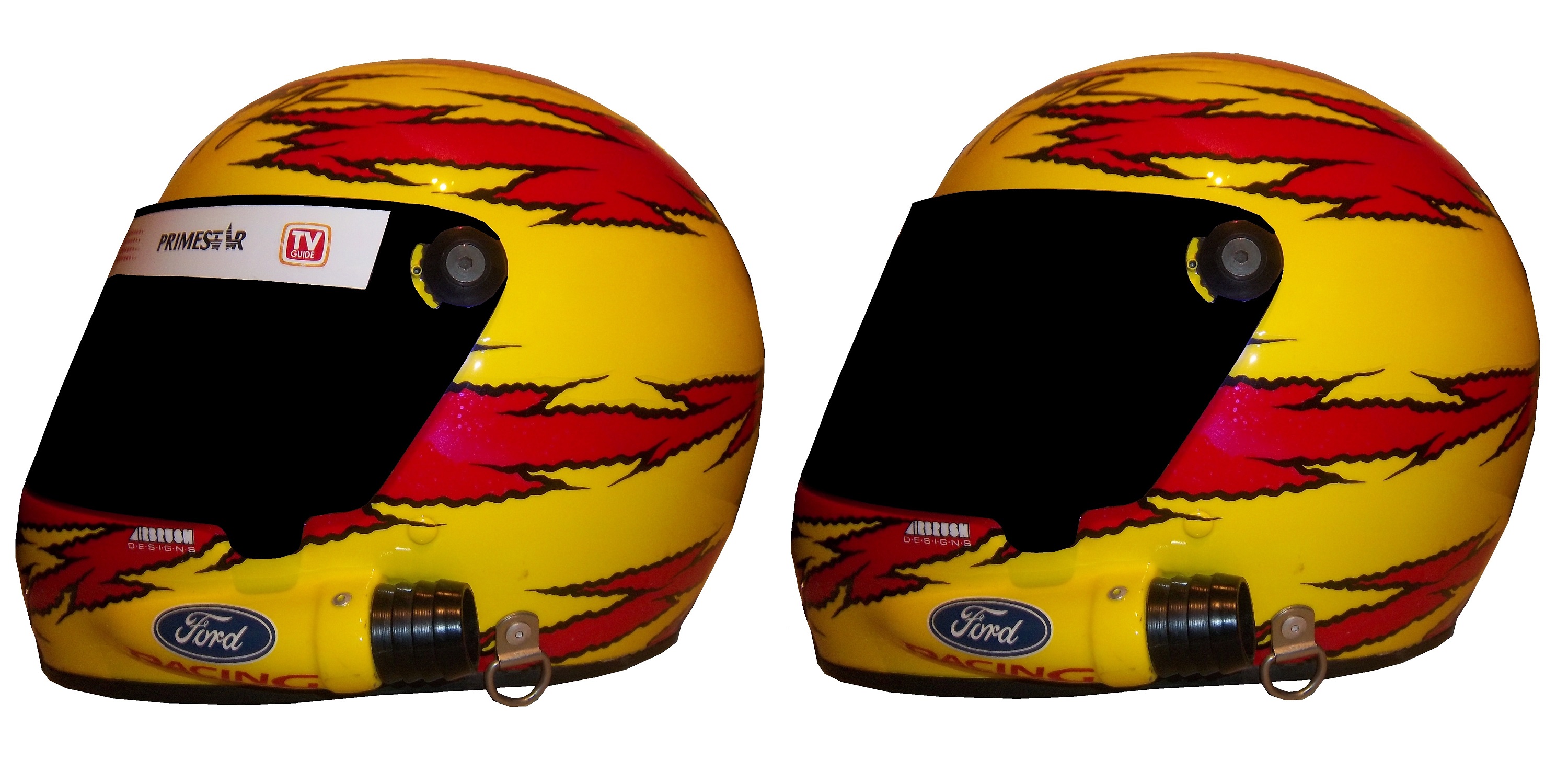
The second reason that helmet stripes were slow to come to NASCAR is that in-car cameras, while used, were for many years positioned in such a way that the visor would not be seen. Even if helmets were painted, the visor had no stripe. When the in-car cameras were positioned to film the driver from the side and even from the front, the helmet stripe became the standard. The stripe is designed to fit over the part of the visor that overlaps the opaque part of the helmet, as this example shows.
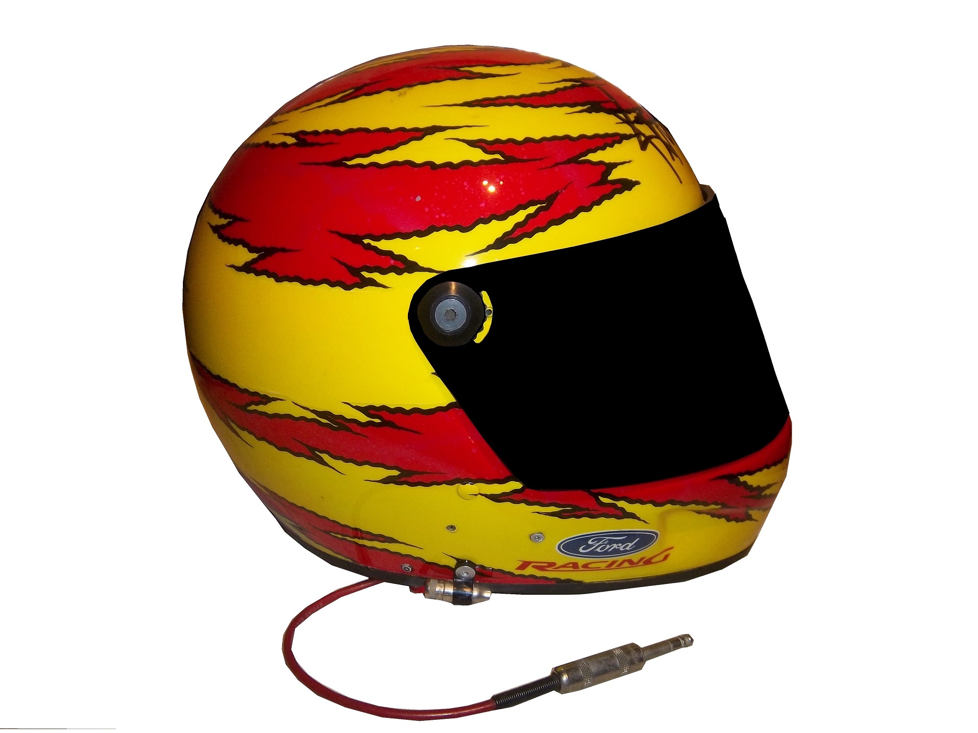
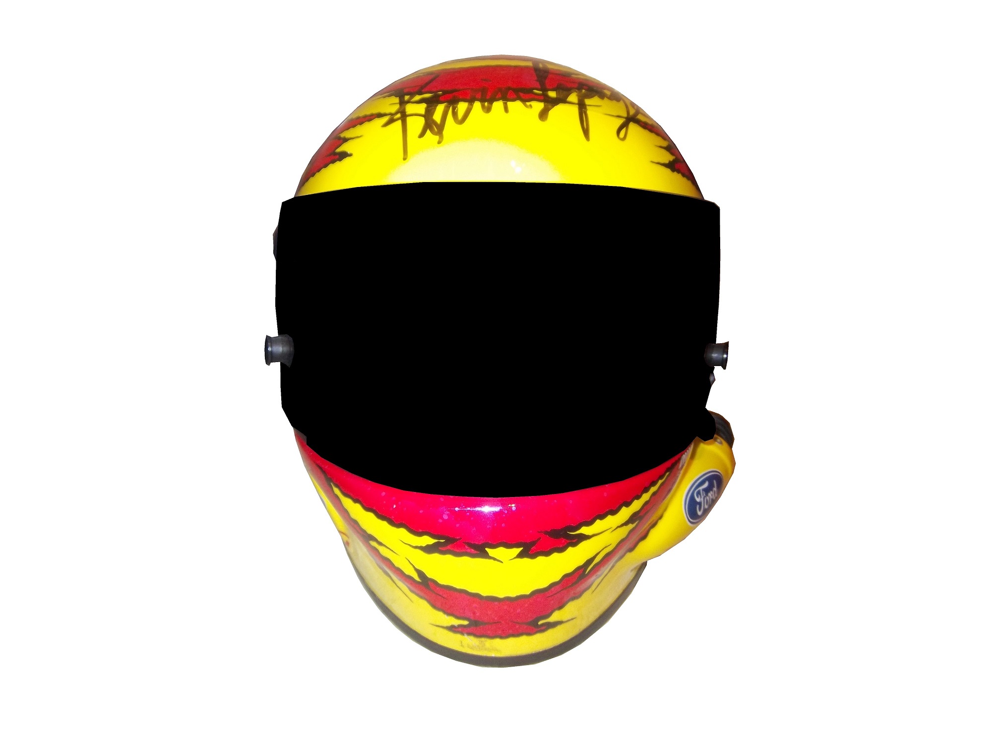
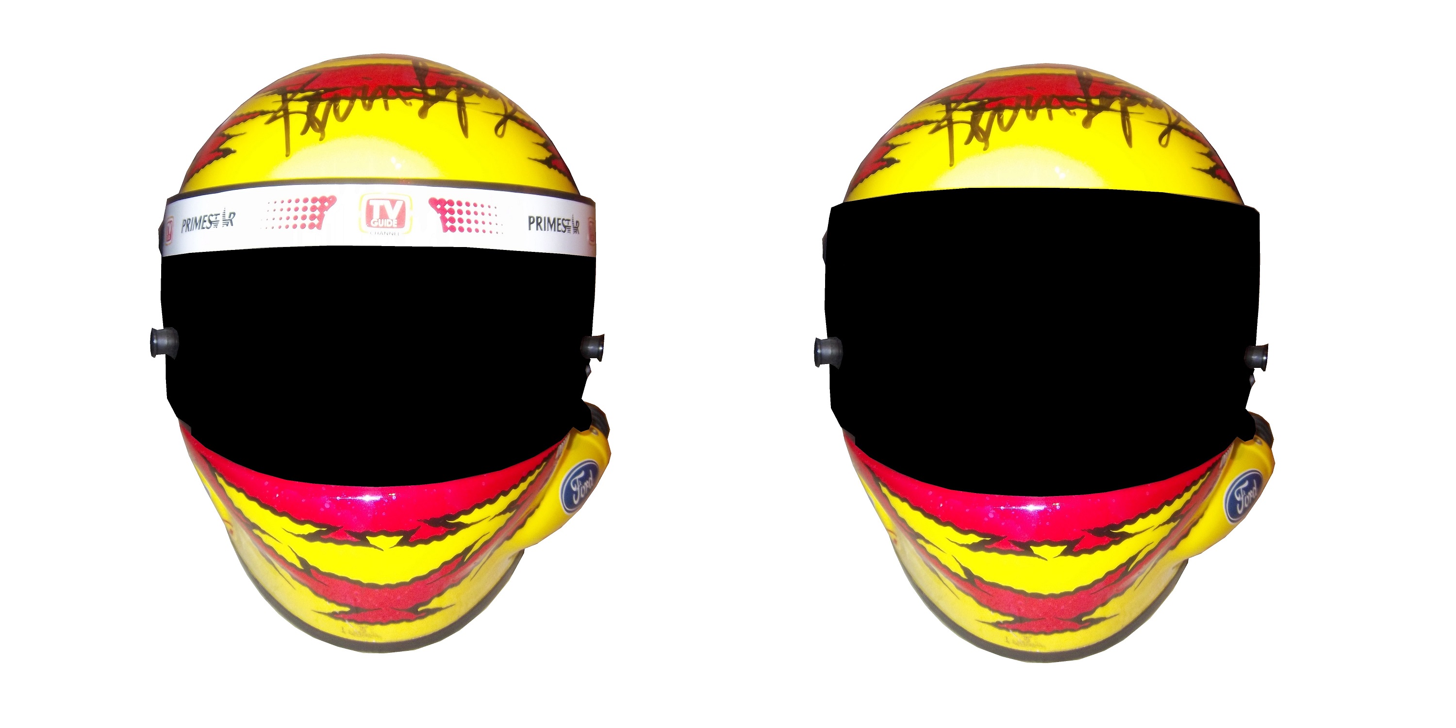
Helmet stripes have become standard. To show how it affects the overall look of the helmet, I took this Kevin Lepage helmet from 1999, and edited the pictures to show how it looks.
Not bad, but let’s compare it side by side to the original helmet…
Helmet stripes have become a unique way for a driver to customize a helmet, as this video shows:
Facebook pages and Twitter helmets are becoming standard on these. All visors that a driver would wear on a helmet have these stripes, which is standard, as visors are changed on a regular basis, and sponsors want the advertising space that they pay for.
Paint Scheme Reviews!
Because of the Uni-Watch article last week, I didn’t get to review paint schemes. Within the last couple of weeks there were a large number of 2014 paint schemes released. Now I know that many of these will change before the start of the 2014 season, but I will grade them anyways.
Tony Stewart #14 Bass Pro Shop/Mobil 1 Chevy SS I get that two companies with different desgin schemes are sharing the car, but this is just brutal to look at. The orange and camo contrast is hideous, and the overall design is overdone. C-
Tony Stewart #14 Mobil 1/Bass Pro Shop Chevy SS The white and black contrast just looks awful! I really hope this changes before the season starts, because this is a scheme that is painful to look at. I have to give it an F
Tony Stewart #14 Code 3 Associates/Mobil 1 Chevy SS As bad of a color scheme as this is, it is certainly better than the other two Tony Stewart schemes are. That said, the color scheme warrants an F while the design warrants an A, so I’ll split the difference and give it a C
Jeff Gordon #24 Pepsi Max Chevy SS I gave this scheme a C-, but given the *ahem* other Pepsi Max scheme, I’ve reconsidered, and I will give this scheme a B
Aric Almirola #43 Smithfield Foods Ford Fusion If the hood and front were done in the stars design, and the rest of the car was red and white striped, it would look better, and I would be able to give it more than a C+
Jimmie Johnson #48 Lowes Chevy SS Supposidly, this will be the main scheme for the whole season, and I have to say it looks amazing, and is an A+ grade
Jamie McMurray #1 Cessna/Auburn University Chevy SS The white hood and roof just look aukward, compared to the black covering the rest of the car. That said, it is still a decent scheme, and I’ll give it a B
Landon Cassill #33 T-Mone Chevy SS This is a perfect example as to why only one person should design a car. It looks like it took at least 3 people to design the car, each with a different idea as to what the car should look like. And in the end it is just a mess, and not even a good color scheme can give this scheme a passing grade. F
Kurt Busch #78 Wonder Bread Chevy SS To celebrate the return of Wonder Bread, Kurt is going to channel Ricky Bobby, except for one difference…this scheme is a lot better than the Ricky Bobby Scheme. No flames and the baloons coming from the brake duct are a great look for this car, and it earns an A
Dale Earnhardt Jr. #88 Mountain Dew/Xbox 1 Chevy SS It has a great color scheme, and that is the nicest thing I can say about it. The design is just awful, and it looks like it will give people seizures as it drives around the track. I give it an F
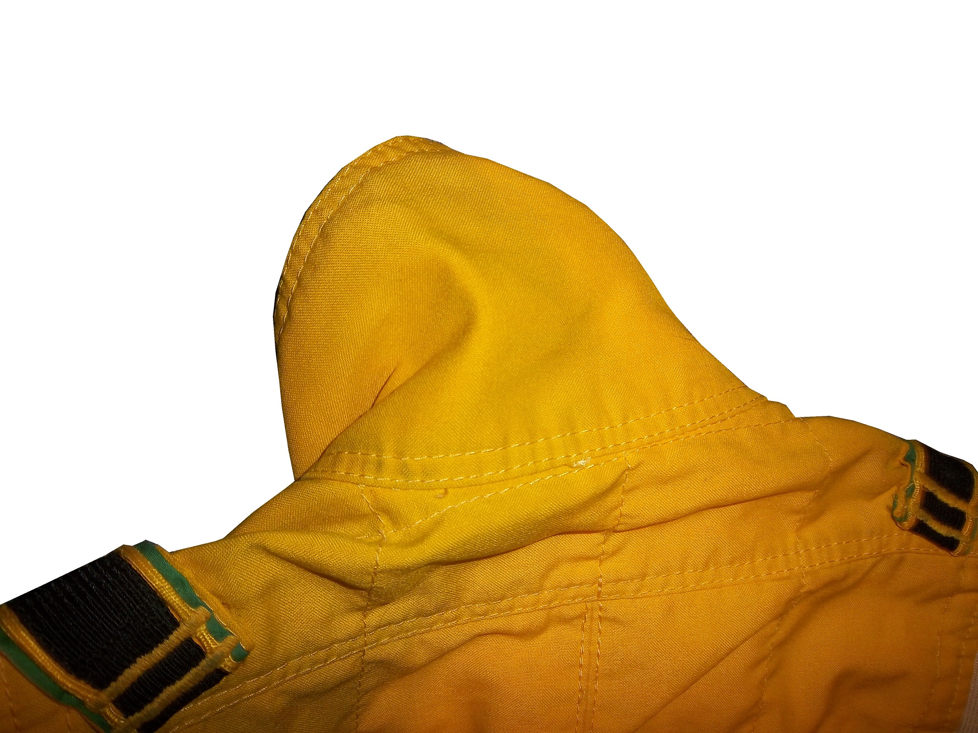
The driver suit is almost always customized for the driver, and as such, the driver has the option of adding customizations to the suit. This may come in the form of size,
and belt design,
but the back of the neck is a unique place for customizations. The designs that are placed on the back of the neck are as unique as the driver themselves.
I’ve gone at length to discuss the FIA certification which is frequently sewn into the back of the neck. This is a prominent feature in Formula 1 and IndyCar. That is standard issue, so no real need to comment on it any more.
n NASCAR, the back of the neck can be used for a myriad of different customizations. One of the most common is a car number, such as this Christian Fittipaldi suit,
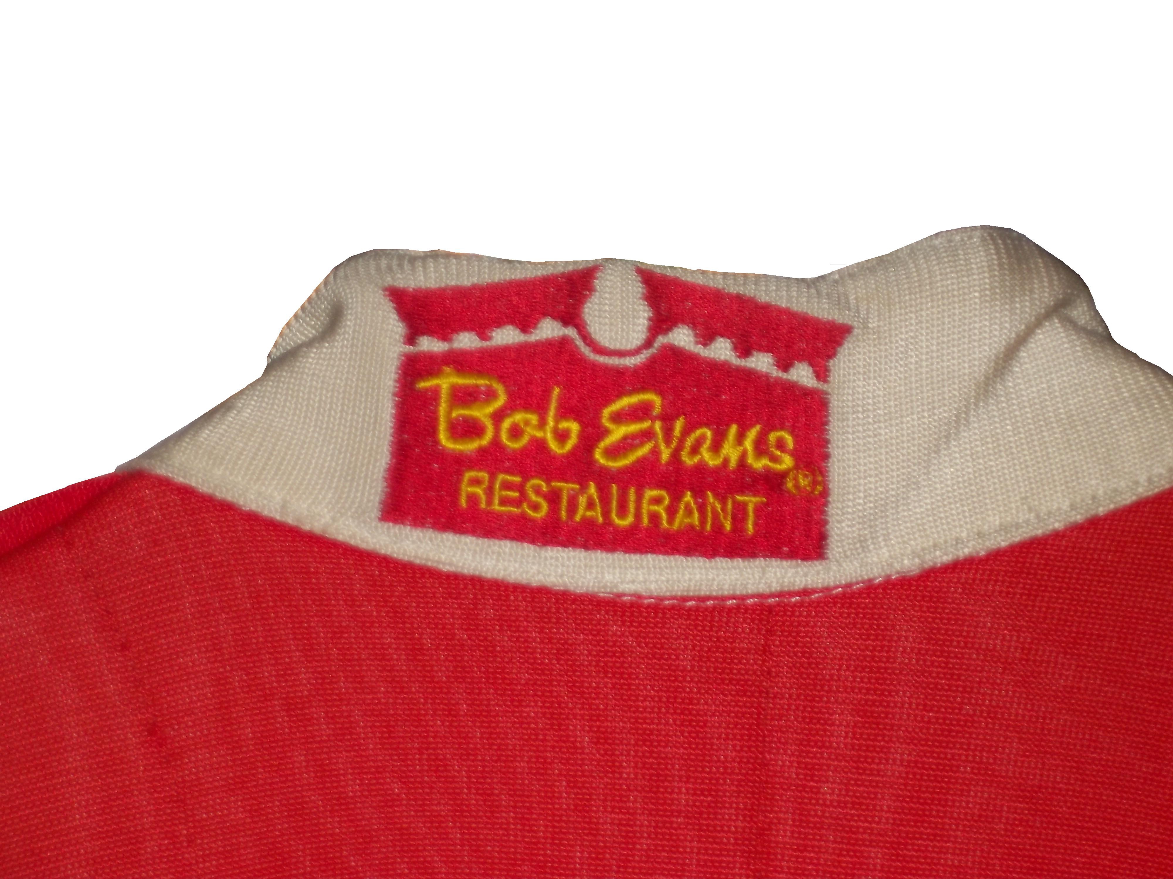
and another common feature can be sponsor logos, such as this Randy LaJoie Bob Evans suit from 1999-2000,
and this Joey Miller Craftsman Truck Series suit from 2005.
This Kasey Kahne suit has the Evernham Motorsports logo sewn into the back of the neck.
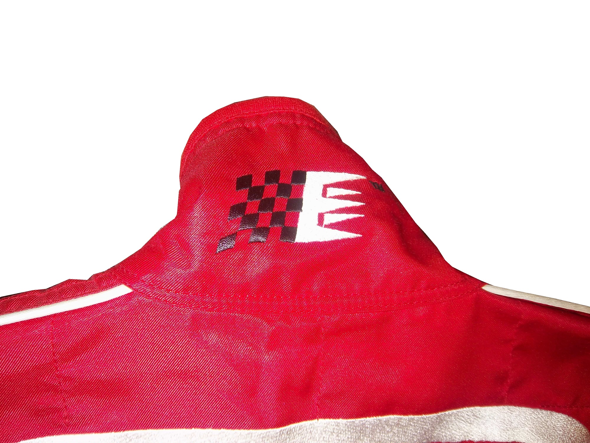
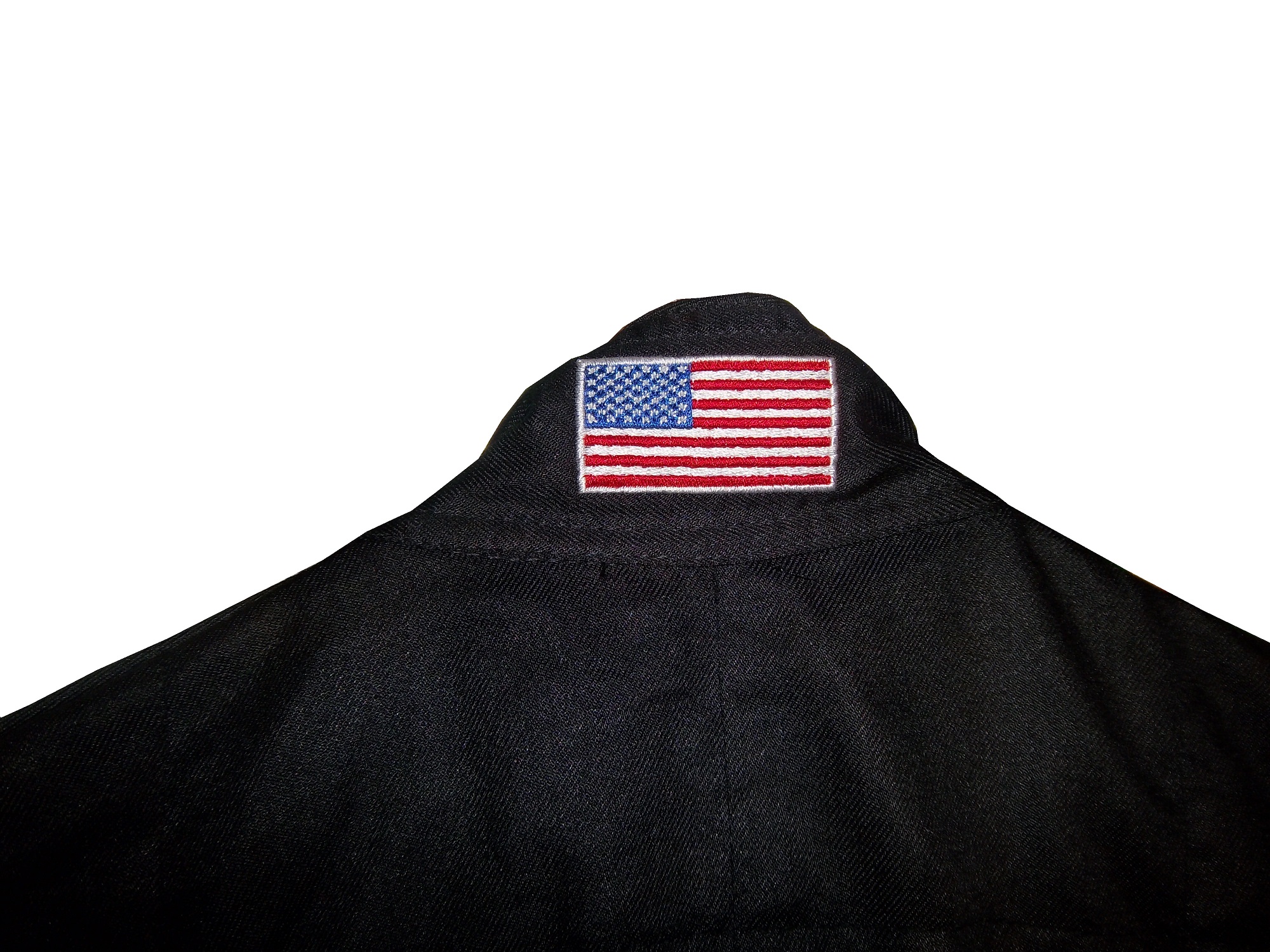
And Roger Penske likes to have the American Flag on the back of the neck of his suits, as evidenced by this David Stremme suit from 2009.
Older Simpson driver suits have been known to have an inventory number sewn here, as exampled by this Mike Skinner suit from 1997,
and this Stevie Reeves example, again from 1997.
But for my money, the personal customizations are more fun when they are as unique as the driver is. In this Terry Labonte suit, Terry has added a Texas logo.
My favorite customization is from a Boris Said suit from 2005. Said has added a Boris Badenov design to the back of his neck.
It’s the little things that make a suit personal, and these are some of those little things. Who says a driver suit can’t be fun.
And of course, it goes without saying that the neck is frequently left blank, as exampled by this Nort Northam suit from 1988.
Jamie McMurray #1 Cessna Patriotic Chevy SS Pretty good scheme here, red white and blue is always a solid scheme, but the one gripe I have is the pointless circle around the door number. While it gives the car a vintage look, it is just out of place here. Even still, this scheme is a solid A-
Kasey Kahne #5 Hendrick Cars Chevy SS Red white and black is a very solid color scheme, and the design, while a bit convoluted looks really good. It has a hurricane-esquire design that looks really good. A-
Danica Patrick #10 Go Daddy .US Chevy SS The simple design of this scheme looks really good…but what is going on with the colors? Why is the car painted in Russian dressing green? Russian dressing is good, but not as a color scheme. The red white and blue designs clash, and it just looks awful. D-
Kyle Busch #18 Interstate Batteries All Battery Center Toyota Camry Now THIS is what an Interstate Batteries scheme should be! The classic dark green, gold and white color scheme is amazing, and the design is simple yet very attractive. Giving this scheme an A+ is not saying enough about how great this scheme is!
Jeff Gordon #24 Axalta Standox Chevy SS White flames on a blue background? Seriously? I could forgive it if it was blue flames on a white background, blue flames look really good. But white flames? This design ruins a great color scheme AND a great design scheme TOGETHER! Now that is impressive! F-
Jeff Burton #31 Quikset Chevy SS Decent color scheme but the design needs a little work. If the red was on the hood, roof and deck-lid and the black was on the sides, I would give it an A, but the shark-fin design is brutal on the eyes, and serves no real purpose. As such, I can only give it a C-
AJ Allmendinger #51 Neil Bonnett Throwback Chevy SS While I like most throwback schemes, this one, while accurate, has the worst color scheme I have ever seen. It just screams 1980’s. Hot pink and neon yellow really stands out, and not in a good way. Still, I do miss Neil, and they were pretty accurate, so I will give this scheme a B
Many race fans have seen these small patches on driver suits, and may have wondered what they are. What many do not realize is that these small patches have a very critical role in driver safety. These small patches are the safety certification patches. These small patches state that this uniform part has been examined by one of the two groups, and determined to meet the standards set by the group. For North American made equipment that group is SFI.
According to their website, SFI was founded in 1963 as part of Speed Equipment Manufacturers Association or SEMA, as a safety group. Back then, the safety culture wasn’t as rigorous as it is today, and there were not many standards in place. SEMA started the safety certification with SFI or SEMA Foundation, Inc certification. If the equipment didn’t meet SFI standards, the participant could be denied entrance to the event. Eventually, SFI left SEMA and became its own independent group.
Since then, SFI has certified safety equipment, and their certification is the standard in North America. This small patch is usually sewn into the inside wrist area on the left sleeve. This example, from a Terry Labonte suit from 2008, indicates that the suit meets “3.2A/5” standards. According to their site, this certification is standard for driver suits, and this suit would need re-certification in the next 5 years, or 2013. This certification is standard for many NASCAR suits, as shown below.
For suits made internationally, the certification comes from a different group, the FIA Institute. Like SFI, the FIA Institute has the exact same goal, to make sure auto racing is safe, and that the equipment that drivers wear is as safe as possible. Unlike SFI however, FIA certification ends up in one of two places, either on the back of the neck,
or inside the belt,
Both certifications serve the same purpose and both are mandated in racing today. These certifications also appear on driver gloves,
and even helmets, usually on the HANS anchor
Moving on to more 2013 paint schemes…
Trevor Bayne #6 Valvoline Ford Mustang Love this scheme! This brings back some fond memories of Mark Martin behind the wheel back in the 1990’s. The color and design scheme are amazing, so it gets an A
Brad Keselowski #22 Hertz Ford Mustang Only Penske can ruin one of the best color schemes with an awful design. Seriously what is the design on the front? It kills this scheme. Final Grade: D
Travis Pastrana #60 Ford Mustang What the Hell? Did Lisa Frank design this car? I’d love to comment on the color scheme, but just looking at the picture is enough! I didn’t think it was possible to make a scheme worse than the Kyle Bush Sponsafier car, but here we are! Final Grade: F’
By the way, I never thought I would reference Lisa Frank in this blog…
Casey Mears #13 Geico Ford Fusion Eww…just eww. The color scheme is dreadfull, and the designs on the side are painful to look at. It passed because of the logo and number design. Final Grade: D-
Kyle Busch #18 Interstate Batteries Toyota Camry Great color scheme, and good basic design, but there is something with this car I find annoying. The driver’s name is on the windshield and above the door, so why is it on the top of the hood? Not just on the top of the hood, but UPSIDE DOWN as well? Seriously? It makes no sense, and takes the final grade down to a B


