Here are my thoughts on the Generation 6 car after the Sprint Unlimited
Here is a video showing the new cars in action…
Why did the roof logos come to NASCAR? I stated during Winter Testing that I thought that the logos would show up on roof cameras…but they can’t. The logos on the roof are all but invisible to the in-cars, and are next to impossible to see at speed on the regular cameras circling the track. The whole point of sponsorship is for the logos to be seen, but the roof logos defy that, so really, they are useless
Fox debuted several new cameras, including a revamped zipline camera called the CAMCAT that flies over the track, and a gyroscopic camera that stays level even when the car is on a banking. The new zip line camera is really good, and the gyroscopic camera gives the fan a really good idea of how banked the track really is.
The new cars in general look really good, and I was wrong about the names on the windshields. They do look good, and they are easy to see with the in-cars. I don’t approve of the manufacturer logos on windshield on either side of the name though. In addition to the larger roof flaps, the cowl flaps are visibly bigger, and have been moved to the hood.
The orange Home Depot back bumper on the Dollar General Toyota driven by Matt Kenseth looks really weird. As does the door design on the Target Chevy.
Man! Kevin Harvick’s car looks really good, as does Dale Jr’s! Martin Truex in the Napa Toyota is the most improved paint scheme of the whole field.
The cars seem to be sparking more than they did last year. They also look “cleaner” than they did last year. They have cleaner lines and cleaner windshields.
Speaking of windshields and windows the side windows need to be attached better. During the wreck, one car lost a side window, and Carl Edwards lost a side window in the final laps of the race. NASCAR needs to look into that.
The fan picks format worked really well, and I hope this shows up again during the All-Star Race
Now on to photo matching.
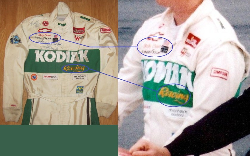
One of the best ways to authenticate a driver suit as having been worn by the driver is to find a photo of the driver wearing the suit. In many instances, this is not possible. In other instances the driver wears several different suits throughout the season, and finding the exact suit can be difficult. Let’s take a look at a Ricky Craven suit from 1996.
This suit was difficult to photo match but I thought I had in this photo from Fuller Motorsports and Collectibles.
Upon closer inspection, this suit in the photo and the suit in my collection are not the same.
The location of the yellow RACING embroidery is in a different location, the leg stripes in the photo are white whereas the suit I own has green leg stripes…but modifications are not uncommon, and the name and GOODYEAR logos are in different places as well.

This card is from 1996, and shows Craven clearly wearing the suit in my collection.
The RACING, GOODYEAR, and name are all in the correct place. The only difference is that the ALARM SOUTH and MANHEIM AUCTIONS logos are not seen in the card, but on the suit they were clearly added later. They are patches on the suit whereas everything else is embroidered on the suit.

Now on to paint schemes…a lot of ground to cover
We start with the Truck Series
Dusty Davis #1 Accell Chevy Silverado Good Color scheme, simple yet attracive design, final grade: A
Jeb Burton #4 Arrowhead Chevy Silverado Color scheme is great, but the door design is a little overdone. The Arrowhead sponsorship could be used better with an arrowhead design on the door. Still it is a decent design that earns a B-
Justin Lofton #6 MADVAPES Chevy Silverado The early 1990’s called, they want their design back. All joking aside, this is actually a good scheme. The color scheme is great, and the design, while loud, is attractive. Final Grade A
John Wes Townley #7 Zaxby’s Toyota Tundra There is nothing right with this design. Everything here is just awful, and earns the F grade it deserves.
Max Gresham #8 AMWINS Chevy Silverado The side stripes are good, the color scheme is good, and it gets an A grade
Ron Horniday #9 Smokey Mountain Herbal Snuff Chevy Silverado First off, I thought snuff was banned as a sponsor from NASCAR…oh well…anyway, the design is good, and the color scheme is good, thought the gold could be a little bolder. Final Grade A-
Jennifer Jo Cobb #10 Driven2Honor.org Chevy Silverado No redeeming factors at all…F-
Brad Keselowski #19 DrawTite/National Watermelon Association/Reese Racing Ford F-Series The Reese and DrawTite schemes are A grades, but the National Watermelon Association scheme gets an A+ for the graphics on the bed of the truck that make it look filled with watermelons..that is just awesome!
Ryan Blaney #29 Cooper Standard Ford F-Series Another great color and design scheme, and I love the yellow wheels…A+
James Buescher #31 Rheem Chevy Silverado The Same as Kevin Harvick, and it is a good scheme…A
Devin Jones #35 Veristor Chevy Silverado Good colors bad design…C
Ryan Sieg #39 Pull-A-Part Chevy Silverado Good color scheme, but mediocre side design…C-
Kyle Busch #51 Toyota Care Toyota Tundra. Normally I would give this a bad grade, but give the fact that it is Kyle’s truck, the design and color schemes just scream Kyle Busch, so it is rather appropriate. I also love the Days of Thunder numbers and ROWDY above the door…A-
Darrell Wallace Jr. #54 Toyota Care Toyota Tundra I’ll forgive this one as well…A-
Dakoda Armstrong #60 Winfield Chevy Silverado This I will not forgive for one simple reason…THE SPONSOR LETTING IS NEXT TO INVISIBLE ON THE WHITE BACKGROUND! The point of sponsorship is to make your logo and lettering as visible as possible! As such, this scheme gets an F
David Starr #81 BYF/Chasco Toyota Tundra Good color scheme and simple yet attractive design work well here. I like the Lone Star logo on David Starr’s truck as well…A+
Moving on to Nationwide Schemes
Brad Sweet #5/Dale Earnhardt Jr. #88 Great Clips Chevy Camaro This looks like a paint scheme that was thrown together at the last minute by an art student. The color scheme is odd, and the design is just weird. What does this has to do with a barber shop? Final Grade D+
Paul Menard #33 Menards Chevy Camaro Pretty much the same scheme as his Sprint Cup Scheme…Same grade too C-
Parker Kligerman #77 Toyota Toyota Camry You can never go wrong with a plain black car with white lettering…A+
Now on to the Sprint Cup
Jamie McMurray #1 Race With Insulin Chevy SS A good design based on Charlie Kimball’s IndyCar race car that has a simple yet good design, and a great color scheme. My only complaint here is that the stripe doesn’t go far enough back. Final Grade: B+
Kasey Kahne #5 Great Clips Chevy SS Huh? What does this design have to do with a barber shop? This design looks like the team didn’t have enough of one single color and went with a patchwork design to make it work…but it doesn’t work, and it gets a D+ grade
Dave Blaney #7 Sany Chevy SS Great color scheme ruined by bad door design and generic racing number design. The design is just disgusting to look at, and it gets a D- The paint scheme saved it.
Kyle Busch #18 Interstate All Battery Center Toyota Camry This is a design that has elemets from the Dale Jarret and Bobby Labonte eras. I love this design! Great color scheme, simple nostalgic design, and it gets an A!
Mike Bliss #19 G Oil Toyota Camry This is a very weird design…the weed design doesn’t do the car any favors, and the doors and quarter panels are worse. Green, black and white is usually a good scheme, but here is just falls flat. I love how the nose makes it look like the car has a piece of cilantro stuck in its teeth and that boost the grade to a C-
Trevor Bayne #21 Motorcraft Quick Lane Ford Fusion This is based on the 1963 Daytona 500 winning car Tiny Lund drove and it looks really good! I can’t give this scheme any lower than an A so I won’t.
Michael Waltrip #26 Sandy Hook Support Fund Toyota Camry Are you serious? I think it is really disgusting that a support fund for a school shooting is sponsoring a car for the Daytona 500! I don’t know who thought this was a good idea, but it is just awful. I’m so sickened by the sponsor, I will just give the scheme an F-
Terry Labonte #32 C&J Energy Services Ford Fusion Is Terry trying to pull a Grey Ghost? If it wasn’t for the yellow decals, I would be convinced that this photo is in black and white. If the flames were red, or yellow, or even blue I could give it a higher grade, but I can’t give this scheme anything but a D
David Ragan #34 Peanut Patch Ford Fusion Good Color scheme, good overall general design, good scheme, Final Grade: A
Regan Smith #51 Guy Roofing Chevy SS Decent color scheme, the number change is not good from last year, and the basic design is decent, so I give it a C
Brian Keselowski #52 Wreaths Across America Toyota Camry Not bad, not bad at all. Great color scheme and decent design. The hood design needs a little work, the left side looks odd with a white box, while the right side has no box at all, but that is a minor complaint for an A grade
Mark Martin Aarons Toyota Camry Great design, great colors and simple designs that look good, it gets an A
David Reutimann #83 Burger King/Dr. Pepper Toyota Camry. Great classic design with a great color scheme that gets an A+
Travis Kvapil #93 Burger King/ Dr. Pepper Toyota Camry See Above, A+


