
 By David G. Firestone
For the end of the 2014 NASCAR Sprint Cup Season, the Paint Schemies have returned! The Schemies will reveal the best and worst paint schemes and driver suits of 2014. This was done using the Driver Suit Blog executive committee for paint scheme analysis and consists of me and me alone, and uses the following standards:
Color Scheme:How the colors look, and how they work with each other.
Overall Design:How good the design itself looks, is there too much, or not enough.
Primary Sponsor Logos: How the primary sponsor logos look on the car
Originality: How original is the scheme.
All of the above can work for or against a scheme, and all will be taken into consideration.
Let’s get the bad paint scheme awards out of the way.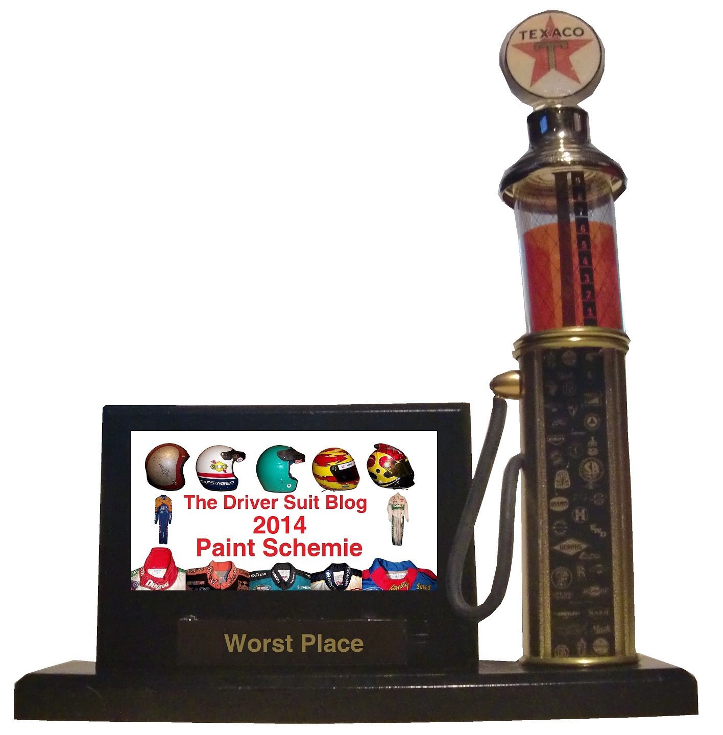
First, the Paint Schemie Award for Worst Regular Season Single Paint Scheme .
The nominees are:
Austin Dillon #3 Bass Pro Shops Chevy SS
Danica Patrick #10 Go Daddy Breast Cancer Awareness Chevy SS
Casey Mears #13 Geico Military Chevy SS
Clint Bowyer #15 Duck Commander Toyota Camry
Greg Biffle #16 Hire Our Heroes Ford Fusion
Joey Logano #22 Pennzoil Platnum Ford Fusion
Parker Kligerman #30 Phoenix Warehouse Toyota Camry
Morgan Shepherd #93 SupportMillitary.org Toyota Camry
Josh Wise #98 Provident Metals Ford Fusion
And the winner of the Paint Schemie Award for Worst Regular Season Single Paint Scheme is…
The next Paint Schemie Award is for Exhibition Race Paint Schemes. This category is a little different, as the Schemies will go to the best and worst special scheme that was run in either the Sprint Unlimited, the Sprint Showdown or the Sprint All-Star Race.
The Paint Schemie Award for Worst Exhibition Race Paint Scheme Goes To:
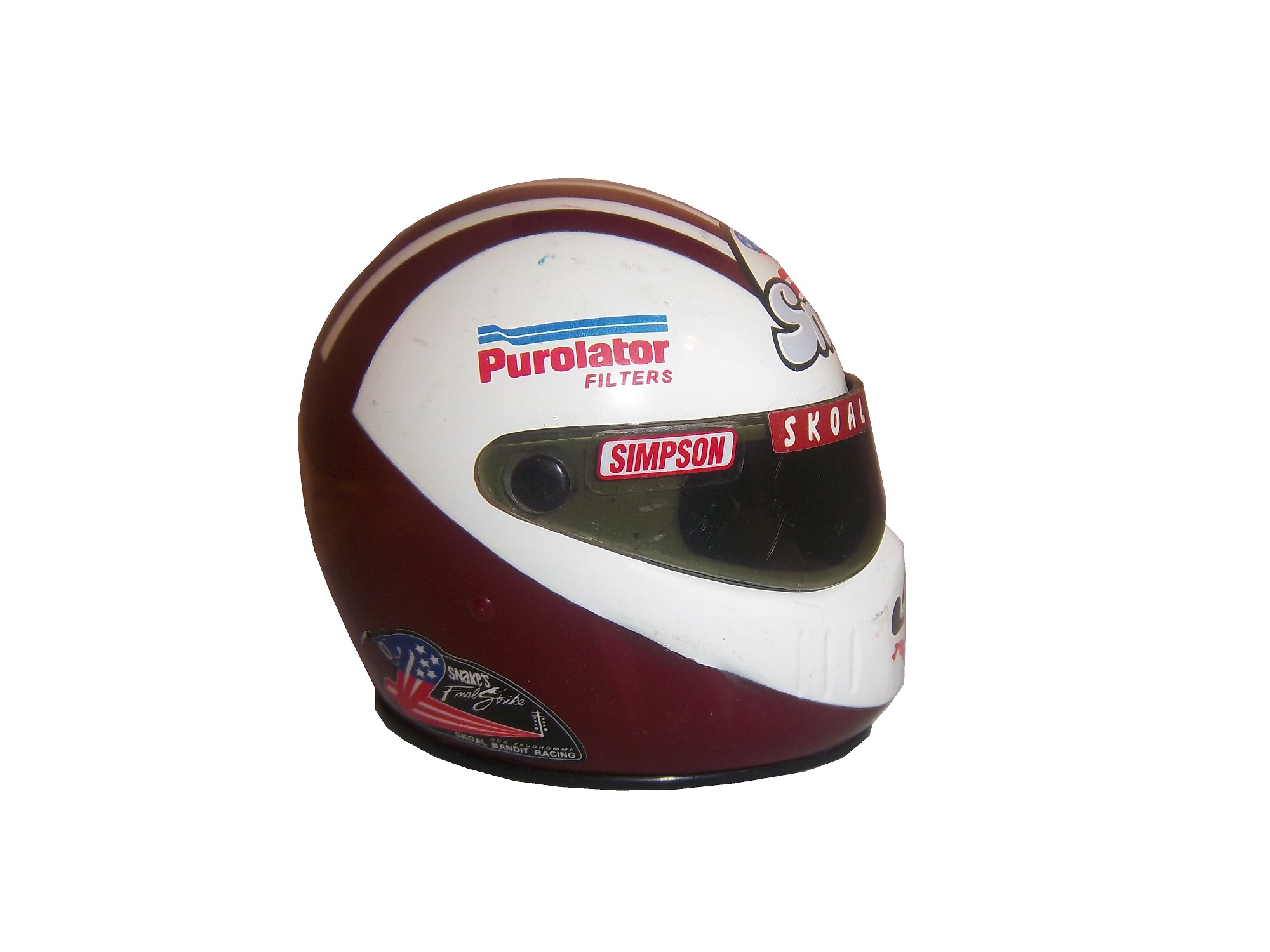
Blake Koch #32 Support Military Ford Fusion!
The paint scheme for worst driver suit goes to…
Joey Logano Auto Trader Ford Fusion
The Schemie for Least Improved Scheme Set from 2013 goes to
The next award is for Worst Paint Scheme Set, meaning the team that is running consistently bad schemes all year. The nominees are:
#16 Roush Fenway Racing Ford Fusion
#44 Xxxtreme Motorsports Chevy SS
#66 Michael Waltrip Racing Toyota Camry
The winner of the Award For Worst Scheme Set of 2014 goes to…
Michael Waltrip Racing #66 Toyota Camry!
Now after talking about the bad, we discuss the good. Here are the winners in the best category…
First, the Paint Schemie Award for Best Regular Season Single Paint Scheme.
Jamie McMurray #1 Cessna/Hawker Chevy SS
Brad Keselowski #2 Miller Lite Ford Fusion
Kyle Busch #18 M&M’s Toyota Camry
Trevor Bayne #21 Motorcraft Ford Fusion
Jimmie Johnson #48 Lowe’s Chevy SS
Brian Vickers #55 Aaron’s Toyota Camry
And the winner of the Paint Schemie Award for Best Regular Season Single Paint Scheme is…
The next Paint Schemie Award is for Best Exhibition Race Paint Scheme that was run in either the Sprint Unlimited, the Sprint Showdown or the Sprint All-Star Race.
And taking these schemes into consideration, the Paint Scheme Goes To:
Dave Blaney #77 Folcher Law Ford Fusion
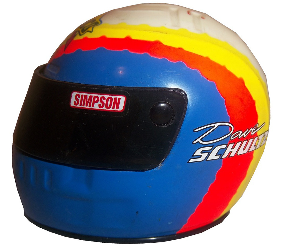
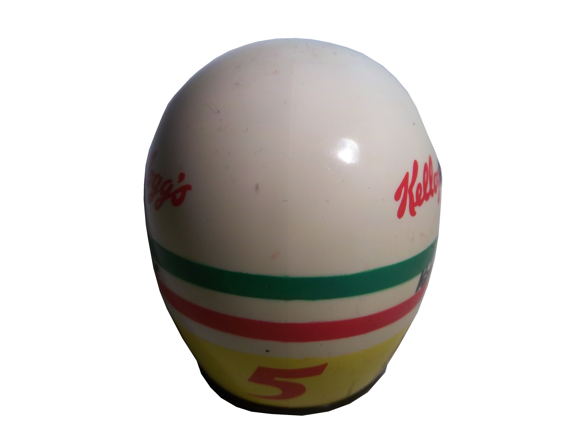
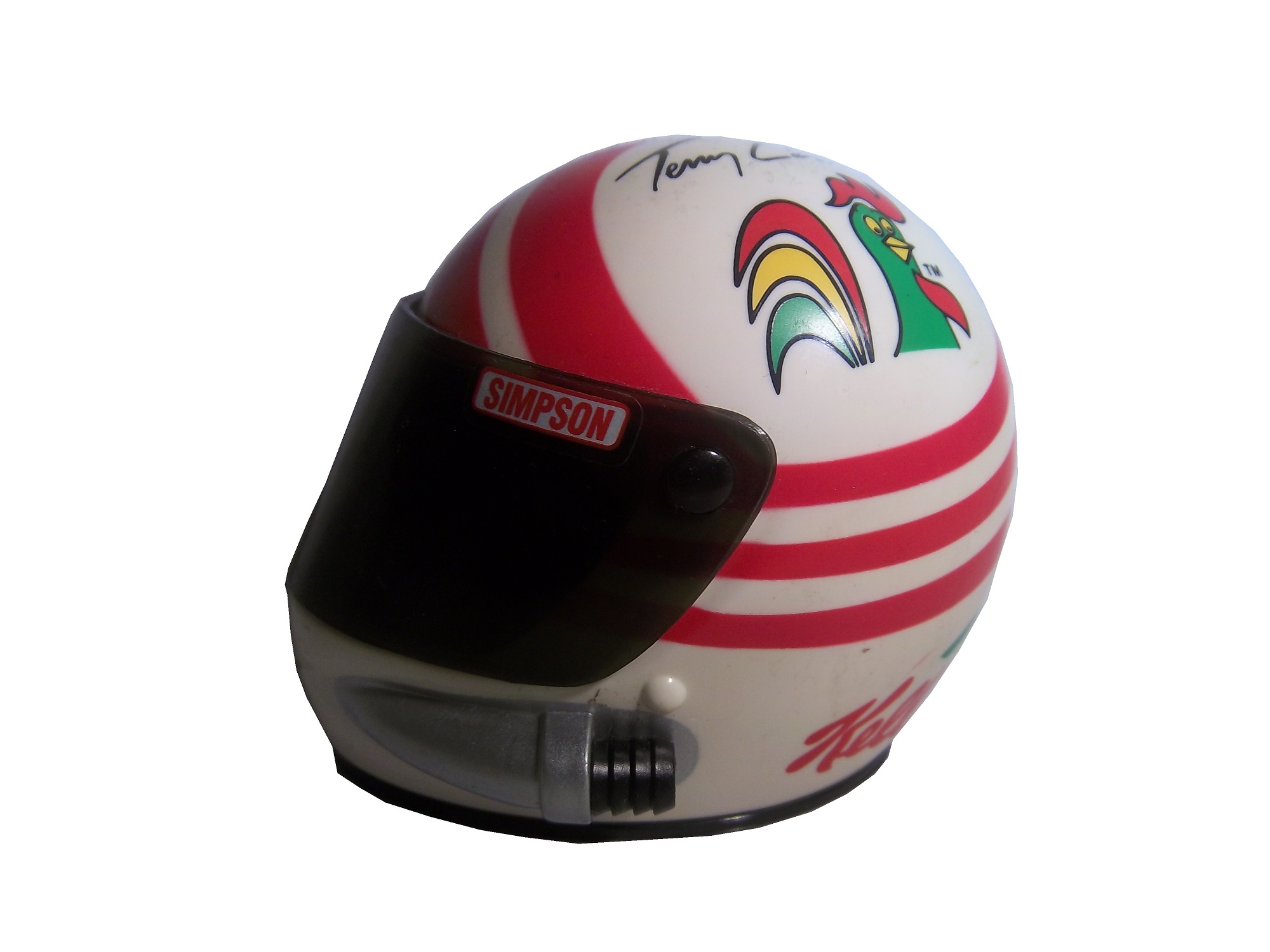
The Paint Schemie for Best Driver Suit of 2014 goes to…
The Paint Schemie for Most Improved Scheme Set goes to
We have a tie between Swan Racing/BK Racing, and Levine Family Racing, so both win the Schemie!
I will be adding a new category for this year, and it is best throwback scheme. It can be full time or special. The nominees are:
Brad Keselowski #2 Miller Lite Ford Fusion
Trevor Bayne #21 Motorcraft Ford Fusion
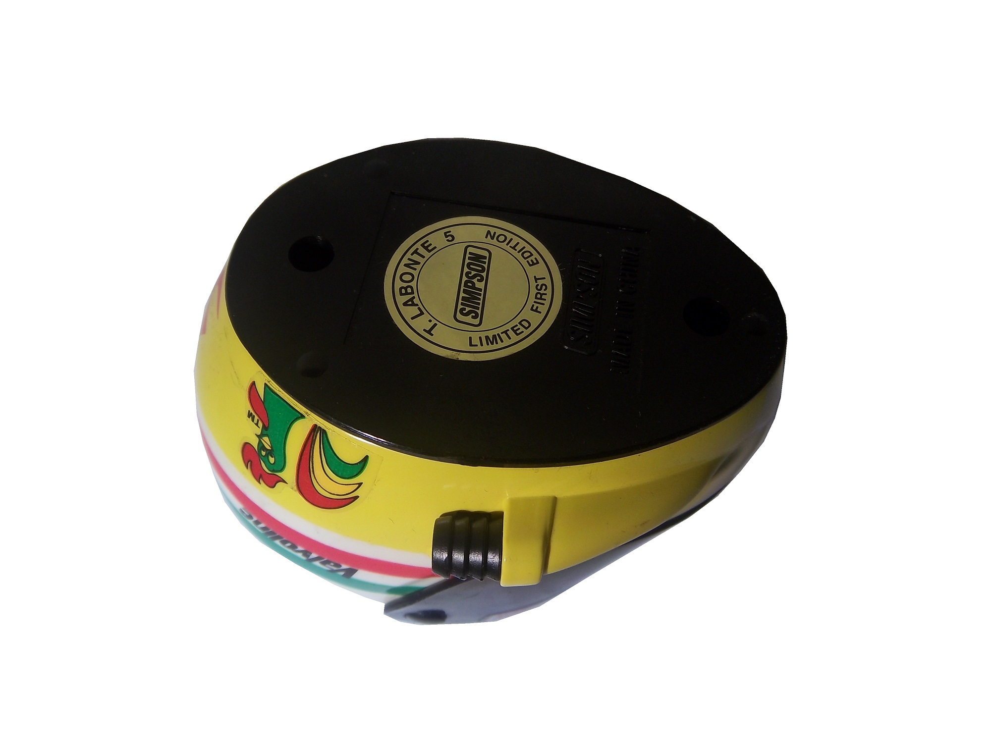
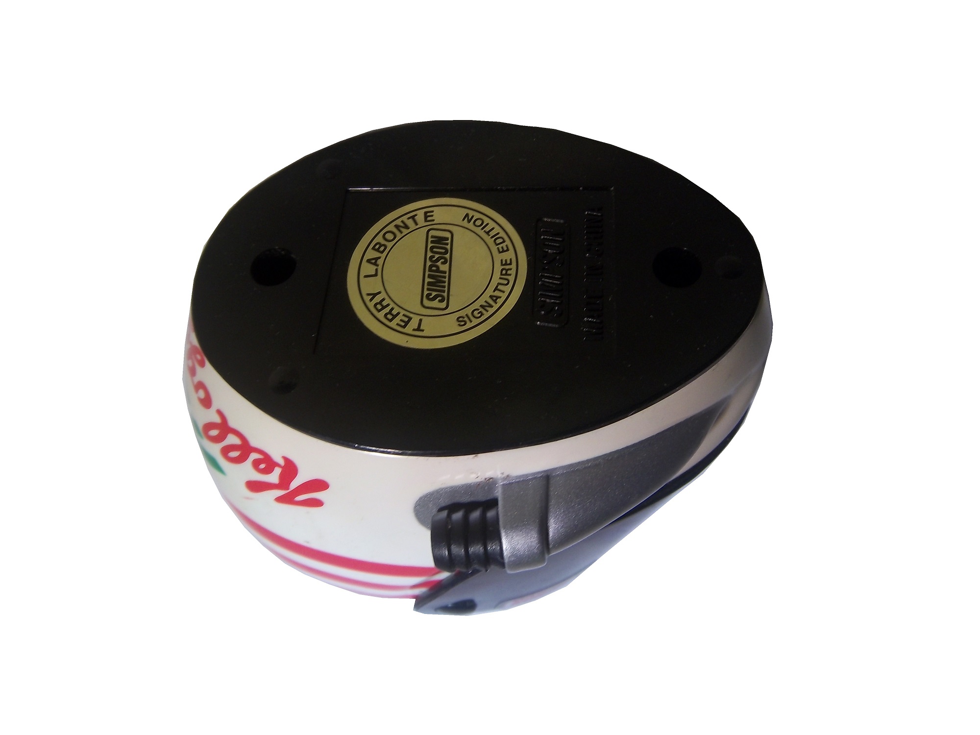
Terry Labonte #32 C&J Energy Services Ford Fusion
David Ragan #34 Wendell Scott Tribute Ford Fusion
Aric Almirola #43 STP Ford Fusion
David Stremme #90 Junie Donlavey Ford Fusion
The winner of the Paint Schemie for Best Throwback Scheme is…
The final award of 2014 is the Paint Schemie for Best Paint Scheme Set of 2014. The nominees are:
Trevor Bayne #21 Motorcraft Ford Fusion
Jimmie Johnson #48 Lowe’s Chevy SS
Brian Vickers #55 Aaron’s Toyota Camry
The winner of the Paint Schemie is…
That’s all for the best and worst, now I wanted to do something in the way of a top 10 list, but I wanted to do something differnet. I wanted to do the top to logos that have never been the primary sponsor of a Sprint Cup Car, so here they are:
10: Apple
7: Lockheed
6: Microsoft
5: Bose
4: Boeing
3: Sprite
2: Fanta
1: Wendy’s
Now that’s all for this week, but stay tuned next week as the Paint Scheme Leaderboard Starts, this time with Chevy! See you soon!


