
By David G. Firestone
NASCAR has a lengthy history in the United States. Founded in 1948, 72 years ago, NASCAR has taken stock car racing to new heights. Once a regional promotion, NASCAR is now an international powerhouse. NASCAR and their various series have logo histories that are interesting.
Let’s start with NASCAR itself.
 1948-1968
The first NASCAR logo features a track-inspired oval design, with checkered flags, and two streamlined cars heading toward each other. NASCAR INTERNATIONAL is printed in black on the greenish-yellow oval.
 1968-1978
A newer version of the logo is introduced. The oval is gone, the colors have changed from black and greenish-yellow to blue and white. The checkered flags have a much more pronounced, and a line motif is added to the back ground. NASCAR is on top of the cars, INTERNATIONAL is underneath them.
 1978-2017
A brand new logo is introduced in 1978. A rectangle with NASCAR in white lettering, with various different colors in the negative space replaces the old school NASCAR International logo. A series of colored vertical bricks are on the left side of the logo.
![]() 2018-???
2018-???
A much more toned down version of the previous logo, with different font is introduced during 2017, with much fanfare.
The Monster Energy NASCAR Cup Series has a unique tradition that stretches back to the 1970’s, the Series Logo. Series Logos are now commonplace in most forms of racing The evolution of the NASCAR Sprint Cup Series logo over the years in interesting.
 1972-1981
This logo is designed in classic 1970’s design, and can be seen on driver suits, as this Dale Earnhardt Sr. example from 1980 clearly shows.
 1982-1988
The “1 Car” logo was a major redesign, and features a logo, with NASCAR GRAND NATIONAL SERIES embroidered, and a 1980’s car. Very visible on driver suits from the era.
 1989-1992
A simple Winston logo, which, while underwhelming is very visible on this Bobby Hillin Jr. Suit, and this photo of Dale Earnhardt Sr. from 1992…and look who is next to him!
 1993-1996
Again an underwhelming yet attractive series logo. The interesting thing about logos from 1993-2001 is that there are two designs, red with white lettering that displayed better on light driver suits, and white with red lettering that displayed better on dark colored driver suits. Though the rule was rather ambiguous for a while.
 1997-1999
This design went through some changes when Winston changed the design of their packaging. Starting in 1998, Winston went from a rounder typeface to a narrower and straighter typeface, as a young Tony Stewart is modeling.
 1998:
1998:
Every team and driver ran the NASCAR 50th Anniversary logo on their cars and driver suits. Not bad at all.
 2000-2001
A square design with an oval logo was used from 2000-2001, with the color-flipping returning. At this point, the discussion of who would replace Winston started, as due to legislation, cigarettes would not be allowed to sponsor auto racing within the next few years.
 2002-2003
The transitional oval logo. The Busch Grand National series had adopted an oval logo in 1995, and since the series would change sponsorships in 2004, this new logo would be the bridge between the old and the new.
 2004-2007
New sponsor, new colors, new shape. Nextell Communications took over in 2004 and it became the Nextell Cup Series. This logo would remain constant until Sprint and Nextell merged, which led to:
 2008-2016:
Same color scheme, same shape, same basic design.
The logo has become a marketing point for NASCAR teams and NASCAR itself. Die casts, driver uniform coats, t-shirts, pit crew shirts, and many other items carry these logos.
 2017-2019
Monster Energy takes over the series sponsorship from Sprint, initially for only one season, though two seasons were eventually announced. The new Monster Energy NASCAR Cup Series has a logo based on the new Xfinity Series. It’s a black rectangle, with the current Monster Energy NASCAR Cup Series.
 2020-?
Starting in 2020, the Cup Series took a different direction with its sponsorship. Instead of one company sponsoring the Cup Series with exclusive rights for their field, four companies, Busch Beer, Coca Cola, Geico, and Xfinity sponsor the new Cup Series. Another welcome change is that the exclusivity aspect of the sponsorship is gone.
Now on to the NASCAR Xfinity Series

 1982-1994
These two logos were used for the Busch Grand National series. The plain Busch logo worked better and was used more often than the Busch Beer Series logo.
 1995-2004
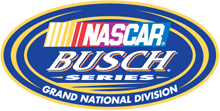
An oval logo with the sponsor name, and GRAND NATIONAL SERIES added below. It was very marketable and worked quite well as a logo.
 2004-2007
Grand National Series has been removed, and some minor redesigns to BUSCH and the NASCAR logo as well. 2006 featured the 25th Anniversary logo.
 2007-2014
Complete redesign for the NASCAR Nationwide Series which began when Nationwide took over the titular sponsorship of the series. Uneven oval with a Nationwide logo, and a NASCAR logo, with a new overall design and color scheme.
![]() 2015-2017
2015-2017
Xfinity takes over the series sponsorship, and release an off-center oval logo, black outline with cutting edge designs on the black outline. The center is white, and features a NASCAR Xfinity Series logo.
![]() 2018-Present
2018-Present
With the new NASCAR logo came a new Xfinity Series logo, this one a black square with red designs and a NASCAR Xfinity Series logo replaces the oval.
Last but certainly not least the NASCAR Gander Outdoors Truck Series.
 1995
1995
For the first season, the Truck Series was referred to as the “Super Truck Series by Craftsman.” It featured a decidedly early 1990’s logo. It lasted for only one season.
 1996-2002
The Craftsman Truck Series is a better name and the logo, while still bearing a 1990’s style design, is more refined and professional.

 2003-2008
The entire logo is inside the oval, some minor color and typeface changes are present as well. 2005 featured the 10th Anniversary logo.
 2009-2018
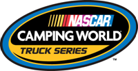
The same off-center oval design as the Nationwide Series and Sprint Cup logos, with a sponsor redesign for Camping World, who took over for Craftsman after 2009.
![]() 2019
2019
Gander Mountain takes over from Camping World. They are both owned by the same company. This results in a new name, The NASCAR Gander Outdoors Truck Series, and a logo, this one with a black rectangle, outlined in blue, with a blue rectangle with white lettering.
 2020
2020
The series makes a slight change, going from the NASCAR Gander Outdoors Truck Series to the NASCAR Gander RV & Outdoors Truck Series, complete with new logo, adding RV into the logo.
Next week, the first of a couple of random suits.
