Two Great Pieces of Advice for Anyone With A Hobby

By David G. Firestone

If I could give a new collector two pieces of advice, they would be 1: In this hobby, when you stop learning, it stops being fun and 2: Research, research, research. Research is critical in any hobby, and that is, for the most part, why The Driver Suit Blog exists. I put a lot of research into this hobby, and I will give some pointers to help my fellow collectors.

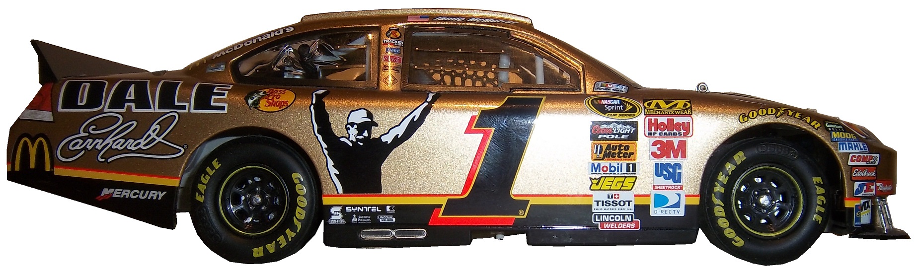
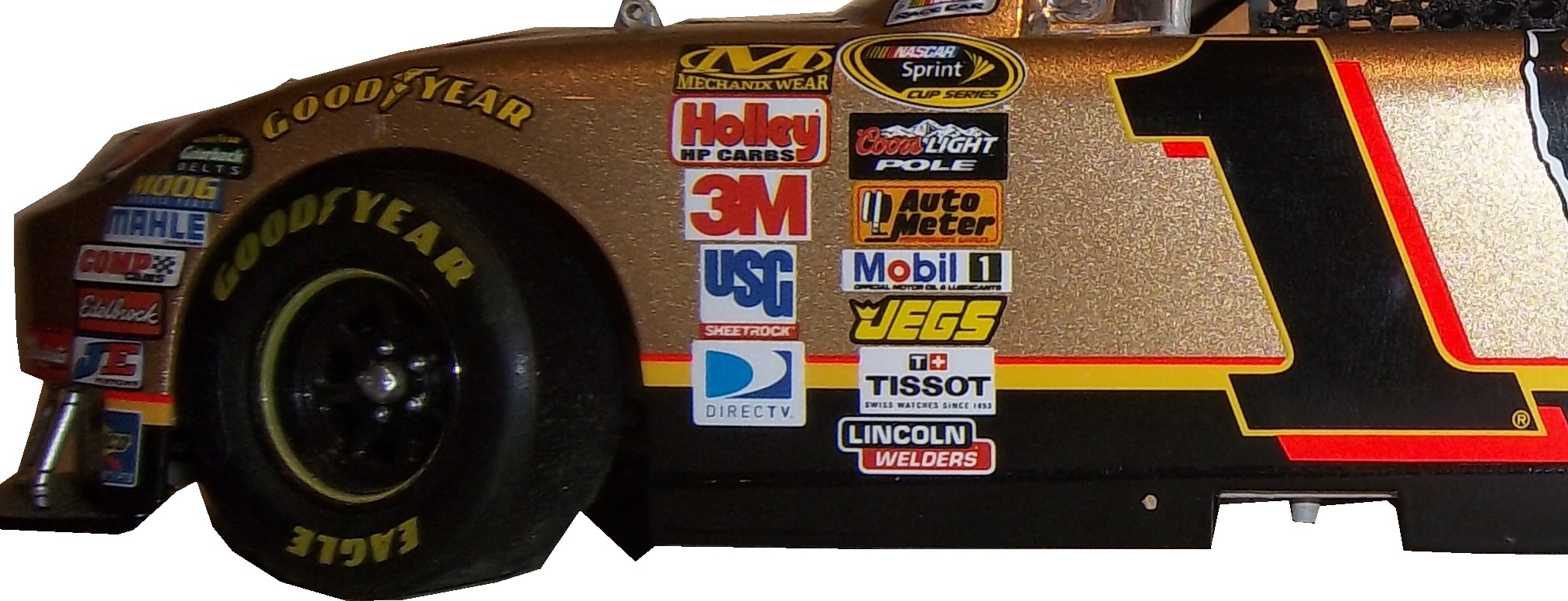
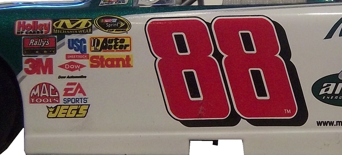
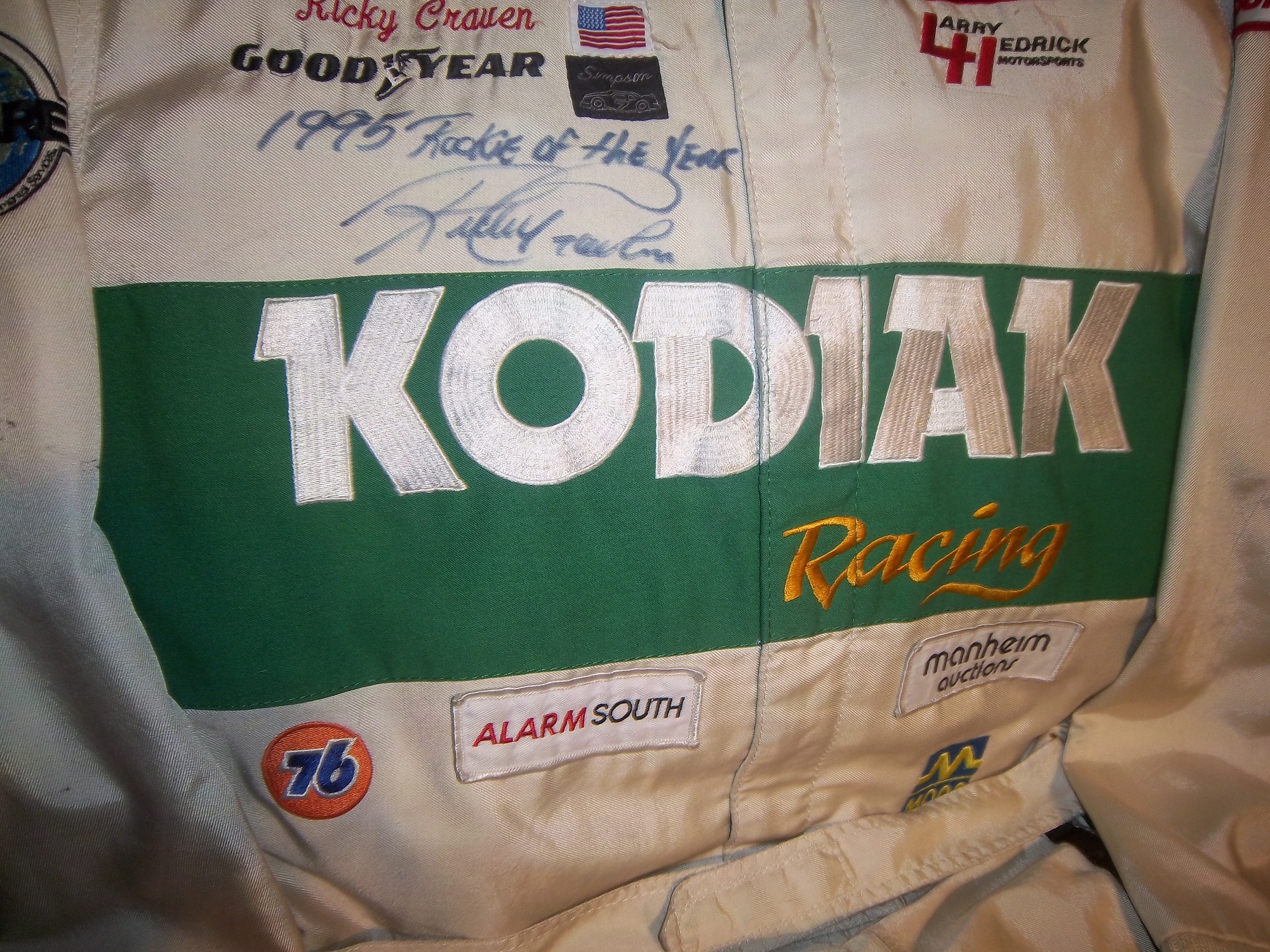
First, always get a picture of the item you are going to buy beforehand. This is useful for a number of reasons. First, you can photo match the item. If you are not able to find an exact photo of the suit, helmet or accessory, you can “style match” the item. Style matching is finding evidence that the driver or crew member wore a design similar to the item in question. Drivers wear multiple versions of the same suit for a number of reasons. Nomex is a great material, however, if the suit catches fire, the Nomex will change color, and will not protect the area of the burn after the fire. So if a driver gets into a fiery crash in practice, and the suit gets damaged on the arm. The suit will have to be replaced for the race, because it is very possible that a similar crash could occur during the race, and wearing the damaged suit would wind up burning the driver.

Figuring out WHEN the suit was worn can be tricky, but in addition to photo matching, you can do a driver search on Racing Reference. Racing Reference is a site devoted entirely to racing stats, and for every race they list, they have driver, owner and sponsor information. So for example, let’s take this Stevie Reeves suit:96-reeves

The primary sponsor is Big A Auto Parts, and is a Busch Series suit. So you go to his driver page:reeves1

and clicking the races in his Nationwide Series Statistics section, you can look at each of his sponsors.reeves2 In this case, he was only sponsored by Big A Auto Parts in 1997. So it can be concluded that the suit was worn in 1997.

In some cases, you will not be able to find a photo of the driver wearing the suit, that is just the law of the land. When searching for a photo, I use Getty Images, Google, YouTube, and eBay. It might seem strange that I use eBay but it works quite well and I have had a lot of success. People sell photos, press kits, hero cards and other such things on eBay, and this is a gold mine. In some cases, I have no luck in searching for photos, and I will take a break, get something to eat, play with the cat, take the dog for a walk, and I will have a moment when I realize I should change a parameter of the search. Sometimes it works, other times it does not.

When it comes to learning, when you stop, the hobby stops being fun. I’ve been collecting sports memorabilia since I was 5, and I’m constantly learning new things about it all the time. Never stop learning, because every hobby is constantly changing, and new information can be very useful.

I also have to cover this story. I gave Swan Racing a lot of bad reviews for paint schemes last year, and I said this year, they stand a good chance of winning the Schemie for most improved paint scheme set. Well, it looks as though they will have to shut down due to a lack of sponsorship. As it stands right now, the team is shutting down and Cole Whitt does not have a ride for Richmond. I will update the story as I learn more information.

Now we move on to…

PAINT SCHEME REVIEWS

Brad Keselowski #2 Detroit Genuine Parts Ford Fusion  Great design, great color scheme, I like the black B post, A+

Kevin Harvick #4 Budweiser Chevy SS The Coca Cola 600 is held as the July 4th race, and as such, NASCAR teams like to run patriotic schemes. The scheme as a whole is good, and red, white and blue is a great color scheme. I give it an A. Something else to note: Notice that the name on the windshield is in a patriotic design, as opposed to white lettering on a black background. Is this going to be run by all teams? Stay Tuned!

Kasey Kahne #5 Farmers/Thank A Million Teachers Chevy SS I really hate the huge FARMERS lettering on the side of the car, and I’m guessing that the design on the lettering is a photo mosiac. The color scheme is not good, and there are a number of dark designs on the black background which are almost impossible to see. I support the idea of Thank a Million Teachers, but this scheme looks awful, and earns an F

Tony Stewart #14 Bass Pro Shops/Ducks Unlimited Chevy SS Sadly this is the best Bass Pro Shops scheme I have seen in 2014, and it is a C+ design so that isn’t saying much. Why can’t we go back to this?

Greg Biffle #16 Scotch Ford Fusion  Greg’s paint scheme downward spiral continues, with this horrid scheme!  The green and plaid doesn’t work with the Biffle template, and it just looks like a mangled mess that earns an F grade!

Paul Menard #27 Menard’s/Certainteed Chevy SS This scheme works! I love the color scheme, and the design is really good. A+

Paul Menard #27 Menard’s/Pittsburgh Paints Chevy SS I love this scheme! The color works well, the design is original. It stands out, and it just plain works! A+

David Stremme #33 Newton Building Supplies Chevy SS Red and white is a good color combination, and if the side did not have the small rectangle just behind the front wheel, I would give it an A, but it takes it down to a B+

Kyle Larson #42 Target 25th Anniversary Chevy SS Really simple design, and a good color scheme. I will tentatively give this scheme an A until I see the real scheme.

Kyle Larson #42 Axe Peace Chevy SS  Decent color scheme, but much too overdesigned.  Too much visual noise, and i just don’t like it.  The green number look awful as well.  D-

Ryan Truex #83 VooDoo BBQ Toyota Camry color scheme is not great, and the car in general is way too overdesigned.  I can’t give this scheme anything less than a D-

Carl Edwards #99 Fordalwaysracing.com Ford Fusion See Brad Keselowski Above…A+

Also, NASCAR.com has come up with their staff picks for the best paint schemes in the Sprint Cup, Nationwide Series, and Camping World Truck Series. I can’t say I disagree with most of their choices in this respect!


Die Casts-Celebrating the Machines

100_4177 - CopyBy David G. Firestone

How I have gone as long as I have without delving into the subject of die casts? I really don’t know, but for this week’s column, we are going to discuss it. Racing as a sport is half man, half machine. When it comes to collectibles, they both get virtually equal billing. One of the biggest collectibles in racing is the legendary die cast car.

Die cast cars began as an industry in the early 20th Century, but the early cars were very basic, with a simple body design and rolling wheels. They were of very poor quality, lacked detail, and often broke for no apparent reason. An zinc-based alloy named Zamak solved this problem. In 1953 Jack Odell, co-owner of Lesney Products in England had a moment that revolutionized the industry forever. His daughter went to a school that allowed the students to bring toys, provided they were small enough to fit in a matchbox. He created a small die cast steam roller that could easily fit in a matchbox. For the Coronation of Queen Elizabeth II, he created a similarly sized model of her Coronation coach. After selling 1 million of these small coaches, he realized he was on to something, and thus the Matchbox line of die cast cars was born. In 1968 Mattel launched the Hot Wheels brand, which, like Matchbox created cars in 1:64 scale, or S-Scale for railroading. In 1997 after being sold numerous times, Mattel bought Matchbox and has been fostering the brand ever since.

Race cars are a popular version of die casts, as most boys who love racing will buy the die cast of their favorite driver, and play with it as if they are driving the car. I’m guilty of this, as I’m willing to bet the majority of racing fans are, if you don’t believe, check this out. In the beginning, die casts were marketed and sold to kids, but as time went on, it became clear that grown up fans liked these as well. So die cast manufacturers began to create larger “adult collectibles,” typically in either 1:18 scale, or 1:24 scale, or one of the accepted G scales. The adult die casts will feature alcohol and tobacco sponsors, and are much more accurate in design, with cloth window nets, and working hoods, decklids, and roof spoilers. As time progressed, these cars gained a very dedicated following, and have become very profitable for NASCAR, IndyCar and F1. Interesting to note that the standard size for NHRA and NASCAR die casts is 1:24 and 1:64 whereas IndyCar uses 1:18 and 1:64 and F1 use 1:18 and 1:43. NASCAR die casts can also be purchased in 1:43, 1:32, and 1:18, here is how they compare to each other:100_4177

An adult collectible die cast as mentioned above, is very accurate, such as this Jamie McMurray example from 2010. The amount of accuracy in this design is stunning! 1-mcmurray-1 1-mcmurray-2 1-mcmurray-3The window net is made of cloth,1-mcmurray-1 - doorthe contingency decals are all accurate1-mcmurray-1 - number

the roof features a place for the in car cameras, as well was a pair of functioning roof spoilers.1-mcmurray-1 - roofThe hood opens to display a very accurately recreated engine.1-mcmurray-1 - hoodWhereas this Dale Earnhardt Jr. die cast, this one a children’s toy has a plastic window net,88-earnhart-1 88-earnhart-2 88-earnhart-3the contingency decals aren’t as accurate,88-earnhart-1-doorthe roof does not feature working roof spoilers, or an in-car camera pod,88-earnhart-3 -roofand the hood doesn’t open.88-earnhart-3 - CopyIf we look at an IndyCar die cast, we see some different things. This example is an Alex Barron example from 1998, purchased because I have the matching driver suit. This particular die cast is a 1:18 scale, and features a working suspension that when you move the wheels move the steering wheel. Everything else about the car, including the helmet and driver suit are perfect as compared to the real car.36i-barron-1 36i-barron-2 36i-barron-3Everything that I just said about the Jamie McMurray die cast can also apply to this Dale Earnhardt IROC model. Again the accuracy in this design is amazing!1-earnhardt1 1-earnhardt2 1-earnhardt3 1-mcmurray-1 - de hoofOne of my personal favorie die casts is this Cruz Pedregon 1:32 die cast from 1998. The body can be removed from the rest of the car to reveal details of the car.pedregon-8 pedregon-9 pedregon-10 pedregon-1 pedregon-2 pedregon-3 pedregon-4 pedregon-5 pedregon-6 pedregon-7pedregon-11Haulers, which are used to transport cars to and from races, but they aren’t made as much today as they used to, sadly. This example is a Ricky Rudd example from the early 1990’s.rudd2 rudd1 rudd3Now we move from replica cars to the real ones as we get to…

PAINT SCHEME REVIEWS

Brad Keselowski #2 Alliance Truck Parts Ford Fusion Very solid design, the yellow works very well, and the black numbers and stripes work very well, and I can’t give it anything less than an A+

Brad Keselowski #2 Wurth Ford Fusion Another very solid design with a great color scheme that earns an A+

Dave Blaney #77 Plinker Arms Ford Fusion I would love for the side design to be more simplified. It is a decent scheme, but the door design is too busy, and it is very distracting. I give this scheme a C-, bad design, good color scheme.

Ryan Truex #83 Borla Exhaust Toyota Camry This is actually a great scheme, with the oversized exhaust design that starts on the area where the real exhaust starts, and extends to just under the numbers. The number has been redesigned since last year and they work very well. I give this scheme an A.

In Memorandum 2013 Continued.

Andy Granatelli-Former CEO of STP, partially responsible for STP’s sponsorship of Richard Petty.

Bruce Pepper-Brother of ThorSport Racing GM David Pepper.

Dennis Wood-Former owner of Phoenix International Speedway

Now comes the best news of the new year so far…THE ROLEX 24 AT DAYTONA STARTS LATER TODAY!  The TUDOR United SportsCar Championship starts off the racing season later today.  Fox will carry the first part of the race starting at 2PM/1PM CST, and Fox Sports 1 and Fox Sports 2 will carry the race as well.  You had better believe I will be watching and enjoying it.

They Pay the Bills, So They Design The Suit

By David G. Firestone96-reeves-flogoFrom a design aspect, no other factor contributes as much as the primary sponsor or sponsors of the car. Everything from the colors to the torso design, to the television logos, to the shoulder epaulet and collar design depends on the primary sponsor. While this has been the case for the most part, how the primary sponsor is displayed can vary quite a bit.

Currently, the standard design for a primary sponsor logo is to have a large logo across the front of the lower torso, and on the back on the upper torso. These Christian Fittipaldi designs from 2002-2003 are great examples of that. The Georgia Pacific design from 2002 has a decent sized logo on the front bottom torso, and the same logo higher up on the back torso.45-fittipaldi-flogo 45-fittipaldi-blogoThe Bugles example from 2003 has identical logo placement for the Bugles logo.44-Fittipaldi-flogo 44-Fittipaldi-blogoMany driver suits feature this same logo placement.96-reeves-flogo 96-reeves-blogo 90-stricklin-flogo 90-stricklin-blogo 31-skinner-flogo 31-skinner-blogo 17-sedgwick-flogo 17-sedgwickb-logo 16-musgrave-flogo 16-musgrave-blogo 15-sprague-flogo 15-sprague-blogo 1-lajoie-flogo 1-lajoie-blogo 12-miller-flogo 12-miller-blogo

Taking a look at this Ricky Craven example from 1996, it features a design aspect that was very heavily used. The torso features a plan color, with a stripe across it with the sponsor name on that stripe. Dale Earnhardt Sr. used this design for many years, as did Rusty Wallace, Dick Trickle, and Steve Grissom among others. It is a fairly straightforward design, but it works very well.41-craven-flogo 41-craven-blogoOther suits have the primary sponsor logo present, but the logo is underwhelming. This design is exampled by this Bobby Hillin Jr. Moroso driver suit from 1991,20-hillinThis Lake Speed example from 1997,9-speed

and this Ted Musgrave example from 1998.15-musgrave-lchest 15-musgrave-blogo

In very rare instances, a primary sponsor is excluded from the suit altogether. One example is this Terry Labonte suit I covered earlier this year. That example was made for Terry to wear in a very last minute driver change. Another example is this David Stremme suit from 2009. I covered this issue earlier in the year, but to sum it up, because of a conflict between Verizon, the sponsor of Stremme’s car, and Sprint, the title sponsor of the Sprint Cup race, Verizon was not allowed to have their logos on Stremme’s car and driver suit. As such, Stremme raced a Dodge sponsorship, and wore this suit.12-stremme-flogo 12-stremme-blogoOne of the newer designs that is frequently seen is what I call the leg stripe design. This Kasey Kahne example shows a leg design that has a large white stripe running up the red background, with the DODGE television logo running up the leg. Sponsors can make their logos stand out more with this design, so it is becoming more popular every year.9-kahne-legsThis Scott Wimmer example is from 2002, and is rather unique in this category.23-wimmer-legsIt needs an explanation…The suit was worn for the entire 2002 season, which had a Siemens sponsorship for the first 25 races. After Siemens left the team, Scott Wimmer went on to win 4 of the next 9 races in an unsponsored black car with red and yellow flames…while wearing this suit.

While I get that the team not buying another suit for Wimmer to wear…it just looks weird.

Now this is another suit that needs an explanation. Nort Northam is a Porsche dealer based in Florida. He was a race car driver from 1979-1992, and his career was not great, with no wins, and two podiums. In 1988, he raced in the Sunbank 24 at Daytona, now called the Rolex 24 at Daytona in a Porsche owned by fellow driver Karl Durkheimer.56-Northam 56-Northamb

During that race, he wore this driver suit. It appears on this suit that a sponsor patch has been removed or fallen off. Now to understand the basic design, you need to understand that Nort raced in two races a year, and having a suit custom designed would be a needless expense. As such, his name, and two sponsor patches did the trick. Not fancy, but effective. This late 1980’s SCCA example is also a minimalist design, but it sticks to the “80’s stripe” design as the Ricky Craven example.

The last thing about primary sponsors is that sometimes, primary sponsor designs follow other sports uniform trends. This example from 1998 was worn by Jeremy Mayfield. At that time, gigantic logos across the fronts of uniforms were the big thing, and that was not good. This fad did not last long, thank heavens!

Driver Suit Blog “Wheel Reviews”

Last night, I went to see the movie “Rush” and I have to say, it was really good.  It has been said “you love your rivals, because you need someone to beat.” Nowhere is this more evident than Rush. Directed by Ron Howard and starring Daniel Brühl as Niki Lauda and Chris Hemsworth as James Hunt, Rush is the story of the rivalry between the two, from their days in Formula 3 in 1970, to Formula 1 in the 1970’s. For fans of racing movies, it is a true masterpiece.

The film takes the perspectives of the two drivers. Lauda is represented in the film as a talented driver who is great with setting up a race car. He is a driver who takes what he does very seriously. Hunt on the other hand is more of a playboy. He is a great driver, but his fast and furious lifestyle is a distraction from his true talent. Both are talented, but when Hesketh Racing, Hunt’s team can’t find sponsorship for the upcoming 1976 season, Hunt loses his ride. After his wife leaves for a ski trip, Hunt gets a ride with McLaren after Emerson Fittipaldi leaves to race for his cousin.

In 1976, Hunt struggles for the first part of the year, while Lauda, fresh off his 1975 World Championship is always a factor in the points standings. Hunt’s luck changes at the Spanish Grand Prix, where he beats Lauda, though he is disqualified for his car being less than an inch over regulation. Hunt’s wife divorces him, and driven by this, his season turns around. Though Lauda struggles at this point, the points standings are close coming into the German Grand Prix

The 1976 German Grand Prix was a critical point in this story, as the points battle was heating up. This race was at the the “Old Nürburgring” one of the most difficult tracks in the world. The weather was stormy, which kicks up the danger. Knowing the track as well as he did, Lauda called a meeting of the drivers and stated that the race should be canceled because of the conditions. Hunt thinks it is just a trick to take a race out of the schedule, and the cancellation is voted down. Lauda is seriously hurt in a wreck, and he is hospitalized. Hunt blames himself for the wreck. The story from there is the story of the 1976 Formula 1 World Championship.

The cars in the movie were very accurate, in some cases, vintage equipment was used. The tires used were made by Goodyear, and had the lettering in white as opposed to the yellow lettering that they currently use. The crew uniforms were very accurate as well. The driver uniforms were very well done, as were the helmets. Something that I noticed about them was that I couldn’t see any safety certification visible.

All in all, this is a great movie, and racing fans will enjoy this movie, so I give it an A!

Paint Scheme Reviews

Jamie McMurray #1 Liftmaster Chevy SS Good color scheme and decent desisn add up to an A- grade

Clint Bowyer #15 Raspberry 5-Hour Energy/Living Beyond Breast Cancer Toyota Camry I hate pinkwashing and I hate raspberries, so this gets an automatic F

Kyle Busch #18 M&M’s Halloween Toyota Camry The leaf designs on the bottom of the doors just look odd, and it takes a solid A scheme, to an A-. It does have great overall design and great colors, but the leaves just kill it.

Matt Kenseth #20 Home Depot/Let’s Do This Toyota Camry The overall scheme is great, and has a great color scheme. The problem is that the back end is yellow, which just looks odd when compared to the rest of the car. If the back was black, it would match quite well, but this is just bad. I want to give this scheme a higher grade, but the best I can do is a B-

JJ Yeley #36 Drive Sober Arrive Alive Chevy SS Great color scheme, great colors, and a cause that is easy to support add up to an A+ scheme.

Ryan Newman #39 Slate Water Heaters Chevy SS While I don’t get the silver design at the bottom of the car, this is a great scheme, and gets an A+

Ryan Truex #51 Shooters Sporting Center Chevy SS The yellow outline on the numbers is brutal, and the Shooters Sporting Center logo is just awful. C- is the best I can do.