The ONLY Time A Visor Looks Good!

By David G. Firestone100_4068

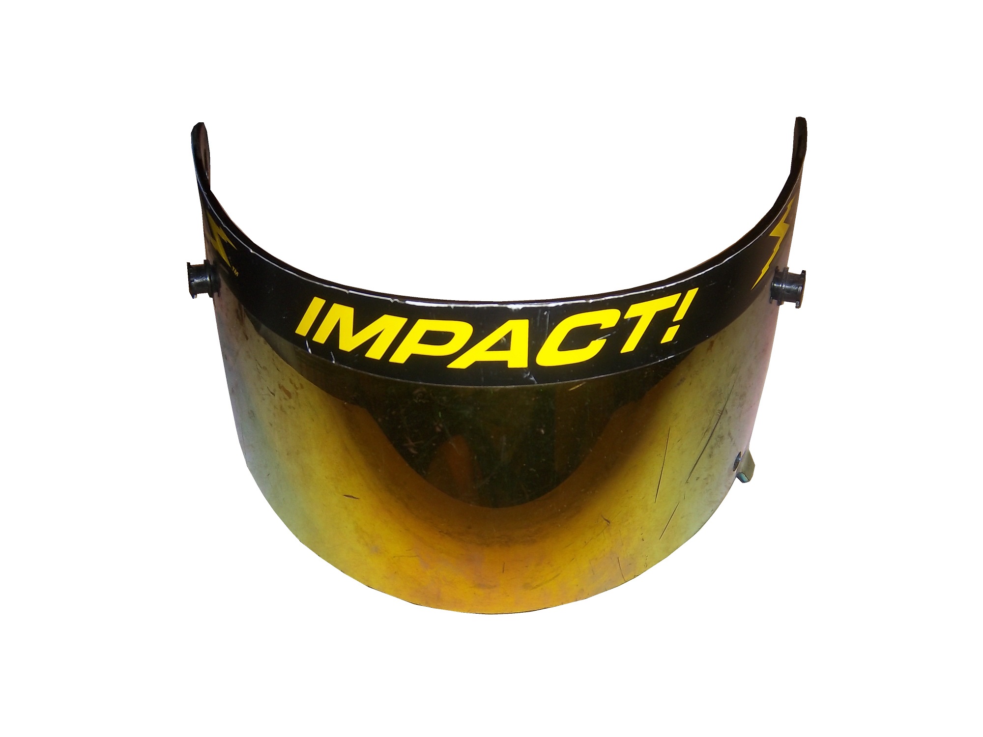
Some time ago, I did two posts focusing on one item, and for the next two weeks, I’ll do something similar. A part of the driver uniform that is seen by virtually everyone but not really discussed is the visor in the helmet. We see them on in-car cameras and on television, but we don’t think about them by itself that much. It seems like a minor part, but it has an interesting history.

From the 1920’s through the late 1980’s, helmets were primarily open-faced. This example is from the 1960’s, and was worn by Maine short track driver Jim McConnell.mcconnell-5 mcconnell-3 mcconnell-1 mcconnell-7 mcconnell-8

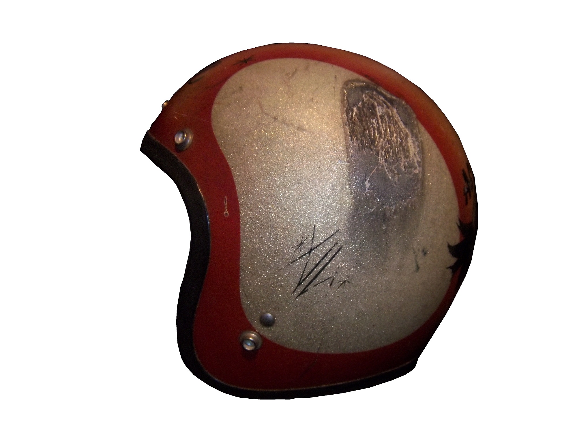
These helmets are very simple in design, they just cover the whole head, except for the face. The downside to this is that when the sun shines in the driver’s eyes, or if the car is an open-cockpit the wind can and will force the drivers eyes closed, or fumes from the car can get in a driver’s eyes. As such, these helmets were worn with goggles.100_3182

As full-faced helmets took over, the visor came attached to the helmet. The early ones were basically plexi-glass but as safety certification got more advanced, the visors were and still are fire tested. They also have to stand impact testing as well. As the helmets became more advanced over the years, so did the visors. Let’s take a look at one:100_4068

This visor is from the McDonald’s helmet I covered earlier in the year. It is made of a very tough, but very light clear plastic. The visor is attached to the helmet by 3 screws, two that hold the visor to the helmet and a third that guides the visor and keep it in the proper place. There was a 4th one, but it was removed at the driver’s request. The visor has some unique features. At the bottom-left side there is a small flap, which is used by the driver to open the visor. Next to the small flap is a hole for a small peg. The peg goes in the hole, and holds the visors shut, but is small enough so that if a driver wants to open the helmet, they can do so with no trouble. Drivers frequently leave the visor open slightly, so two small knobs, one on each side so the driver can open or close the visor.100_4069

Notice that it has a yellow-ish tint. This is one of 3 options for drivers, dark tint, light tint, and clear. The visor is designed to be easily changed at the drivers request. Clear visors are used for night races, and tinted ones are used for sunny races. In the event a race goes from day to night, a driver can use a tinted tear off, so that when it gets dark, they can remove the tint and have a clear visor.100_4070 100_4071

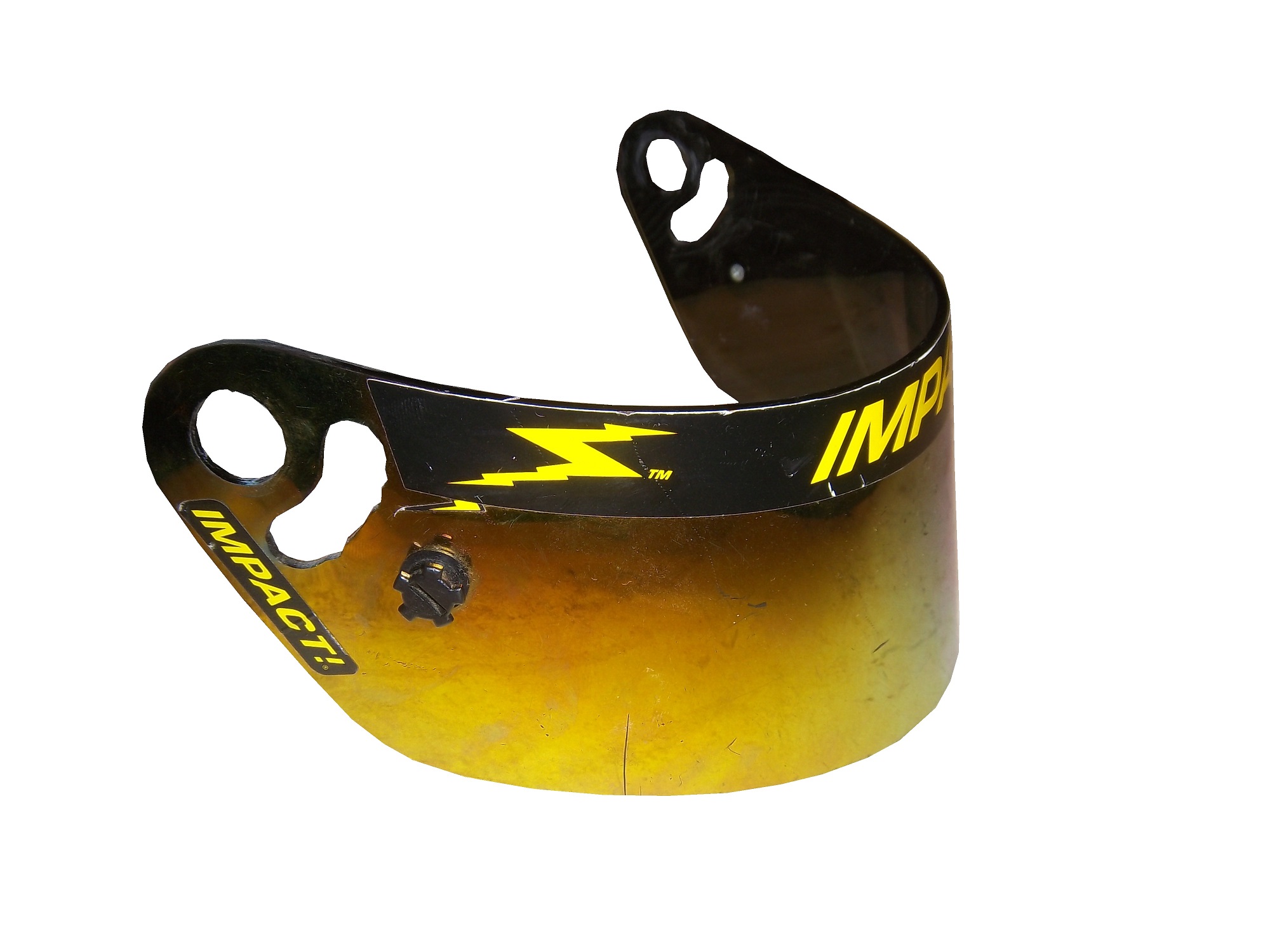
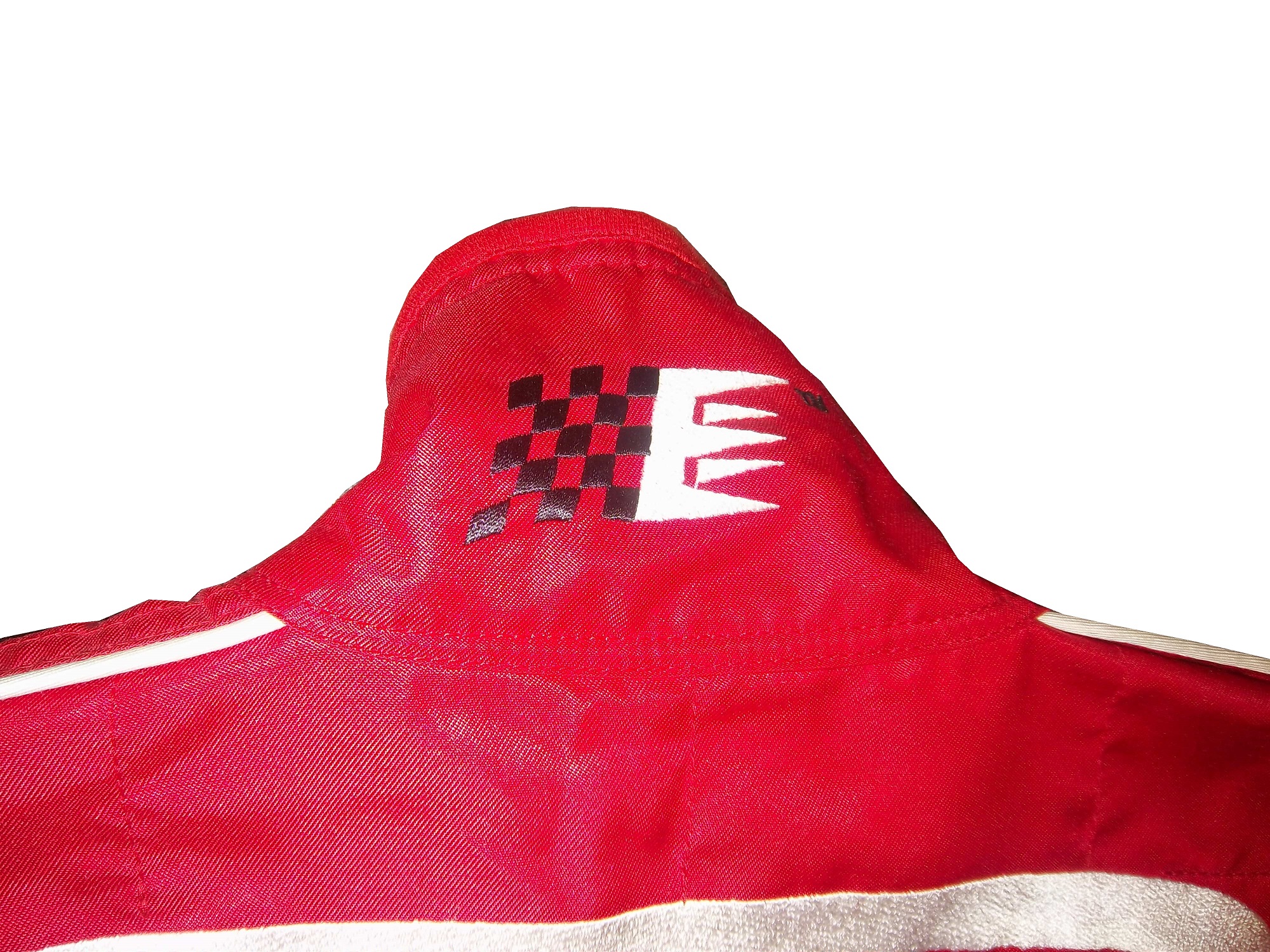
Like eyeglasses, visors get scratched over time. As such, they are changed often. Like most other items racing teams and drivers use, when they are no longed needed, they are sold to the general public. They are frequently autographed by drivers, and are a popular item to get signed by drivers. They are interesting to look at, and interesting to examine up-close. All helmet visors in this day in age have a sponsor stripe across the top, and we’ll cover that next week.

Paint Scheme Reviews

Danica Patrick #10 Go Daddy Chevy SS Pinkwashing is an automatic F

Greg Biffle #16 Sherwin Williams Ford Fusion See Above

Tony Raines #40 Moon Shine Attitude Attire Chevy SS See Above

and we have a new 2014 scheme

Kasey Kahne #5 Farmers Insurance Chevy SS It’s amazing what a different shade of paint can do to a paint scheme. This years Farmer’s scheme earned a D+ because of the primary color, this scheme earns a B+ because of the color. The design needs some work, but the whole scheme is a major improvement.

Neck Backs…A Hotbed for Unique Customizations.

36-saidThe driver suit is almost always customized for the driver, and as such, the driver has the option of adding customizations to the suit. This may come in the form of size,

and belt design,36-barron-belt


but the back of the neck is a unique place for customizations. The designs that are placed on the back of the neck are as unique as the driver themselves.36-barron-neck

I’ve gone at length to discuss the FIA certification which is frequently sewn into the back of the neck. This is a prominent feature in Formula 1 and IndyCar. That is standard issue, so no real need to comment on it any more.barber-neck

n NASCAR, the back of the neck can be used for a myriad of different customizations. One of the most common is a car number, such as this Christian Fittipaldi suit, 45-fittipaldi-bneck

and another common feature can be sponsor logos, such as this Randy LaJoie Bob Evans suit from 1999-2000,1-lajoie-neck

and this Joey Miller Craftsman Truck Series suit from 2005.12-miller-blogo

This Kasey Kahne suit has the Evernham Motorsports logo sewn into the back of the neck.9-kahne-neck

And Roger Penske likes to have the American Flag on the back of the neck of his suits, as evidenced by this David Stremme suit from 2009.12-stremme-neck

Older Simpson driver suits have been known to have an inventory number sewn here, as exampled by this Mike Skinner suit from 1997,31-skinner-future

and this Stevie Reeves example, again from 1997.96-reeves-neck

But for my money, the personal customizations are more fun when they are as unique as the driver is. In this Terry Labonte suit, Terry has added a Texas logo.10-labonte-neck

My favorite customization is from a Boris Said suit from 2005. Said has added a Boris Badenov design to the back of his neck.36-said-neck

It’s the little things that make a suit personal, and these are some of those little things. Who says a driver suit can’t be fun.

And of course, it goes without saying that the neck is frequently left blank, as exampled by this Nort Northam suit from 1988.56-Northam-neck

Jamie McMurray #1 Cessna Patriotic Chevy SS Pretty good scheme here, red white and blue is always a solid scheme, but the one gripe I have is the pointless circle around the door number. While it gives the car a vintage look, it is just out of place here. Even still, this scheme is a solid A-

Brad Keselowski #2 Miller Lite Patriotic Ford Fusion Solid scheme, nothing to complain about, A+

Kasey Kahne #5 Hendrick Cars Chevy SS Red white and black is a very solid color scheme, and the design, while a bit convoluted looks really good. It has a hurricane-esquire design that looks really good. A-

Danica Patrick #10 Go Daddy .US Chevy SS The simple design of this scheme looks really good…but what is going on with the colors? Why is the car painted in Russian dressing green? Russian dressing is good, but not as a color scheme. The red white and blue designs clash, and it just looks awful. D-

Clint Bowyer #15 Peak Blue DEF Toyota Camry I gave this scheme a B grade, and the logo change on the hood does nothing to either add or subtract for this grade. B

Greg Biffle #16 3M Statue Of Liberty Ford Fusion Amazing how a better color scheme, as well as the Statue of Liberty design take a C grade and bring it up to a B

Kyle Busch #18 Interstate Batteries All Battery Center Toyota Camry Now THIS is what an Interstate Batteries scheme should be! The classic dark green, gold and white color scheme is amazing, and the design is simple yet very attractive. Giving this scheme an A+ is not saying enough about how great this scheme is!

Jeff Gordon #24 Axalta Standox Chevy SS White flames on a blue background? Seriously? I could forgive it if it was blue flames on a white background, blue flames look really good. But white flames? This design ruins a great color scheme AND a great design scheme TOGETHER! Now that is impressive! F-

Kevin Harvick #29 Budweiser Folds of Honor Chevy SS The Patriotic schemes worked quite well this year, and this is another example of that. A-

Jeff Burton #31 Quikset Chevy SS Decent color scheme but the design needs a little work. If the red was on the hood, roof and deck-lid and the black was on the sides, I would give it an A, but the shark-fin design is brutal on the eyes, and serves no real purpose. As such, I can only give it a C-

JJ Yeley #36 Golden Coral Patriotic Chevy SS Another A grade Patriotic scheme.

AJ Allmendinger #51 Neil Bonnett Throwback Chevy SS While I like most throwback schemes, this one, while accurate, has the worst color scheme I have ever seen. It just screams 1980’s. Hot pink and neon yellow really stands out, and not in a good way. Still, I do miss Neil, and they were pretty accurate, so I will give this scheme a B

Carl Edwards #99 Subway Ahhvocado Ford Fusion Good color scheme and a simple design. I’m not a fan of avocados on sandwiches, but this is a good solid A scheme.