
For the season finale of the 10th season of Introduction to Sports Memorabilia, I present this Kasey Kahne driver suit which he wore at the 2005 Detroit Auto Show.
Tag: nascar busch series
Introduction to Sports Memorabilia-Christian Fittipaldi 2003 Race-Worn Driver Suit
One of the more unusual driver suits that I have come across, this Christian Fittipaldi Bugles suit from 2003.
Introduction to Sports Memorabilia-Jody Miller 2005 Race Worn Driver Suit
A uniquly designed Jody Miller Toyota Tundra race worn driver suit from 2005 will be examined this week.
Introduction to Sports Memorabilia-Kenny Wallace 1999-2000 Race-Worn Driver Suit
Kenny Wallace is in the spotlight this week, as we look at a race-worn driver suit circa 1999-2000, which he has boldly autographed across the front.
Collar Guard…Not a Product, but a Safety Feature.
 By David G. Firestone
Like shoulder epaulets, the collar of a driver suit has made a transition. It has gone from safety accessory to fashion piece, but unlike the epaulet, it is not only ornamental. Because the collar is still a piece of safety equipment. It goes without saying that fire is an ever present danger in auto racing. The collar protects the neck from burns. This may seem minor, but many people who die from burns die from infection. When the skin is compromised, it can’t stop germs from getting inside the body, and as such makes infection a serious risk during burn injuries.
But the fashion aspect of collars is interesting as well. With the standard alignment of sponsors on the top of the suit, the Series logo, tire manufacturer logo, car manufacturer logo, and other sponsor logos are on the top, and the primary sponsor logos are present on the collar and epaulets. This Randy Lajoie example shows how the suit appears during an televised interview: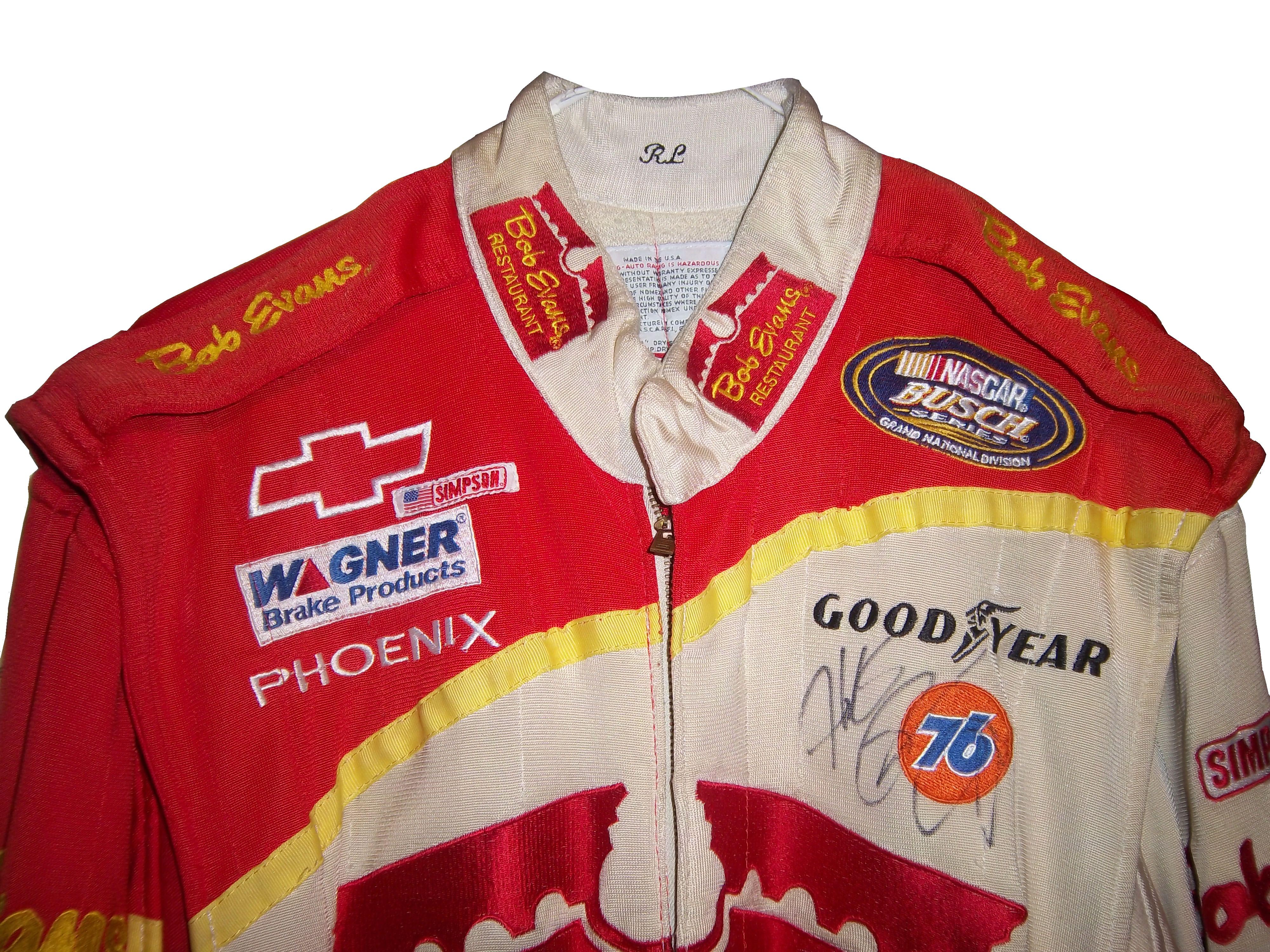
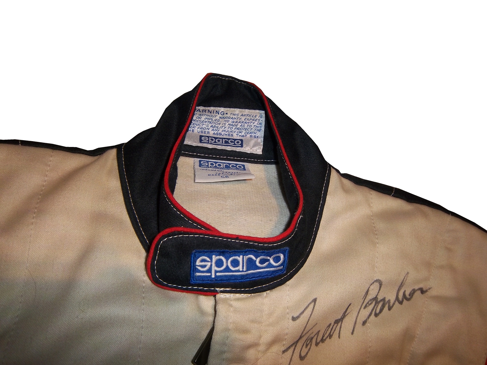
Note a couple of things: First, the fabric on the collar overlaps just a bit here, but when the driver wears it, it meets perfectly at the center of the neck. Second, it allows the driver to breathe easily. Comfort Vs. Safety is a constant debate. This is one kind of collar, the other kind of collar is what I call the Velcro collar, as shown in this Alex Barron suit from 1998:
The Velcro collar is exactly what it sounds like, a collar with a strap which Velcros shut. This provides a little more protection in case of fire. It also has another use, as sponsor ads are popular to put on the front of the Velcro strap. This has been used quite often over the years…
This is due to the fact that for quite some time the open face helmet was used, and the collar provided extra fire protection where the helmet failed. In this day in age, helmets come standard with Nomex socks on the bottom, so the collar, while still a key safety feature, is not as critical. But for sponsor logo placement, it really can’t be beat.
If the collar does not have a Velcro closure, then the primary sponsor logo is sewn into either side of the collar. Like the Lajoie example above, or this Mike Skinner example below, this can be used very effectively as a place for sponsor logos.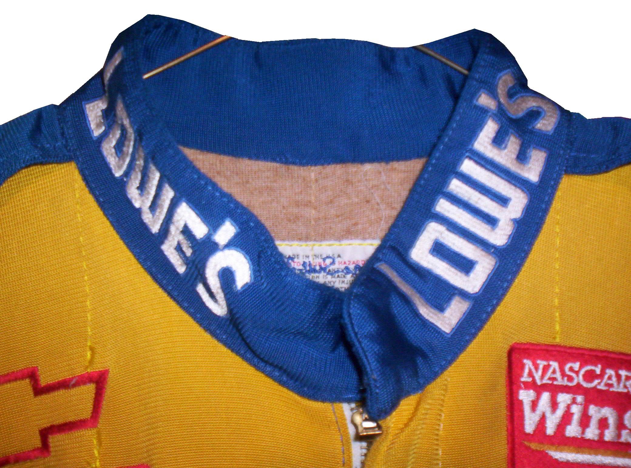
Like most other aspects of the driver suit, the choice of Velcro or not comes down to driver preference. Kyle Bush, as well as older brother Kurt favor the Velcro style, whereas Tony Stewart and Carl Edwards prefer the non-Velcro variety. Many pit crew shirts have a similar design to the driver design as well.
Editor’s note: For the next two weeks I will be on a very badly needed vacation. I will still have articles ready to go, but I won’t be commenting on up do date issues until I get back. I will still check in from time to time.
Moving on to paint schemes…
Denny Hamlin #11 FedEx Express 2005 Toyota Camry Done as a memorial to Jason Leffler, this is a replica of the scheme that Leffler ran in 2005 during FedEx’s first season as a full-time NASCAR sponsor. It is very faithfull to the original scheme. It also has a great design and color scheme, and earns an A
Greg Biffle #16 3M/Give Kids a Smile Ford Fusion The same bland paint scheme that I described as “There’s nothing really wrong here, but nothing really right here either. The side design looks forced, the black roof is idiotic, the color scheme is good, but the number design looks too cliche. It makes no sense, but 3M schemes never do.” It has a small Give Kids a Smile logo on the hood, that is all but invisible. I gave it a C and it will stay at a C.
David Stremme #30 Window Wax Toyota Camry Ugh! This is bad, I can live with the color scheme, but the design is bad. It gets a D
Austin Dillon #33 American Ethanol Chevy SS While I hate the shade of green used here, this scheme looks pretty decent. The designs around the front brake vent are unnessicary, but I still like them. If the green were a bit darker, I could give it a better grade than a C+.
AJ Allmendinger #47 Charter Toytoa Camry The hood design is interesting here. It is designed in the same light as television logos on driver suits. It is a unique idea that works and I hope will catch on. The color scheme is great, and I love the overall design. A
Brian Vickers #55 Aaron’s/Louisville Cardinals Toyota Camry The color scheme is good, but the Fruit Stripe Gum design seen on the Louisville Cardinals shorts is ugly. The whole Zubaz design scheme is horrible on sports uniforms, and even worse on this car. I have nothing against the Louisville Cardinals, but this is horrible. F
Dale Earnhardt Jr #88 National Guard Solider of Steel Chevy SS Solid simple scheme with good colors, but the Superman Logo on the hood is next to invisible.
Richard Lasater and His Helmet
By David G. Firestone
Spent the last week just being insanely busy, with Passover and the Chicago Sun Times Collectables Convention, but now back to work. I’ve discussed the safety aspects of race gear, but today, I’m going in a bit of a different direction. Even in today’s safety-conscious racing environment, injuries are always a possibility. Denny Hamlin suffered a fractured vertebrae, and Dale Earnhardt Jr. has suffered a concussion in the last few years. Wrecks can be hell on drivers, but what about the uniform protecting them? What would a helmet from a wreck like this look like?
Well the helmet looks like this:


For a helmet that went through a scary-looking wreck, it is in good shape…and that is not by accident. It was worn by Richard Lasater throughout the 1993 season. At the 1993 Fram Filter 500K, Lasater was involved in that scary wreck, and wasn’t seriously hurt. As for overall damage, it is mainly scratches, scrapes and dings, no cracks or serious damage.
The helmet kept Lasater safe and suffered minor damage because that is what it was designed to do. After the race, he autographed the helmet and it wound up in my collection. This helmet shows better than any other helmet I have the reasons why proper equipment is needed in racing.
On to Paint Schemes…
Jamie McMurray #1 Bass Pro Shops Chevy SS White? Seriously? Did the designers not realize that the white looks awful? The black and orange color scheme works, but white? I don’t get this scheme at all, and it gets an F grade
Marcos Ambrose #9 MAC Tools Ford Fusion Good color choices here. The basic design is solid. I can do without the quarter panel design, but it is still a good scheme with a B grade-
Danica Patrick #10 Go Daddy St. Patrick’s Day Chevy SS I would like to thank the 1978 Cincinnati Reds for being one of the first teams to wear green on St. Patrick’s Day for encouraging this awful F grade scheme.-
Denny Hamlin #11 Fedex March of Dimes Toyota Camry There are two schemes that fans voted for. With Hamlin on the shelf for a while, Mark Martin and Brian Vickers will share the 11 ride. That said, scheme #1 I don’t hate, but it has something odd going on with the hood and nose design…I swear it looks like the two parts were designed by different people who never interacted with each other, and that earns it a C grade Scheme #2, the better of the two schemes, not only looks more like a FedEx scheme, it is simpler and much cleaner as well, and earns an A grade.
Tony Stewart #14 Rush Truck Centers Chevy SS Good color and design schemes here. A Grade
Kyle Bush #18 Snickers Bites Toyota Camry A paint scheme that has a great color scheme, and illustrates the theory that less is more. Nothing bad about this Scheme-A+
Jeff Gordon #24 Imron Elite Real Truck Paint Chevy SS Based off the classic Jeff Gordon Scheme, it looks really good, and it works as a paint scheme. Great color scheme used here…A+
Jeff Gordon Cromax Pro Chevy SS Another good DuPont inspired scheme with a great color scheme and great design-A+
Ken Schrader #32 Federated Auto Parts Ford Fusion Federated Auto Parts always has great looking cars, and they do not disappoint here. Great color scheme and great design earn a great grade of A+
Timmy Hill #32 U.S. Chrome Ford Fusion NASCAR rules prevent using chrome in most NASCAR paint scheme aspects, which is kind of disappointing since this scheme should have a bit of chrome in it. Even so, it is still a solid A scheme, with great colors and simple, yet elegant design
Josh Wise #35 MDS Ford Fusion The color scheme of the car, and the color scheme of the logos match! As a direct result, the car looks so much better! This scheme earns a B grade because the deisgn on the quarter panel needs some work.
Ryan Newman #39 HAAS Automation Chevy SS Great color scheme, good basic design, I love the diagonal hood logo, A+ Scheme
Brian Vickers #55 RK Motors Toyota Camry Basic design with an uninspired color scheme. The car is just blah. I can’t give this scheme anything except a C-
Brian Vickers #55 Jet Edge Toyota Camry A better color scheme takes the grade from C to B
Joe Nemecheck #87 Maddies Place Rocks Toyota Camry Simple design, decent color scheme, good hood logo, Final grade B
Dale Earnhardt Jr. #88 Amp Energy Chevy SS Orange? Amp’s main can color is green. It’s not a bad design, but using a color that isn’t really used on the packaging earns this scheme a C-
