Sponsor Profiiles-Kodiak Tobacco

41-craven - CopyBy David G. Firestone

As this week’s column is being posted, I am boarding the Texas Eagle in Tucson Arizona, awaiting the train ride back to Chicago to begin. I’ve spent the last week away from the deep freeze of Chicago, and in the warm weather in Arizona.

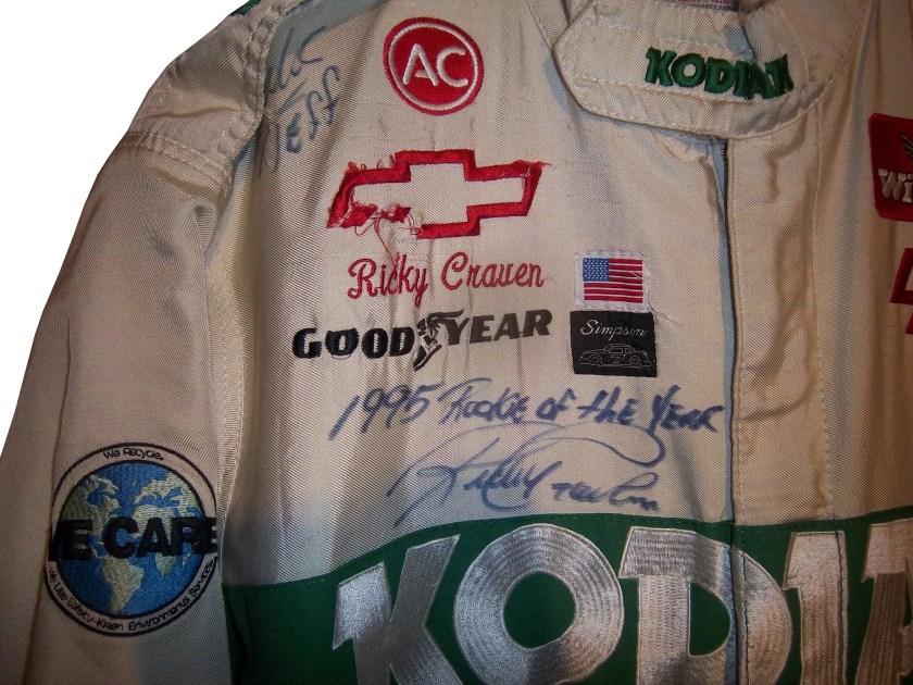
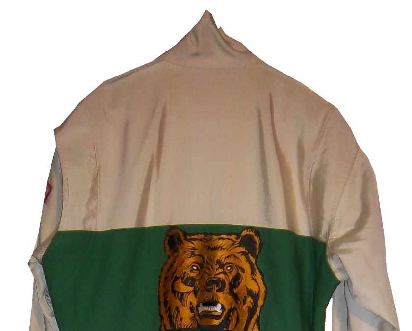
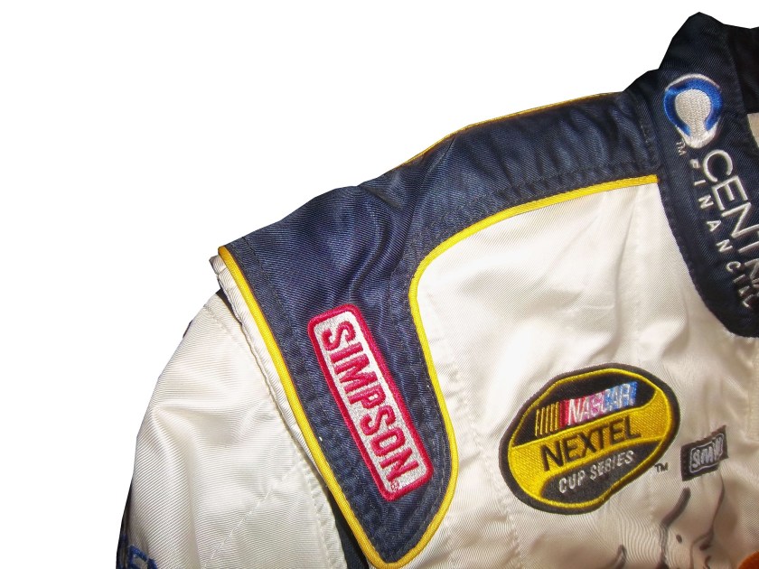
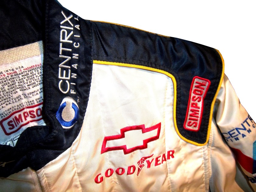
The colors of the desert are deep and bold. Just like those of one of my favorite racing sponsors to collect, Kodiak Tobacco. Kodiak is a subsidiary of Reynolds American, which also owns Kool, Winston, Salem, Doral, Capri, and Camel cigarettes, and Grizzly tobacco. They were a major sponsor of NASCAR in the 1980’s and 1990’s. They sponsored Rusty Wallace, Ricky Rudd(as Levi Garrett) Ken Schrader, Ricky Craven, Steve Grissom, and Stacy Compton. They have one of my favorite shades of green used in racing. Interestingly, for many years, green was considered an unlucky color in racing. The most promenent item in my collection is this Ricky Craven suit from 1996.41-craven - Copy

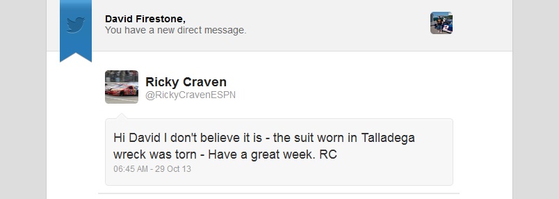
It does show signs of use, but the big question is “was this worn in the 1996 Winston Select?” which was the race that Ricky Craven suffered his worst wreck…

I asked Ricky about that via Twitter, and got this Private message in response.Untitled

So we can eliminate this as that suit he wore in that event. But I have been able to photo-match this suit to a trading card released later in the year. I can’t say when exactly this suit was worn, but it was worn. The design of suits to in-car cameras and replica jackets is still in its infancy, so there is little consideration to either, so it does have both a modern and vintage look at the same time.41-craven 41-craven-collar 41-craven-rchest 41-craven-lchest 41-craven-flogo 41-craven-ltorso 41-cravenb 41-craven-neck100_3456 100_3457 100_345841-craven-7 41-craven-6I also have a small Ricky Craven mini helmet also from 1996.41-craven1 41-craven2 41-craven3 41-craven4 41-craven5 41-craven6

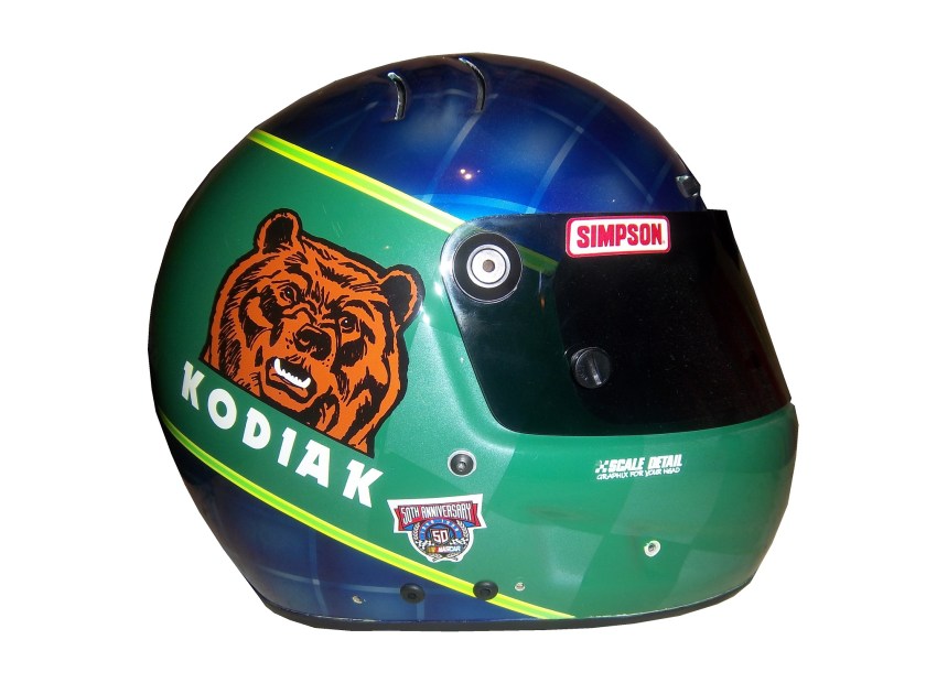
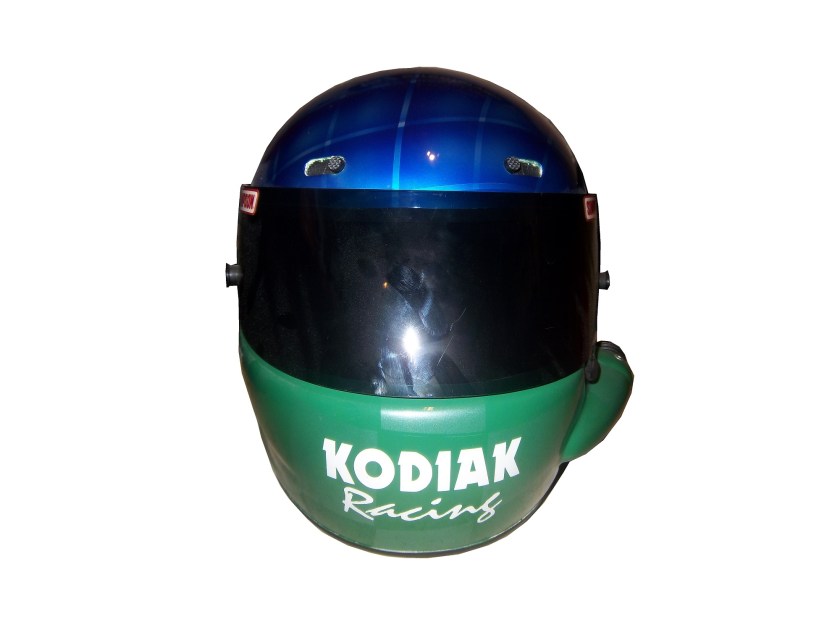
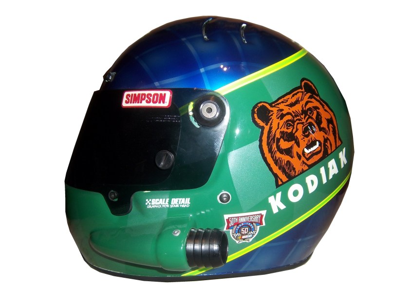
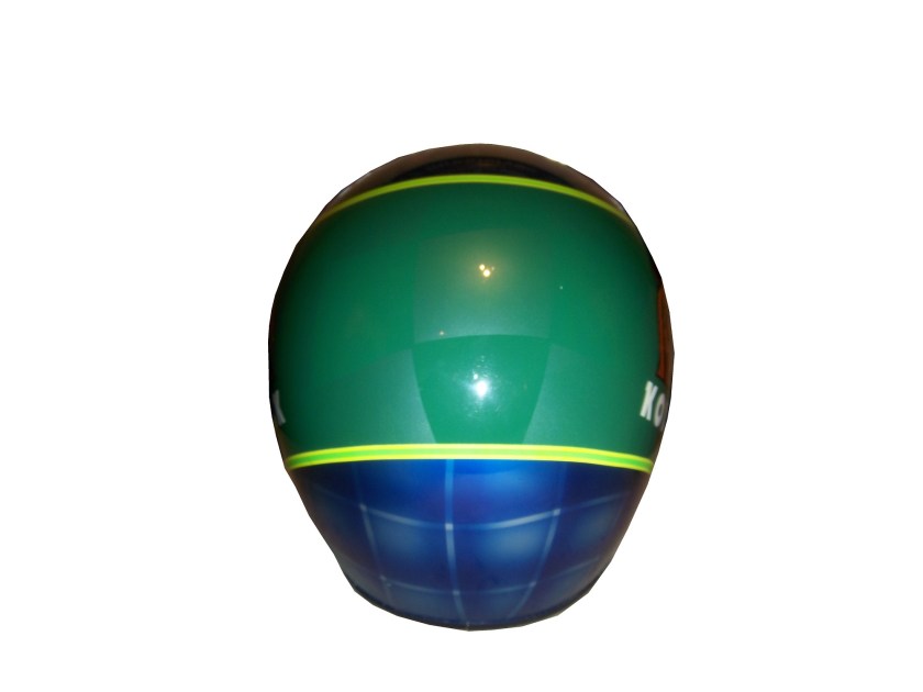
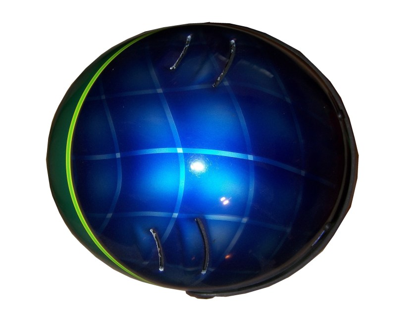
Ricky Craven left Larry Hedrick Motorsports and Kodiak for Hendrick Motorsports in 1997, and Steve Grissom took over. In 1998, in his second year for Hedrick and Kodiak, Grissom donned this customized race helmet.grissom-1 grissom-2 grissom-3 grissom-4 grissom-5 grissom-6 grissom-7

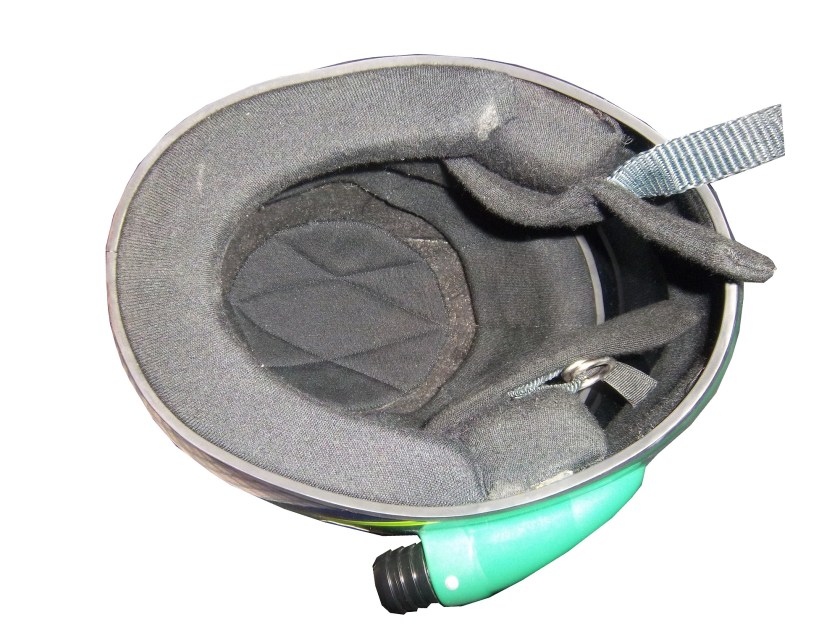
It is in great condition, though it has had the microphone equipment removed. The color scheme is that same shade of green that had graced the side of Rusty Wallace’s car during his 1989 Winston Cup Championship. The blue is used in the design of Kodiak Ice packaging, and works surprisingly well. Grissom ran a Kodiak Ice scheme once in 1998, at the Pepsi Southern 500.

I also have a 1/64 die cast car of similar vintage.100_4055 100_4057 100_4054

Kodiak is one of the many sponsors in NASCAR that I miss. Tobacco advertising has been severely restricted and Kodiak was a casualty. I do miss it but the times have changed.

Again, there will be no paint scheme reviews until next week, when I get back home. I look forward to getting back to normal after a week of relaxation.

They Pay the Bills, So They Design The Suit

By David G. Firestone96-reeves-flogoFrom a design aspect, no other factor contributes as much as the primary sponsor or sponsors of the car. Everything from the colors to the torso design, to the television logos, to the shoulder epaulet and collar design depends on the primary sponsor. While this has been the case for the most part, how the primary sponsor is displayed can vary quite a bit.

Currently, the standard design for a primary sponsor logo is to have a large logo across the front of the lower torso, and on the back on the upper torso. These Christian Fittipaldi designs from 2002-2003 are great examples of that. The Georgia Pacific design from 2002 has a decent sized logo on the front bottom torso, and the same logo higher up on the back torso.45-fittipaldi-flogo 45-fittipaldi-blogoThe Bugles example from 2003 has identical logo placement for the Bugles logo.44-Fittipaldi-flogo 44-Fittipaldi-blogoMany driver suits feature this same logo placement.96-reeves-flogo 96-reeves-blogo 90-stricklin-flogo 90-stricklin-blogo 31-skinner-flogo 31-skinner-blogo 17-sedgwick-flogo 17-sedgwickb-logo 16-musgrave-flogo 16-musgrave-blogo 15-sprague-flogo 15-sprague-blogo 1-lajoie-flogo 1-lajoie-blogo 12-miller-flogo 12-miller-blogo

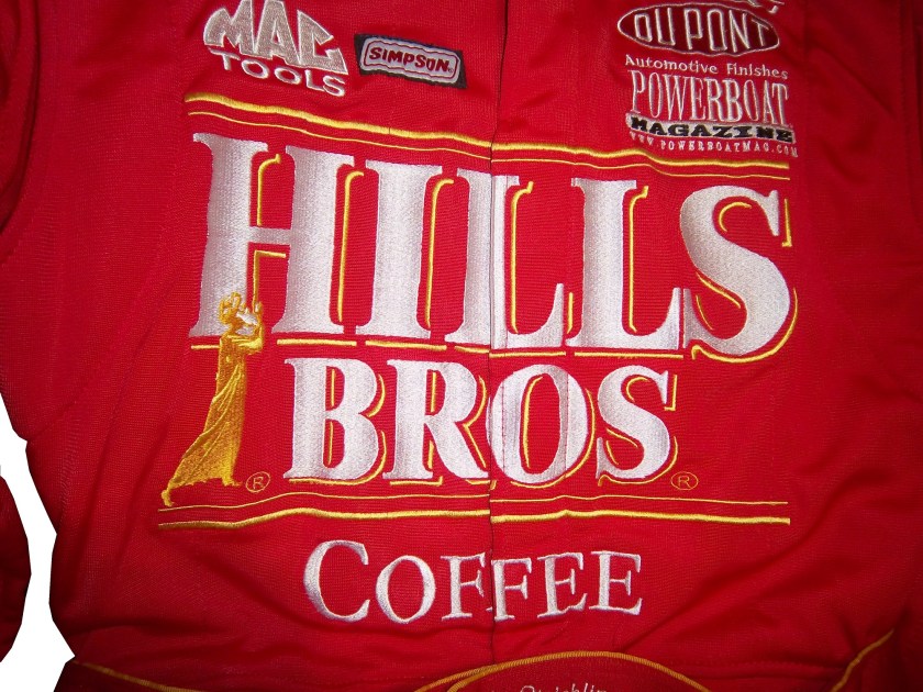
Taking a look at this Ricky Craven example from 1996, it features a design aspect that was very heavily used. The torso features a plan color, with a stripe across it with the sponsor name on that stripe. Dale Earnhardt Sr. used this design for many years, as did Rusty Wallace, Dick Trickle, and Steve Grissom among others. It is a fairly straightforward design, but it works very well.41-craven-flogo 41-craven-blogoOther suits have the primary sponsor logo present, but the logo is underwhelming. This design is exampled by this Bobby Hillin Jr. Moroso driver suit from 1991,20-hillinThis Lake Speed example from 1997,9-speed

and this Ted Musgrave example from 1998.15-musgrave-lchest 15-musgrave-blogo

In very rare instances, a primary sponsor is excluded from the suit altogether. One example is this Terry Labonte suit I covered earlier this year. That example was made for Terry to wear in a very last minute driver change. Another example is this David Stremme suit from 2009. I covered this issue earlier in the year, but to sum it up, because of a conflict between Verizon, the sponsor of Stremme’s car, and Sprint, the title sponsor of the Sprint Cup race, Verizon was not allowed to have their logos on Stremme’s car and driver suit. As such, Stremme raced a Dodge sponsorship, and wore this suit.12-stremme-flogo 12-stremme-blogoOne of the newer designs that is frequently seen is what I call the leg stripe design. This Kasey Kahne example shows a leg design that has a large white stripe running up the red background, with the DODGE television logo running up the leg. Sponsors can make their logos stand out more with this design, so it is becoming more popular every year.9-kahne-legsThis Scott Wimmer example is from 2002, and is rather unique in this category.23-wimmer-legsIt needs an explanation…The suit was worn for the entire 2002 season, which had a Siemens sponsorship for the first 25 races. After Siemens left the team, Scott Wimmer went on to win 4 of the next 9 races in an unsponsored black car with red and yellow flames…while wearing this suit.

While I get that the team not buying another suit for Wimmer to wear…it just looks weird.

Now this is another suit that needs an explanation. Nort Northam is a Porsche dealer based in Florida. He was a race car driver from 1979-1992, and his career was not great, with no wins, and two podiums. In 1988, he raced in the Sunbank 24 at Daytona, now called the Rolex 24 at Daytona in a Porsche owned by fellow driver Karl Durkheimer.56-Northam 56-Northamb
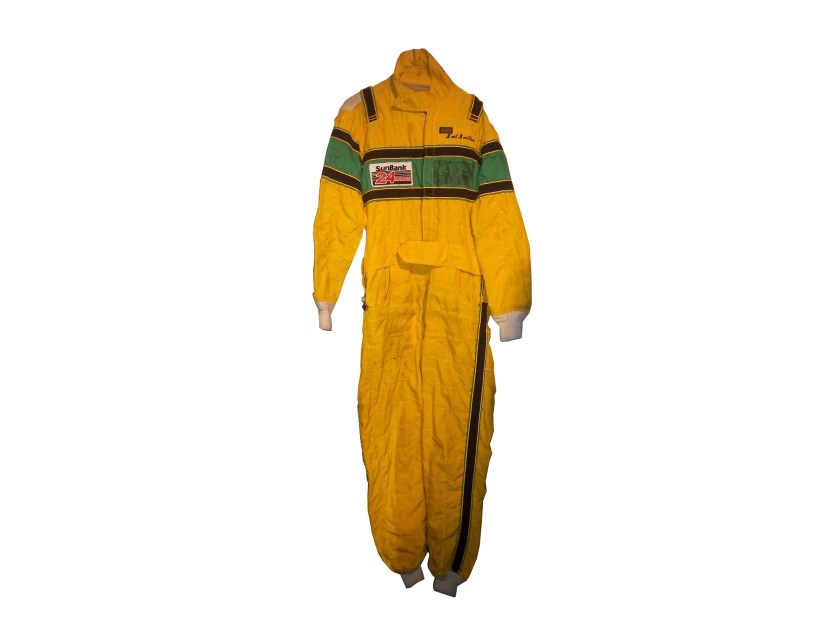
During that race, he wore this driver suit. It appears on this suit that a sponsor patch has been removed or fallen off. Now to understand the basic design, you need to understand that Nort raced in two races a year, and having a suit custom designed would be a needless expense. As such, his name, and two sponsor patches did the trick. Not fancy, but effective. This late 1980’s SCCA example is also a minimalist design, but it sticks to the “80’s stripe” design as the Ricky Craven example.

The last thing about primary sponsors is that sometimes, primary sponsor designs follow other sports uniform trends. This example from 1998 was worn by Jeremy Mayfield. At that time, gigantic logos across the fronts of uniforms were the big thing, and that was not good. This fad did not last long, thank heavens!

Driver Suit Blog “Wheel Reviews”

Last night, I went to see the movie “Rush” and I have to say, it was really good.  It has been said “you love your rivals, because you need someone to beat.” Nowhere is this more evident than Rush. Directed by Ron Howard and starring Daniel Brühl as Niki Lauda and Chris Hemsworth as James Hunt, Rush is the story of the rivalry between the two, from their days in Formula 3 in 1970, to Formula 1 in the 1970’s. For fans of racing movies, it is a true masterpiece.

The film takes the perspectives of the two drivers. Lauda is represented in the film as a talented driver who is great with setting up a race car. He is a driver who takes what he does very seriously. Hunt on the other hand is more of a playboy. He is a great driver, but his fast and furious lifestyle is a distraction from his true talent. Both are talented, but when Hesketh Racing, Hunt’s team can’t find sponsorship for the upcoming 1976 season, Hunt loses his ride. After his wife leaves for a ski trip, Hunt gets a ride with McLaren after Emerson Fittipaldi leaves to race for his cousin.

In 1976, Hunt struggles for the first part of the year, while Lauda, fresh off his 1975 World Championship is always a factor in the points standings. Hunt’s luck changes at the Spanish Grand Prix, where he beats Lauda, though he is disqualified for his car being less than an inch over regulation. Hunt’s wife divorces him, and driven by this, his season turns around. Though Lauda struggles at this point, the points standings are close coming into the German Grand Prix

The 1976 German Grand Prix was a critical point in this story, as the points battle was heating up. This race was at the the “Old Nürburgring” one of the most difficult tracks in the world. The weather was stormy, which kicks up the danger. Knowing the track as well as he did, Lauda called a meeting of the drivers and stated that the race should be canceled because of the conditions. Hunt thinks it is just a trick to take a race out of the schedule, and the cancellation is voted down. Lauda is seriously hurt in a wreck, and he is hospitalized. Hunt blames himself for the wreck. The story from there is the story of the 1976 Formula 1 World Championship.

The cars in the movie were very accurate, in some cases, vintage equipment was used. The tires used were made by Goodyear, and had the lettering in white as opposed to the yellow lettering that they currently use. The crew uniforms were very accurate as well. The driver uniforms were very well done, as were the helmets. Something that I noticed about them was that I couldn’t see any safety certification visible.

All in all, this is a great movie, and racing fans will enjoy this movie, so I give it an A!

Paint Scheme Reviews

Jamie McMurray #1 Liftmaster Chevy SS Good color scheme and decent desisn add up to an A- grade

Clint Bowyer #15 Raspberry 5-Hour Energy/Living Beyond Breast Cancer Toyota Camry I hate pinkwashing and I hate raspberries, so this gets an automatic F

Kyle Busch #18 M&M’s Halloween Toyota Camry The leaf designs on the bottom of the doors just look odd, and it takes a solid A scheme, to an A-. It does have great overall design and great colors, but the leaves just kill it.

Matt Kenseth #20 Home Depot/Let’s Do This Toyota Camry The overall scheme is great, and has a great color scheme. The problem is that the back end is yellow, which just looks odd when compared to the rest of the car. If the back was black, it would match quite well, but this is just bad. I want to give this scheme a higher grade, but the best I can do is a B-

JJ Yeley #36 Drive Sober Arrive Alive Chevy SS Great color scheme, great colors, and a cause that is easy to support add up to an A+ scheme.

Ryan Newman #39 Slate Water Heaters Chevy SS While I don’t get the silver design at the bottom of the car, this is a great scheme, and gets an A+

Ryan Truex #51 Shooters Sporting Center Chevy SS The yellow outline on the numbers is brutal, and the Shooters Sporting Center logo is just awful. C- is the best I can do.

Collar Guard…Not a Product, but a Safety Feature.

1-lajoie-collarBy David G. Firestone

Like shoulder epaulets, the collar of a driver suit has made a transition. It has gone from safety accessory to fashion piece, but unlike the epaulet, it is not only ornamental. Because the collar is still a piece of safety equipment. It goes without saying that fire is an ever present danger in auto racing. The collar protects the neck from burns. This may seem minor, but many people who die from burns die from infection. When the skin is compromised, it can’t stop germs from getting inside the body, and as such makes infection a serious risk during burn injuries.

But the fashion aspect of collars is interesting as well. With the standard alignment of sponsors on the top of the suit, the Series logo, tire manufacturer logo, car manufacturer logo, and other sponsor logos are on the top, and the primary sponsor logos are present on the collar and epaulets. This Randy Lajoie example shows how the suit appears during an televised interview:1-lajoie-f

Note a couple of things: First, the fabric on the collar overlaps just a bit here, but when the driver wears it, it meets perfectly at the center of the neck. Second, it allows the driver to breathe easily. Comfort Vs. Safety is a constant debate. This is one kind of collar, the other kind of collar is what I call the Velcro collar, as shown in this Alex Barron suit from 1998:36-barron-collar

The Velcro collar is exactly what it sounds like, a collar with a strap which Velcros shut. This provides a little more protection in case of fire. It also has another use, as sponsor ads are popular to put on the front of the Velcro strap. This has been used quite often over the years…41-craven-collarbarber-collar

This is due to the fact that for quite some time the open face helmet was used, and the collar provided extra fire protection where the helmet failed. In this day in age, helmets come standard with Nomex socks on the bottom, so the collar, while still a key safety feature, is not as critical. But for sponsor logo placement, it really can’t be beat.

If the collar does not have a Velcro closure, then the primary sponsor logo is sewn into either side of the collar. Like the Lajoie example above, or this Mike Skinner example below, this can be used very effectively as a place for sponsor logos.31-skinner-collar

Like most other aspects of the driver suit, the choice of Velcro or not comes down to driver preference. Kyle Bush, as well as older brother Kurt favor the Velcro style, whereas Tony Stewart and Carl Edwards prefer the non-Velcro variety. Many pit crew shirts have a similar design to the driver design as well.

Editor’s note: For the next two weeks I will be on a very badly needed vacation. I will still have articles ready to go, but I won’t be commenting on up do date issues until I get back. I will still check in from time to time.

Moving on to paint schemes…

Denny Hamlin #11 FedEx Express 2005 Toyota Camry Done as a memorial to Jason Leffler, this is a replica of the scheme that Leffler ran in 2005 during FedEx’s first season as a full-time NASCAR sponsor. It is very faithfull to the original scheme. It also has a great design and color scheme, and earns an A

Greg Biffle #16 3M/Give Kids a Smile Ford Fusion The same bland paint scheme that I described as “There’s nothing really wrong here, but nothing really right here either.  The side design looks forced, the black roof is idiotic, the color scheme is good, but the number design looks too cliche.  It makes no sense, but 3M schemes never do.” It has a small Give Kids a Smile logo on the hood, that is all but invisible. I gave it a C and it will stay at a C.

David Stremme #30 Window Wax Toyota Camry Ugh! This is bad, I can live with the color scheme, but the design is bad. It gets a D

Austin Dillon #33 American Ethanol Chevy SS While I hate the shade of green used here, this scheme looks pretty decent. The designs around the front brake vent are unnessicary, but I still like them. If the green were a bit darker, I could give it a better grade than a C+.

AJ Allmendinger #47 Charter Toytoa Camry The hood design is interesting here. It is designed in the same light as television logos on driver suits. It is a unique idea that works and I hope will catch on. The color scheme is great, and I love the overall design. A

Brian Vickers #55 Aaron’s/Louisville Cardinals Toyota Camry The color scheme is good, but the Fruit Stripe Gum design seen on the Louisville Cardinals shorts is ugly. The whole Zubaz design scheme is horrible on sports uniforms, and even worse on this car. I have nothing against the Louisville Cardinals, but this is horrible. F

Dale Earnhardt Jr #88 National Guard Solider of Steel Chevy SS Solid simple scheme with good colors, but the Superman Logo on the hood is next to invisible.

Arm Gussets…Comfortable AND Safe!

By David G. Firestone

We’ve all seen them in telecasts and photos, but what many of us do not realize is what they are and what they do. I am talking about the arm gusset. Arm gussets are seen at the top of the sleeve on a driver suit, under the shoulder. They are a flexible piece of Nomex specifically designed to do two things. One is protect the driver, the other is give the driver some freedom of movement.10-labonte-rshoulder 10-labonte-lshoulder

Arm Gussets are almost always present on race-worn driver suits. Anyone who has worn a one-piece full body jumpsuit can attest to the fact that it restricts freedom of body movement. The gusset takes some of that restriction away. This is important when it comes to driving, because it gives the driver one less thing to concentrate on, and in the worst case scenario, can help a driver escape a burning vehicle much quicker.36-said-rshoulder 36-said-lshoulder

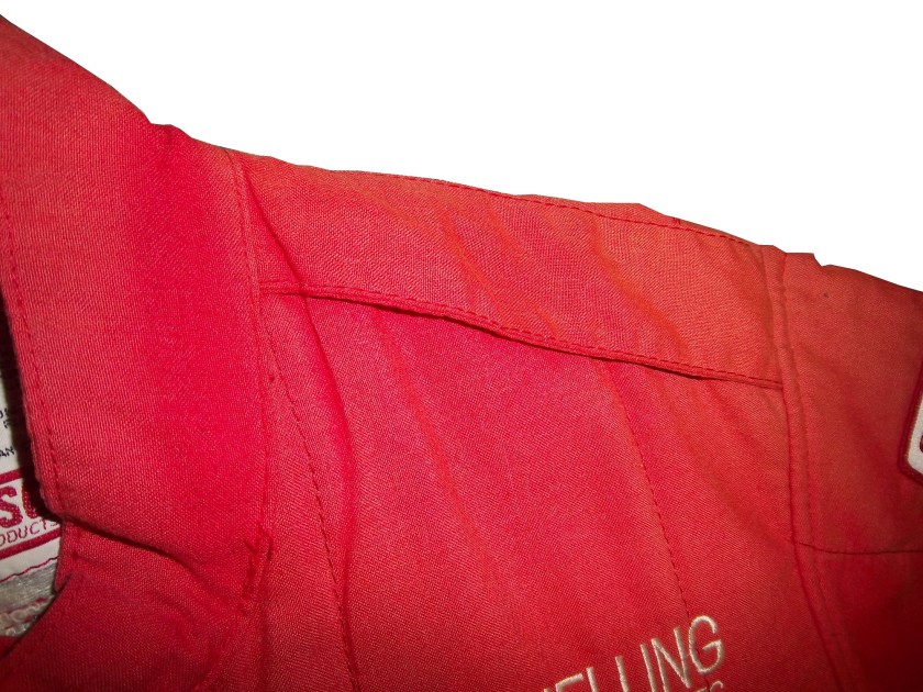
Gussets have very little variation, though I have seen one unusual one. In this Ricky Craven suit from 1996, the front of the sleeves look like they are attached to the body, whereas the back has a gusset in it. This would be done for driver preference of course, bur I have never seen a half gusset before or since.100_3458 100_3457 100_3456

This Lake Speed suit from 1997 is store bought, as opposed to custom designed, and it has no gussets. This suit would have some restriction of movement. Again this can come down to driver choice.9-speed-rshoulder 9-speed-lshoulder

The need for protection vs. the need for driver comfort is a major conflict in the world of racing safety. The gusset is a major meeting point between the two sides involved, and the drivers love them.

RIP Jason Leffler…you will be missed.

Now on to paint schemes.

Jame McMurray #1 Parade Magazine Chevy SS-Great color scheme, great design, nothing wrong at all, A+

Jame McMurray #1 Banana Boat Chevy SS-A scheme that could be a B+ is ruined by an awful color scheme. That orange is the worst I have ever seen on a race car. It takes this scheme and takes to a D-

Jamie McMurray #1 Bad Boy Buggies Chevy SS-An attempt to be innovative with design fails horribly here. The color scheme is decent, but the design is awful.

Marcos Ambrose #9 Stanley/DeWalt Racing for a Miracle Ford Fusion-This is a major improvement over what they currently run. This just works! A+

Denny Hamlin #11 Sport Clips Toyota Camry-Seriously? Why does it look like a sperm is painted in red on the side of the car? The red/white/black color scheme works, but the door design is just awful! D-

Denny Hamlin #11 Fedex/Autism Speaks Toyota Camry-Much better! The puzzle design, and solid color scheme look really good here. The red 11 is amazing too! Can’t give this anything but an A+

Tony Stewart #14 Code 3 Chevy SS-Love the scheme, love the simple design and great color scheme.  Works very well and earns an A+

Clint Bowyer #15 5-Hour Energy Patriotic Toyota Camry-How is this patriotic? Oh….I get it…the stars….just one problem…THE COLOR SCHEME IS WRONG! If it was red white and blue I would like this, but this is just awful! You want to honor America, but can’t get the color scheme right? F-

Greg Biffle #16 Fastenal Ford Fusion-Since minor variations of this scheme were run by Biffle, Ricky Stenhouse, and Carl Edwards with minor variations between them, I will grade them all here. Solid scheme, good color scheme, A+ for all 3.

Greg Biffle #16 3M/Ace/Rite Aid Ford Fusion-The color scheme is good, but the door design is too busy. If it was one single color, it would work quite well, but being a mix of black, blue, red, and white it just looks confusing. It works, but not as well as it could, and earns a C+

Jeff Gordon #24 Axalta Chevy SS-Another DuPont scheme with different logos that works very well. Good color scheme and design. A+

Paul Menard #27 Menard’s/Libman Chevy SS-The Libman green hood design just looks horrible on the yellow background of the car. The green is too light, and if it were darker it might work, but this scheme earns a D

Kevin Harvick #29 Budweiser Patriotic Chevy SS-This is another patriotic scheme that works very well with a good design. A+

J.J. Yeley #36 Click it or Ticket Chevy SS-Good design, but awful color scheme. The green and blue is just horrible. If one or the other was used it might work, but this is horrific. F

Ryan Newman #39 Quicken Loans Patriotic Chevy SS-Meh.  The design needs work.  Too much going on with the front of the car to earn anything above a C

Aric Almirola #43 Air Force Ford Fusion-Great design, simple design with a great color scheme. A+

Bobby Labonte #47 Bush’s Grilling Beans Toyota Camry-The overall design and color scheme is good, but the major flaw here is that the quarter panel has 5 different logos, most of which clash with the Bush’s scheme. It takes an A scheme and drags it down to a C

Jimmie Johnson #48 Lowes Patriotic Chevy SS-The only bad thing I can say about this is that the red should be a little darker. Other than that, this scheme earns an A

Jimmie Johnson #48 Monsters University Chevy SS-If the blue was darker, I would like it more, but the blue is too light. Other than that, this is a solid scheme. B+

Martin Truex Jr. #56 Napa Patriotic Toyota Camry-Perfect…that is all I can say. A+