
 By David G. Firestone
Number designs are an important detail in American auto racing, especially NASCAR, where the number is used on all of the merchandise sold to fans. The number is an identity for the driver and for the fans. While I was watching the Camping World RV Sales 301, for some reason, I noticed that the majorty of the car number are slanted. As the race went on, I noticed that almost all of them were slanted to the right. The Carl Edwards die cast above shows what I mean. Let’s look at the driver’s side car number up close. As you can see, the numbers are slanted with the top slanted to the right of the bottom. This gives the illusion that the numbers are being blown back by the speed of the car. I kept thinking about this and I decieded to see just who uses which slant when designing numbers for race cars. I wound up doing the NASCAR Sprint Cup Series, the Verizon IndyCar Series, and Formula 1. Here is what my research found…
NASCAR SPRINT CUP SERIES
Jamie McMurray-1-Straight
Brad Keselowski-2-Right
Austin Dillon-3-Left
Kevin Harvick-4-Right
Kasey Kahne-5-Right
Michael Annett-7-Right
Marcos Ambrose-9-Right
Danica Patrick-10-Right
Denny Hamlin-11-Right
Ryan Blaney/Juan Pablo Montoya-12-Right
Casey Mears-13-Right
Tony Stewart-14-Right
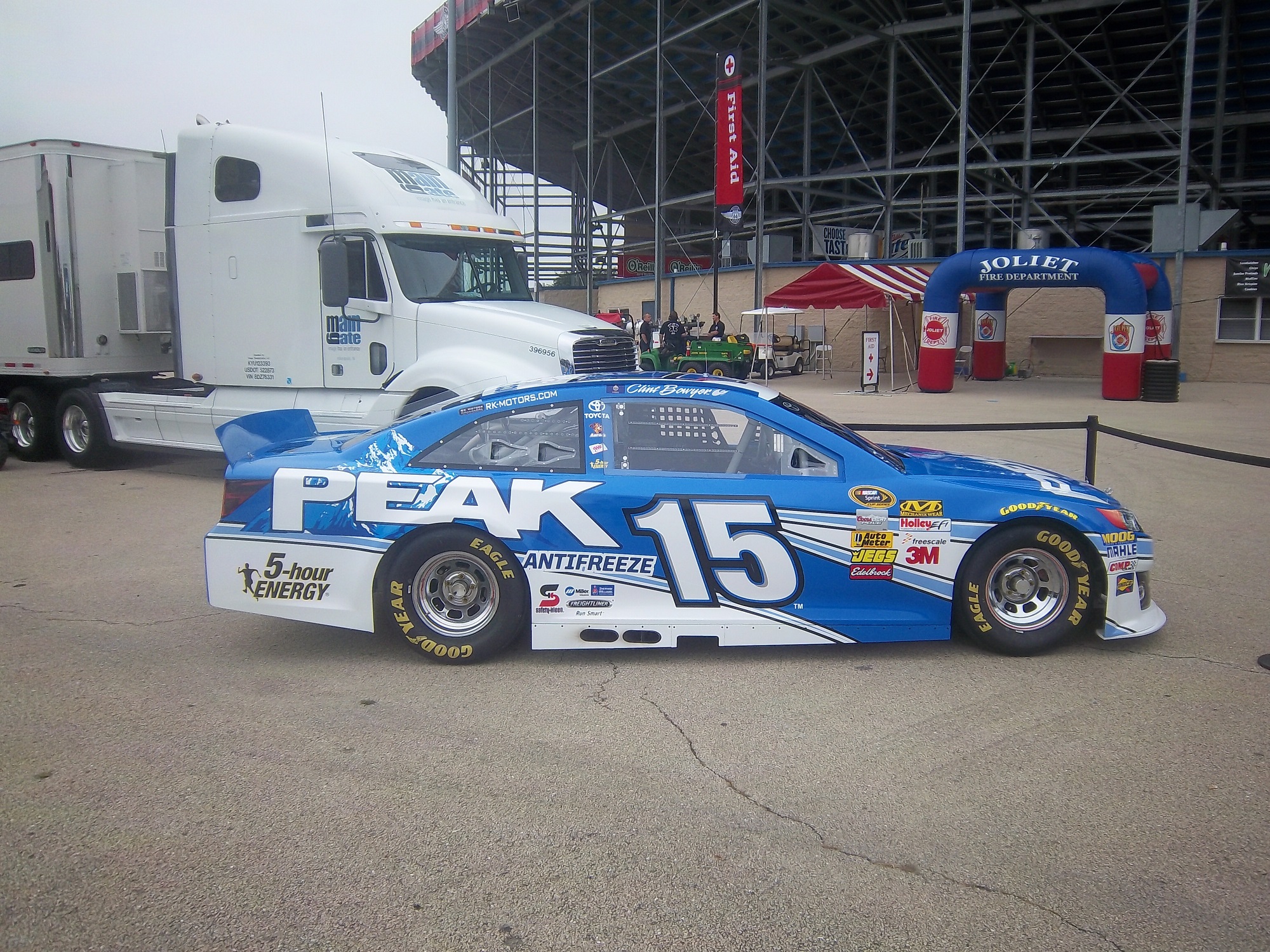
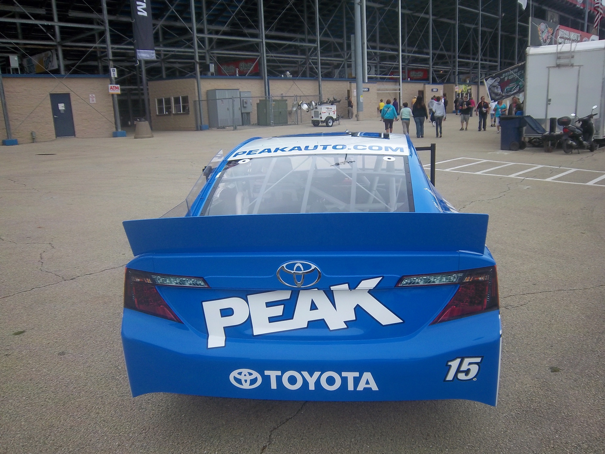
Clint Bowyer-15-Right
Greg Biffle-16-Right
Ricky Stenhouse Jr.-17-Right
Kyle Busch-18-Right
Matt Kenseth-20-Right
Trevor Bayne-21-Straight
Joey Logano-22-Right
Alex-Bowman-23-Right
Jeff Gordon-24-Right
Cole Whitt-26-Right
Paul Menard-27-Right
Joe Nemecheck-29-Right
Parker Kligerman-30-Right
Ryan Newman-31-Left
Travis Kvapil/Blake Koch/Boris Said/Eddie MacDonald-32-Right/Straight
RCR/Circle Sport-33-Left(RCR)/Right/(Circle Sport)
David Ragan-34-Right
David Reutimann-35-Right
Reed Sorenson-36-Right
David Gilliland-38-Right
Landon Cassill-40-Right
Kurt Busch-41-Right
Kyle Larson-42-Right
Aric Almirola-43-Right
JJ Yeley-44-Right
AJ Allmendinger-47-Right
Jimmie Johnson-48-Right
Justin Allgaier-51-Right
Bobby Labonte-52-Right
Brian Vickers-55-Right
Michael Waltrip/Joe Nemechek-66-Right
Dave Blaney-77-Straight
Martin Truex Jr.-78-Right
Ryan Truex-83-Right
Joe Nemecheck-87-Right
Dale Earnhardt Jr.-88-Left
BK Racing-93-Right
Michael McDowell-95-Right
Josh Wise-98-Right
Carl Edwards-99-Right
VERIZON INDYCAR SERIES
Juan Pablo Montoya-2-Straight
Helio Castroneves-3-Straight
Jacques Villeneuve-5-Right
Townsend Bell-6-Right
Mikhail Aleshin-7-Right
Ryan Briscoe-8-Straight
Scott Dixon-9-Straight
Tony Kanaan-10-Straight
Sebastien Bourdais-11-Right
Will Power-12-Straight
Takuma Sato-14-Straight
Graham Rahal-15-Right
Oriol Servia-16-Right
Sebastian Saavedra-17-Straight
Carlos Huertas-18-Right
Justin Wilson-19-Right
Ed Carpenter/Mike Conway-20-Right
JR Hilderbrand-21-Right
Sage Karan-22-Right
Marco Andretti-25-Right
Kurt Busch/Franck Montagny-26-Right
James Hinchcliffe-27-Right
Ryan Hunter-Reay-28-Right
James Davison-33-Straight
Carlos Munoz-34-Right
Martin Plowman-41-Straight
Pippa Mann-63-Right
Josef Newgarden-67-Straight
Alex Tagliani-68-Straight
Simon Pagenaud-77-Right
Charlie Kimball-83-Straight
Buddy Lazier-91-Right
Jack Hawksworth-98-Straight
FORMULA 1
Sebastian Vettel-1-Straight
Daniel Ricciardo-3-Straight
Max Chilton-4-Straight
Nico Rosberg-6-Straight
Kimi Raikkonen-7-Straight
Romain Grosjean-8-Right
Marcus Ericsson-9-Straight
Kamui Kobayashi-10-Straight
Sergio Perez-11-Right
Pastor Maldonado-13-Right
Fernando Alonso-14-Right
Jules Bianchi-17-Straight
Felipe Massa-19-Straight
Kevin Magnussen-20-Straight
Esteban Gutierrez-21-Straight
Jenson Button-22-Straight
Jean-Eric Vergne-25-Straight
Daniil Kvyat-26 Straight
Nico Hulkenberg-27-Straight
Lewis Hamilton-44-Straight
Valtteri Bottas-77-Straight
Adrian Sutil-99-Straight
Ok, that’s a lot to swallow, so let’s add the total number of number designs and look at the data:
*NASCAR-54 *IndyCar-33 *Formula 1-22 *Totals-109
Right-47-87% Right-19-58% Right-4-18% Right-70-64%
Straight-3-5.5% Straight-14-42% Straight-18-82% Straight-35-32%
Left-4-7% Left-0-0% Left-0-0% Left-4-4%
The Sprint Cup car numbers overwhelmingly are designed to lean to the right. In fact, only 6 of the 54 teams don’t use numbers that lean to the right. In IndyCar, it is much more down the middle, with 19 cars with right leaning numbers and 14 straight leaning numbers. Formula 1 is the straightest series, with only 4 of the 22 numbers being slanted. NASCAR is the only group of the series that has left-leaning numbers, all 3 of which 3, 31, and 33, are raced by Richard Childress Racing.
It is one of those odd idiosyncrasies of racing design that a lot of people see but don’t notice. In fact, I didn’t notice until a couple weeks ago that the numbers seem to lean from one side to another. I also am curious as to why so many teams choose to have the car numbers lean to the right. I’m not saying it looks bad, they, for the most part, look really good.
Now we continue our theme with…
PAINT SCHEME REVIEWS!
Austin Dillon #3 Mycogen Seeds Chevy SS The red black and white scheme works very well, and it has a really good design that works well and earns an A
Kevin Harvick #4 Mobil 1 Chevy SS For a Mobil 1 design, this is pretty good. It is a lot less clutter, and shorter stripes than Tony Stewart’s car, and the color scheme is good. A+
Juan Pablo Montoya #12 Go Penske Ford Fusion Great simple design, decent color scheme earns an A-
Greg Biffle #16 3M 1942 Throwback Ford Fusion An perfect example of why throwback schemes fail. A classic logo which I have to admit looks really good, on a modern car, with modern design, modern numbers, and modern logos. It just looks out of place. F
Jeff Gordon #24 Axalta/Maaco Chevy SS The red, yellow and black color scheme works, except the blue and white Maaco logo scheme contrasts with it. The Pepsi globe looks odd there too, so I can’t give it any higher than a C-
Cole Whitt #26 Toyota of Scranton Racing Toyota Camry Great color scheme, great simple design, A+
David Ragan #34 MDS Ford Fusion Great simple design, decent color scheme earns an A-
David Ragan #34 A&W Root Beer Float Day Ford Fusion The color is good, the basic design scheme is good, but the Root Beer Float Day logos are too small. Even in this picture they look too small and are hard to see. If I am looking at a picture and I think it is too small, how do you think it will look on the track? C-
Reed Sorenson #36 Red Rocks Cafe Chevy SS The red black and white scheme works very well, and it has a really good design that works well and earns an A
Reed Sorenson #36 Zing Zang Chevy SS The overall design looks like a Richard Petty Motorsports car, the color schemes are all over the place, and the logo looks too much like a Mountain Dew logo. I give it a D-
Bobby Labonte #37 Accell Construction Chevy SS Good color scheme, but the awful template is back for Tommy Baldwin. It is really sad, because this could be a great scheme, but the template takes it from an A to a C-
Landon Cassill #40 Cars For Sale Chevy SS The yellow is too bright, and the gray and black numbers look too dark on the side. The design is mediocre and I’ll give it a C-
Kurt Busch #41 Haas Automotion Chevy SS This is a perfect example of why gray-scale color schemes don’t work. By itself it is a good look, but the Monster Energy logo, the Goodyear logo, and the contigency logos ruin the look. If it were all gray-scale, I would give it an A, but because of those flaws, it earns a B-
Aric Almirola #43 Go Bowling Ford Fusion I love what they did here. The bowling ball nose and pin design give a great impression, and the color scheme works very well here. A+
Justin Allgaier #51 Collision Cure Chevy SS Yellow black and blue is a bold color scheme choice, but this works. The design is simple, and it has a really good unique look, and I’ll give it an A
Dale Earnhardt Jr. #88 Michael Baker International Chevy SS Basically this is the National Guard scheme with a different color scheme, and let me tell you, it just doesn’t work. I love the new number design, but blue and black just doesn’t work. The overall color scheme is not great either, and it shows. It takes an A+ scheme and takes it down to a C+
Michael McDowell #95 Thrivent Financial Ford Fusion Levine Family Racing has improved leaps and bounds over last year and it shows. Great color scheme, great design, A+


