Paint Scheme Leaderboard, Week #1-Chevy

By David G. Firestone

Starting this week, and for the next four Fridays, we will rank the paint schemes of all 55 race teams in the NASCAR Sprint Cup. I will not grade any paint schemes until these rankings are done, but I will still update the Paint Scheme Tracker on Wednesday. The rankings were determined by the Paint Scheme Ranking Executive Committee, made up of myself, and Alejandro my black cat, though all he did was sleep through the proceedings. First up will be Chevy. I will also add the rank each scheme held last year. Teams that did not exist or run Chevy cars will be marked as NR for Not Ranked..

1-Hendrick Motorsports #48 Rank Last Year: 1st of 19-Classic, smooth looks with no needless clutter. Jimmie always runs great schemes

2-Stewart Haas Racing #4 Rank Last Year: NR-With the exception of Hunt Brothers Pizza, which uses an awful shade of green, Kevin has consistently run a series of great schemes.

3-Stewart Haas Racing #41 Rank Last Year: NR-The Slate scheme does not work, but all the other schemes work very well.

4-Richard Childress Racing #31 Rank Last Year: 13th of 19-A lot of great schemes this year, but Wix is overdone, and the Cat/Quicken Loans hybrid looks awful

5-Chip Ganassi Racing #1 Rank Last Year: 9th of 19- A pink-washing scheme and a terrible shade of green on the WEMO scheme cost this team the 2nd place spot,knocking them down to 5th. They have run a lot of great schemes this season

6-Furniture Row Racing #78 Rank Last Year: 2nd of 19-The World Vision scheme needs work, as the color does not support a fade, but the Furniture Row, and Colorado Freedom Memorial work very well.

7-Hendrick Motorsports #88 Rank Last Year: 8th of 19-National Guard, Mountain Dew, Kickstart, and Superman look good, and work well with the new number design, but Michael Baker, Kelly Blue Book, and Nationwide don’t at all.

8-Chip Ganassi Racing #42 Rank Last Year: 4th of 19-While Cottonelle, the Silver Scheme, and Energizer work very well, but the rest of their schemes are mediocre at best. The white on the back doesn’t work.

9-Beard Oil Racing #75 Rank Last Year: NR-If the sides had a sponsor, and the stripe at the bottom was eliminated, it would work a lot better.

10-JTG Daugherty Racing #47 Rank Last Year: NR-While Bush’s, Clorox, Scott’s, Sullivan/Palatek, Kingsford, and Bush’s Grilling Beans work well,Kroger/USO is overdone, Charter Communications uses a horrid shade of green, and Hungry Jack just looks terrible.

11-Hendrick Motorsports #24 Rank Last Year: 14th of 19-Drive to end Hunger is too overdone, and the upside down D on the hood looks terrible. Their orange scheme is even worse. Panasonic is mediocre at best. Pepsi looks good, and all of the Axalta schemes are really good.

12-Hillman Racing #40 Rank Last Year: NR-When the car doesn’t have a scheme, it looks very good. When it has a sponsor it looks awful.

13-HScott Motorsports #52 Rank Last Year: NR-The black scheme is good, but the orange Florida Lottery scheme is a trainwreck. Less is more on a paint scheme.

14-HScott Motorsports #51 Rank Last Year: 5th of 19-If the car is running a Brandt scheme it looks good, anything else looks terrible.

15-Richard Childress Racing #27 Rank Last Year: 6th of 19-Neon yellow looks terrible, when they use the stripes on the sides it looks even worse. The Pittsburgh Paints scheme looks really good though.

16-CircleSport/Richard Childress Racing #33 Rank Last Year: 19th of 19-

17-Tommy Baldwin Racing #37 Rank Last Year: NR-Accell Construction has a great color scheme, but the design scheme ruins it.

18-Tommy Baldwin Racing #36 Rank Last Year:10th of 19-Another example of a team where when the car is unsponsored, it looks better.

19-Stewart Haas Racing #14 Rank Last Year: 7th of 19-The over designing of the Bass Pro Shops schemes, as well as the use of orange and camo just look horrible. Mobil 1, Rush Truck Centers, and Code 3 look decent, but to some extent have issues. Mobil 1 is over designed, Rush uses too dark a yellow, Code 3 uses too bright a yellow.

20-Tommy Baldwin Racing #7 Rank Last Year:16th of 19-Allstate Peterbuilt, and Pilot-St Jude Children’s Network work well, as both have good color schemes and design schemes. Anything else just looks awful.

21-Richard Childress Racing #3 Rank Last Year:NR-Cheerios is very good, and has a classic look. Dow schemes have a great color scheme, but have mediocre design. Anything else looks terrible on this car.

22-Germain Racing #13 Rank Last Year:NR-The blue is too bright, as is the yellow. The car is overdesigned, and the whole car looks like a mess. The camo scheme is much worse.

23-Hendrick Motorsports #5 Rank Last Year:17th of 19-The only half decent scheme is Pepsi. Everything else is an over designed mess.

24-Stewart Haas Racing #10 Rank Last Year:14th of 19-The only scheme that doesn’t make my eyes hurt here is Aspen Dental. Terrible shades of orange and green, with ugly design. The pink-washing scheme is terrible.

25-Xxxtreme Motorsports #44 Rank Last Year:NR-Every single one of their cars is an ugly, over-designed mess that doesn’t look good at all.

Next week, we move on to Ford…See you soon!

The Helmet Stripe-An Unusual Place For Sponsorship

By David G. Firestone14A

Last week, I had a column run on Uni-Watch, and I delayed this article until this week.  Two weeks ago, we discussed visors, this week, we will discuss what has become known as the “helmet stripe.” Helmet stripes came from IndyCar and Formula 1 cars, which are open cockpit cars. Helmets are clearly visible to television cameras and fans. As a direct result, helmet design in Formula 1 has become its own unique art form. Helmet designs become a part of the driver identity. The other thing that these open cockpits allow is for sponsorship opportunity. As such, a small opaque stripe is used on helmet visors.lepage-3

In NASCAR, the visor was slow to arrive. This is due to two reasons, first, many drivers up until the mid 1990’s chose to wear open-faced helmets. While these helmets had a shade to help keep the sun out of a driver’s eyes. While sponsor logos do show up, they were used for the driver’s name. This Brad Noffsinger example from 1988 is an example of that.Noffsinger-4

The second reason that helmet stripes were slow to come to NASCAR is that in-car cameras, while used, were for many years positioned in such a way that the visor would not be seen. Even if helmets were painted, the visor had no stripe. When the in-car cameras were positioned to film the driver from the side and even from the front, the helmet stripe became the standard. The stripe is designed to fit over the part of the visor that overlaps the opaque part of the helmet, as this example shows.musgrave2 musgrave3

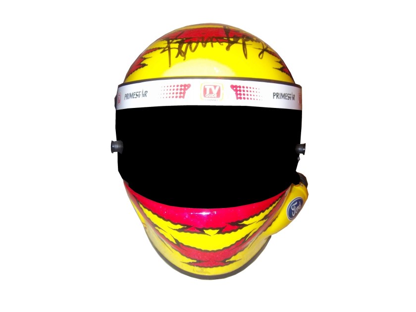
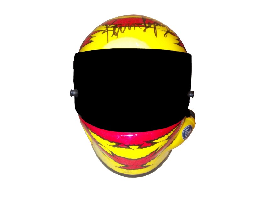
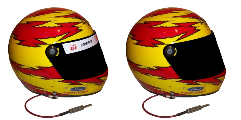
Helmet stripes have become standard. To show how it affects the overall look of the helmet, I took this Kevin Lepage helmet from 1999, and edited the pictures to show how it looks. lepage-2  lepage-4  lepage-6

Not bad, but let’s compare it side by side to the original helmet…lepage-7 lepage-8 lepage-9

Helmet stripes have become a unique way for a driver to customize a helmet, as this video shows:

Facebook pages and Twitter helmets are becoming standard on these. All visors that a driver would wear on a helmet have these stripes, which is standard, as visors are changed on a regular basis, and sponsors want the advertising space that they pay for.

Paint Scheme Reviews!

Because of the Uni-Watch article last week, I didn’t get to review paint schemes.  Within the last couple of weeks there were a large number of 2014 paint schemes released. Now I know that many of these will change before the start of the 2014 season, but I will grade them anyways.

Brad Keselowski #2 Miller Lite Ford Fusion  Same scheme as this year, same grade, C

Kevin Harvick #4 Budweiser Chevy SS Same Scheme as last year, same grade, A

Kevin Harvick #4 Jimmy John’s Chevy SS  They improved one of the best schemes in NASCAR and went from an A to A+

Kevin Harvick #4 Outback Steakhouse Chevy SS The color scheme remains the same but red takes over from beige as the primary color, which gives the car a great look, and an A grade

Kasey Kahne #5 Great Clips Chevy SS Same scheme as this year, same D+ grade

Kasey Kahne #5 Pepsi Max Cheyv SS Same scheme as last year, same F grade

Marcos Ambrose #9 Stanley/DeWalt Ford Fusion Great color scheme, though the nose, and quarter panel design are over done. Even still, I give it a B-

Marcos Ambrose #9 DeWalt/Stanley Ford Fusion See Above

Tony Stewart #14 Bass Pro Shop/Mobil 1 Chevy SS I get that two companies with different desgin schemes are sharing the car, but this is just brutal to look at. The orange and camo contrast is hideous, and the overall design is overdone. C-

Tony Stewart #14 Mobil 1/Bass Pro Shop Chevy SS The white and black contrast just looks awful! I really hope this changes before the season starts, because this is a scheme that is painful to look at. I have to give it an F

Tony Stewart #14 Code 3 Associates/Mobil 1 Chevy SS As bad of a color scheme as this is, it is certainly better than the other two Tony Stewart schemes are. That said, the color scheme warrants an F while the design warrants an A, so I’ll split the difference and give it a C

Greg Biffle #16 3M Ford Fusion This scheme is a MAJOR improvement over this year’s design! All of the pointless noise on the door is gone, and the car has a very smooth look because of it, and I have to give this design an A

Ricky Stenhouse Jr. #17 Nationwide Insurance Ford Fusion Great color and design schemes, though the white on light blue lettering and logos are hard to see. Even still, I have to give it an A-

Joey Logano #22 Shell/Pennzoil Ford Fusion Same scheme as last year, same grade, D

Joey Logano #22 AAA Insurance Ford Fusion  See Above

Jeff Gordon #24 Pepsi Max Chevy SS I gave this scheme a C-, but given the *ahem* other Pepsi Max scheme, I’ve reconsidered, and I will give this scheme a B

Ryan Newman #31 Caterpillar Chevy SS  An improvement on an already good scheme, A+

Aric Almirola #43 Smithfield Foods Ford Fusion If the hood and front were done in the stars design, and the rest of the car was red and white striped, it would look better, and I would be able to give it more than a C+

Jimmie Johnson #48 Lowes Chevy SS Supposidly, this will be the main scheme for the whole season, and I have to say it looks amazing, and is an A+ grade

Jimmie Johnson #48 Lowes/Kobalt Chevy SS This will be run for a few races, and it is an A+ scheme.

Carl Edwards #99 Fastenal Ford Fusion Same scheme as last year, same A grade

Carl Edwards #99 UPS Ford Fusion No redeeming features whatsoever, F-`

Now on to new 2013 paint schemes…

Jamie McMurray #1 Cessna/Auburn University Chevy SS The white hood and roof just look aukward, compared to the black covering the rest of the car.  That said, it is still a decent scheme, and I’ll give it a B

Dave Blaney #7 Breast Cancer Awareness Chevy SS Pinkwashing is an automatic F

Marcos Ambrose #9 Bostitch Ford Fusion The 2014 scheme is previewed here, and I’ll give it the same B- grade I gave the 2014 scheme.

Landon Cassill #33 T-Mone Chevy SS This is a perfect example as to why only one person should design a car.  It looks like it took at least 3 people to design the car, each with a different idea as to what the car should look like.  And in the end it is just a mess, and not even a good color scheme can give this scheme a passing grade.  F

David Ragan #34 Safercar.gov Ford Fusion  See Above. F

JJ Yeley #36 United Mining Equipment Chevy SS Even if I didn’t give pinkwashing schemes an automatic F, this scheme would get an F anyway, it just looks awful

Kyle Larson #51 Target Chevy SS Simple, yet attractive, and it earns an A

Kurt Busch #78 Wonder Bread Chevy SS  To celebrate the return of Wonder Bread, Kurt is going to channel Ricky Bobby, except for one difference…this scheme is a lot better than the Ricky Bobby Scheme.    No flames and the baloons coming from the brake duct are a great look for this car, and it earns an A

Dale Earnhardt Jr. #88 Mountain Dew/Xbox 1 Chevy SS  It has a great color scheme, and that is the nicest thing I can say about it.  The design is just awful, and it looks like it will give people seizures as it drives around the track.  I give it an F

Blake Koch #95 Supportmillitary.org Ford Fusion Eww…Too much going on, with the over-sized camo in too many different colors, and the door design which is awful. F-

Birds and Sports

Quick, what do Randy Johnson, Dave Winfield, and Dale Earnhardt Sr. all have in common? Well for starters, all were very talented, and all are Hall of Famers, but that isn’t all. The unique thing about these three players is that each one of them has accidentally killed a bird while playing sports. Dave Winfield was playing in Toronto in 1983, and was playing catch with a bat boy, when a seagull flew into the path of the ball, and was hit and killed as a result. This was a total accident, but the fans were so upset that Winfield was arrested for animal cruelty. Police later dropped the charges, and Winfield was released. In 2001, Randy Johnson was pitching a spring training game, when he hit a dove with a pitch in a freak accident. A number of animal rights groups were upset, but no charges were filed.

Dale Earnhardt Sr.’s story is by far the strangest. At the 1991 Daytona 500, Earnhardt was a heavy favorite to win the race. Davey Allison won the pole, Hut Stricklin was 2nd, and Earnhardt was 3rd. Allison led the first lap, and Earnhardt took the lead during the 2nd lap. During that same lap, Earnhardt’s Chevy Lumina struck a seagull on the back stretch. Although this might not seem that bad, it seriously damaged the car, affecting the air intake, and raising the temperature of the engine. Emergency repairs took place, and while Earnhardt finished 5th, he wasn’t in contention for the lead after the seagull incident.

The really weird thing is that for many years, the seagull incident was a metaphor for Dale Sr.’s record at the Daytona 500. No discussion on his 19 futile attempts to win the Daytona 500 would be complete without mentioning the seagull incident. While other attempts to win the 500 ended with flat tires, or running out of gas, or just plain wrecks, the seagull incident stands out, along with the 1997 flip.

The 1997 Daytona 500 had the other unique incident at Daytona. During the 1997 event, Earnhardt was, again, a heavy favorite to win the event, and on lap 188, he was in a four-way battle for the lead, and he got into a wreck with the 28 car of Ernie Irvan, and rolled his car on the back-stretch. Irvan’s hood flies into the crowd and causes a number of injuries to fans. Earnhardt’s car lands on its wheels and Dale gets out of the car and heads to the ambulance. As he does so, he notices that his car has all four tires on it, so being Dale Earnhardt, he gets out of the ambulance and walks over to the car, and asks the guy attaching the car to the wrecker to see if the engine will fire, and it fired. He climbs back into his car and drives back to pit road, where is car is patched up as best could be done, and he finished the race 5 laps down. This is the only incident where a die-cast was made of a wrecked car. Speaking to reporters after the race, Earnhardt said “Well I just wanted to get back in the race and try to make laps, and we runnin’ for a championship…I got in the ambulance and I looked back at the car and said “man the wheels is still on that thing.” I got out of the ambulance and and asked the guy inside the car and he was hooking it up, I said “see if it would crank,” and he cranked it up, I said “get out, give me the car back” so I drove it back around and we taped it up.” It is a moment that still brings chills to my spine and this is 15 years later.

Image

I am proud to say that I own a piece of each car from the two above stories. From the 1991 Daytona 500, I own a small piece of the passenger-side fender, which still has race damage present. As seen below:

 Image

From the 1997 Daytona 500 I have this piece of what remained of the car after the event. Interestingly, the car was repaired, and raced at Talladega later that season. The race damage is clearly visible on it:

 Image

Moving on to paint schemes…

Kyle Busch #18 M&Ms Toyota Camry Very solid scheme here. Not only is the color scheme great, it looks even better than last year, with a clean front. The cleaner lines of the new car just make this scheme so much better as well. Final Grade A+

Jeff Burton #31 Caterpillar Hybrid Excavator Chevy SS Another great scheme, though the tailpipe decals are really ugly, and the yellow roof number is really ugly. Final Grade B+

And we also have some driver suit photos and videos

Joey Logano #22 Shell/Pennzoil Ford Fusion This was posted on Logano’s Facebook page, and all I can say is… Hey look kids! It’s Ronald McDonald! Joking aside, this seriously looks like a McDonald’s suit, but with Shell and Pennzoil logos. That being said, it’s not a bad suit, the television logos are good, and it gets a final grade of an A

Jimmie Johnson #48 Lowes Chevy SS This video, from Hendrick Motorsports YouTube page shows Johnson’s new suit.  Very solid, with a great color scheme and basic design. I could to without the white collar, but that is only a minor complaint for a great suit, and it gets an A!