Paint Scheme Leaderboard Part 2- Chevy

By David G. Firestone

Last week, I ranked the Ford teams based on their paint schemes, and this week I will do the Chevy teams and next week I’ll rank the Toyota teams, so without further ado all the Chevy teams ranked from best to worst:

#1 Hendrick Motorsports #48 Jimmie Johnson went with a very classic look, with a day scheme and a night scheme, which worked very well. Johnson did not have a bad look all year.

#2 Furniture Row Racing #78 When it came down to picking a number 1 for Chevy, for both the Paint Schemie and the Leaderboard, I had to flip a coin to pick a number 1, and Johnson won. Kurt Busch ran a series of very solid schemes, not a lot to comment on and it always looks good.

#3 Richard Childress Racing #29 The Bad Boy Buggies scheme is bad, and the Rheem/Budweiser combo scheme is awful, but aside from those, Kevin Harvick has had a very good season, paint scheme wise

#4 Earnhardt Ganassi Racing #42 Get rid of the Axe Apollo scheme and the Camouflage scheme, and Juan Pablo Montoya would have the top spot.

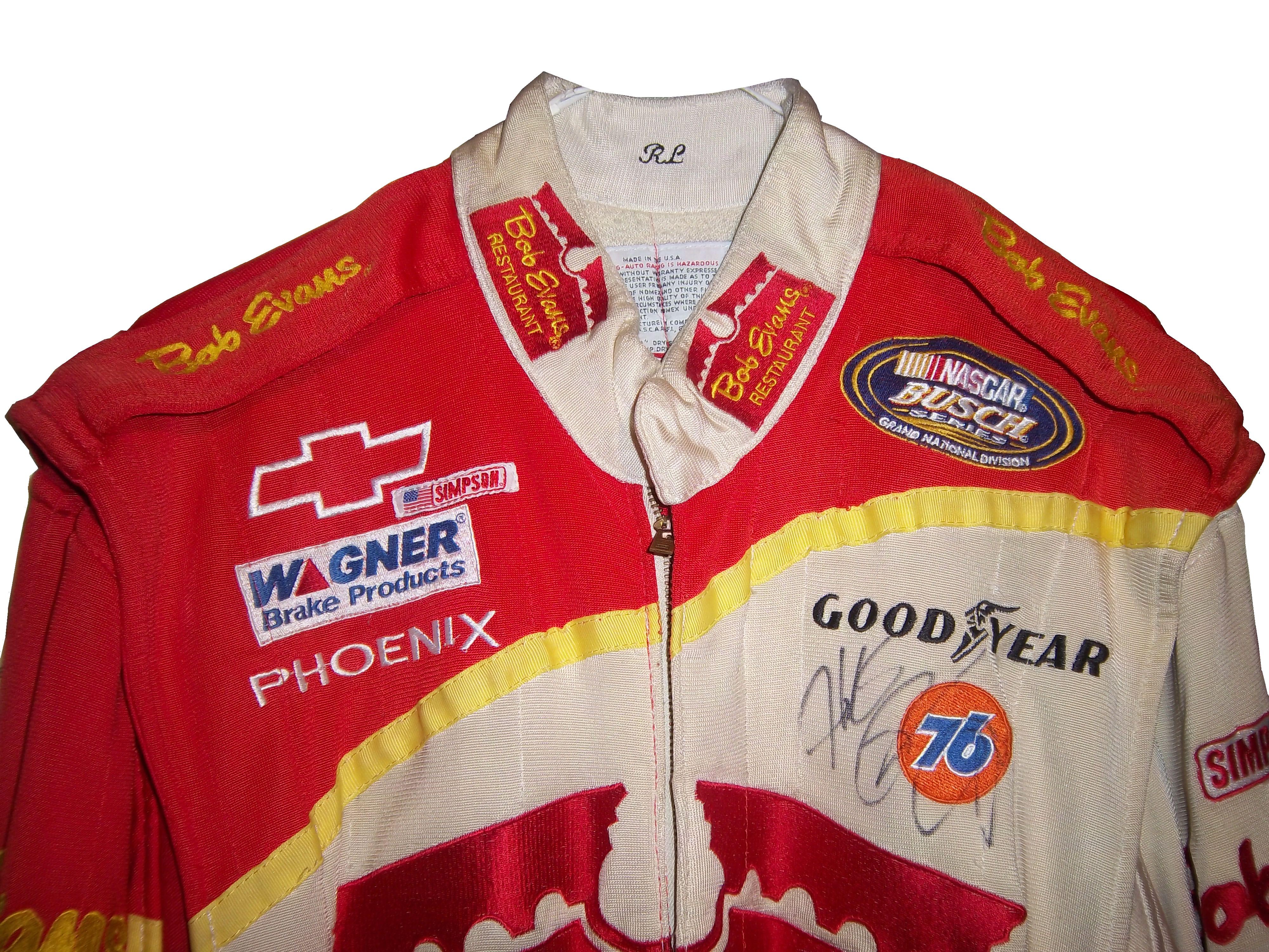
#5 Phoenix Racing/Turner Scott #51 Guy Roofing and Hendrick Cars are hideous, but apart from that, they have run a great set of paint schemes. Bonus points given for the Neil Bonnett throwback scheme.

#6 Richard Childress Racing #27 The yellow is too bright, but other than that, the schemes are really good.

#7 Stewart Haas Racing #14 Some of these schemes are good, others not so much.

#8 Hendrick Motorsports #88 Dale Jr. runs good schemes most of the time, but Soldiers of Steel, Orange Amp Energy, and Camouflage are just brutal. Additional points lost for a pinkwashing scheme.

#9 Earnhardt Ganassi Racing #1 Bad Boy Buggies is even worse here, and the Bass Pro Shop schemes are awful. A number of good schemes here as well.

#10 Tommy Baldwin Racing #36 This team looks better without a primary sponsor than they do with one.

#11 Max Q Motorsports #37 Simple, yet attractive. Would be higher if they ran more races.

#12 Circle Team Sport #40 Interstate Moving is really good. Moon Shine Attitude Attire is really awful, and their pinkwashing scheme is even worse.

#13 Richard Childress Racing #31 A few good schemes but most of them are mediocre at best.

#14-Hendrick Motorsports #24 See Above

#14 Stewart Haas Racing #10 Worst shades of yellow in NASCAR, and the pinkwashing scheme is so much worse.

#15 Stewart Haas Racing #39 I have to give them credit, their schemes are mostly awful, but at least they are creative.

#16 Tommy Baldwin Racing #7 Worst. Door. Number. Ever. The rest of the car isn’t good either, and a pinkwashing scheme doesn’t help.

#17 Hendrick Motorsports #5 Innovation can be a bad thing. This, for example is what happens when you let Karl Benjamin design your cars.

#19 Circle Sport/RCR #33 It amazes me how two different teams can use the same car number, and both can put awful designs on their cars. Special credit for the Honey Nut Cheerios scheme, which is just horrific.

Collar Guard…Not a Product, but a Safety Feature.

1-lajoie-collarBy David G. Firestone

Like shoulder epaulets, the collar of a driver suit has made a transition. It has gone from safety accessory to fashion piece, but unlike the epaulet, it is not only ornamental. Because the collar is still a piece of safety equipment. It goes without saying that fire is an ever present danger in auto racing. The collar protects the neck from burns. This may seem minor, but many people who die from burns die from infection. When the skin is compromised, it can’t stop germs from getting inside the body, and as such makes infection a serious risk during burn injuries.

But the fashion aspect of collars is interesting as well. With the standard alignment of sponsors on the top of the suit, the Series logo, tire manufacturer logo, car manufacturer logo, and other sponsor logos are on the top, and the primary sponsor logos are present on the collar and epaulets. This Randy Lajoie example shows how the suit appears during an televised interview:1-lajoie-f

Note a couple of things: First, the fabric on the collar overlaps just a bit here, but when the driver wears it, it meets perfectly at the center of the neck. Second, it allows the driver to breathe easily. Comfort Vs. Safety is a constant debate. This is one kind of collar, the other kind of collar is what I call the Velcro collar, as shown in this Alex Barron suit from 1998:36-barron-collar

The Velcro collar is exactly what it sounds like, a collar with a strap which Velcros shut. This provides a little more protection in case of fire. It also has another use, as sponsor ads are popular to put on the front of the Velcro strap. This has been used quite often over the years…41-craven-collarbarber-collar

This is due to the fact that for quite some time the open face helmet was used, and the collar provided extra fire protection where the helmet failed. In this day in age, helmets come standard with Nomex socks on the bottom, so the collar, while still a key safety feature, is not as critical. But for sponsor logo placement, it really can’t be beat.

If the collar does not have a Velcro closure, then the primary sponsor logo is sewn into either side of the collar. Like the Lajoie example above, or this Mike Skinner example below, this can be used very effectively as a place for sponsor logos.31-skinner-collar

Like most other aspects of the driver suit, the choice of Velcro or not comes down to driver preference. Kyle Bush, as well as older brother Kurt favor the Velcro style, whereas Tony Stewart and Carl Edwards prefer the non-Velcro variety. Many pit crew shirts have a similar design to the driver design as well.

Editor’s note: For the next two weeks I will be on a very badly needed vacation. I will still have articles ready to go, but I won’t be commenting on up do date issues until I get back. I will still check in from time to time.

Moving on to paint schemes…

Denny Hamlin #11 FedEx Express 2005 Toyota Camry Done as a memorial to Jason Leffler, this is a replica of the scheme that Leffler ran in 2005 during FedEx’s first season as a full-time NASCAR sponsor. It is very faithfull to the original scheme. It also has a great design and color scheme, and earns an A

Greg Biffle #16 3M/Give Kids a Smile Ford Fusion The same bland paint scheme that I described as “There’s nothing really wrong here, but nothing really right here either.  The side design looks forced, the black roof is idiotic, the color scheme is good, but the number design looks too cliche.  It makes no sense, but 3M schemes never do.” It has a small Give Kids a Smile logo on the hood, that is all but invisible. I gave it a C and it will stay at a C.

David Stremme #30 Window Wax Toyota Camry Ugh! This is bad, I can live with the color scheme, but the design is bad. It gets a D

Austin Dillon #33 American Ethanol Chevy SS While I hate the shade of green used here, this scheme looks pretty decent. The designs around the front brake vent are unnessicary, but I still like them. If the green were a bit darker, I could give it a better grade than a C+.

AJ Allmendinger #47 Charter Toytoa Camry The hood design is interesting here. It is designed in the same light as television logos on driver suits. It is a unique idea that works and I hope will catch on. The color scheme is great, and I love the overall design. A

Brian Vickers #55 Aaron’s/Louisville Cardinals Toyota Camry The color scheme is good, but the Fruit Stripe Gum design seen on the Louisville Cardinals shorts is ugly. The whole Zubaz design scheme is horrible on sports uniforms, and even worse on this car. I have nothing against the Louisville Cardinals, but this is horrible. F

Dale Earnhardt Jr #88 National Guard Solider of Steel Chevy SS Solid simple scheme with good colors, but the Superman Logo on the hood is next to invisible.

Some Issues with the New Gen 6 Car

By David G. Firestone

I would like to discuss some issues that have come up in recent weeks with the new Gen 6 car. These issues seem minor, but with this new car, they need to be addressed. And because these issues are issues, it leads to a conclusion that is kind of stunning in my mind.

Two issues revolve around Denny Hamilin. The first is his $25,000 fine for “criticizing the product.” and I’ll get to that in just a minute. The other one is his massive L1 Compression fracture that he suffered at Fontana. This injury should never have happened, but it did. The Gen 5 cars, as unattractive as they were design-wise, were safety-focused. The discussion on how safe they were ended with Michael McDowell’s scary wreck during qualifying at Texas in 2008. The car suffered serious damage, but McDowell was unhurt. This wreck was just as bad, but Hamlin is out of the car until he is fully healed.

NASCAR needs to be safety-focused, putting driver and fan safety before anything else. The fact that Denny has an L1 compression fracture because of a wreck is proof that there is a lot of room for improvement in the Gen 6 car. That isn’t the only issue with the car that needs to be addressed. The car seems to change with each race. At a super speedway, the spoiler is lower than it is at other tracks. At intermediate tracks the roof cameras are not used for reasons that have yet to be explained to the general public. It almost seems as though NASCAR is making the rules up as they go along. Please pick a design and setup and stick with it.

The other issue that needs to be discussed is penalties surrounding the new car. Denny Hamlin was fined $25,000 for saying that the car has room for improvement. Why was he fined for that? I understand that the car was designed by many different people, who put a lot of time and effort into it, but here is the thing…the people who designed the car are not the ones who are the focal point of racing, the driver is. If the drivers are complaining about the car not being competitive, and not driving the way it is supposed to, it should be addressed. The Gen 4 and Gen 5 cars went through a lot of refining, and so should the Gen 6 car.

One penalty that was issued was to Penske Racing for having suspension parts unapproved by NASCAR. Although all of Ford’s engines come from Roush Yates, many teams use their own designs for equipment used in the car. As such, these parts have to be approved by NASCAR. Obviously these parts weren’t approved. Yet Penske, Brad Keselwoski, and Joey Logano are swearing up and down that they were legal, and working in a gray area. If the parts are unapproved, they are unapproved.

The other major penalty was to Matt Kenseth for having a connector rod that was 3 grams under the minimum weight required by NASCAR. My concern with this issue is that the engine in question came from Toyota Racing Development. TRD knows what the rules and regulations are, and they knew what the parts should have been. I do not believe for a second that of the people involved with making the engine, not one of them knew didn’t realize that the parts were illegal. They knew what it was, and they sent it out anyway. That brings up an important question. 8 teams in the Sprint Cup work with TRD. In total that accounts for 10 different teams. Each team has a primary and backup car. There is also an additional engine at the teams disposal. So for each Toyota team there are 3 engines for use. If Matt Kenseth is running illegal equipment, who else is?

On to paint schemes…

Brad Keselowski #2 Redd’s Apple Ale Ford Fusion Black and Red is always a good scheme, and the overall design is good. The sticking point for me with this scheme is that APPLE ALE is almost invisible on the quarter panel. So for a final grade, it gets a B-

Tony Stewart #14 National Wild Turkey Federation Chevy SS Good color scheme and overall design, but the major issue I have is with the NATIONAL WILD TURKEY being on a curve and not as visible It gets a B-

Jeff Gordon #24 AARP Chase Card Chevy SS The color and designs are all over the place, and the giant credit card on the hood is pretty ugly. Not good at all, F

Kevin Harvick Bell Helicopters Chevy SS A simple design with a good color scheme. Not much else to say other than good job, and it gets an A grade.

Jeff Burton #31 Airgas-Bulwark Chevy SS Meh. That sums it up. Uninspired color scheme, and bland design give it a mediocre look and a C- grade.

Jeff Burton #31 American Ethanol Chevy SS Good color scheme and design. A-

David Ragan #34 CSX Play It Safe Ford Fusion This is a very solid scheme, with great colors, great design and an overall great look. CSX did this scheme very well and it gets an A+

JJ Yeley #36 NASCAR Day Chevy SS Another simple yet attractive scheme that works very well. Nothing more to say than great job, and enjoy your A grade.

David Gilliland #38 EZ Pawn Ford Fusion Good color scheme though the design is a bit over complex. As such it gets a B+.

Ryan Newman #39 Code 3 Associates Chevy SS Ok, you can have either flames OR a racing stripe, but not both. Because the combo takes a good design and makes it into a horrible design. The only thing giving this scheme a passing grade is the color scheme being as good as it is, but it earns a D-

Bobby Labonte #47 Pine Sol Toyota Camry Yet another simple yet amazing good scheme that earns an A grade!

Elliot Sadler #81 Alert Energy Gum Toyota Camry A good scheme with a consistent design and a decent color scheme that earns a B+ grade.

Travis Kvapil #93 Dominion Raceway Toyota Camry Am I the only one who thinks it is odd that a speedway that doesn’t exist yet is sponsoring a car for one race? That aside, the door design needs work, but the color scheme is solid, and I give it a B-