
 By David G. Firestone
Editor’s Note: I will be traveling to Tucson, Arizona this week, and I’m on the train as you read this. I will have the Friday Feature and Throwback Thursday items next week, but no tracker or grades. In the meantime, here is my Friday Feature for the week.
If you were a kid during the Roman empire, and you were with a friend, and needed something to do, you could play “navia aut caput” or “ship or head.” How it works is that you take a coin, and one picks ship, the other picks head, and then you flip the coin in the air, and whichever side the coin lands on the person who picked that side wins. If you were playing it in England, you were playing “cross and pile.”
That simple game would grow into a bit of dispute resolution that is still used today. While it is used in politics, and business on occasion, coin tossing has become a major part of sports. It’s used in soccer to determine which goal the winning team attacks first. Cricket uses it to determine who bats first and who bowls first. Fencing uses a coin toss at the end of a tied match, where overtime has also ended. But the most well-known usage of a coin toss is in American Football, at the start of the game, to determine who gets the ball first.
Three minutes prior to the game, the team captains meet at midfield, the referee then instructs the visiting team captain to chose heads or tails, which are named for being sides opposite each other. He then flips the coin into the air, and the side that wins can chose to receive, or kick, and to defer their choice until the second half.
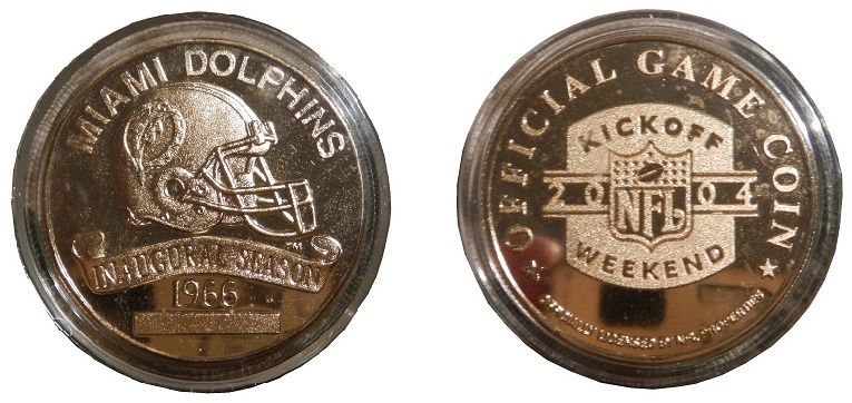
The 2004 season was one that Dolphins fans would like to forget. Not only did the Dolphins go 4-12, but they had to deal with Ricky Williams retiring from football. They also had to reschedule two games because of the threat of hurricanes. Their September 26th game was moved from 1 PM to 8:30 PM due to Hurricane Jeanne, and their opening day game was moved from September 12th to September 11th due to Hurricane Ivan. Their opening day game wasn’t great, they lost the game, and lost the coin toss, which was done with this Highland Mint coin.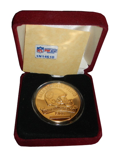 The Highland Mint was founded in the 1980’s, and focuses strictly on sports coins, and custom minting. They make the game coins for the NFL. The game coin from The Super Bowl is taken from the game to the NFL Hall of Fame, so they never end up on the private market. Coins from the regular season make it to the market, and this is one such example.
 The coin is gold, and has on the head side, a Miami Dolphins helmet, and MIAMI DOLPHINS INAUGURAL SEASON 1966 stamped into the coin. There is also a box for the serial number to be etched, but since this wasn’t one of the limited edition coins that got sold on the collector market, it is blank.
 The tails side of the coin has the NFL Kickoff Weekend 2004 logo, and OFFICIAL GAME COIN and OFFICIALLY LICENSED NFL PROPERTIES stamped into the coin.
 This is 1 of 2500 coins, and has the serial number 0001 stamped into the edge of the coin, near the bottom of the front.
It has been placed in a plastic holder, and comes in a felt box. It has a tag that comes with the retail coins, but it has the PSA DNA sticker on it, as well as a PSA/DNA lot.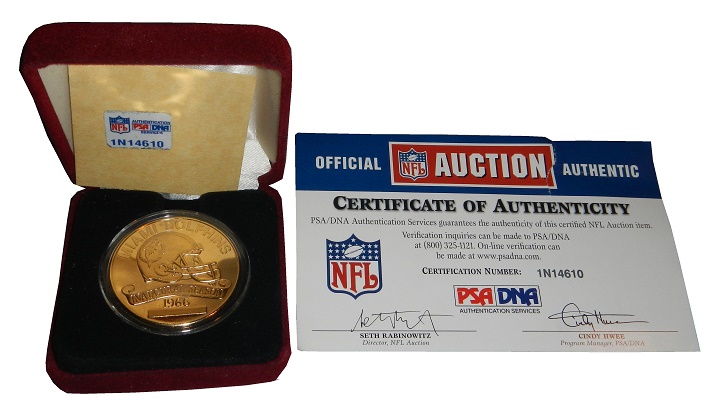 I sent Uni-Watch an eBay link for a similar coin, this one from the 2012-2013 Pro Bowl, and they poised the question “[game used coin]…Or would that be pregame-used?” That’s actually an interesting question. It could go either way. The only time this coin was used was during the coin toss, before the kickoff, so you could call it pregame used. On the other hand, this coin did give the Titans the choice of what they wanted to do at the start of the game, and had the game gone into overtime, the coin would have been used a second time, for the same thing, so you could say it was game used.
I find the subject of coins to be interesting, and I’m going to continue this line, when I revisit the Infinite Hero Challenge Coin program in the NHRA next week.


