Paint Scheme Grades-January 16, 2016

By David G. Firestone

Kasey Kahne #5 Quicken Loans Chevy SS-It’s a downgrade from last year, Kasey fancies himself a designer, but most of his schemes look horrible. This one is saved by a good color scheme, so I’ll give it a C+.

Kasey Kahne #5 Panasonic Toughbook Chevy SS-It’s a distinctive look, and it looks really good. Blue, white, and black is a good color scheme. A+

Clint Bowyer #15 Five-Hour Energy Chevy SS-All my complaints about the 2015 scheme are gone with this scheme, and it looks really good. A+

Clint Bowyer #15 Peak Chevy SS-It’s a bold scheme, with a really good color scheme. It looks really good. A+

Kyle Busch #18 M&M’s Toyota Camry-M&M’s always has a good look, and since 2016 is the 75th anniversary of the introduction of M&M”s, they decided to add vintage M characters to modern M characters, to create a really good look. A+

Ryan Blaney #21 Motorcraft Ford Fusion-Same scheme as last year, same A+ grade.

Chase Elliott #24 Kelly Blue Book Chevy SS– The lack of metallic gold is a downgrade, and the design went from smooth to more haphazard. It’s not horrible, but not great. Combined with the decent color scheme, I give it a C+.

Chris Buescher #34 Love’s Truck Stops Ford Fusion-New year, new driver, new scheme. It’s really good, Love’s uses a good shade of yellow, and the red rainbow design works well too. All said, I give it an A+.

Brian Scott #44 Twisted Tea Ford Fusion-Same scheme as last year, same A grade.

The Real Currency of Auto Racing

haganpiston-1By David G. Firestone

I’ve discussed the currency of commerce over the last couple of weeks. This week, I’m going to discuss the currency of auto racing. That currency is speed. Every race car driver wants speed out of their car. The more speed they have, the better chance they have to win the race. Every part of the car is designed specifically to produce as much speed as possible, within the letter of the law…or as close as possible to the letter of the law.

Speeds reach new levels in the NHRA Mello Yello Drag Racing Series. 10,000 horsepower, nitromethane fueled cars can reach speeds well over 330 MPH in just under 4 seconds. To be the fastest in this sport, you have to have the right parts, the right crew chief, the right driver, and the right equipment. When these four come together in a run, it’s something beautiful.

Brainerd International Raceway in Brainerd, Minnesota isn’t known as a place where records get broken. In 2015, it seemed as though there might not be an event there at all, as severe weather damaged many of the facilities on July 12. The racing community rallied around, and got the track ready for their race on the weekend of August 20-23.

The weather was really cold for August, and when the Lucas Oil NHRA Nationals kicked off, the four pieces that make up the currency of racing came together, and led to some monumental runs. The first was a qualifying run which saw Driver Suit Blog favorite Fast Jack Beckman run 1000 feet in 3.901 seconds in his funny car during qualifying, then backing it up with a 3.903 the next day. In top fuel, Antron Brown ran a 3.68, and the backed it up with a 3.696. Shawn Langdon ran a 3.662, but failed to back it up, thus not setting the official record, and getting the 20 bonus championship points it brings.

The big highlight for funny car at Brainerd was Del Worsham vs. Matt Hagan in an elimination round. During that run, Hagan ran a blistering 3.879 second elapsed time. This piston head came from Hagan’s car during that historic run.haganpiston-1The head itself is in decent condition, having some scrapes and scuffs. It also has some stuff etched into it. The number 75 is etched into both the top and bottom of the piston. Hagan and crew chief Dickie Venables have signed the side of the piston, and a Mopar logo and 3.879 have been added to the top.haganpiston-2 haganpiston-5 haganpiston-4 haganpiston-3 haganpiston-6Speed may be the currency of racing, but safety is another primary focus. Next week, the pit crew aspect of safety will be discussed. Until then, here are the record setting runs from Brainerd…

Throwback Thursday-Buddy Arrington-1985

By David G. Firestone

This is a Buddy Arrington example from 1985

This scheme was only used for the 1985 Pepsi Firecracker 400 on July 4, and interestingly, despite obviously being a Ford, is sponsored by Jim Peacock Dodge. The patriotic red, white, and blue scheme works very well. The vintage blue and white numbers stand out on the red background, and the vintage lettering looks really good. The design is great too, with the red on the side running under the windows, and the blue over the windows.

The vintage wheels look good in the blue paint, the white letter tires work well on them, and I’m amazed at how high off the ground the car is. This is a really good look.

Paint Scheme Tracker-January 13, 2016

By David G. Firestone

CHIP GANASSI RACING TEAM #1

Jamie McMurray #1 Cessna/Beechcraft Chevy SSNew scheme for 2016, blue top, reverse wave formation across sides, white bottom, with silver accents. B+

TEAM PENSKE #2

Brad Keselowski #2 Miller Lite Ford FusionSame basic scheme as 2015, but Miller has been removed from hood, similar 2014. A+

Brad Keselowski #2 Alliance Truck Parts Ford FusionNo Change. A+

Brad Keselowski #2 Wurth Ford FusionNo Change. A+

RICHARD CHILDRESS RACING #3

Austin Dillon #3 Dow Chevy SSSame basic scheme, but the hood logo is slightly larger. B+

Austin Dillon #3 Cheerios Chevy SSNo change. A+

Austin Dillon #3 American Ethanol Chevy SSNo change. A-

STEWART-HAAS RACING #4

Kevin Harvick #4 Busch Chevy SS-New sponsor for 2015, designed around a Busch throwback can. A+

Kevin Harvick #4 Busch Light Chevy SS-New sponsor for 2015, designed around a Busch Light can. A+

Kevin Harvick #4 Jimmy John’s Chevy SSNo change. A+

Kevin Harvick #4 Outback Chevy SSNew scheme for 2016, mountain design starts near brake duct, instead of at front of car. B+

Kevin Harvick #4 Ditech Chevy SSNo change. A+

HENDRICK MOTORSPORTS #5

Kasey Kahne #5 Farmers Insurance Chevy SSNo Change. C+

Kasey Kahne #5 Great Clips Chevy SSNo Change. D+

Kasey Kahne #5 Liftmaster Chevy SSNew scheme for 2016, geometrical designs on side changed. C

Kasey Kahne #5 Panasonic Toughbook Chevy SS-New sponsor for 2016, blue fade to black, with a couple of wave stripes, and some fade designs on side. A+

TOMMY BALDWIN RACING #7

Alex Bowman #7 Road Rippers Chevy SS-New scheme for 2015, shark motif on front, fades to fire motif and logo on back. F

STEWART-HAAS RACING #10

Danica Patrick #10 Nature’s Bakery Chevy SS-New sponsor for 2016, blue with white lettering on sides, white and black stripe across hood and roof. A+

Danica Patrick #10 TaxAct Chevy SS-New sponsor for 2016, white front, red TaxAct X logo, gray back. A+

Danica Patrick #10 Nature’s Pride Pumpkin Spice Chevy SS-New sponsor for 2016, same basic scheme as Nature’s Pride, but with orange and red color scheme, and some slight redesigns on the side. A+

JOE GIBBS RACING #11

Denny Hamlin #11 FedEx Express Toyota CamrySlight redesign for 2016, hood logo moved slightly to the right, side stripes wider. A+

Denny Hamlin #11 FedEx Freight Toyota CamrySlight redesign for 2016, hood logo moved slightly to the right, side stripes wider. A+

Denny Hamlin #11 FedEx Ground Toyota CamrySlight redesign for 2016, hood logo moved slightly to the right, side stripes wider. A+

Denny Hamlin #11 FedEx Office Toyota CamrySlight redesign for 2016, hood logo moved slightly to the right, side stripes wider. A+

GERMAIN RACING #13

Casey Mears #13 Geico Chevy SSNew scheme for 2016, much more subdued version of the 2015 scheme. A+

Casey Mears #13 Geico Millitary Chevy SSNew scheme for 2016, black with camo motif across car. F

STEWART-HAAS RACING #14

Tony Stewart #14 Mobil 1 Chevy SSNew scheme for 2016, Bass Pro Shops has left, so the Mobil 1 scheme features a white background, with the Pegasus wing starting at the side of the front, extending to the door numbers. A+

Tony Stewart #14 Code 3 Associates/Mobil 1 Chevy SSSlight redesign, removal of Bass Pro Shops logo, cleaner rear end of the car. A+

Tony Stewart #14 Rush Truck Stops/Mobil 1 Chevy SSSlight redesign, removal of Bass Pro Shops logo, cleaner rear end of the car. A+

HSCOTT MOTORSPORTS #15

Clint Bowyer #15 Five-Hour Energy Chevy SSNew scheme for 2015, the front stripe has been moved up to the top of the side, and the roof matches with the design. A+

Clint Bowyer #15 Peak Chevy SSNew scheme for 2015, Blue with white geometrical designs on side. A+

ROUSH-FEWNAY RACING #16

Greg Bffle #16 Cheez-its Ford FusionNew scheme for 2015, stripe has been extended down tot he bottom of the car, some slight rearangment of the crackers on the side of the car. A+

JOE GIBBS RACING #18

Kyle Busch #18 Interstate Batteries Chevy SSSlight redesign for 2015, stripes are wider, black stripe on bottom gone. F

Kyle Busch #18 Skittles Toyota CamryNo Change. A+

Kyle Busch #18 M&M’s Toyota CamryNew scheme for 2016, similar to 2014 scheme, but with vintage characters to celebrate M&M’s 75th anniversary. A+

JOE GIBBS RACING #19

Carl Edwards #19 Stanley Toyota CamryNo Change. B+

Carl Edwards #19 Stanley Toyota CamrySlight redesign for 2016, logos are bigger, outlines are bolder. A

JOE GIBBS RACING #20

Matt Kenseth #20 Dollar General Toytota CamrySlight redesign for 2016, black stripe across bottom now gone. A+

Matt Kenseth #20 DeWalt USA Toyota CamryNo Change. A+

WOOD BROTHERS RACING #21

Ryan Blaney #21 Motorcraft Ford FusionNo Change. A+

TEAM PENSKE #22

Joey Logano #22 Shell/Pennzoil Ford FusionNo change D

Joey Logano #22 AAA Ford FusionNo Change. D

HENDRICK MOTORSPORTS #24

Chase Elliott #24 NAPA Chevy SS-New sponsor for 2015, blue with white stripes across side which start at brake duct. A+

Chase Elliott #24 3M Chevy SSNew scheme for 2015, black and white replaces silver, extra geometrical designs on sides. B+

RICHARD CHILDRESS RACING #27

Paul Menard #27 Menard’s/Moen Chevy SSNew scheme for 2016, black front, extending into Menard’s template, yellow rear. B-

RICHARD CHILDRESS RACING #31

Ryan Newman #31 Cat Chevy SSSlight redesign for 2016, yellow stripes are narrower, and hood logo is slightly larger. A+

Ryan Newman #31 Granger Chevy SSNo change. B +

STEWART-HAAS RACING #41

Kurt Busch #41 Monster Energy Chevy SS-New sponsor for 2016, black with yellow and white numbers and lettering. A+

Kurt Busch #41 Haas Automation Chevy SSNew scheme for 2016, red front, fades to black rear end.  A+

Kurt Busch #41 Haas Automation/Monster Energy Chevy SS-New scheme for 2016, red front, fades to black rear end. A+

RICHARD PETTY MOTORSPORTS #43

Aric Almirola #43 Smithfield Ford FusionSlight redesign for 2016, roof numbers turn from yellow to red. B+

RICHARD PETTY MOTORSPORTS #44

Brian Scott #44 Twisted Tea Ford FusionAside from the number change, no significant changes for 2016. A

HENDRICK MOTORSPORTS #48

Jimmie Johnson #48 Lowe’s Chevy SSSlight redesign for 2016, stripes are narrower, and hood logo is slightly forward. C-

Jimmie Johnson #48 Lowe’s/Kobalt Chevy SSSlight redesign for 2016, stripes are narrower, and hood logo is slightly forward. C-

Jimmie Johnson #48 Lowe’s Pro ServicesSlight redesign for 2016, stripes are narrower, and hood logo is slightly forward. C-

FURNITURE ROW RACING #78

Marin Truex Jr. #78 Furniture Row Toyota CamryOther than the switch from Chevy to Toyota, there are no major changes. A+

HENDRICK MOTORSPORTS #88

Dale Earnhardt Jr. #88 TaxSlayer Chevy SS-New sponsor for 2016, red top and front, white bottom and back, gold designs separate the two. A+

Dale Earnhardt Jr. #88 Nationwide Chevy SSNew scheme for 2015, reminiscent of old Mountain Dew/Amp Energy scheme. A+

Dale Earnhardt Jr. #88 Axalta Chevy SS-New sponsor for 2016, red top, fade to yellow bottom, across whole car. A+

My Thoughts On Being Who You Are

By David G. Firestone

I just want to say that I HATE cleaning! I really, really hate cleaning. I say this as a 34 year old male who lives, at the moment, by himself. I’m the classic bachelor, who just leaves dirty dishes in the sink, until he runs out of clean plates and silverware, and then does the dishes. I do laundry once a week, and that’s only clothes. I couldn’t tell you when the last time I vacuumed my office. The point is, I hate cleaning.

As much as I hate cleaning, I like clean surroundings. I like my office and house clean. I’m really organized. I don’t really go anywhere most of the time, except to my real job. So I have plenty of time to clean. I just hate to do it.

I was thinking about some of my idiosyncrasies as a person, and I’m realizing that we all have things about us that seem odd to other people. Take some of my examples:

-I HATE peaches and raspberries, and will go out of my way not to eat them.

-Since age 16, I have had some kind of facial hair, to the point, I feel insecure without it.

-I take fiendish pride in the fact that I haven’t flown on a plane or had a cup of coffee in over 10 years.

-I sleep on a couch, not a fold out one.

-On my desk, there are two stacks of poker chips. One is 15 chips high, 3 of five different colors, red, green, grey, blue, and black in that order. The small white lines on them align at all times. The other is 13 chips high, three different colors in no order, and I will occasionally pick them up while watching TV.

-I use 4 different body sprays over the course of a week.

-I enjoy video taping rainstorms…I don’t know why.

-Under no circumstances will I ever go to a theme park anymore.

-I have tied a tie on my own 3 times in my life.

-I always have at least one poker chip on me at all times.

-I HATE politics, and go out of my way not to get involved.

-Closed businesses that have illuminated Open signs annoy me to no end.

-I will not have tomato sauce on pasta.

I have no problem admitting any of this publicly, because I am comfortable with who I am. Bullies can only win if you let them, and I don’t let them. Be who you are, and don’t be ashamed.

Currency and Us Part 2-Banknotes and Their History

currency-1 - CopyBy David G. Firestone

Last week, I discussed coins, and their history. The history of bank notes, or bills, is no less interesting. We spend our lives working to get bank notes, but we don’t often think about how they came to be. We tend to do that with most inventions. Interestingly, bank notes have an interesting history.

The first government to issue bank notes was the Song Dynasty in China. The Song Dynasty, in the early 11th century, allowed 16 different banks to print up the first bank notes. This was done because copper coinage is much heavier than a bank note, and that copper production was declining. Once the Song Dynasty realized the advantages of bank notes, they took over production of the notes in 1023. By the 1200’s, most Dynasties were using some form of paper bank note.

Around the 13th Century, Marco Polo and other European explorers made their way into Asia, and began to encounter paper bank notes. Polo was especially interested in these notes, stating chapter 24 in The Travels of Marco Polo:

“All these pieces of paper are, issued with as much solemnity and authority as if they were of pure gold or silver… with these pieces of paper, made as I have described, Kublai Khan causes all payments on his own account to be made; and he makes them to pass current universally over all his kingdoms and provinces and territories, and whithersoever his power and sovereignty extends… and indeed everybody takes them readily, for wheresoever a person may go throughout the Great Kaan’s dominions he shall find these pieces of paper current, and shall be able to transact all sales and purchases of goods by means of them just as well as if they were coins of pure gold.”

This system was seen as effective way to transport currency from one country to another, with little confusion as to exchange rates. These early notes were not true bank notes, but were promissory notes. The note was an instruction to the bank to pay the person holding the note the amount in gold or silver. As time went on, the banks began preferring to issue bank notes as currency, and governments soon followed. For a time, there were both governments and private banks were issuing their own notes. Private banks were eventually banned from issuing their own notes as currency, and the government bank notes became the standard.

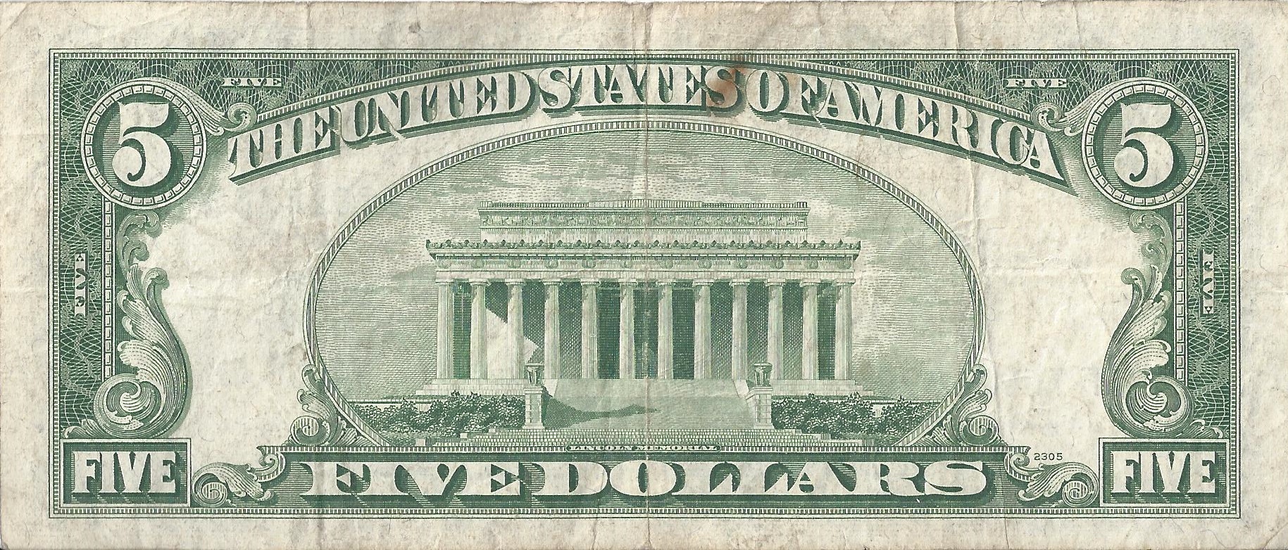
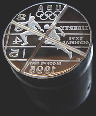
In the United States, the Federal Government is in charge of printing bank notes, though this was not always the case. The Coinage Act of 1792 specified a “dollar” to be based in the Spanish milled dollar and of 371 grains and 4 sixteenths part of a grain of pure or 416 grains (27.0g) of standard silver and an “eagle” to be 247 and 4 eighths of a grain or 270 grains (17g) of gold (again depending on purity). This was based on the Spanish Dollar, which was in use in many of the Colonies at that time. This had its drawbacks, as at the time, all 13 Colonies were each using a different state-specific currency. Each currency defined the value of a dollar differently. This system was used until 1862, when, because of The Civil War, banknotes attached to gold or silver, called gold certificates or silver certificates were issued. These could be exchanged for a set amount of gold or silver.53-5-1 53-5-2

American bank notes are made with a special paper, which uses scrap cotton from the denim jeans industry. This helps with durability. Granted a coin will have a useful life of 30 years, whereas a bank note will have a useful life of 22 months. The paper itself is made by Crane and Company of Dalton Massachusetts, who have made this special paper since 1879. Blue jean scraps make up 75% of the material in the paper, with the other 25% being waste flax. The process is painstaking. The steps to make the paper itself, including reductions, security threads, and security strips are very exacting. The paper is then rolled into rolls and shipped.

The paper then goes to the Bureau of Engraving and Printing in either Washington D.C. Or Fort Worth Texas. The paper is cut into uniform squares, and printed using the Intaglio printing method, first used in Germany in the 1430’s. A simplified explanation of the process is that the dies that have the reverse image of the bill are filled with ink. Excess ink is removed, and the design is stamped into the bill. The ink fills all the small crevices of the die. This gives the bank note a textured feel to it, due to the different layers of ink.

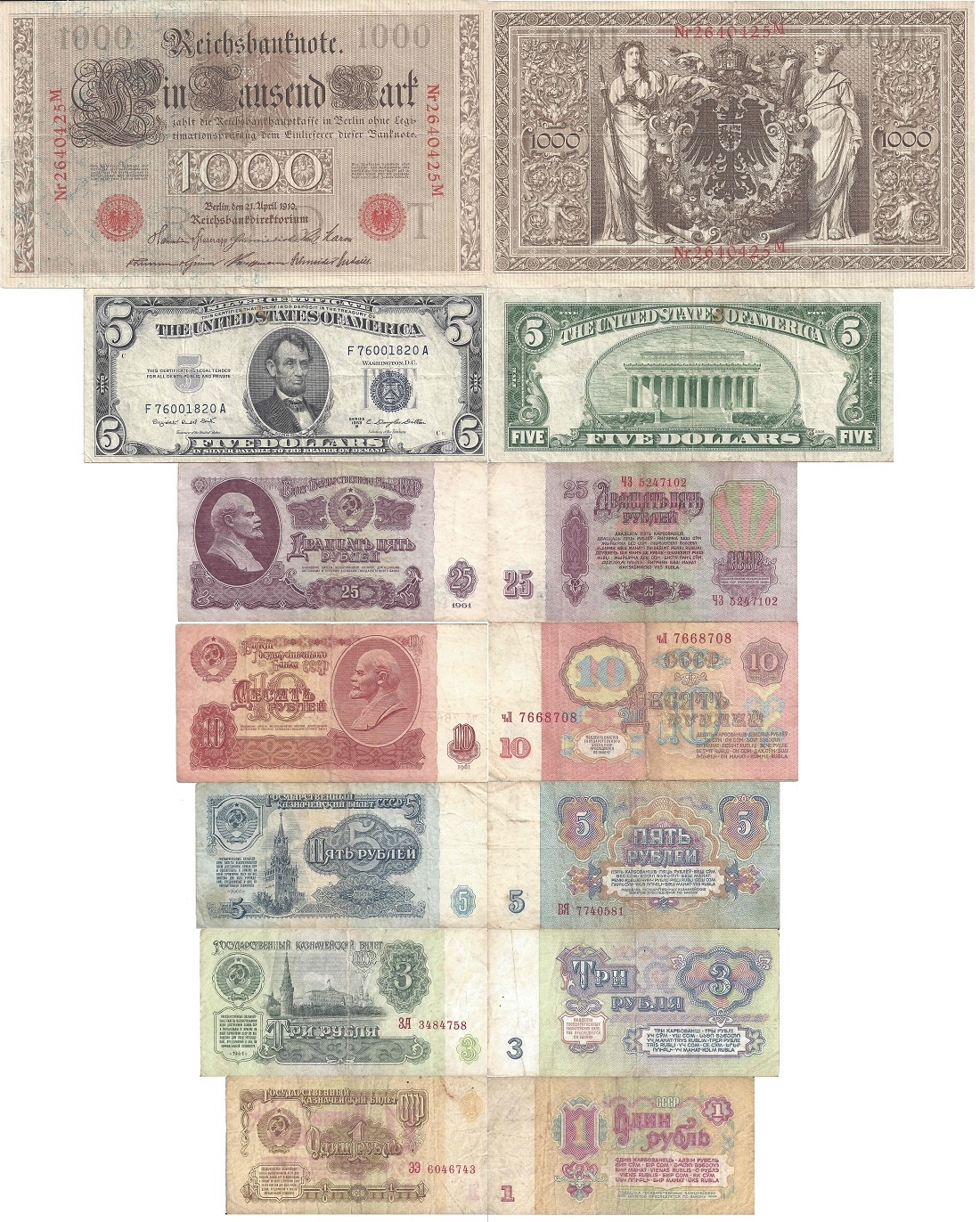
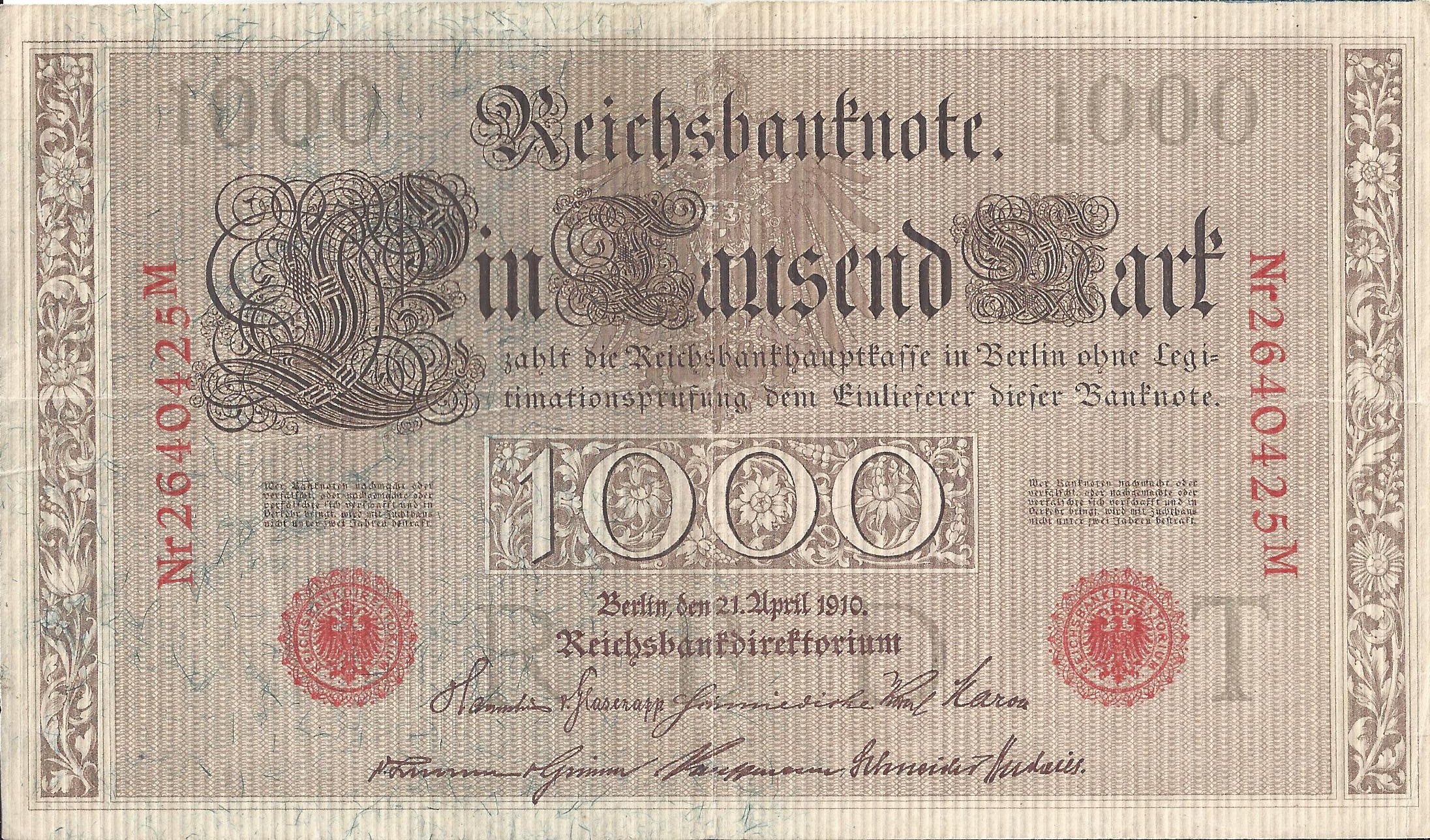
While the United States has had a somewhat stable currency since the Civil War, some other countries were not as fortunate. Germany, for example, went through a lot of upheaval in the 20th Century. Prior to World War I, The German Gold Mark was the banknote Germans used. Produced in denominations of 20, 50, 100 and 1000 Mark, the bank notes are quite large, especially compared to American notes, as this 1000 Mark example from 1910 shows:german-1 german-2The German Gold Mark was replaced in 1914, by the German Papiermark. This decision was because the link between the gold reserves and the mark was abandoned. By the end of the War in 1918, the German Papiermark was nearly worthless, due to the German loss, and insistence of Germany to pay back war debts by printing and using bank notes. The Rentenmark replaced the Papiermark as such, due to hyper inflation. It was replaced with the Reichsmark, prior to World War 11, and then the East German Mark, and Deutsche Mark from War’s end to 1990, when Germany was reunited, and the Deutsche Mark took over from 1990, until 2002, when the Euro took over as currency for Germany and much of Europe.

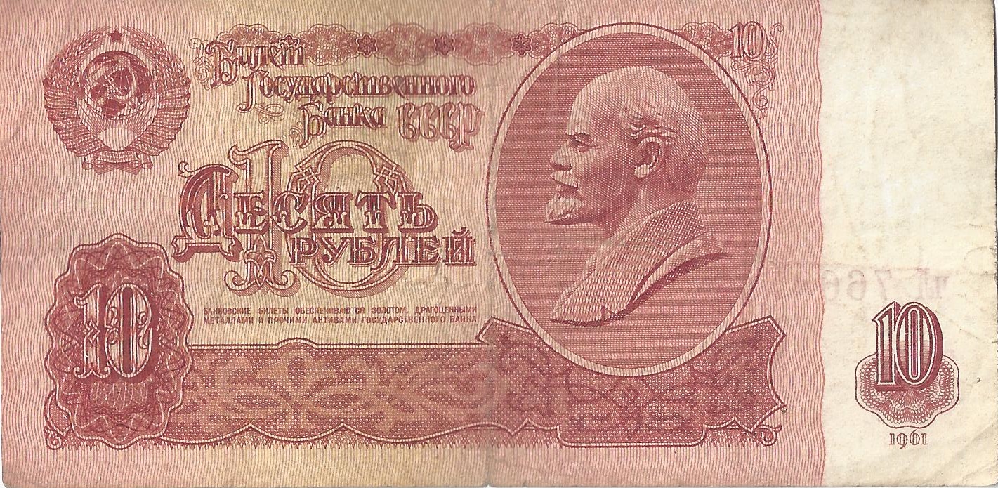
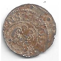
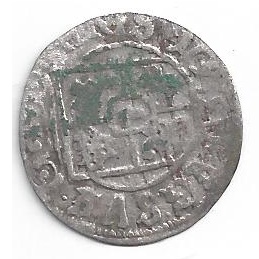
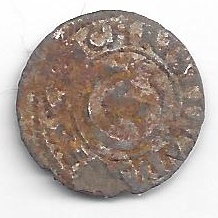
Another country that had a lot of economic upheaval was Russia. The Ruble is the traditional currency of Russia, and like other currencies, were made of gold or silver. The amount of metal per coin varied, until Peter The Great standardized the amount of silver in 1704. By 1768, banknotes were being printed, by the Assignation Bank. This lasted until 1843, when the Assignation Bank folded, and “state credit notes” were issued by the government.

The old system lasted until the October Revolution of 1917, when the Russian Soviet Federative Socialist Republic took over as government, and began circulating their own version of the ruble. The first version, which was used until 1922, had to be adjusted for post-war, non-gold standard hyperinflation after World War I. In 1922, the second version was instituted, this version having a rate of 1 “new” ruble for 10,000 “old” rubles, due to hyperinflation. The third change took place in 1923, at a rate of 100 to 1. This lasted until 1924, when Joesph Stalin’s consolidation of power following the death of Lenin, and Stalin issued the fourth version of the Soviet Ruble, which was attached to the gold standard, and lasted through 1947, when the fifth version, which was issued in response to citizens selling wartime rations for a profit, and keeping the money for themselves. This was placed on amounts over 3,000 rubles.

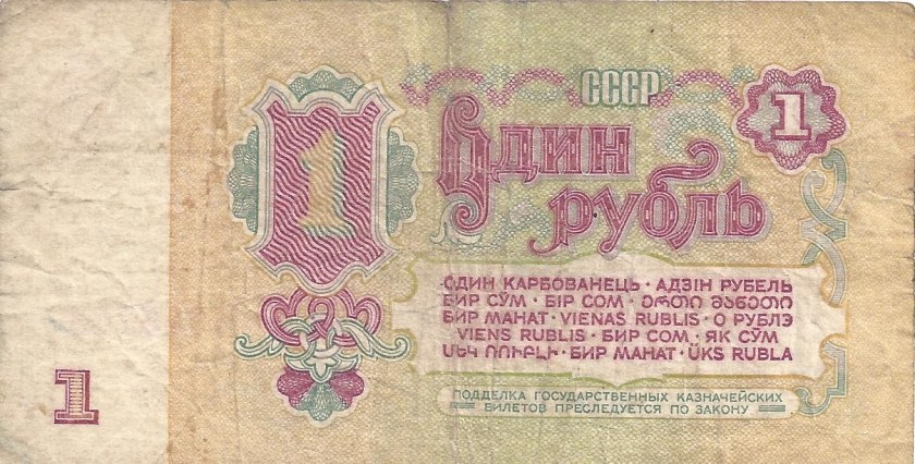
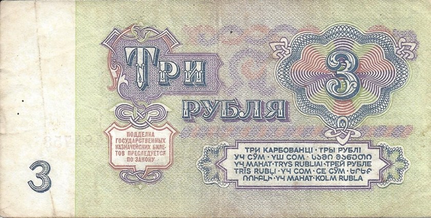
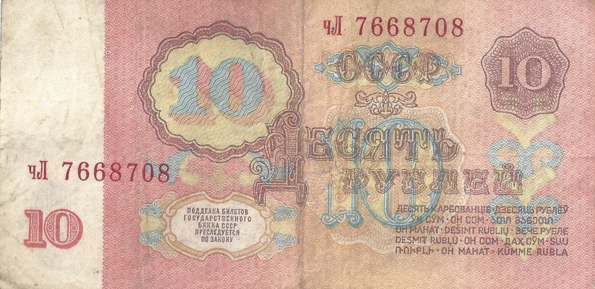
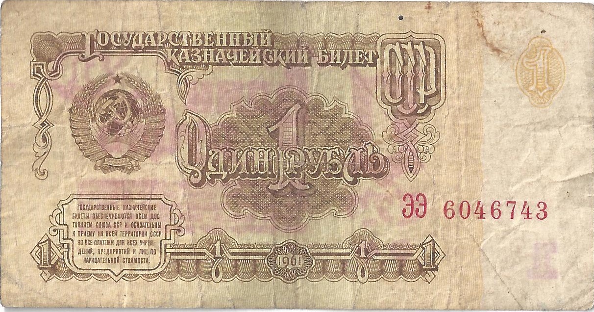
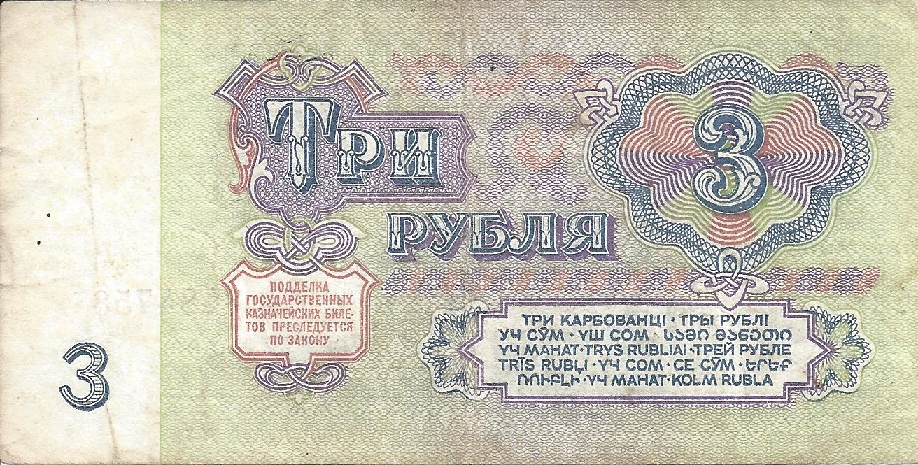
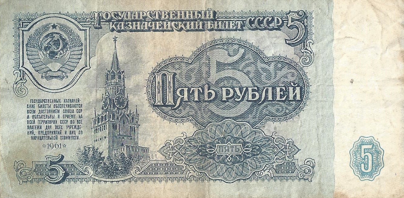
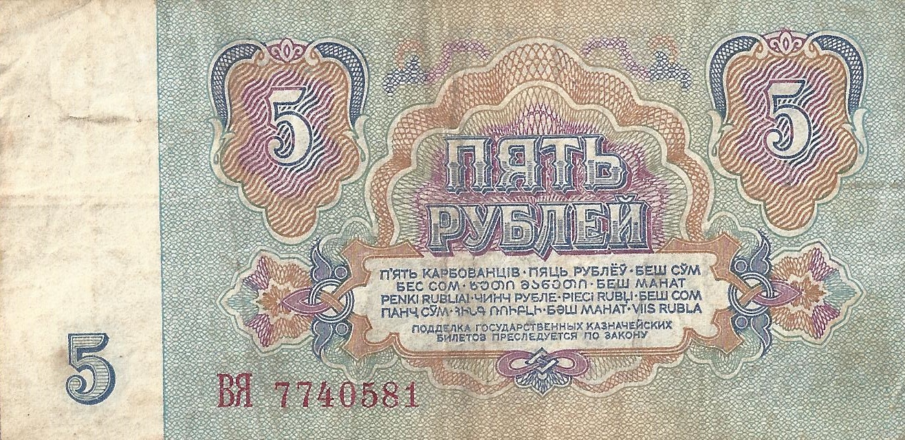
These are examples of the sixth version, used from 1961 to 1991. These brand new bank notes were designed by arists Victor Tsigal, and had a gold exchange rate of one ruble for 0.987412 gram of gold, though the gold was never offered to the general public. These are the 1, 3, 5, 10, and 25 ruble bills from 1961, the first year of issue.cccp-61-1-1 cccp-61-1-2 cccp-61-3-1 cccp-61-3-2 cccp-61-5-1 cccp-61-5-2 cccp-61-10-1 cccp-61-10-2 cccp-61-25-1 cccp-61-25-2Bank notes, like coins have different sizes, These are the scale designs of the different bank notes I have discussed.currency-1 currency-2
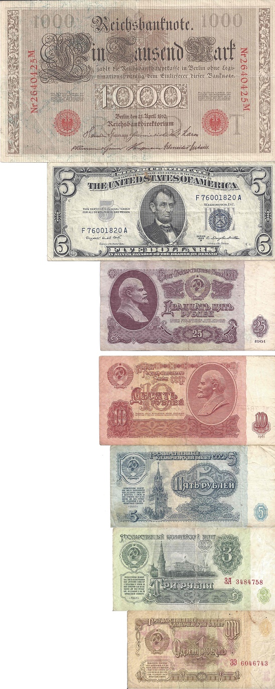
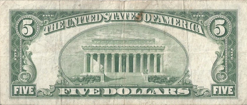
I have to say that given recent trends, which emphasize anti-counterfeiting measures as opposed to aesthetic design, I hate United States Currency.  This is the front and back of the current design, first used in 2006.  This is the front and back from a $5 1953.   This is the front and back of a $5 bill from 1928.  This is the front and back of a $5 bill from 1896, and from 1891, 1880, and 1862.  It’s amazing how much better the bill gets, the older it is.  I understand that anti-counterfeiting measures are a requirement in this day in age, but can we at least make them pleasant to look at?

Next week, we will return to auto racing, with a historic piece of Funny Car memorabilia…stay tuned.

Throwback Thursday-Dale Earnhardt 1982-1983

By David G. Firestone

I canceled Throwback Thursday last year. This was because of the format I was doing, listing all the throwback schemes for 2015, was too time consuming, and I would often forget to upload it if I was too busy. I didn’t want to do it, but circumstances forced me to. I also hated that it took place on the same day that my videos were uploaded.

As I began to think about this, it dawned on me that this isn’t how it should work. I don’t want to do modern interpretations of classic paint schemes. As I thought about this, I realized that I should do a true Throwback Thursday. As such, from here on out, every Thursday, I will upload a classic paint scheme, and describe it based on my current standard of paint scheme grading. This way, I can do Throwback Thursday, and have it work the way I want it to.

Our first example, is this Dale Earnhardt Sr. 1982-1983 Wrangler Jeans Ford Thunderbird

The scheme has a good color scheme, the yellow isn’t too bright, and the blue contrasts with it just enough, The design scheme works well too. The yellow running up the side, ending just after the door, with an indentation that matches the #1 is a good touch, and the yellow running up the roof to the rear window. I also like the JEANS MACHINE on the back bumper.

One thing I find that’s odd is that the contingency decals in the photo, there are two separate STP logos. I also love the old-school wheel rims with white letter GOODYEAR lettering on them. I also didn’t notice until just now that the roof number is upside down, making it look like it is 51. It’s still a good scheme, and the box-like design of the car works well here.

Paint Scheme Tracker-January 6, 2016

By David G. Firestone

CHIP GANASSI RACING TEAM #1

Jamie McMurray #1 Cessna/Beechcraft Chevy SSNew scheme for 2016, blue top, reverse wave formation across sides, white bottom, with silver accents. B+

TEAM PENSKE #2

Brad Keselowski #2 Miller Lite Ford FusionSame basic scheme as 2015, but Miller has been removed from hood, similar 2014. A+

Brad Keselowski #2 Alliance Truck Parts Ford FusionNo Change. A+

Brad Keselowski #2 Wurth Ford FusionNo Change. A+

RICHARD CHILDRESS RACING #3

Austin Dillon #3 Dow Chevy SSSame basic scheme, but the hood logo is slightly larger. B+

Austin Dillon #3 Cheerios Chevy SSNo change. A+

Austin Dillon #3 American Ethanol Chevy SSNo change. A-

STEWART-HAAS RACING #4

Kevin Harvick #4 Busch Chevy SS-New sponsor for 2015, designed around a Busch throwback can. A+

Kevin Harvick #4 Busch Light Chevy SS-New sponsor for 2015, designed around a Busch Light can. A+

Kevin Harvick #4 Jimmy John’s Chevy SSNo change. A+

Kevin Harvick #4 Outback Chevy SSNew scheme for 2016, mountain design starts near brake duct, instead of at front of car. B+

Kevin Harvick #4 Ditech Chevy SSNo change. A+

HENDRICK MOTORSPORTS #5

Kasey Kahne #5 Farmers Insurance Chevy SSNo Change. C+

Kasey Kahne #5 Great Clips Chevy SSNo Change. D+

Kasey Kahne #5 Liftmaster Chevy SSNew scheme for 2016, geometrical designs on side changed. C

TOMMY BALDWIN RACING #7

Alex Bowman #7 Road Rippers Chevy SS-New scheme for 2015, shark motif on front, fades to fire motif and logo on back. F

STEWART-HAAS RACING #10

Danica Patrick #10 Nature’s Bakery Chevy SS-New sponsor for 2016, blue with white lettering on sides, white and black stripe across hood and roof. A+

Danica Patrick #10 TaxAct Chevy SS-New sponsor for 2016, white front, red TaxAct X logo, gray back. A+

Danica Patrick #10 Nature’s Pride Pumpkin Spice Chevy SS-New sponsor for 2016, same basic scheme as Nature’s Pride, but with orange and red color scheme, and some slight redesigns on the side. A+

JOE GIBBS RACING #11

Denny Hamlin #11 FedEx Express Toyota CamrySlight redesign for 2016, hood logo moved slightly to the right, side stripes wider. A+

Denny Hamlin #11 FedEx Freight Toyota CamrySlight redesign for 2016, hood logo moved slightly to the right, side stripes wider. A+

Denny Hamlin #11 FedEx Ground Toyota CamrySlight redesign for 2016, hood logo moved slightly to the right, side stripes wider. A+

Denny Hamlin #11 FedEx Office Toyota CamrySlight redesign for 2016, hood logo moved slightly to the right, side stripes wider. A+

GERMAIN RACING #13

Casey Mears #13 Geico Chevy SSNew scheme for 2016, much more subdued version of the 2015 scheme. A+

Casey Mears #13 Geico Millitary Chevy SSNew scheme for 2016, black with camo motif across car. F

STEWART-HAAS RACING #14

Tony Stewart #14 Mobil 1 Chevy SSNew scheme for 2016, Bass Pro Shops has left, so the Mobil 1 scheme features a white background, with the Pegasus wing starting at the side of the front, extending to the door numbers. A+

Tony Stewart #14 Code 3 Associates/Mobil 1 Chevy SSSlight redesign, removal of Bass Pro Shops logo, cleaner rear end of the car. A+

Tony Stewart #14 Rush Truck Stops/Mobil 1 Chevy SSSlight redesign, removal of Bass Pro Shops logo, cleaner rear end of the car. A+

HSCOTT MOTORSPORTS #15

Clint Bowyer #15 Five-Hour Energy Chevy SSNew scheme for 2015, the front stripe has been moved up to the top of the side, and the roof matches with the design. A+

Clint Bowyer #15 Peak Chevy SSNew scheme for 2015, Blue with white geometrical designs on side. A+

ROUSH-FEWNAY RACING #16

Greg Bffle #16 Cheez-its Ford FusionNew scheme for 2015, stripe has been extended down tot he bottom of the car, some slight rearangment of the crackers on the side of the car. A+

JOE GIBBS RACING #18

Kyle Busch #18 Interstate Batteries Chevy SSSlight redesign for 2015, stripes are wider, black stripe on bottom gone. F

Kyle Busch #18 Skittles Toyota CamryNo Change. A+

JOE GIBBS RACING #19

Carl Edwards #19 Stanley Toyota CamryNo Change. B+

Carl Edwards #19 Stanley Toyota CamrySlight redesign for 2016, logos are bigger, outlines are bolder. A

JOE GIBBS RACING #20

Matt Kenseth #20 Dollar General Toytota CamrySlight redesign for 2016, black stripe across bottom now gone. A+

Matt Kenseth #20 DeWalt USA Toyota CamryNo Change. A+

TEAM PENSKE #22

Joey Logano #22 Shell/Pennzoil Ford FusionNo change D

Joey Logano #22 AAA Ford FusionNo Change. D

HENDRICK MOTORSPORTS #24

Chase Elliott #24 NAPA Chevy SS-New sponsor for 2015, blue with white stripes across side which start at brake duct. A+

Chase Elliott #24 3M Chevy SSNew scheme for 2015, black and white replaces silver, extra geometrical designs on sides. B+

RICHARD CHILDRESS RACING #27

Paul Menard #27 Menard’s/Moen Chevy SSNew scheme for 2016, black front, extending into Menard’s template, yellow rear. B-

RICHARD CHILDRESS RACING #31

Ryan Newman #31 Cat Chevy SSSlight redesign for 2016, yellow stripes are narrower, and hood logo is slightly larger. A+

Ryan Newman #31 Granger Chevy SSNo change. B +

STEWART-HAAS RACING #41

Kurt Busch #41 Monster Energy Chevy SS-New sponsor for 2016, black with yellow and white numbers and lettering. A+

Kurt Busch #41 Haas Automation Chevy SSNew scheme for 2016, red front, fades to black rear end.  A+

Kurt Busch #41 Haas Automation/Monster Energy Chevy SS-New scheme for 2016, red front, fades to black rear end. A+

RICHARD PETTY MOTORSPORTS #43

Aric Almirola #43 Smithfield Ford FusionSlight redesign for 2016, roof numbers turn from yellow to red. B+

HENDRICK MOTORSPORTS #48

Jimmie Johnson #48 Lowe’s Chevy SSSlight redesign for 2016, stripes are narrower, and hood logo is slightly forward. C-

Jimmie Johnson #48 Lowe’s/Kobalt Chevy SSSlight redesign for 2016, stripes are narrower, and hood logo is slightly forward. C-

Jimmie Johnson #48 Lowe’s Pro ServicesSlight redesign for 2016, stripes are narrower, and hood logo is slightly forward. C-

FURNITURE ROW RACING #78

Marin Truex Jr. #78 Furniture Row Toyota CamryOther than the switch from Chevy to Toyota, there are no major changes. A+

HENDRICK MOTORSPORTS #88

Dale Earnhardt Jr. #88 TaxSlayer Chevy SS-New sponsor for 2016, red top and front, white bottom and back, gold designs separate the two. A+

Dale Earnhardt Jr. #88 Nationwide Chevy SSNew scheme for 2015, reminiscent of old Mountain Dew/Amp Energy scheme. A+

Dale Earnhardt Jr. #88 Axalta Chevy SS-New sponsor for 2016, red top, fade to yellow bottom, across whole car. A+


nascar, sprint cup, nascar sprint cup, chevy, ss, chevy ss, toyota, camry, toyota camry, ford, fusion, ford fusion, danica patrick, nature made, martin truex jr., furniture row, dale earnhardt jr., taxslayer,kevin harvick, busch, busch light, napa, chase elliott, kurt busch, monster energy, taxact, casey mears, geico, jamie mcmurray, cessna, beechcraft, brad keselAowski, miller lite, wurth, alliance, alex bowman, road rippers, denny hamlin, fedex, tony stewart, mobil 1, code 3, rush, stanley, kurt busch, monster, axalta, austin dillon, dow, cheerios, american ethanol, kasey kahne, liftmaster, great clips, farmers insurance, greg biffle, cheez-its, kyle busch, interstate batteries, skittles, matt kenseth, dewalt usa, dollar general, ryan newman, cat, granger, aric almirola, smithfield, jimmie johnson, lowe’s, kobalt, lowe”s pro services,paul menard, menard’s, moen, nature’s pride pumpkin spice, 3m,clint bowyer, peak, five-hour energy,


My Thoughts on 2016

By David G. Firestone

I think that we can all agree that vacations rule…and it sucks when they end. Well, I have come to the end of my winter sabbatical. Well, it’s 2016, the holiday season is over, and I’ve got back into the grind. I’m coming back to The Driver Suit Blog with a slightly new setup. I’ve moved the videos to Mondays, which will start in March. The other major change will be Throwback Thursdays are coming back.

Videos will be on Monday, because I NEVER post articles on Monday, and at least there will be something. I’ve got a great set of videos ready for 2016. They cover a lot of items, many I have already talked about, some I haven’t. I’m looking forward to them, and I like the way they turned out.

I’m also proud to announce that Throwback Thursday has returned! I’ve decided that I wanted to do something, and I thought that I should use the way I grade paint schemes. So, starting this Thursday, I will feature a vintage car design and describe what I like and don’t like about the paint scheme in question. I will also discuss design aspects of the car I notice. I’ve done a number of them already, and I like what they come out.

The Tracker will still be on Wednesday, the Friday Feature will stay as is, and the Grades will still be on Saturday. The only day that will be free will be Sunday, because I want my readers to watch the races, rather than read my blog. I’ve got six days worth of stuff every week. I’m really excited for 2016.

I’m also implementing a new rule for comments. From here on out, I would prefer that if you comment, please use a real name. I HATE people who make up fake names to comment on web pages. Look at everything I’ve done on The Driver Suit Blog. Everything I have done, the first line of text has always been “By David G. Firestone.” If you only want to use a first name, I have no problem with that, but I reserve the right to deny a comment if it’s an obviously fake name. I don’t care if you disagree with me, just own up to it.

I’m really looking forward to 2016, it’s gonna be a great year, I have a lot of things planned. Stay Tuned!

Currency and Us Part 1-Coins and Their History

grizzlydie-2By David G. Firestone

I wanted to start 2016, and celebrate my 34th birthday with a project I have been working on for a while. Money really is the great equalizer. Every human being on the planet wants as much of it as possible. We work jobs we hate in order to get it, and we spend it as we see fit. While we mainly spend it on things we need to live, food, shelter, and clothing, we do spend it on things that make us happy.

I find it amazing that most people know so little about one of the most important objects in the world. For a lot of us, our pocket change can be useful, but if you knew the history about it, and how it was made, they would be awestruck.

Metallic coins really started with the human desire for gold. While the earliest known coins date back to around the 8th and 7th centuries BCE, gold has been used since 600 BCE for monetary purposes. Today, gold is still a part of global currency, but most gold mined is used for other applications, such as jewelry, electronics, medicine, commercial chemistry, and other industrial uses.

Gold is also a status symbol. Gold medals, and trophies are symbols of victory and achievement. Gold used in jewelry is symbolic of wealth and success. Gold in and of itself is seen as both a form of good and evil. One of James Bond’s most well known foes was Auric Goldfinger, who spent his entire life trying to acquire as much gold as possible.

I happen to have some pure gold in my possession. I have .61 grams of gold in the form of three small ingots. Two of them, weighing .1 grams and .01 grams respectively are from NZP Gold, a smelting plant in Turkey. nzp-10-1 nzp-10-2 nzp-1-1 nzp-1-2The third one, weighing .5 grams comes from Istanbul Gold Refinery, also in Turkey.igr-5-1 igr-5-2

Coins started their lives as a way to simplify the use of gold as currency. Coins were originally made by using molds and metal. The blank was made using bars of metal, which was hammered out on anvils. Then the blank, which is known as a “planchet” was then heated up, placed between the two molds, and hammered. This was a less than precise method, and since the mold had to be hammered by hand, the design would vary. These examples of medieval coins are examples of that process.medievil-1 medievil-6 medievil-5 medievil-4 medievil-3 medievil-2

As time went on, the process improved. Dies replaced the molds. The die process is similar in theory to the mold process, but there is a lot more quality control involved. Dies are cast from a master die. The design for the master die is drawn on paper, and then hand carved in clay then plaster by an engraving expert, in a much larger size than the coin will be. That is then coated in expoxy, which takes 18 hours to set and cure, then it is placed in a machine that is called a “reducing lathe” which spins the design around while transferring every minute detail from the large epoxy mold to a coin-sized die. This die is called “the reduction hub” and is used to make the master die.

When the master die is made, the reduction hub is placed into a machine with a cone-shaped piece of metal. The machine presses the hub into the cone, creating the master die. This master die is used to make “working hubs” which are used in the die press. Dies have the image of the coin reversed, so they come out properly in the minting process. Planchets come about from 1,500 foot rolls of prefabricated metal, which has the correct mixing of metals. The planchets are punched out, and the waste metal is recycled. These are two examples of modern planchets, one is a quarter, one is a dime.planchet-2 planchet-1

After they are washed and cleaned, the coins go through an “upsetting mill” which uses a large spinning disk to move the planchet through a groove which grows narrower and narrower. This adds a raised edge to the coin, higher than the design, which is called a “relief.” This is done to protect the relief. Then the planchet, with the raised edge heads to the press, where a die set is waiting. The coin press can stamp out 750 coins a minute, or 12.5 coins a second! One die is the “hammer” which moves back and forth during the stamping process, and the other is called the “anvil” and is stationary.

After the coin is struck, mint technicians examine a sample from the batch. If there are die errors, or other forms of damage, the lot it scrapped, the metal recycled, and a new hub is brought in. This is done for several reasons. The mint takes pride in their work, but the main reason is that new vending machines have scanners that scan coins as they are inserted. Errors of any kind mean that the scanner will reject the coin as it sees it as fake.

Interestingly, the US Mint doesn’t simply throw away used coin dies. They realize that there is a huge demand for coin dies. The relief is removed from the die, and destroyed. The end result is packaged with one of the coins it minted, and sold in sets to collectors, such as this example here.coinddie2

This set comes from the Philadelphia Mint, and the die, this one #P6-122687 was used from February 14, 2006 to February 16, 2006, and was used to strike 286,000 Nevada P quarters.  coinddie1 coinddie2The relief has been removed, coinddie7 coinddie3 coinddie4 coinddie5 coinddie6 coinddie8and the Brilliant Uncirculated Nevada P Quarter it comes with is one of the 286,000 quarters it minted.  coinddie9 coinddie10

The has obviously had the relief removed. This is not a minor issue, as there are a lot of counterfeiters out there, who want to make money the illegal way, rather than earn it. This also goes back to the Canadian Voyager Die incident. In 1986, the Royal Canadian Mint shipped both sets of master dies from Ottowa to Winnepeg. In the following investigation, it was discovered that the Royal Canadian Mint had no set procedure for shipping dies, and in a bid to save $43.50 Canadian. This disastrous decision forced the Mint to come up with a new design, due to the very real fears of counterfeiting, and as such, the Loonie was chosen as the new design for the dollar coin.

While it is impossible to get a die used in a monetary coin, medallion dies are easier to get. While some dies are clearly canceled, others, such as these three examples, still have the reverse image present. These two small dies were used to make a small “B.T.” token, slightly bigger than a nickel. btdie-1 btdie-2The accompanying token is a fit to the mold. btdie-6 btdie-5 btdie-4 btdie-3 btdie-7This second die is from a 1960’s Wildwood Medallic Arts Wildlife series medallion. grizzlydie-1This is from the 3rd medal in the series, this is the Grizzly Bear die from the Grizzly Bear/Golden Eagle Medallion.  The relief is just under 1.5 inches across, and is in perfect condition, having no evidence of cancellation.grizzlydie-1 grizzlydie-2 grizzlydie-3 grizzlydie-4 grizzlydie-5 grizzlydie-6 grizzlydie-7 The detail in it is amazing.

Next week, I will discuss bank note design. Until then, here is a video showing the dies pressed into soft clay.